Post pobrano z: Catching up with Markus Magnusson

In this Motionographer article, we hear from Markus Magnusson on his new experience with Patreon and investing time in himself.
Post pobrano z: Catching up with Markus Magnusson
In this Motionographer article, we hear from Markus Magnusson on his new experience with Patreon and investing time in himself.
Post pobrano z: Edward Johnson creates stunning wooden furniture
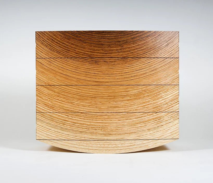
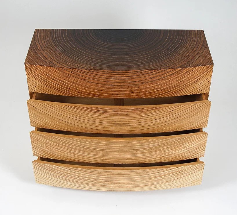
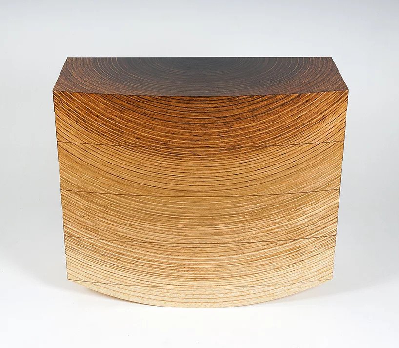
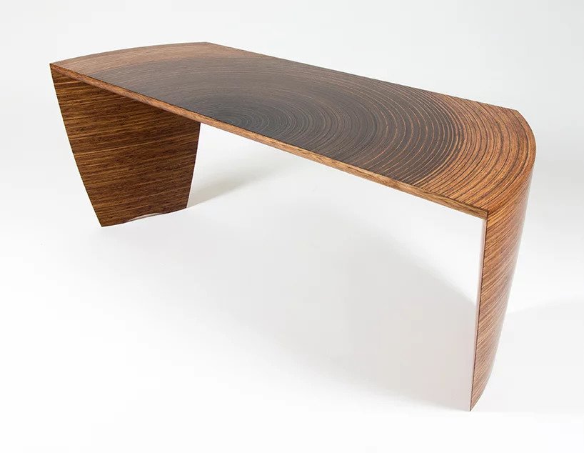
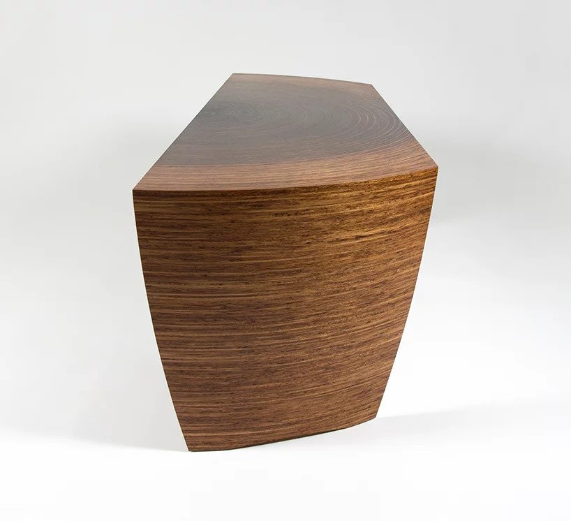
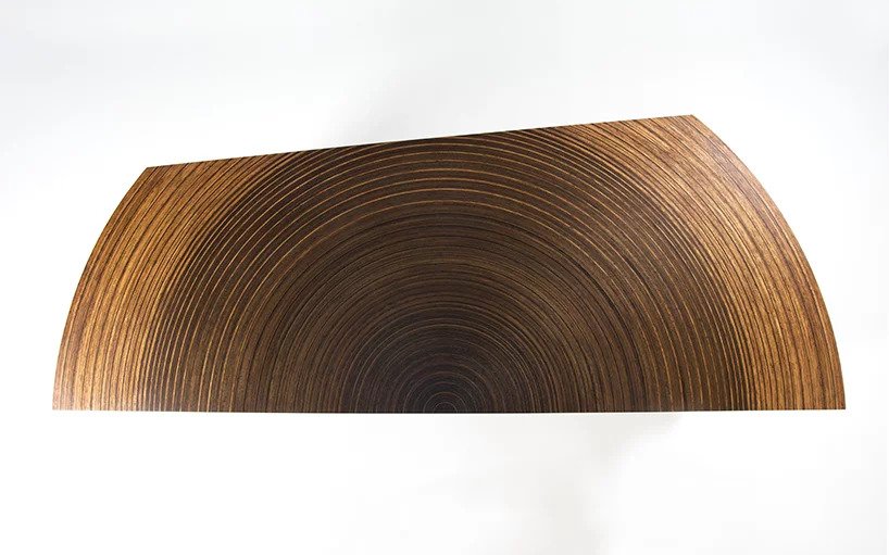
Edward Johnson creates spectacular furniture inspired by nature and with sculptural designs. The radiant desk and chest drawers produce effects using contrasting timbers enhanced with oil. This visual effect makes the furniture looks like it was cut directly out of a tree.
Post pobrano z: CSS Grid in IE: CSS Grid and the New Autoprefixer
In Part 1 of this series, I debunked a few misconceptions that many people have around the Internet Explorer (IE) implementation of CSS grid. This article builds on that knowledge. It would be best to go back and read that article first if you haven’t already.
Today I’m going to be tackling the biggest misconception of all: that utilizing the IE implementation of CSS grid is extremely difficult. You can easily use CSS grid in IE right now without having to give it any sort of crappy fallback layout. It really isn’t that hard.
Giving IE a crappy fallback layout is a bit of a tough sell to clients. It is especially tough if this is for an intranet where 90% of the users are using IE. If you want IE compatibility, first you need to resign to the fact that you can’t use all of the fancy bells and whistles that can be found in the modern CSS grid spec. Don’t let this get you down though, you would be amazed by how much IE11 can handle, especially if it has some help from Autoprefixer.
Before I get too far into this, you need to know that this isn’t a general „how to use CSS grid” article. This article is for those that understand CSS grid, but are either too afraid or not allowed to use it, thanks to IE.
I’ll be assuming that you already have a good understanding of how to use CSS grid in modern browsers for this article. If you aren’t sure about how to use CSS grid yet, go watch Rachel Andrew’s excellent CSS grid video tutorial series. After that, go play some levels of the browser game Grid Garden to get some hands-on CSS grid experience. Once you understand the basics of how to use CSS grid in modern browsers, come back here and learn how to use it in a way that produces identical results in IE10 and 11.
Before you do anything else, you will want to get Autoprefixer up and running. Autoprefixer is a tool used for automatically adding browser-specific CSS prefixes to your CSS so that you don’t have to. It’s a bit like Babel but for CSS. (We have a great overview by the creator of Autoprefixer here on CSS Tricks.)
If you have never used Autoprefixer (or any build tool) before, then first install Node on your computer then follow this guide on how to get a basic workflow up and running. The bit in the guide specifically about Autoprefixer is found here. (I recommend the Gulp setup over Grunt if you aren’t sure which to go with.)
If you are already using Autoprefixer in your projects, make sure to update it to the latest version using this command:
npm i autoprefixer@latest -DSome features used in the latest version of Autoprefixer are not supported in PostCSS version 5. This means that you may also need to update your version of PostCSS to at least version 6. If using Gulp, that means updating gulp-postcss to at least v7.0.0. If using Grunt, you may need to update grunt-postcss to at least v0.9.0.
Once you have an environment up and running, you will need to set the Autoprefixer grid setting to true. Without that setting turned on, Autoprefixer will not be able to do any of the cool stuff that I’m about to show you.
The exact method for turning the grid setting on depends a lot on how you compile your code. If you were using the guide that I linked to earlier, you would have seen this snippet of code:
var processorsArray = [
  // snipped for brevity
  require('autoprefixer')({ browsers: ['last 2 versions', 'ie 6-8', 'Firefox > 20']  })
];
Add grid: true to the options to turn grid prefixing on:
var processorsArray = [
  // snipped for brevity
  require('autoprefixer')({ grid: true, browsers: ['last 2 versions', 'ie 6-8', 'Firefox > 20']  })
];
By the way, the browser settings in the tutorial are pretty outdated and will be outputting far more prefixes than you actually need. Just going with ">1%" will mean that when a browser dies, Autoprefixer will automatically stop writing prefixes for that browser. It bases browser usage on global browser data retrieved from caniuse.com.
So, these are the Autoprefixer settings that you should end up using:
var processorsArray = [
  require('autoprefixer')({ grid: true, browsers: ['>1%'] })
];
Now onto the fun stuff! 😃
You may have read Rachel Andrew’s article „Should I try to use the IE implementation of CSS Grid Layout?” That article is all about CSS grid and understanding it’s support in IE10 and 11. It’s a great article and very useful for understanding IE’s limitations. Definitely still worth a read if you haven’t already checked it out. Note that it is extremely outdated in terms of its information on Autoprefixer though.
Autoprefixer has come a long way since Rachel wrote her IE11 CSS grid article and Autoprefixer now supports far more CSS grid translations. Take a look at this new, updated version of Rachel’s table based on Autoprefixer version 8.6.4. Note that items in bold represent a change in Autoprefixer support compared to Rachel’s article:
| CSS Grid Property | IE10 Implementation | Autoprefixer? | Notes |
|---|---|---|---|
| grid-template-columns | -ms-grid-columns | Yes | |
| grid-template-rows | -ms-grid-rows | Yes | |
| grid-template-areas | NA | Yes | Autoprefixer uses this to understand what the grid looks like but does not add any extra properties. |
| grid-template | NA | Yes | Shorthand for grid-template-columns, grid-template-rows, and grid-template-areas |
| grid-auto-columns | NA | No | IE doesn’t support auto-placement |
| grid-auto-rows | NA | No | IE doesn’t support auto-placement |
| grid-auto-flow | NA | No | IE doesn’t support auto-placement |
| grid | NA | No | See this GitHub issue as to why this isn’t supported |
| grid-row-start | -ms-grid-row | Yes1 | Span syntax requires grid-row-end to be defined |
| grid-column-start | -ms-grid-column | Yes1 | Span syntax requires grid-column-end to be defined |
| grid-row-end | NA | Yes1 | grid-row-start must be defined |
| grid-column-end | NA | Yes1 | grid-column-start must be defined |
| grid-row | NA | Yes1 | |
| grid-column | NA | Yes1 | |
| grid-area | NA | Yes2 | Autoprefixer translates the grid area into column/row coordinates |
| grid-row-gap | NA | Yes3 | Generates extra rows/columns in IE. |
| grid-column-gap | NA | Yes3 | Generates extra rows/columns in IE. |
| grid-gap | NA | Yes3 | Generates extra rows/columns in IE. |
| NA | -ms-grid-column-span | Yes | Translated from grid-column-end and grid-area. |
| NA | -ms-grid-row-span | Yes | Translated from grid-row-end and grid-area. |
| align-self | -ms-grid-row-align | Yes | |
| justify-self | -ms-grid-column-align | Yes |
I will cover these in far more detail later in the article:
grid-gap if both grid-template-areas and grid-template-columns have been defined. It also cannot inherit grid-gap through media queries.As you can see from the updated (and much more positive-looking) table, there are a lot of cool new features in Autoprefixer now. The most important of which is its support for grid-template-areas (and by extension grid-template). By supporting grid-template-areas, Autoprefixer now understands exactly what your grid looks like. This paved the way for Autoprefixer to also support (in a limited capacity) grid-gap.
Note that Autoprefixer still does not support the shortcut grid property. This was an intentional design decision that you can learn more about in this GitHub issue. The short story is that the grid property is not only a shortcut for the templating settings but also the auto-placement settings. Since IE can’t do auto-placement and the grid-template property can essentially do anything that the grid property can do (that IE can handle), it was decided that the grid property wasn’t worth supporting.
Back when Rachel wrote her article, this was the sort of grid code you would need to write in order to support IE:
/* IE-friendly source code 26 November 2016 */
/* Code needed to make Autoprefixer work properly */

.grid {
  display: grid;
  grid-template-columns: 1fr 10px 1fr;
  grid-template-rows: 100px 10px 100px;
}

.cell-A {
  grid-column: 1;
  grid-row: 1;
}

.cell-B {
  grid-column: 3;
  grid-row: 1;
}

.cell-C {
  grid-column: 1;
  grid-row: 3;
}

.cell-D {
  grid-column: 3;
  grid-row: 3;
}
Now, you can write code like this instead:
/* Today’s IE-friendly source code */
/* Autoprefixer can now make this code IE safe */

.grid {
  display: grid;
  grid-gap: 10px;
  grid-template:
    "a   b" 100px
    "c   d" 100px /
    1fr  1fr;
}

.cell-A {
  grid-area: a;
}

.cell-B {
  grid-area: b;
}

.cell-C {
  grid-area: c;
}

.cell-D {
  grid-area: d;
}
Autoprefixer will take the above code and translate it into this much more IE-friendly code for you:
/* Autoprefixer’s IE-friendly translation */

.grid {
 display: -ms-grid;
 display: grid;
 grid-gap: 10px;
 -ms-grid-rows: 100px 10px 100px;
 -ms-grid-columns: 1fr 10px 1fr;
 grid-template:
   "a   b" 100px
   "c   d" 100px /
   1fr  1fr;
}

.cell-A {
  -ms-grid-row: 1;
  -ms-grid-column: 1;
  grid-area: a;
}

.cell-B {
  -ms-grid-row: 1;
  -ms-grid-column: 3;
  grid-area: b;
}

.cell-C {
  -ms-grid-row: 3;
  -ms-grid-column: 1;
  grid-area: c;
}

.cell-D {
  -ms-grid-row: 3;
  -ms-grid-column: 3;
  grid-area: d;
}
Best of all, you can then simply change the grid-template or grid-template-areas property with a media query and Autoprefixer will automatically update all of the grid cell coordinates for you:
/* Changing a grid-template with a media-query */

.grid {
  display: grid;
  grid-gap: 10px;
  grid-template:
    "a   b" 100px
    "c   d" 100px
    "e   f" 100px /
    1fr  1fr;
}

@media (min-width: 600px){
  .grid {
    /* Autoprefixer 8.6.4 doesn't inherit grid gaps :( */
    grid-gap: 10px;
    grid-template:
      "a   b   c" 100px
      "d   e   f" 100px /
      1fr  1fr 1fr;
  }
}

.cell-A {
  grid-area: a;
}

.cell-B {
  grid-area: b;
}

.cell-C {
  grid-area: c;
}

.cell-D {
  grid-area: d;
}

.cell-E {
  grid-area: e;
}

.cell-F {
  grid-area: f;
}
The above gets translated into this IE-friendly code:
/* Autoprefixer’s IE-friendly media query translation */

.grid {
  display: -ms-grid;
  display: grid;
  grid-gap: 10px;
  -ms-grid-rows: 100px 10px 100px 10px 100px;
  -ms-grid-columns: 1fr 10px 1fr;
  grid-template:
    "a   b" 100px
    "c   d" 100px
    "e   f" 100px /
    1fr  1fr;
}

@media (min-width: 600px) {
  .grid {
    /* Autoprefixer 8.6.4 doesn't inherit gaps :( */
    grid-gap: 10px;
    -ms-grid-rows: 100px 10px 100px;
    -ms-grid-columns: 1fr 10px 1fr 10px 1fr;
    grid-template:
      "a   b   c" 100px
      "d   e   f" 100px /
      1fr  1fr 1fr;
  }
}

.cell-A {
  -ms-grid-row: 1;
  -ms-grid-column: 1;
  grid-area: a;
}

.cell-B {
  -ms-grid-row: 1;
  -ms-grid-column: 3;
  grid-area: b;
}

.cell-C {
  -ms-grid-row: 3;
  -ms-grid-column: 1;
  grid-area: c;
}

.cell-D {
  -ms-grid-row: 3;
  -ms-grid-column: 3;
  grid-area: d;
}

.cell-E {
  -ms-grid-row: 5;
  -ms-grid-column: 1;
  grid-area: e;
}

.cell-F {
  -ms-grid-row: 5;
  -ms-grid-column: 3;
  grid-area: f;
}

@media (min-width: 600px) {
  .cell-A {
    -ms-grid-row: 1;
    -ms-grid-column: 1;
  }

  .cell-B {
    -ms-grid-row: 1;
    -ms-grid-column: 3;
  }

  .cell-C {
    -ms-grid-row: 1;
    -ms-grid-column: 5;
  }

  .cell-D {
    -ms-grid-row: 3;
    -ms-grid-column: 1;
  }

  .cell-E {
    -ms-grid-row: 3;
    -ms-grid-column: 3;
  }

  .cell-F {
    -ms-grid-row: 3;
    -ms-grid-column: 5;
  }
}
The duplicate media query might look a bit ugly but I assure you that this is the best possible way that Autoprefixer can handle the media query translation. The new IE grid cell coordinates could not be placed into the same media query as the grid template definition. Doing so would lead to one of two possible outcomes. One outcome is that the default grid cell positions would override the altered positions stated in the media query. This would cause the media query to have no effect in IE. The other outcome would be for Autoprefixer to shift all of the styles inside the media query (yes, that includes all of the styles that you wrote yourself) to another location in the style sheet, potentially causing horrific CSS specificity issues. You can learn more about the thinking behind this decision in the now closed GitHub issue for it.
Even Superman can’t always save everyone and Autoprefixer is no different. While Autoprefixer is able to cut down on a lot of the workload involved in making our grids IE-compatible, it can’t fix everything. It can only translate things that IE can understand. These are the many critical things that you need to be aware of if you don’t want to open the site up in IE one day and have it blow up in your face.
As you may have seen in that last example, grid-gap isn’t currently able to be inherited through media queries. If you want to use grid-gap, you will need to duplicate the grid-gap setting across all of the media queries where you define a grid template for that grid. There is an issue open on GitHub about this. Go give it a thumbs up if you want Autoprefixer to support it. Hopefully the issue is fixed soon.
That isn’t the only problem around using grid-gap though. It is only supported by Autoprefixer when both grid-template-areas and grid-template-columns have been defined.
Autoprefixer adds grid-gap support by using grid-template-areas to understand what your grid looks like. It then takes your grid-template-columns and grid-template-rows definitions and injects the grid-gap value between each row and column, creating extra rows and columns in IE.
If you try to use grid-gap on its own without grid-template-areas, Autoprefixer has no way of knowing what cell belongs to what grid. Without that critical knowledge, it cannot safely inject the extra columns and rows that IE needs.
That explains grid-template-areas but why do we also need to define grid-template-columns? Shouldn’t something like this be just as easy for Autoprefixer to translate?
.grid {
  display: grid;
  grid-gap: 20px;
  grid-template-areas:
    "a  b  c"
    "d  e  f";
}

.cell-a {
  grid-area: a;
}

.cell-f {
  grid-area: f;
}
Rows and columns in CSS grid default to a value of auto so can’t Autoprefixer just add something like -ms-grid-columns: auto 20px auto 20px auto;? It does that for rows, so why can’t it do the same thing for columns?
Well my inquisitive friend, I explained in Part 1 that auto in IE acts a bit differently to auto in modern browsers. When columns are set to auto in IE, they will always shrink down to the value of max-content. Modern grid columns, on the other hand, will expand to 1fr if there are no other fr units being used in that grid template declaration. This discrepancy can cause a massive difference in appearance between the modern and the IE version of a grid. The Autoprefixer team felt that it was too dangerous to make assumptions about this, so they made grid-template-columns a mandatory setting in order for grid-gap to take effect.
So that explains why Autoprefixer doesn’t support grid-gap when grid-template-columns is missing. If auto behaves so differently in IE, then why does Autoprefixer support grid-gap without the user explicitly having to define grid-template-rows? Isn’t that just as bad?
Not really. When you set display: grid; on something, it’s width will grow to the full width of its container. Its height, on the other hand, typically shrinks to the height of its content. Of course this isn’t always the case. There are a number of reasons why a grid might be taller than its content. If the grid is also a flex item and the flex container is taller than the grid, then that would be one reason why the grid might be taller than its content. In general though, if there are no other forces involved, then a grid container will always be the same height as its content.
Since the height of a typical grid is the same height as its content, in most cases, auto in both IE and modern browsers will behave identically to one another. It will only differ in functionality if the height of the grid exceeds the height of the content inside of it. For the best balance between user convenience and browser consistency, the Autoprefixer team made a choice. They decided that supporting a missing grid-template-rows property but not a missing grid-template-columns property was the best way to handle grid-gap support.
I really can’t say this enough. The most important thing to remember when using CSS grid in IE is that everything must be placed manually. The instant you start thinking about using auto-placement is the instant your site blows up in IE. I have a method for dealing with grids that have an unknown number of cells in them. I’m covering that in Part 3 of this series. The main thing to know right now is that if you want to use CSS grid in an IE-friendly way, you should only ever use it if there are a known number of cells for a known number of rows and columns.
It’s this lack of auto-placement in IE that makes having access to grid areas through Autoprefixer such a blessing. Instead of having to calculate all of the coordinates manually, you can instead name each cell and then let Autoprefixer do the math for you. When using media queries, you only need to redefine the grid template and autoprefixer will recalculate all of the coordinates for you. You rarely have to do any column or row counting. It’s great!
The ability to use grid-template-areas is one of Autoprefixer’s greatest strengths, though it has its limits. Autoprefixer does not have any access to the DOM. Due to this, Autoprefixer is entirely dependent on using the area name for understanding where each cell needs to be placed in the grid. This can cause clashes if you use the same area name twice in the same stylesheet.
Here is a small example. Early in the stylesheet, Grid Alpha has grid-template-areas: "delta echo". Later in the stylesheet, Grid Beta has grid-template-areas: "echo delta". We say that our grid cell belongs to area echo… so does it go in column 1 or 2?
.grid-alpha {
  grid-template-areas: "delta  echo";
}

.grid-beta {
  grid-template-areas: "echo  delta";
}

.grid-cell {
  /* What column does .grid-cell go in? */
  -ms-grid-column: ???;
  grid-area: echo;
}
Modern browsers know exactly what column to place the grid cell in because they have access to the DOM. If the cell is placed inside Grid Alpha, it will go in the first column. If it is placed in Grid Beta it will go in the second column. Autoprefixer can only read your CSS. It has no idea if the grid cell is placed in Grid Alpha or Grid Beta. All it knows is that the grid cell needs to be placed in the „echo” area. Autoprefixer resolves this conundrum by going with whichever one came last in the stylesheet. In this case, Autoprefixer will honor Grid Beta’s "echo delta" areas definition since it occurs last. If you placed the grid cell inside Grid Alpha, it would look great in modern browsers but it would be placed in the wrong column in IE.
This also means that you can’t really use the strategy of giving a component a single designated area name that is repeatedly referenced. Referencing that area name in more than one grid-template-areas property will break IE for sure. Every single area name across every single grid in your style sheet needs to be unique or Autoprefixer will freak the heck out.
Autoprefixer currently does not warn you when you have used a duplicate area name in your stylesheet. If you would like to start seeing warnings for duplicate area names, there is an issue open on GitHub that you can add your support to. In the meantime, the easiest way to ensure that each area name is unique is probably adopting a BEM style approach to naming the areas.
.grid-alpha {
  grid-template-areas: "grid-alpha__delta  grid-alpha__echo";
}

.grid-beta {
  grid-template-areas: "grid-beta__echo  grid-beta__delta";
}

.grid-cell {
  /* No more conflict :) */
  -ms-grid-column: 2;
  grid-area: grid-alpha__echo;
}
This can be pretty verbose if there are lots of columns and rows. You might want to shorten it down to an abbreviation instead. Of course, the less verbose your area names, the more chance there is of a conflict.
.grid-alpha {
  grid-template-areas: "ga_delta  ga_echo";
}

.grid-beta {
  grid-template-areas: "gb_echo  gb_delta";
}

.grid-cell {
  -ms-grid-column: 2;
  arid-area: ga_echo;
}
There is one major exception. Grid areas in media queries are allowed to be duplicates of other areas as long as the area names defined in the media query are targeted at the same element. Without this exception, it would be impossible to change the grid areas based on screen size. The main thing to remember is that each grid has to have its own set of unique area names that must not be shared with any other grids.
@media (min-width: 600px) {
  .grid-one {
    grid-template-areas:
      "alpha bravo"
      "alpha charlie";
   }
}

@media (min-width: 900px) {
  .grid-one {
    /* This is fine */
    /* It is targeting the same element */
    grid-template-areas:
      "alpha bravo charlie";
  }
}

@media (min-width: 900px) {
  /* NOT FINE! */
  /* The "alpha" area is being reused on a different element! */
  .grid-two {
    grid-template-areas:
      "alpha delta";
  }
}There are only two properties in IE’s implementation of CSS grid that will help you span multiple columns. The main one being -ms-grid-column/row-span which tells IE how many columns/rows to span. The other being -ms-grid-column/row which tells IE where to start counting from.
.grid-cell {
  -ms-grid-column-span: 2; /* number of cells to span */
  -ms-grid-column: 1; /* starting cell */
}
In modern browsers, you have access to far more options.
Out of the modern ways to span multiple cells, Autoprefixer fully supports the following. Feel free to use any of these methods as much as you like:
Specify a starting line and the number of lines to span (similar to IE):
.grid-cell {
  grid-column: 1 / span 2;
}
Specify an end line, then span backwards:
.grid-cell {
  grid-column: span 2 / 3;
}
Specify a starting line and an end line directly:
.grid-cell {
  grid-column: 1 / 3;
}
Specify only a number of cells to span using grid-column/row-end. Remember that IE can’t do auto-placement though. A starting line will still need to be specified elsewhere in the style sheet:
.grid-cell {
  /* Make sure you specify a starting line elsewhere */
  grid-column-end: span 2;
}
Specify only a starting line:
.grid-cell {
  /* The short way */
  grid-column: 1;

  /* The more verbose way */
  grid-column-start: 1;
}Now this is where Autoprefixer reaches its limit. The following methods are supported in modern browsers but are not supported by Autoprefixer. This is mainly due to Autoprefixer having no idea what grid the grid cell belongs to since it can only base its decisions on what is in the stylesheet.
Specify a starting line and how many lines from the end of the explicit grid to span:
.grid-cell {
  grid-column: 1 / -1;
}
Specify both the start and end line from the end of the explicit grid:
.grid-cell {
  grid-column: -3 / -1;
}
Specify only how many lines to span using the shorthand syntax (issue in GitHub):
.grid-cell {
  grid-column: span 2;
}
Specify only a backwards span (IE can’t span backwards):
.grid-cell {
  grid-column-start: span 2;
}
Specify only an end line (IE doesn’t understand end and Autoprefixer doesn’t know where the start is):
.grid-cell {
  grid-column-end: 3;
}
So, basically avoid counting backwards from the end of the grid and you’ll be fine. 😊
One of the cool features of modern grids is giving grid templates line names. Instead of using numbers to reference a line, you can give the line a name and reference that instead. Since Autoprefixer supports grid areas, you would think that they would also support line names. Unfortunately, that isn’t the case. As of version 8.6.4, Autoprefixer does not support line names (at the time of writing). Don’t worry though! It’s not that it is impossible to support (at least not entirely), it just hasn’t been a high priority for them. If you love using line names in your grids then let them know about it in the GitHub issue for it. Post your use cases and it will surely increase the priority of the feature. In the meantime, see if you can use grid areas instead for now.
Keep in mind that, if it is going to be implemented, then every line name across your stylesheet would need to be unique. Like with grid areas, Autoprefixer wouldn’t know what line name belongs to what grid. The only way it can tell is if every line name in the stylesheet is unique (excluding media queries).
IE will behave itself most of the time as long as you follow all of the rules we’ve covered so far. That said, IE can still be a bit unpredictable. Just recently, I made a grid item a vertical flowing flex container and encountered an odd bug in IE11. The column width was set to minmax(min-content, 350px) but IE seemed to treat min-content like max-content in this circumstance. This completely broke the layout. Changing it to minmax(0, 350px) fixed the issue. Just goes to show that IE’s grid implementation isn’t quite perfect.
There are also times when you might accidentally forget to explicitly place grid cells. We build our grids in modern browsers because they have the nice grid development tools (especially Firefox). Modern browsers have auto-placement, though. This means that you might be halfway through building your grid then get called away for a moment. When you return to your desk, you see the layout looking beautiful in your browser, but you completely forget that you haven’t explicitly placed any grid cells yet. You move onto the next thing, blissfully unaware that you have left IE in a completely broken state.
Neither of those issues will reveal themselves until you test your site in IE11. Any time that you get a grid looking good in a modern browser, open it up in IE and double-check that it still looks the way you expect it to.
Despite Autoprefixer’s best efforts, there are still some rare occasions when it seems like Autoprefixer is hindering you more than it is helping you. If you ever find yourself in a situation where it would be easier to not have Autoprefixer translating your code, you can turn Autoprefixer off using something called a „control comment.”
This control comment will turn off Autoprefixer translations for the entire CSS block. It will not prefix any styles before or after the point where the comment is made.
/* Input CSS */

.normal-behavior {
  display: grid;
  grid-template-columns: 1fr 1fr;
  grid-template-rows: 1fr 1fr;
}

.off-behavior {
  display: grid;
  /* autoprefixer: off */
  grid-template-columns: 1fr 1fr;
  grid-template-rows: 1fr 1fr;
}

.normal-behavior-again {
  display: grid;
}
/* Output CSS */
.normal-behavior {
display: -ms-grid;
display: grid;
-ms-grid-columns: 1fr 1fr;
grid-template-columns: 1fr 1fr;
-ms-grid-rows: 1fr 1fr;
grid-template-rows: 1fr 1fr;
}
.off-behavior {
display: grid;
/* autoprefixer: off */
grid-template-columns: 1fr 1fr;
grid-template-rows: 1fr 1fr;
}
.normal-behavior-again {
display: -ms-grid;
display: grid;
}If you are after more of a scalpel than a sledge hammer, the /* autoprefixer: ignore next */ control comment is more for you. „Ignore next” will skip the next CSS declaration rather than ignoring the entire CSS block.
/* Input CSS */

.normal-behavior {
  display: grid;
  grid-template-columns: 1fr 1fr;
  grid-template-rows: 1fr 1fr;
}

.ignore-next-behavior {
  display: grid;
  /* autoprefixer: ignore next */
  grid-template-columns: 1fr 1fr;
  grid-template-rows: 1fr 1fr;
}
/* Output CSS */
.normal-behavior {
display: -ms-grid;
display: grid;
-ms-grid-columns: 1fr 1fr;
grid-template-columns: 1fr 1fr;
-ms-grid-rows: 1fr 1fr;
grid-template-rows: 1fr 1fr;
}
.ignore-next-behavior {
display: -ms-grid;
display: grid;
/* autoprefixer: ignore next */
grid-template-columns: 1fr 1fr;
-ms-grid-rows: 1fr 1fr;
grid-template-rows: 1fr 1fr;
}If you are using Sass (or another CSS pre-processor) in your project, do not use the double slash (//) method for writing these comments. Sass will strip those comments out before Autoprefixer has a chance to translate the code.
/* Input SCSS */

.normal-behavior {
  display: grid;
}

.failed-off-behavior {
  // autoprefixer: off
  display: grid;
}

.successful-off-behavior {
  /* autoprefixer: off */
  display: grid;
}
/* Output CSS */
.normal-behavior {
display: -ms-grid;
display: grid;
}
.failed-off-behavior {
display: -ms-grid;
display: grid;
}
.successful-off-behavior {
/* autoprefixer: off */
display: grid;
}So, after all that, here is the list of all the things you need to remember to be an IE11 CSS grid master:
npm i autoprefixer@latest -D).grid-template-areas as your primary method for placing grid cells into position.grid-template (not grid) as a shortcut.grid-gap as long as you define both grid-template-areas and grid-template-columns.grid-gap is currently not inherited through media queries. Go give this GitHub issue a thumbs up if you want to write less grid-gap code./* autoprefixer: off */ and /* autoprefixer: ignore next */ to prevent Autoprefixer from translating certain parts of your style-sheet that are causing problems.…and from Part 1:
minmax(), min-content and max-content are all natively supported.fit-content() isn’t natively supported but you can work around this with auto and max-width settings.auto is not equal to auto in modern browsers.If you have any questions, or if this really helped you out, let me know in the comments! I’m also @Daniel_Tonon on Twitter. 😁
In Part 3, I will be covering how to make a fully responsive flexbox-based grid in IE11. This flexbox technique even replicates grid-gap functionality!
The post CSS Grid in IE: CSS Grid and the New Autoprefixer appeared first on CSS-Tricks.
Post pobrano z: How to Create a Dark Double Exposure Effect in Affinity Photo

Today we will be creating a dark forest themed double exposure effect using Affinity Photo! As with all things, there is more than one way to create a double exposure effect, and we will be looking at one of those variations today that involves some beginner level painting.
We will also be creating some dramatic dual-tone color grading using Affinity Photo’s impressive Split Toning adjustment layer.
Today’s focus is on taking a slow, close look at Affinity Photo, with the goal of ultimately understanding the basics of this affordable yet powerful program!
You will need the following resources in order to complete this project:
To start things off, we’ll be learning how to create a fresh new document and how to bring in images to edit!
First, open up Affinity Photo.
Once it’s open, you will be able to create a new document in one of two ways. You can click the New Document button on the bottom right-hand corner of the Affinity Photo splash screen.

Alternatively, you can go to File > New in the upper left-hand corner of Affinity Photo.

Next, in our New Document panel, we will be setting up our document to make sure it’s print-ready.
Affinity Photo has suggested settings depending on what you intend to do with your image. In this case, I want my image to be print-ready, so I choose Print.
Today our canvas won’t be a standard size, so I choose Custom. A good default size to chose in a lot of circumstances is A4 as that is your standard medium-sized poster or print.
This is personal preference—in fact, usually I work in inches or pixels, but today it’ll be Millimeters. You can change this at any time, and Affinity Photo will simply convert one unit to another.
Here we are choosing how many bits we want our image to be. When printing, we always want RGB/8. You can always convert from RGB/16 later; however, you will notice a slight change in your image’s colors and tones.
A lot of people start off with a different Color Profile, such as Adobe RGB, and then convert to sRGB when saving something for the internet. I am one of those people. However, if you don’t need to worry about printing, and your images are internet only, feel free to always set this to sRGB!
Also be sure to check Transparent Background.
This one is self-explanatory, luckily!
DPI stands for „Dots Per Inch” meaning „For every inch, there will be this many printed dots.” When preparing a file that you intend to print, you want your DPI to be no lower than 230, and ideally you want it to be right at 300.
If you aren’t printing then the default is usually 72 as DPI has absolutely no effect on web-based images.

After all that, we get to finally press OK!
Now we will be dropping the first image onto our canvas.
I find the easiest way to import an image into Affinity Photo is to drag and drop it into the document.
With that information, we can now properly place and size our Dark Forest Background to fill out the canvas.

Next, we will be preparing our Sensuous Woman stock image, which includes removing her earrings.
Drag and drop in the Sensuous Woman image and size her similar to what you see below, placing her above the dark forest background layer.

I will rename and refer to this layer as the „Model” layer from here on out.
There are several ways to remove an object from an image. In this case, our model is on a flat black background, which simplifies our job significantly. Today we will be using the Clone Brush Tool.
With the Clone Brush Tool selected, change the Brush Hardness to 70%. Start off with a medium brush size and change the brush size as needed while painting.
Hold Alt and click on a section of the black background to select it as a source.
With short horizontal strokes, paint black over the earrings until they are no longer visible. I recommend using a smaller brush the closer you get to the face.
Use Command-Z to undo a stroke if needed.

Let’s move on by setting our model layer to Screen.
To change a layer’s Layer Mode, look towards the top-right of the Layers panel, to the right of Opacity. It will always be set to Normal by default.

Finally, on to the fun stuff: painting! I will be using a Wacom graphics tablet to paint, but you can use any tablet, a mouse, or even premade tree brushes/shapes!
Create a New Layer below the model by hitting the Add Pixel button on the bottom-right corner of the Layers panel.

You can move and reorder a layer by hitting left-click and dragging it above or below another layer.
Select the Paint Brush Tool, and then in the top toolbar change the Hardness to 89% and the Color to black #000000.
If you are using a tablet, you will want to turn on the Force Pressure option, located to the right of Hardness and More in the top toolbar.

The brush size will change as needed to paint our branches.
Next, let’s start painting some trees! This may sound intimidating if you aren’t a painter; however, we are trying to recreate the same shapes of trees that are in the background. We basically are just tracing, and once you get the feeling and movement of painting trees down then you can start free-handing them!
You’ll notice that wherever you paint black, you will see more of the model, so we want to focus color on the eyes and mouth.
Below I turned off my „Model” layer so you can more clearly see what I painted. However, you should paint with your model layer on.

You may have noticed above that I painted some soft black towards the bottom of the canvas. That was to bring back the model’s shoulders.
Change the brush’s Hardness to 0% and paint to achieve the same soft-brush effect.
Let’s do the same thing to the left and right sides of the model’s face and around her eyes to bring out her features more.
This time, bring the brush’s Flow down to 5% and the Hardness to 0%.
Flow is located to the left of Hardness in the upper brush toolbar.

The flow amount tells the brush how much to paint at one time. Notice how when you paint with a low flow percentage, you can slowly build up color, creating a very soft and subtle edge.

To finish off my trees, I free-handed some more branches around the model’s nose and eyes, as I really want these features to stand out.

When I turn my „Model” layer back on, this is what we have!

Remember, I recommend you keep your model layer on while painting. I only turned it off so you could better see my exact lines.
You can turn a layer on and off by clicking the checkmark to the right of the layer’s name.
Next up, we will be adding a wood grain texture from the Wood Grain Texture Pack to our model.
Drag and drop a wood grain texture onto the canvas, above our „Model” layer. I used „06” from the pack.
Set the texture’s layer to Overlay.

Add a Layer Mask to the texture layer by clicking the Mask Layer button, which is the first button located to the middle-right of the Layers panel.

Layer masks work like this: Anywhere you paint white will show, and anywhere you paint black will become hidden. Layer masks are a great way of „erasing” things without actually erasing them as you can always bring something back by painting white!
All layer masks start off as white by default, but we want ours black. So let’s click on the layer mask and hit Command-I to invert the layer mask, which will turn it black, which in turn will hide our texture.
So we hid our texture with a black layer mask, and now we are going to paint some of the texture back in using a white #ffffff brush!
Select the Paint Brush Tool, and set the color to white, the Hardness to 0%, and the Flow to 100%.
Paint the wood grain texture back onto the model’s face and chest.

To finish our image off, we are going to be doing some pretty intense color grading.
We will be color grading using a whopping six different adjustment layers that will be placed above all other layers.
You can find adjustment layers by clicking the Adjustments button in the middle of the Layers panel.

Be sure to pay attention to the order—how you order the layers will affect the overall outcome! We will be creating the layers starting bottom to top, meaning the last layer we create will be at the very top of our Layers panel.
Create a Curves adjustment layer, dragging the three white dots to match what you see below:

Create a Black & White adjustment layer. Settings: Red 86%, Yellow 0%, Green 131%, Cyan 148%, and Blue 300%.
Create another Curves adjustment layer.
To change what color curve you are controlling, change Master to Red, Green, or Blue.
Each color has a slight adjustment, so I’ve shown each curve individually below, circling where I moved each curve point.


Create a Color Balance adjustment layer. Red 14%, Green -18%, and Blue -51%.
Create a Lens Filter adjustment layer. Settings: Filter Color R:255 G:59 B:0 and Optical Density 79%.
Create a Split Toning adjustment layer. Settings below:


Creating a double exposure effect will always impress! And, even better, we have learned that we don’t have to be confined by just images and that sometimes painting in your own background to create the structure of the double exposure effect can give you a much stronger sense of control.
We also took a look at how some quick color grading can create an intense mood and atmosphere, especially when working with dual-tone colors. The difference between before and after color grading is staggering!
As always, keep experimenting with different techniques, and don’t forget to post your version below, along with any questions, comments, or critiques!


Post pobrano z: Apparel Designer Must-Haves: T-Shirt Design Templates, Photoshop Actions, and More
Whether you’re looking for content to add to your designs, inspire your designs, or show off your designs, this jam-packed list of clothing design templates for Photoshop from Envato Market is for you! Apparel designers of all sorts will find numerous brushes, styles, actions, and more to give a boost to their work, making it ready for the next step!
When your designs are ready for catalogs, marketing materials, or your online shop, you’ll need to show them off as much as possible. Mock-ups are a great way to showcase print-on-demand content, work up samples, or showcase designs in your portfolio.
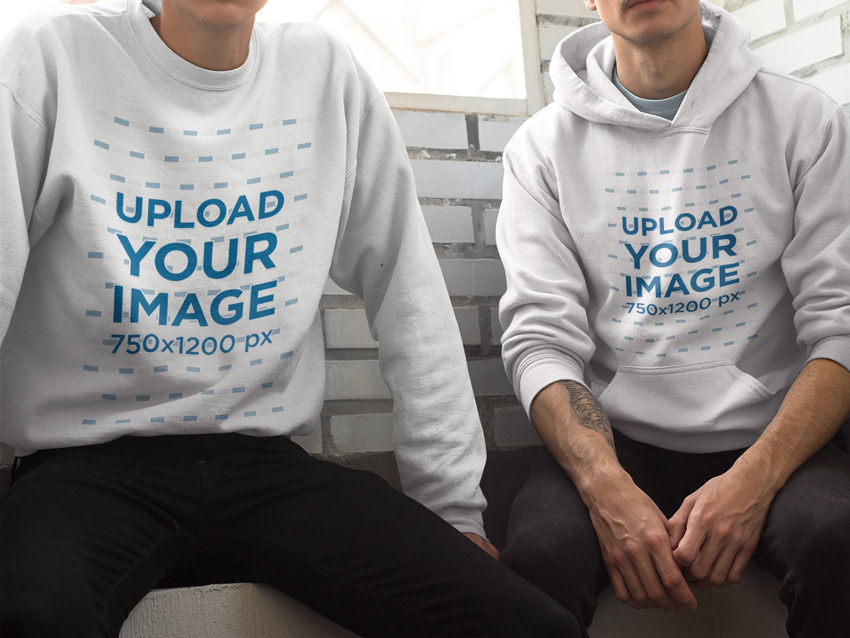
Your hoodies and crewnecks deserve to be promoted with the best assets too, and this hoodie mockup by Placeit will be your next favorite mockup. Why? Easy. You’ll be able to upload a different design to each hoodie and even choose a different garment color, and all straight from your browser—no Photoshop whatsoever. Go ahead and check out Placeit’s other available hoodie mockups.
Perfect for all of your t-shirt design needs, this set of t-shirt mock-ups places the focus on the product itself rather than the model.

These baby apparel mock-ups are perfect for designing an entire line of baby clothes or simply showing off textile prints in a new format.

Pillows may not be apparel, but expanding your designs to include other textile-based products is a great and easy way to expand your line of designs!

For those fall and winter months, show off your t-shirt designs on a long-sleeved mock-up!

With athleisure at an all-time high, busting out some legging designs to fit with your shirts and other apparel is a no-brainer. Have fun with a larger canvas or an all-over print!

It’s not all about t-shirts in here: socks are fantastic for printed design work and patterns! Present a full look from head to toe with these cycling sock mock-ups or a similar product.

Printed shoe designs are forever cool for skaters, teens, and more. Present a variety of work styles in a way you may not have considered when designing apparel with this skate shoe mock-up!

Make your mockups stand out against awesome urban backgrounds. Capture the hustle of your empire with this set of urban mockups. Enjoy 14 templates with organized layers for easy customization.

Give your finished and printed products a space to shine and be sold with one of these fantastic e-commerce themes!
Flatsome is a fantastic, responsive theme for WordPress and WooCommerce. I love its focus on large images and a simple, boxy design.

I’m especially fond of how professional and catalog-focused you can make this WooCommerce theme. Have fun showcasing your content with or without all of the bells and whistles with Shopkeeper.

Neighborhood is a responsive theme with a very sleek design sensibility. The customization of this theme really makes it shine, allowing you to create something wonderfully unique without compromising on design.

Ultimo is a fantastic shop theme for Magneto, giving users the ability to customize a fun, responsive theme that’s perfect for apparel and accessory shops.

Shopper is a fantastic theme with an instant-film feel and responsive, customizable design that can take you from image-heavy to simple in no time!

Shoppica is an OpenCart theme that’s perfect for showcasing large catalogs or apparel with multiple design options. With over 40 custom widgets ready for your shop, you’ll have something unique in no time!
.jpg)
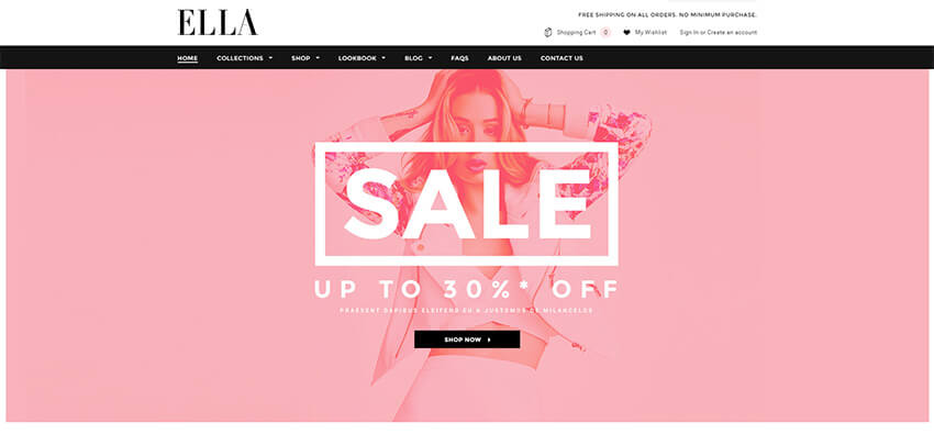
Ella is an elegant shop template with a fully responsive design that showcases apparel designs wonderfully. Integrate your brand’s social media accounts into the template to keep well in touch with your customer base and grow a community around your apparel and products.
Actions are fantastic for speeding up your workflow and allowing you to perform intricate tasks in the click of a button (and some loading time). Text Effects make for quick marketing content or fun effects for editorial on a t-shirt. Check out some of the selections below!
You’ll find assets in this theme quite a bit in this list. Fabric, apparel, and more are great themes for marketing or designed content for apparel. When you can’t actually embellish textiles, digital assets are your next best bet.

I love how realistic this denim material generator is. Whether you’re working on a denim line or in need of some quick graphics for a t-shirt, actions like these are sure to speed up your design or prototype process.

Whether you’re working up leather details within a design or want to add a realistically rendered touch to your apparel work, this stitched leather generator does the job in a snap.

Add stitched details to your catalog, sell sheets, or designs themselves with this stitching actions set.

Speed up your design process with some vintage text effects. Whether you’re adding it to your printed apparel or playing off the theme for marketing materials, this set of effects is a great addition to your toolbox!

Turn your text into an awesome painted effect with this selection of three Photoshop actions. Choose from ten handmade and digitized styles for stencil effects and more. Also included is an easy-to-follow tutorial.

Speed up your design and creation process with utility actions. Those listed below are great for creating apparel-themed effects or can serve as a time saver for creating complex imagery.
I love this action for creating embroidered mock-ups for samples, sell sheets, and manufacturers. When designing apparel, you don’t always have time to create a real embroidered sample. This action set gives you the next best thing to embroidering content yourself!

This action set serves double duty for creating cross-stitch style designs for apparel prints or creating mock-ups for manufacturers or crafters!

Get cozy with this knit and fur style action. Perfect for designing knitwear samples and sketches or for adding a fun, digital knit touch to printed apparel designs!

This interesting action set is fantastic for quickly differentiating between material types within manufacturer mock-ups or showing a variety of stitch types if you’re designing for embroidered materials.

Turn your work into instant vector creations! This Photoshop action transforms your designs for amazing t-shirt illustrations. Follow the simple instructions to get started right away!

Whether you’re a designer for a larger label or company or simply an indie designer, you may have to show off completed apparel in the best light possible via catalog or lookbook. Using photo effects helps put your brand’s best foot forward and create a unified look for a season’s designs!
For a trendy vintage look to your product and model shots, check out this fantastic pack of vintage photo effects.

For a soft and dreamy touch to all of your product shots, this set of „marshmallow” styled photo effects is perfect. Consider running through different themes for different lines or brands. It can really unify a catalog or lookbook!

I find it best to focus on portrait photo effects for model shots. A set like this one is great for playing with different looks for content from a single photo shoot or even unifying shots from multiple photo shoots.

Give model shots a quick, professional retouch with this retouching kit.

Go the distance with this huge pack of skin retouching actions. With 25 retouching actions included, your catalog will be polished in no time!

Make your marketing photos stand out with this
wicked suite of Photoshop actions. With this pack you can easily apply
45 different photo filters to your photos. Update banners, social media
profiles and more with this wonderful suite.

Styles are a fantastic way to utilize a document’s layers in a non-destructive way. Check out some of the fantastic styles below that are sure to be an asset to your design work!
With one click, these fabric styles will surely be a great asset to your design work or marketing materials for your apparel line!

Get a little cartoony with these fantastic cartoon and comic book styles! I love these for creating fun, geeky apparel print designs or eye-catching copy for advertisements.

Go old school with this gorgeous set of retro styles. Whether you’re creating printed apparel or marketing materials for a retro-inspired apparel line, this set will be a great addition to your designer toolbox.

Looking for a more „worn” vintage look for your designs? Check out this style set to give your content a weathered appearance.

Keep on rocking the retro cool with these vintage text effect styles. From printed to weathered, these styles feature a variety of looks for your apparel designs at the click of a button.

Instantly transform text into graffiti designs at the click of a button with this style set!

I love this style set for hang tags and marketing materials. Instantly transform design work or logos into a cotton pressed style at the click of a button.

This set of ten cartoon-inspired text effects offers a fantastic way to quickly create apparel design or marketing content without losing time. These work wonderfully as a point of inspiration for unique designs too.

Patterns are wonderful for adding quick bits of color to shapes, as inspiration for all-over print designs, and more!
Choose a holiday theme, like Valentine’s Day, and use a set of seamless patterns like the set below to add a festive touch to shapes or prints within your apparel design work.

For something a bit more elegant, this Baroque themed pattern set is positively perfect, whether as your printed design or a source of inspiration!

Get on theme with fabric texture patterns. These are great for showing different fabric types in a catalog or to be used within the planning stages of your design work!

Classic textile pattern styles, like argyle and plaid, are a must for your pattern collection. This set is the perfect inspiration point for patterned areas in your apparel design work.

Japanese-inspired patterns are a fantastic way to fill in some areas of larger designs or serve as a starting point for intricately doodled design work.

Sometimes you just need to narrow down your pattern choices and go for something sweet, like this vintage cupcake pattern!

Transform your design tile into a multitude of seamless patterns with this pattern generator!

Create a variety of patterns from your design work, whether it’s an entirely new design or it’s a variation on something from within your apparel line, with this pattern generator!

Create impressive designs with these gorgeous indigo patterns. This package includes 11 different watercolor patterns you can use for fabric textures and more. Deliver professional-looking designs in less time!

Artistic brushes are fantastic to have in your toolkit for designing real-media styled digital work for apparel. Whether you’re creating digital watercolors for t-shirt prints or digital ink drawings for your apparel line, these brushes will get the job done and more!
This set of ink pen and pencil brushes is absolutely top notch and a must-have for designers of all kinds!

Add a touch of ink or paint splatter to your design work with this mega pack of splatter brushes!

Transform your design work with this fantastic set of watercolor brushes and splatters.

This set of watercolor styled brushes is fantastic for creating dry-brush-inspired illustrative work for apparel or marketing materials.

Add a touch of Japanese design work to your own apparel designs with this fantastic brush set!

Unleash your creativity with this fun art brush bundle. This bundle includes 27 high-quality art brushes to help you make beautiful artwork.

Flourishes are great for when you need quick additions to your apparel designs or patterns in brush form.
This elegant set of watercolor flourishes is a fantastic addition to your brush set, especially for those with watercolor brushes.

This set of filigree brushes lends a quick and elegant touch to your design work or can be combined to create new patterns and motifs.

For tattoo-inspired work, tribal tattoo flourishes are a perfect touch for printed or embroidered design pieces.

This gorgeous set of flourishes takes inspiration from Russian folk art, and is a wonderful addition to your apparel design work as well as a great source of inspiration.

This set of flourishes is fantastic for when you need a variety of themed prints or apparel designs.

Add some direction to your illustrations with this set of arrow flourishes. This download includes one Photoshop file with all the vector shapes you need for cool hand-drawn arrows.

These brushes are fantastic for adding texture to your designs for a grunge, distressed, or worn look.
Ink scratches like those found in this set of brushes are fantastic for mimicking vintage photos and designs.

This set of brushes is perfect for creating a distressed look over your latest vintage-inspired design.

These textured embroidered brushes are fantastic for meticulously creating your own digital embroidery designs or adding a touch of stitching to your apparel work.

Ink explosions are fantastic textures for ink or watercolor-style additions to your design work. I especially like content like this for modifying figurative illustrations or photographic elements.

This set of 50 brushes is great for showing torn, distressed, and partially destroyed effects within your design content.

Shapes are fantastic for adding a variety of elements to your work in an easily editable or repeatable way. Choose from a variety of abstract sets or specific object sets to add something special to your work!
Whether you’re creating a line of fantasy-inspired or tattoo-inspired designs, this set of wing shapes is a perfect fit for a variety of uses.

This set of floral swirls is a great way to start an abstract design or even a fun source of inspiration for creating flourishes and shapes of your own.

Whether designing t-shirts for your fantasy house of choice or creating something new, these fantasy creatures are a great addition to most any designer’s toolkit.

Floral patterns and design are a classic touch to an apparel or textile design. This set of 80 flower shapes should have exactly what you need to design to your heart’s content.

For all those times that your design would have truly been completed with a mustache, beard, or swanky pair of glasses, this set of hipster-inspired shapes is here for you!

Instantly add some grunge details to your work with this grunge paint splash set. This pack includes customizable vector shapes that imitate realistic textures. Enjoy high-quality shapes you can use for print or web.

Laurel wreaths are a symbol of victory and honor. Show off your honor with this set of vector laurel wreaths. Download six amazing designs available in gold and black.

Whether you need a starting point or simply some inspiration, these ready-made t-shirt templates are a great addition to even an established apparel designer’s toolbox.
Need t-shirt designs? Look no further! Placeit has a bunch of t-shirt design templates to help you grow your t-shirt business without breaking the bank. The t-shirt design maker over at Placeit is super easy to use—just type your text and choose your graphics, fonts and colors straight from the browser. No need to open up Photoshop or Illustrator at all. It really is as easy as it gets.

Double up on your t-shirt designs with couple sets! Expand upon these designs with custom text or other design elements.

Go for a classic look with this set of customizable branded t-shirt designs.

Sometimes you just need something for an event or are called upon to design something on a short deadline. That’s where event t-shirt designs like the one below come in handy!
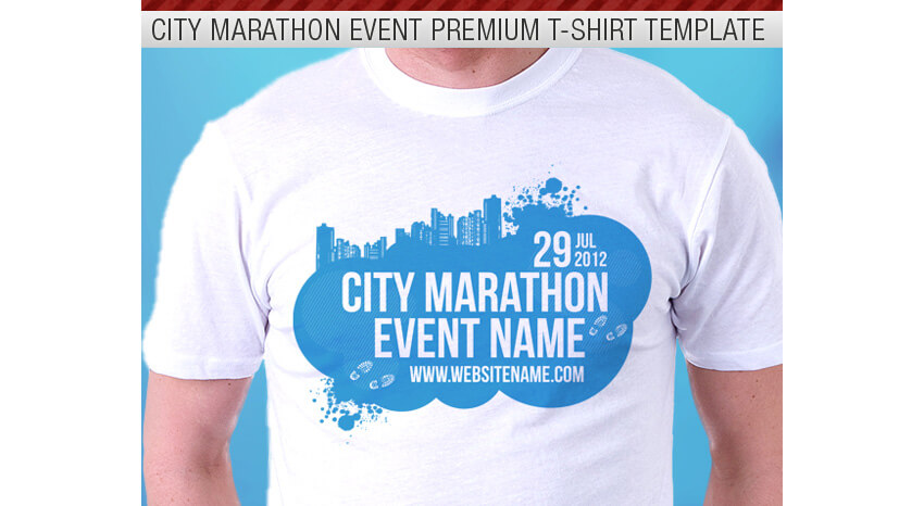
Celebrate an event in vintage style with these t-shirt templates. These designs can be a fantastic start to new designs or a great way to save time when designing for smaller budgets.

A five-star product on Envato Market, this awesome hoodie mockup will give you everything you need for apparel marketing. Enjoy nine brilliant templates with changeable hoodies and more to save valuable time.

This list of fantastic resources aims to highlight useful and must-have content for apparel designers that use Adobe Photoshop. Chances are we’ve missed some Envato Market items that you think would be an excellent asset to any designer’s toolbox. Share those links in the comment section below, and let this list be a jumping-off point for building your ultimate digital asset kit!

Post pobrano z: Sam Mason joins Hornet

Post pobrano z: How to Create a Tropical Stationery Set in Adobe InDesign

Tropical and botanical patterns are a big trend in brand design right now. Channel the nature-inspired look with this letterhead and business card set—perfect for making great first impressions with new clients.
In this tutorial suitable for beginners to Adobe InDesign, we’ll look at how to lay out the card and letterhead and prepare them for printing.
Looking for a quick stationery fix? You can download and adapt lots of easy-to-edit stationery templates from Envato Elements and GraphicRiver.
You’ll need access to Adobe InDesign, and to download the following patterns and font files:
Open InDesign and go to File > New > Document.
Set the Width of the page to 2 in and Height to 3.5 in. Increase the Number of Pages to 4, and uncheck Facing Pages.
Add Margins of 0.1875 in and a Bleed of 0.125 in, before clicking Create.

Expand the Layers panel (Window > Layers) and double-click on the Layer 1 name, renaming it Pattern.
Create a second new layer, and name this Type.

Lock the Type layer, and click on Pattern to activate it.

Select the Rectangle Frame Tool (F) and drag across the whole of Page 1, extending the edges up to the edge of the bleed.

Go to File > Place, navigate to the ‘patt2.jpg’ file in the Tropical Accent pattern folder, and click Open. Allow it to fill up the whole image frame.

Lock the Pattern layer and unlock the layer above, Type.
Use the Rectangle Tool (M) to create a shape across the page, extending its edges up to the margin line. From the Swatches panel, set the Fill of the shape to [Paper].

Switch to the Type Tool (T) and create a text frame centrally on the card, about a third of the way down.
Type in the name of the person or business, and from either the top Controls panel or the Character and Paragraph panels (Window > Type & Tables > Character / Paragraph), set the Font to Abside Smooth, Size 11 pt, Leading 17 pt, Tracking 60, All Caps, and set the text to Align Center.

Create a second text frame below the first and type in the occupation of the person.
Set the Font to Abside Round 1, Size 9 pt, Tracking 60, and Align Center.

Add a final text frame below this, listing the website, email and phone number of the business, setting the Font to Abside Smooth, Size 7 pt, Leading 13 pt, Tracking 60, and Align Center.

Unlock the Pattern layer and select the image frame containing the pattern. Edit > Copy it.
Scroll down to Page 2 of your document and Edit > Paste in Place.

The artwork for your business card is finished—great job! Now we can work on creating a letterhead with a matching style within the same InDesign document.

Scroll down to Page 3 of your document.
Select the Page Tool (Shift-P) and click onto the page to select it.

In the top Controls panel, adjust the Width (W) of the page to 8.5 in and Height (H) to 11 in, to expand the page to a US Letter size.

With the page still selected using the Page Tool, go to Layout > Margins and Columns.
Increase the Margins to 0.3125 in, and click OK.

Scroll down to Page 4, and repeat the process to expand this to a Letter size as well, with a 0.3125 in Margin.

Head back up to Page 3 and Edit > Paste to drop a pattern image frame onto the page.
Expand the edges of the frame to fit the larger page size, and allow the image to scale up, so that it fills the frame completely.

Remaining on Page 3, unlock the Type layer and use the Rectangle Tool (M) to create a shape across the page, extending it up to the margin edge.
Set the Fill of the shape to [Paper].

Copy the name and occupation text frames from Page 1, and Paste them onto Page 3.
Move the text frame towards the top of the white shape, and increase the Font Size a little, to make it more proportional for the letter page size.

Create a header text frame below, set in Abside Smooth.
Then create another text frame below this for a sub-heading, setting the Font to Domani, Size 12 pt.

Use the Line Tool (\) to create small bounding lines above and below the header and sub-heading frames. From the Stroke panel (Window > Stroke), set the Weight to 2 pt, and adjust the Cap to a Round Cap.

Create a large text frame across the main body of the page. Set your Type Tool cursor in the frame and set the Font to Domani, Size 9 pt, Leading 16 pt, Tracking 60.
You can type in your body text here, or go to Type > Fill with Placeholder Text, to place filler text in the frame for now.

Add a trio of text frames along the bottom of the letter, setting contact details in each.
Set the Font to Abside Smooth, Size 9 pt.

Use the Line Tool (\) to add two small vertical dividers between each item of text, setting the Weight to 1 pt and adding a Round Cap.

To create the reverse side of your letterhead, unlock the Pattern layer and Edit > Copy the pattern image frame sitting on Page 3.
Scroll down to Page 4 and Edit > Paste in Place. Pull back the edges of the image frame, until they hit the margin line, leaving a blank margin around the edge of the page.

Unlock the Type layer, scroll up to Page 3, and Copy the name and occupation text frames from the top of the page. Head back down to Page 4 and Edit > Paste them onto the page.
Move them onto the center of the page, adjust the Font Color to [Paper], and increase the Font Size until the text looks more proportional.

Great work! Your letterhead artwork is finished and ready for exporting.

Go to File > Export. In the Export window, name the file something like ‘Letterhead and business card for print’ and choose Adobe PDF (Print) from the Format menu at the bottom of the window. Then click Save.
In the Export Adobe PDF window that opens, choose [Press Quality] from the Preset menu at the top, and make sure that Pages is set to export All.

Click on Marks and Bleeds in the window’s left-hand menu.
Check both All Printer’s Marks and Use Document Bleed Settings, before clicking Export.

Your tropical stationery set is ready for sending straight off to print—awesome work!

We’ve covered a wide range of print design skills over the course of this tutorial. You now know how to create stationery documents in InDesign, import graphic patterns to add style and flair, and format typography to a high standard, as well as using the Page Tool to adjust page sizes as you work.
On the hunt for more great stationery styles? You can find lots of easy-to-edit stationery templates over on Envato Elements and GraphicRiver.
Or why not try out another stationery design tutorial?


Post pobrano z: How to Create a Beach Guard Tower Illustration in Adobe Illustrator

In today’s tutorial we are going to get into summer vibes while creating a lonely beach guard tower on a seashore in Adobe Illustrator. We will use simple tools and techniques.
As usual, you can purchase the result as a part of my Summer Seaside collection on GraphicRiver.

First, set up a New Document (File > New or Control/Command-N) with these settings:
From the Advanced tab:

Let’s start simple by creating a 127 x 127 px rectangle and filling it with #98D2BE.
Take the Direct Selection Tool (A) and select both top anchors of the rectangle. Press Enter to open the Move window. Set the Horizontal value to -32 px and the Vertical value to 0 px and press OK, moving our anchors to the left.
This angled rectangle will act as a main front wall.

Select the shape and Copy it, using Control-C. Click Control-F twice to get two copies on the top of the rectangle, and move the top copy to the right by about 60 px.
Add the second copy to the selection and use the Minus Front option of the Pathfinder panel.

Select the resulting shape with the Selection Tool (V) and reduce its size by Shift-dragging one of the top corners of the Bounding Box blue area to the center.
Set the color of the shape to #48A987 and position the shape in the middle part of the wall. It will act as a doorway.

Copy (Control-C) the doorway and paste two copies in the front by pressing Control-F twice.
Move the top shape slightly to the right, add a second copy to the selection, and press the Intersect button on the Pathfinder panel. Change the color of the new shape to #225443, forming the inner shadow part of the entrance.

Now we are going to add a shadow to the entrance wall. Make two copies (Control-C) and paste them in front of the shape (Control-F twice), and move the top copy to the left and down.
Add a second shape to the selection using the Minus Front option of Pathfinder, getting an angled shape.
Since it will act as a shadow, change its Blending Mode to Multiply while lowering the Opacity to 40% in the Transparency panel.

Let’s add a highlight on the right part of the wall.
Create two front copies of the wall again and move the top copy to the right. Add another copy to the selection while using the Minus Front option of Pathfinder, making sure to change the resulting shape’s color to white (#FFFFFF).

Time to add outlines to the shapes.
Select the main rectangle and copy it. Then click once on the shadow doorway part and press Control-F, getting a copy of the wall in front of the entrance.
Set the Fill of the copy to None, the Stroke color to #3d342d, and the Weight to 6 px.
Give 6 px thick outlines (#3d342d) to the doorway parts.

Build a 152 x 127 px rectangle (#6ebea2) for the side wall, placing its top-left anchor behind the top-right anchor of the front wall and hiding it behind the previous section.
As we did with the previous wall, give the current one a shadow part by making two front copies, moving the top copy to the left and bottom and using the Minus Front option of the Pathfinder for the two shapes, making sure to change the Blending Mode of the resulting shape to Multiply while lowering the Opacity to 40%.

Working the same way, add one more side shadow on the wall.
Let’s add an outline to the side wall. Copy (Control-C) the side wall, click on the upper shadow, and paste the shape in front of it with Control-F. Remove the Fill while setting the Stroke color to #3d342d and the Weight to 6 px.

Add a 210 x 16.5 px rectangle (#6ebea2) on the top of the side wall and align it to the center of the shape.
As we did for the previous sections, give the current rectangle two shadows and a 6 px thick outline (#3d342d).

Form a 129 x 16.5 px rectangle (#98d2be) on the outer left side of the previously created shape.
Using the same methods, build a highlight on the left part and a shadow on the right side of the stripe, followed by a 6 px wide outline (#3d342d).
Group (Control-G) all the parts together.

Let’s start working on the bottom section of our tower by forming a 290 x 16.5 px rectangle (#48a987) below the upper section, aligning it to the right edge of the roof.
Make one more 230.5 x 16.5 px stripe of the same color under the first one.
Rotate the rectangle by 30 degrees by Alt-clicking on the bottom-left anchor with the Rotate tool (R), setting the Angle to 30 degrees.
Attached the angled shape to the left side of the horizontal one, positioning its top anchor on the top-left anchor of the horizontal rectangle.

Select the angled rectangle and press Enter to open the Move option window. Set the Horizontal value to -100 px and the Vertical value to 0 px and press Copy, getting a duplicate on the left side.
Take the Direct Selection Tool (A) and drag the bottom-right anchor of the duplicate onto the top point of the original angled shape.
Then select the bottom-left anchor of the left angled shape and position it on the top-left anchor of the original rectangle.
Set the color of the resulting shape to #98d2be.

Take the Rectangle Tool (M) and add a small rectangle (#48a987) under the bottom side of the large angled shape, making sure to place its lower edge on the same level as the bottom anchor of the right angled stripe.
Select the lower edge of the created figure with the Direct Selection Tool (A) and drag it to the right, positioning its right side on the left edge of the neighboring angled stripe.

Now let’s work on the highlights.
Make a larger copy of the side angled rectangle. Select it together with the original shape and the horizontal rectangle and cut off the outstanding part by Alt-clicking on it with the Shape Builder Tool (Shift-M). Change the color of the resulting shape to white (#ffffff).
Using the Pathfinder method, as we did before, add a second highlight to the slope.

Give shadows to the horizontal side stripe and the slope.
Select the angled rectangle and horizontal stripe and unite the two into a single larger shape using Pathfinder’s Unite Shape Mode.
Add 6 px thick outlines (#3d342d) with a Round Join to all the bottom pieces.

Start working on the fence by creating an 11.5 x 29 px rectangle (#6ebea2) for the post, giving it a shadow followed by a 4 px thick outline (#3d342d). Group (Control-G) all the parts together and place one copy of the post on the top of the slope.

Select the original post, open the Move option window (Enter), and set the horizontal value to 65 px. Click on the Copy, getting a duplicate of the post on the right side. Keeping the duplicate selected, press Control-D two more times, getting two more copies.
Group (Control-G) all four posts together and rotate the group by 30 degrees using the Rotate tool (R).
Attach the post group to the left edge of the slope.

Now we need a rail sitting over the posts.
Copy the slope’s black outline and drag it onto the side row of posts, making its left edge sit on their top as shown in the image below.
Delete the right and bottom edges of the outline.
Drag its end points with the Direct Selection Tool (A), placing one of them on the left edge of the cabin and another on the top-left anchor of the left post. Set Round Cap for the rail.

Doing the same manipulations, copying and dragging the posts and the rail, create another fence on the right side of the tower.

Let’s create bearing piles supporting our cabin.
Build a 14 x 113 px rectangle (#48a987) on the right side below the cabin. Give it a shadow followed by a 6 px thick outline (#3d342d).
Group (Control-G) all the parts together and make a duplicate on the left.

Draw two 6 px thick horizontal lines (#3d342d) going from one pile to another, making the left endpoints slightly overlap the left post.
Group (Control-G) the bearing piles construction and create a copy, moving it to the left and hiding it behind the tower, as well as making the color darker.

Let’s add a flowing windsock on the roof of our beach tower.
Form a 62 x 24 px rectangle (#d65428) for the main windsock shape.
Then add one anchor point on the middle of the right edge with the Add Anchor Point Tool (+). Delete the top and bottom anchors, getting a triangle, and make its right corner rounded by pulling the Live Corner indicator to the center with the Direct Selection Tool (A).
Add a 15.5 x 24 px ellipse (#a8411f) on the left part of the triangle.

Select the ellipse and go to Object > Path > Offset Path. Enter 10 px into the Offset value field and press OK, getting an outline.
Keeping the outer ellipse selected, use the Offset Path again, setting the Offset value to 5 px.
Select both outer shapes and go to Object > Path > Offset Path again. Set the Offset to 20 px, getting two more outer shapes.
Select the cone shape, get one copy in the front, and select the copy together with the four outer ellipses using the Divide option of the Pathfinder panel.
Delete all divided pieces except the two stripes, changing their color to #fbf8f1.

Give the shape that we’ve just created a highlight followed by a 4 px thick outline (#3d342d) with a Round Join. Add the same outline to the ellipse.
Create two ropes attaching our windsock to the pole. Use two 4 px thick lines for the ropes and a 6 px thick line for the pole.
Group (Control-G) all the sock parts together and position it on the roof of the tower.

We are nearly done with the beach guard tower.
Give our tower a more interesting and stylish look by opening some of the outlines. To do it, just use the Add Anchor Point Tool (+) to add additional anchors on the outlines and then Delete paths between these anchors, making sure to set the Cap of the remaining outlines to Round from within the Stroke panel.
Take your time, and once you’re done, add some additional 4 px thick lines near the edges of our illustration.
Finish the tower by adding a few lines below for the ground level.

Let’s place our beach guard tower on a tropical paradise by creating a seaside landscape on the background.
Form a 1200 x 1200 px rectangle (#fb9f31) behind our building for the background.
Add a few 6 px thick lines of #f8cc6b color below the tower to imitate the surface of water. Make them more interesting and lively by adding some dashes and varying their sizes.

Add a 300 x 300 px circle (#f37f10) for the setting sun and two outer circles for the sun’s glow. Use white color and Screen Blending mode with 30% Opacity for the glow.
Delete the outstanding lower part of the outer circle by selecting it and Alt-dragging over the outstanding part with the Eraser Tool (Shift-E).

We need a few additional elements to finish the composition.
Create a simple palm made from a few leaves and a rectangular trunk. We can get a leaf by using the Intersect option of the Pathfinder panel for two overlapping ellipses. Then attach a rectangle for the trunk and form a crown by copying and moving the leaves. Use #f37f10 for the color.
Then make a cloud consisting of overlapping circles and a rounded rectangle. Just remove any unwanted pieces with the help of the Shape Builder Tool (Shift-M), merge all shapes into one with the Unite option of Pathfinder, and set the color to #fbe2aa.
Spread the palms and clouds over the scene, creating a balanced composition.

Congratulations! Our flat-style Baywatch house scene is finished.
I decided to add two seagull silhouettes on the background to enhance the atmosphere of the seaside sunset. Can you now feel the summer breeze and the sea surf splashing on a tropical coast? Our lesson is ending here, and new adventures are beginning.
I hope you enjoyed the process and discovered something new and helpful along the way.

This beach guard tower illustration is only a part of my Summer Seaside collection, and there are far more travel and adventure illustrations in my portfolio on GraphicRiver.

Post pobrano z: 10 awesome examples of stamps used for graphic design
Thinking of using stamps in one of your upcoming design projects? This may be a good idea, especially if you use the stamps as well as these following examples.
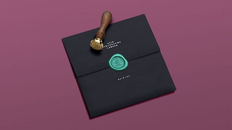
A seal imagined by Daniel Brokstad to add a nice touch to the package.
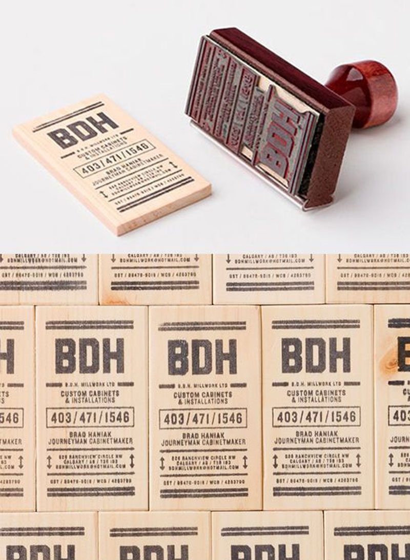
How do you print on wooden business cards? Easy, you use a stamp like Hans Thiessen did.
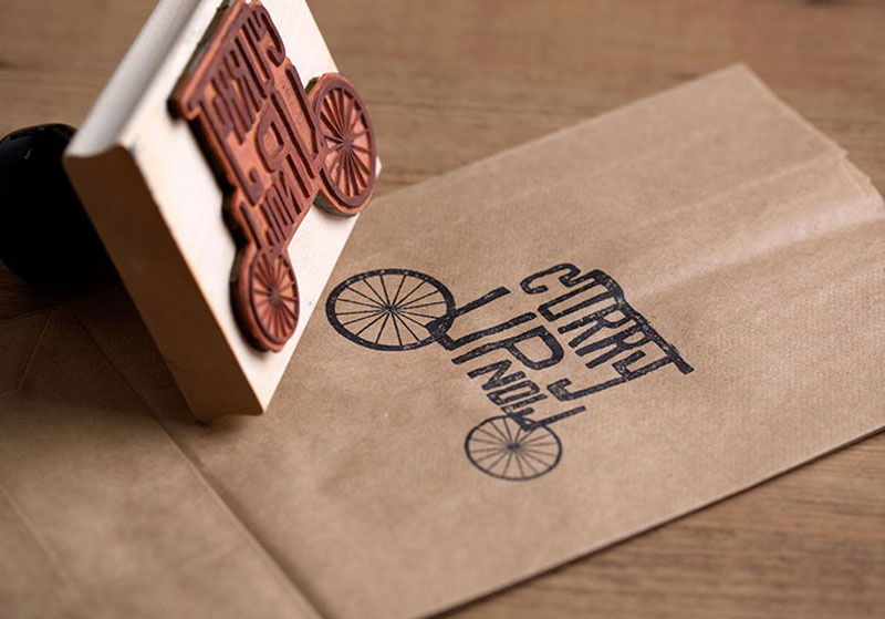
On top of having a cool business name, Curry Up had a good idea to hire Design Wombs for their rebranding. The use of stamps was a great idea too.
Who said stamps always needed to be used with ink? Stamp relief itself looks good enough to add a touch of class. Take a look for yourself on this amazing identity design.
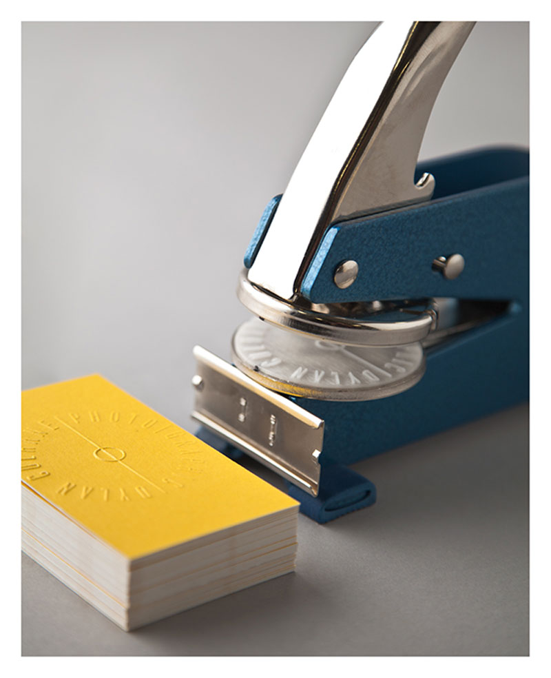
When you name your design studio The Awesome Project, it makes sense that you create awesome business cards, which they did.
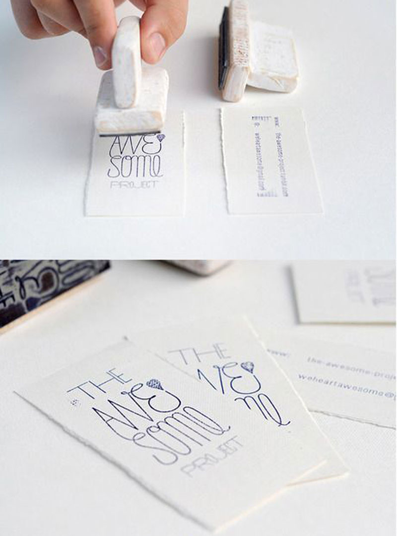
Gorgeous business cards and identity design for this online store, more about the project.
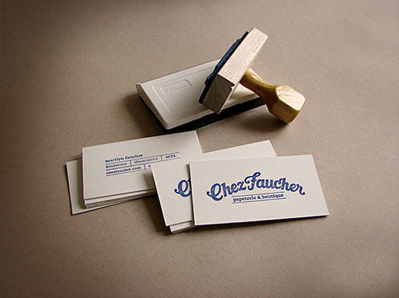
Stamps play an important in visual arts in East Asia, this packaging design is a great tribute to this traditional art form.
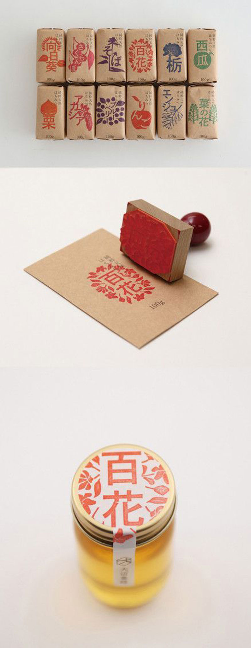
The use of stamps adds a warm feeling and a real human touch. Great work by KMG.
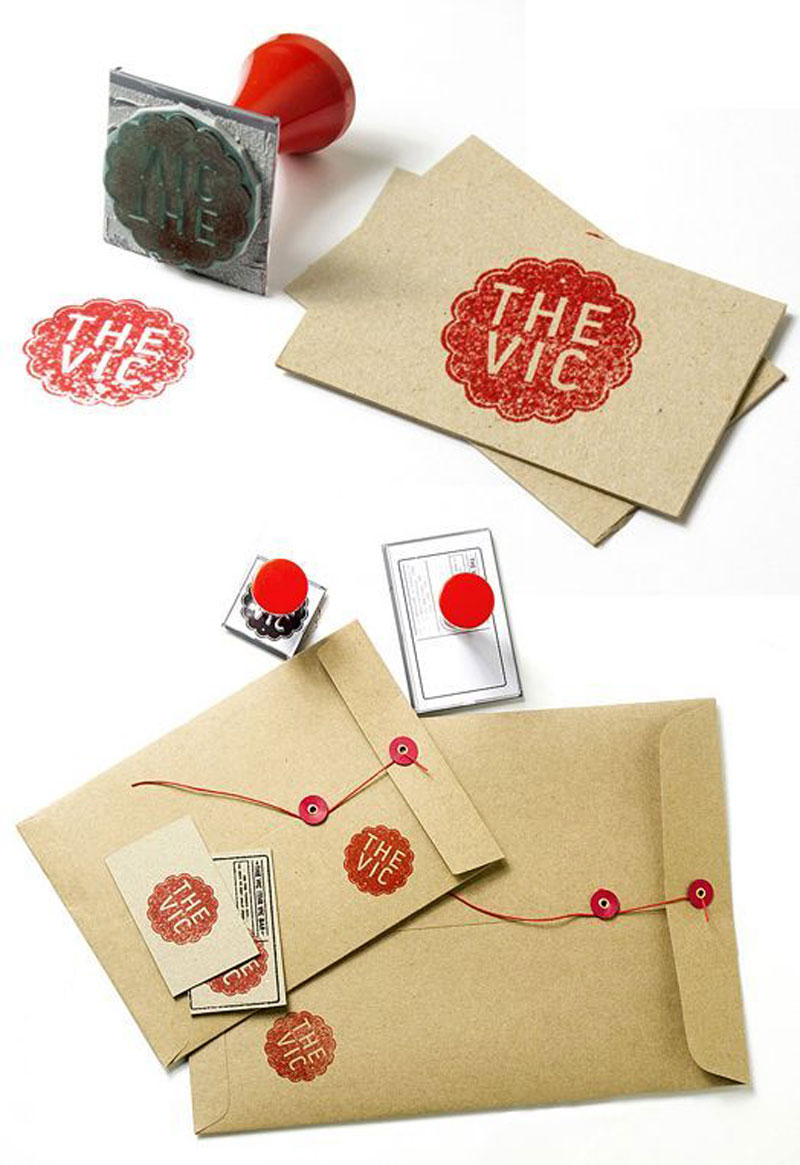
For Café Chiquilin’s corporate identity, larger chunks of texts have been included using stamps, and it works very well.
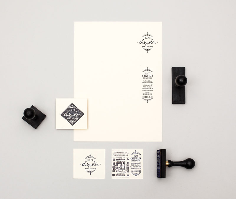
A golden stamp that looks just perfect for this Dubai company that sells luxury goods.
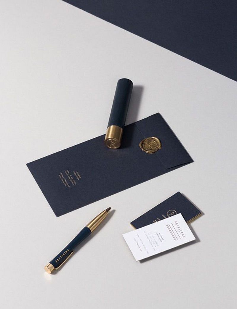
Post pobrano z: DANI WOLF SHOWREEL
