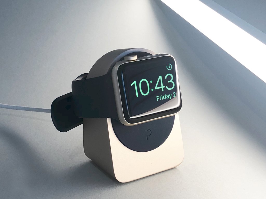
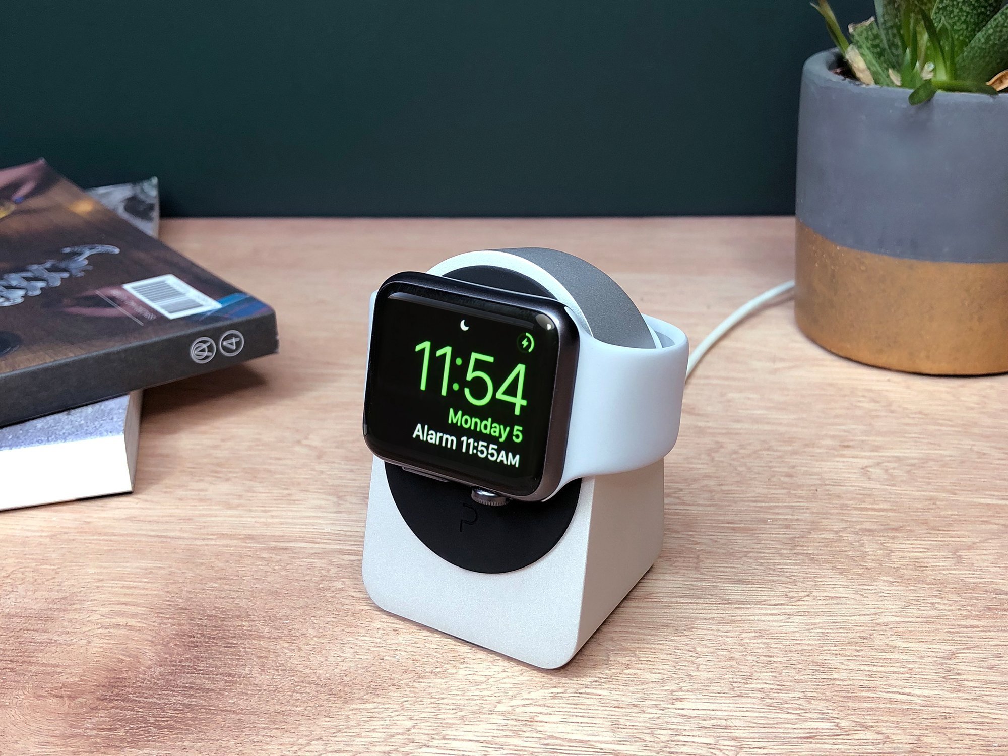
Do you know how to make sure that you will not lose your Apple Watch? Always put it in the same place! You surely already have a hook for your keys, a stand for your phone, and a bucket or something else for other small appliance, it’s time your Apple Watch gets its own.
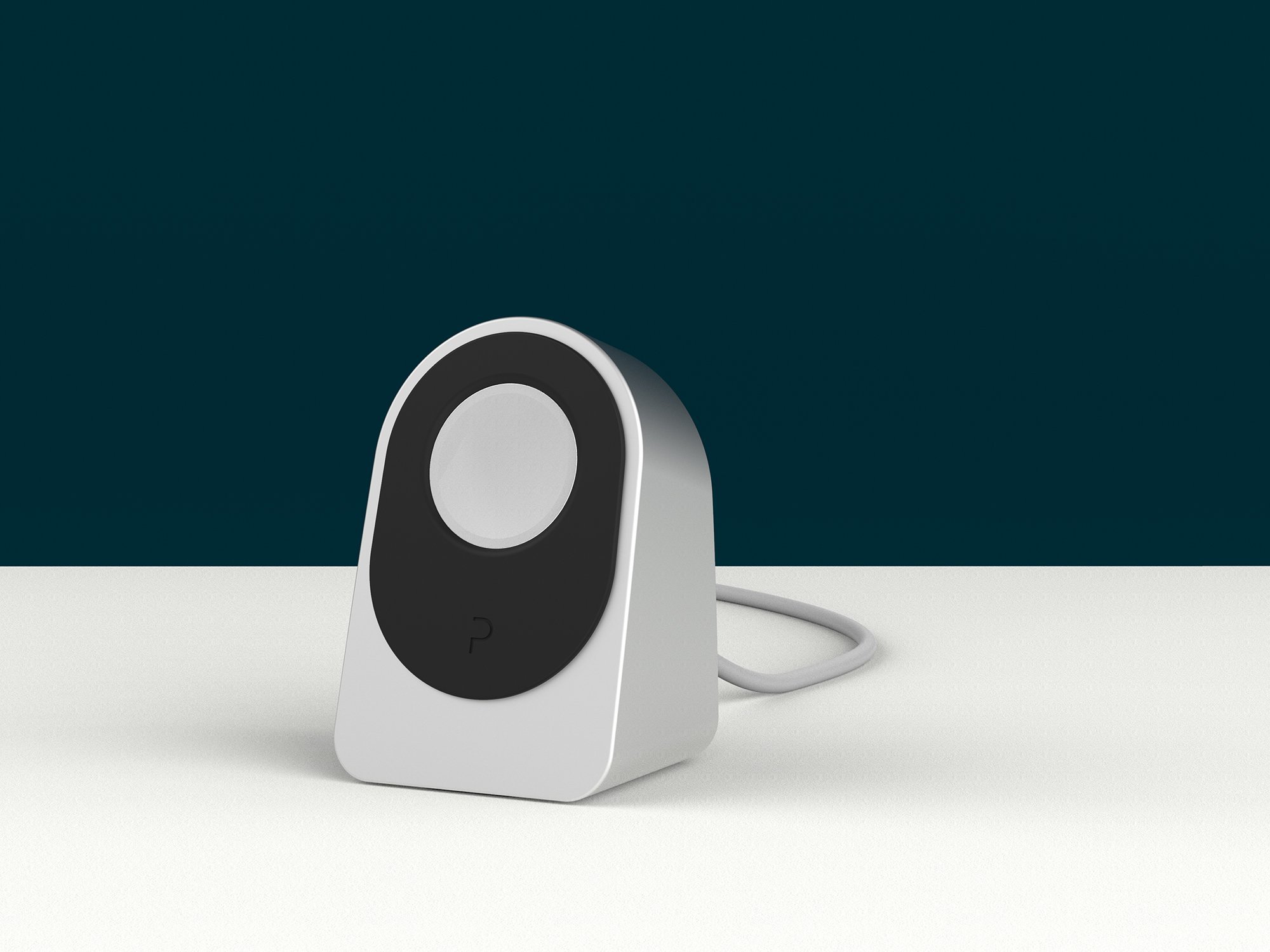
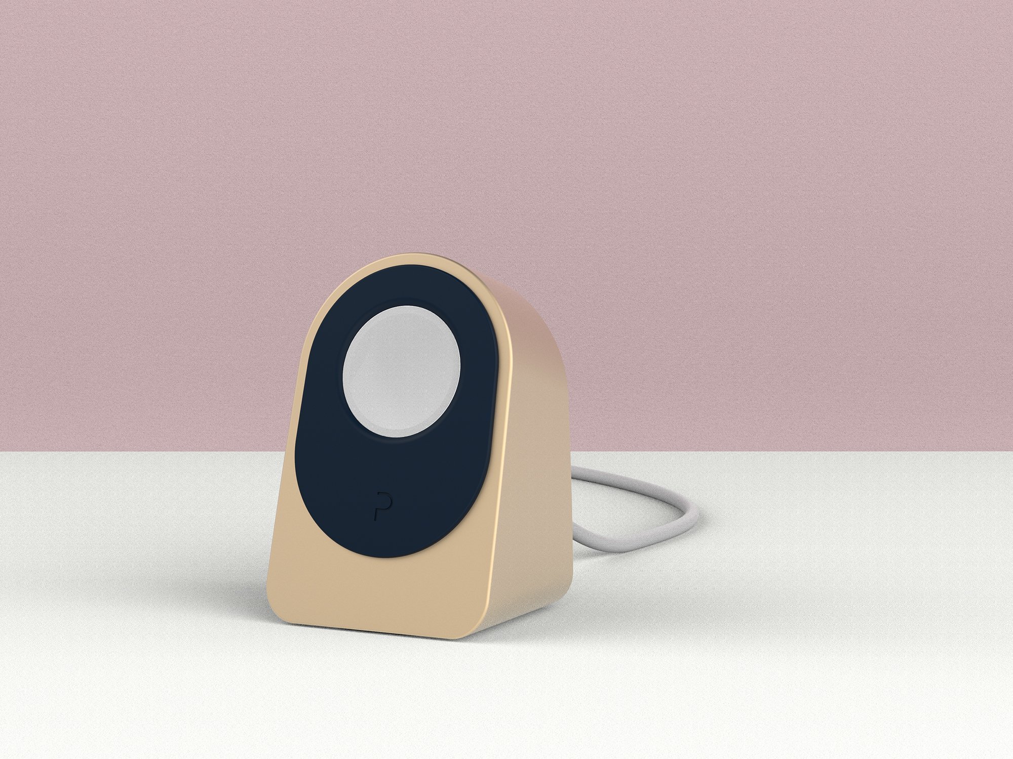
Designed and sold by Proper, the Apple Watch Dock also acts as a charger for your watch. It has a stunning minimalist design that is just as good as any Apple product’s design.
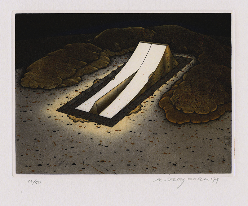
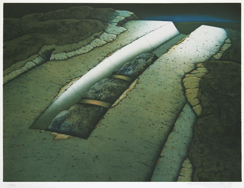
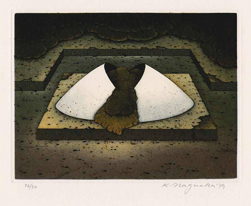
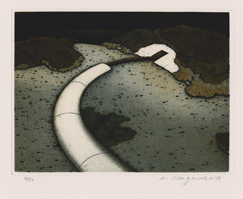
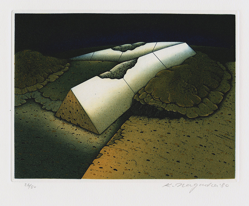
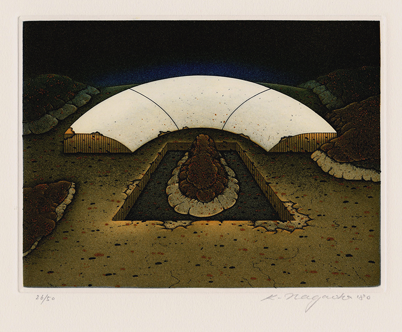
Kunito Nagaoka is a Japanese printmaker with a long career as an artist. Born in 1940, he grew up and studied art in his country, then lived in Berlin, Germany, for 20 years. Now, he teaches art in a Fine Art school in Kyoto.
Nagaoka’s work is full of mystery, often involving landscape that include geometric architectural structure that give it an alien-like look-and-feel. For his time, the Japanese artist used exceptional etching techniques that make his work stand out from the crowd.
Build legally binding and secure eSignatures directly into your website with the HelloSign API. Automate and brand your paperwork with 3 different embedded features:
Embedded signing, for building eSignatures directly into your website.
Embedded requesting, for requesting signatures via your app.
Embedded templates, for formatting and sending single use or repeat documents.
As a developer-friendly company, we’re proud to offer clean and modern API docs that are publicly accessible and offered in multiple open source wrappers. HelloSign API is always free during development and you or your developers can choose optional self-sign up at any time. HelloSign API customers have experienced 8% growth in revenue in the first year and dramatic decrease in overhead. Additionally, customers are using the API to automate both external and internal workflows. This empowers your business to streamline paperwork on the front facing side and for your employees.
Each Container stores cookies separately, so you can log into the same site with different accounts and online trackers can’t easily connect the browsing.
A great idea for a feature if you ask me. For example, I have two Buffer accounts and my solution is to use different browsers entirely to stay logged into both of them. I know plenty of folks that prefer the browser version of apps like Notion, Front, and Twitter, and it’s cool to have a way to log into the same site with multiple accounts if you need to — and without weird trickery.
This is browsers competing on UI/UX features rather than web platform features, which is a good thing. Relevant: Opera Neon and Refresh.
This tutorial will show you how to create a cool-looking comic-book ink text effect using Photoshop’s layer styles, filters, and automatically applied custom brushes.
This text effect is based on Comic Book Ink Actions from Envato Market. The Action transforms any text or shape into comic-book-style type in high-resolution 300 DPI with possible color customization.
Open Adobe Photoshop, go to File > Open, and choose paper-background.jpg.
2. How to Install the Pattern and Brushes
Step 1
Go to Edit > Presets > Preset Manager… In the Preset Type, select Patterns, and then click Load… and choose the Comic-book-ink-pattern.pat.
Step 2
Go to Edit > Presets > Preset Manager… In the Preset Type, select Brushes, and then click Load… and choose the Comic-book-ink-brushes.abr.
3. How to Create the Text Layers
Step 1
Pick the Type Tool (T) and write „COMIC”, and then hit the key Enter and write „BOOK”. Choose the HVD Comic Serif font and then go to Window > Character and set the Size to 225 pt, Tracking to -50, and Leading to 183 pt. Then go Window > Paragraph and choose Center text.
Step 2
Go to Type > Warp text, and set the Style to Arc and Bend to +5%. Click OK.
Step 3
You will now prepare text layers for the style you will apply. To do so, first go to Layer > Smart Object > Convert to Smart Object and then go to Layer > Duplicate Layer… and name the layer „COMIC BOOK 2”. Now repeat the duplicating until you have created a „COMIC BOOK 5” layer.
4. How to Style the First Text Layer
Select the layer „COMIC BOOK” and double click this layer to apply the following layer style:
Step 1
Set the Blending Options:
Fill Opacity: 0%
Step 2
Add a Bevel and Emboss with these settings:
Style: Inner Bevel
Technique: Smooth
Depth: 209%
Direction: Up
Size: 21 px
Soften: 4 px
Uncheck the Use Global Light box
Angle: 0
Altitude: 30
Gloss Contour: Cove – Deep
Check the Anti-aliased box
Highlight Mode: Linear Burn with color #000000
Highlight Mode – Opacity: 20%
Shadow Mode – Opacity: 0%
Step 3
Add a Contour with these settings:
Contour: Ring – Double
Check the Anti-aliased box
Range: 100%
Step 4
Add an Inner Glow with these settings:
Opacity: 100%
Color:#ffffff
Technique: Softer
Source: Edge
Choke: 100%
Size: 4 px
Check the Anti-aliased box
Step 5
Add a Satin style with these settings:
Color:#5fbd13
Opacity: 100%
Angle: 0
Distance: 10 px
Size: 5 px
Check the Anti-aliased box
Step 6
Add a Color Overlay with these settings:
Blend Mode: Multiply
Color:#92b506
Opacity: 24%
Step 7
Add a Pattern Overlay with these settings:
Opacity: 50%
Pattern: Comic-book-ink-pattern
Click OK.
5. How to Add a Filter for the First Text Layer
Go to Filter > Distort > Wave… and use these settings:
Number of Generators: 5
Wavelength: Min. 36 Max. 44
Amplitude: Min. 16 Max. 17
Scale: Horiz. 3% Vert. 3%
Type: Sine
Undefined Areas: Wrap Around
Click OK.
6. How to Style the Second Text Layer
Select the layer „COMIC BOOK 2” and then double click this layer to apply the following layer style:
Step 1
Set the Blending Options:
Fill Opacity: 0%
Step 2
Add an Inner Shadow with these settings:
Color:#000000
Uncheck the Use Global Light box
Angle: -74
Distance: 5 px
Choke: 61%
Size: 4 px
Check the Anti-aliased box
Step 3
Add an Outer Glow with these settings:
Opacity: 100%
Color:#000000
Technique: Softer
Spread: 86%
Size: 1 px
Check the Anti-aliased box
Range: 15%
Click OK.
7. How to Add a Filter for the Second Text Layer
Step 1
Go to Filter > Distort > Wave… and use these settings:
Number of Generators: 5
Wavelength: Min. 36 Max. 44
Amplitude: Min. 16 Max. 17
Scale: Horiz. 3% Vert. 3%
Type: Sine
Undefined Areas: Wrap Around
Click OK.
Step 2
Go to Layer > Smart Object > Convert to Smart Object.
8. How to Style the Third Text Layer
Select the layer „COMIC BOOK 3” and then double click this layer to apply the following layer style:
Step 1
Set the Blending Options:
Fill Opacity: 0%
Step 2
Add a Color Overlay with these settings:
Blend Mode: Multiply
Color:#bbf100
Opacity: 52%
9. How to Add Filters for the Third Text Layer
Step 1
Go to Filter > Distort > Wave… and use these settings:
Number of Generators: 1
Wavelength: Min. 236 Max. 237
Amplitude: Min. 13 Max. 21
Scale: Horiz. 38% Vert. 28%
Type: Sine
Undefined Areas: Wrap Around
Click OK.
Step 2
Go to Filter > Distort > Wave… and use these settings:
Amount: 150%
Size: Large
Click OK.
10. How to Style the Fourth Text Layer
Select the layer „COMIC BOOK 4” and then double click this layer to apply the following layer style:
Step 1
Set the Blending Options:
Fill Opacity: 0%
Step 2
Add a Color Overlay with these settings:
Blend Mode: Multiply
Color:#7be300
Opacity: 63%
11. How to Add Filters for the Fourth Text Layer
Step 1
Go to Filter > Distort > ZigZag… and use these settings:
Amount: 2
Ridges: 9
Style: Around Center
Click OK.
Step 2
Go to Filter > Distort > Ripple… and use these settings:
Amount: -166%
Size: Large
Click OK.
Step 3
Go to Filter > Distort > Wave… and use these settings:
Number of Generators: 5
Wavelength: Min. 97 Max. 120
Amplitude: Min. 5 Max. 25
Scale: Horiz. 11% Vert. 11%
Type: Sine
Undefined Areas: Repeat Edge Pixels
Click OK.
12. How to Style the Fifth Text Layer
Select the layer „COMIC BOOK 5” and then double click this layer to apply the following layer style:
Step 1
Set the Blending Options:
Fill Opacity: 0%
Step 2
Add a Pattern Overlay with these settings:
Blend Mode: Overlay
Opacity: 100%
Pattern: Comic-book-ink-pattern
Step 3
Add an Outer Glow with these settings:
Color:#000000
Technique: Softer
Spread: 80%
Size: 1 px
Check the Anti-aliased box
Range: 54%
Click OK.
13. How to Add Filters for the Fifth Text Layer
Go to Filter > Distort > Wave… and use these settings:
Number of Generators: 5
Wavelength: Min. 24 Max. 79
Amplitude: Min. 8 Max. 10
Scale: Horiz. 11% Vert. 13%
Type: Sine
Undefined Areas: Repeat Edge Pixels
Click OK.
This is the result after you applied all of the styles and filters to the text layers.
14. How to Create Layers for the Brushes
You will create seven blank layers for the brushes. To do so, you can use one of the options below.
Option 1: Click the Create New Layer button at the bottom of your Layers panel seven times, and then double click each layer’s name to rename the layers to „Brush 1”, „Brush 2”, and so on.
Option 2: Go to Layer > New > Layer… and set the name to „Brush 1”, and then repeat this step and stop with the layer „Brush 7”.
15. How to Apply the First Brush
Step 1
Select the „Brush 1” layer and then hold down the Control key and click on the thumbnail of the „COMIC BOOK” layer to make a selection.
Step 2
Go to Window > Paths and click the Make work path from selection button at the bottom of the Paths panel.
Step 3
Now go to Window > Brushes and select the Big dots brush, and then Right click on the Work Path layer in your Paths panel and select Stroke Path… from the menu. Select Tool:Brush, uncheck the Simulate Pressure button, and click OK.
Tip: Each time you do this step, the result will be different. So if you don’t like the brush result, you can hold down the Control key and hit the Z key to undo this step, and then repeat the stroke path.
Step 4
While the „Brush 1” layer is selected, hold down the Control key and click on the thumbnail of „COMIC BOOK” layer to make a selection again, and then go to Layer > Layer Mask > Hide Selection to apply the selection as a mask for the „Brush 1” layer.
16. How to Style the First Brush Layer
Select the layer „Brush 1” and double click this layer to apply the following layer style:
Step 1
Set the Blending Options:
Fill Opacity: 0%
Check the Layer Mask Hides Effects box
Step 2
Add an Inner Shadow with these settings:
Color:#000000
Uncheck the Use Global Light box
Angle: -90
Distance: 3 px
Choke: 48%
Size: 0 px
Check the Anti-aliased box
Step 3
Add an Outer Glow with these settings:
Color: #000000
Technique: Softer
Spread: 49%
Size: 1 px
Check the Anti-aliased box
Range: 15%
Click OK.
This is the result with the first brush applied.
17. How to Apply the Second Brush
Step 1
Select the „Brush 2” layer.
Go to Window > Brushes, select the Big dots brush, and set the Size to 35 px. Then Right click on the Work Path layer in your Paths panel and select Stroke Path… from the menu. Select Tool:Brush, uncheck the Simulate Pressure button, and click OK.
Step 2
While the „Brush 2” layer is selected, hold down the Control key and click on the thumbnail of „COMIC BOOK” layer to make a selection, and then go to Layer > Layer Mask > Hide Selection to apply the selection as a mask for the „Brush 2” layer.
This is the result with the second brush applied.
18. How to Apply the Third Brush
Step 1
Select the „Brush 3” layer.
Go to Window > Brushes, select the Small dots brush, and then Right click on the Work Path layer in your Paths panel and select Stroke Path… from the menu. Select Tool:Brush, uncheck the Simulate Pressure button, and click OK.
Step 2
Double click the layer „Brush 3” to open the layer style window. In the Blending Options tab, hold down and move the left handle of Underlying Layer option to 120, and then hold down the Alt key and click and hold the right side of this handle. Move this part of the handle to 200, and click OK.
This is the result with the third brush applied.
19. How to Apply the Fourth Brush
Step 1
Select the „Brush 4” layer.
Go to Window > Brushes, select the Big lines brush, and then Right click on the Work Path layer in your Paths panel and select Stroke Path… from the menu. Select Tool:Brush, uncheck the Simulate Pressure button, and click OK.
Step 2
Double click the layer „Brush 4” to open the layer style window. In the Blending Options tab, hold down and move the left handle of Underlying Layer option to 120, and then hold down the Alt key and click and hold the right side of this handle. Move this part of the handle to 200, and click OK.
This is the result with the fourth brush applied.
20. How to Apply the Fifth Brush
Step 1
Select the „Brush 5” layer.
Go to Window > Brushes, select the Small drops brush, and then Right click on the Work Path layer in your Paths panel and select Stroke Path… from the menu. Select Tool:Brush, uncheck the Simulate Pressure button, and click OK.
Step 2
Double click the layer „Brush 5” to open the layer style window. In the Blending Options tab, hold down and move the left handle of Underlying Layer option to 120, and then hold down the Alt key and click and hold the right side of this handle. Move this part of the handle to 200, and click OK.
This is the result with the fifth brush applied.
21. How to Apply the Sixth Brush
Step 1
Go to Window > Paths, select the Work Path layer, and click the Load path as a selection button. Then go to Select > Modify > Contract… and set Contract By to 6 px and hit OK. Finally, go back to your Paths panel and click the Make work path from selection button.
Step 2
Select the „Brush 6” layer.
Go to Window > Brushes, select the Small lines brush, and then Right click on the Work Path layer in your Paths panel and select Stroke Path… from the menu. Select Tool:Brush, uncheck the Simulate Pressure button, and click OK.
Step 3
Double click the layer „Brush 6” to open the layer style window. In the Blending Options tab, hold down and move the left handle of Underlying Layer option to 120, and then hold down the Alt key and click and hold the right side of this handle. Move this part of the handle to 200, and click OK.
This is the result with the sixth brush applied.
22. How to Apply the Seventh Brush
Step 1
Select the „Brush 7” layer, hold down the Control key, and click on the thumbnail of the „COMIC BOOK” layer. Then hold down the Control and Alt keys and click on the thumbnail of the „COMIC BOOK 2” layer to make a selection.
Step 2
Go to Select > Modify > Contract…, set Contract By to 3 px, and hit OK. Then go to Window >Paths and click the Make work path from selection button.
Step 3
Go to Window > Brushes, select the Double lines brush, and then Right click on the Work Path layer in your Paths panel and select Stroke Path… from the menu. Select Tool:Brush, uncheck the Simulate Pressure button, and click OK.
Step 4
Double click the „Brush 7” layer to open the layer style window. In the Blending Options tab, hold down and move the left handle of Underlying Layer option to 120, and then hold down the Alt key and click and hold the right side of this handle. Move this part of the handle to 200, and click OK.
Congratulations! You’re Done!
In this tutorial, you learned how to use layer styles, filters and custom brushes to create a comic-book text effect in Adobe Photoshop.
We started by creating our text, and then we used layer styles and filters on our text layers, and finally we added different custom brushes.
I hope you have enjoyed this tutorial. Please feel free to leave your comments, suggestions and outcomes below. This text effect we just created is inspired by Comic Book Ink Actions – 300 DPI, which will automatically apply the comic-book effect to any text or shape in high resolution.
After you’ve created a new document, let’s start to create the gnome. Use the Ellipse Tool (L) to draw an ellipse (fill color R=240, G=208, B=180). While keeping it selected, go to Effect > Warp > Fish and, in the new dialogue window, enter the options you see below. Then press OK.
Step 2
Change the fill color to R=140, G=88, B=56. Again, using the Ellipse Tool (L) and while holding down the Shift key (to create an even circle), create a tiny circle for the eye of the gnome.
To get the other eye, select the one you just created and hold down the Shift and Alt buttons. The Alt key will create a copy for you, and the Shift key will keep it perfectly aligned. So, while holding these two keys, move the existing eye to the right. You’ll notice that you just created another eye.
Change the fill color to R=232, G=1182, B=1450 and draw a small horizontal ellipse for the nose.
Step 3
Let’s create the mustache. Set a white fill color and draw an ellipse using the Ellipse Tool (L). While keeping it selected, go to Effect > Warp > Flag and, in the new dialogue window, enter the options you see below. After pressing OK, expand the shape (Object > Expand Appearance). Keep in mind that you do not need the black stroke—it’s just there so you can tell it apart from the background.
Step 4
Place the mustache behind the nose, or place the nose over the mustache (Control-X, Control-F). Next, while keeping the mustache selected, take the Reflect Tool (O) and click under the nose while pressing down the Alt key. In the new dialogue window, enter Axis Vertical, Angle 90 degrees and then press Copy. That’s how you’ll get the right part of the mustache.
You may have already noticed that the eyebrows are a copy of the mustache, which have shrunk vertically.
Step 5
To get the beard, create a copy of the head behind (Control-C, Control-B), and stretch it horizontally. Keep in mind that you don’t need the stroke color—it’s there just for better visibility.
Every self-respecting gnome must have a red cap. So hit the Polygon Tool and click on your artboard. Enter Sides 3 with any Radius in the new window. Change its fill color to R=228, G=65, B=69.
2. How to Create the Body
Step 1
Change the fill color to green (R=129, G=175, B=69) and draw an ellipse. Use the Rectangle Tool (M) to create a rectangle of any color overlapping it. You have to cover just the bottom part of the ellipse.
Select both shapes and in the Pathfinder panel (Window > Pathfinder) press the MinusFront button. You’ll end up with one half of the ellipse which will be the upper body of the gnome.
Place the upper body under and behind the head.
Step 2
Set a darker fill color (R=111, G=147, B=55) and using the Rectangle Tool (M) draw a thin vertical rectangle on the upper body, behind the gnome’s head.
Change the fill color to yellow (R=221, G=176, B=64) and draw a horizontal rectangle, as we’re going to create the belt.
Make the fill color darker (R=191, G=121, B=29) and draw a tiny circle on the belt.
While keeping it selected, and while holding down the Shift and Alt keys, move the circle to the right. You’ll get a new copy of it. After that, press Control-D a few times, as this combination will create more copies that are perfectly aligned.
Delete the fill color and set the stroke color to R=249, G=208, B=93. Select the Rounded Rectangle Tool and draw a small rounded rectangle for the belt buckle.
Finally, add a tiny line using the Line Segment Tool (/). The gnome’s belt is finished!
Step 3
To create the bottom part of the gnome’s body, simply create a copy of the upper part and turn it upside down.
Change the fill color to R=186, G=112, B=32.
Step 4
Let’s create the red boot for our gnome. First, draw a red rectangle (R=228, G=65, B=69).
While keeping it selected, go to Effect > Warp > Arc Upper and enter the options you see below. Expand this shape (Object > Expand Appearance).
After that, create a triangle the same way as you created the gnome’s hat. Place the triangle as shown in the image below. That will be the upper part of the boot.
Step 5
As we want our gnome boots have curled toecaps, we need to create a kind of crescent shape for it. Draw two overlapping circles as shown below. Be sure the smaller one is on top.
Then press the Minus Front button on the Pathfinder panel (Window > Pathfinder).
Place the crescent shape on the boot we created. Make sure you don’t have any stroke color on the boot and it is grouped (right-click > Group).
Step 6
Place the boot as shown below.
Now let’s make another boot. Select the existing one and create a copy of it in front (Control-C, Control-F). Then hit the Reflect Tool (O) and press the Enter key on your keyboard. In the new dialogue window, enter Axis Vertical, Angle 90 degrees and then press OK. After that, move the new boot to the right.
With a lighter fill color (R=252, G=114, B=114), draw a thin horizontal rectangle on top of the two boots. Then warp it (Effect > Warp > Arc).
Step 7
To make sure the two legs are separated, draw a thin, black, vertically oriented rectangle where the two legs have to be divided.
Now, be sure your Transparency panel is open (Window > Transparency). Change the Opacity on the Transparency panel to Soft Light and lower the Opacity to 60%. See how the rectangle changed its color?
Step 8
We won’t create a new shape for the arms. Instead, we’ll create a copy of the upper body behind (Control-C, Control-B). Change its fill color to R=111, G=147, B=55. Stretch it down to the belt.
Then, draw a horizontal rectangle (R=178, G=211, B=127) behind the body and in front of the arms.
Change the fill color to R=240, G=208, B=180. Create a small ellipse and place it behind the whole body. It will be the left hand.
While holding the Shift and Alt keys, move the left hand to the right and you’ll get the right hand.
Delete the fill color and set the stroke color to R=232, G=182, B=145. Take the Arc Tool and draw a small curve to create the thumb of the gnome.
Create the same curve on the other hand. And your gnome is done!
3. How to Create the Background
Step 1
Take the Rectangle Tool (M) and click on your artboard. In the new dialogue window, enter Width and Height 850 px and press OK. A big square will appear on your artboard, which is going to be the background. Make sure the background stays in the middle of your artboard. Set the fill color to R=244, G=234, B=208.
Place the gnome on the background.
Step 2
Let’s create the fence. Set the white fill color with no stroke and draw a small rectangle.
Using the Pen Tool (P), put a new anchor point on top and in the middle of the fence. Using the Direct Selection Tool (A), move the new anchor point up. This will be the first wooden bar of the fence.
While holding down the Shift and Alt keys, move this wooden bar to the right. Then press Control-D a few times to get a line made of these bars.
Add a little darker horizontal rectangle in the middle of the line. The fence is done!
Place the fence behind the gnome and in front of the background.
Step 3
Add one more horizontal rectangle (R=242, G=224, B=184) where the gnome will stand.
4. How to Create the Trees
Step 1
Delete the fill color and set the stroke color to R=209, G=170, B=120. We will start with the trunk and branches. Draw a long, thick, vertical line, which will be the trunk. You can increase the stroke Weight on the Stroke panel (Window > Stroke).
Decrease the stroke Weight, take the Arc Tool, and draw a few branches.
Decrease the stroke Weight even more and draw some smaller branches.
Step 2
Using the green fill color (R=129, G=175, B=69) and no stroke color, create a bunch of ellipses as the foliage. The black strokes on the image will guide you.
Change the fill color to a darker green (R=111, G=147, B=55) and create even more ellipses behind the branches. The first tree is done!
Step 3
Let’s create an apple. Start with a red (R=228, G=65, B=69) ellipse that is rotated to the left.
Create a copy of it in front (Control-C, Control-F). Hit the Reflect Tool (O) and then immediately press the Enter key twice. You just created a vertical reflection of the red ellipse. Move the new copy to the right, but not too far—just enough to get the shape of an apple.
Delete the fill color and set the stroke color to (R=224, G=203, B=155). Using the Line Segment Tool (/), draw a stem for the apple.
Step 4
Create a green ellipse (R=178, G=211, B=127). Then, using the Convert Anchor Point Tool (Shift-C), make the anchor points sharp by clicking on the left and right anchor points. You’ll get a simple leaf shape.
Step 5
Place the leaf on the apple. Group the apple, make copies, and spread them on the tree.
Step 6
In a similar way, we’ll create the pear tree. First, draw the trunk, and then add bigger and smaller branches.
Then add the leaves (fill color R=131, G=153, B=77).
Step 7
Make sure you don’t have any stroke and have the fill color set to R=249, G=208, B=93. Create a yellow ellipse.
While keeping it selected, go to Effect > Warp > Fish. Enter the options you see below. Expand the shape.
Add a stem (stroke color R=209, G=170, B=120).
Add green leaves (fill color R=178, G=211, B=127). And group the whole pear.
Step 8
Spread copies of the pear on the tree.
Step 9
Place the two trees we just created in front of the background but behind the gnome. And you’ve finished your illustration!
Conclusion
I hope you enjoyed going through this tutorial with me. Feel free to post your result—it’s always interesting to see.
If you enjoyed this tutorial, why not try some of my others:
This tutorial will show you how to create a cool-looking comic-book ink text effect using Photoshop’s layer styles, filters, and automatically applied custom brushes.
This text effect is based on Comic Book Ink Actions from Envato Market. The Action transforms any text or shape into comic-book-style type in high-resolution 300 DPI with possible color customization.
Open Adobe Photoshop, go to File > Open, and choose paper-background.jpg.
2. How to Install the Pattern and Brushes
Step 1
Go to Edit > Presets > Preset Manager… In the Preset Type, select Patterns, and then click Load… and choose the Comic-book-ink-pattern.pat.
Step 2
Go to Edit > Presets > Preset Manager… In the Preset Type, select Brushes, and then click Load… and choose the Comic-book-ink-brushes.abr.
3. How to Create the Text Layers
Step 1
Pick the Type Tool (T) and write „COMIC”, and then hit the key Enter and write „BOOK”. Choose the HVD Comic Serif font and then go to Window > Character and set the Size to 225 pt, Tracking to -50, and Leading to 183 pt. Then go Window > Paragraph and choose Center text.
Step 2
Go to Type > Warp text, and set the Style to Arc and Bend to +5%. Click OK.
Step 3
You will now prepare text layers for the style you will apply. To do so, first go to Layer > Smart Object > Convert to Smart Object and then go to Layer > Duplicate Layer… and name the layer „COMIC BOOK 2”. Now repeat the duplicating until you have created a „COMIC BOOK 5” layer.
4. How to Style the First Text Layer
Select the layer „COMIC BOOK” and double click this layer to apply the following layer style:
Step 1
Set the Blending Options:
Fill Opacity: 0%
Step 2
Add a Bevel and Emboss with these settings:
Style: Inner Bevel
Technique: Smooth
Depth: 209%
Direction: Up
Size: 21 px
Soften: 4 px
Uncheck the Use Global Light box
Angle: 0
Altitude: 30
Gloss Contour: Cove – Deep
Check the Anti-aliased box
Highlight Mode: Linear Burn with color #000000
Highlight Mode – Opacity: 20%
Shadow Mode – Opacity: 0%
Step 3
Add a Contour with these settings:
Contour: Ring – Double
Check the Anti-aliased box
Range: 100%
Step 4
Add an Inner Glow with these settings:
Opacity: 100%
Color:#ffffff
Technique: Softer
Source: Edge
Choke: 100%
Size: 4 px
Check the Anti-aliased box
Step 5
Add a Satin style with these settings:
Color:#5fbd13
Opacity: 100%
Angle: 0
Distance: 10 px
Size: 5 px
Check the Anti-aliased box
Step 6
Add a Color Overlay with these settings:
Blend Mode: Multiply
Color:#92b506
Opacity: 24%
Step 7
Add a Pattern Overlay with these settings:
Opacity: 50%
Pattern: Comic-book-ink-pattern
Click OK.
5. How to Add a Filter for the First Text Layer
Go to Filter > Distort > Wave… and use these settings:
Number of Generators: 5
Wavelength: Min. 36 Max. 44
Amplitude: Min. 16 Max. 17
Scale: Horiz. 3% Vert. 3%
Type: Sine
Undefined Areas: Wrap Around
Click OK.
6. How to Style the Second Text Layer
Select the layer „COMIC BOOK 2” and then double click this layer to apply the following layer style:
Step 1
Set the Blending Options:
Fill Opacity: 0%
Step 2
Add an Inner Shadow with these settings:
Color:#000000
Uncheck the Use Global Light box
Angle: -74
Distance: 5 px
Choke: 61%
Size: 4 px
Check the Anti-aliased box
Step 3
Add an Outer Glow with these settings:
Opacity: 100%
Color:#000000
Technique: Softer
Spread: 86%
Size: 1 px
Check the Anti-aliased box
Range: 15%
Click OK.
7. How to Add a Filter for the Second Text Layer
Step 1
Go to Filter > Distort > Wave… and use these settings:
Number of Generators: 5
Wavelength: Min. 36 Max. 44
Amplitude: Min. 16 Max. 17
Scale: Horiz. 3% Vert. 3%
Type: Sine
Undefined Areas: Wrap Around
Click OK.
Step 2
Go to Layer > Smart Object > Convert to Smart Object.
8. How to Style the Third Text Layer
Select the layer „COMIC BOOK 3” and then double click this layer to apply the following layer style:
Step 1
Set the Blending Options:
Fill Opacity: 0%
Step 2
Add a Color Overlay with these settings:
Blend Mode: Multiply
Color:#bbf100
Opacity: 52%
9. How to Add Filters for the Third Text Layer
Step 1
Go to Filter > Distort > Wave… and use these settings:
Number of Generators: 1
Wavelength: Min. 236 Max. 237
Amplitude: Min. 13 Max. 21
Scale: Horiz. 38% Vert. 28%
Type: Sine
Undefined Areas: Wrap Around
Click OK.
Step 2
Go to Filter > Distort > Wave… and use these settings:
Amount: 150%
Size: Large
Click OK.
10. How to Style the Fourth Text Layer
Select the layer „COMIC BOOK 4” and then double click this layer to apply the following layer style:
Step 1
Set the Blending Options:
Fill Opacity: 0%
Step 2
Add a Color Overlay with these settings:
Blend Mode: Multiply
Color:#7be300
Opacity: 63%
11. How to Add Filters for the Fourth Text Layer
Step 1
Go to Filter > Distort > ZigZag… and use these settings:
Amount: 2
Ridges: 9
Style: Around Center
Click OK.
Step 2
Go to Filter > Distort > Ripple… and use these settings:
Amount: -166%
Size: Large
Click OK.
Step 3
Go to Filter > Distort > Wave… and use these settings:
Number of Generators: 5
Wavelength: Min. 97 Max. 120
Amplitude: Min. 5 Max. 25
Scale: Horiz. 11% Vert. 11%
Type: Sine
Undefined Areas: Repeat Edge Pixels
Click OK.
12. How to Style the Fifth Text Layer
Select the layer „COMIC BOOK 5” and then double click this layer to apply the following layer style:
Step 1
Set the Blending Options:
Fill Opacity: 0%
Step 2
Add a Pattern Overlay with these settings:
Blend Mode: Overlay
Opacity: 100%
Pattern: Comic-book-ink-pattern
Step 3
Add an Outer Glow with these settings:
Color:#000000
Technique: Softer
Spread: 80%
Size: 1 px
Check the Anti-aliased box
Range: 54%
Click OK.
13. How to Add Filters for the Fifth Text Layer
Go to Filter > Distort > Wave… and use these settings:
Number of Generators: 5
Wavelength: Min. 24 Max. 79
Amplitude: Min. 8 Max. 10
Scale: Horiz. 11% Vert. 13%
Type: Sine
Undefined Areas: Repeat Edge Pixels
Click OK.
This is the result after you applied all of the styles and filters to the text layers.
14. How to Create Layers for the Brushes
You will create seven blank layers for the brushes. To do so, you can use one of the options below.
Option 1: Click the Create New Layer button at the bottom of your Layers panel seven times, and then double click each layer’s name to rename the layers to „Brush 1”, „Brush 2”, and so on.
Option 2: Go to Layer > New > Layer… and set the name to „Brush 1”, and then repeat this step and stop with the layer „Brush 7”.
15. How to Apply the First Brush
Step 1
Select the „Brush 1” layer and then hold down the Control key and click on the thumbnail of the „COMIC BOOK” layer to make a selection.
Step 2
Go to Window > Paths and click the Make work path from selection button at the bottom of the Paths panel.
Step 3
Now go to Window > Brushes and select the Big dots brush, and then Right click on the Work Path layer in your Paths panel and select Stroke Path… from the menu. Select Tool:Brush, uncheck the Simulate Pressure button, and click OK.
Tip: Each time you do this step, the result will be different. So if you don’t like the brush result, you can hold down the Control key and hit the Z key to undo this step, and then repeat the stroke path.
Step 4
While the „Brush 1” layer is selected, hold down the Control key and click on the thumbnail of „COMIC BOOK” layer to make a selection again, and then go to Layer > Layer Mask > Hide Selection to apply the selection as a mask for the „Brush 1” layer.
16. How to Style the First Brush Layer
Select the layer „Brush 1” and double click this layer to apply the following layer style:
Step 1
Set the Blending Options:
Fill Opacity: 0%
Check the Layer Mask Hides Effects box
Step 2
Add an Inner Shadow with these settings:
Color:#000000
Uncheck the Use Global Light box
Angle: -90
Distance: 3 px
Choke: 48%
Size: 0 px
Check the Anti-aliased box
Step 3
Add an Outer Glow with these settings:
Color: #000000
Technique: Softer
Spread: 49%
Size: 1 px
Check the Anti-aliased box
Range: 15%
Click OK.
This is the result with the first brush applied.
17. How to Apply the Second Brush
Step 1
Select the „Brush 2” layer.
Go to Window > Brushes, select the Big dots brush, and set the Size to 35 px. Then Right click on the Work Path layer in your Paths panel and select Stroke Path… from the menu. Select Tool:Brush, uncheck the Simulate Pressure button, and click OK.
Step 2
While the „Brush 2” layer is selected, hold down the Control key and click on the thumbnail of „COMIC BOOK” layer to make a selection, and then go to Layer > Layer Mask > Hide Selection to apply the selection as a mask for the „Brush 2” layer.
This is the result with the second brush applied.
18. How to Apply the Third Brush
Step 1
Select the „Brush 3” layer.
Go to Window > Brushes, select the Small dots brush, and then Right click on the Work Path layer in your Paths panel and select Stroke Path… from the menu. Select Tool:Brush, uncheck the Simulate Pressure button, and click OK.
Step 2
Double click the layer „Brush 3” to open the layer style window. In the Blending Options tab, hold down and move the left handle of Underlying Layer option to 120, and then hold down the Alt key and click and hold the right side of this handle. Move this part of the handle to 200, and click OK.
This is the result with the third brush applied.
19. How to Apply the Fourth Brush
Step 1
Select the „Brush 4” layer.
Go to Window > Brushes, select the Big lines brush, and then Right click on the Work Path layer in your Paths panel and select Stroke Path… from the menu. Select Tool:Brush, uncheck the Simulate Pressure button, and click OK.
Step 2
Double click the layer „Brush 4” to open the layer style window. In the Blending Options tab, hold down and move the left handle of Underlying Layer option to 120, and then hold down the Alt key and click and hold the right side of this handle. Move this part of the handle to 200, and click OK.
This is the result with the fourth brush applied.
20. How to Apply the Fifth Brush
Step 1
Select the „Brush 5” layer.
Go to Window > Brushes, select the Small drops brush, and then Right click on the Work Path layer in your Paths panel and select Stroke Path… from the menu. Select Tool:Brush, uncheck the Simulate Pressure button, and click OK.
Step 2
Double click the layer „Brush 5” to open the layer style window. In the Blending Options tab, hold down and move the left handle of Underlying Layer option to 120, and then hold down the Alt key and click and hold the right side of this handle. Move this part of the handle to 200, and click OK.
This is the result with the fifth brush applied.
21. How to Apply the Sixth Brush
Step 1
Go to Window > Paths, select the Work Path layer, and click the Load path as a selection button. Then go to Select > Modify > Contract… and set Contract By to 6 px and hit OK. Finally, go back to your Paths panel and click the Make work path from selection button.
Step 2
Select the „Brush 6” layer.
Go to Window > Brushes, select the Small lines brush, and then Right click on the Work Path layer in your Paths panel and select Stroke Path… from the menu. Select Tool:Brush, uncheck the Simulate Pressure button, and click OK.
Step 3
Double click the layer „Brush 6” to open the layer style window. In the Blending Options tab, hold down and move the left handle of Underlying Layer option to 120, and then hold down the Alt key and click and hold the right side of this handle. Move this part of the handle to 200, and click OK.
This is the result with the sixth brush applied.
22. How to Apply the Seventh Brush
Step 1
Select the „Brush 7” layer, hold down the Control key, and click on the thumbnail of the „COMIC BOOK” layer. Then hold down the Control and Alt keys and click on the thumbnail of the „COMIC BOOK 2” layer to make a selection.
Step 2
Go to Select > Modify > Contract…, set Contract By to 3 px, and hit OK. Then go to Window >Paths and click the Make work path from selection button.
Step 3
Go to Window > Brushes, select the Double lines brush, and then Right click on the Work Path layer in your Paths panel and select Stroke Path… from the menu. Select Tool:Brush, uncheck the Simulate Pressure button, and click OK.
Step 4
Double click the „Brush 7” layer to open the layer style window. In the Blending Options tab, hold down and move the left handle of Underlying Layer option to 120, and then hold down the Alt key and click and hold the right side of this handle. Move this part of the handle to 200, and click OK.
Congratulations! You’re Done!
In this tutorial, you learned how to use layer styles, filters and custom brushes to create a comic-book text effect in Adobe Photoshop.
We started by creating our text, and then we used layer styles and filters on our text layers, and finally we added different custom brushes.
I hope you have enjoyed this tutorial. Please feel free to leave your comments, suggestions and outcomes below. This text effect we just created is inspired by Comic Book Ink Actions – 300 DPI, which will automatically apply the comic-book effect to any text or shape in high resolution.