How to Create a Comic-Book Ink Text Effect in Adobe Photoshop

Post pobrano z: How to Create a Comic-Book Ink Text Effect in Adobe Photoshop

Final product image
What You’ll Be Creating

This tutorial will show you how to create a cool-looking comic-book ink text effect using Photoshop’s layer styles, filters, and automatically applied custom brushes. 

This text effect is based on Comic Book Ink Actions from Envato Market. The Action transforms any text or shape into comic-book-style type in high-resolution 300 DPI with possible color customization.

Comic Book Ink Action
Comic Book Ink Actions – 300 DPI

Tutorial Assets

The following assets were used during this tutorial:

1. How to Set the Background for the Action

Open Adobe Photoshop, go to File > Open, and choose paper-background.jpg.

Paper Background

2. How to Install the Pattern and Brushes

Step 1

Go to Edit > Presets > Preset Manager… In the Preset Type, select Patterns, and then click Load… and choose the Comic-book-ink-pattern.pat.

Load Patterns

Step 2

Go to Edit > Presets > Preset Manager… In the Preset Type, select Brushes, and then click Load… and choose the Comic-book-ink-brushes.abr.

Load Brushes

3. How to Create the Text Layers

Step 1

Pick the Type Tool (T) and write „COMIC”, and then hit the key Enter and write „BOOK”. Choose the HVD Comic Serif font and then go to Window > Character and set the Size to 225 pt, Tracking to -50, and Leading to 183 pt. Then go Window > Paragraph and choose Center text.

Create the Text

Step 2

Go to Type > Warp text, and set the Style to Arc and Bend to +5%. Click OK.

Warp the Text

Step 3

You will now prepare text layers for the style you will apply. To do so, first go to Layer > Smart Object > Convert to Smart Object and then go to Layer > Duplicate Layer… and name the layer „COMIC BOOK 2”. Now repeat the duplicating until you have created a „COMIC BOOK 5” layer.

Duplicate the Text

4. How to Style the First Text Layer

Select the layer „COMIC BOOK” and double click this layer to apply the following layer style:

Step 1

Set the Blending Options:

  • Fill Opacity: 0%
Set the Blending Options

Step 2

Add a Bevel and Emboss with these settings:

  • Style: Inner Bevel
  • Technique: Smooth
  • Depth: 209%
  • Direction: Up
  • Size: 21 px
  • Soften: 4 px
  • Uncheck the Use Global Light box
  • Angle: 0
  • Altitude: 30
  • Gloss Contour: Cove – Deep
  • Check the Anti-aliased box
  • Highlight Mode: Linear Burn with color #000000
  • Highlight Mode – Opacity: 20%
  • Shadow Mode – Opacity: 0%
Add a Bevel

Step 3

Add a Contour with these settings:

  • Contour: Ring – Double
  • Check the Anti-aliased box
  • Range: 100%
Add a Contour

Step 4

Add an Inner Glow with these settings:

  • Opacity: 100%
  • Color: #ffffff
  • Technique: Softer
  • Source: Edge
  • Choke: 100%
  • Size: 4 px
  • Check the Anti-aliased box
Add an Inner Glow

Step 5

Add a Satin style with these settings:

  • Color: #5fbd13
  • Opacity: 100%
  • Angle: 0
  • Distance: 10 px
  • Size: 5 px
  • Check the Anti-aliased box
Add a Satin

Step 6

Add a Color Overlay with these settings:

  • Blend Mode: Multiply
  • Color: #92b506
  • Opacity: 24%
Add a Color Overlay

Step 7

Add a Pattern Overlay with these settings:

  • Opacity: 50%
  • Pattern: Comic-book-ink-pattern

Click OK.

Add a Pattern Overlay

5. How to Add a Filter for the First Text Layer

Go to Filter > Distort > Wave… and use these settings:

  • Number of Generators: 5
  • Wavelength: Min. 36 Max. 44
  • Amplitude: Min. 16 Max. 17
  • Scale: Horiz. 3% Vert. 3%
  • Type: Sine
  • Undefined Areas: Wrap Around

Click OK.

Add a Wave Filter

6. How to Style the Second Text Layer

Select the layer „COMIC BOOK 2” and then double click this layer to apply the following layer style:

Step 1

Set the Blending Options:

  • Fill Opacity: 0%
Set the Blending Options

Step 2

Add an Inner Shadow with these settings:

  • Color: #000000
  • Uncheck the Use Global Light box
  • Angle: -74
  • Distance: 5 px
  • Choke: 61%
  • Size: 4 px
  • Check the Anti-aliased box
Add an Inner Shadow

Step 3

Add an Outer Glow with these settings:

  • Opacity: 100%
  • Color: #000000
  • Technique: Softer
  • Spread: 86%
  • Size: 1 px
  • Check the Anti-aliased box
  • Range: 15%

Click OK.

Add an Outer Glow

7. How to Add a Filter for the Second Text Layer

Step 1

Go to Filter > Distort > Wave… and use these settings:

  • Number of Generators: 5
  • Wavelength: Min. 36 Max. 44
  • Amplitude: Min. 16 Max. 17
  • Scale: Horiz. 3% Vert. 3%
  • Type: Sine
  • Undefined Areas: Wrap Around

Click OK.

Add a Wave Filter

Step 2

Go to Layer > Smart Object > Convert to Smart Object.

Convert to Smart Object

8. How to Style the Third Text Layer

Select the layer „COMIC BOOK 3” and then double click this layer to apply the following layer style:

Step 1

Set the Blending Options:

  • Fill Opacity: 0%
Set the Blending Options

Step 2

Add a Color Overlay with these settings:

  • Blend Mode: Multiply
  • Color: #bbf100
  • Opacity: 52%
Add a Color Overlay

9. How to Add Filters for the Third Text Layer

Step 1

Go to Filter > Distort > Wave… and use these settings:

  • Number of Generators: 1
  • Wavelength: Min. 236 Max. 237
  • Amplitude: Min. 13 Max. 21
  • Scale: Horiz. 38% Vert. 28%
  • Type: Sine
  • Undefined Areas: Wrap Around

Click OK.

Add a Wave Filter

Step 2

Go to Filter > Distort > Wave… and use these settings:

  • Amount: 150%
  • Size: Large

Click OK.

Add a Ripple Filter

10. How to Style the Fourth Text Layer

Select the layer „COMIC BOOK 4” and then double click this layer to apply the following layer style:

Step 1

Set the Blending Options:

  • Fill Opacity: 0%
Set the Blending Options

Step 2

Add a Color Overlay with these settings:

  • Blend Mode: Multiply
  • Color: #7be300
  • Opacity: 63%
Add a Color Overlay

11. How to Add Filters for the Fourth Text Layer

Step 1

Go to Filter > Distort > ZigZag… and use these settings:

  • Amount: 2
  • Ridges: 9
  • Style: Around Center

Click OK.

Add a ZigZag Filter

Step 2

Go to Filter > Distort > Ripple… and use these settings:

  • Amount: -166%
  • Size: Large

Click OK.

Add a Ripple Filter

Step 3

Go to Filter > Distort > Wave… and use these settings:

  • Number of Generators: 5
  • Wavelength: Min. 97 Max. 120
  • Amplitude: Min. 5 Max. 25
  • Scale: Horiz. 11% Vert. 11%
  • Type: Sine
  • Undefined Areas: Repeat Edge Pixels

Click OK.

Add a Wave Filter

12. How to Style the Fifth Text Layer

Select the layer „COMIC BOOK 5” and then double click this layer to apply the following layer style:

Step 1

Set the Blending Options:

  • Fill Opacity: 0%
Set the Blending Options

Step 2

Add a Pattern Overlay with these settings:

  • Blend Mode: Overlay
  • Opacity: 100%
  • Pattern: Comic-book-ink-pattern
Add a Pattern Overlay

Step 3

Add an Outer Glow with these settings:

  • Color: #000000
  • Technique: Softer
  • Spread: 80%
  • Size: 1 px
  • Check the Anti-aliased box
  • Range: 54%

Click OK.

Add an Outer Glow

13. How to Add Filters for the Fifth Text Layer

Go to Filter > Distort > Wave… and use these settings:

  • Number of Generators: 5
  • Wavelength: Min. 24 Max. 79
  • Amplitude: Min. 8 Max. 10
  • Scale: Horiz. 11% Vert. 13%
  • Type: Sine
  • Undefined Areas: Repeat Edge Pixels

Click OK.

Add a Wave Filter

This is the result after you applied all of the styles and filters to the text layers.

Layer Styles Result

14. How to Create Layers for the Brushes

You will create seven blank layers for the brushes. To do so, you can use one of the options below.

Option 1: Click the Create New Layer button at the bottom of your Layers panel seven times, and then double click each layer’s name to rename the layers to „Brush 1”, „Brush 2”, and so on. 

Option 2: Go to Layer > New > Layer… and set the name to „Brush 1”, and then repeat this step and stop with the layer „Brush 7”.

Create Layers

15. How to Apply the First Brush

Step 1

Select the „Brush 1” layer and then hold down the Control key and click on the thumbnail of the „COMIC BOOK” layer to make a selection.

Make a selection

Step 2

Go to Window > Paths and click the Make work path from selection button at the bottom of the Paths panel.

Make a workpath

Step 3

Now go to Window > Brushes and select the Big dots brush, and then Right click on the Work Path layer in your Paths panel and select Stroke Path… from the menu. Select Tool: Brush, uncheck the Simulate Pressure button, and click OK.

Tip: Each time you do this step, the result will be different. So if you don’t like the brush result, you can hold down the Control key and hit the Z key to undo this step, and then repeat the stroke path.

Stroke Path

Step 4

While the „Brush 1” layer is selected, hold down the Control key and click on the thumbnail of „COMIC BOOK” layer to make a selection again, and then go to Layer > Layer Mask > Hide Selection to apply the selection as a mask for the „Brush 1” layer.

Mask the brush

16. How to Style the First Brush Layer

Select the layer „Brush 1” and double click this layer to apply the following layer style:

Step 1

Set the Blending Options:

  • Fill Opacity: 0%
  • Check the Layer Mask Hides Effects box
Add Blending Options

Step 2

Add an Inner Shadow with these settings:

  • Color: #000000
  • Uncheck the Use Global Light box
  • Angle: -90
  • Distance: 3 px
  • Choke: 48%
  • Size: 0 px
  • Check the Anti-aliased box
Add an Inner Shadow

Step 3

Add an Outer Glow with these settings:

  • Color: #000000
  • Technique: Softer
  • Spread: 49%
  • Size: 1 px
  • Check the Anti-aliased box
  • Range: 15%

Click OK.

Add an Outer Glow

This is the result with the first brush applied.

Result with the first brush

17. How to Apply the Second Brush

Step 1

Select the „Brush 2” layer.

Go to Window > Brushes, select the Big dots brush, and set the Size to 35 px. Then Right click on the Work Path layer in your Paths panel and select Stroke Path… from the menu. Select Tool: Brush, uncheck the Simulate Pressure button, and click OK.

Stroke Path with Brush

Step 2

While the „Brush 2” layer is selected, hold down the Control key and click on the thumbnail of „COMIC BOOK” layer to make a selection, and then go to Layer > Layer Mask > Hide Selection to apply the selection as a mask for the „Brush 2” layer.

Mask the brush

This is the result with the second brush applied.

Result with the second brush

18. How to Apply the Third Brush

Step 1

Select the „Brush 3” layer.

Go to Window > Brushes, select the Small dots brush, and then Right click on the Work Path layer in your Paths panel and select Stroke Path… from the menu. Select Tool: Brush, uncheck the Simulate Pressure button, and click OK.

Stroke path with the brush

Step 2

Double click the layer „Brush 3” to open the layer style window. In the Blending Options tab, hold down and move the left handle of Underlying Layer option to 120, and then hold down the Alt key and click and hold the right side of this handle. Move this part of the handle to 200, and click OK.

Set blending options

This is the result with the third brush applied.

Result with the third brush

19. How to Apply the Fourth Brush

Step 1

Select the „Brush 4” layer.

Go to Window > Brushes, select the Big lines brush, and then Right click on the Work Path layer in your Paths panel and select Stroke Path… from the menu. Select Tool: Brush, uncheck the Simulate Pressure button, and click OK.

Stroke path with the brush

Step 2

Double click the layer „Brush 4” to open the layer style window. In the Blending Options tab, hold down and move the left handle of Underlying Layer option to 120, and then hold down the Alt key and click and hold the right side of this handle. Move this part of the handle to 200, and click OK.

Set blending options

This is the result with the fourth brush applied.

Result with the fourth brush

20. How to Apply the Fifth Brush

Step 1

Select the „Brush 5” layer.

Go to Window > Brushes, select the Small drops brush, and then Right click on the Work Path layer in your Paths panel and select Stroke Path… from the menu. Select Tool: Brush, uncheck the Simulate Pressure button, and click OK.

Stroke path with the brush

Step 2

Double click the layer „Brush 5” to open the layer style window. In the Blending Options tab, hold down and move the left handle of Underlying Layer option to 120, and then hold down the Alt key and click and hold the right side of this handle. Move this part of the handle to 200, and click OK.

Set the blending options

This is the result with the fifth brush applied.

Result with the fifth brush

21. How to Apply the Sixth Brush

Step 1

Go to Window > Paths, select the Work Path layer, and click the Load path as a selection button. Then go to Select > Modify > Contract… and set Contract By to 6 px and hit OK. Finally, go back to your Paths panel and click the Make work path from selection button.

Make a new work path

Step 2

Select the „Brush 6” layer.

Go to Window > Brushes, select the Small lines brush, and then Right click on the Work Path layer in your Paths panel and select Stroke Path… from the menu. Select Tool: Brush, uncheck the Simulate Pressure button, and click OK.

Stroke path with the brush

Step 3

Double click the layer „Brush 6” to open the layer style window. In the Blending Options tab, hold down and move the left handle of Underlying Layer option to 120, and then hold down the Alt key and click and hold the right side of this handle. Move this part of the handle to 200, and click OK.

Set the blending options

This is the result with the sixth brush applied.

Result with the sixth brush

22. How to Apply the Seventh Brush

Step 1

Select the „Brush 7” layer, hold down the Control key, and click on the thumbnail of the „COMIC BOOK” layer. Then hold down the Control and Alt keys and click on the thumbnail of the „COMIC BOOK 2” layer to make a selection.

Make a selection

Step 2

Go to Select > Modify > Contract…, set Contract By to 3 px, and hit OK. Then go to Window > Paths and click the Make work path from selection button.

Make a work path

Step 3

Go to Window > Brushes, select the Double lines brush, and then Right click on the Work Path layer in your Paths panel and select Stroke Path… from the menu. Select Tool: Brush, uncheck the Simulate Pressure button, and click OK.

Stroke path with the brush

Step 4

Double click the „Brush 7” layer to open the layer style window. In the Blending Options tab, hold down and move the left handle of Underlying Layer option to 120, and then hold down the Alt key and click and hold the right side of this handle. Move this part of the handle to 200, and click OK.

Set the blending options

Congratulations! You’re Done!

In this tutorial, you learned how to use layer styles, filters and custom brushes to create a comic-book text effect in Adobe Photoshop.

We started by creating our text, and then we used layer styles and filters on our text layers, and finally we added different custom brushes.

Final result

I hope you have enjoyed this tutorial. Please feel free to leave your comments, suggestions and outcomes below. This text effect we just created is inspired by Comic Book Ink Actions – 300 DPI, which will automatically apply the comic-book effect to any text or shape in high resolution.

Comic Book Ink Action
Comic Book Ink Actions – 300 DPI

How to Create a Comic-Book Ink Text Effect in Adobe Photoshop

Post pobrano z: How to Create a Comic-Book Ink Text Effect in Adobe Photoshop

Final product image
What You’ll Be Creating

This tutorial will show you how to create a cool-looking comic-book ink text effect using Photoshop’s layer styles, filters, and automatically applied custom brushes. 

This text effect is based on Comic Book Ink Actions from Envato Market. The Action transforms any text or shape into comic-book-style type in high-resolution 300 DPI with possible color customization.

Comic Book Ink Action
Comic Book Ink Actions – 300 DPI

Tutorial Assets

The following assets were used during this tutorial:

1. How to Set the Background for the Action

Open Adobe Photoshop, go to File > Open, and choose paper-background.jpg.

Paper Background

2. How to Install the Pattern and Brushes

Step 1

Go to Edit > Presets > Preset Manager… In the Preset Type, select Patterns, and then click Load… and choose the Comic-book-ink-pattern.pat.

Load Patterns

Step 2

Go to Edit > Presets > Preset Manager… In the Preset Type, select Brushes, and then click Load… and choose the Comic-book-ink-brushes.abr.

Load Brushes

3. How to Create the Text Layers

Step 1

Pick the Type Tool (T) and write „COMIC”, and then hit the key Enter and write „BOOK”. Choose the HVD Comic Serif font and then go to Window > Character and set the Size to 225 pt, Tracking to -50, and Leading to 183 pt. Then go Window > Paragraph and choose Center text.

Create the Text

Step 2

Go to Type > Warp text, and set the Style to Arc and Bend to +5%. Click OK.

Warp the Text

Step 3

You will now prepare text layers for the style you will apply. To do so, first go to Layer > Smart Object > Convert to Smart Object and then go to Layer > Duplicate Layer… and name the layer „COMIC BOOK 2”. Now repeat the duplicating until you have created a „COMIC BOOK 5” layer.

Duplicate the Text

4. How to Style the First Text Layer

Select the layer „COMIC BOOK” and double click this layer to apply the following layer style:

Step 1

Set the Blending Options:

  • Fill Opacity: 0%
Set the Blending Options

Step 2

Add a Bevel and Emboss with these settings:

  • Style: Inner Bevel
  • Technique: Smooth
  • Depth: 209%
  • Direction: Up
  • Size: 21 px
  • Soften: 4 px
  • Uncheck the Use Global Light box
  • Angle: 0
  • Altitude: 30
  • Gloss Contour: Cove – Deep
  • Check the Anti-aliased box
  • Highlight Mode: Linear Burn with color #000000
  • Highlight Mode – Opacity: 20%
  • Shadow Mode – Opacity: 0%
Add a Bevel

Step 3

Add a Contour with these settings:

  • Contour: Ring – Double
  • Check the Anti-aliased box
  • Range: 100%
Add a Contour

Step 4

Add an Inner Glow with these settings:

  • Opacity: 100%
  • Color: #ffffff
  • Technique: Softer
  • Source: Edge
  • Choke: 100%
  • Size: 4 px
  • Check the Anti-aliased box
Add an Inner Glow

Step 5

Add a Satin style with these settings:

  • Color: #5fbd13
  • Opacity: 100%
  • Angle: 0
  • Distance: 10 px
  • Size: 5 px
  • Check the Anti-aliased box
Add a Satin

Step 6

Add a Color Overlay with these settings:

  • Blend Mode: Multiply
  • Color: #92b506
  • Opacity: 24%
Add a Color Overlay

Step 7

Add a Pattern Overlay with these settings:

  • Opacity: 50%
  • Pattern: Comic-book-ink-pattern

Click OK.

Add a Pattern Overlay

5. How to Add a Filter for the First Text Layer

Go to Filter > Distort > Wave… and use these settings:

  • Number of Generators: 5
  • Wavelength: Min. 36 Max. 44
  • Amplitude: Min. 16 Max. 17
  • Scale: Horiz. 3% Vert. 3%
  • Type: Sine
  • Undefined Areas: Wrap Around

Click OK.

Add a Wave Filter

6. How to Style the Second Text Layer

Select the layer „COMIC BOOK 2” and then double click this layer to apply the following layer style:

Step 1

Set the Blending Options:

  • Fill Opacity: 0%
Set the Blending Options

Step 2

Add an Inner Shadow with these settings:

  • Color: #000000
  • Uncheck the Use Global Light box
  • Angle: -74
  • Distance: 5 px
  • Choke: 61%
  • Size: 4 px
  • Check the Anti-aliased box
Add an Inner Shadow

Step 3

Add an Outer Glow with these settings:

  • Opacity: 100%
  • Color: #000000
  • Technique: Softer
  • Spread: 86%
  • Size: 1 px
  • Check the Anti-aliased box
  • Range: 15%

Click OK.

Add an Outer Glow

7. How to Add a Filter for the Second Text Layer

Step 1

Go to Filter > Distort > Wave… and use these settings:

  • Number of Generators: 5
  • Wavelength: Min. 36 Max. 44
  • Amplitude: Min. 16 Max. 17
  • Scale: Horiz. 3% Vert. 3%
  • Type: Sine
  • Undefined Areas: Wrap Around

Click OK.

Add a Wave Filter

Step 2

Go to Layer > Smart Object > Convert to Smart Object.

Convert to Smart Object

8. How to Style the Third Text Layer

Select the layer „COMIC BOOK 3” and then double click this layer to apply the following layer style:

Step 1

Set the Blending Options:

  • Fill Opacity: 0%
Set the Blending Options

Step 2

Add a Color Overlay with these settings:

  • Blend Mode: Multiply
  • Color: #bbf100
  • Opacity: 52%
Add a Color Overlay

9. How to Add Filters for the Third Text Layer

Step 1

Go to Filter > Distort > Wave… and use these settings:

  • Number of Generators: 1
  • Wavelength: Min. 236 Max. 237
  • Amplitude: Min. 13 Max. 21
  • Scale: Horiz. 38% Vert. 28%
  • Type: Sine
  • Undefined Areas: Wrap Around

Click OK.

Add a Wave Filter

Step 2

Go to Filter > Distort > Wave… and use these settings:

  • Amount: 150%
  • Size: Large

Click OK.

Add a Ripple Filter

10. How to Style the Fourth Text Layer

Select the layer „COMIC BOOK 4” and then double click this layer to apply the following layer style:

Step 1

Set the Blending Options:

  • Fill Opacity: 0%
Set the Blending Options

Step 2

Add a Color Overlay with these settings:

  • Blend Mode: Multiply
  • Color: #7be300
  • Opacity: 63%
Add a Color Overlay

11. How to Add Filters for the Fourth Text Layer

Step 1

Go to Filter > Distort > ZigZag… and use these settings:

  • Amount: 2
  • Ridges: 9
  • Style: Around Center

Click OK.

Add a ZigZag Filter

Step 2

Go to Filter > Distort > Ripple… and use these settings:

  • Amount: -166%
  • Size: Large

Click OK.

Add a Ripple Filter

Step 3

Go to Filter > Distort > Wave… and use these settings:

  • Number of Generators: 5
  • Wavelength: Min. 97 Max. 120
  • Amplitude: Min. 5 Max. 25
  • Scale: Horiz. 11% Vert. 11%
  • Type: Sine
  • Undefined Areas: Repeat Edge Pixels

Click OK.

Add a Wave Filter

12. How to Style the Fifth Text Layer

Select the layer „COMIC BOOK 5” and then double click this layer to apply the following layer style:

Step 1

Set the Blending Options:

  • Fill Opacity: 0%
Set the Blending Options

Step 2

Add a Pattern Overlay with these settings:

  • Blend Mode: Overlay
  • Opacity: 100%
  • Pattern: Comic-book-ink-pattern
Add a Pattern Overlay

Step 3

Add an Outer Glow with these settings:

  • Color: #000000
  • Technique: Softer
  • Spread: 80%
  • Size: 1 px
  • Check the Anti-aliased box
  • Range: 54%

Click OK.

Add an Outer Glow

13. How to Add Filters for the Fifth Text Layer

Go to Filter > Distort > Wave… and use these settings:

  • Number of Generators: 5
  • Wavelength: Min. 24 Max. 79
  • Amplitude: Min. 8 Max. 10
  • Scale: Horiz. 11% Vert. 13%
  • Type: Sine
  • Undefined Areas: Repeat Edge Pixels

Click OK.

Add a Wave Filter

This is the result after you applied all of the styles and filters to the text layers.

Layer Styles Result

14. How to Create Layers for the Brushes

You will create seven blank layers for the brushes. To do so, you can use one of the options below.

Option 1: Click the Create New Layer button at the bottom of your Layers panel seven times, and then double click each layer’s name to rename the layers to „Brush 1”, „Brush 2”, and so on. 

Option 2: Go to Layer > New > Layer… and set the name to „Brush 1”, and then repeat this step and stop with the layer „Brush 7”.

Create Layers

15. How to Apply the First Brush

Step 1

Select the „Brush 1” layer and then hold down the Control key and click on the thumbnail of the „COMIC BOOK” layer to make a selection.

Make a selection

Step 2

Go to Window > Paths and click the Make work path from selection button at the bottom of the Paths panel.

Make a workpath

Step 3

Now go to Window > Brushes and select the Big dots brush, and then Right click on the Work Path layer in your Paths panel and select Stroke Path… from the menu. Select Tool: Brush, uncheck the Simulate Pressure button, and click OK.

Tip: Each time you do this step, the result will be different. So if you don’t like the brush result, you can hold down the Control key and hit the Z key to undo this step, and then repeat the stroke path.

Stroke Path

Step 4

While the „Brush 1” layer is selected, hold down the Control key and click on the thumbnail of „COMIC BOOK” layer to make a selection again, and then go to Layer > Layer Mask > Hide Selection to apply the selection as a mask for the „Brush 1” layer.

Mask the brush

16. How to Style the First Brush Layer

Select the layer „Brush 1” and double click this layer to apply the following layer style:

Step 1

Set the Blending Options:

  • Fill Opacity: 0%
  • Check the Layer Mask Hides Effects box
Add Blending Options

Step 2

Add an Inner Shadow with these settings:

  • Color: #000000
  • Uncheck the Use Global Light box
  • Angle: -90
  • Distance: 3 px
  • Choke: 48%
  • Size: 0 px
  • Check the Anti-aliased box
Add an Inner Shadow

Step 3

Add an Outer Glow with these settings:

  • Color: #000000
  • Technique: Softer
  • Spread: 49%
  • Size: 1 px
  • Check the Anti-aliased box
  • Range: 15%

Click OK.

Add an Outer Glow

This is the result with the first brush applied.

Result with the first brush

17. How to Apply the Second Brush

Step 1

Select the „Brush 2” layer.

Go to Window > Brushes, select the Big dots brush, and set the Size to 35 px. Then Right click on the Work Path layer in your Paths panel and select Stroke Path… from the menu. Select Tool: Brush, uncheck the Simulate Pressure button, and click OK.

Stroke Path with Brush

Step 2

While the „Brush 2” layer is selected, hold down the Control key and click on the thumbnail of „COMIC BOOK” layer to make a selection, and then go to Layer > Layer Mask > Hide Selection to apply the selection as a mask for the „Brush 2” layer.

Mask the brush

This is the result with the second brush applied.

Result with the second brush

18. How to Apply the Third Brush

Step 1

Select the „Brush 3” layer.

Go to Window > Brushes, select the Small dots brush, and then Right click on the Work Path layer in your Paths panel and select Stroke Path… from the menu. Select Tool: Brush, uncheck the Simulate Pressure button, and click OK.

Stroke path with the brush

Step 2

Double click the layer „Brush 3” to open the layer style window. In the Blending Options tab, hold down and move the left handle of Underlying Layer option to 120, and then hold down the Alt key and click and hold the right side of this handle. Move this part of the handle to 200, and click OK.

Set blending options

This is the result with the third brush applied.

Result with the third brush

19. How to Apply the Fourth Brush

Step 1

Select the „Brush 4” layer.

Go to Window > Brushes, select the Big lines brush, and then Right click on the Work Path layer in your Paths panel and select Stroke Path… from the menu. Select Tool: Brush, uncheck the Simulate Pressure button, and click OK.

Stroke path with the brush

Step 2

Double click the layer „Brush 4” to open the layer style window. In the Blending Options tab, hold down and move the left handle of Underlying Layer option to 120, and then hold down the Alt key and click and hold the right side of this handle. Move this part of the handle to 200, and click OK.

Set blending options

This is the result with the fourth brush applied.

Result with the fourth brush

20. How to Apply the Fifth Brush

Step 1

Select the „Brush 5” layer.

Go to Window > Brushes, select the Small drops brush, and then Right click on the Work Path layer in your Paths panel and select Stroke Path… from the menu. Select Tool: Brush, uncheck the Simulate Pressure button, and click OK.

Stroke path with the brush

Step 2

Double click the layer „Brush 5” to open the layer style window. In the Blending Options tab, hold down and move the left handle of Underlying Layer option to 120, and then hold down the Alt key and click and hold the right side of this handle. Move this part of the handle to 200, and click OK.

Set the blending options

This is the result with the fifth brush applied.

Result with the fifth brush

21. How to Apply the Sixth Brush

Step 1

Go to Window > Paths, select the Work Path layer, and click the Load path as a selection button. Then go to Select > Modify > Contract… and set Contract By to 6 px and hit OK. Finally, go back to your Paths panel and click the Make work path from selection button.

Make a new work path

Step 2

Select the „Brush 6” layer.

Go to Window > Brushes, select the Small lines brush, and then Right click on the Work Path layer in your Paths panel and select Stroke Path… from the menu. Select Tool: Brush, uncheck the Simulate Pressure button, and click OK.

Stroke path with the brush

Step 3

Double click the layer „Brush 6” to open the layer style window. In the Blending Options tab, hold down and move the left handle of Underlying Layer option to 120, and then hold down the Alt key and click and hold the right side of this handle. Move this part of the handle to 200, and click OK.

Set the blending options

This is the result with the sixth brush applied.

Result with the sixth brush

22. How to Apply the Seventh Brush

Step 1

Select the „Brush 7” layer, hold down the Control key, and click on the thumbnail of the „COMIC BOOK” layer. Then hold down the Control and Alt keys and click on the thumbnail of the „COMIC BOOK 2” layer to make a selection.

Make a selection

Step 2

Go to Select > Modify > Contract…, set Contract By to 3 px, and hit OK. Then go to Window > Paths and click the Make work path from selection button.

Make a work path

Step 3

Go to Window > Brushes, select the Double lines brush, and then Right click on the Work Path layer in your Paths panel and select Stroke Path… from the menu. Select Tool: Brush, uncheck the Simulate Pressure button, and click OK.

Stroke path with the brush

Step 4

Double click the „Brush 7” layer to open the layer style window. In the Blending Options tab, hold down and move the left handle of Underlying Layer option to 120, and then hold down the Alt key and click and hold the right side of this handle. Move this part of the handle to 200, and click OK.

Set the blending options

Congratulations! You’re Done!

In this tutorial, you learned how to use layer styles, filters and custom brushes to create a comic-book text effect in Adobe Photoshop.

We started by creating our text, and then we used layer styles and filters on our text layers, and finally we added different custom brushes.

Final result

I hope you have enjoyed this tutorial. Please feel free to leave your comments, suggestions and outcomes below. This text effect we just created is inspired by Comic Book Ink Actions – 300 DPI, which will automatically apply the comic-book effect to any text or shape in high resolution.
Comic Book Ink Action
Comic Book Ink Actions – 300 DPI

How to Create a Garden Gnome Illustration in Adobe Illustrator

Post pobrano z: How to Create a Garden Gnome Illustration in Adobe Illustrator

Final product image
What You’ll Be Creating

Do you like garden gnomes? Learn how to create a garden gnome illustration in Adobe Illustrator. 

For more images and inspiration, be sure to visit GraphicRiver to check their vector characters collection.

Let’s get started!

1. How to Create the Head of the Gnome

Step 1

After you’ve created a new document, let’s start to create the gnome. Use the Ellipse Tool (L) to draw an ellipse (fill color R=240, G=208, B=180). While keeping it selected, go to Effect > Warp > Fish and, in the new dialogue window, enter the options you see below. Then press OK.

how to create the head shape

Step 2

Change the fill color to R=140, G=88, B=56. Again, using the Ellipse Tool (L) and while holding down the Shift key (to create an even circle), create a tiny circle for the eye of the gnome.

To get the other eye, select the one you just created and hold down the Shift and Alt buttons. The Alt key will create a copy for you, and the Shift key will keep it perfectly aligned. So, while holding these two keys, move the existing eye to the right. You’ll notice that you just created another eye.

Change the fill color to R=232, G=1182, B=1450 and draw a small horizontal ellipse for the nose.

how to create the eyes and nose

Step 3

Let’s create the mustache. Set a white fill color and draw an ellipse using the Ellipse Tool (L). While keeping it selected, go to Effect > Warp > Flag and, in the new dialogue window, enter the options you see below. After pressing OK, expand the shape (Object > Expand Appearance). Keep in mind that you do not need the black stroke—it’s just there so you can tell it apart from the background.

how to create the mustaches

Step 4

Place the mustache behind the nose, or place the nose over the mustache (Control-X, Control-F). Next, while keeping the mustache selected, take the Reflect Tool (O) and click under the nose while pressing down the Alt key. In the new dialogue window, enter Axis Vertical, Angle 90 degrees and then press Copy. That’s how you’ll get the right part of the mustache.

You may have already noticed that the eyebrows are a copy of the mustache, which have shrunk vertically.

how to place the mustaches

Step 5

To get the beard, create a copy of the head behind (Control-C, Control-B), and stretch it horizontally. Keep in mind that you don’t need the stroke color—it’s there just for better visibility.

Every self-respecting gnome must have a red cap. So hit the Polygon Tool and click on your artboard. Enter Sides 3 with any Radius in the new window. Change its fill color to R=228, G=65, B=69.

how to create the bird and gnomes cap

2. How to Create the Body

Step 1

Change the fill color to green (R=129, G=175, B=69) and draw an ellipse. Use the  Rectangle Tool (M) to create a rectangle of any color overlapping it. You have to cover just the bottom part of the ellipse. 

Select both shapes and in the Pathfinder panel (Window > Pathfinder) press the Minus Front button. You’ll end up with one half of the ellipse which will be the upper body of the gnome.

how to create the upper body

Place the upper body under and behind the head.

how to place the upper body

Step 2

Set a darker fill color (R=111, G=147, B=55) and using the Rectangle Tool (M) draw a thin vertical rectangle on the upper body, behind the gnome’s head.

Change the fill color to yellow (R=221, G=176, B=64) and draw a horizontal rectangle, as we’re going to create the belt.

Make the fill color darker (R=191, G=121, B=29) and draw a tiny circle on the belt.

While keeping it selected, and while holding down the Shift and Alt keys, move the circle to the right. You’ll get a new copy of it. After that, press Control-D a few times, as this combination will create more copies that are perfectly aligned.

Delete the fill color and set the stroke color to R=249, G=208, B=93. Select the Rounded Rectangle Tool and draw a small rounded rectangle for the belt buckle.

Finally, add a tiny line using the Line Segment Tool (/). The gnome’s belt is finished!

how to create the belt

Step 3

To create the bottom part of the gnome’s body, simply create a copy of the upper part and turn it upside down.

Change the fill color to R=186, G=112, B=32.

how to create the bottom body

Step 4

Let’s create the red boot for our gnome. First, draw a red rectangle (R=228, G=65, B=69).

While keeping it selected, go to Effect > Warp > Arc Upper and enter the options you see below. Expand this shape (Object > Expand Appearance).

After that, create a triangle the same way as you created the gnome’s hat. Place the triangle as shown in the image below. That will be the upper part of the boot.

how to create the boot

Step 5

As we want our gnome boots have curled toecaps, we need to create a kind of crescent shape for it. Draw two overlapping circles as shown below. Be sure the smaller one is on top.

Then press the Minus Front button on the Pathfinder panel (Window > Pathfinder).

how to create the curled toe cap for the boot

Place the crescent shape on the boot we created. Make sure you don’t have any stroke color on the boot and it is grouped (right-click > Group).

how to combined all the parts from the boot

Step 6

Place the boot as shown below.

Now let’s make another boot. Select the existing one and create a copy of it in front (Control-C, Control-F). Then hit the Reflect Tool (O) and press the Enter key on your keyboard. In the new dialogue window, enter Axis Vertical, Angle 90 degrees and then press OK. After that, move the new boot to the right.

With a lighter fill color (R=252, G=114, B=114), draw a thin horizontal rectangle on top of the two boots. Then warp it (Effect > Warp > Arc).

how to place the boot and create another one

Step 7

To make sure the two legs are separated, draw a thin, black, vertically oriented rectangle where the two legs have to be divided.

Now, be sure your Transparency panel is open (Window > Transparency). Change the Opacity on the Transparency panel to Soft Light and lower the Opacity to 60%. See how the rectangle changed its color?

how to create visiual division of the legs

Step 8

We won’t create a new shape for the arms. Instead, we’ll create a copy of the upper body behind (Control-C, Control-B). Change its fill color to R=111, G=147, B=55. Stretch it down to the belt.

Then, draw a horizontal rectangle (R=178, G=211, B=127) behind the body and in front of the arms.

Change the fill color to R=240, G=208, B=180. Create a small ellipse and place it behind the whole body. It will be the left hand.

While holding the Shift and Alt keys, move the left hand to the right and you’ll get the right hand.

Delete the fill color and set the stroke color to R=232, G=182, B=145. Take the Arc Tool and draw a small curve to create the thumb of the gnome.

Create the same curve on the other hand. And your gnome is done!

how to create the hands

3. How to Create the Background

Step 1

Take the Rectangle Tool (M) and click on your artboard. In the new dialogue window, enter Width and Height 850 px and press OK. A big square will appear on your artboard, which is going to be the background. Make sure the background stays in the middle of your artboard. Set the fill color to R=244, G=234, B=208.

how to create the background

Place the gnome on the background.

how to place the gnome on the background

Step 2

Let’s create the fence. Set the white fill color with no stroke and draw a small rectangle.

Using the Pen Tool (P), put a new anchor point on top and in the middle of the fence. Using the Direct Selection Tool (A), move the new anchor point up. This will be the first wooden bar of the fence.

While holding down the Shift and Alt keys, move this wooden bar to the right. Then press Control-D a few times to get a line made of these bars.

Add a little darker horizontal rectangle in the middle of the line. The fence is done!

how to create the fence

Place the fence behind the gnome and in front of the background.

how to place the fence

Step 3

Add one more horizontal rectangle (R=242, G=224, B=184) where the gnome will stand.

how to add the shadow

4. How to Create the Trees

Step 1

Delete the fill color and set the stroke color to R=209, G=170, B=120. We will start with the trunk and branches. Draw a long, thick, vertical line, which will be the trunk. You can increase the stroke Weight on the Stroke panel (Window > Stroke).

Decrease the stroke Weight, take the Arc Tool, and draw a few branches.

Decrease the stroke Weight even more and draw some smaller branches.

how to create the trunk and branches

Step 2

Using the green fill color (R=129, G=175, B=69) and no stroke color, create a bunch of ellipses as the foliage. The black strokes on the image will guide you.

Change the fill color to a darker green (R=111, G=147, B=55) and create even more ellipses behind the branches. The first tree is done!

how to create the foliage

Step 3

Let’s create an apple. Start with a red (R=228, G=65, B=69) ellipse that is rotated to the left.

Create a copy of it in front (Control-C, Control-F). Hit the Reflect Tool (O) and then immediately press the Enter key twice. You just created a vertical reflection of the red ellipse. Move the new copy to the right, but not too far—just enough to get the shape of an apple.

Delete the fill color and set the stroke color to (R=224, G=203, B=155). Using the Line Segment Tool (/), draw a stem for the apple.

how to create the apple

Step 4

Create a green ellipse (R=178, G=211, B=127). Then, using the Convert Anchor Point Tool (Shift-C), make the anchor points sharp by clicking on the left and right anchor points. You’ll get a simple leaf shape.

how to create the leaf

Step 5

Place the leaf on the apple. Group the apple, make copies, and spread them on the tree.

how to spread apples on the tree

Step 6

In a similar way, we’ll create the pear tree. First, draw the trunk, and then add bigger and smaller branches.

Then add the leaves (fill color R=131, G=153, B=77).

how to create the tree

Step 7

Make sure you don’t have any stroke and have the fill color set to R=249, G=208, B=93.  Create a yellow ellipse.

While keeping it selected, go to Effect > Warp > Fish. Enter the options you see below. Expand the shape.

Add a stem (stroke color R=209, G=170, B=120).

Add green leaves (fill color R=178, G=211, B=127). And group the whole pear.

how to create the pear

Step 8

Spread copies of the pear on the tree.

how to spread pears on the tree

Step 9

Place the two trees we just created in front of the background but behind the gnome. And you’ve finished your illustration!

how to place the trees on the background

Conclusion

I hope you enjoyed going through this tutorial with me. Feel free to post your result—it’s always interesting to see.

final

If you enjoyed this tutorial, why not try some of my others:

How to Create a Garden Gnome Illustration in Adobe Illustrator

Post pobrano z: How to Create a Garden Gnome Illustration in Adobe Illustrator

Final product image
What You’ll Be Creating

Do you like garden gnomes? Learn how to create a garden gnome illustration in Adobe Illustrator. 

For more images and inspiration, be sure to visit GraphicRiver to check their vector characters collection.

Let’s get started!

1. How to Create the Head of the Gnome

Step 1

After you’ve created a new document, let’s start to create the gnome. Use the Ellipse Tool (L) to draw an ellipse (fill color R=240, G=208, B=180). While keeping it selected, go to Effect > Warp > Fish and, in the new dialogue window, enter the options you see below. Then press OK.

how to create the head shape

Step 2

Change the fill color to R=140, G=88, B=56. Again, using the Ellipse Tool (L) and while holding down the Shift key (to create an even circle), create a tiny circle for the eye of the gnome.

To get the other eye, select the one you just created and hold down the Shift and Alt buttons. The Alt key will create a copy for you, and the Shift key will keep it perfectly aligned. So, while holding these two keys, move the existing eye to the right. You’ll notice that you just created another eye.

Change the fill color to R=232, G=1182, B=1450 and draw a small horizontal ellipse for the nose.

how to create the eyes and nose

Step 3

Let’s create the mustache. Set a white fill color and draw an ellipse using the Ellipse Tool (L). While keeping it selected, go to Effect > Warp > Flag and, in the new dialogue window, enter the options you see below. After pressing OK, expand the shape (Object > Expand Appearance). Keep in mind that you do not need the black stroke—it’s just there so you can tell it apart from the background.

how to create the mustaches

Step 4

Place the mustache behind the nose, or place the nose over the mustache (Control-X, Control-F). Next, while keeping the mustache selected, take the Reflect Tool (O) and click under the nose while pressing down the Alt key. In the new dialogue window, enter Axis Vertical, Angle 90 degrees and then press Copy. That’s how you’ll get the right part of the mustache.

You may have already noticed that the eyebrows are a copy of the mustache, which have shrunk vertically.

how to place the mustaches

Step 5

To get the beard, create a copy of the head behind (Control-C, Control-B), and stretch it horizontally. Keep in mind that you don’t need the stroke color—it’s there just for better visibility.

Every self-respecting gnome must have a red cap. So hit the Polygon Tool and click on your artboard. Enter Sides 3 with any Radius in the new window. Change its fill color to R=228, G=65, B=69.

how to create the bird and gnomes cap

2. How to Create the Body

Step 1

Change the fill color to green (R=129, G=175, B=69) and draw an ellipse. Use the  Rectangle Tool (M) to create a rectangle of any color overlapping it. You have to cover just the bottom part of the ellipse. 

Select both shapes and in the Pathfinder panel (Window > Pathfinder) press the Minus Front button. You’ll end up with one half of the ellipse which will be the upper body of the gnome.

how to create the upper body

Place the upper body under and behind the head.

how to place the upper body

Step 2

Set a darker fill color (R=111, G=147, B=55) and using the Rectangle Tool (M) draw a thin vertical rectangle on the upper body, behind the gnome’s head.

Change the fill color to yellow (R=221, G=176, B=64) and draw a horizontal rectangle, as we’re going to create the belt.

Make the fill color darker (R=191, G=121, B=29) and draw a tiny circle on the belt.

While keeping it selected, and while holding down the Shift and Alt keys, move the circle to the right. You’ll get a new copy of it. After that, press Control-D a few times, as this combination will create more copies that are perfectly aligned.

Delete the fill color and set the stroke color to R=249, G=208, B=93. Select the Rounded Rectangle Tool and draw a small rounded rectangle for the belt buckle.

Finally, add a tiny line using the Line Segment Tool (/). The gnome’s belt is finished!

how to create the belt

Step 3

To create the bottom part of the gnome’s body, simply create a copy of the upper part and turn it upside down.

Change the fill color to R=186, G=112, B=32.

how to create the bottom body

Step 4

Let’s create the red boot for our gnome. First, draw a red rectangle (R=228, G=65, B=69).

While keeping it selected, go to Effect > Warp > Arc Upper and enter the options you see below. Expand this shape (Object > Expand Appearance).

After that, create a triangle the same way as you created the gnome’s hat. Place the triangle as shown in the image below. That will be the upper part of the boot.

how to create the boot

Step 5

As we want our gnome boots have curled toecaps, we need to create a kind of crescent shape for it. Draw two overlapping circles as shown below. Be sure the smaller one is on top.

Then press the Minus Front button on the Pathfinder panel (Window > Pathfinder).

how to create the curled toe cap for the boot

Place the crescent shape on the boot we created. Make sure you don’t have any stroke color on the boot and it is grouped (right-click > Group).

how to combined all the parts from the boot

Step 6

Place the boot as shown below.

Now let’s make another boot. Select the existing one and create a copy of it in front (Control-C, Control-F). Then hit the Reflect Tool (O) and press the Enter key on your keyboard. In the new dialogue window, enter Axis Vertical, Angle 90 degrees and then press OK. After that, move the new boot to the right.

With a lighter fill color (R=252, G=114, B=114), draw a thin horizontal rectangle on top of the two boots. Then warp it (Effect > Warp > Arc).

how to place the boot and create another one

Step 7

To make sure the two legs are separated, draw a thin, black, vertically oriented rectangle where the two legs have to be divided.

Now, be sure your Transparency panel is open (Window > Transparency). Change the Opacity on the Transparency panel to Soft Light and lower the Opacity to 60%. See how the rectangle changed its color?

how to create visiual division of the legs

Step 8

We won’t create a new shape for the arms. Instead, we’ll create a copy of the upper body behind (Control-C, Control-B). Change its fill color to R=111, G=147, B=55. Stretch it down to the belt.

Then, draw a horizontal rectangle (R=178, G=211, B=127) behind the body and in front of the arms.

Change the fill color to R=240, G=208, B=180. Create a small ellipse and place it behind the whole body. It will be the left hand.

While holding the Shift and Alt keys, move the left hand to the right and you’ll get the right hand.

Delete the fill color and set the stroke color to R=232, G=182, B=145. Take the Arc Tool and draw a small curve to create the thumb of the gnome.

Create the same curve on the other hand. And your gnome is done!

how to create the hands

3. How to Create the Background

Step 1

Take the Rectangle Tool (M) and click on your artboard. In the new dialogue window, enter Width and Height 850 px and press OK. A big square will appear on your artboard, which is going to be the background. Make sure the background stays in the middle of your artboard. Set the fill color to R=244, G=234, B=208.

how to create the background

Place the gnome on the background.

how to place the gnome on the background

Step 2

Let’s create the fence. Set the white fill color with no stroke and draw a small rectangle.

Using the Pen Tool (P), put a new anchor point on top and in the middle of the fence. Using the Direct Selection Tool (A), move the new anchor point up. This will be the first wooden bar of the fence.

While holding down the Shift and Alt keys, move this wooden bar to the right. Then press Control-D a few times to get a line made of these bars.

Add a little darker horizontal rectangle in the middle of the line. The fence is done!

how to create the fence

Place the fence behind the gnome and in front of the background.

how to place the fence

Step 3

Add one more horizontal rectangle (R=242, G=224, B=184) where the gnome will stand.

how to add the shadow

4. How to Create the Trees

Step 1

Delete the fill color and set the stroke color to R=209, G=170, B=120. We will start with the trunk and branches. Draw a long, thick, vertical line, which will be the trunk. You can increase the stroke Weight on the Stroke panel (Window > Stroke).

Decrease the stroke Weight, take the Arc Tool, and draw a few branches.

Decrease the stroke Weight even more and draw some smaller branches.

how to create the trunk and branches

Step 2

Using the green fill color (R=129, G=175, B=69) and no stroke color, create a bunch of ellipses as the foliage. The black strokes on the image will guide you.

Change the fill color to a darker green (R=111, G=147, B=55) and create even more ellipses behind the branches. The first tree is done!

how to create the foliage

Step 3

Let’s create an apple. Start with a red (R=228, G=65, B=69) ellipse that is rotated to the left.

Create a copy of it in front (Control-C, Control-F). Hit the Reflect Tool (O) and then immediately press the Enter key twice. You just created a vertical reflection of the red ellipse. Move the new copy to the right, but not too far—just enough to get the shape of an apple.

Delete the fill color and set the stroke color to (R=224, G=203, B=155). Using the Line Segment Tool (/), draw a stem for the apple.

how to create the apple

Step 4

Create a green ellipse (R=178, G=211, B=127). Then, using the Convert Anchor Point Tool (Shift-C), make the anchor points sharp by clicking on the left and right anchor points. You’ll get a simple leaf shape.

how to create the leaf

Step 5

Place the leaf on the apple. Group the apple, make copies, and spread them on the tree.

how to spread apples on the tree

Step 6

In a similar way, we’ll create the pear tree. First, draw the trunk, and then add bigger and smaller branches.

Then add the leaves (fill color R=131, G=153, B=77).

how to create the tree

Step 7

Make sure you don’t have any stroke and have the fill color set to R=249, G=208, B=93.  Create a yellow ellipse.

While keeping it selected, go to Effect > Warp > Fish. Enter the options you see below. Expand the shape.

Add a stem (stroke color R=209, G=170, B=120).

Add green leaves (fill color R=178, G=211, B=127). And group the whole pear.

how to create the pear

Step 8

Spread copies of the pear on the tree.

how to spread pears on the tree

Step 9

Place the two trees we just created in front of the background but behind the gnome. And you’ve finished your illustration!

how to place the trees on the background

Conclusion

I hope you enjoyed going through this tutorial with me. Feel free to post your result—it’s always interesting to see.

final

If you enjoyed this tutorial, why not try some of my others:

Seriously, though. What is a progressive web app?

Post pobrano z: Seriously, though. What is a progressive web app?

Amberley Romo read a ton about PWAs in order to form her own solid understanding.

“Progressive web app” (PWA) is both a general term for a new philosophy toward building websites and a specific term with an established set of three explicit, testable, baseline requirements.

As a general term, the PWA approach is characterized by striving to satisfy the following set of attributes:

  1. Responsive
  2. Connectivity independent
  3. App-like-interactions
  4. Fresh
  5. Safe
  6. Discoverable
  7. Re-engageable
  8. Installable
  9. Linkable

Direct Link to ArticlePermalink

The post Seriously, though. What is a progressive web app? appeared first on CSS-Tricks.

Level up your .filter game

Post pobrano z: Level up your .filter game

.filter is a built-in array iteration method that accepts a predicate which is called against each of its values, and returns a subset of all values that return a truthy value.

That is a lot to unpack in one statement! Let’s take a look at that statement piece-by-piece.

  • „Built-in” simply means that it is part of the language—you don’t need to add any libraries to get access to this functionality.
  • „Iteration methods” accept a function that are run against each item of the array. Both .map and .reduce are other examples of iteration methods.
  • A „predicate” is a function that returns a boolean.
  • A „truthy value” is any value that evaluates to true when coerced to a boolean. Almost all values are truthy, with the exceptions of: undefined, null, false, 0, NaN, or "" (empty string).

To see .filter in action, let’s take a look at this array of restaurants.

const restaurants = [
    {
        name: "Dan's Hamburgers",
        price: 'Cheap',
        cuisine: 'Burger',
    },
    {
        name: "Austin's Pizza",
        price: 'Cheap',
        cuisine: 'Pizza',
    },
    {
        name: "Via 313",
        price: 'Moderate',
        cuisine: 'Pizza',
    },
    {
        name: "Bufalina",
        price: 'Expensive',
        cuisine: 'Pizza',
    },
    {
        name: "P. Terry's",
        price: 'Cheap',
        cuisine: 'Burger',
    },
    {
        name: "Hopdoddy",
        price: 'Expensive',
        cuisine: 'Burger',
    },
    {
        name: "Whataburger",
        price: 'Moderate',
        cuisine: 'Burger',
    },
    {
        name: "Chuy's",
        cuisine: 'Tex-Mex',
        price: 'Moderate',
    },
    {
        name: "Taquerias Arandina",
        cuisine: 'Tex-Mex',
        price: 'Cheap',
    },
    {
        name: "El Alma",
        cuisine: 'Tex-Mex',
        price: 'Expensive',
    },
    {
        name: "Maudie's",
        cuisine: 'Tex-Mex',
        price: 'Moderate',
    },
];

That’s a lot of information. I’m currently in the mood for a burger, so let’s filter that array down a bit.

const isBurger = ({cuisine}) => cuisine === 'burger';
const burgerJoints = restaurants.filter(isBurger);

isBurger is the predicate, and burgerJoints is a new array which is a subset of restaurants. It is important to note that restaurants remained unchanged from the .filter.

Here is a simple example of two lists being rendered—one of the original restaurants array, and one of the filtered burgerJoints array.

See the Pen .filter – isBurger by Adam Giese (@AdamGiese) on CodePen.

Negating Predicates

For every predicate there is an equal and opposite negated predicate.

A predicate is a function that returns a boolean. Since there are only two possible boolean values, that means it is easy to „flip” the value of a predicate.

A few hours have passed since I’ve eaten my burger, and now I’m hungry again. This time, I want to filter out burgers to try something new. One option is to write a new isNotBurger predicate from scratch.

const isBurger = ({cuisine}) => cuisine === 'burger';
const isNotBurger = ({cuisine}) => cuisine !== 'burger';

However, look at the amount of similarities between the two predicates. This is not very DRY code. Another option is to call the isBurger predicate and flip the result.

const isBurger = ({cuisine}) => cuisine === 'burger';
const isNotBurger = ({cuisine}) => !isBurger(cuisine);

This is better! If the definition of a burger changes, you will only need to change the logic in one place. However, what if we have a number of predicates that we’d like to negate? Since this is something that we’d likely want to do often, it may be a good idea to write a negate function.

const negate = predicate => function() {
  return !predicate.apply(null, arguments);
}

const isBurger = ({cuisine}) => cuisine === 'burger';
const isNotBurger = negate(isBurger);

const isPizza = ({cuisine}) => cuisine === 'pizza';
const isNotPizza = negate(isPizza);

You may have some questions.

What is .apply?

MDN:

apply() method calls a function with a given this value, and arguments provided as an array (or an array-like object).

What is arguments?

MDN:

The arguments object is a local variable available within all (non-arrow) functions. You can refer to a function’s arguments within the function by using the arguments object.

Why return an old-school function instead of a newer, cooler arrow function?

In this case, returning a traditional function is necessary because the arguments object is only available on traditional functions.

Returning Predicates

As we saw with our negate function, it is easy for a function to return a new function in JavaScript. This can be useful for writing „predicate creators.” For example, let’s look back at our isBurger and isPizza predicates.

const isBurger = ({cuisine}) => cuisine === 'burger';
const isPizza  = ({cuisine}) => cuisine === 'pizza';

These two predicates share the same logic; they only differ in comparisons. So, we can wrap the shared logic in an isCuisine function.

const isCuisine = comparison => ({cuisine}) => cuisine === comparison;
const isBurger  = isCuisine('burger');
const isPizza   = isCuisine('pizza');

This is great! Now, what if we want to start checking the price?

const isPrice = comparison => ({price}) => price === comparison;
const isCheap = isPrice('cheap');
const isExpensive = isPrice('expensive');

Now the isCheap and isExpensive are DRY, and isPizza and isBurger are DRY—but isPrice and isCuisine share their logic! Luckily, there are no rules for how many functions deep you can return.

const isKeyEqualToValue = key => value => object => object[key] === value;

// these can be rewritten
const isCuisine = isKeyEqualToValue('cuisine');
const isPrice = isKeyEqualToValue('price');

// these don't need to change
const isBurger = isCuisine('burger');
const isPizza = isCuisine('pizza');
const isCheap = isPrice('cheap');
const isExpensive = isPrice('expensive');

This, to me, is the beauty of arrow functions. In a single line, you can elegantly create a third-order function. isKeyEqualToValue is a function that returns the function isPrice which returns the function isCheap.

See how easy it is to create multiple filtered lists from the original restaurants array?

See the Pen .filter – returning predicates by Adam Giese (@AdamGiese) on CodePen.

Composing Predicates

We can now filter our array by burgers or by a cheap price… but what if you want cheap burgers? One option is to simply chain to filters together.

const cheapBurgers = restaurants.filter(isCheap).filter(isBurger);

Another option is to „compose” the two predicates into a single one.

const isCheapBurger = restaurant => isCheap(restaurant) && isBurger(restaurant);
const isCheapPizza = restaurant => isCheap(restaurant) && isPizza(restaurant);

Look at all of that repeated code. We can definitely wrap this into a new function!

const both = (predicate1, predicate2) => value =>
  predicate1(value) && predicate2(value);

const isCheapBurger = both(isCheap, isBurger);
const isCheapPizza = both(isCheap, isPizza);

const cheapBurgers = restaurants.filter(isCheapBurger);
const cheapPizza = restaurants.filter(isCheapPizza);

What if you are fine with either pizza or burgers?

const either = (predicate1, predicate2) => value =>
  predicate1(value) || predicate2(value);

const isDelicious = either(isBurger, isPizza);
const deliciousFood = restaurants.filter(isDelicious);

This is a step in the right direction, but what if you have more than two foods you’d like to include? This isn’t a very scalable approach. There are two built-in array methods that come in handy here. .every and .some are both predicate methods that also accept predicates. .every checks if each member of an array passes a predicate, while .some checks to see if any member of an array passes a predicate.

const isDelicious = restaurant =>
  [isPizza, isBurger, isBbq].some(predicate => predicate(restaurant));

const isCheapAndDelicious = restaurant =>
  [isDelicious, isCheap].every(predicate => predicate(restaurant));

And, as always, let’s wrap them up into some useful abstraction.

const isEvery = predicates => value =>
  predicates.every(predicate => predicate(value));

const isAny = predicates => value =>
  predicates.some(predicate => predicate(value));

const isDelicious = isAny([isBurger, isPizza, isBbq]);
const isCheapAndDelicious = isEvery([isCheap, isDelicious]);

isEvery and isAny both accept an array of predicates and return a single predicate.

Since all of these predicates are easily created by higher order functions, it isn’t too difficult to create and apply these predicates based on a user’s interaction. Taking all of the lessons we have learned, here is an example of an app that searches restaurants by applying filters based on button clicks.

See the Pen .filter – dynamic filters by Adam Giese (@AdamGiese) on CodePen.

Wrapping up

Filters are an essential part of JavaScript development. Whether you’re sorting out bad data from an API response or responding to user interactions, there are countless times when you would want a subset of an array’s values. I hope this overview helped with ways that you can manipulate predicates to write more readable and maintainable code.

The post Level up your .filter game appeared first on CSS-Tricks.

Working with refs in React

Post pobrano z: Working with refs in React

Refs make it possible to access DOM nodes directly within React. This comes in handy in situations where, just as one example, you want to change the child of a component. Let’s say you want to change the value of an <input> element, but without using props or re-rendering the whole component.

That’s the sort of thing refs are good for and what we’ll be digging into in this post.

How to create a ref

createRef() is a new API that shipped with React 16.3. You can create a ref by calling React.createRef() and attaching a React element to it using the ref attribute on the element.

class Example extends React.Component {
  constructor(props) {
    super(props)

    // Create the ref
    this.exampleRef = React.createRef()
  }

  render() {
    return (
      <div>
        // Call the ref with the `ref` attribute
        <input type="text" ref={this.exampleRef} />
      </div>
    )
  }
}

We can „refer” to the node of the ref created in the render method with access to the current attribute of the ref. From the example above, that would be this.exampleRef.current.

Here’s an example:

See the Pen React Ref – createRef by Kingsley Silas Chijioke (@kinsomicrote) on CodePen.

class App extends React.Component {
  constructor(props) {
    super(props)
    
    // Create the ref
    this.textInput = React.createRef();
    this.state = {
      value: ''
    }
  }
  
  // Set the state for the ref
  handleSubmit = e => {
    e.preventDefault();
    this.setState({ value: this.textInput.current.value})
  };

  render() {
    return (
      <div>
        <h1>React Ref - createRef</h1>
        // This is what will update
        <h3>Value: {this.state.value}</h3>
        <form onSubmit={this.handleSubmit}>
          // Call the ref on <input> so we can use it to update the <h3> value
          <input type="text" ref={this.textInput} />
          <button>Submit</button>
        </form>
      </div>
    );
  }
}
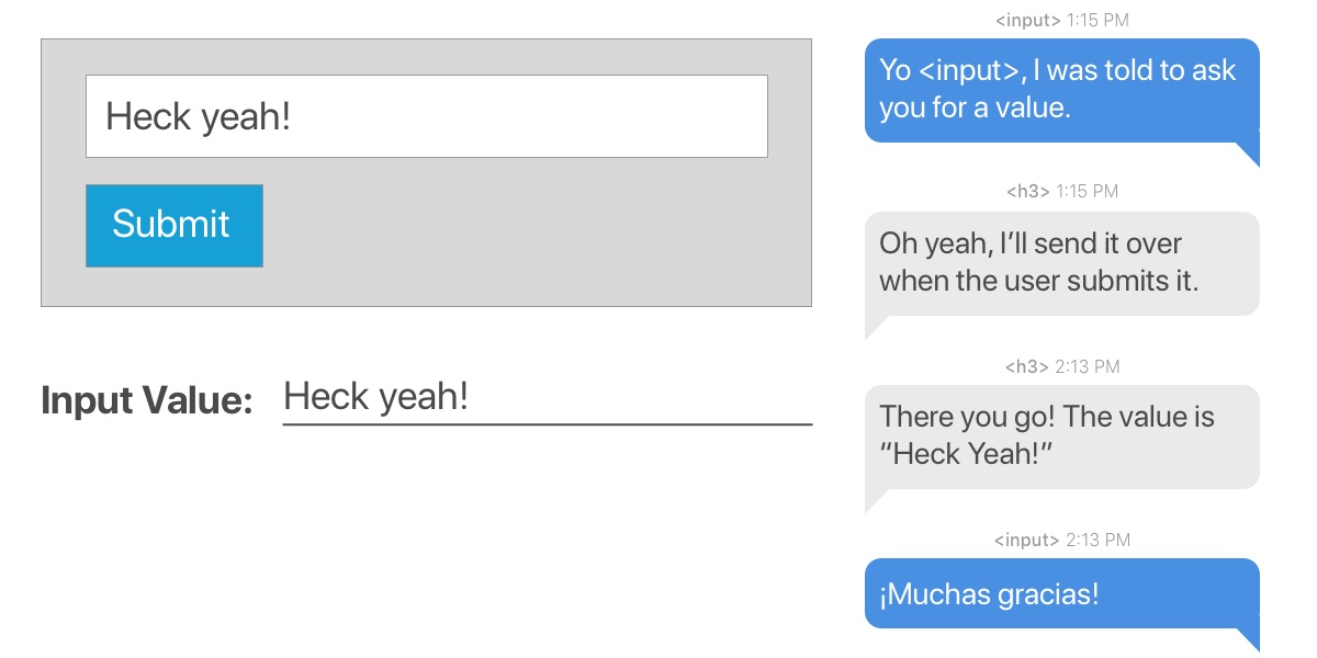
How a conversation between a child component and an element containing the ref might go down.

This is a component that renders some text, an input field and a button. The ref is created in the constructor and then attached to the input element when it renders. When the button is clicked, the value submitted from the input element (which has the ref attached) is used to update the state of the text (contained in an H3 tag). We make use of this.textInput.current.value to access the value and the new state is then rendered to the screen.

Passing a callback function to ref

React allows you to create a ref by passing a callback function to the ref attribute of a component. Here is how it looks:

<input type="text" ref={element => this.textInput = element} />

The callback is used to store a reference to the DOM node in an instance property. When we want to make use of this reference, we access it using:

this.textInput.value

Let’s see how that looks in the same example we used before.

See the Pen React Ref – Callback Ref by Kingsley Silas Chijioke (@kinsomicrote) on CodePen.

class App extends React.Component {
    state = {
    value: ''
  }
  
  handleSubmit = e => {
    e.preventDefault();
    this.setState({ value: this.textInput.value})
  };

  render() {
    return (
      <div>
        <h1>React Ref - Callback Ref</h1>
        <h3>Value: {this.state.value}</h3>
        <form onSubmit={this.handleSubmit}>
          <input type="text" ref={element => this.textInput = element} />
          <button>Submit</button>
        </form>
      </div>
    );
  }
}

When you make use of callback like we did above, React will call the ref callback with the DOM node when the component mounts, when the component un-mounts, it will call it with null.

It is also possible to pass ref from a parent component to a child component using callbacks.

See the Pen React Ref – Callback Ref 2 by Kingsley Silas Chijioke (@kinsomicrote) on CodePen.

Let’s create our „dumb” component that will render a simple input:

const Input = props => {
  return (
    <div>
      <input type="text" ref={props.inputRef} />
    </div>
  );
};

This component is expecting inputRef props from its parent component which is then used to create a ref to the DOM node.

Here’s the parent component:

class App extends React.Component {
  state = {
    value: ''
  };

  handleSubmit = event => {
    this.setState({ value: this.inputElement.value });
  };

  render() {
    return (
      <div>
        <h1>React Ref - Callback Ref</h1>
        <h3>Value: {this.state.value}</h3>
        <Input inputRef={el => (this.inputElement = el)} />
        <button onClick={this.handleSubmit}>Submit</button>
      </div>
    );
  }
}

In the App component, we want to obtain the text that is entered in the input field (which is in the child component) so we can render it. The ref is created using a callback like we did in the first example of this section. The key lies in how we access the DOM of the input element in the Input component from the App component. If you look closely, we access it using this.inputElement. So, when updating the state of value in the App component, we get the text that was entered in the input field using this.inputElement.value.

The ref attribute as a string

This is the old way of creating a ref and it will likely be removed in a future release because of some issues associated with it. The React team advises against using it, going so far as to label it as „legacy” in the documentation. We’re including it here anyway because there’s a chance you could come across it in a codebase.

See the Pen React Ref – String Ref by Kingsley Silas Chijioke (@kinsomicrote) on CodePen.

Going back to our example of an input whose value is used to update text value on submit:

class App extends React.Component {
    state = {
    value: ''
  }
  
  handleSubmit = e => {
    e.preventDefault();
    this.setState({ value: this.refs.textInput.value})
  };

  render() {
    return (
      <div>
        <h1>React Ref - String Ref</h1>
        <h3>Value: {this.state.value}</h3>
        <form onSubmit={this.handleSubmit}>
          <input type="text" ref="textInput" />
          <button>Submit</button>
        </form>
      </div>
    );
  }
}

The component is initialized and we start with a default state value set to an empty string (value='’). The component renders the text and form, as usual and, like before, the H3 text updates its state when the form is submitted with the contents entered in the input field.

We created a ref by setting the ref prop of the input field to textInput. That gives us access to the value of the input in the handleSubmit() method using this.refs.textInput.value.

Forwarding a ref from one component to another

**Ref forwarding is the technique of passing a ref from a component to a child component by making use of the React.forwardRef() method.

See the Pen React Ref – forward Ref by Kingsley Silas Chijioke (@kinsomicrote) on CodePen.

Back to our running example of a input field that updates the value of text when submitted:

class App extends React.Component {
    constructor(props) {
      super(props)
      this.inputRef = React.createRef();
      this.state = {
        value: ''
      }
    }
  
  handleSubmit = e => {
    e.preventDefault();
    this.setState({ value: this.inputRef.current.value})
  };

  render() {
    return (
      <div>
        <h1>React Ref - createRef</h1>
        <h3>Value: {this.state.value}</h3>
        <form onSubmit={this.handleSubmit}>
          <Input ref={this.inputRef} />
          <button>Submit</button>
        </form>
      </div>
    );
  }
}

We’ve created the ref in this example with inputRef, which we want to pass to the child component as a ref attribute that we can use to update the state of our text.

const Input = React.forwardRef((props, ref) => (
  <input type="text" ref={ref} />
));

Here is an alternative way to do it by defining the ref outside of the App component:

const Input = React.forwardRef((props, ref) => (
  <input type="text" ref={ref} />
));

const inputRef = React.createRef();

class App extends React.Component {
    constructor(props) {
      super(props)
      
      this.state = {
        value: ''
      }
    }
  
  handleSubmit = e => {
    e.preventDefault();
    this.setState({ value: inputRef.current.value})
  };

  render() {
    return (
      <div>
        <h1>React Ref - createRef</h1>
        <h3>Value: {this.state.value}</h3>
        <form onSubmit={this.handleSubmit}>
          <Input ref={inputRef} />
          <button>Submit</button>
        </form>
      </div>
    );
  }
}

Using ref for form validation

We all know that form validation is super difficult but something React is well-suited for. You know, things like making sure a form cannot be submitted with an empty input value. Or requiring a password with at least six characters. Refs can come in handy for these types of situations.

See the Pen React ref Pen – validation by Kingsley Silas Chijioke (@kinsomicrote) on CodePen.

class App extends React.Component {
  constructor(props) {
    super(props);

    this.username = React.createRef();
    this.password = React.createRef();
    this.state = {
      errors: []
    };
  }

  handleSubmit = (event) => {
    event.preventDefault();
    const username = this.username.current.value;
    const password = this.password.current.value;
    const errors = this.handleValidation(username, password);

    if (errors.length > 0) {
      this.setState({ errors });
      return;
    }
    // Submit data
  };

  handleValidation = (username, password) => {
    const errors = [];
    // Require username to have a value on submit
    if (username.length === 0) {
      errors.push("Username cannot be empty");
    }
    
    // Require at least six characters for the password
    if (password.length < 6) {
      errors.push("Password should be at least 6 characters long");
    }
    
    // If those conditions are met, then return error messaging
    return errors;
  };

  render() {
    const { errors } = this.state;
    return (
      <div>
        <h1>React Ref Example</h1>
        <form onSubmit={this.handleSubmit}>
          // If requirements are not met, then display errors
          {errors.map(error => <p key={error}>{error}</p>)}
          <div>
            <label>Username:</label>
            // Input for username containing the ref
            <input type="text" ref={this.username} />
          </div>
          <div>
            <label>Password:</label>
            // Input for password containing the ref
            <input type="text" ref={this.password} />
          </div>
          <div>
            <button>Submit</button>
          </div>
        </form>
      </div>
    );
  }
}

We used the createRef() to create refs for the inputs which we then passed as parameters to the validation method. We populate the errors array when either of the input has an error, which we then display to the user.

That’s a ref… er, a wrap!

Hopefully this walkthrough gives you a good understanding of how powerful refs can be. They’re an excellent way to update part of a component without the need to re-render the entire thing. That’s convenient for writing leaner code and getting better performance.

At the same time, it’s worth heeding the advice of the React docs themselves and avoid using ref too much:

Your first inclination may be to use refs to „make things happen” in your app. If this is the case, take a moment and think more critically about where state should be owned in the component hierarchy. Often, it becomes clear that the proper place to „own” that state is at a higher level in the hierarchy.

Get it? Got it? Good.

The post Working with refs in React appeared first on CSS-Tricks.