Photography isn’t the only way to represent your brand on your website. There are other ways like illustration, You can use illustrations to make your website stand out from the rest. Illustrations are becoming more and more popular, and some designers are really pushing the limits with some gorgeous ones. I personally love to draw and always looking at beautiful illustrations for inspiration when it comes across to my work but I’m nowhere near what these designers can do, so here are 25 beautiful examples of Illustrated websites that I gathered to inspire you.
Photography isn’t the only way to represent your brand on your website. There are other ways like illustration, You can use illustrations to make your website stand out from the rest. Illustrations are becoming more and more popular, and some designers are really pushing the limits with some gorgeous ones. I personally love to draw and always looking at beautiful illustrations for inspiration when it comes across to my work but I’m nowhere near what these designers can do, so here are 25 beautiful examples of Illustrated websites that I gathered to inspire you.
Photography isn’t the only way to represent your brand on your website. There are other ways like illustration, You can use illustrations to make your website stand out from the rest. Illustrations are becoming more and more popular, and some designers are really pushing the limits with some gorgeous ones. I personally love to draw and always looking at beautiful illustrations for inspiration when it comes across to my work but I’m nowhere near what these designers can do, so here are 25 beautiful examples of Illustrated websites that I gathered to inspire you.
I think of named grid areas in CSS Grids as bring-your-own syntactic sugar. You don’t absolutely need them (you could express grid placement in other ways), but it can make that placement more intuitive. And, hey, if I’m wrong about that, correct me in the comments.
No rows defined there; those are implicit and will appear as needed. We could define them, we just aren’t, because like most situations in web design, we don’t care how tall the items are — the height will grow as needed to accomodate the content.
Now, how do we place something in that very top-left position in the grid? We could tell the grid to place it there like this:
.item {
  grid-column: 1 / 2; /* start at the first grid column line and end at the second */
}
That works, although that .item better be the first child of .grid. Otherwise, something else may implicitly be placed there and .item will kick down to the next open row. If we wanted to be super sure to place it in the top-left, we could do the row as well:
.item {
  grid-column: 1 / 2;
  grid-row: 1 / 2;
}
Now it will be in the top-left for sure, even if other items are explicitly placed there (they’ll just overlap). We can even shorten things up with the grid-area property:
.item {
  grid-area: 1 / 1 / 2 / 2;
}
All those 1’s and 2’s might be intuitive enough for now, but the numbers become a bit much in more complex grids involving both column and row placement.
Check this. While we are defining the columns, we can name them with a separate property:
.grid {
  display: grid;
  grid-gap: 1rem;
  grid-template-columns:
     200px  1fr  1fr;
  grid-template-areas:
    "pro    a    b"
    "pro    c    d";
}
Every quoted group in grid-template-areas is a row. Inside are names I just made up. Could be just about anything, as long as it makes sense to you. See how the word „pro” is repeated twice there on two rows? That’s important, as it’s saying that we could place a grid item where that value „pro” is and it will be in the first of three columns and span two rows. Pretty intuitive, yeah?
We place it like this:
.pro-features {
  /* rather than */
  grid-area: 1 / 1 / 2 / 3;
  /* we can now do */
  grid-area: pro;
}
Before you start creating the cartoon text effect, download and install
the font and the pattern into your Photoshop, and also download the
background.
1. How to Load a Document Background
We will use the Stars background from the Tutorial Assets as our document background. It is an 850 x 600 px JPG file. Go to File > Open and open star-background.jpg.
2. How to Create and Warp Text
This text effect is made of one layer, so you can save it as a new style in your Styles palette when you are done.
Step 1
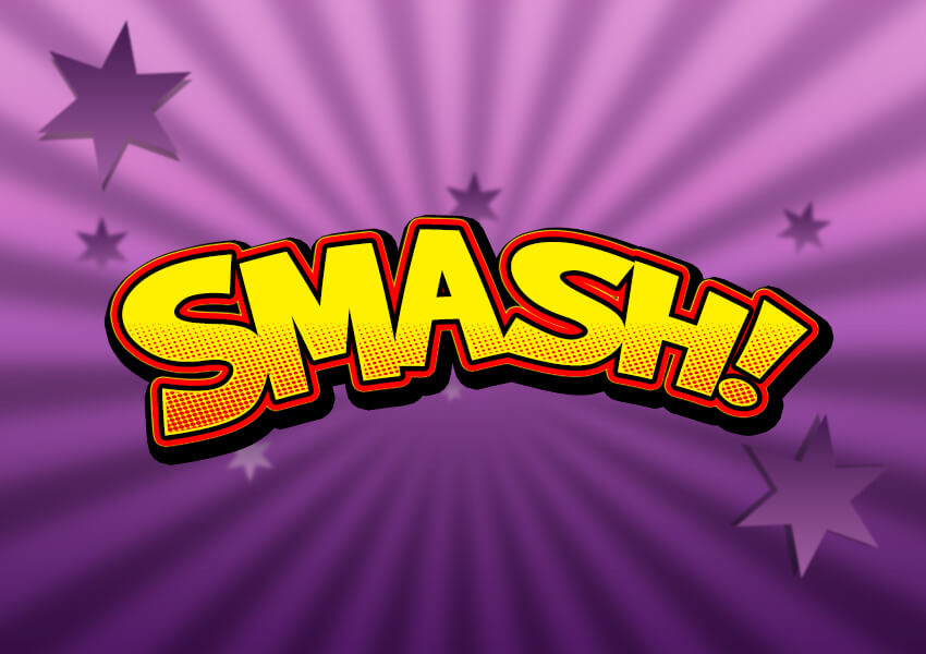
Pick the Type Tool and select the Brady Bunch Remastered font. Set the Font Size around 212 pt. Write „SMASH!” with capital letters and with any color.
Step 2
Now we need to stretch the letter spaces. Select the text layer, and then go to the Character panel and change the Tracking to -20. If you can’t see the character panel icon, go to Type > Panels > Character Panel.
Step 3
The last step before we start applying the layer style is to warp our text. Right-click with your mouse on the text layer and select Warp Text from the menu. Set the Style to Arc, select Horizontal, and set the Bend to 30% and Horizontal Distortion to -30%. Now hit OK to apply the changes.
3. How to Create a Cartoon Text Effect
Step 1
Select the layer SMASH! and Double-click the layer to apply the following layer style:
Add a Stroke with these settings:
Size: 10 px
Position: Outside
Blend Mode: Normal
Opacity: 100%
Fill Type: Gradient
Style: Shape Burst
Angle: 0°
Check the Dither box
Set the Gradient with these 2 color stops:
First gradient stop Color#f80000 and Location at 45%
Second gradient stop Color#000000 and Location at 59%
Step 2
Add an Inner Shadow with these settings:
Blend Mode: Normal with the Color#fff000
Opacity: 100%
Uncheck the Use Global Light before setting Angle: 180°
Distance: 3 px
Choke: 100%
Size: 0 px
Check the Anti-aliased box
Step 3
Add a Satin effect with these settings:
Blend Mode: Normal with the Color#fff000
Opacity: 100%
Angle: 90°
Distance: 2 px
Size: 0 px
Check the Anti-aliased box
Uncheck the Invert box, if checked
Step 4
Add a Color Overlay with these settings:
Blend Mode: Multiply
Click on the Color box and choose the color #fff000
Opacity: 100%
Step 5
Add a Pattern Overlay with these settings:
Click on the Pattern box and choose the Red Dots pattern
Opacity: 100%
Scale: 100%
Now you can change the pattern position: just Left-click and Drag your mouse over the text in the document to move the pattern up or down.
Step 6
Add an Outer Glow with these settings:
Blend Mode: Normal
Opacity: 100%
Set Color of glow #fff000
Technique: Softer
Spread: 94%
Size: 11 px
Check the Anti-aliased box
Step 7
As a final step, add a Drop Shadow with these settings:
Blend Mode: Multiply and pick the Color#000000
Opacity: 100%
Uncheck the Use Global Light before setting Angle: 120°
Distance: 8 px
Spread: 100%
Size: 20 px
Check the Anti-aliased box
Hit OK to apply the layer style.
Congratulations! You’re Done!
In this tutorial, you learned how to create a cartoon text effect in Adobe Photoshop.
We
started out by creating and warping our text, and then we added multiple different effects in order
to create our final text effect.
I hope you’ve enjoyed
this tutorial, and if you like the final effect, don’t forget to save
this style to your Layer Styles palette for future projects.
Before you start creating the cartoon text effect, download and install
the font and the pattern into your Photoshop, and also download the
background.
1. How to Load a Document Background
We will use the Stars background from the Tutorial Assets as our document background. It is an 850 x 600 px JPG file. Go to File > Open and open star-background.jpg.
2. How to Create and Warp Text
This text effect is made of one layer, so you can save it as a new style in your Styles palette when you are done.
Step 1
Pick the Type Tool and select the Brady Bunch Remastered font. Set the Font Size around 212 pt. Write „SMASH!” with capital letters and with any color.
Step 2
Now we need to stretch the letter spaces. Select the text layer, and then go to the Character panel and change the Tracking to -20. If you can’t see the character panel icon, go to Type > Panels > Character Panel.
Step 3
The last step before we start applying the layer style is to warp our text. Right-click with your mouse on the text layer and select Warp Text from the menu. Set the Style to Arc, select Horizontal, and set the Bend to 30% and Horizontal Distortion to -30%. Now hit OK to apply the changes.
3. How to Create a Cartoon Text Effect
Step 1
Select the layer SMASH! and Double-click the layer to apply the following layer style:
Add a Stroke with these settings:
Size: 10 px
Position: Outside
Blend Mode: Normal
Opacity: 100%
Fill Type: Gradient
Style: Shape Burst
Angle: 0°
Check the Dither box
Set the Gradient with these 2 color stops:
First gradient stop Color#f80000 and Location at 45%
Second gradient stop Color#000000 and Location at 59%
Step 2
Add an Inner Shadow with these settings:
Blend Mode: Normal with the Color#fff000
Opacity: 100%
Uncheck the Use Global Light before setting Angle: 180°
Distance: 3 px
Choke: 100%
Size: 0 px
Check the Anti-aliased box
Step 3
Add a Satin effect with these settings:
Blend Mode: Normal with the Color#fff000
Opacity: 100%
Angle: 90°
Distance: 2 px
Size: 0 px
Check the Anti-aliased box
Uncheck the Invert box, if checked
Step 4
Add a Color Overlay with these settings:
Blend Mode: Multiply
Click on the Color box and choose the color #fff000
Opacity: 100%
Step 5
Add a Pattern Overlay with these settings:
Click on the Pattern box and choose the Red Dots pattern
Opacity: 100%
Scale: 100%
Now you can change the pattern position: just Left-click and Drag your mouse over the text in the document to move the pattern up or down.
Step 6
Add an Outer Glow with these settings:
Blend Mode: Normal
Opacity: 100%
Set Color of glow #fff000
Technique: Softer
Spread: 94%
Size: 11 px
Check the Anti-aliased box
Step 7
As a final step, add a Drop Shadow with these settings:
Blend Mode: Multiply and pick the Color#000000
Opacity: 100%
Uncheck the Use Global Light before setting Angle: 120°
Distance: 8 px
Spread: 100%
Size: 20 px
Check the Anti-aliased box
Hit OK to apply the layer style.
Congratulations! You’re Done!
In this tutorial, you learned how to create a cartoon text effect in Adobe Photoshop.
We
started out by creating and warping our text, and then we added multiple different effects in order
to create our final text effect.
I hope you’ve enjoyed
this tutorial, and if you like the final effect, don’t forget to save
this style to your Layer Styles palette for future projects.
Before you start creating the cartoon text effect, download and install
the font and the pattern into your Photoshop, and also download the
background.
1. How to Load a Document Background
We will use the Stars background from the Tutorial Assets as our document background. It is an 850 x 600 px JPG file. Go to File > Open and open star-background.jpg.
2. How to Create and Warp Text
This text effect is made of one layer, so you can save it as a new style in your Styles palette when you are done.
Step 1
Pick the Type Tool and select the Brady Bunch Remastered font. Set the Font Size around 212 pt. Write „SMASH!” with capital letters and with any color.
Step 2
Now we need to stretch the letter spaces. Select the text layer, and then go to the Character panel and change the Tracking to -20. If you can’t see the character panel icon, go to Type > Panels > Character Panel.
Step 3
The last step before we start applying the layer style is to warp our text. Right-click with your mouse on the text layer and select Warp Text from the menu. Set the Style to Arc, select Horizontal, and set the Bend to 30% and Horizontal Distortion to -30%. Now hit OK to apply the changes.
3. How to Create a Cartoon Text Effect
Step 1
Select the layer SMASH! and Double-click the layer to apply the following layer style:
Add a Stroke with these settings:
Size: 10 px
Position: Outside
Blend Mode: Normal
Opacity: 100%
Fill Type: Gradient
Style: Shape Burst
Angle: 0°
Check the Dither box
Set the Gradient with these 2 color stops:
First gradient stop Color#f80000 and Location at 45%
Second gradient stop Color#000000 and Location at 59%
Step 2
Add an Inner Shadow with these settings:
Blend Mode: Normal with the Color#fff000
Opacity: 100%
Uncheck the Use Global Light before setting Angle: 180°
Distance: 3 px
Choke: 100%
Size: 0 px
Check the Anti-aliased box
Step 3
Add a Satin effect with these settings:
Blend Mode: Normal with the Color#fff000
Opacity: 100%
Angle: 90°
Distance: 2 px
Size: 0 px
Check the Anti-aliased box
Uncheck the Invert box, if checked
Step 4
Add a Color Overlay with these settings:
Blend Mode: Multiply
Click on the Color box and choose the color #fff000
Opacity: 100%
Step 5
Add a Pattern Overlay with these settings:
Click on the Pattern box and choose the Red Dots pattern
Opacity: 100%
Scale: 100%
Now you can change the pattern position: just Left-click and Drag your mouse over the text in the document to move the pattern up or down.
Step 6
Add an Outer Glow with these settings:
Blend Mode: Normal
Opacity: 100%
Set Color of glow #fff000
Technique: Softer
Spread: 94%
Size: 11 px
Check the Anti-aliased box
Step 7
As a final step, add a Drop Shadow with these settings:
Blend Mode: Multiply and pick the Color#000000
Opacity: 100%
Uncheck the Use Global Light before setting Angle: 120°
Distance: 8 px
Spread: 100%
Size: 20 px
Check the Anti-aliased box
Hit OK to apply the layer style.
Congratulations! You’re Done!
In this tutorial, you learned how to create a cartoon text effect in Adobe Photoshop.
We
started out by creating and warping our text, and then we added multiple different effects in order
to create our final text effect.
I hope you’ve enjoyed
this tutorial, and if you like the final effect, don’t forget to save
this style to your Layer Styles palette for future projects.
Before you start creating the cartoon text effect, download and install
the font and the pattern into your Photoshop, and also download the
background.
1. How to Load a Document Background
We will use the Stars background from the Tutorial Assets as our document background. It is an 850 x 600 px JPG file. Go to File > Open and open star-background.jpg.
2. How to Create and Warp Text
This text effect is made of one layer, so you can save it as a new style in your Styles palette when you are done.
Step 1
Pick the Type Tool and select the Brady Bunch Remastered font. Set the Font Size around 212 pt. Write „SMASH!” with capital letters and with any color.
Step 2
Now we need to stretch the letter spaces. Select the text layer, and then go to the Character panel and change the Tracking to -20. If you can’t see the character panel icon, go to Type > Panels > Character Panel.
Step 3
The last step before we start applying the layer style is to warp our text. Right-click with your mouse on the text layer and select Warp Text from the menu. Set the Style to Arc, select Horizontal, and set the Bend to 30% and Horizontal Distortion to -30%. Now hit OK to apply the changes.
3. How to Create a Cartoon Text Effect
Step 1
Select the layer SMASH! and Double-click the layer to apply the following layer style:
Add a Stroke with these settings:
Size: 10 px
Position: Outside
Blend Mode: Normal
Opacity: 100%
Fill Type: Gradient
Style: Shape Burst
Angle: 0°
Check the Dither box
Set the Gradient with these 2 color stops:
First gradient stop Color#f80000 and Location at 45%
Second gradient stop Color#000000 and Location at 59%
Step 2
Add an Inner Shadow with these settings:
Blend Mode: Normal with the Color#fff000
Opacity: 100%
Uncheck the Use Global Light before setting Angle: 180°
Distance: 3 px
Choke: 100%
Size: 0 px
Check the Anti-aliased box
Step 3
Add a Satin effect with these settings:
Blend Mode: Normal with the Color#fff000
Opacity: 100%
Angle: 90°
Distance: 2 px
Size: 0 px
Check the Anti-aliased box
Uncheck the Invert box, if checked
Step 4
Add a Color Overlay with these settings:
Blend Mode: Multiply
Click on the Color box and choose the color #fff000
Opacity: 100%
Step 5
Add a Pattern Overlay with these settings:
Click on the Pattern box and choose the Red Dots pattern
Opacity: 100%
Scale: 100%
Now you can change the pattern position: just Left-click and Drag your mouse over the text in the document to move the pattern up or down.
Step 6
Add an Outer Glow with these settings:
Blend Mode: Normal
Opacity: 100%
Set Color of glow #fff000
Technique: Softer
Spread: 94%
Size: 11 px
Check the Anti-aliased box
Step 7
As a final step, add a Drop Shadow with these settings:
Blend Mode: Multiply and pick the Color#000000
Opacity: 100%
Uncheck the Use Global Light before setting Angle: 120°
Distance: 8 px
Spread: 100%
Size: 20 px
Check the Anti-aliased box
Hit OK to apply the layer style.
Congratulations! You’re Done!
In this tutorial, you learned how to create a cartoon text effect in Adobe Photoshop.
We
started out by creating and warping our text, and then we added multiple different effects in order
to create our final text effect.
I hope you’ve enjoyed
this tutorial, and if you like the final effect, don’t forget to save
this style to your Layer Styles palette for future projects.
Before you start creating the cartoon text effect, download and install
the font and the pattern into your Photoshop, and also download the
background.
1. How to Load a Document Background
We will use the Stars background from the Tutorial Assets as our document background. It is an 850 x 600 px JPG file. Go to File > Open and open star-background.jpg.
2. How to Create and Warp Text
This text effect is made of one layer, so you can save it as a new style in your Styles palette when you are done.
Step 1
Pick the Type Tool and select the Brady Bunch Remastered font. Set the Font Size around 212 pt. Write „SMASH!” with capital letters and with any color.
Step 2
Now we need to stretch the letter spaces. Select the text layer, and then go to the Character panel and change the Tracking to -20. If you can’t see the character panel icon, go to Type > Panels > Character Panel.
Step 3
The last step before we start applying the layer style is to warp our text. Right-click with your mouse on the text layer and select Warp Text from the menu. Set the Style to Arc, select Horizontal, and set the Bend to 30% and Horizontal Distortion to -30%. Now hit OK to apply the changes.
3. How to Create a Cartoon Text Effect
Step 1
Select the layer SMASH! and Double-click the layer to apply the following layer style:
Add a Stroke with these settings:
Size: 10 px
Position: Outside
Blend Mode: Normal
Opacity: 100%
Fill Type: Gradient
Style: Shape Burst
Angle: 0°
Check the Dither box
Set the Gradient with these 2 color stops:
First gradient stop Color#f80000 and Location at 45%
Second gradient stop Color#000000 and Location at 59%
Step 2
Add an Inner Shadow with these settings:
Blend Mode: Normal with the Color#fff000
Opacity: 100%
Uncheck the Use Global Light before setting Angle: 180°
Distance: 3 px
Choke: 100%
Size: 0 px
Check the Anti-aliased box
Step 3
Add a Satin effect with these settings:
Blend Mode: Normal with the Color#fff000
Opacity: 100%
Angle: 90°
Distance: 2 px
Size: 0 px
Check the Anti-aliased box
Uncheck the Invert box, if checked
Step 4
Add a Color Overlay with these settings:
Blend Mode: Multiply
Click on the Color box and choose the color #fff000
Opacity: 100%
Step 5
Add a Pattern Overlay with these settings:
Click on the Pattern box and choose the Red Dots pattern
Opacity: 100%
Scale: 100%
Now you can change the pattern position: just Left-click and Drag your mouse over the text in the document to move the pattern up or down.
Step 6
Add an Outer Glow with these settings:
Blend Mode: Normal
Opacity: 100%
Set Color of glow #fff000
Technique: Softer
Spread: 94%
Size: 11 px
Check the Anti-aliased box
Step 7
As a final step, add a Drop Shadow with these settings:
Blend Mode: Multiply and pick the Color#000000
Opacity: 100%
Uncheck the Use Global Light before setting Angle: 120°
Distance: 8 px
Spread: 100%
Size: 20 px
Check the Anti-aliased box
Hit OK to apply the layer style.
Congratulations! You’re Done!
In this tutorial, you learned how to create a cartoon text effect in Adobe Photoshop.
We
started out by creating and warping our text, and then we added multiple different effects in order
to create our final text effect.
I hope you’ve enjoyed
this tutorial, and if you like the final effect, don’t forget to save
this style to your Layer Styles palette for future projects.
Before you start creating the cartoon text effect, download and install
the font and the pattern into your Photoshop, and also download the
background.
1. How to Load a Document Background
We will use the Stars background from the Tutorial Assets as our document background. It is an 850 x 600 px JPG file. Go to File > Open and open star-background.jpg.
2. How to Create and Warp Text
This text effect is made of one layer, so you can save it as a new style in your Styles palette when you are done.
Step 1
Pick the Type Tool and select the Brady Bunch Remastered font. Set the Font Size around 212 pt. Write „SMASH!” with capital letters and with any color.
Step 2
Now we need to stretch the letter spaces. Select the text layer, and then go to the Character panel and change the Tracking to -20. If you can’t see the character panel icon, go to Type > Panels > Character Panel.
Step 3
The last step before we start applying the layer style is to warp our text. Right-click with your mouse on the text layer and select Warp Text from the menu. Set the Style to Arc, select Horizontal, and set the Bend to 30% and Horizontal Distortion to -30%. Now hit OK to apply the changes.
3. How to Create a Cartoon Text Effect
Step 1
Select the layer SMASH! and Double-click the layer to apply the following layer style:
Add a Stroke with these settings:
Size: 10 px
Position: Outside
Blend Mode: Normal
Opacity: 100%
Fill Type: Gradient
Style: Shape Burst
Angle: 0°
Check the Dither box
Set the Gradient with these 2 color stops:
First gradient stop Color#f80000 and Location at 45%
Second gradient stop Color#000000 and Location at 59%
Step 2
Add an Inner Shadow with these settings:
Blend Mode: Normal with the Color#fff000
Opacity: 100%
Uncheck the Use Global Light before setting Angle: 180°
Distance: 3 px
Choke: 100%
Size: 0 px
Check the Anti-aliased box
Step 3
Add a Satin effect with these settings:
Blend Mode: Normal with the Color#fff000
Opacity: 100%
Angle: 90°
Distance: 2 px
Size: 0 px
Check the Anti-aliased box
Uncheck the Invert box, if checked
Step 4
Add a Color Overlay with these settings:
Blend Mode: Multiply
Click on the Color box and choose the color #fff000
Opacity: 100%
Step 5
Add a Pattern Overlay with these settings:
Click on the Pattern box and choose the Red Dots pattern
Opacity: 100%
Scale: 100%
Now you can change the pattern position: just Left-click and Drag your mouse over the text in the document to move the pattern up or down.
Step 6
Add an Outer Glow with these settings:
Blend Mode: Normal
Opacity: 100%
Set Color of glow #fff000
Technique: Softer
Spread: 94%
Size: 11 px
Check the Anti-aliased box
Step 7
As a final step, add a Drop Shadow with these settings:
Blend Mode: Multiply and pick the Color#000000
Opacity: 100%
Uncheck the Use Global Light before setting Angle: 120°
Distance: 8 px
Spread: 100%
Size: 20 px
Check the Anti-aliased box
Hit OK to apply the layer style.
Congratulations! You’re Done!
In this tutorial, you learned how to create a cartoon text effect in Adobe Photoshop.
We
started out by creating and warping our text, and then we added multiple different effects in order
to create our final text effect.
I hope you’ve enjoyed
this tutorial, and if you like the final effect, don’t forget to save
this style to your Layer Styles palette for future projects.
 Barrel Recap 2017
  Rise To The 2018 Challenge
  Pixity Land
  Danish Sait
  Animal
  Newlytics
  Baunfire
  Major Savage
  Reverend Danger
  Malika Favre
  In Pieces
  PEZ
PEZ  Mi Banxico
  Future Living
  Adult Swim Singles 2016
  BIG
BIG  Ufo.lt
  Plavacek.net
  Bank Of England
  Every Last Drop
  Your Plan, Your Planet
  Genesis
  Kick My Habits
  Mint Design Company
  LightHouse Brewing