Why do you think customers are bouncing off your website? There are many reasons why this could be happening but a poor visual design impression could be a cause. Over the years in the web design business, MangoMatter has always emphasized the significance of graphic design when it comes to your website’s success. Having an in-house graphic designer could be expensive but you can always outsource professional freelance graphic designers.
Here are the reasons why it matters having high-quality graphics in the success of your website:
Helps create the first impression
The impression one gets when he visits your website for the first time will determine whether he or she will fulfill your set goals such as making a purchase, email or newsletter subscription. Applying the best and modern graphics help you catch the first attention of the customer.
Building a relationship with customers
Many customers will not remember the name of the company MangoMatter but the logo of the company will stick in their mind. Whenever they find the logo they will feel some sense of relationship with the company.
Customers building a relationship with your website will sooner or later convert into a lead or prospect. Visuals are known to build a relationship with customers very fast compared to written content.
Cool graphics evoke emotions
Capturing the mind of your website visitors should be the ultimate goal of visuals. You must have heard ‘A picture is worth a thousand words’. Through pictures, you can bring out the aspects of trust, sadness, hope, delight, self-confidence or comfort. The emotion created will determine the conversion rate of your website. This means that you should select visuals depending on your website’s niche.
Beautifying your website
Imagine if a website has content only? It must be awful. Graphic designer’s responsibility is to ensure the website looks aesthetic and appealing to the users. Who would like to own a ramshackle house? Why should think of owning such as a website too?
A clean and elaborate website is easy to use for customers, hence increasing the conversion meaning more success will be achieved.
Graphics are entertaining
Don’t perceive your visitors to be robots. They require some entertainment. Using animated visuals you can easily capture the attention of the visitors to your website. This reduces the bounce rate of your website and could eventually bring on-board a promising prospect. If visitors feel entertained on visiting your website this will basically increase the number of returning visitors hence high retention rate.
Final thought
It is important not to neglect the small aspects when carrying out a web design project. Professional graphic design is necessary to ensure brand awareness and a long lasting relationship with your visitors.
The website should also be accessible, usable and findable. Combining all aspects of website design will make your visitors get the most out of it, hence building a strong foundation for the future of your website. High quality graphic design is an essential for customer retention. Graphic design is a key pillar which will determine your website’s success now and in the future.
Why do you think customers are bouncing off your website? There are many reasons why this could be happening but a poor visual design impression could be a cause. Over the years in the web design business, MangoMatter has always emphasized the significance of graphic design when it comes to your website’s success. Having an in-house graphic designer could be expensive but you can always outsource professional freelance graphic designers.
Here are the reasons why it matters having high-quality graphics in the success of your website:
Helps create the first impression
The impression one gets when he visits your website for the first time will determine whether he or she will fulfill your set goals such as making a purchase, email or newsletter subscription. Applying the best and modern graphics help you catch the first attention of the customer.
Building a relationship with customers
Many customers will not remember the name of the company MangoMatter but the logo of the company will stick in their mind. Whenever they find the logo they will feel some sense of relationship with the company.
Customers building a relationship with your website will sooner or later convert into a lead or prospect. Visuals are known to build a relationship with customers very fast compared to written content.
Cool graphics evoke emotions
Capturing the mind of your website visitors should be the ultimate goal of visuals. You must have heard ‘A picture is worth a thousand words’. Through pictures, you can bring out the aspects of trust, sadness, hope, delight, self-confidence or comfort. The emotion created will determine the conversion rate of your website. This means that you should select visuals depending on your website’s niche.
Beautifying your website
Imagine if a website has content only? It must be awful. Graphic designer’s responsibility is to ensure the website looks aesthetic and appealing to the users. Who would like to own a ramshackle house? Why should think of owning such as a website too?
A clean and elaborate website is easy to use for customers, hence increasing the conversion meaning more success will be achieved.
Graphics are entertaining
Don’t perceive your visitors to be robots. They require some entertainment. Using animated visuals you can easily capture the attention of the visitors to your website. This reduces the bounce rate of your website and could eventually bring on-board a promising prospect. If visitors feel entertained on visiting your website this will basically increase the number of returning visitors hence high retention rate.
Final thought
It is important not to neglect the small aspects when carrying out a web design project. Professional graphic design is necessary to ensure brand awareness and a long lasting relationship with your visitors.
The website should also be accessible, usable and findable. Combining all aspects of website design will make your visitors get the most out of it, hence building a strong foundation for the future of your website. High quality graphic design is an essential for customer retention. Graphic design is a key pillar which will determine your website’s success now and in the future.
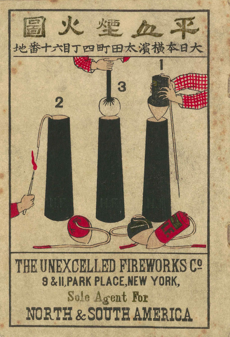
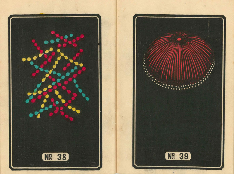
The city of Yokohama’s public library took a great initiative and digitized six ancient books dated from the 19th century.
These six books depict firework designs by Jinta Hirayama, a master in this art at that time. We have selected a few designs here, the full books can be downloaded from the city of Yokohama’s public library’s website (granted you find out how to navigate around on a Japanese website).
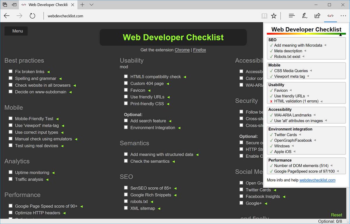
Designing an optimised webpage involves following many steps and procedures, it’s certainly not easy. Even the best developers could sometimes forget to add the crucials which in turn causes the rating of various benchmark websites to drop.
The Web Developer Checklist extension analyses the whole page for you. It matches all content with the most common SEO practices and shows a detailed report containing what you did and what you missed. Some instances are image alt tags, meta description, google page speed ranking, and more.
Webpage compatibility could also turn out to be an issue for developers when working with Internet Explorer (IE). Since different IE versions render webpages differently, it will test their webpages. There need to be more chrome extensions for web developers that are so handy.
IE Tab emulates various versions of IE on chrome along with ActiveX controls to give complete peace of mind to developers that their project is going to run smoothly on all browsers.
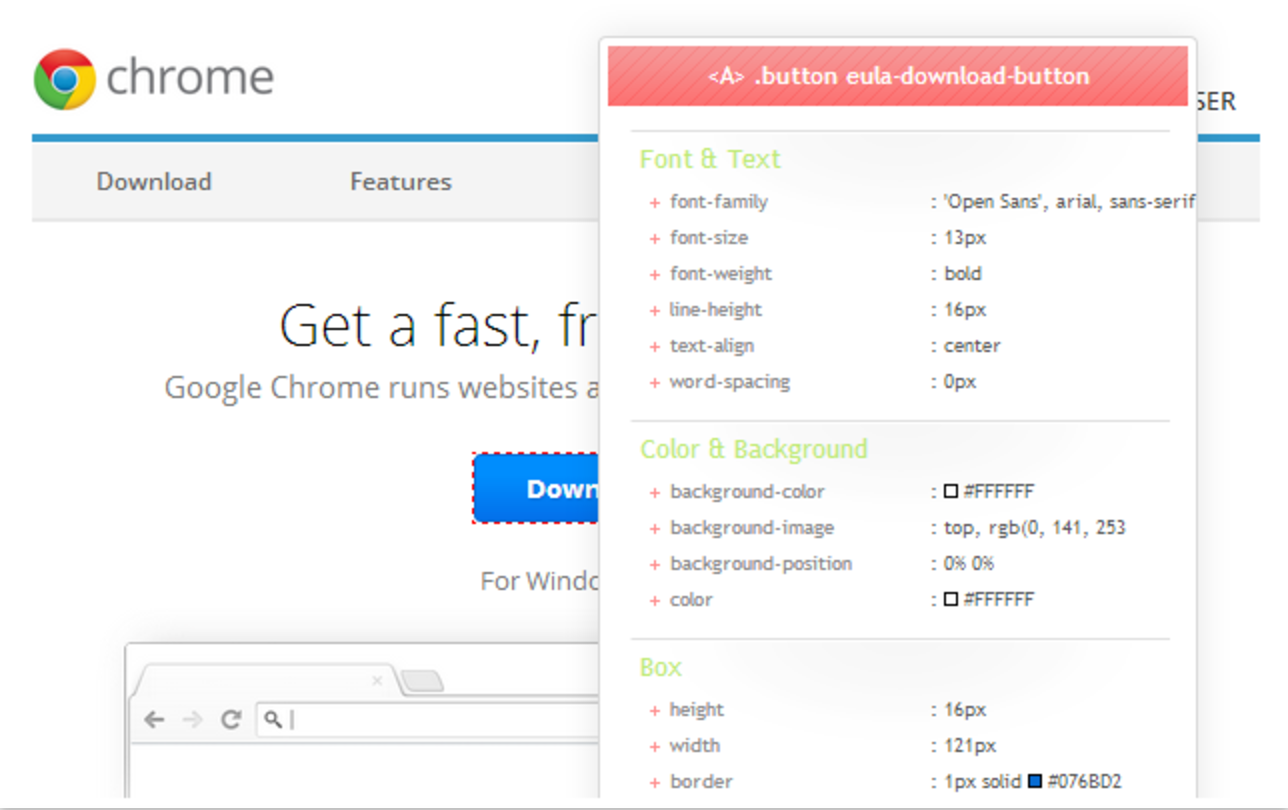
If you are exploring websites for design inspiration and find something you like, this is the extension that will assist you.
With CSSViewer, you will get complete styling details used on a particular div, block, table or even images. It will save your time as you will see all values just by hovering over the object.
Testing a website over and over is a tiring and repetitive process, imacros will save you lots of time. It works by recording testing patterns of mouse clicks and browsing, so it runs automatically when testing a webpage repeatedly.
So the next time you create a website with numerous forms to test, just run iMacro once and replay/test your forms whenever you want.
Good chrome extensions for web developers such as this one can solve issues that are generally overlooked. Some API developers face problems when communicating with remote server calls.
Most of modern day browsers block Cross-Origin Resource Sharing (CORS) by default and disabling them on various browsers involves disabling security manually for few. This extension handles all these tasks for you and enables you to communicate with remote API calls without CORS errors.
Google provides a bunch of online tools that monitor and monetize user activity. For using these features, you need multiple active scripts on a website. Now, Google ensures there is assistance in the form of chrome extensions for web developers.
Tag Assistant will check, verify and ensure that all these scripts are working properly. It has support for Adwords, Adsense, conversion tracking, Google Tag Manager and monitoring user activity. In addition, it also suggests improvements that can be made to the implementation.
MySQL Admin is the PHPmyAdmin of chrome extensions. It eases the import of databases in your local or remote MySQL database providing administration GUI of server. Some of its features include SSL server connection support, insert/create/update records, foreign keys support and drawing ER diagrams.
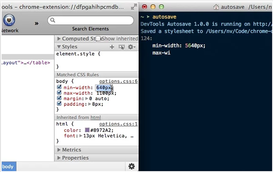
Generally, during functionality testing, developers edit a webpage by inspecting an element on chrome browser. After changing an element in console window, the changes will reflect only if they are copied to the original CSS\JS file without refreshing the page or they will be lost.
However, DevTools Autosave chrome extension allows you to automatically save whatever changes you have made to website’s CSS or JS console files.
There are a few chrome extensions for web developers that are capable of identifying the font used on any website. WhatFont is the best out of these. Just hover on any page element and it will show you the font used for that particular text. Additionally, it can also identify the source or service of the font.
Trifold brochures can be an excellent tool for getting information to people in an easy-to-use, eye-catching way. In this tutorial, I will show you how to make a brochure template in Adobe InDesign CC. This versatile pamphlet template will allow you to change the information as you need.
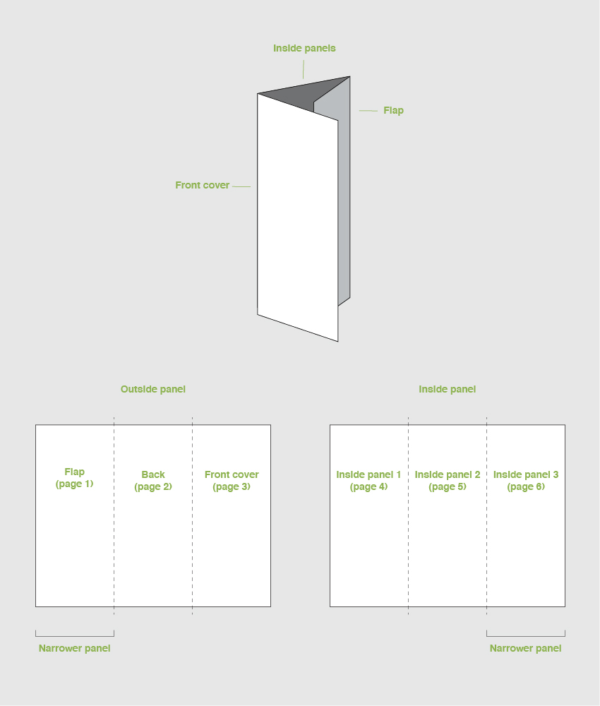
A trifold brochure is a page containing three panels per side for a total of six panels inside and outside of a brochure. Two of the panels are the same width, while one panel is slightly narrower to accommodate the roll fold.
We will be creating a file with six pages and altering the Master Pages later on. This approach will allow us to easily move panels on a template when necessary. We will also be able to make a PDF with crop marks, which will indicate the position of the folds. Do make sure to indicate this to the printer to avoid any mistakes.
What You Will Need
You’ll need access to Adobe InDesign and Adobe Illustrator; if you don’t have the software, you can download a trial from the Adobe website. You’ll also need the following assets:
1. Setting Up a Trifold Brochure File in Adobe InDesign
A common trifold dimension when open flat is letter size or A4. We will be using a letter size page for this tutorial, but feel free to use an A4 page if you prefer. As trifold brochure dimensions will vary depending on your needs, I’ve created an equation chart that you can follow below:
Step 1
The trifold brochure size for this tutorial is a letter page. First, we need to divide the final width (279.4 mm) by 3 (93.13 mm). To this new width, we need to add a buffer for the fold (1 mm). The width of the two panels is 94.13 mm.
Later on, we will modify the size of the shorter panel. We need to subtract (2 mm) from the panel to accommodate the fold (91.13 mm).
In InDesign, go to File > New. Name the document trifold brochure. Set the trifold dimensions to the following:
Width to 94.13 mm
Height to 215.9 mm
Units to Millimetres
Orientation to Portrait
Uncheck Facing Pages
Pages to 6
Margins to 10 mm
Bleeds to 3 mm (although it’s best to seek your professional printer’s preference)
Click Create.
Step 2
A trifold brochure has a flap that folds in; this is a shorter panel. We will create a second Master Page with this new size.
Head over to the Pages panel. If you don’t have it active, head over to Windows > Pages. The top portion of the panel contains the Master Pages.
Right-click on A-Master > New Master. In the New Master window, make sure Based on Master is set to [Master]. Set the Width to 91.13 mm (subtract 2 mm from the 93.13 mm).Click OK.
Step 3
On the Pages panel, right-click on the B-Master we just created and select Apply Master. In the Apply Master window, under To Pages enter 1, 6 (this is to specify that we are changing Pages 1 and 6). Click OK.
In the Master Page Size Conflict window, click Use Master Page Size.
Step 4
Now that we have the page sizes set up, we can move the pages to set up the spreads. Pages 1-3 will be the outside spread, and Pages 4-6 will be the inside spreads.
On the Main Menu of the Pages panel, make sure that Allow Document Pages to Shuffle is unchecked. Drag Page 2 towards Page 1 to combine. Combine Pages 1-3 as one spread and Pages 4-6. Make sure that you have the BAA and AABMaster Pages configuration.
To exit the Master Pages mode, double-click on the regular pages thumbnail.
Step 5
For this trifold brochure template tutorial, we will work with two layers. This will make it easier to update the template when it needs to updated with new information.
Bring up the Layers panel by going to Window > Layers. Double-click on Layer 1 and rename it Images.
On the Layers panel main menu, select New Layer. Name it Copy, and click OK.
Step 6
We will be using Rulers for this tutorial, so press Command-R to bring them up.
Let’s add some Guides. Head over to Layout > Create Guides. In the Create Guides option window, set the Rows Number to 3 and the Gutter to 0. Under the Options, set the Fit Guides to: Page and click OK. Repeat this step on the second spread.
Show/Hide the guides and margins by pressing Command-;. Alternatively, use W to enter and exit Preview mode.
Step 7
Before we start with the design, let’s add some color swatches. Head over to Window > Color > Swatches to expand the Swatches panel. Choose New Color Swatch button from the main menu. Add the following two colors:
Yellow:C=0 M=25 Y=100 K=0. Click Add and OK.
Blue:C=95 M=95 Y=0 K=30
Click Add and OK after you input each of the color values.
2.How to Place Images in Adobe InDesign
Step 1
Let’s start by placing images into the document. On the Layers panel, make sure you have the Images layer selected. We will be working on Page 1-3.
On the Toolbar, select the Frame Tool (F). Using the guides we created, draw frames covering the following:
Page 1: full page
Page 2: lower 1/3 of the page
Page 3: top 2/3 of the page
I’ve changed the color for easier guidance. Make sure all the frames extend to the bleed. This will ensure there are no white edges.
Step 2
Select the full page rectangle and press Command-D to Place an image. Select the Modern architectureimage and click Open.
Select the image inside the frame. You can do this by clicking on the donut shape in the center of the frame or by selecting the Direct Selection Tool (A) from the toolbar. Head over to the Control bar, activate the Constrain Proportions for scaling button, and set the percentage to 45%.
This will be a background image. Place the image as you wish—there’s no right or wrong.
Step 3
Select the rectangle on Page 2 and press Command-D to Place an image. Select the Business people image and click Open.
Select the image and head over to the Control bar. Activate the Constrain Proportions for scaling button and set the percentage to 25%. Try to center the hands in the frame using the Direct Selection Tool (A).
Repeat this process for Page 3. Select the Two creative owners image and click Open.
Head over to the Control bar. Activate the Constrain Proportions for scaling button and set the percentage to 35%. Try to place the focused subject within the margins.
Step 4
You’ll notice that the images we placed have different tones. A great way to fix this is to add a colored effect over the top. This is also a great way to apply your brand to the brochure by choosing colors from your logo.
Using the Rectangle Tool (M), create rectangles over each image. Head over to the Swatches panel and select the purple color we added previously.
Step 5
To apply an effect, bring up the Effects panel. Go to Window > Effects.
Select the rectangle on Page 1. Since we will have text over this image, we need to select a Blending Mode that will allow the type to be legible. Select Multiply from the drop-down menu and set the Opacity to 90%.
Step 6
We need the images on Page 2 and 3 to come through more since they will be standalone images. Select both rectangles and set the Blending Mode to Color.
Step 7
Let’s add a contrasting color to some of the empty sections. This will help to reinforce the brand on the brochure template. Select the Rectangle Tool (M) and draw a rectangle covering the top portion of Page 2. Head over to the Swatches panel and select the yellow color we added.
Additionally, create a line under the main image on Page 3. Select the Line Tool (\) from the toolbar. Hold down Shift to draw a straight horizontal line across the panel.Head over to the Control bar, set the Stroke size to 7 pt, and set the Stroke color to yellow.
Step 8
Let’s add a logo to the pamphlet template. Ideally, the logo is placed on the first page and the back of the pamphlet. Press Command-D and select 01_smartnet.eps and 02_smartnet.eps. The file 01 is perfect for the front of the brochure template, and 02 is perfect to go over a colored background.
Resize both images by going to the Control bar and setting the Scaling to 10%.
Step 9
Let’s work on Pages 4-6. Select the Rectangle Tool (M) and draw a rectangle at the very top of the pages. Cover the width of the document, making sure it is extended to the bleeds. On the Control bar, set the Height to 20 mm.
Using the Add Anchor Point Tool (=), add an anchor on the first fold guide. Using the Direct Selection Tool (A), select the point and move it upwards as much as you’d like. We are adding some movement to the inside as the exterior is static.
Head over to the Swatches panel, and select the color yellow.
Step 10
Select the Rectangle Tool (M) from the toolbar.Draw a rectangle that fits Page 4-5 and a second rectangle that covers Page 6.
Select the first rectangle and set the Height to 100 mm on the Control bar. Select the second rectangle and set the Height to 120 mm.
Using the Direct Selection Tool (A), select the top inside points of the rectangles and move both downwards.
Step 11
Select the left object and press Command-D to Place an image. Select the Young people brainstorming and click Open. Select the image and head over to the Control bar. Set the Scale to 10%.
Place an image on the right-hand side object. Select the Businessman working file, and click Open. Select the image and head over to the Control bar. Set the Scale to 35%.
Let’s apply the same color effect here as the outside panel. Select both objects and press Command-C to Copy and Command-V to Paste. Using the Direct Selection Tool (A), select the image within the object and press Backspace to Delete.
Select both objects and head over to the Swatches panel. Set the color to purple. On the Effect panel, set the Blending Mode to Color.
Great job! We’ve finished working on the Images layer, and now it’s time to work on the Copy layer. Head over to the Layers panel, lock the Images layer, and select the Copy layer.
3.How to Format Type Using Paragraph Styles in Adobe InDesign
Paragraph styles allow us to add formatting attributes to be applied to large amounts of text. This is useful if you want to maintain the same type settings throughout your design. Therefore, the styles will keep your template flawless and cohesive. For this tutorial, we will create two styles: headline and body copy.
Step 1
Head over to Window > Paragraph Styles. On the Paragraph Styles panel, select the New Paragraph Style option from the main menu.
In the New Paragraph Style window option, select Basic Character Formats in the left menu. Set the Style Name to Headline. Use the following settings for Basic Paragraph Formats options:
Font Family: Sentral
Font Style: ExtraBold
Size: 20 pt
Tracking: -15
Click OK.
Let’s add a second Paragraph Style. This time, let’s name it Body Copy and use the following settings for the Basic Character Formats options:
Font Family: Sentral
Font Style: Regular
Size: 10 pt
Tracking: -5
Click OK.
Step 2
Let’s work on the first spread, Pages 1-3.
Let’s use our new Paragraph Styles. On the Toolbar, select the Text Tool (T). Create a text box on Page 1.
Add the copy you wish to add. To format the text box, select the headline using the Text Tool (T) and click on the Headline style from the Paragraph Styles panel.Select the rest of the body copy and select the Body Copy style from the Paragraph Styles panel.
Select the text box and head over to the Swatches panel. Select the [Paper] color, which will make the type legible against the background.
On Page 2, add a small tagline and contact information—this is great to have on the back of the template. Set the tagline to the Headline style. When applying a Paragraph Style to a text box, you can change the format through the Control bar. This will only change the format on the text box you are selecting and not on the style. Set the contact information to Body Copy and change the Size to 9 pt on the Control bar.
On the Swatches panel, select the color purple for both elements.
Page 3 is the front of the brochure, so add a headline here that describes the information inside. Set the format to Headline style from the Paragraph Style panel. Using the same method as before, select the first line and head over to the Control bar. Change the Family to Regular. This small detail can add something special that will set this headline apart from the rest of the content.
On the Swatches panel, select the color purple.
Step 3
Let’s work on the inside panels. On the Layers panel, select Pages 4-6.
Using the Text Tool (T), create a text box on all three pages. With the help of the Paragraph Styles, format the contents.
Let’s add some vectors on Page 5. Open the 150 Line icons1.ai file on Adobe Illustrator. Press Command-G to Ungroup the icons. Select the first three icons from the first row. Press Command-C to Copy.
Head back into Adobe InDesign and press Command-V to Paste the icons. Press Command-G to Ungroup the objects. On the Swatches panel, set the color to yellow.
Head over to the Control bar and activate the Constrain Proportions button. Set the Width to 13 mm. Move the icons to the left side within the margins of Page 5.
To make space for each icon, we can use the Text Wrap option. Go to Window > Text Wrap to open the panel. Select all three icons and select the Wrap around bounding box button. Set the Bottom Offset to 6 mm and the Right Offset to 3 mm.
Using the Swatches panel, set the sub-heading color to yellow. This will make it easier for the reader to distinguish this section from the regular copy.
Let’s work on Page 6. Use the Paragraph Styles to format the text.
A great tip when working with bullet points is to use hanging punctuations. This means that the lines after the first line are indented and aligned to the first line (vertically). Avoiding having any text under the bullet point makes for a sharper design.
To do this, we can add an Indent to Here special character by pressing Command-\ after the bullet point. To see if this is activated, head over to Type > Show Hidden Characters. The Indent to Here should be shown as a dagger.
4. How to Export a PDF File for Printing
Before exporting a file for printing, it’s useful to take a look around all the edges of the brochure. This is to make sure all the images and vectors bleeding out are touching the bleeds. Press W to go between Preview mode and Normal mode.
Remember that each fold will be represented by a crop mark. Let your professional printer know to avoid confusion. It is also helpful to ask for a printer’s proof to make sure the project is printed correctly.
Step 1
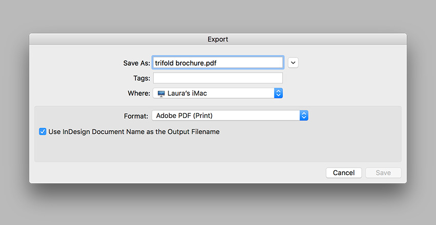
To export the file, go to File > Export. Name the file trifold brochure and choose Adobe PDF (Print) from the Format drop-down menu. Click Save.
Step 2
In the Export Adobe PDF window, set the Adobe PDF Preset to Press Quality. Under Pages, select Export As Spreads.
On the left side of the panel, select Marks and Bleeds. Check All Printer’s Marks and Use Document Bleed Settings. Click Export. You will have a ready-to-print PDF file.
Great Job! You’ve Finished This Tutorial!
In this tutorial, we learned how to make a trifold brochure template that’s ready to print. This pamphlet is easy to use and edit to any branding guidelines. Today, we’ve learned to:
Set up a ready-to-print pamphlet template in Adobe InDesign.
Design and properly set up a letter size brochure.
Create Master Pages and Layers.
Place images and use blending modes.
Use the Paragraph Styles panel to format typography.
Use vectors and format shapes.
Export a ready-to-print brochure template PDF file.
Trifold brochures can be an excellent tool for getting information to people in an easy-to-use, eye-catching way. In this tutorial, I will show you how to make a brochure template in Adobe InDesign CC. This versatile pamphlet template will allow you to change the information as you need.
A trifold brochure is a page containing three panels per side for a total of six panels inside and outside of a brochure. Two of the panels are the same width, while one panel is slightly narrower to accommodate the roll fold.
We will be creating a file with six pages and altering the Master Pages later on. This approach will allow us to easily move panels on a template when necessary. We will also be able to make a PDF with crop marks, which will indicate the position of the folds. Do make sure to indicate this to the printer to avoid any mistakes.
What You Will Need
You’ll need access to Adobe InDesign and Adobe Illustrator; if you don’t have the software, you can download a trial from the Adobe website. You’ll also need the following assets:
1. Setting Up a Trifold Brochure File in Adobe InDesign
A common trifold dimension when open flat is letter size or A4. We will be using a letter size page for this tutorial, but feel free to use an A4 page if you prefer. As trifold brochure dimensions will vary depending on your needs, I’ve created an equation chart that you can follow below:
Step 1
The trifold brochure size for this tutorial is a letter page. First, we need to divide the final width (279.4 mm) by 3 (93.13 mm). To this new width, we need to add a buffer for the fold (1 mm). The width of the two panels is 94.13 mm.
Later on, we will modify the size of the shorter panel. We need to subtract (2 mm) from the panel to accommodate the fold (91.13 mm).
In InDesign, go to File > New. Name the document trifold brochure. Set the trifold dimensions to the following:
Width to 94.13 mm
Height to 215.9 mm
Units to Millimetres
Orientation to Portrait
Uncheck Facing Pages
Pages to 6
Margins to 10 mm
Bleeds to 3 mm (although it’s best to seek your professional printer’s preference)
Click Create.
Step 2
A trifold brochure has a flap that folds in; this is a shorter panel. We will create a second Master Page with this new size.
Head over to the Pages panel. If you don’t have it active, head over to Windows > Pages. The top portion of the panel contains the Master Pages.
Right-click on A-Master > New Master. In the New Master window, make sure Based on Master is set to [Master]. Set the Width to 91.13 mm (subtract 2 mm from the 93.13 mm).Click OK.
Step 3
On the Pages panel, right-click on the B-Master we just created and select Apply Master. In the Apply Master window, under To Pages enter 1, 6 (this is to specify that we are changing Pages 1 and 6). Click OK.
In the Master Page Size Conflict window, click Use Master Page Size.
Step 4
Now that we have the page sizes set up, we can move the pages to set up the spreads. Pages 1-3 will be the outside spread, and Pages 4-6 will be the inside spreads.
On the Main Menu of the Pages panel, make sure that Allow Document Pages to Shuffle is unchecked. Drag Page 2 towards Page 1 to combine. Combine Pages 1-3 as one spread and Pages 4-6. Make sure that you have the BAA and AABMaster Pages configuration.
To exit the Master Pages mode, double-click on the regular pages thumbnail.
Step 5
For this trifold brochure template tutorial, we will work with two layers. This will make it easier to update the template when it needs to updated with new information.
Bring up the Layers panel by going to Window > Layers. Double-click on Layer 1 and rename it Images.
On the Layers panel main menu, select New Layer. Name it Copy, and click OK.
Step 6
We will be using Rulers for this tutorial, so press Command-R to bring them up.
Let’s add some Guides. Head over to Layout > Create Guides. In the Create Guides option window, set the Rows Number to 3 and the Gutter to 0. Under the Options, set the Fit Guides to: Page and click OK. Repeat this step on the second spread.
Show/Hide the guides and margins by pressing Command-;. Alternatively, use W to enter and exit Preview mode.
Step 7
Before we start with the design, let’s add some color swatches. Head over to Window > Color > Swatches to expand the Swatches panel. Choose New Color Swatch button from the main menu. Add the following two colors:
Yellow:C=0 M=25 Y=100 K=0. Click Add and OK.
Blue:C=95 M=95 Y=0 K=30
Click Add and OK after you input each of the color values.
2.How to Place Images in Adobe InDesign
Step 1
Let’s start by placing images into the document. On the Layers panel, make sure you have the Images layer selected. We will be working on Page 1-3.
On the Toolbar, select the Frame Tool (F). Using the guides we created, draw frames covering the following:
Page 1: full page
Page 2: lower 1/3 of the page
Page 3: top 2/3 of the page
I’ve changed the color for easier guidance. Make sure all the frames extend to the bleed. This will ensure there are no white edges.
Step 2
Select the full page rectangle and press Command-D to Place an image. Select the Modern architectureimage and click Open.
Select the image inside the frame. You can do this by clicking on the donut shape in the center of the frame or by selecting the Direct Selection Tool (A) from the toolbar. Head over to the Control bar, activate the Constrain Proportions for scaling button, and set the percentage to 45%.
This will be a background image. Place the image as you wish—there’s no right or wrong.
Step 3
Select the rectangle on Page 2 and press Command-D to Place an image. Select the Business people image and click Open.
Select the image and head over to the Control bar. Activate the Constrain Proportions for scaling button and set the percentage to 25%. Try to center the hands in the frame using the Direct Selection Tool (A).
Repeat this process for Page 3. Select the Two creative owners image and click Open.
Head over to the Control bar. Activate the Constrain Proportions for scaling button and set the percentage to 35%. Try to place the focused subject within the margins.
Step 4
You’ll notice that the images we placed have different tones. A great way to fix this is to add a colored effect over the top. This is also a great way to apply your brand to the brochure by choosing colors from your logo.
Using the Rectangle Tool (M), create rectangles over each image. Head over to the Swatches panel and select the purple color we added previously.
Step 5
To apply an effect, bring up the Effects panel. Go to Window > Effects.
Select the rectangle on Page 1. Since we will have text over this image, we need to select a Blending Mode that will allow the type to be legible. Select Multiply from the drop-down menu and set the Opacity to 90%.
Step 6
We need the images on Page 2 and 3 to come through more since they will be standalone images. Select both rectangles and set the Blending Mode to Color.
Step 7
Let’s add a contrasting color to some of the empty sections. This will help to reinforce the brand on the brochure template. Select the Rectangle Tool (M) and draw a rectangle covering the top portion of Page 2. Head over to the Swatches panel and select the yellow color we added.
Additionally, create a line under the main image on Page 3. Select the Line Tool (\) from the toolbar. Hold down Shift to draw a straight horizontal line across the panel.Head over to the Control bar, set the Stroke size to 7 pt, and set the Stroke color to yellow.
Step 8
Let’s add a logo to the pamphlet template. Ideally, the logo is placed on the first page and the back of the pamphlet. Press Command-D and select 01_smartnet.eps and 02_smartnet.eps. The file 01 is perfect for the front of the brochure template, and 02 is perfect to go over a colored background.
Resize both images by going to the Control bar and setting the Scaling to 10%.
Step 9
Let’s work on Pages 4-6. Select the Rectangle Tool (M) and draw a rectangle at the very top of the pages. Cover the width of the document, making sure it is extended to the bleeds. On the Control bar, set the Height to 20 mm.
Using the Add Anchor Point Tool (=), add an anchor on the first fold guide. Using the Direct Selection Tool (A), select the point and move it upwards as much as you’d like. We are adding some movement to the inside as the exterior is static.
Head over to the Swatches panel, and select the color yellow.
Step 10
Select the Rectangle Tool (M) from the toolbar.Draw a rectangle that fits Page 4-5 and a second rectangle that covers Page 6.
Select the first rectangle and set the Height to 100 mm on the Control bar. Select the second rectangle and set the Height to 120 mm.
Using the Direct Selection Tool (A), select the top inside points of the rectangles and move both downwards.
Step 11
Select the left object and press Command-D to Place an image. Select the Young people brainstorming and click Open. Select the image and head over to the Control bar. Set the Scale to 10%.
Place an image on the right-hand side object. Select the Businessman working file, and click Open. Select the image and head over to the Control bar. Set the Scale to 35%.
Let’s apply the same color effect here as the outside panel. Select both objects and press Command-C to Copy and Command-V to Paste. Using the Direct Selection Tool (A), select the image within the object and press Backspace to Delete.
Select both objects and head over to the Swatches panel. Set the color to purple. On the Effect panel, set the Blending Mode to Color.
Great job! We’ve finished working on the Images layer, and now it’s time to work on the Copy layer. Head over to the Layers panel, lock the Images layer, and select the Copy layer.
3.How to Format Type Using Paragraph Styles in Adobe InDesign
Paragraph styles allow us to add formatting attributes to be applied to large amounts of text. This is useful if you want to maintain the same type settings throughout your design. Therefore, the styles will keep your template flawless and cohesive. For this tutorial, we will create two styles: headline and body copy.
Step 1
Head over to Window > Paragraph Styles. On the Paragraph Styles panel, select the New Paragraph Style option from the main menu.
In the New Paragraph Style window option, select Basic Character Formats in the left menu. Set the Style Name to Headline. Use the following settings for Basic Paragraph Formats options:
Font Family: Sentral
Font Style: ExtraBold
Size: 20 pt
Tracking: -15
Click OK.
Let’s add a second Paragraph Style. This time, let’s name it Body Copy and use the following settings for the Basic Character Formats options:
Font Family: Sentral
Font Style: Regular
Size: 10 pt
Tracking: -5
Click OK.
Step 2
Let’s work on the first spread, Pages 1-3.
Let’s use our new Paragraph Styles. On the Toolbar, select the Text Tool (T). Create a text box on Page 1.
Add the copy you wish to add. To format the text box, select the headline using the Text Tool (T) and click on the Headline style from the Paragraph Styles panel.Select the rest of the body copy and select the Body Copy style from the Paragraph Styles panel.
Select the text box and head over to the Swatches panel. Select the [Paper] color, which will make the type legible against the background.
On Page 2, add a small tagline and contact information—this is great to have on the back of the template. Set the tagline to the Headline style. When applying a Paragraph Style to a text box, you can change the format through the Control bar. This will only change the format on the text box you are selecting and not on the style. Set the contact information to Body Copy and change the Size to 9 pt on the Control bar.
On the Swatches panel, select the color purple for both elements.
Page 3 is the front of the brochure, so add a headline here that describes the information inside. Set the format to Headline style from the Paragraph Style panel. Using the same method as before, select the first line and head over to the Control bar. Change the Family to Regular. This small detail can add something special that will set this headline apart from the rest of the content.
On the Swatches panel, select the color purple.
Step 3
Let’s work on the inside panels. On the Layers panel, select Pages 4-6.
Using the Text Tool (T), create a text box on all three pages. With the help of the Paragraph Styles, format the contents.
Let’s add some vectors on Page 5. Open the 150 Line icons1.ai file on Adobe Illustrator. Press Command-G to Ungroup the icons. Select the first three icons from the first row. Press Command-C to Copy.
Head back into Adobe InDesign and press Command-V to Paste the icons. Press Command-G to Ungroup the objects. On the Swatches panel, set the color to yellow.
Head over to the Control bar and activate the Constrain Proportions button. Set the Width to 13 mm. Move the icons to the left side within the margins of Page 5.
To make space for each icon, we can use the Text Wrap option. Go to Window > Text Wrap to open the panel. Select all three icons and select the Wrap around bounding box button. Set the Bottom Offset to 6 mm and the Right Offset to 3 mm.
Using the Swatches panel, set the sub-heading color to yellow. This will make it easier for the reader to distinguish this section from the regular copy.
Let’s work on Page 6. Use the Paragraph Styles to format the text.
A great tip when working with bullet points is to use hanging punctuations. This means that the lines after the first line are indented and aligned to the first line (vertically). Avoiding having any text under the bullet point makes for a sharper design.
To do this, we can add an Indent to Here special character by pressing Command-\ after the bullet point. To see if this is activated, head over to Type > Show Hidden Characters. The Indent to Here should be shown as a dagger.
4. How to Export a PDF File for Printing
Before exporting a file for printing, it’s useful to take a look around all the edges of the brochure. This is to make sure all the images and vectors bleeding out are touching the bleeds. Press W to go between Preview mode and Normal mode.
Remember that each fold will be represented by a crop mark. Let your professional printer know to avoid confusion. It is also helpful to ask for a printer’s proof to make sure the project is printed correctly.
Step 1
To export the file, go to File > Export. Name the file trifold brochure and choose Adobe PDF (Print) from the Format drop-down menu. Click Save.
Step 2
In the Export Adobe PDF window, set the Adobe PDF Preset to Press Quality. Under Pages, select Export As Spreads.
On the left side of the panel, select Marks and Bleeds. Check All Printer’s Marks and Use Document Bleed Settings. Click Export. You will have a ready-to-print PDF file.
Great Job! You’ve Finished This Tutorial!
In this tutorial, we learned how to make a trifold brochure template that’s ready to print. This pamphlet is easy to use and edit to any branding guidelines. Today, we’ve learned to:
Set up a ready-to-print pamphlet template in Adobe InDesign.
Design and properly set up a letter size brochure.
Create Master Pages and Layers.
Place images and use blending modes.
Use the Paragraph Styles panel to format typography.
Use vectors and format shapes.
Export a ready-to-print brochure template PDF file.
Trifold brochures can be an excellent tool for getting information to people in an easy-to-use, eye-catching way. In this tutorial, I will show you how to make a brochure template in Adobe InDesign CC. This versatile pamphlet template will allow you to change the information as you need.
A trifold brochure is a page containing three panels per side for a total of six panels inside and outside of a brochure. Two of the panels are the same width, while one panel is slightly narrower to accommodate the roll fold.
We will be creating a file with six pages and altering the Master Pages later on. This approach will allow us to easily move panels on a template when necessary. We will also be able to make a PDF with crop marks, which will indicate the position of the folds. Do make sure to indicate this to the printer to avoid any mistakes.
What You Will Need
You’ll need access to Adobe InDesign and Adobe Illustrator; if you don’t have the software, you can download a trial from the Adobe website. You’ll also need the following assets:
1. Setting Up a Trifold Brochure File in Adobe InDesign
A common trifold dimension when open flat is letter size or A4. We will be using a letter size page for this tutorial, but feel free to use an A4 page if you prefer. As trifold brochure dimensions will vary depending on your needs, I’ve created an equation chart that you can follow below:
Step 1
The trifold brochure size for this tutorial is a letter page. First, we need to divide the final width (279.4 mm) by 3 (93.13 mm). To this new width, we need to add a buffer for the fold (1 mm). The width of the two panels is 94.13 mm.
Later on, we will modify the size of the shorter panel. We need to subtract (2 mm) from the panel to accommodate the fold (91.13 mm).
In InDesign, go to File > New. Name the document trifold brochure. Set the trifold dimensions to the following:
Width to 94.13 mm
Height to 215.9 mm
Units to Millimetres
Orientation to Portrait
Uncheck Facing Pages
Pages to 6
Margins to 10 mm
Bleeds to 3 mm (although it’s best to seek your professional printer’s preference)
Click Create.
Step 2
A trifold brochure has a flap that folds in; this is a shorter panel. We will create a second Master Page with this new size.
Head over to the Pages panel. If you don’t have it active, head over to Windows > Pages. The top portion of the panel contains the Master Pages.
Right-click on A-Master > New Master. In the New Master window, make sure Based on Master is set to [Master]. Set the Width to 91.13 mm (subtract 2 mm from the 93.13 mm).Click OK.
Step 3
On the Pages panel, right-click on the B-Master we just created and select Apply Master. In the Apply Master window, under To Pages enter 1, 6 (this is to specify that we are changing Pages 1 and 6). Click OK.
In the Master Page Size Conflict window, click Use Master Page Size.
Step 4
Now that we have the page sizes set up, we can move the pages to set up the spreads. Pages 1-3 will be the outside spread, and Pages 4-6 will be the inside spreads.
On the Main Menu of the Pages panel, make sure that Allow Document Pages to Shuffle is unchecked. Drag Page 2 towards Page 1 to combine. Combine Pages 1-3 as one spread and Pages 4-6. Make sure that you have the BAA and AABMaster Pages configuration.
To exit the Master Pages mode, double-click on the regular pages thumbnail.
Step 5
For this trifold brochure template tutorial, we will work with two layers. This will make it easier to update the template when it needs to updated with new information.
Bring up the Layers panel by going to Window > Layers. Double-click on Layer 1 and rename it Images.
On the Layers panel main menu, select New Layer. Name it Copy, and click OK.
Step 6
We will be using Rulers for this tutorial, so press Command-R to bring them up.
Let’s add some Guides. Head over to Layout > Create Guides. In the Create Guides option window, set the Rows Number to 3 and the Gutter to 0. Under the Options, set the Fit Guides to: Page and click OK. Repeat this step on the second spread.
Show/Hide the guides and margins by pressing Command-;. Alternatively, use W to enter and exit Preview mode.
Step 7
Before we start with the design, let’s add some color swatches. Head over to Window > Color > Swatches to expand the Swatches panel. Choose New Color Swatch button from the main menu. Add the following two colors:
Yellow:C=0 M=25 Y=100 K=0. Click Add and OK.
Blue:C=95 M=95 Y=0 K=30
Click Add and OK after you input each of the color values.
2.How to Place Images in Adobe InDesign
Step 1
Let’s start by placing images into the document. On the Layers panel, make sure you have the Images layer selected. We will be working on Page 1-3.
On the Toolbar, select the Frame Tool (F). Using the guides we created, draw frames covering the following:
Page 1: full page
Page 2: lower 1/3 of the page
Page 3: top 2/3 of the page
I’ve changed the color for easier guidance. Make sure all the frames extend to the bleed. This will ensure there are no white edges.
Step 2
Select the full page rectangle and press Command-D to Place an image. Select the Modern architectureimage and click Open.
Select the image inside the frame. You can do this by clicking on the donut shape in the center of the frame or by selecting the Direct Selection Tool (A) from the toolbar. Head over to the Control bar, activate the Constrain Proportions for scaling button, and set the percentage to 45%.
This will be a background image. Place the image as you wish—there’s no right or wrong.
Step 3
Select the rectangle on Page 2 and press Command-D to Place an image. Select the Business people image and click Open.
Select the image and head over to the Control bar. Activate the Constrain Proportions for scaling button and set the percentage to 25%. Try to center the hands in the frame using the Direct Selection Tool (A).
Repeat this process for Page 3. Select the Two creative owners image and click Open.
Head over to the Control bar. Activate the Constrain Proportions for scaling button and set the percentage to 35%. Try to place the focused subject within the margins.
Step 4
You’ll notice that the images we placed have different tones. A great way to fix this is to add a colored effect over the top. This is also a great way to apply your brand to the brochure by choosing colors from your logo.
Using the Rectangle Tool (M), create rectangles over each image. Head over to the Swatches panel and select the purple color we added previously.
Step 5
To apply an effect, bring up the Effects panel. Go to Window > Effects.
Select the rectangle on Page 1. Since we will have text over this image, we need to select a Blending Mode that will allow the type to be legible. Select Multiply from the drop-down menu and set the Opacity to 90%.
Step 6
We need the images on Page 2 and 3 to come through more since they will be standalone images. Select both rectangles and set the Blending Mode to Color.
Step 7
Let’s add a contrasting color to some of the empty sections. This will help to reinforce the brand on the brochure template. Select the Rectangle Tool (M) and draw a rectangle covering the top portion of Page 2. Head over to the Swatches panel and select the yellow color we added.
Additionally, create a line under the main image on Page 3. Select the Line Tool (\) from the toolbar. Hold down Shift to draw a straight horizontal line across the panel.Head over to the Control bar, set the Stroke size to 7 pt, and set the Stroke color to yellow.
Step 8
Let’s add a logo to the pamphlet template. Ideally, the logo is placed on the first page and the back of the pamphlet. Press Command-D and select 01_smartnet.eps and 02_smartnet.eps. The file 01 is perfect for the front of the brochure template, and 02 is perfect to go over a colored background.
Resize both images by going to the Control bar and setting the Scaling to 10%.
Step 9
Let’s work on Pages 4-6. Select the Rectangle Tool (M) and draw a rectangle at the very top of the pages. Cover the width of the document, making sure it is extended to the bleeds. On the Control bar, set the Height to 20 mm.
Using the Add Anchor Point Tool (=), add an anchor on the first fold guide. Using the Direct Selection Tool (A), select the point and move it upwards as much as you’d like. We are adding some movement to the inside as the exterior is static.
Head over to the Swatches panel, and select the color yellow.
Step 10
Select the Rectangle Tool (M) from the toolbar.Draw a rectangle that fits Page 4-5 and a second rectangle that covers Page 6.
Select the first rectangle and set the Height to 100 mm on the Control bar. Select the second rectangle and set the Height to 120 mm.
Using the Direct Selection Tool (A), select the top inside points of the rectangles and move both downwards.
Step 11
Select the left object and press Command-D to Place an image. Select the Young people brainstorming and click Open. Select the image and head over to the Control bar. Set the Scale to 10%.
Place an image on the right-hand side object. Select the Businessman working file, and click Open. Select the image and head over to the Control bar. Set the Scale to 35%.
Let’s apply the same color effect here as the outside panel. Select both objects and press Command-C to Copy and Command-V to Paste. Using the Direct Selection Tool (A), select the image within the object and press Backspace to Delete.
Select both objects and head over to the Swatches panel. Set the color to purple. On the Effect panel, set the Blending Mode to Color.
Great job! We’ve finished working on the Images layer, and now it’s time to work on the Copy layer. Head over to the Layers panel, lock the Images layer, and select the Copy layer.
3.How to Format Type Using Paragraph Styles in Adobe InDesign
Paragraph styles allow us to add formatting attributes to be applied to large amounts of text. This is useful if you want to maintain the same type settings throughout your design. Therefore, the styles will keep your template flawless and cohesive. For this tutorial, we will create two styles: headline and body copy.
Step 1
Head over to Window > Paragraph Styles. On the Paragraph Styles panel, select the New Paragraph Style option from the main menu.
In the New Paragraph Style window option, select Basic Character Formats in the left menu. Set the Style Name to Headline. Use the following settings for Basic Paragraph Formats options:
Font Family: Sentral
Font Style: ExtraBold
Size: 20 pt
Tracking: -15
Click OK.
Let’s add a second Paragraph Style. This time, let’s name it Body Copy and use the following settings for the Basic Character Formats options:
Font Family: Sentral
Font Style: Regular
Size: 10 pt
Tracking: -5
Click OK.
Step 2
Let’s work on the first spread, Pages 1-3.
Let’s use our new Paragraph Styles. On the Toolbar, select the Text Tool (T). Create a text box on Page 1.
Add the copy you wish to add. To format the text box, select the headline using the Text Tool (T) and click on the Headline style from the Paragraph Styles panel.Select the rest of the body copy and select the Body Copy style from the Paragraph Styles panel.
Select the text box and head over to the Swatches panel. Select the [Paper] color, which will make the type legible against the background.
On Page 2, add a small tagline and contact information—this is great to have on the back of the template. Set the tagline to the Headline style. When applying a Paragraph Style to a text box, you can change the format through the Control bar. This will only change the format on the text box you are selecting and not on the style. Set the contact information to Body Copy and change the Size to 9 pt on the Control bar.
On the Swatches panel, select the color purple for both elements.
Page 3 is the front of the brochure, so add a headline here that describes the information inside. Set the format to Headline style from the Paragraph Style panel. Using the same method as before, select the first line and head over to the Control bar. Change the Family to Regular. This small detail can add something special that will set this headline apart from the rest of the content.
On the Swatches panel, select the color purple.
Step 3
Let’s work on the inside panels. On the Layers panel, select Pages 4-6.
Using the Text Tool (T), create a text box on all three pages. With the help of the Paragraph Styles, format the contents.
Let’s add some vectors on Page 5. Open the 150 Line icons1.ai file on Adobe Illustrator. Press Command-G to Ungroup the icons. Select the first three icons from the first row. Press Command-C to Copy.
Head back into Adobe InDesign and press Command-V to Paste the icons. Press Command-G to Ungroup the objects. On the Swatches panel, set the color to yellow.
Head over to the Control bar and activate the Constrain Proportions button. Set the Width to 13 mm. Move the icons to the left side within the margins of Page 5.
To make space for each icon, we can use the Text Wrap option. Go to Window > Text Wrap to open the panel. Select all three icons and select the Wrap around bounding box button. Set the Bottom Offset to 6 mm and the Right Offset to 3 mm.
Using the Swatches panel, set the sub-heading color to yellow. This will make it easier for the reader to distinguish this section from the regular copy.
Let’s work on Page 6. Use the Paragraph Styles to format the text.
A great tip when working with bullet points is to use hanging punctuations. This means that the lines after the first line are indented and aligned to the first line (vertically). Avoiding having any text under the bullet point makes for a sharper design.
To do this, we can add an Indent to Here special character by pressing Command-\ after the bullet point. To see if this is activated, head over to Type > Show Hidden Characters. The Indent to Here should be shown as a dagger.
4. How to Export a PDF File for Printing
Before exporting a file for printing, it’s useful to take a look around all the edges of the brochure. This is to make sure all the images and vectors bleeding out are touching the bleeds. Press W to go between Preview mode and Normal mode.
Remember that each fold will be represented by a crop mark. Let your professional printer know to avoid confusion. It is also helpful to ask for a printer’s proof to make sure the project is printed correctly.
Step 1
To export the file, go to File > Export. Name the file trifold brochure and choose Adobe PDF (Print) from the Format drop-down menu. Click Save.
Step 2
In the Export Adobe PDF window, set the Adobe PDF Preset to Press Quality. Under Pages, select Export As Spreads.
On the left side of the panel, select Marks and Bleeds. Check All Printer’s Marks and Use Document Bleed Settings. Click Export. You will have a ready-to-print PDF file.
Great Job! You’ve Finished This Tutorial!
In this tutorial, we learned how to make a trifold brochure template that’s ready to print. This pamphlet is easy to use and edit to any branding guidelines. Today, we’ve learned to:
Set up a ready-to-print pamphlet template in Adobe InDesign.
Design and properly set up a letter size brochure.
Create Master Pages and Layers.
Place images and use blending modes.
Use the Paragraph Styles panel to format typography.
Use vectors and format shapes.
Export a ready-to-print brochure template PDF file.
Trifold brochures can be an excellent tool for getting information to people in an easy-to-use, eye-catching way. In this tutorial, I will show you how to make a brochure template in Adobe InDesign CC. This versatile pamphlet template will allow you to change the information as you need.
A trifold brochure is a page containing three panels per side for a total of six panels inside and outside of a brochure. Two of the panels are the same width, while one panel is slightly narrower to accommodate the roll fold.
We will be creating a file with six pages and altering the Master Pages later on. This approach will allow us to easily move panels on a template when necessary. We will also be able to make a PDF with crop marks, which will indicate the position of the folds. Do make sure to indicate this to the printer to avoid any mistakes.
What You Will Need
You’ll need access to Adobe InDesign and Adobe Illustrator; if you don’t have the software, you can download a trial from the Adobe website. You’ll also need the following assets:
1. Setting Up a Trifold Brochure File in Adobe InDesign
A common trifold dimension when open flat is letter size or A4. We will be using a letter size page for this tutorial, but feel free to use an A4 page if you prefer. As trifold brochure dimensions will vary depending on your needs, I’ve created an equation chart that you can follow below:
Step 1
The trifold brochure size for this tutorial is a letter page. First, we need to divide the final width (279.4 mm) by 3 (93.13 mm). To this new width, we need to add a buffer for the fold (1 mm). The width of the two panels is 94.13 mm.
Later on, we will modify the size of the shorter panel. We need to subtract (2 mm) from the panel to accommodate the fold (91.13 mm).
In InDesign, go to File > New. Name the document trifold brochure. Set the trifold dimensions to the following:
Width to 94.13 mm
Height to 215.9 mm
Units to Millimetres
Orientation to Portrait
Uncheck Facing Pages
Pages to 6
Margins to 10 mm
Bleeds to 3 mm (although it’s best to seek your professional printer’s preference)
Click Create.
Step 2
A trifold brochure has a flap that folds in; this is a shorter panel. We will create a second Master Page with this new size.
Head over to the Pages panel. If you don’t have it active, head over to Windows > Pages. The top portion of the panel contains the Master Pages.
Right-click on A-Master > New Master. In the New Master window, make sure Based on Master is set to [Master]. Set the Width to 91.13 mm (subtract 2 mm from the 93.13 mm).Click OK.
Step 3
On the Pages panel, right-click on the B-Master we just created and select Apply Master. In the Apply Master window, under To Pages enter 1, 6 (this is to specify that we are changing Pages 1 and 6). Click OK.
In the Master Page Size Conflict window, click Use Master Page Size.
Step 4
Now that we have the page sizes set up, we can move the pages to set up the spreads. Pages 1-3 will be the outside spread, and Pages 4-6 will be the inside spreads.
On the Main Menu of the Pages panel, make sure that Allow Document Pages to Shuffle is unchecked. Drag Page 2 towards Page 1 to combine. Combine Pages 1-3 as one spread and Pages 4-6. Make sure that you have the BAA and AABMaster Pages configuration.
To exit the Master Pages mode, double-click on the regular pages thumbnail.
Step 5
For this trifold brochure template tutorial, we will work with two layers. This will make it easier to update the template when it needs to updated with new information.
Bring up the Layers panel by going to Window > Layers. Double-click on Layer 1 and rename it Images.
On the Layers panel main menu, select New Layer. Name it Copy, and click OK.
Step 6
We will be using Rulers for this tutorial, so press Command-R to bring them up.
Let’s add some Guides. Head over to Layout > Create Guides. In the Create Guides option window, set the Rows Number to 3 and the Gutter to 0. Under the Options, set the Fit Guides to: Page and click OK. Repeat this step on the second spread.
Show/Hide the guides and margins by pressing Command-;. Alternatively, use W to enter and exit Preview mode.
Step 7
Before we start with the design, let’s add some color swatches. Head over to Window > Color > Swatches to expand the Swatches panel. Choose New Color Swatch button from the main menu. Add the following two colors:
Yellow:C=0 M=25 Y=100 K=0. Click Add and OK.
Blue:C=95 M=95 Y=0 K=30
Click Add and OK after you input each of the color values.
2.How to Place Images in Adobe InDesign
Step 1
Let’s start by placing images into the document. On the Layers panel, make sure you have the Images layer selected. We will be working on Page 1-3.
On the Toolbar, select the Frame Tool (F). Using the guides we created, draw frames covering the following:
Page 1: full page
Page 2: lower 1/3 of the page
Page 3: top 2/3 of the page
I’ve changed the color for easier guidance. Make sure all the frames extend to the bleed. This will ensure there are no white edges.
Step 2
Select the full page rectangle and press Command-D to Place an image. Select the Modern architectureimage and click Open.
Select the image inside the frame. You can do this by clicking on the donut shape in the center of the frame or by selecting the Direct Selection Tool (A) from the toolbar. Head over to the Control bar, activate the Constrain Proportions for scaling button, and set the percentage to 45%.
This will be a background image. Place the image as you wish—there’s no right or wrong.
Step 3
Select the rectangle on Page 2 and press Command-D to Place an image. Select the Business people image and click Open.
Select the image and head over to the Control bar. Activate the Constrain Proportions for scaling button and set the percentage to 25%. Try to center the hands in the frame using the Direct Selection Tool (A).
Repeat this process for Page 3. Select the Two creative owners image and click Open.
Head over to the Control bar. Activate the Constrain Proportions for scaling button and set the percentage to 35%. Try to place the focused subject within the margins.
Step 4
You’ll notice that the images we placed have different tones. A great way to fix this is to add a colored effect over the top. This is also a great way to apply your brand to the brochure by choosing colors from your logo.
Using the Rectangle Tool (M), create rectangles over each image. Head over to the Swatches panel and select the purple color we added previously.
Step 5
To apply an effect, bring up the Effects panel. Go to Window > Effects.
Select the rectangle on Page 1. Since we will have text over this image, we need to select a Blending Mode that will allow the type to be legible. Select Multiply from the drop-down menu and set the Opacity to 90%.
Step 6
We need the images on Page 2 and 3 to come through more since they will be standalone images. Select both rectangles and set the Blending Mode to Color.
Step 7
Let’s add a contrasting color to some of the empty sections. This will help to reinforce the brand on the brochure template. Select the Rectangle Tool (M) and draw a rectangle covering the top portion of Page 2. Head over to the Swatches panel and select the yellow color we added.
Additionally, create a line under the main image on Page 3. Select the Line Tool (\) from the toolbar. Hold down Shift to draw a straight horizontal line across the panel.Head over to the Control bar, set the Stroke size to 7 pt, and set the Stroke color to yellow.
Step 8
Let’s add a logo to the pamphlet template. Ideally, the logo is placed on the first page and the back of the pamphlet. Press Command-D and select 01_smartnet.eps and 02_smartnet.eps. The file 01 is perfect for the front of the brochure template, and 02 is perfect to go over a colored background.
Resize both images by going to the Control bar and setting the Scaling to 10%.
Step 9
Let’s work on Pages 4-6. Select the Rectangle Tool (M) and draw a rectangle at the very top of the pages. Cover the width of the document, making sure it is extended to the bleeds. On the Control bar, set the Height to 20 mm.
Using the Add Anchor Point Tool (=), add an anchor on the first fold guide. Using the Direct Selection Tool (A), select the point and move it upwards as much as you’d like. We are adding some movement to the inside as the exterior is static.
Head over to the Swatches panel, and select the color yellow.
Step 10
Select the Rectangle Tool (M) from the toolbar.Draw a rectangle that fits Page 4-5 and a second rectangle that covers Page 6.
Select the first rectangle and set the Height to 100 mm on the Control bar. Select the second rectangle and set the Height to 120 mm.
Using the Direct Selection Tool (A), select the top inside points of the rectangles and move both downwards.
Step 11
Select the left object and press Command-D to Place an image. Select the Young people brainstorming and click Open. Select the image and head over to the Control bar. Set the Scale to 10%.
Place an image on the right-hand side object. Select the Businessman working file, and click Open. Select the image and head over to the Control bar. Set the Scale to 35%.
Let’s apply the same color effect here as the outside panel. Select both objects and press Command-C to Copy and Command-V to Paste. Using the Direct Selection Tool (A), select the image within the object and press Backspace to Delete.
Select both objects and head over to the Swatches panel. Set the color to purple. On the Effect panel, set the Blending Mode to Color.
Great job! We’ve finished working on the Images layer, and now it’s time to work on the Copy layer. Head over to the Layers panel, lock the Images layer, and select the Copy layer.
3.How to Format Type Using Paragraph Styles in Adobe InDesign
Paragraph styles allow us to add formatting attributes to be applied to large amounts of text. This is useful if you want to maintain the same type settings throughout your design. Therefore, the styles will keep your template flawless and cohesive. For this tutorial, we will create two styles: headline and body copy.
Step 1
Head over to Window > Paragraph Styles. On the Paragraph Styles panel, select the New Paragraph Style option from the main menu.
In the New Paragraph Style window option, select Basic Character Formats in the left menu. Set the Style Name to Headline. Use the following settings for Basic Paragraph Formats options:
Font Family: Sentral
Font Style: ExtraBold
Size: 20 pt
Tracking: -15
Click OK.
Let’s add a second Paragraph Style. This time, let’s name it Body Copy and use the following settings for the Basic Character Formats options:
Font Family: Sentral
Font Style: Regular
Size: 10 pt
Tracking: -5
Click OK.
Step 2
Let’s work on the first spread, Pages 1-3.
Let’s use our new Paragraph Styles. On the Toolbar, select the Text Tool (T). Create a text box on Page 1.
Add the copy you wish to add. To format the text box, select the headline using the Text Tool (T) and click on the Headline style from the Paragraph Styles panel.Select the rest of the body copy and select the Body Copy style from the Paragraph Styles panel.
Select the text box and head over to the Swatches panel. Select the [Paper] color, which will make the type legible against the background.
On Page 2, add a small tagline and contact information—this is great to have on the back of the template. Set the tagline to the Headline style. When applying a Paragraph Style to a text box, you can change the format through the Control bar. This will only change the format on the text box you are selecting and not on the style. Set the contact information to Body Copy and change the Size to 9 pt on the Control bar.
On the Swatches panel, select the color purple for both elements.
Page 3 is the front of the brochure, so add a headline here that describes the information inside. Set the format to Headline style from the Paragraph Style panel. Using the same method as before, select the first line and head over to the Control bar. Change the Family to Regular. This small detail can add something special that will set this headline apart from the rest of the content.
On the Swatches panel, select the color purple.
Step 3
Let’s work on the inside panels. On the Layers panel, select Pages 4-6.
Using the Text Tool (T), create a text box on all three pages. With the help of the Paragraph Styles, format the contents.
Let’s add some vectors on Page 5. Open the 150 Line icons1.ai file on Adobe Illustrator. Press Command-G to Ungroup the icons. Select the first three icons from the first row. Press Command-C to Copy.
Head back into Adobe InDesign and press Command-V to Paste the icons. Press Command-G to Ungroup the objects. On the Swatches panel, set the color to yellow.
Head over to the Control bar and activate the Constrain Proportions button. Set the Width to 13 mm. Move the icons to the left side within the margins of Page 5.
To make space for each icon, we can use the Text Wrap option. Go to Window > Text Wrap to open the panel. Select all three icons and select the Wrap around bounding box button. Set the Bottom Offset to 6 mm and the Right Offset to 3 mm.
Using the Swatches panel, set the sub-heading color to yellow. This will make it easier for the reader to distinguish this section from the regular copy.
Let’s work on Page 6. Use the Paragraph Styles to format the text.
A great tip when working with bullet points is to use hanging punctuations. This means that the lines after the first line are indented and aligned to the first line (vertically). Avoiding having any text under the bullet point makes for a sharper design.
To do this, we can add an Indent to Here special character by pressing Command-\ after the bullet point. To see if this is activated, head over to Type > Show Hidden Characters. The Indent to Here should be shown as a dagger.
4. How to Export a PDF File for Printing
Before exporting a file for printing, it’s useful to take a look around all the edges of the brochure. This is to make sure all the images and vectors bleeding out are touching the bleeds. Press W to go between Preview mode and Normal mode.
Remember that each fold will be represented by a crop mark. Let your professional printer know to avoid confusion. It is also helpful to ask for a printer’s proof to make sure the project is printed correctly.
Step 1
To export the file, go to File > Export. Name the file trifold brochure and choose Adobe PDF (Print) from the Format drop-down menu. Click Save.
Step 2
In the Export Adobe PDF window, set the Adobe PDF Preset to Press Quality. Under Pages, select Export As Spreads.
On the left side of the panel, select Marks and Bleeds. Check All Printer’s Marks and Use Document Bleed Settings. Click Export. You will have a ready-to-print PDF file.
Great Job! You’ve Finished This Tutorial!
In this tutorial, we learned how to make a trifold brochure template that’s ready to print. This pamphlet is easy to use and edit to any branding guidelines. Today, we’ve learned to:
Set up a ready-to-print pamphlet template in Adobe InDesign.
Design and properly set up a letter size brochure.
Create Master Pages and Layers.
Place images and use blending modes.
Use the Paragraph Styles panel to format typography.
Use vectors and format shapes.
Export a ready-to-print brochure template PDF file.
When you’re putting together a build process for a site, it’s so dang useful to look at other people’s processes. I ran across Andrew Welch’s „An Annotated webpack 4 Config for Frontend Web Development” the other day and was glad he blogged it. If I was kicking off a new site where I wanted a webpack build, then I’d almost certainly reference something like this rather than start from scratch. At the same time, it made me realize how build processes all have such different needs and how unique those needs are now from even a few years ago in the hay day of Grunt and Gulp build processes.
I was looking around for an annotated Gulp reference file and came across another one of Andrew’s articles — „A Gulp Workflow for Frontend Development Automation” — from just one year earlier! Here’s a simplified list of what he was doing with Gulp (which he explains in more detail in the post):
Compile Sass
Run Autoprefixer
Create Sourcemaps
Minify
Inject critical CSS and bits of scripts
Run Babel
Uglify
Do style injection/reloading
Run accessibility audit</li
Generate icon font
Optimize images
Speaking of Gulp and annotated build processes, I’m working on a CSS-Tricks redesign and, for various reasons, went with a Gulp build. Against my better judgment, I wrote it from scratch, and this is how far I’ve gotten. It doesn’t feel particularly robust or efficient, so rewrites and suggestions are welcome! And speaking of Gulp, here’s a recently-published boilerplate I wish I had seen before starting.
Now, a year later, here’s what the build process is being asked to do:
Run differently-configured web servers
Hot module replacement
Dynamic code splitting
Lazy loading
Make modern and legacy code bundles
Cache busting
Create service worker
Compile PostCSS
Optimize images / create .webp
Process .vue files
Run Tailwind and PurgeCSS
It’s funny how quickly things change. We’re still essentially asking for help compiling files and optimizing things, but the tools we use change, the code we write changes, the way we talk about development changes, the expectations of development changes, the best practices change… makes ya sweat. 😅
At Twitter I used the approach described here to publish the company’s SVG icon library in several different formats: optimized SVGs, plain JavaScript modules, React DOM components, and React Native components.
One thing different systems tend to share is some kind of build process to turn a folder full of SVG files into a more programmatically digestible format. For example, gulp-svg-sprite takes your folder of SVGs and creates a SVG sprite (chunk of <symbol>s) to use in that type of SVG icon system. Grunticon processes your folder of SVGs into a CSS file, and is capable of enhancing them into inline SVG. Gallagher’s script creates React components out of them, and like he said, that’s great for delivery to different targets as well as performance optimization, like code splitting.
This speaks to the versatility of SVG. It’s just markup, so it’s easy to work with.