How to Create an Action in Photoshop

Post pobrano z: How to Create an Action in Photoshop

Final product image
What You’ll Be Creating

If you know how to make Photoshop actions, you have a powerful tool in your hands. Actions let you create magical Photoshop effects with a single click, saving you a lot of time and effort. In this tutorial, I will show you how to create an action in Photoshop so that you can design your own effects for pictures.

Follow along over on our Envato Tuts+ YouTube channel:

1. How to Create an Action in Photoshop

Step 1

First, you need to have a sample image that will help you see the effects of the action. Open it in Photoshop.

open your file
I used this image.

Step 2

Open the Actions panel. You can find it under Window > Actions.

open actions panel

Step 3

To create a new action, click the white card icon on the bottom of the panel.

create new action

Step 4

Give the action a name. If you want to be able to play this action with a press of a button, you can assign a Function Key to it.

name your action

Step 5

The action is being recorded now. But don’t worry, there’s no hurry. Photoshop only records your actions, and it doesn’t care how much time passes between them.

start recording an action

Let’s show Photoshop which actions we want it to save for later. First, create a New Layer.

create new layer

You’ll notice that your action has been automatically added to the list in the Actions panel.

new action added

Step 6

Let’s fill this layer with some color. When creating an action, it’s better to avoid tools that are based on clicking on the canvas, because if you play the action on an image with a different size, it may not work properly. Always try to use something as universal and fool-proof as possible—so instead of using the Paint Bucket Tool to fill the canvas, go to Edit > Fill.

fill canvas

Step 7

Let’s do something fun with this layer. Right click it and select Blending Options. This panel is often used in actions, because it’s full of switches and sliders that you can use to heavily modify the layer, without having to point at anything on the canvas.

First, drag Fill Opacity down to zero. This will make the fill color invisible.

open blending options

Step 8

Check Gradient Overlay and click it to see its settings.

check gradient overlay

Step 9

Change the gradient to a rainbow.

add rainbow gradient

Step 10

Change the Angle of the gradient to something more interesting.

rotate gradient

Step 11

Finally, change the Blend Mode to Color.

change blend mode of gradient

This method lets you apply the colors of the gradient to the image below without modifying it.

how to make rainbow photo in photoshop

Step 12

If you like the effect, press OK and stop recording by clicking the first button in the Actions panel.

stop recording an action

Step 13

And that’s it, our action has been recorded and saved! If you want to use it, just click the play button.

play an action

You can test it on many different images. A properly created action will give you the same results regardless of the photo you use!

rainbow action examples

To give you a better idea of how Photoshop actions can be used, here are a few examples from Envato Elements.

Painting Photoshop Action

If you want to turn a photo into a painting, it can be done with a single click, too! This action uses custom brushes and patterns to create a convincing effect of an oil painting. It also organizes the layer neatly, so that you can customize the effect afterwards.

painting photoshop action
Painting Photoshop Action

Geometric Portrait Photoshop Action

This action is a good example of a selective photo effect. Before you play the action, you must show the program which area you want to be affected. This is especially useful for portraits, to create a different effect for the person and the background.

portrait photoshop action
Geometric Portrait Photoshop Action

Cartoon Photoshop Action

Photoshop actions can also be used to create a comic book effect. You don’t have to be able to draw to create something that looks like a nicely stylized drawing! Just find a good photo, select the character, and click play!

cartoon photoshop action
Cartoon Photoshop Action

Vintage Photo Effect

If you want to give your photo a vintage feel, it can be easily done with many types of actions. This set has 20 of them, and each of these actions will give your photo a unique style that brings old cameras to mind.

vintage photo effect
Vintage Photo Effect Action

Retro Poster Photoshop Action

But photo effects don’t need to be all about photos. You can create a real poster from start to finish with a carefully prepared action. This action turns a photo into a neat illustration that can be used as a retro style poster.

restro photoshop action
Retro Poster Photoshop Action

Good Job!

Now you know how to create a Photoshop action step by step. If you want to learn more about Photoshop actions and photo effects in general, you can try these tutorials as well:

how to create action in photosop

Studio Dotto’s tiny guides are a wonderful way to learn about a city

Post pobrano z: Studio Dotto’s tiny guides are a wonderful way to learn about a city

When it comes to designing touristic information, graphic designers rarely skip the obligatory photos. It makes obvious sense, but it also makes this industry’s design work less interesting.

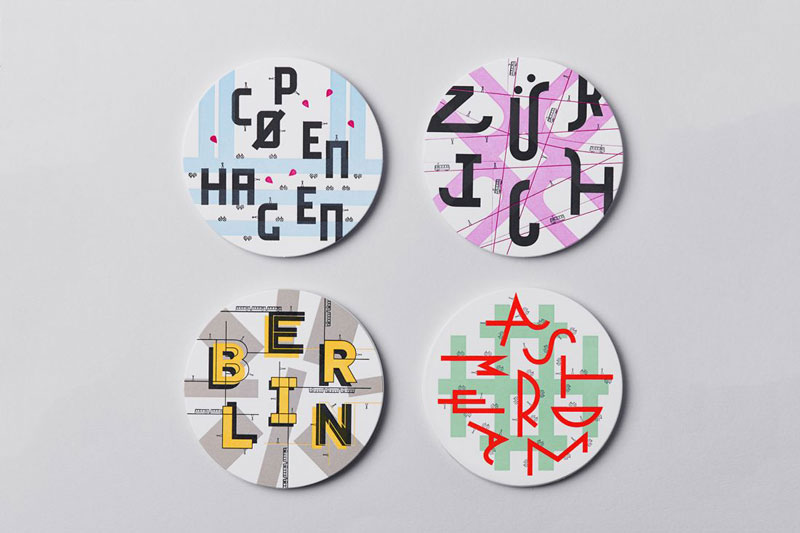
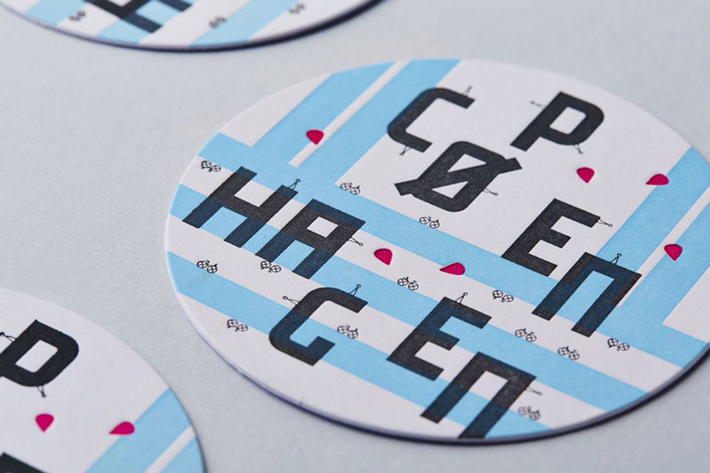
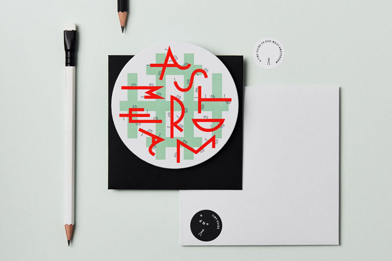
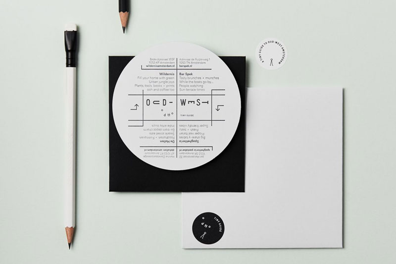
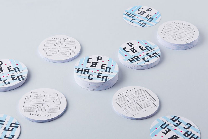
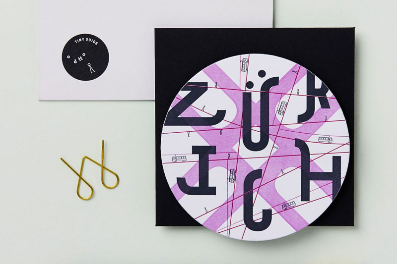
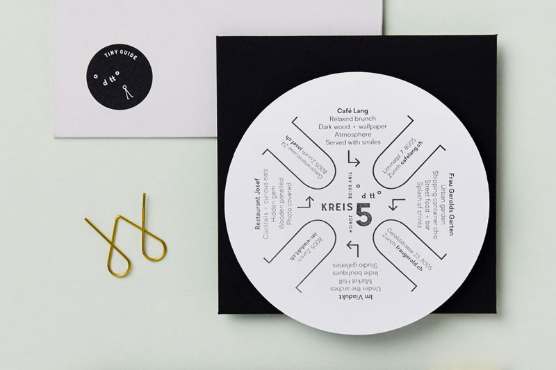
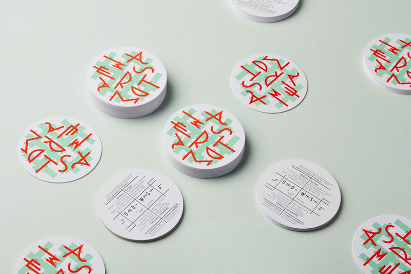
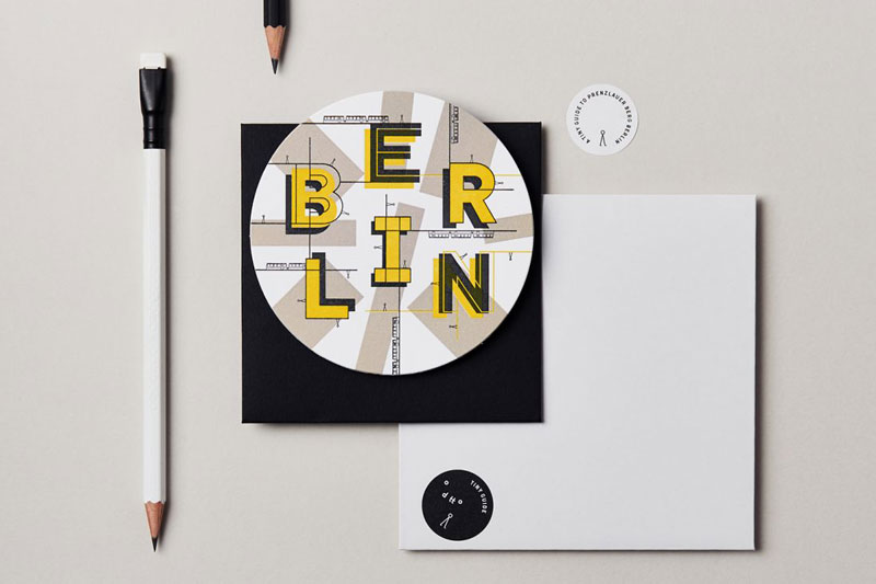
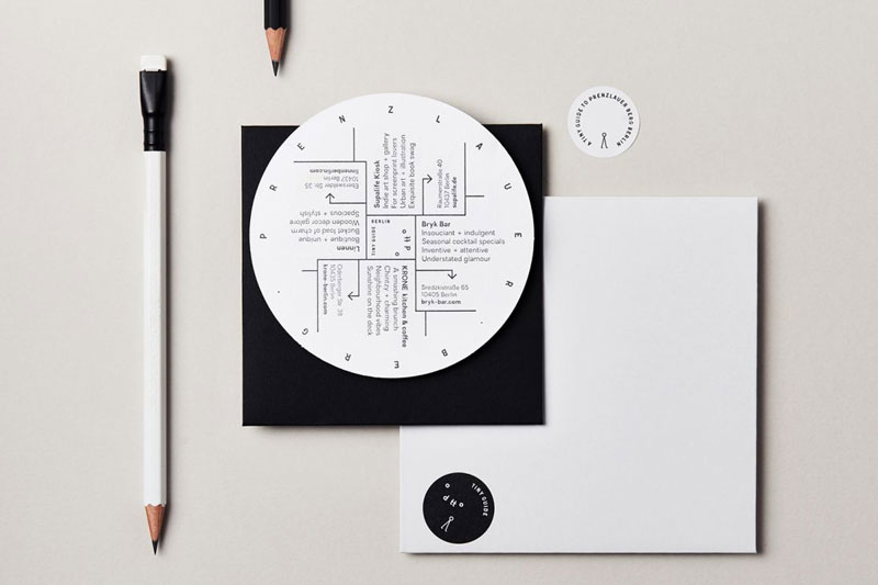
In an interesting project, the designers at Dotto, a design consultancy based in Manchester city, UK, published some small and hipsterish guides to fun places in four European cities. All this was made using an unusual format and typographic layouts.

The four places recommended are Zürich’s Industrial Kreis 5, the district of Vesterbro in Copenhagen, Oud-West in Amsterdam, and Prenzlauer Berg in Berlin. Prints of these great little guides can be purchased from Dotto’s online shop.

Studio Dotto’s tiny guides are a wonderful way to learn about a city

Post pobrano z: Studio Dotto’s tiny guides are a wonderful way to learn about a city

When it comes to designing touristic information, graphic designers rarely skip the obligatory photos. It makes obvious sense, but it also makes this industry’s design work less interesting.

In an interesting project, the designers at Dotto, a design consultancy based in Manchester city, UK, published some small and hipsterish guides to fun places in four European cities. All this was made using an unusual format and typographic layouts.

The four places recommended are Zürich’s Industrial Kreis 5, the district of Vesterbro in Copenhagen, Oud-West in Amsterdam, and Prenzlauer Berg in Berlin. Prints of these great little guides can be purchased from Dotto’s online shop.

Studio Dotto’s tiny guides are a wonderful way to learn about a city

Post pobrano z: Studio Dotto’s tiny guides are a wonderful way to learn about a city

When it comes to designing touristic information, graphic designers rarely skip the obligatory photos. It makes obvious sense, but it also makes this industry’s design work less interesting.

In an interesting project, the designers at Dotto, a design consultancy based in Manchester city, UK, published some small and hipsterish guides to fun places in four European cities. All this was made using an unusual format and typographic layouts.

The four places recommended are Zürich’s Industrial Kreis 5, the district of Vesterbro in Copenhagen, Oud-West in Amsterdam, and Prenzlauer Berg in Berlin. Prints of these great little guides can be purchased from Dotto’s online shop.

Studio Dotto’s tiny guides are a wonderful way to learn about a city

Post pobrano z: Studio Dotto’s tiny guides are a wonderful way to learn about a city

When it comes to designing touristic information, graphic designers rarely skip the obligatory photos. It makes obvious sense, but it also makes this industry’s design work less interesting.

In an interesting project, the designers at Dotto, a design consultancy based in Manchester city, UK, published some small and hipsterish guides to fun places in four European cities. All this was made using an unusual format and typographic layouts.

The four places recommended are Zürich’s Industrial Kreis 5, the district of Vesterbro in Copenhagen, Oud-West in Amsterdam, and Prenzlauer Berg in Berlin. Prints of these great little guides can be purchased from Dotto’s online shop.

Compound Components in React Using the Context API

Post pobrano z: Compound Components in React Using the Context API

Compound components in React allow you to create components with some form of connected state that’s managed amongst themselves. A good example is the Form component in Semantic UI React.

To see how we can implement compound components in a real-life React application, we’ll build a compound (multi-part) form for login and sign up. The state will be saved in the form component and we’ll put React’s Context AP to use to pass that state and the method from the Context Provider to the component that needs them. The component that needs them? It will become a subscriber to Context Consumers.

Here’s what we’re building:

See the Pen React Compound Component by Kingsley Silas Chijioke (@kinsomicrote) on CodePen.

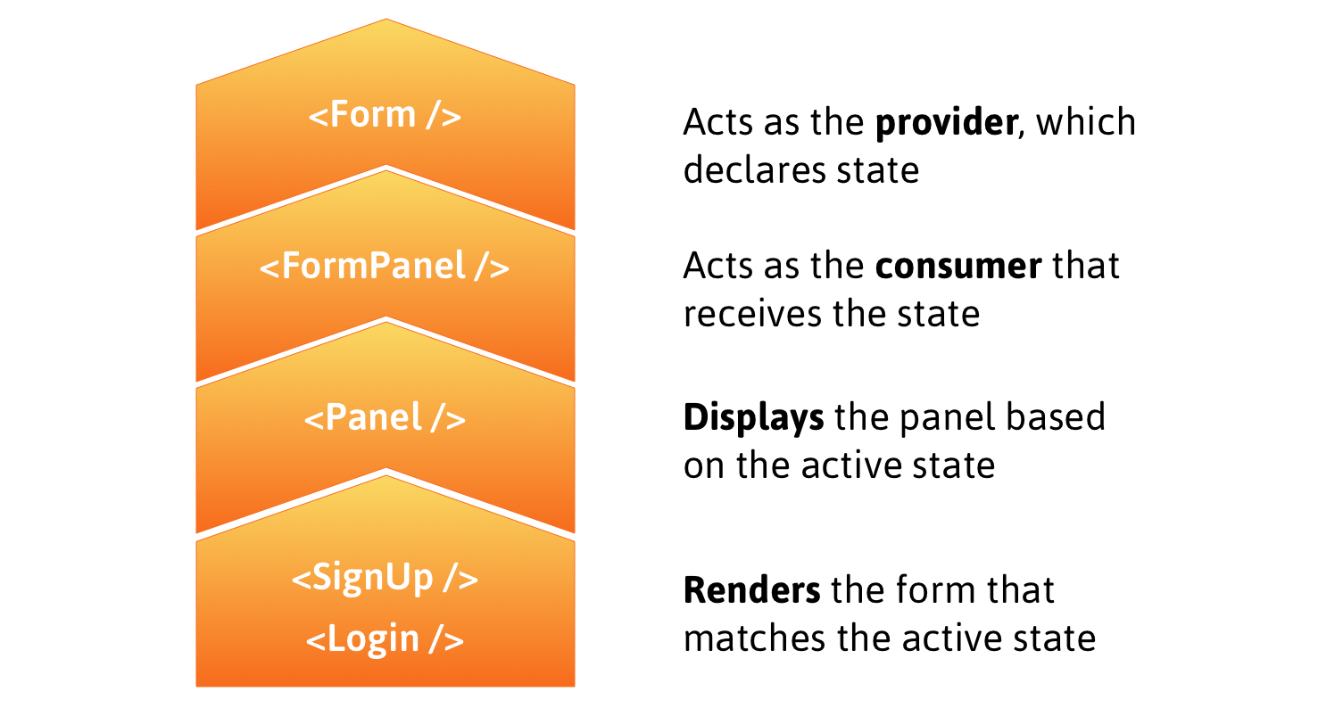
Here’s a rough outline that shows how the following steps fit together:

Form is the provider with state, Form Panel is the consumer receiving state, Panel displays the panel based on the state, and Signup and Login render the form views in the Panel.

Before treading any further, you may want to brush up on the React Context API if you haven’t already. Neal Fennimore demonstrates the concept in this post and my primer on it is worth checking out as well.

Step 1: Creating context

First, let’s initialize a new context using the React Context API.

const FormContext = React.createContext({});
const FormProvider = FormContext.Provider;
const FormConsumer = FormContext.Consumer;

The provider, FormProvider, will hold the application state, making it available to components that subscribe to FormConsumer.

Step 2: Implement provider

One panel contains the form to log in and the other contains the form to sign up. In the provider, we want to declare the state, which determines the active panel, i.e. the form currently in display. We’ll also create a method to switch from one panel to another when a heading is clicked.

class Form extends React.Component {
  state = {
    activePanel: "login"
  };

  render() {
    return (
      <React.Fragment>
        <FormProvider
          value={{
            activePanel: this.state.activePanel,
            actions: {
              handlePanelSwitch: newPanel => {
                this.setState({
                  activePanel: newPanel
                });
              }
            }
          }}
        >
          {this.props.children}
        </FormProvider>
      </React.Fragment>
    );
  }
}

By default, the login panel will be shown to the user. When the signup panel is clicked, we want to make it the active panel by setting the state of activePanel to signup using the method handlePanelSwitch().

Step 3: Implement Consumers

We’ll use FormConsumer to make context available to the components that subscribe to it. That means the FormPanel component that handles displaying panels will look like this:

const FormPanel = props => {
  return (
    <FormConsumer>
      {({ activePanel }) =>
        activePanel === props.isActive ? props.children : null
      }
    </FormConsumer>
  );
};

And the Panel component will look like this:

const Panel = props => (
  <FormConsumer>
    {({ actions }) => {
      return (
        <div onClick={() => actions.switchPanel(props.id)}>
          {props.children}
        </div>
      );
    }}
  </FormConsumer>
);

To understand what is happening, let’s understand the approach here. The login and signup panels will have unique IDs that get passed via props to the Panel component. When a panel is selected, we get the ID and and use it to set activePanel to swap forms. The FormPanel component also receives the name of the panel via the isActive prop and we then check to see if the returned value is true. If it is, then the panel is rendered!

To get the full context, here is how the App component looks:

const App = () => {
  return (
    <div className="form-wrap">
      <Form>
        <div className="tabs">
          <Panel id="login">
            <h2 className="login-tab">Login</h2>
          </Panel>
          <Panel id="signup">
            <h2 className="signup-tab">Sign Up</h2>
          </Panel>
        </div>

        <FormPanel isActive="login">
          <Login />
        </FormPanel>

        <FormPanel isActive="signup">
          <SignUp />
        </FormPanel>
      </Form>
    </div>
  );
};

You can see how the components are composed when activePanel matches isActive (which is supposed to return true). The component is rendered under those conditions.

With that done, the Login component looks like this:

const Login = () => {
  return (
    <React.Fragment>
      <div id="login-tab-content">
        <form className="login-form" action="" method="post">
          <input
            type="text"
            className="input"
            id="user_login"
            placeholder="Email or Username"
          />
          <input
            type="password"
            className="input"
            id="user_pass"
            placeholder="Password"
          />
          <input type="checkbox" className="checkbox" id="remember_me" />
          <label htmlFor="remember_me">Remember me</label>

          <input type="submit" className="button" value="Login" />
        </form>
      </div>
    </React.Fragment>
  );
};

And the SignUp component:

const SignUp = () => {
  return (
    <React.Fragment>
      <div id="signup-tab-content" className="active tabs-content">
        <form className="signup-form" action="" method="post">
          <input
            type="email"
            className="input"
            id="user_email"
            placeholder="Email"
          />
          <input
            type="text"
            className="input"
            id="user_name"
            placeholder="Username"
          />
          <input
            type="password"
            className="input"
            id="user_pass"
            placeholder="Password"
          />
          <input type="submit" className="button" value="Sign Up" />
        </form>
      </div>
    </React.Fragment>
  );
};

Get it? Got it? Good!

You can use this pattern anytime you have components in your React application that need to share implicit state. You can also build compound components using React.cloneElement().

References

The post Compound Components in React Using the Context API appeared first on CSS-Tricks.

Edge’s Announcements

Post pobrano z: Edge’s Announcements

The public-consumption blog post:

Ultimately, we want to make the web experience better for many different audiences. People using Microsoft Edge (and potentially other browsers) will experience improved compatibility with all web sites, while getting the best-possible battery life and hardware integration on all kinds of Windows devices. Web developers will have a less-fragmented web platform to test their sites against, ensuring that there are fewer problems and increased satisfaction for users of their sites; and because we’ll continue to provide the Microsoft Edge service-driven understanding of legacy IE-only sites, Corporate IT will have improved compatibility for both old and new web apps in the browser that comes with Windows.

For us devs:

  1. We are making this decision for the long term. We expect our engineers to learn and over time become experts in the Chromium project and grow into active and responsible members of the community. We are eager to increase our contributions to the Chromium project and will continue to maintain any contributions we make.

  2. When seeking improvements in the web platform, our default position will be to contribute. We are focused on delivering a world class browser with Microsoft Edge through its differentiated user experience features and connected services, but where new platform capabilities are concerned, we will seek a ‘rising tide that floats all boats’. We will get started with bug fixes and meaningful contributions in such areas as ARM64 support, accessibility, security, touch input and power enhancements on Windows.

  3. We recognize and will respect the architecture requirements and engineering approach that are intrinsic in web open-source projects and have made Chromium successful. There are many aspects that have governed Chromium OSS and other projects: multi-device support, multi-OS support, rigorous real-time engineering, etc. Although our company has historically had a focus on Windows PCs and we believe we can make contributions that improve browsers on Windows, we also understand that web OSS projects embrace a wide range of device-types, including Android, and that contributions must accommodate this device diversity. We will contribute in a way that is consistent with the architectural design that meets Chromium’s cross-platform and cross-device needs.

  4. We believe the evolution of the open web is best served though the standards communities, and the open web benefits from open debate from a wide variety of perspectives. We will remain deeply and vigorously engaged in the standards discussions in the context of the W3C, ECMA and the WHATWG where the perspectives of vendors developing competing browsers and the larger web community can be heard and considered.

Nothing terribly surprising here. We’re doing this. We think it’ll be good for everybody. I’m slightly surprised they didn’t attempt to answer everyone’s main worry: is the web actually better off with less engine diversity? We’ll never know I guess.

The post Edge’s Announcements appeared first on CSS-Tricks.

30 Unique Pen Drawings

Post pobrano z: 30 Unique Pen Drawings

We all have pens in our homes, whether a Bic or another type of Biro pen. This tool for writing is transformed into something magical in the hands of the right person. Pen art became its own genre, with many artists focusing on their own styles. A great ink drawing carries a certain evocative power that stems from the cleanliness of the finished work.

Talented artists made these amazing drawings you’re about to see. Their drawings strongly differ from one another, but these artists are not only relying on their natural talents, but they also put in hard work and practice in further developing their skills. So make sure to support them by checking them out.


Chandra Destiawan

Mark Powell

Marcel Van Den Berg

Christian Tapia Enríquez

Wilfred Wong

Piotr Napora

Piotr Banak

Molly Dekkers

Orsolya Gyorffy

Daniela S Nassetti

Sarah Lee

Georgina Cset?

Dave Barnaville

Phillip Hortis

Kyung Lee

Cassondra Collom

Vicki Thompson

Kátia Maria Fernandes

Amanda Moussa

Sam Doughty

Marta Lavagnini

Farzad Golpayegani

Sanooj KJ

yonkun noh

Zoe Amelia

Joshua Mulligan

Otto Caracol

Luis Martínez

Niki Balassa

Joanna Ciolek

Conclusion

That’s it, Thanks so much for stopping by, I hope you enjoyed this collection. I hoped any of these pen drawings inspired you to draw more often. If there are any drawings that you like the most than the others comment below and let me know. Have a great day!