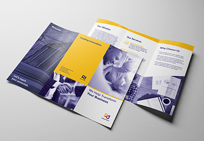
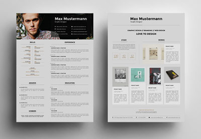
Every week, we’ll give you an overview of the best deals for designers, make sure you don’t miss any by subscribing to our deals feed. You can also follow the recently launched website Type Deals if you are looking for free fonts or font deals.
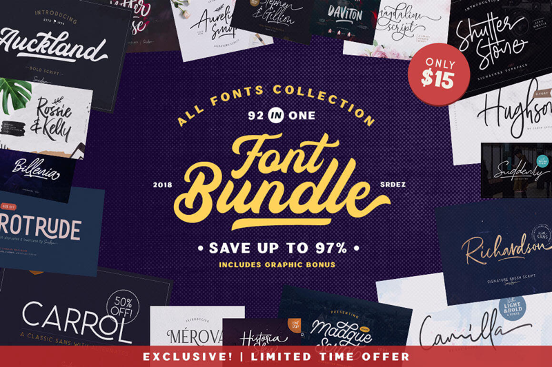
92 IN ONE, Exclusive Fonts Bundle
Save 97% on this collection of 92 premium fonts, culled from 30 unique typefaces. You’ll get a wide range of styles from script to sans to display, as well as OpenType Features and a slew of bonuses such as vector illustrations and texture images.
From January, 28 till February, 2, you’ll be able to get Woostroid WooCommerce theme at a 30% lower price. Woostroid2 is multipurpose WooCommerce theme, with JetPlugins inside. With the help of this theme you are able to build your eCommerce Store within a week Smile.
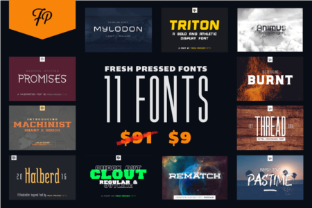
Fresh Pressed Fonts is a collection of 11 premium fonts from Ryan Welch. You’ll get everything from serifs to display fonts, along with a wide variety of styles from ultra-condensed to futuristic. With the included extended license, you can create just about anything under the sun such as T-shirts, packaging, posters, logos and more.
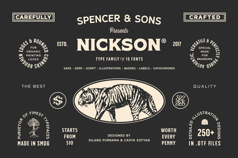
S&S Nickson Font Bundle of 15 Display, Script, Illustrations and More Typefaces
How would you like a collection of fonts that are strong enough to stand on their own, but creative enough to pair beautifully with one another? That’s exactly what you’ll get with the S&S Nickson Font Bundle Collection! Take home 15 different typefaces in a variety of creatively elegant styles including display fonts, script, illustrations, badges and more!
Standards for web design tend to change quickly — with millions of business owners lagging behind the new norms. Consumers take no time at all to get used to new features or layouts, and in a matter of months, your once-impressive and once-new website can look antiquated by comparison. If you aren’t keeping up with the latest design trends, you may fall behind the competition, resulting in damage to your reputation, less online visitor engagement and less revenue.
The problem is, it’s hard to tell whether
new design trends are gimmicks or whether they’re here to stay, and it’s not
always evident when your site has fallen behind the times. So how are you supposed
to tell when your website is obsolete?
Key
Strategies
These approaches will help you stay plugged
into the latest web design trends, and ensure you stay a step ahead of the
competition:
Work
with an online marketing agency. You
could start by working with an online marketing agency, like Simple
Machines Marketing.
Online marketing agencies are constantly paying attention to the latest design
trends and are occasionally innovating some of their own too. They’re much more
experienced and will be much more likely to detect when a new trend begins to
solidify, so they can take action when it’s time to give your site a facelift.
Read
more web design blogs. You can
also spend more time perusing web design blogs, like Smashing Magazine. These sources constantly churn out new content about the
latest in web design trends and point out the sites that are most innovative in
their respective industries. The more time you spend reading this material, the
more closely acquainted you’ll become with the web design industry, and the
easier you’ll be able to spot areas where your site is falling behind.
Visit
a diversity of websites. It’s
helpful to visit and browse many types of websites from many types of
industries and preferably, with very different layouts. This doesn’t have to be
a daily task, but do browse new sites on a regular basis, and take note of what
they’re doing differently. This can be a tremendous source of inspiration — and
a wake-up call that your site isn’t up-to-date.
Commit
to periodic redesigns. You can
also simply commit to periodically redesigning your site. For example, if you
update your site once every year, you’ll be forced to reevaluate your previous
designs and examine some of the latest trends that have taken hold in the web
design world. This can get expensive if you redesign too frequently, so try to
find an ideal pace for your industry — some businesses will be forced to adapt
faster than others.
Points
to Monitor
If you’re going to monitor your website’s
age and modernity on your own, keep an eye out for these important main points
as indicators of obsolescence:
Sheer age. All sites become outdated eventually. Trends never stay the same for too long, so if your website was designed five years ago or longer, it almost certainly will need an upgrade. The longer you’ve gone since your last site update, the more likely it is to be out of date. This is why regular updates are such an effective strategy.
Technological compatibility. You’ll also need to consider the technical compatibility of your website. For example, many websites started to become obsolete once mobile devices became more popular for browsing and companies like Google took a stand to make “mobile friendliness” and responsive web design the new norms. If your site can’t be easily or conveniently run on the latest devices, browsers, and operating systems, it needs to be revisited. Otherwise, consumers won’t be able to access it easily.
Navigation and functionality. Also, think about how your visitors are going to navigate your website and access certain functions. Some navigation elements, like hamburger-style menus, originated as novel ways to make navigation more convenient, but have become obsolete over time. Check these elements and consider how easy your site is to use by comparing it to similar sites from competitors.
Performance. Finally, consider how your site is performing. If you find it constantly crashing or if it starts taking several seconds to load a page, it’s a sign there’s something wrong with it. Web visitors aren’t going to tolerate a site that won’t load properly, or one that takes too long compared to other modern sites.
When your website starts underperforming or
seems like it could use an update, you don’t necessarily have to tear the whole
thing down and start over. Instead, a few tweaks, or a migration to a new platform
might be all you need. Pay close attention to the quality and newness of your
site at all times, and you should have no trouble keeping it up-to-date.
SVG is a great format for icons. Vector formats look crisp and razor sharp, no matter the size or device — and we get tons of design control when using them inline.
SVG also gives us another powerful feature: the ability to manipulate their properties with CSS. As a result, we can make quick and simple interactions where it used to take crafty CSS tricks or swapping out entire image files.
Those interactions include changing color on hover states. It sounds like such a straightforward thing here in 2019, but there are actually a few totally valid ways to go about it — which only demonstrates the awesome powers of SVG more.
First off, let’s begin with a little abbreviated SVG markup:
<svg class="icon">
  <path .../>
</svg>
Target the .icon class in CSS and set the SVG fill property on the hover state to swap colors.
.icon:hover {
  fill: #DA4567;
}
This is by far the easiest way to apply a colored hover state to an SVG. Three lines of code!
SVGs can also be referenced using an <img> tag or as a background image. This allows the images to be cached and we can avoid bloating your HTML with chunks of SVG code. But the downside is a big one: we no longer have the ability to manipulate those properties using CSS. Whenever I come across non-inline icons, my first port of call is to inline them, but sometimes that’s not an option.
I was recently working on a project where the social icons were a component in a pattern library that everyone was happy with. In this case, the icons were being referenced from an <img> element. I was tasked with applying colored :focus and :hover styles, without adjusting the markup.
So, how do you go about adding a colored hover effect to an icon if it’s not an inline SVG?
CSS Filters
CSS filters allow us to apply a whole bunch of cool, Photoshop-esque effects right in the browser. Filters are applied to the element after the browser renders layout and initial paint, which means they fall back gracefully. They apply to the whole element, including children. Think of a filter as a lens laid over the top of the element it’s applied to.
These are the CSS filters available to us:
brightness(<number-percentage>);
contrast(<number-percentage>);
grayscale(<number-percentage>);
invert(<number-percentage>);
opacity(<number-percentage>);
saturate(<number-percentage>);
sepia(<number-percentage>);
hue-rotate(<angle>);
blur(<length>);
drop-shadow(<length><color>);
All filters take a value which can be changed to adjust the effect. In most cases, this value can be expressed in either a decimal or percent units (e.g. brightness(0.5) or brightness(50%)).
Straight out of the box, there’s no CSS filter that allows us to add our own specific color.
We have hue-rotate(), but that only adjusts an existing color; it doesn’t add a color, which is no good since we’re starting with a monochromatic icon.
The game-changing bit about CSS filters is that we don’t have to use them in isolation. Multiple filters can be applied to an element by space-separating the filter functions like this:
If one of the filter functions doesn’t exist, or has an incorrect value, the whole list is ignored and no filter will be applied to the element.
When applying multiple filter functions to an element, their order is important and will affect the final output. Each filter function will be applied to the result of the previous operation.
So, in order to colorize our icons, we have to find the right combination.
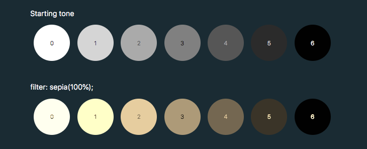
To make use of hue-rotate(), we need to start off with a colored icon. The sepia() filter is the only filter function that allows us to add a color, giving the filtered element a yellow-brown-y tinge, like an old photo.
The output color is dependent on the starting tonal value:
In order to add enough color with sepia(), we first need to use invert() to convert our icon to a medium grey:
.icon:hover {
  filter: invert(0.5)
}
We can then add the yellow/brown tone with sepia():
Filters are defined by a <filter> element, which goes inside the <defs> section of an SVG.
SVG filters can be applied to SVG content within the same SVG document. Or, the filter can be referenced and applied to HTML content elsewhere.
To apply an SVG filter to HTML content, we reference it the same way as a CSS filter: by using the url() filter function. The URL points to the ID of the SVG filter.
The SVG filter can be placed inline in the document or the filter function can reference an external SVG. I prefer the latter route as it allows me to keep my SVG filters tidied away in an assets folder.
Right now, this filter is empty and won’t do anything as we haven’t defined a filter primitive. Filter primitives are what create the filter effects. There are a number of filter primitives available to us, including:
[<feBlend>]
[<feColorMatrix>]
[<feComponentTransfer>]
[<feComposite>]
[<feConvolveMatrix>]
[<feDiffuseLighting>]
[<feDisplacementMap>]
[<feDropShadow>]
[<feFlood>]
[<feGaussianBlur>]
[<feImage>]
[<feMerge>]
[<feMorphology>]
[<feOffset>]
[<feSpecularLighting>]
[<feTile>]
[<feTurbulence>]
Just like with CSS filters, we can use them on their own or include multiple filter primitives in the <filter> tag for more interesting effects. If more than one filter primitive is used, then each operation will build on top of the previous one.
For our purposes we’re just going to use feColorMatrix, but if you want to know more about SVG filters, you can check out the specs on MDN or this (in progress, at the time of this writing) article series that Sara Soueidan has kicked off.
feColourMatrix allows us to change color values on a per-channel basis, much like channel mixing in Photoshop.
The color-interpolation-filters attribute specifies our color space. The default color space for filter effects is linearRGB, whereas in CSS, RGB colors are specified in the sRGB color space. It’s important that we set the value to sRGB in order for our colors to match up.
Let’s have a closer look at the color matrix values.
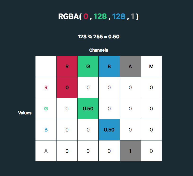
The first four columns represent the red, green and blue channels of color and the alpha (opacity) value. The rows contain the red, green, blue and alpha values in those channels.
The M column is a multiplier — we don’t need to change any of these values for our purposes here. The values for each color channel are represented as floating point numbers in the range 0 to 1.
We could write these values as a CSS RGBA color declaration like this:
The values for each color channel (red, green and blue) are stored as integers in the range 0 to 255. In computers, this is the range that one 8-bit byte can offer.
By dividing these color channel values by 255, the values can be represented as a floating point number which we can use in the feColorMatrix.
And, by doing this, we can create a color filter for any color with an RGB value!
This SVG filter will only impart color to icons with a white fill, so If we have an icon with a black fill, we can use invert() to convert it to white before applying the SVG filter.
If we just have a hex code, the math is a little trickier, although there are plenty of hex-to-RGBA converters out there. To help out, I’ve made a HEX to feColorMatrix converter.
I came across this update from Scott Kellum’s and Sal Hernandez’s project Typetura via my Medium feed this morning, and what a delight?!
(Also, wow, I really have been out of the game for a minute.)
Typetura.js is a fluid design solution, for any property, based on any input. It’s not for just typography across screen sizes. Transition between anything — width, height, scroll position, cursor position, and more.https://t.co/EoouX0PkGC
This is quite exciting! Typetura wants to deal with some of the main problems that come up when utilizing fluid type in your CSS.
> Typetura is a fluid typesetting tool. Use the slider at the top of the screen to select the breakpoint you want to style, then use the panel on the left of the screen to style your page.https://t.co/6cjgdEylwY
Typetura was created to make fluid typography mainstream. To do this there were two problems to solve. First, develop an implementation that is feature rich and easy to implement with CSS. Second, create a design tool that designers can use to illustrate how they want fluid typography to look.
I love a tool that tries to remove friction and make technologies easier to use.
To ensure the implementation was easy to use and understand, Typetura needed a simple, declarative syntax in vanilla CSS. This means no complicated math or Sass tricks.
Design software is constructed around fixed art boards, but there needs to be a way for designers to communicate how designs transition between sizes… Typetura is a tool that enables designers to work with a fluid canvas.
I came across this update from Scott Kellum’s and Sal Hernandez’s project Typetura via my Medium feed this morning, and what a delight?!
(Also, wow, I really have been out of the game for a minute.)
Typetura.js is a fluid design solution, for any property, based on any input. It’s not for just typography across screen sizes. Transition between anything — width, height, scroll position, cursor position, and more.https://t.co/EoouX0PkGC
This is quite exciting! Typetura wants to deal with some of the main problems that come up when utilizing fluid type in your CSS.
> Typetura is a fluid typesetting tool. Use the slider at the top of the screen to select the breakpoint you want to style, then use the panel on the left of the screen to style your page.https://t.co/6cjgdEylwY
Typetura was created to make fluid typography mainstream. To do this there were two problems to solve. First, develop an implementation that is feature rich and easy to implement with CSS. Second, create a design tool that designers can use to illustrate how they want fluid typography to look.
I love a tool that tries to remove friction and make technologies easier to use.
To ensure the implementation was easy to use and understand, Typetura needed a simple, declarative syntax in vanilla CSS. This means no complicated math or Sass tricks.
Design software is constructed around fixed art boards, but there needs to be a way for designers to communicate how designs transition between sizes… Typetura is a tool that enables designers to work with a fluid canvas.
Scott O’Hara digs into the <figure> and <figcaption> elements. Gotta love a good ol’ HTML deep dive.
I use these on just about every blog post here on CSS-Tricks, and as I’ve suspected, I’ve basically been doing it wrong forever. My original thinking was that a figcaption was just as good as the alt attribute. I generally use it to describe the image.
<figure>
  <img src="starry-night.jpg" alt="">
  <figcaption>The Starry Night, a famous painting by Vincent van Gogh</figcaption>
</figure>
I intentionally left off the alt text, because the figcaption is saying what I would want to say in the alt text and I thought duplicating it would be annoying (to a screen reader user) and unnecessary. Scott says that’s bad as the empty alt text makes the image entirely undiscoverable by some screen readers and the figure is describing nothing as a result.
The correct answer, I think, is to do more work:
<figure>
  <img src="starry-night.jpg" alt="An abstract painting with a weird squiggly tree thing in front of a swirling starry nighttime sky.">
  <figcaption>The Starry Night, a famous painting by Vincent van Gogh</figcaption>
</figure>
It’s a good goal, and I should do better about this. It’s just laziness that gets in the way, and laziness that makes me wish there was a pattern that allowed me to write a description once that worked for both. Maybe something like Nino Ross Rodriguez just shared today where artificial intelligence can take some of the lift. But that’s kinda not the point here. The point is that you can’t write it once because <figcaption> and alt do different things.
Web developers and content editors alike often forget or ignore one of the most important parts of making a website accessible and SEO performant: image alt text. You know, that seemingly small image attribute that describes an image:
<img src="/cute/sloth/image.jpg" alt="A brown baby sloth staring straight into the camera with a tongue sticking out." >
📷 Credit: Huffington Post
If you regularly publish content on the web, then you know it can be tedious trying to come up with descriptive text. Sure, 5-10 images is doable. But what if we are talking about hundreds or thousands of images? Do you have the resources for that?
Let’s look at some possibilities for automatically generating alt text for images with the use of computer vision and image recognition services from the likes Google, IBM, and Microsoft. They have the resources!
Reminder: What is alt text good for?
Often overlooked during web development and content entry, the alt attribute is a small bit of HTML code that describes an image that appears on a page. It’s so inconspicuous that it may not appear to have any impact on the average user, but it has very important uses indeed:
Web Accessibility for Screen Readers: Imagine a page with lots of images and not a single one contains alt text. A user surfing in using a screen reader would only hear the word “image” blurted out and that’s not very helpful. Great, there’s an image, but what is it? Including alt enables screen readers to help the visually impaired “see” what’s there and have a better understanding of the content of the page. They say a picture is worth a thousand words — that’s a thousand words of context a user could be missing.
Display text if an image does not load: The World Wide Web seems infallible and, like New York City, that it never sleeps, but flaky and faulty connections are a real thing and, if that happens, well, images tend not to load properly and “break.” Alt text is a safeguard in that it displays on the page in place of where the “broken” image is, providing users with content as a fallback.
SEO performance: Alt text on images contributes to SEO performance as well. Though it doesn’t exactly help a site or page skyrocket to the top of the search results, it is one factor to keep in mind for SEO performance.
Knowing how important these things are, hopefully you’ll be able to include proper alt text during development and content entry. But are your archives in good shape? Trying to come up with a detailed description for a large backlog of images can be a daunting task, especially if you’re working on tight deadlines or have to squeeze it in between other projects.
What if there was a way to apply alt text as an image is uploaded? And! What if there was a way to check the page for missing alt tags and automagically fill them in for us?
There are available solutions!
Computer vision (or image recognition) has actually been offered for quite some time now. Companies like Google, IBM and Microsoft have their own APIs publicly available so that developers can tap into those capabilities and use them to identify images as well as the content in them.
There are developers who have already utilized these services and created their own plugins to generate alt text. Take Sarah Drasner’s generator, for example, which demonstrates how Azure’s Computer Vision API can be used to create alt text for any image via upload or URL. Pretty awesome!
There’s also Automatic Alternative Text by Jacob Peattie, which is a WordPress plugin that uses the same Computer Vision API. It’s basically an addition to the workflow that allows the user to upload an image and generated alt text automatically.
Tools like these generally help speed-up the process of content management, editing and maintenance. Even the effort of thinking of a descriptive text has been minimized and passed to the machine!
Getting Your Hands Dirty With AI
I have managed to have played around with a few AI services and am confident in saying that Microsoft Azure’s Computer Vision produces the best results. The services offered by Google and IBM certainly have their perks and can still identify images and proper results, but Microsoft’s is so good and so accurate that it’s not worth settling for something else, at least in my opinion.
Creating your own image recognition plugin is pretty straightforward. First, head down to Microsoft Azure Computer Vision. You’ll need to login or create an account in order to grab an API key for the plugin.
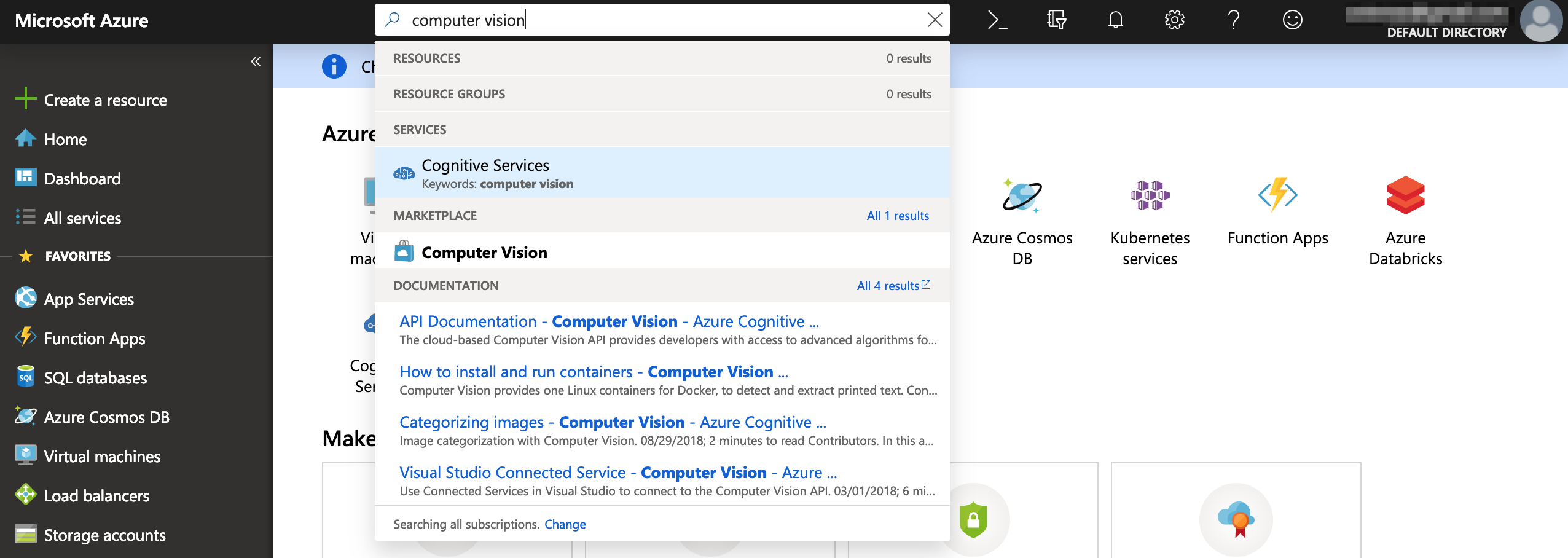
Once you’re on the dashboard, search and select Computer Vision and fill in the necessary details.
Starting out
Wait for the platform to finish spinning up an instance of your computer vision. The API keys for development will be available once it’s done.
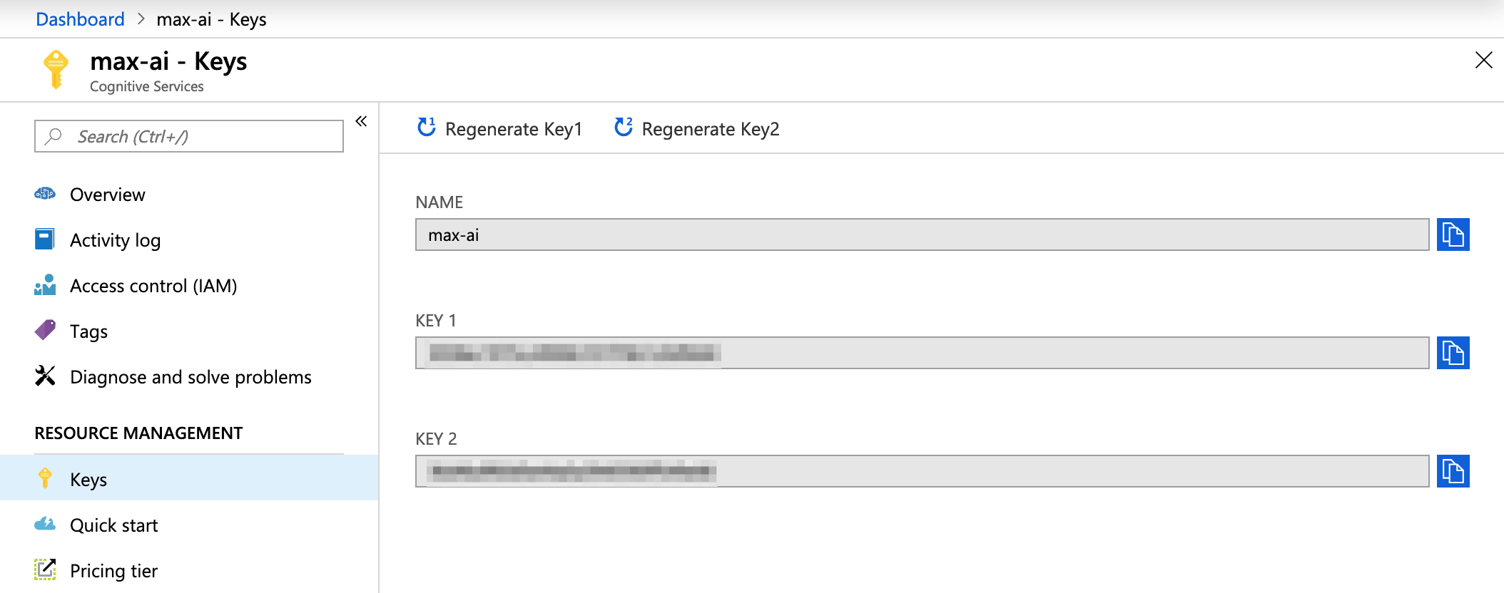
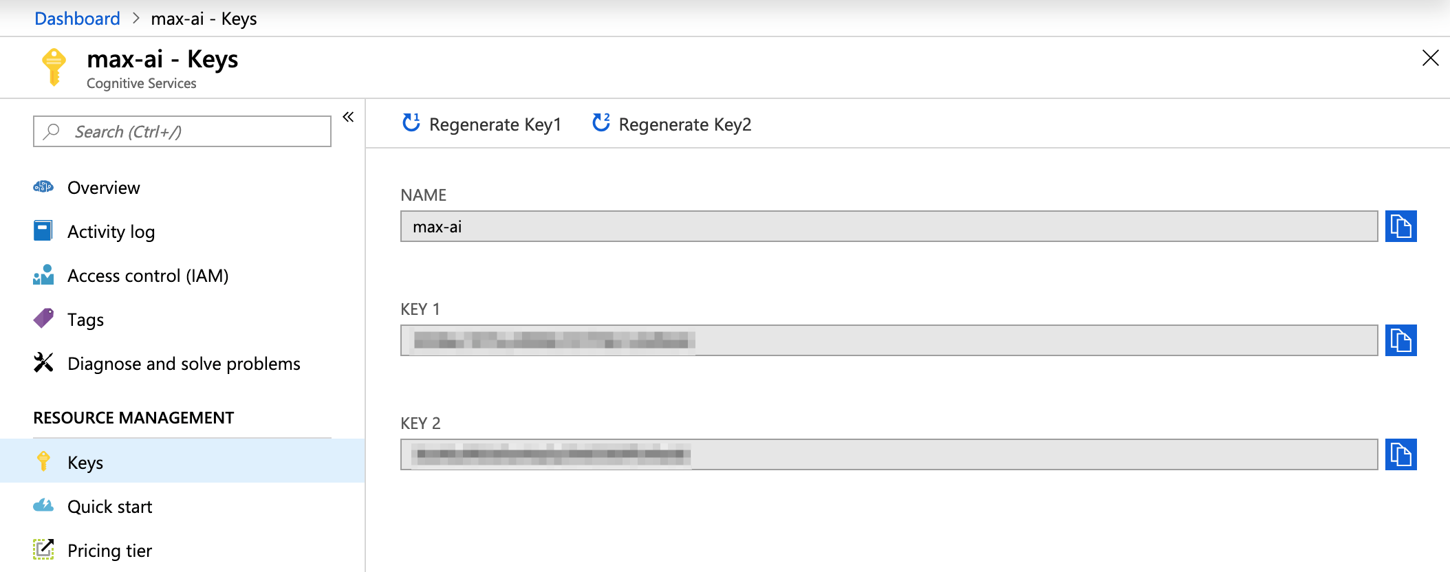
Keys: Also known as the Subscription Key in the official documentation
Let the interesting and tricky parts begin! I will be using vanilla JavaScript for the sake of demonstration. For other languages, you can check out the documentation. Below is a straight-up copy and paste of the code and you can use to replace the placeholders.
var request = new XMLHttpRequest();
request.open('POST', 'https://[LOCATION]/vision/v1.0/describe?maxCandidates=1&language=en', true);
request.setRequestHeader('Content-Type', 'application/json');
request.setRequestHeader('Ocp-Apim-Subscription-Key', '[SUBSCRIPTION_KEY]');
request.send(JSON.stringify({ "url": "[IMAGE_URL]" }));
request.onload = function () {
var resp = request.responseText;
if (request.status >= 200 && request.status < 400) {
// Success!
console.log('Success!');
} else {
// We reached our target server, but it returned an error
console.error('Error!');
}
console.log(JSON.parse(resp));
};
request.onerror = function (e) {
console.log(e);
};
Alright, let’s run through some key terminology of the AI service.
Location: This is the subscription location of the service that was selected prior to getting the subscription keys. If you can’t remember the location for some reason, you can go to the Overview screen and find it under Endpoint.
Overview > Endpoint : To get the location value
Subscription Key: This is the key that unlocks the service for our plugin use and can be obtained under Keys. There’s two of them, but it doesn’t really matter which one is used.
Image URL: This is the path for the image that’s getting the alt text. Take note that the images that are sent to the API must meet specific requirements:
File type must be JPEG, PNG, GIF, BMP
File size must be less than 4MB
Dimensions should be greater than 50px by 50px
Easy peasy
Thanks to big companies opening their services and API to developers, it’s now relatively easy for anyone to utilize computer vision. As a simple demonstration, I uploaded the image below to Microsoft Azure’s Computer Vision API.
From there, you could pick out the alt text that could be potentially used for an image. How you build upon this capability is your business:
You could create a CMS plugin and add it to the content workflow, where the alt text is generated when an image is uploaded and saved in the CMS.
You could write a JavaScript plugin that adds alt text on-the-fly, after an image has been loaded with notably missing alt text.
You could author a browser extension that adds alt text to images on any website when it finds images with it missing.
You could write code that scours your existing database or repo of content for any missing alt text and updates them or opens pull requests for suggested changes.
Take note that these services are not 100% accurate. They do sometimes return a low confidence rating and a description that is not at all aligned with the subject matter. But, these platforms are constantly learning and improving. After all, Rome wasn’t built in a day.
In this quick tutorial, I’ll show you how to change page size in Adobe InDesign, so you can create custom page sizes for your projects.
Whether you are working on an Adobe InDesign template or your own design, knowing how to change page size in InDesign is crucial. Many editorial designers use these tricks when designing magazines that contain pull-out folds. While there are a few ways of changing page sizes, you need to know which applies to what situation.
But what other Adobe InDesign templates can you resize? If you are working with an InDesign brochure template—especially trifold or gatefold brochures—this tutorial is essential. You’ve found an InDesign newsletter template style you like, but the size is not what you are looking for? This tutorial is the answer for that too! InDesign book templates and book jackets, you say? We’ve got you covered.
In this tutorial, we will take a look at three different ways of resizing a page. You can resize the whole document, multiple selected pages, or only one page—it really depends on the project you are working on. In the last example, we’ll create a gatefold brochure to show you we can use different page sizes as spreads. So let’s get on to the assets you’ll need in the section below.
You’ll need access to Adobe InDesign; if you don’t have the software, you can download a trial from the Adobe website.
Also, download the Adobe InDesign template Exercise File. The font I am using is Helvetica, but feel free to replace it. The Exercise File contains six pages. Pages 1-2 will be used for Steps 1 and 2, while pages 3-6 will be used for Step 3. Ready to dive in?
1. How to Change Page Size in InDesign With the Document Setup Option
If you’re planning on resizing all the pages on your document, use the Document Setup option. This option gives you the chance to resize all the elements on a page. It’s useful for InDesign newsletter templates or multi-page documents.
Step 1
Open the Exercise File in InDesign. Let’s work on pages 1-2. Head over to File > Document Setup.
Step 2
If you are using the latest version of Adobe InDesign CC, you will notice that this window is the older version of the New Document set up in InDesign. Here you have various options you can change, starting with page numbers, sizes, margins, bleed, and slug.
To change the page size, check the Preview box on the bottom left. Change the Width to 8 in and the Height to 6 in. You will notice the pages in the entire document expand, while the elements are in the original size. If you’d like to proceed, click OK.
Step 3
If you’d like the elements on the page to expand with the page, click on Adjust Layout. A new Adjust Layout option window will open. Set the Width to 8 in and the Height to 6 in.
In this option window, you can also find options to auto-adjust margins to the page size or to leave it to maintain the original settings. You can change the bleed—this setting won’t expand like the elements.
A very useful option is the Adjust Font Size setting. You can allow the font to resize along with the page or keep it the same size. In the example below, I’ll choose not to adjust the font size. You will notice that the pages have expanded, but the font is the original size.
Under the Options setting, you can also find the Adjust Locked Content option, which will allow any locked elements to adjust to the page.
Step 4
In the example below, I’ve checked the Adjust Font Size option. You can see that the text has expanded proportionally with the page. Within this option, you can set limits on the size. If you’re making a document smaller and you’d like to keep the font at a legible size, for example, you’d set a minimum size.
2. How to Change Page Size in InDesign in the Pages Panel
Use the Change Page Size option on the Pages panel if you are planning on changing a single page on the document and don’t want the elements to resize.
Step 1
Open the Pages panel by going to Window > Pages.
Step 2
On the Pages panel, click on the Edit Page Size button, and select Custom.
Step 3
In the Custom Page Size option window, you will be able to find previous sizes you’ve used that you can select from. You can also create a new size by adding a Name and changing the Width and Height.
Let’s create a new option, and set the Name to Project 1. Set the Width to 8 in and the Height to 6 in. Click on Add. Select the new setting from the options below and click OK.
Step 4
In the image below, you can see that page 1 is bigger than page 2. This will be reflected in the layout window but not in the Pages panel. This approach won’t allow you to resize the elements on the page, only the size of a single or multiple pages of your choice.
3. How to Change Page Size in InDesign With the Page Tool
Use the Change Page Size option if you’re planning on changing a single page or multiple pages in the document and don’t want the elements to resize. This option is great if you want to create a gatefold, trifold brochure, magazine fold-outs, or InDesign book templates that include a spine. It’s also useful if you are working with an InDesign brochure template and want to adjust the sizes.
Step 1
On the Tools panel, select the Page Tool (Shift-P).
Step 2
Head over to the Control bar to make changes. Before we resize, let’s take a look at the options.
On the far left side, you will find the Reference Point buttons, the X and Y page location, the Width and Height settings, and the Orientation.
In the second compartment, you will find the Liquid Page Rule options. These pages give you the flexibility to design multiple page sizes, orientations, or aspect ratios. This is great if you are working on a publication and, let’s say, you’d like to create a web version to be viewed on a horizontal screen.
In the last compartment, you’ll find a checkbox for Objects Move with Page, which will readjust the elements on the page. You will also find Show Master Page Overlay to show the Master Page outline.
Step 3
With the Page Tool (Shift-P), select Exercise Gatefold 1. Select the top-right corner reference point. Make sure Liquid Page Rule is set to Off. Set the Width to 3 in. You’ll see the page change sizes.
Step 4
With the Page Tool (Shift-P), select Exercise Gatefold 3 on the layout. This time, select the top-left corner reference point. Set the Liquid Page Rule to Scale so we can see the difference. Set the Width to 3 in. And now you’ve got a gatefold brochure.
From here, you can adjust the elements on the layout as you wish.
Great Job! You’ve Finished This Tutorial!
In this tutorial, we learned how to change page size in InDesign. While not many would think it’s necessary, this is a great tool to have in your back pocket when it comes to designing brochures, book jackets, and magazines. InDesign templates come in specific sizes, so this is a great tutorial you can use to change sizes. Got questions? Let us know in the comments below!
In this quick tutorial, I’ll show you how to change page size in Adobe InDesign, so you can create custom page sizes for your projects.
Whether you are working on an Adobe InDesign template or your own design, knowing how to change page size in InDesign is crucial. Many editorial designers use these tricks when designing magazines that contain pull-out folds. While there are a few ways of changing page sizes, you need to know which applies to what situation.
But what other Adobe InDesign templates can you resize? If you are working with an InDesign brochure template—especially trifold or gatefold brochures—this tutorial is essential. You’ve found an InDesign newsletter template style you like, but the size is not what you are looking for? This tutorial is the answer for that too! InDesign book templates and book jackets, you say? We’ve got you covered.
In this tutorial, we will take a look at three different ways of resizing a page. You can resize the whole document, multiple selected pages, or only one page—it really depends on the project you are working on. In the last example, we’ll create a gatefold brochure to show you we can use different page sizes as spreads. So let’s get on to the assets you’ll need in the section below.
You’ll need access to Adobe InDesign; if you don’t have the software, you can download a trial from the Adobe website.
Also, download the Adobe InDesign template Exercise File. The font I am using is Helvetica, but feel free to replace it. The Exercise File contains six pages. Pages 1-2 will be used for Steps 1 and 2, while pages 3-6 will be used for Step 3. Ready to dive in?
1. How to Change Page Size in InDesign With the Document Setup Option
If you’re planning on resizing all the pages on your document, use the Document Setup option. This option gives you the chance to resize all the elements on a page. It’s useful for InDesign newsletter templates or multi-page documents.
Step 1
Open the Exercise File in InDesign. Let’s work on pages 1-2. Head over to File > Document Setup.
Step 2
If you are using the latest version of Adobe InDesign CC, you will notice that this window is the older version of the New Document set up in InDesign. Here you have various options you can change, starting with page numbers, sizes, margins, bleed, and slug.
To change the page size, check the Preview box on the bottom left. Change the Width to 8 in and the Height to 6 in. You will notice the pages in the entire document expand, while the elements are in the original size. If you’d like to proceed, click OK.
Step 3
If you’d like the elements on the page to expand with the page, click on Adjust Layout. A new Adjust Layout option window will open. Set the Width to 8 in and the Height to 6 in.
In this option window, you can also find options to auto-adjust margins to the page size or to leave it to maintain the original settings. You can change the bleed—this setting won’t expand like the elements.
A very useful option is the Adjust Font Size setting. You can allow the font to resize along with the page or keep it the same size. In the example below, I’ll choose not to adjust the font size. You will notice that the pages have expanded, but the font is the original size.
Under the Options setting, you can also find the Adjust Locked Content option, which will allow any locked elements to adjust to the page.
Step 4
In the example below, I’ve checked the Adjust Font Size option. You can see that the text has expanded proportionally with the page. Within this option, you can set limits on the size. If you’re making a document smaller and you’d like to keep the font at a legible size, for example, you’d set a minimum size.
2. How to Change Page Size in InDesign in the Pages Panel
Use the Change Page Size option on the Pages panel if you are planning on changing a single page on the document and don’t want the elements to resize.
Step 1
Open the Pages panel by going to Window > Pages.
Step 2
On the Pages panel, click on the Edit Page Size button, and select Custom.
Step 3
In the Custom Page Size option window, you will be able to find previous sizes you’ve used that you can select from. You can also create a new size by adding a Name and changing the Width and Height.
Let’s create a new option, and set the Name to Project 1. Set the Width to 8 in and the Height to 6 in. Click on Add. Select the new setting from the options below and click OK.
Step 4
In the image below, you can see that page 1 is bigger than page 2. This will be reflected in the layout window but not in the Pages panel. This approach won’t allow you to resize the elements on the page, only the size of a single or multiple pages of your choice.
3. How to Change Page Size in InDesign With the Page Tool
Use the Change Page Size option if you’re planning on changing a single page or multiple pages in the document and don’t want the elements to resize. This option is great if you want to create a gatefold, trifold brochure, magazine fold-outs, or InDesign book templates that include a spine. It’s also useful if you are working with an InDesign brochure template and want to adjust the sizes.
Step 1
On the Tools panel, select the Page Tool (Shift-P).
Step 2
Head over to the Control bar to make changes. Before we resize, let’s take a look at the options.
On the far left side, you will find the Reference Point buttons, the X and Y page location, the Width and Height settings, and the Orientation.
In the second compartment, you will find the Liquid Page Rule options. These pages give you the flexibility to design multiple page sizes, orientations, or aspect ratios. This is great if you are working on a publication and, let’s say, you’d like to create a web version to be viewed on a horizontal screen.
In the last compartment, you’ll find a checkbox for Objects Move with Page, which will readjust the elements on the page. You will also find Show Master Page Overlay to show the Master Page outline.
Step 3
With the Page Tool (Shift-P), select Exercise Gatefold 1. Select the top-right corner reference point. Make sure Liquid Page Rule is set to Off. Set the Width to 3 in. You’ll see the page change sizes.
Step 4
With the Page Tool (Shift-P), select Exercise Gatefold 3 on the layout. This time, select the top-left corner reference point. Set the Liquid Page Rule to Scale so we can see the difference. Set the Width to 3 in. And now you’ve got a gatefold brochure.
From here, you can adjust the elements on the layout as you wish.
Great Job! You’ve Finished This Tutorial!
In this tutorial, we learned how to change page size in InDesign. While not many would think it’s necessary, this is a great tool to have in your back pocket when it comes to designing brochures, book jackets, and magazines. InDesign templates come in specific sizes, so this is a great tutorial you can use to change sizes. Got questions? Let us know in the comments below!
In this quick tutorial, I’ll show you how to change page size in Adobe InDesign, so you can create custom page sizes for your projects.
Whether you are working on an Adobe InDesign template or your own design, knowing how to change page size in InDesign is crucial. Many editorial designers use these tricks when designing magazines that contain pull-out folds. While there are a few ways of changing page sizes, you need to know which applies to what situation.
But what other Adobe InDesign templates can you resize? If you are working with an InDesign brochure template—especially trifold or gatefold brochures—this tutorial is essential. You’ve found an InDesign newsletter template style you like, but the size is not what you are looking for? This tutorial is the answer for that too! InDesign book templates and book jackets, you say? We’ve got you covered.
In this tutorial, we will take a look at three different ways of resizing a page. You can resize the whole document, multiple selected pages, or only one page—it really depends on the project you are working on. In the last example, we’ll create a gatefold brochure to show you we can use different page sizes as spreads. So let’s get on to the assets you’ll need in the section below.
You’ll need access to Adobe InDesign; if you don’t have the software, you can download a trial from the Adobe website.
Also, download the Adobe InDesign template Exercise File. The font I am using is Helvetica, but feel free to replace it. The Exercise File contains six pages. Pages 1-2 will be used for Steps 1 and 2, while pages 3-6 will be used for Step 3. Ready to dive in?
1. How to Change Page Size in InDesign With the Document Setup Option
If you’re planning on resizing all the pages on your document, use the Document Setup option. This option gives you the chance to resize all the elements on a page. It’s useful for InDesign newsletter templates or multi-page documents.
Step 1
Open the Exercise File in InDesign. Let’s work on pages 1-2. Head over to File > Document Setup.
Step 2
If you are using the latest version of Adobe InDesign CC, you will notice that this window is the older version of the New Document set up in InDesign. Here you have various options you can change, starting with page numbers, sizes, margins, bleed, and slug.
To change the page size, check the Preview box on the bottom left. Change the Width to 8 in and the Height to 6 in. You will notice the pages in the entire document expand, while the elements are in the original size. If you’d like to proceed, click OK.
Step 3
If you’d like the elements on the page to expand with the page, click on Adjust Layout. A new Adjust Layout option window will open. Set the Width to 8 in and the Height to 6 in.
In this option window, you can also find options to auto-adjust margins to the page size or to leave it to maintain the original settings. You can change the bleed—this setting won’t expand like the elements.
A very useful option is the Adjust Font Size setting. You can allow the font to resize along with the page or keep it the same size. In the example below, I’ll choose not to adjust the font size. You will notice that the pages have expanded, but the font is the original size.
Under the Options setting, you can also find the Adjust Locked Content option, which will allow any locked elements to adjust to the page.
Step 4
In the example below, I’ve checked the Adjust Font Size option. You can see that the text has expanded proportionally with the page. Within this option, you can set limits on the size. If you’re making a document smaller and you’d like to keep the font at a legible size, for example, you’d set a minimum size.
2. How to Change Page Size in InDesign in the Pages Panel
Use the Change Page Size option on the Pages panel if you are planning on changing a single page on the document and don’t want the elements to resize.
Step 1
Open the Pages panel by going to Window > Pages.
Step 2
On the Pages panel, click on the Edit Page Size button, and select Custom.
Step 3
In the Custom Page Size option window, you will be able to find previous sizes you’ve used that you can select from. You can also create a new size by adding a Name and changing the Width and Height.
Let’s create a new option, and set the Name to Project 1. Set the Width to 8 in and the Height to 6 in. Click on Add. Select the new setting from the options below and click OK.
Step 4
In the image below, you can see that page 1 is bigger than page 2. This will be reflected in the layout window but not in the Pages panel. This approach won’t allow you to resize the elements on the page, only the size of a single or multiple pages of your choice.
3. How to Change Page Size in InDesign With the Page Tool
Use the Change Page Size option if you’re planning on changing a single page or multiple pages in the document and don’t want the elements to resize. This option is great if you want to create a gatefold, trifold brochure, magazine fold-outs, or InDesign book templates that include a spine. It’s also useful if you are working with an InDesign brochure template and want to adjust the sizes.
Step 1
On the Tools panel, select the Page Tool (Shift-P).
Step 2
Head over to the Control bar to make changes. Before we resize, let’s take a look at the options.
On the far left side, you will find the Reference Point buttons, the X and Y page location, the Width and Height settings, and the Orientation.
In the second compartment, you will find the Liquid Page Rule options. These pages give you the flexibility to design multiple page sizes, orientations, or aspect ratios. This is great if you are working on a publication and, let’s say, you’d like to create a web version to be viewed on a horizontal screen.
In the last compartment, you’ll find a checkbox for Objects Move with Page, which will readjust the elements on the page. You will also find Show Master Page Overlay to show the Master Page outline.
Step 3
With the Page Tool (Shift-P), select Exercise Gatefold 1. Select the top-right corner reference point. Make sure Liquid Page Rule is set to Off. Set the Width to 3 in. You’ll see the page change sizes.
Step 4
With the Page Tool (Shift-P), select Exercise Gatefold 3 on the layout. This time, select the top-left corner reference point. Set the Liquid Page Rule to Scale so we can see the difference. Set the Width to 3 in. And now you’ve got a gatefold brochure.
From here, you can adjust the elements on the layout as you wish.
Great Job! You’ve Finished This Tutorial!
In this tutorial, we learned how to change page size in InDesign. While not many would think it’s necessary, this is a great tool to have in your back pocket when it comes to designing brochures, book jackets, and magazines. InDesign templates come in specific sizes, so this is a great tutorial you can use to change sizes. Got questions? Let us know in the comments below!