This year’s Oscar ceremony is just around the corner, so why not get in the mood by taking our new course on cinematic text animation?
What You’ll Learn
This is a course for artists and designers who are interested in motion graphics. In this course, Jonathan Lam will show you how to create a modern, atmospheric text animation in Adobe After Effects.
Among other things, you’ll learn how to:
animate text
add lighting and shadow effects
create animated light streaks and lens flares
animate particles and atmospheric smoke
You’ll be able to use the skills you learn to create animated text and titles for your movie trailers, video effects, and animated sequences.
Here’s a free lesson from this course, as a preview of what you can expect:
How to Animate Text
In this video, you’ll learn how to animate text in Adobe After Effects. You’ll add the cinematic effects later, but this video will show you how to create a simple text animation to work with.
Take the Course
You can take our new course straight away with a subscription to Envato Elements. For a single low monthly fee, you get access not only to this course, but also to our growing library of over 1,000 video courses and industry-leading eBooks on Envato Tuts+.
Plus you get unlimited downloads from the huge Envato Elements library of 870,000+ creative assets. Create with unique fonts, photos, graphics and templates, and deliver better projects faster.
In this tutorial, you will learn how to make an event flyer design in Microsoft Word. I will explain everything in so much detail that everyone can create it, even those who have just opened Word for the first time.
First, we need to create the right
size paper to work with. Go to Page Layout > Size > More Paper Sizes
and set the Width to 8.5″ and Height to 11″.
Then, go to Page Layout > Margins > Custom Margins and set the Top, Left, Bottom, and Right margins to 0„.
2. How to Create the Background
Step 1
In this section, we are going to create the background. Go to Insert > Picture and choose the photo from the link.
Step 2
Now go to Format > Size and set the Height of the picture to 11″. Then, go to Format > Text Wrapping
> Behind Text.
Step 3
Go to Format > Align > Align Center and then Format > Align >
Align Middle to align the picture both horizontally and vertically.
Step 4
Now go
to Insert > Shapes > Rectangle and click and drag to draw a
rectangle.
Step 5
Go to Format > Size,
uncheck the Lock aspect ratio option, and set the Height to 11″
and Width to 8.5″. Then, go to Format > Align > Align Center and then Format > Align >
Align Middle to align the shape both horizontally and vertically.
After that, go
to Format > Shape Styles,and for the Fill set the Color to No Color, and for the Line, set the Color to White, Weight to 35 pt, and Dashed to Solid.
3. How to Create the Header Area
Step 1
In this section, we are going to create the header area. Go
to Insert > Shapes > Rectangle and click and drag to draw a
rectangle.
Step 2
Go to Format > Shape Fill >
More Fill Colors > Custom and set the Red to 247, Green
to 150, and Blue to 70, and go to Format > Shape
Outline > No Outline to remove the shape outline.
Then, go to Format > Size, uncheck
the Lock aspect ratio option, and set the Height to 0.8″
and Width to 8.5″. After that, go to Format > Position > More Layout Options and set the Horizontal Alignment to Centered and Vertical Absolute Position to 1.08″ below the page to align and position the shape both horizontally and vertically.
Step 3
Now go to Format > Send to Back > Send Backward to move the shape behind the border. Then, go to Insert > Text Box
> Draw Text Box, click and drag to draw a text box anywhere inside the shape, and type the text that you want.
Step 4
Now go to Format > Shape Fill >
No Fill, and Format > Shape Outline > No Outline to remove
both the shape fill and the outline.
Then, go to Format > Position >
More Layout Options and set the Horizontal Alignment to Centered and Vertical Absolute Position to 1.08″ below the page to align
and position the text box both horizontally and vertically. After
that, go to Format > Size > Text Box and set the Left, Right,
Top and Bottom internal margins to 0″ and the Vertical Alignment to Center.
Step 5
Now press Control-A on your
keyboard to select the text, go to Home > Font, and set the Font
to Roboto, Size to 30, and Font Color to White, and check the All Caps option.
Then, go to Home
> Font > Character Spacing and set the Spacing to Expanded By30 pt. After that, go to Home > Paragraph and set
the Alignment to Centered, After spacing to 2pt, and Line spacing to Single.
4. How to Create the Content Area
Step 1
In this section, we’re going to create the content area. Go
to Insert > Shapes > Rectangle and click and drag to draw a
rectangle.
Step 2
Go to Format > Shape Fill >
More Fill Colors > Custom and set the Red to 51, Green
to 51,Blue to 51, and Transparency to 50%,andgo to Format > Shape
Outline > No Outline to remove the shape outline.
Then, go to Format > Size, uncheck
the Lock aspect ratio option, and set the Height to 2.95″
and Width to 8.5″. After that, go to Format > Position > More Layout Options and set the Horizontal Alignment to Centered and Vertical Absolute Position to 2.93″ below the page to align and position the shape both horizontally and vertically.
Step 3
Now go to Format > Send to Back > Send Backward twice to move the shape behind the border. Then, go to Insert > Text Box
> Draw Text Box, click and drag to draw a text box anywhere inside the shape, and type the text that you want.
Step 4
Now go to Format > Shape Fill >
No Fill, and Format > Shape Outline > No Outline to remove
both the shape fill and the outline.
Then, go to Format > Position >
More Layout Options and set the Horizontal Alignment to Centered and Vertical Absolute Position to 2.93″ below the page to align
and position the text box both horizontally and vertically.
After
that, go to Format > Size > Text Box and set the Left, Right and Bottom internal margins to 0″, Top to 0.15″, and Vertical Alignment to Center.
Step 5
Now press Control-A on your
keyboard to select the text, go to Home > Font, and set the Font
to Roboto Black, Size to 100, and Font color to White, and check the All Caps option.
Then, go to Home
> Font > Character Spacing and set the Spacing to Expanded By10 pt. After that, go to Home > Paragraph and set
the Alignment to Centered, Before spacing to 16 pt, After spacing to 0pt, and Line spacing to Exactly70 pt.
Step 6
Go
to Insert > Shapes > Rectangle and click and drag to draw a
rectangle.
Step 7
Go to Format > Shape Fill >
More Fill Colors > Custom and set the Red to 247, Green
to 150, andBlue to 70, andgo to Format > Shape
Outline > No Outline to remove the shape outline.
Then, go to Format > Size, uncheck
the Lock aspect ratio option, and set the Height to 1.34″
and Width to 8.5″. After that, go to Format > Position > More Layout Options and set the Horizontal Alignment to Centered and Vertical Absolute Position to 2.93″ below the page to align and position the shape both horizontally and vertically.
Step 8
Now go to Format > Send to Back > Send Backward three times to move the shape behind the border. Then, go to Insert > Text Box
> Draw Text Box, click and drag to draw a text box anywhere inside the shape, and type the text that you want.
Step 9
Now go to Format > Shape Fill >
No Fill and Format > Shape Outline > No Outline to remove
both the shape fill and the outline.
Then, go to Format > Position >
More Layout Options and set the Horizontal Alignment to Centered and Vertical Absolute Position to 5.88″ below the page to align
and position the text box both horizontally and vertically.
After
that, go to Format > Size > Text Box and set the Left, Right,
Top and Bottom internal margins to 0″.
Step 10
Now press Control-A on your
keyboard to select the text, go to Home > Font, and set the Font
to Roboto Black, Font Style to Bold, and Size to 30. Set the Font color to White and check the All Caps option.
Then, go to Home
> Font > Character Spacing and set the Spacing to Expanded By3 pt. After that, go to Home > Paragraph and set
the Alignment to Centeredand Before spacing to 15pt.
Step 11
Go to Insert > Text Box
> Draw Text Box, click and drag to draw a text box anywhere inside the shape, and type the text that you want.
Step 12
Now go to Format > Shape Fill >
No Fill, and Format > Shape Outline > No Outline to remove
both the shape fill and the outline.
Then, go to Format > Position >
More Layout Options and set the Horizontal Alignment to Centered and Vertical Absolute Position to 6.5″ below the page to align
and position the text box both horizontally and vertically.
After
that, go to Format > Size > Text Box and set the Left, Right,
Top and Bottom internal margins to 0″.
Step 13
Now press Control-A on your
keyboard to select the text, go to Home > Font, and set the Font
to Roboto Light, Size to 20, and Font color to White, and check the All Caps option.
Then, go to Home
> Font > Character Spacing and set the Spacing to Expanded By5 pt. After that, go to Home > Paragraph and set
the Alignment to Centeredand Before spacing to 5pt.
5. How to Create the Footer Area
Step 1
In this section, we’re going to create the footer area. Go to Insert > Text Box
> Draw Text Box, click and drag to draw a text box anywhere in the bottom-left corner of the design, and type the text that you want.
Step 2
Now go to Format > Shape Fill >
No Fill and Format > Shape Outline > No Outline to remove
both the shape fill and the outline.
Then, go to Format > Position >
More Layout Options and set the Horizontal Absolute Position to 0.67″ to the right of the page and Vertical Absolute Position to 9.8″ below the page to align
and position the text box both horizontally and vertically.
After
that, go to Format > Size > Text Box and set the Left, Right,
Top and Bottom internal margins to 0″.
Step 3
Now press Control-A on your
keyboard to select the text, go to Home > Font, and set the Font
to Roboto Light, Size to 20, and Font color to White, and check the All Caps option. Then, go to Home > Paragraph and set
the Before spacing to 17 pt.
Step 4
Select the text box, and press Control-C
on your keyboard to copy it, select the background image, and press Control-V to
paste it.
Then, change the text to text that you want, go to Home >
Paragraph, and set the Alignment to Right. After that, go to
Format > Position > More Layout Options and set the Horizontal Absolute Position to 6.19″ to the right of the page and Vertical Absolute Position to 9.8″ below the page to align and position the text box both horizontally and
vertically.
You Made It!
Congratulations, you have succeeded! You have now learned how to make a flyer design in Word
which would work as a base for any future event flyer templates you may
require. Here is our final flyer design result:
In this tutorial, you will learn how to make an event flyer design in Microsoft Word. I will explain everything in so much detail that everyone can create it, even those who have just opened Word for the first time.
First, we need to create the right
size paper to work with. Go to Page Layout > Size > More Paper Sizes
and set the Width to 8.5″ and Height to 11″.
Then, go to Page Layout > Margins > Custom Margins and set the Top, Left, Bottom, and Right margins to 0„.
2. How to Create the Background
Step 1
In this section, we are going to create the background. Go to Insert > Picture and choose the photo from the link.
Step 2
Now go to Format > Size and set the Height of the picture to 11″. Then, go to Format > Text Wrapping
> Behind Text.
Step 3
Go to Format > Align > Align Center and then Format > Align >
Align Middle to align the picture both horizontally and vertically.
Step 4
Now go
to Insert > Shapes > Rectangle and click and drag to draw a
rectangle.
Step 5
Go to Format > Size,
uncheck the Lock aspect ratio option, and set the Height to 11″
and Width to 8.5″. Then, go to Format > Align > Align Center and then Format > Align >
Align Middle to align the shape both horizontally and vertically.
After that, go
to Format > Shape Styles,and for the Fill set the Color to No Color, and for the Line, set the Color to White, Weight to 35 pt, and Dashed to Solid.
3. How to Create the Header Area
Step 1
In this section, we are going to create the header area. Go
to Insert > Shapes > Rectangle and click and drag to draw a
rectangle.
Step 2
Go to Format > Shape Fill >
More Fill Colors > Custom and set the Red to 247, Green
to 150, and Blue to 70, and go to Format > Shape
Outline > No Outline to remove the shape outline.
Then, go to Format > Size, uncheck
the Lock aspect ratio option, and set the Height to 0.8″
and Width to 8.5″. After that, go to Format > Position > More Layout Options and set the Horizontal Alignment to Centered and Vertical Absolute Position to 1.08″ below the page to align and position the shape both horizontally and vertically.
Step 3
Now go to Format > Send to Back > Send Backward to move the shape behind the border. Then, go to Insert > Text Box
> Draw Text Box, click and drag to draw a text box anywhere inside the shape, and type the text that you want.
Step 4
Now go to Format > Shape Fill >
No Fill, and Format > Shape Outline > No Outline to remove
both the shape fill and the outline.
Then, go to Format > Position >
More Layout Options and set the Horizontal Alignment to Centered and Vertical Absolute Position to 1.08″ below the page to align
and position the text box both horizontally and vertically. After
that, go to Format > Size > Text Box and set the Left, Right,
Top and Bottom internal margins to 0″ and the Vertical Alignment to Center.
Step 5
Now press Control-A on your
keyboard to select the text, go to Home > Font, and set the Font
to Roboto, Size to 30, and Font Color to White, and check the All Caps option.
Then, go to Home
> Font > Character Spacing and set the Spacing to Expanded By30 pt. After that, go to Home > Paragraph and set
the Alignment to Centered, After spacing to 2pt, and Line spacing to Single.
4. How to Create the Content Area
Step 1
In this section, we’re going to create the content area. Go
to Insert > Shapes > Rectangle and click and drag to draw a
rectangle.
Step 2
Go to Format > Shape Fill >
More Fill Colors > Custom and set the Red to 51, Green
to 51,Blue to 51, and Transparency to 50%,andgo to Format > Shape
Outline > No Outline to remove the shape outline.
Then, go to Format > Size, uncheck
the Lock aspect ratio option, and set the Height to 2.95″
and Width to 8.5″. After that, go to Format > Position > More Layout Options and set the Horizontal Alignment to Centered and Vertical Absolute Position to 2.93″ below the page to align and position the shape both horizontally and vertically.
Step 3
Now go to Format > Send to Back > Send Backward twice to move the shape behind the border. Then, go to Insert > Text Box
> Draw Text Box, click and drag to draw a text box anywhere inside the shape, and type the text that you want.
Step 4
Now go to Format > Shape Fill >
No Fill, and Format > Shape Outline > No Outline to remove
both the shape fill and the outline.
Then, go to Format > Position >
More Layout Options and set the Horizontal Alignment to Centered and Vertical Absolute Position to 2.93″ below the page to align
and position the text box both horizontally and vertically.
After
that, go to Format > Size > Text Box and set the Left, Right and Bottom internal margins to 0″, Top to 0.15″, and Vertical Alignment to Center.
Step 5
Now press Control-A on your
keyboard to select the text, go to Home > Font, and set the Font
to Roboto Black, Size to 100, and Font color to White, and check the All Caps option.
Then, go to Home
> Font > Character Spacing and set the Spacing to Expanded By10 pt. After that, go to Home > Paragraph and set
the Alignment to Centered, Before spacing to 16 pt, After spacing to 0pt, and Line spacing to Exactly70 pt.
Step 6
Go
to Insert > Shapes > Rectangle and click and drag to draw a
rectangle.
Step 7
Go to Format > Shape Fill >
More Fill Colors > Custom and set the Red to 247, Green
to 150, andBlue to 70, andgo to Format > Shape
Outline > No Outline to remove the shape outline.
Then, go to Format > Size, uncheck
the Lock aspect ratio option, and set the Height to 1.34″
and Width to 8.5″. After that, go to Format > Position > More Layout Options and set the Horizontal Alignment to Centered and Vertical Absolute Position to 2.93″ below the page to align and position the shape both horizontally and vertically.
Step 8
Now go to Format > Send to Back > Send Backward three times to move the shape behind the border. Then, go to Insert > Text Box
> Draw Text Box, click and drag to draw a text box anywhere inside the shape, and type the text that you want.
Step 9
Now go to Format > Shape Fill >
No Fill and Format > Shape Outline > No Outline to remove
both the shape fill and the outline.
Then, go to Format > Position >
More Layout Options and set the Horizontal Alignment to Centered and Vertical Absolute Position to 5.88″ below the page to align
and position the text box both horizontally and vertically.
After
that, go to Format > Size > Text Box and set the Left, Right,
Top and Bottom internal margins to 0″.
Step 10
Now press Control-A on your
keyboard to select the text, go to Home > Font, and set the Font
to Roboto Black, Font Style to Bold, and Size to 30. Set the Font color to White and check the All Caps option.
Then, go to Home
> Font > Character Spacing and set the Spacing to Expanded By3 pt. After that, go to Home > Paragraph and set
the Alignment to Centeredand Before spacing to 15pt.
Step 11
Go to Insert > Text Box
> Draw Text Box, click and drag to draw a text box anywhere inside the shape, and type the text that you want.
Step 12
Now go to Format > Shape Fill >
No Fill, and Format > Shape Outline > No Outline to remove
both the shape fill and the outline.
Then, go to Format > Position >
More Layout Options and set the Horizontal Alignment to Centered and Vertical Absolute Position to 6.5″ below the page to align
and position the text box both horizontally and vertically.
After
that, go to Format > Size > Text Box and set the Left, Right,
Top and Bottom internal margins to 0″.
Step 13
Now press Control-A on your
keyboard to select the text, go to Home > Font, and set the Font
to Roboto Light, Size to 20, and Font color to White, and check the All Caps option.
Then, go to Home
> Font > Character Spacing and set the Spacing to Expanded By5 pt. After that, go to Home > Paragraph and set
the Alignment to Centeredand Before spacing to 5pt.
5. How to Create the Footer Area
Step 1
In this section, we’re going to create the footer area. Go to Insert > Text Box
> Draw Text Box, click and drag to draw a text box anywhere in the bottom-left corner of the design, and type the text that you want.
Step 2
Now go to Format > Shape Fill >
No Fill and Format > Shape Outline > No Outline to remove
both the shape fill and the outline.
Then, go to Format > Position >
More Layout Options and set the Horizontal Absolute Position to 0.67″ to the right of the page and Vertical Absolute Position to 9.8″ below the page to align
and position the text box both horizontally and vertically.
After
that, go to Format > Size > Text Box and set the Left, Right,
Top and Bottom internal margins to 0″.
Step 3
Now press Control-A on your
keyboard to select the text, go to Home > Font, and set the Font
to Roboto Light, Size to 20, and Font color to White, and check the All Caps option. Then, go to Home > Paragraph and set
the Before spacing to 17 pt.
Step 4
Select the text box, and press Control-C
on your keyboard to copy it, select the background image, and press Control-V to
paste it.
Then, change the text to text that you want, go to Home >
Paragraph, and set the Alignment to Right. After that, go to
Format > Position > More Layout Options and set the Horizontal Absolute Position to 6.19″ to the right of the page and Vertical Absolute Position to 9.8″ below the page to align and position the text box both horizontally and
vertically.
You Made It!
Congratulations, you have succeeded! You have now learned how to make a flyer design in Word
which would work as a base for any future event flyer templates you may
require. Here is our final flyer design result:
In this tutorial, you will learn how to make an event flyer design in Microsoft Word. I will explain everything in so much detail that everyone can create it, even those who have just opened Word for the first time.
First, we need to create the right
size paper to work with. Go to Page Layout > Size > More Paper Sizes
and set the Width to 8.5″ and Height to 11″.
Then, go to Page Layout > Margins > Custom Margins and set the Top, Left, Bottom, and Right margins to 0„.
2. How to Create the Background
Step 1
In this section, we are going to create the background. Go to Insert > Picture and choose the photo from the link.
Step 2
Now go to Format > Size and set the Height of the picture to 11″. Then, go to Format > Text Wrapping
> Behind Text.
Step 3
Go to Format > Align > Align Center and then Format > Align >
Align Middle to align the picture both horizontally and vertically.
Step 4
Now go
to Insert > Shapes > Rectangle and click and drag to draw a
rectangle.
Step 5
Go to Format > Size,
uncheck the Lock aspect ratio option, and set the Height to 11″
and Width to 8.5″. Then, go to Format > Align > Align Center and then Format > Align >
Align Middle to align the shape both horizontally and vertically.
After that, go
to Format > Shape Styles,and for the Fill set the Color to No Color, and for the Line, set the Color to White, Weight to 35 pt, and Dashed to Solid.
3. How to Create the Header Area
Step 1
In this section, we are going to create the header area. Go
to Insert > Shapes > Rectangle and click and drag to draw a
rectangle.
Step 2
Go to Format > Shape Fill >
More Fill Colors > Custom and set the Red to 247, Green
to 150, and Blue to 70, and go to Format > Shape
Outline > No Outline to remove the shape outline.
Then, go to Format > Size, uncheck
the Lock aspect ratio option, and set the Height to 0.8″
and Width to 8.5″. After that, go to Format > Position > More Layout Options and set the Horizontal Alignment to Centered and Vertical Absolute Position to 1.08″ below the page to align and position the shape both horizontally and vertically.
Step 3
Now go to Format > Send to Back > Send Backward to move the shape behind the border. Then, go to Insert > Text Box
> Draw Text Box, click and drag to draw a text box anywhere inside the shape, and type the text that you want.
Step 4
Now go to Format > Shape Fill >
No Fill, and Format > Shape Outline > No Outline to remove
both the shape fill and the outline.
Then, go to Format > Position >
More Layout Options and set the Horizontal Alignment to Centered and Vertical Absolute Position to 1.08″ below the page to align
and position the text box both horizontally and vertically. After
that, go to Format > Size > Text Box and set the Left, Right,
Top and Bottom internal margins to 0″ and the Vertical Alignment to Center.
Step 5
Now press Control-A on your
keyboard to select the text, go to Home > Font, and set the Font
to Roboto, Size to 30, and Font Color to White, and check the All Caps option.
Then, go to Home
> Font > Character Spacing and set the Spacing to Expanded By30 pt. After that, go to Home > Paragraph and set
the Alignment to Centered, After spacing to 2pt, and Line spacing to Single.
4. How to Create the Content Area
Step 1
In this section, we’re going to create the content area. Go
to Insert > Shapes > Rectangle and click and drag to draw a
rectangle.
Step 2
Go to Format > Shape Fill >
More Fill Colors > Custom and set the Red to 51, Green
to 51,Blue to 51, and Transparency to 50%,andgo to Format > Shape
Outline > No Outline to remove the shape outline.
Then, go to Format > Size, uncheck
the Lock aspect ratio option, and set the Height to 2.95″
and Width to 8.5″. After that, go to Format > Position > More Layout Options and set the Horizontal Alignment to Centered and Vertical Absolute Position to 2.93″ below the page to align and position the shape both horizontally and vertically.
Step 3
Now go to Format > Send to Back > Send Backward twice to move the shape behind the border. Then, go to Insert > Text Box
> Draw Text Box, click and drag to draw a text box anywhere inside the shape, and type the text that you want.
Step 4
Now go to Format > Shape Fill >
No Fill, and Format > Shape Outline > No Outline to remove
both the shape fill and the outline.
Then, go to Format > Position >
More Layout Options and set the Horizontal Alignment to Centered and Vertical Absolute Position to 2.93″ below the page to align
and position the text box both horizontally and vertically.
After
that, go to Format > Size > Text Box and set the Left, Right and Bottom internal margins to 0″, Top to 0.15″, and Vertical Alignment to Center.
Step 5
Now press Control-A on your
keyboard to select the text, go to Home > Font, and set the Font
to Roboto Black, Size to 100, and Font color to White, and check the All Caps option.
Then, go to Home
> Font > Character Spacing and set the Spacing to Expanded By10 pt. After that, go to Home > Paragraph and set
the Alignment to Centered, Before spacing to 16 pt, After spacing to 0pt, and Line spacing to Exactly70 pt.
Step 6
Go
to Insert > Shapes > Rectangle and click and drag to draw a
rectangle.
Step 7
Go to Format > Shape Fill >
More Fill Colors > Custom and set the Red to 247, Green
to 150, andBlue to 70, andgo to Format > Shape
Outline > No Outline to remove the shape outline.
Then, go to Format > Size, uncheck
the Lock aspect ratio option, and set the Height to 1.34″
and Width to 8.5″. After that, go to Format > Position > More Layout Options and set the Horizontal Alignment to Centered and Vertical Absolute Position to 2.93″ below the page to align and position the shape both horizontally and vertically.
Step 8
Now go to Format > Send to Back > Send Backward three times to move the shape behind the border. Then, go to Insert > Text Box
> Draw Text Box, click and drag to draw a text box anywhere inside the shape, and type the text that you want.
Step 9
Now go to Format > Shape Fill >
No Fill and Format > Shape Outline > No Outline to remove
both the shape fill and the outline.
Then, go to Format > Position >
More Layout Options and set the Horizontal Alignment to Centered and Vertical Absolute Position to 5.88″ below the page to align
and position the text box both horizontally and vertically.
After
that, go to Format > Size > Text Box and set the Left, Right,
Top and Bottom internal margins to 0″.
Step 10
Now press Control-A on your
keyboard to select the text, go to Home > Font, and set the Font
to Roboto Black, Font Style to Bold, and Size to 30. Set the Font color to White and check the All Caps option.
Then, go to Home
> Font > Character Spacing and set the Spacing to Expanded By3 pt. After that, go to Home > Paragraph and set
the Alignment to Centeredand Before spacing to 15pt.
Step 11
Go to Insert > Text Box
> Draw Text Box, click and drag to draw a text box anywhere inside the shape, and type the text that you want.
Step 12
Now go to Format > Shape Fill >
No Fill, and Format > Shape Outline > No Outline to remove
both the shape fill and the outline.
Then, go to Format > Position >
More Layout Options and set the Horizontal Alignment to Centered and Vertical Absolute Position to 6.5″ below the page to align
and position the text box both horizontally and vertically.
After
that, go to Format > Size > Text Box and set the Left, Right,
Top and Bottom internal margins to 0″.
Step 13
Now press Control-A on your
keyboard to select the text, go to Home > Font, and set the Font
to Roboto Light, Size to 20, and Font color to White, and check the All Caps option.
Then, go to Home
> Font > Character Spacing and set the Spacing to Expanded By5 pt. After that, go to Home > Paragraph and set
the Alignment to Centeredand Before spacing to 5pt.
5. How to Create the Footer Area
Step 1
In this section, we’re going to create the footer area. Go to Insert > Text Box
> Draw Text Box, click and drag to draw a text box anywhere in the bottom-left corner of the design, and type the text that you want.
Step 2
Now go to Format > Shape Fill >
No Fill and Format > Shape Outline > No Outline to remove
both the shape fill and the outline.
Then, go to Format > Position >
More Layout Options and set the Horizontal Absolute Position to 0.67″ to the right of the page and Vertical Absolute Position to 9.8″ below the page to align
and position the text box both horizontally and vertically.
After
that, go to Format > Size > Text Box and set the Left, Right,
Top and Bottom internal margins to 0″.
Step 3
Now press Control-A on your
keyboard to select the text, go to Home > Font, and set the Font
to Roboto Light, Size to 20, and Font color to White, and check the All Caps option. Then, go to Home > Paragraph and set
the Before spacing to 17 pt.
Step 4
Select the text box, and press Control-C
on your keyboard to copy it, select the background image, and press Control-V to
paste it.
Then, change the text to text that you want, go to Home >
Paragraph, and set the Alignment to Right. After that, go to
Format > Position > More Layout Options and set the Horizontal Absolute Position to 6.19″ to the right of the page and Vertical Absolute Position to 9.8″ below the page to align and position the text box both horizontally and
vertically.
You Made It!
Congratulations, you have succeeded! You have now learned how to make a flyer design in Word
which would work as a base for any future event flyer templates you may
require. Here is our final flyer design result:
If you want to position your brand, it’s not just enough to make a good face to face impression. Make no mistake. I don’t mean that face to face impressions aren’t important. But you often have to follow them up with a business card. As a matter of fact, a business card sometimes doubles up as a first impression and also as a follow-up reminder as to why customers should pay attention to your brand in the first place.
The danger though is that with more
and more businesses creating business cards, it has become a lot harder to
stand out and that could lead to fewer eyeballs looking at your business card.
To help solve the issue, I will walk you through 5 awesome tips to help you
come up with a better business card design
for your next card. By the end of this post, you will have a clear sense of
what you need to do to create stunning business cards.
Sounds good?
Let’s begin.
5
Awesome Business Card Design Tips
Experiment
with Your Colors
Yes, you want your business card to
right off the bat define your value and differentiate you from your
competitors, but you also want to appeal to your client’s emotions. And nothing
appeals to people’s emotions better than color. I’ll admit there are two sides
to this argument. Some people believe colors draw people and appeal to their
emotions while others argue that if you use the wrong colors, you lose your
audience before you even get a chance to sell them your ideas. The jury is
still out on this one. But the truth is color impacts everyone.
So you will want to get a deeper
understanding of color psychology so that you can use that knowledge to predict
people’s responses. For example, psychology tells us that black is somber color
and is often associated with death. So if you want to make an impression, then
you might want to use black sparingly or completely forget about incorporating
it into your business card design.
In contrast, white sends a different
message altogether. It says elegance. It says sophistication and is often
associated with high-end luxury brands. On the other end of the spectrum, pink
comes across as being more feminine. It represents sweetness, love, warmth, and
sexuality. So once a customer sees a pink shade, it tells them that they can
get female apparel and female necessities.
Switch
Up the Texture
The card’s texture is a priceless business card design asset. You know
how people are said to be visually inclined to like something from the onset.
Well, the same principle applies to texture. Only that with a textured card,
you are engaging multiple senses.
This means that customers can create
more memories with your brand and will, therefore, be more likely to give you a
call or make an order.
The question is: How do you give the
card texture? Simple: change the paper stock. Instead of using convectional
paper stocks, look for a more modern paper stock with a unique feel to it.
Something crisp and witty but still professional.
Another way to switch up the texture
is to go for an entirely new manufacturing material. This gives you the chance
to surprise your audience in a whole new way since no one will be expecting a
card made out of cotton, leather, wood, crackers or chocolate.
Use
Unique Shapes
You may not realize it, but shapes
have quite an impact on our daily lives. I mean think about it. There are
shapes everywhere. And just like colors, they have their own set of
psychological associations. So for instance, when we come across the octagonal
shape on the road, our first instinct is to stop while the cross symbol denotes
first aid. Again, you will want to do a little research into the psychology
behind shapes so that you influence the correct response. After all, you don’t
want to send the wrong message, do you?
Enhance
your Layout
I’d venture to say that the business
card layout is the most important aspect of creating a stunning card. That’s a
pretty big claim, right? But it makes perfect sense when you think about it.
The whole point of creating a business card is so that people can read it. If
customers cannot read what is on the business card, it’s a complete waste of
time. So you will want to ensure that you leverage the power of readability by
enhancing the layout.
Space
It Out
Very closely tied to the layout is
space. Just as with any other kind of design, spacing up elements on your
business card unclutters the card and gives a little more breathing space to
enhance readability. However, remember you also don’t want to put in too much
white space and make it seem like elements are floating all over the place. You
will need to ensure that there’s a balance to ensure cohesion.
Wrapping
It Up
There you have it, folks! A
comprehensive blog post on what you need to create stunning business cards. Of
course, there’s a bazillion of other tips I could have included, but these are
the most important yet. Be sure to leverage different colors and creative
textures to come up with a better business
card design for your card. Also, ensure that you enhance the layout and
space out elements for maximum readability.
As always I hope that this information
has been helpful.
If you want to position your brand, it’s not just enough to make a good face to face impression. Make no mistake. I don’t mean that face to face impressions aren’t important. But you often have to follow them up with a business card. As a matter of fact, a business card sometimes doubles up as a first impression and also as a follow-up reminder as to why customers should pay attention to your brand in the first place.
The danger though is that with more
and more businesses creating business cards, it has become a lot harder to
stand out and that could lead to fewer eyeballs looking at your business card.
To help solve the issue, I will walk you through 5 awesome tips to help you
come up with a better business card design
for your next card. By the end of this post, you will have a clear sense of
what you need to do to create stunning business cards.
Sounds good?
Let’s begin.
5
Awesome Business Card Design Tips
Experiment
with Your Colors
Yes, you want your business card to
right off the bat define your value and differentiate you from your
competitors, but you also want to appeal to your client’s emotions. And nothing
appeals to people’s emotions better than color. I’ll admit there are two sides
to this argument. Some people believe colors draw people and appeal to their
emotions while others argue that if you use the wrong colors, you lose your
audience before you even get a chance to sell them your ideas. The jury is
still out on this one. But the truth is color impacts everyone.
So you will want to get a deeper
understanding of color psychology so that you can use that knowledge to predict
people’s responses. For example, psychology tells us that black is somber color
and is often associated with death. So if you want to make an impression, then
you might want to use black sparingly or completely forget about incorporating
it into your business card design.
In contrast, white sends a different
message altogether. It says elegance. It says sophistication and is often
associated with high-end luxury brands. On the other end of the spectrum, pink
comes across as being more feminine. It represents sweetness, love, warmth, and
sexuality. So once a customer sees a pink shade, it tells them that they can
get female apparel and female necessities.
Switch
Up the Texture
The card’s texture is a priceless business card design asset. You know
how people are said to be visually inclined to like something from the onset.
Well, the same principle applies to texture. Only that with a textured card,
you are engaging multiple senses.
This means that customers can create
more memories with your brand and will, therefore, be more likely to give you a
call or make an order.
The question is: How do you give the
card texture? Simple: change the paper stock. Instead of using convectional
paper stocks, look for a more modern paper stock with a unique feel to it.
Something crisp and witty but still professional.
Another way to switch up the texture
is to go for an entirely new manufacturing material. This gives you the chance
to surprise your audience in a whole new way since no one will be expecting a
card made out of cotton, leather, wood, crackers or chocolate.
Use
Unique Shapes
You may not realize it, but shapes
have quite an impact on our daily lives. I mean think about it. There are
shapes everywhere. And just like colors, they have their own set of
psychological associations. So for instance, when we come across the octagonal
shape on the road, our first instinct is to stop while the cross symbol denotes
first aid. Again, you will want to do a little research into the psychology
behind shapes so that you influence the correct response. After all, you don’t
want to send the wrong message, do you?
Enhance
your Layout
I’d venture to say that the business
card layout is the most important aspect of creating a stunning card. That’s a
pretty big claim, right? But it makes perfect sense when you think about it.
The whole point of creating a business card is so that people can read it. If
customers cannot read what is on the business card, it’s a complete waste of
time. So you will want to ensure that you leverage the power of readability by
enhancing the layout.
Space
It Out
Very closely tied to the layout is
space. Just as with any other kind of design, spacing up elements on your
business card unclutters the card and gives a little more breathing space to
enhance readability. However, remember you also don’t want to put in too much
white space and make it seem like elements are floating all over the place. You
will need to ensure that there’s a balance to ensure cohesion.
Wrapping
It Up
There you have it, folks! A
comprehensive blog post on what you need to create stunning business cards. Of
course, there’s a bazillion of other tips I could have included, but these are
the most important yet. Be sure to leverage different colors and creative
textures to come up with a better business
card design for your card. Also, ensure that you enhance the layout and
space out elements for maximum readability.
As always I hope that this information
has been helpful.
If you want to position your brand, it’s not just enough to make a good face to face impression. Make no mistake. I don’t mean that face to face impressions aren’t important. But you often have to follow them up with a business card. As a matter of fact, a business card sometimes doubles up as a first impression and also as a follow-up reminder as to why customers should pay attention to your brand in the first place.
The danger though is that with more
and more businesses creating business cards, it has become a lot harder to
stand out and that could lead to fewer eyeballs looking at your business card.
To help solve the issue, I will walk you through 5 awesome tips to help you
come up with a better business card design
for your next card. By the end of this post, you will have a clear sense of
what you need to do to create stunning business cards.
Sounds good?
Let’s begin.
5
Awesome Business Card Design Tips
Experiment
with Your Colors
Yes, you want your business card to
right off the bat define your value and differentiate you from your
competitors, but you also want to appeal to your client’s emotions. And nothing
appeals to people’s emotions better than color. I’ll admit there are two sides
to this argument. Some people believe colors draw people and appeal to their
emotions while others argue that if you use the wrong colors, you lose your
audience before you even get a chance to sell them your ideas. The jury is
still out on this one. But the truth is color impacts everyone.
So you will want to get a deeper
understanding of color psychology so that you can use that knowledge to predict
people’s responses. For example, psychology tells us that black is somber color
and is often associated with death. So if you want to make an impression, then
you might want to use black sparingly or completely forget about incorporating
it into your business card design.
In contrast, white sends a different
message altogether. It says elegance. It says sophistication and is often
associated with high-end luxury brands. On the other end of the spectrum, pink
comes across as being more feminine. It represents sweetness, love, warmth, and
sexuality. So once a customer sees a pink shade, it tells them that they can
get female apparel and female necessities.
Switch
Up the Texture
The card’s texture is a priceless business card design asset. You know
how people are said to be visually inclined to like something from the onset.
Well, the same principle applies to texture. Only that with a textured card,
you are engaging multiple senses.
This means that customers can create
more memories with your brand and will, therefore, be more likely to give you a
call or make an order.
The question is: How do you give the
card texture? Simple: change the paper stock. Instead of using convectional
paper stocks, look for a more modern paper stock with a unique feel to it.
Something crisp and witty but still professional.
Another way to switch up the texture
is to go for an entirely new manufacturing material. This gives you the chance
to surprise your audience in a whole new way since no one will be expecting a
card made out of cotton, leather, wood, crackers or chocolate.
Use
Unique Shapes
You may not realize it, but shapes
have quite an impact on our daily lives. I mean think about it. There are
shapes everywhere. And just like colors, they have their own set of
psychological associations. So for instance, when we come across the octagonal
shape on the road, our first instinct is to stop while the cross symbol denotes
first aid. Again, you will want to do a little research into the psychology
behind shapes so that you influence the correct response. After all, you don’t
want to send the wrong message, do you?
Enhance
your Layout
I’d venture to say that the business
card layout is the most important aspect of creating a stunning card. That’s a
pretty big claim, right? But it makes perfect sense when you think about it.
The whole point of creating a business card is so that people can read it. If
customers cannot read what is on the business card, it’s a complete waste of
time. So you will want to ensure that you leverage the power of readability by
enhancing the layout.
Space
It Out
Very closely tied to the layout is
space. Just as with any other kind of design, spacing up elements on your
business card unclutters the card and gives a little more breathing space to
enhance readability. However, remember you also don’t want to put in too much
white space and make it seem like elements are floating all over the place. You
will need to ensure that there’s a balance to ensure cohesion.
Wrapping
It Up
There you have it, folks! A
comprehensive blog post on what you need to create stunning business cards. Of
course, there’s a bazillion of other tips I could have included, but these are
the most important yet. Be sure to leverage different colors and creative
textures to come up with a better business
card design for your card. Also, ensure that you enhance the layout and
space out elements for maximum readability.
As always I hope that this information
has been helpful.
Design is an extraordinarily competitive yet rewarding industry, and as such, any aspiring design student must work hard to break even. With design, it is a whole new world altogether. Students will embark on a somewhat artistic journey, gradually exploring from being a student to assuming his/her place as a professional. Initially, things can get quite challenging. These are however the opportunities that help them develop their expertise as a designer. If you are a design student just starting out in the industry and striving to make your mark, below are seven great tips to guide you through our career path:
1. Get Organized
As many established designers will
attest to, one of the most important things a designer needs to do is be well-organized. It is important
that you detail everything that you aspire to accomplish including deadlines in
chronological order. One way you can do this is by investing in a calendar. You can use it as a planner
to help you keep track of all your objectives and project process. Why is this important? Once you list them in
chronological order, it is hard to miss or to fall behind on essential assignments;
and if you are overwhelmed with tasks and can’t quite work on all of them in
time to beat your deadline, you can always seek for professional assistance
from online essay writers especially one that can handle design assignments.
All you need to do is request an
online professional writer. However before doing so, do some research about the
writing service, and once you have several options, ask yourself various
questions like who can write my essay
cheap but still produce quality work? Or who is the best essay writer
online? This way, you can narrow down your options and pick out the best online
helper for you.
Finally, learn to strictly stick to
all your deadlines as well as ensuring that you never miss any of your
assignments since this reflects well on your ability to meet and even exceed
client expectations in your career.
2. Prioritize
As mentioned earlier, design is a
highly competitive and demanding trade, and as such, it is essential for any
design student aspiring to become
successful in their field to set their priorities straight. Learning how to
prioritize starts with something as simple as knowing when to study and when to
socialize. Essentially, you need to spend more time working to sharpen your
skill set and complete projects compared to the time you do for other leisurely
activities such as socializing.
Prioritizing works for both subject management and projects. As such, it is also vital that you determine those subjects that need more attention
to allow you to focus your energy on them. By doing so, you are not only able
to manage your time effectively, but you also free up extra time to improve
your overall performance.
3. Give Yourself Time
Just like preparing for an exam,
design assignments and projects cannot be completed overnight. As a student, it
is important to realize that assignments as well as projects will be handed out
ahead of time and will usually require a specific time frame to submit or
complete, although this depends on the subject/assignment difficulty.
When it comes to time, ensure that
you set yourself to always ‘overestimate’ the time needed to complete each
project. Be sure never to eyeball how much time you assume you will
require. If you manage to complete a
project before the deadline, you can benefit from the extra time to either
review it or engage in other activities.
Once you establish yourself as a
professional designer, you will discover that ‘the overestimation’ technique
will save you quite some time allowing you to be effectively detail-oriented as
well as more effective in your duties.
4. Build Yourself a Network
Any aspiring designer looking to
make a name in the industry must invest in building themselves a network. Why?
Networking allows you to pool both resources and expertise to your benefit. However,
if you are requested to write my essay cheapin design, there are plenty of professional writing services
eager to help you online.
Design is a diverse field with
various specialties. Once you are in business, you will discover that you may
need professional assistance from experts in other areas. As such, work to
build a close network of individuals to form a potential list of partners who
can offer you professional assistance when you start your career.
Use a friendly approach to win over
these individuals and ensure that you keep in touch with individuals who may be
specialists in other areas or working with other firms/agencies. Be keen to
establish genuine connections for both your professional future as well as personal growth.
5. Invest in Your Portfolio
As a designer, it is vital that you
take the time to build a portfolio. Start by taking time to identify both your
strengths as well as your weaknesses. Get organized and also take time to
understand why in particular you have picked various components to include in
your portfolio. Why? This will ensure that you have an easy time figuring out
why you have selected specific works to include in your portfolio for
showcasing.
6. Learn to take criticism
Being a designer entails numerous
things, and one vital component is to know how to take criticism. In this line of work,
you can expect adverse reactions from various individuals. However, the key is
to learn not to take it to heart. After all, aren’t setbacks supposed to help
you work even harder?
By knowing how to handle criticism,
you can get yourself up even after failing to land a job or an internship. You
should accept that although a client or agency has not taken you, they may need
your expertise in the future.
7. Have a strong sense of Self-Belief
As competitive as the design
industry is, it is essential that you identify your worth, stick by your values
and take great pride in it. This, in essence, allows people to see it and
subsequently respect it.
Before you seek the opinion of other
individuals about your work, it is important that you value it yourself first.
How you value, yourself will reflect on your designs and creations not to
mention that it will play a significant role in how you market your work. If
you don’t believe in your art or its value, it will be impossible to sell it to
others.
As a first, it is crucial you
understand that both your efforts and time are worth the overall price of your
work. By believing in both your work as well as your craft, you will have no
problem overcoming intimidation, and demeaning criticism will not shake you or
affect how you work.
Conclusion
It is the dream of every aspiring
designer to make it big. However, to succeed in a field as competitive as
design, it is necessary for any design student to understand what is required
of them. With these few tips, you can effectively propel yourself to ultimate
success in your career. Even so, be sure to keep in mind that design is a
quest. Keep calm, remain focused, and most importantly, enjoy yourself!
Design is an extraordinarily competitive yet rewarding industry, and as such, any aspiring design student must work hard to break even. With design, it is a whole new world altogether. Students will embark on a somewhat artistic journey, gradually exploring from being a student to assuming his/her place as a professional. Initially, things can get quite challenging. These are however the opportunities that help them develop their expertise as a designer. If you are a design student just starting out in the industry and striving to make your mark, below are seven great tips to guide you through our career path:
1. Get Organized
As many established designers will
attest to, one of the most important things a designer needs to do is be well-organized. It is important
that you detail everything that you aspire to accomplish including deadlines in
chronological order. One way you can do this is by investing in a calendar. You can use it as a planner
to help you keep track of all your objectives and project process. Why is this important? Once you list them in
chronological order, it is hard to miss or to fall behind on essential assignments;
and if you are overwhelmed with tasks and can’t quite work on all of them in
time to beat your deadline, you can always seek for professional assistance
from online essay writers especially one that can handle design assignments.
All you need to do is request an
online professional writer. However before doing so, do some research about the
writing service, and once you have several options, ask yourself various
questions like who can write my essay
cheap but still produce quality work? Or who is the best essay writer
online? This way, you can narrow down your options and pick out the best online
helper for you.
Finally, learn to strictly stick to
all your deadlines as well as ensuring that you never miss any of your
assignments since this reflects well on your ability to meet and even exceed
client expectations in your career.
2. Prioritize
As mentioned earlier, design is a
highly competitive and demanding trade, and as such, it is essential for any
design student aspiring to become
successful in their field to set their priorities straight. Learning how to
prioritize starts with something as simple as knowing when to study and when to
socialize. Essentially, you need to spend more time working to sharpen your
skill set and complete projects compared to the time you do for other leisurely
activities such as socializing.
Prioritizing works for both subject management and projects. As such, it is also vital that you determine those subjects that need more attention
to allow you to focus your energy on them. By doing so, you are not only able
to manage your time effectively, but you also free up extra time to improve
your overall performance.
3. Give Yourself Time
Just like preparing for an exam,
design assignments and projects cannot be completed overnight. As a student, it
is important to realize that assignments as well as projects will be handed out
ahead of time and will usually require a specific time frame to submit or
complete, although this depends on the subject/assignment difficulty.
When it comes to time, ensure that
you set yourself to always ‘overestimate’ the time needed to complete each
project. Be sure never to eyeball how much time you assume you will
require. If you manage to complete a
project before the deadline, you can benefit from the extra time to either
review it or engage in other activities.
Once you establish yourself as a
professional designer, you will discover that ‘the overestimation’ technique
will save you quite some time allowing you to be effectively detail-oriented as
well as more effective in your duties.
4. Build Yourself a Network
Any aspiring designer looking to
make a name in the industry must invest in building themselves a network. Why?
Networking allows you to pool both resources and expertise to your benefit. However,
if you are requested to write my essay cheapin design, there are plenty of professional writing services
eager to help you online.
Design is a diverse field with
various specialties. Once you are in business, you will discover that you may
need professional assistance from experts in other areas. As such, work to
build a close network of individuals to form a potential list of partners who
can offer you professional assistance when you start your career.
Use a friendly approach to win over
these individuals and ensure that you keep in touch with individuals who may be
specialists in other areas or working with other firms/agencies. Be keen to
establish genuine connections for both your professional future as well as personal growth.
5. Invest in Your Portfolio
As a designer, it is vital that you
take the time to build a portfolio. Start by taking time to identify both your
strengths as well as your weaknesses. Get organized and also take time to
understand why in particular you have picked various components to include in
your portfolio. Why? This will ensure that you have an easy time figuring out
why you have selected specific works to include in your portfolio for
showcasing.
6. Learn to take criticism
Being a designer entails numerous
things, and one vital component is to know how to take criticism. In this line of work,
you can expect adverse reactions from various individuals. However, the key is
to learn not to take it to heart. After all, aren’t setbacks supposed to help
you work even harder?
By knowing how to handle criticism,
you can get yourself up even after failing to land a job or an internship. You
should accept that although a client or agency has not taken you, they may need
your expertise in the future.
7. Have a strong sense of Self-Belief
As competitive as the design
industry is, it is essential that you identify your worth, stick by your values
and take great pride in it. This, in essence, allows people to see it and
subsequently respect it.
Before you seek the opinion of other
individuals about your work, it is important that you value it yourself first.
How you value, yourself will reflect on your designs and creations not to
mention that it will play a significant role in how you market your work. If
you don’t believe in your art or its value, it will be impossible to sell it to
others.
As a first, it is crucial you
understand that both your efforts and time are worth the overall price of your
work. By believing in both your work as well as your craft, you will have no
problem overcoming intimidation, and demeaning criticism will not shake you or
affect how you work.
Conclusion
It is the dream of every aspiring
designer to make it big. However, to succeed in a field as competitive as
design, it is necessary for any design student to understand what is required
of them. With these few tips, you can effectively propel yourself to ultimate
success in your career. Even so, be sure to keep in mind that design is a
quest. Keep calm, remain focused, and most importantly, enjoy yourself!
Every week, we’ll give you an overview of the best deals for designers, make sure you don’t miss any by subscribing to our deals feed. You can also follow the recently launched website Type Deals if you are looking for free fonts or font deals.
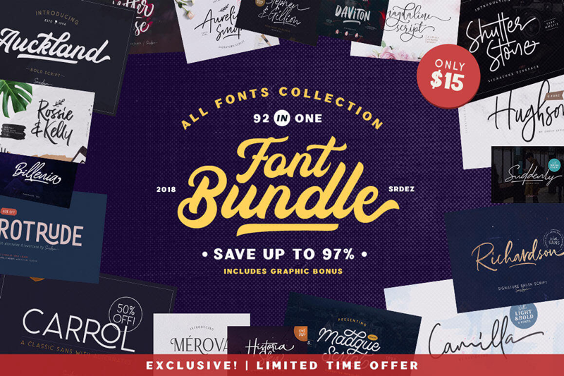
92 IN ONE, Exclusive Fonts Bundle
Save 97% on this collection of 92 premium fonts, culled from 30 unique typefaces. You’ll get a wide range of styles from script to sans to display, as well as OpenType Features and a slew of bonuses such as vector illustrations and texture images.
From January, 28 till February, 2, you’ll be able to get Woostroid WooCommerce theme at a 30% lower price. Woostroid2 is multipurpose WooCommerce theme, with JetPlugins inside. With the help of this theme you are able to build your eCommerce Store within a week Smile.
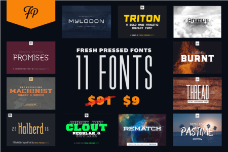
Fresh Pressed Fonts is a collection of 11 premium fonts from Ryan Welch. You’ll get everything from serifs to display fonts, along with a wide variety of styles from ultra-condensed to futuristic. With the included extended license, you can create just about anything under the sun such as T-shirts, packaging, posters, logos and more.
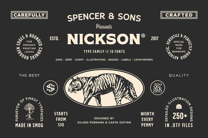
S&S Nickson Font Bundle of 15 Display, Script, Illustrations and More Typefaces
How would you like a collection of fonts that are strong enough to stand on their own, but creative enough to pair beautifully with one another? That’s exactly what you’ll get with the S&S Nickson Font Bundle Collection! Take home 15 different typefaces in a variety of creatively elegant styles including display fonts, script, illustrations, badges and more!