Every week, we’ll give you an overview of the best deals for designers, make sure you don’t miss any by subscribing to our deals feed. You can also follow the recently launched website Type Deals if you are looking for free fonts or font deals.
25+ InDesign Magazine & Brochure Templates
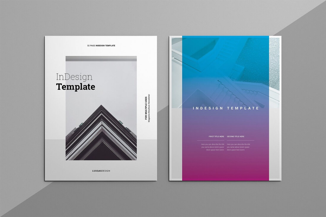
This deal from Luuqas Design will get your graphic groove going! This InDesign bundle features 26 professional magazine and brochure templates, featuring more than 820 unique design pages. Print ready, most templates are available in A4 and Letter Size and are compatible with Adobe InDesign CS4 and up.
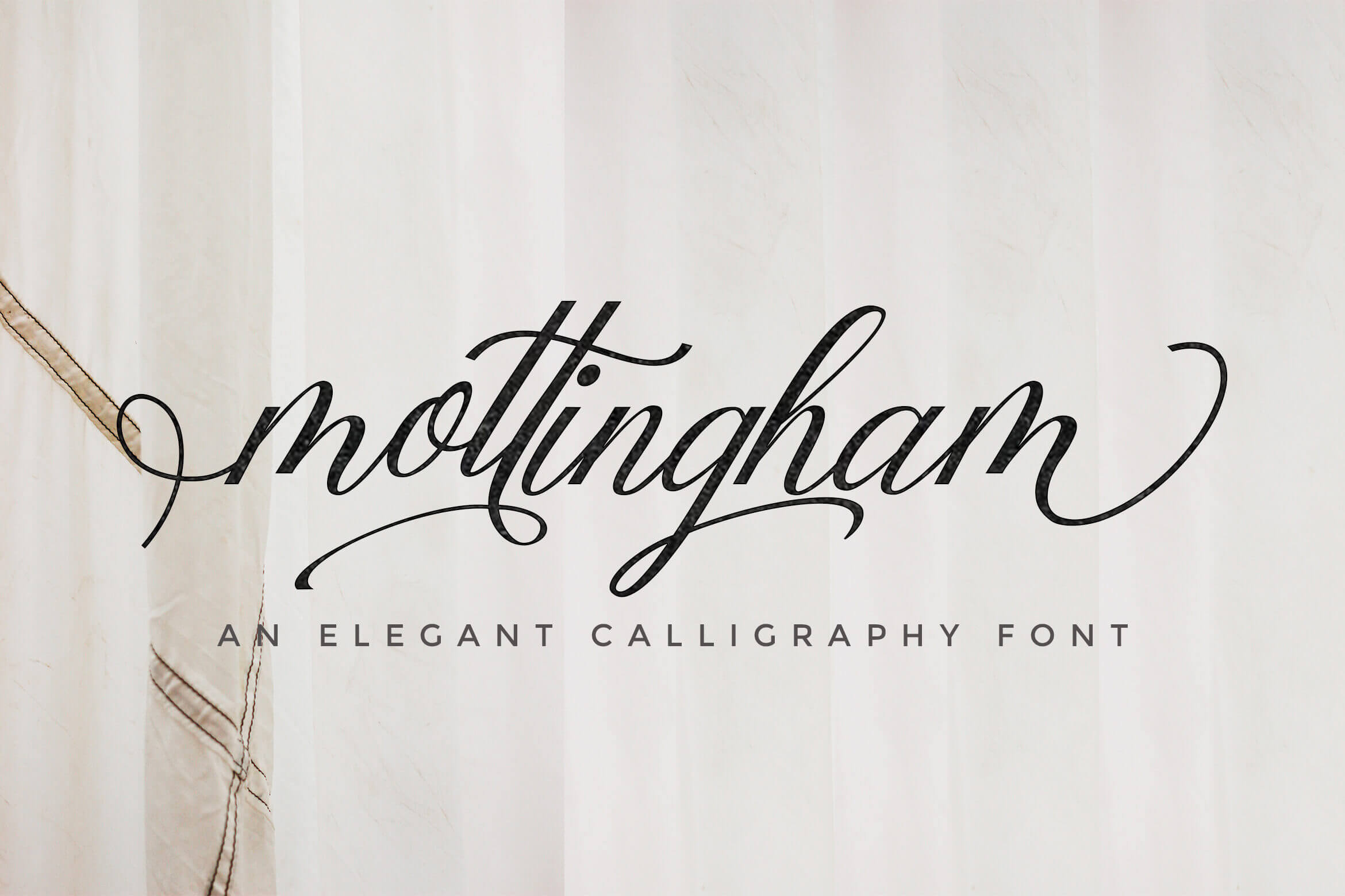
The Mottingham Typeface is a truly elegant handwritten stylish copperplate calligraphy font. It’s a great choice for those professional and beautiful projects you’re working on from signatures to wedding invitations. With over 300 unique glyphs and plenty of OpenType features, you’ll have plenty of flexibility for whatever you’re currently working on.
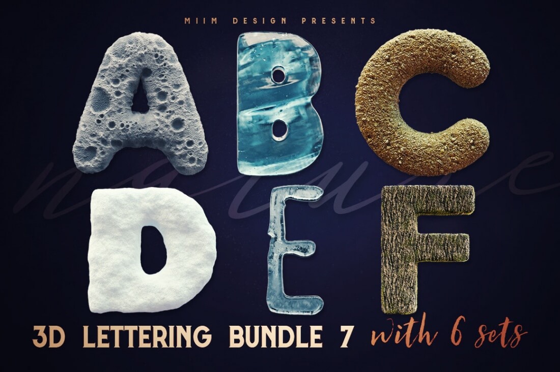
Get your hands on this unique 3D typography bundle with 24 new lettering sets. Whether you want to create original print design or just add something new and fresh to your typography collection, this bundle of transparent PNG files can fit the bill. You’ll find great nature themes too such as realistic snow, ice, grunge ice, sand, moon surface and more. There’s even a bonus of 12 seamless patterns!
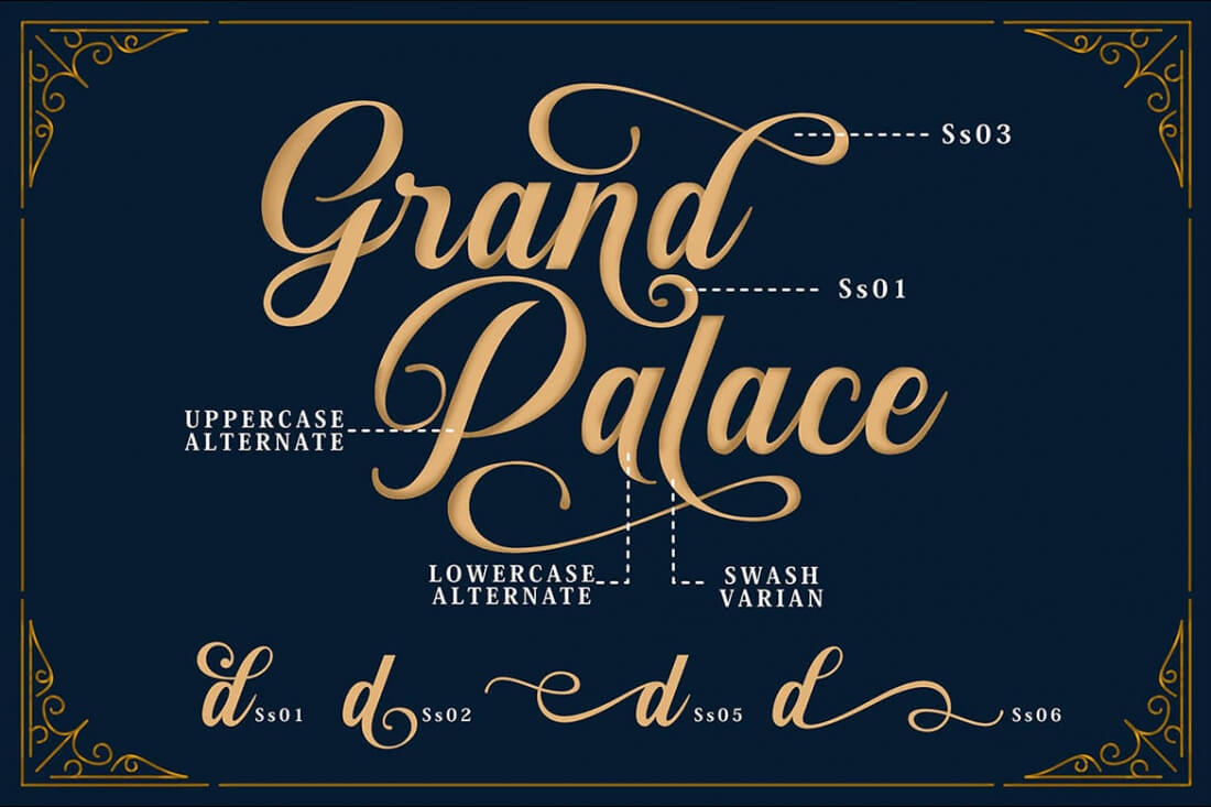
Sunshine is a beautiful modern and vintage script font. No matter your need, the flexibility of this typeface lies in its stylistic alternates, ligatures and additional stylistic sets. A variety of breathtaking ornaments from curved to straight, round out the set to give you that little extra your artwork needs.
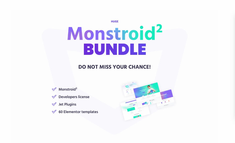
This monster bundle features a whopping 39 unique templates to build or update your own website or even your clients. You’ll get templates for WordPress, HTML5, Landing Pages, After Effects and even PSD files. From sports to travel themes, these premium templates will instantly make your site stand out from the crowd.
Shortly after the world was shaken by World War I, a design school in Weimar, Germany, was established by Walter Gropius, a German architect.
Although the impact can’t be compared to the horror brought by the first World War, the Bauhaus movement was much bigger than just a regular design school. Gropius’ school influenced the world of design and all artistic fields like no other know movement in history.
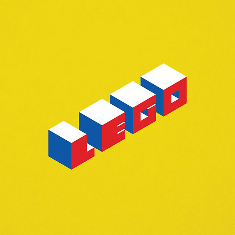
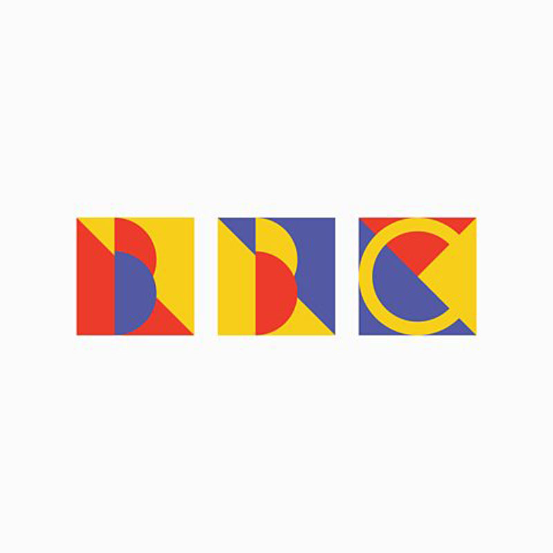
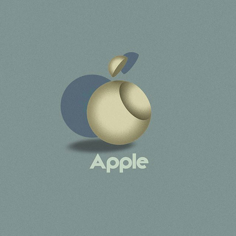
Hundred years later, we are still influenced by it. For this reason and to celebrate the impact of Bauhaus on our lives, the website 99designs asked its community to imagine what the logos of famous brands such as Google, Apple, BMW, or Apple, would look like if they were adapted using the characteristic features of the Bauhaus style.
In this post, you can see some of the results. Although the original Bauhaus students would certainly tackle the logo designs differently, it is still interesting to see what contemporary designers have done with it.
Jen Simmons has been coining the term intrinsic design, referring to a new era in web layout where the sizing of content has gone beyond fluid columns and media query breakpoints and into, I dunno, something a bit more exotic. For example, columns that are sized more by content and guidelines than percentages. And not always columns, but more like appropriate placement, however that needs to be done.
One thing is for sure, people are playing with the possibilities a lot right now. In the span of 10 days I’ve gathered these links:
In my experience working with design systems, I’ve found that I have to sacrifice my portfolio to do it well. Unlike a lot of other design work where it’s relatively easy to present Dribbble-worthy interfaces and designs, I fear that systems are quite a bit trickier than that.
You could make things beautiful, but the best work that happens on a design systems team often isn’t beautiful. In fact, a lot of the best work isn’t even visible.
For example, most days I’m pairing up with folks on my team to help them understand how our system works; from the CSS architecture, to the font stack, to the UI Kit to how a component can be manipulated to solve a specific problem, to many things in between. I’m trying as best as I can to help other designers understand what would be hard to build and what would be easy, as well as when to change their designs based on technical or other design constraints.
Further, there’s a lot of hard and diligent work that goes into projects that have no visible impact on the system at all. Last week, I noticed a weird thing with our checkboxes. Our Checkbox React component would output HTML like this:
We needed to wrap the checkbox with a <div> for styling purposes and, from a quick glance, there’s nothing wrong with this markup. However, the <div> and the <input> both have a class of .checkbox and there were confusing styles in the CSS file that styled the <div> first and then un-did those styles to fix the <input> itself.
The fix for this is a pretty simple one: all we need to do is make sure that the class names are specific so that we can safely refactor any confusing CSS:
The thing is that this work took more than a week to ship because we had to refactor a ton of checkboxes in our app to behave in the same way and make sure that they were all using the same component. These checkboxes are one of those things that are now significantly better and less confusing, but it’s difficult to make it look sexy in a portfolio. I can’t simply drop them into a big iPhone mockup and rotate it as part of a fancy portfolio post if I wanted to write about my work or show it to someone else.
Take another example: I spent an entire day making an audit of our illustrations to help our team get an understanding of how we use them in our application. I opened up Figma and took dozens of screenshots:
It’s sort of hard to take credit for this work because the heavy lifting is really moderating a discussion and helping the team plan. It’s important work! But I feel like it’s hard to show that this work is valuable and to show the effects of it in a large org. “Things are now less confusing,” isn’t exactly a great accomplishment – but it really should be. These boring, methodical changes are vital for the health of a good design system.
Also… it’s kind of weird to putm “I wrote documentation” in a portfolio as much as it is to say, “I paired with designers and engineers for three years.” It’s certainly less satisfying than a big, glossy JPEG of a cool interface you designed. And I’m not sure if this is the same everywhere, but only about 10% of the work I do is visual and worthy of showing off.
My point is that building new components like this RadioCard I designed a while back is extraordinarily rare and accounts for a tiny amount of the useful work that I do:
I’d love to see how you’re dealing with this problem though. How do you show off your front-end and design systems work? How do you make it visible and valuable in your organization? Let me know in the comments!
There is no one true way to hide something on the web. Nor should there be, because hiding is too vague. Are you hiding visually or temporarily (like a user menu), but the content should still be accessible? Are you hiding it from assistive tech on purpose? Are you showing it to assistive tech only? Are you hiding it at certain screen sizes or other scenarios? Or are you just plain hiding it from everyone all the time?
The popularity of CSS-in-JS has mostly come from the React community, and indeed many CSS-in-JS libraries are React-specific. However, Emotion, the most popular library in terms of npm downloads, is framework agnostic.
Using the shadow DOM is common when creating custom elements, but there’s no requirement to do so. Not all use cases require that level of encapsulation. While it’s also possible to style custom elements with CSS in a regular stylesheet, we’re going to look at using Emotion.
We start with an install:
npm i emotion
Emotion offers the css function:
import {css} from 'emotion';
css is a tagged template literal. It accepts standard CSS syntax but adds support for Sass-style nesting.
Once some styles have been defined, they need to be applied. Working with custom elements can be somewhat cumbersome. Libraries — like Stencil and LitElement — compile to web components, but offer a friendlier API than what we’d get right out of the box.
So, we’re going to define styles with Emotion and take advantage of both Stencil and LitElement to make working with web components a little easier.
Applying styles for Stencil
Stencil makes use of the bleeding-edge JavaScript decorators feature. An @Component decorator is used to provide metadata about the component. By default, Stencil won’t use shadow DOM, but I like to be explicit by setting shadow: false inside the @Component decorator:
LitElement, on the other hand, <em<does use shadow DOM by default. When creating a custom element with LitElement, the LitElement class is extended. LitElement has a createRenderRoot() method, which creates and opens a shadow DOM:
We don’t have to stress over naming our button — a random class name will be generated by Emotion.
We could make use of CSS nesting and attach a class only to a parent element. Alternatively, we can define styles as separate tagged template literals:
So far, we’ve styled the inner contents of the custom element. To style the container itself, we need another import from Emotion.
import {css, injectGlobal} from 'emotion';
injectGlobal injects styles into the “global scope” (like writing regular CSS in a traditional stylesheet — rather than generating a random class name). Custom elements are display: inline by default (a somewhat odd decision from spec authors). In almost all cases, I change this default with a style applied to all instances of the component. Below are the buttonStyles which is how we can change that up, making use of injectGlobal:
injectGlobal`
fancy-button {
  display: block;
}
`
Why not just use shadow DOM?
If a component could end up in any codebase, then shadow DOM may well be a good option. It’s ideal for third party widgets — any CSS that’s applied to the page simply won’t break the the component, thanks to the isolated nature of shadow DOM. That’s why it’s used by Twitter embeds, to take one example. However, the vast majority of us make components for for a particular site or app and nowhere else. In that situation, shadow DOM can arguably add complexity with limited benefit.
In the following steps, you will learn how to create a colorful icon pack in Adobe Illustrator.
For starters, you will learn how to set up a simple grid and how to create a frame for your line icon pack. Using basic tools and taking full advantage of the grid and snap to grid features, you will learn how to create a printer icon design, a color swatches icon design, and an eyedropper icon design. You’ll learn how to work with basic tools and effect, how to easily transform and multiply shapes, and how to add subtle shading.
For more inspiration on how to adjust or improve your icon design, you can find plenty of resources at GraphicRiver.
1. How to Create a New Document and Set Up a Grid
Hit Control-N to create a new document. Select Pixels from the Units drop-down menu, enter 850 in the width box and 340 in the height box, and then click that More Settings button. Select RGB for the Color Mode, set the Raster Effects to Screen (72 ppi), and then click Create Document.
Enable the Grid (View > Show Grid) and the Snap to Grid (View > Snap to Grid). You will need a grid every 1 px, so simply go to Edit > Preferences > Guides & Grid, enter 1 in the Gridline every box and 1 in the Subdivisions box. Try not to get discouraged by all that grid—it will make your work easier, and keep in mind that you can easily enable or disable it using the Control-„ keyboard shortcut.
You should also open the Info panel (Window > Info) for a live preview with the size and position of your shapes. Don’t forget to set the unit of measurement to pixels from Edit > Preferences > Units. All these options will significantly increase your work speed.
2. How to Create the Frames for the Colorful Icon Pack
Step 1
Before you learn how to make icons, pick the Rectangle Tool (M) and focus on the toolbar. Remove the color from the stroke and then select the fill and set its color to a random red.
Hold down the Shift key and create a 72 px square. Make sure that it stays selected, open the Appearance panel (Window > Appearance), and lower the Opacity to around 20%.
Step 2
Make sure that your square stays selected and open the Transform panel (Window > Transform). Focus on the X and Y input fields to numerically place shapes on your artboard. Enter the settings shown in the following image, and in the end your shape should be placed as shown below.
Step 3
Make sure that your square is still selected and go to Effect > Distort & Transform > Transform. Drag the Move-Horizontal slider to 206 px, enter 2 in the Copies box, and click OK.
Focus on the Layers panel (Window > Layers), expand the existing layer, and simply lock your shape to make sure that you won’t accidentally select/move it. You’ll only need these red squares as frames for your icons.
3. How to Create the Printer Icon Design
Step 1
Now, let’s learn how to make icons. Focus on the left square and pick the Rectangle Tool (M). Create a 68 x 35 px shape, fill it with R=78 G=185 B=255, and place it exactly as shown in the following image.
Step 2
Use the Direct Selection Tool (A) to select your blue rectangle, focus on the control panel, and enter 5 px in the Corners box.
Step 3
Make sure that your rounded rectangle stays selected and focus on the Appearance panel (Window > Appearance). Select the stroke, set its color to R=48 G=26 B=118, and increase the Weight to 4 px.
Step 4
Pick the Rounded Rectangle Tool, create a 48 x 8 px shape, and enter 2 px in the Corners box. Fill this new shape with R=48 G=26 B=118 and place it as shown below.
Step 5
Pick the Rectangle Tool (M) and create a 52 x 4 px shape. Fill this new rectangle with R=48 G=26 B=118 and place it as shown below.
Focus on the bottom side of this new shape and pick the Direct Selection Tool (A). Select both anchor points and enter 2 px in the Corners box.
Step 6
Pick the Rectangle Tool (M) and create a 48 x 4 px shape. Fill this new rectangle with R=48 G=26 B=118, lower its Opacity to 50%, and place it as shown in the following image.
Step 7
Pick the Rounded Rectangle Tool and create a 48 x 2 px shape. Fill this new shape with white (R=255 G=255 B=255), lower its Opacity to 50% and change the Blending Mode to Overlay, and then place it as shown below.
Step 8
Pick the Rectangle Tool (M) and create a 40 x 21 px shape. Fill this new rectangle with white and place it as shown below.
Focus on the top side of this new shape and pick the Direct Selection Tool (A). Select both anchor points and enter 2 px in the Corners box.
Step 9
Pick the Rectangle Tool (M) and create a 40 x 26 px shape. Fill this new rectangle with white and place it as shown below.
Focus on the bottom side of this new shape and pick the Direct Selection Tool (A). Select both anchor points and enter 2 px in the Corners box.
Step 10
Select both white shapes and focus on the Appearance panel. Set the stroke color to R=48 G=26 B=118 and increase the Weight to 4 px.
Step 11
Pick the Ellipse Tool (L) and create two 4 px circles. Fill one of these shapes with white and the other with R=48 G=26 B=118, and then place them as shown in the following image.
Step 12
Pick the Rectangle Tool (M) and create three 12 x 22 px shapes. Fill these new shapes with the colors indicated below and then place them as shown in the following image.
Step 13
Pick the Rectangle Tool (M) and create two 36 x 2 px shapes. Fill both shapes with R=48 G=26 B=118 and lower their Opacity to 50%, and then place them as shown in the following image.
4. How to Create the Color Swatches Icon Design
Step 1
Focus on the next red square.
Pick the Rectangle Tool (M) and create a 68 x 20 px shape. Fill this new rectangle with white and place it as shown in the first image.
Focus on the left side of your white rectangle and switch to the Direct Selection Tool (A). Select both anchor points and enter 10 px in the Corners box.
Step 2
Pick the Ellipse Tool (L), hold down the Shift key, and create a 4 px circle. Fill this new shape with black (R=0 G=0 B=0) and place it as shown in the first image.
Switch to the Rectangle Tool (M) and create four 8 px squares. Fill these new shapes with black and place them as shown in the second image.
Step 3
Select your white shape along with the five black shapes and pick the Rotate Tool (R). Hold down the Alt key and simply click in the center of that black circle. This will set the rotation reference point in that spot and open the Rotate window. Set the Angle to 30 degrees and click the Copy button.
Step 4
Select the set of shapes added in the previous step and repeat the Rotate technique. Make sure that you set the reference point in the center of that circle, set the Angle to 30 degrees, and click the Copy button. Select the resulting set of shapes and repeat the Rotate technique one more time.
Step 5
Select your front white shape and go to Object > Path > Offset Path. Enter a 4 px Offset and click OK. Fill the resulting shape with R=48 G=26 B=118 and lower its Opacity to 30%.
Select the next white shape and add a copy in front (Control-C > Control-F). Select it along with the other shape made in this step and click the Intersect button from the Pathfinder panel.
Step 6
Select your second white shape and go to Object > Path > Offset Path. Enter a 4 px Offset and click OK. Fill the resulting shape with R=48 G=26 B=118 and lower its Opacity to 30%.
Select the next white shape and add a copy in front (Control-C > Control-F). Select it along with the other shape made in this step and click the Intersect button from the Pathfinder panel.
Step 7
Select your third white shape and go to Object > Path > Offset Path. Enter a 4 px Offset and click OK. Fill the resulting shape with R=48 G=26 B=118 and lower its Opacity to 30%.
Select the next white shape and add a copy in front (Control-C > Control-F). Select it along with the other shape made in this step and click the Intersect button from the Pathfinder panel.
Step 8
Select all those black squares, except the front ones. First, enter 2 px in that Corners box, and then replace the black with the three colors indicated in the following image.
Step 9
Select the black circle and change its color to R=48 G=26 B=118.
Step 10
Select the front-white shape and focus on the Appearance panel. First, change the fill color to R=78 G=185 B=255 and then select the stroke. Set its color to R=48 G=26 B=118, increase the Weight to 4 px, and check the Round Join button from the Stroke fly-out panel.
Step 11
Select the remaining white shapes and focus on the Appearance panel. Add a 4 px stroke, set its color to R=48 G=26 B=118, and don’t forget to check that Round Join button.
Step 12
Pick the Rounded Rectangle Tool and create a 12 x 2 px shape. Fill this new shape with white, lower its Opacity to 50% and change the Blending Mode to Overlay, and then place it as shown below.
5. How to Create the Eyedropper Icon Design
Step 1
Pick the Rectangle Tool (M), create a 34 x 12 px shape, and fill it with R=78 G=185 B=255. Using the same tool and appearance attributes, create a 34 x 4 px shape and place it exactly as shown in the second image.
Focus on the top side of this second rectangle and switch to the Direct Selection Tool (A). Select the left anchor point and drag it 5 px to the right, and then select the right anchor point and drag it 5 px to the left.
Step 2
Pick the Rectangle Tool (M) and create a 24 x 27 px shape. Fill it with R=78 G=185 B=255 and place it exactly as shown in the first image.
Focus on the top side of this new rectangle and switch to the Direct Selection Tool (A). Select both anchor points and enter 12 px in the Corners box.
Step 3
Select the three shapes highlighted in the following image, open the Pathfinder panel (Window > Pathfinder), and click the Union button.
Step 4
Pick the Rectangle Tool (M) and create a 22 x 31 px shape. Fill it with a random yellow and place it exactly as shown in the first image. Using the same tool and appearance attributes, create a 22 x 5 px shape and place it exactly as shown in the second image.
Focus on the bottom side of this second rectangle and switch to the Direct Selection Tool (A). Select the left anchor point and drag it 6 px to the right, and then select the right anchor point and drag it 6 px to the left.
Step 5
Pick the Rectangle Tool (M) and create a 10 x 7 px shape. Fill it with yellow and place it exactly as shown in the first image.
Select the three yellow shapes, open the Pathfinder panel, and click the Union button.
Step 6
Select your yellow shape and focus on the Appearance panel. First, remove the fill color, and then select the stroke. Set its color to R=48 G=26 B=118, increase the Weight to 4 px, and check the Round Join button from the Stroke fly-out panel.
Step 7
Select the blue shape and focus on the Appearance panel. Select the stroke, set its color to R=48 G=26 B=118, increase the Weight to 4 px, and don’t forget to check the Round Join button from the Stroke fly-out panel.
Pick the Rounded Rectangle Tool and create a 12 x 4 px shape. Fill this new shape with R=48 G=26 B=118 and place it as shown below.
Step 8
Pick the Ellipse Tool (L) and create a 10 x 6 px shape. Fill this new shape with white, lower its Opacity to 50% and change the Blending Mode to Overlay, and then place it as shown below.
Switch to the Rectangle Tool (M) and create an 18 x 4 px shape. Fill this new shape with R=48 G=26 B=118 and lower its Opacity to 30%, and then place it as shown below.
Step 9
Select all the shapes that make up your eyedropper icon and go to Object > Transform > Rotate. Set the Angle to -45 degrees and click OK.
Step 10
Place your eyedropper on top of that third red square. Select the shape highlighted in the first image and go to Object > Path > Offset Path. Enter a -4 px Offset and click OK.
Select the resulting shape and focus on the Appearance panel. First, remove the stroke color, and then select the fill and set its color to R=255 G=65 B=129.
6. How to Add a Background to the Final Icon Design
Step 1
Now that your line icon pack is ready, go to the Layers panel, unlock that red square, and delete it.
Step 2
Pick the Rectangle Tool (M) and create an 860 x 350 px shape. Fill this new rectangle with R=245 G=245 B=245, make sure that it covers your entire artboard, and then send it to back (Shift-Control-[).
Congratulations! You’re Done!
Here is how your colorful icon pack should look. I hope you’ve enjoyed this tutorial and can apply these techniques in your future projects. Don’t hesitate to share your final result in the comments section.
Feel free to adjust the final design and make it your own. You can find some great sources of inspiration at GraphicRiver, with interesting solutions to improve your icon design.
Learn More About Icon Design
If you’re looking for more icon design content, check one of the following tutorials:
In the following steps, you will learn how to create a colorful icon pack in Adobe Illustrator.
For starters, you will learn how to set up a simple grid and how to create a frame for your line icon pack. Using basic tools and taking full advantage of the grid and snap to grid features, you will learn how to create a printer icon design, a color swatches icon design, and an eyedropper icon design. You’ll learn how to work with basic tools and effect, how to easily transform and multiply shapes, and how to add subtle shading.
For more inspiration on how to adjust or improve your icon design, you can find plenty of resources at GraphicRiver.
1. How to Create a New Document and Set Up a Grid
Hit Control-N to create a new document. Select Pixels from the Units drop-down menu, enter 850 in the width box and 340 in the height box, and then click that More Settings button. Select RGB for the Color Mode, set the Raster Effects to Screen (72 ppi), and then click Create Document.
Enable the Grid (View > Show Grid) and the Snap to Grid (View > Snap to Grid). You will need a grid every 1 px, so simply go to Edit > Preferences > Guides & Grid, enter 1 in the Gridline every box and 1 in the Subdivisions box. Try not to get discouraged by all that grid—it will make your work easier, and keep in mind that you can easily enable or disable it using the Control-„ keyboard shortcut.
You should also open the Info panel (Window > Info) for a live preview with the size and position of your shapes. Don’t forget to set the unit of measurement to pixels from Edit > Preferences > Units. All these options will significantly increase your work speed.
2. How to Create the Frames for the Colorful Icon Pack
Step 1
Before you learn how to make icons, pick the Rectangle Tool (M) and focus on the toolbar. Remove the color from the stroke and then select the fill and set its color to a random red.
Hold down the Shift key and create a 72 px square. Make sure that it stays selected, open the Appearance panel (Window > Appearance), and lower the Opacity to around 20%.
Step 2
Make sure that your square stays selected and open the Transform panel (Window > Transform). Focus on the X and Y input fields to numerically place shapes on your artboard. Enter the settings shown in the following image, and in the end your shape should be placed as shown below.
Step 3
Make sure that your square is still selected and go to Effect > Distort & Transform > Transform. Drag the Move-Horizontal slider to 206 px, enter 2 in the Copies box, and click OK.
Focus on the Layers panel (Window > Layers), expand the existing layer, and simply lock your shape to make sure that you won’t accidentally select/move it. You’ll only need these red squares as frames for your icons.
3. How to Create the Printer Icon Design
Step 1
Now, let’s learn how to make icons. Focus on the left square and pick the Rectangle Tool (M). Create a 68 x 35 px shape, fill it with R=78 G=185 B=255, and place it exactly as shown in the following image.
Step 2
Use the Direct Selection Tool (A) to select your blue rectangle, focus on the control panel, and enter 5 px in the Corners box.
Step 3
Make sure that your rounded rectangle stays selected and focus on the Appearance panel (Window > Appearance). Select the stroke, set its color to R=48 G=26 B=118, and increase the Weight to 4 px.
Step 4
Pick the Rounded Rectangle Tool, create a 48 x 8 px shape, and enter 2 px in the Corners box. Fill this new shape with R=48 G=26 B=118 and place it as shown below.
Step 5
Pick the Rectangle Tool (M) and create a 52 x 4 px shape. Fill this new rectangle with R=48 G=26 B=118 and place it as shown below.
Focus on the bottom side of this new shape and pick the Direct Selection Tool (A). Select both anchor points and enter 2 px in the Corners box.
Step 6
Pick the Rectangle Tool (M) and create a 48 x 4 px shape. Fill this new rectangle with R=48 G=26 B=118, lower its Opacity to 50%, and place it as shown in the following image.
Step 7
Pick the Rounded Rectangle Tool and create a 48 x 2 px shape. Fill this new shape with white (R=255 G=255 B=255), lower its Opacity to 50% and change the Blending Mode to Overlay, and then place it as shown below.
Step 8
Pick the Rectangle Tool (M) and create a 40 x 21 px shape. Fill this new rectangle with white and place it as shown below.
Focus on the top side of this new shape and pick the Direct Selection Tool (A). Select both anchor points and enter 2 px in the Corners box.
Step 9
Pick the Rectangle Tool (M) and create a 40 x 26 px shape. Fill this new rectangle with white and place it as shown below.
Focus on the bottom side of this new shape and pick the Direct Selection Tool (A). Select both anchor points and enter 2 px in the Corners box.
Step 10
Select both white shapes and focus on the Appearance panel. Set the stroke color to R=48 G=26 B=118 and increase the Weight to 4 px.
Step 11
Pick the Ellipse Tool (L) and create two 4 px circles. Fill one of these shapes with white and the other with R=48 G=26 B=118, and then place them as shown in the following image.
Step 12
Pick the Rectangle Tool (M) and create three 12 x 22 px shapes. Fill these new shapes with the colors indicated below and then place them as shown in the following image.
Step 13
Pick the Rectangle Tool (M) and create two 36 x 2 px shapes. Fill both shapes with R=48 G=26 B=118 and lower their Opacity to 50%, and then place them as shown in the following image.
4. How to Create the Color Swatches Icon Design
Step 1
Focus on the next red square.
Pick the Rectangle Tool (M) and create a 68 x 20 px shape. Fill this new rectangle with white and place it as shown in the first image.
Focus on the left side of your white rectangle and switch to the Direct Selection Tool (A). Select both anchor points and enter 10 px in the Corners box.
Step 2
Pick the Ellipse Tool (L), hold down the Shift key, and create a 4 px circle. Fill this new shape with black (R=0 G=0 B=0) and place it as shown in the first image.
Switch to the Rectangle Tool (M) and create four 8 px squares. Fill these new shapes with black and place them as shown in the second image.
Step 3
Select your white shape along with the five black shapes and pick the Rotate Tool (R). Hold down the Alt key and simply click in the center of that black circle. This will set the rotation reference point in that spot and open the Rotate window. Set the Angle to 30 degrees and click the Copy button.
Step 4
Select the set of shapes added in the previous step and repeat the Rotate technique. Make sure that you set the reference point in the center of that circle, set the Angle to 30 degrees, and click the Copy button. Select the resulting set of shapes and repeat the Rotate technique one more time.
Step 5
Select your front white shape and go to Object > Path > Offset Path. Enter a 4 px Offset and click OK. Fill the resulting shape with R=48 G=26 B=118 and lower its Opacity to 30%.
Select the next white shape and add a copy in front (Control-C > Control-F). Select it along with the other shape made in this step and click the Intersect button from the Pathfinder panel.
Step 6
Select your second white shape and go to Object > Path > Offset Path. Enter a 4 px Offset and click OK. Fill the resulting shape with R=48 G=26 B=118 and lower its Opacity to 30%.
Select the next white shape and add a copy in front (Control-C > Control-F). Select it along with the other shape made in this step and click the Intersect button from the Pathfinder panel.
Step 7
Select your third white shape and go to Object > Path > Offset Path. Enter a 4 px Offset and click OK. Fill the resulting shape with R=48 G=26 B=118 and lower its Opacity to 30%.
Select the next white shape and add a copy in front (Control-C > Control-F). Select it along with the other shape made in this step and click the Intersect button from the Pathfinder panel.
Step 8
Select all those black squares, except the front ones. First, enter 2 px in that Corners box, and then replace the black with the three colors indicated in the following image.
Step 9
Select the black circle and change its color to R=48 G=26 B=118.
Step 10
Select the front-white shape and focus on the Appearance panel. First, change the fill color to R=78 G=185 B=255 and then select the stroke. Set its color to R=48 G=26 B=118, increase the Weight to 4 px, and check the Round Join button from the Stroke fly-out panel.
Step 11
Select the remaining white shapes and focus on the Appearance panel. Add a 4 px stroke, set its color to R=48 G=26 B=118, and don’t forget to check that Round Join button.
Step 12
Pick the Rounded Rectangle Tool and create a 12 x 2 px shape. Fill this new shape with white, lower its Opacity to 50% and change the Blending Mode to Overlay, and then place it as shown below.
5. How to Create the Eyedropper Icon Design
Step 1
Pick the Rectangle Tool (M), create a 34 x 12 px shape, and fill it with R=78 G=185 B=255. Using the same tool and appearance attributes, create a 34 x 4 px shape and place it exactly as shown in the second image.
Focus on the top side of this second rectangle and switch to the Direct Selection Tool (A). Select the left anchor point and drag it 5 px to the right, and then select the right anchor point and drag it 5 px to the left.
Step 2
Pick the Rectangle Tool (M) and create a 24 x 27 px shape. Fill it with R=78 G=185 B=255 and place it exactly as shown in the first image.
Focus on the top side of this new rectangle and switch to the Direct Selection Tool (A). Select both anchor points and enter 12 px in the Corners box.
Step 3
Select the three shapes highlighted in the following image, open the Pathfinder panel (Window > Pathfinder), and click the Union button.
Step 4
Pick the Rectangle Tool (M) and create a 22 x 31 px shape. Fill it with a random yellow and place it exactly as shown in the first image. Using the same tool and appearance attributes, create a 22 x 5 px shape and place it exactly as shown in the second image.
Focus on the bottom side of this second rectangle and switch to the Direct Selection Tool (A). Select the left anchor point and drag it 6 px to the right, and then select the right anchor point and drag it 6 px to the left.
Step 5
Pick the Rectangle Tool (M) and create a 10 x 7 px shape. Fill it with yellow and place it exactly as shown in the first image.
Select the three yellow shapes, open the Pathfinder panel, and click the Union button.
Step 6
Select your yellow shape and focus on the Appearance panel. First, remove the fill color, and then select the stroke. Set its color to R=48 G=26 B=118, increase the Weight to 4 px, and check the Round Join button from the Stroke fly-out panel.
Step 7
Select the blue shape and focus on the Appearance panel. Select the stroke, set its color to R=48 G=26 B=118, increase the Weight to 4 px, and don’t forget to check the Round Join button from the Stroke fly-out panel.
Pick the Rounded Rectangle Tool and create a 12 x 4 px shape. Fill this new shape with R=48 G=26 B=118 and place it as shown below.
Step 8
Pick the Ellipse Tool (L) and create a 10 x 6 px shape. Fill this new shape with white, lower its Opacity to 50% and change the Blending Mode to Overlay, and then place it as shown below.
Switch to the Rectangle Tool (M) and create an 18 x 4 px shape. Fill this new shape with R=48 G=26 B=118 and lower its Opacity to 30%, and then place it as shown below.
Step 9
Select all the shapes that make up your eyedropper icon and go to Object > Transform > Rotate. Set the Angle to -45 degrees and click OK.
Step 10
Place your eyedropper on top of that third red square. Select the shape highlighted in the first image and go to Object > Path > Offset Path. Enter a -4 px Offset and click OK.
Select the resulting shape and focus on the Appearance panel. First, remove the stroke color, and then select the fill and set its color to R=255 G=65 B=129.
6. How to Add a Background to the Final Icon Design
Step 1
Now that your line icon pack is ready, go to the Layers panel, unlock that red square, and delete it.
Step 2
Pick the Rectangle Tool (M) and create an 860 x 350 px shape. Fill this new rectangle with R=245 G=245 B=245, make sure that it covers your entire artboard, and then send it to back (Shift-Control-[).
Congratulations! You’re Done!
Here is how your colorful icon pack should look. I hope you’ve enjoyed this tutorial and can apply these techniques in your future projects. Don’t hesitate to share your final result in the comments section.
Feel free to adjust the final design and make it your own. You can find some great sources of inspiration at GraphicRiver, with interesting solutions to improve your icon design.
Learn More About Icon Design
If you’re looking for more icon design content, check one of the following tutorials:
In the following steps, you will learn how to create a colorful icon pack in Adobe Illustrator.
For starters, you will learn how to set up a simple grid and how to create a frame for your line icon pack. Using basic tools and taking full advantage of the grid and snap to grid features, you will learn how to create a printer icon design, a color swatches icon design, and an eyedropper icon design. You’ll learn how to work with basic tools and effect, how to easily transform and multiply shapes, and how to add subtle shading.
For more inspiration on how to adjust or improve your icon design, you can find plenty of resources at GraphicRiver.
1. How to Create a New Document and Set Up a Grid
Hit Control-N to create a new document. Select Pixels from the Units drop-down menu, enter 850 in the width box and 340 in the height box, and then click that More Settings button. Select RGB for the Color Mode, set the Raster Effects to Screen (72 ppi), and then click Create Document.
Enable the Grid (View > Show Grid) and the Snap to Grid (View > Snap to Grid). You will need a grid every 1 px, so simply go to Edit > Preferences > Guides & Grid, enter 1 in the Gridline every box and 1 in the Subdivisions box. Try not to get discouraged by all that grid—it will make your work easier, and keep in mind that you can easily enable or disable it using the Control-„ keyboard shortcut.
You should also open the Info panel (Window > Info) for a live preview with the size and position of your shapes. Don’t forget to set the unit of measurement to pixels from Edit > Preferences > Units. All these options will significantly increase your work speed.
2. How to Create the Frames for the Colorful Icon Pack
Step 1
Before you learn how to make icons, pick the Rectangle Tool (M) and focus on the toolbar. Remove the color from the stroke and then select the fill and set its color to a random red.
Hold down the Shift key and create a 72 px square. Make sure that it stays selected, open the Appearance panel (Window > Appearance), and lower the Opacity to around 20%.
Step 2
Make sure that your square stays selected and open the Transform panel (Window > Transform). Focus on the X and Y input fields to numerically place shapes on your artboard. Enter the settings shown in the following image, and in the end your shape should be placed as shown below.
Step 3
Make sure that your square is still selected and go to Effect > Distort & Transform > Transform. Drag the Move-Horizontal slider to 206 px, enter 2 in the Copies box, and click OK.
Focus on the Layers panel (Window > Layers), expand the existing layer, and simply lock your shape to make sure that you won’t accidentally select/move it. You’ll only need these red squares as frames for your icons.
3. How to Create the Printer Icon Design
Step 1
Now, let’s learn how to make icons. Focus on the left square and pick the Rectangle Tool (M). Create a 68 x 35 px shape, fill it with R=78 G=185 B=255, and place it exactly as shown in the following image.
Step 2
Use the Direct Selection Tool (A) to select your blue rectangle, focus on the control panel, and enter 5 px in the Corners box.
Step 3
Make sure that your rounded rectangle stays selected and focus on the Appearance panel (Window > Appearance). Select the stroke, set its color to R=48 G=26 B=118, and increase the Weight to 4 px.
Step 4
Pick the Rounded Rectangle Tool, create a 48 x 8 px shape, and enter 2 px in the Corners box. Fill this new shape with R=48 G=26 B=118 and place it as shown below.
Step 5
Pick the Rectangle Tool (M) and create a 52 x 4 px shape. Fill this new rectangle with R=48 G=26 B=118 and place it as shown below.
Focus on the bottom side of this new shape and pick the Direct Selection Tool (A). Select both anchor points and enter 2 px in the Corners box.
Step 6
Pick the Rectangle Tool (M) and create a 48 x 4 px shape. Fill this new rectangle with R=48 G=26 B=118, lower its Opacity to 50%, and place it as shown in the following image.
Step 7
Pick the Rounded Rectangle Tool and create a 48 x 2 px shape. Fill this new shape with white (R=255 G=255 B=255), lower its Opacity to 50% and change the Blending Mode to Overlay, and then place it as shown below.
Step 8
Pick the Rectangle Tool (M) and create a 40 x 21 px shape. Fill this new rectangle with white and place it as shown below.
Focus on the top side of this new shape and pick the Direct Selection Tool (A). Select both anchor points and enter 2 px in the Corners box.
Step 9
Pick the Rectangle Tool (M) and create a 40 x 26 px shape. Fill this new rectangle with white and place it as shown below.
Focus on the bottom side of this new shape and pick the Direct Selection Tool (A). Select both anchor points and enter 2 px in the Corners box.
Step 10
Select both white shapes and focus on the Appearance panel. Set the stroke color to R=48 G=26 B=118 and increase the Weight to 4 px.
Step 11
Pick the Ellipse Tool (L) and create two 4 px circles. Fill one of these shapes with white and the other with R=48 G=26 B=118, and then place them as shown in the following image.
Step 12
Pick the Rectangle Tool (M) and create three 12 x 22 px shapes. Fill these new shapes with the colors indicated below and then place them as shown in the following image.
Step 13
Pick the Rectangle Tool (M) and create two 36 x 2 px shapes. Fill both shapes with R=48 G=26 B=118 and lower their Opacity to 50%, and then place them as shown in the following image.
4. How to Create the Color Swatches Icon Design
Step 1
Focus on the next red square.
Pick the Rectangle Tool (M) and create a 68 x 20 px shape. Fill this new rectangle with white and place it as shown in the first image.
Focus on the left side of your white rectangle and switch to the Direct Selection Tool (A). Select both anchor points and enter 10 px in the Corners box.
Step 2
Pick the Ellipse Tool (L), hold down the Shift key, and create a 4 px circle. Fill this new shape with black (R=0 G=0 B=0) and place it as shown in the first image.
Switch to the Rectangle Tool (M) and create four 8 px squares. Fill these new shapes with black and place them as shown in the second image.
Step 3
Select your white shape along with the five black shapes and pick the Rotate Tool (R). Hold down the Alt key and simply click in the center of that black circle. This will set the rotation reference point in that spot and open the Rotate window. Set the Angle to 30 degrees and click the Copy button.
Step 4
Select the set of shapes added in the previous step and repeat the Rotate technique. Make sure that you set the reference point in the center of that circle, set the Angle to 30 degrees, and click the Copy button. Select the resulting set of shapes and repeat the Rotate technique one more time.
Step 5
Select your front white shape and go to Object > Path > Offset Path. Enter a 4 px Offset and click OK. Fill the resulting shape with R=48 G=26 B=118 and lower its Opacity to 30%.
Select the next white shape and add a copy in front (Control-C > Control-F). Select it along with the other shape made in this step and click the Intersect button from the Pathfinder panel.
Step 6
Select your second white shape and go to Object > Path > Offset Path. Enter a 4 px Offset and click OK. Fill the resulting shape with R=48 G=26 B=118 and lower its Opacity to 30%.
Select the next white shape and add a copy in front (Control-C > Control-F). Select it along with the other shape made in this step and click the Intersect button from the Pathfinder panel.
Step 7
Select your third white shape and go to Object > Path > Offset Path. Enter a 4 px Offset and click OK. Fill the resulting shape with R=48 G=26 B=118 and lower its Opacity to 30%.
Select the next white shape and add a copy in front (Control-C > Control-F). Select it along with the other shape made in this step and click the Intersect button from the Pathfinder panel.
Step 8
Select all those black squares, except the front ones. First, enter 2 px in that Corners box, and then replace the black with the three colors indicated in the following image.
Step 9
Select the black circle and change its color to R=48 G=26 B=118.
Step 10
Select the front-white shape and focus on the Appearance panel. First, change the fill color to R=78 G=185 B=255 and then select the stroke. Set its color to R=48 G=26 B=118, increase the Weight to 4 px, and check the Round Join button from the Stroke fly-out panel.
Step 11
Select the remaining white shapes and focus on the Appearance panel. Add a 4 px stroke, set its color to R=48 G=26 B=118, and don’t forget to check that Round Join button.
Step 12
Pick the Rounded Rectangle Tool and create a 12 x 2 px shape. Fill this new shape with white, lower its Opacity to 50% and change the Blending Mode to Overlay, and then place it as shown below.
5. How to Create the Eyedropper Icon Design
Step 1
Pick the Rectangle Tool (M), create a 34 x 12 px shape, and fill it with R=78 G=185 B=255. Using the same tool and appearance attributes, create a 34 x 4 px shape and place it exactly as shown in the second image.
Focus on the top side of this second rectangle and switch to the Direct Selection Tool (A). Select the left anchor point and drag it 5 px to the right, and then select the right anchor point and drag it 5 px to the left.
Step 2
Pick the Rectangle Tool (M) and create a 24 x 27 px shape. Fill it with R=78 G=185 B=255 and place it exactly as shown in the first image.
Focus on the top side of this new rectangle and switch to the Direct Selection Tool (A). Select both anchor points and enter 12 px in the Corners box.
Step 3
Select the three shapes highlighted in the following image, open the Pathfinder panel (Window > Pathfinder), and click the Union button.
Step 4
Pick the Rectangle Tool (M) and create a 22 x 31 px shape. Fill it with a random yellow and place it exactly as shown in the first image. Using the same tool and appearance attributes, create a 22 x 5 px shape and place it exactly as shown in the second image.
Focus on the bottom side of this second rectangle and switch to the Direct Selection Tool (A). Select the left anchor point and drag it 6 px to the right, and then select the right anchor point and drag it 6 px to the left.
Step 5
Pick the Rectangle Tool (M) and create a 10 x 7 px shape. Fill it with yellow and place it exactly as shown in the first image.
Select the three yellow shapes, open the Pathfinder panel, and click the Union button.
Step 6
Select your yellow shape and focus on the Appearance panel. First, remove the fill color, and then select the stroke. Set its color to R=48 G=26 B=118, increase the Weight to 4 px, and check the Round Join button from the Stroke fly-out panel.
Step 7
Select the blue shape and focus on the Appearance panel. Select the stroke, set its color to R=48 G=26 B=118, increase the Weight to 4 px, and don’t forget to check the Round Join button from the Stroke fly-out panel.
Pick the Rounded Rectangle Tool and create a 12 x 4 px shape. Fill this new shape with R=48 G=26 B=118 and place it as shown below.
Step 8
Pick the Ellipse Tool (L) and create a 10 x 6 px shape. Fill this new shape with white, lower its Opacity to 50% and change the Blending Mode to Overlay, and then place it as shown below.
Switch to the Rectangle Tool (M) and create an 18 x 4 px shape. Fill this new shape with R=48 G=26 B=118 and lower its Opacity to 30%, and then place it as shown below.
Step 9
Select all the shapes that make up your eyedropper icon and go to Object > Transform > Rotate. Set the Angle to -45 degrees and click OK.
Step 10
Place your eyedropper on top of that third red square. Select the shape highlighted in the first image and go to Object > Path > Offset Path. Enter a -4 px Offset and click OK.
Select the resulting shape and focus on the Appearance panel. First, remove the stroke color, and then select the fill and set its color to R=255 G=65 B=129.
6. How to Add a Background to the Final Icon Design
Step 1
Now that your line icon pack is ready, go to the Layers panel, unlock that red square, and delete it.
Step 2
Pick the Rectangle Tool (M) and create an 860 x 350 px shape. Fill this new rectangle with R=245 G=245 B=245, make sure that it covers your entire artboard, and then send it to back (Shift-Control-[).
Congratulations! You’re Done!
Here is how your colorful icon pack should look. I hope you’ve enjoyed this tutorial and can apply these techniques in your future projects. Don’t hesitate to share your final result in the comments section.
Feel free to adjust the final design and make it your own. You can find some great sources of inspiration at GraphicRiver, with interesting solutions to improve your icon design.
Learn More About Icon Design
If you’re looking for more icon design content, check one of the following tutorials:
In the following steps, you will learn how to create a colorful icon pack in Adobe Illustrator.
For starters, you will learn how to set up a simple grid and how to create a frame for your line icon pack. Using basic tools and taking full advantage of the grid and snap to grid features, you will learn how to create a printer icon design, a color swatches icon design, and an eyedropper icon design. You’ll learn how to work with basic tools and effect, how to easily transform and multiply shapes, and how to add subtle shading.
For more inspiration on how to adjust or improve your icon design, you can find plenty of resources at GraphicRiver.
1. How to Create a New Document and Set Up a Grid
Hit Control-N to create a new document. Select Pixels from the Units drop-down menu, enter 850 in the width box and 340 in the height box, and then click that More Settings button. Select RGB for the Color Mode, set the Raster Effects to Screen (72 ppi), and then click Create Document.
Enable the Grid (View > Show Grid) and the Snap to Grid (View > Snap to Grid). You will need a grid every 1 px, so simply go to Edit > Preferences > Guides & Grid, enter 1 in the Gridline every box and 1 in the Subdivisions box. Try not to get discouraged by all that grid—it will make your work easier, and keep in mind that you can easily enable or disable it using the Control-„ keyboard shortcut.
You should also open the Info panel (Window > Info) for a live preview with the size and position of your shapes. Don’t forget to set the unit of measurement to pixels from Edit > Preferences > Units. All these options will significantly increase your work speed.
2. How to Create the Frames for the Colorful Icon Pack
Step 1
Before you learn how to make icons, pick the Rectangle Tool (M) and focus on the toolbar. Remove the color from the stroke and then select the fill and set its color to a random red.
Hold down the Shift key and create a 72 px square. Make sure that it stays selected, open the Appearance panel (Window > Appearance), and lower the Opacity to around 20%.
Step 2
Make sure that your square stays selected and open the Transform panel (Window > Transform). Focus on the X and Y input fields to numerically place shapes on your artboard. Enter the settings shown in the following image, and in the end your shape should be placed as shown below.
Step 3
Make sure that your square is still selected and go to Effect > Distort & Transform > Transform. Drag the Move-Horizontal slider to 206 px, enter 2 in the Copies box, and click OK.
Focus on the Layers panel (Window > Layers), expand the existing layer, and simply lock your shape to make sure that you won’t accidentally select/move it. You’ll only need these red squares as frames for your icons.
3. How to Create the Printer Icon Design
Step 1
Now, let’s learn how to make icons. Focus on the left square and pick the Rectangle Tool (M). Create a 68 x 35 px shape, fill it with R=78 G=185 B=255, and place it exactly as shown in the following image.
Step 2
Use the Direct Selection Tool (A) to select your blue rectangle, focus on the control panel, and enter 5 px in the Corners box.
Step 3
Make sure that your rounded rectangle stays selected and focus on the Appearance panel (Window > Appearance). Select the stroke, set its color to R=48 G=26 B=118, and increase the Weight to 4 px.
Step 4
Pick the Rounded Rectangle Tool, create a 48 x 8 px shape, and enter 2 px in the Corners box. Fill this new shape with R=48 G=26 B=118 and place it as shown below.
Step 5
Pick the Rectangle Tool (M) and create a 52 x 4 px shape. Fill this new rectangle with R=48 G=26 B=118 and place it as shown below.
Focus on the bottom side of this new shape and pick the Direct Selection Tool (A). Select both anchor points and enter 2 px in the Corners box.
Step 6
Pick the Rectangle Tool (M) and create a 48 x 4 px shape. Fill this new rectangle with R=48 G=26 B=118, lower its Opacity to 50%, and place it as shown in the following image.
Step 7
Pick the Rounded Rectangle Tool and create a 48 x 2 px shape. Fill this new shape with white (R=255 G=255 B=255), lower its Opacity to 50% and change the Blending Mode to Overlay, and then place it as shown below.
Step 8
Pick the Rectangle Tool (M) and create a 40 x 21 px shape. Fill this new rectangle with white and place it as shown below.
Focus on the top side of this new shape and pick the Direct Selection Tool (A). Select both anchor points and enter 2 px in the Corners box.
Step 9
Pick the Rectangle Tool (M) and create a 40 x 26 px shape. Fill this new rectangle with white and place it as shown below.
Focus on the bottom side of this new shape and pick the Direct Selection Tool (A). Select both anchor points and enter 2 px in the Corners box.
Step 10
Select both white shapes and focus on the Appearance panel. Set the stroke color to R=48 G=26 B=118 and increase the Weight to 4 px.
Step 11
Pick the Ellipse Tool (L) and create two 4 px circles. Fill one of these shapes with white and the other with R=48 G=26 B=118, and then place them as shown in the following image.
Step 12
Pick the Rectangle Tool (M) and create three 12 x 22 px shapes. Fill these new shapes with the colors indicated below and then place them as shown in the following image.
Step 13
Pick the Rectangle Tool (M) and create two 36 x 2 px shapes. Fill both shapes with R=48 G=26 B=118 and lower their Opacity to 50%, and then place them as shown in the following image.
4. How to Create the Color Swatches Icon Design
Step 1
Focus on the next red square.
Pick the Rectangle Tool (M) and create a 68 x 20 px shape. Fill this new rectangle with white and place it as shown in the first image.
Focus on the left side of your white rectangle and switch to the Direct Selection Tool (A). Select both anchor points and enter 10 px in the Corners box.
Step 2
Pick the Ellipse Tool (L), hold down the Shift key, and create a 4 px circle. Fill this new shape with black (R=0 G=0 B=0) and place it as shown in the first image.
Switch to the Rectangle Tool (M) and create four 8 px squares. Fill these new shapes with black and place them as shown in the second image.
Step 3
Select your white shape along with the five black shapes and pick the Rotate Tool (R). Hold down the Alt key and simply click in the center of that black circle. This will set the rotation reference point in that spot and open the Rotate window. Set the Angle to 30 degrees and click the Copy button.
Step 4
Select the set of shapes added in the previous step and repeat the Rotate technique. Make sure that you set the reference point in the center of that circle, set the Angle to 30 degrees, and click the Copy button. Select the resulting set of shapes and repeat the Rotate technique one more time.
Step 5
Select your front white shape and go to Object > Path > Offset Path. Enter a 4 px Offset and click OK. Fill the resulting shape with R=48 G=26 B=118 and lower its Opacity to 30%.
Select the next white shape and add a copy in front (Control-C > Control-F). Select it along with the other shape made in this step and click the Intersect button from the Pathfinder panel.
Step 6
Select your second white shape and go to Object > Path > Offset Path. Enter a 4 px Offset and click OK. Fill the resulting shape with R=48 G=26 B=118 and lower its Opacity to 30%.
Select the next white shape and add a copy in front (Control-C > Control-F). Select it along with the other shape made in this step and click the Intersect button from the Pathfinder panel.
Step 7
Select your third white shape and go to Object > Path > Offset Path. Enter a 4 px Offset and click OK. Fill the resulting shape with R=48 G=26 B=118 and lower its Opacity to 30%.
Select the next white shape and add a copy in front (Control-C > Control-F). Select it along with the other shape made in this step and click the Intersect button from the Pathfinder panel.
Step 8
Select all those black squares, except the front ones. First, enter 2 px in that Corners box, and then replace the black with the three colors indicated in the following image.
Step 9
Select the black circle and change its color to R=48 G=26 B=118.
Step 10
Select the front-white shape and focus on the Appearance panel. First, change the fill color to R=78 G=185 B=255 and then select the stroke. Set its color to R=48 G=26 B=118, increase the Weight to 4 px, and check the Round Join button from the Stroke fly-out panel.
Step 11
Select the remaining white shapes and focus on the Appearance panel. Add a 4 px stroke, set its color to R=48 G=26 B=118, and don’t forget to check that Round Join button.
Step 12
Pick the Rounded Rectangle Tool and create a 12 x 2 px shape. Fill this new shape with white, lower its Opacity to 50% and change the Blending Mode to Overlay, and then place it as shown below.
5. How to Create the Eyedropper Icon Design
Step 1
Pick the Rectangle Tool (M), create a 34 x 12 px shape, and fill it with R=78 G=185 B=255. Using the same tool and appearance attributes, create a 34 x 4 px shape and place it exactly as shown in the second image.
Focus on the top side of this second rectangle and switch to the Direct Selection Tool (A). Select the left anchor point and drag it 5 px to the right, and then select the right anchor point and drag it 5 px to the left.
Step 2
Pick the Rectangle Tool (M) and create a 24 x 27 px shape. Fill it with R=78 G=185 B=255 and place it exactly as shown in the first image.
Focus on the top side of this new rectangle and switch to the Direct Selection Tool (A). Select both anchor points and enter 12 px in the Corners box.
Step 3
Select the three shapes highlighted in the following image, open the Pathfinder panel (Window > Pathfinder), and click the Union button.
Step 4
Pick the Rectangle Tool (M) and create a 22 x 31 px shape. Fill it with a random yellow and place it exactly as shown in the first image. Using the same tool and appearance attributes, create a 22 x 5 px shape and place it exactly as shown in the second image.
Focus on the bottom side of this second rectangle and switch to the Direct Selection Tool (A). Select the left anchor point and drag it 6 px to the right, and then select the right anchor point and drag it 6 px to the left.
Step 5
Pick the Rectangle Tool (M) and create a 10 x 7 px shape. Fill it with yellow and place it exactly as shown in the first image.
Select the three yellow shapes, open the Pathfinder panel, and click the Union button.
Step 6
Select your yellow shape and focus on the Appearance panel. First, remove the fill color, and then select the stroke. Set its color to R=48 G=26 B=118, increase the Weight to 4 px, and check the Round Join button from the Stroke fly-out panel.
Step 7
Select the blue shape and focus on the Appearance panel. Select the stroke, set its color to R=48 G=26 B=118, increase the Weight to 4 px, and don’t forget to check the Round Join button from the Stroke fly-out panel.
Pick the Rounded Rectangle Tool and create a 12 x 4 px shape. Fill this new shape with R=48 G=26 B=118 and place it as shown below.
Step 8
Pick the Ellipse Tool (L) and create a 10 x 6 px shape. Fill this new shape with white, lower its Opacity to 50% and change the Blending Mode to Overlay, and then place it as shown below.
Switch to the Rectangle Tool (M) and create an 18 x 4 px shape. Fill this new shape with R=48 G=26 B=118 and lower its Opacity to 30%, and then place it as shown below.
Step 9
Select all the shapes that make up your eyedropper icon and go to Object > Transform > Rotate. Set the Angle to -45 degrees and click OK.
Step 10
Place your eyedropper on top of that third red square. Select the shape highlighted in the first image and go to Object > Path > Offset Path. Enter a -4 px Offset and click OK.
Select the resulting shape and focus on the Appearance panel. First, remove the stroke color, and then select the fill and set its color to R=255 G=65 B=129.
6. How to Add a Background to the Final Icon Design
Step 1
Now that your line icon pack is ready, go to the Layers panel, unlock that red square, and delete it.
Step 2
Pick the Rectangle Tool (M) and create an 860 x 350 px shape. Fill this new rectangle with R=245 G=245 B=245, make sure that it covers your entire artboard, and then send it to back (Shift-Control-[).
Congratulations! You’re Done!
Here is how your colorful icon pack should look. I hope you’ve enjoyed this tutorial and can apply these techniques in your future projects. Don’t hesitate to share your final result in the comments section.
Feel free to adjust the final design and make it your own. You can find some great sources of inspiration at GraphicRiver, with interesting solutions to improve your icon design.
Learn More About Icon Design
If you’re looking for more icon design content, check one of the following tutorials: