How to Make a Colorful Icon Pack

Post pobrano z: How to Make a Colorful Icon Pack

Final product image
What You’ll Be Creating

In the following steps, you will learn how to create a colorful icon pack in Adobe Illustrator.

For starters, you will learn how to set up a simple grid and how to create a frame for your line icon pack. Using basic tools and taking full advantage of the grid and snap to grid features, you will learn how to create a printer icon design, a color swatches icon design, and an eyedropper icon design. You’ll learn how to work with basic tools and effect, how to easily transform and multiply shapes, and how to add subtle shading.

For more inspiration on how to adjust or improve your icon design, you can find plenty of resources at GraphicRiver.

1. How to Create a New Document and Set Up a Grid

Hit Control-N to create a new document. Select Pixels from the Units drop-down menu, enter 850 in the width box and 340 in the height box, and then click that More Settings button. Select RGB for the Color Mode, set the Raster Effects to Screen (72 ppi), and then click Create Document.

Enable the Grid (View > Show Grid) and the Snap to Grid (View > Snap to Grid). You will need a grid every 1 px, so simply go to Edit > Preferences > Guides & Grid, enter 1 in the Gridline every box and 1 in the Subdivisions box. Try not to get discouraged by all that grid—it will make your work easier, and keep in mind that you can easily enable or disable it using the Control-„ keyboard shortcut.

You can learn more about Illustrator’s grid system in this short tutorial from Andrei Stefan: Understanding Adobe Illustrator’s Grid System.

You should also open the Info panel (Window > Info) for a live preview with the size and position of your shapes. Don’t forget to set the unit of measurement to pixels from Edit > Preferences > Units. All these options will significantly increase your work speed.

new document

2. How to Create the Frames for the Colorful Icon Pack

Step 1

Before you learn how to make icons, pick the Rectangle Tool (M) and focus on the toolbar. Remove the color from the stroke and then select the fill and set its color to a random red.

Hold down the Shift key and create a 72 px square. Make sure that it stays selected, open the Appearance panel (Window > Appearance), and lower the Opacity to around 20%.

square frame

Step 2

Make sure that your square stays selected and open the Transform panel (Window > Transform). Focus on the X and Y input fields to numerically place shapes on your artboard. Enter the settings shown in the following image, and in the end your shape should be placed as shown below.

transform position

Step 3

Make sure that your square is still selected and go to Effect > Distort & Transform > Transform. Drag the Move-Horizontal slider to 206 px, enter 2 in the Copies box, and click OK.

Focus on the Layers panel (Window > Layers), expand the existing layer, and simply lock your shape to make sure that you won’t accidentally select/move it. You’ll only need these red squares as frames for your icons.

transform effect lock

3. How to Create the Printer Icon Design

Step 1

Now, let’s learn how to make icons. Focus on the left square and pick the Rectangle Tool (M). Create a 68 x 35 px shape, fill it with R=78 G=185 B=255, and place it exactly as shown in the following image.

blue rectangle

Step 2

Use the Direct Selection Tool (A) to select your blue rectangle, focus on the control panel, and enter 5 px in the Corners box.

live corners

Step 3

Make sure that your rounded rectangle stays selected and focus on the Appearance panel (Window > Appearance). Select the stroke, set its color to R=48 G=26 B=118, and increase the Weight to 4 px.

blue stroke

Step 4

Pick the Rounded Rectangle Tool, create a 48 x 8 px shape, and enter 2 px in the Corners box. Fill this new shape with R=48 G=26 B=118 and place it as shown below.

rounded rectangle

Step 5

Pick the Rectangle Tool (M) and create a 52 x 4 px shape. Fill this new rectangle with R=48 G=26 B=118 and place it as shown below.

Focus on the bottom side of this new shape and pick the Direct Selection Tool (A). Select both anchor points and enter 2 px in the Corners box.

rounded corners

Step 6

Pick the Rectangle Tool (M) and create a 48 x 4 px shape. Fill this new rectangle with R=48 G=26 B=118, lower its Opacity to 50%, and place it as shown in the following image.

rectangle

Step 7

Pick the Rounded Rectangle Tool and create a 48 x 2 px shape. Fill this new shape with white (R=255 G=255 B=255), lower its Opacity to 50% and change the Blending Mode to Overlay, and then place it as shown below.

rounded rectangle

Step 8

Pick the Rectangle Tool (M) and create a 40 x 21 px shape. Fill this new rectangle with white and place it as shown below.

Focus on the top side of this new shape and pick the Direct Selection Tool (A). Select both anchor points and enter 2 px in the Corners box.

white shape

Step 9

Pick the Rectangle Tool (M) and create a 40 x 26 px shape. Fill this new rectangle with white and place it as shown below.

Focus on the bottom side of this new shape and pick the Direct Selection Tool (A). Select both anchor points and enter 2 px in the Corners box.

white

Step 10

Select both white shapes and focus on the Appearance panel. Set the stroke color to R=48 G=26 B=118 and increase the Weight to 4 px.

blue stroke

Step 11

Pick the Ellipse Tool (L) and create two 4 px circles. Fill one of these shapes with white and the other with R=48 G=26 B=118, and then place them as shown in the following image.

small circles

Step 12

Pick the Rectangle Tool (M) and create three 12 x 22 px shapes. Fill these new shapes with the colors indicated below and then place them as shown in the following image.

colorful

Step 13

Pick the Rectangle Tool (M) and create two 36 x 2 px shapes. Fill both shapes with R=48 G=26 B=118 and lower their Opacity to 50%, and then place them as shown in the following image.

shading

4. How to Create the Color Swatches Icon Design

Step 1

Focus on the next red square.

Pick the Rectangle Tool (M) and create a 68 x 20 px shape. Fill this new rectangle with white and place it as shown in the first image.

Focus on the left side of your white rectangle and switch to the Direct Selection Tool (A). Select both anchor points and enter 10 px in the Corners box.

white rectangle

Step 2

Pick the Ellipse Tool (L), hold down the Shift key, and create a 4 px circle. Fill this new shape with black (R=0 G=0 B=0) and place it as shown in the first image.

Switch to the Rectangle Tool (M) and create four 8 px squares. Fill these new shapes with black and place them as shown in the second image.

black shapes

Step 3

Select your white shape along with the five black shapes and pick the Rotate Tool (R). Hold down the Alt key and simply click in the center of that black circle. This will set the rotation reference point in that spot and open the Rotate window. Set the Angle to 30 degrees and click the Copy button.

rootate tool

Step 4

Select the set of shapes added in the previous step and repeat the Rotate technique. Make sure that you set the reference point in the center of that circle, set the Angle to 30 degrees, and click the Copy button. Select the resulting set of shapes and repeat the Rotate technique one more time.

reference point

Step 5

Select your front white shape and go to Object > Path > Offset Path. Enter a 4 px Offset and click OK. Fill the resulting shape with R=48 G=26 B=118 and lower its Opacity to 30%.

Select the next white shape and add a copy in front (Control-C > Control-F). Select it along with the other shape made in this step and click the Intersect button from the Pathfinder panel.

offset path shading

Step 6

Select your second white shape and go to Object > Path > Offset Path. Enter a 4 px Offset and click OK. Fill the resulting shape with R=48 G=26 B=118 and lower its Opacity to 30%.

Select the next white shape and add a copy in front (Control-C > Control-F). Select it along with the other shape made in this step and click the Intersect button from the Pathfinder panel.

offset path shading

Step 7

Select your third white shape and go to Object > Path > Offset Path. Enter a 4 px Offset and click OK. Fill the resulting shape with R=48 G=26 B=118 and lower its Opacity to 30%.

Select the next white shape and add a copy in front (Control-C > Control-F). Select it along with the other shape made in this step and click the Intersect button from the Pathfinder panel.

offset path shading

Step 8

Select all those black squares, except the front ones. First, enter 2 px in that Corners box, and then replace the black with the three colors indicated in the following image.

colorful

Step 9

Select the black circle and change its color to R=48 G=26 B=118.

blue circle

Step 10

Select the front-white shape and focus on the Appearance panel. First, change the fill color to R=78 G=185 B=255 and then select the stroke. Set its color to R=48 G=26 B=118, increase the Weight to 4 px, and check the Round Join button from the Stroke fly-out panel.

front swatch

Step 11

Select the remaining white shapes and focus on the Appearance panel. Add a 4 px stroke, set its color to R=48 G=26 B=118, and don’t forget to check that Round Join button.

blue stroke

Step 12

Pick the Rounded Rectangle Tool and create a 12 x 2 px shape. Fill this new shape with white, lower its Opacity to 50% and change the Blending Mode to Overlay, and then place it as shown below.

tiny highlight

5. How to Create the Eyedropper Icon Design

Step 1

Pick the Rectangle Tool (M), create a 34 x 12 px shape, and fill it with R=78 G=185 B=255. Using the same tool and appearance attributes, create a 34 x 4 px shape and place it exactly as shown in the second image.

Focus on the top side of this second rectangle and switch to the Direct Selection Tool (A). Select the left anchor point and drag it 5 px to the right, and then select the right anchor point and drag it 5 px to the left.

blue shapes

Step 2

Pick the Rectangle Tool (M) and create a 24 x 27 px shape. Fill it with R=78 G=185 B=255 and place it exactly as shown in the first image.

Focus on the top side of this new rectangle and switch to the Direct Selection Tool (A). Select both anchor points and enter 12 px in the Corners box.

live corners

Step 3

Select the three shapes highlighted in the following image, open the Pathfinder panel (Window > Pathfinder), and click the Union button.

pathfinder unite

Step 4

Pick the Rectangle Tool (M) and create a 22 x 31 px shape. Fill it with a random yellow and place it exactly as shown in the first image. Using the same tool and appearance attributes, create a 22 x 5 px shape and place it exactly as shown in the second image.

Focus on the bottom side of this second rectangle and switch to the Direct Selection Tool (A). Select the left anchor point and drag it 6 px to the right, and then select the right anchor point and drag it 6 px to the left.

yellow shapes

Step 5

Pick the Rectangle Tool (M) and create a 10 x 7 px shape. Fill it with yellow and place it exactly as shown in the first image.

Select the three yellow shapes, open the Pathfinder panel, and click the Union button.

pathfinder unite

Step 6

Select your yellow shape and focus on the Appearance panel. First, remove the fill color, and then select the stroke. Set its color to R=48 G=26 B=118, increase the Weight to 4 px, and check the Round Join button from the Stroke fly-out panel.

stroke round join

Step 7

Select the blue shape and focus on the Appearance panel. Select the stroke, set its color to R=48 G=26 B=118, increase the Weight to 4 px, and don’t forget to check the Round Join button from the Stroke fly-out panel.

Pick the Rounded Rectangle Tool and create a 12 x 4 px shape. Fill this new shape with R=48 G=26 B=118 and place it as shown below.

eyedropper stroke

Step 8

Pick the Ellipse Tool (L) and create a 10 x 6 px shape. Fill this new shape with white, lower its Opacity to 50% and change the Blending Mode to Overlay, and then place it as shown below.

Switch to the Rectangle Tool (M) and create an 18 x 4 px shape. Fill this new shape with R=48 G=26 B=118 and lower its Opacity to 30%, and then place it as shown below.

eyedropper shading highlights

Step 9

Select all the shapes that make up your eyedropper icon and go to Object > Transform > Rotate. Set the Angle to -45 degrees and click OK.

rotate icon

Step 10

Place your eyedropper on top of that third red square. Select the shape highlighted in the first image and go to Object > Path > Offset Path. Enter a -4 px Offset and click OK.

Select the resulting shape and focus on the Appearance panel. First, remove the stroke color, and then select the fill and set its color to R=255 G=65 B=129.

offset path

6. How to Add a Background to the Final Icon Design

Step 1

Now that your line icon pack is ready, go to the Layers panel, unlock that red square, and delete it.

delete frame

Step 2

Pick the Rectangle Tool (M) and create an 860 x 350 px shape. Fill this new rectangle with R=245 G=245 B=245, make sure that it covers your entire artboard, and then send it to back (Shift-Control-[).

background

Congratulations! You’re Done!

Here is how your colorful icon pack should look. I hope you’ve enjoyed this tutorial and can apply these techniques in your future projects. Don’t hesitate to share your final result in the comments section.

Feel free to adjust the final design and make it your own. You can find some great sources of inspiration at GraphicRiver, with interesting solutions to improve your icon design.

colorful icon pack

Learn More About Icon Design

If you’re looking for more icon design content, check one of the following tutorials:

How to Create a Cartoon Gradient Text Effect in Adobe Photoshop

Post pobrano z: How to Create a Cartoon Gradient Text Effect in Adobe Photoshop

Final product image
What You’ll Be Creating

In this tutorial I want to show you how to create a gradient text effect in Adobe Photoshop. If you want to get the final result without any effort, you can buy it on GraphicRiver.

This pack includes different text effects and works with shapes and text.

Photoshop Text Styles 01
Photoshop Text Styles

Looking for more cartoon actions and assets? Check out our recommended cartoon photo effects and comic text effect actions:

Tutorial Assets

The following assets will be used during this tutorial:

Before you start creating this text effect, download and install the font.

1. How to Create the Layer Styles

Step 1

Open Photoshop, and go to File > New to create a new document.

Creating a New Document

Step 2

Fill the document using #282828 color. Pick the Type Tool (T) with these settings:

  • Font: Great Vibes
  • Font Size: 127 pt
  • Color: White
  • The tracking for the selection characters: -25
Text Tool

Step 3

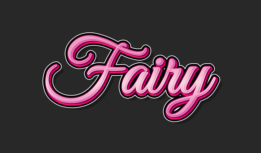
Write „Fairy” (the first letter should be capital) and place it in the center of the Photoshop document (press Control-A to select the document, and then pick the Move Tool (V) and click on the Align Vertical Center and Align Horizontal Center icons).

Text Align

Step 4

Double-click the text layer to apply the following layer style.

Add a Stroke with these settings:

  • Size: 7 px
  • Position: Outside
  • Blend Mode: Normal
  • Opacity: 100%
  • Fill Type: Color
  • Color: #ff0084
Layer 1 - Stroke

Then click OK to save changes.

Step 5

Select the Fairy layer, go to Layer > Duplicate Layer, and name the layer „Middle”. Click OK to create the layer. Pick the Move Tool (V) and move it up and left by 7 px. Go to Layer > Layer Style > Clear Layer Style to clean the layer styles. Change the color to #c6c6c6.

Creating a New Layer

Step 6

Then double-click with your mouse on the text layer to open the Layer Style window.

Add a Stroke with these settings:

  • Size: 4 px
  • Position: Outside
  • Blend Mode: Normal
  • Opacity: 100%
  • Fill Type: Color
  • Color: #8c054a
Layer 2 - Stroke

Step 7

Now add an Inner Glow:

  • Blend Mode: Overlay
  • Opacity: 50%
  • Noise: 0%
  • Color: #ffffff
  • Technique: Softer
  • Source: Edge
  • Choke: 100%
  • Size: 4 px
  • Contour: Linear
  • Uncheck Anti-aliased
  • Range: 100%
  • Jitter: 0%
Layer 2 - Inner Glow

Step 8

Add a Gradient Overlay with these settings:

  • Blend Mode: Normal
  • Opacity: 100%
  • Gradient: from #f6b6ce to #e35b9b
  • Style: Reflected
  • Angle: 90°
  • Scale: 46%
  • Uncheck Reverse and Dither
  • Check Align with Layer
Layer 2 - Gradient Overlay

Step 9

Add a Drop Shadow with these settings:

  • Blending Mode: Normal
  • Pick the color #840048
  • Opacity: 100%
  • Uncheck Use Global Light box before setting the Angle: 135°
  • Distance: 10 px
  • Spread: 100%
  • Size: 0 px
  • Contour: Linear
  • Uncheck Anti-aliased
  • Noise: 0%
  • Check Layer Knocks Out Drop Shadow
Layer 2 - Drop Shadow

Click OK to save changes.

Step 10

Select the Middle layer and duplicate it. Double-click on the name and change it to „Front”. Press Enter to apply the settings. Pick the Move Tool (V) and move it up by 5 px and left by 1 px. Go to Layer > Layer Style > Clear Layer Style to clean the layer styles.

Creating a New Layer

Step 11

Make sure that the Front layer is selected. Double-click with your mouse on the layer to apply the following layer style. Set the Fill Opacity to 0%.

Layer 3 - Blending Options

Step 12

Add a Stroke:

  • Size: 7 px
  • Position: Inside
  • Blend Mode: Normal
  • Opacity: 0%
  • Fill Type: Color
  • Color: #000000
Layer 3 - Stroke

Step 13

Add a Color Overlay with these settings:

  • Blend Mode: Normal
  • Color: #ffffff
  • Opacity: 40%
Layer 3 - Color Overlay

Then click OK to save changes.

Step 14

Select the layers Fairy, Middle and Front, go to Layer > Merge Layers (or press Control-E) to merge them into one.

Merging the Layers

Step 15

Double-click the text layer to apply the following layer style.

Add a Stroke:

  • Size: 10 px
  • Position: Outside
  • Blend Mode: Normal
  • Opacity: 100%
  • Fill Type: Color
  • Color: #000000
Merged Layer - Stroke

Step 16

Now add an Outer Glow:

  • Blend Mode: Normal
  • Opacity: 100%
  • Noise: 0%
  • Color: #ffffff
  • Technique: Softer
  • Choke: 100%
  • Size: 14 px
  • Contour: Linear
  • Uncheck Anti-aliased
  • Range: 100%
  • Jitter: 0%
Merged Layer - Outer Glow

Step 17

Add a Drop Shadow with these settings:

  • Blending Mode: Normal
  • Pick the color #000000
  • Opacity: 30%
  • Uncheck Use Global Light box before setting the Angle: 135°
  • Distance: 35 px
  • Spread: 0%
  • Size: 0 px
  • Contour: Linear
  • Uncheck Anti-aliased
  • Noise: 0%
  • Check Layer Knocks Out Drop Shadow
Merged Layer - Drop Shadow

Click OK to save changes.

Congratulations, You’re Done!

In this tutorial you learned how to create a piece of fairytale text. Hope you like it. Don’t forget to share your result with us.

Final Result

This text effect we have just created is a part of my text style pack on GraphicRiver.

Photoshop Text Styles 01
Photoshop Text Styles

Looking for more cartoon actions and assets? Check out our recommended cartoon photo effects and comic text effect actions:

How to Create a Cartoon Gradient Text Effect in Adobe Photoshop

Post pobrano z: How to Create a Cartoon Gradient Text Effect in Adobe Photoshop

Final product image
What You’ll Be Creating

In this tutorial I want to show you how to create a gradient text effect in Adobe Photoshop. If you want to get the final result without any effort, you can buy it on GraphicRiver.

This pack includes different text effects and works with shapes and text.

Photoshop Text Styles 01
Photoshop Text Styles

Looking for more cartoon actions and assets? Check out our recommended cartoon photo effects and comic text effect actions:

Tutorial Assets

The following assets will be used during this tutorial:

Before you start creating this text effect, download and install the font.

1. How to Create the Layer Styles

Step 1

Open Photoshop, and go to File > New to create a new document.

Creating a New Document

Step 2

Fill the document using #282828 color. Pick the Type Tool (T) with these settings:

  • Font: Great Vibes
  • Font Size: 127 pt
  • Color: White
  • The tracking for the selection characters: -25
Text Tool

Step 3

Write „Fairy” (the first letter should be capital) and place it in the center of the Photoshop document (press Control-A to select the document, and then pick the Move Tool (V) and click on the Align Vertical Center and Align Horizontal Center icons).

Text Align

Step 4

Double-click the text layer to apply the following layer style.

Add a Stroke with these settings:

  • Size: 7 px
  • Position: Outside
  • Blend Mode: Normal
  • Opacity: 100%
  • Fill Type: Color
  • Color: #ff0084
Layer 1 - Stroke

Then click OK to save changes.

Step 5

Select the Fairy layer, go to Layer > Duplicate Layer, and name the layer „Middle”. Click OK to create the layer. Pick the Move Tool (V) and move it up and left by 7 px. Go to Layer > Layer Style > Clear Layer Style to clean the layer styles. Change the color to #c6c6c6.

Creating a New Layer

Step 6

Then double-click with your mouse on the text layer to open the Layer Style window.

Add a Stroke with these settings:

  • Size: 4 px
  • Position: Outside
  • Blend Mode: Normal
  • Opacity: 100%
  • Fill Type: Color
  • Color: #8c054a
Layer 2 - Stroke

Step 7

Now add an Inner Glow:

  • Blend Mode: Overlay
  • Opacity: 50%
  • Noise: 0%
  • Color: #ffffff
  • Technique: Softer
  • Source: Edge
  • Choke: 100%
  • Size: 4 px
  • Contour: Linear
  • Uncheck Anti-aliased
  • Range: 100%
  • Jitter: 0%
Layer 2 - Inner Glow

Step 8

Add a Gradient Overlay with these settings:

  • Blend Mode: Normal
  • Opacity: 100%
  • Gradient: from #f6b6ce to #e35b9b
  • Style: Reflected
  • Angle: 90°
  • Scale: 46%
  • Uncheck Reverse and Dither
  • Check Align with Layer
Layer 2 - Gradient Overlay

Step 9

Add a Drop Shadow with these settings:

  • Blending Mode: Normal
  • Pick the color #840048
  • Opacity: 100%
  • Uncheck Use Global Light box before setting the Angle: 135°
  • Distance: 10 px
  • Spread: 100%
  • Size: 0 px
  • Contour: Linear
  • Uncheck Anti-aliased
  • Noise: 0%
  • Check Layer Knocks Out Drop Shadow
Layer 2 - Drop Shadow

Click OK to save changes.

Step 10

Select the Middle layer and duplicate it. Double-click on the name and change it to „Front”. Press Enter to apply the settings. Pick the Move Tool (V) and move it up by 5 px and left by 1 px. Go to Layer > Layer Style > Clear Layer Style to clean the layer styles.

Creating a New Layer

Step 11

Make sure that the Front layer is selected. Double-click with your mouse on the layer to apply the following layer style. Set the Fill Opacity to 0%.

Layer 3 - Blending Options

Step 12

Add a Stroke:

  • Size: 7 px
  • Position: Inside
  • Blend Mode: Normal
  • Opacity: 0%
  • Fill Type: Color
  • Color: #000000
Layer 3 - Stroke

Step 13

Add a Color Overlay with these settings:

  • Blend Mode: Normal
  • Color: #ffffff
  • Opacity: 40%
Layer 3 - Color Overlay

Then click OK to save changes.

Step 14

Select the layers Fairy, Middle and Front, go to Layer > Merge Layers (or press Control-E) to merge them into one.

Merging the Layers

Step 15

Double-click the text layer to apply the following layer style.

Add a Stroke:

  • Size: 10 px
  • Position: Outside
  • Blend Mode: Normal
  • Opacity: 100%
  • Fill Type: Color
  • Color: #000000
Merged Layer - Stroke

Step 16

Now add an Outer Glow:

  • Blend Mode: Normal
  • Opacity: 100%
  • Noise: 0%
  • Color: #ffffff
  • Technique: Softer
  • Choke: 100%
  • Size: 14 px
  • Contour: Linear
  • Uncheck Anti-aliased
  • Range: 100%
  • Jitter: 0%
Merged Layer - Outer Glow

Step 17

Add a Drop Shadow with these settings:

  • Blending Mode: Normal
  • Pick the color #000000
  • Opacity: 30%
  • Uncheck Use Global Light box before setting the Angle: 135°
  • Distance: 35 px
  • Spread: 0%
  • Size: 0 px
  • Contour: Linear
  • Uncheck Anti-aliased
  • Noise: 0%
  • Check Layer Knocks Out Drop Shadow
Merged Layer - Drop Shadow

Click OK to save changes.

Congratulations, You’re Done!

In this tutorial you learned how to create a piece of fairytale text. Hope you like it. Don’t forget to share your result with us.

Final Result

This text effect we have just created is a part of my text style pack on GraphicRiver.

Photoshop Text Styles 01
Photoshop Text Styles

Looking for more cartoon actions and assets? Check out our recommended cartoon photo effects and comic text effect actions:

How to Create a Cartoon Gradient Text Effect in Adobe Photoshop

Post pobrano z: How to Create a Cartoon Gradient Text Effect in Adobe Photoshop

Final product image
What You’ll Be Creating

In this tutorial I want to show you how to create a gradient text effect in Adobe Photoshop. If you want to get the final result without any effort, you can buy it on GraphicRiver.

This pack includes different text effects and works with shapes and text.

Photoshop Text Styles 01
Photoshop Text Styles

Looking for more cartoon actions and assets? Check out our recommended cartoon photo effects and comic text effect actions:

Tutorial Assets

The following assets will be used during this tutorial:

Before you start creating this text effect, download and install the font.

1. How to Create the Layer Styles

Step 1

Open Photoshop, and go to File > New to create a new document.

Creating a New Document

Step 2

Fill the document using #282828 color. Pick the Type Tool (T) with these settings:

  • Font: Great Vibes
  • Font Size: 127 pt
  • Color: White
  • The tracking for the selection characters: -25
Text Tool

Step 3

Write „Fairy” (the first letter should be capital) and place it in the center of the Photoshop document (press Control-A to select the document, and then pick the Move Tool (V) and click on the Align Vertical Center and Align Horizontal Center icons).

Text Align

Step 4

Double-click the text layer to apply the following layer style.

Add a Stroke with these settings:

  • Size: 7 px
  • Position: Outside
  • Blend Mode: Normal
  • Opacity: 100%
  • Fill Type: Color
  • Color: #ff0084
Layer 1 - Stroke

Then click OK to save changes.

Step 5

Select the Fairy layer, go to Layer > Duplicate Layer, and name the layer „Middle”. Click OK to create the layer. Pick the Move Tool (V) and move it up and left by 7 px. Go to Layer > Layer Style > Clear Layer Style to clean the layer styles. Change the color to #c6c6c6.

Creating a New Layer

Step 6

Then double-click with your mouse on the text layer to open the Layer Style window.

Add a Stroke with these settings:

  • Size: 4 px
  • Position: Outside
  • Blend Mode: Normal
  • Opacity: 100%
  • Fill Type: Color
  • Color: #8c054a
Layer 2 - Stroke

Step 7

Now add an Inner Glow:

  • Blend Mode: Overlay
  • Opacity: 50%
  • Noise: 0%
  • Color: #ffffff
  • Technique: Softer
  • Source: Edge
  • Choke: 100%
  • Size: 4 px
  • Contour: Linear
  • Uncheck Anti-aliased
  • Range: 100%
  • Jitter: 0%
Layer 2 - Inner Glow

Step 8

Add a Gradient Overlay with these settings:

  • Blend Mode: Normal
  • Opacity: 100%
  • Gradient: from #f6b6ce to #e35b9b
  • Style: Reflected
  • Angle: 90°
  • Scale: 46%
  • Uncheck Reverse and Dither
  • Check Align with Layer
Layer 2 - Gradient Overlay

Step 9

Add a Drop Shadow with these settings:

  • Blending Mode: Normal
  • Pick the color #840048
  • Opacity: 100%
  • Uncheck Use Global Light box before setting the Angle: 135°
  • Distance: 10 px
  • Spread: 100%
  • Size: 0 px
  • Contour: Linear
  • Uncheck Anti-aliased
  • Noise: 0%
  • Check Layer Knocks Out Drop Shadow
Layer 2 - Drop Shadow

Click OK to save changes.

Step 10

Select the Middle layer and duplicate it. Double-click on the name and change it to „Front”. Press Enter to apply the settings. Pick the Move Tool (V) and move it up by 5 px and left by 1 px. Go to Layer > Layer Style > Clear Layer Style to clean the layer styles.

Creating a New Layer

Step 11

Make sure that the Front layer is selected. Double-click with your mouse on the layer to apply the following layer style. Set the Fill Opacity to 0%.

Layer 3 - Blending Options

Step 12

Add a Stroke:

  • Size: 7 px
  • Position: Inside
  • Blend Mode: Normal
  • Opacity: 0%
  • Fill Type: Color
  • Color: #000000
Layer 3 - Stroke

Step 13

Add a Color Overlay with these settings:

  • Blend Mode: Normal
  • Color: #ffffff
  • Opacity: 40%
Layer 3 - Color Overlay

Then click OK to save changes.

Step 14

Select the layers Fairy, Middle and Front, go to Layer > Merge Layers (or press Control-E) to merge them into one.

Merging the Layers

Step 15

Double-click the text layer to apply the following layer style.

Add a Stroke:

  • Size: 10 px
  • Position: Outside
  • Blend Mode: Normal
  • Opacity: 100%
  • Fill Type: Color
  • Color: #000000
Merged Layer - Stroke

Step 16

Now add an Outer Glow:

  • Blend Mode: Normal
  • Opacity: 100%
  • Noise: 0%
  • Color: #ffffff
  • Technique: Softer
  • Choke: 100%
  • Size: 14 px
  • Contour: Linear
  • Uncheck Anti-aliased
  • Range: 100%
  • Jitter: 0%
Merged Layer - Outer Glow

Step 17

Add a Drop Shadow with these settings:

  • Blending Mode: Normal
  • Pick the color #000000
  • Opacity: 30%
  • Uncheck Use Global Light box before setting the Angle: 135°
  • Distance: 35 px
  • Spread: 0%
  • Size: 0 px
  • Contour: Linear
  • Uncheck Anti-aliased
  • Noise: 0%
  • Check Layer Knocks Out Drop Shadow
Merged Layer - Drop Shadow

Click OK to save changes.

Congratulations, You’re Done!

In this tutorial you learned how to create a piece of fairytale text. Hope you like it. Don’t forget to share your result with us.

Final Result

This text effect we have just created is a part of my text style pack on GraphicRiver.

Photoshop Text Styles 01
Photoshop Text Styles

Looking for more cartoon actions and assets? Check out our recommended cartoon photo effects and comic text effect actions:

How to Create a Cartoon Gradient Text Effect in Adobe Photoshop

Post pobrano z: How to Create a Cartoon Gradient Text Effect in Adobe Photoshop

Final product image
What You’ll Be Creating

In this tutorial I want to show you how to create a gradient text effect in Adobe Photoshop. If you want to get the final result without any effort, you can buy it on GraphicRiver.

This pack includes different text effects and works with shapes and text.

Photoshop Text Styles 01
Photoshop Text Styles

Looking for more cartoon actions and assets? Check out our recommended cartoon photo effects and comic text effect actions:

Tutorial Assets

The following assets will be used during this tutorial:

Before you start creating this text effect, download and install the font.

1. How to Create the Layer Styles

Step 1

Open Photoshop, and go to File > New to create a new document.

Creating a New Document

Step 2

Fill the document using #282828 color. Pick the Type Tool (T) with these settings:

  • Font: Great Vibes
  • Font Size: 127 pt
  • Color: White
  • The tracking for the selection characters: -25
Text Tool

Step 3

Write „Fairy” (the first letter should be capital) and place it in the center of the Photoshop document (press Control-A to select the document, and then pick the Move Tool (V) and click on the Align Vertical Center and Align Horizontal Center icons).

Text Align

Step 4

Double-click the text layer to apply the following layer style.

Add a Stroke with these settings:

  • Size: 7 px
  • Position: Outside
  • Blend Mode: Normal
  • Opacity: 100%
  • Fill Type: Color
  • Color: #ff0084
Layer 1 - Stroke

Then click OK to save changes.

Step 5

Select the Fairy layer, go to Layer > Duplicate Layer, and name the layer „Middle”. Click OK to create the layer. Pick the Move Tool (V) and move it up and left by 7 px. Go to Layer > Layer Style > Clear Layer Style to clean the layer styles. Change the color to #c6c6c6.

Creating a New Layer

Step 6

Then double-click with your mouse on the text layer to open the Layer Style window.

Add a Stroke with these settings:

  • Size: 4 px
  • Position: Outside
  • Blend Mode: Normal
  • Opacity: 100%
  • Fill Type: Color
  • Color: #8c054a
Layer 2 - Stroke

Step 7

Now add an Inner Glow:

  • Blend Mode: Overlay
  • Opacity: 50%
  • Noise: 0%
  • Color: #ffffff
  • Technique: Softer
  • Source: Edge
  • Choke: 100%
  • Size: 4 px
  • Contour: Linear
  • Uncheck Anti-aliased
  • Range: 100%
  • Jitter: 0%
Layer 2 - Inner Glow

Step 8

Add a Gradient Overlay with these settings:

  • Blend Mode: Normal
  • Opacity: 100%
  • Gradient: from #f6b6ce to #e35b9b
  • Style: Reflected
  • Angle: 90°
  • Scale: 46%
  • Uncheck Reverse and Dither
  • Check Align with Layer
Layer 2 - Gradient Overlay

Step 9

Add a Drop Shadow with these settings:

  • Blending Mode: Normal
  • Pick the color #840048
  • Opacity: 100%
  • Uncheck Use Global Light box before setting the Angle: 135°
  • Distance: 10 px
  • Spread: 100%
  • Size: 0 px
  • Contour: Linear
  • Uncheck Anti-aliased
  • Noise: 0%
  • Check Layer Knocks Out Drop Shadow
Layer 2 - Drop Shadow

Click OK to save changes.

Step 10

Select the Middle layer and duplicate it. Double-click on the name and change it to „Front”. Press Enter to apply the settings. Pick the Move Tool (V) and move it up by 5 px and left by 1 px. Go to Layer > Layer Style > Clear Layer Style to clean the layer styles.

Creating a New Layer

Step 11

Make sure that the Front layer is selected. Double-click with your mouse on the layer to apply the following layer style. Set the Fill Opacity to 0%.

Layer 3 - Blending Options

Step 12

Add a Stroke:

  • Size: 7 px
  • Position: Inside
  • Blend Mode: Normal
  • Opacity: 0%
  • Fill Type: Color
  • Color: #000000
Layer 3 - Stroke

Step 13

Add a Color Overlay with these settings:

  • Blend Mode: Normal
  • Color: #ffffff
  • Opacity: 40%
Layer 3 - Color Overlay

Then click OK to save changes.

Step 14

Select the layers Fairy, Middle and Front, go to Layer > Merge Layers (or press Control-E) to merge them into one.

Merging the Layers

Step 15

Double-click the text layer to apply the following layer style.

Add a Stroke:

  • Size: 10 px
  • Position: Outside
  • Blend Mode: Normal
  • Opacity: 100%
  • Fill Type: Color
  • Color: #000000
Merged Layer - Stroke

Step 16

Now add an Outer Glow:

  • Blend Mode: Normal
  • Opacity: 100%
  • Noise: 0%
  • Color: #ffffff
  • Technique: Softer
  • Choke: 100%
  • Size: 14 px
  • Contour: Linear
  • Uncheck Anti-aliased
  • Range: 100%
  • Jitter: 0%
Merged Layer - Outer Glow

Step 17

Add a Drop Shadow with these settings:

  • Blending Mode: Normal
  • Pick the color #000000
  • Opacity: 30%
  • Uncheck Use Global Light box before setting the Angle: 135°
  • Distance: 35 px
  • Spread: 0%
  • Size: 0 px
  • Contour: Linear
  • Uncheck Anti-aliased
  • Noise: 0%
  • Check Layer Knocks Out Drop Shadow
Merged Layer - Drop Shadow

Click OK to save changes.

Congratulations, You’re Done!

In this tutorial you learned how to create a piece of fairytale text. Hope you like it. Don’t forget to share your result with us.

Final Result

This text effect we have just created is a part of my text style pack on GraphicRiver.

Photoshop Text Styles 01
Photoshop Text Styles

Looking for more cartoon actions and assets? Check out our recommended cartoon photo effects and comic text effect actions:

How to Create a Cartoon Gradient Text Effect in Adobe Photoshop

Post pobrano z: How to Create a Cartoon Gradient Text Effect in Adobe Photoshop

Final product image
What You’ll Be Creating

In this tutorial I want to show you how to create a gradient text effect in Adobe Photoshop. If you want to get the final result without any effort, you can buy it on GraphicRiver.

This pack includes different text effects and works with shapes and text.

Photoshop Text Styles 01
Photoshop Text Styles

Looking for more cartoon actions and assets? Check out our recommended cartoon photo effects and comic text effect actions:

Tutorial Assets

The following assets will be used during this tutorial:

Before you start creating this text effect, download and install the font.

1. How to Create the Layer Styles

Step 1

Open Photoshop, and go to File > New to create a new document.

Creating a New Document

Step 2

Fill the document using #282828 color. Pick the Type Tool (T) with these settings:

  • Font: Great Vibes
  • Font Size: 127 pt
  • Color: White
  • The tracking for the selection characters: -25
Text Tool

Step 3

Write „Fairy” (the first letter should be capital) and place it in the center of the Photoshop document (press Control-A to select the document, and then pick the Move Tool (V) and click on the Align Vertical Center and Align Horizontal Center icons).

Text Align

Step 4

Double-click the text layer to apply the following layer style.

Add a Stroke with these settings:

  • Size: 7 px
  • Position: Outside
  • Blend Mode: Normal
  • Opacity: 100%
  • Fill Type: Color
  • Color: #ff0084
Layer 1 - Stroke

Then click OK to save changes.

Step 5

Select the Fairy layer, go to Layer > Duplicate Layer, and name the layer „Middle”. Click OK to create the layer. Pick the Move Tool (V) and move it up and left by 7 px. Go to Layer > Layer Style > Clear Layer Style to clean the layer styles. Change the color to #c6c6c6.

Creating a New Layer

Step 6

Then double-click with your mouse on the text layer to open the Layer Style window.

Add a Stroke with these settings:

  • Size: 4 px
  • Position: Outside
  • Blend Mode: Normal
  • Opacity: 100%
  • Fill Type: Color
  • Color: #8c054a
Layer 2 - Stroke

Step 7

Now add an Inner Glow:

  • Blend Mode: Overlay
  • Opacity: 50%
  • Noise: 0%
  • Color: #ffffff
  • Technique: Softer
  • Source: Edge
  • Choke: 100%
  • Size: 4 px
  • Contour: Linear
  • Uncheck Anti-aliased
  • Range: 100%
  • Jitter: 0%
Layer 2 - Inner Glow

Step 8

Add a Gradient Overlay with these settings:

  • Blend Mode: Normal
  • Opacity: 100%
  • Gradient: from #f6b6ce to #e35b9b
  • Style: Reflected
  • Angle: 90°
  • Scale: 46%
  • Uncheck Reverse and Dither
  • Check Align with Layer
Layer 2 - Gradient Overlay

Step 9

Add a Drop Shadow with these settings:

  • Blending Mode: Normal
  • Pick the color #840048
  • Opacity: 100%
  • Uncheck Use Global Light box before setting the Angle: 135°
  • Distance: 10 px
  • Spread: 100%
  • Size: 0 px
  • Contour: Linear
  • Uncheck Anti-aliased
  • Noise: 0%
  • Check Layer Knocks Out Drop Shadow
Layer 2 - Drop Shadow

Click OK to save changes.

Step 10

Select the Middle layer and duplicate it. Double-click on the name and change it to „Front”. Press Enter to apply the settings. Pick the Move Tool (V) and move it up by 5 px and left by 1 px. Go to Layer > Layer Style > Clear Layer Style to clean the layer styles.

Creating a New Layer

Step 11

Make sure that the Front layer is selected. Double-click with your mouse on the layer to apply the following layer style. Set the Fill Opacity to 0%.

Layer 3 - Blending Options

Step 12

Add a Stroke:

  • Size: 7 px
  • Position: Inside
  • Blend Mode: Normal
  • Opacity: 0%
  • Fill Type: Color
  • Color: #000000
Layer 3 - Stroke

Step 13

Add a Color Overlay with these settings:

  • Blend Mode: Normal
  • Color: #ffffff
  • Opacity: 40%
Layer 3 - Color Overlay

Then click OK to save changes.

Step 14

Select the layers Fairy, Middle and Front, go to Layer > Merge Layers (or press Control-E) to merge them into one.

Merging the Layers

Step 15

Double-click the text layer to apply the following layer style.

Add a Stroke:

  • Size: 10 px
  • Position: Outside
  • Blend Mode: Normal
  • Opacity: 100%
  • Fill Type: Color
  • Color: #000000
Merged Layer - Stroke

Step 16

Now add an Outer Glow:

  • Blend Mode: Normal
  • Opacity: 100%
  • Noise: 0%
  • Color: #ffffff
  • Technique: Softer
  • Choke: 100%
  • Size: 14 px
  • Contour: Linear
  • Uncheck Anti-aliased
  • Range: 100%
  • Jitter: 0%
Merged Layer - Outer Glow

Step 17

Add a Drop Shadow with these settings:

  • Blending Mode: Normal
  • Pick the color #000000
  • Opacity: 30%
  • Uncheck Use Global Light box before setting the Angle: 135°
  • Distance: 35 px
  • Spread: 0%
  • Size: 0 px
  • Contour: Linear
  • Uncheck Anti-aliased
  • Noise: 0%
  • Check Layer Knocks Out Drop Shadow
Merged Layer - Drop Shadow

Click OK to save changes.

Congratulations, You’re Done!

In this tutorial you learned how to create a piece of fairytale text. Hope you like it. Don’t forget to share your result with us.

Final Result

This text effect we have just created is a part of my text style pack on GraphicRiver.

Photoshop Text Styles 01
Photoshop Text Styles

Looking for more cartoon actions and assets? Check out our recommended cartoon photo effects and comic text effect actions:

The Stunning Crochet Sculptures of Caitlin McCormack

Post pobrano z: The Stunning Crochet Sculptures of Caitlin McCormack

When someone mentions crochet in a conversation, chances are that your first thoughts are for an old lady who seems to be doing it all the time.

Caitlin McCormack does another type of crochet! Although she is a cat lady, she is well under eighty, and her art is far from traditional.

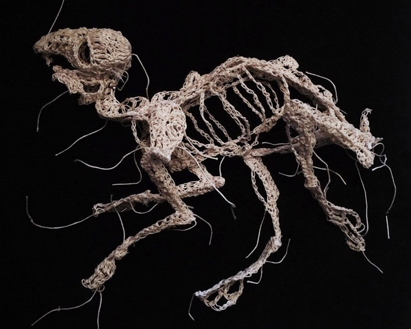
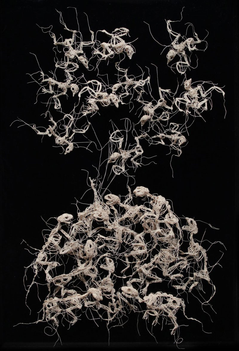
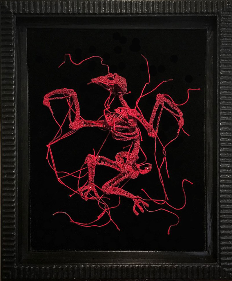
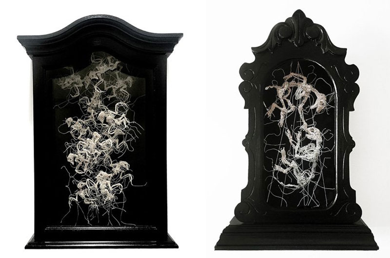
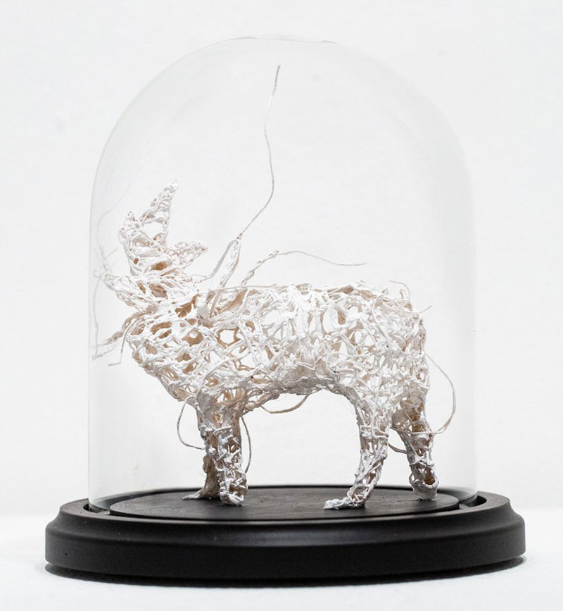
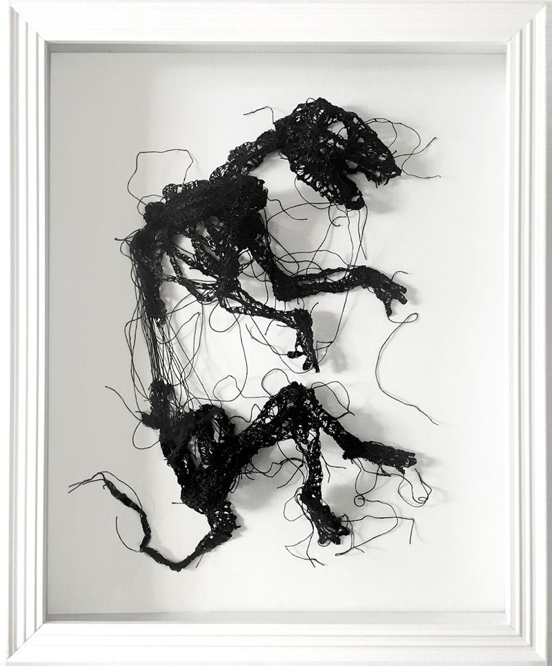
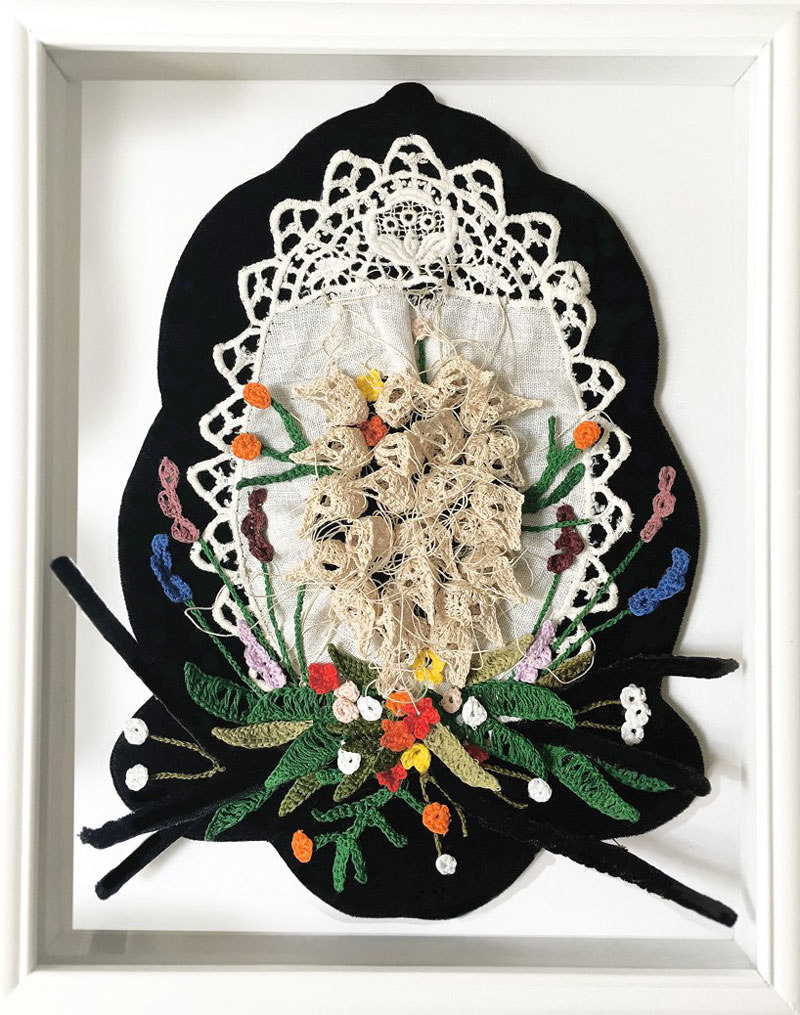
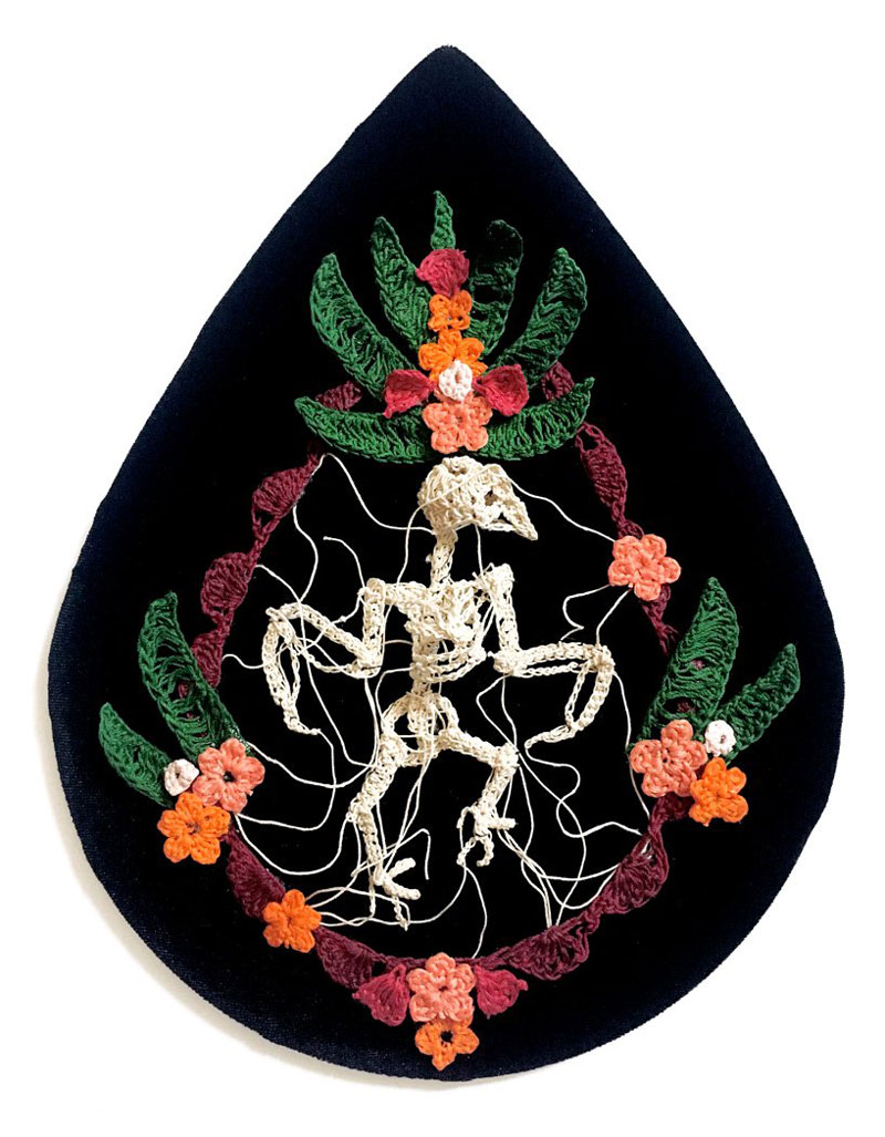
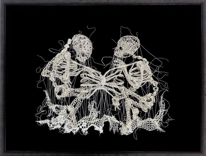
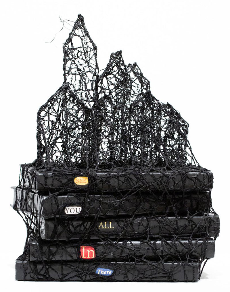
Firstly, the American artist’s creations are not just hung on the walls or displayed on tables, they are shown as sculptures. The sculptures look like taxonomical specimens that you can see in anatomy books or science museums.

The skeletal figures appear as totally vulnerable, exposed to the looks of passer-by, and defenseless. The texture of the art adds to the fragile look-and-feel, making us feel almost guilty to look at it.

The Stunning Crochet Sculptures of Caitlin McCormack

Post pobrano z: The Stunning Crochet Sculptures of Caitlin McCormack

When someone mentions crochet in a conversation, chances are that your first thoughts are for an old lady who seems to be doing it all the time.

Caitlin McCormack does another type of crochet! Although she is a cat lady, she is well under eighty, and her art is far from traditional.

Firstly, the American artist’s creations are not just hung on the walls or displayed on tables, they are shown as sculptures. The sculptures look like taxonomical specimens that you can see in anatomy books or science museums.

The skeletal figures appear as totally vulnerable, exposed to the looks of passer-by, and defenseless. The texture of the art adds to the fragile look-and-feel, making us feel almost guilty to look at it.