How to Make a Wedding Menu Template in InDesign

Post pobrano z: How to Make a Wedding Menu Template in InDesign

Final product image
What You’ll Be Creating

Make a statement with your wedding stationery by learning how to make an InDesign menu template in just a few easy steps.

In this tutorial, we will cover how to set up a wedding menu template through the use of Layers and Paragraph styles. You will also learn how to prepare your wedding menu template in an InDesign template that users can edit easily. This menu format measures 9 in x 4 in, which makes it easy for you and other users to print at home.   

In a hurry? We’ve got amazing dinner menu templates and menu card templates over at Envato Elements and GraphicRiver. Go check them out!

What You Will Need for Your InDesign Menu Template

You’ll need access to Adobe InDesign. If you don’t have the software, you can download a trial from the Adobe website. We’ll also be using:

Download the assets and make sure the fonts are installed on your system before starting. When you are ready, we can dive in! 

1. Setting Up a Wedding Menu Template File in InDesign

Step 1

In InDesign, go to File > New. Name the document wedding menu template. Set the file to the following dimensions:

  • Width to 4 in
  • Height to 9 in 
  • Orientation to Portrait
  • Units to Inches
  • Pages to 1
  • Uncheck Facing Pages
  • Columns to 1
  • Margins to 0.5 in
  • Bleeds to 0.125 in (it’s best to seek your professional printer’s preference)

Click Create.

create a new file

Step 2

Organizing layers is an important practice when designing an InDesign template. Bring up the Layers panel by going to Window > Layers. Double-click on Layer 1 and rename it Background. 

rename layer 1 to background

Step 3

On the Layers panel main menu, select New Layer. Name it Copy. Click OK.

Create a new layer named Images. Click OK.

create new layers

2. Designing Your Wedding Menu Layout in InDesign

Step 1

On the Layers panel, select the Background layer.

To Place an image, press Command-D. Locate the Watercolor pink backgrounds folder and select the 7.jpg file. Click Place.

place the background image

Step 2

Click on the InDesign menu template to place the image. Using the Direct Selection Tool (V), resize the frame to cover the width of the wedding menu template and extend it to the bleed.

resize the image

Step 3

Head over to the Layers panel and lock the Background layer. Select the Copy layer. 

lock the background layer and select the copy layer

Step 4

Using the Text Tool (T), create a text frame at the very top of the InDesign menu template. Use the side margins to help you place the text box in the center of the page. Add text—in this case, I’ve added ‘Let’s Dine!’

using the text tool add a title

Step 5

Open the Character panel by going to Window > Type & Tables > Character panel.

On the Character panel, set the Font to Cest Lavie Regular and the Size to 40 pt. 

On the Control bar, set the Alignment to Center.

use the character panel to format the text frame

Step 6

Create a text box under the title using the Text Tool (T). Here, we will include the couple’s name and date on two lines. 

On the Character panel, set the Font to Cest Lavie Serif and the Size to 10 pt. 

On the Control bar, set the Alignment to Center.

add names and date under the title on the menu design

Step 7

Create a text box under the names using the Text Tool (T). Here, we will include the menu for the day. We will use a combination of the Regular and Serif family. Add copy, and let’s start formatting:

  • Subtitle: Add a hyphen before and after each subtitle as this will help create emphasis.  Set the Font to Cest Lavie Regular and the Size to 20 pt.
  • Menu items: set the Font to  Cest Lavie Serif and the Size to 8 pt.

On the Control bar, set the Alignment to Center.

add the menu copy and use the character panel to format the menu template

Step 8

Create a text box under the menu with the Text Tool (T). Include a line such as ‘Bon Appetit’.

On the Character panel, set the Font to Cest Lavie Serif and the Size to 10 pt. 

On the Control bar, set the Alignment to Center.

add a final line on the menu card template

Step 9

Head over to the Layers panel and lock the Copy layer. Select the Images layer.

lock the copy layer and select the images layer

Step 10

Press Command-D to Place an image on the InDesign menu template. Locate the arrange_6.png file and click Open.

place the flower arrangement on the menu template

Step 11

Click on the menu layout to place the image. 

Head over to the Control panel and activate the Constrain Proportions button. Set the Percentage to 45%. 

Place the image on the bottom left corner of the menu. Make sure that the image is touching the bleed marks.

place the image on the bottom left corner of the menu template

Step 12

Press Command-D to Place an image on the menu card template. Locate the arrange_5.png file and click Open.

Click on the InDesign menu template to place the image. 

Head over to the Control panel and activate the Constrain Proportions button. Set the Percentage to 55%. 

Place the image on the bottom right corner of the menu. Make sure that the image is touching the bleed mark.

place a second arrangement on the food menu template

3. Converting Your Menu Layout Into an InDesign Template

Once you’ve finished designing your menu layout, it’s time to get it ready for easy customization. In this particular InDesign menu template, we will create Paragraph Styles for the content. The rest of the elements are JPEG files that don’t require specific formatting.

Step 1

Go to Window > Styles > Paragraph Styles. On the Paragraph Styles panel, we will create a number of formatting styles based on our menu design. 

Select and activate the text box at the top of the page. Head over to the Paragraph Styles panel and click on the Create New Style button. This will create a new style based on the text you selected. 

open the paragraph styles panel

Step 2

Double-click on Paragraph Style 1 to open the Paragraph Style Options window. 

Change the Style Name to Title. You will notice that the Style Settings will include the settings you used on the text—this is a great way to double-check everything is in order. Click OK. 

create paragraph styles

Step 3

Select the couple’s name and date using the Text Tool (T). Head over to the Paragraph Styles panel and click on the Create New Style button. 

Double-click on the new Paragraph Style and set the Style Name to Couple name. 

Repeat the same procedure for the rest of the menu and create styles for the Subtitle and Menu Description. 

Now your InDesign menu template is ready to be shared with others. Users will have the option to easily change the fonts and content through the paragraph styles. Users will also be able to change the images if they desire through the organized Layers panel. 

create paragraph styles for the rest of the menu design template

4. How to Export a File for Printing

Before exporting a file for printing, it is useful to take a look around all the edges of the menu design. This is to make sure all the images bleeding out are touching the bleeds.

Step 1

To export the file, go to File > Export. Name the file Wedding Menu Template and choose Adobe PDF (Print) from the Format dropdown menu. Click Save. 

expor the file as a PDF for print

Step 2

In the Export Adobe PDF window, set the Adobe PDF Preset to Press Quality.

use the press quality preset

On the left side of the panel, select Marks and Bleeds. Check All Printer’s Marks and Use Document Bleed Settings. Click Export. You will have a ready-to-print PDF file.

check all printers marks and document bleed settings

Great Job! You’ve Finished Your Wedding Menu Template!

In this tutorial, we learned how to make a wedding menu template in InDesign. We covered key tools that will help you create a ready-to-edit menu design. Today, we learned to:

  • set up a ready-to-print InDesign menu template
  • organize and create different layers
  • use paragraph styles to create a template
  • export a PDF file for printing

If you are new to InDesign and need menu layout ideas or menu design templates right away, head over to Envato Elements and GraphicRiver. We’ve got many options to explore! 
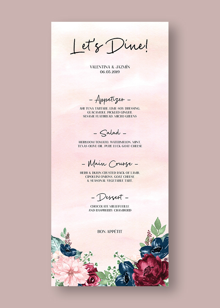
Final wedding menu template

If you liked this tutorial, you might like these:

wake up your money / Réveillez-vous, ça manque d’originalité!

Post pobrano z: wake up your money / Réveillez-vous, ça manque d’originalité!

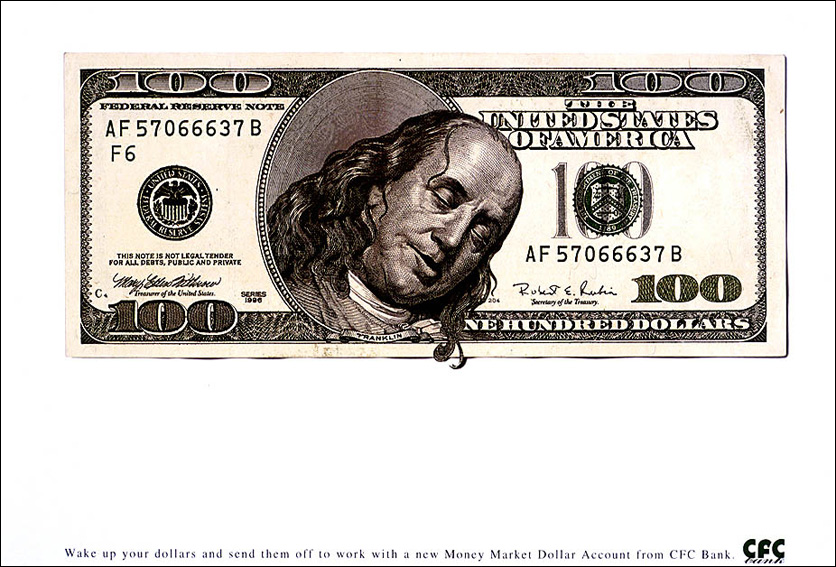
THE ORIGINAL?
CFC Bank / Dollar Accounts – 2000
“Wake up your dollars…”
Source : Cannes Archive
Agency : Scanad Marketing (Kenya)
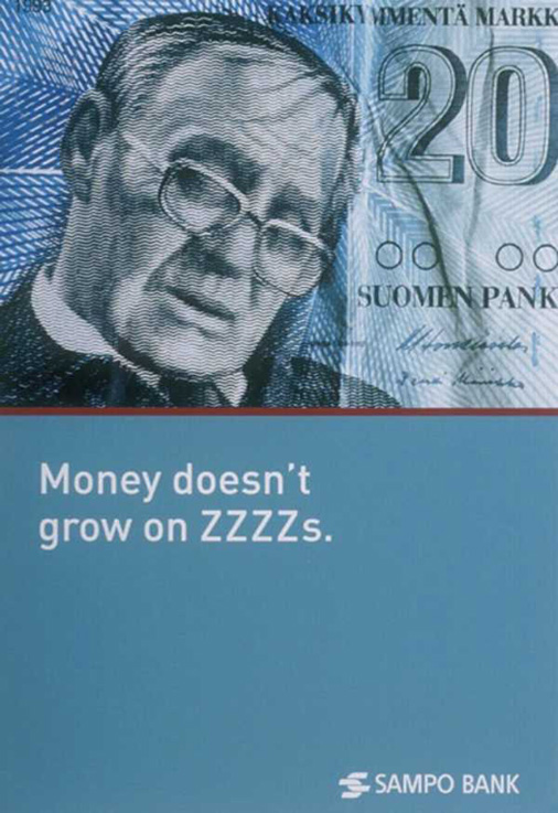
LESS ORIGINAL
Sampo Bank – 2002
“Money doesn’t
grow on zzzzs”
Agency : H&P (Finland)
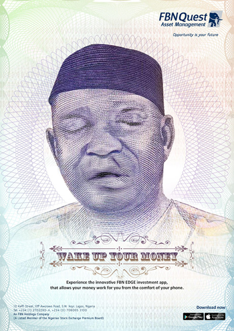
LESS ORIGINAL
FNB Asset Man. – 2019
“Wake up your money”
Source : adsoftheworld
Agency : X3M (Nigeria)

wake up your money / Réveillez-vous, ça manque d’originalité!

Post pobrano z: wake up your money / Réveillez-vous, ça manque d’originalité!

THE ORIGINAL?
CFC Bank / Dollar Accounts – 2000
“Wake up your dollars…”
Source : Cannes Archive
Agency : Scanad Marketing (Kenya)
LESS ORIGINAL
Sampo Bank – 2002
“Money doesn’t
grow on zzzzs”
Agency : H&P (Finland)
LESS ORIGINAL
FNB Asset Man. – 2019
“Wake up your money”
Source : adsoftheworld
Agency : X3M (Nigeria)

Why is the Mona Lisa So Famous?

Post pobrano z: Why is the Mona Lisa So Famous?

Creativity and Art

Ever noticed that whenever people have a
discussion about art somehow it diverts to become a topic on creativity. But
many do believe that the two have no connection whatsoever. Creativity is not
art but we can definitely say that art is creativity.

The reason why we are so comfortable saying that is because art is design, the ability to manipulate anything that comes to mind. It does involve a little bit of creativity but it is not creativity. Art is the freedom of interpretation that has no rules, unlike south african casino games they have many rules. You can decide to see a different thing from what everyone else can see or hear or feel. That is art.

The famous painting of Mona Lisa is worth
talking about. It is not a usual thing when people mention art and do not mention the painting of Mona Lisa.

Mona Lisa Playing Cards

What really is the fuss about this
painting. Seeing it for the first time well we bet you all have thought, ok,
this is just a pretty woman with a nice smile and looking very modest. With no jewelry or makeup whatsoever. But is that what
this is about?

We would like to think so. But again it is also because of the talented hands of the legendary Leonardo da Vinci. Only the real artists would understand the meaning of detail. The Mona Lisa painting shows the handling of sfumato among other great techniques that only the talented and skillful are able to possess, just like most of the creative online casino games visit site if you would like to see more.

If you are to look at that painting very
carefully you will think it is a photo that was taken. And with that, you fail to find a reason for the admiration for the great
painting.

What better way to appreciate the painting but to have Mona Lisa playing cards. To be honest it would only make sense this way. Playing cards have paintings that are ancient and very artistic. And we did mention that there is no art without Mona Lisa. And there you have it enjoy using Mona Lisa playing cards.  

Featured image by Juan Di Nella

5 Points on Great Logo Ideas

Post pobrano z: 5 Points on Great Logo Ideas

A great logo plays a significant role in any successful company as it goes a long way in creating an appealing and catchy visual impression of a brand. Although logo maker software can help you create a professional and stunning logo, you shouldn’t rely solely on the intuitiveness of the program because each business is unique. A logo design isn’t one-size-fits-all; it should be tailored to portray specific unique aspects of your business in an exclusive way. Here are some great logo ideas that can help you come up with a killer logo that will be recognizable by your clients whenever they see it and remind them of the great experiences they’ve had with your business.

1. Understand your audience

Before everything else as far as logo designing is concerned, you need to understand your target audience and the best way to win their loyalty. Identify that which they value in your business. It could be that they value speed in the way you serve them, the quality of your products, affordability of your product and the like. You can do a little research to identify that.  Your logo should feature at least one particular thing that your existing and target customers value or likely to value about your business. That thing should also be part of the business’ values.

2. Strive to be unique

In as much as you might be tempted to go with the trendy logo design, uniqueness is key as it sets a business apart from others. Uniqueness in a logo creates an impression of the exceptionality of a business, even in its operations. As such, ensure that you create a logo that you are convinced that none other out there looks similar. Well, it’s not easy to come up with an original thing, but it’s possible. Just take your time to give it the best shot.

3. Color matters

The color palette has very significant influence on the impression of your logo as colors bear different meanings and convey different ideas.  You can either use the brand’s color(s) or any other color(s) that you are certain will bear the intended meaning and convey the message you want to be communicated to the target audience. You can conduct research to understand different colors and their respective impressions to ensure that you don’t go wrong with your color pallet choice.

4. Keep it simple

The best logo is that which a targeted person will easily understand the message it conveys. There’s no need for giving the target audience a hard time as they take ages to analyze the logo. In as much as you might want to show off your typographical prowess, you need to understand if you create a complicated thing, most likely it won’t give you the desired results. The main aim of a logo is to represent a brand in a way that will make it memorable for the people to which it’s directed. A complex logo won’t be memorable. On the other hand, a simple and powerful one will be easily memorable and so, stand the test of time.

5. It’s even easier with online resources

In case you need some inspiration to create a stunning logo design, you can turn to online resources such as logo maker software.  There, you’ll get an array of design tools that will help you customize a logo that will accurately reflect the brand at hand as well as the related products.

A logo is a very vital component in the marketing of a business or brand. Therefore, its creation should be given the attention it deserves. Particularly, ensure that you implement the above five ideas.

Featured image by Aleks Dorohovich

5 Watch design trends we’re seeing in 2019

Post pobrano z: 5 Watch design trends we’re seeing in 2019

If you’re a watch brand in 2019, you’d best be doing something different, otherwise you’re just going to get lost in the sea of companies out there all vying for our attention. At Designer Daily, not much slips past our nets when it comes to noticing the design trends currently happening in the world of watches! That’s why we’re going to list a few of the noticeable crazes we’ve been seeing lately. Strap in and watch out for these.

Big watch faces

Go big or go home, it seems. Diminutive square faces and circular watch faces the size of a quarter coin are no good here, as wrist-swallowing designs are the order of the day in 2019. We can see why such designs are prevalent, after all, why buy a watch if it doesn’t get noticed? Jaeger-LeCoultre is doing some pretty cool world-changing things with its Geophysic Universal Time steel watch, in particular, as it’s literally a large map of the world. This is done quite tastefully and is elegant enough to stand side-by-side with Jaeger-LeCoultre’s other models, but its $14,300 might be a little off-putting for some. Despite that, it could be worth checking on Chrono24 to see if there’s a cheaper one online.

Notable collabs

Hublot has collaborated with Ferrari, Nixon with Metallica, and even Swatch with a famous painting pig called Pigasso. These days, joining forces with big names for a cooperated design is a wise marketing move, as you get two camps interested in your watch that may not have been otherwise. Which metalhead fan could honestly say they would have bought a Nixon watch if some designs didn’t feature album art from ‘Ride the Lightning’ or ‘Master of Puppets?’ Sponsoring celebrities to be brand ambassadors for your watch brand will always be a thing, but working together on new projects is a trend that will only get bigger.

Weird and wonderful

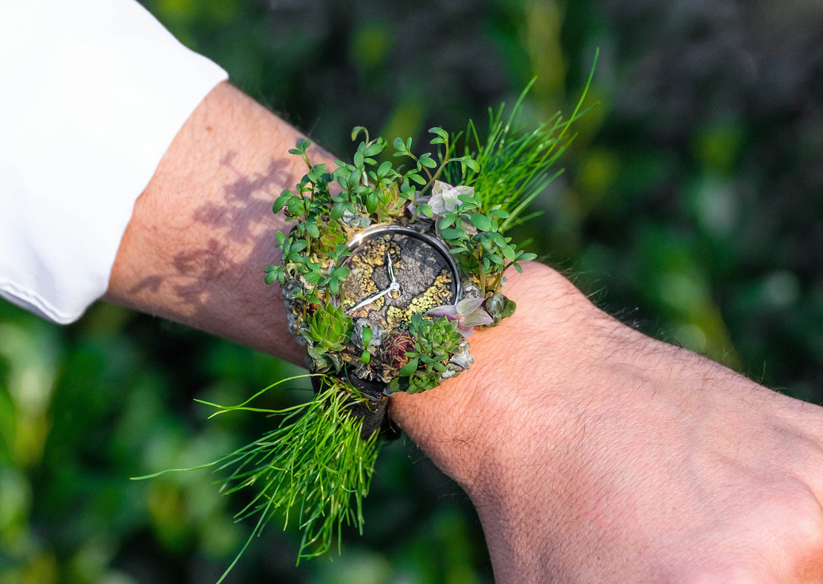
It’s not completely uncommon for unusual watch designs to pop up here and there, but 2019 will see them more than ever. Swatch has always been known to push the boundaries for what’s considered a “normal” design, but respected watchmaker Richard Mille has even gone a bit wacky with a series of sweets-inspired watches. Of course, let’s not forget H. Moser & Cie., which recently made a watch from living plants and even a model that simply chimes you the time instead of having hands.

Simplistic

Why so fancy? Swiss watch brands are known to release highly complex watches, with what you could call a “busy” watch face and too many dials than you even know what to do with. In going the opposite direction, companies like MVMT, Daniel Wellington, and Skagen are keeping things simple and producing designs which are literally a blank watch face with hour indicators, as well as an hour and minute hand – literally all you need to know the time during the day. These designs are a lot cheaper, too, which generally keeps customers interested.

Fitness features

Finally, if your watch isn’t checking your heart rate or counting your steps, is it even a watch? Smartwatches like the Apple Watch and Samsung Gear have become increasingly popular, as consumers love to have the apps that keep track of everything from the amount of calories burned to how much water was drunk that day. TAG Heuer even released its Connected Modular 45 smartwatch, a true sign that even longstanding Swiss companies are feeling the pressure of staying relevant in the modern age.

5 Watch design trends we’re seeing in 2019

Post pobrano z: 5 Watch design trends we’re seeing in 2019

If you’re a watch brand in 2019, you’d best be doing something different, otherwise you’re just going to get lost in the sea of companies out there all vying for our attention. At Designer Daily, not much slips past our nets when it comes to noticing the design trends currently happening in the world of watches! That’s why we’re going to list a few of the noticeable crazes we’ve been seeing lately. Strap in and watch out for these.

Big watch faces

Go big or go home, it seems. Diminutive square faces and circular watch faces the size of a quarter coin are no good here, as wrist-swallowing designs are the order of the day in 2019. We can see why such designs are prevalent, after all, why buy a watch if it doesn’t get noticed? Jaeger-LeCoultre is doing some pretty cool world-changing things with its Geophysic Universal Time steel watch, in particular, as it’s literally a large map of the world. This is done quite tastefully and is elegant enough to stand side-by-side with Jaeger-LeCoultre’s other models, but its $14,300 might be a little off-putting for some. Despite that, it could be worth checking on Chrono24 to see if there’s a cheaper one online.

Notable collabs

Hublot has collaborated with Ferrari, Nixon with Metallica, and even Swatch with a famous painting pig called Pigasso. These days, joining forces with big names for a cooperated design is a wise marketing move, as you get two camps interested in your watch that may not have been otherwise. Which metalhead fan could honestly say they would have bought a Nixon watch if some designs didn’t feature album art from ‘Ride the Lightning’ or ‘Master of Puppets?’ Sponsoring celebrities to be brand ambassadors for your watch brand will always be a thing, but working together on new projects is a trend that will only get bigger.

Weird and wonderful

It’s not completely uncommon for unusual watch designs to pop up here and there, but 2019 will see them more than ever. Swatch has always been known to push the boundaries for what’s considered a “normal” design, but respected watchmaker Richard Mille has even gone a bit wacky with a series of sweets-inspired watches. Of course, let’s not forget H. Moser & Cie., which recently made a watch from living plants and even a model that simply chimes you the time instead of having hands.

Simplistic

Why so fancy? Swiss watch brands are known to release highly complex watches, with what you could call a “busy” watch face and too many dials than you even know what to do with. In going the opposite direction, companies like MVMT, Daniel Wellington, and Skagen are keeping things simple and producing designs which are literally a blank watch face with hour indicators, as well as an hour and minute hand – literally all you need to know the time during the day. These designs are a lot cheaper, too, which generally keeps customers interested.

Fitness features

Finally, if your watch isn’t checking your heart rate or counting your steps, is it even a watch? Smartwatches like the Apple Watch and Samsung Gear have become increasingly popular, as consumers love to have the apps that keep track of everything from the amount of calories burned to how much water was drunk that day. TAG Heuer even released its Connected Modular 45 smartwatch, a true sign that even longstanding Swiss companies are feeling the pressure of staying relevant in the modern age.

5 Watch design trends we’re seeing in 2019

Post pobrano z: 5 Watch design trends we’re seeing in 2019

If you’re a watch brand in 2019, you’d best be doing something different, otherwise you’re just going to get lost in the sea of companies out there all vying for our attention. At Designer Daily, not much slips past our nets when it comes to noticing the design trends currently happening in the world of watches! That’s why we’re going to list a few of the noticeable crazes we’ve been seeing lately. Strap in and watch out for these.

Big watch faces

Go big or go home, it seems. Diminutive square faces and circular watch faces the size of a quarter coin are no good here, as wrist-swallowing designs are the order of the day in 2019. We can see why such designs are prevalent, after all, why buy a watch if it doesn’t get noticed? Jaeger-LeCoultre is doing some pretty cool world-changing things with its Geophysic Universal Time steel watch, in particular, as it’s literally a large map of the world. This is done quite tastefully and is elegant enough to stand side-by-side with Jaeger-LeCoultre’s other models, but its $14,300 might be a little off-putting for some. Despite that, it could be worth checking on Chrono24 to see if there’s a cheaper one online.

Notable collabs

Hublot has collaborated with Ferrari, Nixon with Metallica, and even Swatch with a famous painting pig called Pigasso. These days, joining forces with big names for a cooperated design is a wise marketing move, as you get two camps interested in your watch that may not have been otherwise. Which metalhead fan could honestly say they would have bought a Nixon watch if some designs didn’t feature album art from ‘Ride the Lightning’ or ‘Master of Puppets?’ Sponsoring celebrities to be brand ambassadors for your watch brand will always be a thing, but working together on new projects is a trend that will only get bigger.

Weird and wonderful

It’s not completely uncommon for unusual watch designs to pop up here and there, but 2019 will see them more than ever. Swatch has always been known to push the boundaries for what’s considered a “normal” design, but respected watchmaker Richard Mille has even gone a bit wacky with a series of sweets-inspired watches. Of course, let’s not forget H. Moser & Cie., which recently made a watch from living plants and even a model that simply chimes you the time instead of having hands.

Simplistic

Why so fancy? Swiss watch brands are known to release highly complex watches, with what you could call a “busy” watch face and too many dials than you even know what to do with. In going the opposite direction, companies like MVMT, Daniel Wellington, and Skagen are keeping things simple and producing designs which are literally a blank watch face with hour indicators, as well as an hour and minute hand – literally all you need to know the time during the day. These designs are a lot cheaper, too, which generally keeps customers interested.

Fitness features

Finally, if your watch isn’t checking your heart rate or counting your steps, is it even a watch? Smartwatches like the Apple Watch and Samsung Gear have become increasingly popular, as consumers love to have the apps that keep track of everything from the amount of calories burned to how much water was drunk that day. TAG Heuer even released its Connected Modular 45 smartwatch, a true sign that even longstanding Swiss companies are feeling the pressure of staying relevant in the modern age.

Miniature Birds Created with Paper and Watercolors

Post pobrano z: Miniature Birds Created with Paper and Watercolors

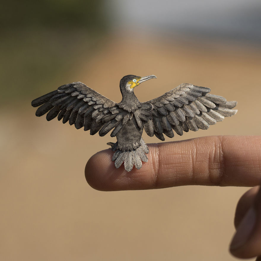
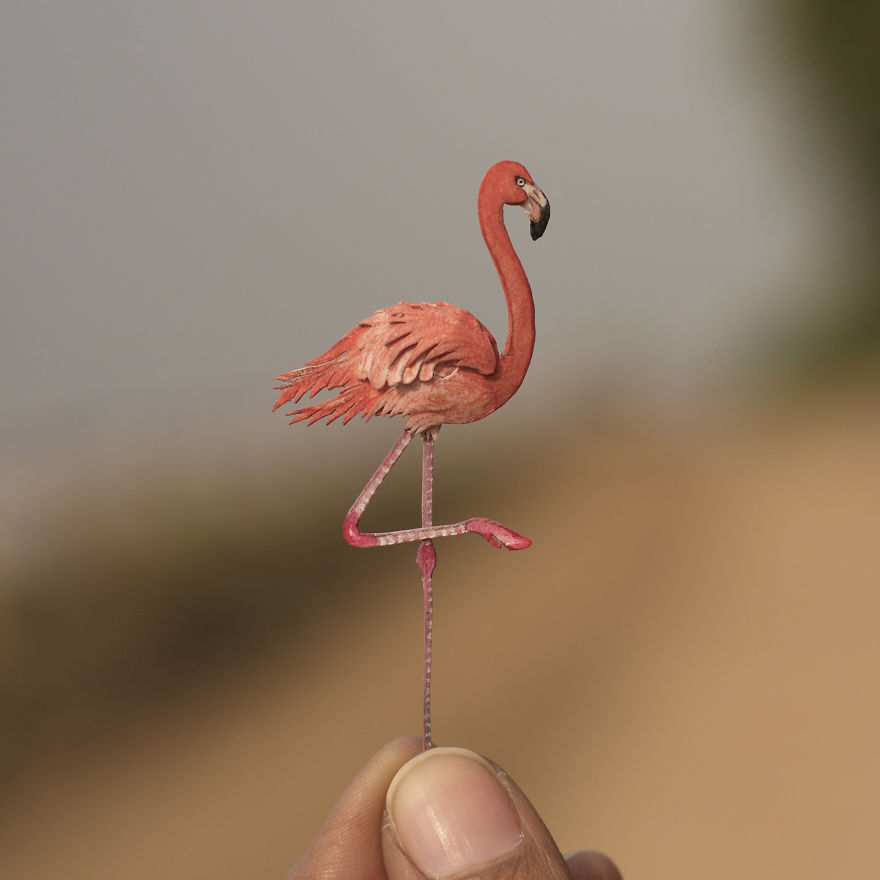
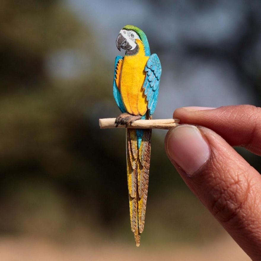
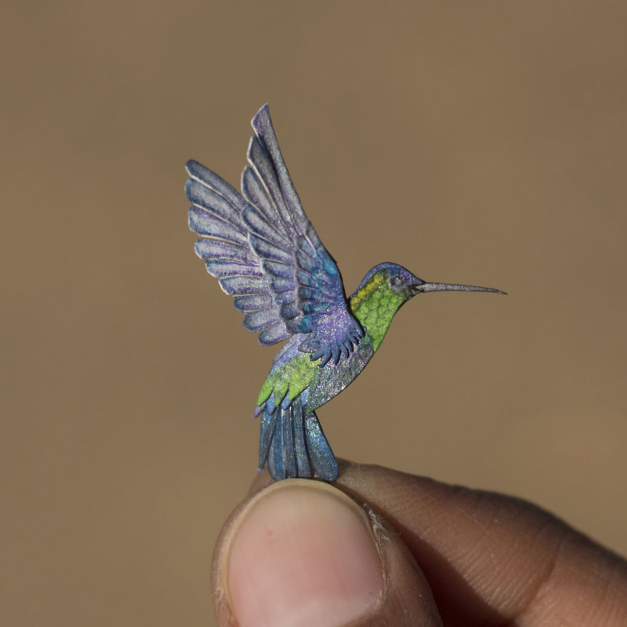
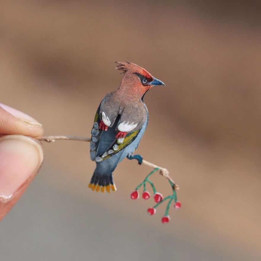
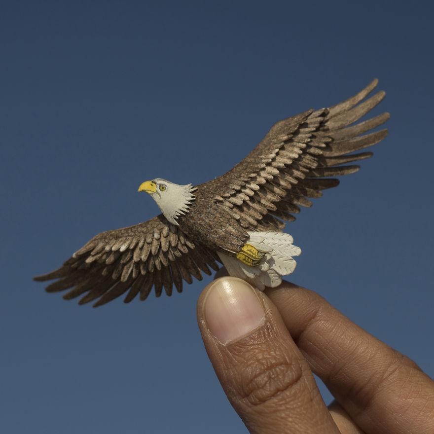
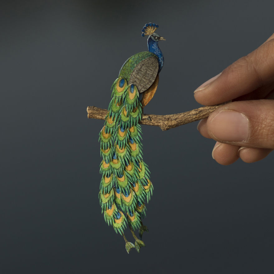
Vaishali Chudasama and Nayan are two designers based in Ahmedabad, India. Vaishali works as an illustrator, while Nayan is an interior designer. Together, they run an Etsy shop that sells some impressive paper cutted birds.

Each papercut takes from four to eight hours to create, which is quite fast when you take the level of details into consideration. As you can see on the photos, the birds are very small, the smallest being as tiny as 1.8cm!

To follow updates of the two artists’ work, check out their Instagram account.