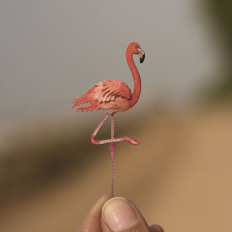
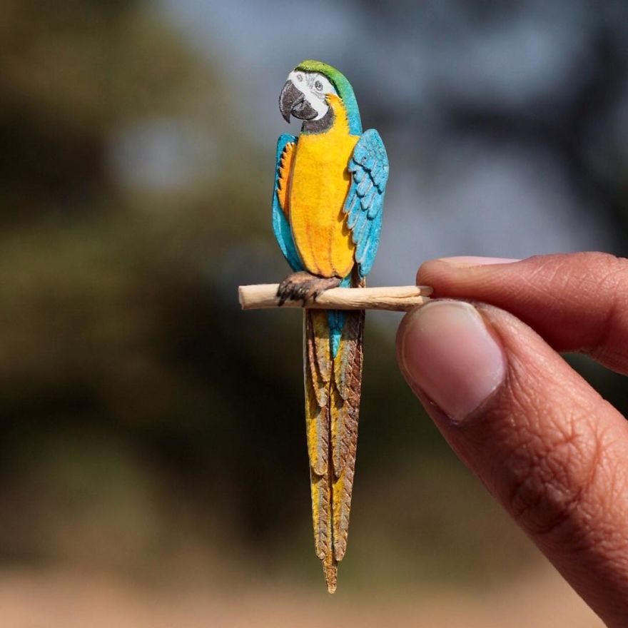
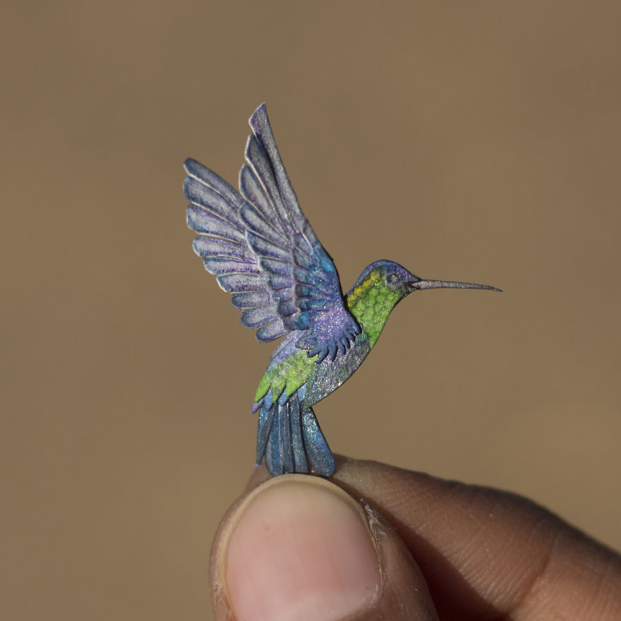
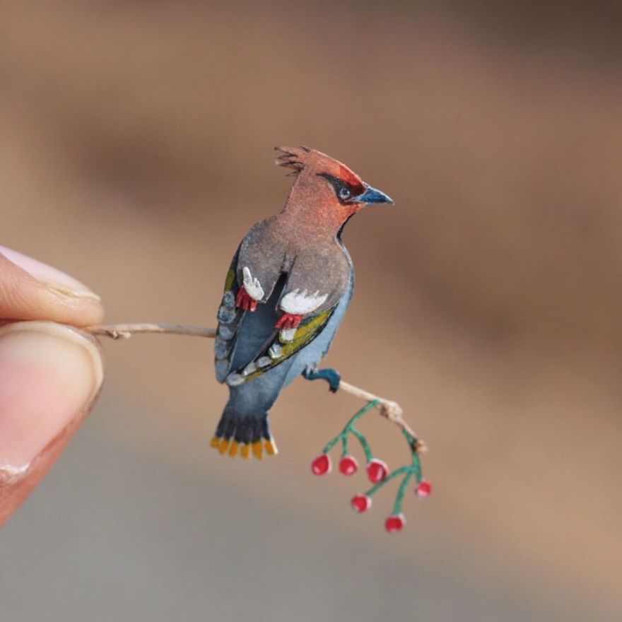
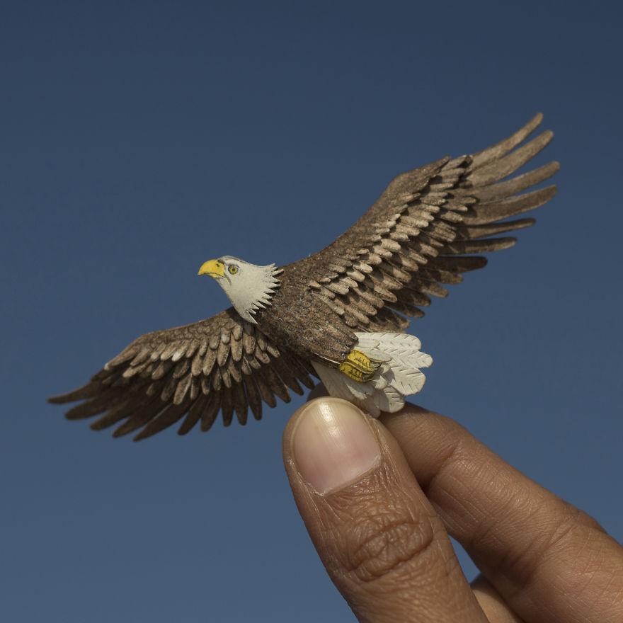
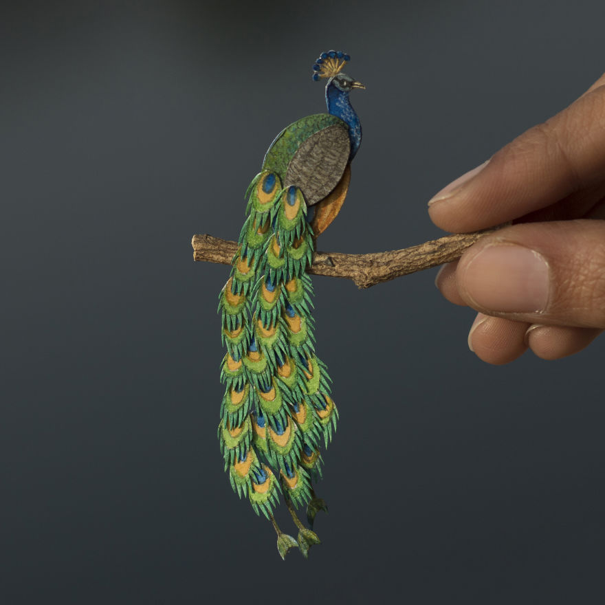
Vaishali Chudasama and Nayan are two designers based in Ahmedabad, India. Vaishali works as an illustrator, while Nayan is an interior designer. Together, they run an Etsy shop that sells some impressive paper cutted birds.
Each papercut takes from four to eight hours to create, which is quite fast when you take the level of details into consideration. As you can see on the photos, the birds are very small, the smallest being as tiny as 1.8cm!
Vaishali Chudasama and Nayan are two designers based in Ahmedabad, India. Vaishali works as an illustrator, while Nayan is an interior designer. Together, they run an Etsy shop that sells some impressive paper cutted birds.
Each papercut takes from four to eight hours to create, which is quite fast when you take the level of details into consideration. As you can see on the photos, the birds are very small, the smallest being as tiny as 1.8cm!
There are two types of trends in web design.
The first type is trends that stem from research. UX trends do not disappear,
they evolve. Ultimately, there are some things that work best, and they are
there to stay.
Then there are UI trends. Most of the times,
they’re a great way to show your website is changing. Some trends, however, tend
to be so prevalent they become trite.
It’s these trends that you’d be better off not
using in 2019.
1. Bright Colors
How do you attract attention to something on
your website? You make it bright red! This was the motto of some web designers
for quite some time.
Even though the trend to use bright colors is
not as egregious as this simple strategy, it’s not without its faults either.
It’s been overused, and frankly, bright colors do not work for most websites.
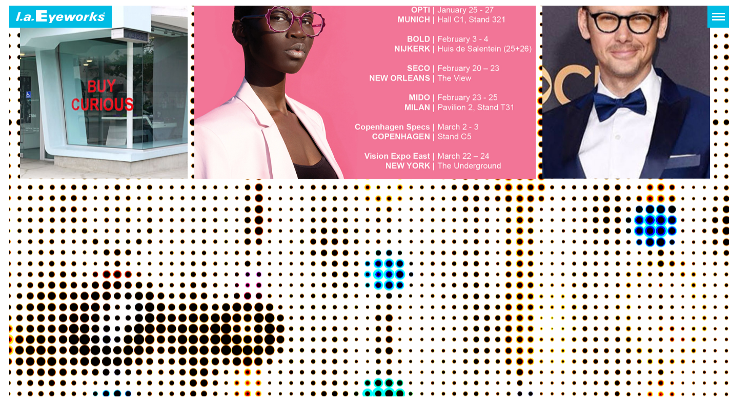
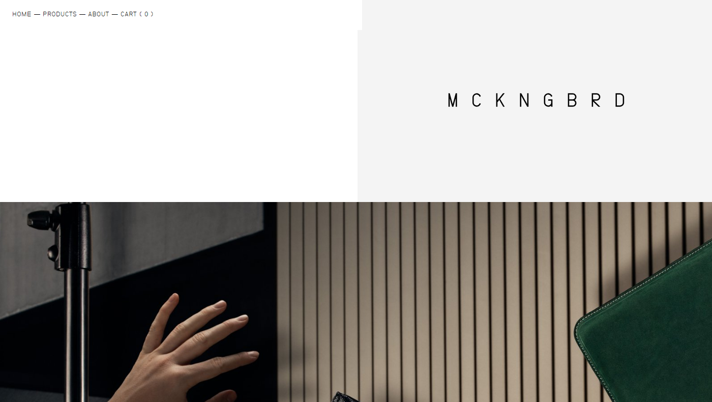
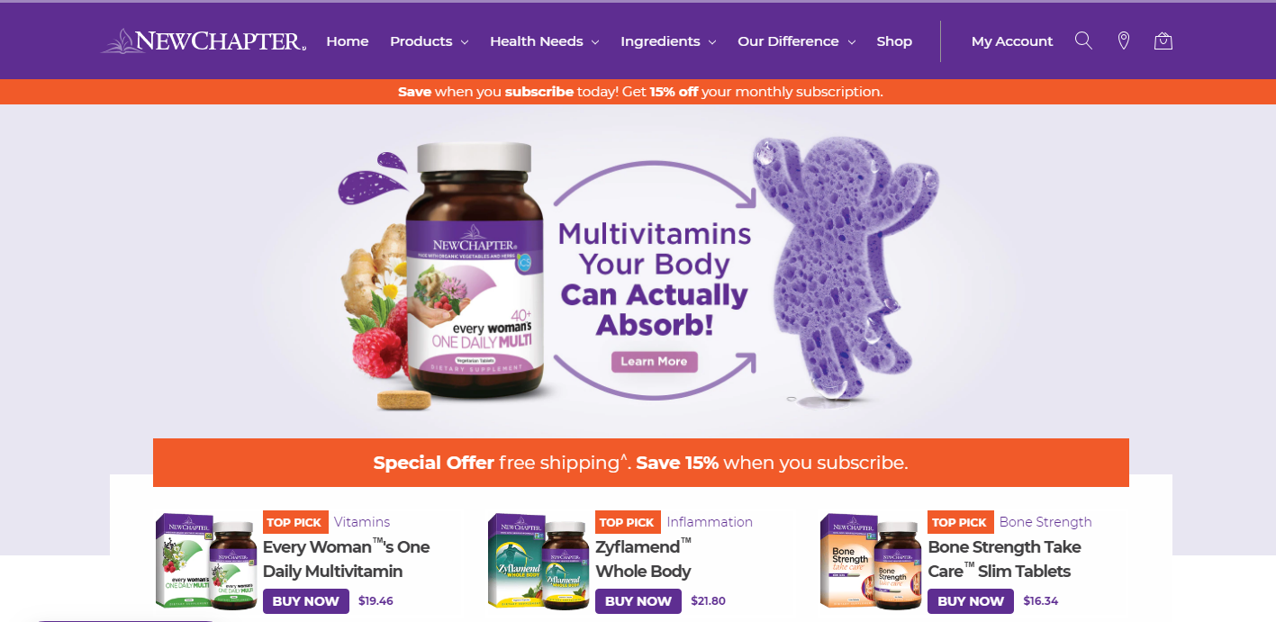
Take a look at this website. It does a great
job with imagery on the top of the page – great photography and smooth pastel
tones. Then it descends into this nightmare of a background.
If you have to use color, make it smoother.
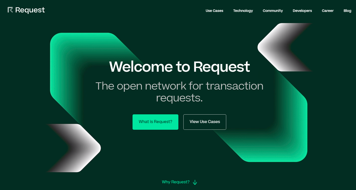
Take a look at this screenshot. The biggest part of a page is taken up by a
picture, but it isn’t bright and doesn’t make your eyes bleed.
If you’ve read something on typography trends,
you know that people love to mix fonts. Sometimes it looks good, sometimes it’s
over the top.
When you take on too many fonts, the odds of
you making something that looks good are rather low. Add to it too many
different and mismatching fonts and you’re headed for a disaster.
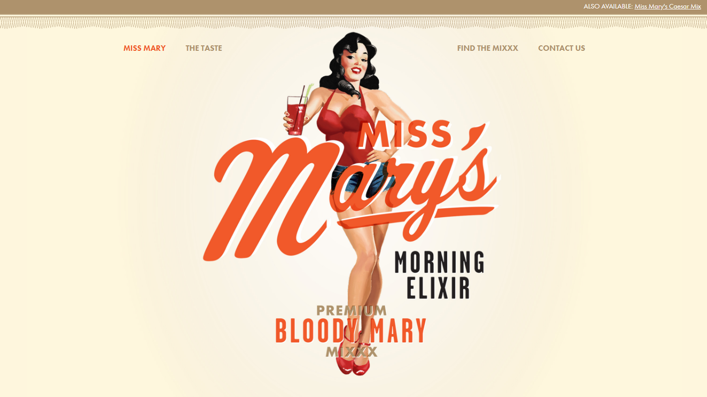
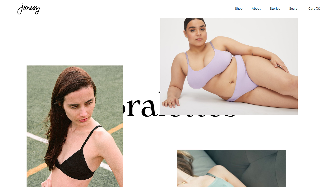
Sometimes, creative use of fonts works. Take a
look at this website, for instance.
In most cases, it just doesn’t cut it. If you
stick to a more traditional approach, you have higher chances of success. At
least, you don’t have as many opportunities to fail. Make your typography look
something along these lines, and you’re on the safe side.
If you’ve tried to design your own logo, you
know what badge logos are. They’re supposed to look hip and vintage. They’re
the Gucci of logo design – everyone wants one but few can afford them.
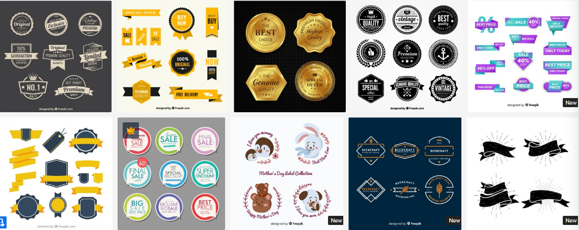
The thing is, most stock websites offer some
kind of badge logo. Most of these logos look pretty cool, and they may be a
great fit for a website that sells beard lotions with wood flavor.
But what is a logo for, anyway? It should make
your company stand out from the crowd. A badge logo will only make you look
like every other company that visited this page to get a cheap logo.
Approach creating your logo like getting your APA style paper written for you. If the thing
you’re paying for predicts your success, make sure to find a professional and
pay them well.
4. The Burst
The burst is another ugly trend that comes
from the stock websites and must go. It’s a classic way to attract attention to
something important, and it shows you’re a lazy designer.
The problem with this design trend is that
it’s overused. It’s overused to the point where it’s become trite. The bursting
badge that says “New” or “Sale” is boring now.
Try to present your sale in a new and fun way.
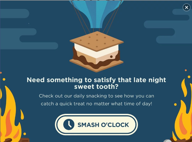
Make the news about a sale an experience of its own. This is what your popup
that informs people about discounts can look like.
It catches attention due to being well-designed
and well-written, and not due to being bright and having the word “Sale” in all
caps.
If you need to use badges for products, make
them minimalistic. These badges attract attention by means of contrast, even
though they don’t look like a small explosion that the burst is .
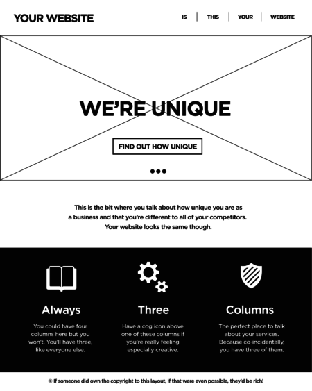
No. The thing is, there’s a fear that if you
conform to the standards of UX design this will make your website look dull.
That’s not what makes it this way. It’s a
combination of things, really. If your website does follow the standards of
layout that many conform to and then doesn’t communicate to the users, you end
up looking like this.
It sure looks ugly, but breaking the tree
columns rule won’t make your website interesting. It’s inconsistent and
confusing for the customers. It will only work if you have a couple of products
on display as well since scrolling through four screens of these is hard.
Minimalism is trendy. It’s great, too. Flat
design is not the minimalism you need, however.
It’s been around for a while. It had its peak
of popularity, and now it’s time for it to go. The problem with flat is that
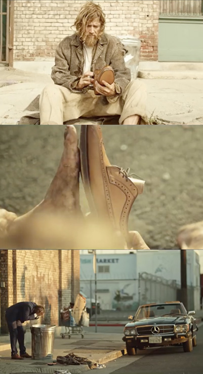
it’s overused (just like the burst and badge logos). Every stock photo website
offers it. This picture must have been posted on too many websites.
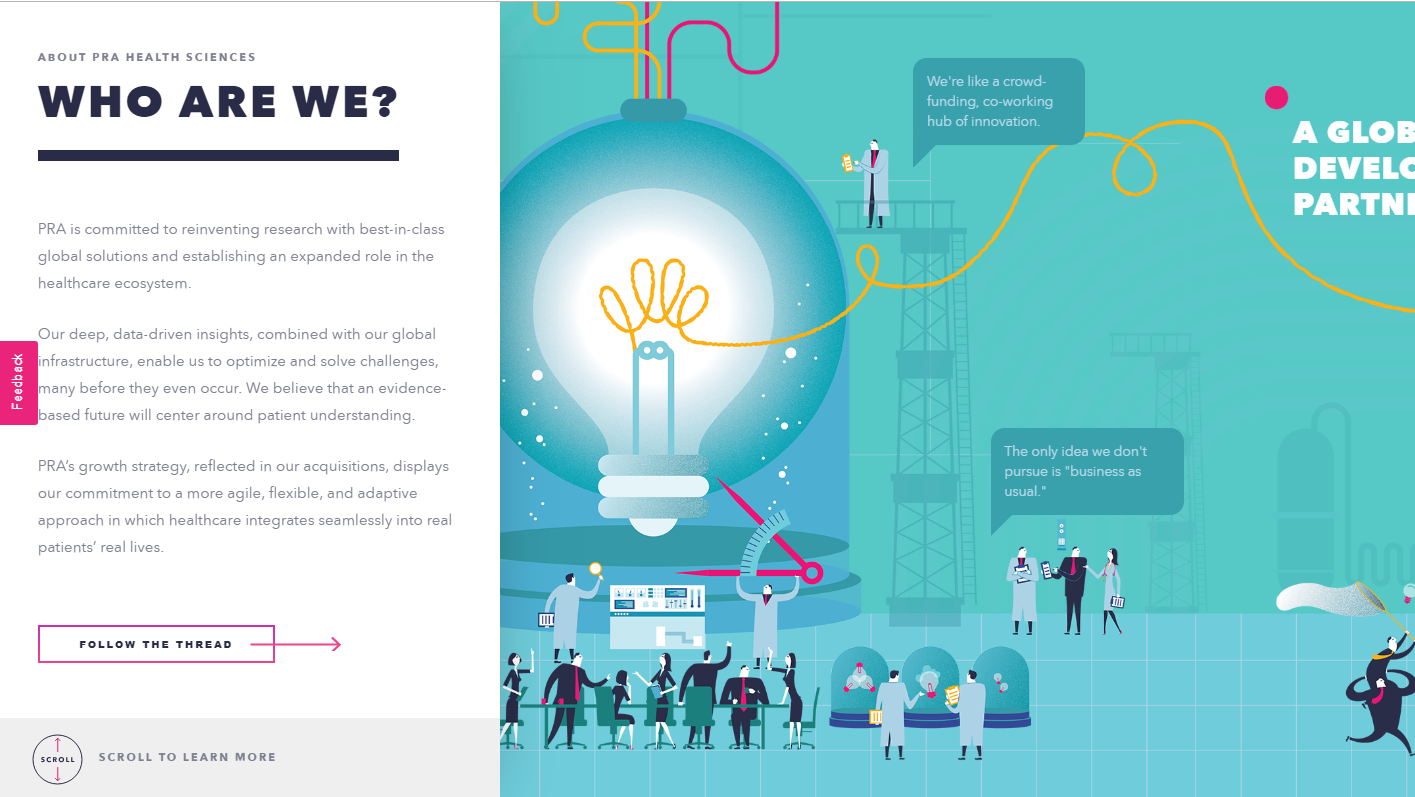
Your illustrations don’t have to be this
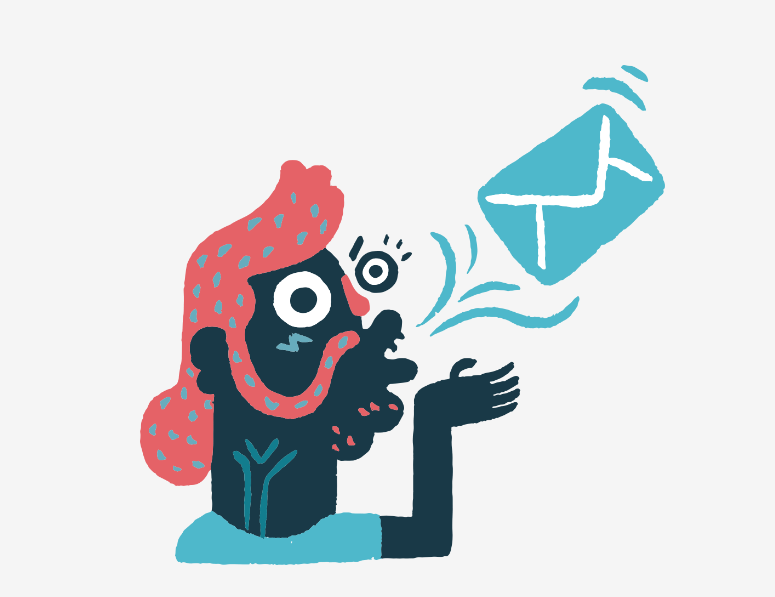
boring. Take a look at how MailChimp treats illustrations in their blog
articles. It’s just a random picture, but it’s fun and attention-grabbing.
The ultimate lesson you should draw from this
list is that following UI trends is not a great idea in general. You can use
most of them and make your website look great but only if you adopt a trend,
not follow it.
Take a trend and give it your own spin. This
will make you both up to date and unique.
There are two types of trends in web design.
The first type is trends that stem from research. UX trends do not disappear,
they evolve. Ultimately, there are some things that work best, and they are
there to stay.
Then there are UI trends. Most of the times,
they’re a great way to show your website is changing. Some trends, however, tend
to be so prevalent they become trite.
It’s these trends that you’d be better off not
using in 2019.
1. Bright Colors
How do you attract attention to something on
your website? You make it bright red! This was the motto of some web designers
for quite some time.
Even though the trend to use bright colors is
not as egregious as this simple strategy, it’s not without its faults either.
It’s been overused, and frankly, bright colors do not work for most websites.
Take a look at this website. It does a great
job with imagery on the top of the page – great photography and smooth pastel
tones. Then it descends into this nightmare of a background.
If you have to use color, make it smoother.
Take a look at this screenshot. The biggest part of a page is taken up by a
picture, but it isn’t bright and doesn’t make your eyes bleed.
If you’ve read something on typography trends,
you know that people love to mix fonts. Sometimes it looks good, sometimes it’s
over the top.
When you take on too many fonts, the odds of
you making something that looks good are rather low. Add to it too many
different and mismatching fonts and you’re headed for a disaster.
Sometimes, creative use of fonts works. Take a
look at this website, for instance.
In most cases, it just doesn’t cut it. If you
stick to a more traditional approach, you have higher chances of success. At
least, you don’t have as many opportunities to fail. Make your typography look
something along these lines, and you’re on the safe side.
If you’ve tried to design your own logo, you
know what badge logos are. They’re supposed to look hip and vintage. They’re
the Gucci of logo design – everyone wants one but few can afford them.
The thing is, most stock websites offer some
kind of badge logo. Most of these logos look pretty cool, and they may be a
great fit for a website that sells beard lotions with wood flavor.
But what is a logo for, anyway? It should make
your company stand out from the crowd. A badge logo will only make you look
like every other company that visited this page to get a cheap logo.
Approach creating your logo like getting your APA style paper written for you. If the thing
you’re paying for predicts your success, make sure to find a professional and
pay them well.
4. The Burst
The burst is another ugly trend that comes
from the stock websites and must go. It’s a classic way to attract attention to
something important, and it shows you’re a lazy designer.
The problem with this design trend is that
it’s overused. It’s overused to the point where it’s become trite. The bursting
badge that says “New” or “Sale” is boring now.
Try to present your sale in a new and fun way.
Make the news about a sale an experience of its own. This is what your popup
that informs people about discounts can look like.
It catches attention due to being well-designed
and well-written, and not due to being bright and having the word “Sale” in all
caps.
If you need to use badges for products, make
them minimalistic. These badges attract attention by means of contrast, even
though they don’t look like a small explosion that the burst is .
No. The thing is, there’s a fear that if you
conform to the standards of UX design this will make your website look dull.
That’s not what makes it this way. It’s a
combination of things, really. If your website does follow the standards of
layout that many conform to and then doesn’t communicate to the users, you end
up looking like this.
It sure looks ugly, but breaking the tree
columns rule won’t make your website interesting. It’s inconsistent and
confusing for the customers. It will only work if you have a couple of products
on display as well since scrolling through four screens of these is hard.
Minimalism is trendy. It’s great, too. Flat
design is not the minimalism you need, however.
It’s been around for a while. It had its peak
of popularity, and now it’s time for it to go. The problem with flat is that
it’s overused (just like the burst and badge logos). Every stock photo website
offers it. This picture must have been posted on too many websites.
Your illustrations don’t have to be this
boring. Take a look at how MailChimp treats illustrations in their blog
articles. It’s just a random picture, but it’s fun and attention-grabbing.
The ultimate lesson you should draw from this
list is that following UI trends is not a great idea in general. You can use
most of them and make your website look great but only if you adopt a trend,
not follow it.
Take a trend and give it your own spin. This
will make you both up to date and unique.
You scroll down to a certain point, now you want to style things in a certain way. A header becomes fixed. An animation triggers. A table of contents appears. To do anything based on scroll position, JavaScript is required right now. You watch the scroll position via a DOM event and alter an element’s styling based on that position. Or, probably better if you can, use IntersectionObserver. We just blogged about all this.
Now there is a new (unofficial) spec trying to bring these possibilities to CSS. I love it when web standards get involved because it sees authors like us trying to pull off certain design effects and wants to (presumably) help make it easier and more performant. I also like how this spec lists editors from Mozilla and Google and Apple.
I wonder how they’ll handle the infinite-loop stuff here. Like you scroll to a point, it triggers some animation, which moves some element such that it changes the scroll position, which stops the animation, which moves the scroll position again… etc. I also wonder why it’s all specific to animation. „Scroll-position styling” seems like it would have the widest appeal and use level of usefulness.
The idea behind most of web applications is to fetch data from the database and present it to the user in the best possible way. When we deal with data there are cases when the best possible way of presentation means creating a list.
Depending on the amount of data and its content, we may decide to show all content at once (very rarely), or show only a specific part of a bigger data set (more likely). The main reason behind showing only part of the existing data is that we want to keep our applications as performant as possible and avoid loading or showing unnecessary data.
If we decide to show our data in „chunks” then we need a way to navigate through that collection. The two most common ways of navigating through set of data are:
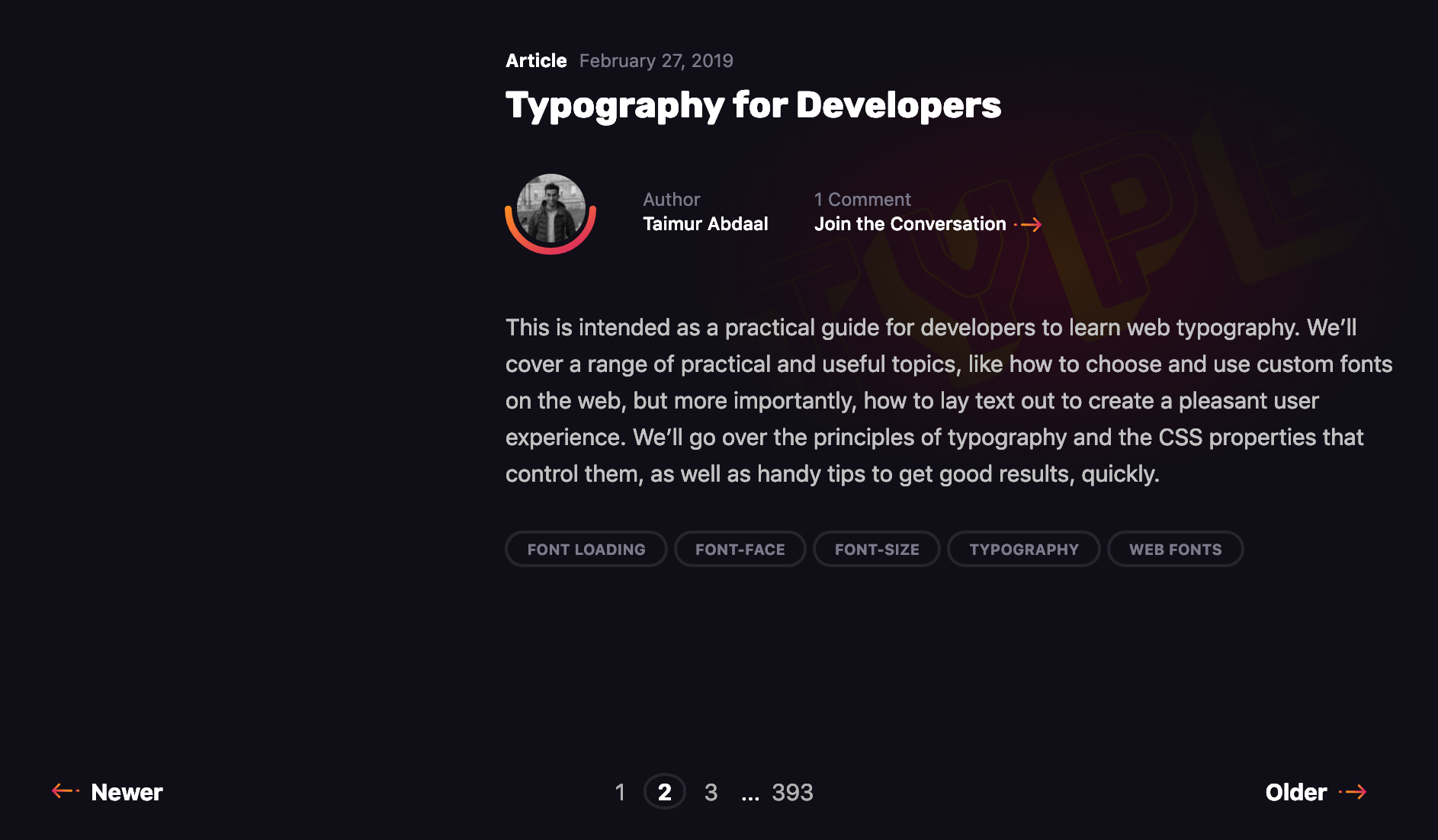
The first is pagination, a technique that splits the set of data into a specific number of pages, saving users from being overwhelmed by the amount of data on one page and allowing them to view one set of results at a time. Take this very blog you’re reading, for example. The homepage lists the latest 10 posts. Viewing the next set of latest posts requires clicking a button.
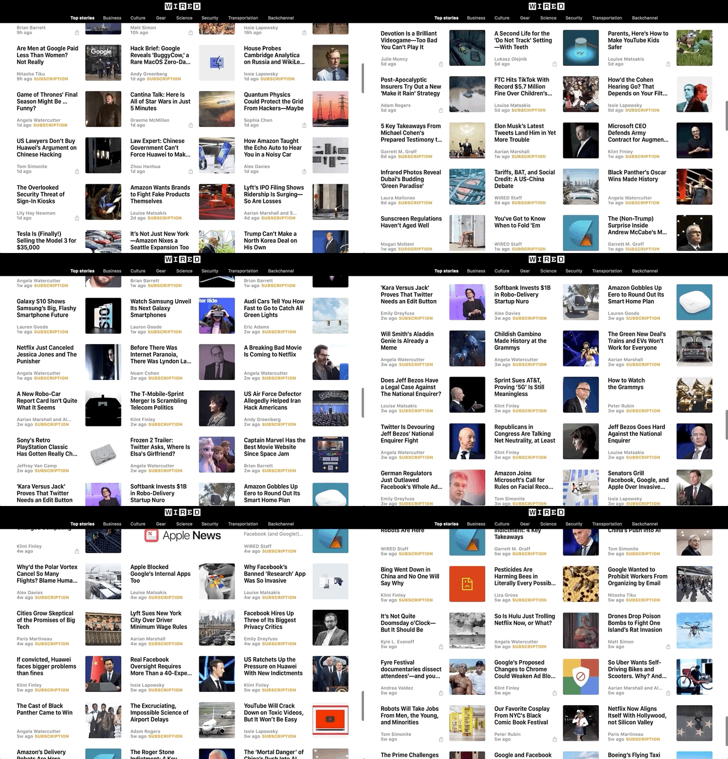
The second common technique is infinite scrolling, something you’re likely familiar with if you’ve ever scrolled through a timeline on either Facebook or Twitter.
The Apple News app also uses infinite scroll to browse a list of articles.
We’re going to take a deeper look at the first type in this post. Pagination is something we encounter on a near-daily basis, yet making it is not exactly trivial. It’s a great use case for a component, so that’s exactly what we’re going to do. We will go through the process of creating a component that is in charge of displaying that list, and triggering the action that fetches additional articles when we click on a specific page to be displayed. In other words, we’re making a pagination component in Vue.js like this:
Let’s go through the steps together.
Step 1: Create the ArticlesList component in Vue
Let’s start by creating a component that will show a list of articles (but without pagination just yet). We’ll call it ArticlesList. In the component template, we’ll iterate through the set of articles and pass a single article item to each ArticleItem component.
Now we need to create a method that will load the next page, the previous page or a selected page.
In the pageChangeHandle method, before loading new articles, we change the currentPage value depending on a property passed to the method and fetch the data respective to a specific page from the API. Upon receiving new data, we replace the existing articles array with the fresh data containing a new page of articles.
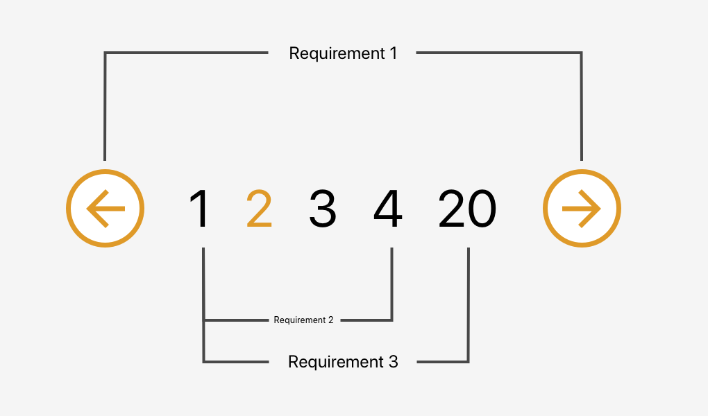
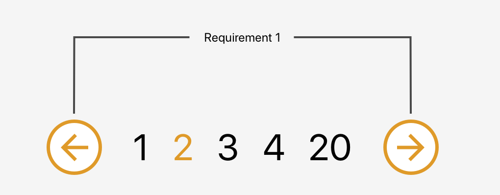
The component will accept currentPage and pageCount properties from the parent component and emit proper actions back to the parent when the next or previous button is clicked. It will also be responsible for disabling buttons when we are on the first or last page to prevent moving out of the existing collection.
That was the easy part. Now we need to create a list of page numbers, each allowing us to select a specific page. The number of pages should be customizable and we also need to make sure not to show any pages that may lead us beyond the collection range.
Requirement 2: Allow the user to go to a specific page within a range
Let’s start by creating a component that will be used as a single page number. I called it BasePaginationTrigger. It will do two things: show the page number passed from the BasePagination component and emit an event when the user clicks on a specific number.
In the script section, we need to add one more method (onLoadPage) that will be fired when the loadPage event is emitted from the trigger component. This method will receive a page number that was clicked and emit the event up to the ArticlesList component.
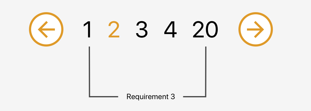
Requirement 3: Change the range of page numbers based on the current page
OK, now we have a single trigger that shows us the current page and allows us to fetch the same page again. Pretty useless, don’t you think? Let’s make some use of that newly created trigger component. We need a list of pages that will allow us to jump from one page to another without needing to go through the pages in between.
We also need to make sure to display the pages in a nice manner. We always want to display the first page (on the far left) and the last page (on the far right) on the pagination list and then the remaining pages between them.
We have three possible scenarios:
The selected page number is smaller than half of the list width (e.g. 1 – 2 – 3 – 4 – 18)
The selected page number is bigger than half of the list width counting from the end of the list (e.g. 1 – 15 – 16 – 17 – 18)
All other cases (e.g. 1 – 4 – 5 – 6 – 18)
To handle these cases, we will create a computed property that will return an array of numbers that should be shown between the next and previous buttons. To make the component more reusable we will accept a property visiblePagesCount that will specify how many pages should be visible in the pagination component.
Before going to the cases one by one we create few variables:
visiblePagesThreshold:- Tells us how many pages from the centre (selected page should be shown)
paginationTriggersArray: Array that will be filled with page numbers
visiblePagesCount: Creates an array with the required length
Scenario 1: The selected page number is smaller than half of the list width
We set the first element to always be equal to 1. Then we iterate through the list, adding an index to each element. At the end, we add the last value and set it to be equal to the last page number — we want to be able to go straight to the last page if we need to.
Scenario 2: The selected page number is bigger than half of the list width counting from the end of the list
Similar to the previous scenario, we start with the last page and iterate through the list, this time subtracting the index from each element. Then we reverse the array to get the proper order and push 1 into the first place in our array.
We know what number should be in the center of our list: the current page. We also know how long the list should be. This allows us to get the first number in our array. Then we populate the list by adding an index to each element. At the end, we push 1 into the first place in our array and replace the last number with our last page number.
And we are done! We just built a nice and reusable pagination component in Vue.
When to avoid this pattern
Although this component is pretty sweet, it’s not a silver bullet for all use cases involving pagination.
For example, it’s probably a good idea to avoid this pattern for content that streams constantly and has a relatively flat structure, like each item is at the same level of hierarchy and has a similar chance of being interesting to the user. In other words, something less like an article with multiple pages and something more like main navigation.
Another example would be browsing news rather than looking for a specific news article. We do not need to know where exactly the news is and how much we scrolled to get to a specific article.
That’s a wrap!
Hopefully this is a pattern you will be able to find useful in a project, whether it’s for a simple blog, a complex e-commerce site, or something in between. Pagination can be a pain, but having a modular pattern that not only can be re-used, but considers a slew of scenarios, can make it much easier to handle.
Brad Frost wrote about a recent experience with a website that used <input type="number">:
Last week I got a call from my bank regarding a wire transfer I had just scheduled. The customer support guy had me repeat everything back to him because there seemed to be a problem with the information. “Hmmmm, everything you said is right right except the last 3 digits of the account number.”
He had me resubmit the wire transfer form. When I exited the account number field, the corner of my eye noticed the account number change ever so slightly. I quickly refocused into the field and slightly moved my index finger up on my Magic Mouse. It started looking more like a slot machine than an input field!
Brad argues that we then shouldn’t be using <input type="number"> for “account numbers, social security numbers, credit card numbers, confirmation numbers” which makes a bunch of sense to me! Instead we can use the pattern attribute that Chris Ferdinandi looked at a while back in a post all about constraint validation in HTML.
It’s worth mentioning that numeric inputs can be more complex than they appear and that their appearance and behavior vary between browsers. All good things to consider along alongside Brad’s advice when evaluating user experience.
Also:
<input inputmode="numeric"> is the way forward for mobile numeric keyboards (paired with `pattern="[0-9]*"` on iOS pending inputmode support).
Let’s draw some fun cartoon icons in Adobe Illustrator CC! Download the sketch file to the right of this tutorial, or you can sketch out some portraits of your own and apply the techniques outlined below to create your own personalized icons, ready for web and print use.
On 31st March, it is International Transgender Day of Visibility, a day celebrating the transgender community and raising awareness of the discrimination transgender people face worldwide. The people I chose for these icons identify in a variety of ways and have been active for transgender awareness and within the larger LGBT community:
Janet Mock: Notable writer, trans+ activist, and entertainment host. Janet has worked with LGBT organizations in creating transgender-specific youth programs to support and educate, as well as written and spoken frequently about trans* issues within our society and her own experiences.
Laura Jane Grace: The front woman for the punk band Against Me!, Laura is not only a fantastic musician, but also went through the process of transition in a public way. Against Me!’s album Transgender Dysphoria Blues deals with the topic of gender dysphoria.
Marsha P. Johnson: Notable LGBT activist, Stonewall Riot veteran, and drag queen, Marsha was a staple of New York City’s gay and art scene throughout the 60s and 70s. She, along with Sylvia Rivera, co-founded STAR (Sweet Transvestite Action Revolutionaries), a group focused on helping homeless drag queens and trans* women of color.
Chaz Bono: Quite famous as the son of Cher and the late Sonny Bono, Chaz is a writer, entertainer, and LGBT activist in his own right. Like some of the others in this list, his transition was public. He has written for the magazine The Advocate, worked as spokesperson for the Human Rights Campaign, and worked with GLAAD as their Entertainment Media Director.
Balian Buschbaum: German pole vaulter who competed in world and Olympic competitions before retiring to transition. I included him for his openness and public transition, as athletes are often regarded in high esteem and those who tackle gender issues in a public way are icons to youths.
Tyler Ford: Though not as famous as those listed above, Tyler is a noted agender youth and LGBT activist and writer. They’ve written for Rookie magazine, MTV, and worked with the Happy Hippie foundation, an organization supporting homeless LGBT youth.
The list of notable trans* activists goes quite a bit further than this, and I encourage you, after creating something fantastic with the tutorial, to consider those profiled here as a starting point for International Transgender Day of Visibility.
1. Using a Sketch for an Icon
Step 1
Let’s check out my initial sketches. All six of my subjects have portraits drawn out in little rounded boxes. I’ve made notes about their hairstyles and face shapes, and aimed for a cute, cartoony likeness for each.
You’re welcome to build your icons off these sketches and follow along with me, or use something of your own and apply the techniques outlined below.
Step 2
Our first icon subject is Janet Mock. I’ve locked my sketch on its own layer in the Layers panel of a New Document in Adobe Illustrator. On a new layer, I started with the Pen Tool (P) and traced the basic head shape from my sketch.
Then I started to trace the eyes. I temporarily set the head shape’s Blending Mode to Multiply in the Transparency panel in order to make sure it fit with the facial features I was beginning to draw.
Step 3
I’ve hidden the head shape for now in the Layers panel. Using the Blob Brush Tool (Shift-B), with pressure enabled, I followed my sketch’s lines in order to draw the eyes, nose, and mouth. (If you’re using a mouse, feel free to stick with the Pen Tool or Curvature Tool (Shift-~) to draw components and trace your sketch.)
For the eyes, I drew two almond-shaped gradient objects with Linear Gradients going from dark purple to white and back to dark purple. Adjust the gradient’s distribution with the Gradient Tool (G) or the Gradient panel.
I find that using the Blob Brush Tool keeps the design cartoony and looking as if it was drawn with a marker. You can also get a similar look by using stroked paths and adjusting the stroke weight with the Width Tool (Shift-W).
Step 4
I’ve placed the head shape beneath the newly drawn facial features. Group (Control-G) together the face components and center them vertically with the head object. As you can see, we have the basics ready: eyebrows, eyes, nose, and mouth. Let’s get on to the details!
2. Detailing the Face With Gradients
Step 1
I like to reference my sketches as often as possible. Give the nose some color variation by drawing a shape over the entirety of the nose and applying a gradient that goes from a red, orange, or brown hue to the skin tone you’re using for your portrait.
I’ve done the same thing with eyeshadow behind both eyes, emphasizing the arch of the brow and the cat-eye shape of the eyelashes.
I changed the lines of the nose and mouth to a dark pink and drew the mouth with the Pencil Tool (N) as two distinct shapes placed below the mouth lines in the Layers panel.
Step 2
Let’s break down some of the details created so far:
Place the eyeshadow gradients behind the eyes. Also note the transparent shadow drawn over the eyes. Make sure it’s the same color as your eye outline and adjust the transparency or apply a gradient to it to give a little bit of depth to the face.
The teeth are the same gradient and shadow attribute as those on the eyes—note how the shadows are in the corners of the mouth and the highlight is in the center.
For the nose, I drew an oval for the center of the nose using the same gradient used previously on the nose. The Blending Mode was set to Screen and the Opacity was reduced to 70-50% in the Transparency panel.
Step 3
For Janet’s high cheek-bones, I drew a shape that cuts the side of her face in half diagonally and used the Shape Builder Tool(Shift-M) to fit it to the head object perfectly. I applied a Linear Gradient to the shape that goes from dark brown to the same brown used for her skin color, with the darker color on the outside of the jaw (see below).
Step 4
Next up I drew some highlight shapes on the forehead and cheeks. I applied Radial Gradients to each, going from skin tone at 100% Opacity to 0% Opacity with the Blending Mode set to Screen.
Step 5
Speeding up our face creation process, let’s take a look at the details I’ve added:
Add some simple ears! Using the sketch as a guide, draw two ear shapes and place them behind the head with dark pink detail shapes.
The earrings are two rounded rectangles with a Linear Gradient applied that goes from yellow to light yellow and back to yellow again. There’s also a yellow-orange stroke applied to the shape to separate it a bit from the face.
Finally, I’ve added shadow and highlight shapes to the chin and mouth areas.
3. Creating Hair and Clothes
Step 1
I like to handle the drawing of hairstyles in sections. For Janet’s fabulous, thick hair, check out my process below:
I like to start with the largest section and a side part. Using the Pencil Tool, I’ve drawn a fluffy, cloud-like shape in the same dark brown I’ve used throughout this illustration.
Continue filling in the other side of her hair. I want to make sure it covers most of her forehead and part of her ears.
I added another fluffy shape to the left side in order to lead us into the rest of the hairdo, which will be placed behind the head.
Finally, with a darker brown, I’ve drawn a large shape behind the head in order to give the hair some depth in addition to all of this dimension.
Step 2
The neck and shoulders are one shape drawn with the Pen Tool. The Linear Gradient applied to the shape goes from dark brown at the top to medium brown. Place this behind the head but above the lower layer of hair.
For the shirt, I drew it quickly and simply with the Pen Tool and added a couple of stroked paths to create a quick bit of detail without taking away too much attention from the rest of the portrait.
Step 3
Each of my icons will have a similar background of a rounded rectangle, which you can draw with the Rounded Rectangle Tool, with a Radial Gradient applied. Group all of the icon components together. Draw another rounded rectangle and place it over the icon group. Create a Clipping Mask (Control-7) so the portrait body stays within the icon’s frame.
Add other details like a bit of scripted text (check out some fantastic fonts over at GraphicRiver, or draw them in yourself) and additional shadow shapes to define the hair.
4. Creating Other Hair Styles
Step 1
Rather than going through the same process for each of the icons, I’d like to highlight some of the techniques that make each icon unique. Starting with a cartoony version of Laura Jane Grace, let’s check out how I handled her long tresses.
On a layer above the rest of her body, I started with a half circle for her bangs. This was drawn with the Blob Brush Tool, but could definitely be done with the drawing tool of your choice.
Like Janet’s hair above, I like to handle hair in sections. A couple of curved lines take care of the details in the top of her hair.
Then, I focused on wavy hair to frame the face. Notice how it’s not detailing every strand, but gives you a good idea of volume and shape.
Group these hair outlines together, and we’ll define the hair further with some shadow shapes next.
Step 2
Much like shadow shapes drawn before, we’ll be using Linear Gradients that go from 100% to 0% Opacity.
Draw a large shape outlining the hair with the Pen Tool or Pencil Tool and place it beneath the hair line art. I drew a big, jagged shape that follows the contour of the bangs.
Apply the shadow gradient and continue drawing shapes that define a few sections of hair, similar to what’s seen below.
Step 3
The highlights are similar to the shadow shapes: they accentuate several sections in the hair and bring depth to the design. Use a lighter shade than the hair or set the gradient shapes to Screen as the Blending Mode in the Transparency or Appearance panels.
5. Drawing Clothes and Accessories
Step 1
For the crown of flowers on either Marsha P. Johnson’s or Tyler Ford’s heads, I mostly followed my initial sketch and drew shapes with the Pencil Tool. Like the hair, I took it all in sections.
In the case of the flower crown below, I went for color sections of flowers and leaves. I drew red flowers, Grouped them together, and then drew yellow flowers and leaves after that.
Step 2
Drawing something complex like a crown of flowers or a floral arrangement in sections allows you to change colors quickly and easily. I drew veins on the leaves with the Blob Brush Tool.
To add some shadow to the flowers I Grouped the crown together and then Copied (Control-C) and Pasted (Control-V) the whole thing. In the Gradient panel, I applied a Radial Gradient of dark brown at 100% to 0% Opacity (with the opaque color in the center), and set the Blending Mode to Overlay in the Transparency panel.
The highlights are light yellow Linear Gradient shapes, similar to those drawn on the Laura Jane Grace icon’s hair.
Step 3
Most of the clothes drawn on each icon are simple. The clothes drawn on my Balian Buschbaum icon were drawn in three steps: shirt, scarf around the neck, and scarf hanging down. Then I drew simple gradient shadow shapes that accentuated the draping and folds in the scarf itself (as seen below).
Great Job, You’re Done!
The icons seen below were created with the techniques highlighted above. Feel free to follow along with the sketch provided or create some designs of your own and use the ideas, style, and techniques from this tutorial. Share your results in the comment section below!
Agregator najlepszych postów o designie, webdesignie, cssie i Internecie