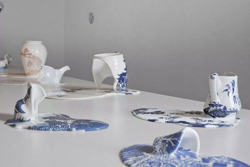
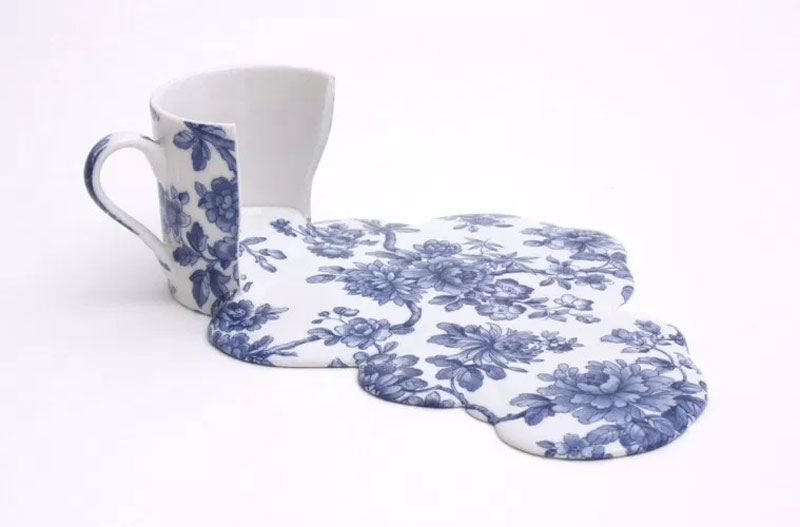
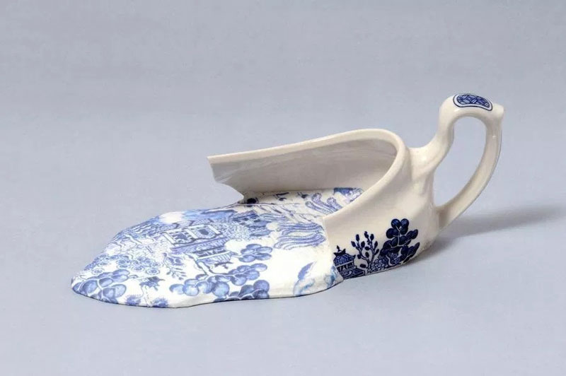
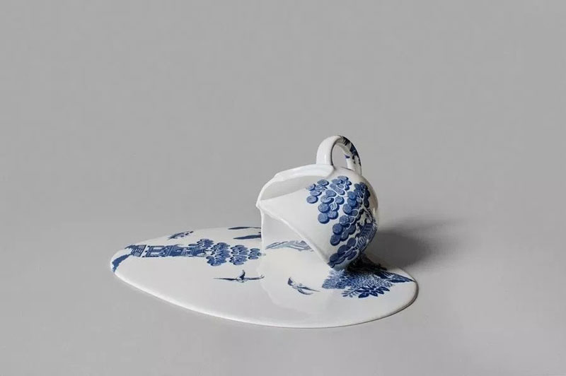
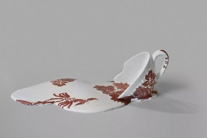
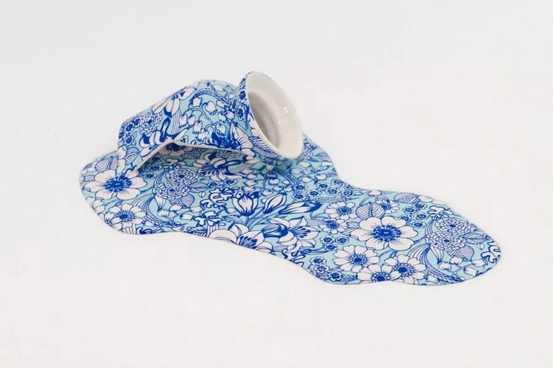
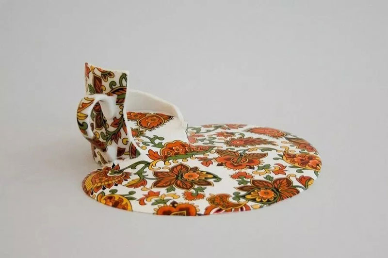
Livia Marin’s teapots and cups seem to come out of a Salvador Dali painting. The Chile-born artist created these with a mix of resin, ceramic, and transfer patterns, making it look like it melted in a very unusual fashion.
Livia Marin’s teapots and cups seem to come out of a Salvador Dali painting. The Chile-born artist created these with a mix of resin, ceramic, and transfer patterns, making it look like it melted in a very unusual fashion.
Did you know that the attention span of a
human is shorter than a goldfish’s? The attention span of a goldfish is 9
seconds while a human’s attention span is anywhere from 6 seconds to 8 seconds!
You’re probably wondering what this has to do with your website… well, it has a
lot to with the design of your website.
You may find it hard to believe but the way
your website “looks” plays a major role in how long a customer or visitor will
stay on your site. Because a human’s attention span is shorter than that of a
goldfish, it’s incredibly important to grab the visitor’s attention within the
first few seconds of their encounter to your website.
You Have 7 Seconds…
Tributemedia.com says that when someone visits
your website, your website needs to answer four questions within seven seconds:
What is this website about?/How will it help someone?- Once a visitor lands on your website, they should be able to figure
out what your website is all about or what product or service it is you’re
selling.
Does this website grab their attention?-
Aesthetically speaking, does my website look good? Your website should be easy
on the eye, meaning easy to read with good font and size choices as well as a
pleasing color scheme.
What does this website want the customer to do?- Your website should have a very clear call-to-action. When a visitor
goes to your website, it should be obvious what the website wants you to do.
Your website should either want you to buy something or provide good and
helpful information.
Will your visitors have a good experience where they want to share it?- Hopefully so. You ultimately want anyone who visits your site to have
a great user experience whether they’re buying something or not. You want them
to leave good customer reviews and share your site with friends and family via
word-of-mouth or through social media.
Design Elements to Make Visitors
Stay and Gander
Let’s say that you have an online business and
you have all the logistics worked out but you’re still trying to find the best small business WordPress hosting. With that,
you have several wonderful options to choose from that can take your online
business to the next level. Once you find the one you want, this is when the
creative process of building your website comes into play.
Typography: It Should Be Unique
and Distinct
For your website, you’ll want typography or a
font that will be uniquely linked to your site… something that visitors will be
able to distinguish in their minds that will make you stand out from your
competitors.
Large Images of the Product
For your business, if you’re selling products,
you want to make sure that you have large images of your products so that
visitors will be able to see what they’re truly buying. These large images help
potential customers see the product in great detail.
For these images, you don’t have to be a
professional photographer either… but you do need to know how to use photography effectively. The large
images you put on your site should entice visitors to want to buy whatever
they’re looking for on your site.
Organized Menu
Nothing is more unattractive on a website than
clutter. Clutter isn’t just found in homes… websites have clutter too! Because
of “website clutter” a lot of businesses opt for the “hamburger menu.” With the
hamburger menu, it allows visitors who visit your site to be able to go to the
exact page they want to see. It’s those three lines stacked on top of each
other (like a hamburger) that you see on the top right-hand side of a website.
Videos in the Background
One thing that people don’t take advantage of
or realize the benefit of is background videos. Having a video that plays in
the background of your website can actually save a lot of space and reduce a
portion of content that could be needed to explain the purpose of your
business.
For example, a visitor may come to the
homepage of your site. Upon arriving on the homepage, a large video
automatically starts playing. Once that video starts playing, it will then
prompt the visitor to want to click the main video. The purpose of the video is
to entice visitors from the moment that come to your site. This is especially
important, given the human’s short attention span!
Did you know that the attention span of a
human is shorter than a goldfish’s? The attention span of a goldfish is 9
seconds while a human’s attention span is anywhere from 6 seconds to 8 seconds!
You’re probably wondering what this has to do with your website… well, it has a
lot to with the design of your website.
You may find it hard to believe but the way
your website “looks” plays a major role in how long a customer or visitor will
stay on your site. Because a human’s attention span is shorter than that of a
goldfish, it’s incredibly important to grab the visitor’s attention within the
first few seconds of their encounter to your website.
You Have 7 Seconds…
Tributemedia.com says that when someone visits
your website, your website needs to answer four questions within seven seconds:
What is this website about?/How will it help someone?- Once a visitor lands on your website, they should be able to figure
out what your website is all about or what product or service it is you’re
selling.
Does this website grab their attention?-
Aesthetically speaking, does my website look good? Your website should be easy
on the eye, meaning easy to read with good font and size choices as well as a
pleasing color scheme.
What does this website want the customer to do?- Your website should have a very clear call-to-action. When a visitor
goes to your website, it should be obvious what the website wants you to do.
Your website should either want you to buy something or provide good and
helpful information.
Will your visitors have a good experience where they want to share it?- Hopefully so. You ultimately want anyone who visits your site to have
a great user experience whether they’re buying something or not. You want them
to leave good customer reviews and share your site with friends and family via
word-of-mouth or through social media.
Design Elements to Make Visitors
Stay and Gander
Let’s say that you have an online business and
you have all the logistics worked out but you’re still trying to find the best small business WordPress hosting. With that,
you have several wonderful options to choose from that can take your online
business to the next level. Once you find the one you want, this is when the
creative process of building your website comes into play.
Typography: It Should Be Unique
and Distinct
For your website, you’ll want typography or a
font that will be uniquely linked to your site… something that visitors will be
able to distinguish in their minds that will make you stand out from your
competitors.
Large Images of the Product
For your business, if you’re selling products,
you want to make sure that you have large images of your products so that
visitors will be able to see what they’re truly buying. These large images help
potential customers see the product in great detail.
For these images, you don’t have to be a
professional photographer either… but you do need to know how to use photography effectively. The large
images you put on your site should entice visitors to want to buy whatever
they’re looking for on your site.
Organized Menu
Nothing is more unattractive on a website than
clutter. Clutter isn’t just found in homes… websites have clutter too! Because
of “website clutter” a lot of businesses opt for the “hamburger menu.” With the
hamburger menu, it allows visitors who visit your site to be able to go to the
exact page they want to see. It’s those three lines stacked on top of each
other (like a hamburger) that you see on the top right-hand side of a website.
Videos in the Background
One thing that people don’t take advantage of
or realize the benefit of is background videos. Having a video that plays in
the background of your website can actually save a lot of space and reduce a
portion of content that could be needed to explain the purpose of your
business.
For example, a visitor may come to the
homepage of your site. Upon arriving on the homepage, a large video
automatically starts playing. Once that video starts playing, it will then
prompt the visitor to want to click the main video. The purpose of the video is
to entice visitors from the moment that come to your site. This is especially
important, given the human’s short attention span!
A logo is one of
the best ways to communicate with your clientele and create a brand name for
your business. Many business owners struggle to create the right logo for their
business. Instead of just picking up a new design, it is better to follow a few
tips when creating the logo for your business. These few tips will make it easy
for you to get the right logo.
We will share with you ten different tips which you can
follow while creating the logo for your business.
1.
Understand your brand:
The first thing
which you have to ensure is the association of the logo with your brand. You
have to write down a few things which you need to associate with your brand.
Once you design the logo, you have to ask yourself if these things associate
with the logo design or not. Doing so will help you choose the right design.
2.
Industry reflection:
You should always
choose a logo design which reflects your industry. It will help you design a
more relevant logo, which can best present your business.
3. Get
the colors right:
The colors in the
logo should be such that they go well with each other. Also, they should
complement each other as well. Only when you get the colors right, the logo
becomes easy to decipher.
4.
Choose fonts wisely:
While designing, or
creating the logo, it is essential to understand that the fonts are not only
for creating the company name but also add a bit of personality to the logo.
Due to this very reason, you have to choose the fonts carefully. They should be
easy to decipher and should add to the look of the logo and the personality of
the business. Doing so will help you create a logo which can brand
your business.
5.
Decide the type of logo:
Logos can be of
different types. You can choose one which uses only the brand name of the
company, or you can choose one which has an abstract design. When you generate logo
for your business, it is essential to first decide between different types like:
Monogram
Abstract
Mascots
Emblem
Wordmarks
Only once you can
decide the logotype, you can go ahead and create the right one for your
business.
6. Go
with simple design:
One thing which
most of the business owners and designers ignore is that you should always keep
the logo simple. Only when it is simple enough, people can associate it with
your business quite easily. You should ensure that at the most, you use two
colors in the logo and the fonts should be easy to read. The viewer should be
able to decipher the logo in a single glance. You have to keep this in mind
while generating the logo for your business.
7.
Choose a versatile design:
You need to
understand that the look of your business will not just be on your website. It
can be on your business cards, manuals, pamphlets and a variety of other marketing materials. Hence; you have to choose
a versatile design which will look good on all of these places.
8.
Decide the positioning:
You can generate
the logo in a horizontal or a vertical position. The choice is entirely up to
you. However, before you finalize the draft, it is essential to decide which
one you prefer and then choose accordingly.
9. Be
ready to revise:
You have to assume
that in the very first attempt, you can’t generate the perfect logo. That is why;
you will have to edit it at least a few times. You might have to change the
entire design and start from scratch as well. Instead of getting frustrated,
you have to understand that it is part of the process and therefore; be ready
to change the design.
10.
Make it readable:
Lastly, you have to
generate the logo in such a way that anyone can read it. Only when that is the
case, you can go for mass branding.
These are the ten
tips which you should always follow when generating a logo for your business. You
can easily brand your business with the help of the logo designed using this
guide. Once you follow this guide, it is effortless to get the right design in
a short time.
A logo is one of
the best ways to communicate with your clientele and create a brand name for
your business. Many business owners struggle to create the right logo for their
business. Instead of just picking up a new design, it is better to follow a few
tips when creating the logo for your business. These few tips will make it easy
for you to get the right logo.
We will share with you ten different tips which you can
follow while creating the logo for your business.
1.
Understand your brand:
The first thing
which you have to ensure is the association of the logo with your brand. You
have to write down a few things which you need to associate with your brand.
Once you design the logo, you have to ask yourself if these things associate
with the logo design or not. Doing so will help you choose the right design.
2.
Industry reflection:
You should always
choose a logo design which reflects your industry. It will help you design a
more relevant logo, which can best present your business.
3. Get
the colors right:
The colors in the
logo should be such that they go well with each other. Also, they should
complement each other as well. Only when you get the colors right, the logo
becomes easy to decipher.
4.
Choose fonts wisely:
While designing, or
creating the logo, it is essential to understand that the fonts are not only
for creating the company name but also add a bit of personality to the logo.
Due to this very reason, you have to choose the fonts carefully. They should be
easy to decipher and should add to the look of the logo and the personality of
the business. Doing so will help you create a logo which can brand
your business.
5.
Decide the type of logo:
Logos can be of
different types. You can choose one which uses only the brand name of the
company, or you can choose one which has an abstract design. When you generate logo
for your business, it is essential to first decide between different types like:
Monogram
Abstract
Mascots
Emblem
Wordmarks
Only once you can
decide the logotype, you can go ahead and create the right one for your
business.
6. Go
with simple design:
One thing which
most of the business owners and designers ignore is that you should always keep
the logo simple. Only when it is simple enough, people can associate it with
your business quite easily. You should ensure that at the most, you use two
colors in the logo and the fonts should be easy to read. The viewer should be
able to decipher the logo in a single glance. You have to keep this in mind
while generating the logo for your business.
7.
Choose a versatile design:
You need to
understand that the look of your business will not just be on your website. It
can be on your business cards, manuals, pamphlets and a variety of other marketing materials. Hence; you have to choose
a versatile design which will look good on all of these places.
8.
Decide the positioning:
You can generate
the logo in a horizontal or a vertical position. The choice is entirely up to
you. However, before you finalize the draft, it is essential to decide which
one you prefer and then choose accordingly.
9. Be
ready to revise:
You have to assume
that in the very first attempt, you can’t generate the perfect logo. That is why;
you will have to edit it at least a few times. You might have to change the
entire design and start from scratch as well. Instead of getting frustrated,
you have to understand that it is part of the process and therefore; be ready
to change the design.
10.
Make it readable:
Lastly, you have to
generate the logo in such a way that anyone can read it. Only when that is the
case, you can go for mass branding.
These are the ten
tips which you should always follow when generating a logo for your business. You
can easily brand your business with the help of the logo designed using this
guide. Once you follow this guide, it is effortless to get the right design in
a short time.
In a perfect world, our projects would have unlimited resources and time. Our teams would begin coding with well thought out and highly refined UX designs. There would be consensus among developers about the best way to approach styling. There’d be one or more CSS gurus on the team who could ensure that functionality and style could roll out simultaneously without it turning into a train-wreck.
I’ve actually seen this happen in large enterprise environments. It’s a beautiful thing. This article is not for those people.
On the flip side of the coin is the tiny startup that has zero funding, one or two front-end developers, and a very short timeline to demonstrate some functionality. It doesn’t have to look perfect, but it should at least render reasonably well on desktop, tablet, and mobile. This gets them to a point where it can be shown to advisors and early users; maybe even potential investors who’ve expressed an interest in the concept. Once they get some cashflow from sales and/or investment, they can get a dedicated UX designer and polish the interface.
What follows is for this latter group.
Project Kickoff Meeting
Let’s invent a company to get the ball rolling.
Solar Excursions is a small travel agency aiming to serve the near-future’s burgeoning space tourism industry.
Our tiny development team has agreed that React will be used for the UI. One of our front-end developers is big on Sass, and the other is enamored with CSS in JavaScript. But they’ll be hard pressed to knock out their initial sprint goals; there’s certainly no time for arguing about the best possible styling approach. Both coders agree the choice doesn’t matter much in the long run, as long as its consistently executed. They’re certain that implementing the styling from scratch under the gun now will incur technical debt that will have to be cleaned up later.
After some discussion, the team opts to plan for one or more „styling refactor” sprints. For now, we’ll just focus on getting something up on the screen using React-Bootstrap. That way we’ll be able to quickly build working desktop and mobile layouts without much fuss.
The less time spent on front-end styling the better, because we’ll also need the UI to hook up to the services our backend developer will be cranking out. And, as our application architecture begins to take shape, both front-enders agree it’s important that it be unit tested. They have a lot on their plate.
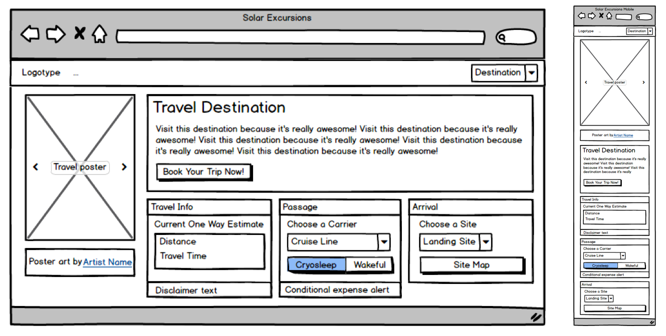
Based on my discussions with the Powers That Be, as a dedicated project manager, I slaved over Balsamiq for at least ten minutes to provide the team with mockups for the booking page on desktop and mobile. I assume they’ll make tablet meet in the middle and look reasonable.
Initial mockups for the Solar Excursions Trip Booking Page on desktop (left) and mobile (right).
Sprint Zero: Review Meeting
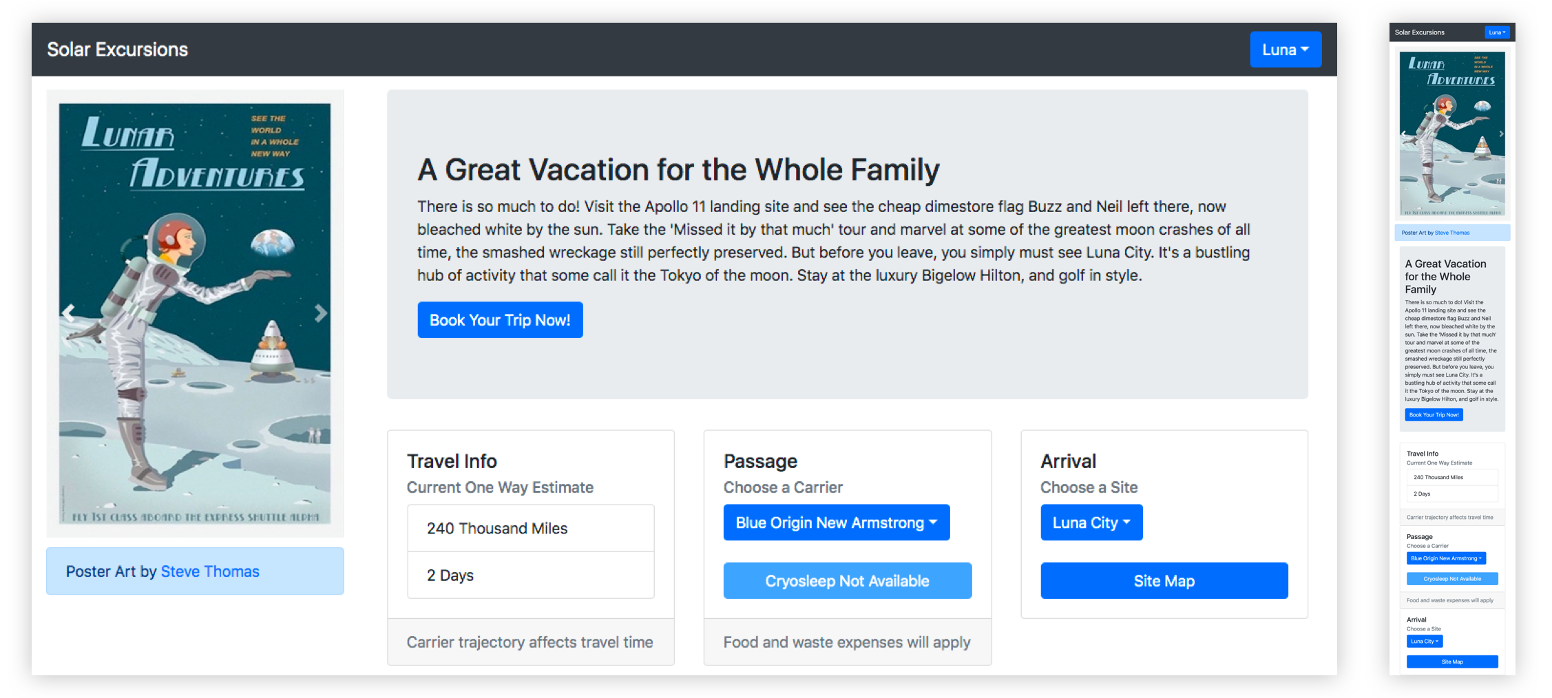
Pizza all around! The team worked really hard to hit its goals, and we now have a booking page with a layout that approximates the mockups. The infrastructure for services is coming together, but there’s quite a way to go before we can connect the UI to it. In the interim, the front-enders are using a hardcoded mock data structure.
The first iteration of the page in code using react-bootstrap.
Here’s a look at our UI code so far:
This is all straightforward React. We’re using some of that Hooks hotness, but it’s probably passé to most of you by now.
The key takeaway to notice here is how four of our five application components import and use components from react-bootstrap. Only the main App component is unaffected. That’s because it just composes the top level view with our custom components.
// App.js imports
import React, { useState } from "react";
import Navigation from "./Navigation";
import Page from "./Page";

// Navigation.js imports
import React from "react";
import { Navbar, Dropdown, Nav } from "react-bootstrap";

// Page.js imports
import React from "react";
import PosterCarousel from "./PosterCarousel";
import DestinationLayout from "./DestinationLayout";
import { Container, Row, Col } from "react-bootstrap";

// PosterCarousel.js imports
import React from "react";
import { Alert, Carousel, Image } from "react-bootstrap";

// DestinationLayout.js imports
import React, { useState, useEffect } from "react";
import {
  Button,
  Card,
  Col,
  Container,
  Dropdown,
  Jumbotron,
  ListGroup,
  Row,
  ToggleButtonGroup,
  ToggleButton
} from "react-bootstrap";
The decision to move fast with Bootstrap has allowed us to hit our sprint goals, but we’re already accumulating technical debt. This is just four affected components, but as the application grows, it’s clear the „styling refactor” sprints that we planned for are going to become exponentially harder. And we haven’t even customized these components much. Once we have tens of components, all using Bootstrap with lots of inline styling to pretty them up, refactoring them to remove react-bootstrap dependencies will be a scary proposition indeed.
Rather than building more of the booking pipeline pages, the team decides that we’ll spend the next sprint working to isolate the react-bootstrap usage in a custom component kit since our services are still under construction. Application components will only use components from this kit. That way, when it comes time to ween ourselves from react-bootstrap, the process will be much easier. We won’t have to refactor thirty usages of the react-bootstrap Button throughout the app, we’ll just rewrite the internals of our KitButton component.
Sprint One: Review Meeting
Well, that was easy. High-fives. No change to the visual appearance of the UI, but we now have a „kit” folder that’s sibling to „components” in our React source. It has a bunch of files like KitButton.js, which basically export renamed react-bootstrap components.
An example component from our kit looks like this:
We wrap those all kit components up into a module like this:
// kit/index.js
import { KitCard } from "./KitCard";
import { KitHero } from "./KitHero";
import { KitList } from "./KitList";
import { KitImage } from "./KitImage";
import { KitCarousel } from "./KitCarousel";
import { KitDropdown } from "./KitDropdown";
import { KitAttribution } from "./KitAttribution";
import { KitNavbar, KitNav } from "./KitNavbar";
import { KitContainer, KitRow, KitCol } from "./KitContainer";
import { KitButton, KitToggleButton, KitToggleButtonGroup } from "./KitButton";
export {
  KitCard,
  KitHero,
  KitList,
  KitImage,
  KitCarousel,
  KitDropdown,
  KitAttribution,
  KitButton,
  KitToggleButton,
  KitToggleButtonGroup,
  KitContainer,
  KitRow,
  KitCol,
  KitNavbar,
  KitNav
};
And now our application components are completely free of react-bootstrap. Here are the imports for the affected components:
// Navigation.js imports
import React from "react";
import { KitNavbar, KitNav, KitDropdown } from "../kit";


// Page.js imports
import React from "react";
import PosterCarousel from "./PosterCarousel";
import DestinationLayout from "./DestinationLayout";
import { KitContainer, KitRow, KitCol } from "../kit";


// PosterCarousel.js imports
import React from "react";
import { KitAttribution, KitImage, KitCarousel } from "../kit";


// DestinationLayout.js imports
import React, { useState, useEffect } from "react";
import {
  KitCard,
  KitHero,
  KitList,
  KitButton,
  KitToggleButton,
  KitToggleButtonGroup,
  KitDropdown,
  KitContainer,
  KitRow,
  KitCol
} from "../kit";
Here’s the front-end codebase now:
Although we’ve corralled all of the react imports into our kit components, our application components still rely a bit on the react-bootstrap implementation because the attributes we place on our kit component instances are the same as those of react-bootstrap. That constrains us when it comes to re-implementing the kit components, because we need to adhere to the same API. For instance:
// From Navigation.js
<KitNavbar bg="dark" variant="dark" fixed="top">
Ideally, we wouldn’t have to add those react-bootstrap specific attributes when we instantiate our KitNavbar.
The front-enders promise to refactor those out as we go, now that we’ve identified them as problematic. And any new references to react-bootstrap components will go into our kit instead of directly into the application components.
Meanwhile, we’ve shared our mock data with the server engineer, who is working hard to build separate server environments, implement the database schema, and expose some services to us.
That gives us time to add some gloss to our UI in the next sprint — which is good because the Powers That Be would like to see separate themes for each destination. As the user browses destinations, we need to have the UI color scheme change to match the displayed travel poster. Also, we want to try and spiff up those components a bit to begin evolving our own look and feel. Once we have some money coming in, we’ll get a designer to do a complete overhaul, but hopefully we can reach a happy medium for our early users.
Sprint Two: Review Meeting
Wow! The team really pulled out all the stops this sprint. We got per-destination themes, customized components, and a lot of the lingering react-bootstrap API implementations removed from the application components.
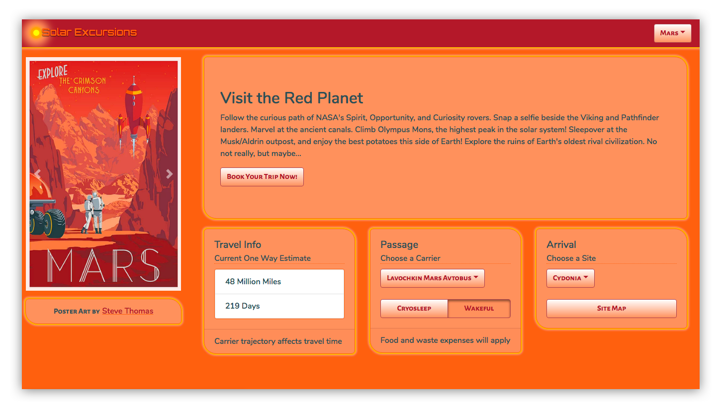
Here’s what the desktop looks like now:
Check out the solarized theme for the red planet!
In order to pull this off, the front-enders brought in the Styled Components library. It made styling the individual kit components a breeze, as well as adding support for multiple themes.
Let’s look at a few highlights of their changes for this sprint.
First, for global things like pulling in fonts and setting the page body styles, we have a new kit component called KitGlobal.
It uses the createGlobalStyle helper to define the CSS for the body element. That imports our desired web fonts from Google, sets the background color to whatever the current theme’s „foreground” value is, and turns off overflow in the x-direction to eliminate a pesky horizontal scrollbar. We use that KitGlobal component in the render method of our App component.
Also in the App component, we import ThemeProvider from styled-components, and something called „themes” from ../theme. We use React’s useState to set the initial theme to themes.luna and React’s useEffect to call setTheme whenever the „destination” changes. The returned component is now wrapped in ThemeProvider, which is passed „theme” as a prop. Here’s the App component in its entirety.
KitGlobal is rendering like any other component. Nothing special there, only that the body tag is affected. ThemeProvider is using the React Context API to pass theme down to whatever components need it (which is all of them). In order to fully understand that, we also need to take a look at what a theme actually is.
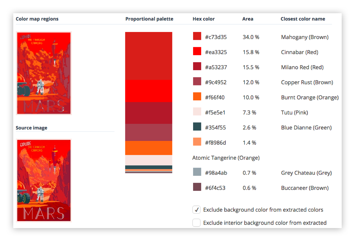
To create a theme, one of our front-enders took all the travel posters and created palettes for each by extracting the prominent colors. That was fairly simple.
Obviously, we weren’t going to use all the colors. The approach was mainly to dub the most used two colors foreground and background. Then we took three more colors, generally ordered from lightest to darkest as accent1, accent2, and accent3. Finally, we picked two contrasting colors to call text1 and text2. For the above destination, that looked like:
Once we have a theme for each destination, and it is being passed into all the components (including the kit components that our application components are now built from), we need to use styled-components to apply those theme colors as well as our custom visual styling, like the panel corners and „border glow.”
This is a simple example where we made our KitHero component apply the theme and custom styles to the Bootstrap Jumbotron:
Then there are more complex cases where we want to preset some attributes on the react-bootstrap component. For instance, the KitNavbar component which we identified earlier as having a bunch of react-bootstrap attributes that we’d rather not pass from the application’s declaration of the component.
First, we create a component called StyledBootstrapNavbar using styled-components. We were able to handle some of the attributes with the CSS we passed to styled-components. But in order to continue leveraging (for now) the reliable stickiness of the component to the top of the screen while everything else is scrolled, our front-enders elected to continue using react-bootstrap’s fixed attribute. In order to do that, we had to create a KitNavbar component that rendered an instance of StyledBootstrapNavbar with the fixed=top attribute. We also passed through all the props, which includes its children.
We only have to create a separate class that renders styled-component’s work and passes props through to it if we want to explicitly set some attributes in our kit component by default. In most cases, we can just name and return styled-component’s output and use it as we did with KitHero above.
Now, when we render the KitNavbar in our application’s Navigation component, it looks like this:
Finally, we took our first stabs at refactoring our kit components away from react-bootstrap. The KitAttribution component is a Bootstrap Alert which, for our purposes, is little more than an ordinary div. We were able to easily refactor to remove its dependency on react-bootstrap.
This is the component as it emerged from the previous sprint:
After three sprints, our team is well on its way to having a scalable component architecture in place for the UI.
We are moving quickly thanks to react-bootstrap, but are no longer piling up loads of technical debt as a result of it.
Thanks to styled-components, we were able to implement multiple themes (like how almost every app on the Internet these days sports dark and light modes). We also don’t look like an out-of-the-box Bootstrap app anymore.
By implementing a custom component kit that contains all references to react-bootstrap, we can refactor away from it as time permits.
I’ve heard people say that the #1 most exciting and important thing that came out of Google I/O this year was the evergreen Googlebot:
Today, we are happy to announce that Googlebot now runs the latest Chromium rendering engine (74 at the time of this post) when rendering pages for Search. Moving forward, Googlebot will regularly update its rendering engine to ensure support for latest web platform features.
Before this, I guess I never even thought about it.
I guess part of it is that some people did already know that the old version didn’t support some newfangled JavaScript stuff, and thus literally packaged their app with old JavaScript to be more SEO-friendly.
A bunch of people were apparently shipping older code simply for the sake of Googlebot, and now they don’t have to. Sure, I’ll call that a win.
Don’t read this news as „don’t worry about your JavaScript-rendered pages and SEO” though, because Google Webmasters is still telling us that pages with content that requires JavaScript to render are put into a special slower queue for both initial crawling and for updates. Not necessarily a penalty, but certainly a delay. I’m sure that’s enough to make server-side rendering a priority for sites where SEO is the whole ballgame.
The inputmode global attribute provides a hint to browsers for devices with onscreen keyboards to help them decide which keyboard to display when a user has selected any input or textarea element.
Unlike changing the type of the form, inputmode doesn’t change the way the browser interprets the input — it instructs the browser which keyboard to display.
The inputmode attribute has a long history but has only very recently been adopted by the two major mobile browsers: Safari for iOS and Chrome for Android. Before that, it was implemented in Firefox for Android way back in 2012, and then subsequently removed several months later (though it is still available via a flag).
Almost six years later, Chrome for Android implemented the feature — and with the recent release of iOS 12.2, Safari now supports it too.
This browser support data is from Caniuse, which has more detail. A number indicates that browser supports the feature at that version and up.
Desktop
Chrome
Opera
Firefox
IE
Edge
Safari
66
53
20
No
75
No
Mobile / Tablet
iOS Safari
Opera Mobile
Opera Mini
Android
Android Chrome
Android Firefox
12.2
No
No
67
74
No
But before we go deep into the ins and outs of the attribute, consider that the WHATWG living standard provides inputmode documentation while the W3C 5.2 spec no longer lists it in its contents, which suggests they consider it obsolete. Given that WHATWG has documented it and browsers have worked toward supporting it, we’re going to go assume WHATWG specifications are the standard.
inputmode accepts a number of values. Let’s go through them, one by one.
None
<input type="text" inputmode="none" />
We’re starting here because it’s very possible we don’t want any type of keyboard on an input. Using inputmode=none will not show a keyboard at all on Chrome for Android. iOS 12.2 will still show its default alphanumeric keyboard, so specifying none could be sort of a reset for iOS in that regard. Regardless, none is intended for content that renders its own keyboard control.
Numeric
<input type="text" inputmode="numeric" />
This one is probably the one of the more common inputmode values out in the wild because it’s ideal for inputs that require numbers but no letters — things like PIN entry, zip codes, credit card numbers, etc. Using the numeric value with an input of type="text" may actually make more sense than setting the input to type="number" alone because, unlike a numeric input, inputmode="numeric" can be used with maxlength, minlength and pattern attributes, making it more versatile for different use cases.
The numeric value on Chrome Android (left) and iOS 12.2 (right)
I’ve often seen sites using type=tel on an input to display a numeric keyboard, and that checks out as a workaround, but isn’t semantically correct. If that bums you out, remember that inputmode supports patterns, we can add pattern="\d*" to the input for the same effect. That said, only use this if you are certain the input should only allow numeric input because Android (unlike iOS) doesn’t allow the user to change to the keyboard to use letters, which might inadvertently prevent users from submitting valid data.
Tel
<input type="text" inputmode="tel" />
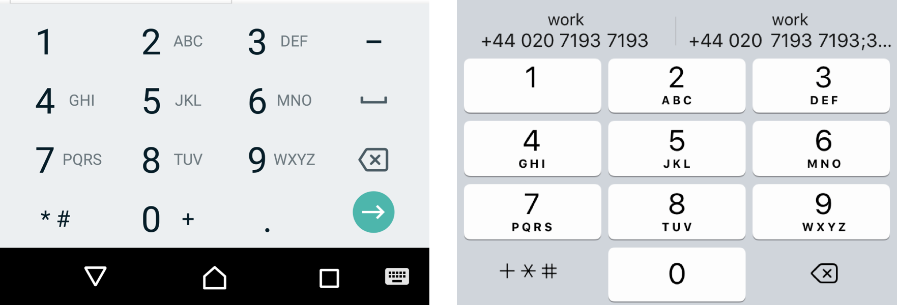
Entering a telephone number using a standard alphanumeric keyboard can be a pain. For one, each number on a telephone keyboard (except 1 and 0) represents three letters (e.g. 2 represents A, B and C) which are displayed with the number. The alphanumeric keyboard does not reference those letters, so decoding a telephone number containing letters (e.g. 1-800-COLLECT) takes more mental power.
The tel value on Chrome Android (left) and iOS 12.2 (right)
Using inputmode set to tel will produce a standard-looking telephone keyboard, including keys for digits 0 to 9, the pound (#) character, and the asterisk (*) character. Plus, we get those alphabetic mnemonic labels (e.g. ABC).
Decimal
<input type="text" inputmode="decimal" />
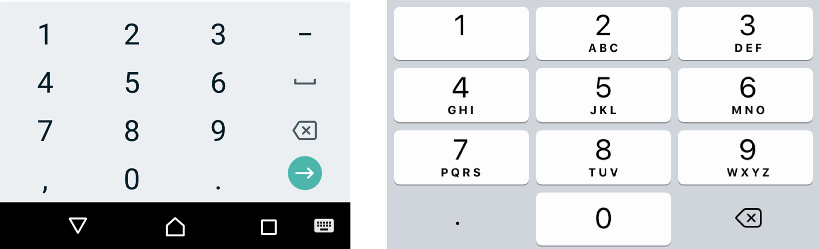
The decimal value on Chrome Android (left) and iOS 12.2 (right)
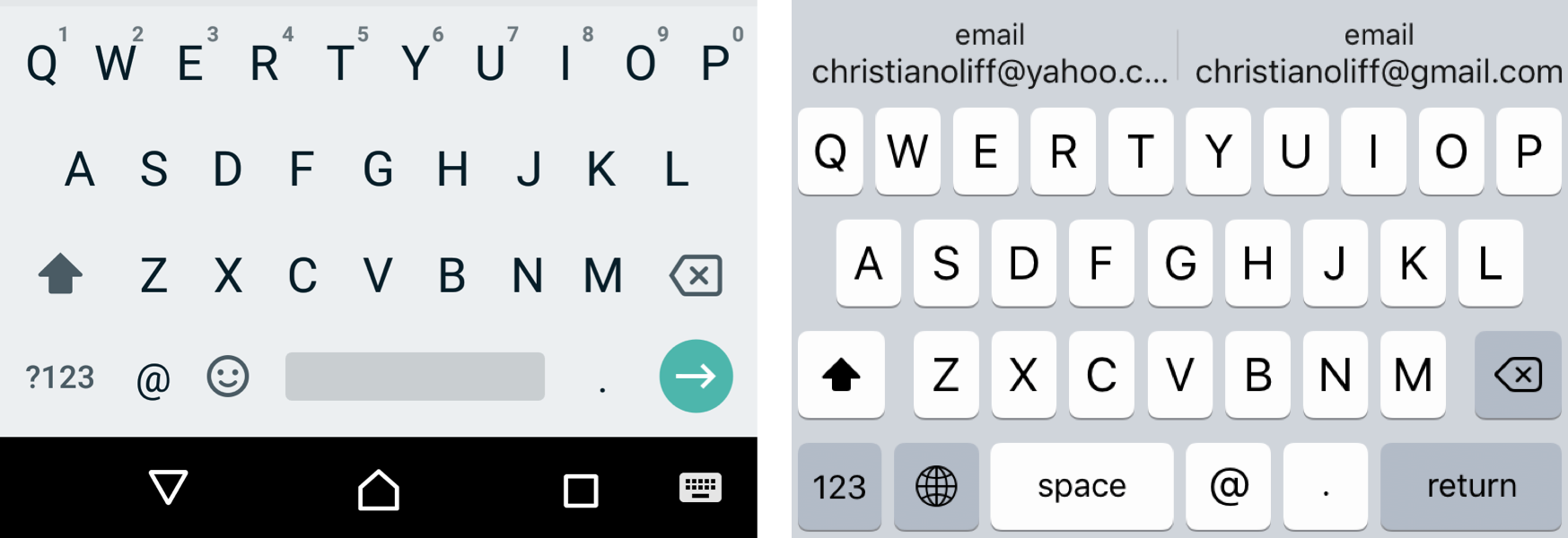
An inputmode set to the decimal value results in a subtle change in iOS where the keyboard appears to be exactly the same as the tel value, but replaces the +*# key with a simple decimal (.). On the flip side, this has no effect on Android, which will simply use the numeric keyboard.
Email
<input type="text" inputmode="email" />
I’m sure you (and at least someone you know) has filled out a form that asks for an email address, only to make you swap keyboards to access the @ character. It’s not life-threatening or anything, but certainly not a great user experience either.
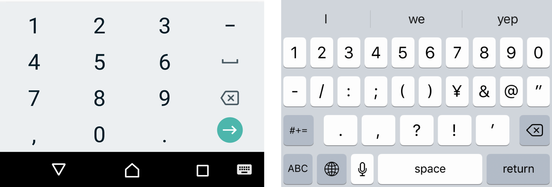
That’s where the email value comes in. It brings the @ character into the fray, as well as the decimal (.) character.
The email value on Chrome Android (left) and iOS 12.2 (right)
This could also be a useful keyboard to show users who need to enter a Twitter username, given that@ is a core Twitter character for identifying users. However, the email address suggestions that iOS display above the keyboard may cause confusion.
Another use case could be if you have your own email validation script and don’t want to use the browsers built-in email validation.
URL
<input type="text" inputmode="url" />
The url value on Chrome Android (left) and iOS 12.2 (right)
The url value provides a handy shortcut for users to append TLDs (e.g. .com or .co.uk) with a single key, as well keys typically used in web addresses, like the dot (.) and forward slash (/) characters. The exact TLD displayed on the keyboard is tied to the user’s locale.
This could also be a useful keyboard to show users if your input accepts domain names (e.g. css-tricks.com) as well as full URIs (e.g. https://css-tricks.com). Use type="url" instead if your input requires validating the input.
Search
<input type="text" inputmode="search" />
The search value on Chrome Android (left) and iOS 12.2 (right)
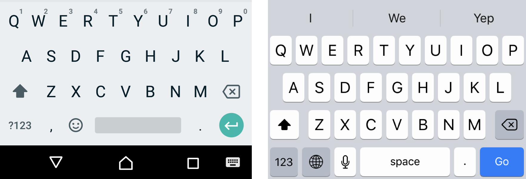
This displays a blue Go key on iOS and a green Enter key on Android, both in place of where Return. As you may have guessed by the value’s name, search is useful for search forms, providing that submission key to make a query.
If you’d like to showSearch instead of Enter on iOS and a magnifying glass icon on Android in place of the green arrow, use type=search instead.
Other things you oughta know
Chromium-based browsers on Android — such as Microsoft Edge, Brave and Opera — share the same inputmode behavior as Chrome.
I haven’t included details of keyboards on iPad for the sake of brevity. It’s mostly the same as iPhone but includes more keys. Same is true for Android tablets, save for third-party keyboards, which might be another topic worth covering.
The original proposed spec had the values kana and katakana for Japanese input but they were never implemented by any browser and have since been removed from the spec.
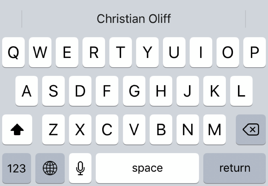
latin-name was also one of the values of the original spec and has since been removed. Interestingly, if it’s used now on Safari for iOS, it will display the user’s name as a suggestion above the keyboard.
The latin-name value displays my name as an auto-fill suggestion
Demo
Oh, you want to see how all of these input modes work for yourself? Here’s a demo you can use on a device with a touchscreen keyboard to see the differences.
The inputmode global attribute provides a hint to browsers for devices with onscreen keyboards to help them decide which keyboard to display when a user has selected any input or textarea element.
Unlike changing the type of the form, inputmode doesn’t change the way the browser interprets the input — it instructs the browser which keyboard to display.
The inputmode attribute has a long history but has only very recently been adopted by the two major mobile browsers: Safari for iOS and Chrome for Android. Before that, it was implemented in Firefox for Android way back in 2012, and then subsequently removed several months later (though it is still available via a flag).
Almost six years later, Chrome for Android implemented the feature — and with the recent release of iOS 12.2, Safari now supports it too.
This browser support data is from Caniuse, which has more detail. A number indicates that browser supports the feature at that version and up.
Desktop
Chrome
Opera
Firefox
IE
Edge
Safari
66
53
20
No
75
No
Mobile / Tablet
iOS Safari
Opera Mobile
Opera Mini
Android
Android Chrome
Android Firefox
12.2
No
No
67
74
No
But before we go deep into the ins and outs of the attribute, consider that the WHATWG living standard provides inputmode documentation while the W3C 5.2 spec no longer lists it in its contents, which suggests they consider it obsolete. Given that WHATWG has documented it and browsers have worked toward supporting it, we’re going to go assume WHATWG specifications are the standard.
inputmode accepts a number of values. Let’s go through them, one by one.
None
<input type="text" inputmode="none" />
We’re starting here because it’s very possible we don’t want any type of keyboard on an input. Using inputmode=none will not show a keyboard at all on Chrome for Android. iOS 12.2 will still show its default alphanumeric keyboard, so specifying none could be sort of a reset for iOS in that regard. Regardless, none is intended for content that renders its own keyboard control.
Numeric
<input type="text" inputmode="numeric" />
This one is probably the one of the more common inputmode values out in the wild because it’s ideal for inputs that require numbers but no letters — things like PIN entry, zip codes, credit card numbers, etc. Using the numeric value with an input of type="text" may actually make more sense than setting the input to type="number" alone because, unlike a numeric input, inputmode="numeric" can be used with maxlength, minlength and pattern attributes, making it more versatile for different use cases.
The numeric value on Chrome Android (left) and iOS 12.2 (right)
I’ve often seen sites using type=tel on an input to display a numeric keyboard, and that checks out as a workaround, but isn’t semantically correct. If that bums you out, remember that inputmode supports patterns, we can add pattern="\d*" to the input for the same effect. That said, only use this if you are certain the input should only allow numeric input because Android (unlike iOS) doesn’t allow the user to change to the keyboard to use letters, which might inadvertently prevent users from submitting valid data.
Tel
<input type="text" inputmode="tel" />
Entering a telephone number using a standard alphanumeric keyboard can be a pain. For one, each number on a telephone keyboard (except 1 and 0) represents three letters (e.g. 2 represents A, B and C) which are displayed with the number. The alphanumeric keyboard does not reference those letters, so decoding a telephone number containing letters (e.g. 1-800-COLLECT) takes more mental power.
The tel value on Chrome Android (left) and iOS 12.2 (right)
Using inputmode set to tel will produce a standard-looking telephone keyboard, including keys for digits 0 to 9, the pound (#) character, and the asterisk (*) character. Plus, we get those alphabetic mnemonic labels (e.g. ABC).
Decimal
<input type="text" inputmode="decimal" />
The decimal value on Chrome Android (left) and iOS 12.2 (right)
An inputmode set to the decimal value results in a subtle change in iOS where the keyboard appears to be exactly the same as the tel value, but replaces the +*# key with a simple decimal (.). On the flip side, this has no effect on Android, which will simply use the numeric keyboard.
Email
<input type="text" inputmode="email" />
I’m sure you (and at least someone you know) has filled out a form that asks for an email address, only to make you swap keyboards to access the @ character. It’s not life-threatening or anything, but certainly not a great user experience either.
That’s where the email value comes in. It brings the @ character into the fray, as well as the decimal (.) character.
The email value on Chrome Android (left) and iOS 12.2 (right)
This could also be a useful keyboard to show users who need to enter a Twitter username, given that@ is a core Twitter character for identifying users. However, the email address suggestions that iOS display above the keyboard may cause confusion.
Another use case could be if you have your own email validation script and don’t want to use the browsers built-in email validation.
URL
<input type="text" inputmode="url" />
The url value on Chrome Android (left) and iOS 12.2 (right)
The url value provides a handy shortcut for users to append TLDs (e.g. .com or .co.uk) with a single key, as well keys typically used in web addresses, like the dot (.) and forward slash (/) characters. The exact TLD displayed on the keyboard is tied to the user’s locale.
This could also be a useful keyboard to show users if your input accepts domain names (e.g. css-tricks.com) as well as full URIs (e.g. https://css-tricks.com). Use type="url" instead if your input requires validating the input.
Search
<input type="text" inputmode="search" />
The search value on Chrome Android (left) and iOS 12.2 (right)
This displays a blue Go key on iOS and a green Enter key on Android, both in place of where Return. As you may have guessed by the value’s name, search is useful for search forms, providing that submission key to make a query.
If you’d like to showSearch instead of Enter on iOS and a magnifying glass icon on Android in place of the green arrow, use type=search instead.
Other things you oughta know
Chromium-based browsers on Android — such as Microsoft Edge, Brave and Opera — share the same inputmode behavior as Chrome.
I haven’t included details of keyboards on iPad for the sake of brevity. It’s mostly the same as iPhone but includes more keys. Same is true for Android tablets, save for third-party keyboards, which might be another topic worth covering.
The original proposed spec had the values kana and katakana for Japanese input but they were never implemented by any browser and have since been removed from the spec.
latin-name was also one of the values of the original spec and has since been removed. Interestingly, if it’s used now on Safari for iOS, it will display the user’s name as a suggestion above the keyboard.
The latin-name value displays my name as an auto-fill suggestion
Demo
Oh, you want to see how all of these input modes work for yourself? Here’s a demo you can use on a device with a touchscreen keyboard to see the differences.