Šime posts regular content for web developers on webplatform.news. Each week, he covers timely news at the intersection of development standards and the tools that make them available on the web.
Installed PWAs cannot easily be restarted on iOS
iOS 12.2 PWAs 🔁 In-App browser for external content (OAuth) 💾 New lifecycle (No Reload) 🔙Navigation gestures 🤝WebShare ⚠️Motion Sensors disabled; old getUserMedia removed 👍 IntersectionObserver, ConicGradients, datalist, color picker, AbortFetchhttps://t.co/LNzq6MzqjR
— Maximiliano Firtman @ 🇱🇹 Vilnius (@firt) March 26, 2019
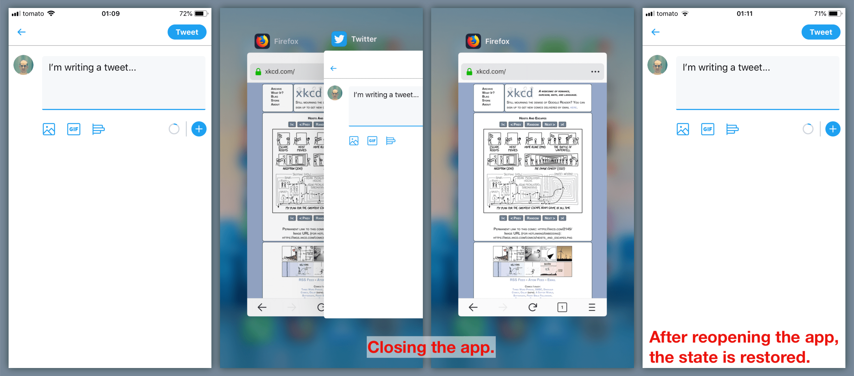
Maximiliano Firtman: On iOS, it is not possible to restart an installed PWA by closing it from the recently used apps screen and then immediately reopening it. Instead of restarting the app, iOS restores its state. This can be a problem for users if the PWA gets stuck in a broken state.
<input> with type 'file' bug on #iOS 12.2 #PWA Open the input, put the PWA in bg by pressing home button. The input stops working. True for any input with type 'file' throughout the app. It works after a phone restart. pic.twitter.com/IfzsXy91RK
After some undefined time, the saved context seems to disappear. So if you get out of the PWA, do nothing with your phone and wait some hours to go back to the PWA, it restarts from scratch.
Instilling a performance culture at The Telegraph
We've been working hard at The Telegraph to improve third-party performance. Here is an insight into our approach – https://t.co/4hhRDYaidS#webperf ⚡️
Gareth Clubb: At The Telegraph (a major UK newspaper), we set up a web performance working group to tackle our “organizational” performance challenges and instill a performance culture. The group meets regularly to review third-party tags and work on improving our site’s performance.
We’ve started deferring all JavaScript (including our own) using the <script defer> attribute. This change alone nearly doubled our (un-throttled) Lighthouse performance score.
Deferring our JavaScript hasn’t skewed any existing analytics and it certainly hasn’t delayed any advertising. […] The First Ad Loaded metric improved by an average of four seconds.
We also removed 1 MB of third-party payload from our new front end. When one of our teams requests the addition of any new script, we now test the script in isolation and reject it if it degrades our metrics (first contentful paint, etc.).
When we started this process, we had a collection of very old scripts and couldn’t track the original requester. We removed those on the premise that, if they were important, people would get back in touch — no one did.
Microsoft plans to add tracking prevention to the Edge browser
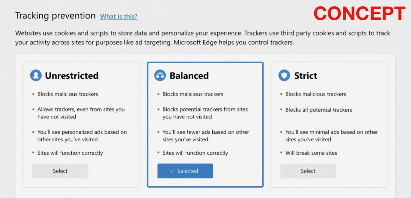
Kyle Pflug: Microsoft has announced plans to add options for blocking trackers to the Edge browser. Malicious trackers would be blocked automatically, and the user would have the option to additionally block all potential trackers.
This would make Edge the fourth major browser with some form of built-in anti-tracking feature (two other major browsers, Opera and UC Browser, include ad blockers instead).
In 2015, Firefox added Tracking Protection — recently renamed to Content Blocking — becoming the first major browser to protect users from third-party trackers (when browsing the web in private mode).
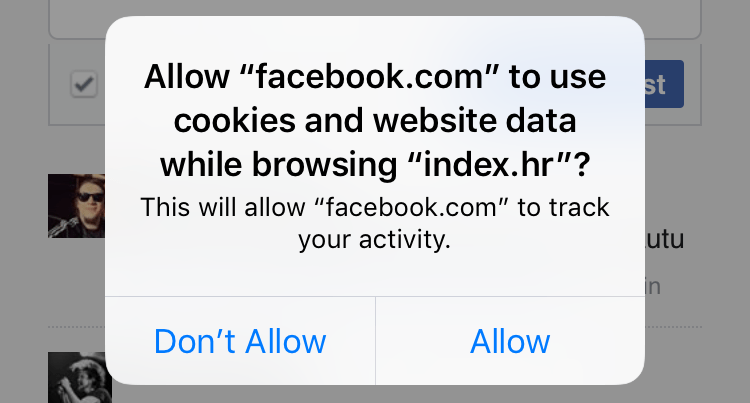
Since 2017, Safari prevents cross-site tracking by default, through a feature called Intelligent Tracking Prevention (ITP). Users are prompted to allow tracking when they try to interact with third-party widgets on websites.
Earlier this year, Samsung Internet added an experimental feature called Smart Anti-Tracking that denies third-party trackers access to cookies.
This simple flyer tutorial shows you how to create a rainbow-themed flyer template to promote IDAHOBIT at your workplace, college, or school. Perfect for beginners to Adobe InDesign, this is a quick and simple flyer design to put together.
On 17 May,people worldwide are invited to celebrate IDAHOBIT (International Day Against Homophobia, Biphobia, Intersexism and Transphobia).
This important event invites people to show their support for their lesbian, gay, bisexual, transgender, intersex, and queer (LGBTIQ) mates, colleagues, and families, and make a stand against discrimination.
Install the font files on your computer and save the texture pack to a safe place.
You’ll also need to download the provided Adobe Swatch Exchange file, to access the color swatches for your poster. We’ll look at how to install the swatches a little later.
Then you’re ready to start creating your flyer!
1. How to Set Up the Flyer Document in InDesign
Step 1
First up, you’ll need to define the flyer dimensions in InDesign.
Open InDesign and go to File > New > Document.
Choose Print from the options at the top of the window, and select A3 for the Page Size. Deselect Facing Pages.
Add Margins of 0.375 in and a Bleed of 0.25 in*.
*The bleed is only necessary if you’re sending your flyer for professional printing. If you’re printing from a home or office printer, you can skip this step.
Step 2
Expand the Layers panel (Window > Layers) and double-click on Layer 1, renaming it Background.
Create four more new layers in this order—Texture Background, Hearts, Type, and finally Texture Overlay at the top of the sequence.
Then lock all layers except the bottom layer, Background.
Step 3
Expand the Swatches panel (Window > Color > Swatches), and choose Load Swatches from the panel’s drop-down menu.
Navigate to the IDAHOBIT Poster Swatches.ase file you downloaded earlier, and click Open, loading the color swatches into the panel.
2. How to Build Up Color and Texture on Your Flyer Template
Step 1
Working on the Background layer, use the Rectangle Tool (M) to create a shape across the page, extending the edges up to the margins.
From the Swatches panel, set the Fill to the pale beige swatch in the Swatches panel.
Step 2
Lock the Background layer and unlock the next layer up, Texture Background.
Use the Rectangle Frame Tool (F) to create an image frame across the top half of the background shape. Go to File > Place, and choose Texture 6.png from the folder of PNG images inside the textile textures pack you downloaded earlier.
Click Open and allow the image to fill the frame.
With the image frame selected, go to Object > Effects > Transparency, and set the Mode to Screen.
Step 3
Copy and Paste the image frame, moving the second frame directly below, so that the background shape is completely overlaid with texture.
Expand the Texture Background layer in the Layers panel and select both the PNG elements sitting inside this layer.
Select Duplicate Page Items from the panel’s menu, to make a copy of the elements.
Unlock the Texture Overlay layer at the top, drag the two copies up, and drop them into this top layer.
Then lock both the Texture Background and Texture Overlay layers.
3. How to Create IDAHOBIT Hearts for Your Poster
Step 1
Unlock the Hearts layer. Use the Pen Tool (P) to create a half-heart shape, dragging on the anchor points to create the curved top of the half-heart.
Don’t panic if the shape looks a little bit shaky. You can switch to the Smooth Tool and drag your cursor over the line, smoothing out any lumps and bumps.
Step 2
When you’re happy with the shape, select it and Edit > Copy, Edit > Paste it.
On the copy, Right-Click > Transform > Flip Horizontal.
Bring the two lines together and go to Object > Paths > Join.
Step 3
With your heart shape joined and ready to use in your design, hold Shift while you scale it down, placing it at the top left of the layout.
Switch the Fill Color to your red swatch, and the Stroke Color to [None].
With the heart selected, go to Object > Effects > Transparency. Switch the Mode to Multiply and bring the Opacity down to 90%, before clicking OK.
Step 4
Copy and Paste the red heart and position it to the right of the first, creating an overlapping effect.
Adjust the Fill Color to the orange swatch in the Swatches panel.
Paste again, moving further to the right, and switch the Fill to yellow. Add a fourth and final yellow heart to the sequence.
Step 5
Select all four heart shapes and Copy and Paste them, moving the new sequence of four about two-thirds of the way down the page.
Adjust the colors to move from green to blue to purple to complete the Pride colors.
4. How to Format Colorful Typography on Your Flyer Template
Step 1
Lock the Hearts layer and unlock the Type layer.
Use the Type Tool (T) to create a sequence of text frames across the layout, adding a large header at the top ‘WE STAND WITH OUR/LGBTIQ MATES’ and a sub-heading below this reading ‘International Day Against Homophobia, Biphobia, Intersexism and Transphobia’.
Add the date, May 17, below this.
Below the second sequence of hearts, you can find space to add a text frame for the event details, and below this add a social media hashtag for IDAHOBIT.
From either the top Controls panel or the Character and Paragraph panels (Window > Type & Tables > Character), set the Font to Liber.
Step 2
Use your Type Tool cursor to highlight individual words and letters across the text and apply different color swatches to these to make them pop.
Step 3
For the main header of the flyer, we can create a gradient swatch to really add an extra special touch to the design.
Choose New Gradient Swatch from the Swatches panel’s main menu.
Name the swatch Gradient 1, and set the Type to Linear.
Choose Swatches from the Stop Color menu. Click on the left-hand stop on the Gradient Ramp and set this to the red swatch in the Swatches list. For the right-hand stop, choose the orange swatch.
Then click Add and OK.
Highlight the header text with your Type Tool cursor and apply the Gradient 1 swatch to the Font Color from the Swatches panel.
5. How to Export Your Flyer Design for Printing
If you’re simply printing your flyer from a home or office printer, you can head straight up to File > Print.
If you’re sending the flyer off to be printed at a local print shop or through an online print-on-demand service, you should follow the instructions below.
Step 1
Go to File > Export and choose Adobe PDF (Print) from the Format menu in the Export window.
Click Save. In the Export Adobe PDF window that opens, choose [Press Quality] from the Preset menu at the top of the window.
Step 2
Click on Marks and Bleeds in the window’s left-hand menu.
Check both All Printer’s Marks and Use Document Bleed Settings. Then go ahead and click Export. You can send this PDF straight off to the printers—great job!
Conclusion: Your Finished Flyer Design
IDAHOBIT is the perfect opportunity to show your support for your LGBTIQ friends, colleagues and family members, and encourage others to do the same.
Display your poster with Pride in your local community hall, college, school, or workplace, and help to make the world a better and more inclusive place!
Here we’ll look at how to create a tribute poster, using typography, colors and grids which are trademarks of the Bauhaus style. This is a great all-round…
This simple flyer tutorial shows you how to create a rainbow-themed flyer template to promote IDAHOBIT at your workplace, college, or school. Perfect for beginners to Adobe InDesign, this is a quick and simple flyer design to put together.
On 17 May,people worldwide are invited to celebrate IDAHOBIT (International Day Against Homophobia, Biphobia, Intersexism and Transphobia).
This important event invites people to show their support for their lesbian, gay, bisexual, transgender, intersex, and queer (LGBTIQ) mates, colleagues, and families, and make a stand against discrimination.
Install the font files on your computer and save the texture pack to a safe place.
You’ll also need to download the provided Adobe Swatch Exchange file, to access the color swatches for your poster. We’ll look at how to install the swatches a little later.
Then you’re ready to start creating your flyer!
1. How to Set Up the Flyer Document in InDesign
Step 1
First up, you’ll need to define the flyer dimensions in InDesign.
Open InDesign and go to File > New > Document.
Choose Print from the options at the top of the window, and select A3 for the Page Size. Deselect Facing Pages.
Add Margins of 0.375 in and a Bleed of 0.25 in*.
*The bleed is only necessary if you’re sending your flyer for professional printing. If you’re printing from a home or office printer, you can skip this step.
Step 2
Expand the Layers panel (Window > Layers) and double-click on Layer 1, renaming it Background.
Create four more new layers in this order—Texture Background, Hearts, Type, and finally Texture Overlay at the top of the sequence.
Then lock all layers except the bottom layer, Background.
Step 3
Expand the Swatches panel (Window > Color > Swatches), and choose Load Swatches from the panel’s drop-down menu.
Navigate to the IDAHOBIT Poster Swatches.ase file you downloaded earlier, and click Open, loading the color swatches into the panel.
2. How to Build Up Color and Texture on Your Flyer Template
Step 1
Working on the Background layer, use the Rectangle Tool (M) to create a shape across the page, extending the edges up to the margins.
From the Swatches panel, set the Fill to the pale beige swatch in the Swatches panel.
Step 2
Lock the Background layer and unlock the next layer up, Texture Background.
Use the Rectangle Frame Tool (F) to create an image frame across the top half of the background shape. Go to File > Place, and choose Texture 6.png from the folder of PNG images inside the textile textures pack you downloaded earlier.
Click Open and allow the image to fill the frame.
With the image frame selected, go to Object > Effects > Transparency, and set the Mode to Screen.
Step 3
Copy and Paste the image frame, moving the second frame directly below, so that the background shape is completely overlaid with texture.
Expand the Texture Background layer in the Layers panel and select both the PNG elements sitting inside this layer.
Select Duplicate Page Items from the panel’s menu, to make a copy of the elements.
Unlock the Texture Overlay layer at the top, drag the two copies up, and drop them into this top layer.
Then lock both the Texture Background and Texture Overlay layers.
3. How to Create IDAHOBIT Hearts for Your Poster
Step 1
Unlock the Hearts layer. Use the Pen Tool (P) to create a half-heart shape, dragging on the anchor points to create the curved top of the half-heart.
Don’t panic if the shape looks a little bit shaky. You can switch to the Smooth Tool and drag your cursor over the line, smoothing out any lumps and bumps.
Step 2
When you’re happy with the shape, select it and Edit > Copy, Edit > Paste it.
On the copy, Right-Click > Transform > Flip Horizontal.
Bring the two lines together and go to Object > Paths > Join.
Step 3
With your heart shape joined and ready to use in your design, hold Shift while you scale it down, placing it at the top left of the layout.
Switch the Fill Color to your red swatch, and the Stroke Color to [None].
With the heart selected, go to Object > Effects > Transparency. Switch the Mode to Multiply and bring the Opacity down to 90%, before clicking OK.
Step 4
Copy and Paste the red heart and position it to the right of the first, creating an overlapping effect.
Adjust the Fill Color to the orange swatch in the Swatches panel.
Paste again, moving further to the right, and switch the Fill to yellow. Add a fourth and final yellow heart to the sequence.
Step 5
Select all four heart shapes and Copy and Paste them, moving the new sequence of four about two-thirds of the way down the page.
Adjust the colors to move from green to blue to purple to complete the Pride colors.
4. How to Format Colorful Typography on Your Flyer Template
Step 1
Lock the Hearts layer and unlock the Type layer.
Use the Type Tool (T) to create a sequence of text frames across the layout, adding a large header at the top ‘WE STAND WITH OUR/LGBTIQ MATES’ and a sub-heading below this reading ‘International Day Against Homophobia, Biphobia, Intersexism and Transphobia’.
Add the date, May 17, below this.
Below the second sequence of hearts, you can find space to add a text frame for the event details, and below this add a social media hashtag for IDAHOBIT.
From either the top Controls panel or the Character and Paragraph panels (Window > Type & Tables > Character), set the Font to Liber.
Step 2
Use your Type Tool cursor to highlight individual words and letters across the text and apply different color swatches to these to make them pop.
Step 3
For the main header of the flyer, we can create a gradient swatch to really add an extra special touch to the design.
Choose New Gradient Swatch from the Swatches panel’s main menu.
Name the swatch Gradient 1, and set the Type to Linear.
Choose Swatches from the Stop Color menu. Click on the left-hand stop on the Gradient Ramp and set this to the red swatch in the Swatches list. For the right-hand stop, choose the orange swatch.
Then click Add and OK.
Highlight the header text with your Type Tool cursor and apply the Gradient 1 swatch to the Font Color from the Swatches panel.
5. How to Export Your Flyer Design for Printing
If you’re simply printing your flyer from a home or office printer, you can head straight up to File > Print.
If you’re sending the flyer off to be printed at a local print shop or through an online print-on-demand service, you should follow the instructions below.
Step 1
Go to File > Export and choose Adobe PDF (Print) from the Format menu in the Export window.
Click Save. In the Export Adobe PDF window that opens, choose [Press Quality] from the Preset menu at the top of the window.
Step 2
Click on Marks and Bleeds in the window’s left-hand menu.
Check both All Printer’s Marks and Use Document Bleed Settings. Then go ahead and click Export. You can send this PDF straight off to the printers—great job!
Conclusion: Your Finished Flyer Design
IDAHOBIT is the perfect opportunity to show your support for your LGBTIQ friends, colleagues and family members, and encourage others to do the same.
Display your poster with Pride in your local community hall, college, school, or workplace, and help to make the world a better and more inclusive place!
Here we’ll look at how to create a tribute poster, using typography, colors and grids which are trademarks of the Bauhaus style. This is a great all-round…
This simple flyer tutorial shows you how to create a rainbow-themed flyer template to promote IDAHOBIT at your workplace, college, or school. Perfect for beginners to Adobe InDesign, this is a quick and simple flyer design to put together.
On 17 May,people worldwide are invited to celebrate IDAHOBIT (International Day Against Homophobia, Biphobia, Intersexism and Transphobia).
This important event invites people to show their support for their lesbian, gay, bisexual, transgender, intersex, and queer (LGBTIQ) mates, colleagues, and families, and make a stand against discrimination.
Install the font files on your computer and save the texture pack to a safe place.
You’ll also need to download the provided Adobe Swatch Exchange file, to access the color swatches for your poster. We’ll look at how to install the swatches a little later.
Then you’re ready to start creating your flyer!
1. How to Set Up the Flyer Document in InDesign
Step 1
First up, you’ll need to define the flyer dimensions in InDesign.
Open InDesign and go to File > New > Document.
Choose Print from the options at the top of the window, and select A3 for the Page Size. Deselect Facing Pages.
Add Margins of 0.375 in and a Bleed of 0.25 in*.
*The bleed is only necessary if you’re sending your flyer for professional printing. If you’re printing from a home or office printer, you can skip this step.
Step 2
Expand the Layers panel (Window > Layers) and double-click on Layer 1, renaming it Background.
Create four more new layers in this order—Texture Background, Hearts, Type, and finally Texture Overlay at the top of the sequence.
Then lock all layers except the bottom layer, Background.
Step 3
Expand the Swatches panel (Window > Color > Swatches), and choose Load Swatches from the panel’s drop-down menu.
Navigate to the IDAHOBIT Poster Swatches.ase file you downloaded earlier, and click Open, loading the color swatches into the panel.
2. How to Build Up Color and Texture on Your Flyer Template
Step 1
Working on the Background layer, use the Rectangle Tool (M) to create a shape across the page, extending the edges up to the margins.
From the Swatches panel, set the Fill to the pale beige swatch in the Swatches panel.
Step 2
Lock the Background layer and unlock the next layer up, Texture Background.
Use the Rectangle Frame Tool (F) to create an image frame across the top half of the background shape. Go to File > Place, and choose Texture 6.png from the folder of PNG images inside the textile textures pack you downloaded earlier.
Click Open and allow the image to fill the frame.
With the image frame selected, go to Object > Effects > Transparency, and set the Mode to Screen.
Step 3
Copy and Paste the image frame, moving the second frame directly below, so that the background shape is completely overlaid with texture.
Expand the Texture Background layer in the Layers panel and select both the PNG elements sitting inside this layer.
Select Duplicate Page Items from the panel’s menu, to make a copy of the elements.
Unlock the Texture Overlay layer at the top, drag the two copies up, and drop them into this top layer.
Then lock both the Texture Background and Texture Overlay layers.
3. How to Create IDAHOBIT Hearts for Your Poster
Step 1
Unlock the Hearts layer. Use the Pen Tool (P) to create a half-heart shape, dragging on the anchor points to create the curved top of the half-heart.
Don’t panic if the shape looks a little bit shaky. You can switch to the Smooth Tool and drag your cursor over the line, smoothing out any lumps and bumps.
Step 2
When you’re happy with the shape, select it and Edit > Copy, Edit > Paste it.
On the copy, Right-Click > Transform > Flip Horizontal.
Bring the two lines together and go to Object > Paths > Join.
Step 3
With your heart shape joined and ready to use in your design, hold Shift while you scale it down, placing it at the top left of the layout.
Switch the Fill Color to your red swatch, and the Stroke Color to [None].
With the heart selected, go to Object > Effects > Transparency. Switch the Mode to Multiply and bring the Opacity down to 90%, before clicking OK.
Step 4
Copy and Paste the red heart and position it to the right of the first, creating an overlapping effect.
Adjust the Fill Color to the orange swatch in the Swatches panel.
Paste again, moving further to the right, and switch the Fill to yellow. Add a fourth and final yellow heart to the sequence.
Step 5
Select all four heart shapes and Copy and Paste them, moving the new sequence of four about two-thirds of the way down the page.
Adjust the colors to move from green to blue to purple to complete the Pride colors.
4. How to Format Colorful Typography on Your Flyer Template
Step 1
Lock the Hearts layer and unlock the Type layer.
Use the Type Tool (T) to create a sequence of text frames across the layout, adding a large header at the top ‘WE STAND WITH OUR/LGBTIQ MATES’ and a sub-heading below this reading ‘International Day Against Homophobia, Biphobia, Intersexism and Transphobia’.
Add the date, May 17, below this.
Below the second sequence of hearts, you can find space to add a text frame for the event details, and below this add a social media hashtag for IDAHOBIT.
From either the top Controls panel or the Character and Paragraph panels (Window > Type & Tables > Character), set the Font to Liber.
Step 2
Use your Type Tool cursor to highlight individual words and letters across the text and apply different color swatches to these to make them pop.
Step 3
For the main header of the flyer, we can create a gradient swatch to really add an extra special touch to the design.
Choose New Gradient Swatch from the Swatches panel’s main menu.
Name the swatch Gradient 1, and set the Type to Linear.
Choose Swatches from the Stop Color menu. Click on the left-hand stop on the Gradient Ramp and set this to the red swatch in the Swatches list. For the right-hand stop, choose the orange swatch.
Then click Add and OK.
Highlight the header text with your Type Tool cursor and apply the Gradient 1 swatch to the Font Color from the Swatches panel.
5. How to Export Your Flyer Design for Printing
If you’re simply printing your flyer from a home or office printer, you can head straight up to File > Print.
If you’re sending the flyer off to be printed at a local print shop or through an online print-on-demand service, you should follow the instructions below.
Step 1
Go to File > Export and choose Adobe PDF (Print) from the Format menu in the Export window.
Click Save. In the Export Adobe PDF window that opens, choose [Press Quality] from the Preset menu at the top of the window.
Step 2
Click on Marks and Bleeds in the window’s left-hand menu.
Check both All Printer’s Marks and Use Document Bleed Settings. Then go ahead and click Export. You can send this PDF straight off to the printers—great job!
Conclusion: Your Finished Flyer Design
IDAHOBIT is the perfect opportunity to show your support for your LGBTIQ friends, colleagues and family members, and encourage others to do the same.
Display your poster with Pride in your local community hall, college, school, or workplace, and help to make the world a better and more inclusive place!
Here we’ll look at how to create a tribute poster, using typography, colors and grids which are trademarks of the Bauhaus style. This is a great all-round…
When creating a website from scratch, there’s always a lot of
things to keep in mind. A lot of work goes into designing a website. However, a
lot more work has to go into securing it.
Ensuring the code’s good, relying on a VPN to encrypt the
connection, protecting the passwords, etc. All of these things play a major
role in improving cybersecurity, so let’s take a closer look.
First Thing’s First
Writing a quality code takes a lot of time and effort, but it’s essential. Cybercriminals are agile and constantly working on ways that’ll help them navigate around a website’s code. Staying on top of trends and being familiar with the popular methods hackers use could prove to be invaluable.
Investing in ethical hackers after designing a website is a great
idea. They can help find any vulnerabilities and report them so that they can
be fixed.
Navigation
This refers to the general internet navigation rather than the
navigation of the website that’s being designed. Staying vigilant when browsing
the internet from the office computer can save everyone a lot of trouble.
There are countless of malicious websites that can compromise the
security of the computer. Over 350,000 new malicious programs are detected
every day. And even with good firewalls in place, some can still slip through
the cracks. Wise navigation is always advised.
Secure Connection
An internet connection that’s open to others poses major risks, as
it enables anyone with some skill to attack a device connected to that network.
The only thing that ensures a truly secure and private internet
connection is a VPN. VPN creates a tunnel between the device and the network.
It routes internet traffic through remote servers, providing an anonymous
connection with almost indecipherable encryption.
Even if the website itself was designed following the best
cybersecurity practices, there are other vulnerabilities.
Companies with social media accounts must ensure those accounts
are secure as well. Employee emails, personal and other accounts must be
considered as well.
Companies with BYOD policies have to ensure the cybersecurity of
each device. All vulnerabilities must be taken into account to really improve
the company’s cybersecurity.
Sensitive Information
Businesses that sell their products online must ensure all client
credit card information is completely secure.
The countless data breaches of the past few years have made many
people wary. Therefore, if a company doesn’t have proper security measures in
place, customers are more likely to take their business elsewhere.
While storing client information on a computer is essential, that
information must never land on a company’s website. No page should store
sensitive client information. This would only increase the chance of
cyberattack and has no benefits whatsoever.
Password Protection
Creating a strong password for a website is a must. Good passwords
are the first step towards improving the overall cybersecurity. So, web designers
should come up with one that’s impossible to guess.
Any public information about the business should not be in the
password. The best solution here is to rely on password managers that can
generate strong and unique passwords.
The Backup Plan
No matter how well-designed a website is, some mistakes will peek
through. This is why it’s always good to have a backup plan for the worst-case
scenario.
Having a backup plan will ensure that the best course of action is
taken in case of a breach. It will limit the potential losses, and it will be
easier to deal with the crisis.
Having a backup plan,
practicing safe internet browsing, and using a VPN. All of this is necessary to
improve the overall cybersecurity of the whole organization. None of these steps
should be skipped, as cybersecurity is not a single solution to a single
problem – it’s different parts working together.
When creating a website from scratch, there’s always a lot of
things to keep in mind. A lot of work goes into designing a website. However, a
lot more work has to go into securing it.
Ensuring the code’s good, relying on a VPN to encrypt the
connection, protecting the passwords, etc. All of these things play a major
role in improving cybersecurity, so let’s take a closer look.
First Thing’s First
Writing a quality code takes a lot of time and effort, but it’s essential. Cybercriminals are agile and constantly working on ways that’ll help them navigate around a website’s code. Staying on top of trends and being familiar with the popular methods hackers use could prove to be invaluable.
Investing in ethical hackers after designing a website is a great
idea. They can help find any vulnerabilities and report them so that they can
be fixed.
Navigation
This refers to the general internet navigation rather than the
navigation of the website that’s being designed. Staying vigilant when browsing
the internet from the office computer can save everyone a lot of trouble.
There are countless of malicious websites that can compromise the
security of the computer. Over 350,000 new malicious programs are detected
every day. And even with good firewalls in place, some can still slip through
the cracks. Wise navigation is always advised.
Secure Connection
An internet connection that’s open to others poses major risks, as
it enables anyone with some skill to attack a device connected to that network.
The only thing that ensures a truly secure and private internet
connection is a VPN. VPN creates a tunnel between the device and the network.
It routes internet traffic through remote servers, providing an anonymous
connection with almost indecipherable encryption.
Even if the website itself was designed following the best
cybersecurity practices, there are other vulnerabilities.
Companies with social media accounts must ensure those accounts
are secure as well. Employee emails, personal and other accounts must be
considered as well.
Companies with BYOD policies have to ensure the cybersecurity of
each device. All vulnerabilities must be taken into account to really improve
the company’s cybersecurity.
Sensitive Information
Businesses that sell their products online must ensure all client
credit card information is completely secure.
The countless data breaches of the past few years have made many
people wary. Therefore, if a company doesn’t have proper security measures in
place, customers are more likely to take their business elsewhere.
While storing client information on a computer is essential, that
information must never land on a company’s website. No page should store
sensitive client information. This would only increase the chance of
cyberattack and has no benefits whatsoever.
Password Protection
Creating a strong password for a website is a must. Good passwords
are the first step towards improving the overall cybersecurity. So, web designers
should come up with one that’s impossible to guess.
Any public information about the business should not be in the
password. The best solution here is to rely on password managers that can
generate strong and unique passwords.
The Backup Plan
No matter how well-designed a website is, some mistakes will peek
through. This is why it’s always good to have a backup plan for the worst-case
scenario.
Having a backup plan will ensure that the best course of action is
taken in case of a breach. It will limit the potential losses, and it will be
easier to deal with the crisis.
Having a backup plan,
practicing safe internet browsing, and using a VPN. All of this is necessary to
improve the overall cybersecurity of the whole organization. None of these steps
should be skipped, as cybersecurity is not a single solution to a single
problem – it’s different parts working together.
In this tutorial, you will learn how to create an amazing dispersion effect.
First we will create several patterns that we will use for creating the dispersed parts. We will then define which areas of our photo we want to disperse and create the parts. After that, we will disperse them in the direction we choose, transform them, blur some of them to add depth, and finally make some adjustments to our design.
I will try to explain everything in so much detail that everyone can create it, even those who have just opened Photoshop for the first time.
The effect shown above is the one I will show you how to create here in this tutorial. If you would like to create the effects shown below, with a single click and in just a few minutes, then check out my Dispersion Photoshop Action.
What You’ll Need
To recreate this tutorial design, you will need the following photo:
The stock image used is no longer available, however you can find similar over on Photodune.
1. How to Get Started
First, open the photo that you want to work with. To open your photo, go to File > Open, choose your photo, and click Open. Now, before we get started, just check a couple of things:
Your photo should be in RGB Color mode, 8 Bits/Channel. To check this, go to Image > Mode.
For best results, your photo size should be 1500–4000 px wide/high. To check this, go to Image > Image Size.
Your photo should be the Background layer. If it is not, go to Layer > New > Background from Layer.
2. How to Create the Patterns
Step 1
In this step, we are going to create some patterns that we will use for creating the dispersed parts. So, go to File > New to create a new file, name it Pattern 1, and choose the settings below:
Step 2
Now choose the Ellipse Tool and left-click anywhere inside the canvas to create an ellipse, and select the settings below. Then position the ellipse exactly in the center of the canvas.
Step 3
Left-click the eye icon of the Background layer to hide it, go to Edit > Define Pattern to define a new pattern, and name it Circle_Pattern_1.
Step 4
Now you can close the Pattern 1 file. Go to File > New to create a new file, name it Pattern 2, and enter the settings below:
Step 5
Choose the Ellipse Tool and left-click
anywhere inside the canvas to create an ellipse, and select the settings
below. Then position the ellipse exactly in the center of the canvas.
Step 6
Left-click the eye icon of the Background layer to hide it, go to Edit > Define Pattern to define a new pattern, and name it Circle_Pattern_2.
Step 7
Now you can close the Pattern 2 file. Go to File > New to create a new file, name it Pattern 3, and select the settings below:
Step 8
Choose the Ellipse Tool and left-click
anywhere inside the canvas to create an ellipse, and choose the settings
below. Then position the ellipse exactly in the center of the canvas.
Step 9
Left-click the eye icon of the Background layer to hide it, go to Edit > Define Pattern to define a new pattern, and name it Circle_Pattern_3.
3. How to Create the Base
Step 1
In this chapter we are going to create the base that determines which areas of the photo will be dispersed. Go to Layer > New > Layer to create a new layer and name it Base.
Step 2
Now choose the Brush Tool (B),
pick a soft brush, adjust the size of the brush, and brush over the
areas that you want to disperse. You can use any
color—it doesn’t matter.
4. How to Create the Parts
Step 1
In this chapter we are going to create parts that we will disperse later. Control-click on the Base layer thumbnail to make a selection of that layer.
Step 2
Now hide the Base layer by clicking on the eye icon next to its thumbnail. Pick the Lasso Tool (L), right-click anywhere inside the canvas, choose Make Work Path, and enter the settings below:
Step 3
Select the Background layer and go to Layer > New > Layer to create a new layer. Keep the default name Layer 1 because we will delete this layer in one of the next few steps.
Step 4
Pick the Pen Tool (P), right-click anywhere inside the canvas, choose Fill Path, and select Circle_Pattern_1 as Custom Pattern. Enter the other settings shown below:
Step 5
Now Control-click on the Layer 1 thumbnail to make a selection of that layer, select the Background layer, and choose Layer > New > Layer Via Copy.
Step 6
Double-click on the Layer 2 name and rename it MP_1 as these are medium-sized parts. Then right-click on Layer 1 and choose Delete Layer.
Step 7
Now to create more medium-sized parts, repeat all the steps from Step 3 to Step 6 in this chapter. Of course, in Step 6, change the name according to the sequence number of the medium parts layer. Repeat these steps as many times as you want, depending on how many parts you would like to create. I have repeated these steps 49 times, and created 50 medium-sized parts layers.
Step 8
We are going to group these parts so it will be much easier for us to work with them later. So while your last medium parts layer is selected, Shift-click on the first medium parts layer on the top, go to Layer > New > Group from Layers to create a new group from these layers, and name it Medium Parts.
Step 9
Now we are going to create small parts. Select the Background layer and go to Layer > New > Layer to create a new layer, and keep the default name Layer 1 because we will delete this layer in one of the next few steps.
Step 10
Pick the Pen Tool (P), right-click anywhere inside the canvas, choose Fill Path, and select Circle_Pattern_2 as Custom Pattern. Enter the other settings shown below:
Step 11
Now Control-click on the Layer 1 thumbnail to make a selection of that layer, select the Background layer, and choose Layer > New > Layer Via Copy.
Step 12
Double-click on the Layer 2 name and rename it SP_1 as these are small parts. Then right-click on the Layer 1 layer and choose Delete Layer.
Step 13
Now, to create more small parts, repeat all the steps from
Step 9 to Step 12 in this chapter. Of course, in Step 12 change the name according to the sequence number of the small parts layer. Repeat these steps as many times as
you want, depending on how many parts you would like to create. I have
repeated these steps 14 times, and created 15 small parts layers.
Step 14
We are going to group these parts as well. So while your last small parts
layer is selected, Shift-click on the first small parts layer on the top, go to Layer > New > Group from Layers to create a new group from these layers, and name it Small Parts.
Step 15
Now we are going to create large parts. Select the Background layer and go to Layer > New > Layer to create a new layer, and keep the default name Layer 1 because we will delete this layer in one of the next few steps.
Step 16
Pick the Pen Tool (P), right-click anywhere inside the canvas, choose Fill Path, and select Circle_Pattern_3 as Custom Pattern. Enter the other settings shown below:
Step 17
Now Control-click on the Layer 1 layer thumbnail to make a selection of that layer, select the Background layer, and choose Layer > New > Layer Via Copy.
Step 18
Double-click on the Layer 2 layer name and rename it LP_1 as these are small parts. Then right-click on Layer 1 and choose Delete Layer.
Step 19
Now, to create more large parts, repeat all the steps from
Step 15 to Step 18 in this chapter. Of course, in Step 18 change the name according to the sequence number of the large parts layer. Repeat these steps as many times as
you want, depending on how many parts you would like to create. I have
repeated these steps 13 times, and created 14 large parts layers.
Step 20
We are going to group these parts as well. So while your last large parts
layer is selected, Shift-click on the first large parts layer on the top, go to Layer > New > Group from Layers to create a new group from these layers, and name it Large Parts.
Step 21
Now drag the Large Parts group above the Medium Parts group. Then pick the Pen Tool (P), Right-click anywhere inside the canvas and choose Delete Path.
5. How to Disperse the Parts
Step 1
In this chapter, we are going to disperse the parts. Pick the Move Tool (V) and start selecting the parts layers in the Layers panel and moving them around to create a dispersion effect. You can disperse them in any direction you like. I’ll disperse them in an upward direction. So here is what I got:
Step 2
Now we are going to blur some parts to create depth. So select some of the parts layers, go to Filter > Blur > Gaussian Blur, and enter the settings below:
Step 3
You can repeat Step 2 to blur as many parts as you want. Also, feel free to use different Radius values in the Gaussian Blur panel. I have blurred 14 parts in total, and here is my result:
Step 4
Now we are going to rename all layers that we have blurred to BP_1, BP_2 and so on, depending on how many blurred layers you have, so it will be easier for us later to customize the effect if needed.
Then select all the blurred parts layers, in my case all layers from BP_1 to BP_14 as I have blurred 14 parts, and then go to Layer > New > Group from Layers to create a new group from these layers. Name it Blurred Parts. Position this group on top of the other parts groups, just below the Base layer.
Step 5
Now we are going to transform some parts to add more depth. So select some of the parts layers, press Control-T on your keyboard, and change the width and height as below:
Step 6
You can repeat Step 5 to transform as many parts as you want. Also, feel free to use different transforming values. I have transformed nine parts in total, and here is my result:
Step 7
Now you can make some final changes to the parts, like blurring some more parts, transforming them, changing their position, creating more parts by duplicating some of the layers, or removing some parts by hiding some layers or using the Eraser Tool (E) and a soft brush. Here is my result:
6. How to Add Motion
Step 1
In this chapter, we are going to add motion to the parts. Click on the Background layer eye icon next to its thumbnail to hide that layer, select the Blurred Parts group, and then press Control-Alt-Shift-E on your keyboard to make a snapshot.
Step 2
Change the blending mode of this layer to Screen,go to Filter > Blur > Gaussian Blur, and enter the settings below.
Step 3
Now press Control-Alt-Shift-E on your keyboard to make a snapshot again. Then go to Filter > Blur > Motion Blur and choose the settings below:
Step 4
Go to Filter > Distort > Wave and select the settings below:
Step 5
Now right-click on Layer 1 in the Layers panel, choose Delete Layer, and click on the Layer 2 eye icon next to its thumbnail to hide that layer. Select the Blurred Parts group and press Control-Alt-Shift-E on your keyboard to make a snapshot again.
Step 6
Now select Layer 2 and click on the eye icon next to its thumbnail to show it. Control-click on the Layer 3 thumbnail to make a selection of that layer, pick the Move Tool (V), and click on Align bottom edges in the top menu. Then go to Select > Deselect to remove the selection.
Step 7
Right-click on the Layer 3 and choose Delete Layer. Then click on the Background layer eye icon next to its thumbnail to show that layer. Drag Layer 2 just above the Background layer, double-click on its name, and rename it Parts Motion. Drop its Opacity to 20%.
7. How to Add Contrast to Parts
Step 1
In this chapter, we are going to add some contrast to the parts. Press D on your keyboard to reset the swatches, select the Blurred Parts group, and go to Layer > New Adjustment Layer > Gradient Map to create a new curves adjustment layer. Name it Parts Contrast.
Step 2
Now change this layer blending mode to Soft Light and drop the Opacity to 20%.
Step 3
Now, while the Parts Contrast layer is selected, Shift-click on the Parts Motion layer to select these two layers and all other layers between them, and go to Layer > New > Group from Layers to create a group from these selected layers. Name it Parts and change its blending mode to Normal.
8. How to Make the Final Adjustments
Step 1
In this chapter we are going to make some final adjustments to our design. Go to Layer > New Adjustment Layer > Curves to create a new curves adjustment layer and name it Color Look.
Step 2
Double-click on the Color Look layer thumbnail and enter the following settings:
Step 3
Now go to Layer > New Adjustment Layer > Vibrance to create a new vibrance adjustment layer and name it Overall Vibrance.
Step 4
Double-click on the Overall Vibrance layer thumbnail and enter the following settings:
Step 5
Now press D on your keyboard to reset the swatches and go to Layer > New Adjustment Layer > Gradient Map to create a new gradient map adjustment layer. Name it Overall Contrast.
Step 6
Change this layer blending mode to Soft Light and drop the Opacity to 15%.
Step 7
And finally we will add some sharpening to our design. Press Control-Alt-Shift-E on your keyboard to make a snapshot, go to Filter > Other > High Pass, and choose the settings below:
Step 8
Now double-click on the Layer 1 name and rename it Overall Sharpening. Then change its blending mode to Hard Light and drop the Opacity to 80%.
You Made It!
Congratulations, you have succeeded! Here is our final result:
Creating this effect manually can be really time-consuming and painful. If you would like to create dispersion effects with a single click and in just a few minutes, with the direction and shape of parts of your choice, then check out my Dispersion Photoshop Action.
The action works so that you just brush over the areas that you want to disperse, choose a shape and direction, and play the
action. The action will do everything for you in a few minutes, giving you fully
layered and customizable results. The action includes 13 different shapes that you can choose from:
circle
heart
diamond
star
triangle
hexagon
musical note
circle stroke
heart stroke
diamond stroke
star stroke
triangle stroke
hexagon stroke
And also five different directions of dispersion that you can choose from:
In this tutorial, you will learn how to create an amazing dispersion effect.
First we will create several patterns that we will use for creating the dispersed parts. We will then define which areas of our photo we want to disperse and create the parts. After that, we will disperse them in the direction we choose, transform them, blur some of them to add depth, and finally make some adjustments to our design.
I will try to explain everything in so much detail that everyone can create it, even those who have just opened Photoshop for the first time.
The effect shown above is the one I will show you how to create here in this tutorial. If you would like to create the effects shown below, with a single click and in just a few minutes, then check out my Dispersion Photoshop Action.
What You’ll Need
To recreate this tutorial design, you will need the following photo:
The stock image used is no longer available, however you can find similar over on Photodune.
1. How to Get Started
First, open the photo that you want to work with. To open your photo, go to File > Open, choose your photo, and click Open. Now, before we get started, just check a couple of things:
Your photo should be in RGB Color mode, 8 Bits/Channel. To check this, go to Image > Mode.
For best results, your photo size should be 1500–4000 px wide/high. To check this, go to Image > Image Size.
Your photo should be the Background layer. If it is not, go to Layer > New > Background from Layer.
2. How to Create the Patterns
Step 1
In this step, we are going to create some patterns that we will use for creating the dispersed parts. So, go to File > New to create a new file, name it Pattern 1, and choose the settings below:
Step 2
Now choose the Ellipse Tool and left-click anywhere inside the canvas to create an ellipse, and select the settings below. Then position the ellipse exactly in the center of the canvas.
Step 3
Left-click the eye icon of the Background layer to hide it, go to Edit > Define Pattern to define a new pattern, and name it Circle_Pattern_1.
Step 4
Now you can close the Pattern 1 file. Go to File > New to create a new file, name it Pattern 2, and enter the settings below:
Step 5
Choose the Ellipse Tool and left-click
anywhere inside the canvas to create an ellipse, and select the settings
below. Then position the ellipse exactly in the center of the canvas.
Step 6
Left-click the eye icon of the Background layer to hide it, go to Edit > Define Pattern to define a new pattern, and name it Circle_Pattern_2.
Step 7
Now you can close the Pattern 2 file. Go to File > New to create a new file, name it Pattern 3, and select the settings below:
Step 8
Choose the Ellipse Tool and left-click
anywhere inside the canvas to create an ellipse, and choose the settings
below. Then position the ellipse exactly in the center of the canvas.
Step 9
Left-click the eye icon of the Background layer to hide it, go to Edit > Define Pattern to define a new pattern, and name it Circle_Pattern_3.
3. How to Create the Base
Step 1
In this chapter we are going to create the base that determines which areas of the photo will be dispersed. Go to Layer > New > Layer to create a new layer and name it Base.
Step 2
Now choose the Brush Tool (B),
pick a soft brush, adjust the size of the brush, and brush over the
areas that you want to disperse. You can use any
color—it doesn’t matter.
4. How to Create the Parts
Step 1
In this chapter we are going to create parts that we will disperse later. Control-click on the Base layer thumbnail to make a selection of that layer.
Step 2
Now hide the Base layer by clicking on the eye icon next to its thumbnail. Pick the Lasso Tool (L), right-click anywhere inside the canvas, choose Make Work Path, and enter the settings below:
Step 3
Select the Background layer and go to Layer > New > Layer to create a new layer. Keep the default name Layer 1 because we will delete this layer in one of the next few steps.
Step 4
Pick the Pen Tool (P), right-click anywhere inside the canvas, choose Fill Path, and select Circle_Pattern_1 as Custom Pattern. Enter the other settings shown below:
Step 5
Now Control-click on the Layer 1 thumbnail to make a selection of that layer, select the Background layer, and choose Layer > New > Layer Via Copy.
Step 6
Double-click on the Layer 2 name and rename it MP_1 as these are medium-sized parts. Then right-click on Layer 1 and choose Delete Layer.
Step 7
Now to create more medium-sized parts, repeat all the steps from Step 3 to Step 6 in this chapter. Of course, in Step 6, change the name according to the sequence number of the medium parts layer. Repeat these steps as many times as you want, depending on how many parts you would like to create. I have repeated these steps 49 times, and created 50 medium-sized parts layers.
Step 8
We are going to group these parts so it will be much easier for us to work with them later. So while your last medium parts layer is selected, Shift-click on the first medium parts layer on the top, go to Layer > New > Group from Layers to create a new group from these layers, and name it Medium Parts.
Step 9
Now we are going to create small parts. Select the Background layer and go to Layer > New > Layer to create a new layer, and keep the default name Layer 1 because we will delete this layer in one of the next few steps.
Step 10
Pick the Pen Tool (P), right-click anywhere inside the canvas, choose Fill Path, and select Circle_Pattern_2 as Custom Pattern. Enter the other settings shown below:
Step 11
Now Control-click on the Layer 1 thumbnail to make a selection of that layer, select the Background layer, and choose Layer > New > Layer Via Copy.
Step 12
Double-click on the Layer 2 name and rename it SP_1 as these are small parts. Then right-click on the Layer 1 layer and choose Delete Layer.
Step 13
Now, to create more small parts, repeat all the steps from
Step 9 to Step 12 in this chapter. Of course, in Step 12 change the name according to the sequence number of the small parts layer. Repeat these steps as many times as
you want, depending on how many parts you would like to create. I have
repeated these steps 14 times, and created 15 small parts layers.
Step 14
We are going to group these parts as well. So while your last small parts
layer is selected, Shift-click on the first small parts layer on the top, go to Layer > New > Group from Layers to create a new group from these layers, and name it Small Parts.
Step 15
Now we are going to create large parts. Select the Background layer and go to Layer > New > Layer to create a new layer, and keep the default name Layer 1 because we will delete this layer in one of the next few steps.
Step 16
Pick the Pen Tool (P), right-click anywhere inside the canvas, choose Fill Path, and select Circle_Pattern_3 as Custom Pattern. Enter the other settings shown below:
Step 17
Now Control-click on the Layer 1 layer thumbnail to make a selection of that layer, select the Background layer, and choose Layer > New > Layer Via Copy.
Step 18
Double-click on the Layer 2 layer name and rename it LP_1 as these are small parts. Then right-click on Layer 1 and choose Delete Layer.
Step 19
Now, to create more large parts, repeat all the steps from
Step 15 to Step 18 in this chapter. Of course, in Step 18 change the name according to the sequence number of the large parts layer. Repeat these steps as many times as
you want, depending on how many parts you would like to create. I have
repeated these steps 13 times, and created 14 large parts layers.
Step 20
We are going to group these parts as well. So while your last large parts
layer is selected, Shift-click on the first large parts layer on the top, go to Layer > New > Group from Layers to create a new group from these layers, and name it Large Parts.
Step 21
Now drag the Large Parts group above the Medium Parts group. Then pick the Pen Tool (P), Right-click anywhere inside the canvas and choose Delete Path.
5. How to Disperse the Parts
Step 1
In this chapter, we are going to disperse the parts. Pick the Move Tool (V) and start selecting the parts layers in the Layers panel and moving them around to create a dispersion effect. You can disperse them in any direction you like. I’ll disperse them in an upward direction. So here is what I got:
Step 2
Now we are going to blur some parts to create depth. So select some of the parts layers, go to Filter > Blur > Gaussian Blur, and enter the settings below:
Step 3
You can repeat Step 2 to blur as many parts as you want. Also, feel free to use different Radius values in the Gaussian Blur panel. I have blurred 14 parts in total, and here is my result:
Step 4
Now we are going to rename all layers that we have blurred to BP_1, BP_2 and so on, depending on how many blurred layers you have, so it will be easier for us later to customize the effect if needed.
Then select all the blurred parts layers, in my case all layers from BP_1 to BP_14 as I have blurred 14 parts, and then go to Layer > New > Group from Layers to create a new group from these layers. Name it Blurred Parts. Position this group on top of the other parts groups, just below the Base layer.
Step 5
Now we are going to transform some parts to add more depth. So select some of the parts layers, press Control-T on your keyboard, and change the width and height as below:
Step 6
You can repeat Step 5 to transform as many parts as you want. Also, feel free to use different transforming values. I have transformed nine parts in total, and here is my result:
Step 7
Now you can make some final changes to the parts, like blurring some more parts, transforming them, changing their position, creating more parts by duplicating some of the layers, or removing some parts by hiding some layers or using the Eraser Tool (E) and a soft brush. Here is my result:
6. How to Add Motion
Step 1
In this chapter, we are going to add motion to the parts. Click on the Background layer eye icon next to its thumbnail to hide that layer, select the Blurred Parts group, and then press Control-Alt-Shift-E on your keyboard to make a snapshot.
Step 2
Change the blending mode of this layer to Screen,go to Filter > Blur > Gaussian Blur, and enter the settings below.
Step 3
Now press Control-Alt-Shift-E on your keyboard to make a snapshot again. Then go to Filter > Blur > Motion Blur and choose the settings below:
Step 4
Go to Filter > Distort > Wave and select the settings below:
Step 5
Now right-click on Layer 1 in the Layers panel, choose Delete Layer, and click on the Layer 2 eye icon next to its thumbnail to hide that layer. Select the Blurred Parts group and press Control-Alt-Shift-E on your keyboard to make a snapshot again.
Step 6
Now select Layer 2 and click on the eye icon next to its thumbnail to show it. Control-click on the Layer 3 thumbnail to make a selection of that layer, pick the Move Tool (V), and click on Align bottom edges in the top menu. Then go to Select > Deselect to remove the selection.
Step 7
Right-click on the Layer 3 and choose Delete Layer. Then click on the Background layer eye icon next to its thumbnail to show that layer. Drag Layer 2 just above the Background layer, double-click on its name, and rename it Parts Motion. Drop its Opacity to 20%.
7. How to Add Contrast to Parts
Step 1
In this chapter, we are going to add some contrast to the parts. Press D on your keyboard to reset the swatches, select the Blurred Parts group, and go to Layer > New Adjustment Layer > Gradient Map to create a new curves adjustment layer. Name it Parts Contrast.
Step 2
Now change this layer blending mode to Soft Light and drop the Opacity to 20%.
Step 3
Now, while the Parts Contrast layer is selected, Shift-click on the Parts Motion layer to select these two layers and all other layers between them, and go to Layer > New > Group from Layers to create a group from these selected layers. Name it Parts and change its blending mode to Normal.
8. How to Make the Final Adjustments
Step 1
In this chapter we are going to make some final adjustments to our design. Go to Layer > New Adjustment Layer > Curves to create a new curves adjustment layer and name it Color Look.
Step 2
Double-click on the Color Look layer thumbnail and enter the following settings:
Step 3
Now go to Layer > New Adjustment Layer > Vibrance to create a new vibrance adjustment layer and name it Overall Vibrance.
Step 4
Double-click on the Overall Vibrance layer thumbnail and enter the following settings:
Step 5
Now press D on your keyboard to reset the swatches and go to Layer > New Adjustment Layer > Gradient Map to create a new gradient map adjustment layer. Name it Overall Contrast.
Step 6
Change this layer blending mode to Soft Light and drop the Opacity to 15%.
Step 7
And finally we will add some sharpening to our design. Press Control-Alt-Shift-E on your keyboard to make a snapshot, go to Filter > Other > High Pass, and choose the settings below:
Step 8
Now double-click on the Layer 1 name and rename it Overall Sharpening. Then change its blending mode to Hard Light and drop the Opacity to 80%.
You Made It!
Congratulations, you have succeeded! Here is our final result:
Creating this effect manually can be really time-consuming and painful. If you would like to create dispersion effects with a single click and in just a few minutes, with the direction and shape of parts of your choice, then check out my Dispersion Photoshop Action.
The action works so that you just brush over the areas that you want to disperse, choose a shape and direction, and play the
action. The action will do everything for you in a few minutes, giving you fully
layered and customizable results. The action includes 13 different shapes that you can choose from:
circle
heart
diamond
star
triangle
hexagon
musical note
circle stroke
heart stroke
diamond stroke
star stroke
triangle stroke
hexagon stroke
And also five different directions of dispersion that you can choose from:
right
left
up
down
middle
Agregator najlepszych postów o designie, webdesignie, cssie i Internecie