Front-End Documentation, Style Guides and the Rise of MDX

Post pobrano z: Front-End Documentation, Style Guides and the Rise of MDX

You can have the best open source project in the world but, if it doesn’t have good documentation, chances are it’ll never take off. In the office, good documentation could save you having to repeatedly answer the same questions. Documentation ensures that people can figure out how things work if key employees decide to leave the company or change roles. Well documented coding guidelines help bring consistency to a codebase.

If you’re writing long-form text, Markdown is clearly a great alternative to authoring HTML. Sometimes though, Markdown syntax isn’t enough. It’s always been possible to write straight HTML inside of Markdown documents. This includes custom elements so, if you’re building a design system with native web components, it’s easy to incorporate them inside your text-based documentation. If you’re working with React (or any other framework that speaks JSX, like Preact or Vue), you can do the same thing by using MDX.

This article is a broad overview of the tools available for writing documentation and for building style guides. Not all the tools listed here make use of MDX but it’s increasingly being incorporated into documentation tooling.

What is MDX?

A .mdx file has exactly the same syntax as a regular Markdown file, but lets you import interactive JSX components and embed them within your content. Support for Vue components is in alpha. It’s easy to get MDX set up with Create React App. There are MDX plugins for Next.js and Gatsby. The forthcoming version two release of Docusaurus will also come with built-in support.

Writing documentation with Docusaurus

Docusaurus is made by Facebook and used by every Facebook open source project, apart from React. It’s also used by many major open source projects outside of Facebook, including Redux, Prettier, Gulp and Babel.
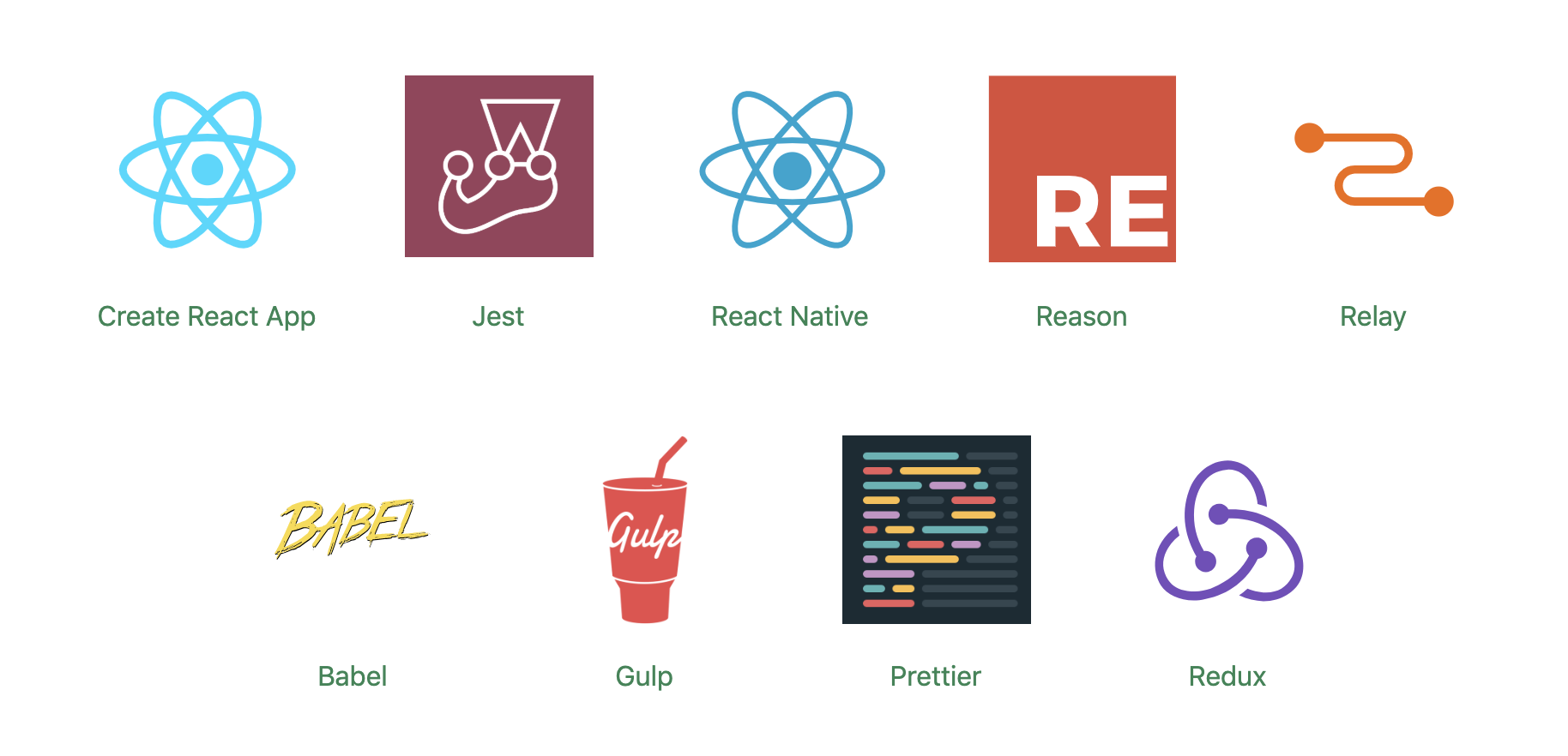
A screenshot of logos of all the various frameworks that support Docusaurus, including React, Gulp, Jest, Babel, Redux and Prettier.
Projects making use of Docusaurus.

You can use Docusaurus to document anything — it isn’t front-end specific. Docusaurus uses React under the hood, but you don’t have to know that framework to make use of it. It’ll take your Markdown files and turn them into a nicely-structured, well-formatted and readable documentation site, with a nice design right out of the box.

A screenshot of the Redux documentation homepage with the headline Getting Started with Redux.
The Redux site shows the typical Docusaurus layout

Sites created with Docusaurus can also include a Markdown-based blog. Prism.js is included by default for zero-setup syntax highlighting. While relatively new, Docusaurus has proven popular, being voted the number one new tool of 2018 on StackShare.

Other options for written content

Docusaurus specifically caters to building documentation. Of course, there are a million and one ways to make a website — so you could roll your own solution with any back-end language, CMS, or static site generator.

The documentation sites for React, IBM’s design system, Apollo and Ghost CMS use Gatsby, for example — a generic static site generator often used for blogs. If you work with the Vue framework, VuePress is becoming a popular option. MkDocs is an open source static site generator for creating documentation, written in Python and configured with a single YAML file. GitBook is a popular paid product that’s free for open-source and non-profit teams. If you’re building internal documentation and want something easy, the reading experience on GitHub itself isn’t half bad, so you could just commit some Markdown files and leave it at that.

Documenting components: Docz, Storybook and Styleguidist

Style guides, design systems, pattern libraries — whatever you want to call them — have become a hugely popular area of concern in the last decade. What’s really made the difference in turning them from vanity projects into useful tools isn’t the pontificating of thought leaders but the emergence of component-driven frameworks, like React, and the tools mentioned here.

Storybook, Docz and Styleguidist all do much the same thing: display interactive UI components and document their API. A project may have dozens or even hundreds of components to keep track of — all with a variety to states and styles. If you want components to be reused, people have to know that they exist. We aid discoverability when we catalog components. A style guide gives an easily searchable and scannable overview of all your UI components. This helps to maintain visual consistency and avoid duplicating work.

These tools provide a convenient way to review different states. It can be difficult to reproduce every state of a component in the context of a real application. Rather than needing to click through an actual app, developing a component in isolation can be helpful. Hard-to-reach states (like a loading state, for example) can be mocked.

Dan Green wrote a nice synopsis of the benefits of using Storybook, but it applies equally to Docz and Styleguidist:

„Storybook has made it really easy for designers who code to collaborate with engineers. By working in storybook they don’t need to get a whole environment running (docker container, etc). For Wave, we have many important components that are only visible in the middle of a process that is short lived and time consuming to reproduce (i.e. a loading screen that only shows while a user is having their payment account set up). Before Storybook, we didn’t have a good way to work on these components and were forced to temporary hacks in order to make them visible. Now, with Storybook we have an isolated place to easily work on them, which has the bonus feature of being easily accessible for designers and PMs. It also makes it really easy for us to show off these states in sprint demos.”

– Dan Green, Wave Financial

As well as visualizing different states side-by-side and listing props, its often helpful to have written content about a component — whether its explaining the design rationale, use-cases, or describing the results of user-testing. Markdown is easy enough for *anybody* to learn — ideally a style guide should be a joint resource for designers and developers that both disciplines contribute to. Docz, Styleguidist and Storybook all offer a way to seamlessly intermingle Markdown with the components themselves.

Docz

Currently, Docz is a React-only project, but is working on support for Preact, Vue and web components. Docz is the newest of the three tools, but has already amounted over 14,000+ stars on GitHub. It is, to my mind, the easiest solution to work with. Docz provides two components — <Playground> and <Props>. These are imported and used directly in .mdx files.

import { Playground, Props } from "docz";
import Button from "../src/Button";

## You can _write_ **markdown**
### You can import and use components

<Button>click</Button>

You can wrap your own React components with <Playground> to create the equivalent of an embedded CodePen or CodeSandbox — a view of your component alongside editable code.

<Playground>
  <Button>click</Button>
</Playground>

<Props> will show all the available props for a given React component, default values, and whether the prop is required.

<Props of={Button} />

I personally find this MDX-based approach the simplest to understand and the easiest to work with.
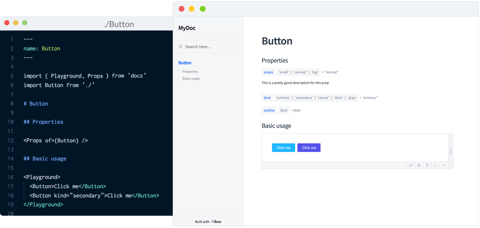
A screenshot of a Code Sandbox project making use of the tool to document the code for a Button component.

If you’re a fan of the React-based static-site generator Gatsby, Docz offers great integration.

Styleguidist

Just like with Docz, examples are written using Markdown syntax. Styleguidist uses Markdown code blocks (triple backticks) in regular .md files rather than MDX:

```js
<Button onClick={() => console.log('clicked')>Push Me</Button>
```

Code blocks in Markdown usually just show the code. With Styleguidist, any code block with a language tag of js, jsx or javascript will be rendered as a React component along with the code. Just like with Docz, the code is editable — you can change props and instantly see the result.
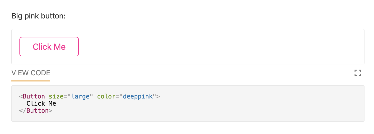
A screenshot of the output of the documentation for a pink button made with Styleguidist.

Styleguidist will automatically create a table of props from either PropTypes, Flow or Typescript declarations.
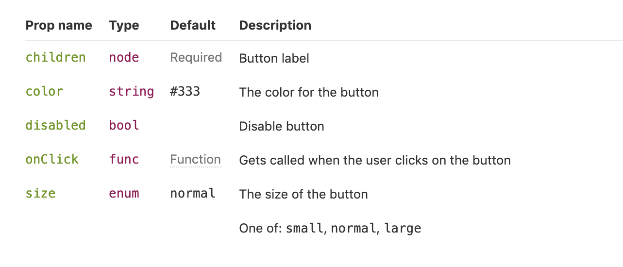
A screenshot of a table of values that Styleguidiist generated for the pink button documentation, including values it accepts.

Styleguidist currently supports React and Vue.

Storybook

Storybook markets itself as „a development environment for UI components.” Rather than writing examples of components inside Markdown or MDX files, you write *stories* inside Javascript files. A *story* documents a particular state of a component. A component might have stories for a loading state and a disabled state, for example.

storiesOf('Button', module)
  .add('disabled', () => (
    <Button disabled>lorem ipsum</Button>
  ))

Storybook is less straightforward to use than Styleguidist and Docz. At over 36,000 GitHub stars though, it’s the most popular option. It’s an open source project with 657 contributors and a full-time maintainer. It is used by, among others, Airbnb, Algolia, Atlassian, Lyft, and Salesforce. Storybook supports more frameworks than any other offering — React, React Native, Vue, Angular, Mithril, Ember, Riot, Svelte and plain HTML are all supported.

Writing documentation about components currently requires addons. In a future release, Storybook is taking inspiration from Docz and adopting MDX.

# Button

Some _notes_ about your button written with **markdown syntax**.

<Story name="disabled">
  <Button disabled>lorem ipsum</Button>
</Story>

Storybook’s new Docs feature is being rolled out incrementally over the next couple of months and looks set to be a big step forward.

Do you use @storybookjs for component docs or design systems? You're gonna love DocBlocks:
📦 Drop into MDX
🏗 Modular and composable
🤝 Compatible w/ @gatsbyjs, #nextjs, etc

🔜 https://t.co/AmE4l9B3FU by @mshilman pic.twitter.com/Q48PQCmiEt

— Dominic Nguyen (@domyen) April 28, 2019

Wrapping up

The benefits of pattern libraries have been extolled at nauseating length in a million Medium articles. When done well, they aid visual consistency and facilitate the creation of cohesive products. Of course, none of these tools can magic up a design system. That takes careful thought about both design and CSS. But when it comes time to communicate that system to the rest of an organization, Docz, Storybook and Styleguidist are all great options.

The post Front-End Documentation, Style Guides and the Rise of MDX appeared first on CSS-Tricks.

How to Create a Typography Dispersion Action in Adobe Photoshop

Post pobrano z: How to Create a Typography Dispersion Action in Adobe Photoshop

Final product image
What You’ll Be Creating

In this tutorial, you will learn how to create an amazing typography dispersion effect. First, we are going to create and define a few patterns and brushes. Then, we are going to create a typography effect from our subject, and then disperse the letters in the direction we choose. After that, we are going to make some final adjustments.

I will try to explain everything in so much detail that everyone can
create it, even those who have just opened Photoshop for the first time.

The effect shown above is the one I will show you how
to create here in this tutorial. If you would like to create the effects
shown below, using just a single click and in just a few minutes, then check out my Typography 4 Photoshop Action.

Action final results

What You’ll Need

To recreate the design above, you will need the following photo:

  • The stock image is no longer available, but you can get a similar one over on PhotoDune.

1. How to Get Started

Step 1

First, open the photo that you want to work with. To open your photo, go to File > Open, choose your photo, and click Open. Now, before we get started, just check a couple of things:

  1. Your photo should be in RGB Color mode, 8 Bits/Channel. To check this, go to Image > Mode.
  2. For best results, your photo size should be 1500–4000 px wide/high. To check this, go to Image > Image Size.
  3. Your photo should be the Background layer. If it is not, go to Layer > New > Background from Layer.
Checking image mode and size

Step 2

We are going to create a typography dispersion effect in the downward direction, so we need to expand the canvas on the bottom so we have more space for the effect, and also a little bit on the left and right sides. Go to Image > Canvas Size and use the settings below:

Expanding canvas

Step 3

Now we need to make this expanded canvas area seamless. Choose the Magic Wand Tool (W) and click once over the white area to select the whole white area we have just added. Go to Edit > Fill and select the settings below. After that, press Control-D on your keyboard to remove the selection.

Filling selection with content-aware

2. How to Create Patterns and Brushes

Step 1

In this section, we are going to create the patterns and brushes we’ll need. Go to File > New to create a new file, name it Typography Pattern 1, and use the settings below:

Creating new file named Typography Pattern 1

Step 2

Now choose the Horizontal Type Tool (T), click anywhere inside the canvas, and type a single letter. You can use any font, font style, and font size. I have chosen Arial font, Regular font style, and 31.47 px size. After you type a letter, hit Enter on your keyboard and use the same method to add several letters. Here is what I got:

Creating typography pattern 1

Step 3

Now click on the Background layer eye icon next to its thumbnail to hide it. Go to Edit > Define Pattern to define a pattern and name it Typography_Pattern_1. Keep this file open.

Defining pattern named Typography_Pattern_1

Step 4

Repeat the first two steps in this section, but in Step 1 name the new file Typography Pattern 2, and in Step 2 use different letters with the same font, font style and font size you used for the previous pattern. Here is what I got:

Creating typography pattern 2

Step 5

Now click on the Background layer eye icon next to its thumbnail to hide it. Go to Edit > Define Pattern to define a pattern and name it Typography_Pattern_2. Keep this file open as well.

Defining pattern named Typography_Pattern_2

Step 6

Repeat the first two steps in this section, but in Step 1 name the new file Typography Pattern 3,
and in Step 2 use different letters with the same font, font style and
font size you used for the previous two patterns. Here is what I got:

Creating typography pattern 3

Step 7

Now click on the Background layer eye icon next to its thumbnail to hide it. Go to Edit > Define Pattern to define a pattern and name it Typography_Pattern_3. Keep this file open as well.

Defining pattern named Typography_Pattern_3

Step 8

We are going to create brushes now. Select the Typography Pattern 1 document, go to Edit > Define Brush Preset, and name it Temp as we will remove this brush in the next few steps.

Defining brush named Temp

Step 9

Press B on your keyboard, right-click anywhere inside the canvas, select the Temp brush, and hit Enter. Then go to Window > Brush and inside the Brush window use the settings below:

Changing brush settings

Step 10

Now we are going to define this brush with new settings as a new brush. Go to Edit > Define Brush Preset and name it Typography_Brush_1. Press B on your keyboard, right-click anywhere inside the canvas, and Alt-click on the Temp brush to remove it.

Defining brush named Typography_Brush_1

Step 11

Repeat all the steps from Step 8 to Step 10 to create two more brushes from the two other documents Typography Pattern 2 and Typography Pattern 3. Of course, name those two new brushes according to their serial number. Then close all documents except your photo document.

Defining two more brushes

3. How to Create the Base

Step 1

Now we need to create the base that determines which part of our photo will be turned into typography. So the base will actually be our subject. Go to Layer > New > Layer to create a new layer and name it Base.

Creating new layer named Base

Step 2

While the Base layer is selected, fill your subject with a color. You can do it in various ways. For example, you can create a selection of your subject using the Pen Tool (P), Magic Wand Tool (W), Lasso Tool (L) or some other tool, and then just fill the selection with a color. Or you can choose the Brush Tool (B) and brush over your photo using a hard or soft brush.

Creating the base

4. How to Create Typography From a Subject

Step 1

In this section we are going to create a typography effect from a subject that we have defined with the Base layer. Control-click on the Base layer thumbnail to make a selection of that layer, select the Background layer, and go to Layer > New > Layer Via Copy. Then hide the Base layer by clicking on the eye icon next to its thumbnail.

Creating new layer via copy

Step 2

Now go to File > New to create a new file, name it Text, and use the settings below. You can use different values for width/height, but make sure that the document is at least as big as your photo document.

Ceating new file named Text

Step 3

Choose the Horizontal Type Tool (T) and type the text so it covers the whole document. You should use the same font and font style that you used for creating patterns and brushes. Also, the font size should be the same or very close. 

Feel free to make changes to your text, like increasing or decreasing leading, tracking and more. If the content of the text does not matter to you, you can use a text generator to speed up the process.

Typing the text

Step 4

Now choose the Move Tool (V), click and hold inside the canvas, and drag the text layer from the Text document to your photo document and position it so it covers the whole subject. Double-click on this layer name and rename it Text.

Dragging the text layer to photo document

Step 5

Control-click on the Layer 1 thumbnail to make a selection of that layer, and then go to Layer > Layer Mask > Reveal Selection.

Making layer mask using selection

Step 6

Now select Layer 1 and drag it above the Text layer. Then go to Layer > Create Clipping Mask. Double-click on this layer name and rename it Text Color.

Creating clipping mask and renaming layer to Text Color

Step 7

Now we are going to create a solid color background. Select the Background layer and go to Layer > New Fill Layer > Solid Color to create a new solid color fill layer, name it Background Color, and use the settings below:

Creating new solid color fill layer

Step 8

Select the Background layer and go to Layer > New > Layer Via Copy to duplicate that layer. Then drag this layer just below the Base layer, go to Filter > Blur > Gaussian Blur, and use the settings below:

Adding gaussian blur filter to Background copy layer

Step 9

Now go to File > Save As to save your document as a new file. You can name it however you want, and you can save it anywhere you want, but keep in mind that you will need to select that file later to apply a filter. Then right-click on the Background copy layer and choose Delete Layer.

Saving document as a new file and deleting Background copy layer

Step 10

We need to correct the edges of the subject slightly. Select the layer mask of the Text layer, go to Select > Select and Mask, and use the settings below:

Selecting and masking layer mask of Text layer

Step 11

Right-click on the Text layer name and choose Convert to Smart Object. Then go to Filter > Displace, use the settings below, and choose OK. After that you will get another window, and there you can choose the file you have previously saved and click Open.

Adding displace filter to the Text layer

Step 12

Now we are just going to group some layers. Select the Background Color layer, Shift-click on the Text Color layer, go to Layer > New > Group from Layers to create a new group from these layers, and name it Subject Typography.

Creating new group from layers nameds Subject Typography

5. How to Create Dispersed Letters

Step 1

In this section, we are going to create letters that we are going to disperse later. First we need to create another base layer that determines which areas will be dispersed. Select the Base layer, go to Layer > New > Layer to create a new layer, and name it Base 2.

Creating new layer named Base 2

Step 2

Control-click on the Base layer thumbnail to make a selection of that layer and go to Layer > Layer Mask > Reveal Selection.

Making layer mask using selection

Step 3

Now select the Base 2 layer thumbnail, choose the Brush Tool (B), pick a soft or hard brush, and start brushing over the areas you want to disperse.

Creating the base 2

Step 4

Select the layer mask of the Base 2 layer, right-click on it, and choose Apply Layer Mask.

Applying layer mask of Base 2 layer

Step 5

Control-click on the Base 2 layer thumbnail to make a selection of that layer. Choose the Lasso Tool (L), right-click anywhere inside the canvas, choose Make Work Path, and use the settings below:

Making work path

Step 6

Now click on the eye icon of the Base 2 layer next to its thumbnail to hide it. Select the Subject Typography group and go to Layer > New > Layer to create a new layer. Leave the default name Layer 1 because we will delete this layer in the next few steps.

Creating a new layer named Layer 1

Step 7

Choose the Pen Tool (P), right-click anywhere inside the canvas, choose Fill Work Path, and use the settings below:

Filling work path with Typography_Pattern_1
Custom Pattern is Typography_Pattern_1.

Step 8

Now Control-click on the Layer 1 thumbnail to make a selection of that layer, select the Background layer, and go to Layer > New > Layer Via Copy to create a new layer via copy, and name it L_1 (abbreviation of Letter_1). Then right-click on Layer 1 and choose Delete Layer.

Creating first letters layer

Step 9

Now repeat all the steps from Step 6 to Step 8 as many times you want, depending on how many letters layers you want to create, using Typography_Pattern_1. I have repeated it nine more times, so I have ten letters layers in total.

Creating more letters layers

Step 10

Now we are going to create more letters layers but with other patterns, so we have different letters. Repeat all the steps from Step 6 to Step 8, but in Step 7 use the settings below instead of the settings you used the previous time.

Filling work path with Typography_Pattern_2
Custom Pattern is Typography_Pattern_2.

Step 11

Now repeat Step 10 as many times you want, depending on
how many letters layers you want to create, using Typography_Pattern_2. I have repeated it nine more
times, so I have 20 letters layers in total.

Creating more the letters layers

Step 12

Now we are going to create more letters layers with our last pattern,
so we have different letters. Repeat all the steps from Step 6 to Step 8,  but in Step 7 use the settings below instead of the settings you used the previous time.

Filling work path with Typography_Pattern_3
Custom Pattern is Typography_Pattern_3.

Step 13

Now repeat Step 12 as many times as you want, depending on
how many letters layers you want to create, using Typography_Pattern_3. I have repeated it nine more
times, so I have 30 letters layers in total.

Creating more letters layers

Step 14

Now select the first letters layer, go to Filter > Displace, use the settings below, and choose OK. After that you will get another window, and there you can choose the file you have previously saved and click Open.

Displacing letters

Step 15

Select the next letters layer and press Control-F to apply the previous filter with the same settings. Use the same method to apply this filter to all other letters layers.

Displacing other letters

Step 16

We are going to group all the letters layers now. Select your top letters layer and Shift-click on the last letters layer to select all letters layers, go to Layer > New > Group from Layers to create a new group from selected layers and name it Letters. Then drag the group just above the Subject Typography group.

Creating new group from layers named Letters

6. How to Disperse Letters

Step 1

In this section, we are going to disperse the letters we have just created. So all you have to do now is to choose the Move Tool (V), select the letters layer that you want to move, and move it in the direction of your choice. I want to create a dispersion in the downward direction, so here is what I got:

Dispersing the letters

Step 2

Now we are going to transform some letters to create depth. Select the letters layer that you want to transform, choose the Lasso Tool (L), right-click anywhere inside the canvas, and use the settings below:

Transforming the letters

Step 3

I have transformed a few more letters layers. Feel free to transform as many layers as you want, and also to use different values for width/height. Here is what I got:

Transforming a more letters

Step 4

Now to give more depth and focus to the effect, we are going to blur some letters. Select the letters layer that you want to blur, go to Filter > Blur > Gaussian Blur, and use the settings below:

Adding gaussian blur filter to letters

Step 5

I have blurred a few more letters layers. Feel free to transform as
many layers as you want, and also to use different values for Gaussian blur. Here is what I got:

Adding gaussian blur filter to more letters

Step 6

Now make some final changes to the dispersed letters, so you can move, transform and blur letters layers as you like. Also feel free to move or transform the whole Letters group and also change the layer order in the Layers panel. Here is what I got:

Making final changes to the letters

7. How to Create a Missing Letters Effect

Step 1

In this section, we are going to create a missing letters effect. Select the Text layer and go to Layer > Layer Mask > Reveal All to add a blank layer mask to this layer.

Making layer mask to Text layer

Step 2

Select the layer mask of the Text layer and press D on your keyboard to reset the swatches. Choose the Brush Tool (B), right-click anywhere inside the canvas, pick some of the typography brushes we have created at the beginning of the tutorial, and hit Enter. Then start brushing over the areas where you wish to create a missing letters effect. You can also use a soft brush for the edges. Here is what I got:

Creating missing letters effect

8. How to Make Adjustments

Step 1

In this section, we are going to make some final adjustments to the effect. Firstly we are going to add a nice color look. So select the Letters group and go to Layer > New Adjustment Layer > Curves to create a new curves adjustment layer just below the Base layer, and name it Color Look.

Creating new curves adjustment layer

Step 2

Now double-click on the Color Look layer thumbnail and use the settings below:

Changing settings of curves adjustment layer

Step 3

Now we are going to add a subtle filter. Go to Layer > New Adjustment Layer > Photo Filter to create a new photo filter adjustment layer and name it Photo Tint.

Creating new photo filter adjustment layer

Step 4

Double-click on the Photo Tint layer thumbnail and use the settings below:

Changing settings of photo filter adjustment layer

Step 5

Now we are going to add a subtle contrast. Press D on your keyboard to reset the swatches, go to Layer > New Adjustment Layer > Gradient Map to create a new gradient map adjustment layer and name it Overall Contrast.

Creating new gradient map adjustment layer

Step 6

Change the blending mode of the Overall Contrast layer to Soft Light and drop the Opacity to 8%.

Changing blending mode and opacity of Overall Contrast layer

Step 7

Finally we are going to add sharpening to the whole effect. Press Control-Alt-Shift-E on your keyboard to make a snapshot, and then go to Filter > Other > High Pass and use the settings below:

Adding high pass filter to Layer 1

Step 8

Double-click on the Layer 1 name and rename it Overall Sharpening. Change its blending mode to Hard Light and drop the Opacity to 82%.

Changing name blending mode and opacity of Overall Sharpening layer

You Made it!

Congratulations, you have succeeded! Here is our final result:

Final result

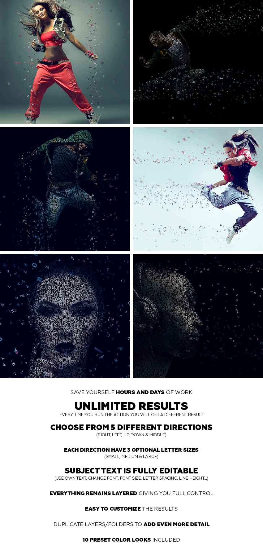
If you would like to create the effect shown below, using just a single click and in just a few minutes, then check out
my Typography 4 Photoshop Action.

Action final results

The action works so that you just brush over the areas that you want to disperse in letters, play the
action, and the action will do everything for you, giving you fully
layered and customizable results.

You can choose from five different dispersion directions:

  • Right
  • Left
  • Up
  • Down
  • Middle

And each direction comes in three optional letter sizes:

  • Small
  • Medium
  • Large

The action is made so that every time you run the action,
you will get a unique result even if you use the same brushed
area. The letters will always be differently arranged and deployed. The subject typography is a fully editable text layer. You can use your own text, change the font, font style, letter spacing, line height, etc. The action will also create 10 preset
color looks for you.

It
comes with a detailed video tutorial that demonstrates how to use and customize the look of your action to get the most out of the effect.

How to Create a Typography Dispersion Action in Adobe Photoshop

Post pobrano z: How to Create a Typography Dispersion Action in Adobe Photoshop

Final product image
What You’ll Be Creating

In this tutorial, you will learn how to create an amazing typography dispersion effect. First, we are going to create and define a few patterns and brushes. Then, we are going to create a typography effect from our subject, and then disperse the letters in the direction we choose. After that, we are going to make some final adjustments.

I will try to explain everything in so much detail that everyone can
create it, even those who have just opened Photoshop for the first time.

The effect shown above is the one I will show you how
to create here in this tutorial. If you would like to create the effects
shown below, using just a single click and in just a few minutes, then check out my Typography 4 Photoshop Action.

Action final results

What You’ll Need

To recreate the design above, you will need the following photo:

  • The stock image is no longer available, but you can get a similar one over on PhotoDune.

1. How to Get Started

Step 1

First, open the photo that you want to work with. To open your photo, go to File > Open, choose your photo, and click Open. Now, before we get started, just check a couple of things:

  1. Your photo should be in RGB Color mode, 8 Bits/Channel. To check this, go to Image > Mode.
  2. For best results, your photo size should be 1500–4000 px wide/high. To check this, go to Image > Image Size.
  3. Your photo should be the Background layer. If it is not, go to Layer > New > Background from Layer.
Checking image mode and size

Step 2

We are going to create a typography dispersion effect in the downward direction, so we need to expand the canvas on the bottom so we have more space for the effect, and also a little bit on the left and right sides. Go to Image > Canvas Size and use the settings below:

Expanding canvas

Step 3

Now we need to make this expanded canvas area seamless. Choose the Magic Wand Tool (W) and click once over the white area to select the whole white area we have just added. Go to Edit > Fill and select the settings below. After that, press Control-D on your keyboard to remove the selection.

Filling selection with content-aware

2. How to Create Patterns and Brushes

Step 1

In this section, we are going to create the patterns and brushes we’ll need. Go to File > New to create a new file, name it Typography Pattern 1, and use the settings below:

Creating new file named Typography Pattern 1

Step 2

Now choose the Horizontal Type Tool (T), click anywhere inside the canvas, and type a single letter. You can use any font, font style, and font size. I have chosen Arial font, Regular font style, and 31.47 px size. After you type a letter, hit Enter on your keyboard and use the same method to add several letters. Here is what I got:

Creating typography pattern 1

Step 3

Now click on the Background layer eye icon next to its thumbnail to hide it. Go to Edit > Define Pattern to define a pattern and name it Typography_Pattern_1. Keep this file open.

Defining pattern named Typography_Pattern_1

Step 4

Repeat the first two steps in this section, but in Step 1 name the new file Typography Pattern 2, and in Step 2 use different letters with the same font, font style and font size you used for the previous pattern. Here is what I got:

Creating typography pattern 2

Step 5

Now click on the Background layer eye icon next to its thumbnail to hide it. Go to Edit > Define Pattern to define a pattern and name it Typography_Pattern_2. Keep this file open as well.

Defining pattern named Typography_Pattern_2

Step 6

Repeat the first two steps in this section, but in Step 1 name the new file Typography Pattern 3,
and in Step 2 use different letters with the same font, font style and
font size you used for the previous two patterns. Here is what I got:

Creating typography pattern 3

Step 7

Now click on the Background layer eye icon next to its thumbnail to hide it. Go to Edit > Define Pattern to define a pattern and name it Typography_Pattern_3. Keep this file open as well.

Defining pattern named Typography_Pattern_3

Step 8

We are going to create brushes now. Select the Typography Pattern 1 document, go to Edit > Define Brush Preset, and name it Temp as we will remove this brush in the next few steps.

Defining brush named Temp

Step 9

Press B on your keyboard, right-click anywhere inside the canvas, select the Temp brush, and hit Enter. Then go to Window > Brush and inside the Brush window use the settings below:

Changing brush settings

Step 10

Now we are going to define this brush with new settings as a new brush. Go to Edit > Define Brush Preset and name it Typography_Brush_1. Press B on your keyboard, right-click anywhere inside the canvas, and Alt-click on the Temp brush to remove it.

Defining brush named Typography_Brush_1

Step 11

Repeat all the steps from Step 8 to Step 10 to create two more brushes from the two other documents Typography Pattern 2 and Typography Pattern 3. Of course, name those two new brushes according to their serial number. Then close all documents except your photo document.

Defining two more brushes

3. How to Create the Base

Step 1

Now we need to create the base that determines which part of our photo will be turned into typography. So the base will actually be our subject. Go to Layer > New > Layer to create a new layer and name it Base.

Creating new layer named Base

Step 2

While the Base layer is selected, fill your subject with a color. You can do it in various ways. For example, you can create a selection of your subject using the Pen Tool (P), Magic Wand Tool (W), Lasso Tool (L) or some other tool, and then just fill the selection with a color. Or you can choose the Brush Tool (B) and brush over your photo using a hard or soft brush.

Creating the base

4. How to Create Typography From a Subject

Step 1

In this section we are going to create a typography effect from a subject that we have defined with the Base layer. Control-click on the Base layer thumbnail to make a selection of that layer, select the Background layer, and go to Layer > New > Layer Via Copy. Then hide the Base layer by clicking on the eye icon next to its thumbnail.

Creating new layer via copy

Step 2

Now go to File > New to create a new file, name it Text, and use the settings below. You can use different values for width/height, but make sure that the document is at least as big as your photo document.

Ceating new file named Text

Step 3

Choose the Horizontal Type Tool (T) and type the text so it covers the whole document. You should use the same font and font style that you used for creating patterns and brushes. Also, the font size should be the same or very close. 

Feel free to make changes to your text, like increasing or decreasing leading, tracking and more. If the content of the text does not matter to you, you can use a text generator to speed up the process.

Typing the text

Step 4

Now choose the Move Tool (V), click and hold inside the canvas, and drag the text layer from the Text document to your photo document and position it so it covers the whole subject. Double-click on this layer name and rename it Text.

Dragging the text layer to photo document

Step 5

Control-click on the Layer 1 thumbnail to make a selection of that layer, and then go to Layer > Layer Mask > Reveal Selection.

Making layer mask using selection

Step 6

Now select Layer 1 and drag it above the Text layer. Then go to Layer > Create Clipping Mask. Double-click on this layer name and rename it Text Color.

Creating clipping mask and renaming layer to Text Color

Step 7

Now we are going to create a solid color background. Select the Background layer and go to Layer > New Fill Layer > Solid Color to create a new solid color fill layer, name it Background Color, and use the settings below:

Creating new solid color fill layer

Step 8

Select the Background layer and go to Layer > New > Layer Via Copy to duplicate that layer. Then drag this layer just below the Base layer, go to Filter > Blur > Gaussian Blur, and use the settings below:

Adding gaussian blur filter to Background copy layer

Step 9

Now go to File > Save As to save your document as a new file. You can name it however you want, and you can save it anywhere you want, but keep in mind that you will need to select that file later to apply a filter. Then right-click on the Background copy layer and choose Delete Layer.

Saving document as a new file and deleting Background copy layer

Step 10

We need to correct the edges of the subject slightly. Select the layer mask of the Text layer, go to Select > Select and Mask, and use the settings below:

Selecting and masking layer mask of Text layer

Step 11

Right-click on the Text layer name and choose Convert to Smart Object. Then go to Filter > Displace, use the settings below, and choose OK. After that you will get another window, and there you can choose the file you have previously saved and click Open.

Adding displace filter to the Text layer

Step 12

Now we are just going to group some layers. Select the Background Color layer, Shift-click on the Text Color layer, go to Layer > New > Group from Layers to create a new group from these layers, and name it Subject Typography.

Creating new group from layers nameds Subject Typography

5. How to Create Dispersed Letters

Step 1

In this section, we are going to create letters that we are going to disperse later. First we need to create another base layer that determines which areas will be dispersed. Select the Base layer, go to Layer > New > Layer to create a new layer, and name it Base 2.

Creating new layer named Base 2

Step 2

Control-click on the Base layer thumbnail to make a selection of that layer and go to Layer > Layer Mask > Reveal Selection.

Making layer mask using selection

Step 3

Now select the Base 2 layer thumbnail, choose the Brush Tool (B), pick a soft or hard brush, and start brushing over the areas you want to disperse.

Creating the base 2

Step 4

Select the layer mask of the Base 2 layer, right-click on it, and choose Apply Layer Mask.

Applying layer mask of Base 2 layer

Step 5

Control-click on the Base 2 layer thumbnail to make a selection of that layer. Choose the Lasso Tool (L), right-click anywhere inside the canvas, choose Make Work Path, and use the settings below:

Making work path

Step 6

Now click on the eye icon of the Base 2 layer next to its thumbnail to hide it. Select the Subject Typography group and go to Layer > New > Layer to create a new layer. Leave the default name Layer 1 because we will delete this layer in the next few steps.

Creating a new layer named Layer 1

Step 7

Choose the Pen Tool (P), right-click anywhere inside the canvas, choose Fill Work Path, and use the settings below:

Filling work path with Typography_Pattern_1
Custom Pattern is Typography_Pattern_1.

Step 8

Now Control-click on the Layer 1 thumbnail to make a selection of that layer, select the Background layer, and go to Layer > New > Layer Via Copy to create a new layer via copy, and name it L_1 (abbreviation of Letter_1). Then right-click on Layer 1 and choose Delete Layer.

Creating first letters layer

Step 9

Now repeat all the steps from Step 6 to Step 8 as many times you want, depending on how many letters layers you want to create, using Typography_Pattern_1. I have repeated it nine more times, so I have ten letters layers in total.

Creating more letters layers

Step 10

Now we are going to create more letters layers but with other patterns, so we have different letters. Repeat all the steps from Step 6 to Step 8, but in Step 7 use the settings below instead of the settings you used the previous time.

Filling work path with Typography_Pattern_2
Custom Pattern is Typography_Pattern_2.

Step 11

Now repeat Step 10 as many times you want, depending on
how many letters layers you want to create, using Typography_Pattern_2. I have repeated it nine more
times, so I have 20 letters layers in total.

Creating more the letters layers

Step 12

Now we are going to create more letters layers with our last pattern,
so we have different letters. Repeat all the steps from Step 6 to Step 8,  but in Step 7 use the settings below instead of the settings you used the previous time.

Filling work path with Typography_Pattern_3
Custom Pattern is Typography_Pattern_3.

Step 13

Now repeat Step 12 as many times as you want, depending on
how many letters layers you want to create, using Typography_Pattern_3. I have repeated it nine more
times, so I have 30 letters layers in total.

Creating more letters layers

Step 14

Now select the first letters layer, go to Filter > Displace, use the settings below, and choose OK. After that you will get another window, and there you can choose the file you have previously saved and click Open.

Displacing letters

Step 15

Select the next letters layer and press Control-F to apply the previous filter with the same settings. Use the same method to apply this filter to all other letters layers.

Displacing other letters

Step 16

We are going to group all the letters layers now. Select your top letters layer and Shift-click on the last letters layer to select all letters layers, go to Layer > New > Group from Layers to create a new group from selected layers and name it Letters. Then drag the group just above the Subject Typography group.

Creating new group from layers named Letters

6. How to Disperse Letters

Step 1

In this section, we are going to disperse the letters we have just created. So all you have to do now is to choose the Move Tool (V), select the letters layer that you want to move, and move it in the direction of your choice. I want to create a dispersion in the downward direction, so here is what I got:

Dispersing the letters

Step 2

Now we are going to transform some letters to create depth. Select the letters layer that you want to transform, choose the Lasso Tool (L), right-click anywhere inside the canvas, and use the settings below:

Transforming the letters

Step 3

I have transformed a few more letters layers. Feel free to transform as many layers as you want, and also to use different values for width/height. Here is what I got:

Transforming a more letters

Step 4

Now to give more depth and focus to the effect, we are going to blur some letters. Select the letters layer that you want to blur, go to Filter > Blur > Gaussian Blur, and use the settings below:

Adding gaussian blur filter to letters

Step 5

I have blurred a few more letters layers. Feel free to transform as
many layers as you want, and also to use different values for Gaussian blur. Here is what I got:

Adding gaussian blur filter to more letters

Step 6

Now make some final changes to the dispersed letters, so you can move, transform and blur letters layers as you like. Also feel free to move or transform the whole Letters group and also change the layer order in the Layers panel. Here is what I got:

Making final changes to the letters

7. How to Create a Missing Letters Effect

Step 1

In this section, we are going to create a missing letters effect. Select the Text layer and go to Layer > Layer Mask > Reveal All to add a blank layer mask to this layer.

Making layer mask to Text layer

Step 2

Select the layer mask of the Text layer and press D on your keyboard to reset the swatches. Choose the Brush Tool (B), right-click anywhere inside the canvas, pick some of the typography brushes we have created at the beginning of the tutorial, and hit Enter. Then start brushing over the areas where you wish to create a missing letters effect. You can also use a soft brush for the edges. Here is what I got:

Creating missing letters effect

8. How to Make Adjustments

Step 1

In this section, we are going to make some final adjustments to the effect. Firstly we are going to add a nice color look. So select the Letters group and go to Layer > New Adjustment Layer > Curves to create a new curves adjustment layer just below the Base layer, and name it Color Look.

Creating new curves adjustment layer

Step 2

Now double-click on the Color Look layer thumbnail and use the settings below:

Changing settings of curves adjustment layer

Step 3

Now we are going to add a subtle filter. Go to Layer > New Adjustment Layer > Photo Filter to create a new photo filter adjustment layer and name it Photo Tint.

Creating new photo filter adjustment layer

Step 4

Double-click on the Photo Tint layer thumbnail and use the settings below:

Changing settings of photo filter adjustment layer

Step 5

Now we are going to add a subtle contrast. Press D on your keyboard to reset the swatches, go to Layer > New Adjustment Layer > Gradient Map to create a new gradient map adjustment layer and name it Overall Contrast.

Creating new gradient map adjustment layer

Step 6

Change the blending mode of the Overall Contrast layer to Soft Light and drop the Opacity to 8%.

Changing blending mode and opacity of Overall Contrast layer

Step 7

Finally we are going to add sharpening to the whole effect. Press Control-Alt-Shift-E on your keyboard to make a snapshot, and then go to Filter > Other > High Pass and use the settings below:

Adding high pass filter to Layer 1

Step 8

Double-click on the Layer 1 name and rename it Overall Sharpening. Change its blending mode to Hard Light and drop the Opacity to 82%.

Changing name blending mode and opacity of Overall Sharpening layer

You Made it!

Congratulations, you have succeeded! Here is our final result:

Final result

If you would like to create the effect shown below, using just a single click and in just a few minutes, then check out
my Typography 4 Photoshop Action.

Action final results

The action works so that you just brush over the areas that you want to disperse in letters, play the
action, and the action will do everything for you, giving you fully
layered and customizable results.

You can choose from five different dispersion directions:

  • Right
  • Left
  • Up
  • Down
  • Middle

And each direction comes in three optional letter sizes:

  • Small
  • Medium
  • Large

The action is made so that every time you run the action,
you will get a unique result even if you use the same brushed
area. The letters will always be differently arranged and deployed. The subject typography is a fully editable text layer. You can use your own text, change the font, font style, letter spacing, line height, etc. The action will also create 10 preset
color looks for you.

It
comes with a detailed video tutorial that demonstrates how to use and customize the look of your action to get the most out of the effect.

How to Create a Typography Dispersion Action in Adobe Photoshop

Post pobrano z: How to Create a Typography Dispersion Action in Adobe Photoshop

Final product image
What You’ll Be Creating

In this tutorial, you will learn how to create an amazing typography dispersion effect. First, we are going to create and define a few patterns and brushes. Then, we are going to create a typography effect from our subject, and then disperse the letters in the direction we choose. After that, we are going to make some final adjustments.

I will try to explain everything in so much detail that everyone can
create it, even those who have just opened Photoshop for the first time.

The effect shown above is the one I will show you how
to create here in this tutorial. If you would like to create the effects
shown below, using just a single click and in just a few minutes, then check out my Typography 4 Photoshop Action.

Action final results

What You’ll Need

To recreate the design above, you will need the following photo:

  • The stock image is no longer available, but you can get a similar one over on PhotoDune.

1. How to Get Started

Step 1

First, open the photo that you want to work with. To open your photo, go to File > Open, choose your photo, and click Open. Now, before we get started, just check a couple of things:

  1. Your photo should be in RGB Color mode, 8 Bits/Channel. To check this, go to Image > Mode.
  2. For best results, your photo size should be 1500–4000 px wide/high. To check this, go to Image > Image Size.
  3. Your photo should be the Background layer. If it is not, go to Layer > New > Background from Layer.
Checking image mode and size

Step 2

We are going to create a typography dispersion effect in the downward direction, so we need to expand the canvas on the bottom so we have more space for the effect, and also a little bit on the left and right sides. Go to Image > Canvas Size and use the settings below:

Expanding canvas

Step 3

Now we need to make this expanded canvas area seamless. Choose the Magic Wand Tool (W) and click once over the white area to select the whole white area we have just added. Go to Edit > Fill and select the settings below. After that, press Control-D on your keyboard to remove the selection.

Filling selection with content-aware

2. How to Create Patterns and Brushes

Step 1

In this section, we are going to create the patterns and brushes we’ll need. Go to File > New to create a new file, name it Typography Pattern 1, and use the settings below:

Creating new file named Typography Pattern 1

Step 2

Now choose the Horizontal Type Tool (T), click anywhere inside the canvas, and type a single letter. You can use any font, font style, and font size. I have chosen Arial font, Regular font style, and 31.47 px size. After you type a letter, hit Enter on your keyboard and use the same method to add several letters. Here is what I got:

Creating typography pattern 1

Step 3

Now click on the Background layer eye icon next to its thumbnail to hide it. Go to Edit > Define Pattern to define a pattern and name it Typography_Pattern_1. Keep this file open.

Defining pattern named Typography_Pattern_1

Step 4

Repeat the first two steps in this section, but in Step 1 name the new file Typography Pattern 2, and in Step 2 use different letters with the same font, font style and font size you used for the previous pattern. Here is what I got:

Creating typography pattern 2

Step 5

Now click on the Background layer eye icon next to its thumbnail to hide it. Go to Edit > Define Pattern to define a pattern and name it Typography_Pattern_2. Keep this file open as well.

Defining pattern named Typography_Pattern_2

Step 6

Repeat the first two steps in this section, but in Step 1 name the new file Typography Pattern 3,
and in Step 2 use different letters with the same font, font style and
font size you used for the previous two patterns. Here is what I got:

Creating typography pattern 3

Step 7

Now click on the Background layer eye icon next to its thumbnail to hide it. Go to Edit > Define Pattern to define a pattern and name it Typography_Pattern_3. Keep this file open as well.

Defining pattern named Typography_Pattern_3

Step 8

We are going to create brushes now. Select the Typography Pattern 1 document, go to Edit > Define Brush Preset, and name it Temp as we will remove this brush in the next few steps.

Defining brush named Temp

Step 9

Press B on your keyboard, right-click anywhere inside the canvas, select the Temp brush, and hit Enter. Then go to Window > Brush and inside the Brush window use the settings below:

Changing brush settings

Step 10

Now we are going to define this brush with new settings as a new brush. Go to Edit > Define Brush Preset and name it Typography_Brush_1. Press B on your keyboard, right-click anywhere inside the canvas, and Alt-click on the Temp brush to remove it.

Defining brush named Typography_Brush_1

Step 11

Repeat all the steps from Step 8 to Step 10 to create two more brushes from the two other documents Typography Pattern 2 and Typography Pattern 3. Of course, name those two new brushes according to their serial number. Then close all documents except your photo document.

Defining two more brushes

3. How to Create the Base

Step 1

Now we need to create the base that determines which part of our photo will be turned into typography. So the base will actually be our subject. Go to Layer > New > Layer to create a new layer and name it Base.

Creating new layer named Base

Step 2

While the Base layer is selected, fill your subject with a color. You can do it in various ways. For example, you can create a selection of your subject using the Pen Tool (P), Magic Wand Tool (W), Lasso Tool (L) or some other tool, and then just fill the selection with a color. Or you can choose the Brush Tool (B) and brush over your photo using a hard or soft brush.

Creating the base

4. How to Create Typography From a Subject

Step 1

In this section we are going to create a typography effect from a subject that we have defined with the Base layer. Control-click on the Base layer thumbnail to make a selection of that layer, select the Background layer, and go to Layer > New > Layer Via Copy. Then hide the Base layer by clicking on the eye icon next to its thumbnail.

Creating new layer via copy

Step 2

Now go to File > New to create a new file, name it Text, and use the settings below. You can use different values for width/height, but make sure that the document is at least as big as your photo document.

Ceating new file named Text

Step 3

Choose the Horizontal Type Tool (T) and type the text so it covers the whole document. You should use the same font and font style that you used for creating patterns and brushes. Also, the font size should be the same or very close. 

Feel free to make changes to your text, like increasing or decreasing leading, tracking and more. If the content of the text does not matter to you, you can use a text generator to speed up the process.

Typing the text

Step 4

Now choose the Move Tool (V), click and hold inside the canvas, and drag the text layer from the Text document to your photo document and position it so it covers the whole subject. Double-click on this layer name and rename it Text.

Dragging the text layer to photo document

Step 5

Control-click on the Layer 1 thumbnail to make a selection of that layer, and then go to Layer > Layer Mask > Reveal Selection.

Making layer mask using selection

Step 6

Now select Layer 1 and drag it above the Text layer. Then go to Layer > Create Clipping Mask. Double-click on this layer name and rename it Text Color.

Creating clipping mask and renaming layer to Text Color

Step 7

Now we are going to create a solid color background. Select the Background layer and go to Layer > New Fill Layer > Solid Color to create a new solid color fill layer, name it Background Color, and use the settings below:

Creating new solid color fill layer

Step 8

Select the Background layer and go to Layer > New > Layer Via Copy to duplicate that layer. Then drag this layer just below the Base layer, go to Filter > Blur > Gaussian Blur, and use the settings below:

Adding gaussian blur filter to Background copy layer

Step 9

Now go to File > Save As to save your document as a new file. You can name it however you want, and you can save it anywhere you want, but keep in mind that you will need to select that file later to apply a filter. Then right-click on the Background copy layer and choose Delete Layer.

Saving document as a new file and deleting Background copy layer

Step 10

We need to correct the edges of the subject slightly. Select the layer mask of the Text layer, go to Select > Select and Mask, and use the settings below:

Selecting and masking layer mask of Text layer

Step 11

Right-click on the Text layer name and choose Convert to Smart Object. Then go to Filter > Displace, use the settings below, and choose OK. After that you will get another window, and there you can choose the file you have previously saved and click Open.

Adding displace filter to the Text layer

Step 12

Now we are just going to group some layers. Select the Background Color layer, Shift-click on the Text Color layer, go to Layer > New > Group from Layers to create a new group from these layers, and name it Subject Typography.

Creating new group from layers nameds Subject Typography

5. How to Create Dispersed Letters

Step 1

In this section, we are going to create letters that we are going to disperse later. First we need to create another base layer that determines which areas will be dispersed. Select the Base layer, go to Layer > New > Layer to create a new layer, and name it Base 2.

Creating new layer named Base 2

Step 2

Control-click on the Base layer thumbnail to make a selection of that layer and go to Layer > Layer Mask > Reveal Selection.

Making layer mask using selection

Step 3

Now select the Base 2 layer thumbnail, choose the Brush Tool (B), pick a soft or hard brush, and start brushing over the areas you want to disperse.

Creating the base 2

Step 4

Select the layer mask of the Base 2 layer, right-click on it, and choose Apply Layer Mask.

Applying layer mask of Base 2 layer

Step 5

Control-click on the Base 2 layer thumbnail to make a selection of that layer. Choose the Lasso Tool (L), right-click anywhere inside the canvas, choose Make Work Path, and use the settings below:

Making work path

Step 6

Now click on the eye icon of the Base 2 layer next to its thumbnail to hide it. Select the Subject Typography group and go to Layer > New > Layer to create a new layer. Leave the default name Layer 1 because we will delete this layer in the next few steps.

Creating a new layer named Layer 1

Step 7

Choose the Pen Tool (P), right-click anywhere inside the canvas, choose Fill Work Path, and use the settings below:

Filling work path with Typography_Pattern_1
Custom Pattern is Typography_Pattern_1.

Step 8

Now Control-click on the Layer 1 thumbnail to make a selection of that layer, select the Background layer, and go to Layer > New > Layer Via Copy to create a new layer via copy, and name it L_1 (abbreviation of Letter_1). Then right-click on Layer 1 and choose Delete Layer.

Creating first letters layer

Step 9

Now repeat all the steps from Step 6 to Step 8 as many times you want, depending on how many letters layers you want to create, using Typography_Pattern_1. I have repeated it nine more times, so I have ten letters layers in total.

Creating more letters layers

Step 10

Now we are going to create more letters layers but with other patterns, so we have different letters. Repeat all the steps from Step 6 to Step 8, but in Step 7 use the settings below instead of the settings you used the previous time.

Filling work path with Typography_Pattern_2
Custom Pattern is Typography_Pattern_2.

Step 11

Now repeat Step 10 as many times you want, depending on
how many letters layers you want to create, using Typography_Pattern_2. I have repeated it nine more
times, so I have 20 letters layers in total.

Creating more the letters layers

Step 12

Now we are going to create more letters layers with our last pattern,
so we have different letters. Repeat all the steps from Step 6 to Step 8,  but in Step 7 use the settings below instead of the settings you used the previous time.

Filling work path with Typography_Pattern_3
Custom Pattern is Typography_Pattern_3.

Step 13

Now repeat Step 12 as many times as you want, depending on
how many letters layers you want to create, using Typography_Pattern_3. I have repeated it nine more
times, so I have 30 letters layers in total.

Creating more letters layers

Step 14

Now select the first letters layer, go to Filter > Displace, use the settings below, and choose OK. After that you will get another window, and there you can choose the file you have previously saved and click Open.

Displacing letters

Step 15

Select the next letters layer and press Control-F to apply the previous filter with the same settings. Use the same method to apply this filter to all other letters layers.

Displacing other letters

Step 16

We are going to group all the letters layers now. Select your top letters layer and Shift-click on the last letters layer to select all letters layers, go to Layer > New > Group from Layers to create a new group from selected layers and name it Letters. Then drag the group just above the Subject Typography group.

Creating new group from layers named Letters

6. How to Disperse Letters

Step 1

In this section, we are going to disperse the letters we have just created. So all you have to do now is to choose the Move Tool (V), select the letters layer that you want to move, and move it in the direction of your choice. I want to create a dispersion in the downward direction, so here is what I got:

Dispersing the letters

Step 2

Now we are going to transform some letters to create depth. Select the letters layer that you want to transform, choose the Lasso Tool (L), right-click anywhere inside the canvas, and use the settings below:

Transforming the letters

Step 3

I have transformed a few more letters layers. Feel free to transform as many layers as you want, and also to use different values for width/height. Here is what I got:

Transforming a more letters

Step 4

Now to give more depth and focus to the effect, we are going to blur some letters. Select the letters layer that you want to blur, go to Filter > Blur > Gaussian Blur, and use the settings below:

Adding gaussian blur filter to letters

Step 5

I have blurred a few more letters layers. Feel free to transform as
many layers as you want, and also to use different values for Gaussian blur. Here is what I got:

Adding gaussian blur filter to more letters

Step 6

Now make some final changes to the dispersed letters, so you can move, transform and blur letters layers as you like. Also feel free to move or transform the whole Letters group and also change the layer order in the Layers panel. Here is what I got:

Making final changes to the letters

7. How to Create a Missing Letters Effect

Step 1

In this section, we are going to create a missing letters effect. Select the Text layer and go to Layer > Layer Mask > Reveal All to add a blank layer mask to this layer.

Making layer mask to Text layer

Step 2

Select the layer mask of the Text layer and press D on your keyboard to reset the swatches. Choose the Brush Tool (B), right-click anywhere inside the canvas, pick some of the typography brushes we have created at the beginning of the tutorial, and hit Enter. Then start brushing over the areas where you wish to create a missing letters effect. You can also use a soft brush for the edges. Here is what I got:

Creating missing letters effect

8. How to Make Adjustments

Step 1

In this section, we are going to make some final adjustments to the effect. Firstly we are going to add a nice color look. So select the Letters group and go to Layer > New Adjustment Layer > Curves to create a new curves adjustment layer just below the Base layer, and name it Color Look.

Creating new curves adjustment layer

Step 2

Now double-click on the Color Look layer thumbnail and use the settings below:

Changing settings of curves adjustment layer

Step 3

Now we are going to add a subtle filter. Go to Layer > New Adjustment Layer > Photo Filter to create a new photo filter adjustment layer and name it Photo Tint.

Creating new photo filter adjustment layer

Step 4

Double-click on the Photo Tint layer thumbnail and use the settings below:

Changing settings of photo filter adjustment layer

Step 5

Now we are going to add a subtle contrast. Press D on your keyboard to reset the swatches, go to Layer > New Adjustment Layer > Gradient Map to create a new gradient map adjustment layer and name it Overall Contrast.

Creating new gradient map adjustment layer

Step 6

Change the blending mode of the Overall Contrast layer to Soft Light and drop the Opacity to 8%.

Changing blending mode and opacity of Overall Contrast layer

Step 7

Finally we are going to add sharpening to the whole effect. Press Control-Alt-Shift-E on your keyboard to make a snapshot, and then go to Filter > Other > High Pass and use the settings below:

Adding high pass filter to Layer 1

Step 8

Double-click on the Layer 1 name and rename it Overall Sharpening. Change its blending mode to Hard Light and drop the Opacity to 82%.

Changing name blending mode and opacity of Overall Sharpening layer

You Made it!

Congratulations, you have succeeded! Here is our final result:

Final result

If you would like to create the effect shown below, using just a single click and in just a few minutes, then check out
my Typography 4 Photoshop Action.

Action final results

The action works so that you just brush over the areas that you want to disperse in letters, play the
action, and the action will do everything for you, giving you fully
layered and customizable results.

You can choose from five different dispersion directions:

  • Right
  • Left
  • Up
  • Down
  • Middle

And each direction comes in three optional letter sizes:

  • Small
  • Medium
  • Large

The action is made so that every time you run the action,
you will get a unique result even if you use the same brushed
area. The letters will always be differently arranged and deployed. The subject typography is a fully editable text layer. You can use your own text, change the font, font style, letter spacing, line height, etc. The action will also create 10 preset
color looks for you.

It
comes with a detailed video tutorial that demonstrates how to use and customize the look of your action to get the most out of the effect.

How to Create a Typography Dispersion Action in Adobe Photoshop

Post pobrano z: How to Create a Typography Dispersion Action in Adobe Photoshop

Final product image
What You’ll Be Creating

In this tutorial, you will learn how to create an amazing typography dispersion effect. First, we are going to create and define a few patterns and brushes. Then, we are going to create a typography effect from our subject, and then disperse the letters in the direction we choose. After that, we are going to make some final adjustments.

I will try to explain everything in so much detail that everyone can
create it, even those who have just opened Photoshop for the first time.

The effect shown above is the one I will show you how
to create here in this tutorial. If you would like to create the effects
shown below, using just a single click and in just a few minutes, then check out my Typography 4 Photoshop Action.

Action final results

What You’ll Need

To recreate the design above, you will need the following photo:

  • The stock image is no longer available, but you can get a similar one over on PhotoDune.

1. How to Get Started

Step 1

First, open the photo that you want to work with. To open your photo, go to File > Open, choose your photo, and click Open. Now, before we get started, just check a couple of things:

  1. Your photo should be in RGB Color mode, 8 Bits/Channel. To check this, go to Image > Mode.
  2. For best results, your photo size should be 1500–4000 px wide/high. To check this, go to Image > Image Size.
  3. Your photo should be the Background layer. If it is not, go to Layer > New > Background from Layer.
Checking image mode and size

Step 2

We are going to create a typography dispersion effect in the downward direction, so we need to expand the canvas on the bottom so we have more space for the effect, and also a little bit on the left and right sides. Go to Image > Canvas Size and use the settings below:

Expanding canvas

Step 3

Now we need to make this expanded canvas area seamless. Choose the Magic Wand Tool (W) and click once over the white area to select the whole white area we have just added. Go to Edit > Fill and select the settings below. After that, press Control-D on your keyboard to remove the selection.

Filling selection with content-aware

2. How to Create Patterns and Brushes

Step 1

In this section, we are going to create the patterns and brushes we’ll need. Go to File > New to create a new file, name it Typography Pattern 1, and use the settings below:

Creating new file named Typography Pattern 1

Step 2

Now choose the Horizontal Type Tool (T), click anywhere inside the canvas, and type a single letter. You can use any font, font style, and font size. I have chosen Arial font, Regular font style, and 31.47 px size. After you type a letter, hit Enter on your keyboard and use the same method to add several letters. Here is what I got:

Creating typography pattern 1

Step 3

Now click on the Background layer eye icon next to its thumbnail to hide it. Go to Edit > Define Pattern to define a pattern and name it Typography_Pattern_1. Keep this file open.

Defining pattern named Typography_Pattern_1

Step 4

Repeat the first two steps in this section, but in Step 1 name the new file Typography Pattern 2, and in Step 2 use different letters with the same font, font style and font size you used for the previous pattern. Here is what I got:

Creating typography pattern 2

Step 5

Now click on the Background layer eye icon next to its thumbnail to hide it. Go to Edit > Define Pattern to define a pattern and name it Typography_Pattern_2. Keep this file open as well.

Defining pattern named Typography_Pattern_2

Step 6

Repeat the first two steps in this section, but in Step 1 name the new file Typography Pattern 3,
and in Step 2 use different letters with the same font, font style and
font size you used for the previous two patterns. Here is what I got:

Creating typography pattern 3

Step 7

Now click on the Background layer eye icon next to its thumbnail to hide it. Go to Edit > Define Pattern to define a pattern and name it Typography_Pattern_3. Keep this file open as well.

Defining pattern named Typography_Pattern_3

Step 8

We are going to create brushes now. Select the Typography Pattern 1 document, go to Edit > Define Brush Preset, and name it Temp as we will remove this brush in the next few steps.

Defining brush named Temp

Step 9

Press B on your keyboard, right-click anywhere inside the canvas, select the Temp brush, and hit Enter. Then go to Window > Brush and inside the Brush window use the settings below:

Changing brush settings

Step 10

Now we are going to define this brush with new settings as a new brush. Go to Edit > Define Brush Preset and name it Typography_Brush_1. Press B on your keyboard, right-click anywhere inside the canvas, and Alt-click on the Temp brush to remove it.

Defining brush named Typography_Brush_1

Step 11

Repeat all the steps from Step 8 to Step 10 to create two more brushes from the two other documents Typography Pattern 2 and Typography Pattern 3. Of course, name those two new brushes according to their serial number. Then close all documents except your photo document.

Defining two more brushes

3. How to Create the Base

Step 1

Now we need to create the base that determines which part of our photo will be turned into typography. So the base will actually be our subject. Go to Layer > New > Layer to create a new layer and name it Base.

Creating new layer named Base

Step 2

While the Base layer is selected, fill your subject with a color. You can do it in various ways. For example, you can create a selection of your subject using the Pen Tool (P), Magic Wand Tool (W), Lasso Tool (L) or some other tool, and then just fill the selection with a color. Or you can choose the Brush Tool (B) and brush over your photo using a hard or soft brush.

Creating the base

4. How to Create Typography From a Subject

Step 1

In this section we are going to create a typography effect from a subject that we have defined with the Base layer. Control-click on the Base layer thumbnail to make a selection of that layer, select the Background layer, and go to Layer > New > Layer Via Copy. Then hide the Base layer by clicking on the eye icon next to its thumbnail.

Creating new layer via copy

Step 2

Now go to File > New to create a new file, name it Text, and use the settings below. You can use different values for width/height, but make sure that the document is at least as big as your photo document.

Ceating new file named Text

Step 3

Choose the Horizontal Type Tool (T) and type the text so it covers the whole document. You should use the same font and font style that you used for creating patterns and brushes. Also, the font size should be the same or very close. 

Feel free to make changes to your text, like increasing or decreasing leading, tracking and more. If the content of the text does not matter to you, you can use a text generator to speed up the process.

Typing the text

Step 4

Now choose the Move Tool (V), click and hold inside the canvas, and drag the text layer from the Text document to your photo document and position it so it covers the whole subject. Double-click on this layer name and rename it Text.

Dragging the text layer to photo document

Step 5

Control-click on the Layer 1 thumbnail to make a selection of that layer, and then go to Layer > Layer Mask > Reveal Selection.

Making layer mask using selection

Step 6

Now select Layer 1 and drag it above the Text layer. Then go to Layer > Create Clipping Mask. Double-click on this layer name and rename it Text Color.

Creating clipping mask and renaming layer to Text Color

Step 7

Now we are going to create a solid color background. Select the Background layer and go to Layer > New Fill Layer > Solid Color to create a new solid color fill layer, name it Background Color, and use the settings below:

Creating new solid color fill layer

Step 8

Select the Background layer and go to Layer > New > Layer Via Copy to duplicate that layer. Then drag this layer just below the Base layer, go to Filter > Blur > Gaussian Blur, and use the settings below:

Adding gaussian blur filter to Background copy layer

Step 9

Now go to File > Save As to save your document as a new file. You can name it however you want, and you can save it anywhere you want, but keep in mind that you will need to select that file later to apply a filter. Then right-click on the Background copy layer and choose Delete Layer.

Saving document as a new file and deleting Background copy layer

Step 10

We need to correct the edges of the subject slightly. Select the layer mask of the Text layer, go to Select > Select and Mask, and use the settings below:

Selecting and masking layer mask of Text layer

Step 11

Right-click on the Text layer name and choose Convert to Smart Object. Then go to Filter > Displace, use the settings below, and choose OK. After that you will get another window, and there you can choose the file you have previously saved and click Open.

Adding displace filter to the Text layer

Step 12

Now we are just going to group some layers. Select the Background Color layer, Shift-click on the Text Color layer, go to Layer > New > Group from Layers to create a new group from these layers, and name it Subject Typography.

Creating new group from layers nameds Subject Typography

5. How to Create Dispersed Letters

Step 1

In this section, we are going to create letters that we are going to disperse later. First we need to create another base layer that determines which areas will be dispersed. Select the Base layer, go to Layer > New > Layer to create a new layer, and name it Base 2.

Creating new layer named Base 2

Step 2

Control-click on the Base layer thumbnail to make a selection of that layer and go to Layer > Layer Mask > Reveal Selection.

Making layer mask using selection

Step 3

Now select the Base 2 layer thumbnail, choose the Brush Tool (B), pick a soft or hard brush, and start brushing over the areas you want to disperse.

Creating the base 2

Step 4

Select the layer mask of the Base 2 layer, right-click on it, and choose Apply Layer Mask.

Applying layer mask of Base 2 layer

Step 5

Control-click on the Base 2 layer thumbnail to make a selection of that layer. Choose the Lasso Tool (L), right-click anywhere inside the canvas, choose Make Work Path, and use the settings below:

Making work path

Step 6

Now click on the eye icon of the Base 2 layer next to its thumbnail to hide it. Select the Subject Typography group and go to Layer > New > Layer to create a new layer. Leave the default name Layer 1 because we will delete this layer in the next few steps.

Creating a new layer named Layer 1

Step 7

Choose the Pen Tool (P), right-click anywhere inside the canvas, choose Fill Work Path, and use the settings below:

Filling work path with Typography_Pattern_1
Custom Pattern is Typography_Pattern_1.

Step 8

Now Control-click on the Layer 1 thumbnail to make a selection of that layer, select the Background layer, and go to Layer > New > Layer Via Copy to create a new layer via copy, and name it L_1 (abbreviation of Letter_1). Then right-click on Layer 1 and choose Delete Layer.

Creating first letters layer

Step 9

Now repeat all the steps from Step 6 to Step 8 as many times you want, depending on how many letters layers you want to create, using Typography_Pattern_1. I have repeated it nine more times, so I have ten letters layers in total.

Creating more letters layers

Step 10

Now we are going to create more letters layers but with other patterns, so we have different letters. Repeat all the steps from Step 6 to Step 8, but in Step 7 use the settings below instead of the settings you used the previous time.

Filling work path with Typography_Pattern_2
Custom Pattern is Typography_Pattern_2.

Step 11

Now repeat Step 10 as many times you want, depending on
how many letters layers you want to create, using Typography_Pattern_2. I have repeated it nine more
times, so I have 20 letters layers in total.

Creating more the letters layers

Step 12

Now we are going to create more letters layers with our last pattern,
so we have different letters. Repeat all the steps from Step 6 to Step 8,  but in Step 7 use the settings below instead of the settings you used the previous time.

Filling work path with Typography_Pattern_3
Custom Pattern is Typography_Pattern_3.

Step 13

Now repeat Step 12 as many times as you want, depending on
how many letters layers you want to create, using Typography_Pattern_3. I have repeated it nine more
times, so I have 30 letters layers in total.

Creating more letters layers

Step 14

Now select the first letters layer, go to Filter > Displace, use the settings below, and choose OK. After that you will get another window, and there you can choose the file you have previously saved and click Open.

Displacing letters

Step 15

Select the next letters layer and press Control-F to apply the previous filter with the same settings. Use the same method to apply this filter to all other letters layers.

Displacing other letters

Step 16

We are going to group all the letters layers now. Select your top letters layer and Shift-click on the last letters layer to select all letters layers, go to Layer > New > Group from Layers to create a new group from selected layers and name it Letters. Then drag the group just above the Subject Typography group.

Creating new group from layers named Letters

6. How to Disperse Letters

Step 1

In this section, we are going to disperse the letters we have just created. So all you have to do now is to choose the Move Tool (V), select the letters layer that you want to move, and move it in the direction of your choice. I want to create a dispersion in the downward direction, so here is what I got:

Dispersing the letters

Step 2

Now we are going to transform some letters to create depth. Select the letters layer that you want to transform, choose the Lasso Tool (L), right-click anywhere inside the canvas, and use the settings below:

Transforming the letters

Step 3

I have transformed a few more letters layers. Feel free to transform as many layers as you want, and also to use different values for width/height. Here is what I got:

Transforming a more letters

Step 4

Now to give more depth and focus to the effect, we are going to blur some letters. Select the letters layer that you want to blur, go to Filter > Blur > Gaussian Blur, and use the settings below:

Adding gaussian blur filter to letters

Step 5

I have blurred a few more letters layers. Feel free to transform as
many layers as you want, and also to use different values for Gaussian blur. Here is what I got:

Adding gaussian blur filter to more letters

Step 6

Now make some final changes to the dispersed letters, so you can move, transform and blur letters layers as you like. Also feel free to move or transform the whole Letters group and also change the layer order in the Layers panel. Here is what I got:

Making final changes to the letters

7. How to Create a Missing Letters Effect

Step 1

In this section, we are going to create a missing letters effect. Select the Text layer and go to Layer > Layer Mask > Reveal All to add a blank layer mask to this layer.

Making layer mask to Text layer

Step 2

Select the layer mask of the Text layer and press D on your keyboard to reset the swatches. Choose the Brush Tool (B), right-click anywhere inside the canvas, pick some of the typography brushes we have created at the beginning of the tutorial, and hit Enter. Then start brushing over the areas where you wish to create a missing letters effect. You can also use a soft brush for the edges. Here is what I got:

Creating missing letters effect

8. How to Make Adjustments

Step 1

In this section, we are going to make some final adjustments to the effect. Firstly we are going to add a nice color look. So select the Letters group and go to Layer > New Adjustment Layer > Curves to create a new curves adjustment layer just below the Base layer, and name it Color Look.

Creating new curves adjustment layer

Step 2

Now double-click on the Color Look layer thumbnail and use the settings below:

Changing settings of curves adjustment layer

Step 3

Now we are going to add a subtle filter. Go to Layer > New Adjustment Layer > Photo Filter to create a new photo filter adjustment layer and name it Photo Tint.

Creating new photo filter adjustment layer

Step 4

Double-click on the Photo Tint layer thumbnail and use the settings below:

Changing settings of photo filter adjustment layer

Step 5

Now we are going to add a subtle contrast. Press D on your keyboard to reset the swatches, go to Layer > New Adjustment Layer > Gradient Map to create a new gradient map adjustment layer and name it Overall Contrast.

Creating new gradient map adjustment layer

Step 6

Change the blending mode of the Overall Contrast layer to Soft Light and drop the Opacity to 8%.

Changing blending mode and opacity of Overall Contrast layer

Step 7

Finally we are going to add sharpening to the whole effect. Press Control-Alt-Shift-E on your keyboard to make a snapshot, and then go to Filter > Other > High Pass and use the settings below:

Adding high pass filter to Layer 1

Step 8

Double-click on the Layer 1 name and rename it Overall Sharpening. Change its blending mode to Hard Light and drop the Opacity to 82%.

Changing name blending mode and opacity of Overall Sharpening layer

You Made it!

Congratulations, you have succeeded! Here is our final result:

Final result

If you would like to create the effect shown below, using just a single click and in just a few minutes, then check out
my Typography 4 Photoshop Action.

Action final results

The action works so that you just brush over the areas that you want to disperse in letters, play the
action, and the action will do everything for you, giving you fully
layered and customizable results.

You can choose from five different dispersion directions:

  • Right
  • Left
  • Up
  • Down
  • Middle

And each direction comes in three optional letter sizes:

  • Small
  • Medium
  • Large

The action is made so that every time you run the action,
you will get a unique result even if you use the same brushed
area. The letters will always be differently arranged and deployed. The subject typography is a fully editable text layer. You can use your own text, change the font, font style, letter spacing, line height, etc. The action will also create 10 preset
color looks for you.

It
comes with a detailed video tutorial that demonstrates how to use and customize the look of your action to get the most out of the effect.

How to Create a Typography Dispersion Action in Adobe Photoshop

Post pobrano z: How to Create a Typography Dispersion Action in Adobe Photoshop

Final product image
What You’ll Be Creating

In this tutorial, you will learn how to create an amazing typography dispersion effect. First, we are going to create and define a few patterns and brushes. Then, we are going to create a typography effect from our subject, and then disperse the letters in the direction we choose. After that, we are going to make some final adjustments.

I will try to explain everything in so much detail that everyone can
create it, even those who have just opened Photoshop for the first time.

The effect shown above is the one I will show you how
to create here in this tutorial. If you would like to create the effects
shown below, using just a single click and in just a few minutes, then check out my Typography 4 Photoshop Action.

Action final results

What You’ll Need

To recreate the design above, you will need the following photo:

  • The stock image is no longer available, but you can get a similar one over on PhotoDune.

1. How to Get Started

Step 1

First, open the photo that you want to work with. To open your photo, go to File > Open, choose your photo, and click Open. Now, before we get started, just check a couple of things:

  1. Your photo should be in RGB Color mode, 8 Bits/Channel. To check this, go to Image > Mode.
  2. For best results, your photo size should be 1500–4000 px wide/high. To check this, go to Image > Image Size.
  3. Your photo should be the Background layer. If it is not, go to Layer > New > Background from Layer.
Checking image mode and size

Step 2

We are going to create a typography dispersion effect in the downward direction, so we need to expand the canvas on the bottom so we have more space for the effect, and also a little bit on the left and right sides. Go to Image > Canvas Size and use the settings below:

Expanding canvas

Step 3

Now we need to make this expanded canvas area seamless. Choose the Magic Wand Tool (W) and click once over the white area to select the whole white area we have just added. Go to Edit > Fill and select the settings below. After that, press Control-D on your keyboard to remove the selection.

Filling selection with content-aware

2. How to Create Patterns and Brushes

Step 1

In this section, we are going to create the patterns and brushes we’ll need. Go to File > New to create a new file, name it Typography Pattern 1, and use the settings below:

Creating new file named Typography Pattern 1

Step 2

Now choose the Horizontal Type Tool (T), click anywhere inside the canvas, and type a single letter. You can use any font, font style, and font size. I have chosen Arial font, Regular font style, and 31.47 px size. After you type a letter, hit Enter on your keyboard and use the same method to add several letters. Here is what I got:

Creating typography pattern 1

Step 3

Now click on the Background layer eye icon next to its thumbnail to hide it. Go to Edit > Define Pattern to define a pattern and name it Typography_Pattern_1. Keep this file open.

Defining pattern named Typography_Pattern_1

Step 4

Repeat the first two steps in this section, but in Step 1 name the new file Typography Pattern 2, and in Step 2 use different letters with the same font, font style and font size you used for the previous pattern. Here is what I got:

Creating typography pattern 2

Step 5

Now click on the Background layer eye icon next to its thumbnail to hide it. Go to Edit > Define Pattern to define a pattern and name it Typography_Pattern_2. Keep this file open as well.

Defining pattern named Typography_Pattern_2

Step 6

Repeat the first two steps in this section, but in Step 1 name the new file Typography Pattern 3,
and in Step 2 use different letters with the same font, font style and
font size you used for the previous two patterns. Here is what I got:

Creating typography pattern 3

Step 7

Now click on the Background layer eye icon next to its thumbnail to hide it. Go to Edit > Define Pattern to define a pattern and name it Typography_Pattern_3. Keep this file open as well.

Defining pattern named Typography_Pattern_3

Step 8

We are going to create brushes now. Select the Typography Pattern 1 document, go to Edit > Define Brush Preset, and name it Temp as we will remove this brush in the next few steps.

Defining brush named Temp

Step 9

Press B on your keyboard, right-click anywhere inside the canvas, select the Temp brush, and hit Enter. Then go to Window > Brush and inside the Brush window use the settings below:

Changing brush settings

Step 10

Now we are going to define this brush with new settings as a new brush. Go to Edit > Define Brush Preset and name it Typography_Brush_1. Press B on your keyboard, right-click anywhere inside the canvas, and Alt-click on the Temp brush to remove it.

Defining brush named Typography_Brush_1

Step 11

Repeat all the steps from Step 8 to Step 10 to create two more brushes from the two other documents Typography Pattern 2 and Typography Pattern 3. Of course, name those two new brushes according to their serial number. Then close all documents except your photo document.

Defining two more brushes

3. How to Create the Base

Step 1

Now we need to create the base that determines which part of our photo will be turned into typography. So the base will actually be our subject. Go to Layer > New > Layer to create a new layer and name it Base.

Creating new layer named Base

Step 2

While the Base layer is selected, fill your subject with a color. You can do it in various ways. For example, you can create a selection of your subject using the Pen Tool (P), Magic Wand Tool (W), Lasso Tool (L) or some other tool, and then just fill the selection with a color. Or you can choose the Brush Tool (B) and brush over your photo using a hard or soft brush.

Creating the base

4. How to Create Typography From a Subject

Step 1

In this section we are going to create a typography effect from a subject that we have defined with the Base layer. Control-click on the Base layer thumbnail to make a selection of that layer, select the Background layer, and go to Layer > New > Layer Via Copy. Then hide the Base layer by clicking on the eye icon next to its thumbnail.

Creating new layer via copy

Step 2

Now go to File > New to create a new file, name it Text, and use the settings below. You can use different values for width/height, but make sure that the document is at least as big as your photo document.

Ceating new file named Text

Step 3

Choose the Horizontal Type Tool (T) and type the text so it covers the whole document. You should use the same font and font style that you used for creating patterns and brushes. Also, the font size should be the same or very close. 

Feel free to make changes to your text, like increasing or decreasing leading, tracking and more. If the content of the text does not matter to you, you can use a text generator to speed up the process.

Typing the text

Step 4

Now choose the Move Tool (V), click and hold inside the canvas, and drag the text layer from the Text document to your photo document and position it so it covers the whole subject. Double-click on this layer name and rename it Text.

Dragging the text layer to photo document

Step 5

Control-click on the Layer 1 thumbnail to make a selection of that layer, and then go to Layer > Layer Mask > Reveal Selection.

Making layer mask using selection

Step 6

Now select Layer 1 and drag it above the Text layer. Then go to Layer > Create Clipping Mask. Double-click on this layer name and rename it Text Color.

Creating clipping mask and renaming layer to Text Color

Step 7

Now we are going to create a solid color background. Select the Background layer and go to Layer > New Fill Layer > Solid Color to create a new solid color fill layer, name it Background Color, and use the settings below:

Creating new solid color fill layer

Step 8

Select the Background layer and go to Layer > New > Layer Via Copy to duplicate that layer. Then drag this layer just below the Base layer, go to Filter > Blur > Gaussian Blur, and use the settings below:

Adding gaussian blur filter to Background copy layer

Step 9

Now go to File > Save As to save your document as a new file. You can name it however you want, and you can save it anywhere you want, but keep in mind that you will need to select that file later to apply a filter. Then right-click on the Background copy layer and choose Delete Layer.

Saving document as a new file and deleting Background copy layer

Step 10

We need to correct the edges of the subject slightly. Select the layer mask of the Text layer, go to Select > Select and Mask, and use the settings below:

Selecting and masking layer mask of Text layer

Step 11

Right-click on the Text layer name and choose Convert to Smart Object. Then go to Filter > Displace, use the settings below, and choose OK. After that you will get another window, and there you can choose the file you have previously saved and click Open.

Adding displace filter to the Text layer

Step 12

Now we are just going to group some layers. Select the Background Color layer, Shift-click on the Text Color layer, go to Layer > New > Group from Layers to create a new group from these layers, and name it Subject Typography.

Creating new group from layers nameds Subject Typography

5. How to Create Dispersed Letters

Step 1

In this section, we are going to create letters that we are going to disperse later. First we need to create another base layer that determines which areas will be dispersed. Select the Base layer, go to Layer > New > Layer to create a new layer, and name it Base 2.

Creating new layer named Base 2

Step 2

Control-click on the Base layer thumbnail to make a selection of that layer and go to Layer > Layer Mask > Reveal Selection.

Making layer mask using selection

Step 3

Now select the Base 2 layer thumbnail, choose the Brush Tool (B), pick a soft or hard brush, and start brushing over the areas you want to disperse.

Creating the base 2

Step 4

Select the layer mask of the Base 2 layer, right-click on it, and choose Apply Layer Mask.

Applying layer mask of Base 2 layer

Step 5

Control-click on the Base 2 layer thumbnail to make a selection of that layer. Choose the Lasso Tool (L), right-click anywhere inside the canvas, choose Make Work Path, and use the settings below:

Making work path

Step 6

Now click on the eye icon of the Base 2 layer next to its thumbnail to hide it. Select the Subject Typography group and go to Layer > New > Layer to create a new layer. Leave the default name Layer 1 because we will delete this layer in the next few steps.

Creating a new layer named Layer 1

Step 7

Choose the Pen Tool (P), right-click anywhere inside the canvas, choose Fill Work Path, and use the settings below:

Filling work path with Typography_Pattern_1
Custom Pattern is Typography_Pattern_1.

Step 8

Now Control-click on the Layer 1 thumbnail to make a selection of that layer, select the Background layer, and go to Layer > New > Layer Via Copy to create a new layer via copy, and name it L_1 (abbreviation of Letter_1). Then right-click on Layer 1 and choose Delete Layer.

Creating first letters layer

Step 9

Now repeat all the steps from Step 6 to Step 8 as many times you want, depending on how many letters layers you want to create, using Typography_Pattern_1. I have repeated it nine more times, so I have ten letters layers in total.

Creating more letters layers

Step 10

Now we are going to create more letters layers but with other patterns, so we have different letters. Repeat all the steps from Step 6 to Step 8, but in Step 7 use the settings below instead of the settings you used the previous time.

Filling work path with Typography_Pattern_2
Custom Pattern is Typography_Pattern_2.

Step 11

Now repeat Step 10 as many times you want, depending on
how many letters layers you want to create, using Typography_Pattern_2. I have repeated it nine more
times, so I have 20 letters layers in total.

Creating more the letters layers

Step 12

Now we are going to create more letters layers with our last pattern,
so we have different letters. Repeat all the steps from Step 6 to Step 8,  but in Step 7 use the settings below instead of the settings you used the previous time.

Filling work path with Typography_Pattern_3
Custom Pattern is Typography_Pattern_3.

Step 13

Now repeat Step 12 as many times as you want, depending on
how many letters layers you want to create, using Typography_Pattern_3. I have repeated it nine more
times, so I have 30 letters layers in total.

Creating more letters layers

Step 14

Now select the first letters layer, go to Filter > Displace, use the settings below, and choose OK. After that you will get another window, and there you can choose the file you have previously saved and click Open.

Displacing letters

Step 15

Select the next letters layer and press Control-F to apply the previous filter with the same settings. Use the same method to apply this filter to all other letters layers.

Displacing other letters

Step 16

We are going to group all the letters layers now. Select your top letters layer and Shift-click on the last letters layer to select all letters layers, go to Layer > New > Group from Layers to create a new group from selected layers and name it Letters. Then drag the group just above the Subject Typography group.

Creating new group from layers named Letters

6. How to Disperse Letters

Step 1

In this section, we are going to disperse the letters we have just created. So all you have to do now is to choose the Move Tool (V), select the letters layer that you want to move, and move it in the direction of your choice. I want to create a dispersion in the downward direction, so here is what I got:

Dispersing the letters

Step 2

Now we are going to transform some letters to create depth. Select the letters layer that you want to transform, choose the Lasso Tool (L), right-click anywhere inside the canvas, and use the settings below:

Transforming the letters

Step 3

I have transformed a few more letters layers. Feel free to transform as many layers as you want, and also to use different values for width/height. Here is what I got:

Transforming a more letters

Step 4

Now to give more depth and focus to the effect, we are going to blur some letters. Select the letters layer that you want to blur, go to Filter > Blur > Gaussian Blur, and use the settings below:

Adding gaussian blur filter to letters

Step 5

I have blurred a few more letters layers. Feel free to transform as
many layers as you want, and also to use different values for Gaussian blur. Here is what I got:

Adding gaussian blur filter to more letters

Step 6

Now make some final changes to the dispersed letters, so you can move, transform and blur letters layers as you like. Also feel free to move or transform the whole Letters group and also change the layer order in the Layers panel. Here is what I got:

Making final changes to the letters

7. How to Create a Missing Letters Effect

Step 1

In this section, we are going to create a missing letters effect. Select the Text layer and go to Layer > Layer Mask > Reveal All to add a blank layer mask to this layer.

Making layer mask to Text layer

Step 2

Select the layer mask of the Text layer and press D on your keyboard to reset the swatches. Choose the Brush Tool (B), right-click anywhere inside the canvas, pick some of the typography brushes we have created at the beginning of the tutorial, and hit Enter. Then start brushing over the areas where you wish to create a missing letters effect. You can also use a soft brush for the edges. Here is what I got:

Creating missing letters effect

8. How to Make Adjustments

Step 1

In this section, we are going to make some final adjustments to the effect. Firstly we are going to add a nice color look. So select the Letters group and go to Layer > New Adjustment Layer > Curves to create a new curves adjustment layer just below the Base layer, and name it Color Look.

Creating new curves adjustment layer

Step 2

Now double-click on the Color Look layer thumbnail and use the settings below:

Changing settings of curves adjustment layer

Step 3

Now we are going to add a subtle filter. Go to Layer > New Adjustment Layer > Photo Filter to create a new photo filter adjustment layer and name it Photo Tint.

Creating new photo filter adjustment layer

Step 4

Double-click on the Photo Tint layer thumbnail and use the settings below:

Changing settings of photo filter adjustment layer

Step 5

Now we are going to add a subtle contrast. Press D on your keyboard to reset the swatches, go to Layer > New Adjustment Layer > Gradient Map to create a new gradient map adjustment layer and name it Overall Contrast.

Creating new gradient map adjustment layer

Step 6

Change the blending mode of the Overall Contrast layer to Soft Light and drop the Opacity to 8%.

Changing blending mode and opacity of Overall Contrast layer

Step 7

Finally we are going to add sharpening to the whole effect. Press Control-Alt-Shift-E on your keyboard to make a snapshot, and then go to Filter > Other > High Pass and use the settings below:

Adding high pass filter to Layer 1

Step 8

Double-click on the Layer 1 name and rename it Overall Sharpening. Change its blending mode to Hard Light and drop the Opacity to 82%.

Changing name blending mode and opacity of Overall Sharpening layer

You Made it!

Congratulations, you have succeeded! Here is our final result:

Final result

If you would like to create the effect shown below, using just a single click and in just a few minutes, then check out
my Typography 4 Photoshop Action.

Action final results

The action works so that you just brush over the areas that you want to disperse in letters, play the
action, and the action will do everything for you, giving you fully
layered and customizable results.

You can choose from five different dispersion directions:

  • Right
  • Left
  • Up
  • Down
  • Middle

And each direction comes in three optional letter sizes:

  • Small
  • Medium
  • Large

The action is made so that every time you run the action,
you will get a unique result even if you use the same brushed
area. The letters will always be differently arranged and deployed. The subject typography is a fully editable text layer. You can use your own text, change the font, font style, letter spacing, line height, etc. The action will also create 10 preset
color looks for you.

It
comes with a detailed video tutorial that demonstrates how to use and customize the look of your action to get the most out of the effect.

How to Create a Typography Dispersion Action in Adobe Photoshop

Post pobrano z: How to Create a Typography Dispersion Action in Adobe Photoshop

Final product image
What You’ll Be Creating

In this tutorial, you will learn how to create an amazing typography dispersion effect. First, we are going to create and define a few patterns and brushes. Then, we are going to create a typography effect from our subject, and then disperse the letters in the direction we choose. After that, we are going to make some final adjustments.

I will try to explain everything in so much detail that everyone can
create it, even those who have just opened Photoshop for the first time.

The effect shown above is the one I will show you how
to create here in this tutorial. If you would like to create the effects
shown below, using just a single click and in just a few minutes, then check out my Typography 4 Photoshop Action.

Action final results

What You’ll Need

To recreate the design above, you will need the following photo:

  • The stock image is no longer available, but you can get a similar one over on PhotoDune.

1. How to Get Started

Step 1

First, open the photo that you want to work with. To open your photo, go to File > Open, choose your photo, and click Open. Now, before we get started, just check a couple of things:

  1. Your photo should be in RGB Color mode, 8 Bits/Channel. To check this, go to Image > Mode.
  2. For best results, your photo size should be 1500–4000 px wide/high. To check this, go to Image > Image Size.
  3. Your photo should be the Background layer. If it is not, go to Layer > New > Background from Layer.
Checking image mode and size

Step 2

We are going to create a typography dispersion effect in the downward direction, so we need to expand the canvas on the bottom so we have more space for the effect, and also a little bit on the left and right sides. Go to Image > Canvas Size and use the settings below:

Expanding canvas

Step 3

Now we need to make this expanded canvas area seamless. Choose the Magic Wand Tool (W) and click once over the white area to select the whole white area we have just added. Go to Edit > Fill and select the settings below. After that, press Control-D on your keyboard to remove the selection.

Filling selection with content-aware

2. How to Create Patterns and Brushes

Step 1

In this section, we are going to create the patterns and brushes we’ll need. Go to File > New to create a new file, name it Typography Pattern 1, and use the settings below:

Creating new file named Typography Pattern 1

Step 2

Now choose the Horizontal Type Tool (T), click anywhere inside the canvas, and type a single letter. You can use any font, font style, and font size. I have chosen Arial font, Regular font style, and 31.47 px size. After you type a letter, hit Enter on your keyboard and use the same method to add several letters. Here is what I got:

Creating typography pattern 1

Step 3

Now click on the Background layer eye icon next to its thumbnail to hide it. Go to Edit > Define Pattern to define a pattern and name it Typography_Pattern_1. Keep this file open.

Defining pattern named Typography_Pattern_1

Step 4

Repeat the first two steps in this section, but in Step 1 name the new file Typography Pattern 2, and in Step 2 use different letters with the same font, font style and font size you used for the previous pattern. Here is what I got:

Creating typography pattern 2

Step 5

Now click on the Background layer eye icon next to its thumbnail to hide it. Go to Edit > Define Pattern to define a pattern and name it Typography_Pattern_2. Keep this file open as well.

Defining pattern named Typography_Pattern_2

Step 6

Repeat the first two steps in this section, but in Step 1 name the new file Typography Pattern 3,
and in Step 2 use different letters with the same font, font style and
font size you used for the previous two patterns. Here is what I got:

Creating typography pattern 3

Step 7

Now click on the Background layer eye icon next to its thumbnail to hide it. Go to Edit > Define Pattern to define a pattern and name it Typography_Pattern_3. Keep this file open as well.

Defining pattern named Typography_Pattern_3

Step 8

We are going to create brushes now. Select the Typography Pattern 1 document, go to Edit > Define Brush Preset, and name it Temp as we will remove this brush in the next few steps.

Defining brush named Temp

Step 9

Press B on your keyboard, right-click anywhere inside the canvas, select the Temp brush, and hit Enter. Then go to Window > Brush and inside the Brush window use the settings below:

Changing brush settings

Step 10

Now we are going to define this brush with new settings as a new brush. Go to Edit > Define Brush Preset and name it Typography_Brush_1. Press B on your keyboard, right-click anywhere inside the canvas, and Alt-click on the Temp brush to remove it.

Defining brush named Typography_Brush_1

Step 11

Repeat all the steps from Step 8 to Step 10 to create two more brushes from the two other documents Typography Pattern 2 and Typography Pattern 3. Of course, name those two new brushes according to their serial number. Then close all documents except your photo document.

Defining two more brushes

3. How to Create the Base

Step 1

Now we need to create the base that determines which part of our photo will be turned into typography. So the base will actually be our subject. Go to Layer > New > Layer to create a new layer and name it Base.

Creating new layer named Base

Step 2

While the Base layer is selected, fill your subject with a color. You can do it in various ways. For example, you can create a selection of your subject using the Pen Tool (P), Magic Wand Tool (W), Lasso Tool (L) or some other tool, and then just fill the selection with a color. Or you can choose the Brush Tool (B) and brush over your photo using a hard or soft brush.

Creating the base

4. How to Create Typography From a Subject

Step 1

In this section we are going to create a typography effect from a subject that we have defined with the Base layer. Control-click on the Base layer thumbnail to make a selection of that layer, select the Background layer, and go to Layer > New > Layer Via Copy. Then hide the Base layer by clicking on the eye icon next to its thumbnail.

Creating new layer via copy

Step 2

Now go to File > New to create a new file, name it Text, and use the settings below. You can use different values for width/height, but make sure that the document is at least as big as your photo document.

Ceating new file named Text

Step 3

Choose the Horizontal Type Tool (T) and type the text so it covers the whole document. You should use the same font and font style that you used for creating patterns and brushes. Also, the font size should be the same or very close. 

Feel free to make changes to your text, like increasing or decreasing leading, tracking and more. If the content of the text does not matter to you, you can use a text generator to speed up the process.

Typing the text

Step 4

Now choose the Move Tool (V), click and hold inside the canvas, and drag the text layer from the Text document to your photo document and position it so it covers the whole subject. Double-click on this layer name and rename it Text.

Dragging the text layer to photo document

Step 5

Control-click on the Layer 1 thumbnail to make a selection of that layer, and then go to Layer > Layer Mask > Reveal Selection.

Making layer mask using selection

Step 6

Now select Layer 1 and drag it above the Text layer. Then go to Layer > Create Clipping Mask. Double-click on this layer name and rename it Text Color.

Creating clipping mask and renaming layer to Text Color

Step 7

Now we are going to create a solid color background. Select the Background layer and go to Layer > New Fill Layer > Solid Color to create a new solid color fill layer, name it Background Color, and use the settings below:

Creating new solid color fill layer

Step 8

Select the Background layer and go to Layer > New > Layer Via Copy to duplicate that layer. Then drag this layer just below the Base layer, go to Filter > Blur > Gaussian Blur, and use the settings below:

Adding gaussian blur filter to Background copy layer

Step 9

Now go to File > Save As to save your document as a new file. You can name it however you want, and you can save it anywhere you want, but keep in mind that you will need to select that file later to apply a filter. Then right-click on the Background copy layer and choose Delete Layer.

Saving document as a new file and deleting Background copy layer

Step 10

We need to correct the edges of the subject slightly. Select the layer mask of the Text layer, go to Select > Select and Mask, and use the settings below:

Selecting and masking layer mask of Text layer

Step 11

Right-click on the Text layer name and choose Convert to Smart Object. Then go to Filter > Displace, use the settings below, and choose OK. After that you will get another window, and there you can choose the file you have previously saved and click Open.

Adding displace filter to the Text layer

Step 12

Now we are just going to group some layers. Select the Background Color layer, Shift-click on the Text Color layer, go to Layer > New > Group from Layers to create a new group from these layers, and name it Subject Typography.

Creating new group from layers nameds Subject Typography

5. How to Create Dispersed Letters

Step 1

In this section, we are going to create letters that we are going to disperse later. First we need to create another base layer that determines which areas will be dispersed. Select the Base layer, go to Layer > New > Layer to create a new layer, and name it Base 2.

Creating new layer named Base 2

Step 2

Control-click on the Base layer thumbnail to make a selection of that layer and go to Layer > Layer Mask > Reveal Selection.

Making layer mask using selection

Step 3

Now select the Base 2 layer thumbnail, choose the Brush Tool (B), pick a soft or hard brush, and start brushing over the areas you want to disperse.

Creating the base 2

Step 4

Select the layer mask of the Base 2 layer, right-click on it, and choose Apply Layer Mask.

Applying layer mask of Base 2 layer

Step 5

Control-click on the Base 2 layer thumbnail to make a selection of that layer. Choose the Lasso Tool (L), right-click anywhere inside the canvas, choose Make Work Path, and use the settings below:

Making work path

Step 6

Now click on the eye icon of the Base 2 layer next to its thumbnail to hide it. Select the Subject Typography group and go to Layer > New > Layer to create a new layer. Leave the default name Layer 1 because we will delete this layer in the next few steps.

Creating a new layer named Layer 1

Step 7

Choose the Pen Tool (P), right-click anywhere inside the canvas, choose Fill Work Path, and use the settings below:

Filling work path with Typography_Pattern_1
Custom Pattern is Typography_Pattern_1.

Step 8

Now Control-click on the Layer 1 thumbnail to make a selection of that layer, select the Background layer, and go to Layer > New > Layer Via Copy to create a new layer via copy, and name it L_1 (abbreviation of Letter_1). Then right-click on Layer 1 and choose Delete Layer.

Creating first letters layer

Step 9

Now repeat all the steps from Step 6 to Step 8 as many times you want, depending on how many letters layers you want to create, using Typography_Pattern_1. I have repeated it nine more times, so I have ten letters layers in total.

Creating more letters layers

Step 10

Now we are going to create more letters layers but with other patterns, so we have different letters. Repeat all the steps from Step 6 to Step 8, but in Step 7 use the settings below instead of the settings you used the previous time.

Filling work path with Typography_Pattern_2
Custom Pattern is Typography_Pattern_2.

Step 11

Now repeat Step 10 as many times you want, depending on
how many letters layers you want to create, using Typography_Pattern_2. I have repeated it nine more
times, so I have 20 letters layers in total.

Creating more the letters layers

Step 12

Now we are going to create more letters layers with our last pattern,
so we have different letters. Repeat all the steps from Step 6 to Step 8,  but in Step 7 use the settings below instead of the settings you used the previous time.

Filling work path with Typography_Pattern_3
Custom Pattern is Typography_Pattern_3.

Step 13

Now repeat Step 12 as many times as you want, depending on
how many letters layers you want to create, using Typography_Pattern_3. I have repeated it nine more
times, so I have 30 letters layers in total.

Creating more letters layers

Step 14

Now select the first letters layer, go to Filter > Displace, use the settings below, and choose OK. After that you will get another window, and there you can choose the file you have previously saved and click Open.

Displacing letters

Step 15

Select the next letters layer and press Control-F to apply the previous filter with the same settings. Use the same method to apply this filter to all other letters layers.

Displacing other letters

Step 16

We are going to group all the letters layers now. Select your top letters layer and Shift-click on the last letters layer to select all letters layers, go to Layer > New > Group from Layers to create a new group from selected layers and name it Letters. Then drag the group just above the Subject Typography group.

Creating new group from layers named Letters

6. How to Disperse Letters

Step 1

In this section, we are going to disperse the letters we have just created. So all you have to do now is to choose the Move Tool (V), select the letters layer that you want to move, and move it in the direction of your choice. I want to create a dispersion in the downward direction, so here is what I got:

Dispersing the letters

Step 2

Now we are going to transform some letters to create depth. Select the letters layer that you want to transform, choose the Lasso Tool (L), right-click anywhere inside the canvas, and use the settings below:

Transforming the letters

Step 3

I have transformed a few more letters layers. Feel free to transform as many layers as you want, and also to use different values for width/height. Here is what I got:

Transforming a more letters

Step 4

Now to give more depth and focus to the effect, we are going to blur some letters. Select the letters layer that you want to blur, go to Filter > Blur > Gaussian Blur, and use the settings below:

Adding gaussian blur filter to letters

Step 5

I have blurred a few more letters layers. Feel free to transform as
many layers as you want, and also to use different values for Gaussian blur. Here is what I got:

Adding gaussian blur filter to more letters

Step 6

Now make some final changes to the dispersed letters, so you can move, transform and blur letters layers as you like. Also feel free to move or transform the whole Letters group and also change the layer order in the Layers panel. Here is what I got:

Making final changes to the letters

7. How to Create a Missing Letters Effect

Step 1

In this section, we are going to create a missing letters effect. Select the Text layer and go to Layer > Layer Mask > Reveal All to add a blank layer mask to this layer.

Making layer mask to Text layer

Step 2

Select the layer mask of the Text layer and press D on your keyboard to reset the swatches. Choose the Brush Tool (B), right-click anywhere inside the canvas, pick some of the typography brushes we have created at the beginning of the tutorial, and hit Enter. Then start brushing over the areas where you wish to create a missing letters effect. You can also use a soft brush for the edges. Here is what I got:

Creating missing letters effect

8. How to Make Adjustments

Step 1

In this section, we are going to make some final adjustments to the effect. Firstly we are going to add a nice color look. So select the Letters group and go to Layer > New Adjustment Layer > Curves to create a new curves adjustment layer just below the Base layer, and name it Color Look.

Creating new curves adjustment layer

Step 2

Now double-click on the Color Look layer thumbnail and use the settings below:

Changing settings of curves adjustment layer

Step 3

Now we are going to add a subtle filter. Go to Layer > New Adjustment Layer > Photo Filter to create a new photo filter adjustment layer and name it Photo Tint.

Creating new photo filter adjustment layer

Step 4

Double-click on the Photo Tint layer thumbnail and use the settings below:

Changing settings of photo filter adjustment layer

Step 5

Now we are going to add a subtle contrast. Press D on your keyboard to reset the swatches, go to Layer > New Adjustment Layer > Gradient Map to create a new gradient map adjustment layer and name it Overall Contrast.

Creating new gradient map adjustment layer

Step 6

Change the blending mode of the Overall Contrast layer to Soft Light and drop the Opacity to 8%.

Changing blending mode and opacity of Overall Contrast layer

Step 7

Finally we are going to add sharpening to the whole effect. Press Control-Alt-Shift-E on your keyboard to make a snapshot, and then go to Filter > Other > High Pass and use the settings below:

Adding high pass filter to Layer 1

Step 8

Double-click on the Layer 1 name and rename it Overall Sharpening. Change its blending mode to Hard Light and drop the Opacity to 82%.

Changing name blending mode and opacity of Overall Sharpening layer

You Made it!

Congratulations, you have succeeded! Here is our final result:

Final result

If you would like to create the effect shown below, using just a single click and in just a few minutes, then check out
my Typography 4 Photoshop Action.

Action final results

The action works so that you just brush over the areas that you want to disperse in letters, play the
action, and the action will do everything for you, giving you fully
layered and customizable results.

You can choose from five different dispersion directions:

  • Right
  • Left
  • Up
  • Down
  • Middle

And each direction comes in three optional letter sizes:

  • Small
  • Medium
  • Large

The action is made so that every time you run the action,
you will get a unique result even if you use the same brushed
area. The letters will always be differently arranged and deployed. The subject typography is a fully editable text layer. You can use your own text, change the font, font style, letter spacing, line height, etc. The action will also create 10 preset
color looks for you.

It
comes with a detailed video tutorial that demonstrates how to use and customize the look of your action to get the most out of the effect.

How to Create a Typography Dispersion Action in Adobe Photoshop

Post pobrano z: How to Create a Typography Dispersion Action in Adobe Photoshop

Final product image
What You’ll Be Creating

In this tutorial, you will learn how to create an amazing typography dispersion effect. First, we are going to create and define a few patterns and brushes. Then, we are going to create a typography effect from our subject, and then disperse the letters in the direction we choose. After that, we are going to make some final adjustments.

I will try to explain everything in so much detail that everyone can
create it, even those who have just opened Photoshop for the first time.

The effect shown above is the one I will show you how
to create here in this tutorial. If you would like to create the effects
shown below, using just a single click and in just a few minutes, then check out my Typography 4 Photoshop Action.

Action final results

What You’ll Need

To recreate the design above, you will need the following photo:

  • The stock image is no longer available, but you can get a similar one over on PhotoDune.

1. How to Get Started

Step 1

First, open the photo that you want to work with. To open your photo, go to File > Open, choose your photo, and click Open. Now, before we get started, just check a couple of things:

  1. Your photo should be in RGB Color mode, 8 Bits/Channel. To check this, go to Image > Mode.
  2. For best results, your photo size should be 1500–4000 px wide/high. To check this, go to Image > Image Size.
  3. Your photo should be the Background layer. If it is not, go to Layer > New > Background from Layer.
Checking image mode and size

Step 2

We are going to create a typography dispersion effect in the downward direction, so we need to expand the canvas on the bottom so we have more space for the effect, and also a little bit on the left and right sides. Go to Image > Canvas Size and use the settings below:

Expanding canvas

Step 3

Now we need to make this expanded canvas area seamless. Choose the Magic Wand Tool (W) and click once over the white area to select the whole white area we have just added. Go to Edit > Fill and select the settings below. After that, press Control-D on your keyboard to remove the selection.

Filling selection with content-aware

2. How to Create Patterns and Brushes

Step 1

In this section, we are going to create the patterns and brushes we’ll need. Go to File > New to create a new file, name it Typography Pattern 1, and use the settings below:

Creating new file named Typography Pattern 1

Step 2

Now choose the Horizontal Type Tool (T), click anywhere inside the canvas, and type a single letter. You can use any font, font style, and font size. I have chosen Arial font, Regular font style, and 31.47 px size. After you type a letter, hit Enter on your keyboard and use the same method to add several letters. Here is what I got:

Creating typography pattern 1

Step 3

Now click on the Background layer eye icon next to its thumbnail to hide it. Go to Edit > Define Pattern to define a pattern and name it Typography_Pattern_1. Keep this file open.

Defining pattern named Typography_Pattern_1

Step 4

Repeat the first two steps in this section, but in Step 1 name the new file Typography Pattern 2, and in Step 2 use different letters with the same font, font style and font size you used for the previous pattern. Here is what I got:

Creating typography pattern 2

Step 5

Now click on the Background layer eye icon next to its thumbnail to hide it. Go to Edit > Define Pattern to define a pattern and name it Typography_Pattern_2. Keep this file open as well.

Defining pattern named Typography_Pattern_2

Step 6

Repeat the first two steps in this section, but in Step 1 name the new file Typography Pattern 3,
and in Step 2 use different letters with the same font, font style and
font size you used for the previous two patterns. Here is what I got:

Creating typography pattern 3

Step 7

Now click on the Background layer eye icon next to its thumbnail to hide it. Go to Edit > Define Pattern to define a pattern and name it Typography_Pattern_3. Keep this file open as well.

Defining pattern named Typography_Pattern_3

Step 8

We are going to create brushes now. Select the Typography Pattern 1 document, go to Edit > Define Brush Preset, and name it Temp as we will remove this brush in the next few steps.

Defining brush named Temp

Step 9

Press B on your keyboard, right-click anywhere inside the canvas, select the Temp brush, and hit Enter. Then go to Window > Brush and inside the Brush window use the settings below:

Changing brush settings

Step 10

Now we are going to define this brush with new settings as a new brush. Go to Edit > Define Brush Preset and name it Typography_Brush_1. Press B on your keyboard, right-click anywhere inside the canvas, and Alt-click on the Temp brush to remove it.

Defining brush named Typography_Brush_1

Step 11

Repeat all the steps from Step 8 to Step 10 to create two more brushes from the two other documents Typography Pattern 2 and Typography Pattern 3. Of course, name those two new brushes according to their serial number. Then close all documents except your photo document.

Defining two more brushes

3. How to Create the Base

Step 1

Now we need to create the base that determines which part of our photo will be turned into typography. So the base will actually be our subject. Go to Layer > New > Layer to create a new layer and name it Base.

Creating new layer named Base

Step 2

While the Base layer is selected, fill your subject with a color. You can do it in various ways. For example, you can create a selection of your subject using the Pen Tool (P), Magic Wand Tool (W), Lasso Tool (L) or some other tool, and then just fill the selection with a color. Or you can choose the Brush Tool (B) and brush over your photo using a hard or soft brush.

Creating the base

4. How to Create Typography From a Subject

Step 1

In this section we are going to create a typography effect from a subject that we have defined with the Base layer. Control-click on the Base layer thumbnail to make a selection of that layer, select the Background layer, and go to Layer > New > Layer Via Copy. Then hide the Base layer by clicking on the eye icon next to its thumbnail.

Creating new layer via copy

Step 2

Now go to File > New to create a new file, name it Text, and use the settings below. You can use different values for width/height, but make sure that the document is at least as big as your photo document.

Ceating new file named Text

Step 3

Choose the Horizontal Type Tool (T) and type the text so it covers the whole document. You should use the same font and font style that you used for creating patterns and brushes. Also, the font size should be the same or very close. 

Feel free to make changes to your text, like increasing or decreasing leading, tracking and more. If the content of the text does not matter to you, you can use a text generator to speed up the process.

Typing the text

Step 4

Now choose the Move Tool (V), click and hold inside the canvas, and drag the text layer from the Text document to your photo document and position it so it covers the whole subject. Double-click on this layer name and rename it Text.

Dragging the text layer to photo document

Step 5

Control-click on the Layer 1 thumbnail to make a selection of that layer, and then go to Layer > Layer Mask > Reveal Selection.

Making layer mask using selection

Step 6

Now select Layer 1 and drag it above the Text layer. Then go to Layer > Create Clipping Mask. Double-click on this layer name and rename it Text Color.

Creating clipping mask and renaming layer to Text Color

Step 7

Now we are going to create a solid color background. Select the Background layer and go to Layer > New Fill Layer > Solid Color to create a new solid color fill layer, name it Background Color, and use the settings below:

Creating new solid color fill layer

Step 8

Select the Background layer and go to Layer > New > Layer Via Copy to duplicate that layer. Then drag this layer just below the Base layer, go to Filter > Blur > Gaussian Blur, and use the settings below:

Adding gaussian blur filter to Background copy layer

Step 9

Now go to File > Save As to save your document as a new file. You can name it however you want, and you can save it anywhere you want, but keep in mind that you will need to select that file later to apply a filter. Then right-click on the Background copy layer and choose Delete Layer.

Saving document as a new file and deleting Background copy layer

Step 10

We need to correct the edges of the subject slightly. Select the layer mask of the Text layer, go to Select > Select and Mask, and use the settings below:

Selecting and masking layer mask of Text layer

Step 11

Right-click on the Text layer name and choose Convert to Smart Object. Then go to Filter > Displace, use the settings below, and choose OK. After that you will get another window, and there you can choose the file you have previously saved and click Open.

Adding displace filter to the Text layer

Step 12

Now we are just going to group some layers. Select the Background Color layer, Shift-click on the Text Color layer, go to Layer > New > Group from Layers to create a new group from these layers, and name it Subject Typography.

Creating new group from layers nameds Subject Typography

5. How to Create Dispersed Letters

Step 1

In this section, we are going to create letters that we are going to disperse later. First we need to create another base layer that determines which areas will be dispersed. Select the Base layer, go to Layer > New > Layer to create a new layer, and name it Base 2.

Creating new layer named Base 2

Step 2

Control-click on the Base layer thumbnail to make a selection of that layer and go to Layer > Layer Mask > Reveal Selection.

Making layer mask using selection

Step 3

Now select the Base 2 layer thumbnail, choose the Brush Tool (B), pick a soft or hard brush, and start brushing over the areas you want to disperse.

Creating the base 2

Step 4

Select the layer mask of the Base 2 layer, right-click on it, and choose Apply Layer Mask.

Applying layer mask of Base 2 layer

Step 5

Control-click on the Base 2 layer thumbnail to make a selection of that layer. Choose the Lasso Tool (L), right-click anywhere inside the canvas, choose Make Work Path, and use the settings below:

Making work path

Step 6

Now click on the eye icon of the Base 2 layer next to its thumbnail to hide it. Select the Subject Typography group and go to Layer > New > Layer to create a new layer. Leave the default name Layer 1 because we will delete this layer in the next few steps.

Creating a new layer named Layer 1

Step 7

Choose the Pen Tool (P), right-click anywhere inside the canvas, choose Fill Work Path, and use the settings below:

Filling work path with Typography_Pattern_1
Custom Pattern is Typography_Pattern_1.

Step 8

Now Control-click on the Layer 1 thumbnail to make a selection of that layer, select the Background layer, and go to Layer > New > Layer Via Copy to create a new layer via copy, and name it L_1 (abbreviation of Letter_1). Then right-click on Layer 1 and choose Delete Layer.

Creating first letters layer

Step 9

Now repeat all the steps from Step 6 to Step 8 as many times you want, depending on how many letters layers you want to create, using Typography_Pattern_1. I have repeated it nine more times, so I have ten letters layers in total.

Creating more letters layers

Step 10

Now we are going to create more letters layers but with other patterns, so we have different letters. Repeat all the steps from Step 6 to Step 8, but in Step 7 use the settings below instead of the settings you used the previous time.

Filling work path with Typography_Pattern_2
Custom Pattern is Typography_Pattern_2.

Step 11

Now repeat Step 10 as many times you want, depending on
how many letters layers you want to create, using Typography_Pattern_2. I have repeated it nine more
times, so I have 20 letters layers in total.

Creating more the letters layers

Step 12

Now we are going to create more letters layers with our last pattern,
so we have different letters. Repeat all the steps from Step 6 to Step 8,  but in Step 7 use the settings below instead of the settings you used the previous time.

Filling work path with Typography_Pattern_3
Custom Pattern is Typography_Pattern_3.

Step 13

Now repeat Step 12 as many times as you want, depending on
how many letters layers you want to create, using Typography_Pattern_3. I have repeated it nine more
times, so I have 30 letters layers in total.

Creating more letters layers

Step 14

Now select the first letters layer, go to Filter > Displace, use the settings below, and choose OK. After that you will get another window, and there you can choose the file you have previously saved and click Open.

Displacing letters

Step 15

Select the next letters layer and press Control-F to apply the previous filter with the same settings. Use the same method to apply this filter to all other letters layers.

Displacing other letters

Step 16

We are going to group all the letters layers now. Select your top letters layer and Shift-click on the last letters layer to select all letters layers, go to Layer > New > Group from Layers to create a new group from selected layers and name it Letters. Then drag the group just above the Subject Typography group.

Creating new group from layers named Letters

6. How to Disperse Letters

Step 1

In this section, we are going to disperse the letters we have just created. So all you have to do now is to choose the Move Tool (V), select the letters layer that you want to move, and move it in the direction of your choice. I want to create a dispersion in the downward direction, so here is what I got:

Dispersing the letters

Step 2

Now we are going to transform some letters to create depth. Select the letters layer that you want to transform, choose the Lasso Tool (L), right-click anywhere inside the canvas, and use the settings below:

Transforming the letters

Step 3

I have transformed a few more letters layers. Feel free to transform as many layers as you want, and also to use different values for width/height. Here is what I got:

Transforming a more letters

Step 4

Now to give more depth and focus to the effect, we are going to blur some letters. Select the letters layer that you want to blur, go to Filter > Blur > Gaussian Blur, and use the settings below:

Adding gaussian blur filter to letters

Step 5

I have blurred a few more letters layers. Feel free to transform as
many layers as you want, and also to use different values for Gaussian blur. Here is what I got:

Adding gaussian blur filter to more letters

Step 6

Now make some final changes to the dispersed letters, so you can move, transform and blur letters layers as you like. Also feel free to move or transform the whole Letters group and also change the layer order in the Layers panel. Here is what I got:

Making final changes to the letters

7. How to Create a Missing Letters Effect

Step 1

In this section, we are going to create a missing letters effect. Select the Text layer and go to Layer > Layer Mask > Reveal All to add a blank layer mask to this layer.

Making layer mask to Text layer

Step 2

Select the layer mask of the Text layer and press D on your keyboard to reset the swatches. Choose the Brush Tool (B), right-click anywhere inside the canvas, pick some of the typography brushes we have created at the beginning of the tutorial, and hit Enter. Then start brushing over the areas where you wish to create a missing letters effect. You can also use a soft brush for the edges. Here is what I got:

Creating missing letters effect

8. How to Make Adjustments

Step 1

In this section, we are going to make some final adjustments to the effect. Firstly we are going to add a nice color look. So select the Letters group and go to Layer > New Adjustment Layer > Curves to create a new curves adjustment layer just below the Base layer, and name it Color Look.

Creating new curves adjustment layer

Step 2

Now double-click on the Color Look layer thumbnail and use the settings below:

Changing settings of curves adjustment layer

Step 3

Now we are going to add a subtle filter. Go to Layer > New Adjustment Layer > Photo Filter to create a new photo filter adjustment layer and name it Photo Tint.

Creating new photo filter adjustment layer

Step 4

Double-click on the Photo Tint layer thumbnail and use the settings below:

Changing settings of photo filter adjustment layer

Step 5

Now we are going to add a subtle contrast. Press D on your keyboard to reset the swatches, go to Layer > New Adjustment Layer > Gradient Map to create a new gradient map adjustment layer and name it Overall Contrast.

Creating new gradient map adjustment layer

Step 6

Change the blending mode of the Overall Contrast layer to Soft Light and drop the Opacity to 8%.

Changing blending mode and opacity of Overall Contrast layer

Step 7

Finally we are going to add sharpening to the whole effect. Press Control-Alt-Shift-E on your keyboard to make a snapshot, and then go to Filter > Other > High Pass and use the settings below:

Adding high pass filter to Layer 1

Step 8

Double-click on the Layer 1 name and rename it Overall Sharpening. Change its blending mode to Hard Light and drop the Opacity to 82%.

Changing name blending mode and opacity of Overall Sharpening layer

You Made it!

Congratulations, you have succeeded! Here is our final result:

Final result

If you would like to create the effect shown below, using just a single click and in just a few minutes, then check out
my Typography 4 Photoshop Action.

Action final results

The action works so that you just brush over the areas that you want to disperse in letters, play the
action, and the action will do everything for you, giving you fully
layered and customizable results.

You can choose from five different dispersion directions:

  • Right
  • Left
  • Up
  • Down
  • Middle

And each direction comes in three optional letter sizes:

  • Small
  • Medium
  • Large

The action is made so that every time you run the action,
you will get a unique result even if you use the same brushed
area. The letters will always be differently arranged and deployed. The subject typography is a fully editable text layer. You can use your own text, change the font, font style, letter spacing, line height, etc. The action will also create 10 preset
color looks for you.

It
comes with a detailed video tutorial that demonstrates how to use and customize the look of your action to get the most out of the effect.

How to Create a Typography Dispersion Action in Adobe Photoshop

Post pobrano z: How to Create a Typography Dispersion Action in Adobe Photoshop

Final product image
What You’ll Be Creating

In this tutorial, you will learn how to create an amazing typography dispersion effect. First, we are going to create and define a few patterns and brushes. Then, we are going to create a typography effect from our subject, and then disperse the letters in the direction we choose. After that, we are going to make some final adjustments.

I will try to explain everything in so much detail that everyone can
create it, even those who have just opened Photoshop for the first time.

The effect shown above is the one I will show you how
to create here in this tutorial. If you would like to create the effects
shown below, using just a single click and in just a few minutes, then check out my Typography 4 Photoshop Action.

Action final results

What You’ll Need

To recreate the design above, you will need the following photo:

  • The stock image is no longer available, but you can get a similar one over on PhotoDune.

1. How to Get Started

Step 1

First, open the photo that you want to work with. To open your photo, go to File > Open, choose your photo, and click Open. Now, before we get started, just check a couple of things:

  1. Your photo should be in RGB Color mode, 8 Bits/Channel. To check this, go to Image > Mode.
  2. For best results, your photo size should be 1500–4000 px wide/high. To check this, go to Image > Image Size.
  3. Your photo should be the Background layer. If it is not, go to Layer > New > Background from Layer.
Checking image mode and size

Step 2

We are going to create a typography dispersion effect in the downward direction, so we need to expand the canvas on the bottom so we have more space for the effect, and also a little bit on the left and right sides. Go to Image > Canvas Size and use the settings below:

Expanding canvas

Step 3

Now we need to make this expanded canvas area seamless. Choose the Magic Wand Tool (W) and click once over the white area to select the whole white area we have just added. Go to Edit > Fill and select the settings below. After that, press Control-D on your keyboard to remove the selection.

Filling selection with content-aware

2. How to Create Patterns and Brushes

Step 1

In this section, we are going to create the patterns and brushes we’ll need. Go to File > New to create a new file, name it Typography Pattern 1, and use the settings below:

Creating new file named Typography Pattern 1

Step 2

Now choose the Horizontal Type Tool (T), click anywhere inside the canvas, and type a single letter. You can use any font, font style, and font size. I have chosen Arial font, Regular font style, and 31.47 px size. After you type a letter, hit Enter on your keyboard and use the same method to add several letters. Here is what I got:

Creating typography pattern 1

Step 3

Now click on the Background layer eye icon next to its thumbnail to hide it. Go to Edit > Define Pattern to define a pattern and name it Typography_Pattern_1. Keep this file open.

Defining pattern named Typography_Pattern_1

Step 4

Repeat the first two steps in this section, but in Step 1 name the new file Typography Pattern 2, and in Step 2 use different letters with the same font, font style and font size you used for the previous pattern. Here is what I got:

Creating typography pattern 2

Step 5

Now click on the Background layer eye icon next to its thumbnail to hide it. Go to Edit > Define Pattern to define a pattern and name it Typography_Pattern_2. Keep this file open as well.

Defining pattern named Typography_Pattern_2

Step 6

Repeat the first two steps in this section, but in Step 1 name the new file Typography Pattern 3,
and in Step 2 use different letters with the same font, font style and
font size you used for the previous two patterns. Here is what I got:

Creating typography pattern 3

Step 7

Now click on the Background layer eye icon next to its thumbnail to hide it. Go to Edit > Define Pattern to define a pattern and name it Typography_Pattern_3. Keep this file open as well.

Defining pattern named Typography_Pattern_3

Step 8

We are going to create brushes now. Select the Typography Pattern 1 document, go to Edit > Define Brush Preset, and name it Temp as we will remove this brush in the next few steps.

Defining brush named Temp

Step 9

Press B on your keyboard, right-click anywhere inside the canvas, select the Temp brush, and hit Enter. Then go to Window > Brush and inside the Brush window use the settings below:

Changing brush settings

Step 10

Now we are going to define this brush with new settings as a new brush. Go to Edit > Define Brush Preset and name it Typography_Brush_1. Press B on your keyboard, right-click anywhere inside the canvas, and Alt-click on the Temp brush to remove it.

Defining brush named Typography_Brush_1

Step 11

Repeat all the steps from Step 8 to Step 10 to create two more brushes from the two other documents Typography Pattern 2 and Typography Pattern 3. Of course, name those two new brushes according to their serial number. Then close all documents except your photo document.

Defining two more brushes

3. How to Create the Base

Step 1

Now we need to create the base that determines which part of our photo will be turned into typography. So the base will actually be our subject. Go to Layer > New > Layer to create a new layer and name it Base.

Creating new layer named Base

Step 2

While the Base layer is selected, fill your subject with a color. You can do it in various ways. For example, you can create a selection of your subject using the Pen Tool (P), Magic Wand Tool (W), Lasso Tool (L) or some other tool, and then just fill the selection with a color. Or you can choose the Brush Tool (B) and brush over your photo using a hard or soft brush.

Creating the base

4. How to Create Typography From a Subject

Step 1

In this section we are going to create a typography effect from a subject that we have defined with the Base layer. Control-click on the Base layer thumbnail to make a selection of that layer, select the Background layer, and go to Layer > New > Layer Via Copy. Then hide the Base layer by clicking on the eye icon next to its thumbnail.

Creating new layer via copy

Step 2

Now go to File > New to create a new file, name it Text, and use the settings below. You can use different values for width/height, but make sure that the document is at least as big as your photo document.

Ceating new file named Text

Step 3

Choose the Horizontal Type Tool (T) and type the text so it covers the whole document. You should use the same font and font style that you used for creating patterns and brushes. Also, the font size should be the same or very close. 

Feel free to make changes to your text, like increasing or decreasing leading, tracking and more. If the content of the text does not matter to you, you can use a text generator to speed up the process.

Typing the text

Step 4

Now choose the Move Tool (V), click and hold inside the canvas, and drag the text layer from the Text document to your photo document and position it so it covers the whole subject. Double-click on this layer name and rename it Text.

Dragging the text layer to photo document

Step 5

Control-click on the Layer 1 thumbnail to make a selection of that layer, and then go to Layer > Layer Mask > Reveal Selection.

Making layer mask using selection

Step 6

Now select Layer 1 and drag it above the Text layer. Then go to Layer > Create Clipping Mask. Double-click on this layer name and rename it Text Color.

Creating clipping mask and renaming layer to Text Color

Step 7

Now we are going to create a solid color background. Select the Background layer and go to Layer > New Fill Layer > Solid Color to create a new solid color fill layer, name it Background Color, and use the settings below:

Creating new solid color fill layer

Step 8

Select the Background layer and go to Layer > New > Layer Via Copy to duplicate that layer. Then drag this layer just below the Base layer, go to Filter > Blur > Gaussian Blur, and use the settings below:

Adding gaussian blur filter to Background copy layer

Step 9

Now go to File > Save As to save your document as a new file. You can name it however you want, and you can save it anywhere you want, but keep in mind that you will need to select that file later to apply a filter. Then right-click on the Background copy layer and choose Delete Layer.

Saving document as a new file and deleting Background copy layer

Step 10

We need to correct the edges of the subject slightly. Select the layer mask of the Text layer, go to Select > Select and Mask, and use the settings below:

Selecting and masking layer mask of Text layer

Step 11

Right-click on the Text layer name and choose Convert to Smart Object. Then go to Filter > Displace, use the settings below, and choose OK. After that you will get another window, and there you can choose the file you have previously saved and click Open.

Adding displace filter to the Text layer

Step 12

Now we are just going to group some layers. Select the Background Color layer, Shift-click on the Text Color layer, go to Layer > New > Group from Layers to create a new group from these layers, and name it Subject Typography.

Creating new group from layers nameds Subject Typography

5. How to Create Dispersed Letters

Step 1

In this section, we are going to create letters that we are going to disperse later. First we need to create another base layer that determines which areas will be dispersed. Select the Base layer, go to Layer > New > Layer to create a new layer, and name it Base 2.

Creating new layer named Base 2

Step 2

Control-click on the Base layer thumbnail to make a selection of that layer and go to Layer > Layer Mask > Reveal Selection.

Making layer mask using selection

Step 3

Now select the Base 2 layer thumbnail, choose the Brush Tool (B), pick a soft or hard brush, and start brushing over the areas you want to disperse.

Creating the base 2

Step 4

Select the layer mask of the Base 2 layer, right-click on it, and choose Apply Layer Mask.

Applying layer mask of Base 2 layer

Step 5

Control-click on the Base 2 layer thumbnail to make a selection of that layer. Choose the Lasso Tool (L), right-click anywhere inside the canvas, choose Make Work Path, and use the settings below:

Making work path

Step 6

Now click on the eye icon of the Base 2 layer next to its thumbnail to hide it. Select the Subject Typography group and go to Layer > New > Layer to create a new layer. Leave the default name Layer 1 because we will delete this layer in the next few steps.

Creating a new layer named Layer 1

Step 7

Choose the Pen Tool (P), right-click anywhere inside the canvas, choose Fill Work Path, and use the settings below:

Filling work path with Typography_Pattern_1
Custom Pattern is Typography_Pattern_1.

Step 8

Now Control-click on the Layer 1 thumbnail to make a selection of that layer, select the Background layer, and go to Layer > New > Layer Via Copy to create a new layer via copy, and name it L_1 (abbreviation of Letter_1). Then right-click on Layer 1 and choose Delete Layer.

Creating first letters layer

Step 9

Now repeat all the steps from Step 6 to Step 8 as many times you want, depending on how many letters layers you want to create, using Typography_Pattern_1. I have repeated it nine more times, so I have ten letters layers in total.

Creating more letters layers

Step 10

Now we are going to create more letters layers but with other patterns, so we have different letters. Repeat all the steps from Step 6 to Step 8, but in Step 7 use the settings below instead of the settings you used the previous time.

Filling work path with Typography_Pattern_2
Custom Pattern is Typography_Pattern_2.

Step 11

Now repeat Step 10 as many times you want, depending on
how many letters layers you want to create, using Typography_Pattern_2. I have repeated it nine more
times, so I have 20 letters layers in total.

Creating more the letters layers

Step 12

Now we are going to create more letters layers with our last pattern,
so we have different letters. Repeat all the steps from Step 6 to Step 8,  but in Step 7 use the settings below instead of the settings you used the previous time.

Filling work path with Typography_Pattern_3
Custom Pattern is Typography_Pattern_3.

Step 13

Now repeat Step 12 as many times as you want, depending on
how many letters layers you want to create, using Typography_Pattern_3. I have repeated it nine more
times, so I have 30 letters layers in total.

Creating more letters layers

Step 14

Now select the first letters layer, go to Filter > Displace, use the settings below, and choose OK. After that you will get another window, and there you can choose the file you have previously saved and click Open.

Displacing letters

Step 15

Select the next letters layer and press Control-F to apply the previous filter with the same settings. Use the same method to apply this filter to all other letters layers.

Displacing other letters

Step 16

We are going to group all the letters layers now. Select your top letters layer and Shift-click on the last letters layer to select all letters layers, go to Layer > New > Group from Layers to create a new group from selected layers and name it Letters. Then drag the group just above the Subject Typography group.

Creating new group from layers named Letters

6. How to Disperse Letters

Step 1

In this section, we are going to disperse the letters we have just created. So all you have to do now is to choose the Move Tool (V), select the letters layer that you want to move, and move it in the direction of your choice. I want to create a dispersion in the downward direction, so here is what I got:

Dispersing the letters

Step 2

Now we are going to transform some letters to create depth. Select the letters layer that you want to transform, choose the Lasso Tool (L), right-click anywhere inside the canvas, and use the settings below:

Transforming the letters

Step 3

I have transformed a few more letters layers. Feel free to transform as many layers as you want, and also to use different values for width/height. Here is what I got:

Transforming a more letters

Step 4

Now to give more depth and focus to the effect, we are going to blur some letters. Select the letters layer that you want to blur, go to Filter > Blur > Gaussian Blur, and use the settings below:

Adding gaussian blur filter to letters

Step 5

I have blurred a few more letters layers. Feel free to transform as
many layers as you want, and also to use different values for Gaussian blur. Here is what I got:

Adding gaussian blur filter to more letters

Step 6

Now make some final changes to the dispersed letters, so you can move, transform and blur letters layers as you like. Also feel free to move or transform the whole Letters group and also change the layer order in the Layers panel. Here is what I got:

Making final changes to the letters

7. How to Create a Missing Letters Effect

Step 1

In this section, we are going to create a missing letters effect. Select the Text layer and go to Layer > Layer Mask > Reveal All to add a blank layer mask to this layer.

Making layer mask to Text layer

Step 2

Select the layer mask of the Text layer and press D on your keyboard to reset the swatches. Choose the Brush Tool (B), right-click anywhere inside the canvas, pick some of the typography brushes we have created at the beginning of the tutorial, and hit Enter. Then start brushing over the areas where you wish to create a missing letters effect. You can also use a soft brush for the edges. Here is what I got:

Creating missing letters effect

8. How to Make Adjustments

Step 1

In this section, we are going to make some final adjustments to the effect. Firstly we are going to add a nice color look. So select the Letters group and go to Layer > New Adjustment Layer > Curves to create a new curves adjustment layer just below the Base layer, and name it Color Look.

Creating new curves adjustment layer

Step 2

Now double-click on the Color Look layer thumbnail and use the settings below:

Changing settings of curves adjustment layer

Step 3

Now we are going to add a subtle filter. Go to Layer > New Adjustment Layer > Photo Filter to create a new photo filter adjustment layer and name it Photo Tint.

Creating new photo filter adjustment layer

Step 4

Double-click on the Photo Tint layer thumbnail and use the settings below:

Changing settings of photo filter adjustment layer

Step 5

Now we are going to add a subtle contrast. Press D on your keyboard to reset the swatches, go to Layer > New Adjustment Layer > Gradient Map to create a new gradient map adjustment layer and name it Overall Contrast.

Creating new gradient map adjustment layer

Step 6

Change the blending mode of the Overall Contrast layer to Soft Light and drop the Opacity to 8%.

Changing blending mode and opacity of Overall Contrast layer

Step 7

Finally we are going to add sharpening to the whole effect. Press Control-Alt-Shift-E on your keyboard to make a snapshot, and then go to Filter > Other > High Pass and use the settings below:

Adding high pass filter to Layer 1

Step 8

Double-click on the Layer 1 name and rename it Overall Sharpening. Change its blending mode to Hard Light and drop the Opacity to 82%.

Changing name blending mode and opacity of Overall Sharpening layer

You Made it!

Congratulations, you have succeeded! Here is our final result:

Final result

If you would like to create the effect shown below, using just a single click and in just a few minutes, then check out
my Typography 4 Photoshop Action.

Action final results

The action works so that you just brush over the areas that you want to disperse in letters, play the
action, and the action will do everything for you, giving you fully
layered and customizable results.

You can choose from five different dispersion directions:

  • Right
  • Left
  • Up
  • Down
  • Middle

And each direction comes in three optional letter sizes:

  • Small
  • Medium
  • Large

The action is made so that every time you run the action,
you will get a unique result even if you use the same brushed
area. The letters will always be differently arranged and deployed. The subject typography is a fully editable text layer. You can use your own text, change the font, font style, letter spacing, line height, etc. The action will also create 10 preset
color looks for you.

It
comes with a detailed video tutorial that demonstrates how to use and customize the look of your action to get the most out of the effect.

Code as Documentation: New Strategies with CSS Grid

Post pobrano z: Code as Documentation: New Strategies with CSS Grid

I work for Supercool, a fast-moving design agency that makes custom built sites for arts clients, powered by the off-the-shelf system, Craft CMS; it’s high-spec graphic design with relatively demanding typography and art direction. Over the past few months we’ve been moving to CSS grid. We’re transitioning slowly, allowing ourselves to discover new paradigms and design methods, instead of simply porting old habits to a new syntax.

So far, we’ve developed a number of really useful strategies for keeping track of the layout. I’ve written a couple of surprisingly nifty mixins, using named areas and templates, and we’ve hit upon some basic conventions to create highly readable code. I thought it would be valuable to walk through a fully-developed production implementation of a single major component using grid, digging in to some of the design questions it throws up and steering you away from some pitfalls we’ve encountered. CSS grid is a large spec, with lots of possible approaches and lots of right ways to do things, but at some point you have to lock down your method and get it live.

I’m expecting some basic familiarity with CSS, Sass, BEM, and some interest in the task of prototyping fully-realized, accessible, custom frameworks with 50+ components from Sketch or Photoshop-type documents on a tight timeline (say, a week).

First, let’s identify and separate out the design into distinct coding tasks and plan how we’ll approach them:

  1. Type: The designer has already defined a type system.
  2. Colors: First, we build a theme model and then include that in the partial.
  3. Content: What elements are in this block? What are its variations? This is where our BEM mixin comes in.
  4. Layout: This is how the content is placed in the block. You might want to skip directly to this.
  5. Conventions: This is exactly how we choose to write all the above. There are many right answers in CSS, so what is important is that we all just agree to a convention, the rules of the road. This really comes first, but for the sake of this article, we’ll conclude here.

Type system

We use utility classes (e.g. h-text--h1, h-text--badge) for type styles. There may be a hundred type styles in a project. We export those styles from Sketch right into our Patternlab using Typex. That’s a whole other article on its own, so let’s just stipulate type as handled. We won’t bring type into our component partial.

Color usage

See the Pen
CSS Variable fallbacks mixin v2
by limograf (@Sally_McGrath)
on CodePen.

Theming is a few tiny mixins dropped in, so we ideally won’t see a ton of color rules in our partial. We store them all together in a _themer.scss partial in our „Mixins and Models” library, so we can be sure to follow the design system of the site. This way, when someone comes back to the build later on, they have a key reference partial describing the design and branding rules. When building and maintaining numerous sites in broadly the same market — but each all with different brand spec — you’ve gotta make sure you don’t mix up one brand with another! So, much like type, we abstract the color rules away from the partial. In essence, we’re really only looking at layout (as much as possible) in our _header.scss file.

Given that we agree the convention to always theme using our mixin, this is how it would be included on an element:

@include var($property, $value);

Then we’ll set a theme model, of how colors work on this particular site and apply that theme to a component with:

@include theme;

Here’s the sample theme model we’re going to use with this page header. It’s super simple.

See the Pen
theme model
by limograf (@Sally_McGrath)
on CodePen.

We’re pairing a color with black or white. We depend on a contrast rule and flip them for emphasis, maybe on events, like hover, or a highlighted call to action. This is all we need to do to make that happen and now we have a document of how color should really work on this site. We can go to and check against if we need to debug or expand the UI.

We also want to prep inheritance to help us, so let’s identify some helpful conventions:

  • Set the fills on SVG icons to currentColor in your pipeline (and default size them as width: 1em; height: 1em; font-size: inherit; in the CSS while we’re at it).
  • Set <body> and <a> to currentColor) at base.
  • Write shorthand, inheriting borders (e.g. 1px solid or 1px solid currentColor).

Using this theme model, we might generate any number of themes, perhaps storing them as utility classes, or looping over a list of modifiers inside a component, or just allowing the user to set variables right on the block in the CMS. When IE 11 drops below 1% in our stats, we can do much more with variables, but this is enough for our current purposes.

Let’s not get side-tracked. What about grid?!

Content components

Grid lets us describe exactly what content we have in each partial in a new way. It’s really a game changer for design agencies building new UI for every project and we’re discovering new (and fun) applications for it as we explore.

To give context: we customize each interface for our clients, with custom fields made to suit their specific needs and their content model, using Craft CMS. We have internal tools that pull in events from ticketing APIs and create entries from that data, which may then be edited and expanded (or created entirely) in the CMS. The client can fill in or edit named fields in permanent page regions, and also add in whole designed, branded content blocks into the layout of each page as they build them.

There’s a lot of UI. The clients have a lot of control over content and we have a lot of control over the HTML, so we can ensure a high standard of accessible, semantic code on the page. We develop the content model together during discovery and then turn ’em loose on content creation. They add what they want and we ensure that it works and always looks right. Better than right! Super. (Sorry! :P)

So, as a developer, I have to balance competing priorities:

  • Accessibility, usability
  • Branding and graphic design
  • Performance
  • Maintenance and codebase health

Let’s look at those one by one:

Accessibility

Accessible, logical HTML is my jam. At minimum, I require a green accessibility score on Lighthouse score for my projects. (Who am I kidding, I want that delicious 100!) Core paths and pages are tested with a couple of screen readers, the keyboard tab, keyboard navigation), low vision simulators, dasher, voice access and binary switch. (I also work for Robots and Cake so this is a big part of my development.) I add giant clickable phone numbers and email addresses to pages over and over. I just want to get people where they are going.

I’ve been concerned about the way content can be re-ordered with grid (and flexbox, for that matter). Having gone through a few builds now, I actually think grid can help us with this problem. With CSS Grid, there’s no reason to move around HTML in service to the layout. We can go back to thinking about the whole document as a logical, linear sequence as our first concern.

Branding vs. Performance vs. Maintenance

Arts venues require high-spec graphic design, unified across print and web, and have constantly changing materials (e.g. programs, brochures, tickets, posters, microsites, etc.) they need to get out to their audiences, including contractual marketing obligations that must be met. As you can imagine, we have a lot of high quality large images we have to prioritize and typically come with strong print-led branding. That means we may be serving around fifteen custom fonts (including weight variations, display faces, etc.) and complex CSS to the page as well. We have to keep ourselves as lean as we can. We are shipping CSS that’s around 20 KB nano Gzipped at the moment but I’m working on reducing it further.

However, we do keep the grid area names full length by setting reduce identifiers to false in our PostCSS task. It’s vastly more useful to have the layout maps available in DevTools than it is to save those few bytes. For maintenance, self-documentation, and the sake of your future self who is debugging this site without repo access on a delayed train in Sowerby Bridge: keep the maps.

Code health

The way to balance all these competing needs is to articulate and agree on conventions so that there’s less to fix in testing and so that solved problems stay solved. We examine all the components we build and make sure they always start with a heading, that links go places, and buttons trigger actions, that countable objects are delivered as a list and preceded by a landmark heading, that navs are <nav> and times are <time> and div soup is eaten for breakfast— the basics.

With CSS Grid, there’s no excuse to move around HTML in service to the layout. Your content can always flow logically while changes in layout happen in CSS. And, as there’s no need for margins or padding to create gutters, you can simply declare:

.o-grid .o-grid { width:100%; }

…to be sure any number of nested groups all visually occupy the same page grid. The HTML can be a clearer guide to what things really are: a closer document.

See the Pen
lock down semantic accessible structures
by limograf (@Sally_McGrath)
on CodePen.

There’s a lot to manage between the heading and the action, and it’s my challenge to keep track of all these fields in all those components and make it traversable, scannable, linearizable, and easily read in some kind of logical, understandable manner, while making sure I’m faithfully executing the design spec.

Let’s bring in my first, surprisingly useful, grid mixin.

@mixin template($elements...) {
  @each $element in $elements {
    &__#{$element} {
      grid-area: $element;
    }
  }
}

Using this mixin everywhere means:

  1. Each component partial now starts out with a list of all its possible elements, which is a very handy piece of documentation, especially when Twigging the actual front-end component.
  2. The mixin takes care of assigning the grid areas.
  3. Element and component names stay consistent across Sketch, CSS, and HTML and any inconsistencies will be very obvious, as the layout will fail. I’m firm, but fair.
  4. BEM naming is enforced automatically but isn’t muddling things up in the partial.

Now, in the partial, we will just declare grid-template-areas, using normal English words, giving us a series of maps of the layouts that also match the database fields. Super readable!

Here’s an example of this mixin working:

See the Pen
BEM ELEMENT AUTO ASSIGN
by limograf (@Sally_McGrath)
on CodePen.

We decided to stick to named areas for internal grids because I read a great article on this very site explaining how Autoprefixer can handle grid for IE 11 if you stick to the listed supported properties — and it does for the most part. If you view this test case with Autoprefixer applied in the super useful Debug Mode in a browser test, you’ll see it working.

So far, so good.

But there are pitfalls! You must set inline elements to block to make sure they always operate as grid cells in IE 11. Comment out the marked line in the example to see what happens otherwise:

Debug has caught an issue.

Ouch! Be careful with those blocks. You may find some versions of IE 11 don’t even pick up this fix, in which case you might try just using plain ol’ <p> tags… sigh.

I don’t include display: grid in this mixin because there are scenarios where the actual grid is set on an inner container, for example, but we’d still want the grid-areas to match on the correct BEM class.

So:

.c-header{ 
  @include template(title, pretitle, posttitle, producer, venue, credit, quote, nav, infobar, search);
}

Let’s lay these suckers out.

Layout

Let’s identify a few more rules of the road to ensure this component slides right into a page layout without hassle. At time of writing, there’s no subgrid) available (but there will be!), so this component knows nothing of the parent grid it’s living in. This happens to match the BEM component approach well — as each component is written flat, and orphaned, to limit inheritance. I’m not advocating for BEM (or BEM-ish as we obviously use) here — I’m just saying that if you’re already using it, this is a bonus.

In this example, the designer has set a page layout of 12 column grid with 20px (1.25rem) gutters, site-wide, with no offset pieces. Our component is a page region and will occupy all 12 grid columns. In this transitional period, we’re still using this kind of set grid as we have a ton of systems still based on this idea that we have to integrate with. So, here’s our convention for this condition: for a full width region drop the grip gap and write the grid template columns as fractional units (fr) of 12.

Doing things this way means:

  1. the sight lines of this internal grid broadly follow the grid it sits within;
  2. it’s easy to see the underlying design rules in the code; and
  3. it’s easy to line things up exactly, if required.

A quick note on „lining up”

Wait… what do I mean 'to have things line up exactly’? Doesn’t it already line up exactly?

Two equal columns split mid-gutter of the parent 12-column grid.

Well, no. The fractional units approach divides across the space perfectly, so you end up in the gutter. Two even columns lands you halfway across the gutter. Two columns where one is 2/3 and the other is 1/3 will split 1/3 of the way across that gutter, and so on.

Two unequal columns (set to 2fr and 1fr, respectively) split a third of the way into a gutter of the 12-column parent grid.

It’s not exactly hard to fix the alignment, as we know the width of our page grid gutter. For example, on an even split, we could include the grid gap.

However, we can’t do that with any other division. What we can do is add that gap as a margin — the margin is added inside no matter what box sizing you have set. In this example, we have three columns (two named areas and one empty space), splitting our gutter into thirds:

This is how to calculate those margins: Make sure the total fr units sum results in 12. Divide the grid gap by the number of columns in the parent grid, then multiply that like so:

The right margin multiplier of n is equal to the sum of the fr units to the right of n. The left margin of n is equal to the sum of the fr units to the left of n.

So, for grid-template-columns with a value of 2fr 3fr 2fr 4fr 1fr:

 2      3      2     4    1 
0/10   2/7    5/5   7/1  11/0

See the Pen
name spec inside and number spec outside — page region, desktop
by limograf (@Sally_McGrath)
on CodePen.

You could even write that as a mixin if you find yourself writing calc() a lot. Something like this for aligning an inner grid to the parent grid:

See the Pen
auto align inner grid to parent grid
by limograf (@Sally_McGrath)
on CodePen.

…and something like this to auto-calculate margins when the name is specified inside but the number is specified outside the grid:

See the Pen
name spec inside and number spec outside — auto calc margins
by limograf (@Sally_McGrath)
on CodePen.

I’m sure you can think of other solutions, like switching to named lines, or adding in extra fixed-width columns or even writing all maps with 12 named areas per row. There are so many ways you can deal with this, but I think a lot of them remove the advantage of named areas. Areas give us a readable layout map that contains what our future selves need to know. It is code as documentation.

To be clear, the design problem I’m walking us through is not one of alignment. Alignment is easy with grid. The question is not of solving the immediate, trivial, layout problem, but of solving it in a way that supports our goal of being able to come back in six months and grasp:

  1. What elements are in the component.
  2. How they are laid out.
  3. Why the code is written in this way.

The grid specification is huge and it’s easy to get lost in the options. Perhaps it’s a better plan to reset to a 12-column grid and use the number spec (i.e. explicitly link to our page grid, which uses the number spec) when absolute alignment is required — but I do feel there’s a smarter, simpler solution waiting to be found. For this site, we ended up writing a page grid object and added nested internal grid cells to it with classes: .o-page-grid__sidebar.

What do you all think? I definitely foresee differing perspectives on this. 🤦‍♀️

A real, live grid!

We can use this to create a generic page header:

See the Pen
01 – Generic Page header
by limograf (@Sally_McGrath)
on CodePen.

Or, we can create a variation of the homepage:

See the Pen
02 – Home page
by limograf (@Sally_McGrath)
on CodePen.

What about a hero header that breaks out of our container? Sure! Or we can deliver it outside the container as well:

See the Pen
03 – Hero
by limograf (@Sally_McGrath)
on CodePen.

What next? A themed event header with a full width info bar that sticks and an internal button that lines up with the sidebar on the parent grid? You bet. I’ll include a parent grid so it’s easier to see:

See the Pen
04 – Event header
by limograf (@Sally_McGrath)
on CodePen.

What about a search with a central alignment? Let’s use a collapsing columns technique:

See the Pen
06 – Search with central alignment
by limograf (@Sally_McGrath)
on CodePen.

Here’s a demo of all these variations as one partial. Yes, it’s a map! And it’s a wrap!

Conventions

Phew, we covered a lot! But you can see how flexible and self-documenting a system like this can be, right?

  1. Type is handled with a separate type system.
  2. Colors are handled by a theme partial that describes the underlying color rules of the design, rather than simply coloring elements ad hoc.
  3. Elements are called what they are, in English, and included as a list at the top of the partial with the template mixin. This list can be taken into Twig or a template as a reference.
  4. Correct HTML is always used and nesting doesn’t break grid. That means you can apply any number of nested grids to the same layout space by setting a convention.
  5. Precise alignment is done in a number spec, and not a name spec (but note that alignment is possible with name spec).
  6. IE 11 is supported.
  7. I do have one more quick note and example of another component built with named areas. In this example, cards are not regions, but components placed in a grid, so there’s no reason to use the fr of 12 convention. You can expect a media object partial to look like this:

    .c-card {
      &--news {
        align-content: start;
        grid-template-areas: 
          "image"
          "datetime"
          "title";
      }
    
      &--search {
        justify-content: start;
        grid-template-columns: 1fr 3fr;
        grid-template-areas:
          "image page"
          "image title"
          "image summary";
      }
    
      &--merchandise {
        grid-gap: 0;
        grid-template-columns: $b 1fr 1fr $b;
        grid-template-areas:
          "image image   image   image"
          ".     title   title   ."
          ".     summary summary ."
          ".     price   action  .";
      }
    
      &--donations {
        // donations thanks button is too long and must take up more space than input
        grid-gap: 0;
        grid-template-columns: $b 1fr 2fr $b;
        grid-template-areas:
          "image image   image   image"
          ".     title   title   ."
          ".     summary summary ."
          ".     input   action  .";
      }
    }
    
    // ...

    The post Code as Documentation: New Strategies with CSS Grid appeared first on CSS-Tricks.