Code as Documentation: New Strategies with CSS Grid

Post pobrano z: Code as Documentation: New Strategies with CSS Grid

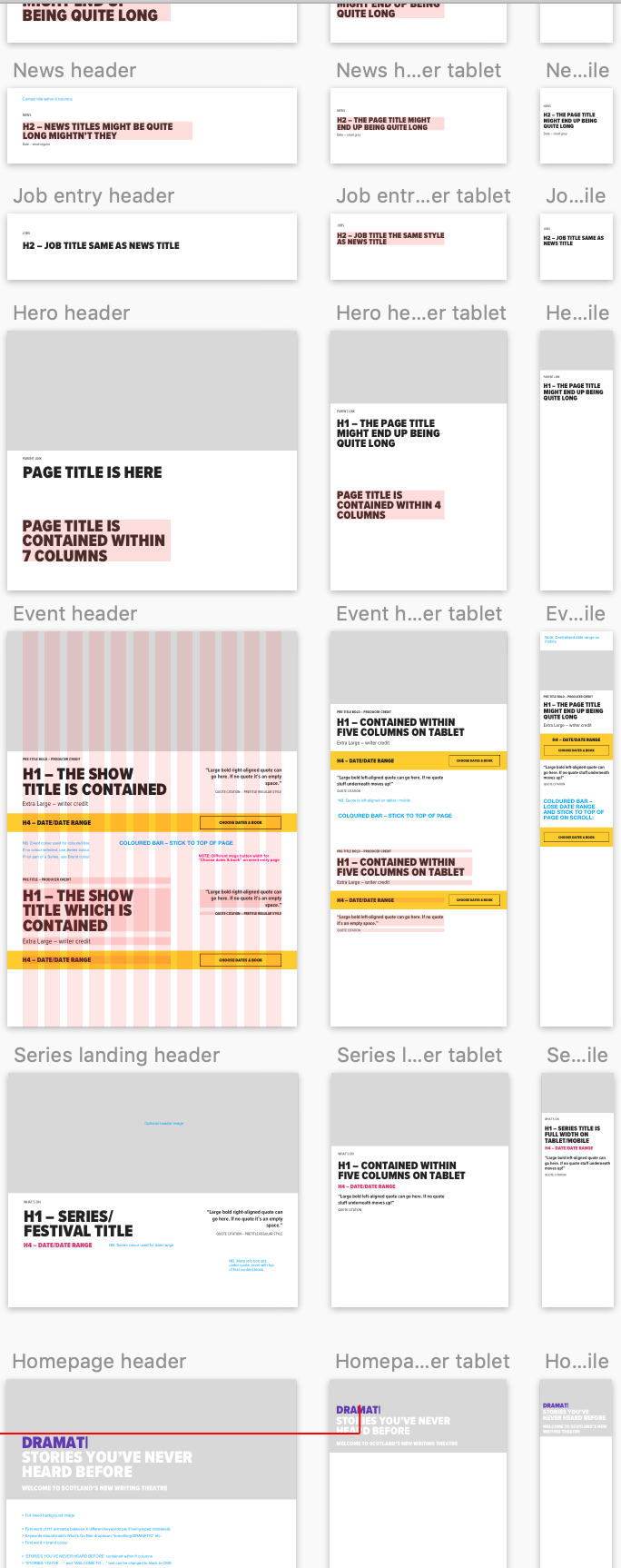
I work for Supercool, a fast-moving design agency that makes custom built sites for arts clients, powered by the off-the-shelf system, Craft CMS; it’s high-spec graphic design with relatively demanding typography and art direction. Over the past few months we’ve been moving to CSS grid. We’re transitioning slowly, allowing ourselves to discover new paradigms and design methods, instead of simply porting old habits to a new syntax.

So far, we’ve developed a number of really useful strategies for keeping track of the layout. I’ve written a couple of surprisingly nifty mixins, using named areas and templates, and we’ve hit upon some basic conventions to create highly readable code. I thought it would be valuable to walk through a fully-developed production implementation of a single major component using grid, digging in to some of the design questions it throws up and steering you away from some pitfalls we’ve encountered. CSS grid is a large spec, with lots of possible approaches and lots of right ways to do things, but at some point you have to lock down your method and get it live.

I’m expecting some basic familiarity with CSS, Sass, BEM, and some interest in the task of prototyping fully-realized, accessible, custom frameworks with 50+ components from Sketch or Photoshop-type documents on a tight timeline (say, a week).

First, let’s identify and separate out the design into distinct coding tasks and plan how we’ll approach them:

  1. Type: The designer has already defined a type system.
  2. Colors: First, we build a theme model and then include that in the partial.
  3. Content: What elements are in this block? What are its variations? This is where our BEM mixin comes in.
  4. Layout: This is how the content is placed in the block. You might want to skip directly to this.
  5. Conventions: This is exactly how we choose to write all the above. There are many right answers in CSS, so what is important is that we all just agree to a convention, the rules of the road. This really comes first, but for the sake of this article, we’ll conclude here.

Type system

We use utility classes (e.g. h-text--h1, h-text--badge) for type styles. There may be a hundred type styles in a project. We export those styles from Sketch right into our Patternlab using Typex. That’s a whole other article on its own, so let’s just stipulate type as handled. We won’t bring type into our component partial.

Color usage

See the Pen
CSS Variable fallbacks mixin v2
by limograf (@Sally_McGrath)
on CodePen.

Theming is a few tiny mixins dropped in, so we ideally won’t see a ton of color rules in our partial. We store them all together in a _themer.scss partial in our „Mixins and Models” library, so we can be sure to follow the design system of the site. This way, when someone comes back to the build later on, they have a key reference partial describing the design and branding rules. When building and maintaining numerous sites in broadly the same market — but each all with different brand spec — you’ve gotta make sure you don’t mix up one brand with another! So, much like type, we abstract the color rules away from the partial. In essence, we’re really only looking at layout (as much as possible) in our _header.scss file.

Given that we agree the convention to always theme using our mixin, this is how it would be included on an element:

@include var($property, $value);

Then we’ll set a theme model, of how colors work on this particular site and apply that theme to a component with:

@include theme;

Here’s the sample theme model we’re going to use with this page header. It’s super simple.

See the Pen
theme model
by limograf (@Sally_McGrath)
on CodePen.

We’re pairing a color with black or white. We depend on a contrast rule and flip them for emphasis, maybe on events, like hover, or a highlighted call to action. This is all we need to do to make that happen and now we have a document of how color should really work on this site. We can go to and check against if we need to debug or expand the UI.

We also want to prep inheritance to help us, so let’s identify some helpful conventions:

  • Set the fills on SVG icons to currentColor in your pipeline (and default size them as width: 1em; height: 1em; font-size: inherit; in the CSS while we’re at it).
  • Set <body> and <a> to currentColor) at base.
  • Write shorthand, inheriting borders (e.g. 1px solid or 1px solid currentColor).

Using this theme model, we might generate any number of themes, perhaps storing them as utility classes, or looping over a list of modifiers inside a component, or just allowing the user to set variables right on the block in the CMS. When IE 11 drops below 1% in our stats, we can do much more with variables, but this is enough for our current purposes.

Let’s not get side-tracked. What about grid?!

Content components

Grid lets us describe exactly what content we have in each partial in a new way. It’s really a game changer for design agencies building new UI for every project and we’re discovering new (and fun) applications for it as we explore.

To give context: we customize each interface for our clients, with custom fields made to suit their specific needs and their content model, using Craft CMS. We have internal tools that pull in events from ticketing APIs and create entries from that data, which may then be edited and expanded (or created entirely) in the CMS. The client can fill in or edit named fields in permanent page regions, and also add in whole designed, branded content blocks into the layout of each page as they build them.
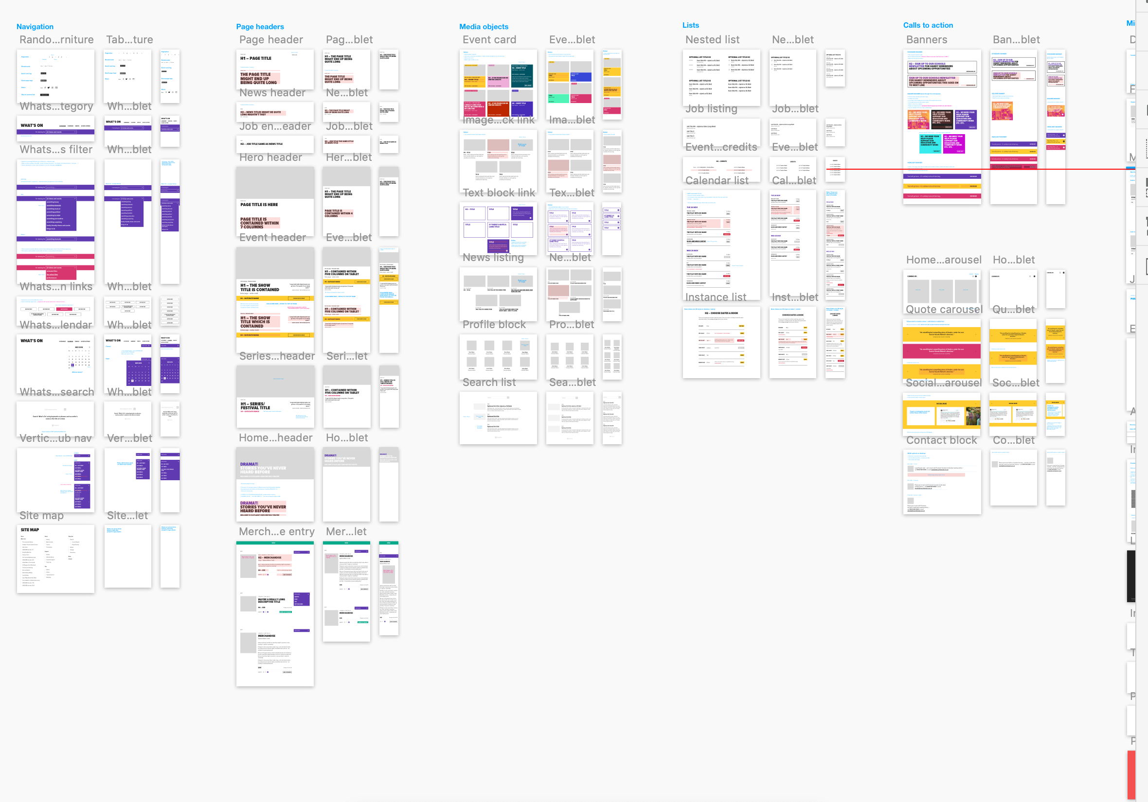
There’s a lot of UI. The clients have a lot of control over content and we have a lot of control over the HTML, so we can ensure a high standard of accessible, semantic code on the page. We develop the content model together during discovery and then turn ’em loose on content creation. They add what they want and we ensure that it works and always looks right. Better than right! Super. (Sorry! :P)

So, as a developer, I have to balance competing priorities:

  • Accessibility, usability
  • Branding and graphic design
  • Performance
  • Maintenance and codebase health

Let’s look at those one by one:

Accessibility

Accessible, logical HTML is my jam. At minimum, I require a green accessibility score on Lighthouse score for my projects. (Who am I kidding, I want that delicious 100!) Core paths and pages are tested with a couple of screen readers, the keyboard tab, keyboard navigation), low vision simulators, dasher, voice access and binary switch. (I also work for Robots and Cake so this is a big part of my development.) I add giant clickable phone numbers and email addresses to pages over and over. I just want to get people where they are going.

I’ve been concerned about the way content can be re-ordered with grid (and flexbox, for that matter). Having gone through a few builds now, I actually think grid can help us with this problem. With CSS Grid, there’s no reason to move around HTML in service to the layout. We can go back to thinking about the whole document as a logical, linear sequence as our first concern.

Branding vs. Performance vs. Maintenance

Arts venues require high-spec graphic design, unified across print and web, and have constantly changing materials (e.g. programs, brochures, tickets, posters, microsites, etc.) they need to get out to their audiences, including contractual marketing obligations that must be met. As you can imagine, we have a lot of high quality large images we have to prioritize and typically come with strong print-led branding. That means we may be serving around fifteen custom fonts (including weight variations, display faces, etc.) and complex CSS to the page as well. We have to keep ourselves as lean as we can. We are shipping CSS that’s around 20 KB nano Gzipped at the moment but I’m working on reducing it further.

However, we do keep the grid area names full length by setting reduce identifiers to false in our PostCSS task. It’s vastly more useful to have the layout maps available in DevTools than it is to save those few bytes. For maintenance, self-documentation, and the sake of your future self who is debugging this site without repo access on a delayed train in Sowerby Bridge: keep the maps.

Code health

The way to balance all these competing needs is to articulate and agree on conventions so that there’s less to fix in testing and so that solved problems stay solved. We examine all the components we build and make sure they always start with a heading, that links go places, and buttons trigger actions, that countable objects are delivered as a list and preceded by a landmark heading, that navs are <nav> and times are <time> and div soup is eaten for breakfast— the basics.

With CSS Grid, there’s no excuse to move around HTML in service to the layout. Your content can always flow logically while changes in layout happen in CSS. And, as there’s no need for margins or padding to create gutters, you can simply declare:

.o-grid .o-grid { width:100%; }

…to be sure any number of nested groups all visually occupy the same page grid. The HTML can be a clearer guide to what things really are: a closer document.

See the Pen
lock down semantic accessible structures
by limograf (@Sally_McGrath)
on CodePen.

There’s a lot to manage between the heading and the action, and it’s my challenge to keep track of all these fields in all those components and make it traversable, scannable, linearizable, and easily read in some kind of logical, understandable manner, while making sure I’m faithfully executing the design spec.

Let’s bring in my first, surprisingly useful, grid mixin.

@mixin template($elements...) {
  @each $element in $elements {
    &__#{$element} {
      grid-area: $element;
    }
  }
}

Using this mixin everywhere means:

  1. Each component partial now starts out with a list of all its possible elements, which is a very handy piece of documentation, especially when Twigging the actual front-end component.
  2. The mixin takes care of assigning the grid areas.
  3. Element and component names stay consistent across Sketch, CSS, and HTML and any inconsistencies will be very obvious, as the layout will fail. I’m firm, but fair.
  4. BEM naming is enforced automatically but isn’t muddling things up in the partial.

Now, in the partial, we will just declare grid-template-areas, using normal English words, giving us a series of maps of the layouts that also match the database fields. Super readable!

Here’s an example of this mixin working:

See the Pen
BEM ELEMENT AUTO ASSIGN
by limograf (@Sally_McGrath)
on CodePen.

We decided to stick to named areas for internal grids because I read a great article on this very site explaining how Autoprefixer can handle grid for IE 11 if you stick to the listed supported properties — and it does for the most part. If you view this test case with Autoprefixer applied in the super useful Debug Mode in a browser test, you’ll see it working.
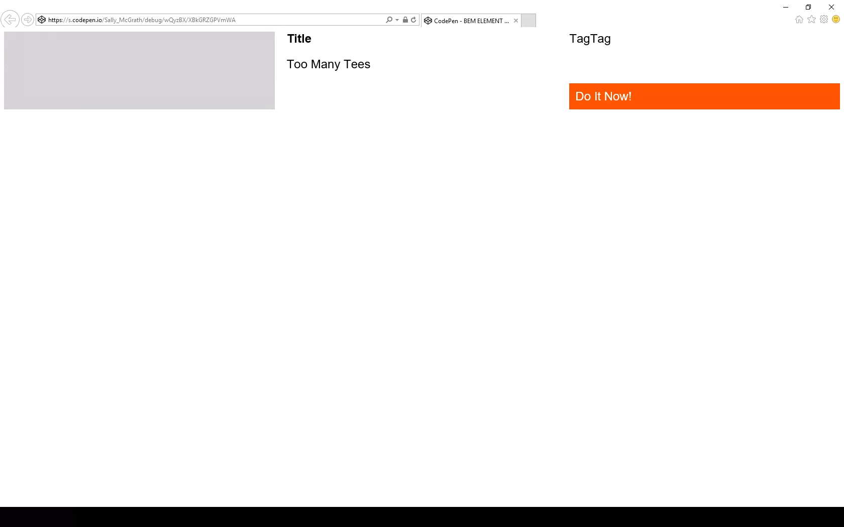
So far, so good.

But there are pitfalls! You must set inline elements to block to make sure they always operate as grid cells in IE 11. Comment out the marked line in the example to see what happens otherwise:
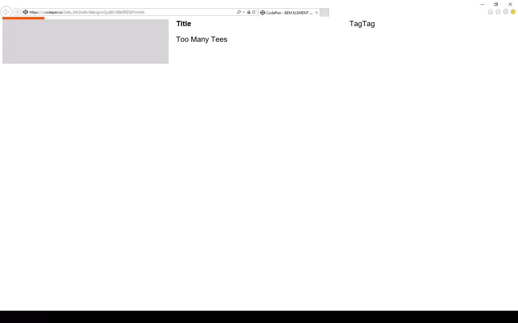
Debug has caught an issue.

Ouch! Be careful with those blocks. You may find some versions of IE 11 don’t even pick up this fix, in which case you might try just using plain ol’ <p> tags… sigh.

I don’t include display: grid in this mixin because there are scenarios where the actual grid is set on an inner container, for example, but we’d still want the grid-areas to match on the correct BEM class.

So:

.c-header{ 
  @include template(title, pretitle, posttitle, producer, venue, credit, quote, nav, infobar, search);
}

Let’s lay these suckers out.

Layout

Let’s identify a few more rules of the road to ensure this component slides right into a page layout without hassle. At time of writing, there’s no subgrid) available (but there will be!), so this component knows nothing of the parent grid it’s living in. This happens to match the BEM component approach well — as each component is written flat, and orphaned, to limit inheritance. I’m not advocating for BEM (or BEM-ish as we obviously use) here — I’m just saying that if you’re already using it, this is a bonus.

In this example, the designer has set a page layout of 12 column grid with 20px (1.25rem) gutters, site-wide, with no offset pieces. Our component is a page region and will occupy all 12 grid columns. In this transitional period, we’re still using this kind of set grid as we have a ton of systems still based on this idea that we have to integrate with. So, here’s our convention for this condition: for a full width region drop the grip gap and write the grid template columns as fractional units (fr) of 12.

Doing things this way means:

  1. the sight lines of this internal grid broadly follow the grid it sits within;
  2. it’s easy to see the underlying design rules in the code; and
  3. it’s easy to line things up exactly, if required.

A quick note on „lining up”

Wait… what do I mean 'to have things line up exactly’? Doesn’t it already line up exactly?
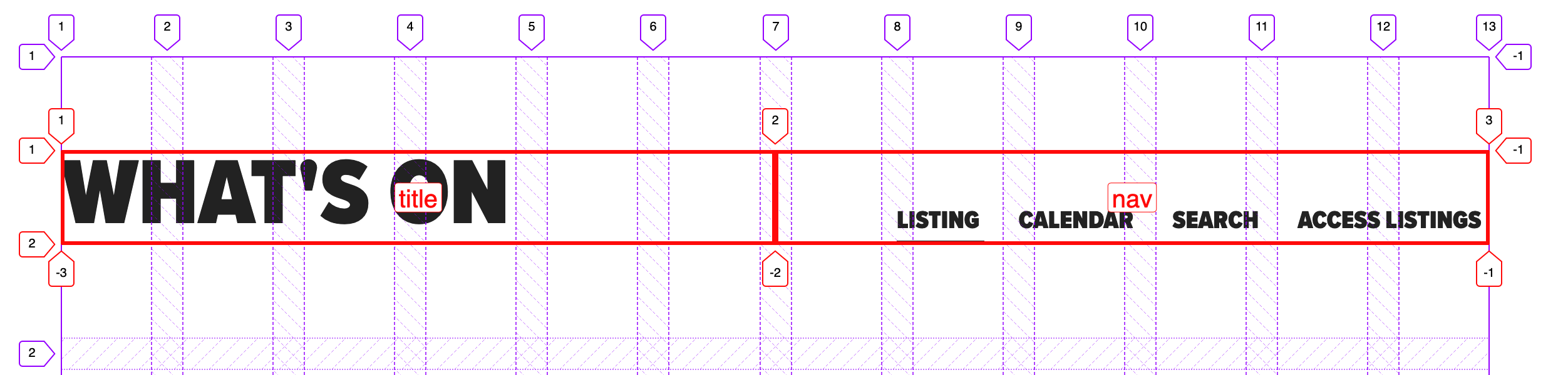
Two equal columns split mid-gutter of the parent 12-column grid.

Well, no. The fractional units approach divides across the space perfectly, so you end up in the gutter. Two even columns lands you halfway across the gutter. Two columns where one is 2/3 and the other is 1/3 will split 1/3 of the way across that gutter, and so on.
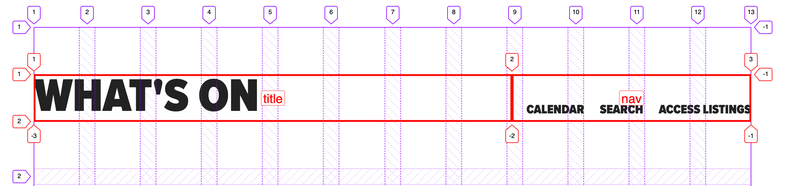
Two unequal columns (set to 2fr and 1fr, respectively) split a third of the way into a gutter of the 12-column parent grid.

It’s not exactly hard to fix the alignment, as we know the width of our page grid gutter. For example, on an even split, we could include the grid gap.
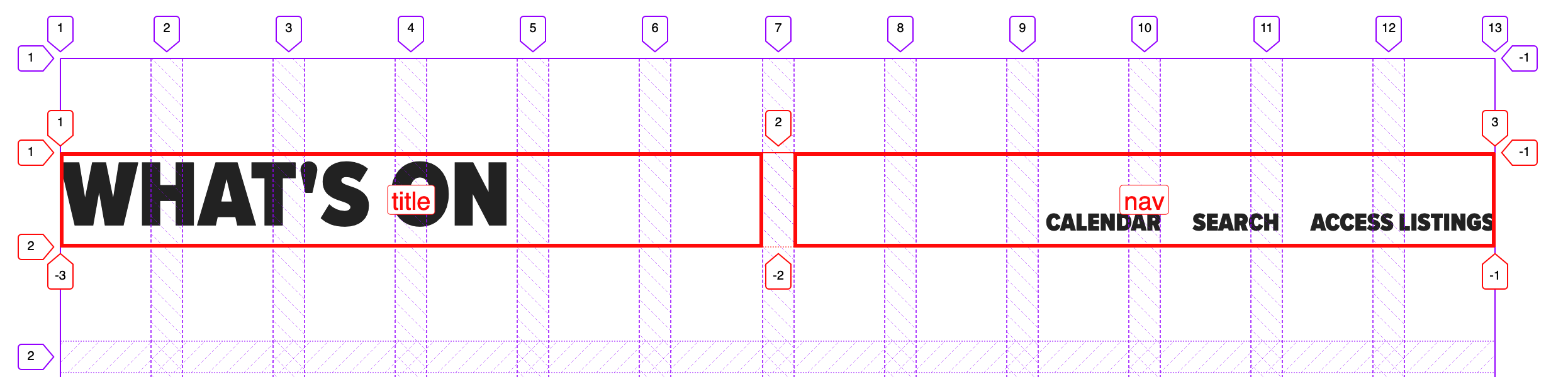
However, we can’t do that with any other division. What we can do is add that gap as a margin — the margin is added inside no matter what box sizing you have set. In this example, we have three columns (two named areas and one empty space), splitting our gutter into thirds:
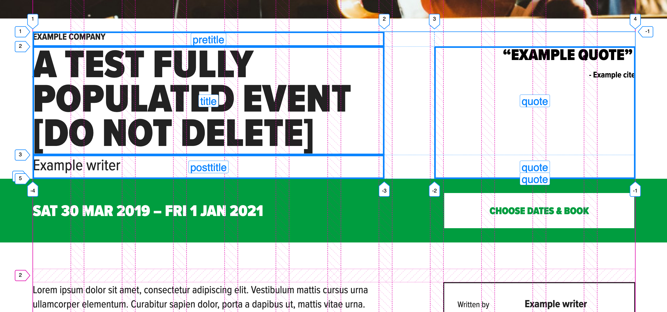
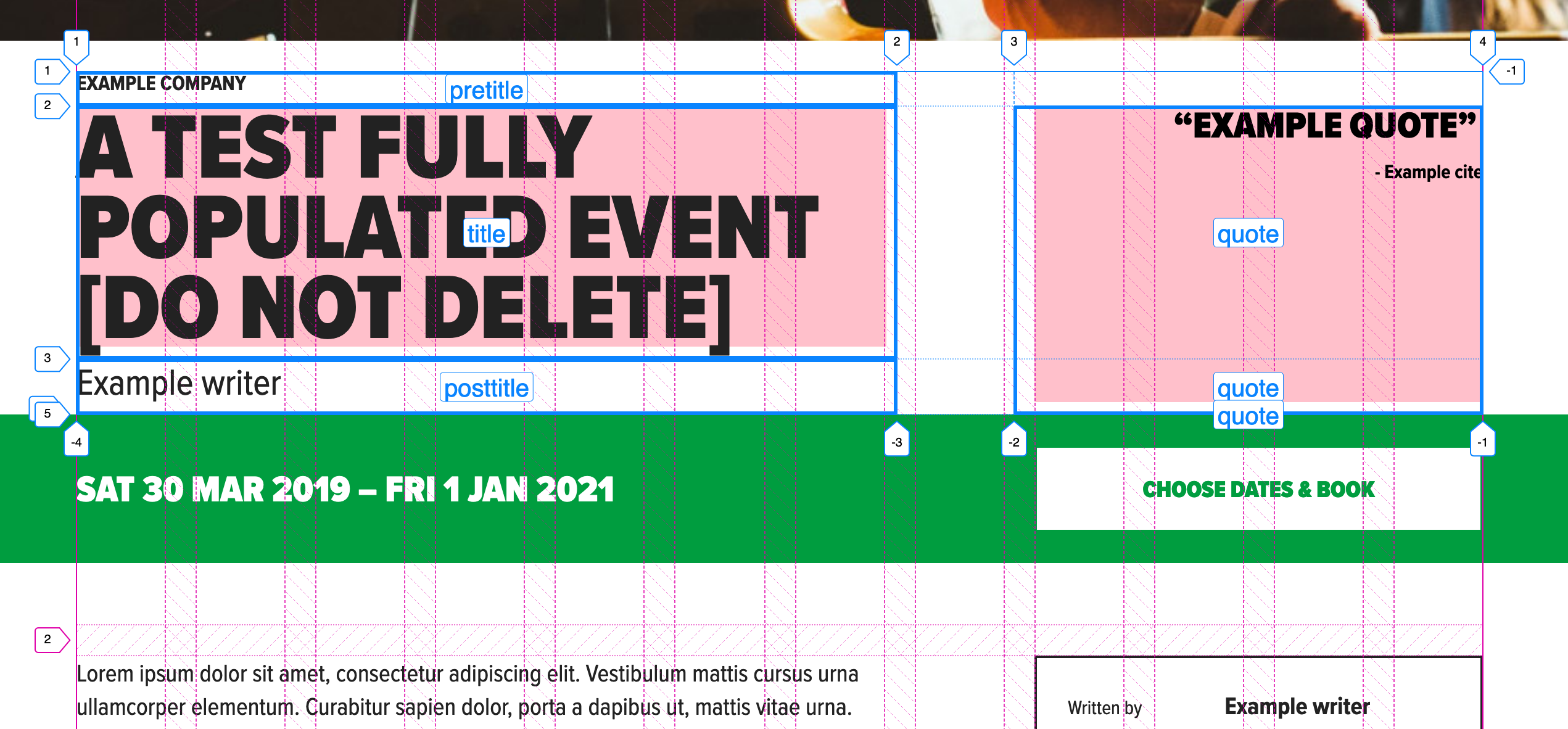
This is how to calculate those margins: Make sure the total fr units sum results in 12. Divide the grid gap by the number of columns in the parent grid, then multiply that like so:

The right margin multiplier of n is equal to the sum of the fr units to the right of n. The left margin of n is equal to the sum of the fr units to the left of n.

So, for grid-template-columns with a value of 2fr 3fr 2fr 4fr 1fr:

 2      3      2     4    1 
0/10   2/7    5/5   7/1  11/0

See the Pen
name spec inside and number spec outside — page region, desktop
by limograf (@Sally_McGrath)
on CodePen.

You could even write that as a mixin if you find yourself writing calc() a lot. Something like this for aligning an inner grid to the parent grid:

See the Pen
auto align inner grid to parent grid
by limograf (@Sally_McGrath)
on CodePen.

…and something like this to auto-calculate margins when the name is specified inside but the number is specified outside the grid:

See the Pen
name spec inside and number spec outside — auto calc margins
by limograf (@Sally_McGrath)
on CodePen.

I’m sure you can think of other solutions, like switching to named lines, or adding in extra fixed-width columns or even writing all maps with 12 named areas per row. There are so many ways you can deal with this, but I think a lot of them remove the advantage of named areas. Areas give us a readable layout map that contains what our future selves need to know. It is code as documentation.

To be clear, the design problem I’m walking us through is not one of alignment. Alignment is easy with grid. The question is not of solving the immediate, trivial, layout problem, but of solving it in a way that supports our goal of being able to come back in six months and grasp:

  1. What elements are in the component.
  2. How they are laid out.
  3. Why the code is written in this way.

The grid specification is huge and it’s easy to get lost in the options. Perhaps it’s a better plan to reset to a 12-column grid and use the number spec (i.e. explicitly link to our page grid, which uses the number spec) when absolute alignment is required — but I do feel there’s a smarter, simpler solution waiting to be found. For this site, we ended up writing a page grid object and added nested internal grid cells to it with classes: .o-page-grid__sidebar.

What do you all think? I definitely foresee differing perspectives on this. 🤦‍♀️

A real, live grid!

We can use this to create a generic page header:

See the Pen
01 – Generic Page header
by limograf (@Sally_McGrath)
on CodePen.

Or, we can create a variation of the homepage:

See the Pen
02 – Home page
by limograf (@Sally_McGrath)
on CodePen.

What about a hero header that breaks out of our container? Sure! Or we can deliver it outside the container as well:

See the Pen
03 – Hero
by limograf (@Sally_McGrath)
on CodePen.

What next? A themed event header with a full width info bar that sticks and an internal button that lines up with the sidebar on the parent grid? You bet. I’ll include a parent grid so it’s easier to see:

See the Pen
04 – Event header
by limograf (@Sally_McGrath)
on CodePen.

What about a search with a central alignment? Let’s use a collapsing columns technique:

See the Pen
06 – Search with central alignment
by limograf (@Sally_McGrath)
on CodePen.

Here’s a demo of all these variations as one partial. Yes, it’s a map! And it’s a wrap!

Conventions

Phew, we covered a lot! But you can see how flexible and self-documenting a system like this can be, right?

  1. Type is handled with a separate type system.
  2. Colors are handled by a theme partial that describes the underlying color rules of the design, rather than simply coloring elements ad hoc.
  3. Elements are called what they are, in English, and included as a list at the top of the partial with the template mixin. This list can be taken into Twig or a template as a reference.
  4. Correct HTML is always used and nesting doesn’t break grid. That means you can apply any number of nested grids to the same layout space by setting a convention.
  5. Precise alignment is done in a number spec, and not a name spec (but note that alignment is possible with name spec).
  6. IE 11 is supported.
  7. I do have one more quick note and example of another component built with named areas. In this example, cards are not regions, but components placed in a grid, so there’s no reason to use the fr of 12 convention. You can expect a media object partial to look like this:

    .c-card {
      &--news {
        align-content: start;
        grid-template-areas: 
          "image"
          "datetime"
          "title";
      }
    
      &--search {
        justify-content: start;
        grid-template-columns: 1fr 3fr;
        grid-template-areas:
          "image page"
          "image title"
          "image summary";
      }
    
      &--merchandise {
        grid-gap: 0;
        grid-template-columns: $b 1fr 1fr $b;
        grid-template-areas:
          "image image   image   image"
          ".     title   title   ."
          ".     summary summary ."
          ".     price   action  .";
      }
    
      &--donations {
        // donations thanks button is too long and must take up more space than input
        grid-gap: 0;
        grid-template-columns: $b 1fr 2fr $b;
        grid-template-areas:
          "image image   image   image"
          ".     title   title   ."
          ".     summary summary ."
          ".     input   action  .";
      }
    }
    
    // ...

    The post Code as Documentation: New Strategies with CSS Grid appeared first on CSS-Tricks.
Code as Documentation: New Strategies with CSS Grid

Post pobrano z: Code as Documentation: New Strategies with CSS Grid

I work for Supercool, a fast-moving design agency that makes custom built sites for arts clients, powered by the off-the-shelf system, Craft CMS; it’s high-spec graphic design with relatively demanding typography and art direction. Over the past few months we’ve been moving to CSS grid. We’re transitioning slowly, allowing ourselves to discover new paradigms and design methods, instead of simply porting old habits to a new syntax.

So far, we’ve developed a number of really useful strategies for keeping track of the layout. I’ve written a couple of surprisingly nifty mixins, using named areas and templates, and we’ve hit upon some basic conventions to create highly readable code. I thought it would be valuable to walk through a fully-developed production implementation of a single major component using grid, digging in to some of the design questions it throws up and steering you away from some pitfalls we’ve encountered. CSS grid is a large spec, with lots of possible approaches and lots of right ways to do things, but at some point you have to lock down your method and get it live.

I’m expecting some basic familiarity with CSS, Sass, BEM, and some interest in the task of prototyping fully-realized, accessible, custom frameworks with 50+ components from Sketch or Photoshop-type documents on a tight timeline (say, a week).

First, let’s identify and separate out the design into distinct coding tasks and plan how we’ll approach them:

  1. Type: The designer has already defined a type system.
  2. Colors: First, we build a theme model and then include that in the partial.
  3. Content: What elements are in this block? What are its variations? This is where our BEM mixin comes in.
  4. Layout: This is how the content is placed in the block. You might want to skip directly to this.
  5. Conventions: This is exactly how we choose to write all the above. There are many right answers in CSS, so what is important is that we all just agree to a convention, the rules of the road. This really comes first, but for the sake of this article, we’ll conclude here.

Type system

We use utility classes (e.g. h-text--h1, h-text--badge) for type styles. There may be a hundred type styles in a project. We export those styles from Sketch right into our Patternlab using Typex. That’s a whole other article on its own, so let’s just stipulate type as handled. We won’t bring type into our component partial.

Color usage

See the Pen
CSS Variable fallbacks mixin v2
by limograf (@Sally_McGrath)
on CodePen.

Theming is a few tiny mixins dropped in, so we ideally won’t see a ton of color rules in our partial. We store them all together in a _themer.scss partial in our „Mixins and Models” library, so we can be sure to follow the design system of the site. This way, when someone comes back to the build later on, they have a key reference partial describing the design and branding rules. When building and maintaining numerous sites in broadly the same market — but each all with different brand spec — you’ve gotta make sure you don’t mix up one brand with another! So, much like type, we abstract the color rules away from the partial. In essence, we’re really only looking at layout (as much as possible) in our _header.scss file.

Given that we agree the convention to always theme using our mixin, this is how it would be included on an element:

@include var($property, $value);

Then we’ll set a theme model, of how colors work on this particular site and apply that theme to a component with:

@include theme;

Here’s the sample theme model we’re going to use with this page header. It’s super simple.

See the Pen
theme model
by limograf (@Sally_McGrath)
on CodePen.

We’re pairing a color with black or white. We depend on a contrast rule and flip them for emphasis, maybe on events, like hover, or a highlighted call to action. This is all we need to do to make that happen and now we have a document of how color should really work on this site. We can go to and check against if we need to debug or expand the UI.

We also want to prep inheritance to help us, so let’s identify some helpful conventions:

  • Set the fills on SVG icons to currentColor in your pipeline (and default size them as width: 1em; height: 1em; font-size: inherit; in the CSS while we’re at it).
  • Set <body> and <a> to currentColor) at base.
  • Write shorthand, inheriting borders (e.g. 1px solid or 1px solid currentColor).

Using this theme model, we might generate any number of themes, perhaps storing them as utility classes, or looping over a list of modifiers inside a component, or just allowing the user to set variables right on the block in the CMS. When IE 11 drops below 1% in our stats, we can do much more with variables, but this is enough for our current purposes.

Let’s not get side-tracked. What about grid?!

Content components

Grid lets us describe exactly what content we have in each partial in a new way. It’s really a game changer for design agencies building new UI for every project and we’re discovering new (and fun) applications for it as we explore.

To give context: we customize each interface for our clients, with custom fields made to suit their specific needs and their content model, using Craft CMS. We have internal tools that pull in events from ticketing APIs and create entries from that data, which may then be edited and expanded (or created entirely) in the CMS. The client can fill in or edit named fields in permanent page regions, and also add in whole designed, branded content blocks into the layout of each page as they build them.

There’s a lot of UI. The clients have a lot of control over content and we have a lot of control over the HTML, so we can ensure a high standard of accessible, semantic code on the page. We develop the content model together during discovery and then turn ’em loose on content creation. They add what they want and we ensure that it works and always looks right. Better than right! Super. (Sorry! :P)

So, as a developer, I have to balance competing priorities:

  • Accessibility, usability
  • Branding and graphic design
  • Performance
  • Maintenance and codebase health

Let’s look at those one by one:

Accessibility

Accessible, logical HTML is my jam. At minimum, I require a green accessibility score on Lighthouse score for my projects. (Who am I kidding, I want that delicious 100!) Core paths and pages are tested with a couple of screen readers, the keyboard tab, keyboard navigation), low vision simulators, dasher, voice access and binary switch. (I also work for Robots and Cake so this is a big part of my development.) I add giant clickable phone numbers and email addresses to pages over and over. I just want to get people where they are going.

I’ve been concerned about the way content can be re-ordered with grid (and flexbox, for that matter). Having gone through a few builds now, I actually think grid can help us with this problem. With CSS Grid, there’s no reason to move around HTML in service to the layout. We can go back to thinking about the whole document as a logical, linear sequence as our first concern.

Branding vs. Performance vs. Maintenance

Arts venues require high-spec graphic design, unified across print and web, and have constantly changing materials (e.g. programs, brochures, tickets, posters, microsites, etc.) they need to get out to their audiences, including contractual marketing obligations that must be met. As you can imagine, we have a lot of high quality large images we have to prioritize and typically come with strong print-led branding. That means we may be serving around fifteen custom fonts (including weight variations, display faces, etc.) and complex CSS to the page as well. We have to keep ourselves as lean as we can. We are shipping CSS that’s around 20 KB nano Gzipped at the moment but I’m working on reducing it further.

However, we do keep the grid area names full length by setting reduce identifiers to false in our PostCSS task. It’s vastly more useful to have the layout maps available in DevTools than it is to save those few bytes. For maintenance, self-documentation, and the sake of your future self who is debugging this site without repo access on a delayed train in Sowerby Bridge: keep the maps.

Code health

The way to balance all these competing needs is to articulate and agree on conventions so that there’s less to fix in testing and so that solved problems stay solved. We examine all the components we build and make sure they always start with a heading, that links go places, and buttons trigger actions, that countable objects are delivered as a list and preceded by a landmark heading, that navs are <nav> and times are <time> and div soup is eaten for breakfast— the basics.

With CSS Grid, there’s no excuse to move around HTML in service to the layout. Your content can always flow logically while changes in layout happen in CSS. And, as there’s no need for margins or padding to create gutters, you can simply declare:

.o-grid .o-grid { width:100%; }

…to be sure any number of nested groups all visually occupy the same page grid. The HTML can be a clearer guide to what things really are: a closer document.

See the Pen
lock down semantic accessible structures
by limograf (@Sally_McGrath)
on CodePen.

There’s a lot to manage between the heading and the action, and it’s my challenge to keep track of all these fields in all those components and make it traversable, scannable, linearizable, and easily read in some kind of logical, understandable manner, while making sure I’m faithfully executing the design spec.

Let’s bring in my first, surprisingly useful, grid mixin.

@mixin template($elements...) {
  @each $element in $elements {
    &__#{$element} {
      grid-area: $element;
    }
  }
}

Using this mixin everywhere means:

  1. Each component partial now starts out with a list of all its possible elements, which is a very handy piece of documentation, especially when Twigging the actual front-end component.
  2. The mixin takes care of assigning the grid areas.
  3. Element and component names stay consistent across Sketch, CSS, and HTML and any inconsistencies will be very obvious, as the layout will fail. I’m firm, but fair.
  4. BEM naming is enforced automatically but isn’t muddling things up in the partial.

Now, in the partial, we will just declare grid-template-areas, using normal English words, giving us a series of maps of the layouts that also match the database fields. Super readable!

Here’s an example of this mixin working:

See the Pen
BEM ELEMENT AUTO ASSIGN
by limograf (@Sally_McGrath)
on CodePen.

We decided to stick to named areas for internal grids because I read a great article on this very site explaining how Autoprefixer can handle grid for IE 11 if you stick to the listed supported properties — and it does for the most part. If you view this test case with Autoprefixer applied in the super useful Debug Mode in a browser test, you’ll see it working.

So far, so good.

But there are pitfalls! You must set inline elements to block to make sure they always operate as grid cells in IE 11. Comment out the marked line in the example to see what happens otherwise:

Debug has caught an issue.

Ouch! Be careful with those blocks. You may find some versions of IE 11 don’t even pick up this fix, in which case you might try just using plain ol’ <p> tags… sigh.

I don’t include display: grid in this mixin because there are scenarios where the actual grid is set on an inner container, for example, but we’d still want the grid-areas to match on the correct BEM class.

So:

.c-header{ 
  @include template(title, pretitle, posttitle, producer, venue, credit, quote, nav, infobar, search);
}

Let’s lay these suckers out.

Layout

Let’s identify a few more rules of the road to ensure this component slides right into a page layout without hassle. At time of writing, there’s no subgrid) available (but there will be!), so this component knows nothing of the parent grid it’s living in. This happens to match the BEM component approach well — as each component is written flat, and orphaned, to limit inheritance. I’m not advocating for BEM (or BEM-ish as we obviously use) here — I’m just saying that if you’re already using it, this is a bonus.

In this example, the designer has set a page layout of 12 column grid with 20px (1.25rem) gutters, site-wide, with no offset pieces. Our component is a page region and will occupy all 12 grid columns. In this transitional period, we’re still using this kind of set grid as we have a ton of systems still based on this idea that we have to integrate with. So, here’s our convention for this condition: for a full width region drop the grip gap and write the grid template columns as fractional units (fr) of 12.

Doing things this way means:

  1. the sight lines of this internal grid broadly follow the grid it sits within;
  2. it’s easy to see the underlying design rules in the code; and
  3. it’s easy to line things up exactly, if required.

A quick note on „lining up”

Wait… what do I mean 'to have things line up exactly’? Doesn’t it already line up exactly?

Two equal columns split mid-gutter of the parent 12-column grid.

Well, no. The fractional units approach divides across the space perfectly, so you end up in the gutter. Two even columns lands you halfway across the gutter. Two columns where one is 2/3 and the other is 1/3 will split 1/3 of the way across that gutter, and so on.

Two unequal columns (set to 2fr and 1fr, respectively) split a third of the way into a gutter of the 12-column parent grid.

It’s not exactly hard to fix the alignment, as we know the width of our page grid gutter. For example, on an even split, we could include the grid gap.

However, we can’t do that with any other division. What we can do is add that gap as a margin — the margin is added inside no matter what box sizing you have set. In this example, we have three columns (two named areas and one empty space), splitting our gutter into thirds:

This is how to calculate those margins: Make sure the total fr units sum results in 12. Divide the grid gap by the number of columns in the parent grid, then multiply that like so:

The right margin multiplier of n is equal to the sum of the fr units to the right of n. The left margin of n is equal to the sum of the fr units to the left of n.

So, for grid-template-columns with a value of 2fr 3fr 2fr 4fr 1fr:

 2      3      2     4    1 
0/10   2/7    5/5   7/1  11/0

See the Pen
name spec inside and number spec outside — page region, desktop
by limograf (@Sally_McGrath)
on CodePen.

You could even write that as a mixin if you find yourself writing calc() a lot. Something like this for aligning an inner grid to the parent grid:

See the Pen
auto align inner grid to parent grid
by limograf (@Sally_McGrath)
on CodePen.

…and something like this to auto-calculate margins when the name is specified inside but the number is specified outside the grid:

See the Pen
name spec inside and number spec outside — auto calc margins
by limograf (@Sally_McGrath)
on CodePen.

I’m sure you can think of other solutions, like switching to named lines, or adding in extra fixed-width columns or even writing all maps with 12 named areas per row. There are so many ways you can deal with this, but I think a lot of them remove the advantage of named areas. Areas give us a readable layout map that contains what our future selves need to know. It is code as documentation.

To be clear, the design problem I’m walking us through is not one of alignment. Alignment is easy with grid. The question is not of solving the immediate, trivial, layout problem, but of solving it in a way that supports our goal of being able to come back in six months and grasp:

  1. What elements are in the component.
  2. How they are laid out.
  3. Why the code is written in this way.

The grid specification is huge and it’s easy to get lost in the options. Perhaps it’s a better plan to reset to a 12-column grid and use the number spec (i.e. explicitly link to our page grid, which uses the number spec) when absolute alignment is required — but I do feel there’s a smarter, simpler solution waiting to be found. For this site, we ended up writing a page grid object and added nested internal grid cells to it with classes: .o-page-grid__sidebar.

What do you all think? I definitely foresee differing perspectives on this. 🤦‍♀️

A real, live grid!

We can use this to create a generic page header:

See the Pen
01 – Generic Page header
by limograf (@Sally_McGrath)
on CodePen.

Or, we can create a variation of the homepage:

See the Pen
02 – Home page
by limograf (@Sally_McGrath)
on CodePen.

What about a hero header that breaks out of our container? Sure! Or we can deliver it outside the container as well:

See the Pen
03 – Hero
by limograf (@Sally_McGrath)
on CodePen.

What next? A themed event header with a full width info bar that sticks and an internal button that lines up with the sidebar on the parent grid? You bet. I’ll include a parent grid so it’s easier to see:

See the Pen
04 – Event header
by limograf (@Sally_McGrath)
on CodePen.

What about a search with a central alignment? Let’s use a collapsing columns technique:

See the Pen
06 – Search with central alignment
by limograf (@Sally_McGrath)
on CodePen.

Here’s a demo of all these variations as one partial. Yes, it’s a map! And it’s a wrap!

Conventions

Phew, we covered a lot! But you can see how flexible and self-documenting a system like this can be, right?

  1. Type is handled with a separate type system.
  2. Colors are handled by a theme partial that describes the underlying color rules of the design, rather than simply coloring elements ad hoc.
  3. Elements are called what they are, in English, and included as a list at the top of the partial with the template mixin. This list can be taken into Twig or a template as a reference.
  4. Correct HTML is always used and nesting doesn’t break grid. That means you can apply any number of nested grids to the same layout space by setting a convention.
  5. Precise alignment is done in a number spec, and not a name spec (but note that alignment is possible with name spec).
  6. IE 11 is supported.
  7. I do have one more quick note and example of another component built with named areas. In this example, cards are not regions, but components placed in a grid, so there’s no reason to use the fr of 12 convention. You can expect a media object partial to look like this:

    .c-card {
      &--news {
        align-content: start;
        grid-template-areas: 
          "image"
          "datetime"
          "title";
      }
    
      &--search {
        justify-content: start;
        grid-template-columns: 1fr 3fr;
        grid-template-areas:
          "image page"
          "image title"
          "image summary";
      }
    
      &--merchandise {
        grid-gap: 0;
        grid-template-columns: $b 1fr 1fr $b;
        grid-template-areas:
          "image image   image   image"
          ".     title   title   ."
          ".     summary summary ."
          ".     price   action  .";
      }
    
      &--donations {
        // donations thanks button is too long and must take up more space than input
        grid-gap: 0;
        grid-template-columns: $b 1fr 2fr $b;
        grid-template-areas:
          "image image   image   image"
          ".     title   title   ."
          ".     summary summary ."
          ".     input   action  .";
      }
    }
    
    // ...

    The post Code as Documentation: New Strategies with CSS Grid appeared first on CSS-Tricks.
Weekly Platform News: Mozilla WebThings, Internet Explorer mode, GraphQL

Post pobrano z: Weekly Platform News: Mozilla WebThings, Internet Explorer mode, GraphQL

Šime posts regular content for web developers on webplatform.news.

Mozilla WebThings provides complete privacy for user data

If you, like many we surveyed, are also concerned about the security & privacy of you smart home check out @MozillaIoT's decentralized, open source solution for keeping your smarthome devices at bay—or learn more dropping by our Bay Area Maker Faire booth! https://t.co/rUcYpjBySH

— Mozilla Hacks (@mozhacks) May 17, 2019

Josephine Lau: Smart home companies require that users’ data goes through their servers, which means that people are giving up their privacy for the convenience of a smart home device (e.g., smart light bulb).

We’ve learned that people are concerned about the privacy of their smart home data. And yet, when there’s no alternative, they feel the need to trade away their privacy for convenience.

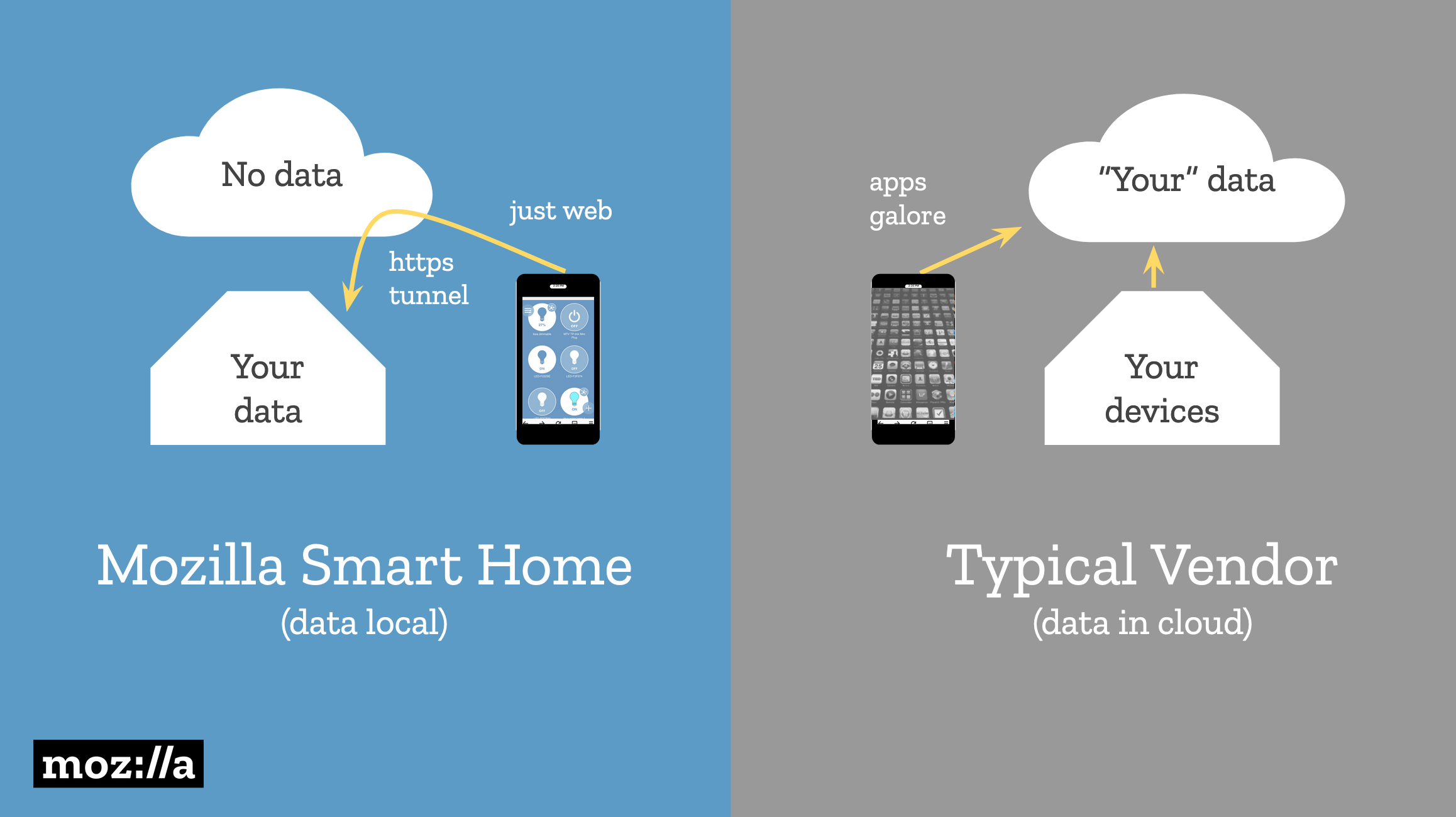
Mozilla WebThings is an alternative approach to the Internet of Things that stores user data in the user’s home. Devices can be controlled locally via a web interface, and the data is tunneled through a private HTTPS connection.

A diagram showing how Mozilla doesn’t store user data in the cloud, unlike smart home vendors.

An Internet Explorer mode is coming to Edge

Still have questions on the recently announced IE mode? Our very own Fred Pullen has all the answers. Check out his in-depth breakdown on how the new IE mode works, and the benefits it will bring to our enterprise community once it goes live.https://t.co/RgewXGC1G2

— Microsoft Edge Dev (@MSEdgeDev) May 17, 2019

Fred Pullen: The next version of Edge will include an Internet Explorer mode for backward compatibility with legacy websites. Edge will also for the first time be available on older versions of Windows (including Windows 7 and 8.1).

By introducing Internet Explorer mode, we’re effectively blurring the lines between the browsers. From an end-user standpoint, it seems like a single browser. … You can use IE mode to limit the sites that instantiate Internet Explorer just to the sites that you approved.

Quick hits: Other interesting articles

Introducing the first Microsoft Edge preview builds for macOS (Microsoft Edge Blog)

Edge Canary (analogous to Chrome Canary) is now officially available on macOS. This version of Edge updates daily.

With our new Chromium foundation, you can expect a consistent rendering experience across the Windows and macOS versions of Microsoft Edge.


#EmberJS2019 More Accessible Than Ever (Yehuda Katz)

Navigating from one page to another in a client-side web app provides no feedback by default in virtually all popular routing solutions across the client-side ecosystem.

Their goal is to make Ember’s router more accessible and screen reader friendly.


Opinion: Five developer trends to watch in 2019 (DeveloperTech)

The article includes a good, short explanation of what GraphQL is and what problems it solves.


Part 2: What the Fr(action)? (CSS IRL)

Read the last section („Intrinsic and extrinsic sizing”). All three columns have the size 1fr but the middle one is wider because of its content. This can be prevented by using the size minmax(0, 1fr) instead.


Parallel streaming of progressive images (Cloudflare Blog)

Instead of loading from top to bottom, progressive images appear blurry at first and become sharper as more data loads.

The benefits of progressive rendering are unique to JPEG (supported in all browsers) and JPEG 2000 (supported in Safari). GIF and PNG have interlaced modes, but these modes come at a cost of worse compression. WebP doesn’t even support progressive rendering at all. This creates a dilemma: WebP is usually 20%-30% smaller than a JPEG of equivalent quality, but progressive JPEG appears to load 50% faster.

The post Weekly Platform News: Mozilla WebThings, Internet Explorer mode, GraphQL appeared first on CSS-Tricks.

Weekly Platform News: Mozilla WebThings, Internet Explorer mode, GraphQL

Post pobrano z: Weekly Platform News: Mozilla WebThings, Internet Explorer mode, GraphQL

Šime posts regular content for web developers on webplatform.news.

Mozilla WebThings provides complete privacy for user data

If you, like many we surveyed, are also concerned about the security & privacy of you smart home check out @MozillaIoT's decentralized, open source solution for keeping your smarthome devices at bay—or learn more dropping by our Bay Area Maker Faire booth! https://t.co/rUcYpjBySH

— Mozilla Hacks (@mozhacks) May 17, 2019

Josephine Lau: Smart home companies require that users’ data goes through their servers, which means that people are giving up their privacy for the convenience of a smart home device (e.g., smart light bulb).

We’ve learned that people are concerned about the privacy of their smart home data. And yet, when there’s no alternative, they feel the need to trade away their privacy for convenience.

Mozilla WebThings is an alternative approach to the Internet of Things that stores user data in the user’s home. Devices can be controlled locally via a web interface, and the data is tunneled through a private HTTPS connection.

A diagram showing how Mozilla doesn’t store user data in the cloud, unlike smart home vendors.

An Internet Explorer mode is coming to Edge

Still have questions on the recently announced IE mode? Our very own Fred Pullen has all the answers. Check out his in-depth breakdown on how the new IE mode works, and the benefits it will bring to our enterprise community once it goes live.https://t.co/RgewXGC1G2

— Microsoft Edge Dev (@MSEdgeDev) May 17, 2019

Fred Pullen: The next version of Edge will include an Internet Explorer mode for backward compatibility with legacy websites. Edge will also for the first time be available on older versions of Windows (including Windows 7 and 8.1).

By introducing Internet Explorer mode, we’re effectively blurring the lines between the browsers. From an end-user standpoint, it seems like a single browser. … You can use IE mode to limit the sites that instantiate Internet Explorer just to the sites that you approved.

Quick hits: Other interesting articles

Introducing the first Microsoft Edge preview builds for macOS (Microsoft Edge Blog)

Edge Canary (analogous to Chrome Canary) is now officially available on macOS. This version of Edge updates daily.

With our new Chromium foundation, you can expect a consistent rendering experience across the Windows and macOS versions of Microsoft Edge.


#EmberJS2019 More Accessible Than Ever (Yehuda Katz)

Navigating from one page to another in a client-side web app provides no feedback by default in virtually all popular routing solutions across the client-side ecosystem.

Their goal is to make Ember’s router more accessible and screen reader friendly.


Opinion: Five developer trends to watch in 2019 (DeveloperTech)

The article includes a good, short explanation of what GraphQL is and what problems it solves.


Part 2: What the Fr(action)? (CSS IRL)

Read the last section („Intrinsic and extrinsic sizing”). All three columns have the size 1fr but the middle one is wider because of its content. This can be prevented by using the size minmax(0, 1fr) instead.


Parallel streaming of progressive images (Cloudflare Blog)

Instead of loading from top to bottom, progressive images appear blurry at first and become sharper as more data loads.

The benefits of progressive rendering are unique to JPEG (supported in all browsers) and JPEG 2000 (supported in Safari). GIF and PNG have interlaced modes, but these modes come at a cost of worse compression. WebP doesn’t even support progressive rendering at all. This creates a dilemma: WebP is usually 20%-30% smaller than a JPEG of equivalent quality, but progressive JPEG appears to load 50% faster.

The post Weekly Platform News: Mozilla WebThings, Internet Explorer mode, GraphQL appeared first on CSS-Tricks.

Jornal Metro: Captcha Against Fake News

Post pobrano z: Jornal Metro: Captcha Against Fake News
Online
Jornal Metro

Fake news has become a major issue worldwide. It&rsquo;s capable of driving nations&rsquo; political paths and influencing elections. And to help fight this phenomenon, Brazilian agency Artplan and Metro Newspaper turned to technology.

We all know captcha, that tool designed to check if you are a robot. But, at Metro&rsquo;s website, it was redesigned. Instead of selecting random images, the user must select which image has a piece of fake news. After the answer, a brief explanation with the true fact appears and the user can move on to comment. Every day, a different piece of fake news was shown, keeping readers up-to-date.

„Press vehicles have not only the responsibility of combating fake news, but of intelligently using their biggest asset, which is credibility”, says Cl&aacute;udio Bianchini, Brazil&rsquo;s Metro president. Zico Farina, Artplan&rsquo;s creative director adds that &ldquo;using technology is the best way to fight fake news. And being able to redesign a tool like captcha is a way to use the system at our favor.&rdquo;

In order to use the tool, just access metrojornal.com.br e comment on any news.

&nbsp;

Advertising Agency:Artplan, São Paulo, Brazil
Creation Management:Zico Farina, Marcos Abrucio
Creation:Ary Nogueira, Rafael Pascarella
Customer Relation Management:Luiz Villano
Production Management:Clariana Regiani
Rtvc:Karoline Justino e Patricia Oliva
Production:Bruno Werner
Customer Approval:Cláudio Bianchini e Luiz Rivoiro
Producer:Bossa Nova Films
Director of scene:Chico Gomes
Executive Producer:Eduardo Tibiriça e Sandra Othon
Assembly and Finish:Pluma, Sefora Rios (Versão português)
Production Coordination:Valquiria Pacheco
Customer Relation:Dani Harriz e Kiska Kaysel
Sound Production:Cabaret

Jornal Metro: Captcha Against Fake News

Post pobrano z: Jornal Metro: Captcha Against Fake News
Online
Jornal Metro

Fake news has become a major issue worldwide. It&rsquo;s capable of driving nations&rsquo; political paths and influencing elections. And to help fight this phenomenon, Brazilian agency Artplan and Metro Newspaper turned to technology.

We all know captcha, that tool designed to check if you are a robot. But, at Metro&rsquo;s website, it was redesigned. Instead of selecting random images, the user must select which image has a piece of fake news. After the answer, a brief explanation with the true fact appears and the user can move on to comment. Every day, a different piece of fake news was shown, keeping readers up-to-date.

„Press vehicles have not only the responsibility of combating fake news, but of intelligently using their biggest asset, which is credibility”, says Cl&aacute;udio Bianchini, Brazil&rsquo;s Metro president. Zico Farina, Artplan&rsquo;s creative director adds that &ldquo;using technology is the best way to fight fake news. And being able to redesign a tool like captcha is a way to use the system at our favor.&rdquo;

In order to use the tool, just access metrojornal.com.br e comment on any news.

&nbsp;

Advertising Agency:Artplan, São Paulo, Brazil
Creation Management:Zico Farina, Marcos Abrucio
Creation:Ary Nogueira, Rafael Pascarella
Customer Relation Management:Luiz Villano
Production Management:Clariana Regiani
Rtvc:Karoline Justino e Patricia Oliva
Production:Bruno Werner
Customer Approval:Cláudio Bianchini e Luiz Rivoiro
Producer:Bossa Nova Films
Director of scene:Chico Gomes
Executive Producer:Eduardo Tibiriça e Sandra Othon
Assembly and Finish:Pluma, Sefora Rios (Versão português)
Production Coordination:Valquiria Pacheco
Customer Relation:Dani Harriz e Kiska Kaysel
Sound Production:Cabaret

Jornal Metro: Captcha Against Fake News

Post pobrano z: Jornal Metro: Captcha Against Fake News
Online
Jornal Metro

Fake news has become a major issue worldwide. It&rsquo;s capable of driving nations&rsquo; political paths and influencing elections. And to help fight this phenomenon, Brazilian agency Artplan and Metro Newspaper turned to technology.

We all know captcha, that tool designed to check if you are a robot. But, at Metro&rsquo;s website, it was redesigned. Instead of selecting random images, the user must select which image has a piece of fake news. After the answer, a brief explanation with the true fact appears and the user can move on to comment. Every day, a different piece of fake news was shown, keeping readers up-to-date.

„Press vehicles have not only the responsibility of combating fake news, but of intelligently using their biggest asset, which is credibility”, says Cl&aacute;udio Bianchini, Brazil&rsquo;s Metro president. Zico Farina, Artplan&rsquo;s creative director adds that &ldquo;using technology is the best way to fight fake news. And being able to redesign a tool like captcha is a way to use the system at our favor.&rdquo;

In order to use the tool, just access metrojornal.com.br e comment on any news.

&nbsp;

Advertising Agency:Artplan, São Paulo, Brazil
Creation Management:Zico Farina, Marcos Abrucio
Creation:Ary Nogueira, Rafael Pascarella
Customer Relation Management:Luiz Villano
Production Management:Clariana Regiani
Rtvc:Karoline Justino e Patricia Oliva
Production:Bruno Werner
Customer Approval:Cláudio Bianchini e Luiz Rivoiro
Producer:Bossa Nova Films
Director of scene:Chico Gomes
Executive Producer:Eduardo Tibiriça e Sandra Othon
Assembly and Finish:Pluma, Sefora Rios (Versão português)
Production Coordination:Valquiria Pacheco
Customer Relation:Dani Harriz e Kiska Kaysel
Sound Production:Cabaret

Jornal Metro: Captcha Against Fake News

Post pobrano z: Jornal Metro: Captcha Against Fake News
Online
Jornal Metro

Fake news has become a major issue worldwide. It&rsquo;s capable of driving nations&rsquo; political paths and influencing elections. And to help fight this phenomenon, Brazilian agency Artplan and Metro Newspaper turned to technology.

We all know captcha, that tool designed to check if you are a robot. But, at Metro&rsquo;s website, it was redesigned. Instead of selecting random images, the user must select which image has a piece of fake news. After the answer, a brief explanation with the true fact appears and the user can move on to comment. Every day, a different piece of fake news was shown, keeping readers up-to-date.

„Press vehicles have not only the responsibility of combating fake news, but of intelligently using their biggest asset, which is credibility”, says Cl&aacute;udio Bianchini, Brazil&rsquo;s Metro president. Zico Farina, Artplan&rsquo;s creative director adds that &ldquo;using technology is the best way to fight fake news. And being able to redesign a tool like captcha is a way to use the system at our favor.&rdquo;

In order to use the tool, just access metrojornal.com.br e comment on any news.

&nbsp;

Advertising Agency:Artplan, São Paulo, Brazil
Creation Management:Zico Farina, Marcos Abrucio
Creation:Ary Nogueira, Rafael Pascarella
Customer Relation Management:Luiz Villano
Production Management:Clariana Regiani
Rtvc:Karoline Justino e Patricia Oliva
Production:Bruno Werner
Customer Approval:Cláudio Bianchini e Luiz Rivoiro
Producer:Bossa Nova Films
Director of scene:Chico Gomes
Executive Producer:Eduardo Tibiriça e Sandra Othon
Assembly and Finish:Pluma, Sefora Rios (Versão português)
Production Coordination:Valquiria Pacheco
Customer Relation:Dani Harriz e Kiska Kaysel
Sound Production:Cabaret

Jornal Metro: Captcha Against Fake News

Post pobrano z: Jornal Metro: Captcha Against Fake News
Online
Jornal Metro

Fake news has become a major issue worldwide. It&rsquo;s capable of driving nations&rsquo; political paths and influencing elections. And to help fight this phenomenon, Brazilian agency Artplan and Metro Newspaper turned to technology.

We all know captcha, that tool designed to check if you are a robot. But, at Metro&rsquo;s website, it was redesigned. Instead of selecting random images, the user must select which image has a piece of fake news. After the answer, a brief explanation with the true fact appears and the user can move on to comment. Every day, a different piece of fake news was shown, keeping readers up-to-date.

„Press vehicles have not only the responsibility of combating fake news, but of intelligently using their biggest asset, which is credibility”, says Cl&aacute;udio Bianchini, Brazil&rsquo;s Metro president. Zico Farina, Artplan&rsquo;s creative director adds that &ldquo;using technology is the best way to fight fake news. And being able to redesign a tool like captcha is a way to use the system at our favor.&rdquo;

In order to use the tool, just access metrojornal.com.br e comment on any news.

&nbsp;

Advertising Agency:Artplan, São Paulo, Brazil
Creation Management:Zico Farina, Marcos Abrucio
Creation:Ary Nogueira, Rafael Pascarella
Customer Relation Management:Luiz Villano
Production Management:Clariana Regiani
Rtvc:Karoline Justino e Patricia Oliva
Production:Bruno Werner
Customer Approval:Cláudio Bianchini e Luiz Rivoiro
Producer:Bossa Nova Films
Director of scene:Chico Gomes
Executive Producer:Eduardo Tibiriça e Sandra Othon
Assembly and Finish:Pluma, Sefora Rios (Versão português)
Production Coordination:Valquiria Pacheco
Customer Relation:Dani Harriz e Kiska Kaysel
Sound Production:Cabaret