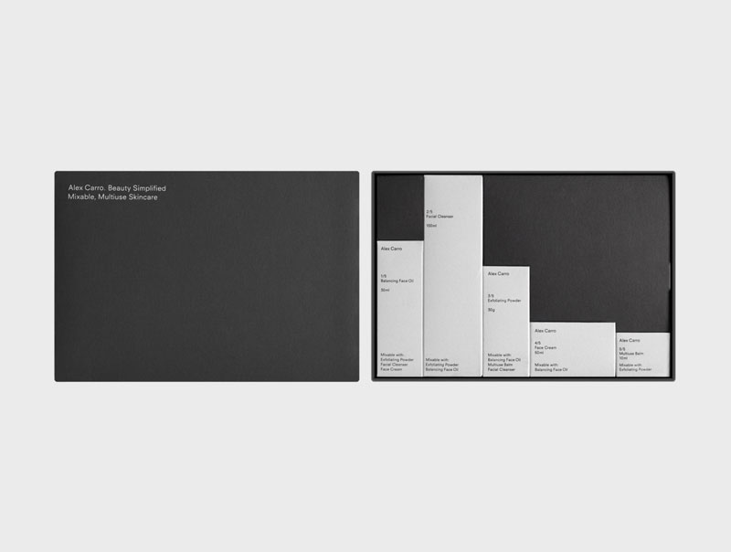
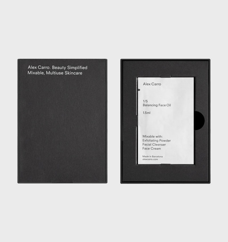
To design their new line of products, Alex Carro, a Barcelona-based skincare brand, hired graphic designer Malva Sawada and art director Andrew Trotter. The duo went for a minimalist design with beautiful use of white space and typography.
My personal favorite is the skincare set that you can see on the first image in this post. It creates a grid-layout type of design that perfectly uses negative space to give a sense of rythm.
To design their new line of products, Alex Carro, a Barcelona-based skincare brand, hired graphic designer Malva Sawada and art director Andrew Trotter. The duo went for a minimalist design with beautiful use of white space and typography.
My personal favorite is the skincare set that you can see on the first image in this post. It creates a grid-layout type of design that perfectly uses negative space to give a sense of rythm.
To design their new line of products, Alex Carro, a Barcelona-based skincare brand, hired graphic designer Malva Sawada and art director Andrew Trotter. The duo went for a minimalist design with beautiful use of white space and typography.
My personal favorite is the skincare set that you can see on the first image in this post. It creates a grid-layout type of design that perfectly uses negative space to give a sense of rythm.
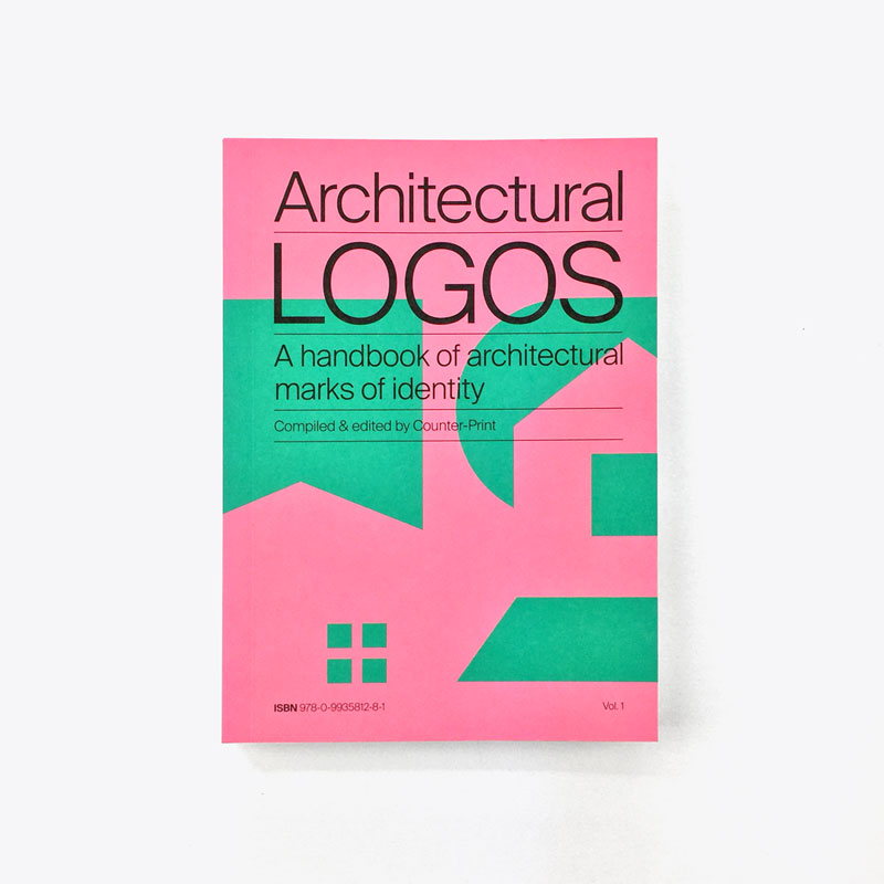
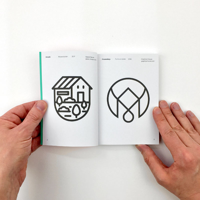
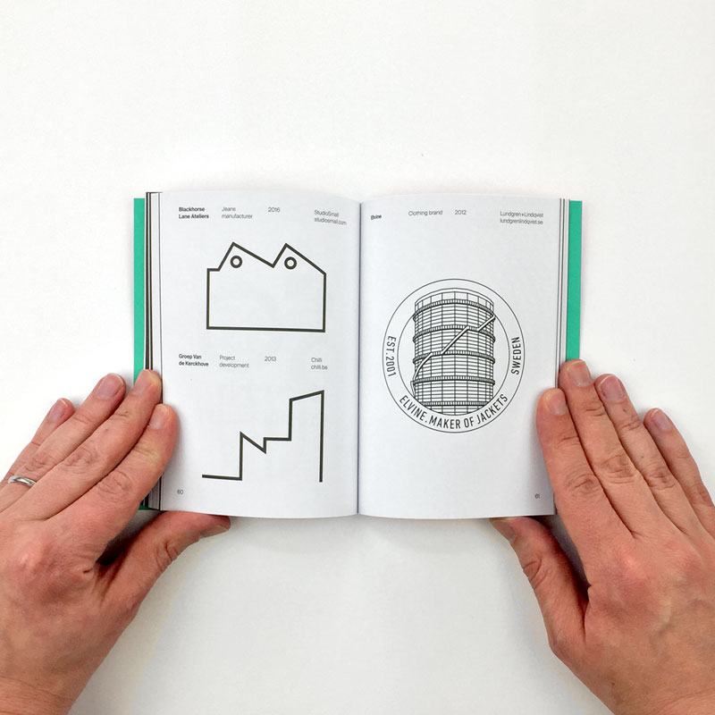
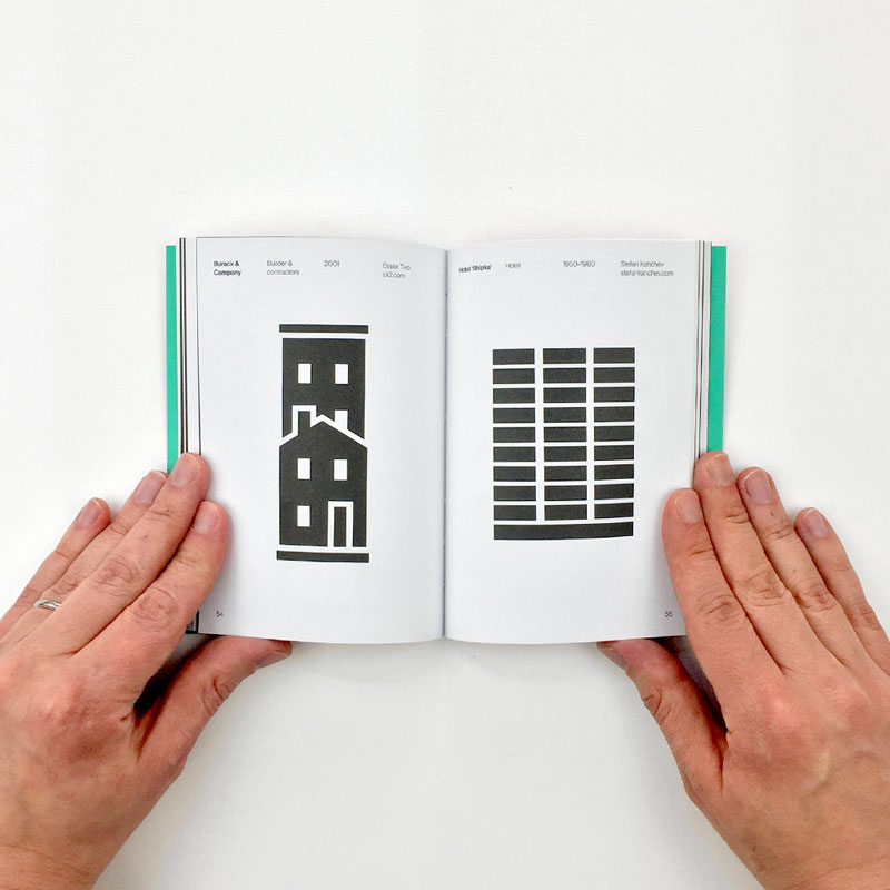
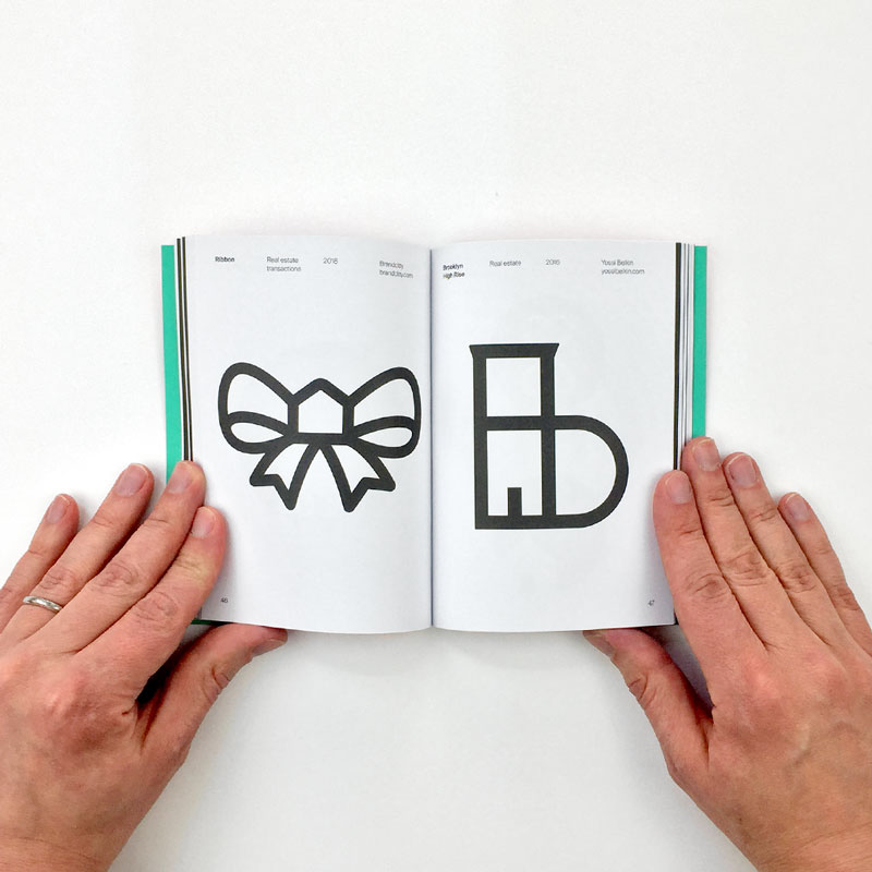
Plenty of logos include architectural elements. Some just use a house or a factory, others are more subtle and just include details or very stylized elements.
Published by Counter Print, the book Architectural Logos collects these occurences of architecture in logo design.
Plenty of logos include architectural elements. Some just use a house or a factory, others are more subtle and just include details or very stylized elements.
Published by Counter Print, the book Architectural Logos collects these occurences of architecture in logo design.
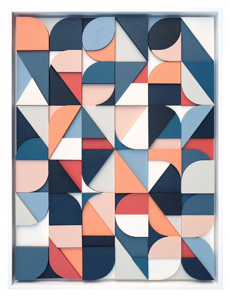
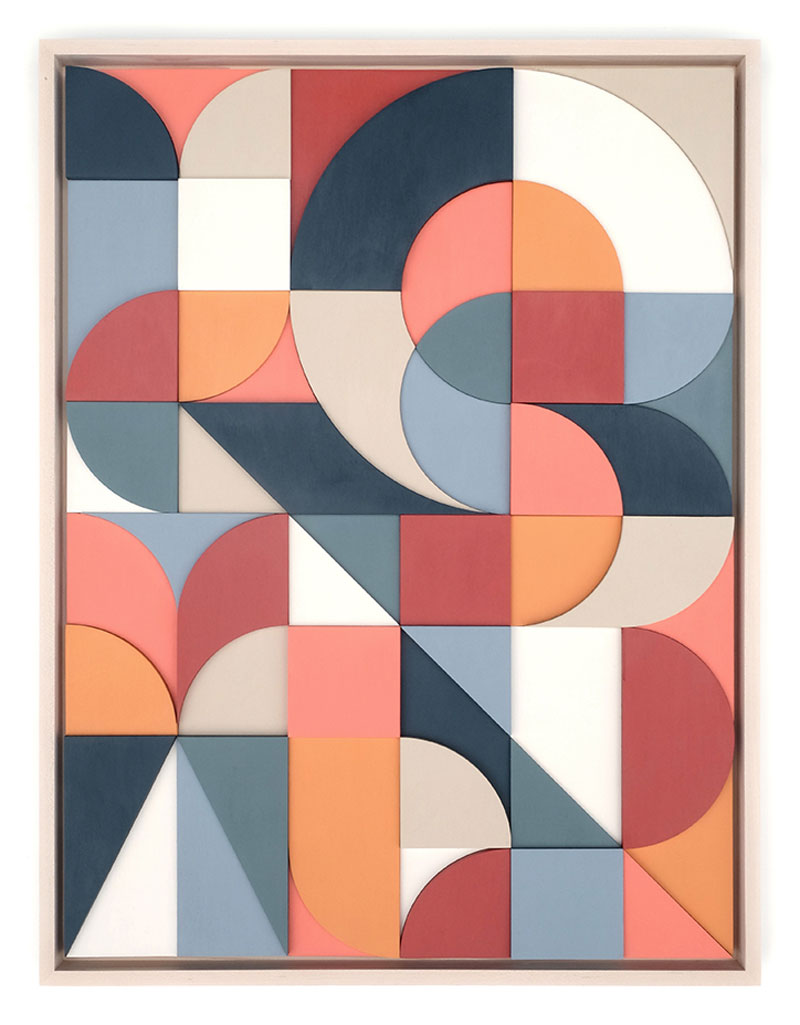
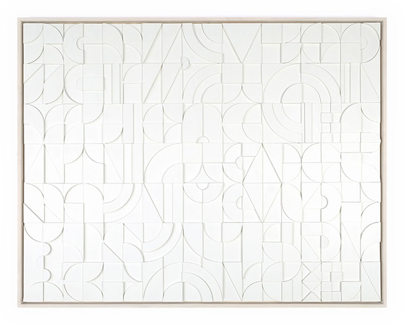
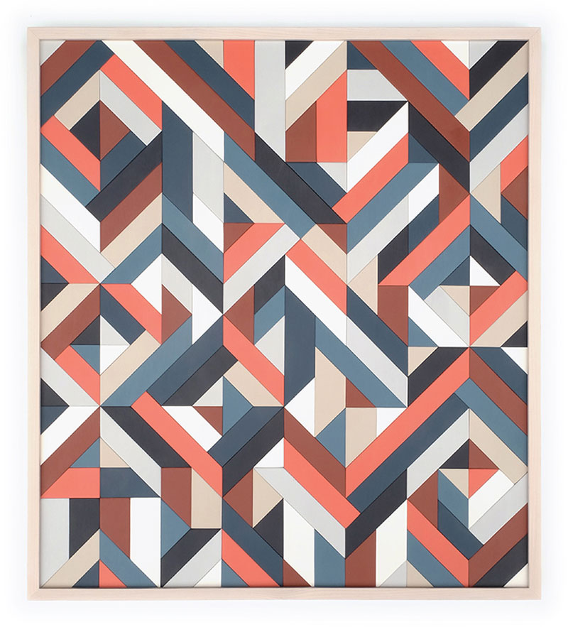
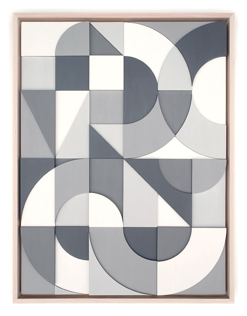
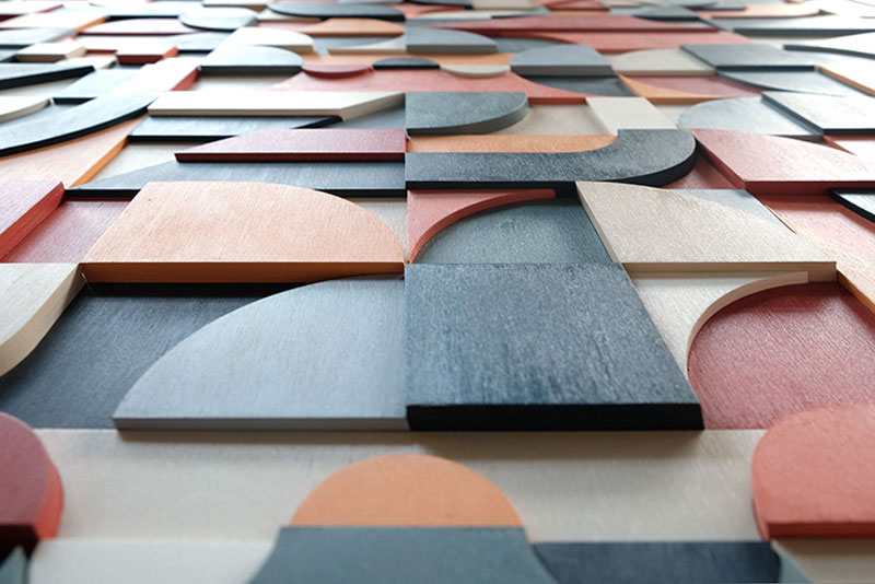
As a graphic designer by formation, Scott Albrecht has developed an interest for typography. He uses this passion for type in his artworks by rearranging typographic forms of various colors and shapes to design jazzy abstract compositions.
The artist works only with wood to create a depth to his work and a more warm texture. He arranges the shapes with a particular attention to details and gives a lot of rythm to the arrangements.
As a graphic designer by formation, Scott Albrecht has developed an interest for typography. He uses this passion for type in his artworks by rearranging typographic forms of various colors and shapes to design jazzy abstract compositions.
The artist works only with wood to create a depth to his work and a more warm texture. He arranges the shapes with a particular attention to details and gives a lot of rythm to the arrangements.
Animating elements, at its most basic, is fairly straightforward. Define the keyframes. Name the animation. Call it on an element.
But sometimes we need something a little more complex to get the right “feel” for the way things move. For example, a sound equalizer might use the same animation on each bar, but they are staggered to give the illusion of being animated independently.
I was recently building a dashboard and wanted the items in one of the widgets to flow into view with a staggered animation.
Just like the sound equalizer above, I started going down the :nth-child route. I used the unordered list (<ul>) as the parent container, gave it a class and employed the :nth-child pseudo selector to offset each list item with animaton-delay.
.my-list li {
  animation: my-animation 300ms ease-out;
}

.my-list li:nth-child(1) {
  animation-delay: 100ms;
}

.my-list li:nth-child(2) {
  animation-delay: 200ms;
}

.my-list li:nth-child(3) {
  animation-delay: 300ms;
}

/* and so on */
This technique does indeed stagger items well, particularly if you know how many items are going to be in the list at any given time. Where things fall apart, however, is when the number of items is unpredictable, which was the case for the widget I was building for the dashboard. I really didn’t want to come back to this piece of code every time the number of items in the list changed, so I knocked out a quick Sass loop that accounts for up to 50 items and increments the animation delay with each item:
.my-list {
  li {
    animation: my-animation 300ms ease-out;

    @for $i from 1 through 50 {
      &:nth-child(#{$i}) {
        animation-delay: 100ms * $i;
      }
    }
  }
}
That should do it! Yet, it feels way too hacky. Sure, it doesn’t add that much weight to the file, but you know the compiled CSS will include a bunch of unused selectors, like nth-child(45).
There must be a better way. This is where I would normally reach for JavaScript to find all of the items and add a delay but… this time I spent a little time exploring to see if there is a way to do it with CSS alone.
How about CSS counters?
The first thing I thought of was using a CSS counter in combination with the calc() function:
The browser support isn’t all that bad (pokes stick at Internet Explorer).
This browser support data is from Caniuse, which has more detail. A number indicates that browser supports the feature at that version and up.
Desktop
Chrome
Opera
Firefox
IE
Edge
Safari
49
36
31
No
16
9.1
Mobile / Tablet
iOS Safari
Opera Mobile
Opera Mini
Android
Android Chrome
Android Firefox
9.3
46
No
67
75
67
One of the great features of CSS is that it will ignore things it doesn’t understand, thanks to the cascade. That means everything will animate in into view together. If that’s not your bag, you can add a feature query to override a default animation:
.my-list li {
  animation: fallback-animation;
}

@supports (--variables) {
  .my-list li {
    animation: fancy-animation;
    animation-delay: calc(var(--animation-order) * 100ms);
  }
}
Vanilla CSS FTW
The more I stop and ask myself whether I need JavaScript, the more I’m amazed what CSS can do on its own. Sure, it would be nice if CSS counters could be used in a calc() function and it would be a pretty elegant solution. But for now, inline custom properties provide both a powerful and flexible way to solve this problem.
Šime posts regular content for web developers on webplatform.news.
In this week’s news, Wikipedia helps identify three slow click handlers, Google Earth comes to the web, SVG properties in CSS get more support, and what to do in the event of zombie cookies.
Tracking down slow event handlers with Event Timing
Event Timing is experimentally available in Chrome (as an Origin Trial) and Wikipedia is taking part in the trial. This API can be used to accurately determine the duration of event handlers with the goal of surfacing slow events.
We quickly identified 3 very frequent slow click handlers experienced frequently by real users on Wikipedia. […] Two of those issues are caused by expensive JavaScript calls causing style recalculation and layout.
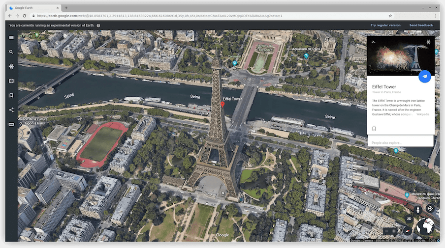
The preview version of Google Earth for Web (powered by WebAssembly) is now available. You can try it out in Chromium-based browsers and Firefox — it runs single-threaded in browsers that don’t yet have (re-)enabled SharedArrayBuffer — but not in Safari because of its lack of full support for WebGL2.
Firefox Nightly has implemented SVG geometry properties (x, y, r, etc.) in CSS. This feature is already supported in Chrome and Safari and is expected to ship in Firefox 69 in September.
Chrome and Firefox allow users to restore the previous browser session on startup. With this option enabled, closing the browser will not delete the user’s session cookies, nor empty the sessionStorage of web pages.
Given this session resumption behavior, it’s more important than ever to ensure that your site behaves reasonably upon receipt of an outdated session cookie (e.g. redirect the user to the login page instead of showing an error).