The Rise of the Sans Serif

Post pobrano z: The Rise of the Sans Serif

In this article, we’ll take a look at the history of sans serif typefaces. You’ll learn what makes them great and discover some wonderful options to consider for your next project.

In the last few years, there has been a big shift in branding. Many high-profile companies have redesigned their logos and replaced classical serifs with sans serif typefaces. The popularity of social media and digital display has influenced the way we think about typefaces and brand development. 

Let’s start by looking into the development of sans serif fonts, and then we’ll see what makes them great and go through a few tips when choosing one for your next project.

The History

Sans serif fonts started developing slowly before the 18th century but weren’t used widely. In 1816, William Caslon IV created a sans serif typeface called Two Lines English Egyptian, which was commissioned by a specific client. 

The Figgins foundry in London released a new sans serif in 1830 that was primarily used in advertising or headings. The anatomy of the face was condensed and bold, resulting in a font that grabbed attention. At this point, sans serifs were called Grotesque due to their “malformations”. 

The Figgins foundrys sans serif font

Later in the 1920s and 1930s, the Bauhaus popularized sans serifs as a reaction to the embellished Art Nouveau style. Bare typefaces were considered beautiful as they didn’t include unnecessary additions. Sans serifs were appreciated for their simple, clean look and high efficiency for reading. Futura, one of the most popular Geometric sans serif styles, was released in 1928. While it features strong geometric lines, Futura followed the styles of its time. 

In the 1960s, the International Typographic style took over the design world by using Helvetica and Univers. This modernist movement emphasized the use of clean and minimalist layouts. Both of these fonts became examples of Neo-grotesque typefaces due to their no-nonsense anatomy. Both typefaces included extensive families that would make them suitable for anything designers would need, from headings to body copy. 

Sans serif typefaces went through another evolution process in the 1970s. The overuse of neutral Neo-grotesque typefaces led to the creation of Humanist sans serifs. At this point, typefaces were lacking the human touch. Humanist fonts are inspired by traditional serifs and calligraphy. Gill Sans, for instance, includes similar forms to those found in Helvetica, but it’s less geometric. Therefore, the typeface is friendlier and more relaxed.

Sans Serif categories

Legibility

Most recently, we’ve seen the rebrand of many labels switching from classic serifs to sans serif typefaces—anything from luxury brands to digital and even bank institutions. Why is sans serif so appealing?

Sleek? Check. 

Sophisticated? Check. 

Legible? It depends… 

Many designers still believe that serifs rule the printed media world, making it easy for our eyes to follow and jump from letter to letter. Sans serifs are increasingly becoming popular as body copy, with great legible typefaces being currently developed. Sans serifs do take the win when it comes to digital displays. Our screens have improved in the last decade, and serifs tend to glare quite a bit in digital displays. We’d need to up the point size significantly to appreciate their beauty. Sans serifs are definitely legible at smaller point sizes, both printed and on screen. Flip through a magazine and you’ll notice that the picture captions and credits are mostly set in sans serifs. They are crisp. 

serif vs sans serif

Personality

In the last few years, many trends came and went away faster than ever. It is difficult to keep up with the increasing use of social media. Aside from being clean and modern, sans serif typefaces offer that trend fluidity that brands are looking for. It has become a priority to accommodate clients and their personality. 

Serif fonts tend to be conservative, classic, and are often classified as feminine. Sans serifs, on the other hand, are more gender neutral and highly adaptable. The redesign of many logos is not only trend-led, it goes hand in hand with the cultural and political climate we’ve been experiencing in the last decade. 

serif logos and their redesigns

Choosing the right font is one of the most important parts of the design process. A thoughtfully chosen typeface can be the foundation that brings a brand together. If you’re looking for that cool, sophisticated look and feel, take a look at a few of our suggestions. Envato Elements has an extensive font library that can help you choose the one typeface for your next project.

Nista Grotesk

Bw Nista is a neutral and clean sans serif font. The anatomy contains clean shapes with quirky details that make it different from regular neo-grotesque fonts. The font comes in seven weights, making it highly functional for any layout or brand development project. 

Nista Grotesk
Nista Grotesk

Gorga Grotesque

Gorga is a humanist sans serif font. It has playful curves, which separate it from cold sans serifs. The package comes with three different weights and their respective italic versions. Gorga Grotesque supports multiple languages. 

Gorga Grotesque
Gorga Grotesque

Noiche Sans Serif

Noiche is a mix of neo-grotesque and a geometric sans serif. The small details like the angle cut on the vertical strokes give it an edgy personality. The font comes in seven different weights and italics. This is perfect if you plan on covering a lot of ground with a single awesome font. 

Noiche Sans Serif
Noiche Sans Serif

Config Font Family

Config is a large family that includes ten weights, italics, and 600 glyphs that support multiple European languages. The font is a condensed geometric sans serif with circular forms. This font has been carefully designed, and all aspects of each character have been considered. The font includes alternates for specific characters that make them interesting when used on display text. 

Config Font Family
Config Font Family

Quadran

Quadran is the right balance of neo-grotesque and geometric sans serif. This contemporary font is contemporary while still maintaining a few classic attributes. The package includes multiple font weights and supports many languages.

Quadran
Quadran

Maiden

This humanist sans serif is inspired by a reverse pen-head style. This package is available with nine weights, from thin to black. This highly legible font is suitable for display text and body text. The discretionary ligatures are beautifully designed and can replace any of the common ligature combinations.

Maiden
Maiden

Monty

Inspired by grotesque fonts, Monty adds a softness by using round curves. This versatile font has a quirky personality that makes it perfect for branding. It’s clean, sophisticated, and fun. The package includes four weights and supports multiple languages.

Monty
Monty

Bergen Sans

Bergen Sans is inspired by the Bauhaus aesthetics. This contemporary sans serif is geometric and clean. The font supports multiple languages and has many OpenType features. It is a small font family, but each font is carefully crafted, including many glyphs in different languages. 

Bergen Sans
Bergen Sans

Liber

Liber is inspired by the geometric forms of Avenir and Futura. The contemporary geometric characters are built on geometric circles and squares while taking roman text fonts into consideration. This modern font includes ten weights, making it suitable for brands and layouts leaning on a single font. 

Liber
Liber

RNS Sanz

RNS Sanz is a neutral, clean, and contemporary sans serif. The open counters on each character make it highly legible and suitable for body copy. RNS Sanz is versatile and is sure to adapt to any theme. The family contains seven weights and standard and tabular figures.

RNS Sanz
RNS Sanz

When to Choose a Sans Serif Font

It’s important to note that sans serif fonts aren’t the right fit for every brand. While they are currently trendy and pretty much everywhere, those shouldn’t be the only reasons for a rebrand. 

When you are redesigning or designing a logo from scratch, examine the brand very carefully. Be specific about your brand, what its personality is, and what you want it to communicate. Think of what can set your brand apart and how your logo can stand out from the same trendy crowd. If you do end up choosing a sans serif font, make sure that you are balancing your design with originality.

Trends tend to be a reaction to what came before. The modernist styles developed in the 20th century were a reaction to Art Nouveau. Art Nouveau was characterized by organic forms and highly stylized elements, while the new modernist styles were composed of abstract compositions, using basic graphic elements and colors. As we see sans serifs becoming trendy, we’re sure to see a reaction to it in the next few years.

In a hurry? We’ve got amazing sans serif fonts over at Envato Elements and GraphicRiver. Go check them out! 

If you liked this article, be sure to check out:

How to Make a Graffiti Text Effect With Photoshop Layer Styles

Post pobrano z: How to Make a Graffiti Text Effect With Photoshop Layer Styles

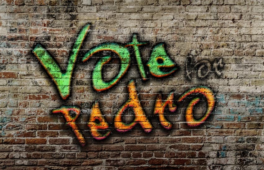
Final product image
What You’ll Be Creating

In this tutorial, I will show you how to create a graffiti text effect in Photoshop. We will use layer styles and the „Blend If” function from the blending options.

The text effect we will be creating is inspired by Graffiti styles from Envato Market.

Graffiti styles

Looking for a shortcut? You can download one of these graffiti fonts to help you create graffiti quickly and easily:

Tutorial Assets

The following assets were used during this text effect tutorial:

1. How to Set the Background and the Text

Step 1

We will use a brick wall background for this graffiti text effect. Open Photoshop and instead of creating a new document, go to File > Open… and select Brick-wall.jpg from the tutorial assets. If you want to try a different background, you can try one of the many wall backgrounds on Envato Elements.

Brick wall

Step 2

Use your Type tool (T), select the Graffogie font with a Size of 285 pt, and write the word „Vote” on your artboard. Then go to Type > Warp Text and select Shell Upper with Bend: 21%, Horizontal Distortion: -29%, and Vertical Distortion: 22%, and hit OK. Finally, select only the letter „V” on your artboard and then go to your Character panel and set the Tracking to -75.

Type Vote

Step 3

Use your Type tool (T) again to write two more words: „for” and „Pedro”. Make sure that each word is on its own layer. Write „for” with the font size 116 pt and tracking 75. Then write „Pedro” on a new layer with the font size 255 pt and tracking 75.

Type for and pedro

Step 4

Use your Move Tool (V) and move the writing together. Then select all three text layers in your Layers panel and hit Control-T. Now set the Rotate to -8°. Finally, we are ready to start creating Photoshop text effects.

Arrange writing

2. How to Create the First Graffiti Text Effect

Step 1

Let’s start by selecting the layer „Vote”. Now go to Layer > Layer Style > Blending Options… and apply the following layer style.

In Blending Options, use these settings:

  • Advanced Blending: 0%
  • Blend if: Grey
  • Underlying Layer: Alt-click (mac users Option-click) on the white marker to split it and then set the left part to 161 and the right part to 236.
Add blending options

Step 2

Add a Bevel and Emboss with these settings:

  • Style: Inner Bevel
  • Technique: Chisel Hard
  • Depth: 144%
  • Direction: Up
  • Size: 8 px
  • Soften: 0 px
  • Uncheck the Use Global Light box
  • Angle: 98º
  • Altitude: 30º
  • Check the Anti-aliased box
  • Highlight Mode: Overlay with color #035b7c  and Opacity: 100%
  • Shadow Mode: Overlay with color #ff3000 and Opacity: 88%
Add a bevel and emboss

Step 3

Add an Inner Shadow to the text effect with these settings:

  • Blend Mode: Normal
  • Color: #000000
  • Opacity: 100%
  • Uncheck the Use Global Light box
  • Angle: -94º
  • Distance: 0 px
  • Choke: 0%
  • Size: 10 px
  • Contour: Cone
  • Check the Anti-aliased box
  • Noise: 11%
Add an inner shadow

Step 4

Add an Inner Glow with these settings:

  • Blend Mode: Normal
  • Color: #000000
  • Opacity: 19%
  • Noise: 61%
  • Technique: Precise
  • Source: Center
  • Choke: 1%
  • Size: 10 px
  • Contour: Cone – Inverted
  • Check the Anti-aliased box
  • Range: 50%
Add an inner glow

Step 5

Add a Satin style with these settings:

  • Blend Mode: Overlay
  • Color: #64ec87
  • Angle: 90°
  • Distance: 19 px
  • Size: 24 px
  • Contour: Half Round
  • Check the Anti-aliased box
  • Check the Invert box
Add a satin

Step 6

Add a Gradient Overlay with these settings:

  • Blend Mode: Linear Burn
  • Check the Dither box
  • Opacity: 6%
  • Style: Linear
  • Angle: 90º
  • Scale: 60%
  • Click on the Gradient and set these stops:
  • Color stops with Color #000000 on Location: 0% and 100%
  • Opacity stop with Opacity: 0% on Location: 0%
  • Opacity stop with Opacity: 100% on Location: 100%
Add a gradient

Step 7

Add an Outer Glow with these settings:

  • Blend Mode: Linear Burn
  • Opacity: 29%
  • Color: #000000
  • Technique: Precise
  • Spread: 50%
  • Size: 3 px
  • Check the Anti-aliased box
Add an outer glow

Step 8

As a final step for this text effect, add a Drop Shadow with these settings:

  • Blend Mode: Normal
  • Pick the color #000000
  • Opacity: 95%
  • Uncheck the Use Global Light box
  • Angle: 90°
  • Distance: 5 px
  • Spread: 39%
  • Size: 24 px
  • Check the Anti-aliased box
  • Noise: 10%

Hit OK to apply all changes.

Add a drop shadow

Here’s the result of the first graffiti text effect applied.

Partial result

3. How to Create the Second Graffiti Text Effect

Step 1

Select the „for” layer and go to Layer > Layer Style > Blending Options… to apply the following layer style.

In Blending Options, use these settings:

  • Advanced Blending: 0%
  • Blend if: Grey
  • Underlying Layer: Alt-click (mac users Option-click) on the white marker to split it and then set the left part to 158 and the right part to 217.
Add blending options

Step 2

Add a Bevel and Emboss to the text effect with these settings:

  • Style: Inner Bevel
  • Technique: Smooth
  • Depth: 100%
  • Direction: Up
  • Size: 8 px
  • Soften: 0 px
  • Uncheck the Use Global Light box
  • Angle: 90º
  • Altitude: 30º
  • Check the Anti-aliased box
  • Highlight Mode – Opacity: 0%
  • Shadow Mode: Multiply with color #000000 and Opacity: 50%
Add a bevel and emboss

Step 3

Add a Stroke with these settings:

  • Size: 1 px
  • Position: Outside
  • Fill Type: Color
  • Color: #000000
Add a stroke

Step 4

Add an Inner Shadow with these settings:

  • Blend Mode: Normal
  • Color: #000000
  • Opacity: 100%
  • Uncheck the Use Global Light box
  • Angle: -94º
  • Distance: 0 px
  • Choke: 18%
  • Size: 5 px
  • Check the Anti-aliased box
  • Noise: 11%
Add an inner shadow

Step 5

Add an Inner Glow with these settings:

  • Blend Mode: Normal
  • Color: #000000
  • Opacity: 30%
  • Noise: 61%
  • Technique: Precise
  • Source: Edge
  • Choke: 1%
  • Size: 4 px
  • Check the Anti-aliased box
  • Range: 50%
Add an inner glow

Step 6

Add a Drop Shadow with these settings to finish this text effect:

  • Blend Mode: Normal
  • Pick the color #000000
  • Opacity: 956%
  • Uncheck the Use Global Light box
  • Angle: 90°
  • Distance: 5 px
  • Spread: 27%
  • Size: 18 px
  • Check the Anti-aliased box
  • Noise: 17%

Hit OK to apply the layer style.

Add a drop shadow

Here’s the result of the second graffiti text effect applied.

Partial result

4. How to Create the Third Graffiti Text Effect

Step 1

Select the „pedro” layer and go to Layer > Layer Style > Blending Options… to apply the following layer style.

In Blending Options, use these settings:

  • Advanced Blending: 0%
  • Blend if: Grey
  • Underlying Layer: Alt-click (mac users Option-click) on the white marker to split it and then set the left part to 139 and the right part to 201. Then split the black marker and set its right part to 80.
Add blending options

Step 2

Add a Bevel and Emboss with these settings:

  • Style: Inner Bevel
  • Technique: Chisel Hard
  • Depth: 144%
  • Direction: Up
  • Size: 8 px
  • Soften: 0 px
  • Uncheck the Use Global Light box
  • Angle: 98º
  • Altitude: 30º
  • Check the Anti-aliased box
  • Highlight Mode: Overlay with color #1faee3  and Opacity: 100%
  • Shadow Mode: Overlay with color #ce43db and Opacity: 88%
Add a bevel and emboss

Step 3

Add an Inner Shadow to the text effect with these settings:

  • Blend Mode: Normal
  • Color: #000000
  • Opacity: 100%
  • Uncheck the Use Global Light box
  • Angle: -94º
  • Distance: 0 px
  • Choke: 0%
  • Size: 10 px
  • Contour: Cone
  • Check the Anti-aliased box
  • Noise: 11%
Add an inner shadow

Step 4

Add an Inner Glow with these settings:

  • Blend Mode: Linear Dodge (Add)
  • Color: #dd8925
  • Opacity: 33%
  • Noise: 47%
  • Technique: Precise
  • Source: Center
  • Choke: 58%
  • Size: 16 px
  • Check the Anti-aliased box
  • Range: 50%
Add an inner glow

Step 5

Add a Satin with these settings:

  • Blend Mode: Overlay
  • Color: #f08d18
  • Angle: 90°
  • Distance: 19 px
  • Size: 24 px
  • Contour: Half Round
  • Check the Anti-aliased box
  • Check the Invert box
Add a satin

Step 6

Add a Gradient Overlay with these settings:

  • Blend Mode: Linear Burn
  • Check the Dither box
  • Opacity: 6%
  • Style: Linear
  • Angle: 90º
  • Scale: 60%
  • Click on the Gradient and set these stops:
  • Color stops with Color #000000 on Location: 0% and 100%
  • Opacity stop with Opacity: 0% on Location: 0%
  • Opacity stop with Opacity: 100% on Location: 100%
Add a gradient

Step 7

Add an Outer Glow with these settings:

  • Blend Mode: Linear Burn
  • Opacity: 29%
  • Color: #000000
  • Technique: Precise
  • Spread: 40%
  • Size: 2 px
  • Check the Anti-aliased box
Add an outer glow

Step 8

As a final step for this text effect, add a Drop Shadow with these settings:

  • Blend Mode: Normal
  • Pick the color #000000
  • Opacity: 96%
  • Uncheck the Use Global Light box
  • Angle: 90°
  • Distance: 5 px
  • Spread: 39%
  • Size: 24 px
  • Check the Anti-aliased box
  • Noise: 10%

Hit OK to apply the text effects.

Add a drop shadow

Congratulations! You’re Done!

In this tutorial, you learned how to use layer styles and blending options to create some cool graffiti text effects in Adobe
Photoshop.

We started by creating our text, and then we changed it with blending options and layer styles to three different graffiti effects on the wall.

Final result

The text effect we created was inspired by Graffiti styles from Envato Market.

Graffiti styles

I hope you have enjoyed this tutorial. Please feel free to leave your
comments, suggestions, and outcomes below. Here are some other tutorials you may enjoy:

How to Make a Graffiti Text Effect With Photoshop Layer Styles

Post pobrano z: How to Make a Graffiti Text Effect With Photoshop Layer Styles

Final product image
What You’ll Be Creating

In this tutorial, I will show you how to create a graffiti text effect in Photoshop. We will use layer styles and the „Blend If” function from the blending options.

The text effect we will be creating is inspired by Graffiti styles from Envato Market.

Graffiti styles

Looking for a shortcut? You can download one of these graffiti fonts to help you create graffiti quickly and easily:

Tutorial Assets

The following assets were used during this text effect tutorial:

1. How to Set the Background and the Text

Step 1

We will use a brick wall background for this graffiti text effect. Open Photoshop and instead of creating a new document, go to File > Open… and select Brick-wall.jpg from the tutorial assets. If you want to try a different background, you can try one of the many wall backgrounds on Envato Elements.

Brick wall

Step 2

Use your Type tool (T), select the Graffogie font with a Size of 285 pt, and write the word „Vote” on your artboard. Then go to Type > Warp Text and select Shell Upper with Bend: 21%, Horizontal Distortion: -29%, and Vertical Distortion: 22%, and hit OK. Finally, select only the letter „V” on your artboard and then go to your Character panel and set the Tracking to -75.

Type Vote

Step 3

Use your Type tool (T) again to write two more words: „for” and „Pedro”. Make sure that each word is on its own layer. Write „for” with the font size 116 pt and tracking 75. Then write „Pedro” on a new layer with the font size 255 pt and tracking 75.

Type for and pedro

Step 4

Use your Move Tool (V) and move the writing together. Then select all three text layers in your Layers panel and hit Control-T. Now set the Rotate to -8°. Finally, we are ready to start creating Photoshop text effects.

Arrange writing

2. How to Create the First Graffiti Text Effect

Step 1

Let’s start by selecting the layer „Vote”. Now go to Layer > Layer Style > Blending Options… and apply the following layer style.

In Blending Options, use these settings:

  • Advanced Blending: 0%
  • Blend if: Grey
  • Underlying Layer: Alt-click (mac users Option-click) on the white marker to split it and then set the left part to 161 and the right part to 236.
Add blending options

Step 2

Add a Bevel and Emboss with these settings:

  • Style: Inner Bevel
  • Technique: Chisel Hard
  • Depth: 144%
  • Direction: Up
  • Size: 8 px
  • Soften: 0 px
  • Uncheck the Use Global Light box
  • Angle: 98º
  • Altitude: 30º
  • Check the Anti-aliased box
  • Highlight Mode: Overlay with color #035b7c  and Opacity: 100%
  • Shadow Mode: Overlay with color #ff3000 and Opacity: 88%
Add a bevel and emboss

Step 3

Add an Inner Shadow to the text effect with these settings:

  • Blend Mode: Normal
  • Color: #000000
  • Opacity: 100%
  • Uncheck the Use Global Light box
  • Angle: -94º
  • Distance: 0 px
  • Choke: 0%
  • Size: 10 px
  • Contour: Cone
  • Check the Anti-aliased box
  • Noise: 11%
Add an inner shadow

Step 4

Add an Inner Glow with these settings:

  • Blend Mode: Normal
  • Color: #000000
  • Opacity: 19%
  • Noise: 61%
  • Technique: Precise
  • Source: Center
  • Choke: 1%
  • Size: 10 px
  • Contour: Cone – Inverted
  • Check the Anti-aliased box
  • Range: 50%
Add an inner glow

Step 5

Add a Satin style with these settings:

  • Blend Mode: Overlay
  • Color: #64ec87
  • Angle: 90°
  • Distance: 19 px
  • Size: 24 px
  • Contour: Half Round
  • Check the Anti-aliased box
  • Check the Invert box
Add a satin

Step 6

Add a Gradient Overlay with these settings:

  • Blend Mode: Linear Burn
  • Check the Dither box
  • Opacity: 6%
  • Style: Linear
  • Angle: 90º
  • Scale: 60%
  • Click on the Gradient and set these stops:
  • Color stops with Color #000000 on Location: 0% and 100%
  • Opacity stop with Opacity: 0% on Location: 0%
  • Opacity stop with Opacity: 100% on Location: 100%
Add a gradient

Step 7

Add an Outer Glow with these settings:

  • Blend Mode: Linear Burn
  • Opacity: 29%
  • Color: #000000
  • Technique: Precise
  • Spread: 50%
  • Size: 3 px
  • Check the Anti-aliased box
Add an outer glow

Step 8

As a final step for this text effect, add a Drop Shadow with these settings:

  • Blend Mode: Normal
  • Pick the color #000000
  • Opacity: 95%
  • Uncheck the Use Global Light box
  • Angle: 90°
  • Distance: 5 px
  • Spread: 39%
  • Size: 24 px
  • Check the Anti-aliased box
  • Noise: 10%

Hit OK to apply all changes.

Add a drop shadow

Here’s the result of the first graffiti text effect applied.

Partial result

3. How to Create the Second Graffiti Text Effect

Step 1

Select the „for” layer and go to Layer > Layer Style > Blending Options… to apply the following layer style.

In Blending Options, use these settings:

  • Advanced Blending: 0%
  • Blend if: Grey
  • Underlying Layer: Alt-click (mac users Option-click) on the white marker to split it and then set the left part to 158 and the right part to 217.
Add blending options

Step 2

Add a Bevel and Emboss to the text effect with these settings:

  • Style: Inner Bevel
  • Technique: Smooth
  • Depth: 100%
  • Direction: Up
  • Size: 8 px
  • Soften: 0 px
  • Uncheck the Use Global Light box
  • Angle: 90º
  • Altitude: 30º
  • Check the Anti-aliased box
  • Highlight Mode – Opacity: 0%
  • Shadow Mode: Multiply with color #000000 and Opacity: 50%
Add a bevel and emboss

Step 3

Add a Stroke with these settings:

  • Size: 1 px
  • Position: Outside
  • Fill Type: Color
  • Color: #000000
Add a stroke

Step 4

Add an Inner Shadow with these settings:

  • Blend Mode: Normal
  • Color: #000000
  • Opacity: 100%
  • Uncheck the Use Global Light box
  • Angle: -94º
  • Distance: 0 px
  • Choke: 18%
  • Size: 5 px
  • Check the Anti-aliased box
  • Noise: 11%
Add an inner shadow

Step 5

Add an Inner Glow with these settings:

  • Blend Mode: Normal
  • Color: #000000
  • Opacity: 30%
  • Noise: 61%
  • Technique: Precise
  • Source: Edge
  • Choke: 1%
  • Size: 4 px
  • Check the Anti-aliased box
  • Range: 50%
Add an inner glow

Step 6

Add a Drop Shadow with these settings to finish this text effect:

  • Blend Mode: Normal
  • Pick the color #000000
  • Opacity: 956%
  • Uncheck the Use Global Light box
  • Angle: 90°
  • Distance: 5 px
  • Spread: 27%
  • Size: 18 px
  • Check the Anti-aliased box
  • Noise: 17%

Hit OK to apply the layer style.

Add a drop shadow

Here’s the result of the second graffiti text effect applied.

Partial result

4. How to Create the Third Graffiti Text Effect

Step 1

Select the „pedro” layer and go to Layer > Layer Style > Blending Options… to apply the following layer style.

In Blending Options, use these settings:

  • Advanced Blending: 0%
  • Blend if: Grey
  • Underlying Layer: Alt-click (mac users Option-click) on the white marker to split it and then set the left part to 139 and the right part to 201. Then split the black marker and set its right part to 80.
Add blending options

Step 2

Add a Bevel and Emboss with these settings:

  • Style: Inner Bevel
  • Technique: Chisel Hard
  • Depth: 144%
  • Direction: Up
  • Size: 8 px
  • Soften: 0 px
  • Uncheck the Use Global Light box
  • Angle: 98º
  • Altitude: 30º
  • Check the Anti-aliased box
  • Highlight Mode: Overlay with color #1faee3  and Opacity: 100%
  • Shadow Mode: Overlay with color #ce43db and Opacity: 88%
Add a bevel and emboss

Step 3

Add an Inner Shadow to the text effect with these settings:

  • Blend Mode: Normal
  • Color: #000000
  • Opacity: 100%
  • Uncheck the Use Global Light box
  • Angle: -94º
  • Distance: 0 px
  • Choke: 0%
  • Size: 10 px
  • Contour: Cone
  • Check the Anti-aliased box
  • Noise: 11%
Add an inner shadow

Step 4

Add an Inner Glow with these settings:

  • Blend Mode: Linear Dodge (Add)
  • Color: #dd8925
  • Opacity: 33%
  • Noise: 47%
  • Technique: Precise
  • Source: Center
  • Choke: 58%
  • Size: 16 px
  • Check the Anti-aliased box
  • Range: 50%
Add an inner glow

Step 5

Add a Satin with these settings:

  • Blend Mode: Overlay
  • Color: #f08d18
  • Angle: 90°
  • Distance: 19 px
  • Size: 24 px
  • Contour: Half Round
  • Check the Anti-aliased box
  • Check the Invert box
Add a satin

Step 6

Add a Gradient Overlay with these settings:

  • Blend Mode: Linear Burn
  • Check the Dither box
  • Opacity: 6%
  • Style: Linear
  • Angle: 90º
  • Scale: 60%
  • Click on the Gradient and set these stops:
  • Color stops with Color #000000 on Location: 0% and 100%
  • Opacity stop with Opacity: 0% on Location: 0%
  • Opacity stop with Opacity: 100% on Location: 100%
Add a gradient

Step 7

Add an Outer Glow with these settings:

  • Blend Mode: Linear Burn
  • Opacity: 29%
  • Color: #000000
  • Technique: Precise
  • Spread: 40%
  • Size: 2 px
  • Check the Anti-aliased box
Add an outer glow

Step 8

As a final step for this text effect, add a Drop Shadow with these settings:

  • Blend Mode: Normal
  • Pick the color #000000
  • Opacity: 96%
  • Uncheck the Use Global Light box
  • Angle: 90°
  • Distance: 5 px
  • Spread: 39%
  • Size: 24 px
  • Check the Anti-aliased box
  • Noise: 10%

Hit OK to apply the text effects.

Add a drop shadow

Congratulations! You’re Done!

In this tutorial, you learned how to use layer styles and blending options to create some cool graffiti text effects in Adobe
Photoshop.

We started by creating our text, and then we changed it with blending options and layer styles to three different graffiti effects on the wall.

Final result

The text effect we created was inspired by Graffiti styles from Envato Market.

Graffiti styles

I hope you have enjoyed this tutorial. Please feel free to leave your
comments, suggestions, and outcomes below. Here are some other tutorials you may enjoy:

How to Make a Graffiti Text Effect With Photoshop Layer Styles

Post pobrano z: How to Make a Graffiti Text Effect With Photoshop Layer Styles

Final product image
What You’ll Be Creating

In this tutorial, I will show you how to create a graffiti text effect in Photoshop. We will use layer styles and the „Blend If” function from the blending options.

The text effect we will be creating is inspired by Graffiti styles from Envato Market.

Graffiti styles

Looking for a shortcut? You can download one of these graffiti fonts to help you create graffiti quickly and easily:

Tutorial Assets

The following assets were used during this text effect tutorial:

1. How to Set the Background and the Text

Step 1

We will use a brick wall background for this graffiti text effect. Open Photoshop and instead of creating a new document, go to File > Open… and select Brick-wall.jpg from the tutorial assets. If you want to try a different background, you can try one of the many wall backgrounds on Envato Elements.

Brick wall

Step 2

Use your Type tool (T), select the Graffogie font with a Size of 285 pt, and write the word „Vote” on your artboard. Then go to Type > Warp Text and select Shell Upper with Bend: 21%, Horizontal Distortion: -29%, and Vertical Distortion: 22%, and hit OK. Finally, select only the letter „V” on your artboard and then go to your Character panel and set the Tracking to -75.

Type Vote

Step 3

Use your Type tool (T) again to write two more words: „for” and „Pedro”. Make sure that each word is on its own layer. Write „for” with the font size 116 pt and tracking 75. Then write „Pedro” on a new layer with the font size 255 pt and tracking 75.

Type for and pedro

Step 4

Use your Move Tool (V) and move the writing together. Then select all three text layers in your Layers panel and hit Control-T. Now set the Rotate to -8°. Finally, we are ready to start creating Photoshop text effects.

Arrange writing

2. How to Create the First Graffiti Text Effect

Step 1

Let’s start by selecting the layer „Vote”. Now go to Layer > Layer Style > Blending Options… and apply the following layer style.

In Blending Options, use these settings:

  • Advanced Blending: 0%
  • Blend if: Grey
  • Underlying Layer: Alt-click (mac users Option-click) on the white marker to split it and then set the left part to 161 and the right part to 236.
Add blending options

Step 2

Add a Bevel and Emboss with these settings:

  • Style: Inner Bevel
  • Technique: Chisel Hard
  • Depth: 144%
  • Direction: Up
  • Size: 8 px
  • Soften: 0 px
  • Uncheck the Use Global Light box
  • Angle: 98º
  • Altitude: 30º
  • Check the Anti-aliased box
  • Highlight Mode: Overlay with color #035b7c  and Opacity: 100%
  • Shadow Mode: Overlay with color #ff3000 and Opacity: 88%
Add a bevel and emboss

Step 3

Add an Inner Shadow to the text effect with these settings:

  • Blend Mode: Normal
  • Color: #000000
  • Opacity: 100%
  • Uncheck the Use Global Light box
  • Angle: -94º
  • Distance: 0 px
  • Choke: 0%
  • Size: 10 px
  • Contour: Cone
  • Check the Anti-aliased box
  • Noise: 11%
Add an inner shadow

Step 4

Add an Inner Glow with these settings:

  • Blend Mode: Normal
  • Color: #000000
  • Opacity: 19%
  • Noise: 61%
  • Technique: Precise
  • Source: Center
  • Choke: 1%
  • Size: 10 px
  • Contour: Cone – Inverted
  • Check the Anti-aliased box
  • Range: 50%
Add an inner glow

Step 5

Add a Satin style with these settings:

  • Blend Mode: Overlay
  • Color: #64ec87
  • Angle: 90°
  • Distance: 19 px
  • Size: 24 px
  • Contour: Half Round
  • Check the Anti-aliased box
  • Check the Invert box
Add a satin

Step 6

Add a Gradient Overlay with these settings:

  • Blend Mode: Linear Burn
  • Check the Dither box
  • Opacity: 6%
  • Style: Linear
  • Angle: 90º
  • Scale: 60%
  • Click on the Gradient and set these stops:
  • Color stops with Color #000000 on Location: 0% and 100%
  • Opacity stop with Opacity: 0% on Location: 0%
  • Opacity stop with Opacity: 100% on Location: 100%
Add a gradient

Step 7

Add an Outer Glow with these settings:

  • Blend Mode: Linear Burn
  • Opacity: 29%
  • Color: #000000
  • Technique: Precise
  • Spread: 50%
  • Size: 3 px
  • Check the Anti-aliased box
Add an outer glow

Step 8

As a final step for this text effect, add a Drop Shadow with these settings:

  • Blend Mode: Normal
  • Pick the color #000000
  • Opacity: 95%
  • Uncheck the Use Global Light box
  • Angle: 90°
  • Distance: 5 px
  • Spread: 39%
  • Size: 24 px
  • Check the Anti-aliased box
  • Noise: 10%

Hit OK to apply all changes.

Add a drop shadow

Here’s the result of the first graffiti text effect applied.

Partial result

3. How to Create the Second Graffiti Text Effect

Step 1

Select the „for” layer and go to Layer > Layer Style > Blending Options… to apply the following layer style.

In Blending Options, use these settings:

  • Advanced Blending: 0%
  • Blend if: Grey
  • Underlying Layer: Alt-click (mac users Option-click) on the white marker to split it and then set the left part to 158 and the right part to 217.
Add blending options

Step 2

Add a Bevel and Emboss to the text effect with these settings:

  • Style: Inner Bevel
  • Technique: Smooth
  • Depth: 100%
  • Direction: Up
  • Size: 8 px
  • Soften: 0 px
  • Uncheck the Use Global Light box
  • Angle: 90º
  • Altitude: 30º
  • Check the Anti-aliased box
  • Highlight Mode – Opacity: 0%
  • Shadow Mode: Multiply with color #000000 and Opacity: 50%
Add a bevel and emboss

Step 3

Add a Stroke with these settings:

  • Size: 1 px
  • Position: Outside
  • Fill Type: Color
  • Color: #000000
Add a stroke

Step 4

Add an Inner Shadow with these settings:

  • Blend Mode: Normal
  • Color: #000000
  • Opacity: 100%
  • Uncheck the Use Global Light box
  • Angle: -94º
  • Distance: 0 px
  • Choke: 18%
  • Size: 5 px
  • Check the Anti-aliased box
  • Noise: 11%
Add an inner shadow

Step 5

Add an Inner Glow with these settings:

  • Blend Mode: Normal
  • Color: #000000
  • Opacity: 30%
  • Noise: 61%
  • Technique: Precise
  • Source: Edge
  • Choke: 1%
  • Size: 4 px
  • Check the Anti-aliased box
  • Range: 50%
Add an inner glow

Step 6

Add a Drop Shadow with these settings to finish this text effect:

  • Blend Mode: Normal
  • Pick the color #000000
  • Opacity: 956%
  • Uncheck the Use Global Light box
  • Angle: 90°
  • Distance: 5 px
  • Spread: 27%
  • Size: 18 px
  • Check the Anti-aliased box
  • Noise: 17%

Hit OK to apply the layer style.

Add a drop shadow

Here’s the result of the second graffiti text effect applied.

Partial result

4. How to Create the Third Graffiti Text Effect

Step 1

Select the „pedro” layer and go to Layer > Layer Style > Blending Options… to apply the following layer style.

In Blending Options, use these settings:

  • Advanced Blending: 0%
  • Blend if: Grey
  • Underlying Layer: Alt-click (mac users Option-click) on the white marker to split it and then set the left part to 139 and the right part to 201. Then split the black marker and set its right part to 80.
Add blending options

Step 2

Add a Bevel and Emboss with these settings:

  • Style: Inner Bevel
  • Technique: Chisel Hard
  • Depth: 144%
  • Direction: Up
  • Size: 8 px
  • Soften: 0 px
  • Uncheck the Use Global Light box
  • Angle: 98º
  • Altitude: 30º
  • Check the Anti-aliased box
  • Highlight Mode: Overlay with color #1faee3  and Opacity: 100%
  • Shadow Mode: Overlay with color #ce43db and Opacity: 88%
Add a bevel and emboss

Step 3

Add an Inner Shadow to the text effect with these settings:

  • Blend Mode: Normal
  • Color: #000000
  • Opacity: 100%
  • Uncheck the Use Global Light box
  • Angle: -94º
  • Distance: 0 px
  • Choke: 0%
  • Size: 10 px
  • Contour: Cone
  • Check the Anti-aliased box
  • Noise: 11%
Add an inner shadow

Step 4

Add an Inner Glow with these settings:

  • Blend Mode: Linear Dodge (Add)
  • Color: #dd8925
  • Opacity: 33%
  • Noise: 47%
  • Technique: Precise
  • Source: Center
  • Choke: 58%
  • Size: 16 px
  • Check the Anti-aliased box
  • Range: 50%
Add an inner glow

Step 5

Add a Satin with these settings:

  • Blend Mode: Overlay
  • Color: #f08d18
  • Angle: 90°
  • Distance: 19 px
  • Size: 24 px
  • Contour: Half Round
  • Check the Anti-aliased box
  • Check the Invert box
Add a satin

Step 6

Add a Gradient Overlay with these settings:

  • Blend Mode: Linear Burn
  • Check the Dither box
  • Opacity: 6%
  • Style: Linear
  • Angle: 90º
  • Scale: 60%
  • Click on the Gradient and set these stops:
  • Color stops with Color #000000 on Location: 0% and 100%
  • Opacity stop with Opacity: 0% on Location: 0%
  • Opacity stop with Opacity: 100% on Location: 100%
Add a gradient

Step 7

Add an Outer Glow with these settings:

  • Blend Mode: Linear Burn
  • Opacity: 29%
  • Color: #000000
  • Technique: Precise
  • Spread: 40%
  • Size: 2 px
  • Check the Anti-aliased box
Add an outer glow

Step 8

As a final step for this text effect, add a Drop Shadow with these settings:

  • Blend Mode: Normal
  • Pick the color #000000
  • Opacity: 96%
  • Uncheck the Use Global Light box
  • Angle: 90°
  • Distance: 5 px
  • Spread: 39%
  • Size: 24 px
  • Check the Anti-aliased box
  • Noise: 10%

Hit OK to apply the text effects.

Add a drop shadow

Congratulations! You’re Done!

In this tutorial, you learned how to use layer styles and blending options to create some cool graffiti text effects in Adobe
Photoshop.

We started by creating our text, and then we changed it with blending options and layer styles to three different graffiti effects on the wall.

Final result

The text effect we created was inspired by Graffiti styles from Envato Market.

Graffiti styles

I hope you have enjoyed this tutorial. Please feel free to leave your
comments, suggestions, and outcomes below. Here are some other tutorials you may enjoy:

How to Make a Graffiti Text Effect With Photoshop Layer Styles

Post pobrano z: How to Make a Graffiti Text Effect With Photoshop Layer Styles

Final product image
What You’ll Be Creating

In this tutorial, I will show you how to create a graffiti text effect in Photoshop. We will use layer styles and the „Blend If” function from the blending options.

The text effect we will be creating is inspired by Graffiti styles from Envato Market.

Graffiti styles

Looking for a shortcut? You can download one of these graffiti fonts to help you create graffiti quickly and easily:

Tutorial Assets

The following assets were used during this text effect tutorial:

1. How to Set the Background and the Text

Step 1

We will use a brick wall background for this graffiti text effect. Open Photoshop and instead of creating a new document, go to File > Open… and select Brick-wall.jpg from the tutorial assets. If you want to try a different background, you can try one of the many wall backgrounds on Envato Elements.

Brick wall

Step 2

Use your Type tool (T), select the Graffogie font with a Size of 285 pt, and write the word „Vote” on your artboard. Then go to Type > Warp Text and select Shell Upper with Bend: 21%, Horizontal Distortion: -29%, and Vertical Distortion: 22%, and hit OK. Finally, select only the letter „V” on your artboard and then go to your Character panel and set the Tracking to -75.

Type Vote

Step 3

Use your Type tool (T) again to write two more words: „for” and „Pedro”. Make sure that each word is on its own layer. Write „for” with the font size 116 pt and tracking 75. Then write „Pedro” on a new layer with the font size 255 pt and tracking 75.

Type for and pedro

Step 4

Use your Move Tool (V) and move the writing together. Then select all three text layers in your Layers panel and hit Control-T. Now set the Rotate to -8°. Finally, we are ready to start creating Photoshop text effects.

Arrange writing

2. How to Create the First Graffiti Text Effect

Step 1

Let’s start by selecting the layer „Vote”. Now go to Layer > Layer Style > Blending Options… and apply the following layer style.

In Blending Options, use these settings:

  • Advanced Blending: 0%
  • Blend if: Grey
  • Underlying Layer: Alt-click (mac users Option-click) on the white marker to split it and then set the left part to 161 and the right part to 236.
Add blending options

Step 2

Add a Bevel and Emboss with these settings:

  • Style: Inner Bevel
  • Technique: Chisel Hard
  • Depth: 144%
  • Direction: Up
  • Size: 8 px
  • Soften: 0 px
  • Uncheck the Use Global Light box
  • Angle: 98º
  • Altitude: 30º
  • Check the Anti-aliased box
  • Highlight Mode: Overlay with color #035b7c  and Opacity: 100%
  • Shadow Mode: Overlay with color #ff3000 and Opacity: 88%
Add a bevel and emboss

Step 3

Add an Inner Shadow to the text effect with these settings:

  • Blend Mode: Normal
  • Color: #000000
  • Opacity: 100%
  • Uncheck the Use Global Light box
  • Angle: -94º
  • Distance: 0 px
  • Choke: 0%
  • Size: 10 px
  • Contour: Cone
  • Check the Anti-aliased box
  • Noise: 11%
Add an inner shadow

Step 4

Add an Inner Glow with these settings:

  • Blend Mode: Normal
  • Color: #000000
  • Opacity: 19%
  • Noise: 61%
  • Technique: Precise
  • Source: Center
  • Choke: 1%
  • Size: 10 px
  • Contour: Cone – Inverted
  • Check the Anti-aliased box
  • Range: 50%
Add an inner glow

Step 5

Add a Satin style with these settings:

  • Blend Mode: Overlay
  • Color: #64ec87
  • Angle: 90°
  • Distance: 19 px
  • Size: 24 px
  • Contour: Half Round
  • Check the Anti-aliased box
  • Check the Invert box
Add a satin

Step 6

Add a Gradient Overlay with these settings:

  • Blend Mode: Linear Burn
  • Check the Dither box
  • Opacity: 6%
  • Style: Linear
  • Angle: 90º
  • Scale: 60%
  • Click on the Gradient and set these stops:
  • Color stops with Color #000000 on Location: 0% and 100%
  • Opacity stop with Opacity: 0% on Location: 0%
  • Opacity stop with Opacity: 100% on Location: 100%
Add a gradient

Step 7

Add an Outer Glow with these settings:

  • Blend Mode: Linear Burn
  • Opacity: 29%
  • Color: #000000
  • Technique: Precise
  • Spread: 50%
  • Size: 3 px
  • Check the Anti-aliased box
Add an outer glow

Step 8

As a final step for this text effect, add a Drop Shadow with these settings:

  • Blend Mode: Normal
  • Pick the color #000000
  • Opacity: 95%
  • Uncheck the Use Global Light box
  • Angle: 90°
  • Distance: 5 px
  • Spread: 39%
  • Size: 24 px
  • Check the Anti-aliased box
  • Noise: 10%

Hit OK to apply all changes.

Add a drop shadow

Here’s the result of the first graffiti text effect applied.

Partial result

3. How to Create the Second Graffiti Text Effect

Step 1

Select the „for” layer and go to Layer > Layer Style > Blending Options… to apply the following layer style.

In Blending Options, use these settings:

  • Advanced Blending: 0%
  • Blend if: Grey
  • Underlying Layer: Alt-click (mac users Option-click) on the white marker to split it and then set the left part to 158 and the right part to 217.
Add blending options

Step 2

Add a Bevel and Emboss to the text effect with these settings:

  • Style: Inner Bevel
  • Technique: Smooth
  • Depth: 100%
  • Direction: Up
  • Size: 8 px
  • Soften: 0 px
  • Uncheck the Use Global Light box
  • Angle: 90º
  • Altitude: 30º
  • Check the Anti-aliased box
  • Highlight Mode – Opacity: 0%
  • Shadow Mode: Multiply with color #000000 and Opacity: 50%
Add a bevel and emboss

Step 3

Add a Stroke with these settings:

  • Size: 1 px
  • Position: Outside
  • Fill Type: Color
  • Color: #000000
Add a stroke

Step 4

Add an Inner Shadow with these settings:

  • Blend Mode: Normal
  • Color: #000000
  • Opacity: 100%
  • Uncheck the Use Global Light box
  • Angle: -94º
  • Distance: 0 px
  • Choke: 18%
  • Size: 5 px
  • Check the Anti-aliased box
  • Noise: 11%
Add an inner shadow

Step 5

Add an Inner Glow with these settings:

  • Blend Mode: Normal
  • Color: #000000
  • Opacity: 30%
  • Noise: 61%
  • Technique: Precise
  • Source: Edge
  • Choke: 1%
  • Size: 4 px
  • Check the Anti-aliased box
  • Range: 50%
Add an inner glow

Step 6

Add a Drop Shadow with these settings to finish this text effect:

  • Blend Mode: Normal
  • Pick the color #000000
  • Opacity: 956%
  • Uncheck the Use Global Light box
  • Angle: 90°
  • Distance: 5 px
  • Spread: 27%
  • Size: 18 px
  • Check the Anti-aliased box
  • Noise: 17%

Hit OK to apply the layer style.

Add a drop shadow

Here’s the result of the second graffiti text effect applied.

Partial result

4. How to Create the Third Graffiti Text Effect

Step 1

Select the „pedro” layer and go to Layer > Layer Style > Blending Options… to apply the following layer style.

In Blending Options, use these settings:

  • Advanced Blending: 0%
  • Blend if: Grey
  • Underlying Layer: Alt-click (mac users Option-click) on the white marker to split it and then set the left part to 139 and the right part to 201. Then split the black marker and set its right part to 80.
Add blending options

Step 2

Add a Bevel and Emboss with these settings:

  • Style: Inner Bevel
  • Technique: Chisel Hard
  • Depth: 144%
  • Direction: Up
  • Size: 8 px
  • Soften: 0 px
  • Uncheck the Use Global Light box
  • Angle: 98º
  • Altitude: 30º
  • Check the Anti-aliased box
  • Highlight Mode: Overlay with color #1faee3  and Opacity: 100%
  • Shadow Mode: Overlay with color #ce43db and Opacity: 88%
Add a bevel and emboss

Step 3

Add an Inner Shadow to the text effect with these settings:

  • Blend Mode: Normal
  • Color: #000000
  • Opacity: 100%
  • Uncheck the Use Global Light box
  • Angle: -94º
  • Distance: 0 px
  • Choke: 0%
  • Size: 10 px
  • Contour: Cone
  • Check the Anti-aliased box
  • Noise: 11%
Add an inner shadow

Step 4

Add an Inner Glow with these settings:

  • Blend Mode: Linear Dodge (Add)
  • Color: #dd8925
  • Opacity: 33%
  • Noise: 47%
  • Technique: Precise
  • Source: Center
  • Choke: 58%
  • Size: 16 px
  • Check the Anti-aliased box
  • Range: 50%
Add an inner glow

Step 5

Add a Satin with these settings:

  • Blend Mode: Overlay
  • Color: #f08d18
  • Angle: 90°
  • Distance: 19 px
  • Size: 24 px
  • Contour: Half Round
  • Check the Anti-aliased box
  • Check the Invert box
Add a satin

Step 6

Add a Gradient Overlay with these settings:

  • Blend Mode: Linear Burn
  • Check the Dither box
  • Opacity: 6%
  • Style: Linear
  • Angle: 90º
  • Scale: 60%
  • Click on the Gradient and set these stops:
  • Color stops with Color #000000 on Location: 0% and 100%
  • Opacity stop with Opacity: 0% on Location: 0%
  • Opacity stop with Opacity: 100% on Location: 100%
Add a gradient

Step 7

Add an Outer Glow with these settings:

  • Blend Mode: Linear Burn
  • Opacity: 29%
  • Color: #000000
  • Technique: Precise
  • Spread: 40%
  • Size: 2 px
  • Check the Anti-aliased box
Add an outer glow

Step 8

As a final step for this text effect, add a Drop Shadow with these settings:

  • Blend Mode: Normal
  • Pick the color #000000
  • Opacity: 96%
  • Uncheck the Use Global Light box
  • Angle: 90°
  • Distance: 5 px
  • Spread: 39%
  • Size: 24 px
  • Check the Anti-aliased box
  • Noise: 10%

Hit OK to apply the text effects.

Add a drop shadow

Congratulations! You’re Done!

In this tutorial, you learned how to use layer styles and blending options to create some cool graffiti text effects in Adobe
Photoshop.

We started by creating our text, and then we changed it with blending options and layer styles to three different graffiti effects on the wall.

Final result

The text effect we created was inspired by Graffiti styles from Envato Market.

Graffiti styles

I hope you have enjoyed this tutorial. Please feel free to leave your
comments, suggestions, and outcomes below. Here are some other tutorials you may enjoy:

How to Make a Graffiti Text Effect With Photoshop Layer Styles

Post pobrano z: How to Make a Graffiti Text Effect With Photoshop Layer Styles

Final product image
What You’ll Be Creating

In this tutorial, I will show you how to create a graffiti text effect in Photoshop. We will use layer styles and the „Blend If” function from the blending options.

The text effect we will be creating is inspired by Graffiti styles from Envato Market.

Graffiti styles

Looking for a shortcut? You can download one of these graffiti fonts to help you create graffiti quickly and easily:

Tutorial Assets

The following assets were used during this text effect tutorial:

1. How to Set the Background and the Text

Step 1

We will use a brick wall background for this graffiti text effect. Open Photoshop and instead of creating a new document, go to File > Open… and select Brick-wall.jpg from the tutorial assets. If you want to try a different background, you can try one of the many wall backgrounds on Envato Elements.

Brick wall

Step 2

Use your Type tool (T), select the Graffogie font with a Size of 285 pt, and write the word „Vote” on your artboard. Then go to Type > Warp Text and select Shell Upper with Bend: 21%, Horizontal Distortion: -29%, and Vertical Distortion: 22%, and hit OK. Finally, select only the letter „V” on your artboard and then go to your Character panel and set the Tracking to -75.

Type Vote

Step 3

Use your Type tool (T) again to write two more words: „for” and „Pedro”. Make sure that each word is on its own layer. Write „for” with the font size 116 pt and tracking 75. Then write „Pedro” on a new layer with the font size 255 pt and tracking 75.

Type for and pedro

Step 4

Use your Move Tool (V) and move the writing together. Then select all three text layers in your Layers panel and hit Control-T. Now set the Rotate to -8°. Finally, we are ready to start creating Photoshop text effects.

Arrange writing

2. How to Create the First Graffiti Text Effect

Step 1

Let’s start by selecting the layer „Vote”. Now go to Layer > Layer Style > Blending Options… and apply the following layer style.

In Blending Options, use these settings:

  • Advanced Blending: 0%
  • Blend if: Grey
  • Underlying Layer: Alt-click (mac users Option-click) on the white marker to split it and then set the left part to 161 and the right part to 236.
Add blending options

Step 2

Add a Bevel and Emboss with these settings:

  • Style: Inner Bevel
  • Technique: Chisel Hard
  • Depth: 144%
  • Direction: Up
  • Size: 8 px
  • Soften: 0 px
  • Uncheck the Use Global Light box
  • Angle: 98º
  • Altitude: 30º
  • Check the Anti-aliased box
  • Highlight Mode: Overlay with color #035b7c  and Opacity: 100%
  • Shadow Mode: Overlay with color #ff3000 and Opacity: 88%
Add a bevel and emboss

Step 3

Add an Inner Shadow to the text effect with these settings:

  • Blend Mode: Normal
  • Color: #000000
  • Opacity: 100%
  • Uncheck the Use Global Light box
  • Angle: -94º
  • Distance: 0 px
  • Choke: 0%
  • Size: 10 px
  • Contour: Cone
  • Check the Anti-aliased box
  • Noise: 11%
Add an inner shadow

Step 4

Add an Inner Glow with these settings:

  • Blend Mode: Normal
  • Color: #000000
  • Opacity: 19%
  • Noise: 61%
  • Technique: Precise
  • Source: Center
  • Choke: 1%
  • Size: 10 px
  • Contour: Cone – Inverted
  • Check the Anti-aliased box
  • Range: 50%
Add an inner glow

Step 5

Add a Satin style with these settings:

  • Blend Mode: Overlay
  • Color: #64ec87
  • Angle: 90°
  • Distance: 19 px
  • Size: 24 px
  • Contour: Half Round
  • Check the Anti-aliased box
  • Check the Invert box
Add a satin

Step 6

Add a Gradient Overlay with these settings:

  • Blend Mode: Linear Burn
  • Check the Dither box
  • Opacity: 6%
  • Style: Linear
  • Angle: 90º
  • Scale: 60%
  • Click on the Gradient and set these stops:
  • Color stops with Color #000000 on Location: 0% and 100%
  • Opacity stop with Opacity: 0% on Location: 0%
  • Opacity stop with Opacity: 100% on Location: 100%
Add a gradient

Step 7

Add an Outer Glow with these settings:

  • Blend Mode: Linear Burn
  • Opacity: 29%
  • Color: #000000
  • Technique: Precise
  • Spread: 50%
  • Size: 3 px
  • Check the Anti-aliased box
Add an outer glow

Step 8

As a final step for this text effect, add a Drop Shadow with these settings:

  • Blend Mode: Normal
  • Pick the color #000000
  • Opacity: 95%
  • Uncheck the Use Global Light box
  • Angle: 90°
  • Distance: 5 px
  • Spread: 39%
  • Size: 24 px
  • Check the Anti-aliased box
  • Noise: 10%

Hit OK to apply all changes.

Add a drop shadow

Here’s the result of the first graffiti text effect applied.

Partial result

3. How to Create the Second Graffiti Text Effect

Step 1

Select the „for” layer and go to Layer > Layer Style > Blending Options… to apply the following layer style.

In Blending Options, use these settings:

  • Advanced Blending: 0%
  • Blend if: Grey
  • Underlying Layer: Alt-click (mac users Option-click) on the white marker to split it and then set the left part to 158 and the right part to 217.
Add blending options

Step 2

Add a Bevel and Emboss to the text effect with these settings:

  • Style: Inner Bevel
  • Technique: Smooth
  • Depth: 100%
  • Direction: Up
  • Size: 8 px
  • Soften: 0 px
  • Uncheck the Use Global Light box
  • Angle: 90º
  • Altitude: 30º
  • Check the Anti-aliased box
  • Highlight Mode – Opacity: 0%
  • Shadow Mode: Multiply with color #000000 and Opacity: 50%
Add a bevel and emboss

Step 3

Add a Stroke with these settings:

  • Size: 1 px
  • Position: Outside
  • Fill Type: Color
  • Color: #000000
Add a stroke

Step 4

Add an Inner Shadow with these settings:

  • Blend Mode: Normal
  • Color: #000000
  • Opacity: 100%
  • Uncheck the Use Global Light box
  • Angle: -94º
  • Distance: 0 px
  • Choke: 18%
  • Size: 5 px
  • Check the Anti-aliased box
  • Noise: 11%
Add an inner shadow

Step 5

Add an Inner Glow with these settings:

  • Blend Mode: Normal
  • Color: #000000
  • Opacity: 30%
  • Noise: 61%
  • Technique: Precise
  • Source: Edge
  • Choke: 1%
  • Size: 4 px
  • Check the Anti-aliased box
  • Range: 50%
Add an inner glow

Step 6

Add a Drop Shadow with these settings to finish this text effect:

  • Blend Mode: Normal
  • Pick the color #000000
  • Opacity: 956%
  • Uncheck the Use Global Light box
  • Angle: 90°
  • Distance: 5 px
  • Spread: 27%
  • Size: 18 px
  • Check the Anti-aliased box
  • Noise: 17%

Hit OK to apply the layer style.

Add a drop shadow

Here’s the result of the second graffiti text effect applied.

Partial result

4. How to Create the Third Graffiti Text Effect

Step 1

Select the „pedro” layer and go to Layer > Layer Style > Blending Options… to apply the following layer style.

In Blending Options, use these settings:

  • Advanced Blending: 0%
  • Blend if: Grey
  • Underlying Layer: Alt-click (mac users Option-click) on the white marker to split it and then set the left part to 139 and the right part to 201. Then split the black marker and set its right part to 80.
Add blending options

Step 2

Add a Bevel and Emboss with these settings:

  • Style: Inner Bevel
  • Technique: Chisel Hard
  • Depth: 144%
  • Direction: Up
  • Size: 8 px
  • Soften: 0 px
  • Uncheck the Use Global Light box
  • Angle: 98º
  • Altitude: 30º
  • Check the Anti-aliased box
  • Highlight Mode: Overlay with color #1faee3  and Opacity: 100%
  • Shadow Mode: Overlay with color #ce43db and Opacity: 88%
Add a bevel and emboss

Step 3

Add an Inner Shadow to the text effect with these settings:

  • Blend Mode: Normal
  • Color: #000000
  • Opacity: 100%
  • Uncheck the Use Global Light box
  • Angle: -94º
  • Distance: 0 px
  • Choke: 0%
  • Size: 10 px
  • Contour: Cone
  • Check the Anti-aliased box
  • Noise: 11%
Add an inner shadow

Step 4

Add an Inner Glow with these settings:

  • Blend Mode: Linear Dodge (Add)
  • Color: #dd8925
  • Opacity: 33%
  • Noise: 47%
  • Technique: Precise
  • Source: Center
  • Choke: 58%
  • Size: 16 px
  • Check the Anti-aliased box
  • Range: 50%
Add an inner glow

Step 5

Add a Satin with these settings:

  • Blend Mode: Overlay
  • Color: #f08d18
  • Angle: 90°
  • Distance: 19 px
  • Size: 24 px
  • Contour: Half Round
  • Check the Anti-aliased box
  • Check the Invert box
Add a satin

Step 6

Add a Gradient Overlay with these settings:

  • Blend Mode: Linear Burn
  • Check the Dither box
  • Opacity: 6%
  • Style: Linear
  • Angle: 90º
  • Scale: 60%
  • Click on the Gradient and set these stops:
  • Color stops with Color #000000 on Location: 0% and 100%
  • Opacity stop with Opacity: 0% on Location: 0%
  • Opacity stop with Opacity: 100% on Location: 100%
Add a gradient

Step 7

Add an Outer Glow with these settings:

  • Blend Mode: Linear Burn
  • Opacity: 29%
  • Color: #000000
  • Technique: Precise
  • Spread: 40%
  • Size: 2 px
  • Check the Anti-aliased box
Add an outer glow

Step 8

As a final step for this text effect, add a Drop Shadow with these settings:

  • Blend Mode: Normal
  • Pick the color #000000
  • Opacity: 96%
  • Uncheck the Use Global Light box
  • Angle: 90°
  • Distance: 5 px
  • Spread: 39%
  • Size: 24 px
  • Check the Anti-aliased box
  • Noise: 10%

Hit OK to apply the text effects.

Add a drop shadow

Congratulations! You’re Done!

In this tutorial, you learned how to use layer styles and blending options to create some cool graffiti text effects in Adobe
Photoshop.

We started by creating our text, and then we changed it with blending options and layer styles to three different graffiti effects on the wall.

Final result

The text effect we created was inspired by Graffiti styles from Envato Market.

Graffiti styles

I hope you have enjoyed this tutorial. Please feel free to leave your
comments, suggestions, and outcomes below. Here are some other tutorials you may enjoy:

How to Make a Graffiti Text Effect With Photoshop Layer Styles

Post pobrano z: How to Make a Graffiti Text Effect With Photoshop Layer Styles

Final product image
What You’ll Be Creating

In this tutorial, I will show you how to create a graffiti text effect in Photoshop. We will use layer styles and the „Blend If” function from the blending options.

The text effect we will be creating is inspired by Graffiti styles from Envato Market.

Graffiti styles

Looking for a shortcut? You can download one of these graffiti fonts to help you create graffiti quickly and easily:

Tutorial Assets

The following assets were used during this text effect tutorial:

1. How to Set the Background and the Text

Step 1

We will use a brick wall background for this graffiti text effect. Open Photoshop and instead of creating a new document, go to File > Open… and select Brick-wall.jpg from the tutorial assets. If you want to try a different background, you can try one of the many wall backgrounds on Envato Elements.

Brick wall

Step 2

Use your Type tool (T), select the Graffogie font with a Size of 285 pt, and write the word „Vote” on your artboard. Then go to Type > Warp Text and select Shell Upper with Bend: 21%, Horizontal Distortion: -29%, and Vertical Distortion: 22%, and hit OK. Finally, select only the letter „V” on your artboard and then go to your Character panel and set the Tracking to -75.

Type Vote

Step 3

Use your Type tool (T) again to write two more words: „for” and „Pedro”. Make sure that each word is on its own layer. Write „for” with the font size 116 pt and tracking 75. Then write „Pedro” on a new layer with the font size 255 pt and tracking 75.

Type for and pedro

Step 4

Use your Move Tool (V) and move the writing together. Then select all three text layers in your Layers panel and hit Control-T. Now set the Rotate to -8°. Finally, we are ready to start creating Photoshop text effects.

Arrange writing

2. How to Create the First Graffiti Text Effect

Step 1

Let’s start by selecting the layer „Vote”. Now go to Layer > Layer Style > Blending Options… and apply the following layer style.

In Blending Options, use these settings:

  • Advanced Blending: 0%
  • Blend if: Grey
  • Underlying Layer: Alt-click (mac users Option-click) on the white marker to split it and then set the left part to 161 and the right part to 236.
Add blending options

Step 2

Add a Bevel and Emboss with these settings:

  • Style: Inner Bevel
  • Technique: Chisel Hard
  • Depth: 144%
  • Direction: Up
  • Size: 8 px
  • Soften: 0 px
  • Uncheck the Use Global Light box
  • Angle: 98º
  • Altitude: 30º
  • Check the Anti-aliased box
  • Highlight Mode: Overlay with color #035b7c  and Opacity: 100%
  • Shadow Mode: Overlay with color #ff3000 and Opacity: 88%
Add a bevel and emboss

Step 3

Add an Inner Shadow to the text effect with these settings:

  • Blend Mode: Normal
  • Color: #000000
  • Opacity: 100%
  • Uncheck the Use Global Light box
  • Angle: -94º
  • Distance: 0 px
  • Choke: 0%
  • Size: 10 px
  • Contour: Cone
  • Check the Anti-aliased box
  • Noise: 11%
Add an inner shadow

Step 4

Add an Inner Glow with these settings:

  • Blend Mode: Normal
  • Color: #000000
  • Opacity: 19%
  • Noise: 61%
  • Technique: Precise
  • Source: Center
  • Choke: 1%
  • Size: 10 px
  • Contour: Cone – Inverted
  • Check the Anti-aliased box
  • Range: 50%
Add an inner glow

Step 5

Add a Satin style with these settings:

  • Blend Mode: Overlay
  • Color: #64ec87
  • Angle: 90°
  • Distance: 19 px
  • Size: 24 px
  • Contour: Half Round
  • Check the Anti-aliased box
  • Check the Invert box
Add a satin

Step 6

Add a Gradient Overlay with these settings:

  • Blend Mode: Linear Burn
  • Check the Dither box
  • Opacity: 6%
  • Style: Linear
  • Angle: 90º
  • Scale: 60%
  • Click on the Gradient and set these stops:
  • Color stops with Color #000000 on Location: 0% and 100%
  • Opacity stop with Opacity: 0% on Location: 0%
  • Opacity stop with Opacity: 100% on Location: 100%
Add a gradient

Step 7

Add an Outer Glow with these settings:

  • Blend Mode: Linear Burn
  • Opacity: 29%
  • Color: #000000
  • Technique: Precise
  • Spread: 50%
  • Size: 3 px
  • Check the Anti-aliased box
Add an outer glow

Step 8

As a final step for this text effect, add a Drop Shadow with these settings:

  • Blend Mode: Normal
  • Pick the color #000000
  • Opacity: 95%
  • Uncheck the Use Global Light box
  • Angle: 90°
  • Distance: 5 px
  • Spread: 39%
  • Size: 24 px
  • Check the Anti-aliased box
  • Noise: 10%

Hit OK to apply all changes.

Add a drop shadow

Here’s the result of the first graffiti text effect applied.

Partial result

3. How to Create the Second Graffiti Text Effect

Step 1

Select the „for” layer and go to Layer > Layer Style > Blending Options… to apply the following layer style.

In Blending Options, use these settings:

  • Advanced Blending: 0%
  • Blend if: Grey
  • Underlying Layer: Alt-click (mac users Option-click) on the white marker to split it and then set the left part to 158 and the right part to 217.
Add blending options

Step 2

Add a Bevel and Emboss to the text effect with these settings:

  • Style: Inner Bevel
  • Technique: Smooth
  • Depth: 100%
  • Direction: Up
  • Size: 8 px
  • Soften: 0 px
  • Uncheck the Use Global Light box
  • Angle: 90º
  • Altitude: 30º
  • Check the Anti-aliased box
  • Highlight Mode – Opacity: 0%
  • Shadow Mode: Multiply with color #000000 and Opacity: 50%
Add a bevel and emboss

Step 3

Add a Stroke with these settings:

  • Size: 1 px
  • Position: Outside
  • Fill Type: Color
  • Color: #000000
Add a stroke

Step 4

Add an Inner Shadow with these settings:

  • Blend Mode: Normal
  • Color: #000000
  • Opacity: 100%
  • Uncheck the Use Global Light box
  • Angle: -94º
  • Distance: 0 px
  • Choke: 18%
  • Size: 5 px
  • Check the Anti-aliased box
  • Noise: 11%
Add an inner shadow

Step 5

Add an Inner Glow with these settings:

  • Blend Mode: Normal
  • Color: #000000
  • Opacity: 30%
  • Noise: 61%
  • Technique: Precise
  • Source: Edge
  • Choke: 1%
  • Size: 4 px
  • Check the Anti-aliased box
  • Range: 50%
Add an inner glow

Step 6

Add a Drop Shadow with these settings to finish this text effect:

  • Blend Mode: Normal
  • Pick the color #000000
  • Opacity: 956%
  • Uncheck the Use Global Light box
  • Angle: 90°
  • Distance: 5 px
  • Spread: 27%
  • Size: 18 px
  • Check the Anti-aliased box
  • Noise: 17%

Hit OK to apply the layer style.

Add a drop shadow

Here’s the result of the second graffiti text effect applied.

Partial result

4. How to Create the Third Graffiti Text Effect

Step 1

Select the „pedro” layer and go to Layer > Layer Style > Blending Options… to apply the following layer style.

In Blending Options, use these settings:

  • Advanced Blending: 0%
  • Blend if: Grey
  • Underlying Layer: Alt-click (mac users Option-click) on the white marker to split it and then set the left part to 139 and the right part to 201. Then split the black marker and set its right part to 80.
Add blending options

Step 2

Add a Bevel and Emboss with these settings:

  • Style: Inner Bevel
  • Technique: Chisel Hard
  • Depth: 144%
  • Direction: Up
  • Size: 8 px
  • Soften: 0 px
  • Uncheck the Use Global Light box
  • Angle: 98º
  • Altitude: 30º
  • Check the Anti-aliased box
  • Highlight Mode: Overlay with color #1faee3  and Opacity: 100%
  • Shadow Mode: Overlay with color #ce43db and Opacity: 88%
Add a bevel and emboss

Step 3

Add an Inner Shadow to the text effect with these settings:

  • Blend Mode: Normal
  • Color: #000000
  • Opacity: 100%
  • Uncheck the Use Global Light box
  • Angle: -94º
  • Distance: 0 px
  • Choke: 0%
  • Size: 10 px
  • Contour: Cone
  • Check the Anti-aliased box
  • Noise: 11%
Add an inner shadow

Step 4

Add an Inner Glow with these settings:

  • Blend Mode: Linear Dodge (Add)
  • Color: #dd8925
  • Opacity: 33%
  • Noise: 47%
  • Technique: Precise
  • Source: Center
  • Choke: 58%
  • Size: 16 px
  • Check the Anti-aliased box
  • Range: 50%
Add an inner glow

Step 5

Add a Satin with these settings:

  • Blend Mode: Overlay
  • Color: #f08d18
  • Angle: 90°
  • Distance: 19 px
  • Size: 24 px
  • Contour: Half Round
  • Check the Anti-aliased box
  • Check the Invert box
Add a satin

Step 6

Add a Gradient Overlay with these settings:

  • Blend Mode: Linear Burn
  • Check the Dither box
  • Opacity: 6%
  • Style: Linear
  • Angle: 90º
  • Scale: 60%
  • Click on the Gradient and set these stops:
  • Color stops with Color #000000 on Location: 0% and 100%
  • Opacity stop with Opacity: 0% on Location: 0%
  • Opacity stop with Opacity: 100% on Location: 100%
Add a gradient

Step 7

Add an Outer Glow with these settings:

  • Blend Mode: Linear Burn
  • Opacity: 29%
  • Color: #000000
  • Technique: Precise
  • Spread: 40%
  • Size: 2 px
  • Check the Anti-aliased box
Add an outer glow

Step 8

As a final step for this text effect, add a Drop Shadow with these settings:

  • Blend Mode: Normal
  • Pick the color #000000
  • Opacity: 96%
  • Uncheck the Use Global Light box
  • Angle: 90°
  • Distance: 5 px
  • Spread: 39%
  • Size: 24 px
  • Check the Anti-aliased box
  • Noise: 10%

Hit OK to apply the text effects.

Add a drop shadow

Congratulations! You’re Done!

In this tutorial, you learned how to use layer styles and blending options to create some cool graffiti text effects in Adobe
Photoshop.

We started by creating our text, and then we changed it with blending options and layer styles to three different graffiti effects on the wall.

Final result

The text effect we created was inspired by Graffiti styles from Envato Market.

Graffiti styles

I hope you have enjoyed this tutorial. Please feel free to leave your
comments, suggestions, and outcomes below. Here are some other tutorials you may enjoy:

Weekly Platform News: HTML Loading Attribute, the Main ARIA Specifications, and Moving from iFrame to Shadow DOM

Post pobrano z: Weekly Platform News: HTML Loading Attribute, the Main ARIA Specifications, and Moving from iFrame to Shadow DOM

In this week’s roundup of platform news, Chrome introduces a new attribute for loading, accessibility specifications for web developers, and the BBC moves visualizations to the Shadow DOM.

Chrome ships the loading attribute

The HTML loading attribute for lazy-loading images and iframes is now supported in Chrome. You can add loading="lazy" to defer the loading of images and iframes that are below the viewport until the user scrolls near them.

Google suggests either treating this feature as a progressive enhancement or using it on top of your existing JavaScript-based lazy-loading solution.

This feature has not yet been added to the HTML Standard (but there is an open pull request), and multiple links to Google’s documentation are listed on its Chrome Status page.

(via web.dev)


Overview of ARIA specifications

The main accessibility specifications for web developers:

Name Description
ARIA in HTML Defines which ARIA role, state, and property attributes are allowed on which HTML elements (the implicit ARIA semantics are defined here)
Using ARIA Provides practical advice on how to use ARIA in HTML, with an emphasis on dynamic content and advanced UI controls (the “five rules of ARIA use” are defined here)
ARIA (Accessible Rich Internet Applications) Defines the ARIA roles, states, and properties
ARIA Authoring Practices Provides general guidelines on how to use ARIA to create accessible apps (includes ARIA implementation patterns for common widgets)
HTML Accessibility API Mappings Defines how browsers map HTML elements and attributes to the operating system’s accessibility APIs
WCAG (Web Content Accessibility Guidelines) Provides guidelines for making web content more accessible (success criteria for WCAG conformance are defined here)

Related: “Contributing to the ARIA Authoring Practices Guide” by Simon Pieters and Valerie Young


Shadow DOM on the BBC website

The BBC has moved from <iframe> to Shadow DOM for the embedded interactive visualizations on its website. This has resulted in significant improvements in load performance (“more than 25% faster”).

The available Shadow DOM polyfills didn’t reliably prevent styles from leaking across the Shadow DOM boundary, so they decided to instead fall back to <iframe> in browsers that don’t support Shadow DOM.

Shadow DOM […] can deliver content in a similar way to iframes in terms of encapsulation but without the negative overheads […] We want encapsulation of an element whose content will appear seamlessly as part of the page. Shadow DOM gives us that without any need for a custom element.

One major drawback of this new approach is that CSS media queries can no longer be used to conditionally apply styles based on the content’s width (since the content no longer loads in a separate, embedded document).

With iframes, media queries would give us the width of our content; with Shadow DOM, media queries give us the width of the device itself. This is a huge challenge for us. We now have no way of knowing how big our content is when it’s served.

(via Toby Cox)


In other news…

  • The next version of Chrome will introduce the Largest Contentful Paint performance metric; this new metric is a more accurate replacement for First Meaningful Paint, and it measures when the largest element is rendered in the viewport (usually, the largest image or paragraph of text) (via Phil Walton)
  • Microsoft has created a prototype of a new tool for viewing a web page’s DOM in 3D; this tool is now experimentally available in the preview version of Edge (via Edge DevTools)
  • Tracking prevention has been enabled by default in the preview versions of Edge; it is set to balanced by default, which “blocks malicious trackers and some third-party trackers” (via Techdows)

Read more news in my new, weekly Sunday issue. Visit webplatform.news for more information.

The post Weekly Platform News: HTML Loading Attribute, the Main ARIA Specifications, and Moving from iFrame to Shadow DOM appeared first on CSS-Tricks.

Augmented Reality vs Virtual Reality Games

Post pobrano z: Augmented Reality vs Virtual Reality Games

Virtual Reality has slowly stepped into the scenes. Such that everything that we do is now slowly evolving around virtual reality. Be it the games we play or the exercises that we do, we are slowly but surely stepping into a whole new world.

However, despite this fact, there’s also still the aspect of
augmented reality. Such people tend to confuse the two terms. Though they may be
a bit a similar, there still are major differences between virtual reality and
argumentative reality. But these are not the only types of reality that they
are. As we also have what is called mixed reality.

What is Virtual Reality?

Virtual reality is a complete immersion experience that transports the user or the player into a whole new world. Such that even playing the game the player is taken into the game as is.

Take for instance play Virtual Reality best online casinos nz games the player will be escorted into the Virtual Casino where they can play as well as interact with the rest of the players.

What is Augmented Reality?

Augmented reality or AR adds digital elements to a live view offered by using the camera or the smartphone. Such that the players surrounding are the same but AR will be adding certain aspects to the surroundings using a device like a smartphone. Popular games that come with

AR include Pokemon go where the player had to use their phone to find the Pokemon at visit website but this does not mean that the Pokemon was actually there in physical Augmented.

What is Mixed Reality?

As one can tell from the name, Mixed Reality is a combination of both AR and VR. Such that it gives players the ultimate experience. Mixed reality is just starting to take off and we are sure to expect a whole lot more fun. As one can only imagine how amazing VR and AR games will be when combined.