Designing logos is hard! It takes time, skills, experience, creativity, and you never know how your work will be perceived if you are the designer. On the client’s side, you are investing considerable money without knowing if you will be satisfied with the outcoming logo.
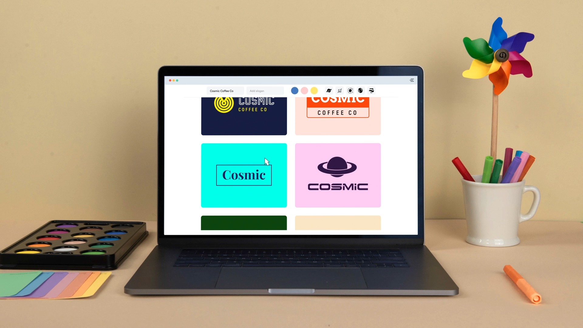
Knowing this, it’s impressive to see what Looka has achieved with its free logo designing tool. Powered by AI, the tool allows you to not only create a professional logo in a matter of minutes but also to design all the branding elements you need as well as social media kits.
The Process: How Designing With Looka Works
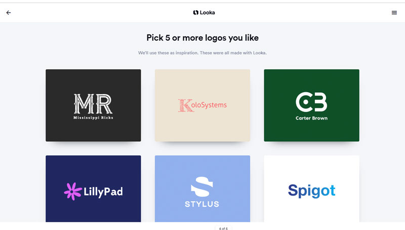
One of Looka’s main advantage is probably the onboarding process. On-screen, the logo design tool takes you through a series of questions to better understand your needs and your visual tastes.
This is actually the way graphic designers work when interviewing their clients to get started on a logo design. The only difference is that the process is so much faster with Looka.
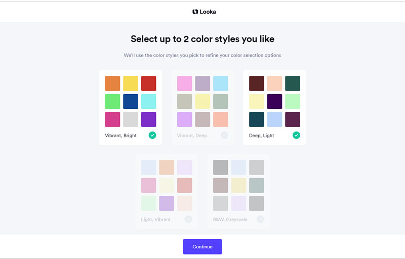
The logo selection helps the IA to understand your tastes in the matter of logo design.During the process, Looka tries to identify the type of color schemes that would work best for you.
Once you are done with the questionnaire, some logos will be generated based on your answers. You can choose the logo that best matches your needs, then it’s possible to click into the logo and see all the different variations of colors, fonts, symbols, graphics, etc.
The Results: Great Logo Design & Branding
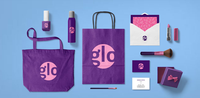
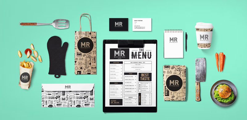
As you can see below, the results you can obtain with Looka are quite stunning. With the Looka Enterprise package, you get the full branding experience and can download ready-to-use business cards and other branding assets for printing or for the web.
To get a quality design like these, it doesn’t take a long process or cost huge money, so get started right away!
Quick Creation of Social Media Kits
Another priceless feature of Looka is the possibility to create visuals for social media extremely quickly. In a time when you need to manage a lot of accounts to be seen online, this will save you some precious time.
In short, this possibility allows you to download your logo in a bunch of different formats for social media profiles, they even include some formats that we tend to forget, such as the email signature image, for example.
There is Even a Website Builder Included!
On top of all these amazing features, Looka provides you with a website builder, which will be good enough for most websites, thanks to the many included features.
This extra-feature gives you almost all you need to quickly and cheaply build a strong presence for your company both online and offline.
There are already over 5 million entrepreneurs who trusted Looka to handle their branding, there is a good reason for that, just give it a try for yourself!
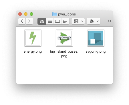
You’ve created a Progressive Web App (PWA), designed an icon to represent it, and now you’re installing it to your Android home screen.
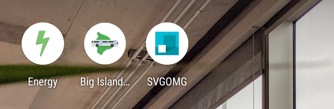
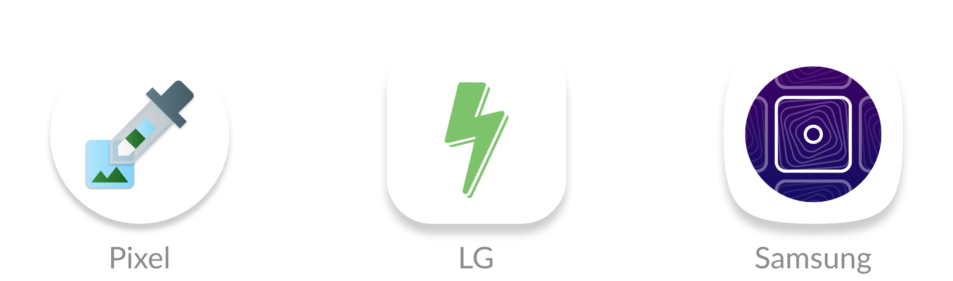
But, if you have a recent Android phone, your icons will show up like this:
What happened? Well, Android Oreo introduced adaptive icons, a new icon format that enforces the same shape for all icons on the home screen. Icons that don’t follow the new format are given a white background.
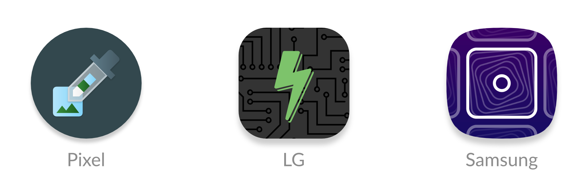
However, there is a new web feature called maskable icons that is coming soon to Firefox Preview and other web browsers. This new icon format will let your PWAs have their own adaptive icons on Android.
I work at Mozilla and have implemented support for maskable icons in Firefox Preview. I’ll show you how to add them to your own PWAs for Android.
What are maskable and adaptive icons?
Until a few years ago, Android app icons were freeform and could be any shape. This meant that web apps could also reuse the same transparent icon when pinned to the home screen.
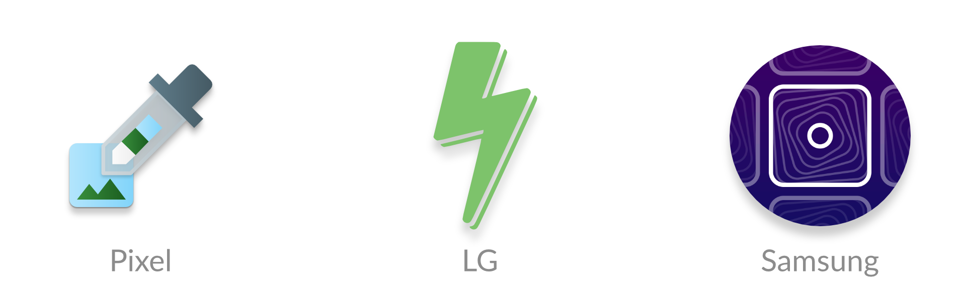
However, manufacturers, like Samsung, wanted to make all icons on a device the same shape to keep things consistent. Some manufacturers even wanted different shapes. To deal with the variety of requirements from manufacturers and devices, Android introduced “adaptive icons.” You supply an image with extra space around the edges, and Android will crop it to the correct shape.
But web apps are designed to work on any platform, so they don’t have APIs to create these special Android icons. Instead, icons would get squished into white boxes like this:
Lo and behold, last September a brand new API descended upon us and was added to the W3C spec. Maskable icons allow web developers to specify a full-bleed icon that will be cropped. It’s platform agnostic, so Windows could use them for tiles or iOS could use them for icons.
How to create maskable icons
Since the maskable icon format is designed work with any platform, the size and ratios are different from the size and ratios of Android’s adaptive icons. This means you can’t reuse the same asset.
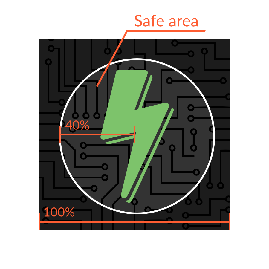
Maskable icons can be any size, and you can continue to use the same sizes that you’d use for normal transparent icons. But when designing the icon, ensure that important information is within a “safe zone” circle with a radius equal to 40% of the image’s size.
The safe zone
All pixels within this zone are guaranteed to be visible. Pixels outside the zone may be cropped off depending on the icon shape and the platform.
Warning: If you already have an Android app, avoid copying and pasting the icon from your Android app to your web app. The ratios are different, so your icons would look too small.
Adding the icon to your Web App Manifest
Once the icons are created, you can add an entry to your Web App Manifest similar to other icon assets. The Web App Manifest provides information about your web app in a JSON file, and includes an "icons" array.
Maskable icons use a special new key, "purpose", to indicate that they are meant to be used with icon masks. Icons with transparent backgrounds have a default "purpose" of "any", and icons can be used for multiple purposes by separating each option with a space.
"purpose": "maskable any"
Preview your icons
Do you want to see what your own maskable icons will look like? I’ve created a tool, Maskable.app, to help you evaluate how the icon appears in different shapes.
The app lets you preview your icon in various shapes that can be found on Android devices. I hope this tool helps you create unique icons for your Progressive Web Apps.
Once you’re satisfied with the results, you can start testing your app with Mozilla’s Reference Browser. This special browser is a testing ground for features before they reach Firefox Preview, and you can use it to check out how your PWA looks. Chrome is working on maskable icon support too.
Tools like PWACompat also have support for maskable icons. You can automatically generate icons for iOS and other devices based on your new maskable icons!
Time to build your own icons
If you want to more control over how your PWA icons are displayed on Android, maskable icons is the way to go. With maskable icons you can customize how your icon is displayed from edge-to-edge. Hopefully this article can get you started on creating your first maskable icon.
Before we come to how to style underlines, we should answer the question: should we underline?
In graphic design, underlines are generally seen as unsophisticated. There are nicer ways to draw emphasis, to establish hierarchy, and to demarcate titles.
If you feel the urge to underline, use bold or italic instead. In special situations, like headings, you can also consider using all caps, small caps, or changing the point size. Not convinced? I invite you to find a book, newspaper, or magazine that underlines text. That look is mostly associated with supermarket tabloids.
But the web is different. Hyperlinks are the defining feature of the internet; and from the internet’s inception, they have been underlined. It’s a universally understood convention. The meaning is crystal clear — an underline means a link.
However, plenty of popular websites have ditched underlines: The New York Times, New YorkMagazine, The Washington Post, Bloomberg, Amazon, Apple, GitHub, Twitter, Wikipedia. When they removed underlines from their search results page in 2014, Google lead designer Jon Wiley argued that it created a cleaner look. Notably though, the majority of these sites have kept slight variances on the traditional lurid blue color (#0000EE) that’s been the browser default since the beginning of the web. While this provides a visual cue for the majority of users, it may not be enough to pass WCAG accessibility compliance.
Color is not used as the only visual means of conveying information, indicating an action, prompting a response, or distinguishing a visual element.
— WCAG 2.1
WCAG do not strictly mandate using underlines for links, but it does recommend them. Color blind users need to be able to discern a link. You could differentiate them in other ways, such as with a bold font-weight. Or you could keep this long-established visual affordance. But if we’re going to use underlines, we want them to look nice. Marcin Wichary, a designer at Medium, described the perfect underline as:
[…] visible, but unobtrusive — allowing people to realize what’s clickable, but without drawing too much attention to itself. It should be positioned at just the right distance from the text, sitting comfortably behind it for when descenders want to occupy the same space.
Achieving this has traditionally required CSS tricks.
The hacks we’ve had
This is one trick all developers will be familiar with: border-bottom. By emulating an underline using border-bottom, we gain control over color and thickness. These pseudo-underlines have one problem: an overly large distance from the text. They are underneath the descenders of the letters. You could potentially solve this issue by using line-height, but that comes with its own issues. A similar technique utilises box-shadow. Marcin Wichary pioneered the most sophisticated technique, using background-image to simulate an underline. They were useful hacks but are thankfully no longer needed.
Styling real underlines
Finally we can demarcate links without sacrificing style thanks to two new CSS properties.
text-underline-offset controls the position of the underline.
text-decoration-thickness controls the thickness of underlines, as well as overlines, and line-throughs.
You can also specify from-font to both of these properties which will pull the relevant metric from the used font file itself.
UX agency Clearleft make bold use of (pseudo) underlines, calling clear attention to links with colorful styling. Here’s one example of a faux underline:
a {
  text-decoration: none;
  border-bottom: #EA215A 0.125em solid;
}
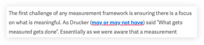
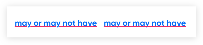
Notice that this fake underline is clearly below the descender of the letter „y”:
Here’s the same paragraph, using DevTools to apply the same styling to a real underline using the new CSS properties:
a {
  text-decoration-color: #EA215A;
  text-decoration-thickness: .125em;
  text-underline-offset: 1.5px;
}
You’ll notice I’m using the em unit in my example code. The spec strongly encourages using it rather than pixels so that the thickness scales with the font.
These properties have already shipped in Safari and are coming in Firefox 70.
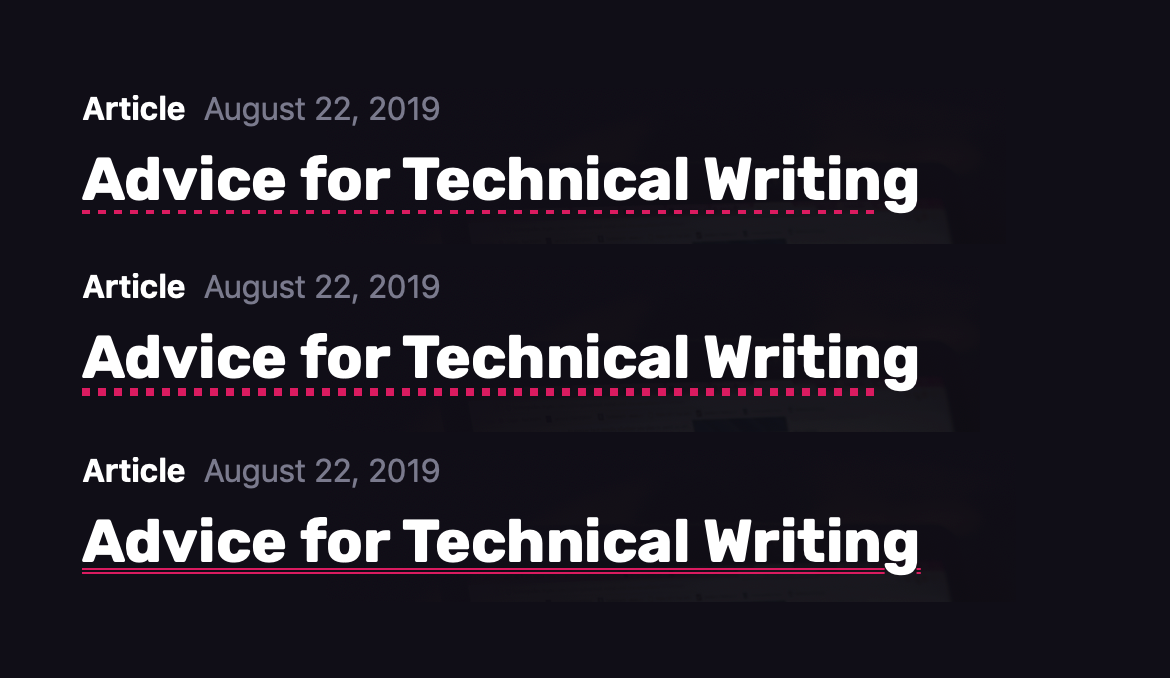
With the move to Chromium for Microsoft’s Edge browser, we will finally have cross browser support for the text-decoration-style property, which offers the options: solid (the default), double, dotted, dashed, and wavy. When combined, these new properties open up a whole range of possibilities.
Perhaps the biggest upgrade for underlines on the web, however, has come without developers needing to do anything. In the bad old days, descenders were unceremoniously sliced through by underlines, which was far from elegant. Developers used to hack around this shortcoming by applying a text-shadow that matched the background color. text-decoration-skip-ink brought a better way to make space for descenders.
The default value of auto (left) and a value of none (right)
Handily, it’s set as the new default value for underlines; meaning the look of underlines has improved while most web developers remain unaware that this property exists. Should you want an underline to cross over glyphs, you can set this property to none.
Before we come to how to style underlines, we should answer the question: should we underline?
In graphic design, underlines are generally seen as unsophisticated. There are nicer ways to draw emphasis, to establish hierarchy, and to demarcate titles.
If you feel the urge to underline, use bold or italic instead. In special situations, like headings, you can also consider using all caps, small caps, or changing the point size. Not convinced? I invite you to find a book, newspaper, or magazine that underlines text. That look is mostly associated with supermarket tabloids.
But the web is different. Hyperlinks are the defining feature of the internet; and from the internet’s inception, they have been underlined. It’s a universally understood convention. The meaning is crystal clear — an underline means a link.
However, plenty of popular websites have ditched underlines: The New York Times, New YorkMagazine, The Washington Post, Bloomberg, Amazon, Apple, GitHub, Twitter, Wikipedia. When they removed underlines from their search results page in 2014, Google lead designer Jon Wiley argued that it created a cleaner look. Notably though, the majority of these sites have kept slight variances on the traditional lurid blue color (#0000EE) that’s been the browser default since the beginning of the web. While this provides a visual cue for the majority of users, it may not be enough to pass WCAG accessibility compliance.
Color is not used as the only visual means of conveying information, indicating an action, prompting a response, or distinguishing a visual element.
— WCAG 2.1
WCAG do not strictly mandate using underlines for links, but it does recommend them. Color blind users need to be able to discern a link. You could differentiate them in other ways, such as with a bold font-weight. Or you could keep this long-established visual affordance. But if we’re going to use underlines, we want them to look nice. Marcin Wichary, a designer at Medium, described the perfect underline as:
[…] visible, but unobtrusive — allowing people to realize what’s clickable, but without drawing too much attention to itself. It should be positioned at just the right distance from the text, sitting comfortably behind it for when descenders want to occupy the same space.
Achieving this has traditionally required CSS tricks.
The hacks we’ve had
This is one trick all developers will be familiar with: border-bottom. By emulating an underline using border-bottom, we gain control over color and thickness. These pseudo-underlines have one problem: an overly large distance from the text. They are underneath the descenders of the letters. You could potentially solve this issue by using line-height, but that comes with its own issues. A similar technique utilises box-shadow. Marcin Wichary pioneered the most sophisticated technique, using background-image to simulate an underline. They were useful hacks but are thankfully no longer needed.
Styling real underlines
Finally we can demarcate links without sacrificing style thanks to two new CSS properties.
text-underline-offset controls the position of the underline.
text-decoration-thickness controls the thickness of underlines, as well as overlines, and line-throughs.
You can also specify from-font to both of these properties which will pull the relevant metric from the used font file itself.
UX agency Clearleft make bold use of (pseudo) underlines, calling clear attention to links with colorful styling. Here’s one example of a faux underline:
a {
  text-decoration: none;
  border-bottom: #EA215A 0.125em solid;
}
Notice that this fake underline is clearly below the descender of the letter „y”:
Here’s the same paragraph, using DevTools to apply the same styling to a real underline using the new CSS properties:
a {
  text-decoration-color: #EA215A;
  text-decoration-thickness: .125em;
  text-underline-offset: 1.5px;
}
You’ll notice I’m using the em unit in my example code. The spec strongly encourages using it rather than pixels so that the thickness scales with the font.
These properties have already shipped in Safari and are coming in Firefox 70.
With the move to Chromium for Microsoft’s Edge browser, we will finally have cross browser support for the text-decoration-style property, which offers the options: solid (the default), double, dotted, dashed, and wavy. When combined, these new properties open up a whole range of possibilities.
Perhaps the biggest upgrade for underlines on the web, however, has come without developers needing to do anything. In the bad old days, descenders were unceremoniously sliced through by underlines, which was far from elegant. Developers used to hack around this shortcoming by applying a text-shadow that matched the background color. text-decoration-skip-ink brought a better way to make space for descenders.
The default value of auto (left) and a value of none (right)
Handily, it’s set as the new default value for underlines; meaning the look of underlines has improved while most web developers remain unaware that this property exists. Should you want an underline to cross over glyphs, you can set this property to none.
The DOM is just a little weird about some things, and the way you deal with attributes is no exception. There are a number of ways to deal with the attributes on elements. By attributes, I mean things like the id in <div id="cool"></div>. Sometimes you need to set them. Sometimes you need to get them. Sometimes you get fancy helpers. Sometimes you don’t.
For this article, I’ll assume el is a DOM element in your JavaScript. Let’s say you’ve done something like const el = document.querySelector("#cool"); and matched <div id="cool"> or whatever.
Some attributes are also attributes of the DOM object itself, so iff you need to set an id or title, you can do:
el.id; // "cool"
el.title = "my title";
el.title; // "my title";
Others that work like that are lang, align, and all the big events, like onclick.
Then there are attributes that work similarly to that but are nested deeper. The style attribute is like that. If you log el.style you’ll see a ton of CSS style declarations. You can get and set them easily:
You can get computed colors this way too. If you do module.style.color hoping to get the color of an element out of the gate, you probably won’t get it. For that, you’d have to do:
let style = window.getComputedStyle(el);
style.color; // whatever in CSS won out
But not all attributes are like first-class attributes like that.
el['aria-hidden'] = true; // nope
That „works” in that it sets that as a property, but it doesn’t set it in the DOM the proper way. Instead, you’ll have to use the generic setter and getter functions that work for all attributes, like:
el.classList.value; // "module big"
el.classList.length; // 2
el.classList.add("cool"); // adds the class "cool", so "module big cool"
el.classList.remove("big"); // removes "big", so "module cool"
el.classList.toggle("big"); // adds "big" back, because it was missing (goes back and forth)
el.classList.contains("module"); // true
There’s even more, and classList itself behaves like an array so you can forEach it and such. That’s a pretty strong reason to use classes, as the DOM API around them is so handy.
Another attribute type that has a somewhat fancy help is data-*. Say you’ve got:
As an icon designer, I’m constantly looking for new tools that could help me broaden my creativity, while giving me less clutter to deal with.
For years now, Adobe has been regarded as the king of digital creative suites, but recently more and more alternatives have started to take shape, challenging the giant in the process.
Today, I’m going to take one of Adobe’s most popular products and stack it against Affinity Designer, a competitor that has more and more people wondering if it’s time to jump ship and embrace change.
So, if you’re into icon design and want to learn how to make icons, whether it’s minimal icon design such as a check icon or a blog icon or more complex depictions, this article should help you figure out what software might be a better fit for you.
That being said, let the comparison begin.
1. What Is the Artboard Support Like?
When it comes to creating icons, you’ll probably end up working on projects that involve a larger number of assets, which means that the software that you’re using needs to be able to take full advantage of multiple Artboard project files.
With Illustrator, Adobe has managed to put together a great implementation of this feature, since it has a simple and intuitive process, where you can set up and define multiple Artboards from the start using its New Document window prompt.
This approach is hands down the best one yet, since with each new project file, you can decide on the number of Artboards that you’re going to be using, instead of having to do so later on.
Going beyond basic Artboard implementation, Illustrator allows you to take full control over:
the Number of Artboards: as of now, the software supports a maximum number of 1,000 Artboards
the arrangement methods: Grid by Row, Grid by Column, Arrange by Row, Arrange by Column
the Number of Artboards Per Row
Layout orientation: Right-to-Left or Left-to-Right Layout
Spacing: the distance between each Artboard
Columns: the number of columns in which the Artboards will be stacked
With Affinity Designer, Serif has taken a different route, which in this case is pretty disappointing, since its Artboard support is lacking some of the advanced features found in Illustrator. Once you get used to those features, you can’t really go without them.
If we go through the process of setting up a new project file using its own version of the New Window prompt, we’ll quickly see that while it lets us use an Artboard to house our assets (which by default comes unchecked), that’s pretty much all we get in terms of Artboard options.
This means that, if you’re hoping to get the same level of control over the spacing found within your Artboards, their column number, etc., you’re out of luck, since you’ll have to go in manually and do it yourself.
The process of setting up multiple Artboards in itself is pretty annoying, especially when dealing with a larger project, since you’ll have to manually add each Artboard, one at a time.
To do so, you first have to select the Artboard Tool, and then use the Insert Artboard button, which will always add a new Artboard to the right side of the existing one. This can quickly turn into a great source of frustration, since there’s no option of setting up a second row, which means that you’ll end up having a long row of Artboards that you’ll have to manually select and rearrange.
When it comes to the maximum number of Artboards that Affinity allows you to set up, I couldn’t find an official value, so I spent a couple of minutes clicking the Insert Artboard button, and once I reached 999, I was impressed to see that it was still going.
Now, why somebody would actually need 1,000 Artboards is beyond me, but it’s nice to see that the software holds its own when it comes to this particular feature.
2. How Do Smart Guides Behave?
When working on icons, the ability to manually align and/or position composing shapes in relation to one another can quickly make a difference in terms of the amount of tools and buttons you need to use, which will result in a faster workflow.
By default, both programs come with their own versions of smart guides, which behave quite differently, as we will see in the following moments.
While Illustrator’s smart guides implementation is a little more basic from a visual perspective, it does a perfect job at helping us keep track of the center and outer edges of any unselected shape, allowing us to quickly position our active shape in relation to them.
For example, if we needed to align a circle to the left edge of a larger underlying square, we can easily do so by first selecting the shape, and then simply dragging it into the desired position, which will immediately trigger the smart guides.
Once the guides become active, they help us maintain a straight line while dragging, immediately snapping the circle’s bounding box to the edge of the square.
To make things more precise, the software lets us keep track of the number of pixels traveled by our shape through the help of a dedicated info panel, which will indicate the X and Y distances (dX & dY).
When it comes to manually positioning a shape, this feature is actually really helpful, but unfortunately it only works when using a click-and-drag approach, since if you nudge the shape with the help of the directional arrow keys, the info panel will remain hidden.
If we switch over to Affinity, we’ll quickly notice that its version of smart guides behaves pretty much identically. The only key difference is that this time around the software doesn’t come with a dedicated panel meant to keep track of the number of pixels that the active shape has traveled.
While Affinity doesn’t give us the option of keeping track of the distance traveled by an active shape, it does however come with a way better feature: distance tracking between multiple shapes.
For example, let’s say that we want to position our circle 4 px from the square’s bottom edge. In Illustrator, we would first have to align the circle to the edge of the square, and then push it downwards by said distance.
In Affinity, we can easily keep track of the distance found between our circle and the larger square, either by clicking and dragging or using the directional arrow keys, which will immediately give us an indicator of the spacing value found between the two.
The only thing that you need to keep in mind is that as of now, this feature only works with non-overlapping shapes.
For me personally, this approach makes it an essential feature that any icon designer should have and use, which is something that I wish Adobe had implemented in Illustrator for a long time now.
3. How Is the Pixel Preview Support?
When working on icons, there are a couple of tools that are essential to figuring out the size and position of their composing shapes, one of those being the ability to view the actual Pixel Grid.
With Illustrator, Adobe has the best Pixel Preview support to date, since it allows us to view the actual pixel fabric onto which our icons will rest.
By default, the view mode is disabled, but you can easily switch back and forward by heading over to View > Pixel Preview or by using the Alt-Control-Y keyboard shortcut.
Once in Pixel Preview mode, we’ll be able to create and adjust any given shape by taking full advantage of the Pixel Grid. By doing so, we can figure out shape sizes more easily and have a clear view of their spacing and positioning, instead of throwing random shapes all over the place.
If we switch over to Affinity Designer, unfortunately true Pixel Preview support is lacking in a big way, since the available Pixel view mode substitute simply shows us how our design would look at a pixel level, but we can’t see or take advantage of the Pixel Grid.
4. How Does Pixel Snapping Behave?
When it comes to creating pixel-perfect icons, we need to make sure that every shape that we create is perfectly snapped to the underlying Pixel Grid, so that in the end we’ll have a sharp-looking product.
In Illustrator, we can turn on pixel snapping either by heading over to View > Snap to Pixel or by clicking on the Align art to pixel grid on creation and transformation button, which can be found on the upper-right corner of the interface.
Recently, Adobe has introduced a dedicated Pixel Snapping Options panel, which we can access by clicking on the little downward-facing arrow found next to the Align art to pixel grid on creation and transformation button.
Once the panel is visible, we’ll be greeted by three different categories of options that control pixel snapping while drawing, moving, and scaling. These are pretty self-explanatory since if we hover over them, we’ll get a little demonstration of that specific feature.
In terms of the pixel snapping itself, the features behave exactly as advertised, since each shape that you create perfectly snaps to the underlying Pixel Grid, no matter what you do to it.
Affinity Designer uses a similar approach, where we get three dedicated buttons: one to Force Pixel Alignment, one to Move By Whole Pixels, and another one to control advanced Snapping.
Quick tip: you can always access the Snapping Manager by heading over to View > Snapping Manager.
Compared to Adobe, the snapping options are quite interesting this time around, since we get a whole new level of control, even though not all of them are directly linked to pixel snapping.
As with Illustrator, pixel snapping behaves exactly as you would expect, with each shape occupying whole pixels, which is exactly what we want.
5. What Is the Grid Support Like?
When working on icons, you’ll often need to set up some building guidelines to help you define your assets, which are mostly created using Grids.
By doing so, you allow yourself to create your composing shapes using similar sizing values that are created by taking advantage of the gridline system.
Illustrator comes with a dedicated Grid, which can be turned on by heading over to View > Show Grid.
To set up a custom Grid, we need to head over to Edit > Preferences > Guides & Grid where we can adjust the Gridline every and Subdivisions options.
As you can see, Adobe doesn’t give us a whole lot of settings when it comes to setting up a custom Grid, which makes the feature feel outdated.
If we switch over to Affinity, well let’s just say that its implementation of the Grid is quite impressive, since you get a dedicated manager that you can customize and adapt for multiple styles of artwork.
To access the tool, we need to head over to View and then simply click on Grid and Axis Manager.
Once the manager is visible, we can check the Show Grid option, which should make it active throughout the entire document.
Next we have Mode, which is where Affinity truly sets itself apart, since you can choose to go with Basic, which is what Illustrator currently offers, or you can go with Advanced and choose from the different available Grid type options.
As you can see, the number of options is quite impressive, so if you’ve ever wanted to try to design isometric icons, this might be the time to do so.
6. How Is the Asset Export Process?
Finally, let’s talk about asset export, which is an equally important step in the process of creating icons. When dealing with a larger project, you need to make sure that your creative suite of choice is capable of handling the workload.
With Illustrator, Adobe has introduced a dedicated exporting tool, called the Asset Export panel, which can be found within the Layers and Artboards panel group.
To export a set of icons, we first have to add them to the panel, either by clicking and dragging them over or by using the Generate multiple assets from the selection button.
Once we’ve generated our selection of assets, all we have to do is click on the Launch Export for Screens dialog button, which will allow us to adjust our export settings and even add size and format variations based on our needs.
As you can see, the process itself is really straightforward, since all you have to do is click a few buttons and you’re good to export.
Affinity Designer does things a little bit differently, since it comes with what Serif calls an Export Persona, which can be found within the upper-left corner of the application.
Once we’ve switched over to the Export Persona, the application will change, giving us a dedicated Export Options panel, where we can control all the different available settings.
All we have to do to export the icons is check their little checkboxes first, and then simply click on the Export Slices button, which will ask us for a location to store the resulting files.
While the exporting process isn’t all that bad, I personally think that what Illustrator offers is more streamlined and easier to use.
At this point, we’ve managed to cover and compare the key features that you should know when deciding which software is right for you, so it’s now time to move on to the conclusion part of our little discussion.
Conclusion
Through its unique features and ease of use, Illustrator once again proves to hold its own, which I why I believe that for now it’s the best icon design suite out there that you can acquire and use.
The main points that lead to this conclusion are:
advanced Artboard support
advanced pixel preview mode integration
overall better asset export support
That being said, I truly hope this information comes in handy when it comes to deciding which creative suite might be a better fit for you, and if you have any questions in regards to the subject, feel free to post them within the comments section, and I’ll get back to you as soon as I can.
Further Develop Your Icon-Building Skills
Just finished going through this in-depth article, and feel like learning more? Well, if that’s the case, you’re in luck, since I took the time to put together this little list that should keep you going for the following days!
As a designer, you’ve probably wondered which Adobe product does a better job when it comes to the process of creating icons. Some love Photoshop, others…
Learn how to create line icons both in Adobe Illustrator and Affinity Designer, and see how you can craft a usable finished product using a few basic shapes.
In today’s tutorial, we’re going to tackle another icon project, in which we’re going to gradually learn how to create a set of text editor elements, using…
In this Affinity Designer tutorial, you’re going to learn how to create a set of office icons using some simple geometric shapes that we will adjust here and…
To celebrate our tenth birthday, learn how to create a set of ten must-have UI icons, using the most basic shapes and tools that Illustrator has to offer.
Since summer is already upon us, I thought it would be nice to treat you to a little icon tutorial using some of the most common accessories that you would…
In today’s tutorial we’re going to get our fashion on and learn how to create a stylized set of accessories icon pack, using the most basic shapes and tools…
Always wanted to learn how to create a check icon, but never knew exactly where to start? In this tutorial, you’ll learn how to create a check icon in Adobe…
Always wanted to learn how to create a filter icon, but never knew exactly where to start?
In this video, you’ll learn how to create two variations of the…
As an icon designer, I’m constantly looking for new tools that could help me broaden my creativity, while giving me less clutter to deal with.
For years now, Adobe has been regarded as the king of digital creative suites, but recently more and more alternatives have started to take shape, challenging the giant in the process.
Today, I’m going to take one of Adobe’s most popular products and stack it against Affinity Designer, a competitor that has more and more people wondering if it’s time to jump ship and embrace change.
So, if you’re into icon design and want to learn how to make icons, whether it’s minimal icon design such as a check icon or a blog icon or more complex depictions, this article should help you figure out what software might be a better fit for you.
That being said, let the comparison begin.
1. What Is the Artboard Support Like?
When it comes to creating icons, you’ll probably end up working on projects that involve a larger number of assets, which means that the software that you’re using needs to be able to take full advantage of multiple Artboard project files.
With Illustrator, Adobe has managed to put together a great implementation of this feature, since it has a simple and intuitive process, where you can set up and define multiple Artboards from the start using its New Document window prompt.
This approach is hands down the best one yet, since with each new project file, you can decide on the number of Artboards that you’re going to be using, instead of having to do so later on.
Going beyond basic Artboard implementation, Illustrator allows you to take full control over:
the Number of Artboards: as of now, the software supports a maximum number of 1,000 Artboards
the arrangement methods: Grid by Row, Grid by Column, Arrange by Row, Arrange by Column
the Number of Artboards Per Row
Layout orientation: Right-to-Left or Left-to-Right Layout
Spacing: the distance between each Artboard
Columns: the number of columns in which the Artboards will be stacked
With Affinity Designer, Serif has taken a different route, which in this case is pretty disappointing, since its Artboard support is lacking some of the advanced features found in Illustrator. Once you get used to those features, you can’t really go without them.
If we go through the process of setting up a new project file using its own version of the New Window prompt, we’ll quickly see that while it lets us use an Artboard to house our assets (which by default comes unchecked), that’s pretty much all we get in terms of Artboard options.
This means that, if you’re hoping to get the same level of control over the spacing found within your Artboards, their column number, etc., you’re out of luck, since you’ll have to go in manually and do it yourself.
The process of setting up multiple Artboards in itself is pretty annoying, especially when dealing with a larger project, since you’ll have to manually add each Artboard, one at a time.
To do so, you first have to select the Artboard Tool, and then use the Insert Artboard button, which will always add a new Artboard to the right side of the existing one. This can quickly turn into a great source of frustration, since there’s no option of setting up a second row, which means that you’ll end up having a long row of Artboards that you’ll have to manually select and rearrange.
When it comes to the maximum number of Artboards that Affinity allows you to set up, I couldn’t find an official value, so I spent a couple of minutes clicking the Insert Artboard button, and once I reached 999, I was impressed to see that it was still going.
Now, why somebody would actually need 1,000 Artboards is beyond me, but it’s nice to see that the software holds its own when it comes to this particular feature.
2. How Do Smart Guides Behave?
When working on icons, the ability to manually align and/or position composing shapes in relation to one another can quickly make a difference in terms of the amount of tools and buttons you need to use, which will result in a faster workflow.
By default, both programs come with their own versions of smart guides, which behave quite differently, as we will see in the following moments.
While Illustrator’s smart guides implementation is a little more basic from a visual perspective, it does a perfect job at helping us keep track of the center and outer edges of any unselected shape, allowing us to quickly position our active shape in relation to them.
For example, if we needed to align a circle to the left edge of a larger underlying square, we can easily do so by first selecting the shape, and then simply dragging it into the desired position, which will immediately trigger the smart guides.
Once the guides become active, they help us maintain a straight line while dragging, immediately snapping the circle’s bounding box to the edge of the square.
To make things more precise, the software lets us keep track of the number of pixels traveled by our shape through the help of a dedicated info panel, which will indicate the X and Y distances (dX & dY).
When it comes to manually positioning a shape, this feature is actually really helpful, but unfortunately it only works when using a click-and-drag approach, since if you nudge the shape with the help of the directional arrow keys, the info panel will remain hidden.
If we switch over to Affinity, we’ll quickly notice that its version of smart guides behaves pretty much identically. The only key difference is that this time around the software doesn’t come with a dedicated panel meant to keep track of the number of pixels that the active shape has traveled.
While Affinity doesn’t give us the option of keeping track of the distance traveled by an active shape, it does however come with a way better feature: distance tracking between multiple shapes.
For example, let’s say that we want to position our circle 4 px from the square’s bottom edge. In Illustrator, we would first have to align the circle to the edge of the square, and then push it downwards by said distance.
In Affinity, we can easily keep track of the distance found between our circle and the larger square, either by clicking and dragging or using the directional arrow keys, which will immediately give us an indicator of the spacing value found between the two.
The only thing that you need to keep in mind is that as of now, this feature only works with non-overlapping shapes.
For me personally, this approach makes it an essential feature that any icon designer should have and use, which is something that I wish Adobe had implemented in Illustrator for a long time now.
3. How Is the Pixel Preview Support?
When working on icons, there are a couple of tools that are essential to figuring out the size and position of their composing shapes, one of those being the ability to view the actual Pixel Grid.
With Illustrator, Adobe has the best Pixel Preview support to date, since it allows us to view the actual pixel fabric onto which our icons will rest.
By default, the view mode is disabled, but you can easily switch back and forward by heading over to View > Pixel Preview or by using the Alt-Control-Y keyboard shortcut.
Once in Pixel Preview mode, we’ll be able to create and adjust any given shape by taking full advantage of the Pixel Grid. By doing so, we can figure out shape sizes more easily and have a clear view of their spacing and positioning, instead of throwing random shapes all over the place.
If we switch over to Affinity Designer, unfortunately true Pixel Preview support is lacking in a big way, since the available Pixel view mode substitute simply shows us how our design would look at a pixel level, but we can’t see or take advantage of the Pixel Grid.
4. How Does Pixel Snapping Behave?
When it comes to creating pixel-perfect icons, we need to make sure that every shape that we create is perfectly snapped to the underlying Pixel Grid, so that in the end we’ll have a sharp-looking product.
In Illustrator, we can turn on pixel snapping either by heading over to View > Snap to Pixel or by clicking on the Align art to pixel grid on creation and transformation button, which can be found on the upper-right corner of the interface.
Recently, Adobe has introduced a dedicated Pixel Snapping Options panel, which we can access by clicking on the little downward-facing arrow found next to the Align art to pixel grid on creation and transformation button.
Once the panel is visible, we’ll be greeted by three different categories of options that control pixel snapping while drawing, moving, and scaling. These are pretty self-explanatory since if we hover over them, we’ll get a little demonstration of that specific feature.
In terms of the pixel snapping itself, the features behave exactly as advertised, since each shape that you create perfectly snaps to the underlying Pixel Grid, no matter what you do to it.
Affinity Designer uses a similar approach, where we get three dedicated buttons: one to Force Pixel Alignment, one to Move By Whole Pixels, and another one to control advanced Snapping.
Quick tip: you can always access the Snapping Manager by heading over to View > Snapping Manager.
Compared to Adobe, the snapping options are quite interesting this time around, since we get a whole new level of control, even though not all of them are directly linked to pixel snapping.
As with Illustrator, pixel snapping behaves exactly as you would expect, with each shape occupying whole pixels, which is exactly what we want.
5. What Is the Grid Support Like?
When working on icons, you’ll often need to set up some building guidelines to help you define your assets, which are mostly created using Grids.
By doing so, you allow yourself to create your composing shapes using similar sizing values that are created by taking advantage of the gridline system.
Illustrator comes with a dedicated Grid, which can be turned on by heading over to View > Show Grid.
To set up a custom Grid, we need to head over to Edit > Preferences > Guides & Grid where we can adjust the Gridline every and Subdivisions options.
As you can see, Adobe doesn’t give us a whole lot of settings when it comes to setting up a custom Grid, which makes the feature feel outdated.
If we switch over to Affinity, well let’s just say that its implementation of the Grid is quite impressive, since you get a dedicated manager that you can customize and adapt for multiple styles of artwork.
To access the tool, we need to head over to View and then simply click on Grid and Axis Manager.
Once the manager is visible, we can check the Show Grid option, which should make it active throughout the entire document.
Next we have Mode, which is where Affinity truly sets itself apart, since you can choose to go with Basic, which is what Illustrator currently offers, or you can go with Advanced and choose from the different available Grid type options.
As you can see, the number of options is quite impressive, so if you’ve ever wanted to try to design isometric icons, this might be the time to do so.
6. How Is the Asset Export Process?
Finally, let’s talk about asset export, which is an equally important step in the process of creating icons. When dealing with a larger project, you need to make sure that your creative suite of choice is capable of handling the workload.
With Illustrator, Adobe has introduced a dedicated exporting tool, called the Asset Export panel, which can be found within the Layers and Artboards panel group.
To export a set of icons, we first have to add them to the panel, either by clicking and dragging them over or by using the Generate multiple assets from the selection button.
Once we’ve generated our selection of assets, all we have to do is click on the Launch Export for Screens dialog button, which will allow us to adjust our export settings and even add size and format variations based on our needs.
As you can see, the process itself is really straightforward, since all you have to do is click a few buttons and you’re good to export.
Affinity Designer does things a little bit differently, since it comes with what Serif calls an Export Persona, which can be found within the upper-left corner of the application.
Once we’ve switched over to the Export Persona, the application will change, giving us a dedicated Export Options panel, where we can control all the different available settings.
All we have to do to export the icons is check their little checkboxes first, and then simply click on the Export Slices button, which will ask us for a location to store the resulting files.
While the exporting process isn’t all that bad, I personally think that what Illustrator offers is more streamlined and easier to use.
At this point, we’ve managed to cover and compare the key features that you should know when deciding which software is right for you, so it’s now time to move on to the conclusion part of our little discussion.
Conclusion
Through its unique features and ease of use, Illustrator once again proves to hold its own, which I why I believe that for now it’s the best icon design suite out there that you can acquire and use.
The main points that lead to this conclusion are:
advanced Artboard support
advanced pixel preview mode integration
overall better asset export support
That being said, I truly hope this information comes in handy when it comes to deciding which creative suite might be a better fit for you, and if you have any questions in regards to the subject, feel free to post them within the comments section, and I’ll get back to you as soon as I can.
Further Develop Your Icon-Building Skills
Just finished going through this in-depth article, and feel like learning more? Well, if that’s the case, you’re in luck, since I took the time to put together this little list that should keep you going for the following days!
As a designer, you’ve probably wondered which Adobe product does a better job when it comes to the process of creating icons. Some love Photoshop, others…
Learn how to create line icons both in Adobe Illustrator and Affinity Designer, and see how you can craft a usable finished product using a few basic shapes.
In today’s tutorial, we’re going to tackle another icon project, in which we’re going to gradually learn how to create a set of text editor elements, using…
In this Affinity Designer tutorial, you’re going to learn how to create a set of office icons using some simple geometric shapes that we will adjust here and…
To celebrate our tenth birthday, learn how to create a set of ten must-have UI icons, using the most basic shapes and tools that Illustrator has to offer.
Since summer is already upon us, I thought it would be nice to treat you to a little icon tutorial using some of the most common accessories that you would…
In today’s tutorial we’re going to get our fashion on and learn how to create a stylized set of accessories icon pack, using the most basic shapes and tools…
Always wanted to learn how to create a check icon, but never knew exactly where to start? In this tutorial, you’ll learn how to create a check icon in Adobe…
Always wanted to learn how to create a filter icon, but never knew exactly where to start?
In this video, you’ll learn how to create two variations of the…
As an icon designer, I’m constantly looking for new tools that could help me broaden my creativity, while giving me less clutter to deal with.
For years now, Adobe has been regarded as the king of digital creative suites, but recently more and more alternatives have started to take shape, challenging the giant in the process.
Today, I’m going to take one of Adobe’s most popular products and stack it against Affinity Designer, a competitor that has more and more people wondering if it’s time to jump ship and embrace change.
So, if you’re into icon design and want to learn how to make icons, whether it’s minimal icon design such as a check icon or a blog icon or more complex depictions, this article should help you figure out what software might be a better fit for you.
That being said, let the comparison begin.
1. What Is the Artboard Support Like?
When it comes to creating icons, you’ll probably end up working on projects that involve a larger number of assets, which means that the software that you’re using needs to be able to take full advantage of multiple Artboard project files.
With Illustrator, Adobe has managed to put together a great implementation of this feature, since it has a simple and intuitive process, where you can set up and define multiple Artboards from the start using its New Document window prompt.
This approach is hands down the best one yet, since with each new project file, you can decide on the number of Artboards that you’re going to be using, instead of having to do so later on.
Going beyond basic Artboard implementation, Illustrator allows you to take full control over:
the Number of Artboards: as of now, the software supports a maximum number of 1,000 Artboards
the arrangement methods: Grid by Row, Grid by Column, Arrange by Row, Arrange by Column
the Number of Artboards Per Row
Layout orientation: Right-to-Left or Left-to-Right Layout
Spacing: the distance between each Artboard
Columns: the number of columns in which the Artboards will be stacked
With Affinity Designer, Serif has taken a different route, which in this case is pretty disappointing, since its Artboard support is lacking some of the advanced features found in Illustrator. Once you get used to those features, you can’t really go without them.
If we go through the process of setting up a new project file using its own version of the New Window prompt, we’ll quickly see that while it lets us use an Artboard to house our assets (which by default comes unchecked), that’s pretty much all we get in terms of Artboard options.
This means that, if you’re hoping to get the same level of control over the spacing found within your Artboards, their column number, etc., you’re out of luck, since you’ll have to go in manually and do it yourself.
The process of setting up multiple Artboards in itself is pretty annoying, especially when dealing with a larger project, since you’ll have to manually add each Artboard, one at a time.
To do so, you first have to select the Artboard Tool, and then use the Insert Artboard button, which will always add a new Artboard to the right side of the existing one. This can quickly turn into a great source of frustration, since there’s no option of setting up a second row, which means that you’ll end up having a long row of Artboards that you’ll have to manually select and rearrange.
When it comes to the maximum number of Artboards that Affinity allows you to set up, I couldn’t find an official value, so I spent a couple of minutes clicking the Insert Artboard button, and once I reached 999, I was impressed to see that it was still going.
Now, why somebody would actually need 1,000 Artboards is beyond me, but it’s nice to see that the software holds its own when it comes to this particular feature.
2. How Do Smart Guides Behave?
When working on icons, the ability to manually align and/or position composing shapes in relation to one another can quickly make a difference in terms of the amount of tools and buttons you need to use, which will result in a faster workflow.
By default, both programs come with their own versions of smart guides, which behave quite differently, as we will see in the following moments.
While Illustrator’s smart guides implementation is a little more basic from a visual perspective, it does a perfect job at helping us keep track of the center and outer edges of any unselected shape, allowing us to quickly position our active shape in relation to them.
For example, if we needed to align a circle to the left edge of a larger underlying square, we can easily do so by first selecting the shape, and then simply dragging it into the desired position, which will immediately trigger the smart guides.
Once the guides become active, they help us maintain a straight line while dragging, immediately snapping the circle’s bounding box to the edge of the square.
To make things more precise, the software lets us keep track of the number of pixels traveled by our shape through the help of a dedicated info panel, which will indicate the X and Y distances (dX & dY).
When it comes to manually positioning a shape, this feature is actually really helpful, but unfortunately it only works when using a click-and-drag approach, since if you nudge the shape with the help of the directional arrow keys, the info panel will remain hidden.
If we switch over to Affinity, we’ll quickly notice that its version of smart guides behaves pretty much identically. The only key difference is that this time around the software doesn’t come with a dedicated panel meant to keep track of the number of pixels that the active shape has traveled.
While Affinity doesn’t give us the option of keeping track of the distance traveled by an active shape, it does however come with a way better feature: distance tracking between multiple shapes.
For example, let’s say that we want to position our circle 4 px from the square’s bottom edge. In Illustrator, we would first have to align the circle to the edge of the square, and then push it downwards by said distance.
In Affinity, we can easily keep track of the distance found between our circle and the larger square, either by clicking and dragging or using the directional arrow keys, which will immediately give us an indicator of the spacing value found between the two.
The only thing that you need to keep in mind is that as of now, this feature only works with non-overlapping shapes.
For me personally, this approach makes it an essential feature that any icon designer should have and use, which is something that I wish Adobe had implemented in Illustrator for a long time now.
3. How Is the Pixel Preview Support?
When working on icons, there are a couple of tools that are essential to figuring out the size and position of their composing shapes, one of those being the ability to view the actual Pixel Grid.
With Illustrator, Adobe has the best Pixel Preview support to date, since it allows us to view the actual pixel fabric onto which our icons will rest.
By default, the view mode is disabled, but you can easily switch back and forward by heading over to View > Pixel Preview or by using the Alt-Control-Y keyboard shortcut.
Once in Pixel Preview mode, we’ll be able to create and adjust any given shape by taking full advantage of the Pixel Grid. By doing so, we can figure out shape sizes more easily and have a clear view of their spacing and positioning, instead of throwing random shapes all over the place.
If we switch over to Affinity Designer, unfortunately true Pixel Preview support is lacking in a big way, since the available Pixel view mode substitute simply shows us how our design would look at a pixel level, but we can’t see or take advantage of the Pixel Grid.
4. How Does Pixel Snapping Behave?
When it comes to creating pixel-perfect icons, we need to make sure that every shape that we create is perfectly snapped to the underlying Pixel Grid, so that in the end we’ll have a sharp-looking product.
In Illustrator, we can turn on pixel snapping either by heading over to View > Snap to Pixel or by clicking on the Align art to pixel grid on creation and transformation button, which can be found on the upper-right corner of the interface.
Recently, Adobe has introduced a dedicated Pixel Snapping Options panel, which we can access by clicking on the little downward-facing arrow found next to the Align art to pixel grid on creation and transformation button.
Once the panel is visible, we’ll be greeted by three different categories of options that control pixel snapping while drawing, moving, and scaling. These are pretty self-explanatory since if we hover over them, we’ll get a little demonstration of that specific feature.
In terms of the pixel snapping itself, the features behave exactly as advertised, since each shape that you create perfectly snaps to the underlying Pixel Grid, no matter what you do to it.
Affinity Designer uses a similar approach, where we get three dedicated buttons: one to Force Pixel Alignment, one to Move By Whole Pixels, and another one to control advanced Snapping.
Quick tip: you can always access the Snapping Manager by heading over to View > Snapping Manager.
Compared to Adobe, the snapping options are quite interesting this time around, since we get a whole new level of control, even though not all of them are directly linked to pixel snapping.
As with Illustrator, pixel snapping behaves exactly as you would expect, with each shape occupying whole pixels, which is exactly what we want.
5. What Is the Grid Support Like?
When working on icons, you’ll often need to set up some building guidelines to help you define your assets, which are mostly created using Grids.
By doing so, you allow yourself to create your composing shapes using similar sizing values that are created by taking advantage of the gridline system.
Illustrator comes with a dedicated Grid, which can be turned on by heading over to View > Show Grid.
To set up a custom Grid, we need to head over to Edit > Preferences > Guides & Grid where we can adjust the Gridline every and Subdivisions options.
As you can see, Adobe doesn’t give us a whole lot of settings when it comes to setting up a custom Grid, which makes the feature feel outdated.
If we switch over to Affinity, well let’s just say that its implementation of the Grid is quite impressive, since you get a dedicated manager that you can customize and adapt for multiple styles of artwork.
To access the tool, we need to head over to View and then simply click on Grid and Axis Manager.
Once the manager is visible, we can check the Show Grid option, which should make it active throughout the entire document.
Next we have Mode, which is where Affinity truly sets itself apart, since you can choose to go with Basic, which is what Illustrator currently offers, or you can go with Advanced and choose from the different available Grid type options.
As you can see, the number of options is quite impressive, so if you’ve ever wanted to try to design isometric icons, this might be the time to do so.
6. How Is the Asset Export Process?
Finally, let’s talk about asset export, which is an equally important step in the process of creating icons. When dealing with a larger project, you need to make sure that your creative suite of choice is capable of handling the workload.
With Illustrator, Adobe has introduced a dedicated exporting tool, called the Asset Export panel, which can be found within the Layers and Artboards panel group.
To export a set of icons, we first have to add them to the panel, either by clicking and dragging them over or by using the Generate multiple assets from the selection button.
Once we’ve generated our selection of assets, all we have to do is click on the Launch Export for Screens dialog button, which will allow us to adjust our export settings and even add size and format variations based on our needs.
As you can see, the process itself is really straightforward, since all you have to do is click a few buttons and you’re good to export.
Affinity Designer does things a little bit differently, since it comes with what Serif calls an Export Persona, which can be found within the upper-left corner of the application.
Once we’ve switched over to the Export Persona, the application will change, giving us a dedicated Export Options panel, where we can control all the different available settings.
All we have to do to export the icons is check their little checkboxes first, and then simply click on the Export Slices button, which will ask us for a location to store the resulting files.
While the exporting process isn’t all that bad, I personally think that what Illustrator offers is more streamlined and easier to use.
At this point, we’ve managed to cover and compare the key features that you should know when deciding which software is right for you, so it’s now time to move on to the conclusion part of our little discussion.
Conclusion
Through its unique features and ease of use, Illustrator once again proves to hold its own, which I why I believe that for now it’s the best icon design suite out there that you can acquire and use.
The main points that lead to this conclusion are:
advanced Artboard support
advanced pixel preview mode integration
overall better asset export support
That being said, I truly hope this information comes in handy when it comes to deciding which creative suite might be a better fit for you, and if you have any questions in regards to the subject, feel free to post them within the comments section, and I’ll get back to you as soon as I can.
Further Develop Your Icon-Building Skills
Just finished going through this in-depth article, and feel like learning more? Well, if that’s the case, you’re in luck, since I took the time to put together this little list that should keep you going for the following days!
As a designer, you’ve probably wondered which Adobe product does a better job when it comes to the process of creating icons. Some love Photoshop, others…
Learn how to create line icons both in Adobe Illustrator and Affinity Designer, and see how you can craft a usable finished product using a few basic shapes.
In today’s tutorial, we’re going to tackle another icon project, in which we’re going to gradually learn how to create a set of text editor elements, using…
In this Affinity Designer tutorial, you’re going to learn how to create a set of office icons using some simple geometric shapes that we will adjust here and…
To celebrate our tenth birthday, learn how to create a set of ten must-have UI icons, using the most basic shapes and tools that Illustrator has to offer.
Since summer is already upon us, I thought it would be nice to treat you to a little icon tutorial using some of the most common accessories that you would…
In today’s tutorial we’re going to get our fashion on and learn how to create a stylized set of accessories icon pack, using the most basic shapes and tools…
Always wanted to learn how to create a check icon, but never knew exactly where to start? In this tutorial, you’ll learn how to create a check icon in Adobe…
Always wanted to learn how to create a filter icon, but never knew exactly where to start?
In this video, you’ll learn how to create two variations of the…
As an icon designer, I’m constantly looking for new tools that could help me broaden my creativity, while giving me less clutter to deal with.
For years now, Adobe has been regarded as the king of digital creative suites, but recently more and more alternatives have started to take shape, challenging the giant in the process.
Today, I’m going to take one of Adobe’s most popular products and stack it against Affinity Designer, a competitor that has more and more people wondering if it’s time to jump ship and embrace change.
So, if you’re into icon design and want to learn how to make icons, whether it’s minimal icon design such as a check icon or a blog icon or more complex depictions, this article should help you figure out what software might be a better fit for you.
That being said, let the comparison begin.
1. What Is the Artboard Support Like?
When it comes to creating icons, you’ll probably end up working on projects that involve a larger number of assets, which means that the software that you’re using needs to be able to take full advantage of multiple Artboard project files.
With Illustrator, Adobe has managed to put together a great implementation of this feature, since it has a simple and intuitive process, where you can set up and define multiple Artboards from the start using its New Document window prompt.
This approach is hands down the best one yet, since with each new project file, you can decide on the number of Artboards that you’re going to be using, instead of having to do so later on.
Going beyond basic Artboard implementation, Illustrator allows you to take full control over:
the Number of Artboards: as of now, the software supports a maximum number of 1,000 Artboards
the arrangement methods: Grid by Row, Grid by Column, Arrange by Row, Arrange by Column
the Number of Artboards Per Row
Layout orientation: Right-to-Left or Left-to-Right Layout
Spacing: the distance between each Artboard
Columns: the number of columns in which the Artboards will be stacked
With Affinity Designer, Serif has taken a different route, which in this case is pretty disappointing, since its Artboard support is lacking some of the advanced features found in Illustrator. Once you get used to those features, you can’t really go without them.
If we go through the process of setting up a new project file using its own version of the New Window prompt, we’ll quickly see that while it lets us use an Artboard to house our assets (which by default comes unchecked), that’s pretty much all we get in terms of Artboard options.
This means that, if you’re hoping to get the same level of control over the spacing found within your Artboards, their column number, etc., you’re out of luck, since you’ll have to go in manually and do it yourself.
The process of setting up multiple Artboards in itself is pretty annoying, especially when dealing with a larger project, since you’ll have to manually add each Artboard, one at a time.
To do so, you first have to select the Artboard Tool, and then use the Insert Artboard button, which will always add a new Artboard to the right side of the existing one. This can quickly turn into a great source of frustration, since there’s no option of setting up a second row, which means that you’ll end up having a long row of Artboards that you’ll have to manually select and rearrange.
When it comes to the maximum number of Artboards that Affinity allows you to set up, I couldn’t find an official value, so I spent a couple of minutes clicking the Insert Artboard button, and once I reached 999, I was impressed to see that it was still going.
Now, why somebody would actually need 1,000 Artboards is beyond me, but it’s nice to see that the software holds its own when it comes to this particular feature.
2. How Do Smart Guides Behave?
When working on icons, the ability to manually align and/or position composing shapes in relation to one another can quickly make a difference in terms of the amount of tools and buttons you need to use, which will result in a faster workflow.
By default, both programs come with their own versions of smart guides, which behave quite differently, as we will see in the following moments.
While Illustrator’s smart guides implementation is a little more basic from a visual perspective, it does a perfect job at helping us keep track of the center and outer edges of any unselected shape, allowing us to quickly position our active shape in relation to them.
For example, if we needed to align a circle to the left edge of a larger underlying square, we can easily do so by first selecting the shape, and then simply dragging it into the desired position, which will immediately trigger the smart guides.
Once the guides become active, they help us maintain a straight line while dragging, immediately snapping the circle’s bounding box to the edge of the square.
To make things more precise, the software lets us keep track of the number of pixels traveled by our shape through the help of a dedicated info panel, which will indicate the X and Y distances (dX & dY).
When it comes to manually positioning a shape, this feature is actually really helpful, but unfortunately it only works when using a click-and-drag approach, since if you nudge the shape with the help of the directional arrow keys, the info panel will remain hidden.
If we switch over to Affinity, we’ll quickly notice that its version of smart guides behaves pretty much identically. The only key difference is that this time around the software doesn’t come with a dedicated panel meant to keep track of the number of pixels that the active shape has traveled.
While Affinity doesn’t give us the option of keeping track of the distance traveled by an active shape, it does however come with a way better feature: distance tracking between multiple shapes.
For example, let’s say that we want to position our circle 4 px from the square’s bottom edge. In Illustrator, we would first have to align the circle to the edge of the square, and then push it downwards by said distance.
In Affinity, we can easily keep track of the distance found between our circle and the larger square, either by clicking and dragging or using the directional arrow keys, which will immediately give us an indicator of the spacing value found between the two.
The only thing that you need to keep in mind is that as of now, this feature only works with non-overlapping shapes.
For me personally, this approach makes it an essential feature that any icon designer should have and use, which is something that I wish Adobe had implemented in Illustrator for a long time now.
3. How Is the Pixel Preview Support?
When working on icons, there are a couple of tools that are essential to figuring out the size and position of their composing shapes, one of those being the ability to view the actual Pixel Grid.
With Illustrator, Adobe has the best Pixel Preview support to date, since it allows us to view the actual pixel fabric onto which our icons will rest.
By default, the view mode is disabled, but you can easily switch back and forward by heading over to View > Pixel Preview or by using the Alt-Control-Y keyboard shortcut.
Once in Pixel Preview mode, we’ll be able to create and adjust any given shape by taking full advantage of the Pixel Grid. By doing so, we can figure out shape sizes more easily and have a clear view of their spacing and positioning, instead of throwing random shapes all over the place.
If we switch over to Affinity Designer, unfortunately true Pixel Preview support is lacking in a big way, since the available Pixel view mode substitute simply shows us how our design would look at a pixel level, but we can’t see or take advantage of the Pixel Grid.
4. How Does Pixel Snapping Behave?
When it comes to creating pixel-perfect icons, we need to make sure that every shape that we create is perfectly snapped to the underlying Pixel Grid, so that in the end we’ll have a sharp-looking product.
In Illustrator, we can turn on pixel snapping either by heading over to View > Snap to Pixel or by clicking on the Align art to pixel grid on creation and transformation button, which can be found on the upper-right corner of the interface.
Recently, Adobe has introduced a dedicated Pixel Snapping Options panel, which we can access by clicking on the little downward-facing arrow found next to the Align art to pixel grid on creation and transformation button.
Once the panel is visible, we’ll be greeted by three different categories of options that control pixel snapping while drawing, moving, and scaling. These are pretty self-explanatory since if we hover over them, we’ll get a little demonstration of that specific feature.
In terms of the pixel snapping itself, the features behave exactly as advertised, since each shape that you create perfectly snaps to the underlying Pixel Grid, no matter what you do to it.
Affinity Designer uses a similar approach, where we get three dedicated buttons: one to Force Pixel Alignment, one to Move By Whole Pixels, and another one to control advanced Snapping.
Quick tip: you can always access the Snapping Manager by heading over to View > Snapping Manager.
Compared to Adobe, the snapping options are quite interesting this time around, since we get a whole new level of control, even though not all of them are directly linked to pixel snapping.
As with Illustrator, pixel snapping behaves exactly as you would expect, with each shape occupying whole pixels, which is exactly what we want.
5. What Is the Grid Support Like?
When working on icons, you’ll often need to set up some building guidelines to help you define your assets, which are mostly created using Grids.
By doing so, you allow yourself to create your composing shapes using similar sizing values that are created by taking advantage of the gridline system.
Illustrator comes with a dedicated Grid, which can be turned on by heading over to View > Show Grid.
To set up a custom Grid, we need to head over to Edit > Preferences > Guides & Grid where we can adjust the Gridline every and Subdivisions options.
As you can see, Adobe doesn’t give us a whole lot of settings when it comes to setting up a custom Grid, which makes the feature feel outdated.
If we switch over to Affinity, well let’s just say that its implementation of the Grid is quite impressive, since you get a dedicated manager that you can customize and adapt for multiple styles of artwork.
To access the tool, we need to head over to View and then simply click on Grid and Axis Manager.
Once the manager is visible, we can check the Show Grid option, which should make it active throughout the entire document.
Next we have Mode, which is where Affinity truly sets itself apart, since you can choose to go with Basic, which is what Illustrator currently offers, or you can go with Advanced and choose from the different available Grid type options.
As you can see, the number of options is quite impressive, so if you’ve ever wanted to try to design isometric icons, this might be the time to do so.
6. How Is the Asset Export Process?
Finally, let’s talk about asset export, which is an equally important step in the process of creating icons. When dealing with a larger project, you need to make sure that your creative suite of choice is capable of handling the workload.
With Illustrator, Adobe has introduced a dedicated exporting tool, called the Asset Export panel, which can be found within the Layers and Artboards panel group.
To export a set of icons, we first have to add them to the panel, either by clicking and dragging them over or by using the Generate multiple assets from the selection button.
Once we’ve generated our selection of assets, all we have to do is click on the Launch Export for Screens dialog button, which will allow us to adjust our export settings and even add size and format variations based on our needs.
As you can see, the process itself is really straightforward, since all you have to do is click a few buttons and you’re good to export.
Affinity Designer does things a little bit differently, since it comes with what Serif calls an Export Persona, which can be found within the upper-left corner of the application.
Once we’ve switched over to the Export Persona, the application will change, giving us a dedicated Export Options panel, where we can control all the different available settings.
All we have to do to export the icons is check their little checkboxes first, and then simply click on the Export Slices button, which will ask us for a location to store the resulting files.
While the exporting process isn’t all that bad, I personally think that what Illustrator offers is more streamlined and easier to use.
At this point, we’ve managed to cover and compare the key features that you should know when deciding which software is right for you, so it’s now time to move on to the conclusion part of our little discussion.
Conclusion
Through its unique features and ease of use, Illustrator once again proves to hold its own, which I why I believe that for now it’s the best icon design suite out there that you can acquire and use.
The main points that lead to this conclusion are:
advanced Artboard support
advanced pixel preview mode integration
overall better asset export support
That being said, I truly hope this information comes in handy when it comes to deciding which creative suite might be a better fit for you, and if you have any questions in regards to the subject, feel free to post them within the comments section, and I’ll get back to you as soon as I can.
Further Develop Your Icon-Building Skills
Just finished going through this in-depth article, and feel like learning more? Well, if that’s the case, you’re in luck, since I took the time to put together this little list that should keep you going for the following days!
As a designer, you’ve probably wondered which Adobe product does a better job when it comes to the process of creating icons. Some love Photoshop, others…
Learn how to create line icons both in Adobe Illustrator and Affinity Designer, and see how you can craft a usable finished product using a few basic shapes.
In today’s tutorial, we’re going to tackle another icon project, in which we’re going to gradually learn how to create a set of text editor elements, using…
In this Affinity Designer tutorial, you’re going to learn how to create a set of office icons using some simple geometric shapes that we will adjust here and…
To celebrate our tenth birthday, learn how to create a set of ten must-have UI icons, using the most basic shapes and tools that Illustrator has to offer.
Since summer is already upon us, I thought it would be nice to treat you to a little icon tutorial using some of the most common accessories that you would…
In today’s tutorial we’re going to get our fashion on and learn how to create a stylized set of accessories icon pack, using the most basic shapes and tools…
Always wanted to learn how to create a check icon, but never knew exactly where to start? In this tutorial, you’ll learn how to create a check icon in Adobe…
Always wanted to learn how to create a filter icon, but never knew exactly where to start?
In this video, you’ll learn how to create two variations of the…
As an icon designer, I’m constantly looking for new tools that could help me broaden my creativity, while giving me less clutter to deal with.
For years now, Adobe has been regarded as the king of digital creative suites, but recently more and more alternatives have started to take shape, challenging the giant in the process.
Today, I’m going to take one of Adobe’s most popular products and stack it against Affinity Designer, a competitor that has more and more people wondering if it’s time to jump ship and embrace change.
So, if you’re into icon design and want to learn how to make icons, whether it’s minimal icon design such as a check icon or a blog icon or more complex depictions, this article should help you figure out what software might be a better fit for you.
That being said, let the comparison begin.
1. What Is the Artboard Support Like?
When it comes to creating icons, you’ll probably end up working on projects that involve a larger number of assets, which means that the software that you’re using needs to be able to take full advantage of multiple Artboard project files.
With Illustrator, Adobe has managed to put together a great implementation of this feature, since it has a simple and intuitive process, where you can set up and define multiple Artboards from the start using its New Document window prompt.
This approach is hands down the best one yet, since with each new project file, you can decide on the number of Artboards that you’re going to be using, instead of having to do so later on.
Going beyond basic Artboard implementation, Illustrator allows you to take full control over:
the Number of Artboards: as of now, the software supports a maximum number of 1,000 Artboards
the arrangement methods: Grid by Row, Grid by Column, Arrange by Row, Arrange by Column
the Number of Artboards Per Row
Layout orientation: Right-to-Left or Left-to-Right Layout
Spacing: the distance between each Artboard
Columns: the number of columns in which the Artboards will be stacked
With Affinity Designer, Serif has taken a different route, which in this case is pretty disappointing, since its Artboard support is lacking some of the advanced features found in Illustrator. Once you get used to those features, you can’t really go without them.
If we go through the process of setting up a new project file using its own version of the New Window prompt, we’ll quickly see that while it lets us use an Artboard to house our assets (which by default comes unchecked), that’s pretty much all we get in terms of Artboard options.
This means that, if you’re hoping to get the same level of control over the spacing found within your Artboards, their column number, etc., you’re out of luck, since you’ll have to go in manually and do it yourself.
The process of setting up multiple Artboards in itself is pretty annoying, especially when dealing with a larger project, since you’ll have to manually add each Artboard, one at a time.
To do so, you first have to select the Artboard Tool, and then use the Insert Artboard button, which will always add a new Artboard to the right side of the existing one. This can quickly turn into a great source of frustration, since there’s no option of setting up a second row, which means that you’ll end up having a long row of Artboards that you’ll have to manually select and rearrange.
When it comes to the maximum number of Artboards that Affinity allows you to set up, I couldn’t find an official value, so I spent a couple of minutes clicking the Insert Artboard button, and once I reached 999, I was impressed to see that it was still going.
Now, why somebody would actually need 1,000 Artboards is beyond me, but it’s nice to see that the software holds its own when it comes to this particular feature.
2. How Do Smart Guides Behave?
When working on icons, the ability to manually align and/or position composing shapes in relation to one another can quickly make a difference in terms of the amount of tools and buttons you need to use, which will result in a faster workflow.
By default, both programs come with their own versions of smart guides, which behave quite differently, as we will see in the following moments.
While Illustrator’s smart guides implementation is a little more basic from a visual perspective, it does a perfect job at helping us keep track of the center and outer edges of any unselected shape, allowing us to quickly position our active shape in relation to them.
For example, if we needed to align a circle to the left edge of a larger underlying square, we can easily do so by first selecting the shape, and then simply dragging it into the desired position, which will immediately trigger the smart guides.
Once the guides become active, they help us maintain a straight line while dragging, immediately snapping the circle’s bounding box to the edge of the square.
To make things more precise, the software lets us keep track of the number of pixels traveled by our shape through the help of a dedicated info panel, which will indicate the X and Y distances (dX & dY).
When it comes to manually positioning a shape, this feature is actually really helpful, but unfortunately it only works when using a click-and-drag approach, since if you nudge the shape with the help of the directional arrow keys, the info panel will remain hidden.
If we switch over to Affinity, we’ll quickly notice that its version of smart guides behaves pretty much identically. The only key difference is that this time around the software doesn’t come with a dedicated panel meant to keep track of the number of pixels that the active shape has traveled.
While Affinity doesn’t give us the option of keeping track of the distance traveled by an active shape, it does however come with a way better feature: distance tracking between multiple shapes.
For example, let’s say that we want to position our circle 4 px from the square’s bottom edge. In Illustrator, we would first have to align the circle to the edge of the square, and then push it downwards by said distance.
In Affinity, we can easily keep track of the distance found between our circle and the larger square, either by clicking and dragging or using the directional arrow keys, which will immediately give us an indicator of the spacing value found between the two.
The only thing that you need to keep in mind is that as of now, this feature only works with non-overlapping shapes.
For me personally, this approach makes it an essential feature that any icon designer should have and use, which is something that I wish Adobe had implemented in Illustrator for a long time now.
3. How Is the Pixel Preview Support?
When working on icons, there are a couple of tools that are essential to figuring out the size and position of their composing shapes, one of those being the ability to view the actual Pixel Grid.
With Illustrator, Adobe has the best Pixel Preview support to date, since it allows us to view the actual pixel fabric onto which our icons will rest.
By default, the view mode is disabled, but you can easily switch back and forward by heading over to View > Pixel Preview or by using the Alt-Control-Y keyboard shortcut.
Once in Pixel Preview mode, we’ll be able to create and adjust any given shape by taking full advantage of the Pixel Grid. By doing so, we can figure out shape sizes more easily and have a clear view of their spacing and positioning, instead of throwing random shapes all over the place.
If we switch over to Affinity Designer, unfortunately true Pixel Preview support is lacking in a big way, since the available Pixel view mode substitute simply shows us how our design would look at a pixel level, but we can’t see or take advantage of the Pixel Grid.
4. How Does Pixel Snapping Behave?
When it comes to creating pixel-perfect icons, we need to make sure that every shape that we create is perfectly snapped to the underlying Pixel Grid, so that in the end we’ll have a sharp-looking product.
In Illustrator, we can turn on pixel snapping either by heading over to View > Snap to Pixel or by clicking on the Align art to pixel grid on creation and transformation button, which can be found on the upper-right corner of the interface.
Recently, Adobe has introduced a dedicated Pixel Snapping Options panel, which we can access by clicking on the little downward-facing arrow found next to the Align art to pixel grid on creation and transformation button.
Once the panel is visible, we’ll be greeted by three different categories of options that control pixel snapping while drawing, moving, and scaling. These are pretty self-explanatory since if we hover over them, we’ll get a little demonstration of that specific feature.
In terms of the pixel snapping itself, the features behave exactly as advertised, since each shape that you create perfectly snaps to the underlying Pixel Grid, no matter what you do to it.
Affinity Designer uses a similar approach, where we get three dedicated buttons: one to Force Pixel Alignment, one to Move By Whole Pixels, and another one to control advanced Snapping.
Quick tip: you can always access the Snapping Manager by heading over to View > Snapping Manager.
Compared to Adobe, the snapping options are quite interesting this time around, since we get a whole new level of control, even though not all of them are directly linked to pixel snapping.
As with Illustrator, pixel snapping behaves exactly as you would expect, with each shape occupying whole pixels, which is exactly what we want.
5. What Is the Grid Support Like?
When working on icons, you’ll often need to set up some building guidelines to help you define your assets, which are mostly created using Grids.
By doing so, you allow yourself to create your composing shapes using similar sizing values that are created by taking advantage of the gridline system.
Illustrator comes with a dedicated Grid, which can be turned on by heading over to View > Show Grid.
To set up a custom Grid, we need to head over to Edit > Preferences > Guides & Grid where we can adjust the Gridline every and Subdivisions options.
As you can see, Adobe doesn’t give us a whole lot of settings when it comes to setting up a custom Grid, which makes the feature feel outdated.
If we switch over to Affinity, well let’s just say that its implementation of the Grid is quite impressive, since you get a dedicated manager that you can customize and adapt for multiple styles of artwork.
To access the tool, we need to head over to View and then simply click on Grid and Axis Manager.
Once the manager is visible, we can check the Show Grid option, which should make it active throughout the entire document.
Next we have Mode, which is where Affinity truly sets itself apart, since you can choose to go with Basic, which is what Illustrator currently offers, or you can go with Advanced and choose from the different available Grid type options.
As you can see, the number of options is quite impressive, so if you’ve ever wanted to try to design isometric icons, this might be the time to do so.
6. How Is the Asset Export Process?
Finally, let’s talk about asset export, which is an equally important step in the process of creating icons. When dealing with a larger project, you need to make sure that your creative suite of choice is capable of handling the workload.
With Illustrator, Adobe has introduced a dedicated exporting tool, called the Asset Export panel, which can be found within the Layers and Artboards panel group.
To export a set of icons, we first have to add them to the panel, either by clicking and dragging them over or by using the Generate multiple assets from the selection button.
Once we’ve generated our selection of assets, all we have to do is click on the Launch Export for Screens dialog button, which will allow us to adjust our export settings and even add size and format variations based on our needs.
As you can see, the process itself is really straightforward, since all you have to do is click a few buttons and you’re good to export.
Affinity Designer does things a little bit differently, since it comes with what Serif calls an Export Persona, which can be found within the upper-left corner of the application.
Once we’ve switched over to the Export Persona, the application will change, giving us a dedicated Export Options panel, where we can control all the different available settings.
All we have to do to export the icons is check their little checkboxes first, and then simply click on the Export Slices button, which will ask us for a location to store the resulting files.
While the exporting process isn’t all that bad, I personally think that what Illustrator offers is more streamlined and easier to use.
At this point, we’ve managed to cover and compare the key features that you should know when deciding which software is right for you, so it’s now time to move on to the conclusion part of our little discussion.
Conclusion
Through its unique features and ease of use, Illustrator once again proves to hold its own, which I why I believe that for now it’s the best icon design suite out there that you can acquire and use.
The main points that lead to this conclusion are:
advanced Artboard support
advanced pixel preview mode integration
overall better asset export support
That being said, I truly hope this information comes in handy when it comes to deciding which creative suite might be a better fit for you, and if you have any questions in regards to the subject, feel free to post them within the comments section, and I’ll get back to you as soon as I can.
Further Develop Your Icon-Building Skills
Just finished going through this in-depth article, and feel like learning more? Well, if that’s the case, you’re in luck, since I took the time to put together this little list that should keep you going for the following days!
As a designer, you’ve probably wondered which Adobe product does a better job when it comes to the process of creating icons. Some love Photoshop, others…
Learn how to create line icons both in Adobe Illustrator and Affinity Designer, and see how you can craft a usable finished product using a few basic shapes.
In today’s tutorial, we’re going to tackle another icon project, in which we’re going to gradually learn how to create a set of text editor elements, using…
In this Affinity Designer tutorial, you’re going to learn how to create a set of office icons using some simple geometric shapes that we will adjust here and…
To celebrate our tenth birthday, learn how to create a set of ten must-have UI icons, using the most basic shapes and tools that Illustrator has to offer.
Since summer is already upon us, I thought it would be nice to treat you to a little icon tutorial using some of the most common accessories that you would…
In today’s tutorial we’re going to get our fashion on and learn how to create a stylized set of accessories icon pack, using the most basic shapes and tools…
Always wanted to learn how to create a check icon, but never knew exactly where to start? In this tutorial, you’ll learn how to create a check icon in Adobe…
Always wanted to learn how to create a filter icon, but never knew exactly where to start?
In this video, you’ll learn how to create two variations of the…
Agregator najlepszych postów o designie, webdesignie, cssie i Internecie