There are reasons why so many people elect
to go with a multipurpose WordPress theme. A multipurpose theme makes good
sense to anyone charged with building websites. It is designed to serve a
variety of purposes or a mix of businesses. Purchasing such a theme also makes
sense for a web designer who seeks maximum design flexibility.
You don’t want to dash out and buy just any
theme. Many multipurpose themes would make excellent choices – such as those
described below. Many others are “OK”, and some are not very good investments
at all.
Doing sufficient research can take up
valuable time. But anytime you can reduce the number of your candidates to 7
excellent multipurpose themes it’s good news indeed.
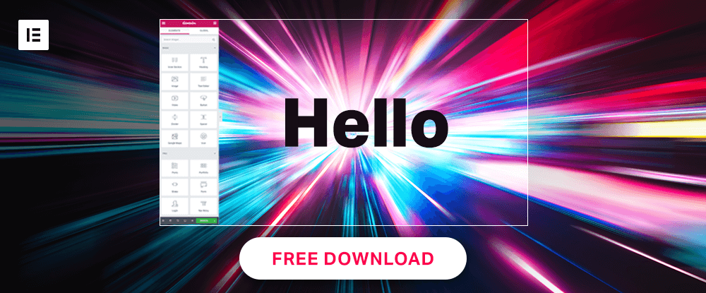
If you’re an Elementor user, you just might have found the theme you’re looking for right here. Hello is without a doubt one of the top multipurpose WordPress themes on the market. This theme is the fastest and lightest product of its type ever created, its literally without boundaries, and to top it off, Hello is used for testing whenever a new version of Elementor is released.
It only follows that if Hello is going to
be used as a key tool for testing new versions of Elementor, the theme itself will
always be up to date and fully capable of providing the expected performance.
Since Hello is fully compatible with and
supportive of the most popular WordPress plugins you won’t experience the
operational performance many other themes experience when using plugins.
Hello’s design and coding are both based on simplicity. There’s no
non-essential code or extraneous bells and whistles to slow either you or this
theme down. Hello is fast, SEO optimized, and an ideal choice for both
designers and developers.
If it’s a multipurpose theme you want, you might consider working with the biggest WordPress theme of them all – Be Theme. This big and beautiful multipurpose theme is loaded with core features (40 of them) and has a large and enthusiastic user base along with a 5-start ThemeForest rating.
The highlight is a library of more than
450 professionally crafted and customizable pre-built websites. Since these
pre-built website designs cover all the website types and more than 30 industry
sectors, you’ll have little problem finding one that can get your next web
design project off to a fast start, and every project thereafter.
These pre-built websites have useful UI
and UX features built into them, making your website design tasks just that
much easier. With the Muffin page builder, shortcode generator, admin panel,
and other Be Theme tools at your fingertips, you could have a website ready to
go in as little as 4 hours.
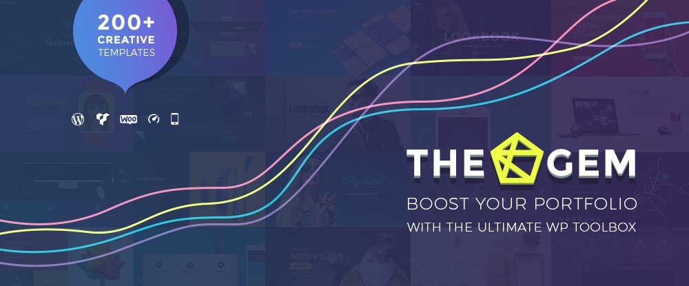
TheGem was designed for users who seek maximum creative freedom without having to have a detailed knowledge of the intricacies of the latest design trends or having to worry about any need for coding.
This creative multipurpose WordPress theme
also provides online businesses, bloggers, artistic entrepreneurs, and agencies
with a massive toolkit of features and design options they can use to create
uniquely-designed websites to convey their respective messages.
TheGem was also created with responsiveness
and peak performance in mind. The authors also followed SEO best practices.
Consequently, the websites you produce using this theme will fare well in the
search engines and display perfectly on desktops, laptops, and hand-held
devices.
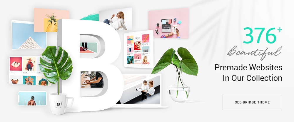
Its 110,000 strong user base makes Bridge the all-time best selling creative theme on ThemeForest. A Qode Interactive creation, Bridge with its 376+ prebuilt websites, a large assortment of plugins, sliders, and design elements, and its open-ended customizability gives you all the website-building flexibility you’ll ever need.
This multipurpose WordPress theme will be a
perfect choice for building almost any type of personal or business-oriented
website. Bridge is a pleasure to use and the user support is excellent.
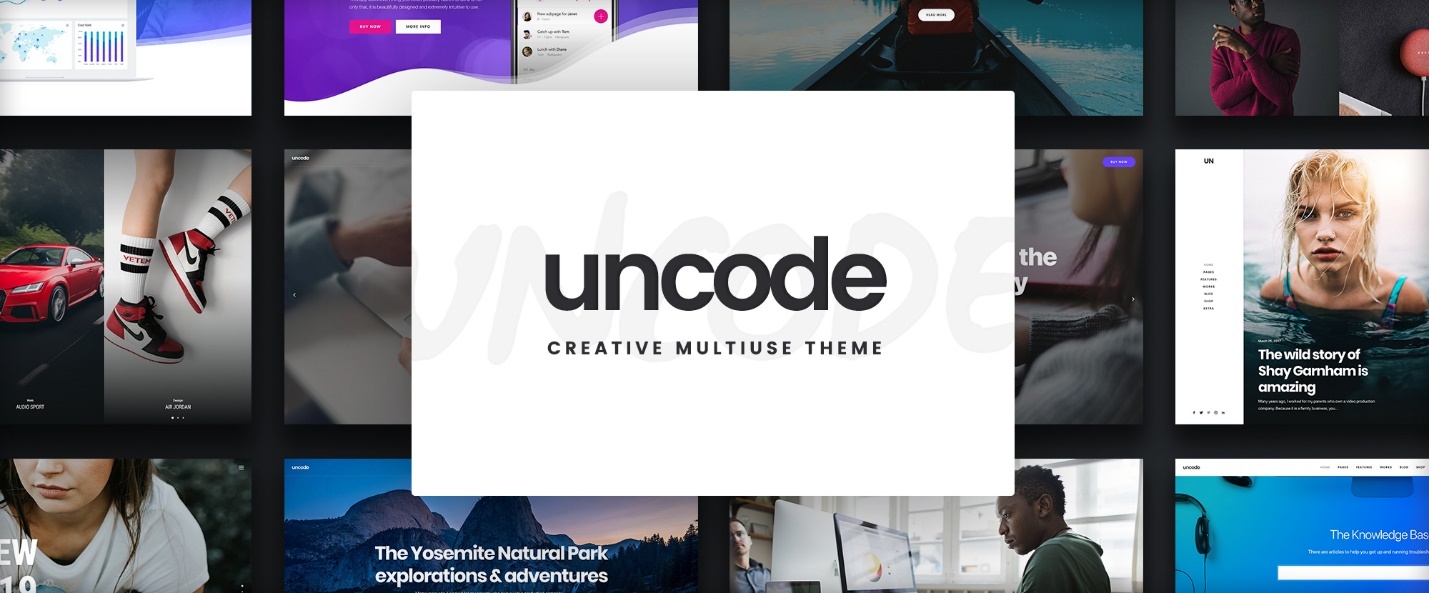
It’s 55,000+ sales to date has made the Uncode multipurpose WordPress theme one of ThemeForest’s all-time top sellers. Packed with design tools, elements, and demos, Uncode has everything a creative web designer could ask for. You’ll quickly come to appreciate the incredible control this theme gives you over your layouts and content. The best way to see what Uncode can do for you is to visit their library of user-created websites. Prepare to be impressed.
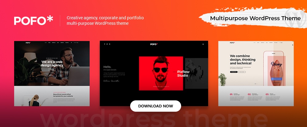
While Pofo is somewhat oriented toward creative agency and portfolio website design, it is in all respects a multipurpose theme that you can work with to create almost any website type you can visualize, whether you’re a blogger, head up a small business, or represent a corporation.
The package includes the WPBakery page
builder, Revolution Slider, and a host of pre-built elements (150+),
shortcodes, and home pages and demos with one click demo import feature.
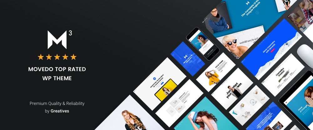
Give MOVEDO a try, and you’re likely to agree with this multipurpose theme’s authors claim that it was created with awesomeness in mind. Spoiler: Test the moldable typography, ultra-dynamic parallax feature, and MOVEDO’s capability to make stationary elements appear to move.
You’ll quickly become a
believer. It’s not all fun and games though. MOVEDO is a solid performer that
offers you a chance to break away from the scourge of website design sameness.
Conclusion
Multipurpose themes are
WordPress theme best-sellers for a very simple and practical reason. Their
flexibility enables users to build virtually any type of website they can think
of and do so with comparative ease.
Most of these themes feature a
large number of ready-made, ready-to-go templates to work with. But their main
selling point is generally the ability they give you to customize the templates
you choose. It can be done with the help of a drag and drop website page to get
exactly what you’re trying to achieve.
There are reasons why so many people elect
to go with a multipurpose WordPress theme. A multipurpose theme makes good
sense to anyone charged with building websites. It is designed to serve a
variety of purposes or a mix of businesses. Purchasing such a theme also makes
sense for a web designer who seeks maximum design flexibility.
You don’t want to dash out and buy just any
theme. Many multipurpose themes would make excellent choices – such as those
described below. Many others are “OK”, and some are not very good investments
at all.
Doing sufficient research can take up
valuable time. But anytime you can reduce the number of your candidates to 7
excellent multipurpose themes it’s good news indeed.
If you’re an Elementor user, you just might have found the theme you’re looking for right here. Hello is without a doubt one of the top multipurpose WordPress themes on the market. This theme is the fastest and lightest product of its type ever created, its literally without boundaries, and to top it off, Hello is used for testing whenever a new version of Elementor is released.
It only follows that if Hello is going to
be used as a key tool for testing new versions of Elementor, the theme itself will
always be up to date and fully capable of providing the expected performance.
Since Hello is fully compatible with and
supportive of the most popular WordPress plugins you won’t experience the
operational performance many other themes experience when using plugins.
Hello’s design and coding are both based on simplicity. There’s no
non-essential code or extraneous bells and whistles to slow either you or this
theme down. Hello is fast, SEO optimized, and an ideal choice for both
designers and developers.
If it’s a multipurpose theme you want, you might consider working with the biggest WordPress theme of them all – Be Theme. This big and beautiful multipurpose theme is loaded with core features (40 of them) and has a large and enthusiastic user base along with a 5-start ThemeForest rating.
The highlight is a library of more than
450 professionally crafted and customizable pre-built websites. Since these
pre-built website designs cover all the website types and more than 30 industry
sectors, you’ll have little problem finding one that can get your next web
design project off to a fast start, and every project thereafter.
These pre-built websites have useful UI
and UX features built into them, making your website design tasks just that
much easier. With the Muffin page builder, shortcode generator, admin panel,
and other Be Theme tools at your fingertips, you could have a website ready to
go in as little as 4 hours.
TheGem was designed for users who seek maximum creative freedom without having to have a detailed knowledge of the intricacies of the latest design trends or having to worry about any need for coding.
This creative multipurpose WordPress theme
also provides online businesses, bloggers, artistic entrepreneurs, and agencies
with a massive toolkit of features and design options they can use to create
uniquely-designed websites to convey their respective messages.
TheGem was also created with responsiveness
and peak performance in mind. The authors also followed SEO best practices.
Consequently, the websites you produce using this theme will fare well in the
search engines and display perfectly on desktops, laptops, and hand-held
devices.
Its 110,000 strong user base makes Bridge the all-time best selling creative theme on ThemeForest. A Qode Interactive creation, Bridge with its 376+ prebuilt websites, a large assortment of plugins, sliders, and design elements, and its open-ended customizability gives you all the website-building flexibility you’ll ever need.
This multipurpose WordPress theme will be a
perfect choice for building almost any type of personal or business-oriented
website. Bridge is a pleasure to use and the user support is excellent.
It’s 55,000+ sales to date has made the Uncode multipurpose WordPress theme one of ThemeForest’s all-time top sellers. Packed with design tools, elements, and demos, Uncode has everything a creative web designer could ask for. You’ll quickly come to appreciate the incredible control this theme gives you over your layouts and content. The best way to see what Uncode can do for you is to visit their library of user-created websites. Prepare to be impressed.
While Pofo is somewhat oriented toward creative agency and portfolio website design, it is in all respects a multipurpose theme that you can work with to create almost any website type you can visualize, whether you’re a blogger, head up a small business, or represent a corporation.
The package includes the WPBakery page
builder, Revolution Slider, and a host of pre-built elements (150+),
shortcodes, and home pages and demos with one click demo import feature.
Give MOVEDO a try, and you’re likely to agree with this multipurpose theme’s authors claim that it was created with awesomeness in mind. Spoiler: Test the moldable typography, ultra-dynamic parallax feature, and MOVEDO’s capability to make stationary elements appear to move.
You’ll quickly become a
believer. It’s not all fun and games though. MOVEDO is a solid performer that
offers you a chance to break away from the scourge of website design sameness.
Conclusion
Multipurpose themes are
WordPress theme best-sellers for a very simple and practical reason. Their
flexibility enables users to build virtually any type of website they can think
of and do so with comparative ease.
Most of these themes feature a
large number of ready-made, ready-to-go templates to work with. But their main
selling point is generally the ability they give you to customize the templates
you choose. It can be done with the help of a drag and drop website page to get
exactly what you’re trying to achieve.
There are reasons why so many people elect
to go with a multipurpose WordPress theme. A multipurpose theme makes good
sense to anyone charged with building websites. It is designed to serve a
variety of purposes or a mix of businesses. Purchasing such a theme also makes
sense for a web designer who seeks maximum design flexibility.
You don’t want to dash out and buy just any
theme. Many multipurpose themes would make excellent choices – such as those
described below. Many others are “OK”, and some are not very good investments
at all.
Doing sufficient research can take up
valuable time. But anytime you can reduce the number of your candidates to 7
excellent multipurpose themes it’s good news indeed.
If you’re an Elementor user, you just might have found the theme you’re looking for right here. Hello is without a doubt one of the top multipurpose WordPress themes on the market. This theme is the fastest and lightest product of its type ever created, its literally without boundaries, and to top it off, Hello is used for testing whenever a new version of Elementor is released.
It only follows that if Hello is going to
be used as a key tool for testing new versions of Elementor, the theme itself will
always be up to date and fully capable of providing the expected performance.
Since Hello is fully compatible with and
supportive of the most popular WordPress plugins you won’t experience the
operational performance many other themes experience when using plugins.
Hello’s design and coding are both based on simplicity. There’s no
non-essential code or extraneous bells and whistles to slow either you or this
theme down. Hello is fast, SEO optimized, and an ideal choice for both
designers and developers.
If it’s a multipurpose theme you want, you might consider working with the biggest WordPress theme of them all – Be Theme. This big and beautiful multipurpose theme is loaded with core features (40 of them) and has a large and enthusiastic user base along with a 5-start ThemeForest rating.
The highlight is a library of more than
450 professionally crafted and customizable pre-built websites. Since these
pre-built website designs cover all the website types and more than 30 industry
sectors, you’ll have little problem finding one that can get your next web
design project off to a fast start, and every project thereafter.
These pre-built websites have useful UI
and UX features built into them, making your website design tasks just that
much easier. With the Muffin page builder, shortcode generator, admin panel,
and other Be Theme tools at your fingertips, you could have a website ready to
go in as little as 4 hours.
TheGem was designed for users who seek maximum creative freedom without having to have a detailed knowledge of the intricacies of the latest design trends or having to worry about any need for coding.
This creative multipurpose WordPress theme
also provides online businesses, bloggers, artistic entrepreneurs, and agencies
with a massive toolkit of features and design options they can use to create
uniquely-designed websites to convey their respective messages.
TheGem was also created with responsiveness
and peak performance in mind. The authors also followed SEO best practices.
Consequently, the websites you produce using this theme will fare well in the
search engines and display perfectly on desktops, laptops, and hand-held
devices.
Its 110,000 strong user base makes Bridge the all-time best selling creative theme on ThemeForest. A Qode Interactive creation, Bridge with its 376+ prebuilt websites, a large assortment of plugins, sliders, and design elements, and its open-ended customizability gives you all the website-building flexibility you’ll ever need.
This multipurpose WordPress theme will be a
perfect choice for building almost any type of personal or business-oriented
website. Bridge is a pleasure to use and the user support is excellent.
It’s 55,000+ sales to date has made the Uncode multipurpose WordPress theme one of ThemeForest’s all-time top sellers. Packed with design tools, elements, and demos, Uncode has everything a creative web designer could ask for. You’ll quickly come to appreciate the incredible control this theme gives you over your layouts and content. The best way to see what Uncode can do for you is to visit their library of user-created websites. Prepare to be impressed.
While Pofo is somewhat oriented toward creative agency and portfolio website design, it is in all respects a multipurpose theme that you can work with to create almost any website type you can visualize, whether you’re a blogger, head up a small business, or represent a corporation.
The package includes the WPBakery page
builder, Revolution Slider, and a host of pre-built elements (150+),
shortcodes, and home pages and demos with one click demo import feature.
Give MOVEDO a try, and you’re likely to agree with this multipurpose theme’s authors claim that it was created with awesomeness in mind. Spoiler: Test the moldable typography, ultra-dynamic parallax feature, and MOVEDO’s capability to make stationary elements appear to move.
You’ll quickly become a
believer. It’s not all fun and games though. MOVEDO is a solid performer that
offers you a chance to break away from the scourge of website design sameness.
Conclusion
Multipurpose themes are
WordPress theme best-sellers for a very simple and practical reason. Their
flexibility enables users to build virtually any type of website they can think
of and do so with comparative ease.
Most of these themes feature a
large number of ready-made, ready-to-go templates to work with. But their main
selling point is generally the ability they give you to customize the templates
you choose. It can be done with the help of a drag and drop website page to get
exactly what you’re trying to achieve.
Every week, we’ll give you an overview of the best deals for designers, make sure you don’t miss any by subscribing to our deals feed. You can also follow the recently launched website Type Deals if you are looking for free fonts or font deals.
35 Beautiful Fonts from Great Studio
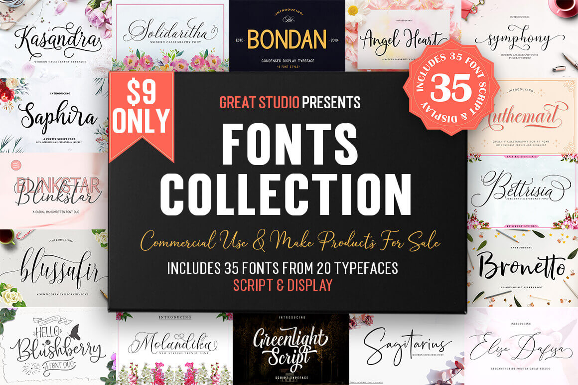
The Great Studio Fonts Collection is jam-packed with 35 unique script and display fonts, all pulled from 20 different font families. From calligraphy to letter brush styles, these gorgeous typefaces feature a number of OpenType features, making them quite flexible for your next project whether that’s wedding invitations, apparel or packaging.
Get the Perfect Watercolor Illustrations with Watercolor Creator
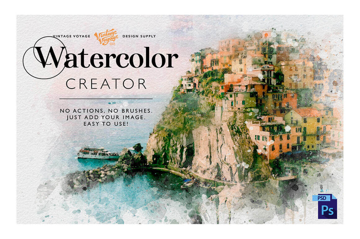
You need watercolor illustrations but don’t have time to learn how to draw or how to use the next Photoshop action? The answer is Watercolor Creator! Don’t waste your time, just open this PSD file, add your image and get the watercolor illustration you need. Easier than you imagine – no actions, no brushes, just one PSD file. All elements are based on real watercolor elements. 100% realistic effect. Also you’ll get “How to use” instructions and a huge gradient collection as bonus.
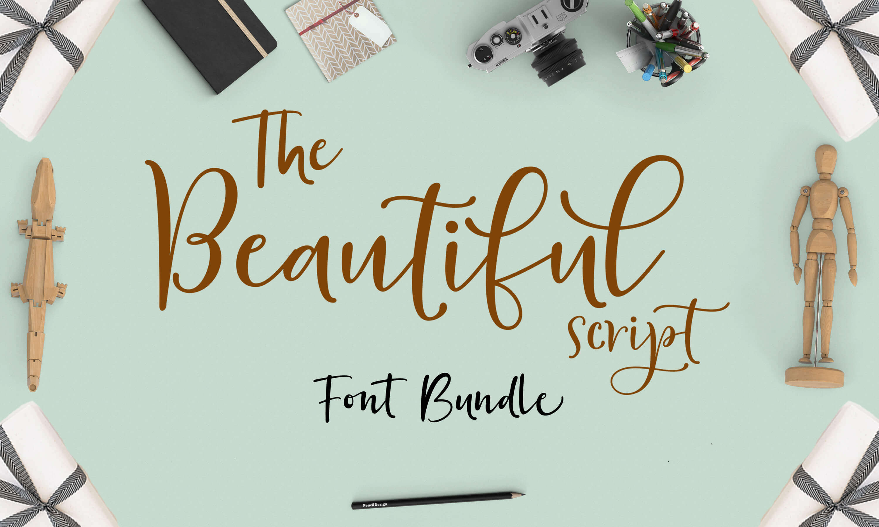
If you’re looking to add a touch of elegance to your current projects, look no further than this deal. You’ll get yourself a fabulous collection of 24 modern script fonts from 13 font famiies, each featuring loads of OpenType Features and multiple languages. Gorgeous, modern and created by hand, this magnificent collection is sure to give your typeface toolbox the curvaceous lift it deserves.
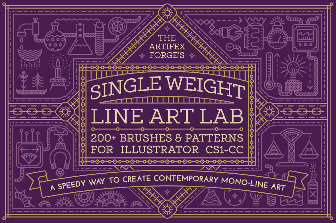
Save yourself hours with this handy design shortcut and start drawing Monoline art today. The Single Weight Line Art Lab features over 200 diverse brushes and patterns to easily let you create stunning, geometric patterned artwork. A quick reference guide, instructions and sample files walk you through every step of the process.
Every week, we’ll give you an overview of the best deals for designers, make sure you don’t miss any by subscribing to our deals feed. You can also follow the recently launched website Type Deals if you are looking for free fonts or font deals.
35 Beautiful Fonts from Great Studio
The Great Studio Fonts Collection is jam-packed with 35 unique script and display fonts, all pulled from 20 different font families. From calligraphy to letter brush styles, these gorgeous typefaces feature a number of OpenType features, making them quite flexible for your next project whether that’s wedding invitations, apparel or packaging.
Get the Perfect Watercolor Illustrations with Watercolor Creator
You need watercolor illustrations but don’t have time to learn how to draw or how to use the next Photoshop action? The answer is Watercolor Creator! Don’t waste your time, just open this PSD file, add your image and get the watercolor illustration you need. Easier than you imagine – no actions, no brushes, just one PSD file. All elements are based on real watercolor elements. 100% realistic effect. Also you’ll get “How to use” instructions and a huge gradient collection as bonus.
If you’re looking to add a touch of elegance to your current projects, look no further than this deal. You’ll get yourself a fabulous collection of 24 modern script fonts from 13 font famiies, each featuring loads of OpenType Features and multiple languages. Gorgeous, modern and created by hand, this magnificent collection is sure to give your typeface toolbox the curvaceous lift it deserves.
Save yourself hours with this handy design shortcut and start drawing Monoline art today. The Single Weight Line Art Lab features over 200 diverse brushes and patterns to easily let you create stunning, geometric patterned artwork. A quick reference guide, instructions and sample files walk you through every step of the process.
A little while back, you might have bumped into this CSS-Tricks article where I described how a mixin can be used to automate responsive font sizes using RFS. In its latest version, v9, RFS is capable of rescaling any value for value for any CSS property with px or rem units, like margin, padding, border-radius or even box-shadow.
Hey, Marc here from Frontend Masters — excited to support CSS-Tricks ❤️!
Have you checked out Sarah Drasner’s courses yet? She has two awesome courses on Design for Developers and SVG! Plus another introducing Vue.js!
Design for Developers
In the Design for Developers course, you’ll learn to become self-sufficient throughout the entire lifecycle of the project — from concept to design to implementation!
You’ll learn to…
Code dynamic layouts and understand the principles of composition.
Select the typography that compliments your design by following simple rules.
Choose colors palettes, and understand the theories to understand why they work together.
Know how and when to reach for design tools such as Photoshop or Sketch.
Use the correct image formats for performance.
Prototype to quickly communicate your ideas and get your layout up-and-running.
SVG Essentials and Animation
In the SVG Essentials and Animation course, you’ll learn to build and optimize SVG – the scalable graphics format for the web that can achieve impressively small file sizes for fast-loading websites.
You’ll learn to…
〰 Create platonic and custom shapes with path commands.
⚡️ Optimize SVG to achieve smaller file sizes for performance.
💻 Assemble new SVGs with code and graphics programs.
🖱 Control complex animations and timelines with user input.
💥 Leverage GreenSock’s JavaScript libraries for immersive animation effects.
Introduction to Vue.js
In the Introduction to Vue.js course, you’ll get started quickly with the Vue.js JavaScript framework!
You’ll learn to…
Build custom, reusable components and animate them.
Use props, slots, and scoped styles to create flexible components.
Grok advanced features like filters and mixins for transforming data.
Get a single page application up and running fast with the Vue-CLI.
Work with Vuex to manage the state of larger-scale applications.
This course is for developers with an intermediate knowledge of JavaScript who want to learn how to build and maintain complex applications quickly and efficiently.
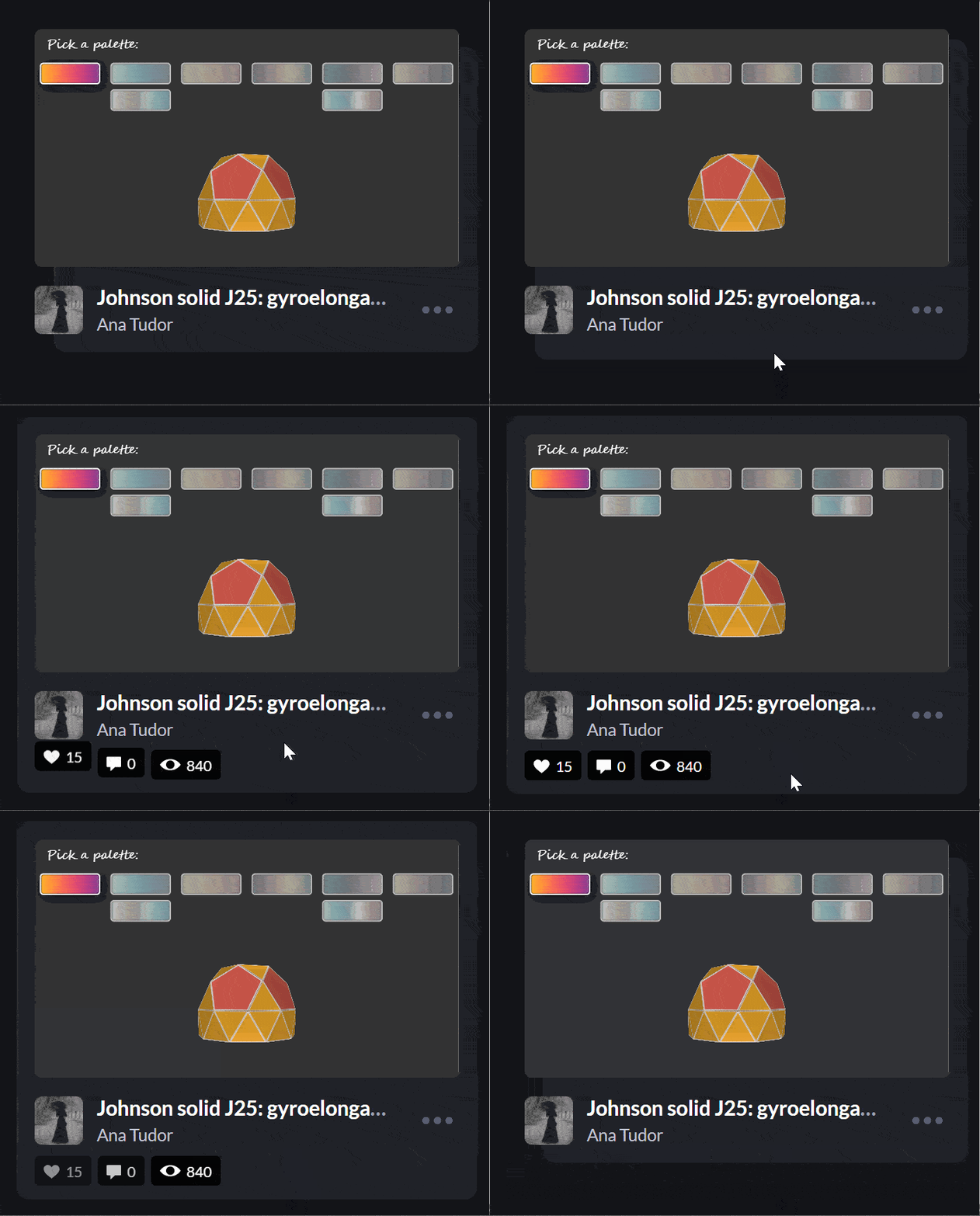
I’ve recently noticed an interesting change on CodePen: on hovering the pens on the homepage, there’s a rectangle with rounded corners expanding in the back.
Expanding box effect on the CodePen homepage.
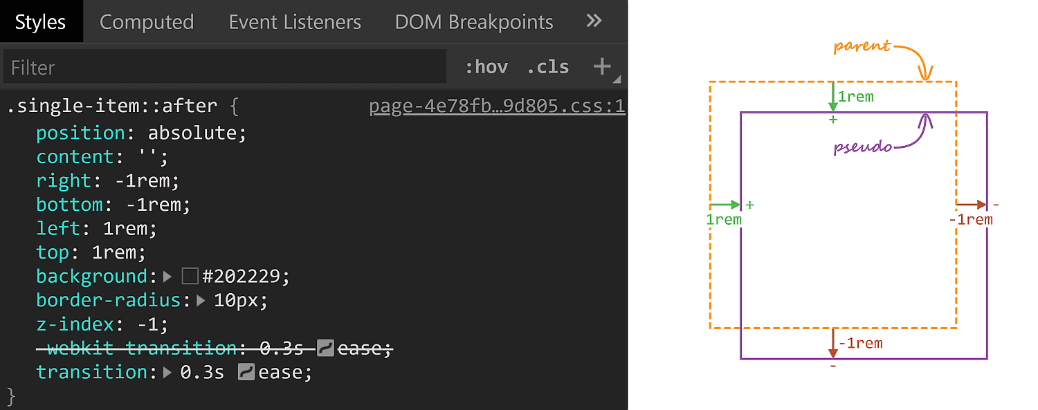
Being the curious creature that I am, I had to check how this works! Turns out, the rectangle in the back is an absolutely positioned ::after pseudo-element.
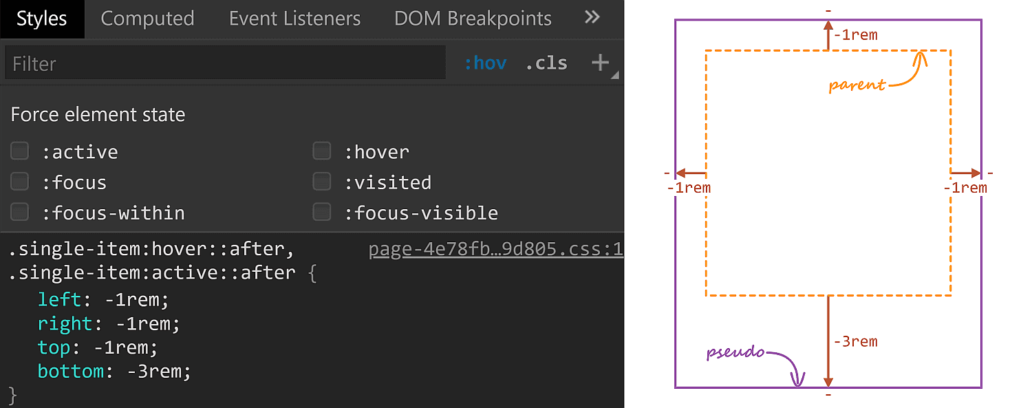
Initial ::after styles. A positive offset goes inwards from the parent’s padding limit, while a negative one goes outwards.
On :hover, its offsets are overridden and, combined with the transition, we get the expanding box effect.
The ::after styles on :hover.
The right property has the same value (-1rem) in both the initial and the :hover rule sets, so it’s unnecessary to override it, but all the other offsets move by 2rem outwards (from 1rem to -1rem for the top and left offsets and from -1rem to -3rem for the bottom offset)
One thing to notice here is that the ::after pseudo-element has a border-radius of 10px which gets preserved as it expands. Which got me to think about what methods we have for expanding/shrinking (pseudo-) elements while preserving their border-radius. How many can you think of? Let me know if you have ideas that haven’t been included below, where we take a look at a bunch of options and see which is best suited for what situation.
Changing offsets
This is the method used on CodePen and it works really well in this particular situation for a bunch of reasons. First off, it has great support. It also works when the expanding (pseudo-) element is responsive, with no fixed dimensions and, at the same time, the amount by which it expands is fixed (a rem value). It also works for expanding in more than two directions (top, bottom and left in this particular case).
There are however a couple of caveats we need to be aware of.
First, our expanding element cannot have position: static. This is not a problem in the context of the CodePen use case since the ::after pseudo-element needs to be absolutely positioned anyway in order to be placed underneath the rest of this parent’s content.
Second, going overboard with offset animations (as well as, in general, animating any property that affects layout with box properties the way offsets, margins, border widths, paddings or dimensions do) can negatively impact performance. Again, this is not something of concern here, we only have a little transition on :hover, no big deal.
Changing dimensions
Instead of changing offsets, we could change dimensions instead. However, this is a method that works if we want our (pseudo-) element to expand in, at most, two directions. Otherwise, we need to change offsets as well. In order to better understand this, let’s consider the CodePen situation where we want our ::after pseudo-elements to expand in three directions (top, bottom and left).
The relevant initial sizing info is the following:
Since opposing offsets (the top–bottom and left–right pairs) cancel each other (1rem - 1rem = 0), it results that the pseudo-element’s dimensions are equal to those of its parent (or 100% of the parent’s dimensions).
…is not enough, as this makes the height increase the downward direction by 4rem instead of increasing it by 2rem up and 2rem down. The following demo illustrates this (put :focus on or hover over the items to see how the ::after pseudo-element expands):
But, to be honest, this feels less desirable than changing offsets alone.
However, changing dimensions is a good solution in a different kind of situation, like when we want to have some bars with rounded corners that expand/shrink in a single direction.
Note that, if we didn’t have rounded corners to preserve, the better solution would be to use directional scaling via the transform property.
Changing padding/border-width
Similar to changing the dimensions, we can change the padding or border-width (for a border that’s transparent). Note that, just like with changing the dimensions, we need to also update offsets if expanding the box in more than two dimensions:
In the demo above, the pinkish box represents the content-box of the ::after pseudo-element and you can see it stays the same size, which is important for this approach.
In order to understand why it is important, consider this other limitation: we also need to have the box dimensions defined by two offsets plus the width and the height instead of using all four offsets. This is because the padding/ border-width would only grow inwards if we were to use four offsets rather than two plus the width and the height.
In spite of these limitations, this method can come in handy if our expanding (pseudo-) element has text content we don’t want to see moving around on :hover as illustrated by the Pen below, where the first two examples change offsets/ dimensions, while the last two change paddings/ border widths:
This is another approach that works great for the CodePen situation, though I cannot really think of other use cases. Also note that, just like changing offsets or dimensions, this method affects the size of the content-box, so any text content we may have gets moved and rearranged.
Changing font size
This is probably the trickiest one of all and has lots of limitations, the most important of which being we cannot have text content on the actual (pseudo-) element that expands/shrinks — but it’s another method that would work well in the CodePen case.
Also, font-size on its own doesn’t really do anything to make a box expand or shrink. We need to combine it with one of the previously discussed properties.
For example, we can set the font-size on ::after to be equal to 1rem, set the offsets to the expanded case and set em margins that would correspond to the difference between the expanded and the initial state.
If you’ve read pieces on animation performance, then you’ve probably read it’s better to animate transforms instead of properties that impact layout, like offsets, margins, borders, paddings, dimensions — pretty much what we’ve used so far!
The first issue that stands out here is that scaling an element also scales its corner rounding, as illustrated below:
We can get around this by also scaling the border-radius the other way.
Let’s say we scale an element by a factor $fx along the x axis and by a factor $fy along the y axis and we want to keep its border-radius at a constant value $r.
This means we also need to divide $r by the corresponding scaling factor along each axis.
However, note that with this method, we need to use scaling factors, not amounts by which we expand our (pseudo-) element in this or that direction. Getting the scaling factors from the dimensions and expansion amounts is possible, but only if they’re expressed in units that have a certain fixed relation between them. While preprocessors can mix units like in or px due to the fact that 1in is always 96px, they cannot resolve how much 1em or 1% or 1vmin or 1ch is in px as they lack context. And calc() is not a solution either, as it doesn’t allow us to divide a length value by another length value to get a unitless scale factor.
This is why scaling is not a solution in the CodePen case, where the ::after boxes have dimensions that depend on the viewport and, at the same time, expand by fixed rem amounts.
But if our scale amount is given or we can easily compute it, this is an option to consider, especially since making the scaling factors custom properties we then animate with a bit of Houdini magic can greatly simplify our code.
This is a method I really like, even though it cuts out pre-Chromium Edge and Internet Explorer support.
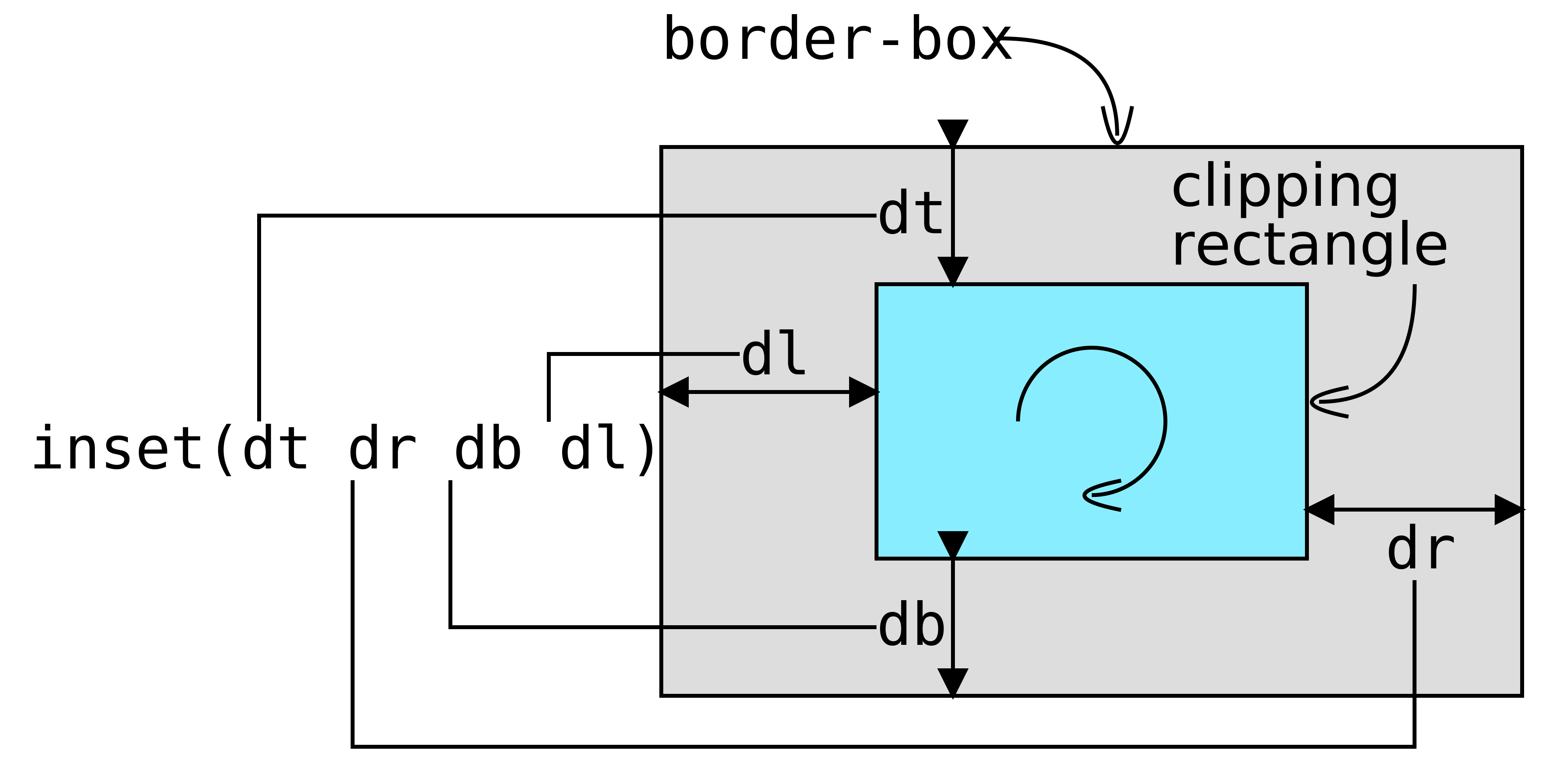
Pretty much every usage example of clip-path out there has either a polygon() value or an SVG reference value. However, if you’ve seen some of my previous articles, then you probably know there are other basic shapes we can use, like inset(), which works as illustrated below:
So, in order to reproduce the CodePen effect with this method, we set the ::after offsets to the expanded state values and then cut out what we don’t want to see with the help of clip-path:
Furthermore, it doesn’t really break anything in non-supporting browsers, it just always stays in the expanded state.
However, while this is method that works great for a lot of situations — including the CodePen use case — it doesn’t work when our expanding/shrinking elements have descendants that go outside their clipped parent’s border-box, as it is the case for the last example given with the previously discussed scaling method.
Pyrophobia is an inordinate fear of or hatred of fire. This tutorial will show you how to use Photoshop’s Flame filter, along with some flame, smoke, and spark image textures as well as blending options, filters, and adjustment settings, to create a blazing, fiery text effect. Let’s get started!
This text effect was inspired by the many Layer Styles available on GraphicRiver. For example, there is this awesome fire text effect action for Photoshop, which you can apply to create a fire photo effect or flaming text effect in seconds:
Tutorial Assets
The following assets were used during the production of this tutorial:
Create a new 1200 x 850 px document, click the Create new fill or adjustment layer icon at the bottom of the Layers panel, choose Solid Color, and use the Color#1e100c.
Step 2
Create the text in All Caps using the font Aller Light. Set the Size to 350 pt and the Tracking to 100.
2. How to Create a Stroke Path and Layer
Step 1
Right-click the text layer and choose Create Work Path.
Step 2
Hide the text layer by clicking the eye icon next to it, and create a new layer with the name Stroke Flames.
3. How to Use the Flame Filter
Step 1
Go to Filter > Render > Flame, and click OK if you get a message telling you that the path is long.
Next, you’ll be playing around with the different options and settings’ values to stroke the path with flames, until you get an outcome you like.
The values used here are:
Basic
Flame Type: 2. Multiple Flames Along Path
Length: 115
Check the Randomize Length box.
Width: 35
Interval: 50
Check the Adjust Interval for Loops box.
Quality: High (Slow)
Advanced
Turbulent: 35
Jag: 20
Opacity: 50
Flame Lines (Complexity): 29
Flame Bottom Alignment: 20
Flame Style: 2. Violent
Flame Shape: 5. Pointing
Check the Randomize Shapes box.
Click OK to apply the filter. It might take some time, so just wait a little bit for it to be rendered.
Step 2
When you like the outcome, pick the Direct Selection Tool (A) and hit the Return key to get rid of the work path.
4. How to Create a Texture Overlay Layer
Step 1
Create a new layer on top of the Stroke Flames layer, name it Flame Texture, and fill it with White.
Make sure to set the Foreground and Background Colors to Black and White.
Step 2
Right-click the Flame Texture layer and choose Convert to Smart Object.
Step 3
Right-click the Flame Texture layer again and choose Create Clipping Mask.
Step 4
Go to Filter > Render > Clouds.
5. How to Create a Texture Using Filters
Step 1
Go to Filter > Filter Gallery to apply the following Filters:
Sketch > Bas Relief
Detail: 13
Smoothness: 3
Light: Bottom
Step 2
Click the New effect layer icon in the bottom right corner to add another filter, and apply Bas Relief with the same values again.
Step 3
Add another new effect layer.
Brush Strokes > Spatter
Spray Radius: 10
Smoothness: 5
Click OK when done.
6. How to Adjust a Layer’s Blending Options
Step 1
Change the Flame Texture layer’s Blend Mode to Soft Light.
Step 2
Double-click the Flame Texture layer to adjust its Blending Options. We are going to adjust the This Layer sliders under the Blend If section.
Press-hold the Option key, and click-drag the right slider to split it. As you move the slider’s ends, you’ll notice how the texture starts to blend better with the flames.
What this slider does is prevent the lighter areas of the texture from interacting with the content below it.
Step 3
Try different values until you like the outcome.
We will get back to the texture at the end of the tutorial to blur it, so you can also modify the values some more then.
7. How to Add Flame Images
Step 1
Use any of the flame images from the Flames0032, Flames0036, and Flames0043 sets to add to the text.
It is better to add the images as Smart Objects so that you can apply changes to them non-destructively.
To do so, go to File > Place Linked, and open the image you want to add.
Step 2
Change the image layer’s Blend Mode to Screen.
Step 3
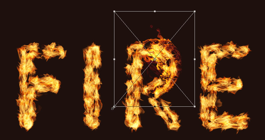
Press Command-T to enter the Free Transform Mode, and move, resize, and rotate the image to place it over a part of the text.
Hit the Return key to commit the changes.
Step 4
Go to Image > Adjustments > Hue/Saturation, and change the Hue to 3 and the Saturation to -35, or use any other values to match the color of the image’s flame with the stroke’s flame color.
8. How to Add More Flames
Step 1
Place another flame image over another part of the text, change its layer’s Blend Mode to Screen, and transform it as needed.
To duplicate the adjustments, expand the first flame image layer’s filter list, press-hold the Option key, and click-drag the Smart Filters tab to the newly added image layer.
Step 2
Repeat the steps to add as many flame images as needed to the text.
Step 3
Place all the flame image layers in a group and name it Flames.
9. How to Add Light Smoke Images
Step 1
Add any of the smoke images you like as a Smart Object, and change its layer’s Blend Mode to Screen.
Place the smoke image over a part of the text, and transform it as needed.
Step 2
Press Command-U to adjust the Hue/Saturation. Check the Colorize box, and change the Hue to 215, the Saturation to 25, and the Lightness to -60.
Step 3
Double-click the smoke image layer to adjust its Blending Options. This time, we are going to adjust the Underlying Layer sliders under the Blend If section.
Press-hold the Option key, and click-drag the right slider to split it. As you move the slider’s ends, you’ll notice how the smoke image starts to blend better with the text and the background.
What this slider does is protect the lighter areas of the text from being affected by the smoke texture.
Step 4
Right-click the smoke image layer and choose Copy Layer Style.
Step 5
Add more smoke images to the text, and for each new image you add, right-click its layer and choose Paste Layer Style.
You can also duplicate the Hue/Saturation adjustments the same way you duplicated them for the flame images.
Double-click the Hue/Saturation tab under the Smart Filters list to use different values depending on the image you add and the effect you want.
Repeat the same steps until you like the outcome.
Step 6
Place all the smoke image layers in a group and name it Smoke, and change the group’s Opacity to 85%, or any value you like.
10. How to Add Heavy Smoke Images
Step 1
We are going to add more smoke images to create more depth.
So add a new smoke image, change its layer’s Blend Mode to Lighter Color, place it over any part of the text, and transform it as needed.
Step 2
Add a few more smoke images using the same Blend Mode, and keep them a little bit smaller in size than the lighter ones.
Step 3
Place all the new smoke image layers in a group and name it Smoke 02, and change the group’s Opacity to 50%, or any value you like depending on the effect you want.
11. How to Add Sparks
Step 1
Place one of the Fireworks0023 images over any part of the text, change its layer’s Blend Mode to Linear Dodge (Add), and transform it as needed.
Step 2
Repeat the same steps to add more sparks all over the text.
Step 3
Place all the spark image layers in a group and name it Sparks.
12. How to Create an Outer Glow
Step 1
Press-hold the Option key, and click-drag the Stroke Flames layer downwards to create a copy below the original.
Step 2
Rename the copy layer to Glow, right-click it, and choose Convert to Smart Object.
Step 3
Go to Filter > Blur > Gaussian Blur, and set the Radius to 25.
Step 4
Change the Glow layer’s Blend Mode to Hard Light and its Opacity to 25%.
13. How to Add Smoke to a Background
Step 1
Place a new smoke image on top of all layers and change its layer’s Blend Mode to Screen.
Resize the image to fill one side of the document.
Step 2
Press Command-U to adjust the Hue/Saturation. Check the Colorize box, and change the Hue to 215, the Saturation to 25, and the Lightness to -83.
Keep in mind that these values are the ones used in the tutorial, but you can always tweak them to suit your work and images.
Step 3
Go to Filter > Blur > Gaussian Blur, and set the Radius to 6. The aim here is to create a subtle foggy effect all around the text.
Step 4
Repeat the same steps to add a couple more smoke images.
Step 5
You can also add some more behind the text.
14. How to Add a Background Texture
Step 1
Place the Fireworks0017 – Image 2 texture on top of the Solid Color layer, and change its layer’s Blend Mode to Linear Dodge (Add) and its Opacity to 50%.
Transform the texture as needed to fill the background.
Step 2
If you want to get rid of any parts of the texture, click the Add layer mask icon at the bottom of the Layers panel, and make sure to select the mask’s thumbnail.
Step 3
Set the Foreground Color to Black, pick the Brush Tool, and choose a soft round tip. Paint over any areas you want to erase.
15. How to Apply Final Adjustments
Step 1
Click the Create new fill or adjustment layer icon at the bottom of the Layers panel and choose Color Lookup.
Choose FoggyNight.3DL from the 3DLUT File menu, and change the layer’s Opacity to 10%.
Step 2
Select the Flame Texture layer, and go to Filter > Blur > Gaussian Blur and set the Radius to 3 so that the texture is not as harsh.
Congratulations! You’re Done
In this tutorial, we created a text work path and stroked it with flames using the Flame filter. Then, we started adding flame, smoke, and spark image textures to build up the effect. We also used blending options, filters, and adjustments to better blend everything together. Finally, we added the background and some finishing touches to finish off the effect.
Please feel free to leave your comments, suggestions, and outcomes below.
Looking to learn more? Check out these awesome fire effect tutorials:
Pyrophobia is an inordinate fear of or hatred of fire. This tutorial will show you how to use Photoshop’s Flame filter, along with some flame, smoke, and spark image textures as well as blending options, filters, and adjustment settings, to create a blazing, fiery text effect. Let’s get started!
This text effect was inspired by the many Layer Styles available on GraphicRiver. For example, there is this awesome fire text effect action for Photoshop, which you can apply to create a fire photo effect or flaming text effect in seconds:
Tutorial Assets
The following assets were used during the production of this tutorial:
Create a new 1200 x 850 px document, click the Create new fill or adjustment layer icon at the bottom of the Layers panel, choose Solid Color, and use the Color#1e100c.
Step 2
Create the text in All Caps using the font Aller Light. Set the Size to 350 pt and the Tracking to 100.
2. How to Create a Stroke Path and Layer
Step 1
Right-click the text layer and choose Create Work Path.
Step 2
Hide the text layer by clicking the eye icon next to it, and create a new layer with the name Stroke Flames.
3. How to Use the Flame Filter
Step 1
Go to Filter > Render > Flame, and click OK if you get a message telling you that the path is long.
Next, you’ll be playing around with the different options and settings’ values to stroke the path with flames, until you get an outcome you like.
The values used here are:
Basic
Flame Type: 2. Multiple Flames Along Path
Length: 115
Check the Randomize Length box.
Width: 35
Interval: 50
Check the Adjust Interval for Loops box.
Quality: High (Slow)
Advanced
Turbulent: 35
Jag: 20
Opacity: 50
Flame Lines (Complexity): 29
Flame Bottom Alignment: 20
Flame Style: 2. Violent
Flame Shape: 5. Pointing
Check the Randomize Shapes box.
Click OK to apply the filter. It might take some time, so just wait a little bit for it to be rendered.
Step 2
When you like the outcome, pick the Direct Selection Tool (A) and hit the Return key to get rid of the work path.
4. How to Create a Texture Overlay Layer
Step 1
Create a new layer on top of the Stroke Flames layer, name it Flame Texture, and fill it with White.
Make sure to set the Foreground and Background Colors to Black and White.
Step 2
Right-click the Flame Texture layer and choose Convert to Smart Object.
Step 3
Right-click the Flame Texture layer again and choose Create Clipping Mask.
Step 4
Go to Filter > Render > Clouds.
5. How to Create a Texture Using Filters
Step 1
Go to Filter > Filter Gallery to apply the following Filters:
Sketch > Bas Relief
Detail: 13
Smoothness: 3
Light: Bottom
Step 2
Click the New effect layer icon in the bottom right corner to add another filter, and apply Bas Relief with the same values again.
Step 3
Add another new effect layer.
Brush Strokes > Spatter
Spray Radius: 10
Smoothness: 5
Click OK when done.
6. How to Adjust a Layer’s Blending Options
Step 1
Change the Flame Texture layer’s Blend Mode to Soft Light.
Step 2
Double-click the Flame Texture layer to adjust its Blending Options. We are going to adjust the This Layer sliders under the Blend If section.
Press-hold the Option key, and click-drag the right slider to split it. As you move the slider’s ends, you’ll notice how the texture starts to blend better with the flames.
What this slider does is prevent the lighter areas of the texture from interacting with the content below it.
Step 3
Try different values until you like the outcome.
We will get back to the texture at the end of the tutorial to blur it, so you can also modify the values some more then.
7. How to Add Flame Images
Step 1
Use any of the flame images from the Flames0032, Flames0036, and Flames0043 sets to add to the text.
It is better to add the images as Smart Objects so that you can apply changes to them non-destructively.
To do so, go to File > Place Linked, and open the image you want to add.
Step 2
Change the image layer’s Blend Mode to Screen.
Step 3
Press Command-T to enter the Free Transform Mode, and move, resize, and rotate the image to place it over a part of the text.
Hit the Return key to commit the changes.
Step 4
Go to Image > Adjustments > Hue/Saturation, and change the Hue to 3 and the Saturation to -35, or use any other values to match the color of the image’s flame with the stroke’s flame color.
8. How to Add More Flames
Step 1
Place another flame image over another part of the text, change its layer’s Blend Mode to Screen, and transform it as needed.
To duplicate the adjustments, expand the first flame image layer’s filter list, press-hold the Option key, and click-drag the Smart Filters tab to the newly added image layer.
Step 2
Repeat the steps to add as many flame images as needed to the text.
Step 3
Place all the flame image layers in a group and name it Flames.
9. How to Add Light Smoke Images
Step 1
Add any of the smoke images you like as a Smart Object, and change its layer’s Blend Mode to Screen.
Place the smoke image over a part of the text, and transform it as needed.
Step 2
Press Command-U to adjust the Hue/Saturation. Check the Colorize box, and change the Hue to 215, the Saturation to 25, and the Lightness to -60.
Step 3
Double-click the smoke image layer to adjust its Blending Options. This time, we are going to adjust the Underlying Layer sliders under the Blend If section.
Press-hold the Option key, and click-drag the right slider to split it. As you move the slider’s ends, you’ll notice how the smoke image starts to blend better with the text and the background.
What this slider does is protect the lighter areas of the text from being affected by the smoke texture.
Step 4
Right-click the smoke image layer and choose Copy Layer Style.
Step 5
Add more smoke images to the text, and for each new image you add, right-click its layer and choose Paste Layer Style.
You can also duplicate the Hue/Saturation adjustments the same way you duplicated them for the flame images.
Double-click the Hue/Saturation tab under the Smart Filters list to use different values depending on the image you add and the effect you want.
Repeat the same steps until you like the outcome.
Step 6
Place all the smoke image layers in a group and name it Smoke, and change the group’s Opacity to 85%, or any value you like.
10. How to Add Heavy Smoke Images
Step 1
We are going to add more smoke images to create more depth.
So add a new smoke image, change its layer’s Blend Mode to Lighter Color, place it over any part of the text, and transform it as needed.
Step 2
Add a few more smoke images using the same Blend Mode, and keep them a little bit smaller in size than the lighter ones.
Step 3
Place all the new smoke image layers in a group and name it Smoke 02, and change the group’s Opacity to 50%, or any value you like depending on the effect you want.
11. How to Add Sparks
Step 1
Place one of the Fireworks0023 images over any part of the text, change its layer’s Blend Mode to Linear Dodge (Add), and transform it as needed.
Step 2
Repeat the same steps to add more sparks all over the text.
Step 3
Place all the spark image layers in a group and name it Sparks.
12. How to Create an Outer Glow
Step 1
Press-hold the Option key, and click-drag the Stroke Flames layer downwards to create a copy below the original.
Step 2
Rename the copy layer to Glow, right-click it, and choose Convert to Smart Object.
Step 3
Go to Filter > Blur > Gaussian Blur, and set the Radius to 25.
Step 4
Change the Glow layer’s Blend Mode to Hard Light and its Opacity to 25%.
13. How to Add Smoke to a Background
Step 1
Place a new smoke image on top of all layers and change its layer’s Blend Mode to Screen.
Resize the image to fill one side of the document.
Step 2
Press Command-U to adjust the Hue/Saturation. Check the Colorize box, and change the Hue to 215, the Saturation to 25, and the Lightness to -83.
Keep in mind that these values are the ones used in the tutorial, but you can always tweak them to suit your work and images.
Step 3
Go to Filter > Blur > Gaussian Blur, and set the Radius to 6. The aim here is to create a subtle foggy effect all around the text.
Step 4
Repeat the same steps to add a couple more smoke images.
Step 5
You can also add some more behind the text.
14. How to Add a Background Texture
Step 1
Place the Fireworks0017 – Image 2 texture on top of the Solid Color layer, and change its layer’s Blend Mode to Linear Dodge (Add) and its Opacity to 50%.
Transform the texture as needed to fill the background.
Step 2
If you want to get rid of any parts of the texture, click the Add layer mask icon at the bottom of the Layers panel, and make sure to select the mask’s thumbnail.
Step 3
Set the Foreground Color to Black, pick the Brush Tool, and choose a soft round tip. Paint over any areas you want to erase.
15. How to Apply Final Adjustments
Step 1
Click the Create new fill or adjustment layer icon at the bottom of the Layers panel and choose Color Lookup.
Choose FoggyNight.3DL from the 3DLUT File menu, and change the layer’s Opacity to 10%.
Step 2
Select the Flame Texture layer, and go to Filter > Blur > Gaussian Blur and set the Radius to 3 so that the texture is not as harsh.
Congratulations! You’re Done
In this tutorial, we created a text work path and stroked it with flames using the Flame filter. Then, we started adding flame, smoke, and spark image textures to build up the effect. We also used blending options, filters, and adjustments to better blend everything together. Finally, we added the background and some finishing touches to finish off the effect.
Please feel free to leave your comments, suggestions, and outcomes below.
Looking to learn more? Check out these awesome fire effect tutorials: