How to Create a Flame Text Effect in Adobe Photoshop

Post pobrano z: How to Create a Flame Text Effect in Adobe Photoshop

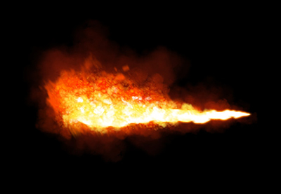
Final product image
What You’ll Be Creating

Pyrophobia is an inordinate fear of or hatred of fire. This tutorial will show you how to use Photoshop’s Flame filter, along with some flame, smoke, and spark image textures as well as blending options, filters, and adjustment settings, to create a blazing, fiery text effect. Let’s get started!

This text effect was inspired by the many Layer Styles available on GraphicRiver. For example, there is this awesome fire text effect action for Photoshop, which you can apply to create a fire photo effect or flaming text effect in seconds:

Fire text action photoshop

Tutorial Assets

The following assets were used during the production of this tutorial:

1. How to Create Background and Text Layers

Step 1

Create a new 1200 x 850 px document, click the Create new fill or adjustment layer icon at the bottom of the Layers panel, choose Solid Color, and use the Color #1e100c.

Solid Color

Step 2

Create the text in All Caps using the font Aller Light. Set the Size to 350 pt and the Tracking to 100.

Create the Text

2. How to Create a Stroke Path and Layer

Step 1

Right-click the text layer and choose Create Work Path.

Create Work Path

Step 2

Hide the text layer by clicking the eye icon next to it, and create a new layer with the name Stroke Flames.

Stroke Flames Layer

3. How to Use the Flame Filter

Step 1

Go to Filter > Render > Flame, and click OK if you get a message telling you that the path is long.

Next, you’ll be playing around with the different options and settings’ values to stroke the path with flames, until you get an outcome you like.

The values used here are:

Basic

  • Flame Type: 2. Multiple Flames Along Path
  • Length: 115
  • Check the Randomize Length box.
  • Width: 35
  • Interval: 50
  • Check the Adjust Interval for Loops box.
  • Quality: High (Slow)
Flame Filter Basic

Advanced

  • Turbulent: 35
  • Jag: 20
  • Opacity: 50
  • Flame Lines (Complexity): 29
  • Flame Bottom Alignment: 20
  • Flame Style: 2. Violent
  • Flame Shape: 5. Pointing
  • Check the Randomize Shapes box.

Click OK to apply the filter. It might take some time, so just wait a little bit for it to be rendered.

Flame Filter Advanced

Step 2

When you like the outcome, pick the Direct Selection Tool (A) and hit the Return key to get rid of the work path.

Hide Work Path

4. How to Create a Texture Overlay Layer

Step 1

Create a new layer on top of the Stroke Flames layer, name it Flame Texture, and fill it with White.

Make sure to set the Foreground and Background Colors to Black and White.

Flame Texture Layer

Step 2

Right-click the Flame Texture layer and choose Convert to Smart Object.

Convert to Smart Object

Step 3

Right-click the Flame Texture layer again and choose Create Clipping Mask.

Create Clipping Mask

Step 4

Go to Filter > Render > Clouds.

Clouds Filter

5. How to Create a Texture Using Filters

Step 1

Go to Filter > Filter Gallery to apply the following Filters:

Sketch > Bas Relief

  • Detail: 13
  • Smoothness: 3
  • Light: Bottom
Bas Relief

Step 2

Click the New effect layer icon in the bottom right corner to add another filter, and apply Bas Relief with the same values again.

New Effect Layer

Step 3

Add another new effect layer.

Brush Strokes > Spatter

  • Spray Radius: 10
  • Smoothness: 5

Click OK when done.

Spatter

6. How to Adjust a Layer’s Blending Options

Step 1

Change the Flame Texture layer’s Blend Mode to Soft Light.

Blend Mode

Step 2

Double-click the Flame Texture layer to adjust its Blending Options. We are going to adjust the This Layer sliders under the Blend If section.

Press-hold the Option key, and click-drag the right slider to split it. As you move the slider’s ends, you’ll notice how the texture starts to blend better with the flames.

What this slider does is prevent the lighter areas of the texture from interacting with the content below it.

Blending Options

Step 3

Try different values until you like the outcome.

We will get back to the texture at the end of the tutorial to blur it, so you can also modify the values some more then.

Adjust the Values

7. How to Add Flame Images

Step 1

Use any of the flame images from the Flames0032, Flames0036, and Flames0043 sets to add to the text.

It is better to add the images as Smart Objects so that you can apply changes to them non-destructively.

To do so, go to File > Place Linked, and open the image you want to add.

Place Flame Images

Step 2

Change the image layer’s Blend Mode to Screen.

Blend Mode

Step 3

Press Command-T to enter the Free Transform Mode, and move, resize, and rotate the image to place it over a part of the text.

Hit the Return key to commit the changes.
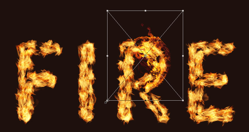
Free Transform Mode

Step 4

Go to Image > Adjustments > Hue/Saturation, and change the Hue to and the Saturation to -35, or use any other values to match the color of the image’s flame with the stroke’s flame color.

HueSaturation

8. How to Add More Flames

Step 1

Place another flame image over another part of the text, change its layer’s Blend Mode to Screen, and transform it as needed.

To duplicate the adjustments, expand the first flame image layer’s filter list, press-hold the Option key, and click-drag the Smart Filters tab to the newly added image layer.

Duplicate the Smart Filters

Step 2

Repeat the steps to add as many flame images as needed to the text.
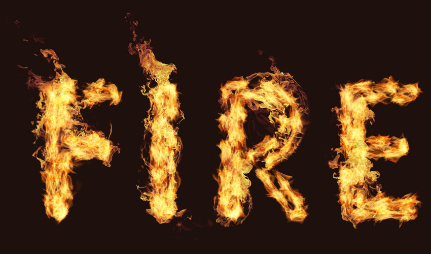
Add More Flame Images

Step 3

Place all the flame image layers in a group and name it Flames.

Flames Group

9. How to Add Light Smoke Images

Step 1

Add any of the smoke images you like as a Smart Object, and change its layer’s Blend Mode to Screen.

Place the smoke image over a part of the text, and transform it as needed.

Add a Smoke Image

Step 2

Press Command-U to adjust the Hue/Saturation. Check the Colorize box, and change the Hue to 215, the Saturation to 25, and the Lightness to -60.

HueSaturation

Step 3

Double-click the smoke image layer to adjust its Blending Options. This time, we are going to adjust the Underlying Layer sliders under the Blend If section.

Press-hold the Option key, and click-drag the right slider to split it. As you move the slider’s ends, you’ll notice how the smoke image starts to blend better with the text and the background.

What this slider does is protect the lighter areas of the text from being affected by the smoke texture.

Blending Options

Step 4

Right-click the smoke image layer and choose Copy Layer Style.

Copy Layer Style

Step 5

Add more smoke images to the text, and for each new image you add, right-click its layer and choose Paste Layer Style.

You can also duplicate the Hue/Saturation adjustments the same way you duplicated them for the flame images.

Double-click the Hue/Saturation tab under the Smart Filters list to use different values depending on the image you add and the effect you want.

Repeat the same steps until you like the outcome.

Add More Smoke Images

Step 6

Place all the smoke image layers in a group and name it Smoke, and change the group’s Opacity to 85%, or any value you like.

Smoke Group

10. How to Add Heavy Smoke Images

Step 1

We are going to add more smoke images to create more depth.

So add a new smoke image, change its layer’s Blend Mode to Lighter Color, place it over any part of the text, and transform it as needed.

Add a Smoke Image

Step 2

Add a few more smoke images using the same Blend Mode, and keep them a little bit smaller in size than the lighter ones.

Add More Smoke Images

Step 3

Place all the new smoke image layers in a group and name it Smoke 02, and change the group’s Opacity to 50%, or any value you like depending on the effect you want.

Smoke 02 Group

11. How to Add Sparks

Step 1

Place one of the Fireworks0023 images over any part of the text, change its layer’s Blend Mode to Linear Dodge (Add), and transform it as needed.

Add a Sparks Image

Step 2

Repeat the same steps to add more sparks all over the text.

Add More Spark Images

Step 3

Place all the spark image layers in a group and name it Sparks.

Sparks Group

12. How to Create an Outer Glow

Step 1

Press-hold the Option key, and click-drag the Stroke Flames layer downwards to create a copy below the original.

Duplicate the Stroke Flames Layer

Step 2

Rename the copy layer to Glow, right-click it, and choose Convert to Smart Object.

Convert to Smart Object

Step 3

Go to Filter > Blur > Gaussian Blur, and set the Radius to 25.

Gaussian Blur

Step 4

Change the Glow layer’s Blend Mode to Hard Light and its Opacity to 25%.

Blend Mode and Opacity

13. How to Add Smoke to a Background

Step 1

Place a new smoke image on top of all layers and change its layer’s Blend Mode to Screen.

Resize the image to fill one side of the document.

Add a Smoke Image

Step 2

Press Command-U to adjust the Hue/Saturation. Check the Colorize box, and change the Hue to 215, the Saturation to 25, and the Lightness to -83.

Keep in mind that these values are the ones used in the tutorial, but you can always tweak them to suit your work and images.

HueSaturation

Step 3

Go to Filter > Blur > Gaussian Blur, and set the Radius to 6. The aim here is to create a subtle foggy effect all around the text.

Gaussian Blur

Step 4

Repeat the same steps to add a couple more smoke images.

Add More Foggy Smoke

Step 5

You can also add some more behind the text.

Add Smoke Behind the Text

14. How to Add a Background Texture

Step 1

Place the Fireworks0017 – Image 2 texture on top of the Solid Color layer, and change its layer’s Blend Mode to Linear Dodge (Add) and its Opacity to 50%.

Transform the texture as needed to fill the background.

Add a Background Texture

Step 2

If you want to get rid of any parts of the texture, click the Add layer mask icon at the bottom of the Layers panel, and make sure to select the mask’s thumbnail.

Add a Layer Mask

Step 3

Set the Foreground Color to Black, pick the Brush Tool, and choose a soft round tip. Paint over any areas you want to erase.

Erase Unwanted Areas

15. How to Apply Final Adjustments

Step 1

Click the Create new fill or adjustment layer icon at the bottom of the Layers panel and choose Color Lookup.

Choose FoggyNight.3DL from the 3DLUT File menu, and change the layer’s Opacity to 10%.

Color Lookup

Step 2

Select the Flame Texture layer, and go to Filter > Blur > Gaussian Blur and set the Radius to 3 so that the texture is not as harsh.

Gaussian Blur

Congratulations! You’re Done

In this tutorial, we created a text work path and stroked it with flames using the Flame filter. Then, we started adding flame, smoke, and spark image textures to build up the effect. We also used blending options, filters, and adjustments to better blend everything together. Finally, we added the background and some finishing touches to finish off the effect.

Please feel free to leave your comments, suggestions, and outcomes below.

Final Result

Looking to learn more? Check out these awesome fire effect tutorials:
How to Create a Flame Text Effect in Adobe Photoshop

Post pobrano z: How to Create a Flame Text Effect in Adobe Photoshop

Final product image
What You’ll Be Creating

Pyrophobia is an inordinate fear of or hatred of fire. This tutorial will show you how to use Photoshop’s Flame filter, along with some flame, smoke, and spark image textures as well as blending options, filters, and adjustment settings, to create a blazing, fiery text effect. Let’s get started!

This text effect was inspired by the many Layer Styles available on GraphicRiver. For example, there is this awesome fire text effect action for Photoshop, which you can apply to create a fire photo effect or flaming text effect in seconds:

Fire text action photoshop

Tutorial Assets

The following assets were used during the production of this tutorial:

1. How to Create Background and Text Layers

Step 1

Create a new 1200 x 850 px document, click the Create new fill or adjustment layer icon at the bottom of the Layers panel, choose Solid Color, and use the Color #1e100c.

Solid Color

Step 2

Create the text in All Caps using the font Aller Light. Set the Size to 350 pt and the Tracking to 100.

Create the Text

2. How to Create a Stroke Path and Layer

Step 1

Right-click the text layer and choose Create Work Path.

Create Work Path

Step 2

Hide the text layer by clicking the eye icon next to it, and create a new layer with the name Stroke Flames.

Stroke Flames Layer

3. How to Use the Flame Filter

Step 1

Go to Filter > Render > Flame, and click OK if you get a message telling you that the path is long.

Next, you’ll be playing around with the different options and settings’ values to stroke the path with flames, until you get an outcome you like.

The values used here are:

Basic

  • Flame Type: 2. Multiple Flames Along Path
  • Length: 115
  • Check the Randomize Length box.
  • Width: 35
  • Interval: 50
  • Check the Adjust Interval for Loops box.
  • Quality: High (Slow)
Flame Filter Basic

Advanced

  • Turbulent: 35
  • Jag: 20
  • Opacity: 50
  • Flame Lines (Complexity): 29
  • Flame Bottom Alignment: 20
  • Flame Style: 2. Violent
  • Flame Shape: 5. Pointing
  • Check the Randomize Shapes box.

Click OK to apply the filter. It might take some time, so just wait a little bit for it to be rendered.

Flame Filter Advanced

Step 2

When you like the outcome, pick the Direct Selection Tool (A) and hit the Return key to get rid of the work path.

Hide Work Path

4. How to Create a Texture Overlay Layer

Step 1

Create a new layer on top of the Stroke Flames layer, name it Flame Texture, and fill it with White.

Make sure to set the Foreground and Background Colors to Black and White.

Flame Texture Layer

Step 2

Right-click the Flame Texture layer and choose Convert to Smart Object.

Convert to Smart Object

Step 3

Right-click the Flame Texture layer again and choose Create Clipping Mask.

Create Clipping Mask

Step 4

Go to Filter > Render > Clouds.

Clouds Filter

5. How to Create a Texture Using Filters

Step 1

Go to Filter > Filter Gallery to apply the following Filters:

Sketch > Bas Relief

  • Detail: 13
  • Smoothness: 3
  • Light: Bottom
Bas Relief

Step 2

Click the New effect layer icon in the bottom right corner to add another filter, and apply Bas Relief with the same values again.

New Effect Layer

Step 3

Add another new effect layer.

Brush Strokes > Spatter

  • Spray Radius: 10
  • Smoothness: 5

Click OK when done.

Spatter

6. How to Adjust a Layer’s Blending Options

Step 1

Change the Flame Texture layer’s Blend Mode to Soft Light.

Blend Mode

Step 2

Double-click the Flame Texture layer to adjust its Blending Options. We are going to adjust the This Layer sliders under the Blend If section.

Press-hold the Option key, and click-drag the right slider to split it. As you move the slider’s ends, you’ll notice how the texture starts to blend better with the flames.

What this slider does is prevent the lighter areas of the texture from interacting with the content below it.

Blending Options

Step 3

Try different values until you like the outcome.

We will get back to the texture at the end of the tutorial to blur it, so you can also modify the values some more then.

Adjust the Values

7. How to Add Flame Images

Step 1

Use any of the flame images from the Flames0032, Flames0036, and Flames0043 sets to add to the text.

It is better to add the images as Smart Objects so that you can apply changes to them non-destructively.

To do so, go to File > Place Linked, and open the image you want to add.

Place Flame Images

Step 2

Change the image layer’s Blend Mode to Screen.

Blend Mode

Step 3

Press Command-T to enter the Free Transform Mode, and move, resize, and rotate the image to place it over a part of the text.

Hit the Return key to commit the changes.

Free Transform Mode

Step 4

Go to Image > Adjustments > Hue/Saturation, and change the Hue to and the Saturation to -35, or use any other values to match the color of the image’s flame with the stroke’s flame color.

HueSaturation

8. How to Add More Flames

Step 1

Place another flame image over another part of the text, change its layer’s Blend Mode to Screen, and transform it as needed.

To duplicate the adjustments, expand the first flame image layer’s filter list, press-hold the Option key, and click-drag the Smart Filters tab to the newly added image layer.

Duplicate the Smart Filters

Step 2

Repeat the steps to add as many flame images as needed to the text.

Add More Flame Images

Step 3

Place all the flame image layers in a group and name it Flames.

Flames Group

9. How to Add Light Smoke Images

Step 1

Add any of the smoke images you like as a Smart Object, and change its layer’s Blend Mode to Screen.

Place the smoke image over a part of the text, and transform it as needed.

Add a Smoke Image

Step 2

Press Command-U to adjust the Hue/Saturation. Check the Colorize box, and change the Hue to 215, the Saturation to 25, and the Lightness to -60.

HueSaturation

Step 3

Double-click the smoke image layer to adjust its Blending Options. This time, we are going to adjust the Underlying Layer sliders under the Blend If section.

Press-hold the Option key, and click-drag the right slider to split it. As you move the slider’s ends, you’ll notice how the smoke image starts to blend better with the text and the background.

What this slider does is protect the lighter areas of the text from being affected by the smoke texture.

Blending Options

Step 4

Right-click the smoke image layer and choose Copy Layer Style.

Copy Layer Style

Step 5

Add more smoke images to the text, and for each new image you add, right-click its layer and choose Paste Layer Style.

You can also duplicate the Hue/Saturation adjustments the same way you duplicated them for the flame images.

Double-click the Hue/Saturation tab under the Smart Filters list to use different values depending on the image you add and the effect you want.

Repeat the same steps until you like the outcome.

Add More Smoke Images

Step 6

Place all the smoke image layers in a group and name it Smoke, and change the group’s Opacity to 85%, or any value you like.

Smoke Group

10. How to Add Heavy Smoke Images

Step 1

We are going to add more smoke images to create more depth.

So add a new smoke image, change its layer’s Blend Mode to Lighter Color, place it over any part of the text, and transform it as needed.

Add a Smoke Image

Step 2

Add a few more smoke images using the same Blend Mode, and keep them a little bit smaller in size than the lighter ones.

Add More Smoke Images

Step 3

Place all the new smoke image layers in a group and name it Smoke 02, and change the group’s Opacity to 50%, or any value you like depending on the effect you want.

Smoke 02 Group

11. How to Add Sparks

Step 1

Place one of the Fireworks0023 images over any part of the text, change its layer’s Blend Mode to Linear Dodge (Add), and transform it as needed.

Add a Sparks Image

Step 2

Repeat the same steps to add more sparks all over the text.

Add More Spark Images

Step 3

Place all the spark image layers in a group and name it Sparks.

Sparks Group

12. How to Create an Outer Glow

Step 1

Press-hold the Option key, and click-drag the Stroke Flames layer downwards to create a copy below the original.

Duplicate the Stroke Flames Layer

Step 2

Rename the copy layer to Glow, right-click it, and choose Convert to Smart Object.

Convert to Smart Object

Step 3

Go to Filter > Blur > Gaussian Blur, and set the Radius to 25.

Gaussian Blur

Step 4

Change the Glow layer’s Blend Mode to Hard Light and its Opacity to 25%.

Blend Mode and Opacity

13. How to Add Smoke to a Background

Step 1

Place a new smoke image on top of all layers and change its layer’s Blend Mode to Screen.

Resize the image to fill one side of the document.

Add a Smoke Image

Step 2

Press Command-U to adjust the Hue/Saturation. Check the Colorize box, and change the Hue to 215, the Saturation to 25, and the Lightness to -83.

Keep in mind that these values are the ones used in the tutorial, but you can always tweak them to suit your work and images.

HueSaturation

Step 3

Go to Filter > Blur > Gaussian Blur, and set the Radius to 6. The aim here is to create a subtle foggy effect all around the text.

Gaussian Blur

Step 4

Repeat the same steps to add a couple more smoke images.

Add More Foggy Smoke

Step 5

You can also add some more behind the text.

Add Smoke Behind the Text

14. How to Add a Background Texture

Step 1

Place the Fireworks0017 – Image 2 texture on top of the Solid Color layer, and change its layer’s Blend Mode to Linear Dodge (Add) and its Opacity to 50%.

Transform the texture as needed to fill the background.

Add a Background Texture

Step 2

If you want to get rid of any parts of the texture, click the Add layer mask icon at the bottom of the Layers panel, and make sure to select the mask’s thumbnail.

Add a Layer Mask

Step 3

Set the Foreground Color to Black, pick the Brush Tool, and choose a soft round tip. Paint over any areas you want to erase.

Erase Unwanted Areas

15. How to Apply Final Adjustments

Step 1

Click the Create new fill or adjustment layer icon at the bottom of the Layers panel and choose Color Lookup.

Choose FoggyNight.3DL from the 3DLUT File menu, and change the layer’s Opacity to 10%.

Color Lookup

Step 2

Select the Flame Texture layer, and go to Filter > Blur > Gaussian Blur and set the Radius to 3 so that the texture is not as harsh.

Gaussian Blur

Congratulations! You’re Done

In this tutorial, we created a text work path and stroked it with flames using the Flame filter. Then, we started adding flame, smoke, and spark image textures to build up the effect. We also used blending options, filters, and adjustments to better blend everything together. Finally, we added the background and some finishing touches to finish off the effect.

Please feel free to leave your comments, suggestions, and outcomes below.

Final Result

Looking to learn more? Check out these awesome fire effect tutorials:

How to Create a Flame Text Effect in Adobe Photoshop

Post pobrano z: How to Create a Flame Text Effect in Adobe Photoshop

Final product image
What You’ll Be Creating

Pyrophobia is an inordinate fear of or hatred of fire. This tutorial will show you how to use Photoshop’s Flame filter, along with some flame, smoke, and spark image textures as well as blending options, filters, and adjustment settings, to create a blazing, fiery text effect. Let’s get started!

This text effect was inspired by the many Layer Styles available on GraphicRiver. For example, there is this awesome fire text effect action for Photoshop, which you can apply to create a fire photo effect or flaming text effect in seconds:

Fire text action photoshop

Tutorial Assets

The following assets were used during the production of this tutorial:

1. How to Create Background and Text Layers

Step 1

Create a new 1200 x 850 px document, click the Create new fill or adjustment layer icon at the bottom of the Layers panel, choose Solid Color, and use the Color #1e100c.

Solid Color

Step 2

Create the text in All Caps using the font Aller Light. Set the Size to 350 pt and the Tracking to 100.

Create the Text

2. How to Create a Stroke Path and Layer

Step 1

Right-click the text layer and choose Create Work Path.

Create Work Path

Step 2

Hide the text layer by clicking the eye icon next to it, and create a new layer with the name Stroke Flames.

Stroke Flames Layer

3. How to Use the Flame Filter

Step 1

Go to Filter > Render > Flame, and click OK if you get a message telling you that the path is long.

Next, you’ll be playing around with the different options and settings’ values to stroke the path with flames, until you get an outcome you like.

The values used here are:

Basic

  • Flame Type: 2. Multiple Flames Along Path
  • Length: 115
  • Check the Randomize Length box.
  • Width: 35
  • Interval: 50
  • Check the Adjust Interval for Loops box.
  • Quality: High (Slow)
Flame Filter Basic

Advanced

  • Turbulent: 35
  • Jag: 20
  • Opacity: 50
  • Flame Lines (Complexity): 29
  • Flame Bottom Alignment: 20
  • Flame Style: 2. Violent
  • Flame Shape: 5. Pointing
  • Check the Randomize Shapes box.

Click OK to apply the filter. It might take some time, so just wait a little bit for it to be rendered.

Flame Filter Advanced

Step 2

When you like the outcome, pick the Direct Selection Tool (A) and hit the Return key to get rid of the work path.

Hide Work Path

4. How to Create a Texture Overlay Layer

Step 1

Create a new layer on top of the Stroke Flames layer, name it Flame Texture, and fill it with White.

Make sure to set the Foreground and Background Colors to Black and White.

Flame Texture Layer

Step 2

Right-click the Flame Texture layer and choose Convert to Smart Object.

Convert to Smart Object

Step 3

Right-click the Flame Texture layer again and choose Create Clipping Mask.

Create Clipping Mask

Step 4

Go to Filter > Render > Clouds.

Clouds Filter

5. How to Create a Texture Using Filters

Step 1

Go to Filter > Filter Gallery to apply the following Filters:

Sketch > Bas Relief

  • Detail: 13
  • Smoothness: 3
  • Light: Bottom
Bas Relief

Step 2

Click the New effect layer icon in the bottom right corner to add another filter, and apply Bas Relief with the same values again.

New Effect Layer

Step 3

Add another new effect layer.

Brush Strokes > Spatter

  • Spray Radius: 10
  • Smoothness: 5

Click OK when done.

Spatter

6. How to Adjust a Layer’s Blending Options

Step 1

Change the Flame Texture layer’s Blend Mode to Soft Light.

Blend Mode

Step 2

Double-click the Flame Texture layer to adjust its Blending Options. We are going to adjust the This Layer sliders under the Blend If section.

Press-hold the Option key, and click-drag the right slider to split it. As you move the slider’s ends, you’ll notice how the texture starts to blend better with the flames.

What this slider does is prevent the lighter areas of the texture from interacting with the content below it.

Blending Options

Step 3

Try different values until you like the outcome.

We will get back to the texture at the end of the tutorial to blur it, so you can also modify the values some more then.

Adjust the Values

7. How to Add Flame Images

Step 1

Use any of the flame images from the Flames0032, Flames0036, and Flames0043 sets to add to the text.

It is better to add the images as Smart Objects so that you can apply changes to them non-destructively.

To do so, go to File > Place Linked, and open the image you want to add.

Place Flame Images

Step 2

Change the image layer’s Blend Mode to Screen.

Blend Mode

Step 3

Press Command-T to enter the Free Transform Mode, and move, resize, and rotate the image to place it over a part of the text.

Hit the Return key to commit the changes.

Free Transform Mode

Step 4

Go to Image > Adjustments > Hue/Saturation, and change the Hue to and the Saturation to -35, or use any other values to match the color of the image’s flame with the stroke’s flame color.

HueSaturation

8. How to Add More Flames

Step 1

Place another flame image over another part of the text, change its layer’s Blend Mode to Screen, and transform it as needed.

To duplicate the adjustments, expand the first flame image layer’s filter list, press-hold the Option key, and click-drag the Smart Filters tab to the newly added image layer.

Duplicate the Smart Filters

Step 2

Repeat the steps to add as many flame images as needed to the text.

Add More Flame Images

Step 3

Place all the flame image layers in a group and name it Flames.

Flames Group

9. How to Add Light Smoke Images

Step 1

Add any of the smoke images you like as a Smart Object, and change its layer’s Blend Mode to Screen.

Place the smoke image over a part of the text, and transform it as needed.

Add a Smoke Image

Step 2

Press Command-U to adjust the Hue/Saturation. Check the Colorize box, and change the Hue to 215, the Saturation to 25, and the Lightness to -60.

HueSaturation

Step 3

Double-click the smoke image layer to adjust its Blending Options. This time, we are going to adjust the Underlying Layer sliders under the Blend If section.

Press-hold the Option key, and click-drag the right slider to split it. As you move the slider’s ends, you’ll notice how the smoke image starts to blend better with the text and the background.

What this slider does is protect the lighter areas of the text from being affected by the smoke texture.

Blending Options

Step 4

Right-click the smoke image layer and choose Copy Layer Style.

Copy Layer Style

Step 5

Add more smoke images to the text, and for each new image you add, right-click its layer and choose Paste Layer Style.

You can also duplicate the Hue/Saturation adjustments the same way you duplicated them for the flame images.

Double-click the Hue/Saturation tab under the Smart Filters list to use different values depending on the image you add and the effect you want.

Repeat the same steps until you like the outcome.

Add More Smoke Images

Step 6

Place all the smoke image layers in a group and name it Smoke, and change the group’s Opacity to 85%, or any value you like.

Smoke Group

10. How to Add Heavy Smoke Images

Step 1

We are going to add more smoke images to create more depth.

So add a new smoke image, change its layer’s Blend Mode to Lighter Color, place it over any part of the text, and transform it as needed.

Add a Smoke Image

Step 2

Add a few more smoke images using the same Blend Mode, and keep them a little bit smaller in size than the lighter ones.

Add More Smoke Images

Step 3

Place all the new smoke image layers in a group and name it Smoke 02, and change the group’s Opacity to 50%, or any value you like depending on the effect you want.

Smoke 02 Group

11. How to Add Sparks

Step 1

Place one of the Fireworks0023 images over any part of the text, change its layer’s Blend Mode to Linear Dodge (Add), and transform it as needed.

Add a Sparks Image

Step 2

Repeat the same steps to add more sparks all over the text.

Add More Spark Images

Step 3

Place all the spark image layers in a group and name it Sparks.

Sparks Group

12. How to Create an Outer Glow

Step 1

Press-hold the Option key, and click-drag the Stroke Flames layer downwards to create a copy below the original.

Duplicate the Stroke Flames Layer

Step 2

Rename the copy layer to Glow, right-click it, and choose Convert to Smart Object.

Convert to Smart Object

Step 3

Go to Filter > Blur > Gaussian Blur, and set the Radius to 25.

Gaussian Blur

Step 4

Change the Glow layer’s Blend Mode to Hard Light and its Opacity to 25%.

Blend Mode and Opacity

13. How to Add Smoke to a Background

Step 1

Place a new smoke image on top of all layers and change its layer’s Blend Mode to Screen.

Resize the image to fill one side of the document.

Add a Smoke Image

Step 2

Press Command-U to adjust the Hue/Saturation. Check the Colorize box, and change the Hue to 215, the Saturation to 25, and the Lightness to -83.

Keep in mind that these values are the ones used in the tutorial, but you can always tweak them to suit your work and images.

HueSaturation

Step 3

Go to Filter > Blur > Gaussian Blur, and set the Radius to 6. The aim here is to create a subtle foggy effect all around the text.

Gaussian Blur

Step 4

Repeat the same steps to add a couple more smoke images.

Add More Foggy Smoke

Step 5

You can also add some more behind the text.

Add Smoke Behind the Text

14. How to Add a Background Texture

Step 1

Place the Fireworks0017 – Image 2 texture on top of the Solid Color layer, and change its layer’s Blend Mode to Linear Dodge (Add) and its Opacity to 50%.

Transform the texture as needed to fill the background.

Add a Background Texture

Step 2

If you want to get rid of any parts of the texture, click the Add layer mask icon at the bottom of the Layers panel, and make sure to select the mask’s thumbnail.

Add a Layer Mask

Step 3

Set the Foreground Color to Black, pick the Brush Tool, and choose a soft round tip. Paint over any areas you want to erase.

Erase Unwanted Areas

15. How to Apply Final Adjustments

Step 1

Click the Create new fill or adjustment layer icon at the bottom of the Layers panel and choose Color Lookup.

Choose FoggyNight.3DL from the 3DLUT File menu, and change the layer’s Opacity to 10%.

Color Lookup

Step 2

Select the Flame Texture layer, and go to Filter > Blur > Gaussian Blur and set the Radius to 3 so that the texture is not as harsh.

Gaussian Blur

Congratulations! You’re Done

In this tutorial, we created a text work path and stroked it with flames using the Flame filter. Then, we started adding flame, smoke, and spark image textures to build up the effect. We also used blending options, filters, and adjustments to better blend everything together. Finally, we added the background and some finishing touches to finish off the effect.

Please feel free to leave your comments, suggestions, and outcomes below.

Final Result

Looking to learn more? Check out these awesome fire effect tutorials:

How to Create a Flame Text Effect in Adobe Photoshop

Post pobrano z: How to Create a Flame Text Effect in Adobe Photoshop

Final product image
What You’ll Be Creating

Pyrophobia is an inordinate fear of or hatred of fire. This tutorial will show you how to use Photoshop’s Flame filter, along with some flame, smoke, and spark image textures as well as blending options, filters, and adjustment settings, to create a blazing, fiery text effect. Let’s get started!

This text effect was inspired by the many Layer Styles available on GraphicRiver. For example, there is this awesome fire text effect action for Photoshop, which you can apply to create a fire photo effect or flaming text effect in seconds:

Fire text action photoshop

Tutorial Assets

The following assets were used during the production of this tutorial:

1. How to Create Background and Text Layers

Step 1

Create a new 1200 x 850 px document, click the Create new fill or adjustment layer icon at the bottom of the Layers panel, choose Solid Color, and use the Color #1e100c.

Solid Color

Step 2

Create the text in All Caps using the font Aller Light. Set the Size to 350 pt and the Tracking to 100.

Create the Text

2. How to Create a Stroke Path and Layer

Step 1

Right-click the text layer and choose Create Work Path.

Create Work Path

Step 2

Hide the text layer by clicking the eye icon next to it, and create a new layer with the name Stroke Flames.

Stroke Flames Layer

3. How to Use the Flame Filter

Step 1

Go to Filter > Render > Flame, and click OK if you get a message telling you that the path is long.

Next, you’ll be playing around with the different options and settings’ values to stroke the path with flames, until you get an outcome you like.

The values used here are:

Basic

  • Flame Type: 2. Multiple Flames Along Path
  • Length: 115
  • Check the Randomize Length box.
  • Width: 35
  • Interval: 50
  • Check the Adjust Interval for Loops box.
  • Quality: High (Slow)
Flame Filter Basic

Advanced

  • Turbulent: 35
  • Jag: 20
  • Opacity: 50
  • Flame Lines (Complexity): 29
  • Flame Bottom Alignment: 20
  • Flame Style: 2. Violent
  • Flame Shape: 5. Pointing
  • Check the Randomize Shapes box.

Click OK to apply the filter. It might take some time, so just wait a little bit for it to be rendered.

Flame Filter Advanced

Step 2

When you like the outcome, pick the Direct Selection Tool (A) and hit the Return key to get rid of the work path.

Hide Work Path

4. How to Create a Texture Overlay Layer

Step 1

Create a new layer on top of the Stroke Flames layer, name it Flame Texture, and fill it with White.

Make sure to set the Foreground and Background Colors to Black and White.

Flame Texture Layer

Step 2

Right-click the Flame Texture layer and choose Convert to Smart Object.

Convert to Smart Object

Step 3

Right-click the Flame Texture layer again and choose Create Clipping Mask.

Create Clipping Mask

Step 4

Go to Filter > Render > Clouds.

Clouds Filter

5. How to Create a Texture Using Filters

Step 1

Go to Filter > Filter Gallery to apply the following Filters:

Sketch > Bas Relief

  • Detail: 13
  • Smoothness: 3
  • Light: Bottom
Bas Relief

Step 2

Click the New effect layer icon in the bottom right corner to add another filter, and apply Bas Relief with the same values again.

New Effect Layer

Step 3

Add another new effect layer.

Brush Strokes > Spatter

  • Spray Radius: 10
  • Smoothness: 5

Click OK when done.

Spatter

6. How to Adjust a Layer’s Blending Options

Step 1

Change the Flame Texture layer’s Blend Mode to Soft Light.

Blend Mode

Step 2

Double-click the Flame Texture layer to adjust its Blending Options. We are going to adjust the This Layer sliders under the Blend If section.

Press-hold the Option key, and click-drag the right slider to split it. As you move the slider’s ends, you’ll notice how the texture starts to blend better with the flames.

What this slider does is prevent the lighter areas of the texture from interacting with the content below it.

Blending Options

Step 3

Try different values until you like the outcome.

We will get back to the texture at the end of the tutorial to blur it, so you can also modify the values some more then.

Adjust the Values

7. How to Add Flame Images

Step 1

Use any of the flame images from the Flames0032, Flames0036, and Flames0043 sets to add to the text.

It is better to add the images as Smart Objects so that you can apply changes to them non-destructively.

To do so, go to File > Place Linked, and open the image you want to add.

Place Flame Images

Step 2

Change the image layer’s Blend Mode to Screen.

Blend Mode

Step 3

Press Command-T to enter the Free Transform Mode, and move, resize, and rotate the image to place it over a part of the text.

Hit the Return key to commit the changes.

Free Transform Mode

Step 4

Go to Image > Adjustments > Hue/Saturation, and change the Hue to and the Saturation to -35, or use any other values to match the color of the image’s flame with the stroke’s flame color.

HueSaturation

8. How to Add More Flames

Step 1

Place another flame image over another part of the text, change its layer’s Blend Mode to Screen, and transform it as needed.

To duplicate the adjustments, expand the first flame image layer’s filter list, press-hold the Option key, and click-drag the Smart Filters tab to the newly added image layer.

Duplicate the Smart Filters

Step 2

Repeat the steps to add as many flame images as needed to the text.

Add More Flame Images

Step 3

Place all the flame image layers in a group and name it Flames.

Flames Group

9. How to Add Light Smoke Images

Step 1

Add any of the smoke images you like as a Smart Object, and change its layer’s Blend Mode to Screen.

Place the smoke image over a part of the text, and transform it as needed.

Add a Smoke Image

Step 2

Press Command-U to adjust the Hue/Saturation. Check the Colorize box, and change the Hue to 215, the Saturation to 25, and the Lightness to -60.

HueSaturation

Step 3

Double-click the smoke image layer to adjust its Blending Options. This time, we are going to adjust the Underlying Layer sliders under the Blend If section.

Press-hold the Option key, and click-drag the right slider to split it. As you move the slider’s ends, you’ll notice how the smoke image starts to blend better with the text and the background.

What this slider does is protect the lighter areas of the text from being affected by the smoke texture.

Blending Options

Step 4

Right-click the smoke image layer and choose Copy Layer Style.

Copy Layer Style

Step 5

Add more smoke images to the text, and for each new image you add, right-click its layer and choose Paste Layer Style.

You can also duplicate the Hue/Saturation adjustments the same way you duplicated them for the flame images.

Double-click the Hue/Saturation tab under the Smart Filters list to use different values depending on the image you add and the effect you want.

Repeat the same steps until you like the outcome.

Add More Smoke Images

Step 6

Place all the smoke image layers in a group and name it Smoke, and change the group’s Opacity to 85%, or any value you like.

Smoke Group

10. How to Add Heavy Smoke Images

Step 1

We are going to add more smoke images to create more depth.

So add a new smoke image, change its layer’s Blend Mode to Lighter Color, place it over any part of the text, and transform it as needed.

Add a Smoke Image

Step 2

Add a few more smoke images using the same Blend Mode, and keep them a little bit smaller in size than the lighter ones.

Add More Smoke Images

Step 3

Place all the new smoke image layers in a group and name it Smoke 02, and change the group’s Opacity to 50%, or any value you like depending on the effect you want.

Smoke 02 Group

11. How to Add Sparks

Step 1

Place one of the Fireworks0023 images over any part of the text, change its layer’s Blend Mode to Linear Dodge (Add), and transform it as needed.

Add a Sparks Image

Step 2

Repeat the same steps to add more sparks all over the text.

Add More Spark Images

Step 3

Place all the spark image layers in a group and name it Sparks.

Sparks Group

12. How to Create an Outer Glow

Step 1

Press-hold the Option key, and click-drag the Stroke Flames layer downwards to create a copy below the original.

Duplicate the Stroke Flames Layer

Step 2

Rename the copy layer to Glow, right-click it, and choose Convert to Smart Object.

Convert to Smart Object

Step 3

Go to Filter > Blur > Gaussian Blur, and set the Radius to 25.

Gaussian Blur

Step 4

Change the Glow layer’s Blend Mode to Hard Light and its Opacity to 25%.

Blend Mode and Opacity

13. How to Add Smoke to a Background

Step 1

Place a new smoke image on top of all layers and change its layer’s Blend Mode to Screen.

Resize the image to fill one side of the document.

Add a Smoke Image

Step 2

Press Command-U to adjust the Hue/Saturation. Check the Colorize box, and change the Hue to 215, the Saturation to 25, and the Lightness to -83.

Keep in mind that these values are the ones used in the tutorial, but you can always tweak them to suit your work and images.

HueSaturation

Step 3

Go to Filter > Blur > Gaussian Blur, and set the Radius to 6. The aim here is to create a subtle foggy effect all around the text.

Gaussian Blur

Step 4

Repeat the same steps to add a couple more smoke images.

Add More Foggy Smoke

Step 5

You can also add some more behind the text.

Add Smoke Behind the Text

14. How to Add a Background Texture

Step 1

Place the Fireworks0017 – Image 2 texture on top of the Solid Color layer, and change its layer’s Blend Mode to Linear Dodge (Add) and its Opacity to 50%.

Transform the texture as needed to fill the background.

Add a Background Texture

Step 2

If you want to get rid of any parts of the texture, click the Add layer mask icon at the bottom of the Layers panel, and make sure to select the mask’s thumbnail.

Add a Layer Mask

Step 3

Set the Foreground Color to Black, pick the Brush Tool, and choose a soft round tip. Paint over any areas you want to erase.

Erase Unwanted Areas

15. How to Apply Final Adjustments

Step 1

Click the Create new fill or adjustment layer icon at the bottom of the Layers panel and choose Color Lookup.

Choose FoggyNight.3DL from the 3DLUT File menu, and change the layer’s Opacity to 10%.

Color Lookup

Step 2

Select the Flame Texture layer, and go to Filter > Blur > Gaussian Blur and set the Radius to 3 so that the texture is not as harsh.

Gaussian Blur

Congratulations! You’re Done

In this tutorial, we created a text work path and stroked it with flames using the Flame filter. Then, we started adding flame, smoke, and spark image textures to build up the effect. We also used blending options, filters, and adjustments to better blend everything together. Finally, we added the background and some finishing touches to finish off the effect.

Please feel free to leave your comments, suggestions, and outcomes below.

Final Result

Looking to learn more? Check out these awesome fire effect tutorials:

How to Create a Flame Text Effect in Adobe Photoshop

Post pobrano z: How to Create a Flame Text Effect in Adobe Photoshop

Final product image
What You’ll Be Creating

Pyrophobia is an inordinate fear of or hatred of fire. This tutorial will show you how to use Photoshop’s Flame filter, along with some flame, smoke, and spark image textures as well as blending options, filters, and adjustment settings, to create a blazing, fiery text effect. Let’s get started!

This text effect was inspired by the many Layer Styles available on GraphicRiver. For example, there is this awesome fire text effect action for Photoshop, which you can apply to create a fire photo effect or flaming text effect in seconds:

Fire text action photoshop

Tutorial Assets

The following assets were used during the production of this tutorial:

1. How to Create Background and Text Layers

Step 1

Create a new 1200 x 850 px document, click the Create new fill or adjustment layer icon at the bottom of the Layers panel, choose Solid Color, and use the Color #1e100c.

Solid Color

Step 2

Create the text in All Caps using the font Aller Light. Set the Size to 350 pt and the Tracking to 100.

Create the Text

2. How to Create a Stroke Path and Layer

Step 1

Right-click the text layer and choose Create Work Path.

Create Work Path

Step 2

Hide the text layer by clicking the eye icon next to it, and create a new layer with the name Stroke Flames.

Stroke Flames Layer

3. How to Use the Flame Filter

Step 1

Go to Filter > Render > Flame, and click OK if you get a message telling you that the path is long.

Next, you’ll be playing around with the different options and settings’ values to stroke the path with flames, until you get an outcome you like.

The values used here are:

Basic

  • Flame Type: 2. Multiple Flames Along Path
  • Length: 115
  • Check the Randomize Length box.
  • Width: 35
  • Interval: 50
  • Check the Adjust Interval for Loops box.
  • Quality: High (Slow)
Flame Filter Basic

Advanced

  • Turbulent: 35
  • Jag: 20
  • Opacity: 50
  • Flame Lines (Complexity): 29
  • Flame Bottom Alignment: 20
  • Flame Style: 2. Violent
  • Flame Shape: 5. Pointing
  • Check the Randomize Shapes box.

Click OK to apply the filter. It might take some time, so just wait a little bit for it to be rendered.

Flame Filter Advanced

Step 2

When you like the outcome, pick the Direct Selection Tool (A) and hit the Return key to get rid of the work path.

Hide Work Path

4. How to Create a Texture Overlay Layer

Step 1

Create a new layer on top of the Stroke Flames layer, name it Flame Texture, and fill it with White.

Make sure to set the Foreground and Background Colors to Black and White.

Flame Texture Layer

Step 2

Right-click the Flame Texture layer and choose Convert to Smart Object.

Convert to Smart Object

Step 3

Right-click the Flame Texture layer again and choose Create Clipping Mask.

Create Clipping Mask

Step 4

Go to Filter > Render > Clouds.

Clouds Filter

5. How to Create a Texture Using Filters

Step 1

Go to Filter > Filter Gallery to apply the following Filters:

Sketch > Bas Relief

  • Detail: 13
  • Smoothness: 3
  • Light: Bottom
Bas Relief

Step 2

Click the New effect layer icon in the bottom right corner to add another filter, and apply Bas Relief with the same values again.

New Effect Layer

Step 3

Add another new effect layer.

Brush Strokes > Spatter

  • Spray Radius: 10
  • Smoothness: 5

Click OK when done.

Spatter

6. How to Adjust a Layer’s Blending Options

Step 1

Change the Flame Texture layer’s Blend Mode to Soft Light.

Blend Mode

Step 2

Double-click the Flame Texture layer to adjust its Blending Options. We are going to adjust the This Layer sliders under the Blend If section.

Press-hold the Option key, and click-drag the right slider to split it. As you move the slider’s ends, you’ll notice how the texture starts to blend better with the flames.

What this slider does is prevent the lighter areas of the texture from interacting with the content below it.

Blending Options

Step 3

Try different values until you like the outcome.

We will get back to the texture at the end of the tutorial to blur it, so you can also modify the values some more then.

Adjust the Values

7. How to Add Flame Images

Step 1

Use any of the flame images from the Flames0032, Flames0036, and Flames0043 sets to add to the text.

It is better to add the images as Smart Objects so that you can apply changes to them non-destructively.

To do so, go to File > Place Linked, and open the image you want to add.

Place Flame Images

Step 2

Change the image layer’s Blend Mode to Screen.

Blend Mode

Step 3

Press Command-T to enter the Free Transform Mode, and move, resize, and rotate the image to place it over a part of the text.

Hit the Return key to commit the changes.

Free Transform Mode

Step 4

Go to Image > Adjustments > Hue/Saturation, and change the Hue to and the Saturation to -35, or use any other values to match the color of the image’s flame with the stroke’s flame color.

HueSaturation

8. How to Add More Flames

Step 1

Place another flame image over another part of the text, change its layer’s Blend Mode to Screen, and transform it as needed.

To duplicate the adjustments, expand the first flame image layer’s filter list, press-hold the Option key, and click-drag the Smart Filters tab to the newly added image layer.

Duplicate the Smart Filters

Step 2

Repeat the steps to add as many flame images as needed to the text.

Add More Flame Images

Step 3

Place all the flame image layers in a group and name it Flames.

Flames Group

9. How to Add Light Smoke Images

Step 1

Add any of the smoke images you like as a Smart Object, and change its layer’s Blend Mode to Screen.

Place the smoke image over a part of the text, and transform it as needed.

Add a Smoke Image

Step 2

Press Command-U to adjust the Hue/Saturation. Check the Colorize box, and change the Hue to 215, the Saturation to 25, and the Lightness to -60.

HueSaturation

Step 3

Double-click the smoke image layer to adjust its Blending Options. This time, we are going to adjust the Underlying Layer sliders under the Blend If section.

Press-hold the Option key, and click-drag the right slider to split it. As you move the slider’s ends, you’ll notice how the smoke image starts to blend better with the text and the background.

What this slider does is protect the lighter areas of the text from being affected by the smoke texture.

Blending Options

Step 4

Right-click the smoke image layer and choose Copy Layer Style.

Copy Layer Style

Step 5

Add more smoke images to the text, and for each new image you add, right-click its layer and choose Paste Layer Style.

You can also duplicate the Hue/Saturation adjustments the same way you duplicated them for the flame images.

Double-click the Hue/Saturation tab under the Smart Filters list to use different values depending on the image you add and the effect you want.

Repeat the same steps until you like the outcome.

Add More Smoke Images

Step 6

Place all the smoke image layers in a group and name it Smoke, and change the group’s Opacity to 85%, or any value you like.

Smoke Group

10. How to Add Heavy Smoke Images

Step 1

We are going to add more smoke images to create more depth.

So add a new smoke image, change its layer’s Blend Mode to Lighter Color, place it over any part of the text, and transform it as needed.

Add a Smoke Image

Step 2

Add a few more smoke images using the same Blend Mode, and keep them a little bit smaller in size than the lighter ones.

Add More Smoke Images

Step 3

Place all the new smoke image layers in a group and name it Smoke 02, and change the group’s Opacity to 50%, or any value you like depending on the effect you want.

Smoke 02 Group

11. How to Add Sparks

Step 1

Place one of the Fireworks0023 images over any part of the text, change its layer’s Blend Mode to Linear Dodge (Add), and transform it as needed.

Add a Sparks Image

Step 2

Repeat the same steps to add more sparks all over the text.

Add More Spark Images

Step 3

Place all the spark image layers in a group and name it Sparks.

Sparks Group

12. How to Create an Outer Glow

Step 1

Press-hold the Option key, and click-drag the Stroke Flames layer downwards to create a copy below the original.

Duplicate the Stroke Flames Layer

Step 2

Rename the copy layer to Glow, right-click it, and choose Convert to Smart Object.

Convert to Smart Object

Step 3

Go to Filter > Blur > Gaussian Blur, and set the Radius to 25.

Gaussian Blur

Step 4

Change the Glow layer’s Blend Mode to Hard Light and its Opacity to 25%.

Blend Mode and Opacity

13. How to Add Smoke to a Background

Step 1

Place a new smoke image on top of all layers and change its layer’s Blend Mode to Screen.

Resize the image to fill one side of the document.

Add a Smoke Image

Step 2

Press Command-U to adjust the Hue/Saturation. Check the Colorize box, and change the Hue to 215, the Saturation to 25, and the Lightness to -83.

Keep in mind that these values are the ones used in the tutorial, but you can always tweak them to suit your work and images.

HueSaturation

Step 3

Go to Filter > Blur > Gaussian Blur, and set the Radius to 6. The aim here is to create a subtle foggy effect all around the text.

Gaussian Blur

Step 4

Repeat the same steps to add a couple more smoke images.

Add More Foggy Smoke

Step 5

You can also add some more behind the text.

Add Smoke Behind the Text

14. How to Add a Background Texture

Step 1

Place the Fireworks0017 – Image 2 texture on top of the Solid Color layer, and change its layer’s Blend Mode to Linear Dodge (Add) and its Opacity to 50%.

Transform the texture as needed to fill the background.

Add a Background Texture

Step 2

If you want to get rid of any parts of the texture, click the Add layer mask icon at the bottom of the Layers panel, and make sure to select the mask’s thumbnail.

Add a Layer Mask

Step 3

Set the Foreground Color to Black, pick the Brush Tool, and choose a soft round tip. Paint over any areas you want to erase.

Erase Unwanted Areas

15. How to Apply Final Adjustments

Step 1

Click the Create new fill or adjustment layer icon at the bottom of the Layers panel and choose Color Lookup.

Choose FoggyNight.3DL from the 3DLUT File menu, and change the layer’s Opacity to 10%.

Color Lookup

Step 2

Select the Flame Texture layer, and go to Filter > Blur > Gaussian Blur and set the Radius to 3 so that the texture is not as harsh.

Gaussian Blur

Congratulations! You’re Done

In this tutorial, we created a text work path and stroked it with flames using the Flame filter. Then, we started adding flame, smoke, and spark image textures to build up the effect. We also used blending options, filters, and adjustments to better blend everything together. Finally, we added the background and some finishing touches to finish off the effect.

Please feel free to leave your comments, suggestions, and outcomes below.

Final Result

Looking to learn more? Check out these awesome fire effect tutorials:

A Brief History of Display Fonts

Post pobrano z: A Brief History of Display Fonts

In this article, I’ll go through the history of display fonts, outlining some essential tips and great examples from our Envato Elements library.

Creating an atmosphere and a feeling on a page is not as easy as it sounds. As designers, we pay close attention to details and devote our time to choosing legible fonts that will make our readers comfortable. Clean designs can often neglect the creation of a feeling on a page. 

Display fonts can create an atmosphere in an instant and are great elements to include in your design. Display fonts are designed to be used at large scale to convey a specific feeling. We see them in custom logos and beautifully laid out editorial stories. Drop caps are another way to use them and enhance your design. 

In this article, we’ll take a look at display fonts, their history, and how they came to be popular. The digital era has made it easier for designers to create their own display fonts, so I’ll show you a few great examples from our own Envato Elements library. Let’s get started! 

Text vs. Display

Text fonts are specifically designed to be read at smaller point size and in long blocks of text. Serif fonts used to be and sometimes still are the font of choice for long blocks of text. In the last few years, we’ve seen a popularity in sans serif fonts as a choice for text too. Designers have focused on making them legible at small point sizes. 

To attract readers to the copy, designers use display fonts. By following a specific theme and choosing a display font accordingly, we can create an atmosphere on the page. Display fonts are used to stand out and perform at larger sizes compared to text copy.

Currently, some serif typefaces are developed with a display version in mind, which is great news for serif lovers. The difference between serif text and serif display lies primarily in the x-height of the lowercase characters. Text serifs have taller x-height, and the serifs are more noticeable, so characters can be identified more easily.

Serif text vs serif display

Traditional display fonts are sometimes called decorative, and these fonts can help you carry out a theme throughout a project. These fonts scream, “Look at me!” and are designed for specific purposes or with a theme in mind. 

Traditional display fonts don’t include a text size version because they are meant to be used sparingly at a large point size in headlines and advertising. Decorative fonts may incorporate graphic elements and details that make them illegible when scaled down. Often, you’ll see logos using customized display fonts that are unique and stylized. These aim to convey a specific personality that fits a brand. There is a wide range of display fonts, and with new technology, it is easier to create them. 

Display fonts

The History

In the 15th century, Johannes Gutenberg developed the printing press, which led to the mass production of printed publications in Europe. However, the Industrial Revolution accelerated the way type was produced through the invention of new processes and machinery. 

The Industrial Revolution had two major effects in typography: functional type design and the production of mass advertising. The Linotype Machine was invented during this time by Ottmar Mergenthaler. This new machine worked the same way as a typewriter and shortened the time that was needed to set type. While typesetting got easier, punch-cutting became faster. Linn Boy Benton invented a pantographic device that could scale a drawing to any size. This is where many of the typefaces got stretched and compressed. 

The invention of lithography in the 1800s made it possible to print large prints. By the end of the century, the ability to print large-scale posters with multiple colors helped start advertising. The Industrial Revolution also made room for signs, posters, and newspapers for the masses. The rise of these mediums called for large-scale characters that could attract attention in public spaces. Heavier, bolder and stretched typefaces were the result of the need for awareness. 

There are multiple categories within decorative/display fonts. Up to this day, we are still creating them, and we’ve seen a resurgence of many of them every 10-15 years. Here, we’ve gathered the most important categories to know:

  • Slab serifs were introduced as display fonts at first. The block-like rectangular serifs commanded attention, and their sturdy serifs held up well during printing. Later on, they were added alongside roman fonts as an alternative to italics to highlight text. 
  • Fat faces first appeared between 1810 and 1820 and were intended for display purposes. The anatomy was exaggerated, with thick vertical lines and the vertical serifs turned into a wedge shape. 
  • Wood Type was carved out of wood and cut perpendicular to the grain. The anatomy of wood type lacked fine lines and was unusually compressed and extended. Wood type has an “old west” feeling as it was associated with America in the 1870–1900 period.
  • Scripts and brush typefaces are based on handwriting—usually writing with a steel nib pen, brush, or regular pen. Some typefaces have a more traditional look, while others are now based on current handwriting.
  • Art Nouveau brought ornamental typefaces that featured organic and intricate lines during the late 19th century. A revival occurred in the 1960s that brought the style back to popularity.
  • Art Deco was the opposite of Art Nouveau. First appearing in the 1920s and 1930s, Art Deco found beauty in clean and geometric lines. Art Deco fonts can also be classified as Sans Serif fonts because of the lack of serifs, but they can be extremely difficult to read in long-form text. Art Deco fonts also made a comeback in the 1970s and 1980s. 
Lawless font
Lawless font

Lawless is a great example of the style of fonts developed during the Industrial Revolution. Drawn in pencil and further developed in Illustrator, Lawless is inspired by Wood Type in the 1800s. Perfect if you are looking for an „Old West” style display font.

With the popularity of digital fonts, the display font category is becoming larger and larger. Nowadays there are thousands of display fonts that can suit any theme for layout design, branding, and advertising. Envato Elements has a great library of display and decorative fonts that are useful for evoking a particular subject, mood, or historical period. Let’s take a look at a few: 

Circus Freak Font

Circus Freak is a display font inspired by the old American wood type from the late 1800s. The font is chromatic, meaning that you can stack two or more styles from the same family on top of one another in different colors. There are four styles that can be layered for a vintage letterpress effect. Bonus points for the four high-resolution textures this download includes! 

Circus Freak Font
Circus Freak Font

Morning Glory

Inspired by the Victorian era, Morning Glory is a highly ornamented font that’s perfect for any vintage-themed layout. Included in this package is the ornamented border that can come in handy for posters and advertising.

Morning Glory
Morning Glory

Hard Stones Family

Hand Stones is a retro font that has a rough style and contains multiple styles. Use the sans serif and match it up with the script version for a super cool look. This font is also chromatic, so you can layer it any way you want! This font supports multiple languages and comes with ligatures that will help you support your design and make it more authentic. 

Hard Stone Family
Hard Stones Family

The Brewski

This wonderful textured typeface is inspired by the early 20th century. The package contains stylistic alternates so you can mix and match pairs to fit your design. This font is perfect for a vintage-inspired logo looking to stand out from the crowd.

The Brewski
The Brewski

Ropstone Typeface

Ropstone is a display font developed by hand and inspired by classic vintage posters. Ropstone is a great package as it includes vintage ornament elements and borders that will help you complete your design. The font includes multiple alternates that can help you find the right character to fit your design.

Ropstone Typeface
Ropstone Typeface

Carter Layered

Carter is a chromatic typeface that you can layer as you wish. It has endless combinations that are inspired by retro signage. One of the combinations even makes the characters look as if they are popping out of the screen. Use this font in your next layout design to enhance the retro look. 

Carter Layered
Carter Layered

Organic Family

Organic is a retro-inspired font that includes four styles in the package. The slab serif has sharp edges that add oomph to your design. Support the slab family with the thin and regular versions for smaller and finer details. Or pair the stencil family with a spray texture for a grungy look!

Organic Family
Organic Family

Oatmeal Jack

Oatmeal Jack is a dynamic typeface developed by hand using brushes and markers. For an authentic look, scale each character separately, and it will look truly hand made. The font includes a serif and script version, so you can use both together or separately. Also included are multiple glyphs that will keep your design looking flawless. Bonus points for including the badges on the preview of the font. These will come in handy when you are looking for some inspiration!

Oatmeal Jack
Oatmeal Jack

Stooges Races

Stooges Races is a retro font inspired by motorcycle posters from the mid-century. The hand-drawn style has an oily look, and the extra splashes make it wonderful for editorial design. In the package, you’ll receive an extra pack of vector silhouettes that can complement your design.

Stooges Races
Stooges Races

Parlour Sans

Parlour Sans is a versatile font with a vintage feel. This grungy font has a texture already applied on lowercase characters, while the uppercase letters have no degradation. There are extra glyphs in the package that will help you complete your project.

Parlour Sans
Parlour Sans

Mars Attack

This display font mimics a marker style. The uneven edges make the characters look even more real and hand-drawn. This display font is perfect for a sci-fi themed poster or editorial story. The font includes lower and uppercase characters that you can mix and match for an edgier look.

Mars Attack
Mars Attack

Flohart Svg Brush Font

Flohart lends your design a handcrafted feel. This informal typeface has a dry brush feel that makes it look real. You’ll notice that the second strokes on a few of the characters are lighter than the main strokes—that is great attention to detail from the designer. The font includes alternate characters that will help you stylize your text for an authentic look.

Flohart Svg Brush
Flohart Svg Brush Font

The Painter

The Painter is inspired by traditional sign and brush lettering. The typeface includes two styles: a clean version and a rusted version. You can layer both to add shadow and depth to your design. The font includes a great set of swashes and stylistic alternates that will give you endless combinations for your design.

The Painter
The Painter

Balistik

This modern script font is perfect to use in your next design project. The clean lines make it highly legible. The package includes multiple stylistic sets and alternates, giving you plenty of options to choose for your design. Complete with swashes and ligatures, you’ll be able to create an extensive brand system.

Balistik
Balistik

White Rocket

This thin lined script font is beautifully designed and highly legible. The package includes uppercase, lowercase, numerals, and punctuation. The thin line is perfect if you are looking for a script font that is light and easy on the eyes.

White Rocket
White Rocket

Tips for Using Display Fonts

In this article, we’ve looked at the differences between text and display fonts, the history of display fonts, and a few examples from the great library of Envato Elements. Whether you are using examples that we showed you here or any display font, it is important to keep in mind the following points:

  • Use a large point size: the more decorative in style the font is, the larger you should be using it. Smaller details will be hard to appreciate at 14 pt, so make sure you are choosing the right display font and using it at the right size.
  • Use sparingly: display fonts can sometimes be anatomically elaborate and difficult to read. So when you are trying it on a headline, get a second set of eyes to look at it and make sure the font is legible. Use display fonts only as accents in your design and not for full blocks of text. If you are using a display font in a layout, try using it as an initial cap at the beginning of a text. It’ll add a nice touch and will look elegant. 
  • Let it breathe: display fonts tend to be highly decorative and can appear visually heavy. Try to give them enough breathing room by making sure there is some distance from other elements on the page. 
  • Smooth flow: try setting display fonts in all caps and sentence case to compare how both versions read. Sentence case titles tend to read better as they have better flow than all caps. Capital letters have the same block appearance and may make some characters more difficult to identify.
  • Mind the gap: kerning is an important step in display fonts due to their intricate nature. Make sure that the headline reads as a whole rather than single characters.

I hope you enjoyed learning all about display fonts. If you are looking for inspiration for your next project, be sure to check out Envato Elements and GraphicRiver. We’ve got many serifs, sans serifs, script and decorative fonts for you to explore!

A Brief History of Display Fonts

Post pobrano z: A Brief History of Display Fonts

In this article, I’ll go through the history of display fonts, outlining some essential tips and great examples from our Envato Elements library.

Creating an atmosphere and a feeling on a page is not as easy as it sounds. As designers, we pay close attention to details and devote our time to choosing legible fonts that will make our readers comfortable. Clean designs can often neglect the creation of a feeling on a page. 

Display fonts can create an atmosphere in an instant and are great elements to include in your design. Display fonts are designed to be used at large scale to convey a specific feeling. We see them in custom logos and beautifully laid out editorial stories. Drop caps are another way to use them and enhance your design. 

In this article, we’ll take a look at display fonts, their history, and how they came to be popular. The digital era has made it easier for designers to create their own display fonts, so I’ll show you a few great examples from our own Envato Elements library. Let’s get started! 

Text vs. Display

Text fonts are specifically designed to be read at smaller point size and in long blocks of text. Serif fonts used to be and sometimes still are the font of choice for long blocks of text. In the last few years, we’ve seen a popularity in sans serif fonts as a choice for text too. Designers have focused on making them legible at small point sizes. 

To attract readers to the copy, designers use display fonts. By following a specific theme and choosing a display font accordingly, we can create an atmosphere on the page. Display fonts are used to stand out and perform at larger sizes compared to text copy.

Currently, some serif typefaces are developed with a display version in mind, which is great news for serif lovers. The difference between serif text and serif display lies primarily in the x-height of the lowercase characters. Text serifs have taller x-height, and the serifs are more noticeable, so characters can be identified more easily.

Serif text vs serif display

Traditional display fonts are sometimes called decorative, and these fonts can help you carry out a theme throughout a project. These fonts scream, “Look at me!” and are designed for specific purposes or with a theme in mind. 

Traditional display fonts don’t include a text size version because they are meant to be used sparingly at a large point size in headlines and advertising. Decorative fonts may incorporate graphic elements and details that make them illegible when scaled down. Often, you’ll see logos using customized display fonts that are unique and stylized. These aim to convey a specific personality that fits a brand. There is a wide range of display fonts, and with new technology, it is easier to create them. 

Display fonts

The History

In the 15th century, Johannes Gutenberg developed the printing press, which led to the mass production of printed publications in Europe. However, the Industrial Revolution accelerated the way type was produced through the invention of new processes and machinery. 

The Industrial Revolution had two major effects in typography: functional type design and the production of mass advertising. The Linotype Machine was invented during this time by Ottmar Mergenthaler. This new machine worked the same way as a typewriter and shortened the time that was needed to set type. While typesetting got easier, punch-cutting became faster. Linn Boy Benton invented a pantographic device that could scale a drawing to any size. This is where many of the typefaces got stretched and compressed. 

The invention of lithography in the 1800s made it possible to print large prints. By the end of the century, the ability to print large-scale posters with multiple colors helped start advertising. The Industrial Revolution also made room for signs, posters, and newspapers for the masses. The rise of these mediums called for large-scale characters that could attract attention in public spaces. Heavier, bolder and stretched typefaces were the result of the need for awareness. 

There are multiple categories within decorative/display fonts. Up to this day, we are still creating them, and we’ve seen a resurgence of many of them every 10-15 years. Here, we’ve gathered the most important categories to know:

  • Slab serifs were introduced as display fonts at first. The block-like rectangular serifs commanded attention, and their sturdy serifs held up well during printing. Later on, they were added alongside roman fonts as an alternative to italics to highlight text. 
  • Fat faces first appeared between 1810 and 1820 and were intended for display purposes. The anatomy was exaggerated, with thick vertical lines and the vertical serifs turned into a wedge shape. 
  • Wood Type was carved out of wood and cut perpendicular to the grain. The anatomy of wood type lacked fine lines and was unusually compressed and extended. Wood type has an “old west” feeling as it was associated with America in the 1870–1900 period.
  • Scripts and brush typefaces are based on handwriting—usually writing with a steel nib pen, brush, or regular pen. Some typefaces have a more traditional look, while others are now based on current handwriting.
  • Art Nouveau brought ornamental typefaces that featured organic and intricate lines during the late 19th century. A revival occurred in the 1960s that brought the style back to popularity.
  • Art Deco was the opposite of Art Nouveau. First appearing in the 1920s and 1930s, Art Deco found beauty in clean and geometric lines. Art Deco fonts can also be classified as Sans Serif fonts because of the lack of serifs, but they can be extremely difficult to read in long-form text. Art Deco fonts also made a comeback in the 1970s and 1980s. 
Lawless font
Lawless font

Lawless is a great example of the style of fonts developed during the Industrial Revolution. Drawn in pencil and further developed in Illustrator, Lawless is inspired by Wood Type in the 1800s. Perfect if you are looking for an „Old West” style display font.

With the popularity of digital fonts, the display font category is becoming larger and larger. Nowadays there are thousands of display fonts that can suit any theme for layout design, branding, and advertising. Envato Elements has a great library of display and decorative fonts that are useful for evoking a particular subject, mood, or historical period. Let’s take a look at a few: 

Circus Freak Font

Circus Freak is a display font inspired by the old American wood type from the late 1800s. The font is chromatic, meaning that you can stack two or more styles from the same family on top of one another in different colors. There are four styles that can be layered for a vintage letterpress effect. Bonus points for the four high-resolution textures this download includes! 

Circus Freak Font
Circus Freak Font

Morning Glory

Inspired by the Victorian era, Morning Glory is a highly ornamented font that’s perfect for any vintage-themed layout. Included in this package is the ornamented border that can come in handy for posters and advertising.

Morning Glory
Morning Glory

Hard Stones Family

Hand Stones is a retro font that has a rough style and contains multiple styles. Use the sans serif and match it up with the script version for a super cool look. This font is also chromatic, so you can layer it any way you want! This font supports multiple languages and comes with ligatures that will help you support your design and make it more authentic. 

Hard Stone Family
Hard Stones Family

The Brewski

This wonderful textured typeface is inspired by the early 20th century. The package contains stylistic alternates so you can mix and match pairs to fit your design. This font is perfect for a vintage-inspired logo looking to stand out from the crowd.

The Brewski
The Brewski

Ropstone Typeface

Ropstone is a display font developed by hand and inspired by classic vintage posters. Ropstone is a great package as it includes vintage ornament elements and borders that will help you complete your design. The font includes multiple alternates that can help you find the right character to fit your design.

Ropstone Typeface
Ropstone Typeface

Carter Layered

Carter is a chromatic typeface that you can layer as you wish. It has endless combinations that are inspired by retro signage. One of the combinations even makes the characters look as if they are popping out of the screen. Use this font in your next layout design to enhance the retro look. 

Carter Layered
Carter Layered

Organic Family

Organic is a retro-inspired font that includes four styles in the package. The slab serif has sharp edges that add oomph to your design. Support the slab family with the thin and regular versions for smaller and finer details. Or pair the stencil family with a spray texture for a grungy look!

Organic Family
Organic Family

Oatmeal Jack

Oatmeal Jack is a dynamic typeface developed by hand using brushes and markers. For an authentic look, scale each character separately, and it will look truly hand made. The font includes a serif and script version, so you can use both together or separately. Also included are multiple glyphs that will keep your design looking flawless. Bonus points for including the badges on the preview of the font. These will come in handy when you are looking for some inspiration!

Oatmeal Jack
Oatmeal Jack

Stooges Races

Stooges Races is a retro font inspired by motorcycle posters from the mid-century. The hand-drawn style has an oily look, and the extra splashes make it wonderful for editorial design. In the package, you’ll receive an extra pack of vector silhouettes that can complement your design.

Stooges Races
Stooges Races

Parlour Sans

Parlour Sans is a versatile font with a vintage feel. This grungy font has a texture already applied on lowercase characters, while the uppercase letters have no degradation. There are extra glyphs in the package that will help you complete your project.

Parlour Sans
Parlour Sans

Mars Attack

This display font mimics a marker style. The uneven edges make the characters look even more real and hand-drawn. This display font is perfect for a sci-fi themed poster or editorial story. The font includes lower and uppercase characters that you can mix and match for an edgier look.

Mars Attack
Mars Attack

Flohart Svg Brush Font

Flohart lends your design a handcrafted feel. This informal typeface has a dry brush feel that makes it look real. You’ll notice that the second strokes on a few of the characters are lighter than the main strokes—that is great attention to detail from the designer. The font includes alternate characters that will help you stylize your text for an authentic look.

Flohart Svg Brush
Flohart Svg Brush Font

The Painter

The Painter is inspired by traditional sign and brush lettering. The typeface includes two styles: a clean version and a rusted version. You can layer both to add shadow and depth to your design. The font includes a great set of swashes and stylistic alternates that will give you endless combinations for your design.

The Painter
The Painter

Balistik

This modern script font is perfect to use in your next design project. The clean lines make it highly legible. The package includes multiple stylistic sets and alternates, giving you plenty of options to choose for your design. Complete with swashes and ligatures, you’ll be able to create an extensive brand system.

Balistik
Balistik

White Rocket

This thin lined script font is beautifully designed and highly legible. The package includes uppercase, lowercase, numerals, and punctuation. The thin line is perfect if you are looking for a script font that is light and easy on the eyes.

White Rocket
White Rocket

Tips for Using Display Fonts

In this article, we’ve looked at the differences between text and display fonts, the history of display fonts, and a few examples from the great library of Envato Elements. Whether you are using examples that we showed you here or any display font, it is important to keep in mind the following points:

  • Use a large point size: the more decorative in style the font is, the larger you should be using it. Smaller details will be hard to appreciate at 14 pt, so make sure you are choosing the right display font and using it at the right size.
  • Use sparingly: display fonts can sometimes be anatomically elaborate and difficult to read. So when you are trying it on a headline, get a second set of eyes to look at it and make sure the font is legible. Use display fonts only as accents in your design and not for full blocks of text. If you are using a display font in a layout, try using it as an initial cap at the beginning of a text. It’ll add a nice touch and will look elegant. 
  • Let it breathe: display fonts tend to be highly decorative and can appear visually heavy. Try to give them enough breathing room by making sure there is some distance from other elements on the page. 
  • Smooth flow: try setting display fonts in all caps and sentence case to compare how both versions read. Sentence case titles tend to read better as they have better flow than all caps. Capital letters have the same block appearance and may make some characters more difficult to identify.
  • Mind the gap: kerning is an important step in display fonts due to their intricate nature. Make sure that the headline reads as a whole rather than single characters.

I hope you enjoyed learning all about display fonts. If you are looking for inspiration for your next project, be sure to check out Envato Elements and GraphicRiver. We’ve got many serifs, sans serifs, script and decorative fonts for you to explore!

A Brief History of Display Fonts

Post pobrano z: A Brief History of Display Fonts

In this article, I’ll go through the history of display fonts, outlining some essential tips and great examples from our Envato Elements library.

Creating an atmosphere and a feeling on a page is not as easy as it sounds. As designers, we pay close attention to details and devote our time to choosing legible fonts that will make our readers comfortable. Clean designs can often neglect the creation of a feeling on a page. 

Display fonts can create an atmosphere in an instant and are great elements to include in your design. Display fonts are designed to be used at large scale to convey a specific feeling. We see them in custom logos and beautifully laid out editorial stories. Drop caps are another way to use them and enhance your design. 

In this article, we’ll take a look at display fonts, their history, and how they came to be popular. The digital era has made it easier for designers to create their own display fonts, so I’ll show you a few great examples from our own Envato Elements library. Let’s get started! 

Text vs. Display

Text fonts are specifically designed to be read at smaller point size and in long blocks of text. Serif fonts used to be and sometimes still are the font of choice for long blocks of text. In the last few years, we’ve seen a popularity in sans serif fonts as a choice for text too. Designers have focused on making them legible at small point sizes. 

To attract readers to the copy, designers use display fonts. By following a specific theme and choosing a display font accordingly, we can create an atmosphere on the page. Display fonts are used to stand out and perform at larger sizes compared to text copy.

Currently, some serif typefaces are developed with a display version in mind, which is great news for serif lovers. The difference between serif text and serif display lies primarily in the x-height of the lowercase characters. Text serifs have taller x-height, and the serifs are more noticeable, so characters can be identified more easily.

Serif text vs serif display

Traditional display fonts are sometimes called decorative, and these fonts can help you carry out a theme throughout a project. These fonts scream, “Look at me!” and are designed for specific purposes or with a theme in mind. 

Traditional display fonts don’t include a text size version because they are meant to be used sparingly at a large point size in headlines and advertising. Decorative fonts may incorporate graphic elements and details that make them illegible when scaled down. Often, you’ll see logos using customized display fonts that are unique and stylized. These aim to convey a specific personality that fits a brand. There is a wide range of display fonts, and with new technology, it is easier to create them. 

Display fonts

The History

In the 15th century, Johannes Gutenberg developed the printing press, which led to the mass production of printed publications in Europe. However, the Industrial Revolution accelerated the way type was produced through the invention of new processes and machinery. 

The Industrial Revolution had two major effects in typography: functional type design and the production of mass advertising. The Linotype Machine was invented during this time by Ottmar Mergenthaler. This new machine worked the same way as a typewriter and shortened the time that was needed to set type. While typesetting got easier, punch-cutting became faster. Linn Boy Benton invented a pantographic device that could scale a drawing to any size. This is where many of the typefaces got stretched and compressed. 

The invention of lithography in the 1800s made it possible to print large prints. By the end of the century, the ability to print large-scale posters with multiple colors helped start advertising. The Industrial Revolution also made room for signs, posters, and newspapers for the masses. The rise of these mediums called for large-scale characters that could attract attention in public spaces. Heavier, bolder and stretched typefaces were the result of the need for awareness. 

There are multiple categories within decorative/display fonts. Up to this day, we are still creating them, and we’ve seen a resurgence of many of them every 10-15 years. Here, we’ve gathered the most important categories to know:

  • Slab serifs were introduced as display fonts at first. The block-like rectangular serifs commanded attention, and their sturdy serifs held up well during printing. Later on, they were added alongside roman fonts as an alternative to italics to highlight text. 
  • Fat faces first appeared between 1810 and 1820 and were intended for display purposes. The anatomy was exaggerated, with thick vertical lines and the vertical serifs turned into a wedge shape. 
  • Wood Type was carved out of wood and cut perpendicular to the grain. The anatomy of wood type lacked fine lines and was unusually compressed and extended. Wood type has an “old west” feeling as it was associated with America in the 1870–1900 period.
  • Scripts and brush typefaces are based on handwriting—usually writing with a steel nib pen, brush, or regular pen. Some typefaces have a more traditional look, while others are now based on current handwriting.
  • Art Nouveau brought ornamental typefaces that featured organic and intricate lines during the late 19th century. A revival occurred in the 1960s that brought the style back to popularity.
  • Art Deco was the opposite of Art Nouveau. First appearing in the 1920s and 1930s, Art Deco found beauty in clean and geometric lines. Art Deco fonts can also be classified as Sans Serif fonts because of the lack of serifs, but they can be extremely difficult to read in long-form text. Art Deco fonts also made a comeback in the 1970s and 1980s. 
Lawless font
Lawless font

Lawless is a great example of the style of fonts developed during the Industrial Revolution. Drawn in pencil and further developed in Illustrator, Lawless is inspired by Wood Type in the 1800s. Perfect if you are looking for an „Old West” style display font.

With the popularity of digital fonts, the display font category is becoming larger and larger. Nowadays there are thousands of display fonts that can suit any theme for layout design, branding, and advertising. Envato Elements has a great library of display and decorative fonts that are useful for evoking a particular subject, mood, or historical period. Let’s take a look at a few: 

Circus Freak Font

Circus Freak is a display font inspired by the old American wood type from the late 1800s. The font is chromatic, meaning that you can stack two or more styles from the same family on top of one another in different colors. There are four styles that can be layered for a vintage letterpress effect. Bonus points for the four high-resolution textures this download includes! 

Circus Freak Font
Circus Freak Font

Morning Glory

Inspired by the Victorian era, Morning Glory is a highly ornamented font that’s perfect for any vintage-themed layout. Included in this package is the ornamented border that can come in handy for posters and advertising.

Morning Glory
Morning Glory

Hard Stones Family

Hand Stones is a retro font that has a rough style and contains multiple styles. Use the sans serif and match it up with the script version for a super cool look. This font is also chromatic, so you can layer it any way you want! This font supports multiple languages and comes with ligatures that will help you support your design and make it more authentic. 

Hard Stone Family
Hard Stones Family

The Brewski

This wonderful textured typeface is inspired by the early 20th century. The package contains stylistic alternates so you can mix and match pairs to fit your design. This font is perfect for a vintage-inspired logo looking to stand out from the crowd.

The Brewski
The Brewski

Ropstone Typeface

Ropstone is a display font developed by hand and inspired by classic vintage posters. Ropstone is a great package as it includes vintage ornament elements and borders that will help you complete your design. The font includes multiple alternates that can help you find the right character to fit your design.

Ropstone Typeface
Ropstone Typeface

Carter Layered

Carter is a chromatic typeface that you can layer as you wish. It has endless combinations that are inspired by retro signage. One of the combinations even makes the characters look as if they are popping out of the screen. Use this font in your next layout design to enhance the retro look. 

Carter Layered
Carter Layered

Organic Family

Organic is a retro-inspired font that includes four styles in the package. The slab serif has sharp edges that add oomph to your design. Support the slab family with the thin and regular versions for smaller and finer details. Or pair the stencil family with a spray texture for a grungy look!

Organic Family
Organic Family

Oatmeal Jack

Oatmeal Jack is a dynamic typeface developed by hand using brushes and markers. For an authentic look, scale each character separately, and it will look truly hand made. The font includes a serif and script version, so you can use both together or separately. Also included are multiple glyphs that will keep your design looking flawless. Bonus points for including the badges on the preview of the font. These will come in handy when you are looking for some inspiration!

Oatmeal Jack
Oatmeal Jack

Stooges Races

Stooges Races is a retro font inspired by motorcycle posters from the mid-century. The hand-drawn style has an oily look, and the extra splashes make it wonderful for editorial design. In the package, you’ll receive an extra pack of vector silhouettes that can complement your design.

Stooges Races
Stooges Races

Parlour Sans

Parlour Sans is a versatile font with a vintage feel. This grungy font has a texture already applied on lowercase characters, while the uppercase letters have no degradation. There are extra glyphs in the package that will help you complete your project.

Parlour Sans
Parlour Sans

Mars Attack

This display font mimics a marker style. The uneven edges make the characters look even more real and hand-drawn. This display font is perfect for a sci-fi themed poster or editorial story. The font includes lower and uppercase characters that you can mix and match for an edgier look.

Mars Attack
Mars Attack

Flohart Svg Brush Font

Flohart lends your design a handcrafted feel. This informal typeface has a dry brush feel that makes it look real. You’ll notice that the second strokes on a few of the characters are lighter than the main strokes—that is great attention to detail from the designer. The font includes alternate characters that will help you stylize your text for an authentic look.

Flohart Svg Brush
Flohart Svg Brush Font

The Painter

The Painter is inspired by traditional sign and brush lettering. The typeface includes two styles: a clean version and a rusted version. You can layer both to add shadow and depth to your design. The font includes a great set of swashes and stylistic alternates that will give you endless combinations for your design.

The Painter
The Painter

Balistik

This modern script font is perfect to use in your next design project. The clean lines make it highly legible. The package includes multiple stylistic sets and alternates, giving you plenty of options to choose for your design. Complete with swashes and ligatures, you’ll be able to create an extensive brand system.

Balistik
Balistik

White Rocket

This thin lined script font is beautifully designed and highly legible. The package includes uppercase, lowercase, numerals, and punctuation. The thin line is perfect if you are looking for a script font that is light and easy on the eyes.

White Rocket
White Rocket

Tips for Using Display Fonts

In this article, we’ve looked at the differences between text and display fonts, the history of display fonts, and a few examples from the great library of Envato Elements. Whether you are using examples that we showed you here or any display font, it is important to keep in mind the following points:

  • Use a large point size: the more decorative in style the font is, the larger you should be using it. Smaller details will be hard to appreciate at 14 pt, so make sure you are choosing the right display font and using it at the right size.
  • Use sparingly: display fonts can sometimes be anatomically elaborate and difficult to read. So when you are trying it on a headline, get a second set of eyes to look at it and make sure the font is legible. Use display fonts only as accents in your design and not for full blocks of text. If you are using a display font in a layout, try using it as an initial cap at the beginning of a text. It’ll add a nice touch and will look elegant. 
  • Let it breathe: display fonts tend to be highly decorative and can appear visually heavy. Try to give them enough breathing room by making sure there is some distance from other elements on the page. 
  • Smooth flow: try setting display fonts in all caps and sentence case to compare how both versions read. Sentence case titles tend to read better as they have better flow than all caps. Capital letters have the same block appearance and may make some characters more difficult to identify.
  • Mind the gap: kerning is an important step in display fonts due to their intricate nature. Make sure that the headline reads as a whole rather than single characters.

I hope you enjoyed learning all about display fonts. If you are looking for inspiration for your next project, be sure to check out Envato Elements and GraphicRiver. We’ve got many serifs, sans serifs, script and decorative fonts for you to explore!

A Brief History of Display Fonts

Post pobrano z: A Brief History of Display Fonts

In this article, I’ll go through the history of display fonts, outlining some essential tips and great examples from our Envato Elements library.

Creating an atmosphere and a feeling on a page is not as easy as it sounds. As designers, we pay close attention to details and devote our time to choosing legible fonts that will make our readers comfortable. Clean designs can often neglect the creation of a feeling on a page. 

Display fonts can create an atmosphere in an instant and are great elements to include in your design. Display fonts are designed to be used at large scale to convey a specific feeling. We see them in custom logos and beautifully laid out editorial stories. Drop caps are another way to use them and enhance your design. 

In this article, we’ll take a look at display fonts, their history, and how they came to be popular. The digital era has made it easier for designers to create their own display fonts, so I’ll show you a few great examples from our own Envato Elements library. Let’s get started! 

Text vs. Display

Text fonts are specifically designed to be read at smaller point size and in long blocks of text. Serif fonts used to be and sometimes still are the font of choice for long blocks of text. In the last few years, we’ve seen a popularity in sans serif fonts as a choice for text too. Designers have focused on making them legible at small point sizes. 

To attract readers to the copy, designers use display fonts. By following a specific theme and choosing a display font accordingly, we can create an atmosphere on the page. Display fonts are used to stand out and perform at larger sizes compared to text copy.

Currently, some serif typefaces are developed with a display version in mind, which is great news for serif lovers. The difference between serif text and serif display lies primarily in the x-height of the lowercase characters. Text serifs have taller x-height, and the serifs are more noticeable, so characters can be identified more easily.

Serif text vs serif display

Traditional display fonts are sometimes called decorative, and these fonts can help you carry out a theme throughout a project. These fonts scream, “Look at me!” and are designed for specific purposes or with a theme in mind. 

Traditional display fonts don’t include a text size version because they are meant to be used sparingly at a large point size in headlines and advertising. Decorative fonts may incorporate graphic elements and details that make them illegible when scaled down. Often, you’ll see logos using customized display fonts that are unique and stylized. These aim to convey a specific personality that fits a brand. There is a wide range of display fonts, and with new technology, it is easier to create them. 

Display fonts

The History

In the 15th century, Johannes Gutenberg developed the printing press, which led to the mass production of printed publications in Europe. However, the Industrial Revolution accelerated the way type was produced through the invention of new processes and machinery. 

The Industrial Revolution had two major effects in typography: functional type design and the production of mass advertising. The Linotype Machine was invented during this time by Ottmar Mergenthaler. This new machine worked the same way as a typewriter and shortened the time that was needed to set type. While typesetting got easier, punch-cutting became faster. Linn Boy Benton invented a pantographic device that could scale a drawing to any size. This is where many of the typefaces got stretched and compressed. 

The invention of lithography in the 1800s made it possible to print large prints. By the end of the century, the ability to print large-scale posters with multiple colors helped start advertising. The Industrial Revolution also made room for signs, posters, and newspapers for the masses. The rise of these mediums called for large-scale characters that could attract attention in public spaces. Heavier, bolder and stretched typefaces were the result of the need for awareness. 

There are multiple categories within decorative/display fonts. Up to this day, we are still creating them, and we’ve seen a resurgence of many of them every 10-15 years. Here, we’ve gathered the most important categories to know:

  • Slab serifs were introduced as display fonts at first. The block-like rectangular serifs commanded attention, and their sturdy serifs held up well during printing. Later on, they were added alongside roman fonts as an alternative to italics to highlight text. 
  • Fat faces first appeared between 1810 and 1820 and were intended for display purposes. The anatomy was exaggerated, with thick vertical lines and the vertical serifs turned into a wedge shape. 
  • Wood Type was carved out of wood and cut perpendicular to the grain. The anatomy of wood type lacked fine lines and was unusually compressed and extended. Wood type has an “old west” feeling as it was associated with America in the 1870–1900 period.
  • Scripts and brush typefaces are based on handwriting—usually writing with a steel nib pen, brush, or regular pen. Some typefaces have a more traditional look, while others are now based on current handwriting.
  • Art Nouveau brought ornamental typefaces that featured organic and intricate lines during the late 19th century. A revival occurred in the 1960s that brought the style back to popularity.
  • Art Deco was the opposite of Art Nouveau. First appearing in the 1920s and 1930s, Art Deco found beauty in clean and geometric lines. Art Deco fonts can also be classified as Sans Serif fonts because of the lack of serifs, but they can be extremely difficult to read in long-form text. Art Deco fonts also made a comeback in the 1970s and 1980s. 
Lawless font
Lawless font

Lawless is a great example of the style of fonts developed during the Industrial Revolution. Drawn in pencil and further developed in Illustrator, Lawless is inspired by Wood Type in the 1800s. Perfect if you are looking for an „Old West” style display font.

With the popularity of digital fonts, the display font category is becoming larger and larger. Nowadays there are thousands of display fonts that can suit any theme for layout design, branding, and advertising. Envato Elements has a great library of display and decorative fonts that are useful for evoking a particular subject, mood, or historical period. Let’s take a look at a few: 

Circus Freak Font

Circus Freak is a display font inspired by the old American wood type from the late 1800s. The font is chromatic, meaning that you can stack two or more styles from the same family on top of one another in different colors. There are four styles that can be layered for a vintage letterpress effect. Bonus points for the four high-resolution textures this download includes! 

Circus Freak Font
Circus Freak Font

Morning Glory

Inspired by the Victorian era, Morning Glory is a highly ornamented font that’s perfect for any vintage-themed layout. Included in this package is the ornamented border that can come in handy for posters and advertising.

Morning Glory
Morning Glory

Hard Stones Family

Hand Stones is a retro font that has a rough style and contains multiple styles. Use the sans serif and match it up with the script version for a super cool look. This font is also chromatic, so you can layer it any way you want! This font supports multiple languages and comes with ligatures that will help you support your design and make it more authentic. 

Hard Stone Family
Hard Stones Family

The Brewski

This wonderful textured typeface is inspired by the early 20th century. The package contains stylistic alternates so you can mix and match pairs to fit your design. This font is perfect for a vintage-inspired logo looking to stand out from the crowd.

The Brewski
The Brewski

Ropstone Typeface

Ropstone is a display font developed by hand and inspired by classic vintage posters. Ropstone is a great package as it includes vintage ornament elements and borders that will help you complete your design. The font includes multiple alternates that can help you find the right character to fit your design.

Ropstone Typeface
Ropstone Typeface

Carter Layered

Carter is a chromatic typeface that you can layer as you wish. It has endless combinations that are inspired by retro signage. One of the combinations even makes the characters look as if they are popping out of the screen. Use this font in your next layout design to enhance the retro look. 

Carter Layered
Carter Layered

Organic Family

Organic is a retro-inspired font that includes four styles in the package. The slab serif has sharp edges that add oomph to your design. Support the slab family with the thin and regular versions for smaller and finer details. Or pair the stencil family with a spray texture for a grungy look!

Organic Family
Organic Family

Oatmeal Jack

Oatmeal Jack is a dynamic typeface developed by hand using brushes and markers. For an authentic look, scale each character separately, and it will look truly hand made. The font includes a serif and script version, so you can use both together or separately. Also included are multiple glyphs that will keep your design looking flawless. Bonus points for including the badges on the preview of the font. These will come in handy when you are looking for some inspiration!

Oatmeal Jack
Oatmeal Jack

Stooges Races

Stooges Races is a retro font inspired by motorcycle posters from the mid-century. The hand-drawn style has an oily look, and the extra splashes make it wonderful for editorial design. In the package, you’ll receive an extra pack of vector silhouettes that can complement your design.

Stooges Races
Stooges Races

Parlour Sans

Parlour Sans is a versatile font with a vintage feel. This grungy font has a texture already applied on lowercase characters, while the uppercase letters have no degradation. There are extra glyphs in the package that will help you complete your project.

Parlour Sans
Parlour Sans

Mars Attack

This display font mimics a marker style. The uneven edges make the characters look even more real and hand-drawn. This display font is perfect for a sci-fi themed poster or editorial story. The font includes lower and uppercase characters that you can mix and match for an edgier look.

Mars Attack
Mars Attack

Flohart Svg Brush Font

Flohart lends your design a handcrafted feel. This informal typeface has a dry brush feel that makes it look real. You’ll notice that the second strokes on a few of the characters are lighter than the main strokes—that is great attention to detail from the designer. The font includes alternate characters that will help you stylize your text for an authentic look.

Flohart Svg Brush
Flohart Svg Brush Font

The Painter

The Painter is inspired by traditional sign and brush lettering. The typeface includes two styles: a clean version and a rusted version. You can layer both to add shadow and depth to your design. The font includes a great set of swashes and stylistic alternates that will give you endless combinations for your design.

The Painter
The Painter

Balistik

This modern script font is perfect to use in your next design project. The clean lines make it highly legible. The package includes multiple stylistic sets and alternates, giving you plenty of options to choose for your design. Complete with swashes and ligatures, you’ll be able to create an extensive brand system.

Balistik
Balistik

White Rocket

This thin lined script font is beautifully designed and highly legible. The package includes uppercase, lowercase, numerals, and punctuation. The thin line is perfect if you are looking for a script font that is light and easy on the eyes.

White Rocket
White Rocket

Tips for Using Display Fonts

In this article, we’ve looked at the differences between text and display fonts, the history of display fonts, and a few examples from the great library of Envato Elements. Whether you are using examples that we showed you here or any display font, it is important to keep in mind the following points:

  • Use a large point size: the more decorative in style the font is, the larger you should be using it. Smaller details will be hard to appreciate at 14 pt, so make sure you are choosing the right display font and using it at the right size.
  • Use sparingly: display fonts can sometimes be anatomically elaborate and difficult to read. So when you are trying it on a headline, get a second set of eyes to look at it and make sure the font is legible. Use display fonts only as accents in your design and not for full blocks of text. If you are using a display font in a layout, try using it as an initial cap at the beginning of a text. It’ll add a nice touch and will look elegant. 
  • Let it breathe: display fonts tend to be highly decorative and can appear visually heavy. Try to give them enough breathing room by making sure there is some distance from other elements on the page. 
  • Smooth flow: try setting display fonts in all caps and sentence case to compare how both versions read. Sentence case titles tend to read better as they have better flow than all caps. Capital letters have the same block appearance and may make some characters more difficult to identify.
  • Mind the gap: kerning is an important step in display fonts due to their intricate nature. Make sure that the headline reads as a whole rather than single characters.

I hope you enjoyed learning all about display fonts. If you are looking for inspiration for your next project, be sure to check out Envato Elements and GraphicRiver. We’ve got many serifs, sans serifs, script and decorative fonts for you to explore!

A Brief History of Display Fonts

Post pobrano z: A Brief History of Display Fonts

In this article, I’ll go through the history of display fonts, outlining some essential tips and great examples from our Envato Elements library.

Creating an atmosphere and a feeling on a page is not as easy as it sounds. As designers, we pay close attention to details and devote our time to choosing legible fonts that will make our readers comfortable. Clean designs can often neglect the creation of a feeling on a page. 

Display fonts can create an atmosphere in an instant and are great elements to include in your design. Display fonts are designed to be used at large scale to convey a specific feeling. We see them in custom logos and beautifully laid out editorial stories. Drop caps are another way to use them and enhance your design. 

In this article, we’ll take a look at display fonts, their history, and how they came to be popular. The digital era has made it easier for designers to create their own display fonts, so I’ll show you a few great examples from our own Envato Elements library. Let’s get started! 

Text vs. Display

Text fonts are specifically designed to be read at smaller point size and in long blocks of text. Serif fonts used to be and sometimes still are the font of choice for long blocks of text. In the last few years, we’ve seen a popularity in sans serif fonts as a choice for text too. Designers have focused on making them legible at small point sizes. 

To attract readers to the copy, designers use display fonts. By following a specific theme and choosing a display font accordingly, we can create an atmosphere on the page. Display fonts are used to stand out and perform at larger sizes compared to text copy.

Currently, some serif typefaces are developed with a display version in mind, which is great news for serif lovers. The difference between serif text and serif display lies primarily in the x-height of the lowercase characters. Text serifs have taller x-height, and the serifs are more noticeable, so characters can be identified more easily.

Serif text vs serif display

Traditional display fonts are sometimes called decorative, and these fonts can help you carry out a theme throughout a project. These fonts scream, “Look at me!” and are designed for specific purposes or with a theme in mind. 

Traditional display fonts don’t include a text size version because they are meant to be used sparingly at a large point size in headlines and advertising. Decorative fonts may incorporate graphic elements and details that make them illegible when scaled down. Often, you’ll see logos using customized display fonts that are unique and stylized. These aim to convey a specific personality that fits a brand. There is a wide range of display fonts, and with new technology, it is easier to create them. 

Display fonts

The History

In the 15th century, Johannes Gutenberg developed the printing press, which led to the mass production of printed publications in Europe. However, the Industrial Revolution accelerated the way type was produced through the invention of new processes and machinery. 

The Industrial Revolution had two major effects in typography: functional type design and the production of mass advertising. The Linotype Machine was invented during this time by Ottmar Mergenthaler. This new machine worked the same way as a typewriter and shortened the time that was needed to set type. While typesetting got easier, punch-cutting became faster. Linn Boy Benton invented a pantographic device that could scale a drawing to any size. This is where many of the typefaces got stretched and compressed. 

The invention of lithography in the 1800s made it possible to print large prints. By the end of the century, the ability to print large-scale posters with multiple colors helped start advertising. The Industrial Revolution also made room for signs, posters, and newspapers for the masses. The rise of these mediums called for large-scale characters that could attract attention in public spaces. Heavier, bolder and stretched typefaces were the result of the need for awareness. 

There are multiple categories within decorative/display fonts. Up to this day, we are still creating them, and we’ve seen a resurgence of many of them every 10-15 years. Here, we’ve gathered the most important categories to know:

  • Slab serifs were introduced as display fonts at first. The block-like rectangular serifs commanded attention, and their sturdy serifs held up well during printing. Later on, they were added alongside roman fonts as an alternative to italics to highlight text. 
  • Fat faces first appeared between 1810 and 1820 and were intended for display purposes. The anatomy was exaggerated, with thick vertical lines and the vertical serifs turned into a wedge shape. 
  • Wood Type was carved out of wood and cut perpendicular to the grain. The anatomy of wood type lacked fine lines and was unusually compressed and extended. Wood type has an “old west” feeling as it was associated with America in the 1870–1900 period.
  • Scripts and brush typefaces are based on handwriting—usually writing with a steel nib pen, brush, or regular pen. Some typefaces have a more traditional look, while others are now based on current handwriting.
  • Art Nouveau brought ornamental typefaces that featured organic and intricate lines during the late 19th century. A revival occurred in the 1960s that brought the style back to popularity.
  • Art Deco was the opposite of Art Nouveau. First appearing in the 1920s and 1930s, Art Deco found beauty in clean and geometric lines. Art Deco fonts can also be classified as Sans Serif fonts because of the lack of serifs, but they can be extremely difficult to read in long-form text. Art Deco fonts also made a comeback in the 1970s and 1980s. 
Lawless font
Lawless font

Lawless is a great example of the style of fonts developed during the Industrial Revolution. Drawn in pencil and further developed in Illustrator, Lawless is inspired by Wood Type in the 1800s. Perfect if you are looking for an „Old West” style display font.

With the popularity of digital fonts, the display font category is becoming larger and larger. Nowadays there are thousands of display fonts that can suit any theme for layout design, branding, and advertising. Envato Elements has a great library of display and decorative fonts that are useful for evoking a particular subject, mood, or historical period. Let’s take a look at a few: 

Circus Freak Font

Circus Freak is a display font inspired by the old American wood type from the late 1800s. The font is chromatic, meaning that you can stack two or more styles from the same family on top of one another in different colors. There are four styles that can be layered for a vintage letterpress effect. Bonus points for the four high-resolution textures this download includes! 

Circus Freak Font
Circus Freak Font

Morning Glory

Inspired by the Victorian era, Morning Glory is a highly ornamented font that’s perfect for any vintage-themed layout. Included in this package is the ornamented border that can come in handy for posters and advertising.

Morning Glory
Morning Glory

Hard Stones Family

Hand Stones is a retro font that has a rough style and contains multiple styles. Use the sans serif and match it up with the script version for a super cool look. This font is also chromatic, so you can layer it any way you want! This font supports multiple languages and comes with ligatures that will help you support your design and make it more authentic. 

Hard Stone Family
Hard Stones Family

The Brewski

This wonderful textured typeface is inspired by the early 20th century. The package contains stylistic alternates so you can mix and match pairs to fit your design. This font is perfect for a vintage-inspired logo looking to stand out from the crowd.

The Brewski
The Brewski

Ropstone Typeface

Ropstone is a display font developed by hand and inspired by classic vintage posters. Ropstone is a great package as it includes vintage ornament elements and borders that will help you complete your design. The font includes multiple alternates that can help you find the right character to fit your design.

Ropstone Typeface
Ropstone Typeface

Carter Layered

Carter is a chromatic typeface that you can layer as you wish. It has endless combinations that are inspired by retro signage. One of the combinations even makes the characters look as if they are popping out of the screen. Use this font in your next layout design to enhance the retro look. 

Carter Layered
Carter Layered

Organic Family

Organic is a retro-inspired font that includes four styles in the package. The slab serif has sharp edges that add oomph to your design. Support the slab family with the thin and regular versions for smaller and finer details. Or pair the stencil family with a spray texture for a grungy look!

Organic Family
Organic Family

Oatmeal Jack

Oatmeal Jack is a dynamic typeface developed by hand using brushes and markers. For an authentic look, scale each character separately, and it will look truly hand made. The font includes a serif and script version, so you can use both together or separately. Also included are multiple glyphs that will keep your design looking flawless. Bonus points for including the badges on the preview of the font. These will come in handy when you are looking for some inspiration!

Oatmeal Jack
Oatmeal Jack

Stooges Races

Stooges Races is a retro font inspired by motorcycle posters from the mid-century. The hand-drawn style has an oily look, and the extra splashes make it wonderful for editorial design. In the package, you’ll receive an extra pack of vector silhouettes that can complement your design.

Stooges Races
Stooges Races

Parlour Sans

Parlour Sans is a versatile font with a vintage feel. This grungy font has a texture already applied on lowercase characters, while the uppercase letters have no degradation. There are extra glyphs in the package that will help you complete your project.

Parlour Sans
Parlour Sans

Mars Attack

This display font mimics a marker style. The uneven edges make the characters look even more real and hand-drawn. This display font is perfect for a sci-fi themed poster or editorial story. The font includes lower and uppercase characters that you can mix and match for an edgier look.

Mars Attack
Mars Attack

Flohart Svg Brush Font

Flohart lends your design a handcrafted feel. This informal typeface has a dry brush feel that makes it look real. You’ll notice that the second strokes on a few of the characters are lighter than the main strokes—that is great attention to detail from the designer. The font includes alternate characters that will help you stylize your text for an authentic look.

Flohart Svg Brush
Flohart Svg Brush Font

The Painter

The Painter is inspired by traditional sign and brush lettering. The typeface includes two styles: a clean version and a rusted version. You can layer both to add shadow and depth to your design. The font includes a great set of swashes and stylistic alternates that will give you endless combinations for your design.

The Painter
The Painter

Balistik

This modern script font is perfect to use in your next design project. The clean lines make it highly legible. The package includes multiple stylistic sets and alternates, giving you plenty of options to choose for your design. Complete with swashes and ligatures, you’ll be able to create an extensive brand system.

Balistik
Balistik

White Rocket

This thin lined script font is beautifully designed and highly legible. The package includes uppercase, lowercase, numerals, and punctuation. The thin line is perfect if you are looking for a script font that is light and easy on the eyes.

White Rocket
White Rocket

Tips for Using Display Fonts

In this article, we’ve looked at the differences between text and display fonts, the history of display fonts, and a few examples from the great library of Envato Elements. Whether you are using examples that we showed you here or any display font, it is important to keep in mind the following points:

  • Use a large point size: the more decorative in style the font is, the larger you should be using it. Smaller details will be hard to appreciate at 14 pt, so make sure you are choosing the right display font and using it at the right size.
  • Use sparingly: display fonts can sometimes be anatomically elaborate and difficult to read. So when you are trying it on a headline, get a second set of eyes to look at it and make sure the font is legible. Use display fonts only as accents in your design and not for full blocks of text. If you are using a display font in a layout, try using it as an initial cap at the beginning of a text. It’ll add a nice touch and will look elegant. 
  • Let it breathe: display fonts tend to be highly decorative and can appear visually heavy. Try to give them enough breathing room by making sure there is some distance from other elements on the page. 
  • Smooth flow: try setting display fonts in all caps and sentence case to compare how both versions read. Sentence case titles tend to read better as they have better flow than all caps. Capital letters have the same block appearance and may make some characters more difficult to identify.
  • Mind the gap: kerning is an important step in display fonts due to their intricate nature. Make sure that the headline reads as a whole rather than single characters.

I hope you enjoyed learning all about display fonts. If you are looking for inspiration for your next project, be sure to check out Envato Elements and GraphicRiver. We’ve got many serifs, sans serifs, script and decorative fonts for you to explore!