How to Create Particle Effects in Photoshop (With Photoshop Action Examples!)

Post pobrano z: How to Create Particle Effects in Photoshop (With Photoshop Action Examples!)

Final product image
What You’ll Be Creating

In this tutorial, you will learn how to create particle effects in Photoshop. I will explain everything in so much detail that everyone can create it, even those who have just opened Photoshop for the first time.

What You’ll Need

To recreate the design above, you will need the following resources:

1. How to Start Creating an Action

First, open the photo that you want to work with. To open your photo, go to File > Open, choose your photo, and click Open. Now, before we get started, just check a couple of things:

  1. Your photo should be in RGB Color mode, 8 Bits/Channel. To check this, go to Image > Mode.
  2. For best results, your photo size should be 2000–4000 px wide/high. To check this, go to Image > Image Size.
  3. Your photo should be the Background layer. If it is not, go to Layer > New > Background from Layer.
checking image size and mode

2. How to Select the Subject

Step 1

In this section, we are going to make a selection of our subject and then copy the subject to a separate layer. Choose the Quick Selection Tool (W) and select the background of the photo. Use the Shift-Alt buttons on your keyboard to add or subtract areas from the selection. After you’ve made a perfect selection, press Control-Shift-I on your keyboard to invert the selection.

making selection

Step 2

Now go to Select > Modify > Smooth and set the Sample Radius to 5 px. Next, go to Select > Modify > Contract and set Contract By to 2 px. Finally, go to Select > Modify > Feather and set the Feather Radius to 1 px.

modifying selection

Step 3

Press Control-J on your keyboard to create a new layer using the selection. Then, name this new layer Subject.

creating new layer using selection

3. How to Create the Particles

Step 1

In this section we are going to create the particles. Go to Filter > Pixelate > Crystallize and set the Cell Size to 60.

adding crystallize filter

Step 2

Now press Control-Shift-U on your keyboard to desaturate this layer and hide the Background layer. Then, go to Select > Color Range, set the Fuzziness to 10 and, using the Eyedropper Tool, select the particles of any color by clicking on any of the particles inside the subject area.

making selection using color range

Step 3

Go to Select > Select and Mask and set the Smooth to 2, Feather to 2 px, Contrast to 50%, and Shift Edge to -2%.

adjusting selection

Step 4

Now select the Background layer and press Control-J to create a new layer using the selection. Name this new layer P_1.

creating new layer using the selection

Step 5

Repeat this process by following the previous two steps to create as many particle layers as you like. Name the layers according to the sequence number of the particle layer. Feel free to use different Color Range and Select and Mask settings each time.

repeating process

Step 6

Now Right-click on the Subject layer and choose Delete Layer. Then, show the Background layer and select the P_1 layer. After that, using the Move Tool (V), click and drag anywhere inside the canvas to position the layer as you like.

positioning layer

Step 7

Repeat this method to position the remaining particles layer as you like. Here is my result:

repeating method

4. How to Make the Final Adjustments

Step 1

In this section we are going to make some final adjustments to the design. Select the P_1 layer and press D to reset the swatches. Then, go to Layer > New Adjustment Layer > Gradient Map to create a new gradient map adjustment layer and name it Overall Contrast.

creating new gradient map adjustment layer

Step 2

Now change the Blending Mode of this layer to Soft Light and set the Opacity to 40%.

changing blending mode and opacity

Step 3

Go to Layer > New Adjustment Layer > Hue/Saturation to create a new hue/saturation adjustment layer and name it Overall Saturation.

creating new hue and saturation adjustment layer

Step 4

Now Double-click on this layer thumbnail and, in the Properties panel, set the Saturation to +18.

adjusting saturation

5. How to Crop the Image

In this section we are going to crop the image. Choose the Crop Tool (C) and transform the Crop Box as shown below:

cropping image

You Made It!

Congratulations, you have
succeeded! You have learned how to create a particle effect Photoshop action. Here is our final result:

final result

15 Particle Effects from Envato Elements

Want to see more exciting photo effects? Check out this list of dispersion effect Photoshop actions from Envato Elements. Enjoy incredible styles from vintage effects to so much more!

Pixelum – Digital Dispersion Effect Photoshop Action

Particle effect Photoshop actions can transform your sports photos into awesome, energetic visuals. This digital dispersion effect from profactions creates an explosion of digital pixels in any direction you need. Use it with Photoshop CS3 and above.

Pixelum - Digital Dispersion Effect Photoshop Action

Tornadum – Powerful Dispersion Effect Photoshop Action

This next dust particle effect Photoshop action looks pretty wild! Create one-of-a-kind images for Instagram or Twitter in just a few short clicks. Explore lots of graphic elements within this download as well as ten color preset options. Check it out!

Tornadum - Powerful Dispersion Effect Photoshop Action

Forge – Particle Dispersion Effect Photoshop Action

Need a wicked intro for your vlog channel or videos? This particle effect Photoshop action looks amazing with 3D text and more. Enjoy a high-quality, professional result that will blow your audience away. Works best with Photoshop CS4 and above.

Forge - Particle Dispersion Effect Photoshop Action

3D Dispersion Effect Photoshop Action

Need a 3D Dispersion effect? Photoshop can help you achieve exactly what you need with this next download. Create amazing flying particles and realistic 3D pieces that are incredibly entertaining and visually effective. Add it to your collection.
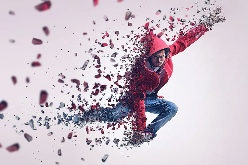
3D Dispersion Effect Photoshop Action

Commetum – Cosmic Tail Photoshop Action

Create an epic cosmic tail with this next particle effect action. Created by profactions, this Photoshop action creates a fully editable image with ten color presets and many more great options. Use it with high-quality images for the best results.

Commetum - Cosmic Tail Photoshop Action

Numeric – Photoshop Particle Effect Plugin

This next add-on features a cool numeric touch as a particle photo effect. Instantly turn your portraits into a wicked typographic effect for social media and more. Just download and install the action to get started. Check it out.

Numeric - Photoshop Particle Effect Plugin

Geometric Dispersion FX Photoshop Add/On Extension

Geometric effects have been trending for years! Now you can use this dispersion particle effect that splits your sports and action shots into edgy, geometric shapes. Use it with any image or resolution and the latest versions of Adobe Photoshop.

Geometric Dispersion FX Photoshop AddOn Extension

Liquify 2 Rain Effect Photoshop Action

Liquify your subjects in seconds! This next Photoshop action creates an unbelievable liquid effect that simulates rain or splashing water. Just mask out the area where you would like to apply the effect, and then play the action. It’s that simple!

Liquify 2 Photoshop Action

Fragmentum – Breaking Distressed Effect Photoshop Action

Feeling a little edgy? Explore a distressed effect Photoshop action like this next one. Fragmentum explodes any object, face or area into millions of tiny dust particles. Easily create this effect yourself using Photoshop versions CS3 and above.

Fragmentum - Breaking Distressed Effect Photoshop Action

Seizure Photoshop Action

Seize new opportunities to express yourself. Photoshop actions like this seizure effect from codetoform turn any boring portrait into a digital masterpiece. Enjoy the well-organized layers and add-ons including a step-by-step tutorial. 

Seizure Photoshop Action

Ashes n Embers – Fire Effect Photoshop Action

Need a fire effect Photoshop action? You can create this next phenomenal look in much less time. Free up your workflow with this easy-to-use Photoshop action that includes ten color presets. Edit the directions to create the best look.

Ashes n Embers - Fire Effect Photoshop Action

Feathers Photoshop Action

Dispersion effects aren’t just for dust and sparkles. This next Photoshop action bursts any subject into a cluster of floating, natural feathers for a bold, new style. Upload your result to Instagram to see how your numbers do! Check it out.

Feathers Photoshop Action

Dispersion 2 Photoshop Action

Trendy dispersion effects are used on dancer photos, but you can also apply them to ordinary objects or photos. This Dispersion 2 Photoshop action from sevenstyles creates a mind-blowing effect with realistic particle details. Edit and add to it to fit your needs.

Dispersion 2 Photoshop Action

Fractal – Sparkle Effect Photoshop Action

Create an electrifying look with lightning and sparkle effects. Simply fill in your model with color and play the action to enjoy this awesome result in seconds. Included in this download is also a helpful video with step-by-step directions. Add it now.

Fractal - Sparkle Effect Photoshop Action

Elementum – Dispersion Photoshop Action

Highly detailed and easy to customize, this next photo effect action includes four options with different directions to choose from. Explore up, down, left, and right directions to switch up the style to fit your needs. Great for Instagram and social media!

Elementum - Dispersion Photoshop Action

More Particle Effects

From sparkles to unique snow effects, Photoshop actions make it possible to create magic in just a few seconds. Explore this list of incredible resources and let us know a few of your favorites.

Enjoy more particle effects from these links:

The Principles of Design

Post pobrano z: The Principles of Design

Have you ever wondered what goes into the creation of a successful design piece? Here are some visual tools that can help you structure your design compositions.

In this article, I’ll show you the definition and importance of the principles of design. This set of visual tools can help you create an organized structure to deliver a clear message. These principles are also applied in art and different design sub-disciplines. Along with definitions, we’ll show you a few principles of design examples that will help you better understand their meaning. 

What Are the Principles of Design?

The principles of design are a set of rules that designers can follow when creating a composition to create visually pleasing work. The purpose of these rules is to deliver a message in the most organized and functional way.

Here’s a list of the main design principles:

  • Balance
  • Unity
  • Contrast
  • Emphasis
  • Repetition
  • Pattern
  • Rhythm
  • Movement
  • Proportion
  • Variety
  • Harmony

While we’ve seen a fair share of experimental pieces out there, it’s important to know the significance of the fundamentals. Every design piece has a structure below the surface that holds up the design and makes it visually interesting and balanced. Once designers understand the usage of the principles, they’ll understand better how to break these rules. 

In my previous article, The Basic Elements of Design, I talked about the elements that create everything we perceive. With a solid understanding of those elements, you’ll be able to learn more about the principles of design. 

Principles of Design: Balance

Principles of Design Balance

Any element placed on a page carries a visual weight. It can range from form to size, color, and texture. In order to make a design feel stable or have balance, the elements need to have a certain scale.

For instance, in a symmetrical design, the elements on the right side have the same visual weight as the elements on the left side. Symmetrical designs are easier to balance but can also come across as boring. Asymmetrical designs have different sides but equal visual weight. Being able to achieve balance in asymmetry can result in a visually interesting design that has movement. 

Lack of balance would make your design feel heavy on one side and empty on the opposite. You’ll know your design lacks balance when it feels as if it’s falling off to one side.

Principles of Design: Unity

Principles of Design Unity

Unity is the harmony produced by all the elements in a design piece. For instance, using similar colors that match and integrate elements organically makes it appear as if they belong together and are not just put on a page.

You can achieve unity by making clear relationships between visual elements. You can find unity wherever you find clear organization and order, and the elements of the page won’t be fighting for attention. Instead, they’ll work together to make the message stronger. Too much unity can result in a sterile design with a lack of personality. That’s when you can start incorporating other elements to add movement. 

Lack of unity would make your design feel cluttered and confusing. Viewers will be attracted to the wrong element of the design and won’t get a clear message. A good rule of thumb is to place an element in your design only if it enhances the message. Ask yourself what the element is adding to the composition.

Principles of Design: Contrast

Principles of Design Contrast

Contrast refers to the level of difference between design elements in order to create visual hierarchies. The variation makes certain elements stand out more than others. You can apply contrast by using colors, textures, sizes, and shapes.

In a layout, contrast is applied to create hierarchy between the font sizes. Larger text tends to be read before any smaller text. Contrast is important when it comes to pairing fonts. For instance, in the example below, we have a font duo that includes a script font and a sans serif font. The script font adds movement to the static sans serif. 

Contrast can create a focal point to certain elements that can draw the viewer’s eyes. Contrast can also be used to create balance and harmony by making sure items are distributed nicely on a page. Lack of contrast can make a design look dull, and viewers can overlook the important message. Contrast is important especially when designing accessible documents. For instance, black type on a white background will be easier to read than black on a brown background.

Jacksons font duo
Jacksons Font Duo

Principles of Design: Emphasis

Principles of Design Emphasis

Emphasis is a strategy to get the viewer’s attention to a specific design element. This can be in any form: a button, a website, or an image. The purpose is to create something that will stand out from the rest of the page. You can use different elements to highlight a specific part of your design, like lines, color, positive/negative relationships, and many more. As long as you can create contrast, either with elements or color, you’ll be creating emphasis. 

  • Lines create direction on a page by pointing to specific elements that help the viewer’s eyes know where to go. 
  • Shapes can also draw attention. Using a group of similar shapes and breaking the group with a different shape will create tension and draw the eyes. 
  • Color can create an emphasis in any design. Buttons on a website tend to contrast with the background to create a sense of urgency and attention.
  • Texture can be seen in materials to enhance tactile features. For instance, a business card can have an emboss or relief on a logo to emphasize it. Digitally, texture can be applied as a drop shadow on a button to appear three-dimensional. 
  • Space is also an option to emphasize certain elements in your design. Enough white space around an object can prioritize the focus on a single element. For instance, Apple has a clean and direct idea of emphasizing products. 

Principles of Design: Repetition

Principles of Design Repetition

Using repeated elements on a layout can be pleasing to the viewer. Repetition is repeating a single element through the design. We can call a grid a repetition of lines because it creates a certain consistency. In layout design, repetition is shown through the folio placement to help viewers find their way in a book or magazine. The same folio placement creates continuity in the repetition. 

In a website, repetition is seen on the menu placement, which gives the viewers a constant placement that can make them feel comfortable and familiar. Repetition can also be achieved by repeating elements in a design like a logo or a tagline in a brand development project. Below, the repetition of waves gives a feeling that the page is endless.

Retro colorful waves background
Retro Colorful Waves Background

Principles of Design: Pattern

Principles of Design Pattern

Pattern is the repetition of more than one design element. While repetition focuses on a single element being repeated, pattern refers to multiple elements repeated throughout a design (e.g. wallpapers and backgrounds).

A seamless pattern is a repeated set of elements that flows without a flaw to create a unit. You can see seamless patterns predominantly in interior design when using tiles. The use of patterns can enhance the viewer’s experience and the look of a final design.

In the example below, the pattern repeats itself from edge to edge without any disruptions. The pattern is composed of multiple elements with varying sizes and depths. 

Cup of tea seamless pattern
Cup of Tea Seamless Pattern

Principles of Design: Rhythm

Principles of Design Rhythm

Rhythm has more complexity than the previous principles of repetition and pattern. Repetition and pattern are applied to the same element throughout a design. Rhythm is the visual tempo of a combination of elements when used repeatedly, and with variation, it gives the feeling of organized movement. 

Rhythm is usually hidden in works of art and is not as obvious as the design principles of repetition and pattern. In the example below, the diagonal lines aren’t arranged in a specific pattern. Instead, there’s a repetition of the elements with variations. 

Melting lines
Melting Lines

Principles of Design: Movement

Principles of Design Movement

Movement refers to the path the viewer’s eye takes through a composition. In an image, every element can affect how the eyes move. Important elements will lead to secondary elements and so on. Movement in a composition creates interest and dynamism that keeps the viewer engaged.

Movement can be created with rhythm when using a variation of an element repeatedly. Using curved lines and diagonal lines creates more movement compared to straight lines. Use lines to trace the path to the focal point. Color can help enhance the feeling of movement, juxtaposing high and low key colors to create energy. A literal way of showing movement is by using an image that includes motion, like a dancer or hair in the wind. Some artists use illusions like optical art, in which the repetition and contrast make our brains want to organize the information. 

In the example below, movement is created by the slightly curved lines and the overlapping colors. Both effects enhance the movement because the lines are unstable and the gradient blurs the lines instead of being static.

Iridescent holographic background
Iridescent Holographic Background

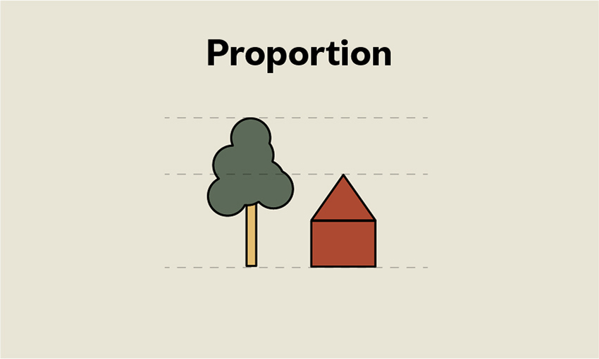
Principles of Design: Proportion

Principles of Design Proportion

Proportion is the sense of unity created when all the elements in a composition relate well with each other. Proportion is mostly about scale and size when two elements are compared. For instance, in art and drawing, proportion is important for the elements to look realistic. Proportion doesn’t necessarily refer to the size of one element but to the relationship of two or more elements. 

In layout hierarchy, the proportion of the headline compared to the photo caption needs to be larger as the headline is the most important element. Smaller elements have less importance. When you achieve a good sense of proportion in a composition, it can add harmony and balance.

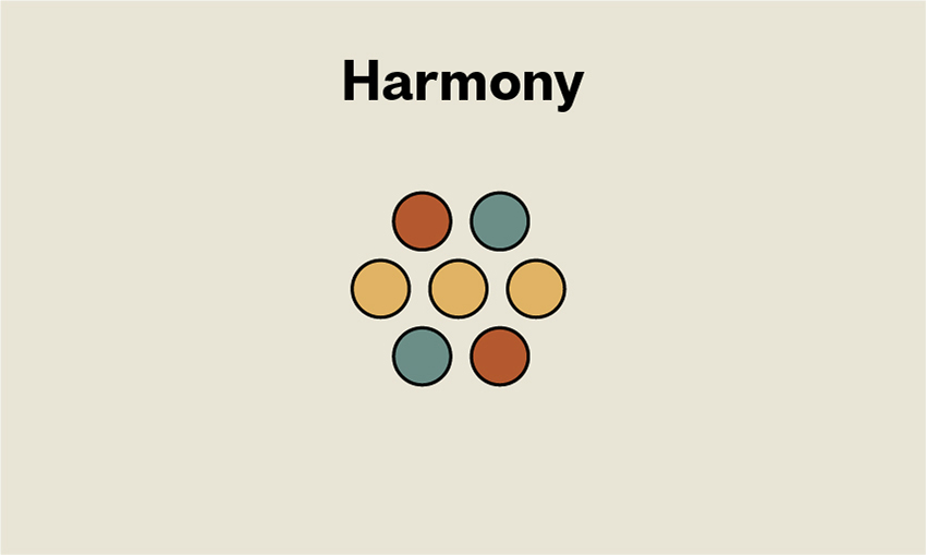
Principles of Design: Harmony

Principles of Design Harmony

Harmony is the sense of cohesiveness between the elements in a composition. The elements shouldn’t be exactly the same or completely different but related in some way. Color palettes or similar textures can create a sense of unity between different components. Using similarly shaped items will create harmony because they will seem related. 

Not enough or too much harmony can make a design dull; there needs to be some kind of variety for it to be visually interesting. 

Principles of Design: Variety

Principles of Design Variety

Creating visual interest will keep viewers engaged with your design. Holding their attention and guiding them through the composition will create a powerful user experience. Variety adds something interesting to the composition to create contrast and tension. For instance, mixing organic shapes with geometric shapes adds variety. This concept should reinforce the message you are trying to communicate in your design—otherwise, it can look pointless.

That’s It! 

The elements and principles of art and design are the foundation for creating a composition. The use of these principles can give structure and help you understand how other design pieces and artworks are built. It can help you determine whether a composition will be successful or determine the missing piece of the puzzle.

The use of these principles will help you design with purpose by giving function to every single element in a composition. Communicating a clear message isn’t only about the message but how we carry it to deliver it cleanly and clearly.

When you look at a design composition from now on, think of these principles and how they are being applied. You’ll be able to decode the most intricate designs and understand what’s working and what’s not. 

If you liked this article, you might like:

The Principles of Design

Post pobrano z: The Principles of Design

Have you ever wondered what goes into the creation of a successful design piece? Here are some visual tools that can help you structure your design compositions.

In this article, I’ll show you the definition and importance of the principles of design. This set of visual tools can help you create an organized structure to deliver a clear message. These principles are also applied in art and different design sub-disciplines. Along with definitions, we’ll show you a few principles of design examples that will help you better understand their meaning. 

What Are the Principles of Design?

The principles of design are a set of rules that designers can follow when creating a composition to create visually pleasing work. The purpose of these rules is to deliver a message in the most organized and functional way.

Here’s a list of the main design principles:

  • Balance
  • Unity
  • Contrast
  • Emphasis
  • Repetition
  • Pattern
  • Rhythm
  • Movement
  • Proportion
  • Variety
  • Harmony

While we’ve seen a fair share of experimental pieces out there, it’s important to know the significance of the fundamentals. Every design piece has a structure below the surface that holds up the design and makes it visually interesting and balanced. Once designers understand the usage of the principles, they’ll understand better how to break these rules. 

In my previous article, The Basic Elements of Design, I talked about the elements that create everything we perceive. With a solid understanding of those elements, you’ll be able to learn more about the principles of design. 

Principles of Design: Balance

Principles of Design Balance

Any element placed on a page carries a visual weight. It can range from form to size, color, and texture. In order to make a design feel stable or have balance, the elements need to have a certain scale.

For instance, in a symmetrical design, the elements on the right side have the same visual weight as the elements on the left side. Symmetrical designs are easier to balance but can also come across as boring. Asymmetrical designs have different sides but equal visual weight. Being able to achieve balance in asymmetry can result in a visually interesting design that has movement. 

Lack of balance would make your design feel heavy on one side and empty on the opposite. You’ll know your design lacks balance when it feels as if it’s falling off to one side.

Principles of Design: Unity

Principles of Design Unity

Unity is the harmony produced by all the elements in a design piece. For instance, using similar colors that match and integrate elements organically makes it appear as if they belong together and are not just put on a page.

You can achieve unity by making clear relationships between visual elements. You can find unity wherever you find clear organization and order, and the elements of the page won’t be fighting for attention. Instead, they’ll work together to make the message stronger. Too much unity can result in a sterile design with a lack of personality. That’s when you can start incorporating other elements to add movement. 

Lack of unity would make your design feel cluttered and confusing. Viewers will be attracted to the wrong element of the design and won’t get a clear message. A good rule of thumb is to place an element in your design only if it enhances the message. Ask yourself what the element is adding to the composition.

Principles of Design: Contrast

Principles of Design Contrast

Contrast refers to the level of difference between design elements in order to create visual hierarchies. The variation makes certain elements stand out more than others. You can apply contrast by using colors, textures, sizes, and shapes.

In a layout, contrast is applied to create hierarchy between the font sizes. Larger text tends to be read before any smaller text. Contrast is important when it comes to pairing fonts. For instance, in the example below, we have a font duo that includes a script font and a sans serif font. The script font adds movement to the static sans serif. 

Contrast can create a focal point to certain elements that can draw the viewer’s eyes. Contrast can also be used to create balance and harmony by making sure items are distributed nicely on a page. Lack of contrast can make a design look dull, and viewers can overlook the important message. Contrast is important especially when designing accessible documents. For instance, black type on a white background will be easier to read than black on a brown background.

Jacksons font duo
Jacksons Font Duo

Principles of Design: Emphasis

Principles of Design Emphasis

Emphasis is a strategy to get the viewer’s attention to a specific design element. This can be in any form: a button, a website, or an image. The purpose is to create something that will stand out from the rest of the page. You can use different elements to highlight a specific part of your design, like lines, color, positive/negative relationships, and many more. As long as you can create contrast, either with elements or color, you’ll be creating emphasis. 

  • Lines create direction on a page by pointing to specific elements that help the viewer’s eyes know where to go. 
  • Shapes can also draw attention. Using a group of similar shapes and breaking the group with a different shape will create tension and draw the eyes. 
  • Color can create an emphasis in any design. Buttons on a website tend to contrast with the background to create a sense of urgency and attention.
  • Texture can be seen in materials to enhance tactile features. For instance, a business card can have an emboss or relief on a logo to emphasize it. Digitally, texture can be applied as a drop shadow on a button to appear three-dimensional. 
  • Space is also an option to emphasize certain elements in your design. Enough white space around an object can prioritize the focus on a single element. For instance, Apple has a clean and direct idea of emphasizing products. 

Principles of Design: Repetition

Principles of Design Repetition

Using repeated elements on a layout can be pleasing to the viewer. Repetition is repeating a single element through the design. We can call a grid a repetition of lines because it creates a certain consistency. In layout design, repetition is shown through the folio placement to help viewers find their way in a book or magazine. The same folio placement creates continuity in the repetition. 

In a website, repetition is seen on the menu placement, which gives the viewers a constant placement that can make them feel comfortable and familiar. Repetition can also be achieved by repeating elements in a design like a logo or a tagline in a brand development project. Below, the repetition of waves gives a feeling that the page is endless.

Retro colorful waves background
Retro Colorful Waves Background

Principles of Design: Pattern

Principles of Design Pattern

Pattern is the repetition of more than one design element. While repetition focuses on a single element being repeated, pattern refers to multiple elements repeated throughout a design (e.g. wallpapers and backgrounds).

A seamless pattern is a repeated set of elements that flows without a flaw to create a unit. You can see seamless patterns predominantly in interior design when using tiles. The use of patterns can enhance the viewer’s experience and the look of a final design.

In the example below, the pattern repeats itself from edge to edge without any disruptions. The pattern is composed of multiple elements with varying sizes and depths. 

Cup of tea seamless pattern
Cup of Tea Seamless Pattern

Principles of Design: Rhythm

Principles of Design Rhythm

Rhythm has more complexity than the previous principles of repetition and pattern. Repetition and pattern are applied to the same element throughout a design. Rhythm is the visual tempo of a combination of elements when used repeatedly, and with variation, it gives the feeling of organized movement. 

Rhythm is usually hidden in works of art and is not as obvious as the design principles of repetition and pattern. In the example below, the diagonal lines aren’t arranged in a specific pattern. Instead, there’s a repetition of the elements with variations. 

Melting lines
Melting Lines

Principles of Design: Movement

Principles of Design Movement

Movement refers to the path the viewer’s eye takes through a composition. In an image, every element can affect how the eyes move. Important elements will lead to secondary elements and so on. Movement in a composition creates interest and dynamism that keeps the viewer engaged.

Movement can be created with rhythm when using a variation of an element repeatedly. Using curved lines and diagonal lines creates more movement compared to straight lines. Use lines to trace the path to the focal point. Color can help enhance the feeling of movement, juxtaposing high and low key colors to create energy. A literal way of showing movement is by using an image that includes motion, like a dancer or hair in the wind. Some artists use illusions like optical art, in which the repetition and contrast make our brains want to organize the information. 

In the example below, movement is created by the slightly curved lines and the overlapping colors. Both effects enhance the movement because the lines are unstable and the gradient blurs the lines instead of being static.

Iridescent holographic background
Iridescent Holographic Background

Principles of Design: Proportion

Principles of Design Proportion

Proportion is the sense of unity created when all the elements in a composition relate well with each other. Proportion is mostly about scale and size when two elements are compared. For instance, in art and drawing, proportion is important for the elements to look realistic. Proportion doesn’t necessarily refer to the size of one element but to the relationship of two or more elements. 

In layout hierarchy, the proportion of the headline compared to the photo caption needs to be larger as the headline is the most important element. Smaller elements have less importance. When you achieve a good sense of proportion in a composition, it can add harmony and balance.

Principles of Design: Harmony

Principles of Design Harmony

Harmony is the sense of cohesiveness between the elements in a composition. The elements shouldn’t be exactly the same or completely different but related in some way. Color palettes or similar textures can create a sense of unity between different components. Using similarly shaped items will create harmony because they will seem related. 

Not enough or too much harmony can make a design dull; there needs to be some kind of variety for it to be visually interesting. 

Principles of Design: Variety

Principles of Design Variety

Creating visual interest will keep viewers engaged with your design. Holding their attention and guiding them through the composition will create a powerful user experience. Variety adds something interesting to the composition to create contrast and tension. For instance, mixing organic shapes with geometric shapes adds variety. This concept should reinforce the message you are trying to communicate in your design—otherwise, it can look pointless.

That’s It! 

The elements and principles of art and design are the foundation for creating a composition. The use of these principles can give structure and help you understand how other design pieces and artworks are built. It can help you determine whether a composition will be successful or determine the missing piece of the puzzle.

The use of these principles will help you design with purpose by giving function to every single element in a composition. Communicating a clear message isn’t only about the message but how we carry it to deliver it cleanly and clearly.

When you look at a design composition from now on, think of these principles and how they are being applied. You’ll be able to decode the most intricate designs and understand what’s working and what’s not. 

If you liked this article, you might like:

The Principles of Design

Post pobrano z: The Principles of Design

Have you ever wondered what goes into the creation of a successful design piece? Here are some visual tools that can help you structure your design compositions.

In this article, I’ll show you the definition and importance of the principles of design. This set of visual tools can help you create an organized structure to deliver a clear message. These principles are also applied in art and different design sub-disciplines. Along with definitions, we’ll show you a few principles of design examples that will help you better understand their meaning. 

What Are the Principles of Design?

The principles of design are a set of rules that designers can follow when creating a composition to create visually pleasing work. The purpose of these rules is to deliver a message in the most organized and functional way.

Here’s a list of the main design principles:

  • Balance
  • Unity
  • Contrast
  • Emphasis
  • Repetition
  • Pattern
  • Rhythm
  • Movement
  • Proportion
  • Variety
  • Harmony

While we’ve seen a fair share of experimental pieces out there, it’s important to know the significance of the fundamentals. Every design piece has a structure below the surface that holds up the design and makes it visually interesting and balanced. Once designers understand the usage of the principles, they’ll understand better how to break these rules. 

In my previous article, The Basic Elements of Design, I talked about the elements that create everything we perceive. With a solid understanding of those elements, you’ll be able to learn more about the principles of design. 

Principles of Design: Balance

Principles of Design Balance

Any element placed on a page carries a visual weight. It can range from form to size, color, and texture. In order to make a design feel stable or have balance, the elements need to have a certain scale.

For instance, in a symmetrical design, the elements on the right side have the same visual weight as the elements on the left side. Symmetrical designs are easier to balance but can also come across as boring. Asymmetrical designs have different sides but equal visual weight. Being able to achieve balance in asymmetry can result in a visually interesting design that has movement. 

Lack of balance would make your design feel heavy on one side and empty on the opposite. You’ll know your design lacks balance when it feels as if it’s falling off to one side.

Principles of Design: Unity

Principles of Design Unity

Unity is the harmony produced by all the elements in a design piece. For instance, using similar colors that match and integrate elements organically makes it appear as if they belong together and are not just put on a page.

You can achieve unity by making clear relationships between visual elements. You can find unity wherever you find clear organization and order, and the elements of the page won’t be fighting for attention. Instead, they’ll work together to make the message stronger. Too much unity can result in a sterile design with a lack of personality. That’s when you can start incorporating other elements to add movement. 

Lack of unity would make your design feel cluttered and confusing. Viewers will be attracted to the wrong element of the design and won’t get a clear message. A good rule of thumb is to place an element in your design only if it enhances the message. Ask yourself what the element is adding to the composition.

Principles of Design: Contrast

Principles of Design Contrast

Contrast refers to the level of difference between design elements in order to create visual hierarchies. The variation makes certain elements stand out more than others. You can apply contrast by using colors, textures, sizes, and shapes.

In a layout, contrast is applied to create hierarchy between the font sizes. Larger text tends to be read before any smaller text. Contrast is important when it comes to pairing fonts. For instance, in the example below, we have a font duo that includes a script font and a sans serif font. The script font adds movement to the static sans serif. 

Contrast can create a focal point to certain elements that can draw the viewer’s eyes. Contrast can also be used to create balance and harmony by making sure items are distributed nicely on a page. Lack of contrast can make a design look dull, and viewers can overlook the important message. Contrast is important especially when designing accessible documents. For instance, black type on a white background will be easier to read than black on a brown background.

Jacksons font duo
Jacksons Font Duo

Principles of Design: Emphasis

Principles of Design Emphasis

Emphasis is a strategy to get the viewer’s attention to a specific design element. This can be in any form: a button, a website, or an image. The purpose is to create something that will stand out from the rest of the page. You can use different elements to highlight a specific part of your design, like lines, color, positive/negative relationships, and many more. As long as you can create contrast, either with elements or color, you’ll be creating emphasis. 

  • Lines create direction on a page by pointing to specific elements that help the viewer’s eyes know where to go. 
  • Shapes can also draw attention. Using a group of similar shapes and breaking the group with a different shape will create tension and draw the eyes. 
  • Color can create an emphasis in any design. Buttons on a website tend to contrast with the background to create a sense of urgency and attention.
  • Texture can be seen in materials to enhance tactile features. For instance, a business card can have an emboss or relief on a logo to emphasize it. Digitally, texture can be applied as a drop shadow on a button to appear three-dimensional. 
  • Space is also an option to emphasize certain elements in your design. Enough white space around an object can prioritize the focus on a single element. For instance, Apple has a clean and direct idea of emphasizing products. 

Principles of Design: Repetition

Principles of Design Repetition

Using repeated elements on a layout can be pleasing to the viewer. Repetition is repeating a single element through the design. We can call a grid a repetition of lines because it creates a certain consistency. In layout design, repetition is shown through the folio placement to help viewers find their way in a book or magazine. The same folio placement creates continuity in the repetition. 

In a website, repetition is seen on the menu placement, which gives the viewers a constant placement that can make them feel comfortable and familiar. Repetition can also be achieved by repeating elements in a design like a logo or a tagline in a brand development project. Below, the repetition of waves gives a feeling that the page is endless.

Retro colorful waves background
Retro Colorful Waves Background

Principles of Design: Pattern

Principles of Design Pattern

Pattern is the repetition of more than one design element. While repetition focuses on a single element being repeated, pattern refers to multiple elements repeated throughout a design (e.g. wallpapers and backgrounds).

A seamless pattern is a repeated set of elements that flows without a flaw to create a unit. You can see seamless patterns predominantly in interior design when using tiles. The use of patterns can enhance the viewer’s experience and the look of a final design.

In the example below, the pattern repeats itself from edge to edge without any disruptions. The pattern is composed of multiple elements with varying sizes and depths. 

Cup of tea seamless pattern
Cup of Tea Seamless Pattern

Principles of Design: Rhythm

Principles of Design Rhythm

Rhythm has more complexity than the previous principles of repetition and pattern. Repetition and pattern are applied to the same element throughout a design. Rhythm is the visual tempo of a combination of elements when used repeatedly, and with variation, it gives the feeling of organized movement. 

Rhythm is usually hidden in works of art and is not as obvious as the design principles of repetition and pattern. In the example below, the diagonal lines aren’t arranged in a specific pattern. Instead, there’s a repetition of the elements with variations. 

Melting lines
Melting Lines

Principles of Design: Movement

Principles of Design Movement

Movement refers to the path the viewer’s eye takes through a composition. In an image, every element can affect how the eyes move. Important elements will lead to secondary elements and so on. Movement in a composition creates interest and dynamism that keeps the viewer engaged.

Movement can be created with rhythm when using a variation of an element repeatedly. Using curved lines and diagonal lines creates more movement compared to straight lines. Use lines to trace the path to the focal point. Color can help enhance the feeling of movement, juxtaposing high and low key colors to create energy. A literal way of showing movement is by using an image that includes motion, like a dancer or hair in the wind. Some artists use illusions like optical art, in which the repetition and contrast make our brains want to organize the information. 

In the example below, movement is created by the slightly curved lines and the overlapping colors. Both effects enhance the movement because the lines are unstable and the gradient blurs the lines instead of being static.

Iridescent holographic background
Iridescent Holographic Background

Principles of Design: Proportion

Principles of Design Proportion

Proportion is the sense of unity created when all the elements in a composition relate well with each other. Proportion is mostly about scale and size when two elements are compared. For instance, in art and drawing, proportion is important for the elements to look realistic. Proportion doesn’t necessarily refer to the size of one element but to the relationship of two or more elements. 

In layout hierarchy, the proportion of the headline compared to the photo caption needs to be larger as the headline is the most important element. Smaller elements have less importance. When you achieve a good sense of proportion in a composition, it can add harmony and balance.

Principles of Design: Harmony

Principles of Design Harmony

Harmony is the sense of cohesiveness between the elements in a composition. The elements shouldn’t be exactly the same or completely different but related in some way. Color palettes or similar textures can create a sense of unity between different components. Using similarly shaped items will create harmony because they will seem related. 

Not enough or too much harmony can make a design dull; there needs to be some kind of variety for it to be visually interesting. 

Principles of Design: Variety

Principles of Design Variety

Creating visual interest will keep viewers engaged with your design. Holding their attention and guiding them through the composition will create a powerful user experience. Variety adds something interesting to the composition to create contrast and tension. For instance, mixing organic shapes with geometric shapes adds variety. This concept should reinforce the message you are trying to communicate in your design—otherwise, it can look pointless.

That’s It! 

The elements and principles of art and design are the foundation for creating a composition. The use of these principles can give structure and help you understand how other design pieces and artworks are built. It can help you determine whether a composition will be successful or determine the missing piece of the puzzle.

The use of these principles will help you design with purpose by giving function to every single element in a composition. Communicating a clear message isn’t only about the message but how we carry it to deliver it cleanly and clearly.

When you look at a design composition from now on, think of these principles and how they are being applied. You’ll be able to decode the most intricate designs and understand what’s working and what’s not. 

If you liked this article, you might like:

10 Top Tips for Designing Awesome Packaging and Labels

Post pobrano z: 10 Top Tips for Designing Awesome Packaging and Labels

Final product image
What You’ll Be Creating

Designing packaging can seem daunting at first glance, but it needn’t be—some of the most effective designs are based on surprisingly simple templates.

Whether you’re looking for tips for creating cosmetics packaging, food cartons, bottle labels or origami-inspired boxes, you’ll be sure to find something here to inspire you.

Packaging takes 2D designs and transforms them into printed, tactile 3D creations—it’s an incredibly effective way of bringing a strong branded look to a product, or helping the consumer to commit to purchasing. In this article we’ll take a look at ten pro tips for giving your packaging a stylish, eye-catching look, as well as technical tips for choosing templates, software and print finishes.

Looking for the perfect packaging template? Take the time to browse the huge range of creative templates over on Envato Market.

1. Origami Styles Aren’t Only for the Brave

Sometimes you encounter packaging that’s so pretty it simply takes your breath away. Folded, origami-inspired designs look incredible and transform packaging into a work of art. 

Many origami-inspired designs are surprisingly simple at their core, and are based on thoughtfully laid-out templates. With so many creative packaging templates at your fingertips through sites like Envato Market, these complex-looking designs are no longer out of reach.

bath salts packaging
Bath Salts Packaging Template

The quirky packaging for these bath salts is tactile, portable and looks fantastic embellished with slices of citrus fruit. 

bath salts packaging
Bath Salts Packaging Template

If you’re brave enough to try creating your own origami designs from scratch, try experimenting with rough mock-ups on low-grade paper before you commit to the computer—it will help you to visualise how a 2D layout will translate to a 3D product.

bath salts packaging
Bath Salts Packaging Template

Origami styles are not always the most practical or stackable of packaging designs, so they tend to suit display packaging best.

2. Simplify Packaging With Easy-Peasy Labels

At one end of the packaging spectrum is origami-style beauties, and at the other the refreshing simplicity of an easy-to-produce label. 

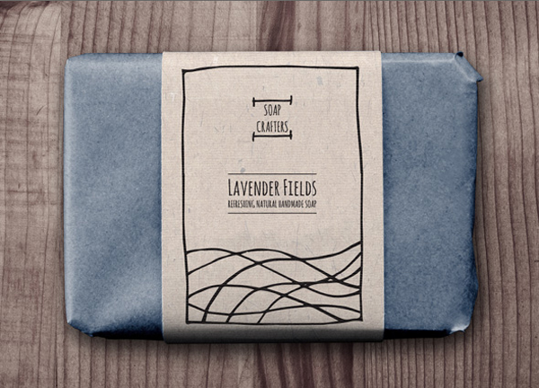
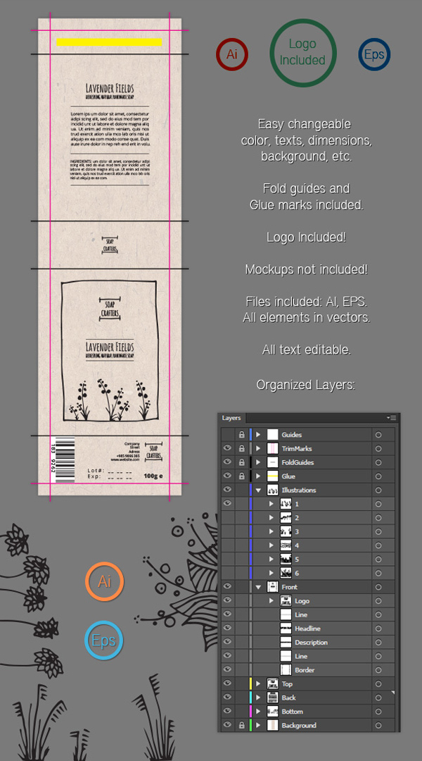
soap wrap label
Soap Wrap Label Template

Labels can be attached to bottles, or wrapped loosely around tissue-wrapped items. They’re super-simple to design (no tricky folds to accommodate) and cheap to print, which is great if you’re on a tight budget.

This isn’t to say that labels lack impact—a well-designed label can bring a lovely hand-done look to packaging, as with these rustic soap wrap labels

soap wrap label
Soap Wrap Label Template

Labels are the perfect choice for independent shops and other small businesses looking to produce branded packaging quickly and cheaply, and they really can add to the charm of the product. Labels and simple stickers are also really practical—they’re easy to edit and can be resized quickly to suit various products. 

soap wrap label
Soap Wrap Label Template

3. Let Your Typography Sell the Product

Typography is such a transformative element in graphic design—choose a classic serif and create an aspirational product, or go for a pared-back sans serif instead and you’re pitching a product that’s suddenly cool and trendy.

Packaging for wine and beer bottles provide some great examples of the power of typography to sell a product to a particular market. 

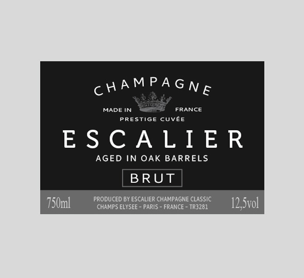
champagne label
Champagne Label Template

You’ll notice that most champagne labels use traditional serif typefaces or heavily-tracked headers which communicate luxury and high-end quality. 

champagne label
Champagne Label Template

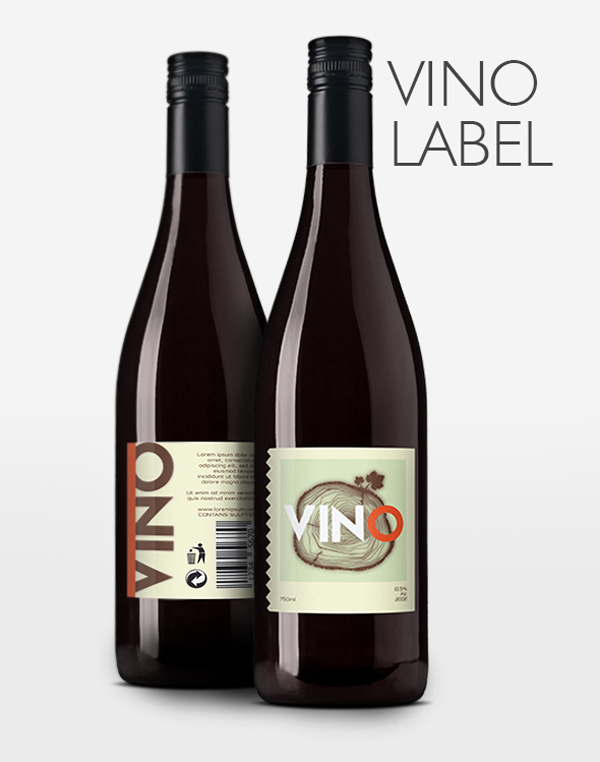
A lot of beer bottles feature informal sans serif or grunge typefaces, to emphasise the laid-back, relaxing nature of their products. Wine bottles can vary—an expensive wine might feature a classic serif to help justify the price tag, or a new wine on the block might use a modern slab type, as on this modern label template, to appeal to younger, fashion-conscious consumers.

vino label
Wine Label Template

When you design your packaging, try experimenting with a number of different type styles in your initial designs. Show the different designs to a market sample or friends/family—which type styles appealed to particular demographics? Does age, disposable income or lifestyle choice sway particular groups towards one typeface or another? 

Once you’ve done your experiment, you’ll feel better prepared to use the type style that appeals best to your target market.

4. Use a Natural Color Palette

The days of bold, brash packaging have come to an end. To be relevant in the modern market, you need to tone it down. 

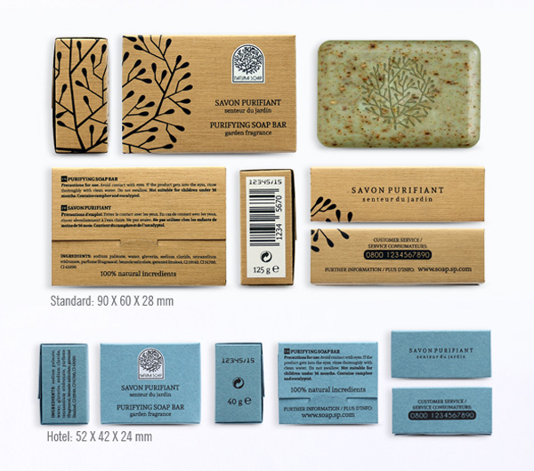
natural soap packaging
Natural Soap Packaging Template

Nature-inspired, tonal colors have a calming effect, and tap into the general trend for commercial products that are more eco- and ethic-conscious. 

Try using tints of brighter colors to give a wash effect to packaging, or team colored elements with natural brown paper or card, as in this packaging design for natural soaps.

natural soap packaging
Natural Soap Packaging Template

Even if your products aren’t 100% organic or don’t come fresh from the farmer’s market, you can still give a touch of wholesomeness to your packaging with a pared-back color palette.

natural soap packaging
Natural Soap Packaging Template

5. Combine Photography With Minimal Styles

Packaging trends come and go, and one thing that is always in flux is the sort of graphics that feel appropriate. At the moment, illustrated graphics or simple typographic designs seem to be the most popular graphic media. 

Photography may not be commonplace on packaging at the moment, but that’s not to say that it can’t look stylish and relevant if designed in the right way. 

box packaging
Box Packaging Template

To keep photography on packaging looking slick and modern, stick to striking, graphic images, and consider using black-and-white photography. Teamed with colorful typography, this can look really eye-catching and on-trend.

Or take inspiration from these minimal templates for cosmetic products and team color photography with simple, sans serif type in a matching color. 

tube packaging
Tube Packaging Template

Adding solid-color graphics set behind the white text keeps the design looking ultra-modern and app-like.

tube packaging
Tube Packaging Template

6. Go Arty!

Sure, a label might be small, but that doesn’t mean it can’t pack a punch. Labels are the perfect place to get really creative, and they’re the stuff of dreams of many a graphic designer.

Many brands are exploring ways to make their products look unique, and some produce special-edition products to increase desirability amongst their loyal customers.

vino labels
Wine Label Template

As a result, collaborations with artists are becoming more common in the packaging design world. Particularly for wine bottles, cosmetics and clothing, labels with an artistic touch help to define products as unique, aspirational and special.

vinho labels
Wine Label Template

If you don’t have Damien Hirst on speed-dial, you’ll have to put on your artistic hat. Painterly finishes, unusual type styles, and hand-drawn illustrations look incredible on packaging and will help your design to stand out from the crowd. 

vinho labels
Wine Label Template

If you’re not a deft hand with a paintbrush, don’t fret—digital and vector art is equally desirable on modern packaging right now.

vino labels
Wine Label Template

7. Go Masculine With Black and White…

Although it’s true that more retailers are pitching their products at a unisex market, there’s still a clear visual divide in products that are aimed at specifically men or women. 

For products aimed at men, such as shaving products and men’s toiletries, there’s still a strict design code as to what sort of colors and type styles will convert to sales.

Though I wouldn’t condone the traditional blue for boys, pink for girls (that’s just lazy), you can add a masculine or unisex touch to your packaging designs with a strong, graphic black and white color combination. This modern packaging template does just that, and is visually very strong while communicating a masculine vibe. 

masculine packaging
Masculine Packaging Template

Team your black-and-white designs with square sans-serif type for a modern take on traditional masculine packaging styles.

masculine packaging
Masculine Packaging Template

8. …or Add a Feminine Touch With Pattern

A ‘feminine’ design doesn’t mean your product will only appeal to women—in fact, adding a feminine element to your packaging only means that you will bring particular qualities to the design, which often have broad market appeal, including elegance and beauty.

Adding a patterned design to your packaging is a fantastic way to bring a beautiful quality to your designs. Mid-century wallpaper-style designs add retro appeal to all sorts of products, or why not try an ornate, William Morris-inspired pattern, as in the packaging template below?

soap packaging
Soap Packaging Template

Patterned packaging is not only beautiful, but also a great way to create a uniform series of packaging designs. 

soap packaging pattern
Soap Packaging Template

These soaps may have different scents, but they are brought together into the same category or brand by simply switching up the color of the pattern, not by changing the design of the pattern itself. 

soap packaging
Soap Packaging Template

Pattern is also surprisingly simple to design, thanks to its repetitive elements. Work on creating a single ‘unit’ of pattern, and then copy this repeatedly to create a whole sheet of pattern that can be pasted onto a packaging template easily.

9. Think About the Full Packaging Range

Your packaging designs don’t stop at just the box. Once a product is opened, you should consider how the style of the packaging can be extended to internal wrapping, labels, and sub-containers. 

Designing a box for a clothes retailer? Once the customer opens up that box, how will the clothing inside be presented? Can you create a branded sticker to place on colored tissue paper? Can you design a stylish clothes tag to place on the garment inside?

This complete packaging range for tea bags is a great example of how to adapt packaging design to a range of purposes—a unified style, using colors, pattern and a strong logo, is extended across the main box to the tea bag packaging and label inside. 

retro tea template
Retro Tea Packaging Template

Keep in mind that packaging is not only for display purposes—to encourage a customer to repurchase, the whole experience of opening and engaging with the product needs to be as pleasurable as possible. A full range of packaging designs will help you to achieve this.

retro tea template
Retro Tea Packaging Template

10. Turn Your Packaging Into a Walking Ad

Think about where you see packaging—on display in shop windows or on supermarket shelves are the obvious places. But you can think about extending your packaging ambitions even further and turn your designs into a mobile advertisement for the product or company.

Creating branded shopping bags is a great way of extending your advertising past the single customer interaction and bringing your brand to a much wider audience.

social media bag
Social Media Shopping Bag Template

If your business is setting up shop at a conference or expo, this is a particularly effective way of advertising your stall around the convention hall. These modern branded bags are eye-catching and stylish, and certain to be both practical and a visual talking point for stall visitors. 

social media bag
Social Media Shopping Bag Template

If your budget won’t stretch to custom printed bags, why not design a simple sticker or stamp in the brand’s style that can be applied to a plain paper bag or canvas tote? 

You’re Ready to Start Designing Awesome Packaging!

In this article, we’ve looked at ten tips for designing amazing packaging and labels. The next time you’re looking to tackle a packaging project, keep these ten useful tips in mind:

  1. Origami-style packaging doesn’t have to be complicated—with the help of templates and mock-ups, it’s surprisingly simple to create folded designs that look striking and decorative.
  2. Try out labels for a simple yet effective packaging design—wrapped around, tied to or stuck to boxes and bottles, labels can give a lovely hand-done look to your product.
  3. Let typography sell the product—switch up the style of your typefaces to transform the personality of your packaging and pitch it at particular consumers.
  4. Use a natural color palette—stay on trend with subtle tints and washed-out tones.
  5. Team photography with minimal design styles—keep photos looking modern and relevant by pairing them with ultra-modern sans serif type styles and tech-inspired graphics and colors.
  6. Go arty! Bring an artistic, unique touch to labels with hand-drawn or vectorized illustrations and logos.
  7. Add a masculine edge to packaging with a strong black-and-white color combination…
  8. …or bring feminine flair with pattern, for a look that’s elegant and beautiful.
  9. Think about the full packaging range—extend your designs to stickers, labels and internal packaging for a truly immersive consumer experience.
  10. Turn your packaging into a walking ad­—design custom shopping bags or add logos to totes for an easy way to advertise your business’s presence on the high street or at a convention.

Have any more top tips for designing your own packaging? We’d love to hear about them in the comments below.

If you’re still on the hunt for that elusive perfect label or box template, you’re in luck! You can find a whole range of great-value packaging templates on Envato Market. Or find even more packaging design tips in this article:

10 Top Tips for Designing Awesome Packaging and Labels

Post pobrano z: 10 Top Tips for Designing Awesome Packaging and Labels

Final product image
What You’ll Be Creating

Designing packaging can seem daunting at first glance, but it needn’t be—some of the most effective designs are based on surprisingly simple templates.

Whether you’re looking for tips for creating cosmetics packaging, food cartons, bottle labels or origami-inspired boxes, you’ll be sure to find something here to inspire you.

Packaging takes 2D designs and transforms them into printed, tactile 3D creations—it’s an incredibly effective way of bringing a strong branded look to a product, or helping the consumer to commit to purchasing. In this article we’ll take a look at ten pro tips for giving your packaging a stylish, eye-catching look, as well as technical tips for choosing templates, software and print finishes.

Looking for the perfect packaging template? Take the time to browse the huge range of creative templates over on Envato Market.

1. Origami Styles Aren’t Only for the Brave

Sometimes you encounter packaging that’s so pretty it simply takes your breath away. Folded, origami-inspired designs look incredible and transform packaging into a work of art. 

Many origami-inspired designs are surprisingly simple at their core, and are based on thoughtfully laid-out templates. With so many creative packaging templates at your fingertips through sites like Envato Market, these complex-looking designs are no longer out of reach.

bath salts packaging
Bath Salts Packaging Template

The quirky packaging for these bath salts is tactile, portable and looks fantastic embellished with slices of citrus fruit. 

bath salts packaging
Bath Salts Packaging Template

If you’re brave enough to try creating your own origami designs from scratch, try experimenting with rough mock-ups on low-grade paper before you commit to the computer—it will help you to visualise how a 2D layout will translate to a 3D product.

bath salts packaging
Bath Salts Packaging Template

Origami styles are not always the most practical or stackable of packaging designs, so they tend to suit display packaging best.

2. Simplify Packaging With Easy-Peasy Labels

At one end of the packaging spectrum is origami-style beauties, and at the other the refreshing simplicity of an easy-to-produce label. 

soap wrap label
Soap Wrap Label Template

Labels can be attached to bottles, or wrapped loosely around tissue-wrapped items. They’re super-simple to design (no tricky folds to accommodate) and cheap to print, which is great if you’re on a tight budget.

This isn’t to say that labels lack impact—a well-designed label can bring a lovely hand-done look to packaging, as with these rustic soap wrap labels

soap wrap label
Soap Wrap Label Template

Labels are the perfect choice for independent shops and other small businesses looking to produce branded packaging quickly and cheaply, and they really can add to the charm of the product. Labels and simple stickers are also really practical—they’re easy to edit and can be resized quickly to suit various products. 

soap wrap label
Soap Wrap Label Template

3. Let Your Typography Sell the Product

Typography is such a transformative element in graphic design—choose a classic serif and create an aspirational product, or go for a pared-back sans serif instead and you’re pitching a product that’s suddenly cool and trendy.

Packaging for wine and beer bottles provide some great examples of the power of typography to sell a product to a particular market. 

champagne label
Champagne Label Template

You’ll notice that most champagne labels use traditional serif typefaces or heavily-tracked headers which communicate luxury and high-end quality. 

champagne label
Champagne Label Template

A lot of beer bottles feature informal sans serif or grunge typefaces, to emphasise the laid-back, relaxing nature of their products. Wine bottles can vary—an expensive wine might feature a classic serif to help justify the price tag, or a new wine on the block might use a modern slab type, as on this modern label template, to appeal to younger, fashion-conscious consumers.

vino label
Wine Label Template

When you design your packaging, try experimenting with a number of different type styles in your initial designs. Show the different designs to a market sample or friends/family—which type styles appealed to particular demographics? Does age, disposable income or lifestyle choice sway particular groups towards one typeface or another? 

Once you’ve done your experiment, you’ll feel better prepared to use the type style that appeals best to your target market.

4. Use a Natural Color Palette

The days of bold, brash packaging have come to an end. To be relevant in the modern market, you need to tone it down. 

natural soap packaging
Natural Soap Packaging Template

Nature-inspired, tonal colors have a calming effect, and tap into the general trend for commercial products that are more eco- and ethic-conscious. 

Try using tints of brighter colors to give a wash effect to packaging, or team colored elements with natural brown paper or card, as in this packaging design for natural soaps.

natural soap packaging
Natural Soap Packaging Template

Even if your products aren’t 100% organic or don’t come fresh from the farmer’s market, you can still give a touch of wholesomeness to your packaging with a pared-back color palette.

natural soap packaging
Natural Soap Packaging Template

5. Combine Photography With Minimal Styles

Packaging trends come and go, and one thing that is always in flux is the sort of graphics that feel appropriate. At the moment, illustrated graphics or simple typographic designs seem to be the most popular graphic media. 

Photography may not be commonplace on packaging at the moment, but that’s not to say that it can’t look stylish and relevant if designed in the right way. 

box packaging
Box Packaging Template

To keep photography on packaging looking slick and modern, stick to striking, graphic images, and consider using black-and-white photography. Teamed with colorful typography, this can look really eye-catching and on-trend.

Or take inspiration from these minimal templates for cosmetic products and team color photography with simple, sans serif type in a matching color. 

tube packaging
Tube Packaging Template

Adding solid-color graphics set behind the white text keeps the design looking ultra-modern and app-like.

tube packaging
Tube Packaging Template

6. Go Arty!

Sure, a label might be small, but that doesn’t mean it can’t pack a punch. Labels are the perfect place to get really creative, and they’re the stuff of dreams of many a graphic designer.

Many brands are exploring ways to make their products look unique, and some produce special-edition products to increase desirability amongst their loyal customers.

vino labels
Wine Label Template

As a result, collaborations with artists are becoming more common in the packaging design world. Particularly for wine bottles, cosmetics and clothing, labels with an artistic touch help to define products as unique, aspirational and special.

vinho labels
Wine Label Template

If you don’t have Damien Hirst on speed-dial, you’ll have to put on your artistic hat. Painterly finishes, unusual type styles, and hand-drawn illustrations look incredible on packaging and will help your design to stand out from the crowd. 

vinho labels
Wine Label Template

If you’re not a deft hand with a paintbrush, don’t fret—digital and vector art is equally desirable on modern packaging right now.

vino labels
Wine Label Template

7. Go Masculine With Black and White…

Although it’s true that more retailers are pitching their products at a unisex market, there’s still a clear visual divide in products that are aimed at specifically men or women. 

For products aimed at men, such as shaving products and men’s toiletries, there’s still a strict design code as to what sort of colors and type styles will convert to sales.

Though I wouldn’t condone the traditional blue for boys, pink for girls (that’s just lazy), you can add a masculine or unisex touch to your packaging designs with a strong, graphic black and white color combination. This modern packaging template does just that, and is visually very strong while communicating a masculine vibe. 

masculine packaging
Masculine Packaging Template

Team your black-and-white designs with square sans-serif type for a modern take on traditional masculine packaging styles.

masculine packaging
Masculine Packaging Template

8. …or Add a Feminine Touch With Pattern

A ‘feminine’ design doesn’t mean your product will only appeal to women—in fact, adding a feminine element to your packaging only means that you will bring particular qualities to the design, which often have broad market appeal, including elegance and beauty.

Adding a patterned design to your packaging is a fantastic way to bring a beautiful quality to your designs. Mid-century wallpaper-style designs add retro appeal to all sorts of products, or why not try an ornate, William Morris-inspired pattern, as in the packaging template below?

soap packaging
Soap Packaging Template

Patterned packaging is not only beautiful, but also a great way to create a uniform series of packaging designs. 

soap packaging pattern
Soap Packaging Template

These soaps may have different scents, but they are brought together into the same category or brand by simply switching up the color of the pattern, not by changing the design of the pattern itself. 

soap packaging
Soap Packaging Template

Pattern is also surprisingly simple to design, thanks to its repetitive elements. Work on creating a single ‘unit’ of pattern, and then copy this repeatedly to create a whole sheet of pattern that can be pasted onto a packaging template easily.

9. Think About the Full Packaging Range

Your packaging designs don’t stop at just the box. Once a product is opened, you should consider how the style of the packaging can be extended to internal wrapping, labels, and sub-containers. 

Designing a box for a clothes retailer? Once the customer opens up that box, how will the clothing inside be presented? Can you create a branded sticker to place on colored tissue paper? Can you design a stylish clothes tag to place on the garment inside?

This complete packaging range for tea bags is a great example of how to adapt packaging design to a range of purposes—a unified style, using colors, pattern and a strong logo, is extended across the main box to the tea bag packaging and label inside. 

retro tea template
Retro Tea Packaging Template

Keep in mind that packaging is not only for display purposes—to encourage a customer to repurchase, the whole experience of opening and engaging with the product needs to be as pleasurable as possible. A full range of packaging designs will help you to achieve this.

retro tea template
Retro Tea Packaging Template

10. Turn Your Packaging Into a Walking Ad

Think about where you see packaging—on display in shop windows or on supermarket shelves are the obvious places. But you can think about extending your packaging ambitions even further and turn your designs into a mobile advertisement for the product or company.

Creating branded shopping bags is a great way of extending your advertising past the single customer interaction and bringing your brand to a much wider audience.

social media bag
Social Media Shopping Bag Template

If your business is setting up shop at a conference or expo, this is a particularly effective way of advertising your stall around the convention hall. These modern branded bags are eye-catching and stylish, and certain to be both practical and a visual talking point for stall visitors. 

social media bag
Social Media Shopping Bag Template

If your budget won’t stretch to custom printed bags, why not design a simple sticker or stamp in the brand’s style that can be applied to a plain paper bag or canvas tote? 

You’re Ready to Start Designing Awesome Packaging!

In this article, we’ve looked at ten tips for designing amazing packaging and labels. The next time you’re looking to tackle a packaging project, keep these ten useful tips in mind:

  1. Origami-style packaging doesn’t have to be complicated—with the help of templates and mock-ups, it’s surprisingly simple to create folded designs that look striking and decorative.
  2. Try out labels for a simple yet effective packaging design—wrapped around, tied to or stuck to boxes and bottles, labels can give a lovely hand-done look to your product.
  3. Let typography sell the product—switch up the style of your typefaces to transform the personality of your packaging and pitch it at particular consumers.
  4. Use a natural color palette—stay on trend with subtle tints and washed-out tones.
  5. Team photography with minimal design styles—keep photos looking modern and relevant by pairing them with ultra-modern sans serif type styles and tech-inspired graphics and colors.
  6. Go arty! Bring an artistic, unique touch to labels with hand-drawn or vectorized illustrations and logos.
  7. Add a masculine edge to packaging with a strong black-and-white color combination…
  8. …or bring feminine flair with pattern, for a look that’s elegant and beautiful.
  9. Think about the full packaging range—extend your designs to stickers, labels and internal packaging for a truly immersive consumer experience.
  10. Turn your packaging into a walking ad­—design custom shopping bags or add logos to totes for an easy way to advertise your business’s presence on the high street or at a convention.

Have any more top tips for designing your own packaging? We’d love to hear about them in the comments below.

If you’re still on the hunt for that elusive perfect label or box template, you’re in luck! You can find a whole range of great-value packaging templates on Envato Market. Or find even more packaging design tips in this article:

10 Top Tips for Designing Awesome Packaging and Labels

Post pobrano z: 10 Top Tips for Designing Awesome Packaging and Labels

Final product image
What You’ll Be Creating

Designing packaging can seem daunting at first glance, but it needn’t be—some of the most effective designs are based on surprisingly simple templates.

Whether you’re looking for tips for creating cosmetics packaging, food cartons, bottle labels or origami-inspired boxes, you’ll be sure to find something here to inspire you.

Packaging takes 2D designs and transforms them into printed, tactile 3D creations—it’s an incredibly effective way of bringing a strong branded look to a product, or helping the consumer to commit to purchasing. In this article we’ll take a look at ten pro tips for giving your packaging a stylish, eye-catching look, as well as technical tips for choosing templates, software and print finishes.

Looking for the perfect packaging template? Take the time to browse the huge range of creative templates over on Envato Market.

1. Origami Styles Aren’t Only for the Brave

Sometimes you encounter packaging that’s so pretty it simply takes your breath away. Folded, origami-inspired designs look incredible and transform packaging into a work of art. 

Many origami-inspired designs are surprisingly simple at their core, and are based on thoughtfully laid-out templates. With so many creative packaging templates at your fingertips through sites like Envato Market, these complex-looking designs are no longer out of reach.

bath salts packaging
Bath Salts Packaging Template

The quirky packaging for these bath salts is tactile, portable and looks fantastic embellished with slices of citrus fruit. 

bath salts packaging
Bath Salts Packaging Template

If you’re brave enough to try creating your own origami designs from scratch, try experimenting with rough mock-ups on low-grade paper before you commit to the computer—it will help you to visualise how a 2D layout will translate to a 3D product.

bath salts packaging
Bath Salts Packaging Template

Origami styles are not always the most practical or stackable of packaging designs, so they tend to suit display packaging best.

2. Simplify Packaging With Easy-Peasy Labels

At one end of the packaging spectrum is origami-style beauties, and at the other the refreshing simplicity of an easy-to-produce label. 

soap wrap label
Soap Wrap Label Template

Labels can be attached to bottles, or wrapped loosely around tissue-wrapped items. They’re super-simple to design (no tricky folds to accommodate) and cheap to print, which is great if you’re on a tight budget.

This isn’t to say that labels lack impact—a well-designed label can bring a lovely hand-done look to packaging, as with these rustic soap wrap labels

soap wrap label
Soap Wrap Label Template

Labels are the perfect choice for independent shops and other small businesses looking to produce branded packaging quickly and cheaply, and they really can add to the charm of the product. Labels and simple stickers are also really practical—they’re easy to edit and can be resized quickly to suit various products. 

soap wrap label
Soap Wrap Label Template

3. Let Your Typography Sell the Product

Typography is such a transformative element in graphic design—choose a classic serif and create an aspirational product, or go for a pared-back sans serif instead and you’re pitching a product that’s suddenly cool and trendy.

Packaging for wine and beer bottles provide some great examples of the power of typography to sell a product to a particular market. 

champagne label
Champagne Label Template

You’ll notice that most champagne labels use traditional serif typefaces or heavily-tracked headers which communicate luxury and high-end quality. 

champagne label
Champagne Label Template

A lot of beer bottles feature informal sans serif or grunge typefaces, to emphasise the laid-back, relaxing nature of their products. Wine bottles can vary—an expensive wine might feature a classic serif to help justify the price tag, or a new wine on the block might use a modern slab type, as on this modern label template, to appeal to younger, fashion-conscious consumers.

vino label
Wine Label Template

When you design your packaging, try experimenting with a number of different type styles in your initial designs. Show the different designs to a market sample or friends/family—which type styles appealed to particular demographics? Does age, disposable income or lifestyle choice sway particular groups towards one typeface or another? 

Once you’ve done your experiment, you’ll feel better prepared to use the type style that appeals best to your target market.

4. Use a Natural Color Palette

The days of bold, brash packaging have come to an end. To be relevant in the modern market, you need to tone it down. 

natural soap packaging
Natural Soap Packaging Template

Nature-inspired, tonal colors have a calming effect, and tap into the general trend for commercial products that are more eco- and ethic-conscious. 

Try using tints of brighter colors to give a wash effect to packaging, or team colored elements with natural brown paper or card, as in this packaging design for natural soaps.

natural soap packaging
Natural Soap Packaging Template

Even if your products aren’t 100% organic or don’t come fresh from the farmer’s market, you can still give a touch of wholesomeness to your packaging with a pared-back color palette.

natural soap packaging
Natural Soap Packaging Template

5. Combine Photography With Minimal Styles

Packaging trends come and go, and one thing that is always in flux is the sort of graphics that feel appropriate. At the moment, illustrated graphics or simple typographic designs seem to be the most popular graphic media. 

Photography may not be commonplace on packaging at the moment, but that’s not to say that it can’t look stylish and relevant if designed in the right way. 

box packaging
Box Packaging Template

To keep photography on packaging looking slick and modern, stick to striking, graphic images, and consider using black-and-white photography. Teamed with colorful typography, this can look really eye-catching and on-trend.

Or take inspiration from these minimal templates for cosmetic products and team color photography with simple, sans serif type in a matching color. 

tube packaging
Tube Packaging Template

Adding solid-color graphics set behind the white text keeps the design looking ultra-modern and app-like.

tube packaging
Tube Packaging Template

6. Go Arty!

Sure, a label might be small, but that doesn’t mean it can’t pack a punch. Labels are the perfect place to get really creative, and they’re the stuff of dreams of many a graphic designer.

Many brands are exploring ways to make their products look unique, and some produce special-edition products to increase desirability amongst their loyal customers.

vino labels
Wine Label Template

As a result, collaborations with artists are becoming more common in the packaging design world. Particularly for wine bottles, cosmetics and clothing, labels with an artistic touch help to define products as unique, aspirational and special.

vinho labels
Wine Label Template

If you don’t have Damien Hirst on speed-dial, you’ll have to put on your artistic hat. Painterly finishes, unusual type styles, and hand-drawn illustrations look incredible on packaging and will help your design to stand out from the crowd. 

vinho labels
Wine Label Template

If you’re not a deft hand with a paintbrush, don’t fret—digital and vector art is equally desirable on modern packaging right now.

vino labels
Wine Label Template

7. Go Masculine With Black and White…

Although it’s true that more retailers are pitching their products at a unisex market, there’s still a clear visual divide in products that are aimed at specifically men or women. 

For products aimed at men, such as shaving products and men’s toiletries, there’s still a strict design code as to what sort of colors and type styles will convert to sales.

Though I wouldn’t condone the traditional blue for boys, pink for girls (that’s just lazy), you can add a masculine or unisex touch to your packaging designs with a strong, graphic black and white color combination. This modern packaging template does just that, and is visually very strong while communicating a masculine vibe. 

masculine packaging
Masculine Packaging Template

Team your black-and-white designs with square sans-serif type for a modern take on traditional masculine packaging styles.

masculine packaging
Masculine Packaging Template

8. …or Add a Feminine Touch With Pattern

A ‘feminine’ design doesn’t mean your product will only appeal to women—in fact, adding a feminine element to your packaging only means that you will bring particular qualities to the design, which often have broad market appeal, including elegance and beauty.

Adding a patterned design to your packaging is a fantastic way to bring a beautiful quality to your designs. Mid-century wallpaper-style designs add retro appeal to all sorts of products, or why not try an ornate, William Morris-inspired pattern, as in the packaging template below?

soap packaging
Soap Packaging Template

Patterned packaging is not only beautiful, but also a great way to create a uniform series of packaging designs. 

soap packaging pattern
Soap Packaging Template

These soaps may have different scents, but they are brought together into the same category or brand by simply switching up the color of the pattern, not by changing the design of the pattern itself. 

soap packaging
Soap Packaging Template

Pattern is also surprisingly simple to design, thanks to its repetitive elements. Work on creating a single ‘unit’ of pattern, and then copy this repeatedly to create a whole sheet of pattern that can be pasted onto a packaging template easily.

9. Think About the Full Packaging Range

Your packaging designs don’t stop at just the box. Once a product is opened, you should consider how the style of the packaging can be extended to internal wrapping, labels, and sub-containers. 

Designing a box for a clothes retailer? Once the customer opens up that box, how will the clothing inside be presented? Can you create a branded sticker to place on colored tissue paper? Can you design a stylish clothes tag to place on the garment inside?

This complete packaging range for tea bags is a great example of how to adapt packaging design to a range of purposes—a unified style, using colors, pattern and a strong logo, is extended across the main box to the tea bag packaging and label inside. 

retro tea template
Retro Tea Packaging Template

Keep in mind that packaging is not only for display purposes—to encourage a customer to repurchase, the whole experience of opening and engaging with the product needs to be as pleasurable as possible. A full range of packaging designs will help you to achieve this.

retro tea template
Retro Tea Packaging Template

10. Turn Your Packaging Into a Walking Ad

Think about where you see packaging—on display in shop windows or on supermarket shelves are the obvious places. But you can think about extending your packaging ambitions even further and turn your designs into a mobile advertisement for the product or company.

Creating branded shopping bags is a great way of extending your advertising past the single customer interaction and bringing your brand to a much wider audience.

social media bag
Social Media Shopping Bag Template

If your business is setting up shop at a conference or expo, this is a particularly effective way of advertising your stall around the convention hall. These modern branded bags are eye-catching and stylish, and certain to be both practical and a visual talking point for stall visitors. 

social media bag
Social Media Shopping Bag Template

If your budget won’t stretch to custom printed bags, why not design a simple sticker or stamp in the brand’s style that can be applied to a plain paper bag or canvas tote? 

You’re Ready to Start Designing Awesome Packaging!

In this article, we’ve looked at ten tips for designing amazing packaging and labels. The next time you’re looking to tackle a packaging project, keep these ten useful tips in mind:

  1. Origami-style packaging doesn’t have to be complicated—with the help of templates and mock-ups, it’s surprisingly simple to create folded designs that look striking and decorative.
  2. Try out labels for a simple yet effective packaging design—wrapped around, tied to or stuck to boxes and bottles, labels can give a lovely hand-done look to your product.
  3. Let typography sell the product—switch up the style of your typefaces to transform the personality of your packaging and pitch it at particular consumers.
  4. Use a natural color palette—stay on trend with subtle tints and washed-out tones.
  5. Team photography with minimal design styles—keep photos looking modern and relevant by pairing them with ultra-modern sans serif type styles and tech-inspired graphics and colors.
  6. Go arty! Bring an artistic, unique touch to labels with hand-drawn or vectorized illustrations and logos.
  7. Add a masculine edge to packaging with a strong black-and-white color combination…
  8. …or bring feminine flair with pattern, for a look that’s elegant and beautiful.
  9. Think about the full packaging range—extend your designs to stickers, labels and internal packaging for a truly immersive consumer experience.
  10. Turn your packaging into a walking ad­—design custom shopping bags or add logos to totes for an easy way to advertise your business’s presence on the high street or at a convention.

Have any more top tips for designing your own packaging? We’d love to hear about them in the comments below.

If you’re still on the hunt for that elusive perfect label or box template, you’re in luck! You can find a whole range of great-value packaging templates on Envato Market. Or find even more packaging design tips in this article:

Greenpeace: EarthApp

Post pobrano z: Greenpeace: EarthApp
PR, Online, Mobile
Greenpeace

Campaign launched by Isobar Moscow and Greenpeace Russia in which with the help of fake app EarthApp we „aged” popular places on the Earth to draw people’s attention to serious climate issues and global warming.

Nobody cares about ecological issues until he sees touchable effect. To reach the goal we used the hype around the FaceApp – popular app, which ages the user’s face. Together with Greenpeace Russia in July 2019 we introduced the EarthApp – in 24 hours we faked the app-launch which „ages” the Earth. We showed the possible future of 6 recognizable places of Russia if we don’t stop the climate change – Moscow, St. Petersburg, Sochi, Baikal, Siberia, the Arctic – and published them on Greenpeace Russia Instagram account.

Advertising Agency:Isobar, Moscow, Russia

Greenpeace: EarthApp

Post pobrano z: Greenpeace: EarthApp
PR, Online, Mobile
Greenpeace

Campaign launched by Isobar Moscow and Greenpeace Russia in which with the help of fake app EarthApp we „aged” popular places on the Earth to draw people’s attention to serious climate issues and global warming.

Nobody cares about ecological issues until he sees touchable effect. To reach the goal we used the hype around the FaceApp – popular app, which ages the user’s face. Together with Greenpeace Russia in July 2019 we introduced the EarthApp – in 24 hours we faked the app-launch which „ages” the Earth. We showed the possible future of 6 recognizable places of Russia if we don’t stop the climate change – Moscow, St. Petersburg, Sochi, Baikal, Siberia, the Arctic – and published them on Greenpeace Russia Instagram account.

Advertising Agency:Isobar, Moscow, Russia

Helly Hansen: Tested by Mountains

Post pobrano z: Helly Hansen: Tested by Mountains

Film
Helly Hansen

When the mountain tests you, trust will set you free.

Advertising Agency:Grey, London, United Kingdom
Creative:Christine Jensen, Thorbjørn Kragh Liljegren
Director:Thorbjørn Kragh Liljegren, Chris Patterson
Creative Director:John Patrick-Racle
Account Director:Jamie Hamill
Business Director:Tim Rogowski
Editor:D-Fran
Colourist:Ben Rogers
Sound Engineer:Liam Conwell
Producer:Luke Mortimer
Planner:Lee Barber, Gemma Bardsley
Josh Haskins:Producer, Warren Miller Entertainment
Warren Miller Entertainment:Chris Patterson
Original Music:WMP Studios
Camera:Colin Witherill
Drone:Colin Witherill
Stills:Cam McLeoud