How to Make an InDesign Book Template (Cover & Layout)

Post pobrano z: How to Make an InDesign Book Template (Cover & Layout)

Final product image
What You’ll Be Creating

In this tutorial, you’ll learn how to make a book in InDesign. Once created, InDesign book templates can be adapted with your own cover design, type formatting and text content to create a unique and professional book layout designs every time. 

We’ll cover a wide range of book design techniques in this tutorial, from how to put together the inside pages to how to design a book cover.

Here we’ll put together a standard-sized paperback (softcover) book, complete with inside pages and a full wraparound cover. 

If you’re looking to self-publish your own books and sell them online, or are making your first steps into professional cover design for clients, this guide will introduce you to the essentials of creating book templates. 

Looking for a quick start? InDesign templates are great value and easy to adapt. You can find a huge range of customizable InDesign book cover templates and book layout templates on Envato Elements and GraphicRiver.

What You’ll Need to Create Your Book Template

We’ll be using Adobe InDesign to create the artwork for the cover and to typeset the inside pages. You’ll also need to download the following fonts for the inside pages template:

To reproduce the cover design pictured, you’ll also need to download the following fonts and graphics:

Install the fonts on your computer, and you’re ready to start creating your book format template. 

1. How to Create the Inside Pages for Your Book Template

Step 1

Open InDesign and go to File > New > Document. 

Choose Print from the options at the top of the New Document window.

Set the Width of the page to 5 in and Height to 8 in. Increase the Number of Pages to 16 (you can always add more later). 

Set the Top Margin to 0.72 in, Inside to 0.75 in, Bottom to 0.7 in, and Outside to 0.5 in. 

Unless you are planning to add background color to the inside pages of your book, you won’t need a bleed, so leave this at 0 in for now. 

new document

Then click Create

first page

Step 2

Expand the Pages panel (Window > Pages) and click on the A-Master icon at the top to bring it up on screen. 

Pull out two guides from the left-hand ruler (View > Show Rulers), dropping them at the two margin lines on the right-hand page. 

margin guides

Pull out a third guide to the center-point between the margins, at roughly 7.62 in. 

center guide

Step 3

From the top ruler, pull down a guide to 2.0839 in.

guide

Then pull down a second to 3.1967 in. 

guide

Step 4

Use the Type Tool (T) to create a text frame on the right-hand page, resting the top edge against the guide you’ve just created and letting the other edges meet the margins on the bottom, left, and right sides. 

text frame

Create a second text frame along the bottom of the right-hand page, centering it on the vertical guide. 

page number frame

Place your type cursor into the frame and head up to Type > Insert Special Character > Markers > Current Page Number. 

Select the text frame and, from either the top Controls panel or the Character and Paragraph panels (Window > Type & Tables > Character / Paragraph), set the Font to George Sans Regular, Size 10 pt, and Align Center. 

george sans font

Step 5

On the A-Master icon in the Pages panel, Right-Click > Master Options for “A-Master”.

master options

Adjust the Name to Opening Page of Chapter and click OK

master options

Step 6

Choose New Master from the Pages panel’s main menu. 

new master

Name this second master Body of Chapter, before clicking OK

new master

Step 7

Select the page number text frame on the A-Master and Edit > Copy it. 

Click on the B-Master icon and Edit > Paste in Place the frame onto the right page. 

page number

Paste again, and move this copy over onto the left-hand page of the B-Master. 

pasted number

Step 8

Create a text frame on the left-hand page, using the margins to guide its dimensions. 

left hand page frames

Then click on the small white square symbol at the bottom-right corner of the text frame and click once onto the facing page, to create a second linked text frame.

threaded frames

Create a text frame for a running header across the top of the left-hand page on the B-Master, setting the Font to George Sans Regular, Size 9 pt, and Align Center. 

 running header

Copy and Paste the header frame, and move over to the top of the right-hand page. 

pasted header

Step 9

Click on the Page 5 icon in the Pages panel, and Right-Click > Numbering & Section Options. 

numbering and section

Check Start Page Numbering at and set this to 1. Choose 1, 2, 3, 4… from the Style menu below, before clicking OK. When the warning message is flagged up, simply click OK. 

new section

Click on the icon for the very first page of the document and Right-Click > Numbering & Section Options. 

numbering and section

As before, check Start Page Numbering at, and set this to 1. This time, choose i, ii, iii, iv… from the Style menu, before clicking OK

numbering and section

Step 10

Right-Click on the [None] master icon at the very top of the Pages panel, and select Apply Master to Pages. 

apply master

In the To Pages box, type in 2-4, and click OK

b master

Right-Click on the B-Master icon and click on Apply Master to Pages. In the To Pages box, type in 2-4, 6-12, and click OK

apply master

Step 11

Click on Page i to bring up the first page of the book on screen. 

Use the Type Tool (T) to add text to this first page, which can list the title, author name, and publisher. Set the Font to George Sans Regular, Align Center. 

book title page

Step 12

On Page ii you can create a contents page. 

Create a list of chapters set in George Sans Regular, Size 12 pt, and rest these against the left margin. 

chapter names

Copy and Paste the text frame and switch the text to Align Right. Edit the text to read ‘X’ for now—these can be updated with page numbers later when the book is finished. 

contents page

Use the Line Tool (\) to create connecting lines between the chapter name and page number. From the Stroke panel (Window > Stroke), set the Weight to about 1.5 pt and the Type to Japanese Dots. 

dotted stroke

Step 13

Page 1 will be the first page of the main body of your book—the first page of the first chapter. 

Create a text frame with the baseline resting on the top horizontal guide. Type in ‘Chapter One’ and set the Font to George Sans Semibold, Size to 14 pt, and Align Center. 

chapter title

Step 14

Set your type cursor into the text frame below (this is carried over from the A-Master), and set the Font to Addington CF Regular, Size to 11 pt, and the Leading to 14 pt. 

From the Paragraph panel, set the First Line Left Indent to 0.125 in. 

font formatting

Now you can drop in your own text, by copying and pasting text over from a Word document, for example. Or go to Type > Fill with Placeholder Text to fill up the frame for now.

placeholder text

Set your type cursor into the first paragraph only, and, from the Paragraph panel, increase the Drop Cap Number of Lines to 2.

drop cap number of lines

Step 15

Now you can start to thread the chapter text across the succeeding pages. 

Click on the white square symbol at the bottom-right of the first text frame to pick up overflowing text (your cursor will show a few lines of text in miniature). Scroll down to the next page, and click once onto the page to continue the flow. 

InDesign will automatically fill the remaining pages with text frames, as these have already been set up on the B-Master. 

threaded frames

Step 16

With the basics of your template now set up, you can use the first chapter as a model for creating further chapters. Copy and Paste pages to tag onto your document. 

You might also want to add few pages for an index or bibliography to the end of your book template. 

With your book template complete and ready to adapt, make sure to head up to File > Save to save it for later use. 

index page

2. How to Create a Cover for Your Book Template

Step 1

In InDesign, go to File > New > Document. 

Choose Print from the options at the top of the New Document window.

Set the Width of the page to 5 in and Height to 8 in. Set the Number of Pages to 3. Deselect Facing Pages.

Set the Margins to 0.5 in. Leave the Bleed value at 0 in for now. 

Then click Create

new document

Step 2

From the Pages panel’s main menu, uncheck Allow Document Pages to Shuffle.

allow pages to shuffle

This will allow you to grab the Page 2 icon and ‘stick’ it to the right side of Page 1. 

combined pages

Then grab the Page 3 icon and ‘stick’ this to the right side of Page 2. 

complete trio of pages

Step 3

Select the Page Tool (Shift-P) and click onto Page 2 to select it. Then head up to Layout > Margins and Columns. 

Set the Left and Right Margins to 0 in and click OK

page tool

This page will form the spine of your book, and the width of this will depend on the page count of your book. For now, you can give it a default width, which can be adjusted later. 

From the top Controls panel, adjust the Width (W) of the page to 0.75 in. 

adjusted page width

Step 4

Expand the Layers panel (Window > Layers) and double-click on Layer 1. Rename it Photo and click OK

Create four more new layers: Type Behind, Retro Dots, Type in Front, and finally, Barcode

layer options

Then lock all the layers except Photo, which we’ll work on first. 

photo layer

Step 5

Expand the Swatches panel (Window > Color > Swatches), and choose New Color Swatch from the panel’s main menu. 

Set the levels to C=4 M=98 Y=88 K=0, name the swatch Red, and click Add and Done

red swatch

Step 6

Working on the Photo layer, use the Rectangle Frame Tool (F) to create an image frame across the bottom half of Page 3 (which will be the front cover). 

File > Place, choosing the woman rushing photo, and Open

woman rushing photo

With the image frame selected, go to Object > Effects > Transparency. Bring the Opacity down to 60%.

transparency

Click on Gradient Feather in the Effects window’s left-hand menu and apply a Linear gradient, at roughly a 110 Degree Angle. Click OK to exit the window. 

gradient feather

Step 7

Use the Rectangle Tool (M) to create a shape along the spine, setting the Fill to Red

spine red

Step 8

Lock the Photo layer and unlock the Type Behind layer. 

Create a large heading across the front cover using the Type Tool (T), setting the Font to Agave Brush and giving the text a Red swatch color. 

agave brush font

Add more text frames above the title, using the same Font and Color, scaling the Font Size down as the text frames get higher up the cover. 

font size reduced

Set the author’s name in the bottom left-hand corner, in George Sans Semibold.

author text

Select all the text frames on the front cover and go to Object > Effects > Transparency. Set the Mode to Multiply and bring the Opacity down to 90%. 

multiply

Step 9

Lock the Type Behind layer and unlock the layer above, Retro Dots. 

Use the Rectangle Frame Tool (F) to create an image frame over the whole of the front cover. File > Place, navigate to the pack of retro dots backgrounds you downloaded earlier, choose the first image, and Open it. 

retro dots

Select the image frame and go to Object > Effects > Transparency. Set the Mode to Hard Light and Opacity to 65%. 

effects panel

Step 10

Copy and Paste the image frame, moving it over to Page 1 (the back cover). 

Paste again, and readjust the width to fit over the top of the spine. 

Pull out the edges of all the background elements across the three pages to create a ‘fake’ bleed. This can be added later when the artwork is exported. 

spine artwork

Step 11

Expand the Type Behind layer in the Layers panel, and identify the large text title’s element. Click to select it, and then click on the Create New Layer button at the bottom of the panel to duplicate it. 

selected header

Unlock the Type in Front layer, and drag the copy of the title up, dropping it into this layer.

Then lock the Type Behind layer.

type in front layer

Step 12

Add text frames to the spine of the cover, on the Type in Front layer. 

To rotate text frames, Right-Click > Transform > Rotate 90 Degrees CW.

type in front

Step 13

Add a review or teaser text to the top of the front cover, set in George Sans Bold. 

review text

Add copies of these to the back cover too. 
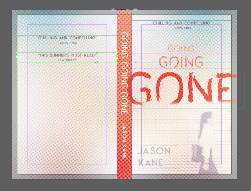
reviews on back

You can also add a blurb to the back cover, setting the Font to George Sans Bold, Size 10 pt. 

You can place an optional barcode on the bottom of the back cover, on the Barcode layer. Use the Rectangle Frame Tool (F) to create a frame, and File > Place your barcode image.

blurb on back

Conclusion: Your Finished Book Template

With the basics of your book template in place, you can now File > Save your work and use the two documents you’ve created as a foundation for creating your own unique paperback book layout designs. 

final book mockup

Still unsure about how to start with creating your own book templates? A downloadable InDesign template is a sensible place to get started, and can be great for boosting your confidence when you’re dipping a toe into book design.

You can find a wide range of customizable InDesign book templates for book covers and book layout designs on Envato Elements and GraphicRiver.

Discover our pick of the best book design tutorials for beginners below:

How to Make an InDesign Book Template (Cover & Layout)

Post pobrano z: How to Make an InDesign Book Template (Cover & Layout)

Final product image
What You’ll Be Creating

In this tutorial, you’ll learn how to make a book in InDesign. Once created, InDesign book templates can be adapted with your own cover design, type formatting and text content to create a unique and professional book layout designs every time. 

We’ll cover a wide range of book design techniques in this tutorial, from how to put together the inside pages to how to design a book cover.

Here we’ll put together a standard-sized paperback (softcover) book, complete with inside pages and a full wraparound cover. 

If you’re looking to self-publish your own books and sell them online, or are making your first steps into professional cover design for clients, this guide will introduce you to the essentials of creating book templates. 

Looking for a quick start? InDesign templates are great value and easy to adapt. You can find a huge range of customizable InDesign book cover templates and book layout templates on Envato Elements and GraphicRiver.

What You’ll Need to Create Your Book Template

We’ll be using Adobe InDesign to create the artwork for the cover and to typeset the inside pages. You’ll also need to download the following fonts for the inside pages template:

To reproduce the cover design pictured, you’ll also need to download the following fonts and graphics:

Install the fonts on your computer, and you’re ready to start creating your book format template. 

1. How to Create the Inside Pages for Your Book Template

Step 1

Open InDesign and go to File > New > Document. 

Choose Print from the options at the top of the New Document window.

Set the Width of the page to 5 in and Height to 8 in. Increase the Number of Pages to 16 (you can always add more later). 

Set the Top Margin to 0.72 in, Inside to 0.75 in, Bottom to 0.7 in, and Outside to 0.5 in. 

Unless you are planning to add background color to the inside pages of your book, you won’t need a bleed, so leave this at 0 in for now. 

new document

Then click Create

first page

Step 2

Expand the Pages panel (Window > Pages) and click on the A-Master icon at the top to bring it up on screen. 

Pull out two guides from the left-hand ruler (View > Show Rulers), dropping them at the two margin lines on the right-hand page. 

margin guides

Pull out a third guide to the center-point between the margins, at roughly 7.62 in. 

center guide

Step 3

From the top ruler, pull down a guide to 2.0839 in.

guide

Then pull down a second to 3.1967 in. 

guide

Step 4

Use the Type Tool (T) to create a text frame on the right-hand page, resting the top edge against the guide you’ve just created and letting the other edges meet the margins on the bottom, left, and right sides. 

text frame

Create a second text frame along the bottom of the right-hand page, centering it on the vertical guide. 

page number frame

Place your type cursor into the frame and head up to Type > Insert Special Character > Markers > Current Page Number. 

Select the text frame and, from either the top Controls panel or the Character and Paragraph panels (Window > Type & Tables > Character / Paragraph), set the Font to George Sans Regular, Size 10 pt, and Align Center. 

george sans font

Step 5

On the A-Master icon in the Pages panel, Right-Click > Master Options for “A-Master”.

master options

Adjust the Name to Opening Page of Chapter and click OK

master options

Step 6

Choose New Master from the Pages panel’s main menu. 

new master

Name this second master Body of Chapter, before clicking OK

new master

Step 7

Select the page number text frame on the A-Master and Edit > Copy it. 

Click on the B-Master icon and Edit > Paste in Place the frame onto the right page. 

page number

Paste again, and move this copy over onto the left-hand page of the B-Master. 

pasted number

Step 8

Create a text frame on the left-hand page, using the margins to guide its dimensions. 

left hand page frames

Then click on the small white square symbol at the bottom-right corner of the text frame and click once onto the facing page, to create a second linked text frame.

threaded frames

Create a text frame for a running header across the top of the left-hand page on the B-Master, setting the Font to George Sans Regular, Size 9 pt, and Align Center. 

 running header

Copy and Paste the header frame, and move over to the top of the right-hand page. 

pasted header

Step 9

Click on the Page 5 icon in the Pages panel, and Right-Click > Numbering & Section Options. 

numbering and section

Check Start Page Numbering at and set this to 1. Choose 1, 2, 3, 4… from the Style menu below, before clicking OK. When the warning message is flagged up, simply click OK. 

new section

Click on the icon for the very first page of the document and Right-Click > Numbering & Section Options. 

numbering and section

As before, check Start Page Numbering at, and set this to 1. This time, choose i, ii, iii, iv… from the Style menu, before clicking OK

numbering and section

Step 10

Right-Click on the [None] master icon at the very top of the Pages panel, and select Apply Master to Pages. 

apply master

In the To Pages box, type in 2-4, and click OK

b master

Right-Click on the B-Master icon and click on Apply Master to Pages. In the To Pages box, type in 2-4, 6-12, and click OK

apply master

Step 11

Click on Page i to bring up the first page of the book on screen. 

Use the Type Tool (T) to add text to this first page, which can list the title, author name, and publisher. Set the Font to George Sans Regular, Align Center. 

book title page

Step 12

On Page ii you can create a contents page. 

Create a list of chapters set in George Sans Regular, Size 12 pt, and rest these against the left margin. 

chapter names

Copy and Paste the text frame and switch the text to Align Right. Edit the text to read ‘X’ for now—these can be updated with page numbers later when the book is finished. 

contents page

Use the Line Tool (\) to create connecting lines between the chapter name and page number. From the Stroke panel (Window > Stroke), set the Weight to about 1.5 pt and the Type to Japanese Dots. 

dotted stroke

Step 13

Page 1 will be the first page of the main body of your book—the first page of the first chapter. 

Create a text frame with the baseline resting on the top horizontal guide. Type in ‘Chapter One’ and set the Font to George Sans Semibold, Size to 14 pt, and Align Center. 

chapter title

Step 14

Set your type cursor into the text frame below (this is carried over from the A-Master), and set the Font to Addington CF Regular, Size to 11 pt, and the Leading to 14 pt. 

From the Paragraph panel, set the First Line Left Indent to 0.125 in. 

font formatting

Now you can drop in your own text, by copying and pasting text over from a Word document, for example. Or go to Type > Fill with Placeholder Text to fill up the frame for now.

placeholder text

Set your type cursor into the first paragraph only, and, from the Paragraph panel, increase the Drop Cap Number of Lines to 2.

drop cap number of lines

Step 15

Now you can start to thread the chapter text across the succeeding pages. 

Click on the white square symbol at the bottom-right of the first text frame to pick up overflowing text (your cursor will show a few lines of text in miniature). Scroll down to the next page, and click once onto the page to continue the flow. 

InDesign will automatically fill the remaining pages with text frames, as these have already been set up on the B-Master. 

threaded frames

Step 16

With the basics of your template now set up, you can use the first chapter as a model for creating further chapters. Copy and Paste pages to tag onto your document. 

You might also want to add few pages for an index or bibliography to the end of your book template. 

With your book template complete and ready to adapt, make sure to head up to File > Save to save it for later use. 

index page

2. How to Create a Cover for Your Book Template

Step 1

In InDesign, go to File > New > Document. 

Choose Print from the options at the top of the New Document window.

Set the Width of the page to 5 in and Height to 8 in. Set the Number of Pages to 3. Deselect Facing Pages.

Set the Margins to 0.5 in. Leave the Bleed value at 0 in for now. 

Then click Create

new document

Step 2

From the Pages panel’s main menu, uncheck Allow Document Pages to Shuffle.

allow pages to shuffle

This will allow you to grab the Page 2 icon and ‘stick’ it to the right side of Page 1. 

combined pages

Then grab the Page 3 icon and ‘stick’ this to the right side of Page 2. 

complete trio of pages

Step 3

Select the Page Tool (Shift-P) and click onto Page 2 to select it. Then head up to Layout > Margins and Columns. 

Set the Left and Right Margins to 0 in and click OK

page tool

This page will form the spine of your book, and the width of this will depend on the page count of your book. For now, you can give it a default width, which can be adjusted later. 

From the top Controls panel, adjust the Width (W) of the page to 0.75 in. 

adjusted page width

Step 4

Expand the Layers panel (Window > Layers) and double-click on Layer 1. Rename it Photo and click OK

Create four more new layers: Type Behind, Retro Dots, Type in Front, and finally, Barcode

layer options

Then lock all the layers except Photo, which we’ll work on first. 

photo layer

Step 5

Expand the Swatches panel (Window > Color > Swatches), and choose New Color Swatch from the panel’s main menu. 

Set the levels to C=4 M=98 Y=88 K=0, name the swatch Red, and click Add and Done

red swatch

Step 6

Working on the Photo layer, use the Rectangle Frame Tool (F) to create an image frame across the bottom half of Page 3 (which will be the front cover). 

File > Place, choosing the woman rushing photo, and Open

woman rushing photo

With the image frame selected, go to Object > Effects > Transparency. Bring the Opacity down to 60%.

transparency

Click on Gradient Feather in the Effects window’s left-hand menu and apply a Linear gradient, at roughly a 110 Degree Angle. Click OK to exit the window. 

gradient feather

Step 7

Use the Rectangle Tool (M) to create a shape along the spine, setting the Fill to Red

spine red

Step 8

Lock the Photo layer and unlock the Type Behind layer. 

Create a large heading across the front cover using the Type Tool (T), setting the Font to Agave Brush and giving the text a Red swatch color. 

agave brush font

Add more text frames above the title, using the same Font and Color, scaling the Font Size down as the text frames get higher up the cover. 

font size reduced

Set the author’s name in the bottom left-hand corner, in George Sans Semibold.

author text

Select all the text frames on the front cover and go to Object > Effects > Transparency. Set the Mode to Multiply and bring the Opacity down to 90%. 

multiply

Step 9

Lock the Type Behind layer and unlock the layer above, Retro Dots. 

Use the Rectangle Frame Tool (F) to create an image frame over the whole of the front cover. File > Place, navigate to the pack of retro dots backgrounds you downloaded earlier, choose the first image, and Open it. 

retro dots

Select the image frame and go to Object > Effects > Transparency. Set the Mode to Hard Light and Opacity to 65%. 

effects panel

Step 10

Copy and Paste the image frame, moving it over to Page 1 (the back cover). 

Paste again, and readjust the width to fit over the top of the spine. 

Pull out the edges of all the background elements across the three pages to create a ‘fake’ bleed. This can be added later when the artwork is exported. 

spine artwork

Step 11

Expand the Type Behind layer in the Layers panel, and identify the large text title’s element. Click to select it, and then click on the Create New Layer button at the bottom of the panel to duplicate it. 

selected header

Unlock the Type in Front layer, and drag the copy of the title up, dropping it into this layer.

Then lock the Type Behind layer.

type in front layer

Step 12

Add text frames to the spine of the cover, on the Type in Front layer. 

To rotate text frames, Right-Click > Transform > Rotate 90 Degrees CW.

type in front

Step 13

Add a review or teaser text to the top of the front cover, set in George Sans Bold. 

review text

Add copies of these to the back cover too. 

reviews on back

You can also add a blurb to the back cover, setting the Font to George Sans Bold, Size 10 pt. 

You can place an optional barcode on the bottom of the back cover, on the Barcode layer. Use the Rectangle Frame Tool (F) to create a frame, and File > Place your barcode image.

blurb on back

Conclusion: Your Finished Book Template

With the basics of your book template in place, you can now File > Save your work and use the two documents you’ve created as a foundation for creating your own unique paperback book layout designs. 

final book mockup

Still unsure about how to start with creating your own book templates? A downloadable InDesign template is a sensible place to get started, and can be great for boosting your confidence when you’re dipping a toe into book design.

You can find a wide range of customizable InDesign book templates for book covers and book layout designs on Envato Elements and GraphicRiver.

Discover our pick of the best book design tutorials for beginners below:

Tips for improving the checkout interface to get better conversions

Post pobrano z: Tips for improving the checkout interface to get better conversions

Many
people are choosing to sell products online as it is now easier than ever. When
designing and maintaining an online shop you should focus on the shopping cart
as one of the main areas of importance.

Having
a checkout that runs smoothly and is easy to access is by far the most
important element within a successful e-commerce site.

Having
a well-designed e-commerce website is all about getting trust from the
customers and it is for this reason that the checkout area on the payment page
needs to be very secure and well-designed.

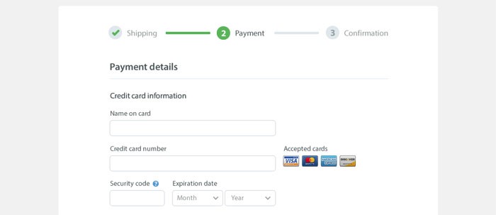
Checkout
Image source

A
well designed and simple layout will make the customer feel more at ease when
they enter their payment information and their private details.

The
problem with an e-commerce website is that if they are too vague and
unwelcoming they can drive customers away. This mostly happens when the web development company handles the UX
as well. Shop owners then risk losing over half of all their customers. So how
do you make sure that your shopping cart is well tweaked to all the potential
customers? For starters, let UX designers handle UX. Still, here are a few
guidelines on designing the checkout interface.

Registration should be optional

The
benefit of registration is that they can allow one the ability to gain
information about their customers. However, this may deter new customers from
using the website
and will stop sales of products from taking
place.

The
best websites really will give the customer the choice of whether they want to
register or not as many people do not enjoy sharing their personal information
but may still wish to buy the products on the website. The annoyance of having
to fill out a registration form is a danger of putting the customer off for
life.

So
how does one get a customer to register without intruding on the purchase? One
method is to ask the customer if they wish to register once they have made the
purchase by offering them a set of forms to fill in. This may be as simple as a
username and password.

The single-page checkout

The single page checkout
Image source

The
trend these days with the modern checkout design is to have a single page
checkout which is easy to understand and quick to fill out.

These
are the most popular ways to purchase orders as multiple columns have shown to
confuse and deter customers from making the initial purchase.

Once
you have a single page flow in your checkout area of the site, you are much
more likely to get your customers purchasing the products that they want to
buy.

If
you’re using WooCommerce and you want to enable this functionality, look
through the best WooCommerce plugins. There surely is
one that has this one built in. If you’re using Opencart or something
else, you might need to look into their guides to see if they have a solution
for this.

Have a back button in the design

It
can be a very good idea to have a back button in the checkout process. If this
is not implemented, when the customer chooses to go back on the process they
may get an error message which will cause frustration and problems for the
purchase. Having a back button allows the customer the ability to check their
details.

If
a back button is not implemented and the customer gets an error message, they
are likely to give up on the whole process altogether.

Optimize for mobile

Many
web designers forget that customers often use their phones to browse websites
and may use this device to purchase products that they find online.

Optimize for mobile
Image source

However,
many websites are not optimized for mobile devices and will not be
able to sell products to the customer in this way. In order to maximize
profits, the individual needs to make sure that their website can work on many
different mobile devices. This often means cutting back on the design of the
site for mobile devices by removing input fields and focusing on the
essentials.

A
checkout on a mobile device should also be as simple as it is on the web and
should not try to make the customer register for the site before they make
their purchase. You should constantly do tweaks to the whole buying process and
make sure everything is as smooth as possible for the end user. Look into web application testing to streamline
your optimization process instead of doing things oldschool.

Set the shipping address as billing address

It
is always a good idea to combine the shipping address and the billing address to
make things simpler for the customer as they will often be making a purchase
from home.

By
doing this the checkout form becomes simpler for the customer and they will
quickly understand that their shipping address is also the billing address by
default.

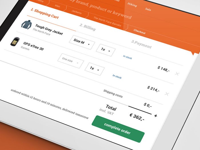
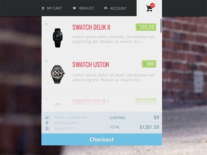
Display all cart items

Display all cart items
Image source

It
is important to clearly show what the customer has bought when they are at the
checkout stage of their purchase. This is also important if you are offering a
special type of shipping such as express delivery.

If
you are in any way unclear about the purchases that customers are making at
this stage, they may very well abandon the purchase and give up completely on
the website.

Trust is vital

Trust is one of the most important
elements in a website
as an individual has never even met you and
is trying to make a purchase of a product that they need.

However,
the good thing is that online shops are becoming more and more popular as one
of the main ways in which to buy products while security and design are also
developing at a rapid rate. Just as in the real world, there is always the
possibility of data being lost or stolen. However, these situations are rare.

Trust is vital
Image source

Keeping the customer feeling safe and
confident

is the key goal and this can be done by offering a more personal experience.
Showing phone numbers and other easy ways to contact the shop is always a good
idea.

Another
good idea is to have trust signals which can be placed throughout the site.
These are simply symbols that have been designed and state things that will
keep the customer feeling safe and secure.

Use progress trackers

Use progress trackers
Image source

A
well-designed checkout page will give the customer the information they need in
order for them to feel safe within the checkout process. In this situation, a
progress tracker is used to show the customer exactly what stage they are at
with the checkout process so that they know how much further they have to go
until the order is completed.

Use descriptions for your form fields

There
will also be many moments when one will need to enter information regarding
personal information such as the email address. Some customers will understand
what this information is needed for. However, others may need a small
description which can either be on the show or hidden behind an arrow button to
explain what the information is used for.

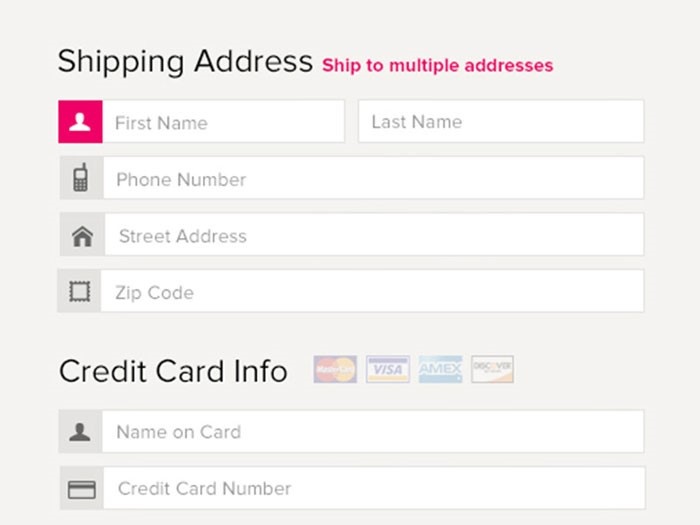
Use only relevant fields in your forms

Use only relevant fields in your forms
Image source

It
really is a good idea to avoid as many forms as possible and stick to the bare
essentials as customers often feel like their personal information is invaded.

This
technique can be seen in some of the bigger websites, which always stick to the
minimal amount of forms, allowing customers to quickly enter the information
and make a purchase without unnecessary hassle.

Avoid multi-columns

It
is also a good idea to avoid multi-columns as these can confuse the customers
when they least expect it. The customer wants to enter their data quickly and
does not want to spend on time and energy on forms that they don’t understand.

The
problem with having several columns on one page is that users begin to wonder
whether these columns are related and this begins to bring confusion to the
user.

Consider closed checkouts

The
final thing to make sure when setting up an e-commerce site is to make sure the
customer fully understands what they are purchasing and how much they have paid
for that product. It is important to outline any other costs when the customer
makes their purchase so that they know exactly how much they are spending.

Finally,
the customer should feel completely confident that their purchase has been
processed and that it is on the way to them. Once they feel this, they are
likely to rely on the website for more product purchases in the future.

Tips for improving the checkout interface to get better conversions

Post pobrano z: Tips for improving the checkout interface to get better conversions

Many
people are choosing to sell products online as it is now easier than ever. When
designing and maintaining an online shop you should focus on the shopping cart
as one of the main areas of importance.

Having
a checkout that runs smoothly and is easy to access is by far the most
important element within a successful e-commerce site.

Having
a well-designed e-commerce website is all about getting trust from the
customers and it is for this reason that the checkout area on the payment page
needs to be very secure and well-designed.

Checkout
Image source

A
well designed and simple layout will make the customer feel more at ease when
they enter their payment information and their private details.

The
problem with an e-commerce website is that if they are too vague and
unwelcoming they can drive customers away. This mostly happens when the web development company handles the UX
as well. Shop owners then risk losing over half of all their customers. So how
do you make sure that your shopping cart is well tweaked to all the potential
customers? For starters, let UX designers handle UX. Still, here are a few
guidelines on designing the checkout interface.

Registration should be optional

The
benefit of registration is that they can allow one the ability to gain
information about their customers. However, this may deter new customers from
using the website
and will stop sales of products from taking
place.

The
best websites really will give the customer the choice of whether they want to
register or not as many people do not enjoy sharing their personal information
but may still wish to buy the products on the website. The annoyance of having
to fill out a registration form is a danger of putting the customer off for
life.

So
how does one get a customer to register without intruding on the purchase? One
method is to ask the customer if they wish to register once they have made the
purchase by offering them a set of forms to fill in. This may be as simple as a
username and password.

The single-page checkout

The single page checkout
Image source

The
trend these days with the modern checkout design is to have a single page
checkout which is easy to understand and quick to fill out.

These
are the most popular ways to purchase orders as multiple columns have shown to
confuse and deter customers from making the initial purchase.

Once
you have a single page flow in your checkout area of the site, you are much
more likely to get your customers purchasing the products that they want to
buy.

If
you’re using WooCommerce and you want to enable this functionality, look
through the best WooCommerce plugins. There surely is
one that has this one built in. If you’re using Opencart or something
else, you might need to look into their guides to see if they have a solution
for this.

Have a back button in the design

It
can be a very good idea to have a back button in the checkout process. If this
is not implemented, when the customer chooses to go back on the process they
may get an error message which will cause frustration and problems for the
purchase. Having a back button allows the customer the ability to check their
details.

If
a back button is not implemented and the customer gets an error message, they
are likely to give up on the whole process altogether.

Optimize for mobile

Many
web designers forget that customers often use their phones to browse websites
and may use this device to purchase products that they find online.

Optimize for mobile
Image source

However,
many websites are not optimized for mobile devices and will not be
able to sell products to the customer in this way. In order to maximize
profits, the individual needs to make sure that their website can work on many
different mobile devices. This often means cutting back on the design of the
site for mobile devices by removing input fields and focusing on the
essentials.

A
checkout on a mobile device should also be as simple as it is on the web and
should not try to make the customer register for the site before they make
their purchase. You should constantly do tweaks to the whole buying process and
make sure everything is as smooth as possible for the end user. Look into web application testing to streamline
your optimization process instead of doing things oldschool.

Set the shipping address as billing address

It
is always a good idea to combine the shipping address and the billing address to
make things simpler for the customer as they will often be making a purchase
from home.

By
doing this the checkout form becomes simpler for the customer and they will
quickly understand that their shipping address is also the billing address by
default.

Display all cart items

Display all cart items
Image source

It
is important to clearly show what the customer has bought when they are at the
checkout stage of their purchase. This is also important if you are offering a
special type of shipping such as express delivery.

If
you are in any way unclear about the purchases that customers are making at
this stage, they may very well abandon the purchase and give up completely on
the website.

Trust is vital

Trust is one of the most important
elements in a website
as an individual has never even met you and
is trying to make a purchase of a product that they need.

However,
the good thing is that online shops are becoming more and more popular as one
of the main ways in which to buy products while security and design are also
developing at a rapid rate. Just as in the real world, there is always the
possibility of data being lost or stolen. However, these situations are rare.

Trust is vital
Image source

Keeping the customer feeling safe and
confident

is the key goal and this can be done by offering a more personal experience.
Showing phone numbers and other easy ways to contact the shop is always a good
idea.

Another
good idea is to have trust signals which can be placed throughout the site.
These are simply symbols that have been designed and state things that will
keep the customer feeling safe and secure.

Use progress trackers

Use progress trackers
Image source

A
well-designed checkout page will give the customer the information they need in
order for them to feel safe within the checkout process. In this situation, a
progress tracker is used to show the customer exactly what stage they are at
with the checkout process so that they know how much further they have to go
until the order is completed.

Use descriptions for your form fields

There
will also be many moments when one will need to enter information regarding
personal information such as the email address. Some customers will understand
what this information is needed for. However, others may need a small
description which can either be on the show or hidden behind an arrow button to
explain what the information is used for.

Use only relevant fields in your forms

Use only relevant fields in your forms
Image source

It
really is a good idea to avoid as many forms as possible and stick to the bare
essentials as customers often feel like their personal information is invaded.

This
technique can be seen in some of the bigger websites, which always stick to the
minimal amount of forms, allowing customers to quickly enter the information
and make a purchase without unnecessary hassle.

Avoid multi-columns

It
is also a good idea to avoid multi-columns as these can confuse the customers
when they least expect it. The customer wants to enter their data quickly and
does not want to spend on time and energy on forms that they don’t understand.

The
problem with having several columns on one page is that users begin to wonder
whether these columns are related and this begins to bring confusion to the
user.

Consider closed checkouts

The
final thing to make sure when setting up an e-commerce site is to make sure the
customer fully understands what they are purchasing and how much they have paid
for that product. It is important to outline any other costs when the customer
makes their purchase so that they know exactly how much they are spending.

Finally,
the customer should feel completely confident that their purchase has been
processed and that it is on the way to them. Once they feel this, they are
likely to rely on the website for more product purchases in the future.

Tips for improving the checkout interface to get better conversions

Post pobrano z: Tips for improving the checkout interface to get better conversions

Many
people are choosing to sell products online as it is now easier than ever. When
designing and maintaining an online shop you should focus on the shopping cart
as one of the main areas of importance.

Having
a checkout that runs smoothly and is easy to access is by far the most
important element within a successful e-commerce site.

Having
a well-designed e-commerce website is all about getting trust from the
customers and it is for this reason that the checkout area on the payment page
needs to be very secure and well-designed.

Checkout
Image source

A
well designed and simple layout will make the customer feel more at ease when
they enter their payment information and their private details.

The
problem with an e-commerce website is that if they are too vague and
unwelcoming they can drive customers away. This mostly happens when the web development company handles the UX
as well. Shop owners then risk losing over half of all their customers. So how
do you make sure that your shopping cart is well tweaked to all the potential
customers? For starters, let UX designers handle UX. Still, here are a few
guidelines on designing the checkout interface.

Registration should be optional

The
benefit of registration is that they can allow one the ability to gain
information about their customers. However, this may deter new customers from
using the website
and will stop sales of products from taking
place.

The
best websites really will give the customer the choice of whether they want to
register or not as many people do not enjoy sharing their personal information
but may still wish to buy the products on the website. The annoyance of having
to fill out a registration form is a danger of putting the customer off for
life.

So
how does one get a customer to register without intruding on the purchase? One
method is to ask the customer if they wish to register once they have made the
purchase by offering them a set of forms to fill in. This may be as simple as a
username and password.

The single-page checkout

The single page checkout
Image source

The
trend these days with the modern checkout design is to have a single page
checkout which is easy to understand and quick to fill out.

These
are the most popular ways to purchase orders as multiple columns have shown to
confuse and deter customers from making the initial purchase.

Once
you have a single page flow in your checkout area of the site, you are much
more likely to get your customers purchasing the products that they want to
buy.

If
you’re using WooCommerce and you want to enable this functionality, look
through the best WooCommerce plugins. There surely is
one that has this one built in. If you’re using Opencart or something
else, you might need to look into their guides to see if they have a solution
for this.

Have a back button in the design

It
can be a very good idea to have a back button in the checkout process. If this
is not implemented, when the customer chooses to go back on the process they
may get an error message which will cause frustration and problems for the
purchase. Having a back button allows the customer the ability to check their
details.

If
a back button is not implemented and the customer gets an error message, they
are likely to give up on the whole process altogether.

Optimize for mobile

Many
web designers forget that customers often use their phones to browse websites
and may use this device to purchase products that they find online.

Optimize for mobile
Image source

However,
many websites are not optimized for mobile devices and will not be
able to sell products to the customer in this way. In order to maximize
profits, the individual needs to make sure that their website can work on many
different mobile devices. This often means cutting back on the design of the
site for mobile devices by removing input fields and focusing on the
essentials.

A
checkout on a mobile device should also be as simple as it is on the web and
should not try to make the customer register for the site before they make
their purchase. You should constantly do tweaks to the whole buying process and
make sure everything is as smooth as possible for the end user. Look into web application testing to streamline
your optimization process instead of doing things oldschool.

Set the shipping address as billing address

It
is always a good idea to combine the shipping address and the billing address to
make things simpler for the customer as they will often be making a purchase
from home.

By
doing this the checkout form becomes simpler for the customer and they will
quickly understand that their shipping address is also the billing address by
default.

Display all cart items

Display all cart items
Image source

It
is important to clearly show what the customer has bought when they are at the
checkout stage of their purchase. This is also important if you are offering a
special type of shipping such as express delivery.

If
you are in any way unclear about the purchases that customers are making at
this stage, they may very well abandon the purchase and give up completely on
the website.

Trust is vital

Trust is one of the most important
elements in a website
as an individual has never even met you and
is trying to make a purchase of a product that they need.

However,
the good thing is that online shops are becoming more and more popular as one
of the main ways in which to buy products while security and design are also
developing at a rapid rate. Just as in the real world, there is always the
possibility of data being lost or stolen. However, these situations are rare.

Trust is vital
Image source

Keeping the customer feeling safe and
confident

is the key goal and this can be done by offering a more personal experience.
Showing phone numbers and other easy ways to contact the shop is always a good
idea.

Another
good idea is to have trust signals which can be placed throughout the site.
These are simply symbols that have been designed and state things that will
keep the customer feeling safe and secure.

Use progress trackers

Use progress trackers
Image source

A
well-designed checkout page will give the customer the information they need in
order for them to feel safe within the checkout process. In this situation, a
progress tracker is used to show the customer exactly what stage they are at
with the checkout process so that they know how much further they have to go
until the order is completed.

Use descriptions for your form fields

There
will also be many moments when one will need to enter information regarding
personal information such as the email address. Some customers will understand
what this information is needed for. However, others may need a small
description which can either be on the show or hidden behind an arrow button to
explain what the information is used for.

Use only relevant fields in your forms

Use only relevant fields in your forms
Image source

It
really is a good idea to avoid as many forms as possible and stick to the bare
essentials as customers often feel like their personal information is invaded.

This
technique can be seen in some of the bigger websites, which always stick to the
minimal amount of forms, allowing customers to quickly enter the information
and make a purchase without unnecessary hassle.

Avoid multi-columns

It
is also a good idea to avoid multi-columns as these can confuse the customers
when they least expect it. The customer wants to enter their data quickly and
does not want to spend on time and energy on forms that they don’t understand.

The
problem with having several columns on one page is that users begin to wonder
whether these columns are related and this begins to bring confusion to the
user.

Consider closed checkouts

The
final thing to make sure when setting up an e-commerce site is to make sure the
customer fully understands what they are purchasing and how much they have paid
for that product. It is important to outline any other costs when the customer
makes their purchase so that they know exactly how much they are spending.

Finally,
the customer should feel completely confident that their purchase has been
processed and that it is on the way to them. Once they feel this, they are
likely to rely on the website for more product purchases in the future.

Tips for improving the checkout interface to get better conversions

Post pobrano z: Tips for improving the checkout interface to get better conversions

Many
people are choosing to sell products online as it is now easier than ever. When
designing and maintaining an online shop you should focus on the shopping cart
as one of the main areas of importance.

Having
a checkout that runs smoothly and is easy to access is by far the most
important element within a successful e-commerce site.

Having
a well-designed e-commerce website is all about getting trust from the
customers and it is for this reason that the checkout area on the payment page
needs to be very secure and well-designed.

Checkout
Image source

A
well designed and simple layout will make the customer feel more at ease when
they enter their payment information and their private details.

The
problem with an e-commerce website is that if they are too vague and
unwelcoming they can drive customers away. This mostly happens when the web development company handles the UX
as well. Shop owners then risk losing over half of all their customers. So how
do you make sure that your shopping cart is well tweaked to all the potential
customers? For starters, let UX designers handle UX. Still, here are a few
guidelines on designing the checkout interface.

Registration should be optional

The
benefit of registration is that they can allow one the ability to gain
information about their customers. However, this may deter new customers from
using the website
and will stop sales of products from taking
place.

The
best websites really will give the customer the choice of whether they want to
register or not as many people do not enjoy sharing their personal information
but may still wish to buy the products on the website. The annoyance of having
to fill out a registration form is a danger of putting the customer off for
life.

So
how does one get a customer to register without intruding on the purchase? One
method is to ask the customer if they wish to register once they have made the
purchase by offering them a set of forms to fill in. This may be as simple as a
username and password.

The single-page checkout

The single page checkout
Image source

The
trend these days with the modern checkout design is to have a single page
checkout which is easy to understand and quick to fill out.

These
are the most popular ways to purchase orders as multiple columns have shown to
confuse and deter customers from making the initial purchase.

Once
you have a single page flow in your checkout area of the site, you are much
more likely to get your customers purchasing the products that they want to
buy.

If
you’re using WooCommerce and you want to enable this functionality, look
through the best WooCommerce plugins. There surely is
one that has this one built in. If you’re using Opencart or something
else, you might need to look into their guides to see if they have a solution
for this.

Have a back button in the design

It
can be a very good idea to have a back button in the checkout process. If this
is not implemented, when the customer chooses to go back on the process they
may get an error message which will cause frustration and problems for the
purchase. Having a back button allows the customer the ability to check their
details.

If
a back button is not implemented and the customer gets an error message, they
are likely to give up on the whole process altogether.

Optimize for mobile

Many
web designers forget that customers often use their phones to browse websites
and may use this device to purchase products that they find online.

Optimize for mobile
Image source

However,
many websites are not optimized for mobile devices and will not be
able to sell products to the customer in this way. In order to maximize
profits, the individual needs to make sure that their website can work on many
different mobile devices. This often means cutting back on the design of the
site for mobile devices by removing input fields and focusing on the
essentials.

A
checkout on a mobile device should also be as simple as it is on the web and
should not try to make the customer register for the site before they make
their purchase. You should constantly do tweaks to the whole buying process and
make sure everything is as smooth as possible for the end user. Look into web application testing to streamline
your optimization process instead of doing things oldschool.

Set the shipping address as billing address

It
is always a good idea to combine the shipping address and the billing address to
make things simpler for the customer as they will often be making a purchase
from home.

By
doing this the checkout form becomes simpler for the customer and they will
quickly understand that their shipping address is also the billing address by
default.

Display all cart items

Display all cart items
Image source

It
is important to clearly show what the customer has bought when they are at the
checkout stage of their purchase. This is also important if you are offering a
special type of shipping such as express delivery.

If
you are in any way unclear about the purchases that customers are making at
this stage, they may very well abandon the purchase and give up completely on
the website.

Trust is vital

Trust is one of the most important
elements in a website
as an individual has never even met you and
is trying to make a purchase of a product that they need.

However,
the good thing is that online shops are becoming more and more popular as one
of the main ways in which to buy products while security and design are also
developing at a rapid rate. Just as in the real world, there is always the
possibility of data being lost or stolen. However, these situations are rare.

Trust is vital
Image source

Keeping the customer feeling safe and
confident

is the key goal and this can be done by offering a more personal experience.
Showing phone numbers and other easy ways to contact the shop is always a good
idea.

Another
good idea is to have trust signals which can be placed throughout the site.
These are simply symbols that have been designed and state things that will
keep the customer feeling safe and secure.

Use progress trackers

Use progress trackers
Image source

A
well-designed checkout page will give the customer the information they need in
order for them to feel safe within the checkout process. In this situation, a
progress tracker is used to show the customer exactly what stage they are at
with the checkout process so that they know how much further they have to go
until the order is completed.

Use descriptions for your form fields

There
will also be many moments when one will need to enter information regarding
personal information such as the email address. Some customers will understand
what this information is needed for. However, others may need a small
description which can either be on the show or hidden behind an arrow button to
explain what the information is used for.

Use only relevant fields in your forms

Use only relevant fields in your forms
Image source

It
really is a good idea to avoid as many forms as possible and stick to the bare
essentials as customers often feel like their personal information is invaded.

This
technique can be seen in some of the bigger websites, which always stick to the
minimal amount of forms, allowing customers to quickly enter the information
and make a purchase without unnecessary hassle.

Avoid multi-columns

It
is also a good idea to avoid multi-columns as these can confuse the customers
when they least expect it. The customer wants to enter their data quickly and
does not want to spend on time and energy on forms that they don’t understand.

The
problem with having several columns on one page is that users begin to wonder
whether these columns are related and this begins to bring confusion to the
user.

Consider closed checkouts

The
final thing to make sure when setting up an e-commerce site is to make sure the
customer fully understands what they are purchasing and how much they have paid
for that product. It is important to outline any other costs when the customer
makes their purchase so that they know exactly how much they are spending.

Finally,
the customer should feel completely confident that their purchase has been
processed and that it is on the way to them. Once they feel this, they are
likely to rely on the website for more product purchases in the future.

Same joke made-up again? / La même idée remaquillée?

Post pobrano z: Same joke made-up again? / La même idée remaquillée?

THE ORIGINAL?
Pepsi Cola – Pepsi X Energy Cola – 2006
“Don’t sleep at the party”
Click on the images to enlarge
Source : Adeevee
Agency : Almap BBDO (Brazil)
LESS ORIGINAL
RollingStone Beer – 2010
“The edition is limited,
fun isn’t”
Source : AdForum
Ag : BBDO Milan (Italy)
LESS ORIGINAL
Pilsener Light – 2019
“This halloween,
avoid being disguised”
Source : Adsoftheworld
Ag : MullenLowe (Ecuador)

Same joke made-up again? / La même idée remaquillée?

Post pobrano z: Same joke made-up again? / La même idée remaquillée?

THE ORIGINAL?
Pepsi Cola – Pepsi X Energy Cola – 2006
“Don’t sleep at the party”
Click on the images to enlarge
Source : Adeevee
Agency : Almap BBDO (Brazil)
LESS ORIGINAL
RollingStone Beer – 2010
“The edition is limited,
fun isn’t”
Source : AdForum
Ag : BBDO Milan (Italy)
LESS ORIGINAL
Pilsener Light – 2019
“This halloween,
avoid being disguised”
Source : Adsoftheworld
Ag : MullenLowe (Ecuador)

Blue Beanie Day 2019

Post pobrano z: Blue Beanie Day 2019

November 30th, the official „Blue Beanie Day,” has come and gone. I’m not sure I ever grokked the exact spirit of it, but I’ve written about what it means to me. Last year:

Web standards, as an overall idea, has entirely taken hold and won the day. That’s worth celebrating, as the web would be kind of a joke without them. So now, our job is to uphold them. We need to cry foul when we see a browser go rogue and ship an API outside the standards process.

Building off that, I’d add the need to prevent browsers from breaking things that have worked for half a decade, like iOS 13 did with CSS parallax.

Zeldman, the Blue Beanie Day champion, isn’t particularly optimistic:

Mainly, though, Blue Beanie Day is receding from view because our industry as a whole thinks less and less about accessibility (not that we ever had an A game on the subject), and talks less and less about progressive enhancement, preferring to chase the ephemeral goal posts of over-engineered solutions to non-problems.

It’s people who won the browser wars, so I suppose it’s fitting that people are going to let it slip away.

The post Blue Beanie Day 2019 appeared first on CSS-Tricks.

Adam Argyle’s 2020 CSS Predictions

Post pobrano z: Adam Argyle’s 2020 CSS Predictions

I think Adam’s first prediction is his boldest, even beyond his Hail Mary prediction. CSS grid is awesome and gap is perhaps one of its best qualities, but gap superseding spacing things out in other ways (e.g. margin) is a bold prediction indeed, especially with Firefox being the only browser supporting it in flexbox.

Direct Link to ArticlePermalink

The post Adam Argyle’s 2020 CSS Predictions appeared first on CSS-Tricks.