How to Make a Fancy Menu Template

Post pobrano z: How to Make a Fancy Menu Template

Final product image
What You’ll Be Creating

In this tutorial, you’ll learn how to create a restaurant menu template in Adobe InDesign. Complete with a luxurious color palette and a vintage style, this fancy menu template is perfect for high-end restaurants or luxury bars. 

This InDesign menu template, which consists of an A4-sized food menu and A5 drinks menu, can be easily adapted with your own text content and is set up for professional, full-color printing. 

menu food
drinks menu

Looking for a different menu style? Discover more delicious and easy-to-edit menu templates over on Envato Elements

What You’ll Need to Create Your Fancy Menu Template

We’ll be using Adobe InDesign to create the menu layout, and dipping into Adobe Illustrator to edit the vector graphics for the menu design. 

You’ll also need to download the following fonts and image files:

Once you’ve installed the fonts onto your computer and saved the graphic files to a safe place, you’re ready to get started with creating your menu design. 

1. How to Set Up the Menu Template in InDesign

Step 1

Open InDesign and go to File > New > Document. 

In the New Document window, choose Print from the options at the top of the window, and select A4 for the page size. 

To the right side of the window, uncheck Facing Pages. Increase the number of Columns to 3 and set the Gutter to 9 mm. 

Add Margins of 15 mm and a Bleed of 5 mm, before clicking Create

new document
new document indesign

Step 2

Expand the Layers panel (Window > Layers) and double-click on Layer 1, renaming it Background

Select New Layer from the panel’s main menu at the top right, and create two new layers: Material and Type

layer options

Lock all the layers except the bottom layer, Background

locked layers

Step 3

Expand the Swatches panel (Window > Color > Swatches) and choose New Color Swatch from the panel’s menu. 

Set the Color Type to Process, Mode to CMYK, and the levels below to C=10 M=2 Y=26 K=0 (Peppermint). Click Add and then OK

Repeat to create three more CMYK swatches:

  • C=100 M=83 Y=29 K=27 (Blue)
  • C=25 M=20 Y=19 K=7 (Silver Gray)
  • C=13 M=35 Y=85 K=7 (Gold)
swatch options

2. How to Add Color and Texture to Your Menu Template

Step 1

Working on the Background layer, select the Rectangle Tool (M) and drag across the whole page and up to the bleed. 

From the Swatches panel, set the Fill Color to Blue

fill color blue

Step 2

Lock the Background layer and unlock the Material layer above.

Use the Rectangle Frame Tool (F) to create an image frame across the left half of the page. File > Place, navigate to the Cloth Backgrounds folder, and choose image 25.jpg, before clicking Open

Select the image inside the frame directly by double-clicking, and Right-Click > Rotate 90 Degrees CCW.

Allow the paler half of the cloth image to fill the image frame. 

material background

Then select the image frame and Edit > Copy, Edit > Paste it. Then Right-Click > Transform > Flip Horizontal. Move it over to the right side of the page.

transform

Step 3

Select both image frames on the Material layer and go to Object > Effects > Transparency. Set the Mode to Multiply and click OK

multiply

3. How to Add Typography to Your Menu Design

Step 1

Lock the Material layer and unlock the top layer, Type

Use the Type Tool (T) to create a text frame across the center of the top of the page. 

Type in the restaurant name and, from the Character panel (Window > Type & Tables > Character), set the Font to Coellak Rad, Size 60 pt, and increase the Tracking (letter-spacing) to 40. You might want to use the Glyphs panel (Window > Type & Tables > Glyphs) to insert different variations of the characters.  

title resturant

From the Swatches panel, set the Font Color to Silver Gray. You can add an optional subtitle below, set to a 20 pt Font Size.

subtitle

Step 2

Open the Art Deco Ornament Pack illustration in Adobe Illustrator. 

Delete the background color and select the four elements of the design shown below, before going to Edit > Copy. 

art deco graphic

Return to InDesign and Edit > Paste the design directly onto the menu. 

Switch the Fill Color of the graphic to Silver Gray, and position it to the left of the restaurant name. 

pasted graphic

Step 3

Edit > Copy the graphic and then Right-Click > Transform > Flip Horizontal. 

flip graphic

Position it to the right of the restaurant name to frame the header. 

frame border

Step 4

Copy and Paste the restaurant title text frame and move it below, reducing the Font Size to 42 pt and editing the text to read the menu name, e.g. ‘A LA CARTE’ or ‘FOOD MENU’.

a la carte title

Step 5

Open the kitchenware01.ai file in Adobe Illustrator. Select the spoon graphic on the far left side and Edit > Copy it. 

copied spoon

Head back to InDesign and Edit > Paste it, switching the Fill Color to Silver Gray. Paste a spoon graphic on either side of the menu title. 

paste spoon

Step 6

Create a text frame spanning the width of the left-hand column, typing in the first subtitle (e.g. ‘STARTERS’), and setting the Font to Coellack Rad, Size 25 pt, and the Font Color to Peppermint

swatches panel

Create a text frame below this, typing in the name of the first item on the menu, followed by a series of ellipses, and the price on the right side of the text frame. Set the Font to Fiona Regular, Size 16 pt, and a Peppermint Font Color.

Copy and Paste the text frame repeatedly, creating a block of dishes under the ‘STARTERS’ title. 

text frame

Step 7

Select all the ‘STARTERS’ text frames you’ve just created and Right-Click > Group them. 

You can now use this group as a block for populating the rest of the menu design. 

body text frames

Step 8

Return to the Art Deco Ornament Pack illustration and select the elements around the edge of the graphic, as highlighted below.

art deco border

Edit > Copy this border graphic. Then head back to InDesign and Edit > Paste it onto the Type layer, rotating it to fit any large gap on the menu layout. 

Set the Fill Color to Silver Gray. 

frame on menu

Inside this border, you can feature a special dish or dish of the day. Set the header in Coellak Rad with a Gold Font Color.

special dishes title

Copy across one or a few of the dish text frames to place inside the border. 

sample dishes text

Step 9

Don’t forget to add a little key at the bottom left of the menu, for dishes with special dietary requirements.

allergies text

The final decorative touch is to add a large text frame across the bottom-right of the page, rotating it slightly and typing in a slogan or quote, before setting the Font to Rosemary Signature and a Gold Font Color.

script text frame

4. How to Create a Matching Drinks Menu 

Step 1

Expand the Pages panel (Window > Pages). 

On Page 1, Right-Click > Duplicate Spread, to create a copy of the menu. 

duplicate spread

Scroll down to Page 2 of your document. Select the Page Tool (Shift-P) and click onto the page to select it. From the top Controls panel, set the Liquid Page Rule to Scale, and then switch the Page Size to A5 from the size menu.

scale page

This scales all the elements on the page down to a smaller A5 page size, without the need to resize elements individually. 

a5 smaller card

Step 2

Working on the Background layer, select the rectangular shape and switch the Fill Color to Peppermint.

peppermint background

Lock the Background layer and unlock the layer above, Material. Delete the image frames on this layer, before creating a new one with the Rectangle Frame Tool (F) that extends across the whole page. 

File > Place, go to the Cloth Backgrounds folder and choose the 28.jpg file, before clicking Open

material green

Select the image frame and go to Object > Effects > Transparency. Switch the Mode to Screen and bring the Opacity down to 75%, before clicking OK

screen mode

Step 3

Working on the Type layer, select the restaurant name text frame(s) and switch the Font Color to Gold. Do the same for the border graphics too. 

type layer

Switch the name of the menu to ‘DRINKS MENU’ or similar, and the Font Color to Gold

gold font color

Step 4

Delete one of the columns of type from the far left or right side, leaving just two columns of text. Move these centrally onto the page, and revise the headings of each section as required (e.g. to ‘COCKTAILS’, ‘BEERS’, etc). 

Keep the decorative frame, moving it to the top right of the righthand column, and use this to frame the name of some special drinks. 

two columns

Change the Font Color of the script text at bottom right to Silver Gray. 

silver gray color

Step 5

Return to the kitchenware01.ai illustration in Adobe Illustrator. This time, select a teapot graphic and Edit > Copy it. Paste it onto your InDesign drinks menu. 

teapot

Select a teacup image separately and Copy and Paste it too. 

teacup

Adjust the Fill Color of both to Silver Gray. 

pasted graphics

5. How to Export Your Menu for Printing

When you’ve finished working on your menu and are ready to send it to print, go to File > Export.

Choose Adobe PDF (Print) from the options in the Format menu at the bottom of the window, name the file, and click Save

In the Export Adobe PDF window that opens, choose [Press Quality] for the Preset.

press quality

Then click on Marks and Bleeds in the window’s left-hand menu. Check both All Printer’s Marks and Use Document Bleed Settings.

printers marks

Click Export to create your menu PDF. You can send this document straight off to the printers—great job!

Conclusion

Your menu layout is finished and ready for sending to the printers! Congratulations!

final menus

In this tutorial, we’ve covered a range of skills and techniques which are really useful for creating print documents in Adobe InDesign. You can now feel more confident in:

  • setting up a full-color menu layout in InDesign
  • using vector graphics to add visual interest to your menu designs
  • choosing and using suitable and effective fonts for your menu layouts
  • layering color, texture, type and graphics to give your menu designs a modern, on-trend look
  • exporting your artwork to a print-ready PDF format

Menu Templates From Envato Elements

Discover more delectable InDesign menu designs over on Envato Elements. Check out our edit below of some of our favourite menu templates:

Seafood Menu Template

This restaurant menu template has a rustic style which could be adapted for seafood restaurants, cafes, or coastal pubs. Available as both a Photoshop and InDesign template, this menu template also makes use of free fonts.

seafood menu
Seafood menu template

Bakery Menu Template

A simple and stylish two-page restaurant menu template, this menu design would be a great match for bakeries, cafes, or ice-cream bars.

bakery menu
Bakery menu template

Rustic Menu Template

Complete with vintage-inspired typography and a punchy color palette, this restaurant menu template is available as Illustrator and Photoshop versions. If you’re designing for a steak restaurant or diner, this menu layout would be a perfect choice.

rustic menu
Rustic menu template

Drinks Menu Template

Looking to design a menu for a cocktail bar, nightclub, or pub? This colorful Photoshop menu template is set up to a large-scale A3 page size—perfect for doubling up as table placemats.

drinks menu
Drinks menu template

Simple Menu Template

On the hunt for a minimal, easy-to-edit restaurant menu template? This stripped-back menu design is supremely stylish and could be adapted for almost any type of restaurant or bar. 

simple menu
Simple menu template

Don’t miss these menu design tutorials:

How to Create a Japanese Brush Font Text Effect in Photoshop

Post pobrano z: How to Create a Japanese Brush Font Text Effect in Photoshop

Final product image
What You’ll Be Creating

Creating a completely custom font effect from scratch may sound like a daunting task, but it’s much less complicated than it might seem! And the task becomes even simpler when you put some high-quality resources to use—resources that you can customize and alter so you still end up with something that’s unique to you and your project!

In this quick tip, we will be taking a look at how to create a Japanese brush font text effect in Adobe Photoshop.  

Follow along with us over on our Envato Tuts+ YouTube channel:

What You’ll Need

To complete this project, we are using the following resources:

Find more resources on Envato Elements!

1. How to Create Paint Stroke Photoshop Brushes

First, let’s start by creating an ink brush Photoshop brush.

Step 1

Import an image of painted brush strokes. Ideally, you want them to be long, with tapered and textured edges.

Paint strokes

Step 2

Turn the image black and white by going to Image > Adjustments > Desaturate. 

These paint strokes are a little light, so let’s darken them by going to Image > Adjustments > Brightness/Contrast and bringing the Contrast up to 100 and the Brightness down to -150. 

Repeat this step until your paint strokes are a nice solid black. 

darken strokes

Step 3

Select your paint strokes by going to Select > Color Range and clicking on the black paint. Bring the Fuzziness all the way up to 200 and hit OK.

Step 4

Create a Color Fill layer set to black. The color fill layer will automatically take the shape of the selection! 

create color fill

Step 5

Smooth out the edges of the paint stroke by double-clicking on the color fill layer’s layer mask and choosing Select and Mask.

Set Smooth to 9, Contrast to 24%, and Shift Edge to -30%. Your settings may vary, but we don’t want to lose too much of that streaky brush texture, so be careful! 

smooth edges

Step 6

Finally, Crop down your paint stroke and go to Edit > Define Brush Preset. Name your brush, and you are done!

You will want to make as many brush strokes as possible, but alternatively, you can also download a set of premade brush strokes that come on a transparent background or a premade brush pack that is all ready to go!

create brush

Step 7

If you’re not sure how to install Photoshop brushes, you will want to select the Brush Tool, open the Brush window, click on the Gear icon found in the top right-hand corner, and then select Import Brushes. 

From there, you will want to navigate to wherever you save your brushes, select them, and that’s it!      

2. How to Create a Brush Stroke Font Effect 

Finally, let’s move on to creating our Japanese-inspired text effect. 

Step 1

This first step is optional, but it might help you out for your first few tries with this effect! 

Choose a font that’s similar to the structure you want your text to have. In this case, the Japanese brush font “Little Samurai” works perfectly.

Type out your word or phrase. Now, we can use this as a template when we are placing our brush strokes!

template text

Step 2

Import your brush stroke brushes, or have your brush stroke images (with a transparent background) in a folder nearby so you can drop or paint them in as needed.

I will be using these brush stroke PNGs found on Envato Elements.

image pack

Step 3

Now, it’s a matter of combing different brush strokes to make different letters. Let’s start with an easy one, “M.”

Drag and drop your strokes to match up with the three vertical lines that make up the lower section of the „M”, using our text as a guide. 

Make sure to use different strokes for each line. You want to avoid patterns and repetition! 

first brush strokes

Step 4

Place a fourth line going through the upper portion of all three lines. You have an “M”!

I suggest grouping all of the brush strokes into their own group and naming it according to the letter they create. 

creating an M

Step 5

You can use the Paint Brush and Eraser Tool to add or take away detail from each line to add further fine-tuning and variation.

Also, remember to Flip lines Vertically and Horizontally and adust both their height and width to avoid the look of repetition.

adjust lines by flipping

Step 6

Use the Warp Transform Mode to create and match curves, and to fit the strokes to match the shape of the template text. 

Do these steps over and over until all of your letters are created! 

adjust lines by warping
all text

Step 7

Change the color of the text by adding a Color Fill layer and clipping it into your master group—the group holding all of your letters. 

You can also go ahead and fill in any sparse spots quickly by creating a New Layer below all of your text layers and painting using a hard white brush. This will help your paint look fuller, if that’s the look you are going for!

change color

We’ve Done It!

And there you have it! You can whip up these painted letters in a matter of minutes, and if you find yourself reaching for this kind of text effect fairly often, go ahead and create the whole alphabet, save it in a PSD file, and you’ve officially created your very own template! 

So, as always, keep experimenting with different techniques and practicing, and don’t forget to post your version below, along with any questions, comments, or critiques!

create a japanese brush text effect

More Japanese Brush Fonts

Okami – Brush Font

Okami is a hand-drawn brush font with rough and bold letters. It’s great for logos, branding, print projects, and of course creating a Japanese brush font text effect! 

okami font

Petal Brush

Petal is a beautiful brush font that was handcrafted by yours truly with a Japanese brush pen. The font is full of character and personality and sits comfortably with modern trends. 

petal font

Wonderfont Brush Typeface

This font face is ideal for creating a Japanese brush font effect that comes off more rustic and unrefined! 

wonder font

30 Acrylic Brush Strokes

This collection contains 30 isolated high-resolution brush texture strokes made using yellow acrylic paint and many different paintbrushes perfect for creating a Japanese brush font effect. 

acrylic brush strokes

66 Long Ink Strokes Photoshop Stamp Brushes

Download 66 hand-painted ink Photoshop brushes that work with any Photoshop version! This ink brush Photoshop pack is high resolution and would be a great addition to any project.

long strokes

Looking to learn more? Why not check out the following tutorials:

Vodacom Mozambique Fashion Week: Unwanted Fashion

Post pobrano z: Vodacom Mozambique Fashion Week: Unwanted Fashion
Print
Vodacom Mozambique Fashion Week

More than 100,000 marine animals die each year from trash dumped into our planet’s oceans. In Mozambique, in addition to the lack of a sustainable recycling system, there is a bad habit of littering along the country’s vast coastline, mainly on beaches and especially during the holiday season. December 4 was World Wildlife Conservation Day and in order to draw society’s attention to this situation, Mozambique Fashion Week launched the Unwanted Fashion campaign, transforming the trash that is dumped into the oceans in fashion accessories and the animals in digital influencers. The initiative wasn’t just live on digital. Also offline, the event’s catwalk was entirely built with 5,000 tiles made from 250,000 plastic bottle caps. Mozambique Fashion Week also featured exhibits of sculptures of marine animals and a 6-meter tree, both made from recycled materials and illuminated with energy from solar panels. In all, more than 1 ton of plastic was used to build these works.

Advertising Agency:DDB, Maputo, Mozambique
Ceo:Vasco Rocha
Coo:Cristiana Oliveira
Creative Directors:Christiano Vendramine, Albachir Muinde
Creative Supervisor:Ivo Alves
Art Directors:João Lucas Roque
Copywriter:Gonzaga Neto
Digital Retoucher:Curgy Junior

How Facebook Avoids Ad Blockers

Post pobrano z: How Facebook Avoids Ad Blockers

Dylan Paulus:

Facebook actually hides 'dummy’ DOM nodes between the 'Sponsored’ text. These values are entirely random characters, with a random number of DOM nodes between them. Invisible characters. At this point our CSS ad blocker is completely broken. There is no way for us to possibly code every possible value in CSS.

We’ve covered this before when Mike Pan noted it. Looks like it’s evolved a bit since then, getting even a little tricker.

I just opened my Facebook and selected „Copy Outer HTML” on the word „Sponsored”:

<span class="v_19dt4zixpg r_19dt4zk7i5"><span class="fsm fwn fcg"><span class="q_19dt4zirbc"><a class="d_19dt4zioka h_19dt4ziol1" role="button" id="u_fetchstream_3_6"><span class="s_19dt4ziok9 d_19dt4ziok- e_19dt4ziokq"><span class="s_19dt4ziok9 d_19dt4ziok- e_19dt4ziokq"><span data-content="a" class="s_19dt4ziok9 l_19dt4zlqyi b_19dt4ziokl"></span></span><span class="s_19dt4ziok9 d_19dt4ziok- e_19dt4ziokq"><span data-content="t" class="s_19dt4ziok9 l_19dt4zlqyi b_19dt4ziokl"></span></span><span class="s_19dt4ziok9 d_19dt4ziok- e_19dt4ziokq"><span data-content="S" class="s_19dt4ziok9 l_19dt4zlqyi b_19dt4ziokl"></span></span><span class="s_19dt4ziok9 d_19dt4ziok- e_19dt4ziokq"><span data-content="p" class="s_19dt4ziok9 l_19dt4zlqyi b_19dt4ziokl"></span></span><span class="s_19dt4ziok9 d_19dt4ziok- e_19dt4ziokq"><span data-content="r" class="s_19dt4ziok9 l_19dt4zlqyi b_19dt4ziokl"></span></span><span class="s_19dt4ziok9 d_19dt4ziok- e_19dt4ziokq"><span data-content="i" class="s_19dt4ziok9 l_19dt4zlqyi b_19dt4ziokl"></span></span><span class="s_19dt4ziok9 d_19dt4ziok- e_19dt4ziokq"><span data-content="n" class="s_19dt4ziok9 l_19dt4zlqyi b_19dt4ziokl"></span></span><span class="s_19dt4ziok9 d_19dt4ziok- e_19dt4ziokq"><span data-content="S" class="s_19dt4ziok9 l_19dt4zlqyi n_19dt4ziokm"></span></span><span class="s_19dt4ziok9 d_19dt4ziok- e_19dt4ziokq"><span data-content="i" class="s_19dt4ziok9 l_19dt4zlqyi b_19dt4ziokl"></span></span><span class="s_19dt4ziok9 d_19dt4ziok- e_19dt4ziokq"><span data-content="p" class="s_19dt4ziok9 l_19dt4zlqyi n_19dt4ziokm"></span></span><span class="s_19dt4ziok9 d_19dt4ziok- e_19dt4ziokq"><span data-content="o" class="s_19dt4ziok9 l_19dt4zlqyi n_19dt4ziokm"></span></span><span class="s_19dt4ziok9 d_19dt4ziok- e_19dt4ziokq"><span data-content="i" class="s_19dt4ziok9 l_19dt4zlqyi b_19dt4ziokl"></span></span><span class="s_19dt4ziok9 d_19dt4ziok- e_19dt4ziokq"><span data-content="n" class="s_19dt4ziok9 l_19dt4zlqyi n_19dt4ziokm"></span></span><span class="s_19dt4ziok9 d_19dt4ziok- e_19dt4ziokq"><span data-content="o" class="s_19dt4ziok9 l_19dt4zlqyi b_19dt4ziokl"></span></span><span class="s_19dt4ziok9 d_19dt4ziok- e_19dt4ziokq"><span data-content="a" class="s_19dt4ziok9 l_19dt4zlqyi b_19dt4ziokl"></span></span><span class="s_19dt4ziok9 d_19dt4ziok- e_19dt4ziokq"><span data-content="c" class="s_19dt4ziok9 l_19dt4zlqyi b_19dt4ziokl"></span></span><span class="s_19dt4ziok9 d_19dt4ziok- e_19dt4ziokq"><span data-content="s" class="s_19dt4ziok9 l_19dt4zlqyi n_19dt4ziokm"></span></span><span class="s_19dt4ziok9 d_19dt4ziok- e_19dt4ziokq"><span data-content="n" class="s_19dt4ziok9 l_19dt4zlqyi b_19dt4ziokl"></span></span><span class="s_19dt4ziok9 d_19dt4ziok- e_19dt4ziokq"><span data-content="s" class="s_19dt4ziok9 l_19dt4zlqyi b_19dt4ziokl"></span></span><span class="s_19dt4ziok9 d_19dt4ziok- e_19dt4ziokq"><span data-content="o" class="s_19dt4ziok9 l_19dt4zlqyi b_19dt4ziokl"></span></span><span class="s_19dt4ziok9 d_19dt4ziok- e_19dt4ziokq"><span data-content="r" class="s_19dt4ziok9 l_19dt4zlqyi b_19dt4ziokl"></span></span><span class="s_19dt4ziok9 d_19dt4ziok- e_19dt4ziokq"><span data-content="e" class="s_19dt4ziok9 l_19dt4zlqyi b_19dt4ziokl"></span></span><span class="s_19dt4ziok9 d_19dt4ziok- e_19dt4ziokq"><span data-content="o" class="s_19dt4ziok9 l_19dt4zlqyi n_19dt4ziokm"></span></span><span class="s_19dt4ziok9 d_19dt4ziok- e_19dt4ziokq"><span data-content="g" class="s_19dt4ziok9 l_19dt4zlqyi b_19dt4ziokl"></span></span><span class="s_19dt4ziok9 d_19dt4ziok- e_19dt4ziokq"><span data-content="r" class="s_19dt4ziok9 l_19dt4zlqyi n_19dt4ziokm"></span></span><span class="s_19dt4ziok9 d_19dt4ziok- e_19dt4ziokq"><span data-content="d" class="s_19dt4ziok9 l_19dt4zlqyi b_19dt4ziokl"></span></span><span class="s_19dt4ziok9 d_19dt4ziok- e_19dt4ziokq"><span data-content="e" class="s_19dt4ziok9 l_19dt4zlqyi n_19dt4ziokm"></span></span><span class="s_19dt4ziok9 d_19dt4ziok- e_19dt4ziokq"><span data-content="f" class="s_19dt4ziok9 l_19dt4zlqyi b_19dt4ziokl"></span></span><span class="s_19dt4ziok9 d_19dt4ziok- e_19dt4ziokq"><span data-content="d" class="s_19dt4ziok9 l_19dt4zlqyi n_19dt4ziokm"></span></span></span></a></span></span></span>

I guess we shouldn’t be terribly surprised at Facebook being user-hostile. I can imagine a workplace environment where fighting against ad blockers is turned into this fun kinda cat-and-mouse technological tennis match. But what they are fighting against is people wanting to exert a little control over what they allow into their eyes, ears, and brains.

It’s worth noting that nothing else in the DOM helps identify a post as an ad. So in that sense it’s just like how Google has evolved SERPs in how ads look just like organic results aside from a tiny „AD” before the URL.

We run sponsored posts here on CSS-Tricks too, so please feel free to hold our feet to the fire of accountability if you feel sponsored posts aren’t clear enough.

Direct Link to ArticlePermalink

The post How Facebook Avoids Ad Blockers appeared first on CSS-Tricks.

Making a Better Custom Select Element

Post pobrano z: Making a Better Custom Select Element

We just covered The Current State of Styling Selects in 2019, but we didn’t get nearly as far and fancy as Julie Grundy gets here. There is a decent chunk of JavaScript that powers it, so I’m still very much eyeballing browsers’ recent interest in giving us more powerful selects in (presumably) just HTML and CSS.

I tossed a fork on CodePen in case you just wanna see the final result.

This is also the first article in the 2019 edition of 24 Ways, the long-running and wonderful annual advent calendar for developers that is worth reading every single year.

Direct Link to ArticlePermalink

The post Making a Better Custom Select Element appeared first on CSS-Tricks.

WordPress.com: One CMS, Infinite Possibilities

Post pobrano z: WordPress.com: One CMS, Infinite Possibilities

(This is a sponsored post.)

Have you ever looked at a site and knew exactly what CMS powers it? You might see a distinctive design aesthetic that gives it away. Or maybe it’s something even less obvious and even harder to articulate, but you know it when you see it.

That seems true with just about any platform, especially those that rely on a set of templates. If you were to jump from one site ot another on the same platform, you can see the similarities, sort of like walking down the street of a neighborhood where all the homes are designed by the same architect.

It’s not a bad thing. But like homes, we tend to want websites with personality and that feel unique. That’s one of the things that makes WordPress.com a nice hosted platform option.

Yes, it has core themes, some of which are commonly used. What it also has is hundreds of others, including 110 themes that are free. The designs range from portfolio- and business-themed sites to ones themed around traditional blogs, weddings, travel, music, and food. There’s so many to choose from, and they’re introducing more every year. Take a look through some live sites using WordPress.com. The variety is awesome and showcases the many possibilities of WordPress as a content management system.

We’ve said it before: if you can build a site with WordPress.com, you should build a site on WordPress.com. We’re proud to have WordPress as a sponsor here at CSS-Tricks and wouldn’t hesitate to recommend it to anyone who needs a quick and easy way to spin up a site. Plus, with a free plan tier, it’s even easier to get started.

Start your website

Direct Link to ArticlePermalink

The post WordPress.com: One CMS, Infinite Possibilities appeared first on CSS-Tricks.

26 Creative Microsoft Word Brochure Templates (Best for 2020!)

Post pobrano z: 26 Creative Microsoft Word Brochure Templates (Best for 2020!)

Get your business off the ground floor with a stunning brochure! Check out this list of awesome brochure templates below.

26 Creative Microsoft Word Brochure Templates

2020 is sure to be the year for your budding business. So make the most out of your proposals with incredible brochure templates.

Today, we’re bringing you a wonderful collection of brochures created by a community of professionals. And now you can design the business of your dreams with high-quality brochure templates from Envato Market and Envato Elements.

From creative trifold brochures to minimalist proposal templates, you’ll be able to find a design that fits your brand.

Or follow your gut and make one instead! Dive into this essential checklist of design tips from instructor Grace Fussell:

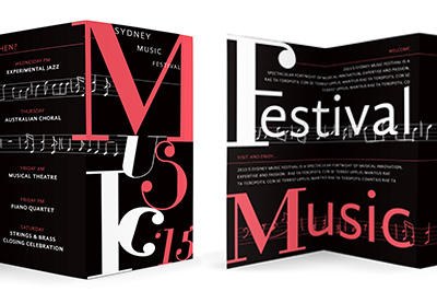
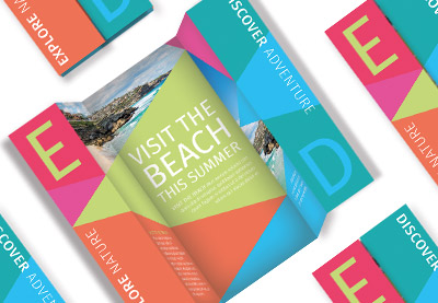
Barbershop Brochure Trifold

While this template features barbershop imagery, it’s highly adaptable. The pop of color and the clean, geometric inspiration are an excellent choice for a variety of projects! Easily swap the imagery and adjust the colors to match your objectives.

Barbershop Brochure Trifold

Media/Press Kit Template Brochure

This two paged template is clean, trendy, and easy to customize—in either Microsoft Word or Adobe InDesign. This template comes with both file types and two sizes too: both A4 and US letter. It’s both beginner friendly and a great foundation for the software savvy, too!

Solutions – Brochure Template

Looking for a larger brochure template with a whole host of pages to choose from? This one comes with a generous 20 pages to mix and match, in both US Letter and A4. Customize this in Microsoft Word, Adobe Photoshop, or InDesign! This is a versatile design too, with so many possibilities to work for a variety of projects!

Solutions  Brochure Template

Trifold Brochure Template

Perhaps a trifold approach is a better fit for your project—look no further! Whether you’re looking for a solid foundation to heavily customize or a complete composition ready for your content, this versatile layout is a great addition to any collection of professional assets.

Trifold Brochure Template

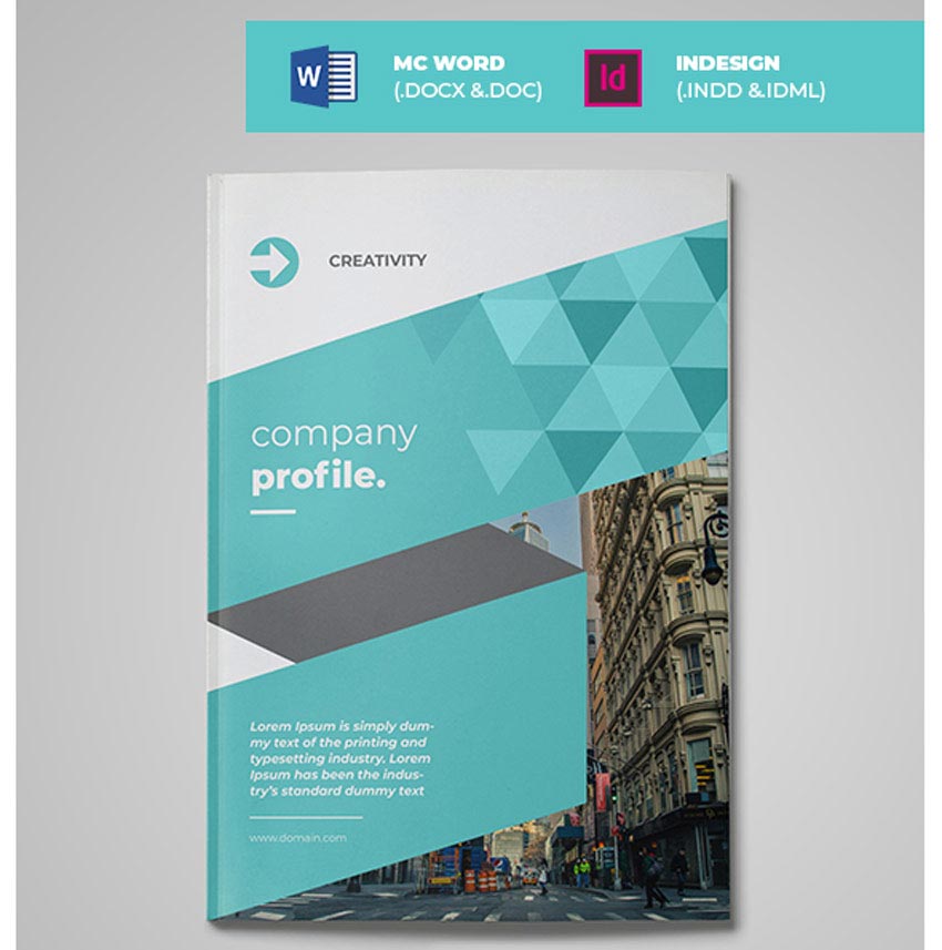
Company Profile Brochure Template

This stylish, professionally designed template is compatible with both Microsoft Word and Adobe InDesign. It’s ready to go, in two different sizes: both A4 and US letter. It also comes in red, yellow, and green—it’s easy to customize this one for your project’s goals.

Company Profile Brochure Template

Trifold Brochure Template

Every
entrepreneur should have at least one solid trifold brochure template.
These professional brochures make it possible for future clients to get
to know more about your company and its services. Clean and
multipurpose, this template features a corporate design that does just the trick for new
businesses!

Trifold Brochure Template

Business Profile Brochure

Design
the business you want with this amazing brochure template. Easy to
edit, this download comes with several editable templates made with
22 custom pages. Need a new font? No problem, just update the template
at your pace with any new details you need.

Business Profile Brochure

Corporate Brochure Template

Need a creative corporate brochure for your business?
Then check out this next print template created in Adobe InDesign. A
special Microsoft Word file has also been included for quick updates.
Get 36 custom pages and a premade cover layout. 

Corporate Brochure Template

The Annual Report 18 Pages

Track the findings of your business dealings with this annual report template. Create your company’s documentation quickly and easily with A4 sized templates and 18 unique layouts. Great for beginners, this template can also be edited with Microsoft Word. 

The Annual Report 18 Pages

Creative Brochure Template

Create your own opportunities with this awesome brochure template. Originally designed with Adobe InDesign, this template also comes in the latest versions available for Microsoft Word. Enjoy this sleek blue and green color scheme or update it fast with your own brand colors. 

Creative Brochure Template

Annual Report Brochure Template

Print ready and fully editable, this brochure template includes 28 pages of extraordinary design. It’s Microsoft Word-friendly and completely layered to make your work life a lot easier. So kick start 2020 with this efficient corporate brochure template. 

Annual Report Brochure Template

Minimal Proposal/Brochure Template

Get started on your next creative project with this minimalist proposal template. Designed for entrepreneurs and business professionals, this template features 24 fully layered pages in high-resolution formats. Easily access text and paragraph styles for a custom look!

Minimal ProposalBrochure Template

Brochure & Proposal Template

Tackling a new design project can be quite overwhelming! So take the headache out of proposals with this sleek and professional template. This download includes a stylish set of print-ready templates available in PDF, InDesign, and Word formats. Try it out!

Brochure  Proposal Template

Proposal Template

Our next print template includes a flexible design that’s great for proposals, invoices, and company details. The beautiful pastel color scheme is right on trend, but you can always swap out the colors to align it better with your brand. Master pages and automatic numbering are also included!

Proposal Template

Business Plan Brochure

Land the contract of your dreams with this incredible brochure template. This business template collection features 32 custom pages available in InDesign and Word formats. It was made entirely with free fonts and is a great deal for just $10!

Business Plan Brochure

Product Proposal Template

Develop your brand and business strategy with this clean, minimalist design. This product proposal template features 28 overall pages that are all easy to edit. Get started with the helpful PDF guide, which will walk you through the steps of the proposal from start to finish.

Product Proposal Template

Company Profile Brochure

Made with Adobe InDesign, this company profile brochure also comes in a handy Microsoft Word file! Enjoy the stylish, modern design with stunning pastel colors and 22 custom pages. Featuring a grid-based layout, this template also includes master pages and so much more!

Company Profile Brochure

Event Proposal Template

Color match this proposal to suit your style with ease! This event proposal template may even help you land funding for your new business. It’s fully editable and print ready, but you’ll need to update it with new pictures. So pick and use your favorites from PhotoDune

Event Proposal Template

Business Proposal Template

This clean and professional template will help you craft amazing opportunities for your business. Enjoy the stylish design which features a grid-based layout and only free fonts. Invoice and letterhead templates are also included for a well-rounded brand package. 

Business Proposal Template

Corporate Business Brochure

Take control of your business dreams with this professional corporate brochure. Available in both Adobe InDesign and Microsoft Word formats, this brochure features A4 and US Letter sizes with 16 custom pages. Just drag and drop your photos and information to get started.

Corporate Business Brochure

Facebook Advertising Proposal

Enter 2020 with the best advertising strategy possible. This Facebook ads proposal template is a smart resource for budding entrepreneurs and designers. It includes A4 and US Letter sizes, along with stylish page layouts for more inspiration. Add it to your collection!

Facebook Advertising Proposal

Corporate Business Proposal

Enjoy three stunning yet simple color schemes with this next proposal template. This no-hassle design includes a minimalist theme perfect for beginners. Break down your expense reports, project descriptions and more with one helpful set. 

Corporate Business Proposal

Business Proposal Template

Writing your business proposals takes up enough time and energy. So cut your worries in half with a professionally designed template you can customize to your needs. This helpful resource comes with fully layered documents and a custom cover design for a fast turnaround. 

Business Proposal Template

Company Profile Brochure

Highlight your company’s services with this extraordinary brochure. This template features 22 custom pages designed with intriguing layout options. Enjoy the trendy geometric-based design with beautiful colors you can update yourself. Check it out!

Company Profile Brochure

Funeral Program Template

Honor your loved one’s life through a special memorial. This memorial template not only allows you to customize it in Microsoft Word but it also gives you a helpful instructional guide for more assistance. Update it with pictures of your loved ones and their special memories.

Funeral Program Template

Business Project Proposal Template

The final resource in this collection is this inspiring Microsoft Word project proposal. This professional template includes 16 pages originally design with Adobe InDesign. Describe your company’s strategy, projections and services with an effective template available in seven color samples. 

Business Project Proposal Template

More Brochure Templates

Build the next business that will make an impact on the world. Brochure templates are just one essential resource for all creatives and designers alike. So how will you use these templates to tackle your dreams and aspirations?

Want more brochure templates? Check out these tutorials and articles for inspiration:

Tried any of these assets? Let us know! Tell us your favorites in the comments below.

This has been a selection of premium resources perfect for the avid creator. For more creative brochure templates, check out Envato Market, or enlist the help of our talented designers at Envato Studio. Happy creating!

Quoting in HTML: Quotations, Citations, and Blockquotes

Post pobrano z: Quoting in HTML: Quotations, Citations, and Blockquotes

It’s all too common to see the incorrect HTML used for quotes in markup. In this article, let’s dig into all this, looking at different situations and different HTML tags to handle those situations.

There are three major HTML elements involved in quotations:

  • <blockquote>
  • <q>
  • <cite>

Let’s take a look.

Blockquotes

Blockquote tags are used for distinguishing quoted text from the rest of the content. My tenth grade English teacher drilled it into my head that any quote of four lines or longer should be set apart this way. The HTML spec has no such requirement, but as long as the text is a quote and you want it to be set apart from the surrounding text and tags, a blockquote is the semantic choice.

By default, browsers indent blockquotes by adding margin on each side.

See the Pen
The Blockquote Tag
by Undead Institute (@undeadinstitute)
on CodePen.

As a flow element (i.e. “block level” element), blockquote can contain other elements inside it. For example, we can drop paragraphs in there with no problem:

<blockquote>
  <p></p>
  <p></p>
</blockquote>

But it could be other elements, too, like a heading or an unordered list:

<blockquote>
    <h2></h2>
    <ul>
      <li></li>
      <li></li>
    </ul>
</blockquote>

It’s important to note that blockquotes should only be used for quotations rather than as a decorative element in a design. This also aids accessibility as screen reader users can jump between blockquotes. Thus a blockquote element used solely for aesthetics could really confuse those users. If you need something more decorative that falls outside the bounds of extended quotations, then perhaps a div with a class is the way to go.

blockquote,
.callout-block {
  /* These could share styling */
}

Quoting with Q

Q tags (<q>) are for inline quotes, or what my tenth grade teacher would say are those under four lines. Many modern browsers will automatically add quotation marks to the quote as pseudo elements but you may need a backup solution for older browsers.

See the Pen
The Q Tag
by CSS-Tricks (@css-tricks)
on CodePen.

Typical quotation marks are just as valid for inline quotes as the <q> element. The benefits of using <q>, however, are that it includes a cite attribute, automatic handling of quotation marks, and automatic handling of quote levels. <q> elements should not used for sarcasm (e.g. “you would use a <q> tag for sarcasm, wouldn’t you?”), or signifying a word with air quotes (e.g. “awesome” is an “accurate” description of the author). But if you can figure out how to mark up air quotes, please let me know. Because that would be “awesome.”

The citation attribute

Both <q> and blockquotes can use a citation (cite) attribute. This attribute holds a URL that provides context and/or a reference for the quoted material. The spec makes a point of saying that the URL can be surrounded by spaces. (I’m not sure why that’s pointed out, but if you want to anger the semantic code deities, you’ll have to do more than throw spaces around.)

<p>The officer left a note saying <q cite="https://johnrhea.com/summons">You have been summoned to appear on the 4th day of January on charges of attempted reader bribery.</q></p>

That cite attribute isn’t visible to the user by default. You could add it in with a sprinkle of CSS magic like the following demo. You could even fiddle with it further to make the citation appear on hover.

See the Pen
Attributable citations
by CSS-Tricks (@css-tricks)
on CodePen.

Neither of those options are particularly great. If you need to cite a source such that users can see it and go to it, you should do it in HTML and probably with the <cite> element, which we’ll cover next.

The citation element

The <cite> tag should be used for referencing creative work rather than the person who said or wrote the quote. In other words, it’s not for quotes. Here are the examples from the spec:

<p>My favorite book is <cite>The Reality Dysfunction</cite> by
Peter F. Hamilton. My favorite comic is <cite>Pearls Before
Swine</cite> by Stephan Pastis. My favorite track is <cite>Jive
Samba</cite> by the Cannonball Adderley Sextet.</p>

Here’s another example:

See the Pen
Cite This!
by CSS-Tricks (@css-tricks)
on CodePen.

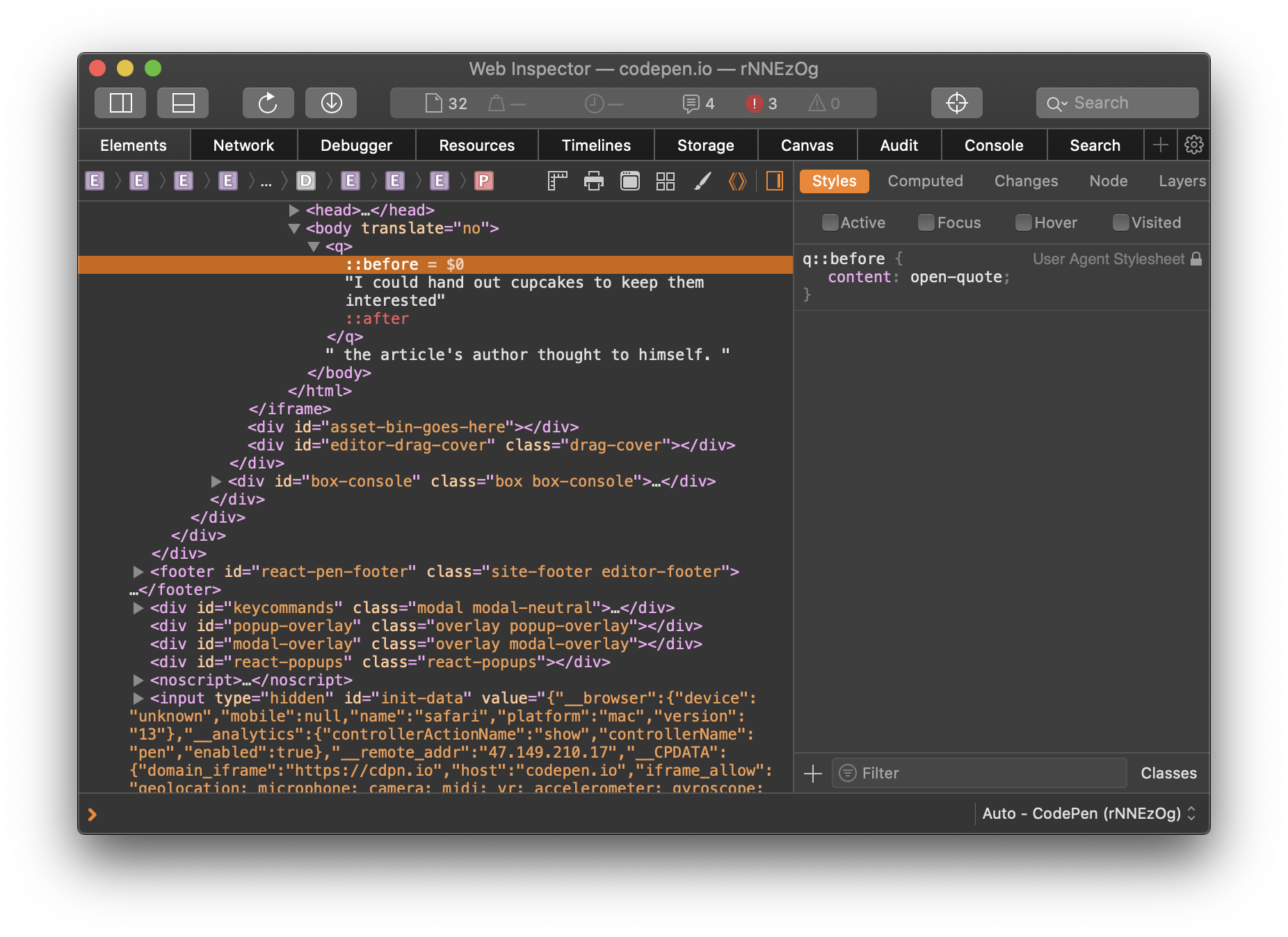
If the author of this article told you he’d give you a cupcake, and you <cite> him by name, that would be semantically incorrect. Thus no cupcakes would change hands. If you cited the article in which he offered you a cupcake, that would be semantically correct, but since the author wouldn’t do that, you still wouldn’t get a cupcake. Sorry.

By default, browsers italicize cite tags and there’s no requirement that a <q> or <blockquote> be present to use the cite element. If you want to cite a book or other creative work, then slap it in the cite element. The semantic deities will smile on you for not using either <i> or <em> elements.

But where to put the cite element? Inside? Outside? The upside down? If we put it inside the <blockquote> or the <q>, we’re making it part of the quote. That’s forbidden by the spec for just that reason.

<!-- This is apparently wrong -->
<blockquote>
  Quote about cupcake distribution from an article
  <cite>The Article</cite>
</blockquote>

Putting it outside just feels wrong and also requires you to have an enclosing element like a <div> if you wanted to style them together.

<div class="need-to-style-together">
  <blockquote>
    Quote about cupcake distribution from an article
  </blockquote>
  <cite>The Article</cite>
</div>

N.B. If you google this issue you may come across an HTML5 Doctor article from 2013 that contradicts much of what’s laid out here. That said, every time it links to the docs for support, the docs agree with the article you’re currently reading rather than the HTML5 Doctor article. Most likely the docs have changed since that article was written.

Hey, what about the figure element?

One way to mark up a quotation — and in a way that pleases the semantic code deities — is to put the blockquote within a figure element. Then, put the cite element and any other author or citation information in a figcaption.

<figure class="quote">
  <blockquote>
    But web browsers aren’t like web servers. If your back-end code is getting so big that it’s starting to run noticably slowly, you can throw more computing power at it by scaling up your server. That’s not an option on the front-end where you don’t really have one run-time environment—your end users have their own run-time environment with its own constraints around computing power and network connectivity.
  </blockquote>
  <figcaption>
    &mdash; Jeremy Keith, <cite>Mental models</cite>
  </figcaption>
</figure>

While this doubles the number of elements needed, there are several benefits:

  1. It’s semantically correct for all four elements.
  2. It allows you to both include and encapsulate author information beyond citing the name of the work.
  3. It gives you an easy way to style the quote without resorting to divs, spans or wretchedness.

See the Pen
It Figures You’d Say That
by CSS-Tricks (@css-tricks)
on CodePen.

None of this is for dialogue

Not <dialog>! Those are for attention-grabbing modals. Dialogue, as in, conversational exchanges between people speaking or typing to each other.

Neither <blockquote> nor <q> nor <cite> are to be used for dialogue and similar exchanges between speakers. If you’re marking up dialogue, you can use whatever makes the most sense to you. There’s no semantic way to do it. That said, the spec suggests <p> tags and punctuation with <span> or <b> tags to designate the speaker and <i> tags to mark stage directions.

Accessibility of quotes

From the research I’ve done, screen readers should not have any issue with understanding semantic-deity-approved <q>, <blockquote>, or <cite> tags.

More “ways” to “quote”

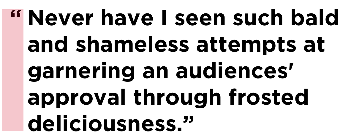
You can add quotation marks to a <blockquote> using CSS pseudo elements. The <q> element comes with quotation marks baked in so they need not be added, however adding them as pseudo-elements can be a workaround for older browsers that don’t automatically add them. Since this is how modern browsers add the quotation marks there’s no danger of adding duplicate quotes. New browsers will overwrite the default pseudo elements, and older browsers that support pseudo elements will add the quotes.

But you can’t, like I did, assume that the above will always give you smart opening and closing quotes. Even if the font supports smart quotes, sometimes straight quotes will be displayed. To be safe, it’s better to use the quotes CSS property to up the intelligence on those quotation marks.

blockquote {
  quotes: "“" "”" "‘" "’";
}

See the Pen
"Quot-a-tizing" the blockquote
by CSS-Tricks (@css-tricks)
on CodePen.

Multi-level quoting

Now let’s look at quote levels. The <q> tag will automatically adjust quote levels.

Let’s say you’re in an area that uses the British convention of using single quotes. You could use the CSS quotes rule to put the opening and closing single quotes first in the list. Here’s an example of both ways:

See the Pen
Quote Within a Quote
by CSS-Tricks (@css-tricks)
on CodePen.

There is no limit to nesting. Those nested <q> elements could even be within a blockquote that’s within a blockquote.

If you add quotation marks to a blockquote, know that the blockquote does not change the quote level the way a <q> tag does. If you expect to have quotes within a blockquote, you may want to add a descendant selector rule to start <q> elements within a blockquote at the single quote level (or double quotes if you follow British conventions).

 blockquote q {
  quotes: "‘" "’" "“" "”";
}

The last quote level you put in will continue through subsequent levels of quotation. To use the double, single, double, single… convention, add more levels to the CSS quotes property.

q {
  quotes: "“" "”" "‘" "’" "“" "”" "‘" "’" "“" "”";
}

Hanging punctuation

Many typography experts will tell you that hanging the quotation marks on blockquotes looks better (and they’re right). Hanging punctuation is, in this case, quotation marks that are pushed out from the text so that the characters of the text line up vertically.

One possibility in CSS is using a slightly negative value on the text-indent property. The exact negative indentation will vary by font, so be sure to double check the spacing with the font you end up using.

blockquote {
  text-indent: -0.45em;
}

There is a nicer way to handle this by using the hanging-punctuation CSS property. It’s only supported in Safari at the time of this writing, so we’ll have to progressively enhance:

/* Fallback */
blockquote {
  text-indent: -0.45em;
}

/* If there's support, erase the indent and use the property instead */
@supports ( hanging-punctuation: first) {
  blockquote {
    text-indent: 0;
    hanging-punctuation: first;
  }
}

Using hanging-punctuation is better because it’s less fiddly. It’ll just work when it can.

See the Pen
Hanging Your Punctuation
by CSS-Tricks (@css-tricks)
on CodePen.

Can we animate quotation marks?

Of course we can.

See the Pen
Dancing Quotes
by CSS-Tricks (@css-tricks)
on CodePen.

Why you’d need to do this, I’m not totally sure, but the quotation marks in a <q> tag are added are pseudo elements in the UA stylesheet, so we’re able to select and style them — including animation — if we need to.

Wait, maybe we just solved the air quotes thing after all.

The post Quoting in HTML: Quotations, Citations, and Blockquotes appeared first on CSS-Tricks.

How to Create a Stained Glass Text Effect in Illustrator

Post pobrano z: How to Create a Stained Glass Text Effect in Illustrator

Final product image
What You’ll Be Creating

In the following steps, you will learn how to create a stained glass text effect in Adobe Illustrator.

For starters, you will learn how to set up a simple grid and how to create the letter outlines for your text design. Next, using the Appearance panel and some graphic styles, you will learn how to add the colored glass pieces.

Using basic vector shape building techniques and some basic effects, you will learn how to add shading and some subtle highlights. Finally, you will learn how to apply a simple opacity mask and how to use built-in Illustrator brushes.

For more inspiration on how to create text effects, you can find plenty of resources at GraphicRiver.

1. How to Set Up a Grid for the Text Design

Hit Control-N to create a new document. Select Pixels from the Units drop-down menu, enter 850 in the width box and 640 in the height box, and then click More Settings. Select RGB for the Color Mode, set the Raster Effects to Screen (72 ppi), and then click Create Document.

Enable the Grid (View > Show Grid) and Snap to Grid (View > Snap to Grid). For starters, you will need a grid every 10 px, so simply go to Edit > Preferences > Guides & Grid, and enter 10 in the Gridline every box and 1 in the Subdivisions box. Try not to get discouraged by all that grid—it will make your work easier, and keep in mind that you can easily enable or disable it using the Control-„ keyboard shortcut.

You can learn more about Illustrator’s grid system in this short tutorial from Andrei Stefan: Understanding Adobe Illustrator’s Grid System.

You should also open the Info panel (Window > Info) for a live preview with the size and position of your shapes. Don’t forget to set the unit of measurement to pixels from Edit > Preferences > Units. All these options will significantly increase your work speed. Now that everything is set up, let’s start to work on our text design.

set up grid

2. How to Create the Outline of the Text Design

Step 1

Pick the Rectangle Tool (M) and focus on your toolbar. Remove the color from the fill and then select the stroke and set its color to black (R=137 G=147 B=150). Move to your artboard and simply create a 90 x 30 px shape—the grid and the Snap to Grid should make it easier.

Make sure that your shape stays selected and open the Appearance panel (Window > Appearance). Click the „Stroke” piece of text to open the Stroke fly-out panel, set the Weight to 5 px, and check the Align Stroke to Inside button.

text design rectangle

Step 2

Using the same tool and the same Appearance attributes, add an 80 x 30 px shape and place it as shown in the first image.

Add a second 90 x 30 px shape and place it as shown in the second image. Create a second 80 x 30 px shape and a new 90 x 30 px shape. Place these rectangles as shown in the third image. In the end, these shapes will form the letter „S„. Your overall letter should be 90 px wide and 130 px long. Keep these overall dimensions in mind, and try to use them for the rest of the letters.

text design letter

Step 3

Using the same tools and Appearance attributes, create the remaining letters from the „STAINED” word, as shown in the following image.

Here’s how you make the oblique shape used for the letter „N„. Create a 130 x 30 px shape and pick the Direct Selection Tool (A). Select the bottom anchor points and drag them 60 px to the right.

text design letters

Step 4

Using the same tools and Appearance attributes, create the letters for the „GLASS” word. This will be the starting outline of your text design.

text design letters

Step 5

Select all the shapes made so far and add copies in front (Control-C > Control-F). Select only these copies, open the Pathfinder panel (Window > Pathfinder), and click the Unite button.

Select the resulting shapes and focus on the Appearance panel. Remove the stroke color, select the fill, and set the color to R=57 G=181 B=74. Make sure that your green shapes are selected and hit Control-8 (or go to Object > Compound Path > Make) to turn them into one compound path. With your compound path still selected, hit Shift-Control-[ to send it to back (behind all the other shapes).

compound path

Step 6

For the following two steps, you will need a grid every 1 px. Just go to Edit > Preferences > Guides & Grid and enter 1 in the Gridline every box.

Focus on the letter „S” from the first word. Pick the Pen Tool (P) and create a simple path roughly as shown in the first image. Add a 3 px stroke for this new path and set its color to black. Using the same tool and Appearance attributes, add a bunch of paths connecting the edges of the letter, as shown in the following images.

pen tool

Step 7

Focus on the rest of the letters and use the technique mentioned in the previous step to add the paths inside the letters, as shown in the first image.

Pick the Move Tool (M) and select everything. Hold Shift and click the green path to deselect it. Now that only the black paths are selected, go to Object > Path > Outline Stroke.

outline stroke

Step 8

Return to gridline every 10 px. Simply go to Edit > Preferences > Guides & Grid and enter 10 in the Gridline every box.

Select one of your black shapes and go to Select > Same > Fill Color to easily select all the shapes with a black fill color. Click the Unite button from the Pathfinder panel and hit Control-8 to turn the resulting shapes into one compound path. Select it and switch to the Direct Selection Tool (A). Enter 2 px in the Corners box from the control panel, and change the fill color to R=46 G=51 B=85. This final shape will be the main frame of your text effect.

radius

3. How to Create the Glass Pieces for the Text Design

Step 1

Make sure that the frame shape is selected and add a copy in front (Control-C > Control-F). Select your green compound path and go to Object > Path > Offset Path. Enter a -1 px Offset and click OK. Select this new shape along with the copy of that frame shape and click the Minus Front button from the Pathfinder panel. Ungroup (Shift-Control-G) the resulting group of shapes.

text effect frame

Step 2

Let’s focus on one of the green shapes. Select it and go to the Appearance panel.

First, select the existing fill and replace the green with R=244 G=50 B=1. Using the Add New Fill button from the bottom of the panel, add a second fill for your selected shape. Select it, change its Blending Mode to Soft Light, and replace the fill color with a linear gradient. Open the Gradient panel (Window > Gradient) to edit this gradient. Set the angle to 90 degrees and then move to the gradient sliders. Select the right one and set its color to black, and then select the left one, set its color to black, and lower the Opacity to 0%.

linear gradient

Step 3

Make sure that your red shape is still selected, open the Graphic Styles panel (Window > Graphic Styles), and click the New Graphic Style button.

text effect graphic style

Step 4

Select another green shape and simply apply the saved graphic style. Focus on the Appearance panel, select the bottom fill, and change the color to R=254 G=123 B=0.

Make sure that this new shape stays selected, return to the Graphic Styles panel, and click the New Graphic Style button.

graphic style

Step 5

Select another green shape and apply one of the saved graphic styles. Focus on the Appearance panel, select the bottom fill, and change the color to R=255 G=209 B=66.

Make sure that this new shape stays selected, return to the Graphic Styles panel, and click the New Graphic Style button.

graphic style

Step 6

Select another green shape and apply one of the saved graphic styles. Focus on the Appearance panel, select the bottom fill, and change the color to R=229 G=239 B=66.

Make sure that this new shape stays selected, return to the Graphic Styles panel, and click the New Graphic Style button.

graphic style

Step 7

Select another green shape and apply one of the saved graphic styles. Focus on the Appearance panel, select the bottom fill, and change the color to R=254 G=249 B=212.

Make sure that this new shape stays selected, return to the Graphic Styles panel, and click the New Graphic Style button.

graphic style

Step 8

Now that you’ve saved your five graphic styles, move to the remaining green shapes and simply apply your saved graphic styles.

glass text effects

4. How to Add Shading and Subtle Highlights to the Text Design

Step 1

Disable the Snap to Grid (Shift-Control-„) and then go to Edit > Preferences > General and make sure that the Keyboard Increment is set to 1 px.

Select the frame shape and add two copies in front (Control-C > Control-F > Control-F). Select the top copy and move it 1 px to the right using the Right Arrow key. Reselect both copies added in this step and click the Minus Front button from the Pathfinder panel. Turn the resulting group of shapes into one compound path and go to the Appearance panel. Change the fill color to white (R=255 G=255 B=255), lower the Opacity to 50%, and don’t forget to change the Blending Mode to Overlay.

text design highlight

Step 2

Select your green compound path, pick the Direct Selection Tool (A), and enter 2 px in the Corners box from the control panel.

Add a copy in front (Control-C > Control-F), bring it to the front (Shift-Control-]), and change the fill color to R=56 G=61 B=95.

corner radius

Step 3

Make sure that the compound path added in the previous step stays selected and focus on the Appearance panel.

Lower the Opacity to 10% and change the Blending Mode to Overlay, and then go to Effect > Artistic > Film Grain. Enter the attributes shown below, click OK, and return to the Appearance panel. Select the fill and go to Effect > Distort > Diffuse Glow. Enter the attributes shown in the following image and click OK.

text design texture

Step 4

Select the green compound path, hit Control-C to copy it, and then focus on the Appearance panel. Select the fill and change the green to black. Lower its Opacity to 15% and change the Blending Mode to Soft Light, and then go to Effect > Distort & Transform > Transform. Enter the attributes shown below, click OK, and go to Effect > Blur > Gaussian Blur. Enter a 6 px Radius and click OK.

text design shadow

Step 5

Make sure that your black compound path stays selected and keep focusing on the Appearance panel. Add a second fill and select it. Make sure that the color is set to black, lower its Opacity to 30%, and change the Blending Mode to Soft Light, and then go to Effect > Distort & Transform > Transform. Enter the attributes shown below, click OK, and go to Effect > Blur > Gaussian Blur. Enter a 6 px Radius and click OK.

text design shadow

Step 6

Select the frame shape and go to Effect > Stylize > Drop Shadow. Enter the attributes shown in the left window (in the following image), click OK, and go again to Effect > Stylize > Drop Shadow. Enter the attributes shown in the right window and click OK.

text design drop shadow

5. How to Add Extra Shading With Illustrator Brushes

Step 1

Open the Brushes panel (Window > Brushes), open the fly-out panel, and go to Ope Brush Library > Artistic > Artistic_ChalkCharcoalTapered. We’ll need one of the built-in Illustrator brushes from this list.

Hit Control-F to paste in front the green compound path copied several steps ago. Hit Control-F one more time to add a second copy. Select it and focus on the Appearance panel. Remove the fill color and then select the stroke. Set the color to black and apply the Charcoal – Tapered brush from that panel.

illustrator brushes

Step 2

Make sure that the compound path with the artistic brush is still selected, and focus on the Appearance panel. Lower the Opacity to 30% and change the Blending Mode to Soft Light.

illustrator brushes

Step 3

Select the green compound path, bring it to the front (Shift-Control-]), and change the fill color to white. Select this white compound path along with the one that has the artistic brush, open the Transparency panel (Window > Transparency), and click the Make Mask button. In the end, things should look like in the second image.

opacity mask

6. How to Add the Background for the Text Design

Step 1

Enable the Snap to Grid (Control-„). Using the Rectangle Tool (M), create an 870 x 660 px shape and send it to back (Shift-Control-[). Fill this rectangle with R=26 G=31 B=45 and make sure that it covers your entire artboard.

background

Step 2

Select the rectangle made in the previous step, add a copy in front (Control-C > Control-F), and bring it to the front (Shift-Control-]).

Select this new shape, change its Blending Mode to Overlay, and replace the existing color with the radial gradient shown below. Use the Gradient Tool (G) to stretch your gradient as shown in the following image. Don’t forget that the yellow zero from the Gradient panel image stands for Opacity.

radial gradient

Congratulations! You’re Done!

Here is how your stained glass text design should look. I hope you’ve enjoyed this tutorial and that it helped you learn more about text effects and Illustrator brushes. Don’t hesitate to share your final result in the comments section.

Feel free to adjust the final text design and make it your own. You can find some great sources of inspiration at GraphicRiver, with interesting solutions to improve your text effect skills.

stained glass text effect

Learn More About Text Effects

If you want to learn more about text design and Illustrator brushes, check one of the following tutorials: