5 Important Tips When Building Your First Mobile App

Post pobrano z: 5 Important Tips When Building Your First Mobile App

Building a mobile application is a complex process, and mistake can be costly in time and money. To make sure that your mobile app projects are a success, here are a few tips that will be helpful.

1. Plan Ahead

When building anything complex, you should never start without a plan. Building a mobile app is no exception. To plan ahead for an app, you’ll have to do extensive thinking to make sure you are not forgetting any important functionalities. Some of the steps you should follow include:

  1. Brainstorming: get together with your team and go wild while looking for ideas. Once you feel like you went through all important ideas, organize the results of your brainstorming sessions by structuring the features you keep and eliminating useless ones.
  2. Do your research: chances are that you are not the first one to have had the idea for the app you are about to create. Search for apps that serve a similar purpose, or at least that target similar audiences if your idea is truly unique. Try to understand what makes the app successful (or not) and look at the way they are doing business (promotion, pricing,…).
  3. Create a comprehensive final list of functional and technical specifications: a crucial step to ensure you will not have too many surprises along the way while developing the app.
  4. Create an app flowchart: maybe the most important step of all. The app flowchart will give you the opportunity to identify the most important “nodes” in your app, as well as the relationship between various functionalities.
  5. List your technical challenges: if you practice the “Getting Things Done” methodology by David Allen, you already know that listing your technical challenges will actually help you solve it by already putting it in your mind, as well as eliminating the surprise effect.

2. Build a Wireframe

As counter-intuitive as it may sound on a design blog, a design-free environment will allow you to create better designed apps. In fact, working on a wireframe will force you to focus on the functional parts of your app design, and prevent you from “prettifying” things to hide your apps flaws.

To make your wireframes more efficient, start by sketching it on paper to get your ideas flowing and work quicker. Try to go for as many ideas as possible.

Use a grid in your wireframes already, grids will make your layout work easier and more stable. Also, try to insert the real content early-on in the process. Dummy content actually doesn’t add any value to the app creation process.

If possible, I would also suggest to try to go colorless. It may be harder, but this type of constrain forces you to be even more sure of the way you lay out the functionalities. When working with a team, you should also annotate your wireframes to better communicate with others.

3. Go for a Quick MVP

Once your mobile app’s preliminary work has been done thoroughly, you should try to go for a quick MVP for your mobile app.

There are several reasons for trying to release quickly and often. First, it can give you a competitive edge on other mobile apps similar to yours. It also gives you the opportunity to quickly understand what your users like or not by observing their behavior and collecting their feedback. At last but not least, it will help you avoid heavy development costs on features that you would have abandoned anyway.

Obviously, this advice doesn’t mean that you should release unfinished work. Releasing with less features should never equate with buggy software.

4. Test, Test, Test, and Test Some More

It is important to understand that there is a major difference between what you think that your users are going to do, and how they effectively behave.

For that reason, testing is a crucial part of app development. Organize user testing sessions where you ask them to perform some tasks and observe their behavior. All data and feedbacks should be collected for analysis and later use.

5. Revise and Maintain

Of course, testing is not useful if it’s not followed by revisions on the app. You need to take your user testing into account and make changes accordingly.

On the longer term, it is important to keep your mobile app updated and regularly fix bugs and add new features. Through the download platforms, you will get regular feeback and comments from your users, you should show them that you care and use their experience to make your software better.
CSS Foldable Display Polyfill

Post pobrano z: CSS Foldable Display Polyfill

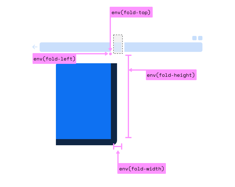
Foldable phones are starting to be a thing. Early days, for sure, but some are already shipping, and they definitely have web browsers on them. Stands to reason that, as web designers, we are going to want to know where that fold is so we can design screens that fit onto the top half and bottom half… or left half and right half¹.

Looks like that’s going to make its way to us in the form of env() constants, just like all that notch stuff.

The code block in the polyfill repo is:

@media (spanning: single-fold-vertical) {
  body {
    flex-direction: row;
  }
  .map {
    flex: 1 1 env(fold-left)
  }
  .locations-list {
    flex: 1;
  }
}

I would also think it could be…

@media (spanning: single-fold-vertical) {
  .page-wrap {
    display: grid;
    grid-template-columns: env(fold-left) 1fr;
  }
}

Interesting how there is no fold-right, isn’t it? And aren’t we trying to stay away from directional terms like that and use logical properties? Why not fold-inline-start?

  1. It’ll be interesting to see how that sentence ages. Just watch the first really popular foldable phone will have three segments.

The post CSS Foldable Display Polyfill appeared first on CSS-Tricks.

Create Diagonal Layouts Like it’s 2020

Post pobrano z: Create Diagonal Layouts Like it’s 2020

Nils Binder covers the ways:

1. Use an SVG in the form of a triangle. This technique is nicely described by Erik Kennedy on CSS-Tricks.

2. Hide part of your section using clip-path. Read Diagonal Containers in CSS by Sebastiano Guerriero or Sloped edges with consistent angle in CSS by Kilian Valkhof.

3. Using CSS Transforms

I would normally be a #2 kinda guy — slice off the top and bottom a bit, make sure there is ample padding, and call it a day. But Nils almost has me convinced this fancy math is better.

Here’s a kinda dumb clip-path way:

CodePen Embed Fallback

And Nils incredibly fancy playground:

CodePen Embed Fallback

Direct Link to ArticlePermalink

The post Create Diagonal Layouts Like it’s 2020 appeared first on CSS-Tricks.

Thinking in Behaviors, Not Screen Sizes

Post pobrano z: Thinking in Behaviors, Not Screen Sizes

Chase McCoy wrote a nifty post about the “gap problem” when making a grid of items. His argument might be summarized like this: how should we space elements with margins in CSS? He notes that the gap property isn’t quite ready for prime time when it comes to using it with flexbox, like this:

.grid {
  display: flex;
  gap: 10px;
}

Right now, using gap with flexbox is only supported in Firefox and I’ve already caught myself forgetting about that in a few projects. So watch out for that.

Anyway, the part about Chase’s blog post that I love is where he mentions Andy Bell’s technique for creating a responsive layout with no media queries, like this:

.grid {
  display: grid;
  grid-gap: 10px;
  grid-template-columns: repeat(auto-fill, minmax(150px, 1fr));
}

This CSS is doing the following:

  • Make a grid with a 10px gap between each column and row.
  • Each column should have a minimum width (150px).
  • Each column should also be equal width (1fr).
  • The grid should auto-fill as many columns that can fit.

The nifty thing about all this is that our grid is now effectively responsive because of minmax — if you resize the browser, then the grid will snap down into fewer columns, just like this:

No media queries at all! Although sure, there’s a few other ways that you could get this to work but I think this is neat not just because we’re avoiding media queries — instead, it’s because it teaches us to think in a new way when designing and building components.

Chase continues:

With this technique, instead of using breakpoints to specify the screen size where your items should stack, you specify the minimum size an element should be before it stacks. I like this because it encourages developers to think about responsive design in terms of behaviors instead of screen sizes.

“Behaviors instead of screen sizes” is such a great way to think about component design! A lot of the problems I’ve encountered when making components for a design system is when I’ve been thinking about screen sizes — mobile, tablet, desktop, etc. — and trying to make those components fit within those constraints.

Thinking in behaviors is always more effective because there are so many things that can impact a component beyond what screen or device width we’re working with. Perhaps we want that component to fit inside another component. Or we want to align some helper text to the side of it for comparison.

Either way, thinking about behaviors instead of screen sizes isn’t really going to be fully impossible until we have container queries, as Chris writes:

Container queries are always on the top of the list of requested improvements to CSS. The general sentiment is that if we had container queries, we wouldn’t write as many global media queries based on page size. That’s because we’re actually trying to control a more scoped container, and the only reason we use media queries for that now is because it’s the best tool we have in CSS. I absolutely believe that.

The post Thinking in Behaviors, Not Screen Sizes appeared first on CSS-Tricks.

Thinking in Behaviors, Not Screen Sizes

Post pobrano z: Thinking in Behaviors, Not Screen Sizes

Chase McCoy wrote a nifty post about the “gap problem” when making a grid of items. His argument might be summarized like this: how should we space elements with margins in CSS? He notes that the gap property isn’t quite ready for prime time when it comes to using it with flexbox, like this:

.grid {
  display: flex;
  gap: 10px;
}

Right now, using gap with flexbox is only supported in Firefox and I’ve already caught myself forgetting about that in a few projects. So watch out for that.

Anyway, the part about Chase’s blog post that I love is where he mentions Andy Bell’s technique for creating a responsive layout with no media queries, like this:

.grid {
  display: grid;
  grid-gap: 10px;
  grid-template-columns: repeat(auto-fill, minmax(150px, 1fr));
}

This CSS is doing the following:

  • Make a grid with a 10px gap between each column and row.
  • Each column should have a minimum width (150px).
  • Each column should also be equal width (1fr).
  • The grid should auto-fill as many columns that can fit.

The nifty thing about all this is that our grid is now effectively responsive because of minmax — if you resize the browser, then the grid will snap down into fewer columns, just like this:

No media queries at all! Although sure, there’s a few other ways that you could get this to work but I think this is neat not just because we’re avoiding media queries — instead, it’s because it teaches us to think in a new way when designing and building components.

Chase continues:

With this technique, instead of using breakpoints to specify the screen size where your items should stack, you specify the minimum size an element should be before it stacks. I like this because it encourages developers to think about responsive design in terms of behaviors instead of screen sizes.

“Behaviors instead of screen sizes” is such a great way to think about component design! A lot of the problems I’ve encountered when making components for a design system is when I’ve been thinking about screen sizes — mobile, tablet, desktop, etc. — and trying to make those components fit within those constraints.

Thinking in behaviors is always more effective because there are so many things that can impact a component beyond what screen or device width we’re working with. Perhaps we want that component to fit inside another component. Or we want to align some helper text to the side of it for comparison.

Either way, thinking about behaviors instead of screen sizes isn’t really going to be fully impossible until we have container queries, as Chris writes:

Container queries are always on the top of the list of requested improvements to CSS. The general sentiment is that if we had container queries, we wouldn’t write as many global media queries based on page size. That’s because we’re actually trying to control a more scoped container, and the only reason we use media queries for that now is because it’s the best tool we have in CSS. I absolutely believe that.

The post Thinking in Behaviors, Not Screen Sizes appeared first on CSS-Tricks.

Dove: Courage

Post pobrano z: Dove: Courage

Film
Dove

Advertising Agency:Ogilvy, Toronto, Canada
Chief Creative Officer:Brian Murray
Group Creative Director:Christian Horsfall
Art Director:Christian Horsfall
Associate Creative Director:Pam Danowski
Copywriter:Pam Danowski
Global Executive Creative Director:Daniel Fisher
Chief Strategy Officer:Tom Kenny
Global Dove EVP:Alessandro Manfredi
Dove Canada Marketing Manager:Divya Singh
Dove Canada Brand Manager:Laura Douglas
Worldwide Managing Director:Aviva Groll
Account Director:Beth Blatch
Account Coordinator:Rebecca Tummers
Senior Print Producer:David Scanlon
PMO Lead:Mike Kerry
Executive Partner:Nadja Bellan-White
Editor:Chris Murphy
Outsider Editorial:Chris Murphy, Kristina Anzlinger, Nathan Olszewicki
Executive Producer:Kristina Anzlinger
Assistant:Nathan Olszewicki
Audio:SNDWRX
Composer:Kevin Sargent

Dove: Courage

Post pobrano z: Dove: Courage

Film
Dove

Advertising Agency:Ogilvy, Toronto, Canada
Chief Creative Officer:Brian Murray
Group Creative Director:Christian Horsfall
Art Director:Christian Horsfall
Associate Creative Director:Pam Danowski
Copywriter:Pam Danowski
Global Executive Creative Director:Daniel Fisher
Chief Strategy Officer:Tom Kenny
Global Dove EVP:Alessandro Manfredi
Dove Canada Marketing Manager:Divya Singh
Dove Canada Brand Manager:Laura Douglas
Worldwide Managing Director:Aviva Groll
Account Director:Beth Blatch
Account Coordinator:Rebecca Tummers
Senior Print Producer:David Scanlon
PMO Lead:Mike Kerry
Executive Partner:Nadja Bellan-White
Editor:Chris Murphy
Outsider Editorial:Chris Murphy, Kristina Anzlinger, Nathan Olszewicki
Executive Producer:Kristina Anzlinger
Assistant:Nathan Olszewicki
Audio:SNDWRX
Composer:Kevin Sargent

Dove: Courage

Post pobrano z: Dove: Courage

Film
Dove

Advertising Agency:Ogilvy, Toronto, Canada
Chief Creative Officer:Brian Murray
Group Creative Director:Christian Horsfall
Art Director:Christian Horsfall
Associate Creative Director:Pam Danowski
Copywriter:Pam Danowski
Global Executive Creative Director:Daniel Fisher
Chief Strategy Officer:Tom Kenny
Global Dove EVP:Alessandro Manfredi
Dove Canada Marketing Manager:Divya Singh
Dove Canada Brand Manager:Laura Douglas
Worldwide Managing Director:Aviva Groll
Account Director:Beth Blatch
Account Coordinator:Rebecca Tummers
Senior Print Producer:David Scanlon
PMO Lead:Mike Kerry
Executive Partner:Nadja Bellan-White
Editor:Chris Murphy
Outsider Editorial:Chris Murphy, Kristina Anzlinger, Nathan Olszewicki
Executive Producer:Kristina Anzlinger
Assistant:Nathan Olszewicki
Audio:SNDWRX
Composer:Kevin Sargent

How to Create a Stylized Chalk Text Effect in Adobe Photoshop

Post pobrano z: How to Create a Stylized Chalk Text Effect in Adobe Photoshop

Final product image
What You’ll Be Creating

This tutorial will show you a really quick and easy way to create a stylized chalk text effect, using some filters and drop shadow effects. Let’s get started!

This text effect was inspired by the many Layer Styles available on Envato Market.

Follow along with us over on our Envato Tuts+ YouTube channel:

Tutorial Assets

The following assets were used during the production of this tutorial:

Looking for a chalk effect in Photoshop? Head on over to Envato Elements and download this amazing chalk effect Photoshop Layer Styles set with 15 chalk and 15 charcoal style presets.

Chalk Effect Photoshop Layer Styles

1. Create the Background

Step 1

Open the Black Board image, and then go to Image > Image Size, and set the Width to 1000 px.

Image Size

Step 2

Click the Create new fill or adjustment layer icon at the bottom of the Layers panel and choose Levels.

Add a Levels Adjustment Layer

Step 3

Set the Gamma value to 0.95. This will darken the texture a little bit.

Darken the Texture

2. Create the Text and Chalk Layers

Step 1

Create the text using the font Magnolia Script. Set the Size to 200 pt, and if you’re using multiple lines of text, set the Leading to a value around 185 pt.

Create the Text

Step 2

Set the Foreground and Background colors to Black and White.

Create a new layer below the text layer, call it Chalk, and fill it with Black.

Create the Chalk Layer

Step 3

Go to Filter > Convert for Smart Filters, to convert the layer into a smart object.

Convert for Smart Filters

3. Apply the Filters

Step 1

Go to Filter > Noise > Add Noise.

Change the Amount to 150 and the Distribution to Gaussian, and check the Monochromatic box.

Add Noise

Step 2

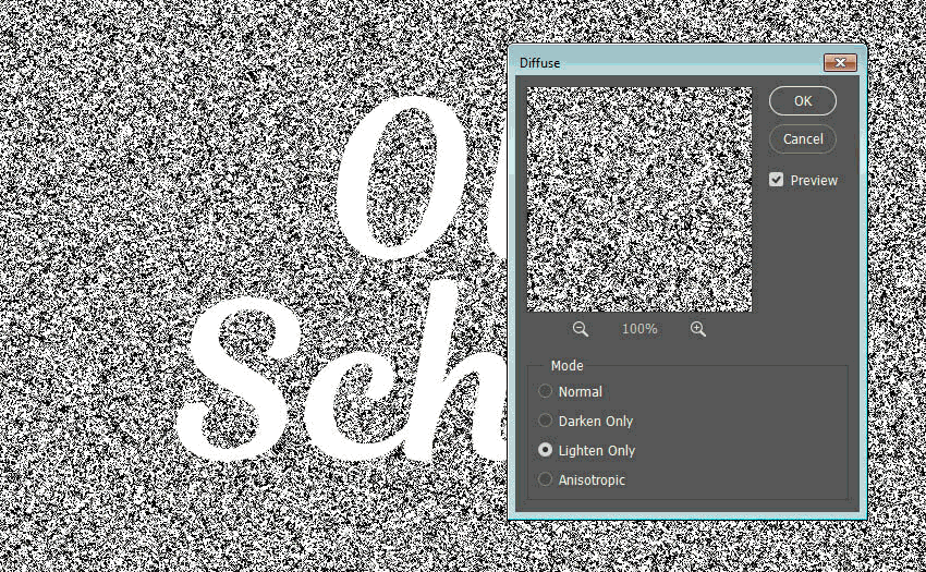
Go to Filter > Stylize > Diffuse, and choose the Lighten Only Mode.

Diffuse Filter

4. Mask the Chalk Texture

Step 1

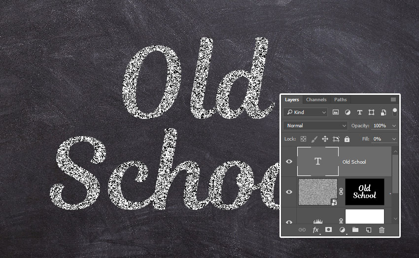
Command-click the text layer’s thumbnail to create a selection.

Create a Selection

Step 2

Click the Add layer mask icon at the bottom of the Layers panel.

Add a Layer Mask

Step 3

Select the text layer, and change its Fill value to 0.

Text Layer Fill Value

5. Style the Text Layer

Double-click the text layer to apply the following layer style:

Step 1

Add a Drop Shadow with these settings:

  • Color: #1e1c1e
  • Opacity: 100%
  • Distance: 6
  • Spread: 35
  • Size: 1
  • Noise: 100%
Drop Shadow 1

Step 2

Click the + icon to the right of the Drop Shadow tab to add another instance with these settings:

  • Color: #b57b88
  • Opacity: 100%
  • Distance: 7
  • Spread: 60
  • Size: 5
  • Noise: 50%
Drop Shadow 2

Step 3

Add another Drop Shadow instance with these settings:

  • Color: #000000
  • Opacity: 25%
  • Distance: 15
  • Spread: 0
  • Size: 15
  • Noise: 30%
Drop Shadow 3

This will create the colored chalk outline and finish off the text effect.

Styled Text Layer

Text Effect Actions

If you need Photoshop actions that will do most of the work for you, check out our propositions:

Chalk Generator

This item comes with 14 extra actions to make your main
shape/text/raster have a chalk writing look. You can play with many
ready-made icons to give your chalkboard a unique look.

Chalk Generator

Flour & Powder – Photoshop Actions

Ever tried to write text or make a logo or graphic using flour
or powder? It’s really hard.
With this set of Photoshop actions, you can achieve amazing results with
few clicks. Simply install the action, create your text or logo, and click play. Job
done!

Flour  Powder - Photoshop Actions

Sand Photoshop Action

Make your text or logo written in the sand! You can achieve a realistic effect of writing on the sand in just a couple of seconds.
Use this summer style for your projects!

Sand Photoshop Action

Leather Badge Generator – Photoshop Actions

Generate realistic leather elements from your text, logo, shape, or design in a few clicks. This is a clean, photo-realistic effect, with high detail.

Leather Badge Generator - Photoshop Actions

Salt and Sugar Generator – Photoshop Actions

Transform your text or logo into a realistic Salt and Sugar effect in few clicks. All the layers are well organized and packed in a Smart Object, so the starting layer is untouched.

Salt and Sugar Generator - Photoshop Actions

Congratulations, You’re Done!

In this tutorial, we created a simple background using a blackboard texture, and then created text and a smart object layer to work on the effect.

After that, we applied some filters to create the main chalk effect and masked it to the text we created.

Finally, we styled the text using a couple of drop shadow effects with different settings to create the colored outline.

Please feel free to leave your comments, suggestions, and outcomes below.

Final Result

How to Create a Stylized Chalk Text Effect in Adobe Photoshop

Post pobrano z: How to Create a Stylized Chalk Text Effect in Adobe Photoshop

Final product image
What You’ll Be Creating

This tutorial will show you a really quick and easy way to create a stylized chalk text effect, using some filters and drop shadow effects. Let’s get started!

This text effect was inspired by the many Layer Styles available on Envato Market.

Follow along with us over on our Envato Tuts+ YouTube channel:

Tutorial Assets

The following assets were used during the production of this tutorial:

Looking for a chalk effect in Photoshop? Head on over to Envato Elements and download this amazing chalk effect Photoshop Layer Styles set with 15 chalk and 15 charcoal style presets.

Chalk Effect Photoshop Layer Styles

1. Create the Background

Step 1

Open the Black Board image, and then go to Image > Image Size, and set the Width to 1000 px.

Image Size

Step 2

Click the Create new fill or adjustment layer icon at the bottom of the Layers panel and choose Levels.

Add a Levels Adjustment Layer

Step 3

Set the Gamma value to 0.95. This will darken the texture a little bit.

Darken the Texture

2. Create the Text and Chalk Layers

Step 1

Create the text using the font Magnolia Script. Set the Size to 200 pt, and if you’re using multiple lines of text, set the Leading to a value around 185 pt.

Create the Text

Step 2

Set the Foreground and Background colors to Black and White.

Create a new layer below the text layer, call it Chalk, and fill it with Black.

Create the Chalk Layer

Step 3

Go to Filter > Convert for Smart Filters, to convert the layer into a smart object.

Convert for Smart Filters

3. Apply the Filters

Step 1

Go to Filter > Noise > Add Noise.

Change the Amount to 150 and the Distribution to Gaussian, and check the Monochromatic box.

Add Noise

Step 2

Go to Filter > Stylize > Diffuse, and choose the Lighten Only Mode.

Diffuse Filter

4. Mask the Chalk Texture

Step 1

Command-click the text layer’s thumbnail to create a selection.

Create a Selection

Step 2

Click the Add layer mask icon at the bottom of the Layers panel.

Add a Layer Mask

Step 3

Select the text layer, and change its Fill value to 0.

Text Layer Fill Value

5. Style the Text Layer

Double-click the text layer to apply the following layer style:

Step 1

Add a Drop Shadow with these settings:

  • Color: #1e1c1e
  • Opacity: 100%
  • Distance: 6
  • Spread: 35
  • Size: 1
  • Noise: 100%
Drop Shadow 1

Step 2

Click the + icon to the right of the Drop Shadow tab to add another instance with these settings:

  • Color: #b57b88
  • Opacity: 100%
  • Distance: 7
  • Spread: 60
  • Size: 5
  • Noise: 50%
Drop Shadow 2

Step 3

Add another Drop Shadow instance with these settings:

  • Color: #000000
  • Opacity: 25%
  • Distance: 15
  • Spread: 0
  • Size: 15
  • Noise: 30%
Drop Shadow 3

This will create the colored chalk outline and finish off the text effect.

Styled Text Layer

Text Effect Actions

If you need Photoshop actions that will do most of the work for you, check out our propositions:

Chalk Generator

This item comes with 14 extra actions to make your main
shape/text/raster have a chalk writing look. You can play with many
ready-made icons to give your chalkboard a unique look.

Chalk Generator

Flour & Powder – Photoshop Actions

Ever tried to write text or make a logo or graphic using flour
or powder? It’s really hard.
With this set of Photoshop actions, you can achieve amazing results with
few clicks. Simply install the action, create your text or logo, and click play. Job
done!

Flour  Powder - Photoshop Actions

Sand Photoshop Action

Make your text or logo written in the sand! You can achieve a realistic effect of writing on the sand in just a couple of seconds.
Use this summer style for your projects!

Sand Photoshop Action

Leather Badge Generator – Photoshop Actions

Generate realistic leather elements from your text, logo, shape, or design in a few clicks. This is a clean, photo-realistic effect, with high detail.

Leather Badge Generator - Photoshop Actions

Salt and Sugar Generator – Photoshop Actions

Transform your text or logo into a realistic Salt and Sugar effect in few clicks. All the layers are well organized and packed in a Smart Object, so the starting layer is untouched.

Salt and Sugar Generator - Photoshop Actions

Congratulations, You’re Done!

In this tutorial, we created a simple background using a blackboard texture, and then created text and a smart object layer to work on the effect.

After that, we applied some filters to create the main chalk effect and masked it to the text we created.

Finally, we styled the text using a couple of drop shadow effects with different settings to create the colored outline.

Please feel free to leave your comments, suggestions, and outcomes below.

Final Result