This seems like a good time to plug our very own little :nth Tester tool. It definitely helps me understand what something like (2n+1) means in English. You can type in any string you like and see what effect that has on your site:
Anyway, back to Eric’s post. As he mentions, his technique is pseudo-random in that it looks like a random image on the page but it technically isn’t. Either way, I think it’s a really lovely technique! And it certainly breaks up the visual monotony that happens when you’re looking at a website for too long.
Here’s what it looks like in practice:
Lovely stuff!
Another way to do this is to use random numbers in CSS. For example, we could set a variable in JavaScript and then apply it with CSS custom properties. Or we could put all the images in a single sprite file and change the background-position based on a random number.
This is definitely one of those things in CSS where there are no wrong answers; just different ways to do the same awesome thing!
Here’s one simple, practical way to make apps perform better on mobile devices: always configure HTML input fields with the correct type, inputmode, and autocomplete attributes. While these three attributes are often discussed in isolation, they make the most sense in the context of mobile user experience when you think of them as a team.
There’s no question that forms on mobile devices can be time-consuming and tedious to fill in, but by properly configuring inputs, we can ensure that the data entry process is as seamless as possible for our users. Let’s take a look at some examples and best practices we can use to create better user experiences on mobile devices.
Use this demo to experiment on your own, if you’d like.
Using the correct input type
This is the easiest thing to get right. Input types, like email, tel, and url, are well-supported across browsers. While the benefit of using a type, like tel over the more generic text, might be hard to see on desktop browsers, it’s immediately apparent on mobile.
Choosing the appropriate type changes the keyboard that pops up on Android and iOS devices when a user focuses the field. For very little effort, just by using the right type, we will show custom keyboards for email, telephone numbers, URLs, and even search inputs.
Text input type on iOS (left) and Android (right)Email input type on iOS (left) and Android (right)URL input type on iOS (left) and Android (right)Search input type on iOS (left) and Android (right)
One thing to note is that both input type="email" and input type="url" come with validation functionality, and modern browsers will show an error tooltip if their values do not match the expected formats when the user submits the form. If you’d rather turn this functionality off, you can simply add the novalidate attribute to the containing form.
A quick detour into date types
HTML inputs comprise far more than specialized text inputs — you also have radio buttons, checkboxes, and so on. For the purposes of this discussion, though, I’m mostly talking about the more text-based inputs.
There is a type of input that sits in the liminal space between the more free-form text inputs and input widgets like radio buttons: date. The date input type comes in a variety of flavors that are well-supported on mobile, including date, time, datetime-local, and month. These pop up custom widgets in iOS and Android when they are focused. Instead of triggering a specialized keyboard, they show a select-like interface in iOS, and various different types of widgets on Android (where the date and time selectors are particularly slick).
I was excited to start using native defaults on mobile, until I looked around and realized that most major apps and mobile websites use custom date pickers rather than native date input types. There could be a couple reasons for this. First, I find the native iOS date selector to be less intuitive than a calendar-type widget. Second, even the beautifully-designed Android implementation is fairly limited compared to custom components — there’s no easy way to input a date range rather than a single date, for instance.
Still, the date input types are worth checking out if the custom datepicker you’re using doesn’t perform well on mobile. If you’d like to try out the native input widgets on iOS and Android while making sure that desktop users see a custom widget instead of the default dropdown, this snippet of CSS will hide the calendar dropdown for desktop browsers that implement it:
Date input type on iOS (left) and Android (right)Time input type on iOS (left) and Android (right)
One final thing to note is that date types cannot be overridden by the inputmode attribute, which we’ll discuss next.
Why should I care about inputmode?
The inputmode attribute allows you to override the mobile keyboard specified by the input’s type and directly declare the type of keyboard shown to the user. When I first learned about this attribute, I wasn’t impressed — why not just use the correct type in the first place? But while inputmode is often unnecessary, there are a few places where the attribute can be extremely helpful. The most notable use case that I’ve found for inputmode is building a better number input.
While some HTML5 input types, like url and email, are straightforward, input type="number" is a different matter. It has some accessibility concerns as well as a somewhat awkward UI. For example, desktop browsers, like Chrome, show tiny increment arrows that are easy to trigger accidentally by scrolling.
So here’s a pattern to memorize and use going forwards. For most numeric inputs, instead of using this:
<input type="number" />
…you actually want to use this:
<input type="text" inputmode="decimal" />
Why not inputmode="numeric" instead of inputmode="decimal" ?
The numeric and decimal attribute values produce identical keyboards on Android. On iOS, however, numeric displays a keyboard that shows both numbers and punctuation, while decimal shows a focused grid of numbers that almost looks exactly like the tel input type, only without extraneous telephone-number focused options. That’s why it’s my preference for most types of number inputs.
iOS numeric input (left) and decimal input (right)Android numeric input (left) and decimal input (right)
Christian Oliff has written an excellent article dedicated solely to the inputmode attribute.
Don’t forget autocomplete
Even more important than showing the correct mobile keyboard is showing helpful autocomplete suggestions. That can go a long way towards creating a faster and less frustrating user experience on mobile.
While browsers have heuristics for showing autocomplete fields, you cannot rely on them, and should still be sure to add the correct autocomplete attribute. For instance, in iOS Safari, I found that an input type="tel" would only show autocomplete options if I explicitly added a autocomplete="tel" attribute.
You may think that you are familiar with the basic autocomplete options, such as those that help the user fill in credit card numbers or address form fields, but I’d urge you to review them to make sure that you are aware of all of the options. The spec lists over 50 values! Did you know that autocomplete="one-time-code" can make a phone verification user flow super smooth?
Speaking of autocomplete…
I’d like to mention one final element that allows you to create your own custom autocomplete functionality: datalist. While it creates a serviceable — if somewhat basic — autocomplete experience on desktop Chrome and Safari, it shines on iOS by surfacing suggestions in a convenient row right above the keyboard, where the system autocomplete functionality usually lives. Further, it allows the user to toggle between text and select-style inputs.
On Android, on the other hand, datalist creates a more typical autocomplete dropdown, with the area above the keyboard reserved for the system’s own typeahead functionality. One possible advantage to this style is that the dropdown list is easily scrollable, creating immediate access to all possible options as soon as the field is focused. (In iOS, in order to view more than the top three matches, the user would have to trigger the select picker by pressing the down arrow icon.)
You can use this demo to play around with datalist:
CodePen Embed Fallback
And you can explore all the autocomplete options, as well as input type and inputmode values, using this tool I made to help you quickly preview various input configurations on mobile.
In summary
When I’m building a form, I’m often tempted to focus on perfecting the desktop experience while treating the mobile web as an afterthought. But while it does take a little extra work to ensure forms work well on mobile, it doesn’t have to be too difficult. Hopefully, this article has shown that with a few easy steps, you can make forms much more convenient for your users on mobile devices.
To commemorate the 10 millionth Mustang made, leading up to Mustang’s 55th anniversary (April 17, 2019), we created a collection of iconic posters representing some of the most impactful and timeless cultural conversations inspired by, or have inspired, the Mustang.
To commemorate the 10 millionth Mustang made, leading up to Mustang’s 55th anniversary (April 17, 2019), we created a collection of iconic posters representing some of the most impactful and timeless cultural conversations inspired by, or have inspired, the Mustang.
To commemorate the 10 millionth Mustang made, leading up to Mustang’s 55th anniversary (April 17, 2019), we created a collection of iconic posters representing some of the most impactful and timeless cultural conversations inspired by, or have inspired, the Mustang.
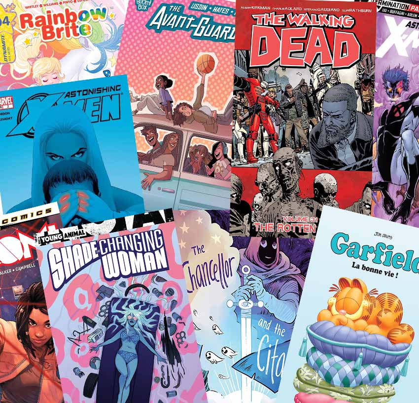
Truth be told, yes, you should judge a book by its cover, especially when it comes to comic book covers. Read this tutorial to learn some rules for designing a stand-out cover for your graphic novels.
Want to create a comic book covers to attract readers and entice people to buy your comic? Let me help you out. Think of comic book covers like Instagram posts… except with superheroes and people trying to save the world.
These graphic story covers are the first thing to catch a potential buyer’s eye and a reader’s interest. For that reason, you need to make sure the cover design is engaging and attention grabbing, portraying the heroes’ brand style and voice, and overall giving a clue to the story within.
There are many approaches to comic cover art. Follow me and let’s learn some necessary basics to designing a good comic cover that stands out from the rest.
And if you need some useful resources for making comic book effects quickly and easily, you can find them here:
Before you start laying out your design, you should know which elements to include when making your comic cover. This will enable you to utilise the 'artboard’ space correctly and to preview where the main artwork will be positioned. The basic elements to include on a comic cover are:
Logo
Title + Subtitle/Tagline
Date of Publication
Author
Publisher
Price
Series # / Episode #
Names of artists & designers
Barcode
To set up the comic book cover template, you may need some graphic design skills to lay out these elements in a well-composed form. Once that’s assessed, you can start putting together your thoughts for the cover design. Just make sure to keep the title, series and episode numbers clearly displayed and readable once the artwork is laid in.
2. Brainstorm & Conceptualise
Step 1
If this is your first time creating a cover, it’s advisable to first look and get inspired by other comic covers in the market, so do your own research. Search online or visit comic stores to check the latest trends.
For example, if most comic books are colorful and full of art, you can choose to create a simple monotone cover design that will stand out from the crowd.
Think about the concept of your comic cover.
Try putting yourself in the place of the buyer, and ask yourself:
What would make the cover interesting enough for readers to pick up the comic book?
Does the cover portray the genre of the story?
Does the cover illustration present a question of what the storyline is about?
Is the cover an example of the artwork inside?
Does the cover communicate the tone of the story?
The comic book illustration is the front face of the story. The main focus is on having the cover illustration reveal the content of the book. If anything, it should reveal a teaser illustration that intrigues customers to pick up and read what’s happening within the comic.
For example, if the comic is a family drama, depict a family scene in a critical moment as they are interacting with one another. If it’s about a superhero, show the superhero/heroine in a compromising or dangerous position. Make sure your primary character/s are on that cover!
Step 2
Plan the cover by sketching out a dummy.
To help you conceptualise, sketch out your ideas in thumbnail scale or create a dummy. This will help you work through your ideas and get the best image laid out properly.
Designing a comic book cover artwork is really a technique of composition, and there are a few guidelines to follow to deliver a captivating design, so let’s go through them next.
3. Plan the Comic Cover Content
Step 1
Brainstorm a catchy and fitting title.
Consider some words that might hook your audience in an instant. A title that perhaps reflects the character’s behaviour or emotional turmoil, action plot lines, battles, mystery, or perhaps a funny play on words. For example:
Emotional titles like „Playful Rage” or „Risky Behaviour”
Comeback titles like „Resurrection’ or „The Revival”
Battle titles like „5 Armies” or „Bloodbath VI”
Mysterious titles like 'In the Lap of the Gods” or „Hush-Hush”
Pun titles like „The Great Cat-sby” or „Positivi-tea”
The most common titles either use the main character name, are 'action’ based, or have a mysterious tone.
Make sure that whichever title you choose, it connects with the cover art and offers readers a feel for what the story will be like on the inside. So if it’s a romantic comic with the title „Love Lounge”, then it should probably reflect a love scene or seductive mood on the cover.
Keep in mind that the font or lettering style of the title must fit the mood of the story. So don’t use a bubble-shaped title if your story is under a horror genre—instead, go for a distressed look.
Design Tips:
Avoid use of bevels or drop shadow effects. The title should stand out alone.
Don’t load the title design with too much color. Keep it clean and simple.
Choose readable fonts. Avoid the use of fancy fonts for the title, author, artist, episode #, and series #.
Bolder and bigger is not better. Keep your title lettering spaced and not crammed in.
Which characters would you like to place on the comic book cover? Only one
main character, two main characters, a villain, a group of people, etc.? It’s important to showcase the stars of your comics on the cover, whether it’s the villain or the hero.
For instance, showcasing a single character has a more striking appearance than a group of characters. It tends to strengthen the presence of our star character and makes it easier for fans to recognise what and who
the comic is about. On top of that, single-character covers tend to give a sense of uniqueness, mystery, and the unexpected. It’s preferable to avoid too many characters on a cover, as it may look overcrowded and messy.
Design Tip:
Always remember, when positioning characters, that the human eye usually moves from left to right, onto the middle of the page and down to the bottom.
Keep away from offensive, sexist, and biased content.
Make sure the characters on the cover have a purpose in the scene.
Don’t overcrowd the design unless you wish to show magnitude.
Comic covers often show characters performing all kinds of motions, like flying, swinging, running, jumping, falling, etc. There are several ways you can showcase your characters on the comic cover, but let’s learn how to do so in a more charismatic way.
A popular layout is the ’villain vs. hero’ face-off. Here, the characters are placed in the classic 'VS” pose, opposite each other.
Eye contact is when the character stares directly into the reader’s eyes. This can create a focus of interest and the unknown.
Oversizing villains in the background is very dramatic and can create an ill-fated scene with an ominous tone.
Scaling is usedwhen you wish to show the magnitudeof a 'battle’ field. A large number of characters are presented at a smaller scale to give a sense of grandeur to the scene. This also helps to integrate more of the setting or environment of the storyline.
Pivotal Point is whena crucial part of the story is presented, for instance thestar character stuck in an extraordinary situation. In this case, make sure the cover is centred on the 'hero’ in that pivotal point of the story. The artwork should reflect a 'hint’ of the story within, yet not reveal everything that’s going on.
The colors you choose for your comic book cover can pique interest as well as drawing attention to the design. When selecting your color palette, make sure it reflects the mood you want to create.
Dark colors convey a sense of evil, suspense, wisdom, or authority. Bright & Lustrous colors convey friendship, dynamism, confidence, and ambition. Pastels are suitable for innocence, romantic covers, and lighter subject matters.
The color tone you choose for your comic should be unique,
eye-catching, and always remain consistent to the comic, or you will confuse readers. It works best when you have a branded color scheme so that the reader can distinguish and recognise the comic book amongst other novels.
Bright covers are the first thing that readers may notice. However, if you find there are many bright-covered comics out there, then to stand out, choose to make a darker comic book cover.
Limited color schemes like monochrome tones, contrasting colours, or just the use of a bold color or shapes can make up very intriguing comic covers. By using monochrome or bold colors, you can make the cover visible from a distance. Contrast color is also a good method to follow, but it doesn’t create a hierarchy of focus points if you are trying to zero in on elements. Contrast colors basically increase visibility and ensure that the cover stands out on the shelf.
The use of Negative Space or lack of color (made up of a lot of white), is a brilliant composition technique that allows you to draw attention to your subject and creates an air of mystery.
Composition is an important factor when designing the cover. It’s how artistic elements are arranged in terms of line work, texture, color, form, space, and so forth to create a
balanced image. A nicely composed cover may be achieved by using these compositional tricks:
Amusing angles: Low angle, overhead, flipped, twisted, etc.
Askew compositions that place the subject away from the center of the page, adding a sense of motion and interest to the scene.
Illusion of movement, motion, or action. To convey motion, line drawing is applied: speed lines, motion trails, or draw debris or sweat flying….
Graphic design elements: Geometric or organic shapes, texture, borders, or frames
Text Integration: Typography, letters, and lettering are an added value and create dynamic compositions.
Build a mood board, doodle, and play with ideas or word games to generate ideas. Get back to the basics of things and try to spark your imagination, as comic covers play an essential part in comic book sales. Keep in mind that you want to give purpose to your images and maintain artwork that is balanced, clean, and true to the content of the story.
Try to push the forms and angles of your design and create signature looks by adding your own personal style and flavor to the design. That will get you noticed on the comic shelves and amongst the fans.
Creating a comic cover takes a lot of work. Get feedback from friends and family. Ask if the comic book looks interesting enough. Take note of any minor design issues that you may have overlooked, and gather their feedback and suggestions on how you can make the cover look more appealing.
Keep yourself updated on the latest comic trends, and remember that these are just guidelines, and there are always exceptions to these suggestions.
Congratulations! You’re Ready!
I hope you were able to learn something new. Now you know the guidelines to creating a good comic book cover, it will steer you in the direction of creating eye-catching designs.
Always remember to have fun and keep your personal style!
If you enjoyed this article and are looking for more comic content, why not check out the following roundups:
Truth be told, yes, you should judge a book by its cover, especially when it comes to comic book covers. Read this tutorial to learn some rules for designing a stand-out cover for your graphic novels.
Want to create a comic book covers to attract readers and entice people to buy your comic? Let me help you out. Think of comic book covers like Instagram posts… except with superheroes and people trying to save the world.
These graphic story covers are the first thing to catch a potential buyer’s eye and a reader’s interest. For that reason, you need to make sure the cover design is engaging and attention grabbing, portraying the heroes’ brand style and voice, and overall giving a clue to the story within.
There are many approaches to comic cover art. Follow me and let’s learn some necessary basics to designing a good comic cover that stands out from the rest.
And if you need some useful resources for making comic book effects quickly and easily, you can find them here:
Before you start laying out your design, you should know which elements to include when making your comic cover. This will enable you to utilise the 'artboard’ space correctly and to preview where the main artwork will be positioned. The basic elements to include on a comic cover are:
Logo
Title + Subtitle/Tagline
Date of Publication
Author
Publisher
Price
Series # / Episode #
Names of artists & designers
Barcode
To set up the comic book cover template, you may need some graphic design skills to lay out these elements in a well-composed form. Once that’s assessed, you can start putting together your thoughts for the cover design. Just make sure to keep the title, series and episode numbers clearly displayed and readable once the artwork is laid in.
2. Brainstorm & Conceptualise
Step 1
If this is your first time creating a cover, it’s advisable to first look and get inspired by other comic covers in the market, so do your own research. Search online or visit comic stores to check the latest trends.
For example, if most comic books are colorful and full of art, you can choose to create a simple monotone cover design that will stand out from the crowd.
Think about the concept of your comic cover.
Try putting yourself in the place of the buyer, and ask yourself:
What would make the cover interesting enough for readers to pick up the comic book?
Does the cover portray the genre of the story?
Does the cover illustration present a question of what the storyline is about?
Is the cover an example of the artwork inside?
Does the cover communicate the tone of the story?
The comic book illustration is the front face of the story. The main focus is on having the cover illustration reveal the content of the book. If anything, it should reveal a teaser illustration that intrigues customers to pick up and read what’s happening within the comic.
For example, if the comic is a family drama, depict a family scene in a critical moment as they are interacting with one another. If it’s about a superhero, show the superhero/heroine in a compromising or dangerous position. Make sure your primary character/s are on that cover!
Step 2
Plan the cover by sketching out a dummy.
To help you conceptualise, sketch out your ideas in thumbnail scale or create a dummy. This will help you work through your ideas and get the best image laid out properly.
Designing a comic book cover artwork is really a technique of composition, and there are a few guidelines to follow to deliver a captivating design, so let’s go through them next.
3. Plan the Comic Cover Content
Step 1
Brainstorm a catchy and fitting title.
Consider some words that might hook your audience in an instant. A title that perhaps reflects the character’s behaviour or emotional turmoil, action plot lines, battles, mystery, or perhaps a funny play on words. For example:
Emotional titles like „Playful Rage” or „Risky Behaviour”
Comeback titles like „Resurrection’ or „The Revival”
Battle titles like „5 Armies” or „Bloodbath VI”
Mysterious titles like 'In the Lap of the Gods” or „Hush-Hush”
Pun titles like „The Great Cat-sby” or „Positivi-tea”
The most common titles either use the main character name, are 'action’ based, or have a mysterious tone.
Make sure that whichever title you choose, it connects with the cover art and offers readers a feel for what the story will be like on the inside. So if it’s a romantic comic with the title „Love Lounge”, then it should probably reflect a love scene or seductive mood on the cover.
Keep in mind that the font or lettering style of the title must fit the mood of the story. So don’t use a bubble-shaped title if your story is under a horror genre—instead, go for a distressed look.
Design Tips:
Avoid use of bevels or drop shadow effects. The title should stand out alone.
Don’t load the title design with too much color. Keep it clean and simple.
Choose readable fonts. Avoid the use of fancy fonts for the title, author, artist, episode #, and series #.
Bolder and bigger is not better. Keep your title lettering spaced and not crammed in.
Which characters would you like to place on the comic book cover? Only one
main character, two main characters, a villain, a group of people, etc.? It’s important to showcase the stars of your comics on the cover, whether it’s the villain or the hero.
For instance, showcasing a single character has a more striking appearance than a group of characters. It tends to strengthen the presence of our star character and makes it easier for fans to recognise what and who
the comic is about. On top of that, single-character covers tend to give a sense of uniqueness, mystery, and the unexpected. It’s preferable to avoid too many characters on a cover, as it may look overcrowded and messy.
Design Tip:
Always remember, when positioning characters, that the human eye usually moves from left to right, onto the middle of the page and down to the bottom.
Keep away from offensive, sexist, and biased content.
Make sure the characters on the cover have a purpose in the scene.
Don’t overcrowd the design unless you wish to show magnitude.
Comic covers often show characters performing all kinds of motions, like flying, swinging, running, jumping, falling, etc. There are several ways you can showcase your characters on the comic cover, but let’s learn how to do so in a more charismatic way.
A popular layout is the ’villain vs. hero’ face-off. Here, the characters are placed in the classic 'VS” pose, opposite each other.
Eye contact is when the character stares directly into the reader’s eyes. This can create a focus of interest and the unknown.
Oversizing villains in the background is very dramatic and can create an ill-fated scene with an ominous tone.
Scaling is usedwhen you wish to show the magnitudeof a 'battle’ field. A large number of characters are presented at a smaller scale to give a sense of grandeur to the scene. This also helps to integrate more of the setting or environment of the storyline.
Pivotal Point is whena crucial part of the story is presented, for instance thestar character stuck in an extraordinary situation. In this case, make sure the cover is centred on the 'hero’ in that pivotal point of the story. The artwork should reflect a 'hint’ of the story within, yet not reveal everything that’s going on.
The colors you choose for your comic book cover can pique interest as well as drawing attention to the design. When selecting your color palette, make sure it reflects the mood you want to create.
Dark colors convey a sense of evil, suspense, wisdom, or authority. Bright & Lustrous colors convey friendship, dynamism, confidence, and ambition. Pastels are suitable for innocence, romantic covers, and lighter subject matters.
The color tone you choose for your comic should be unique,
eye-catching, and always remain consistent to the comic, or you will confuse readers. It works best when you have a branded color scheme so that the reader can distinguish and recognise the comic book amongst other novels.
Bright covers are the first thing that readers may notice. However, if you find there are many bright-covered comics out there, then to stand out, choose to make a darker comic book cover.
Limited color schemes like monochrome tones, contrasting colours, or just the use of a bold color or shapes can make up very intriguing comic covers. By using monochrome or bold colors, you can make the cover visible from a distance. Contrast color is also a good method to follow, but it doesn’t create a hierarchy of focus points if you are trying to zero in on elements. Contrast colors basically increase visibility and ensure that the cover stands out on the shelf.
The use of Negative Space or lack of color (made up of a lot of white), is a brilliant composition technique that allows you to draw attention to your subject and creates an air of mystery.
Composition is an important factor when designing the cover. It’s how artistic elements are arranged in terms of line work, texture, color, form, space, and so forth to create a
balanced image. A nicely composed cover may be achieved by using these compositional tricks:
Amusing angles: Low angle, overhead, flipped, twisted, etc.
Askew compositions that place the subject away from the center of the page, adding a sense of motion and interest to the scene.
Illusion of movement, motion, or action. To convey motion, line drawing is applied: speed lines, motion trails, or draw debris or sweat flying….
Graphic design elements: Geometric or organic shapes, texture, borders, or frames
Text Integration: Typography, letters, and lettering are an added value and create dynamic compositions.
Build a mood board, doodle, and play with ideas or word games to generate ideas. Get back to the basics of things and try to spark your imagination, as comic covers play an essential part in comic book sales. Keep in mind that you want to give purpose to your images and maintain artwork that is balanced, clean, and true to the content of the story.
Try to push the forms and angles of your design and create signature looks by adding your own personal style and flavor to the design. That will get you noticed on the comic shelves and amongst the fans.
Creating a comic cover takes a lot of work. Get feedback from friends and family. Ask if the comic book looks interesting enough. Take note of any minor design issues that you may have overlooked, and gather their feedback and suggestions on how you can make the cover look more appealing.
Keep yourself updated on the latest comic trends, and remember that these are just guidelines, and there are always exceptions to these suggestions.
Congratulations! You’re Ready!
I hope you were able to learn something new. Now you know the guidelines to creating a good comic book cover, it will steer you in the direction of creating eye-catching designs.
Always remember to have fun and keep your personal style!
If you enjoyed this article and are looking for more comic content, why not check out the following roundups:
Truth be told, yes, you should judge a book by its cover, especially when it comes to comic book covers. Read this tutorial to learn some rules for designing a stand-out cover for your graphic novels.
Want to create a comic book covers to attract readers and entice people to buy your comic? Let me help you out. Think of comic book covers like Instagram posts… except with superheroes and people trying to save the world.
These graphic story covers are the first thing to catch a potential buyer’s eye and a reader’s interest. For that reason, you need to make sure the cover design is engaging and attention grabbing, portraying the heroes’ brand style and voice, and overall giving a clue to the story within.
There are many approaches to comic cover art. Follow me and let’s learn some necessary basics to designing a good comic cover that stands out from the rest.
And if you need some useful resources for making comic book effects quickly and easily, you can find them here:
Before you start laying out your design, you should know which elements to include when making your comic cover. This will enable you to utilise the 'artboard’ space correctly and to preview where the main artwork will be positioned. The basic elements to include on a comic cover are:
Logo
Title + Subtitle/Tagline
Date of Publication
Author
Publisher
Price
Series # / Episode #
Names of artists & designers
Barcode
To set up the comic book cover template, you may need some graphic design skills to lay out these elements in a well-composed form. Once that’s assessed, you can start putting together your thoughts for the cover design. Just make sure to keep the title, series and episode numbers clearly displayed and readable once the artwork is laid in.
2. Brainstorm & Conceptualise
Step 1
If this is your first time creating a cover, it’s advisable to first look and get inspired by other comic covers in the market, so do your own research. Search online or visit comic stores to check the latest trends.
For example, if most comic books are colorful and full of art, you can choose to create a simple monotone cover design that will stand out from the crowd.
Think about the concept of your comic cover.
Try putting yourself in the place of the buyer, and ask yourself:
What would make the cover interesting enough for readers to pick up the comic book?
Does the cover portray the genre of the story?
Does the cover illustration present a question of what the storyline is about?
Is the cover an example of the artwork inside?
Does the cover communicate the tone of the story?
The comic book illustration is the front face of the story. The main focus is on having the cover illustration reveal the content of the book. If anything, it should reveal a teaser illustration that intrigues customers to pick up and read what’s happening within the comic.
For example, if the comic is a family drama, depict a family scene in a critical moment as they are interacting with one another. If it’s about a superhero, show the superhero/heroine in a compromising or dangerous position. Make sure your primary character/s are on that cover!
Step 2
Plan the cover by sketching out a dummy.
To help you conceptualise, sketch out your ideas in thumbnail scale or create a dummy. This will help you work through your ideas and get the best image laid out properly.
Designing a comic book cover artwork is really a technique of composition, and there are a few guidelines to follow to deliver a captivating design, so let’s go through them next.
3. Plan the Comic Cover Content
Step 1
Brainstorm a catchy and fitting title.
Consider some words that might hook your audience in an instant. A title that perhaps reflects the character’s behaviour or emotional turmoil, action plot lines, battles, mystery, or perhaps a funny play on words. For example:
Emotional titles like „Playful Rage” or „Risky Behaviour”
Comeback titles like „Resurrection’ or „The Revival”
Battle titles like „5 Armies” or „Bloodbath VI”
Mysterious titles like 'In the Lap of the Gods” or „Hush-Hush”
Pun titles like „The Great Cat-sby” or „Positivi-tea”
The most common titles either use the main character name, are 'action’ based, or have a mysterious tone.
Make sure that whichever title you choose, it connects with the cover art and offers readers a feel for what the story will be like on the inside. So if it’s a romantic comic with the title „Love Lounge”, then it should probably reflect a love scene or seductive mood on the cover.
Keep in mind that the font or lettering style of the title must fit the mood of the story. So don’t use a bubble-shaped title if your story is under a horror genre—instead, go for a distressed look.
Design Tips:
Avoid use of bevels or drop shadow effects. The title should stand out alone.
Don’t load the title design with too much color. Keep it clean and simple.
Choose readable fonts. Avoid the use of fancy fonts for the title, author, artist, episode #, and series #.
Bolder and bigger is not better. Keep your title lettering spaced and not crammed in.
Which characters would you like to place on the comic book cover? Only one
main character, two main characters, a villain, a group of people, etc.? It’s important to showcase the stars of your comics on the cover, whether it’s the villain or the hero.
For instance, showcasing a single character has a more striking appearance than a group of characters. It tends to strengthen the presence of our star character and makes it easier for fans to recognise what and who
the comic is about. On top of that, single-character covers tend to give a sense of uniqueness, mystery, and the unexpected. It’s preferable to avoid too many characters on a cover, as it may look overcrowded and messy.
Design Tip:
Always remember, when positioning characters, that the human eye usually moves from left to right, onto the middle of the page and down to the bottom.
Keep away from offensive, sexist, and biased content.
Make sure the characters on the cover have a purpose in the scene.
Don’t overcrowd the design unless you wish to show magnitude.
Comic covers often show characters performing all kinds of motions, like flying, swinging, running, jumping, falling, etc. There are several ways you can showcase your characters on the comic cover, but let’s learn how to do so in a more charismatic way.
A popular layout is the ’villain vs. hero’ face-off. Here, the characters are placed in the classic 'VS” pose, opposite each other.
Eye contact is when the character stares directly into the reader’s eyes. This can create a focus of interest and the unknown.
Oversizing villains in the background is very dramatic and can create an ill-fated scene with an ominous tone.
Scaling is usedwhen you wish to show the magnitudeof a 'battle’ field. A large number of characters are presented at a smaller scale to give a sense of grandeur to the scene. This also helps to integrate more of the setting or environment of the storyline.
Pivotal Point is whena crucial part of the story is presented, for instance thestar character stuck in an extraordinary situation. In this case, make sure the cover is centred on the 'hero’ in that pivotal point of the story. The artwork should reflect a 'hint’ of the story within, yet not reveal everything that’s going on.
The colors you choose for your comic book cover can pique interest as well as drawing attention to the design. When selecting your color palette, make sure it reflects the mood you want to create.
Dark colors convey a sense of evil, suspense, wisdom, or authority. Bright & Lustrous colors convey friendship, dynamism, confidence, and ambition. Pastels are suitable for innocence, romantic covers, and lighter subject matters.
The color tone you choose for your comic should be unique,
eye-catching, and always remain consistent to the comic, or you will confuse readers. It works best when you have a branded color scheme so that the reader can distinguish and recognise the comic book amongst other novels.
Bright covers are the first thing that readers may notice. However, if you find there are many bright-covered comics out there, then to stand out, choose to make a darker comic book cover.
Limited color schemes like monochrome tones, contrasting colours, or just the use of a bold color or shapes can make up very intriguing comic covers. By using monochrome or bold colors, you can make the cover visible from a distance. Contrast color is also a good method to follow, but it doesn’t create a hierarchy of focus points if you are trying to zero in on elements. Contrast colors basically increase visibility and ensure that the cover stands out on the shelf.
The use of Negative Space or lack of color (made up of a lot of white), is a brilliant composition technique that allows you to draw attention to your subject and creates an air of mystery.
Composition is an important factor when designing the cover. It’s how artistic elements are arranged in terms of line work, texture, color, form, space, and so forth to create a
balanced image. A nicely composed cover may be achieved by using these compositional tricks:
Amusing angles: Low angle, overhead, flipped, twisted, etc.
Askew compositions that place the subject away from the center of the page, adding a sense of motion and interest to the scene.
Illusion of movement, motion, or action. To convey motion, line drawing is applied: speed lines, motion trails, or draw debris or sweat flying….
Graphic design elements: Geometric or organic shapes, texture, borders, or frames
Text Integration: Typography, letters, and lettering are an added value and create dynamic compositions.
Build a mood board, doodle, and play with ideas or word games to generate ideas. Get back to the basics of things and try to spark your imagination, as comic covers play an essential part in comic book sales. Keep in mind that you want to give purpose to your images and maintain artwork that is balanced, clean, and true to the content of the story.
Try to push the forms and angles of your design and create signature looks by adding your own personal style and flavor to the design. That will get you noticed on the comic shelves and amongst the fans.
Creating a comic cover takes a lot of work. Get feedback from friends and family. Ask if the comic book looks interesting enough. Take note of any minor design issues that you may have overlooked, and gather their feedback and suggestions on how you can make the cover look more appealing.
Keep yourself updated on the latest comic trends, and remember that these are just guidelines, and there are always exceptions to these suggestions.
Congratulations! You’re Ready!
I hope you were able to learn something new. Now you know the guidelines to creating a good comic book cover, it will steer you in the direction of creating eye-catching designs.
Always remember to have fun and keep your personal style!
If you enjoyed this article and are looking for more comic content, why not check out the following roundups: