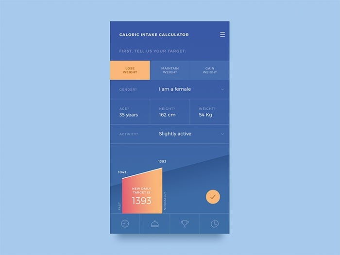
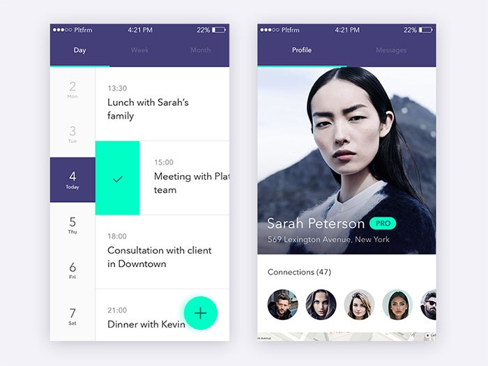
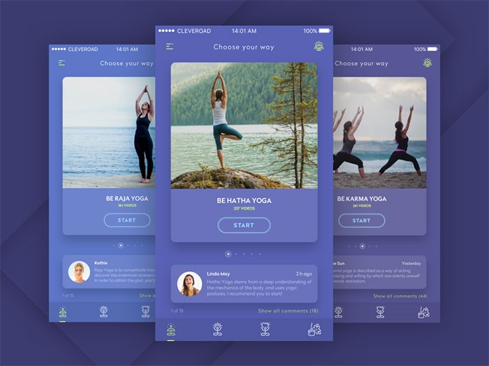
Mobile user experience somehow ‘imposed itself’ with all the development and improvement of mobile communication devices.
In fact, it is the quality of user experience that divides outstanding apps from their less outstanding counterparts.
The same factor enables startups to learn from big brands and to improve their products.
User experience for mobile applications – the key to success
UX seems to fit perfectly the development of mobile interaction. Customers cannot deny the fact that digital disruption is knocking out their loyalty, and mobile brands are gaining success. Instead, they are looking for a customized and stable experience that can always be upgraded.
Only a small part of them agree that channel interactions offered by companies are seamless. Established brands are working hard on triggering loyalty and improving their UX experiences to the level of impeccability.
Image source: Cassius Kiani
It is a challenging task-they need to ensure their sites comply with traditional standards and that they load faster with no need for zooming or pinching.
The success of a website, however, depends on continuous streaming, and customers are becoming more and more frustrated that companies struggle to do business via mobile communication.
Tips for ‘mobilizing’ and personalizing the user experience
We cannot talk about a universal UX simply because we are all different form each other.
Great apps should really consider their users’ personalities. They should research and gather data and they should customize the experience according to their users’ needs.
Take travel apps as an example – they ought to present attractive information even before we adjust searching settings because they know who we are, where we are, and how empowering our budget is.
Menus should have search options
Searching is a core element of good user experience. Therefore, such an option should be available everywhere. Your users need to be able to switch pages, to add or deduct content from the current page. Designers should pay attention to this because their main purpose is to make interaction easy and comfortable, which necessarily involves proper content division. From now on, it counts also for mobile systems.
Additionally, make sure the search field is visible. Put it in the menu or in a very striking position on the pages.
Remember – introducing search is not enough. It is just the beginning. You have to make sure it actually provides results. The results, on the other hand, should be logically ordered and accessible from desktops and mobile phones.
Finally, make sure your results are easily distinguished. One more thing about mobile UX related to search: having the option is just step one. Make sure your internal search result pages look great and are functional as well.
Most generally, 80% of your app’s users are about to use only 20% of its functionality. If not sure this is a valid rule, launch the service online, and observe how customers interact with it (in the case of mobile analytics difficulties, pay special attention to your mobile users). You will conclude which functionality is mostly applied so that you can cut the rest out and get as close to intuitive design as possible.
The same as with your desktop sites, mobile replications should not aspire for too much conversation, especially when we’re talking about forms. You need an app that summarizes information, buys or sells products or makes subscriptions through simple contact forms.
Think about it – what will your mobile UX look like if you introduce an 8-page long questionnaire? It will be ruined! “I’ll do that tomorrow on coffee time” – that’s exactly what users will say. And they won’t do it.
An optimal user experience takes care of size. Therefore, remove everything you wanted to know, but it wasn’t really necessary. Do they want a newsletter? Ask only for their electronic mails. Do they want to shop? Ask for the delivery and input address (and give them the chance to copy-paste the same information).
Excellent apps start from the basics. The designer finds out what customers want and he adjusts the work to their requirements. Improvement comes second, whenever there is an affordable chance for improving your digital existence. Then, if it is a mobile idea, let it be a mobile idea! There is nothing that can make ideas so unique.
An app without content will simply not work
Additionally, too much content will be just as dysfunctional.
And we are not talking about not having content at all. We are talking about content that has not been exposed in a clear way. You may not have a searching tool or it may not work properly. You have to consider every option and to put content as close to your users’ view as possible. Again – filtering that provides low-quality results is equally bad as not having a filter at all.
Therefore, the same efforts apply to the search option-incredibly customized apps need incredibly customized searching features.
Consider interruption
One of the biggest drawbacks when designing for mobile systems is the unavoidable possibility for users to be distracted. They are almost all the time on their phones and there is naturally no chance that something will not interrupt their experience (either from the outside or within the phone itself).
You have to consider this option-maintain the app straightforward and the interface simple because it is the only way to keep users focused and engaged. Make sure that if they leave, they will come back and pick up from where they stopped. Therefore, divide content in small chunks and break larger tasks in no-time operations.
Appear friendly and really grateful for the fact that new customers visited you.
Assuming you’ve gotten to know your target users, the next thing to do is to let them know you. Charm them at first sight and convince them that it is a good decision to start using your site. You have to create a positive impression from the very first moment, instead of waiting for them to start searching. In fact, most clients base their entire experience on the first run they had on the site.
Presenting poor and empty screens to potential users is like signing a death sentence. Their first impression will be terrible and it will likely stay like that forever.
Speed is among most important factors for creating excellent user experience. Speed is what users mostly complain about, so every website is trying to improve it. The improvement goes mostly in two directions: optimization of images (even if everybody tries to hide instant images); and reduction of size.
However, remember that the loading speed on your website/app doesn’t depend only on your efforts. It is highly dependent on mobile connections too. We don’t always have WiFi or 4G and we have to be patient.
Most users adjust their browsing habits to the speed of their internet connection-if traveling on the subway, it’s not really recommendable to try and stream a three-hour movie. Instead, you can read a Wikipedia article or your daily horoscope. This is how it works-users decide!
Even if you made it to the top of all lists and your users seem to adore you, there is a big chance you’ll discover flaws you weren’t really aware of. In fact, it is very probable those will be things you missed when developing the app or results of failing to adjust it to real-time needs.
There are also certain options that make sense when you don’t have a great budget for the app and no revenue, like using free fonts instead of premium ones.
However, it is not a justification for throwing out ideas that seem technically unfeasible at the moment – write them down and work out whether there is an alternative that can replace them, or save them for better days. The mobile world is constantly innovating, so the same way as inundated settings fail to work, futuristic ones may become real. The key is to adjust to the time being.
Remember – your app is a developing entity. It will draw analytical data, users’ feedback, and it will follow trends and breakthroughs. You have to make sure it is ready to provide better and better experience. Don’t think that you will only work hard on it around the launching date when you have all your checklists and plan with what needs to be done.
Try and create excellent mobile user interface which can respond to every need and it can act informatively in every phase of the purchase cycle. Don’t rely on trends which impose the ‘must go mobile’ mindset and think how your users want you to enhance their journey. This is the right approach for keeping customers on board, encouraging purchases, and breaking records.
The quality of your app depends on the quality of its UX design – it will either make it or break it. We think you know what you should do.
Today, we will be putting together a vibrant and dynamic underwater dance scene between two mermaids! With this photo effect, we will take a close look at lighting and shadows, creating simple underwater backdrops and learning how to create a mermaid tail from scratch—no stock images needed.
While we will be using digital painting techniques, I have specially formulated this process with the non-digital painter in mind!
Why not try a similar photo manipulation project over on our Envato Tuts+ YouTube channel, if you wish to try out more mermaid Photoshop content!
What You’ll Need
To complete this project, we are using the following resources:
We’ll start by creating a simple underwater backdrop. Leaving the background clean and straightforward will help keep all of the focus on our two subjects.
Step 1
Create a 3076 x 4359 px canvas.
Change it to a 300 Resolution if you intend to use this for prints.
Step 2
Create a Color Fill layer filled with a dark blue #0f1219.
Step 3
Create a New Layer set to Overlay.
Using a large, soft round Brush,paint blobs of white light towards the top of the canvas.
Set the brush to a low Flow Rate, 1-15%, to slowly build up the light to avoid any harsh edges.
Use multiple layers, set to Overlay or Soft Light, to layer orbs of light over each other. Doing this will give you more control over the light’s opacity as well.
Group all of the light layers together, naming the group „Light.”
Step 4
Repeat step three, adding even more light to the canvas.
Focus on creating light all over the canvas, not just the upper portion.
Group the layers, naming the group „Light Enhance.”
Step 5
You might notice a lot of color banding; there’s a quick way to fix this using the Noise Filter! Even if you don’t have any notable banding, I suggest adding this as it adds to the foggy underwater feel of our background.
Create a New Layer and fill it with Black.
Bring the layer below the two „Light” groups.
Go to Filter > Noise > Add Noise.
Noise Settings
Amount: 5
Distribution: Gaussian
Monochromatic: Checked
Bring the Noise layer’s Opacity to 53%.
Add a light 0.5px Filter > Blur > Gaussian Blur to the noise if it feels too harsh.
Step 6
Create a New Layer setting it to Overlay.
Using the same techniques as in Step 3, paint more blobs of light.
Focus on creating smaller, more stringy light paths towards the upper portion of the canvas.
Step 7
Create a New Layer setting it to Soft Light.
Create shadows using the color Black and the same techniques as in Step 3.
Step 8
Create a Color Lookup layer.
Color Lookup Settings
3DLUT File: TealOrangeContrast
Opacity: 62%
Step 9
Create a New Layer.
With a medium, soft, round Brush,paint light beams coming from the top of the water’s surface.
Paint with a low Flow Rate to build up the light slowly.
If you’re having a hard time getting the light rays to look smooth and slanted, try adding a Filter > Blur > Motion Blur.
Step 10
Create a New Layer set to Screen.
Paint a pop of pale Orange #d8966e in the middle of the light ray. Bring down the opacity of the layer if needed.
Place it towards the bottom of the canvas, flipping it horizontally.
Using the Patch Tool, remove the fish located towards the bottom of the coral.
Step 12
Add a Layer Mask to the coral.
Mask out the top portion of the coral image with a large, soft, round Brush.
Step 13
Go to Image > Adjustments > Hue/Saturation and set the settings as follows.
Settings:
Colorize: Checked
Hue: 193
Saturation: 29
Create a New Layer with a 4% Opacity.
With a large, soft, round Brush, paint a very light fog towards the top of the reef.
Step 14
Create Color Balance, Vibrance and Color Lookup adjustment layers, ordered from bottom to top.
Color Balance Settings
Red: -17
Green: -35
Blue: -46
Vibrance Settings
Vibrance: +40
Saturation: +21
Color Lookup Settings
3DLUT File: Crisp_Warm
Opacity: 17%
Group the three adjustment layers, naming the group „CC.”
Group all of the background layers together, naming the group „Water.”
2. How to Remove Clothing From a Subject
Next, we will be extracting and placing our subjects into their new environment. Our primary focus will be removing the unwanted clothes from our soon-to-be mermaids!
Step 1
Extract the subjects using your preferred method. Find my favorite way in this tutorial!
Don’t worry about either of the subject’s legs—as you can see below, I didn’t even bother doing the male’s!
Step 2
Next, we are going to use the Clone Stamp Tool to remove the seam going down the side of our female mermaid.
I like using a semi-hard brush when using the Clone Stamp Tool to keep as much of the original texture as possible!
Step 3
Next, I am going to use the Mixer Brush Tool to remove some of the cloth and unwanted texture on the bodysuit and the armpit area. Do this by dragging the soft Mixer brush over the areas with the most amount of texture. You can also use this to smooth out shadows and highlights.
The more you use the Mixer Brush, the better you’ll understand how it works!
Mixer Brush Settings
Step 4
Create and clip a New Layer into the subject layer. On this layer, we are going to cover the seam of fabric located on the woman’s thigh.
We will be covering the seam by painting skin over the area; the process is much easier to do than it is to explain, so bear with me!
First, let’s set up our Brush settings.
Brush Settings
Size: Medium (Change as you go)
Hardness: 0%
Flow: 10%
Using the Eyedropper Tool, sample colors from the same area you are painting—in this case, the thigh area.
Slowly paint over the area of the seam, building up color gradually. Sample colors as you go, making sure everything is smooth and there is a natural transition.
If you are having trouble hiding the seam completely, duplicate the layer you are painting on. Do this will increase the overall opacity of the colors.
Use a soft Eraser brush to get rid of any harsh edges and additional color/paint.
Step 5
Repeat Step 4 on the arm and chest seam.
Step 6
Create a New Layer set to Overlay.
Using a soft, round Brush, paint White over the subject’s natural highlights to enhance them.
Step 7
Create and clip a Brightness/Contrast layer into the subject layer.
Brightness/Contrast Settings
Brightness: -12
Blend If:
Step 8
Create and clip a Curves layer into the subject layer.
Curve Settings
Step 9
Create and clip a second Curves layer into the subject layer.
Curve Settings
Step 10
Duplicate the above Curves layer to enhance the effect.
Set the layer mode to Screen with the Blend If settings seen below.
Blend If Settings
Step 12
Add an Image > Adjustments > Brightness/Contrast and Hue/Saturation to the „Water Surface” layer.
Brightness/Contrast Settings
Brightness: -6
Contrast: 21
Hue/Saturation Settings
Hue: +180
Saturation: -67
Step 13
Add a Layer Mask to the „Water Surface” layer.
Use a large, soft, round Brush to mask out the edges of the image.
Step 14
Duplicate the water surface so that it’s placed over the male subject as well.
Group all of the current subject layers, naming the group „Subjects.”
3. How to Create a Dark and Vivid Color Grade
When creating mermaids, I like to set up my colors and contrast levels early on! I set my „Color Grade” folder above all the other layers, where I can quickly turn it on or off and adjust it as I continue to paint.
These layers are ordered from bottom to top so that each layer will go above the previous one!
Step 1
Create a Color Lookup layer.
Color Lookup Settings
3DLUT File: FoggyNight
Opacity: 25%
Blend If:
Step 2
Create a Curves layer.
Curves Settings
Step 3
Create a Color Lookup layer.
Mask out the top half of the layer using a large, soft, round Brush.
Color Lookup Settings
3DLUT File: FoggyNight
Opacity: 24%
Blend If:
Step 4
Create a Color Lookup layer.
Copy the previous layer mask onto this layer.
Color Lookup Settings
3DLUT File: EdgeyAmber
Opacity: 14%
Step 5
Create a Curves layer.
Curves Settings
Step 6
Create a Curves layer.
Curves Settings
Step 7
Create a Curves layer.
Curves Settings
Step 8
Create a Color Lookup layer.
Color Lookup Settings
3DLUT File: DropBlues
Opacity: 51%
Group all of the adjustment layers together, naming the group „Color Grade.”
4. How to Create a Mermaid Tail in Photoshop
Now to the star of the tutorial: the mermaid tail! As mentioned above, I specifically created this technique for non-digital painters, and as with everything, the more tails you create, the better you will get at them.
If it’s your first time, it’s best to start slow with simple shapes, colors, and textures. Then from there, you can continue to grow to more complex, photo-realistic shapes and textures, adding much more movement and detail!
Step 1
Create a New Layer.
With a hard, round Brush set to a bright color like white, sketch out your tail. Just worry about the general shape—no need to make it perfect!
The sketch is just a general guide for our tail; you will likely change it as you’ll see below.
Step 2
Create a New Layer under your sketch.
Now, using the Pen Tool set to Shape, trace your sketch.
Once you are generally happy with your path (don’t worry, you can adjust it later), create a Light Brown #685550Color Fill layer.
The color fill layer will take the shape of your path, making it so you can change the base color of your tail at any time.
Note!
While you won’t always need to do this, for this particular mermaid, I suggest splitting the tail in two. So you will have two shapes, the thigh portion and the bottom portion. Each piece will follow the same process!
Step 3 (Optional)
If you need to edit the shape of your tail, select the Pen Tool set to Path.
On the upper Pen Tool Toolbar, to the left of the Shape button, you will find the Path Operations options.
To Add to Your Tail
If you need to add to your tail, to make it longer for instance, then you will want to set the Path Operations to Combine Shapes.
When set to Combine Shapes, paths will add to the shape of your tail.
To Subtract From Your Tail
If you’d like to subtract from your tail, to adjust the width or shape, for instance, set the Path Operations to Subtract From Shape.
This option will make it so that the path will subtract from the shape, without creating new shapes.
Use these options to adjust and shape your tail until you’re happy!
Step 4
Using the layer mask on the thigh portion of the tail, mask out the top inner area of the tail, blending it into the thigh of the subject.
Step 5
Next, we are going to shade and light the upper portion of our tail.
Create two New Layers and clip them into the thigh layer. Name one „Light” and the other „Shadow.”
With a soft, round Brush set to a very low 1-10% Flow Rate, paint some highlights onto the „Light” layer and then shadows onto the „Shadow” layer.
Use the Eyedropper Tool to select colors, using the subject as the Eyedropper’s reference.
Tips
If you don’t have a graphics tablet, use the Smudge and Mixer Brush Tool to smooth and taper out the edges.
Sample the colors from the subject’s high, mid, and lowlights; however, feel free to adjust the colors as needed.
Build up both the shadows and light slowly. Setting the brush to a low Flow Rate is essential for this.
Keeping the lights and darks helps you have more control and a higher room for error.
Use the subject as a reference!
Use as many layers as you’d like so you can adjust opacities and play with layer modes!
For light and highlights, use Screen, Color Dodge, Overlay, and Softlight.
When painting shadows, set the layer modes to Multiply and Soft Light.
Hold Control and Click your thigh shape to create a selection of it. With the thigh-shaped selection, add a layer mask to the new group.
Rename the group „Scales” as this is the group we will be creating our thigh scales on.
Step 7
Create a New Layer inside the „Scales” group, setting it to Overlay.
Using a mixture of a small, soft, round Brush and the „Pixelstains Fish Scale Brush 03” from the downloaded brush pack, paint a Soft Peach #fdc79bcolor all over the thigh.
Focus the scale texture towards the top of the thigh, keeping the texture small.
Step 8
Create a New Layer set to Darken.
Using the same „Pixelstains Fish Scale Brush 03” brush, paint Dark Brown #4a2618scales onto your mermaid’s thigh.
Tips
Focus on adding scales to areas where the light hits the most. Darker areas should have fewer scales.
Be aware of the direction of the scales.
Create multiple different layers to paint on, and make good use of Control-Z!
Find some fish or other mermaid illustrations for reference.
Add a Filter > Shaper > Smart Sharp to the scales to increase details.
Step 9
Create a New Layer set to Color Dodge, placing setting it above the „Scale” layers.
Add color to the scales using the „Pixelstains Fish Scale Brush 03” Brush. I used a mixture of a Tan #9b8058and Green #819058color.
Bring the Opacity of the layer down if needed.
Step 10
Create a New Layer set to Overlay.
Continue to enhance the light and color of the tail by building up more of the Tan #9b8058color on the thigh.
Use a soft, round Brush set to a 1-15%Flow rate.
Step 11
Repeat step 10 until you are happy!
Looking at references is my biggest tip for this step, along with focusing on building and enhancing the highlights that already exist.
Use a mixture of Overlay and Color layer modes to keep layering on the light.
Step 12
Finish off the scales by creating a New Layer set to Overlay.
Bring this layer belowany „Scale” layers.
Using a small, hard, round Brush, paint white highlights on the edges of the most prominent scales, going down the middle portion of the side of the thigh.
Group the „Scales” group in with our „Thigh” layer, naming the new group „Thigh Tail.”
Step 13
Remember how we split the tail into two shapes? Well, we are going to repeat the process above on the bottom portion of the tail!
The steps are the same, only you will be working in a looping motion this time.
Once you are happy with the bottom portion of the tail, Group everything together, naming the group „Bottom Tail.”
Then Group both the bottom and thigh portion of the tail together, naming the group „Tail – Woman.”
Step 14
Create and clip a Selective Color adjustment layer into the „Tail – Woman” group.
Selective Color Settings
Yellows
Cyan: -56
Magenta: +64
Yellow: -22
Step 15
Create and clip a New Layer set to Overlay into the „Tail – Woman” group.
Using a soft, round Brush, further enhance the highlights of both the top and bottom portion of the tail.
As always, it’s a good idea to layer lighting using multiple layers!
Step 16
Create and clip a Color Balance adjustment layer into the „Tail – Woman” group.
Color Balance Settings
Red: +70
Green: +53
Blue: +90
Step 17
Repeat the steps above with the male subject!
5. How to Create Fish Fins
To finish up our tails, we will be adding our fins. Soft, flowy fins are the easiest to work with, so that is what we will be adding, but incorporating hard fins like dorsal fins is a great way to create more visually appealing/edgy mermaids!
I suggest keeping all of the fish stock images as Smart Objects so that you can copy and resize them as needed, without having to worry about distortion or pixelation!
Set the fish stock to Lighten, placing it over the female subject’s tail.
Step 2
Using a soft, round brush, mask out the fish’s head and body.
Step 3
Add an Image > Adjustments > Brightness/Contrast and Hue/Saturation to the fish stock.
Feel free to adjust these settings for all of the different fins we will create from this fin later on!
Brightness/Contrast Settings
Brightness: -80
Hue/Saturation Settings
Hue: -11
Saturation: -10
Step 4
Repeat Step 3 until you are satisfied with the number of fins!
Use both the Transform and Warp mode to differentiate the fins, along with Layer Masks. We don’t want the fins to look too repetitive!
You can also experiment with using the Screen layer mode along with the Lighten layer mode.
Create a New Layer set to Multiply, placing it below all of the fin layers but above the subject layers. So if you placed fins below your mermaid layers, you would have to create a second layer for those fins.
Let’s finish up the fins by painting a dark blue base underneath them; this will make the fins feel more substantial.
Use a semi-hard round Brush to achieve this effect.
Step 6
Repeat the above steps for the male subject as well!
6. How to Create a Lens Flare Photo Effect
Next, we will be adding a bright light coming from the surface of the water. Using lighting and lens flares is a great way to add contrasting yet complementing colors to your work!
Step 1
Create a New Layer set to Screen.
With a very large, soft, round Brush, paint a LightOrange #ff9259 blob of light towards the upper-middle portion of the canvas.
Use a very large, soft, round Brush to mask out the bottom edge of the light texture.
Step 3
Repeat Step 2 with the Suns and Rays lens flare pack.
Step 4
Create a New Layer set to Screen.
Using a soft, round Brush set to a very low 1-5% Flow, paint a glow coming from the bodies and tails of our two subjects.
Sample colors from the areas you are painting over. For instance, paint light blue over the female mermaid’s tailfins, and a light peach or orange color over her body.
Feel free to bring in other colors as well, like greens or golds! Bring the Opacity of the layer down if needed.
7. How to Paint Dark Shadows
Next up, we will be painting some dramatic shadows to match our rich light source.
Step 1
Create a New Layer right above the „Water” group, setting the layer to Multiply.
Using a medium, soft, round Brush, paint a Dark Green #0e1509color behind your female subject.
The shadows should be slanted, not too soft, and located logically. Creating defined shadows will often produce more dynamic lighting!
Create a New Layer above the previous layer, setting it to Overlay.
Paint a very subtle, soft, faint glow around the woman’s face and chest.
Step 2
Repeat Step 1 above, only this time place the layers above your subject’s.
Whether you place them above or below the fins is up to you—you will likely have a mix.
Paint shadows on multiple different Multiply layers, building the shadows as you go, and adjust the layer’s Opacity as needed.
Use Filter > Blur > Motion Blur to add more slant to your shadows if needed as well!
Also, use the Blend If function to keep shadows out of highlights.
Step 3
Is there an area you want to catch more light? You can use a Brightness/Contrast layer.
Use a layer mask to keep it confined to the tail fin.
Brightness/Contrast Settings
Brightness: 41
Contrast: 79
8. How to Create Underwater Bubbles and Hair
To finish everything off, we will be adding some underwater bubbles and adding some movement to our subject’s hair.
While you can paint your own bubbles, you can also use these premade Colorful soap bubbles!
Step 1
Open up the Colorful soap bubbles PSD, and drag and drop the whole „Wiggling Bubbles” group full of bubbles onto the canvas.
Making sure the „Wiggling Bubbles” group is below the „Lens Flare” group, shrink the bubbles substantially!
Set the group to Screen.
Step 2
Use the Move Tool to position each bubble around the canvas individually.
You can copy, paste, flip, enlarge, and shrink the bubbles as needed. Variation is key, so try not to make any single bubble look the same!
Step 3
Create and clip aBrightness/Contrast layer into the „Wiggling Bubbles” group.
Brightness/Contrast Settings
Brightness: -150
Contrast: 100
Next, to get rid of 100% of the color of the bubbles, create and clip a Gradient Map layer above the „Brightness/Contrast” layer.
Gradient Map Settings
Color: Black to White
To add even more bubbles, without having to copy and paste each bubble individually, try the trick below!
Step 4
Duplicate the „Wiggling Bubbles” group, along with its clipped adjustment layers. Bring the new group above the original group. We want to keep our two types of bubbles separate!
Merge the duplicate group and its adjustment layers together, making sure to reset the layer mode to Screen.
Flip the merged bubbles both horizontally and vertically, as well as shrinking them down. Place the bubbles where desired—I placed them in the upper right-hand corner.
If you find that your bubbles aren’t bright enough, duplicate their layers!
Step 5
Repeat step 4 until you’re satisfied! I added two new sets of bubbles, for a total of three. Again, try to avoid making the bubbles look repetitive!
Use theEraser Tool on any of the bubbles that look out of place.
Step 6
Finally, add some depth by creating foreground bubbles.
Start by repeating step 4. Significantly enlarge the new bubbles, positioning them on the right side and bottom portion of the canvas.
Add a Filter > Blur > Shape Blur to the bubbles to remove any pixelation caused by enlarging the bubbles.
Shape Blur Settings
Shape: Circle
Radius: 25 px
Group all of the merged bubble layers together, naming the group „Merged Bubbles”. You should have a „Merged Bubbles” group and a „Wiggling Bubbles” group!
Step 7
Next, we will want to add some flow to the hair. I personally like to work with the existing hair of the subject, simply adding to it and giving it more motion.
Create a New Layer.
Using a hair-strand brush, like the one I teach you how to create in this fashion portrait tutorial, paint strands of wavy hair extending out of the subject’s current hair.
Use the Eyedropper Tool to pick the colors as you go.
Step 8
Create a New Layer, setting it to Overlay.
Using a soft, round Brush with a 1-10% Flow Rate, paint white highlights in and on the hair strands.
Lower the layer’s Opacity if needed.
We’ve Done It!
These mermaids are just a jumping-off point, here to help you cover the basics; there are so many different directions you can go and so many more details you could add compared to what we did here today! And the best part is that the more you create, the better you’ll get, going from simple shapes to full-blown complex masterpieces.
Take this opportunity to think of all the different kinds of underwater creatures you could create using these techniques as a starting point. Never be afraid to think outside of the tutorial!
So, as always, keep experimenting with different techniques and practicing, and don’t forget to post your version below, along with any questions, comments, or critiques!
Looking to learn more? Why not check out the following photo manipulation tutorials:
Today, we will be putting together a vibrant and dynamic underwater dance scene between two mermaids! With this photo effect, we will take a close look at lighting and shadows, creating simple underwater backdrops and learning how to create a mermaid tail from scratch—no stock images needed.
While we will be using digital painting techniques, I have specially formulated this process with the non-digital painter in mind!
Why not try a similar photo manipulation project over on our Envato Tuts+ YouTube channel, if you wish to try out more mermaid Photoshop content!
What You’ll Need
To complete this project, we are using the following resources:
We’ll start by creating a simple underwater backdrop. Leaving the background clean and straightforward will help keep all of the focus on our two subjects.
Step 1
Create a 3076 x 4359 px canvas.
Change it to a 300 Resolution if you intend to use this for prints.
Step 2
Create a Color Fill layer filled with a dark blue #0f1219.
Step 3
Create a New Layer set to Overlay.
Using a large, soft round Brush,paint blobs of white light towards the top of the canvas.
Set the brush to a low Flow Rate, 1-15%, to slowly build up the light to avoid any harsh edges.
Use multiple layers, set to Overlay or Soft Light, to layer orbs of light over each other. Doing this will give you more control over the light’s opacity as well.
Group all of the light layers together, naming the group „Light.”
Step 4
Repeat step three, adding even more light to the canvas.
Focus on creating light all over the canvas, not just the upper portion.
Group the layers, naming the group „Light Enhance.”
Step 5
You might notice a lot of color banding; there’s a quick way to fix this using the Noise Filter! Even if you don’t have any notable banding, I suggest adding this as it adds to the foggy underwater feel of our background.
Create a New Layer and fill it with Black.
Bring the layer below the two „Light” groups.
Go to Filter > Noise > Add Noise.
Noise Settings
Amount: 5
Distribution: Gaussian
Monochromatic: Checked
Bring the Noise layer’s Opacity to 53%.
Add a light 0.5px Filter > Blur > Gaussian Blur to the noise if it feels too harsh.
Step 6
Create a New Layer setting it to Overlay.
Using the same techniques as in Step 3, paint more blobs of light.
Focus on creating smaller, more stringy light paths towards the upper portion of the canvas.
Step 7
Create a New Layer setting it to Soft Light.
Create shadows using the color Black and the same techniques as in Step 3.
Step 8
Create a Color Lookup layer.
Color Lookup Settings
3DLUT File: TealOrangeContrast
Opacity: 62%
Step 9
Create a New Layer.
With a medium, soft, round Brush,paint light beams coming from the top of the water’s surface.
Paint with a low Flow Rate to build up the light slowly.
If you’re having a hard time getting the light rays to look smooth and slanted, try adding a Filter > Blur > Motion Blur.
Step 10
Create a New Layer set to Screen.
Paint a pop of pale Orange #d8966e in the middle of the light ray. Bring down the opacity of the layer if needed.
Place it towards the bottom of the canvas, flipping it horizontally.
Using the Patch Tool, remove the fish located towards the bottom of the coral.
Step 12
Add a Layer Mask to the coral.
Mask out the top portion of the coral image with a large, soft, round Brush.
Step 13
Go to Image > Adjustments > Hue/Saturation and set the settings as follows.
Settings:
Colorize: Checked
Hue: 193
Saturation: 29
Create a New Layer with a 4% Opacity.
With a large, soft, round Brush, paint a very light fog towards the top of the reef.
Step 14
Create Color Balance, Vibrance and Color Lookup adjustment layers, ordered from bottom to top.
Color Balance Settings
Red: -17
Green: -35
Blue: -46
Vibrance Settings
Vibrance: +40
Saturation: +21
Color Lookup Settings
3DLUT File: Crisp_Warm
Opacity: 17%
Group the three adjustment layers, naming the group „CC.”
Group all of the background layers together, naming the group „Water.”
2. How to Remove Clothing From a Subject
Next, we will be extracting and placing our subjects into their new environment. Our primary focus will be removing the unwanted clothes from our soon-to-be mermaids!
Step 1
Extract the subjects using your preferred method. Find my favorite way in this tutorial!
Don’t worry about either of the subject’s legs—as you can see below, I didn’t even bother doing the male’s!
Step 2
Next, we are going to use the Clone Stamp Tool to remove the seam going down the side of our female mermaid.
I like using a semi-hard brush when using the Clone Stamp Tool to keep as much of the original texture as possible!
Step 3
Next, I am going to use the Mixer Brush Tool to remove some of the cloth and unwanted texture on the bodysuit and the armpit area. Do this by dragging the soft Mixer brush over the areas with the most amount of texture. You can also use this to smooth out shadows and highlights.
The more you use the Mixer Brush, the better you’ll understand how it works!
Mixer Brush Settings
Step 4
Create and clip a New Layer into the subject layer. On this layer, we are going to cover the seam of fabric located on the woman’s thigh.
We will be covering the seam by painting skin over the area; the process is much easier to do than it is to explain, so bear with me!
First, let’s set up our Brush settings.
Brush Settings
Size: Medium (Change as you go)
Hardness: 0%
Flow: 10%
Using the Eyedropper Tool, sample colors from the same area you are painting—in this case, the thigh area.
Slowly paint over the area of the seam, building up color gradually. Sample colors as you go, making sure everything is smooth and there is a natural transition.
If you are having trouble hiding the seam completely, duplicate the layer you are painting on. Do this will increase the overall opacity of the colors.
Use a soft Eraser brush to get rid of any harsh edges and additional color/paint.
Step 5
Repeat Step 4 on the arm and chest seam.
Step 6
Create a New Layer set to Overlay.
Using a soft, round Brush, paint White over the subject’s natural highlights to enhance them.
Step 7
Create and clip a Brightness/Contrast layer into the subject layer.
Brightness/Contrast Settings
Brightness: -12
Blend If:
Step 8
Create and clip a Curves layer into the subject layer.
Curve Settings
Step 9
Create and clip a second Curves layer into the subject layer.
Curve Settings
Step 10
Duplicate the above Curves layer to enhance the effect.
Set the layer mode to Screen with the Blend If settings seen below.
Blend If Settings
Step 12
Add an Image > Adjustments > Brightness/Contrast and Hue/Saturation to the „Water Surface” layer.
Brightness/Contrast Settings
Brightness: -6
Contrast: 21
Hue/Saturation Settings
Hue: +180
Saturation: -67
Step 13
Add a Layer Mask to the „Water Surface” layer.
Use a large, soft, round Brush to mask out the edges of the image.
Step 14
Duplicate the water surface so that it’s placed over the male subject as well.
Group all of the current subject layers, naming the group „Subjects.”
3. How to Create a Dark and Vivid Color Grade
When creating mermaids, I like to set up my colors and contrast levels early on! I set my „Color Grade” folder above all the other layers, where I can quickly turn it on or off and adjust it as I continue to paint.
These layers are ordered from bottom to top so that each layer will go above the previous one!
Step 1
Create a Color Lookup layer.
Color Lookup Settings
3DLUT File: FoggyNight
Opacity: 25%
Blend If:
Step 2
Create a Curves layer.
Curves Settings
Step 3
Create a Color Lookup layer.
Mask out the top half of the layer using a large, soft, round Brush.
Color Lookup Settings
3DLUT File: FoggyNight
Opacity: 24%
Blend If:
Step 4
Create a Color Lookup layer.
Copy the previous layer mask onto this layer.
Color Lookup Settings
3DLUT File: EdgeyAmber
Opacity: 14%
Step 5
Create a Curves layer.
Curves Settings
Step 6
Create a Curves layer.
Curves Settings
Step 7
Create a Curves layer.
Curves Settings
Step 8
Create a Color Lookup layer.
Color Lookup Settings
3DLUT File: DropBlues
Opacity: 51%
Group all of the adjustment layers together, naming the group „Color Grade.”
4. How to Create a Mermaid Tail in Photoshop
Now to the star of the tutorial: the mermaid tail! As mentioned above, I specifically created this technique for non-digital painters, and as with everything, the more tails you create, the better you will get at them.
If it’s your first time, it’s best to start slow with simple shapes, colors, and textures. Then from there, you can continue to grow to more complex, photo-realistic shapes and textures, adding much more movement and detail!
Step 1
Create a New Layer.
With a hard, round Brush set to a bright color like white, sketch out your tail. Just worry about the general shape—no need to make it perfect!
The sketch is just a general guide for our tail; you will likely change it as you’ll see below.
Step 2
Create a New Layer under your sketch.
Now, using the Pen Tool set to Shape, trace your sketch.
Once you are generally happy with your path (don’t worry, you can adjust it later), create a Light Brown #685550Color Fill layer.
The color fill layer will take the shape of your path, making it so you can change the base color of your tail at any time.
Note!
While you won’t always need to do this, for this particular mermaid, I suggest splitting the tail in two. So you will have two shapes, the thigh portion and the bottom portion. Each piece will follow the same process!
Step 3 (Optional)
If you need to edit the shape of your tail, select the Pen Tool set to Path.
On the upper Pen Tool Toolbar, to the left of the Shape button, you will find the Path Operations options.
To Add to Your Tail
If you need to add to your tail, to make it longer for instance, then you will want to set the Path Operations to Combine Shapes.
When set to Combine Shapes, paths will add to the shape of your tail.
To Subtract From Your Tail
If you’d like to subtract from your tail, to adjust the width or shape, for instance, set the Path Operations to Subtract From Shape.
This option will make it so that the path will subtract from the shape, without creating new shapes.
Use these options to adjust and shape your tail until you’re happy!
Step 4
Using the layer mask on the thigh portion of the tail, mask out the top inner area of the tail, blending it into the thigh of the subject.
Step 5
Next, we are going to shade and light the upper portion of our tail.
Create two New Layers and clip them into the thigh layer. Name one „Light” and the other „Shadow.”
With a soft, round Brush set to a very low 1-10% Flow Rate, paint some highlights onto the „Light” layer and then shadows onto the „Shadow” layer.
Use the Eyedropper Tool to select colors, using the subject as the Eyedropper’s reference.
Tips
If you don’t have a graphics tablet, use the Smudge and Mixer Brush Tool to smooth and taper out the edges.
Sample the colors from the subject’s high, mid, and lowlights; however, feel free to adjust the colors as needed.
Build up both the shadows and light slowly. Setting the brush to a low Flow Rate is essential for this.
Keeping the lights and darks helps you have more control and a higher room for error.
Use the subject as a reference!
Use as many layers as you’d like so you can adjust opacities and play with layer modes!
For light and highlights, use Screen, Color Dodge, Overlay, and Softlight.
When painting shadows, set the layer modes to Multiply and Soft Light.
Hold Control and Click your thigh shape to create a selection of it. With the thigh-shaped selection, add a layer mask to the new group.
Rename the group „Scales” as this is the group we will be creating our thigh scales on.
Step 7
Create a New Layer inside the „Scales” group, setting it to Overlay.
Using a mixture of a small, soft, round Brush and the „Pixelstains Fish Scale Brush 03” from the downloaded brush pack, paint a Soft Peach #fdc79bcolor all over the thigh.
Focus the scale texture towards the top of the thigh, keeping the texture small.
Step 8
Create a New Layer set to Darken.
Using the same „Pixelstains Fish Scale Brush 03” brush, paint Dark Brown #4a2618scales onto your mermaid’s thigh.
Tips
Focus on adding scales to areas where the light hits the most. Darker areas should have fewer scales.
Be aware of the direction of the scales.
Create multiple different layers to paint on, and make good use of Control-Z!
Find some fish or other mermaid illustrations for reference.
Add a Filter > Shaper > Smart Sharp to the scales to increase details.
Step 9
Create a New Layer set to Color Dodge, placing setting it above the „Scale” layers.
Add color to the scales using the „Pixelstains Fish Scale Brush 03” Brush. I used a mixture of a Tan #9b8058and Green #819058color.
Bring the Opacity of the layer down if needed.
Step 10
Create a New Layer set to Overlay.
Continue to enhance the light and color of the tail by building up more of the Tan #9b8058color on the thigh.
Use a soft, round Brush set to a 1-15%Flow rate.
Step 11
Repeat step 10 until you are happy!
Looking at references is my biggest tip for this step, along with focusing on building and enhancing the highlights that already exist.
Use a mixture of Overlay and Color layer modes to keep layering on the light.
Step 12
Finish off the scales by creating a New Layer set to Overlay.
Bring this layer belowany „Scale” layers.
Using a small, hard, round Brush, paint white highlights on the edges of the most prominent scales, going down the middle portion of the side of the thigh.
Group the „Scales” group in with our „Thigh” layer, naming the new group „Thigh Tail.”
Step 13
Remember how we split the tail into two shapes? Well, we are going to repeat the process above on the bottom portion of the tail!
The steps are the same, only you will be working in a looping motion this time.
Once you are happy with the bottom portion of the tail, Group everything together, naming the group „Bottom Tail.”
Then Group both the bottom and thigh portion of the tail together, naming the group „Tail – Woman.”
Step 14
Create and clip a Selective Color adjustment layer into the „Tail – Woman” group.
Selective Color Settings
Yellows
Cyan: -56
Magenta: +64
Yellow: -22
Step 15
Create and clip a New Layer set to Overlay into the „Tail – Woman” group.
Using a soft, round Brush, further enhance the highlights of both the top and bottom portion of the tail.
As always, it’s a good idea to layer lighting using multiple layers!
Step 16
Create and clip a Color Balance adjustment layer into the „Tail – Woman” group.
Color Balance Settings
Red: +70
Green: +53
Blue: +90
Step 17
Repeat the steps above with the male subject!
5. How to Create Fish Fins
To finish up our tails, we will be adding our fins. Soft, flowy fins are the easiest to work with, so that is what we will be adding, but incorporating hard fins like dorsal fins is a great way to create more visually appealing/edgy mermaids!
I suggest keeping all of the fish stock images as Smart Objects so that you can copy and resize them as needed, without having to worry about distortion or pixelation!
Set the fish stock to Lighten, placing it over the female subject’s tail.
Step 2
Using a soft, round brush, mask out the fish’s head and body.
Step 3
Add an Image > Adjustments > Brightness/Contrast and Hue/Saturation to the fish stock.
Feel free to adjust these settings for all of the different fins we will create from this fin later on!
Brightness/Contrast Settings
Brightness: -80
Hue/Saturation Settings
Hue: -11
Saturation: -10
Step 4
Repeat Step 3 until you are satisfied with the number of fins!
Use both the Transform and Warp mode to differentiate the fins, along with Layer Masks. We don’t want the fins to look too repetitive!
You can also experiment with using the Screen layer mode along with the Lighten layer mode.
Create a New Layer set to Multiply, placing it below all of the fin layers but above the subject layers. So if you placed fins below your mermaid layers, you would have to create a second layer for those fins.
Let’s finish up the fins by painting a dark blue base underneath them; this will make the fins feel more substantial.
Use a semi-hard round Brush to achieve this effect.
Step 6
Repeat the above steps for the male subject as well!
6. How to Create a Lens Flare Photo Effect
Next, we will be adding a bright light coming from the surface of the water. Using lighting and lens flares is a great way to add contrasting yet complementing colors to your work!
Step 1
Create a New Layer set to Screen.
With a very large, soft, round Brush, paint a LightOrange #ff9259 blob of light towards the upper-middle portion of the canvas.
Use a very large, soft, round Brush to mask out the bottom edge of the light texture.
Step 3
Repeat Step 2 with the Suns and Rays lens flare pack.
Step 4
Create a New Layer set to Screen.
Using a soft, round Brush set to a very low 1-5% Flow, paint a glow coming from the bodies and tails of our two subjects.
Sample colors from the areas you are painting over. For instance, paint light blue over the female mermaid’s tailfins, and a light peach or orange color over her body.
Feel free to bring in other colors as well, like greens or golds! Bring the Opacity of the layer down if needed.
7. How to Paint Dark Shadows
Next up, we will be painting some dramatic shadows to match our rich light source.
Step 1
Create a New Layer right above the „Water” group, setting the layer to Multiply.
Using a medium, soft, round Brush, paint a Dark Green #0e1509color behind your female subject.
The shadows should be slanted, not too soft, and located logically. Creating defined shadows will often produce more dynamic lighting!
Create a New Layer above the previous layer, setting it to Overlay.
Paint a very subtle, soft, faint glow around the woman’s face and chest.
Step 2
Repeat Step 1 above, only this time place the layers above your subject’s.
Whether you place them above or below the fins is up to you—you will likely have a mix.
Paint shadows on multiple different Multiply layers, building the shadows as you go, and adjust the layer’s Opacity as needed.
Use Filter > Blur > Motion Blur to add more slant to your shadows if needed as well!
Also, use the Blend If function to keep shadows out of highlights.
Step 3
Is there an area you want to catch more light? You can use a Brightness/Contrast layer.
Use a layer mask to keep it confined to the tail fin.
Brightness/Contrast Settings
Brightness: 41
Contrast: 79
8. How to Create Underwater Bubbles and Hair
To finish everything off, we will be adding some underwater bubbles and adding some movement to our subject’s hair.
While you can paint your own bubbles, you can also use these premade Colorful soap bubbles!
Step 1
Open up the Colorful soap bubbles PSD, and drag and drop the whole „Wiggling Bubbles” group full of bubbles onto the canvas.
Making sure the „Wiggling Bubbles” group is below the „Lens Flare” group, shrink the bubbles substantially!
Set the group to Screen.
Step 2
Use the Move Tool to position each bubble around the canvas individually.
You can copy, paste, flip, enlarge, and shrink the bubbles as needed. Variation is key, so try not to make any single bubble look the same!
Step 3
Create and clip aBrightness/Contrast layer into the „Wiggling Bubbles” group.
Brightness/Contrast Settings
Brightness: -150
Contrast: 100
Next, to get rid of 100% of the color of the bubbles, create and clip a Gradient Map layer above the „Brightness/Contrast” layer.
Gradient Map Settings
Color: Black to White
To add even more bubbles, without having to copy and paste each bubble individually, try the trick below!
Step 4
Duplicate the „Wiggling Bubbles” group, along with its clipped adjustment layers. Bring the new group above the original group. We want to keep our two types of bubbles separate!
Merge the duplicate group and its adjustment layers together, making sure to reset the layer mode to Screen.
Flip the merged bubbles both horizontally and vertically, as well as shrinking them down. Place the bubbles where desired—I placed them in the upper right-hand corner.
If you find that your bubbles aren’t bright enough, duplicate their layers!
Step 5
Repeat step 4 until you’re satisfied! I added two new sets of bubbles, for a total of three. Again, try to avoid making the bubbles look repetitive!
Use theEraser Tool on any of the bubbles that look out of place.
Step 6
Finally, add some depth by creating foreground bubbles.
Start by repeating step 4. Significantly enlarge the new bubbles, positioning them on the right side and bottom portion of the canvas.
Add a Filter > Blur > Shape Blur to the bubbles to remove any pixelation caused by enlarging the bubbles.
Shape Blur Settings
Shape: Circle
Radius: 25 px
Group all of the merged bubble layers together, naming the group „Merged Bubbles”. You should have a „Merged Bubbles” group and a „Wiggling Bubbles” group!
Step 7
Next, we will want to add some flow to the hair. I personally like to work with the existing hair of the subject, simply adding to it and giving it more motion.
Create a New Layer.
Using a hair-strand brush, like the one I teach you how to create in this fashion portrait tutorial, paint strands of wavy hair extending out of the subject’s current hair.
Use the Eyedropper Tool to pick the colors as you go.
Step 8
Create a New Layer, setting it to Overlay.
Using a soft, round Brush with a 1-10% Flow Rate, paint white highlights in and on the hair strands.
Lower the layer’s Opacity if needed.
We’ve Done It!
These mermaids are just a jumping-off point, here to help you cover the basics; there are so many different directions you can go and so many more details you could add compared to what we did here today! And the best part is that the more you create, the better you’ll get, going from simple shapes to full-blown complex masterpieces.
Take this opportunity to think of all the different kinds of underwater creatures you could create using these techniques as a starting point. Never be afraid to think outside of the tutorial!
So, as always, keep experimenting with different techniques and practicing, and don’t forget to post your version below, along with any questions, comments, or critiques!
Looking to learn more? Why not check out the following photo manipulation tutorials:
Today, we will be putting together a vibrant and dynamic underwater dance scene between two mermaids! With this photo effect, we will take a close look at lighting and shadows, creating simple underwater backdrops and learning how to create a mermaid tail from scratch—no stock images needed.
While we will be using digital painting techniques, I have specially formulated this process with the non-digital painter in mind!
Why not try a similar photo manipulation project over on our Envato Tuts+ YouTube channel, if you wish to try out more mermaid Photoshop content!
What You’ll Need
To complete this project, we are using the following resources:
We’ll start by creating a simple underwater backdrop. Leaving the background clean and straightforward will help keep all of the focus on our two subjects.
Step 1
Create a 3076 x 4359 px canvas.
Change it to a 300 Resolution if you intend to use this for prints.
Step 2
Create a Color Fill layer filled with a dark blue #0f1219.
Step 3
Create a New Layer set to Overlay.
Using a large, soft round Brush,paint blobs of white light towards the top of the canvas.
Set the brush to a low Flow Rate, 1-15%, to slowly build up the light to avoid any harsh edges.
Use multiple layers, set to Overlay or Soft Light, to layer orbs of light over each other. Doing this will give you more control over the light’s opacity as well.
Group all of the light layers together, naming the group „Light.”
Step 4
Repeat step three, adding even more light to the canvas.
Focus on creating light all over the canvas, not just the upper portion.
Group the layers, naming the group „Light Enhance.”
Step 5
You might notice a lot of color banding; there’s a quick way to fix this using the Noise Filter! Even if you don’t have any notable banding, I suggest adding this as it adds to the foggy underwater feel of our background.
Create a New Layer and fill it with Black.
Bring the layer below the two „Light” groups.
Go to Filter > Noise > Add Noise.
Noise Settings
Amount: 5
Distribution: Gaussian
Monochromatic: Checked
Bring the Noise layer’s Opacity to 53%.
Add a light 0.5px Filter > Blur > Gaussian Blur to the noise if it feels too harsh.
Step 6
Create a New Layer setting it to Overlay.
Using the same techniques as in Step 3, paint more blobs of light.
Focus on creating smaller, more stringy light paths towards the upper portion of the canvas.
Step 7
Create a New Layer setting it to Soft Light.
Create shadows using the color Black and the same techniques as in Step 3.
Step 8
Create a Color Lookup layer.
Color Lookup Settings
3DLUT File: TealOrangeContrast
Opacity: 62%
Step 9
Create a New Layer.
With a medium, soft, round Brush,paint light beams coming from the top of the water’s surface.
Paint with a low Flow Rate to build up the light slowly.
If you’re having a hard time getting the light rays to look smooth and slanted, try adding a Filter > Blur > Motion Blur.
Step 10
Create a New Layer set to Screen.
Paint a pop of pale Orange #d8966e in the middle of the light ray. Bring down the opacity of the layer if needed.
Place it towards the bottom of the canvas, flipping it horizontally.
Using the Patch Tool, remove the fish located towards the bottom of the coral.
Step 12
Add a Layer Mask to the coral.
Mask out the top portion of the coral image with a large, soft, round Brush.
Step 13
Go to Image > Adjustments > Hue/Saturation and set the settings as follows.
Settings:
Colorize: Checked
Hue: 193
Saturation: 29
Create a New Layer with a 4% Opacity.
With a large, soft, round Brush, paint a very light fog towards the top of the reef.
Step 14
Create Color Balance, Vibrance and Color Lookup adjustment layers, ordered from bottom to top.
Color Balance Settings
Red: -17
Green: -35
Blue: -46
Vibrance Settings
Vibrance: +40
Saturation: +21
Color Lookup Settings
3DLUT File: Crisp_Warm
Opacity: 17%
Group the three adjustment layers, naming the group „CC.”
Group all of the background layers together, naming the group „Water.”
2. How to Remove Clothing From a Subject
Next, we will be extracting and placing our subjects into their new environment. Our primary focus will be removing the unwanted clothes from our soon-to-be mermaids!
Step 1
Extract the subjects using your preferred method. Find my favorite way in this tutorial!
Don’t worry about either of the subject’s legs—as you can see below, I didn’t even bother doing the male’s!
Step 2
Next, we are going to use the Clone Stamp Tool to remove the seam going down the side of our female mermaid.
I like using a semi-hard brush when using the Clone Stamp Tool to keep as much of the original texture as possible!
Step 3
Next, I am going to use the Mixer Brush Tool to remove some of the cloth and unwanted texture on the bodysuit and the armpit area. Do this by dragging the soft Mixer brush over the areas with the most amount of texture. You can also use this to smooth out shadows and highlights.
The more you use the Mixer Brush, the better you’ll understand how it works!
Mixer Brush Settings
Step 4
Create and clip a New Layer into the subject layer. On this layer, we are going to cover the seam of fabric located on the woman’s thigh.
We will be covering the seam by painting skin over the area; the process is much easier to do than it is to explain, so bear with me!
First, let’s set up our Brush settings.
Brush Settings
Size: Medium (Change as you go)
Hardness: 0%
Flow: 10%
Using the Eyedropper Tool, sample colors from the same area you are painting—in this case, the thigh area.
Slowly paint over the area of the seam, building up color gradually. Sample colors as you go, making sure everything is smooth and there is a natural transition.
If you are having trouble hiding the seam completely, duplicate the layer you are painting on. Do this will increase the overall opacity of the colors.
Use a soft Eraser brush to get rid of any harsh edges and additional color/paint.
Step 5
Repeat Step 4 on the arm and chest seam.
Step 6
Create a New Layer set to Overlay.
Using a soft, round Brush, paint White over the subject’s natural highlights to enhance them.
Step 7
Create and clip a Brightness/Contrast layer into the subject layer.
Brightness/Contrast Settings
Brightness: -12
Blend If:
Step 8
Create and clip a Curves layer into the subject layer.
Curve Settings
Step 9
Create and clip a second Curves layer into the subject layer.
Curve Settings
Step 10
Duplicate the above Curves layer to enhance the effect.
Set the layer mode to Screen with the Blend If settings seen below.
Blend If Settings
Step 12
Add an Image > Adjustments > Brightness/Contrast and Hue/Saturation to the „Water Surface” layer.
Brightness/Contrast Settings
Brightness: -6
Contrast: 21
Hue/Saturation Settings
Hue: +180
Saturation: -67
Step 13
Add a Layer Mask to the „Water Surface” layer.
Use a large, soft, round Brush to mask out the edges of the image.
Step 14
Duplicate the water surface so that it’s placed over the male subject as well.
Group all of the current subject layers, naming the group „Subjects.”
3. How to Create a Dark and Vivid Color Grade
When creating mermaids, I like to set up my colors and contrast levels early on! I set my „Color Grade” folder above all the other layers, where I can quickly turn it on or off and adjust it as I continue to paint.
These layers are ordered from bottom to top so that each layer will go above the previous one!
Step 1
Create a Color Lookup layer.
Color Lookup Settings
3DLUT File: FoggyNight
Opacity: 25%
Blend If:
Step 2
Create a Curves layer.
Curves Settings
Step 3
Create a Color Lookup layer.
Mask out the top half of the layer using a large, soft, round Brush.
Color Lookup Settings
3DLUT File: FoggyNight
Opacity: 24%
Blend If:
Step 4
Create a Color Lookup layer.
Copy the previous layer mask onto this layer.
Color Lookup Settings
3DLUT File: EdgeyAmber
Opacity: 14%
Step 5
Create a Curves layer.
Curves Settings
Step 6
Create a Curves layer.
Curves Settings
Step 7
Create a Curves layer.
Curves Settings
Step 8
Create a Color Lookup layer.
Color Lookup Settings
3DLUT File: DropBlues
Opacity: 51%
Group all of the adjustment layers together, naming the group „Color Grade.”
4. How to Create a Mermaid Tail in Photoshop
Now to the star of the tutorial: the mermaid tail! As mentioned above, I specifically created this technique for non-digital painters, and as with everything, the more tails you create, the better you will get at them.
If it’s your first time, it’s best to start slow with simple shapes, colors, and textures. Then from there, you can continue to grow to more complex, photo-realistic shapes and textures, adding much more movement and detail!
Step 1
Create a New Layer.
With a hard, round Brush set to a bright color like white, sketch out your tail. Just worry about the general shape—no need to make it perfect!
The sketch is just a general guide for our tail; you will likely change it as you’ll see below.
Step 2
Create a New Layer under your sketch.
Now, using the Pen Tool set to Shape, trace your sketch.
Once you are generally happy with your path (don’t worry, you can adjust it later), create a Light Brown #685550Color Fill layer.
The color fill layer will take the shape of your path, making it so you can change the base color of your tail at any time.
Note!
While you won’t always need to do this, for this particular mermaid, I suggest splitting the tail in two. So you will have two shapes, the thigh portion and the bottom portion. Each piece will follow the same process!
Step 3 (Optional)
If you need to edit the shape of your tail, select the Pen Tool set to Path.
On the upper Pen Tool Toolbar, to the left of the Shape button, you will find the Path Operations options.
To Add to Your Tail
If you need to add to your tail, to make it longer for instance, then you will want to set the Path Operations to Combine Shapes.
When set to Combine Shapes, paths will add to the shape of your tail.
To Subtract From Your Tail
If you’d like to subtract from your tail, to adjust the width or shape, for instance, set the Path Operations to Subtract From Shape.
This option will make it so that the path will subtract from the shape, without creating new shapes.
Use these options to adjust and shape your tail until you’re happy!
Step 4
Using the layer mask on the thigh portion of the tail, mask out the top inner area of the tail, blending it into the thigh of the subject.
Step 5
Next, we are going to shade and light the upper portion of our tail.
Create two New Layers and clip them into the thigh layer. Name one „Light” and the other „Shadow.”
With a soft, round Brush set to a very low 1-10% Flow Rate, paint some highlights onto the „Light” layer and then shadows onto the „Shadow” layer.
Use the Eyedropper Tool to select colors, using the subject as the Eyedropper’s reference.
Tips
If you don’t have a graphics tablet, use the Smudge and Mixer Brush Tool to smooth and taper out the edges.
Sample the colors from the subject’s high, mid, and lowlights; however, feel free to adjust the colors as needed.
Build up both the shadows and light slowly. Setting the brush to a low Flow Rate is essential for this.
Keeping the lights and darks helps you have more control and a higher room for error.
Use the subject as a reference!
Use as many layers as you’d like so you can adjust opacities and play with layer modes!
For light and highlights, use Screen, Color Dodge, Overlay, and Softlight.
When painting shadows, set the layer modes to Multiply and Soft Light.
Hold Control and Click your thigh shape to create a selection of it. With the thigh-shaped selection, add a layer mask to the new group.
Rename the group „Scales” as this is the group we will be creating our thigh scales on.
Step 7
Create a New Layer inside the „Scales” group, setting it to Overlay.
Using a mixture of a small, soft, round Brush and the „Pixelstains Fish Scale Brush 03” from the downloaded brush pack, paint a Soft Peach #fdc79bcolor all over the thigh.
Focus the scale texture towards the top of the thigh, keeping the texture small.
Step 8
Create a New Layer set to Darken.
Using the same „Pixelstains Fish Scale Brush 03” brush, paint Dark Brown #4a2618scales onto your mermaid’s thigh.
Tips
Focus on adding scales to areas where the light hits the most. Darker areas should have fewer scales.
Be aware of the direction of the scales.
Create multiple different layers to paint on, and make good use of Control-Z!
Find some fish or other mermaid illustrations for reference.
Add a Filter > Shaper > Smart Sharp to the scales to increase details.
Step 9
Create a New Layer set to Color Dodge, placing setting it above the „Scale” layers.
Add color to the scales using the „Pixelstains Fish Scale Brush 03” Brush. I used a mixture of a Tan #9b8058and Green #819058color.
Bring the Opacity of the layer down if needed.
Step 10
Create a New Layer set to Overlay.
Continue to enhance the light and color of the tail by building up more of the Tan #9b8058color on the thigh.
Use a soft, round Brush set to a 1-15%Flow rate.
Step 11
Repeat step 10 until you are happy!
Looking at references is my biggest tip for this step, along with focusing on building and enhancing the highlights that already exist.
Use a mixture of Overlay and Color layer modes to keep layering on the light.
Step 12
Finish off the scales by creating a New Layer set to Overlay.
Bring this layer belowany „Scale” layers.
Using a small, hard, round Brush, paint white highlights on the edges of the most prominent scales, going down the middle portion of the side of the thigh.
Group the „Scales” group in with our „Thigh” layer, naming the new group „Thigh Tail.”
Step 13
Remember how we split the tail into two shapes? Well, we are going to repeat the process above on the bottom portion of the tail!
The steps are the same, only you will be working in a looping motion this time.
Once you are happy with the bottom portion of the tail, Group everything together, naming the group „Bottom Tail.”
Then Group both the bottom and thigh portion of the tail together, naming the group „Tail – Woman.”
Step 14
Create and clip a Selective Color adjustment layer into the „Tail – Woman” group.
Selective Color Settings
Yellows
Cyan: -56
Magenta: +64
Yellow: -22
Step 15
Create and clip a New Layer set to Overlay into the „Tail – Woman” group.
Using a soft, round Brush, further enhance the highlights of both the top and bottom portion of the tail.
As always, it’s a good idea to layer lighting using multiple layers!
Step 16
Create and clip a Color Balance adjustment layer into the „Tail – Woman” group.
Color Balance Settings
Red: +70
Green: +53
Blue: +90
Step 17
Repeat the steps above with the male subject!
5. How to Create Fish Fins
To finish up our tails, we will be adding our fins. Soft, flowy fins are the easiest to work with, so that is what we will be adding, but incorporating hard fins like dorsal fins is a great way to create more visually appealing/edgy mermaids!
I suggest keeping all of the fish stock images as Smart Objects so that you can copy and resize them as needed, without having to worry about distortion or pixelation!
Set the fish stock to Lighten, placing it over the female subject’s tail.
Step 2
Using a soft, round brush, mask out the fish’s head and body.
Step 3
Add an Image > Adjustments > Brightness/Contrast and Hue/Saturation to the fish stock.
Feel free to adjust these settings for all of the different fins we will create from this fin later on!
Brightness/Contrast Settings
Brightness: -80
Hue/Saturation Settings
Hue: -11
Saturation: -10
Step 4
Repeat Step 3 until you are satisfied with the number of fins!
Use both the Transform and Warp mode to differentiate the fins, along with Layer Masks. We don’t want the fins to look too repetitive!
You can also experiment with using the Screen layer mode along with the Lighten layer mode.
Create a New Layer set to Multiply, placing it below all of the fin layers but above the subject layers. So if you placed fins below your mermaid layers, you would have to create a second layer for those fins.
Let’s finish up the fins by painting a dark blue base underneath them; this will make the fins feel more substantial.
Use a semi-hard round Brush to achieve this effect.
Step 6
Repeat the above steps for the male subject as well!
6. How to Create a Lens Flare Photo Effect
Next, we will be adding a bright light coming from the surface of the water. Using lighting and lens flares is a great way to add contrasting yet complementing colors to your work!
Step 1
Create a New Layer set to Screen.
With a very large, soft, round Brush, paint a LightOrange #ff9259 blob of light towards the upper-middle portion of the canvas.
Use a very large, soft, round Brush to mask out the bottom edge of the light texture.
Step 3
Repeat Step 2 with the Suns and Rays lens flare pack.
Step 4
Create a New Layer set to Screen.
Using a soft, round Brush set to a very low 1-5% Flow, paint a glow coming from the bodies and tails of our two subjects.
Sample colors from the areas you are painting over. For instance, paint light blue over the female mermaid’s tailfins, and a light peach or orange color over her body.
Feel free to bring in other colors as well, like greens or golds! Bring the Opacity of the layer down if needed.
7. How to Paint Dark Shadows
Next up, we will be painting some dramatic shadows to match our rich light source.
Step 1
Create a New Layer right above the „Water” group, setting the layer to Multiply.
Using a medium, soft, round Brush, paint a Dark Green #0e1509color behind your female subject.
The shadows should be slanted, not too soft, and located logically. Creating defined shadows will often produce more dynamic lighting!
Create a New Layer above the previous layer, setting it to Overlay.
Paint a very subtle, soft, faint glow around the woman’s face and chest.
Step 2
Repeat Step 1 above, only this time place the layers above your subject’s.
Whether you place them above or below the fins is up to you—you will likely have a mix.
Paint shadows on multiple different Multiply layers, building the shadows as you go, and adjust the layer’s Opacity as needed.
Use Filter > Blur > Motion Blur to add more slant to your shadows if needed as well!
Also, use the Blend If function to keep shadows out of highlights.
Step 3
Is there an area you want to catch more light? You can use a Brightness/Contrast layer.
Use a layer mask to keep it confined to the tail fin.
Brightness/Contrast Settings
Brightness: 41
Contrast: 79
8. How to Create Underwater Bubbles and Hair
To finish everything off, we will be adding some underwater bubbles and adding some movement to our subject’s hair.
While you can paint your own bubbles, you can also use these premade Colorful soap bubbles!
Step 1
Open up the Colorful soap bubbles PSD, and drag and drop the whole „Wiggling Bubbles” group full of bubbles onto the canvas.
Making sure the „Wiggling Bubbles” group is below the „Lens Flare” group, shrink the bubbles substantially!
Set the group to Screen.
Step 2
Use the Move Tool to position each bubble around the canvas individually.
You can copy, paste, flip, enlarge, and shrink the bubbles as needed. Variation is key, so try not to make any single bubble look the same!
Step 3
Create and clip aBrightness/Contrast layer into the „Wiggling Bubbles” group.
Brightness/Contrast Settings
Brightness: -150
Contrast: 100
Next, to get rid of 100% of the color of the bubbles, create and clip a Gradient Map layer above the „Brightness/Contrast” layer.
Gradient Map Settings
Color: Black to White
To add even more bubbles, without having to copy and paste each bubble individually, try the trick below!
Step 4
Duplicate the „Wiggling Bubbles” group, along with its clipped adjustment layers. Bring the new group above the original group. We want to keep our two types of bubbles separate!
Merge the duplicate group and its adjustment layers together, making sure to reset the layer mode to Screen.
Flip the merged bubbles both horizontally and vertically, as well as shrinking them down. Place the bubbles where desired—I placed them in the upper right-hand corner.
If you find that your bubbles aren’t bright enough, duplicate their layers!
Step 5
Repeat step 4 until you’re satisfied! I added two new sets of bubbles, for a total of three. Again, try to avoid making the bubbles look repetitive!
Use theEraser Tool on any of the bubbles that look out of place.
Step 6
Finally, add some depth by creating foreground bubbles.
Start by repeating step 4. Significantly enlarge the new bubbles, positioning them on the right side and bottom portion of the canvas.
Add a Filter > Blur > Shape Blur to the bubbles to remove any pixelation caused by enlarging the bubbles.
Shape Blur Settings
Shape: Circle
Radius: 25 px
Group all of the merged bubble layers together, naming the group „Merged Bubbles”. You should have a „Merged Bubbles” group and a „Wiggling Bubbles” group!
Step 7
Next, we will want to add some flow to the hair. I personally like to work with the existing hair of the subject, simply adding to it and giving it more motion.
Create a New Layer.
Using a hair-strand brush, like the one I teach you how to create in this fashion portrait tutorial, paint strands of wavy hair extending out of the subject’s current hair.
Use the Eyedropper Tool to pick the colors as you go.
Step 8
Create a New Layer, setting it to Overlay.
Using a soft, round Brush with a 1-10% Flow Rate, paint white highlights in and on the hair strands.
Lower the layer’s Opacity if needed.
We’ve Done It!
These mermaids are just a jumping-off point, here to help you cover the basics; there are so many different directions you can go and so many more details you could add compared to what we did here today! And the best part is that the more you create, the better you’ll get, going from simple shapes to full-blown complex masterpieces.
Take this opportunity to think of all the different kinds of underwater creatures you could create using these techniques as a starting point. Never be afraid to think outside of the tutorial!
So, as always, keep experimenting with different techniques and practicing, and don’t forget to post your version below, along with any questions, comments, or critiques!
Looking to learn more? Why not check out the following photo manipulation tutorials:
Compared to the past, modern browsers have become really efficient at rendering the tangled web of HTML, CSS, and JavaScript code a typical webpage provides. It takes a mere milliseconds to render the code we give it into something people can use.
What could we, as front-end developers, do to actually help the browser be even faster at rendering? There are the usual best practices that are so easy to forget with our modern tooling — especially in cases where we may not have as much control over generated code. We could keep our CSS under control, for instance, with fewer and simpler selectors. We could keep our HTML under control; keep the tree flatter with fewer nodes, and especially fewer children. We could keep our JavaScript under control; while being careful with our HTML and CSS manipulations.
Actually, modern frameworks such as Vue and React do help out a good bit with that last part.
I would like to explore a CSS property that we could use to help the browser figure out what calculations it can reduce in priority or maybe even skip altogether.
This property is called contain. Here is how MDN defines this property:
The contain CSS property allows an author to indicate that an element and its contents are, as much as possible, independent of the rest of the document tree. This allows the browser to recalculate layout, style, paint, size, or any combination of them for a limited area of the DOM and not the entire page, leading to obvious performance benefits.
A simple way to look at what this property provides is that we can give hints to the browser about the relationships of the various elements on the page. Not necessarily smaller elements, such as paragraphs or links, but larger groups such as sections or articles. Essentially, we’re talking about container elements that hold content — even content that can be dynamic in nature. Think of a typical SPA where dynamic content is being inserted and removed throughout the page, often independent of other content on the page.
A browser cannot predict the future of layout changes to the webpage that can happen from JavaScript inserting and removing content on the page. Even simple things as inserting a class name to an element, animating a DOM element, or just getting the dimensions of an element can cause a reflow and repaint of the page. Such things can be expensive and should be avoided, or at least be reduced as much as possible.
Developers can sort of predict the future because they’ll know about possible future changes based on the UX of the page design, such as when the user clicks on a button it will call for data to be inserted in a div located somewhere in the current view. We know that’s a possibility, but the browser does not. We also know that there’s a distinct possibility that inserting data in that div will not change anything visually, or otherwise, for other elements on the page.
Browser developers have spent a good amount of time optimizing the browser to handle such situations. There are various ways of helping the browser be more efficient in such situations, but more direct hints would be helpful. The contain property gives us a way to provide these hints.
The various ways to contain
The contain property has three values that can be used individually or in combination with one another: size, layout, and paint. It also has two shorthand values for common combinations: strict and content. Let’s cover the basics of each.
Please keep in mind that there are a number of rules and edge cases for each of these that are covered in the spec. I would imagine these will not be of much concern in most situations. Yet, if you get an undesired result, then a quick look at the spec might be handy.
There is also a style containment type in the spec that this article will not cover. The reason being that the style containment type is considered of little value at this time and is currently at-risk of being removed from the spec.
Size containment
size containment is actually a simple one to explain. When a container with this containment is involved in the layout calculations, the browser can skip quite a bit because it ignores the children of that container. It is expected the container will have a set height and width; otherwise, it collapses, and that is the only thing considered in layout of the page. It is treated as if it has no content whatsoever.
Consider that descendants can affect their container in terms of size, depending on the styles of the container. This has to be considered when calculating layout; with size containment, it most likely will not be considered. Once the container’s size has been resolved in relation to the page, then the layout of its descendants will be calculated.
size containment doesn’t really provide much in the way of optimizations. It is usually combined with one of the other values.
Although, one benefit it could provide is helping with JavaScript that alters the descendants of the container based on the size of the container, such as a container query type situation. In some circumstances, altering descendants based on the container’s size can cause the container to change size after the change was done to the descendants. Since a change in the container’s size can trigger another change in the descendants you could end up with a loop of changes. size containment can help prevent that loop.
Here’s a totally contrived example of this resizing loop concept:
CodePen Embed Fallback
In this example, clicking the start button will cause the red box to start growing, based on the size of the purple parent box, plus five pixels. As the purple box adjusts in size, a resize observer tells the red square to again resize based on the size of the parent. This causes the parent to resize again and so on. The code stops this process once the parent gets above 300 pixels to prevent the infinite loop.
The reset button, of course, puts everything back into place.
Clicking the checkbox “set size containment” sets different dimensions and the size containment on the purple box. Now when you click on the start button, the red box will resize itself based on the width of the purple box. True, it overflows the parent, but the point is that it only resizes the one time and stops; there’s no longer a loop.
If you click on the resize container button, the purple box will grow wider. After the delay, the red box will resize itself accordingly. Clicking the button again returns the purple box back to its original size and then the red box will resize again.
While it is possible to accomplish this behavior without use of the containment, you will miss out on the benefits. If this is a situation that can happen often in the page the containment helps out with page layout calculations. When the descendants change internal to the containment, the rest of the page behaves as if the changes never happened.
Layout containment
layout containment tells the browser that external elements neither affect the internal layout of the container element, nor does the internal layout of the container element affect external elements. So when the browser does layout calculations, it can assume that the various elements that have the layout containment won’t affect other elements. This can lower the amount of calculations that need to be done.
Another benefit is that related calculations could be delayed or lowered in priority if the container is off-screen or obscured. An example the spec provides is:
[…] for example, if the containing box is near the end of a block container, and you’re viewing the beginning of the block container
The container with layout containment becomes a containing box for absolute or fixed position descendants. This would be the same as applying a relative position to the container. So, keep that in mind how the container’s descendants may be affected when applying this type of containment.
On a similar note, the container gets a new stacking context, so z-index can be used the same as if a relative, absolute, or fixed position was applied. Although, setting the top, right, bottom, or left properties has no effect on the container.
Here’s a simple example of this:
CodePen Embed Fallback
Click the box and layout containment is toggled. When layout containment is applied, the two purple lines, which are absolute positioned, will shift to inside the purple box. This is because the purple box becomes a containing block with the containment. Another thing to note is that the container is now stacked on top of the green lines. This is because the container now has a new stacking context and follows those rules accordingly.
Paint containment
paint containment tells the browser none of the children of the container will ever be painted outside the boundaries of the container’s box dimensions. This is similar to placing overflow: hidden; on the container, but with a few differences.
For one, the container gets the same treatment as it does under layout containment: it becomes a containing block with its own stacking context. So, having positioned children inside paint containment will respect the container in terms of placement. If we were to duplicate the layout containment demo above but use paint containment instead, the outcome would be much the same. The difference being that the purple lines would not overflow the container when containment is applied, but would be clipped at the container’s border-box.
Another interesting benefit of paint containment is that the browser can skip that element’s descendants in paint calculations if it can detect that the container itself is not visible within the viewport. If the container is not in the viewport or obscured in some way, then it’s a guarantee that its descendants are not visible as well. As an example, think of a nav menu that normally sits off-screen to the left of the page and it slides in when a button is clicked. When that menu is in its normal state off-screen, the browser just skips trying to paint its contents.
Containments working together
These three containments provide different ways of influencing parts of rendering calculations performed by the browser. size containment tells the browser that this container should not cause positional shifting on the page when its contents change. layout containment tells the browser that this container’s descendants should not cause layout changes in elements outside of its container and vice-versa. paint containment tells the browser that this container’s content will never be painted outside of the container’s dimensions and, if the container is obscured, then don’t bother painting the contents at all.
Since each of these provide different optimizations, it would make sense to combine some of them. The spec actually allows for that. For example, we could use layout and paint together as values of the contain property like this:
.el {
  contain: layout paint;
}
Since this is such an obvious thing to do, the spec actually provides two shorthand values:
Shorthand
Longhand
content
layout paint
strict
layout paint size
The content value will be the most common to use in a web project with a number of dynamic elements, such as large multiple containers that have content changing over time or from user activity.
The strict value would be useful for containers that have a defined size that will never change, even if the content changes. Once in place, it’ll stay the intended size. A simple example of that is a div that contains third-party external advertising content, at industry-defined dimensions, that has no relation to anything else on the page DOM-wise.
Performance benefits
This part of the article is tough to explain. The problem is that there isn’t much in the way of visuals about the performance benefits. Most of the benefits are behind-the-scenes optimizations that help the browser decide what to do on a layout or paint change.
As an attempt to show the contain property’s performance benefits, I made a simple example that changes the font-size on an element with several children. This sort of change would normally trigger a re-layout, which would also lead to a repaint of the page. The example covers the contain values of none, content, and strict.
CodePen Embed Fallback
The radio buttons change the value of the contain property being applied to the purple box in the center. The “change font-size” button will toggle the font-size of the contents of the purple box by switching classes. Unfortunately, this class change is also a potential trigger for re-layout. If you’re curious, here is a list of situations in JavaScript and then a similar list for CSS that trigger such layout and paint calculations. I bet there’s more than you think.
My totally unscientific process was to select the contain type, start a performance recording in Chome’s developer tools, click the button, wait for the font-size change, then stop the recording after another second or so. I did this three times for each containment type to be able to compare multiple recordings. The numbers for this type of comparison are in the low milliseconds each, but there’s enough of a difference to get a feel for the benefits. The numbers could potentially be quite different in a more real-world situation.
But there are a few things to note other than just the raw numbers.
When looking through the recording, I would find the relevant area in the timeline and focus there to select the task that covers the change. Then I would look at the event log of the task to see the details. The logged events were: recalculate style, layout, update layer tree, paint, and composite layers. Adding the times of all those gives us the total time of the task.
The event log with no containment.
One thing to note for the two containment types is that the paint event was logged twice. I’ll get back to that in a moment.
Completing the task at hand
Here are the total times for the three containment types, three runs each:
Containment
Run 1
Run 2
Run 3
Average
none
24 ms
33.8 ms
23.3 ms
27.03 ms
content
13.2 ms
9 ms
9.2 ms
10.47 ms
strict
5.6 ms
18.9 ms
8.5 ms
11 ms
The majority of the time was spent in layout. There were spikes here and there throughout the numbers, but remember that these are unscientific anecdotal results. In fact, the second run of strict containment had a much higher result than the other two runs; I just kept it in because such things do happen in the real world. Perhaps the music I was listening to at the time changed songs during that run, who knows. But you can see that the other two runs were much quicker.
So, by these numbers you can start to see that the contain property helps the browser render more efficiently. Now imagine my one small change being multiplied over the many changes made to the DOM and styling of a typical dynamic web page.
Where things get more interesting is in the details of the paint event.
Layout once, paint twice
Stick with me here. I promise it will make sense.
I’m going to use the demo above as the basis for the following descriptions. If you wish to follow along then go to the full version of the demo and open the DevTools. Note that you have to open up the details of the “frame” and not the “main” timeline once you run the performance tool to see what I’m about to describe.
Showing frame details open and main details closed in DevTools
I’m actually taking screenshots from the “fullpage” version since DevTools works better with that version. That said, the regular “full” version should give roughly the same idea.
The paint event only fired once in the event log for the task that had no containment at all. Typically, the event didn’t take too long, ranging from 0.2 ms to 3.6 ms. The deeper details is where it gets interesting. In those details, it notes that the area of paint was the entire page. In the event log, if you hover on the paint event, DevTools will even highlight the area of the page that was painted. The dimensions in this case will be whatever the size of your browser viewport happens to be. It will also note the layer root of the paint.
Paint event details
Note that the page area to the left in the image is highlighted, even outside of the purple box. Over to the right, are the dimensions of the paint to the screen. That’s roughly the size of the viewport in this instance. For a future comparison, note the #document as the layer root.
Keep in mind that browsers have the concept of layers for certain elements to help with painting. Layers are usually for elements that may overlap each other due to a new stacking context. An example of this is the way applying position: relative; and z-index: 1; to an element will cause the browser to create that element as a new layer. The contain property has the same effect.
There is a section in DevTools called “rendering” and it provides various tools to see how the browser renders the page. When selecting the checkbox named “Layer borders” we can see different things based on the containment. When the containment is none then you should see no layers beyond the typical static web page layers. Select content or strict and you can see the purple box get converted to its own layer and the rest of the layers for the page shift accordingly.
Layers with no containmentLayers with containment
It may be hard to notice in the image, but after selecting content containment the purple box becomes its own layer and the page has a shift in layers behind the box. Also notice that in the top image the layer line goes across on top of the box, while in the second image the layer line is below the box.
I mentioned before that both content and strict causes the paint to fire twice. This is because two painting processes are done for two different reasons. In my demo the first event is for the purple box and the second is for the contents of the purple box.
Typically the first event will paint the purple box and report the dimensions of that box as part of the event. The box is now its own layer and enjoys the benefits that applies.
The second event is for the contents of the box since they are scrolling elements. As the spec explains; since the stacking context is guaranteed, scrolling elements can be painted into a single GPU layer. The dimensions reported in the second event is taller, the height of the scrolling elements. Possibly even narrower to make room for the scrollbar.
First paint event with content containmentSecond paint event with content containment
Note the difference in dimensions on the right of both of those images. Also, the layer root for both of those events is main.change instead of the #document seen above. The purple box is a main element, so only that element was painted as opposed as to whole document. You can see the box being highlighted as opposed to the whole page.
The benefits of this is that normally when scrolling elements come into view, they have to be painted. Scrolling elements in containment have already been painted and don’t require it again when coming into view. So we get some scrolling optimizations as well.
Again, this can be seen in the demo.
Back to that Rendering tab. This time, check “Scrolling performance issue” instead. When the containment is set to none, Chrome covers the purple box with an overlay that’s labeled “repaints on scroll.”
DevTools showing “repaints on scroll” with no containment
If you wish to see this happen live, check the “Paint flashing” option.
Please note: if flashing colors on the screen may present an issue for you in some way, please consider not checking the “Paint flashing” option. In the example I just described, not much changes on the page, but if one were to leave that checked and visited other sites, then reactions may be different.
With paint flashing enabled, you should see a paint indicator covering all the text within the purple box whenever you scroll inside it. Now change the containment to content or strict and then scroll again. After the first initial paint flash it should never reappear, but the scrollbar does show indications of painting while scrolling.
Paint flashing enabled and scrolling with no containmentPaint flashing and scrolling with content containment
Also notice that the “repaints on scroll” overlay is gone on both forms of containment. In this case, containment has given us not only some performance boost in painting but in scrolling as well.
An interesting accidental discovery
As I was experimenting with the demo above and finding out how the paint and scrolling performance aspects worked, I came across an interesting issue. In one test, I had a simple box in the center of page, but with minimal styling. It was essentially an element that scrolls with lots of text content. I was applying content containment to the container element, but I wasn’t seeing the scrolling performance benefits described above.
The container was flagged with the “repaints on scroll” overlay and the paint flashing was the same as no containment applied, even though I knew for a fact that content containment was being applied to the container. So I started comparing my simple test against the more styled version I discussed above.
I eventually saw that if the background-color of the container is transparent, then the containment scroll performance benefits do not happen.
I ran a similar performance test where I would change the font-size of the contents to trigger the re-layout and repaint. Both tests had roughly the same results, with only difference that the first test had a transparent background-color and the second test had a proper background-color. By the numbers, it looks like the behind-the-scenes calculations are still more performant; only the paint events are different. It appears the element doesn’t become its own layer in the paint calculations with a transparent background-color.
The first test run only had one paint event in the event log. The second test run had the two paint events as I would expect. Without that background color, it seems the browser decides to skip the layer aspect of the containment. I even found that faking transparency by using the same color as the color behind the element works as well. My guess is if the container’s background is transparent then it must rely on whatever is underneath, making it impossible to separate the container to its own paint layer.
I made another version of the test demo that changes the background-color of the container element from transparent to the same color used for the background color of the body. Here are two screenshots showing the differences when using the various options in the Rendering panel in DevTools.
Rendering panel with transparent background-color
You can see the checkboxes that have been selected and the result to the container. Even with a content containment applied, the box has “repaints on scroll” as well as the green overlay showing painting while scrolling.
Rendering panel with background-color applied
In the second image, you can see that the same checkboxes are selected and a different result to the container. The “repaints on scroll” overlay is gone and the green overlay for painting is also gone. You can see the paint overlay on the scrollbar to show it was active.
Conclusion: make sure to apply some form of background color to your container when applying containment to get all the benefits.
Here’s what I used for the test:
CodePen Embed Fallback
This is the bottom of the page
This article has covered the basics of the CSS contain property with its values, benefits, and potential performance gains. There are some excellent benefits to applying this property to certain elements in HTML; which elements need this applied is up to you. At least, that’s what I gather since I’m unaware of any specific guidance. The general idea is apply it to elements that are containers of other elements, especially those with some form of dynamic aspect to them.
Some possible scenarios: grid areas of a CSS grid, elements containing third-party content, and containers that have dynamic content based on user interaction. There shouldn’t be any harm in using the property in these cases, assuming you aren’t trying to contain an element that does, in fact, rely in some way on another element outside that containment.
Browser support is very strong. Safari is the only holdout at this point. You can still use the property regardless because the browser simply skips over that code without error if it doesn’t understand the property or its value.
It’s probably one part coronavirus, one part new-fancy-video setup, and one part “hey this is good for CodePen too,” but I’ve been doing more videos lately. It’s nice to be back in the swing of that for a minute. There’s something fun about coming back to an old familiar workflow.
Where do the videos get published? I’m a publish-on-your-own site kinda guy, as I’m sure you know, so there is a whole Videos section of this site where every video we’ve ever published lives. There is also a YouTube channel, of course, which is probably the most practical way for most people to subscribe. We’re about halfway to Wes Bos-level, so let’s go people!
I had literally forgotten about it, but ages ago when I set this up, I created a special RSS feed for the videos so I could submit it as a video podcast on iTunes. That’s all still there and working! An interesting side note is that this enables offline viewing, as most podcatchers can cache subscriptions. Why build an app when you get the core ability for free, right?
I keep the original videos, of course. On individual video pages, I show a YouTube player that could be somewhat easily swapped out for another player if something crazy happened, like YouTube closes down or drastically changed their business model in some way that makes it problematic to show videos with their player. The originals are stored in an S3 bucket. If you’re an MVP Supporter, I give you the original high-quality download link right on the video pages.
If your curious about my workflow, I’m still using ScreenFlow. I don’t make nearly enough use of it, but it feels good in that it’s fairly easy to use, very reliable and fast, and I can always learn and do more with it. Shooting my screen is easy and a built-in feature of ScreenFlow of course. I also have a Rode Podcaster on a boom arm at my desk so the audio is passable. And I just went through a whole process to use a DSLR camera at my desk too, and I think the quality from that is great. It’s all a little funny because I have this whole sound recording booth as well, with a $1,000 audio setup in there, but I only use that for podcasting. The lighting sucks in there, making it no good for video.
It’s this new desk setup that has inspired me to do more video, and I suspect it will continue! One thing I could really use is a new high quality intro video. Just like a five-second thing with refreshed aesthetics. Anyone do that kind of work?
THE ORIGINAL? Smith Restaurant and Bar – 2018 “Brunch your way”
Click on the image to enlarge Source : Lüerzer’s International Archive Agency : Leo Burnett, Toronto (Canada)
LESS ORIGINAL Revolution Cooking toaster – 2020 “Finally, toast exactly
how you like it”
Source : Adsoftheworld
Agency : MMB, Boston (USA)
Integration tests are a natural fit for interactive websites, like ones you might build with React. They validate how a user interacts with your app without the overhead of end-to-end testing.
This article follows an exercise that starts with a simple website, validates behavior with unit and integration tests, and demonstrates how integration testing delivers greater value from fewer lines of code. The content assumes a familiarity with React and testing in JavaScript. Experience with Jest and React Testing Library is helpful but not required.
There are three types of tests:
Unit tests verify one piece of code in isolation. They are easy to write, but can miss the big picture.
End-to-end tests (E2E) use an automation framework — such as Cypress or Selenium — to interact with your site like a user: loading pages, filling out forms, clicking buttons, etc. They are generally slower to write and run, but closely match the real user experience.
Integration tests fall somewhere in between. They validate how multiple units of your application work together but are more lightweight than E2E tests. Jest, for example, comes with a few built-in utilities to facilitate integration testing; Jest uses jsdom under the hood to emulate common browser APIs with less overhead than automation, and its robust mocking tools can stub out external API calls.
Another wrinkle: In React apps, unit and integration are written the same way, with the same tools.
Getting started with React tests
I created a simple React app (available on GitHub) with a login form. I wired this up to reqres.in, a handy API I found for testing front-end projects.
You can log in successfully:
…or encounter an error message from the API:
The code is structured like this:
LoginModule/
├── components/
⎪   ├── Login.js // renders LoginForm, error messages, and login confirmation
⎪   └── LoginForm.js // renders login form fields and button
├── hooks/
⎪    └── useLogin.js // connects to API and manages state
└── index.js // stitches everything together
Option 1: Unit tests
If you’re like me, and like writing tests — perhaps with your headphones on and something good on Spotify — then you might be tempted to knock out a unit test for every file.
Even if you’re not a testing aficionado, you might be working on a project that’s “trying to be good with testing” without a clear strategy and a testing approach of “I guess each file should have its own test?”
That would look something like this (where I’ve added unit to test file names for clarity):
I went through the exercise of adding each of these unit tests on on GitHub, and created a test:coverage:unit script to generate a coverage report (a built-in feature of Jest). We can get to 100% coverage with the four unit test files:
100% coverage is usually overkill, but it’s achievable for such a simple codebase.
Let’s dig into one of the unit tests created for the onLogin React hook. Don’t worry if you’re not well-versed in React hooks or how to test them.
This test was fun to write (because React Hooks Testing Library makes testing hooks a breeze), but it has a few problems.
First, the test validates that a piece of internal state changes from 'pending' to 'resolved'; this implementation detail is not exposed to the user, and therefore, probably not a good thing to be testing. If we refactor the app, we’ll have to update this test, even if nothing changes from the user’s perspective.
Additionally, as a unit test, this is just part of the picture. If we want to validate other features of the login flow, such as the submit button text changing to “Loading,” we’ll have to do so in a different test file.
Option 2: Integration tests
Let’s consider the alternative approach of adding one integration test to validate this flow:
I implemented this test and a test:coverage:integration script to generate a coverage report. Just like the unit tests, we can get to 100% coverage, but this time it’s all in one file and requires fewer lines of code.
Here’s the integration test covering a successful login flow:
test('successful login', async () => {
  // mock a successful API response
  jest
    .spyOn(window, 'fetch')
    .mockResolvedValue({ json: () => ({ token: '123' }) });


  const { getByLabelText, getByText, getByRole } = render(<LoginModule />);


  const emailField = getByLabelText('Email');
  const passwordField = getByLabelText('Password');
  const button = getByRole('button');


  // fill out and submit form
  fireEvent.change(emailField, { target: { value: 'test@email.com' } });
  fireEvent.change(passwordField, { target: { value: 'password' } });
  fireEvent.click(button);


  // it sets loading state
  expect(button.disabled).toBe(true);
  expect(button.textContent).toBe('Loading...');


  await waitFor(() => {
    // it hides form elements
    expect(button).not.toBeInTheDocument();
    expect(emailField).not.toBeInTheDocument();
    expect(passwordField).not.toBeInTheDocument();


    // it displays success text and email address
    const loggedInText = getByText('Logged in as');
    expect(loggedInText).toBeInTheDocument();
    const emailAddressText = getByText('test@email.com');
    expect(emailAddressText).toBeInTheDocument();
  });
});
I really like this test, because it validates the entire login flow from the user’s perspective: the form, the loading state, and the success confirmation message. Integration tests work really well for React apps for precisely this use case; the user experience is the thing we want to test, and that almost always involves several different pieces of code working together.
This test has no specific knowledge of the components or hook that makes the expected behavior work, and that’s good. We should be able to rewrite and restructure such implementation details without breaking the tests, so long as the user experience remains the same.
I’m not going to dig into the other integration tests for the login flow’s initial state and error handling, but I encourage you to check them out on GitHub.
So, what does need a unit test?
Rather than thinking about unit vs. integration tests, let’s back up and think about how we decide what needs to be tested in the first place. LoginModule needs to be tested because it’s an entity we want consumers (other files in the app) to be able to use with confidence.
The onLogin hook, on the other hand, does not need to be tested because it’s only an implementation detail of LoginModule. If our needs change, however, and onLogin has use cases elsewhere, then we would want to add our own (unit) tests to validate its functionality as a reusable utility. (We’d also want to move the file because it wouldn’t be specific to LoginModule anymore.)
There are still plenty of use cases for unit tests, such as the need to validate reusable selectors, hooks, and plain functions. When developing your code, you might also find it helpful to practice test-driven development with a unit test, even if you later move that logic higher up to an integration test.
Additionally, unit tests do a great job of exhaustively testing against multiple inputs and use cases. For example, if my form needed to show inline validations for various scenarios (e.g. invalid email, missing password, short password), I would cover one representative case in an integration test, then dig into the specific cases in a unit test.
Other goodies
While we’re here, I want to touch on few syntactic tricks that helped my integration tests stay clear and organized.
Big waitFor Blocks
Our test needs to account for the delay between the loading and success states of LoginModule:
const button = getByRole('button');
fireEvent.click(button);


expect(button).not.toBeInTheDocument(); // too soon, the button is still there!
We can do this with DOM Testing Library’s waitFor helper:
But, what if we want to test some other items too? There aren’t a lot of good examples of how to handle this online, and in past projects, I’ve dropped additional items outside of the waitFor:
// wait for the button
await waitFor(() => {
  expect(button).not.toBeInTheDocument();
});


// then test the confirmation message
const confirmationText = getByText('Logged in as test@email.com');
expect(confirmationText).toBeInTheDocument();
This works, but I don’t like it because it makes the button condition look special, even though we could just as easily switch the order of these statements:
// wait for the confirmation message
await waitFor(() => {
  const confirmationText = getByText('Logged in as test@email.com');
  expect(confirmationText).toBeInTheDocument();
});


// then test the button
expect(button).not.toBeInTheDocument();
It’s much better, in my opinion, to group everything related to the same update together inside the waitFor callback:
await waitFor(() => {
  expect(button).not.toBeInTheDocument();

  const confirmationText = getByText('Logged in as test@email.com');
  expect(confirmationText).toBeInTheDocument();
});
Interestingly, an empty waitFor will also get the job done, because waitFor has a default timeout of 50ms. I find this slightly less declarative than putting your expectations inside of the waitFor, but some indentation-averse developers may prefer it:
await waitFor(() => {}); // or maybe a custom util, `await waitForRerender()`


expect(button).not.toBeInTheDocument(); // I pass!
For tests with a few steps, we can have multiple waitFor blocks in row:
const button = getByRole('button');
const emailField = getByLabelText('Email');


// fill out form
fireEvent.change(emailField, { target: { value: 'test@email.com' } });


await waitFor(() => {
  // check button is enabled
  expect(button.disabled).toBe(false);
});


// submit form
fireEvent.click(button);


await waitFor(() => {
  // check button is no longer present
  expect(button).not.toBeInTheDocument();
});
Inline it comments
Another testing best practice is to write fewer, longer tests; this allows you to correlate your test cases to significant user flows while keeping tests isolated to avoid unexpected behavior. I subscribe to this approach, but it can present challenges in keeping code organized and documenting desired behavior. We need future developers to be able to return to a test and understand what it’s doing, why it’s failing, etc.
For example, let’s say one of these expectations starts to fail:
it('handles a successful login flow', async () => {
  // beginning of test hidden for clarity


  expect(button.disabled).toBe(true);
  expect(button.textContent).toBe('Loading...');


  await waitFor(() => {
    expect(button).not.toBeInTheDocument();
    expect(emailField).not.toBeInTheDocument();
    expect(passwordField).not.toBeInTheDocument();


    const confirmationText = getByText('Logged in as test@email.com');
    expect(confirmationText).toBeInTheDocument();
  });
});
A developer looking into this can’t easily determine what is being tested and might have trouble deciding whether the failure is a bug (meaning we should fix the code) or a change in behavior (meaning we should fix the test).
My favorite solution to this problem is using the lesser-known test syntax for each test, and adding inline it-style comments describing each key behavior being tested:
test('successful login', async () => {
  // beginning of test hidden for clarity


  // it sets loading state
  expect(button.disabled).toBe(true);
  expect(button.textContent).toBe('Loading...');


  await waitFor(() => {
    // it hides form elements
    expect(button).not.toBeInTheDocument();
    expect(emailField).not.toBeInTheDocument();
    expect(passwordField).not.toBeInTheDocument();


    // it displays success text and email address
    const confirmationText = getByText('Logged in as test@email.com');
    expect(confirmationText).toBeInTheDocument();
  });
});
These comments don’t magically integrate with Jest, so if you get a failure, the failing test name will correspond to the argument you passed to your test tag, in this case 'successful login'. However, Jest’s error messages contain surrounding code, so these it comments still help identify the failing behavior. Here’s the error message I got when I removed the not from one of my expectations:
For even more explicit errors, there’s package called jest-expect-message that allows you to define error messages for each expectation:
expect(button, 'button is still in document').not.toBeInTheDocument();
Some developers prefer this approach, but I find it a little too granular in most situations, since a single it often involves multiple expectations.
Next steps for teams
Sometimes I wish we could make linter rules for humans. If so, we could set up a prefer-integration-tests rule for our teams and call it a day.
But alas, we need to find a more analog solution to encourage developers to opt for integration tests in a situation, like the LoginModule example we covered earlier. Like most things, this comes down to discussing your testing strategy as a team, agreeing on something that makes sense for the project, and — hopefully — documenting it in an ADR.
When coming up with a testing plan, we should avoid a culture that pressures developers to write a test for every file. Developers need to feel empowered to make smart testing decisions, without worrying that they’re “not testing enough.” Jest’s coverage reports can help with this by providing a sanity check that you’re achieving good coverage, even if the tests are consolidated that the integration level.
I still don’t consider myself an expert on integration tests, but going through this exercise helped me break down a use case where integration testing delivered greater value than unit testing. I hope that sharing this with your team, or going through a similar exercise on your codebase, will help guide you in incorporating integration tests into your workflow.