Cycling is undergoing a HUGE boom during the C-19 crisis as lifestyles and modes of travel are changing. Dutch bike meets tech company VanMoof is at the forefront of this cycling revolution, but it’s a challenge to launch a new product and physically get it in front of press, influencers and fans during lockdown.
To launch its new S3 and X3 series VanMoof worked with digital experience and design studio Resn to create an interactive launch event, virtually, combining audio, video, interactive real time 3D, commenting and live audience Q&A to create an all immersive experience.
Resulting in VanMoof’s most successful launch ever with 6000 viewer, 4440 orders 24 hours after launch – helping sales to go up by 20+ %.
Cycling is undergoing a HUGE boom during the C-19 crisis as lifestyles and modes of travel are changing. Dutch bike meets tech company VanMoof is at the forefront of this cycling revolution, but it’s a challenge to launch a new product and physically get it in front of press, influencers and fans during lockdown.
To launch its new S3 and X3 series VanMoof worked with digital experience and design studio Resn to create an interactive launch event, virtually, combining audio, video, interactive real time 3D, commenting and live audience Q&A to create an all immersive experience.
Resulting in VanMoof’s most successful launch ever with 6000 viewer, 4440 orders 24 hours after launch – helping sales to go up by 20+ %.
Polestar is a Swedish electric vehicle manufacturer and, with its heritage from Volvo, is one of the rising stars among car manufacturers today. This summer, Polestar will release their second model, the Polestar 2. By introducing the Google-based HMI in the Polestar 2, it will become the first car brand in the world with an Android system built in. And just like with any smart device, it responds to the command of your voice and is designed to help you in your everyday life.
Polestar is a Swedish electric vehicle manufacturer and, with its heritage from Volvo, is one of the rising stars among car manufacturers today. This summer, Polestar will release their second model, the Polestar 2. By introducing the Google-based HMI in the Polestar 2, it will become the first car brand in the world with an Android system built in. And just like with any smart device, it responds to the command of your voice and is designed to help you in your everyday life.
Polestar is a Swedish electric vehicle manufacturer and, with its heritage from Volvo, is one of the rising stars among car manufacturers today. This summer, Polestar will release their second model, the Polestar 2. By introducing the Google-based HMI in the Polestar 2, it will become the first car brand in the world with an Android system built in. And just like with any smart device, it responds to the command of your voice and is designed to help you in your everyday life.
Nowadays, businesses have become more competitive than ever before in terms of promoting products and services. The use of websites has been increased tremendously, and the organizations are investing larger funds than ever before in designing websites.
There has been a significant advancement in the field of technology that made several business organizations improve the capability of using a perfect website to promote products & services. As a result, designing a website that can perform better than those of others has become very challenging.
A website can establish reliability amongst the customers and can attract future clients as the most crucial part of the modern business. Visitors can get a great browsing experience from visiting a lucrative website that can turn the single time visitors into frequent ones. Finally, a good website represents the business’s mission, vision, and values and its message towards the society and customers.
A lucrative and properly designed website can attract viewers for a boring business; if the visitors find it special and different from others. In this article, we will discuss how a good performing website can be developed for boring businesses or for miscellaneous themes, like campaign websites.
Techniques for Designing a Unique website
Make it Unique & Special:
There are numerous web templates available on the net; if your design is similar to a boring style of template that people see every day, the visitors will surely run away from your website by the first impression. Tempting or driving away from the visitors largely depends on what impression the site makes on the viewers in the first view. The homepage of a corporate website must be designed in such a way that it represents the whole site, which will make it unique & special and attract the visitors to grab the deal.
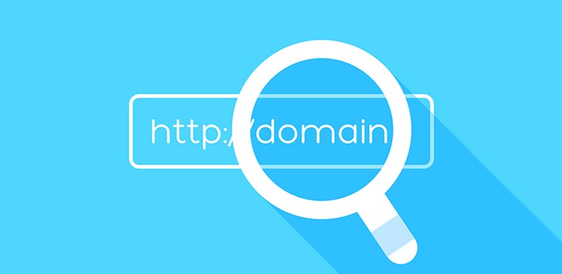
Select an Attractive Domain Name:
A domain name must be selected so that it gives a message to the visitors of what the business stands for. It should also be kept in mind that the domain name should very effective for Search Engine Optimization (SEO) so that the target viewers can easily find what they are looking for.
Create Space around Content:
It’s essential to make the contents easy to focus on the visitors so that they can feel comfortable when hovering over the contents. The surrounding area is equally important as the contents to make the site comfortably readable.
Well Organized:
An ambiguous design with loads of unnecessary information can make the visitors feel uncomfortable, so a perfect website should be designed in a simple yet useful form. A well-organized website reflects business professionalism that makes the visitors reliable to the business.
Use Formatting:
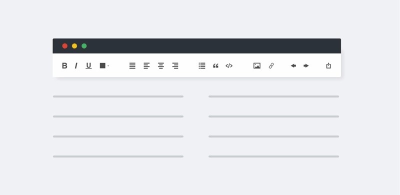
In the current online world, users are very cautious about their time, and none is ready to hovering over your site for a more extended period. Using formatting can be a great way to emphasize the heading and key points of the contents, but it must be simplified so that users can save their time. Nothing extravagant, a simple, bold, italic, or color formatting can catch the eye of the reader.
Professional Branding:
Promote your brand in the most professional manner that reflects the values of your business. Promote it like you are doing business, some serious business, and you mean it. You can use graphical presentation in the contents to highlight your core ideas and statistics.
Think out of the Box:
Sometimes, you may need to think out of the box to make your business website a little different from the competitors. You may adopt a different approach than that of the existing. It can be something crazy, something pleasant, or something totally freaky, or anything that doesn’t go with the flow.
Ensure Smooth Navigation:
The website should be designed in such a way that it enables a user to navigate it smoothly. Since the business is boring, you have to be very careful about arranging a wide range of products & services that might be a hindrance to the smooth navigation for users. So, plan your strategy tactfully and avoid unnecessary content from the site to ensure comfy navigation for viewers.
Use of Animated Graphics:
Using animated graphics could be a great option to attract visitors to your site that will make it unique from the existing competitors. Adding videos to the site will give an extra lucrative look to the site that will lead to an increasing number of visitors and potential customers.
Enhancing Site Performance:
It is very important to use the appropriate hardware and high-speed internet connection for the server to support the website to ensure a great performance. The site cab crash while the users are loading it if the server cannot support it. Especially if any graphical presentations or videos are used in the contents, the site may become slow if the server configuration and the bandwidth are not adequate enough. Site performance can also be increased by choosing a better host.
Well-organized Presentation of Products & Services:
Think profoundly and carefully how well you can organize the products and services on the site, since the customers won’t spend a long time to find the desired outcomes.
Also, you need to ensure there is enough information about the products, i.e., pictures, production descriptions, prices, etc. so that customers can easily be influenced to buy the product.
If you cannot manage a proper display of the product range, you will lose potential customers. Chances are that you won’t be able to create a website like Amazon, but you have to aim for it. Make it similar in functionality, not in style. This means not using their font, color palette, or a similar logo.
Keep a Place for Customer Query:
Customers or users may have various queries about products or services, technical issues of site, or availability of your products in a particular area, or maybe anything. Keep a query box on the site while designing it so that clients can make their queries, and you can answer them anytime. Arranging a real-time chatting box for the visitors will improve customer experience in your site primarily, and it will turn the potential customers into regular ones.
Paying Attention to Details:
While designing the website, you must pay close attention to details so that it doesn’t go far from the ultimate goal. The ultimate purpose of a website to increase the business turnover, and for achieving it, you must not add any redundant materials into the site that results in losing the appeal of the main contents. The details must need to convey a message of professionalism to potential clients.
Monitor Technical Issues like404s:
You must monitor the website regularly to check if any technical issues might annoy the visitors/customers. A problem like the 404 error annoys the visitors seriously when they don’t find the required link while browsing the site. As a result, you may lose a regular customer, including a potential one. Even too much 404 errors reduce the performance of the site and make it slow, which ultimately results in a sales loss.
Suggestions for Good Content
Using Catchy Headlines:
There is numerous information available all around the web, and so does for your site. The visitors don’t have the luxury of spending much time at your site if they don’t find anything attractive. So, to make the contents attractive to the viewers you should use some catchy headlines in your content. A catchy headline attracts the visitors easily and makes them read the full content attentively. To make better headlines, you must review the materials over and over again.
Avoiding Lengthy Paragraphs:
A lengthy paragraph makes the contents wordy and repetitive and thus loses its attraction to the visitors. So, you must prevent such bigger sections, rather you can divide an enormous paragraph into small parts so that it doesn’t look wordy in the eye of the visitors.
Highlighting the Hyperlink:
Hyperlinks are added to the contents to provide additional information to the viewers. Highlighting helps the visitors to trace the hyperlink easily. There is various way of highlighting a hyperlink text such as using a different color or underlining.
Adding Something Funny:
Sometimes, using something funny in the contents make people interested in going through the entire contents, which will eventually make people know about your products and services and thus generates sales.
Nowadays, businesses have become more competitive than ever before in terms of promoting products and services. The use of websites has been increased tremendously, and the organizations are investing larger funds than ever before in designing websites.
There has been a significant advancement in the field of technology that made several business organizations improve the capability of using a perfect website to promote products & services. As a result, designing a website that can perform better than those of others has become very challenging.
A website can establish reliability amongst the customers and can attract future clients as the most crucial part of the modern business. Visitors can get a great browsing experience from visiting a lucrative website that can turn the single time visitors into frequent ones. Finally, a good website represents the business’s mission, vision, and values and its message towards the society and customers.
A lucrative and properly designed website can attract viewers for a boring business; if the visitors find it special and different from others. In this article, we will discuss how a good performing website can be developed for boring businesses or for miscellaneous themes, like campaign websites.
Techniques for Designing a Unique website
Make it Unique & Special:
There are numerous web templates available on the net; if your design is similar to a boring style of template that people see every day, the visitors will surely run away from your website by the first impression. Tempting or driving away from the visitors largely depends on what impression the site makes on the viewers in the first view. The homepage of a corporate website must be designed in such a way that it represents the whole site, which will make it unique & special and attract the visitors to grab the deal.
Select an Attractive Domain Name:
A domain name must be selected so that it gives a message to the visitors of what the business stands for. It should also be kept in mind that the domain name should very effective for Search Engine Optimization (SEO) so that the target viewers can easily find what they are looking for.
Create Space around Content:
It’s essential to make the contents easy to focus on the visitors so that they can feel comfortable when hovering over the contents. The surrounding area is equally important as the contents to make the site comfortably readable.
Well Organized:
An ambiguous design with loads of unnecessary information can make the visitors feel uncomfortable, so a perfect website should be designed in a simple yet useful form. A well-organized website reflects business professionalism that makes the visitors reliable to the business.
Use Formatting:
In the current online world, users are very cautious about their time, and none is ready to hovering over your site for a more extended period. Using formatting can be a great way to emphasize the heading and key points of the contents, but it must be simplified so that users can save their time. Nothing extravagant, a simple, bold, italic, or color formatting can catch the eye of the reader.
Professional Branding:
Promote your brand in the most professional manner that reflects the values of your business. Promote it like you are doing business, some serious business, and you mean it. You can use graphical presentation in the contents to highlight your core ideas and statistics.
Think out of the Box:
Sometimes, you may need to think out of the box to make your business website a little different from the competitors. You may adopt a different approach than that of the existing. It can be something crazy, something pleasant, or something totally freaky, or anything that doesn’t go with the flow.
Ensure Smooth Navigation:
The website should be designed in such a way that it enables a user to navigate it smoothly. Since the business is boring, you have to be very careful about arranging a wide range of products & services that might be a hindrance to the smooth navigation for users. So, plan your strategy tactfully and avoid unnecessary content from the site to ensure comfy navigation for viewers.
Use of Animated Graphics:
Using animated graphics could be a great option to attract visitors to your site that will make it unique from the existing competitors. Adding videos to the site will give an extra lucrative look to the site that will lead to an increasing number of visitors and potential customers.
Enhancing Site Performance:
It is very important to use the appropriate hardware and high-speed internet connection for the server to support the website to ensure a great performance. The site cab crash while the users are loading it if the server cannot support it. Especially if any graphical presentations or videos are used in the contents, the site may become slow if the server configuration and the bandwidth are not adequate enough. Site performance can also be increased by choosing a better host.
Well-organized Presentation of Products & Services:
Think profoundly and carefully how well you can organize the products and services on the site, since the customers won’t spend a long time to find the desired outcomes.
Also, you need to ensure there is enough information about the products, i.e., pictures, production descriptions, prices, etc. so that customers can easily be influenced to buy the product.
If you cannot manage a proper display of the product range, you will lose potential customers. Chances are that you won’t be able to create a website like Amazon, but you have to aim for it. Make it similar in functionality, not in style. This means not using their font, color palette, or a similar logo.
Keep a Place for Customer Query:
Customers or users may have various queries about products or services, technical issues of site, or availability of your products in a particular area, or maybe anything. Keep a query box on the site while designing it so that clients can make their queries, and you can answer them anytime. Arranging a real-time chatting box for the visitors will improve customer experience in your site primarily, and it will turn the potential customers into regular ones.
Paying Attention to Details:
While designing the website, you must pay close attention to details so that it doesn’t go far from the ultimate goal. The ultimate purpose of a website to increase the business turnover, and for achieving it, you must not add any redundant materials into the site that results in losing the appeal of the main contents. The details must need to convey a message of professionalism to potential clients.
Monitor Technical Issues like404s:
You must monitor the website regularly to check if any technical issues might annoy the visitors/customers. A problem like the 404 error annoys the visitors seriously when they don’t find the required link while browsing the site. As a result, you may lose a regular customer, including a potential one. Even too much 404 errors reduce the performance of the site and make it slow, which ultimately results in a sales loss.
Suggestions for Good Content
Using Catchy Headlines:
There is numerous information available all around the web, and so does for your site. The visitors don’t have the luxury of spending much time at your site if they don’t find anything attractive. So, to make the contents attractive to the viewers you should use some catchy headlines in your content. A catchy headline attracts the visitors easily and makes them read the full content attentively. To make better headlines, you must review the materials over and over again.
Avoiding Lengthy Paragraphs:
A lengthy paragraph makes the contents wordy and repetitive and thus loses its attraction to the visitors. So, you must prevent such bigger sections, rather you can divide an enormous paragraph into small parts so that it doesn’t look wordy in the eye of the visitors.
Highlighting the Hyperlink:
Hyperlinks are added to the contents to provide additional information to the viewers. Highlighting helps the visitors to trace the hyperlink easily. There is various way of highlighting a hyperlink text such as using a different color or underlining.
Adding Something Funny:
Sometimes, using something funny in the contents make people interested in going through the entire contents, which will eventually make people know about your products and services and thus generates sales.
Nowadays, businesses have become more competitive than ever before in terms of promoting products and services. The use of websites has been increased tremendously, and the organizations are investing larger funds than ever before in designing websites.
There has been a significant advancement in the field of technology that made several business organizations improve the capability of using a perfect website to promote products & services. As a result, designing a website that can perform better than those of others has become very challenging.
A website can establish reliability amongst the customers and can attract future clients as the most crucial part of the modern business. Visitors can get a great browsing experience from visiting a lucrative website that can turn the single time visitors into frequent ones. Finally, a good website represents the business’s mission, vision, and values and its message towards the society and customers.
A lucrative and properly designed website can attract viewers for a boring business; if the visitors find it special and different from others. In this article, we will discuss how a good performing website can be developed for boring businesses or for miscellaneous themes, like campaign websites.
Techniques for Designing a Unique website
Make it Unique & Special:
There are numerous web templates available on the net; if your design is similar to a boring style of template that people see every day, the visitors will surely run away from your website by the first impression. Tempting or driving away from the visitors largely depends on what impression the site makes on the viewers in the first view. The homepage of a corporate website must be designed in such a way that it represents the whole site, which will make it unique & special and attract the visitors to grab the deal.
Select an Attractive Domain Name:
A domain name must be selected so that it gives a message to the visitors of what the business stands for. It should also be kept in mind that the domain name should very effective for Search Engine Optimization (SEO) so that the target viewers can easily find what they are looking for.
Create Space around Content:
It’s essential to make the contents easy to focus on the visitors so that they can feel comfortable when hovering over the contents. The surrounding area is equally important as the contents to make the site comfortably readable.
Well Organized:
An ambiguous design with loads of unnecessary information can make the visitors feel uncomfortable, so a perfect website should be designed in a simple yet useful form. A well-organized website reflects business professionalism that makes the visitors reliable to the business.
Use Formatting:
In the current online world, users are very cautious about their time, and none is ready to hovering over your site for a more extended period. Using formatting can be a great way to emphasize the heading and key points of the contents, but it must be simplified so that users can save their time. Nothing extravagant, a simple, bold, italic, or color formatting can catch the eye of the reader.
Professional Branding:
Promote your brand in the most professional manner that reflects the values of your business. Promote it like you are doing business, some serious business, and you mean it. You can use graphical presentation in the contents to highlight your core ideas and statistics.
Think out of the Box:
Sometimes, you may need to think out of the box to make your business website a little different from the competitors. You may adopt a different approach than that of the existing. It can be something crazy, something pleasant, or something totally freaky, or anything that doesn’t go with the flow.
Ensure Smooth Navigation:
The website should be designed in such a way that it enables a user to navigate it smoothly. Since the business is boring, you have to be very careful about arranging a wide range of products & services that might be a hindrance to the smooth navigation for users. So, plan your strategy tactfully and avoid unnecessary content from the site to ensure comfy navigation for viewers.
Use of Animated Graphics:
Using animated graphics could be a great option to attract visitors to your site that will make it unique from the existing competitors. Adding videos to the site will give an extra lucrative look to the site that will lead to an increasing number of visitors and potential customers.
Enhancing Site Performance:
It is very important to use the appropriate hardware and high-speed internet connection for the server to support the website to ensure a great performance. The site cab crash while the users are loading it if the server cannot support it. Especially if any graphical presentations or videos are used in the contents, the site may become slow if the server configuration and the bandwidth are not adequate enough. Site performance can also be increased by choosing a better host.
Well-organized Presentation of Products & Services:
Think profoundly and carefully how well you can organize the products and services on the site, since the customers won’t spend a long time to find the desired outcomes.
Also, you need to ensure there is enough information about the products, i.e., pictures, production descriptions, prices, etc. so that customers can easily be influenced to buy the product.
If you cannot manage a proper display of the product range, you will lose potential customers. Chances are that you won’t be able to create a website like Amazon, but you have to aim for it. Make it similar in functionality, not in style. This means not using their font, color palette, or a similar logo.
Keep a Place for Customer Query:
Customers or users may have various queries about products or services, technical issues of site, or availability of your products in a particular area, or maybe anything. Keep a query box on the site while designing it so that clients can make their queries, and you can answer them anytime. Arranging a real-time chatting box for the visitors will improve customer experience in your site primarily, and it will turn the potential customers into regular ones.
Paying Attention to Details:
While designing the website, you must pay close attention to details so that it doesn’t go far from the ultimate goal. The ultimate purpose of a website to increase the business turnover, and for achieving it, you must not add any redundant materials into the site that results in losing the appeal of the main contents. The details must need to convey a message of professionalism to potential clients.
Monitor Technical Issues like404s:
You must monitor the website regularly to check if any technical issues might annoy the visitors/customers. A problem like the 404 error annoys the visitors seriously when they don’t find the required link while browsing the site. As a result, you may lose a regular customer, including a potential one. Even too much 404 errors reduce the performance of the site and make it slow, which ultimately results in a sales loss.
Suggestions for Good Content
Using Catchy Headlines:
There is numerous information available all around the web, and so does for your site. The visitors don’t have the luxury of spending much time at your site if they don’t find anything attractive. So, to make the contents attractive to the viewers you should use some catchy headlines in your content. A catchy headline attracts the visitors easily and makes them read the full content attentively. To make better headlines, you must review the materials over and over again.
Avoiding Lengthy Paragraphs:
A lengthy paragraph makes the contents wordy and repetitive and thus loses its attraction to the visitors. So, you must prevent such bigger sections, rather you can divide an enormous paragraph into small parts so that it doesn’t look wordy in the eye of the visitors.
Highlighting the Hyperlink:
Hyperlinks are added to the contents to provide additional information to the viewers. Highlighting helps the visitors to trace the hyperlink easily. There is various way of highlighting a hyperlink text such as using a different color or underlining.
Adding Something Funny:
Sometimes, using something funny in the contents make people interested in going through the entire contents, which will eventually make people know about your products and services and thus generates sales.
THE ORIGINAL? Mata Atlantica Foundation – 2003 “I saw a man cutting down trees”
Click on the image to enlarge Source : Ad Forum Agency : F/Nazca Saatchi & Saatchi (Brazil)
LESS ORIGINAL Helpengreen Foundation – 2020 “Save trees to save wildlife”
Click on the image to enlarge
Source : Luerzer’s Archive
Agency : ADK Fortune, Gurgaon (India)
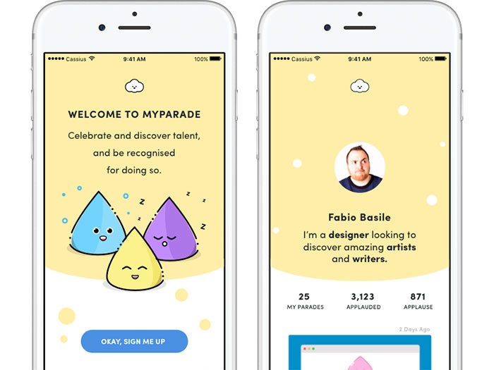
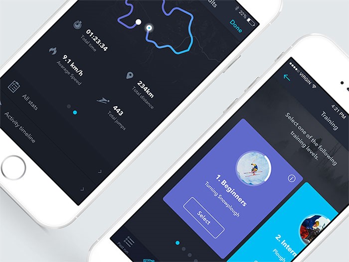
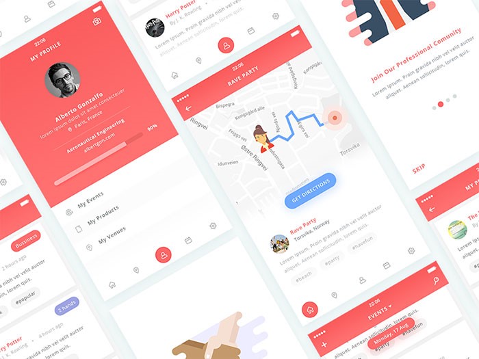
Mobile user experience somehow ‘imposed itself’ with all the development and improvement of mobile communication devices.
In fact, it is the quality of user experience that divides outstanding apps from their less outstanding counterparts.
The same factor enables startups to learn from big brands and to improve their products.
User experience for mobile applications – the key to success
UX seems to fit perfectly the development of mobile interaction. Customers cannot deny the fact that digital disruption is knocking out their loyalty, and mobile brands are gaining success. Instead, they are looking for a customized and stable experience that can always be upgraded.
Only a small part of them agree that channel interactions offered by companies are seamless. Established brands are working hard on triggering loyalty and improving their UX experiences to the level of impeccability.
Image source: Cassius Kiani
It is a challenging task-they need to ensure their sites comply with traditional standards and that they load faster with no need for zooming or pinching.
The success of a website, however, depends on continuous streaming, and customers are becoming more and more frustrated that companies struggle to do business via mobile communication.
Tips for ‘mobilizing’ and personalizing the user experience
We cannot talk about a universal UX simply because we are all different form each other.
Great apps should really consider their users’ personalities. They should research and gather data and they should customize the experience according to their users’ needs.
Take travel apps as an example – they ought to present attractive information even before we adjust searching settings because they know who we are, where we are, and how empowering our budget is.
Menus should have search options
Searching is a core element of good user experience. Therefore, such an option should be available everywhere. Your users need to be able to switch pages, to add or deduct content from the current page. Designers should pay attention to this because their main purpose is to make interaction easy and comfortable, which necessarily involves proper content division. From now on, it counts also for mobile systems.
Additionally, make sure the search field is visible. Put it in the menu or in a very striking position on the pages.
Remember – introducing search is not enough. It is just the beginning. You have to make sure it actually provides results. The results, on the other hand, should be logically ordered and accessible from desktops and mobile phones.
Finally, make sure your results are easily distinguished. One more thing about mobile UX related to search: having the option is just step one. Make sure your internal search result pages look great and are functional as well.
Most generally, 80% of your app’s users are about to use only 20% of its functionality. If not sure this is a valid rule, launch the service online, and observe how customers interact with it (in the case of mobile analytics difficulties, pay special attention to your mobile users). You will conclude which functionality is mostly applied so that you can cut the rest out and get as close to intuitive design as possible.
The same as with your desktop sites, mobile replications should not aspire for too much conversation, especially when we’re talking about forms. You need an app that summarizes information, buys or sells products or makes subscriptions through simple contact forms.
Think about it – what will your mobile UX look like if you introduce an 8-page long questionnaire? It will be ruined! “I’ll do that tomorrow on coffee time” – that’s exactly what users will say. And they won’t do it.
An optimal user experience takes care of size. Therefore, remove everything you wanted to know, but it wasn’t really necessary. Do they want a newsletter? Ask only for their electronic mails. Do they want to shop? Ask for the delivery and input address (and give them the chance to copy-paste the same information).
Excellent apps start from the basics. The designer finds out what customers want and he adjusts the work to their requirements. Improvement comes second, whenever there is an affordable chance for improving your digital existence. Then, if it is a mobile idea, let it be a mobile idea! There is nothing that can make ideas so unique.
An app without content will simply not work
Additionally, too much content will be just as dysfunctional.
And we are not talking about not having content at all. We are talking about content that has not been exposed in a clear way. You may not have a searching tool or it may not work properly. You have to consider every option and to put content as close to your users’ view as possible. Again – filtering that provides low-quality results is equally bad as not having a filter at all.
Therefore, the same efforts apply to the search option-incredibly customized apps need incredibly customized searching features.
Consider interruption
One of the biggest drawbacks when designing for mobile systems is the unavoidable possibility for users to be distracted. They are almost all the time on their phones and there is naturally no chance that something will not interrupt their experience (either from the outside or within the phone itself).
You have to consider this option-maintain the app straightforward and the interface simple because it is the only way to keep users focused and engaged. Make sure that if they leave, they will come back and pick up from where they stopped. Therefore, divide content in small chunks and break larger tasks in no-time operations.
Appear friendly and really grateful for the fact that new customers visited you.
Assuming you’ve gotten to know your target users, the next thing to do is to let them know you. Charm them at first sight and convince them that it is a good decision to start using your site. You have to create a positive impression from the very first moment, instead of waiting for them to start searching. In fact, most clients base their entire experience on the first run they had on the site.
Presenting poor and empty screens to potential users is like signing a death sentence. Their first impression will be terrible and it will likely stay like that forever.
Speed is among most important factors for creating excellent user experience. Speed is what users mostly complain about, so every website is trying to improve it. The improvement goes mostly in two directions: optimization of images (even if everybody tries to hide instant images); and reduction of size.
However, remember that the loading speed on your website/app doesn’t depend only on your efforts. It is highly dependent on mobile connections too. We don’t always have WiFi or 4G and we have to be patient.
Most users adjust their browsing habits to the speed of their internet connection-if traveling on the subway, it’s not really recommendable to try and stream a three-hour movie. Instead, you can read a Wikipedia article or your daily horoscope. This is how it works-users decide!
Even if you made it to the top of all lists and your users seem to adore you, there is a big chance you’ll discover flaws you weren’t really aware of. In fact, it is very probable those will be things you missed when developing the app or results of failing to adjust it to real-time needs.
There are also certain options that make sense when you don’t have a great budget for the app and no revenue, like using free fonts instead of premium ones.
However, it is not a justification for throwing out ideas that seem technically unfeasible at the moment – write them down and work out whether there is an alternative that can replace them, or save them for better days. The mobile world is constantly innovating, so the same way as inundated settings fail to work, futuristic ones may become real. The key is to adjust to the time being.
Remember – your app is a developing entity. It will draw analytical data, users’ feedback, and it will follow trends and breakthroughs. You have to make sure it is ready to provide better and better experience. Don’t think that you will only work hard on it around the launching date when you have all your checklists and plan with what needs to be done.
Try and create excellent mobile user interface which can respond to every need and it can act informatively in every phase of the purchase cycle. Don’t rely on trends which impose the ‘must go mobile’ mindset and think how your users want you to enhance their journey. This is the right approach for keeping customers on board, encouraging purchases, and breaking records.
The quality of your app depends on the quality of its UX design – it will either make it or break it. We think you know what you should do.
Agregator najlepszych postów o designie, webdesignie, cssie i Internecie