So, you’ve got your business website up and running, but it feels like it’s missing a little something. Maybe the speed isn’t quite there, or you need more features to really enhance user experience.
Sounds familiar? Don’t worry—plugins can help with that.
Plugins are like the extra tools you didn’t know you needed. They boost your site’s performance, security, and functionality without requiring you to dive into complicated coding. But with so many out there, which ones are worth your time?
Let’s take a look at the must-have plugins that can help you supercharge your business website.
1. SEO Plugin: Driving Organic Traffic to Your Website
If your website isn’t easily found in search engines, it’s like having a store in the middle of nowhere. That’s where an SEO plugin comes in handy. These tools help optimize your website for search engines, giving you the visibility you need.
An SEO plugin can assist with things like keyword placement, improving meta descriptions, and even checking the readability of your content. In short, it helps make your site more search engine-friendly, which means more organic traffic coming your way.
2. Security Plugin: Keeping Your Website Safe
Imagine leaving your business unlocked overnight—risky, right? The same principle applies to your website. You need a good security system in place to protect it from potential threats like hackers and malware.
A security plugin will help keep everything safe by offering features like firewalls, malware scanning, and login protection. It’s all about locking down your site and making sure only the right people have access.
3. Website Accessibility Plugin: Ensuring Inclusivity for All Users
It’s important to make sure your website is accessible to everyone, including those with disabilities. To ensure that your site can be easily navigated by users with different needs, you’ll need a website accessibility plugin.
These plugins can make adjustments to things like font sizes and color contrast and even support screen readers for visually impaired users. Not only does this create a better experience for all visitors, but it also keeps you in line with legal accessibility standards.
4. Caching Plugin: Boosting Site Speed and Performance
No one likes a slow website. If your site takes too long to load, people will leave before they even get a chance to see what you have to offer. That’s why a caching plugin is essential.
Caching stores parts of your site so that they load faster for returning visitors. This improves both user experience and search engine rankings, making it a must-have for any business website looking to stay competitive.
5. Backup Plugin: Protecting Your Data
Losing your website’s data is the stuff of nightmares, but a backup plugin can save the day. Regular backups are crucial, whether you’re dealing with technical issues, hacking attempts, or just an accidental mistake.
A backup plugin ensures that your site’s content and data are safely stored. That way, if something goes wrong, you can quickly restore your website and get back to business.
6. Form Plugin: Capturing Leads and Feedback
Your website isn’t just about providing information—it’s also a key tool for gathering data from your visitors. Whether you’re looking to capture customer inquiries, feedback, or newsletter sign-ups, a form plugin will help you do just that.
Form plugins allow you to create customized forms for various purposes, ensuring you collect the right information from your audience. With easy-to-use drag-and-drop builders, you can create forms that fit your brand and your business needs perfectly.
7. E-commerce Plugin: Powering Online Sales
If your business involves selling products or services online, having an e-commerce plugin is a game changer. These plugins give your website all the features you need to run a successful online store.
From managing payments and inventory to displaying your products in a user-friendly way, an e-commerce plugin will help turn your website into a revenue-generating machine.
8. Social Media Plugin: Enhancing Engagement and Reach
Your website and social media should work hand in hand. A social media plugin makes it easier for your visitors to share your content, driving more traffic back to your site.
With a good plugin, you can add social sharing buttons, display your social media feeds, and even auto-publish your content to your social profiles. It’s a simple way to boost your online presence and keep your audience engaged.
Selecting the Right Plugins for Your Business Website
Your business website is one of the most important tools you have, so it’s essential to make the most of it. Plugins are the secret to taking your site from “just okay” to truly exceptional. They can improve your SEO, speed, security, accessibility, and so much more.
Take a moment to think about what areas of your website could use a boost, then start integrating these must-have plugins. With the right tools, you’ll have a website that not only looks great but also performs at its best.
Search engine optimization (SEO) has become a critical factor in driving traffic, enhancing visibility, and improving website performance. Whether you’re a seasoned marketer or a business owner, refining your SEO strategies is a necessity to stay ahead of competitors. When you focus on key aspects like keyword research, content creation, and technical SEO, you can optimize your search engine performance effortlessly and achieve better results. Below are some practical tips to help guide you in the process.
Understand the Importance of Accurate Keyword Research
Keywords are the foundation of any effective SEO strategy. Aside from other techniques to improve website ranking, online resources like Serpple can offer insights into keyword performance so you can pinpoint the terms most relevant to your niche. Once you understand keyword difficulty, search volume, and competition, you can strategically integrate these keywords into your content.
When conducting keyword research, remember to focus on long-tail keywords. These phrases, typically three or more words long, tend to have lower competition and a higher intent, meaning they can drive more targeted traffic to your website. Instead of optimizing for “SEO tips,” consider something more specific like “local SEO tips for small businesses.”
Focus on High-Quality Content
Content continues to be king in the world of SEO. Crafting high-quality, informative, and engaging content is key to ranking well on search engines. Google’s algorithms prioritize websites that offer value to readers, so your content needs to be relevant, original, and comprehensive.
Creating long-form content, such as blog posts over 1,000 words, has been shown to rank better on search engines. Longer articles allow for in-depth exploration of topics, and they provide more opportunities for keyword placement. The length is not enough on its own: the content must remain focused and informative, avoiding filler and irrelevant information. Include actionable insights that readers can implement, as this will not only improve your SEO but also boost user engagement.
Optimize On-Page SEO Elements
On-page SEO refers to the elements within your website that you can directly control, such as title tags, meta descriptions, and headers. Each of these elements plays a crucial role in how search engines index and rank your pages. Your title tag should include your primary keyword and be no longer than 60 characters to ensure it displays correctly on search results pages.
Meta descriptions, while not a direct ranking factor, improve click-through rates. These short summaries should be engaging and contain relevant keywords to entice users to click on your link. Header tags (H1, H2, etc.) also help search engines understand the structure of your content. Using keywords naturally in your headers improves readability for both users and search engines, enhancing your chances of ranking higher.
Your URLs should be clean and descriptive. Avoid long strings of numbers or unnecessary characters, and aim for a structure that clearly indicates the content of the page: “www.example.com/seo-tips” is far more effective than “www.example.com/123456.”
Prioritize Mobile Optimization
With more than half of global web traffic coming from mobile devices, you want to optimize your website for mobile users. Google now uses mobile-first indexing, meaning it primarily ranks sites based on their mobile versions rather than desktop ones. If your site is not mobile-friendly, you risk losing valuable traffic and rankings.
A responsive design is the best way to ensure your site works seamlessly on both desktop and mobile devices. This design approach automatically adjusts your site’s layout based on the user’s screen size, offering a better user experience across all devices. Mobile-friendly sites also tend to have faster loading times, which is another factor Google uses to rank pages.
Improve Site Speed for Better Rankings
Page speed is among the most critical ranking factors for search engines and an essential component of user experience. Visitors are likely to leave a site if it takes too long to load, which can increase your bounce rate and hurt your SEO performance. Google has confirmed that slower sites are penalized in search rankings, so ensuring your site loads quickly is a key part of optimization.
You can improve site speed by minimizing the use of large images, leveraging browser caching, and reducing the number of redirects on your site. Easy-to-use tools like Google PageSpeed Insights can help identify areas for improvement. Don’t forget to choose a reliable hosting provider and compressing files can further enhance loading times, giving your website a competitive edge in search engine rankings.
Focus on Building Quality Backlinks
Backlinks, or links from other websites to yours, signal to search engines that your site is trustworthy and authoritative. The more high-quality backlinks you have, the higher your chances of ranking well on search engine results pages. However, it’s not just about quantity. Links from reputable, relevant sites hold far more weight than links from low-quality or irrelevant sources.
To build quality backlinks, consider engaging in guest blogging, reaching out to industry influencers, or creating shareable content like infographics. High-quality content will be referenced by others, naturally attracting backlinks over time. Avoid black hat SEO techniques such as buying backlinks, as these practices can result in penalties from search engines.
Leverage Social Media for SEO Benefits
Although social media signals are not a direct ranking factor for search engines, an active social media presence can still contribute to better SEO performance. Sharing your content across social media platforms like Facebook, Twitter, and LinkedIn can increase its visibility and drive more traffic to your site. Social media profiles often appear in search results, meaning a strong presence on these platforms can improve your overall online visibility.
Social media also facilitates engagement, building trust and authority in your industry. When your content is shared and discussed, it creates opportunities for natural backlinks and can indirectly enhance your SEO. Make sure your posts include relevant keywords and engage with your audience by responding to comments and sharing insights.
Improving your website’s search engine performance doesn’t have to be complicated. By focusing on these key areas—keyword research, content creation, on-page SEO, mobile optimization, site speed, backlinks, and social media—you can boost your rankings effortlessly. Optimizing each of these elements will help ensure your site is both user-friendly and search engine-friendly, increasing visibility and driving long-term success.
As a designer, there are endless opportunities between your creation potential and your usual clients. With the growing demand for visual expertise, the possibility of earning more and increasing income is growing. By specializing in graphic design, web development, or UX/UI, you open doors to new ways of developing your revenues. Selling design templates, coaching, or affiliate marketing is among the many ways to increase revenues from your potential. Here are five effective ways to convert your design skills into various income streams.
1. Freelance on Multiple Platforms
Freelancing opens flexible ways of earning for the designer, and you are free to connect with numerous clients. To maximize your earnings, you should sign up on several freelance platforms: Upwork, Fiverr, and Freelancer. This will increase your chances of securing gigs that are paying well and suit your expertise.
With a good portfolio and strategic pricing, you will manage to stand out. Package your services for returning clients to yield a consistent revenue stream, leveraging competitive services. Network within the platform communities for reviews that improve your visibility to prospective clients and referrals.
2. Create and Sell Design Templates
With platforms such as Creative Market, Etsy, and Envato, designers make templates they sell for websites, presentations, and social media. The beauty of this approach is that you can create once and sell multiple times, providing an ongoing income stream.
Keep an eye on trends your target audience desires, like minimalistic website themes or bold Instagram post templates. Constantly adding new products to the shop will also mean your portfolio is fresh and relevant, and more buyers will come to take a look at what you have available.
3. Affiliate Marketing
You can also affiliate with design software, tools, or educational programs offering affiliate deals. By joining a web design referral program, you may get a commission for each client or friend you refer. After selecting the best platform, understand how it works and keep polishing your skills to offer the best assistance.
You must gain the trust of your audience if you want to make affiliate marketing work. This can be done by providing honest reviews and tutorials on your blog or YouTube channel. Once your audience trusts what you say, they will likely follow your suggestions and eventually make purchases through your affiliate link.
4. Offer Design Coaching or Courses
If you have rich experience and good expertise in design, then it’s worth considering coaching services or even an online course on your subject. Many designers, especially beginners, are okay with paying for step-by-step instruction from a real expert.
You could offer one-on-one coaching or structured learning cases on Skillshare, Udemy, or Teachable. When pricing your coaching or courses, remember the value that you’re providing. Exclusive, high-quality sessions can be priced higher while having a bigger audience at a lower rate attending group courses.
5. Licensing Your Work
Licensing enables others to work with and use your artwork, illustrations, or design patterns without owning them. With websites like Redbubble or Society6, you can upload your work and sell it as licensed products. This way, you can make new designs while receiving royalties from work you have previously designed. Ensure you understand each licensing agreement’s terms and how much control you maintain over your work.
Endnote
Design skills are at the core of the world’s digitization, impacting various sectors, from web design to application development. If this is the area of your expertise, it is easy for you to add more cash to your wallet. You need to make a correct choice of the area in which you should venture, from affiliate marketing to online coaching.
In the 1970s, McDonald’s was at a pivotal point in its growth, and the fast-food giant sought to enhance its brand identity. To achieve this, McDonald’s engaged Unimark International, a prominent design firm, to explore a comprehensive redesign of its packaging and signage. This collaboration aimed to create a more cohesive and appealing visual identity for the restaurant chain.
Unimark’s Approach
In 1973, Unimark conducted extensive studies of McDonald’s operations. They analyzed various aspects of the restaurants, interviewing employees, managers, and customers to gather insights into the brand’s strengths and weaknesses. One of their primary focuses was on improving packaging and ensuring that signage across all locations maintained a consistent look and feel.
Key Findings
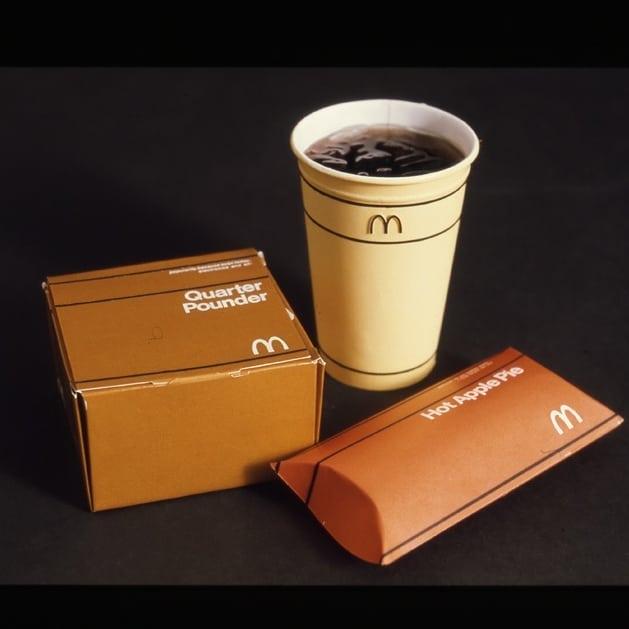
Packaging Love: Unimark discovered that the apple pie packaging was particularly well-received by customers. This insight highlighted the potential for creating packaging that resonated with consumers while also enhancing the overall dining experience.
Signage Consistency: The firm emphasized the need for uniformity in signage throughout McDonald’s locations. They believed that a consistent visual language would strengthen brand recognition and improve customer navigation within stores.
Brand Symbol Usage: A notable recommendation from Unimark was to reconsider the placement of the iconic McDonald’s symbol on trash cans. The design team questioned whether it was appropriate for such a prominent brand element to be associated with waste disposal, suggesting that it could dilute the brand’s image.
Uniform Design: Unimark also critiqued McDonald’s employee uniforms, stating they were “not exciting enough.” The firm proposed redesigning uniforms to reflect a more vibrant and engaging aesthetic that would align with the energetic atmosphere of McDonald’s restaurants.
The Refusal of Unimark’s Redesign
Despite the thorough research and innovative proposals presented by Unimark, McDonald’s ultimately decided against implementing their redesign suggestions. The refusal was likely influenced by several factors:
Brand Identity: At that time, McDonald’s had already established a strong brand identity that resonated with its customer base. Any significant changes could risk alienating loyal customers who were accustomed to the existing look and feel.
Operational Considerations: Implementing widespread changes across thousands of locations would require substantial investment in new materials, training for staff regarding new uniforms, and adjustments to existing signage.
Corporate Culture: McDonald’s corporate culture may have favored maintaining control over its branding decisions rather than outsourcing them to an external agency like Unimark.
Legacy of Unimark’s Vision
While Unimark’s redesign proposals were ultimately shelved, their insights into customer preferences and branding strategies have had lasting implications for how fast-food chains approach design today. The emphasis on cohesive branding, customer experience, and thoughtful packaging continues to influence modern marketing strategies across various industries.In retrospect, one can only wonder how different McDonald’s might have looked had they embraced Unimark’s vision in the 1970s. The potential for a more unified brand experience could have set new standards in fast-food branding—one that might still resonate today.
I’m a bit uncomfortable that responsive design is often pushed into discreet chunks, like “layout A up to this size, then layout B until there’s enough space for layout C.” It’s OK, it works and fits into a workflow where screens are designed as static layouts in PhotoFigVa (caveat, I made that up). But the process feels like a compromise to me. I’ve long believed that responsive design should be almost invisible to the user. When they visit my site on a mobile device while waiting in line for K-Pop tickets, they shouldn’t notice that it’s different from just an hour ago, sitting at the huge curved gaming monitor they persuaded their boss they needed.
Consider this simple hero banner and its mobile equivalent. Sorry for the unsophisticated design. The image is AI generated, but It’s the only thing about this article that is.
The meerkat and the text are all positioned and sized differently. The traditional way to pull this off is to have two layouts, selected by a media, sorry, container query. There might be some flexibility in each layout, perhaps centering the content, and a little fluid typography on the font-size, but we’re going to choose a point at which we flip the layout in and out of the stacked version. As a result, there are likely to be widths near the breakpoint where the layout looks either a little empty or a little congested.
Is there another way?
It turns out there is. We can apply the concept of fluid typography to almost anything. This way we can have a layout that fluidly changes with the size of its parent container. Few users will ever see the transition, but they will all appreciate the results. Honestly, they will.
Let’s get this styled up
For the first step, let’s style the layouts individually, a little like we would when using width queries and a breakpoint. In fact, let’s use a container query and a breakpoint together so that we can easily see what properties need to change.
This is the markup for our hero, and it won’t change:
I’ve attached the background image to a ::before pseudo-element so I can use container queries on it (because containers cannot query themselves). We’ll keep this later on so that we can use inline container query (cqi) units. For now, here’s the container query that just shows the values we’re going to make fluid:
You can see the code running in a live demo — it’s entirely static to show the limitations of a typical approach.
Let’s get fluid
Now we can take those start and end points for the size and position of both the text and background and make them fluid. The text size uses fluid typography in a way you are already familiar with. Here’s the result — I’ll explain the expressions once you’ve looked at the code.
First the changes to the position and size of the text:
/* Line changes
 * -12,27 +12,32
 */

.details {
  /* ... lines 14-16 unchanged */
  /* Evaluates to 50px for a 360px wide container, and 220px for 1200px */
  top: clamp(50px, 20.238cqi - 22.857px, 220px);

  /* Evaluates to 20px for a 360px wide container, and 565px for 1200px */
  left: clamp(20px, 64.881cqi - 213.571px, 565px);

  /* ... lines 20-25 unchanged */
  h1 {
    /* Evaluates to 3.5rem for a 360px wide container, and 5rem for 1200px */
    font-size: clamp(3.5rem, 2.857rem + 2.857cqi, 5rem);
    /* ... font-weight unchanged */

  }

  p {
    /* Evaluates to 2rem for a 360px wide container, and 2.5rem for 1200px */
    font-size: clamp(2rem, 1.786rem + 0.952cqi, 2.5rem);
  }
}
And here’s the background position and size for the meerkat image:
/* Line changes
 * -50,3 +55,8
 */

/* Evaluates to -310px for a 360px wide container, and 0px for 1200px */
background-position-x: clamp(-310px, 36.905cqi - 442.857px, 0px);
/* Evaluates to -25px for a 360px wide container, and 0px for 1200px */
background-position-y: clamp(-25px, 2.976cqi);
/* Evaluates to 710px for a 360px wide container, and 589px for 1200px */
background-size: auto clamp(589px, 761.857px - 14.405cqi, 710px);
Now we can drop the container query entirely.
Let’s explain those clamp() expressions. We’ll start with the expression for the top property.
/* Evaluates to 50px for a 360px wide container, and 220px for 1200px */
top: clamp(50px, 20.238cqi - 22.857px, 220px);
You’ll have noticed there’s a comment there. These expressions are a good example of how magic numbers are a bad thing. But we can’t avoid them here, as they are the result of solving some simultaneous equations — which CSS cannot do!
The upper and lower bounds passed to clamp() are clear enough, but the expression in the middle comes from these simultaneous equations:
f + 12v = 220
f + 3.6v = 50
…where f is the number of fixed-size length units (i.e., px) and v is the variable-sized unit (cqi). In the first equation, we are saying that we want the expression to evaluate to 220px when 1cqi is equal to 12px. In the second equation, we’re saying we want 50px when 1cqi is 3.6px, which solves to:
f = -22.857
v = 20.238
…and this tidies up to 20.238cqi – 22.857px in a calc()-friendly expression.
When the fixed unit is different, we must change the size of the variable units accordingly. So for the <h1> element’s font-size we have;
/* Evaluates to 2rem for a 360px wide container, and 2.5rem for 1200px */
font-size: clamp(2rem, 1.786rem + 0.952cqi, 2.5rem);
This is solving these equations because, at a container width of 1200px, 1cqi is the same as 0.75rem (my rems are relative to the default UA stylesheet, 16px), and at 360px wide, 1cqi is 0.225rem.
f + 0.75v = 2.5
f + 0.225v = 2
This is important to note: The equations are different depending on what unit you are targeting.
Honestly, this is boring math to do every time, so I made a calculator you can use. Not only does it solve the equations for you (to three decimal places to keep your CSS clean) it also provides that helpful comment to use alongside the expression so that you can see where they came from and avoid magic numbers. Feel free to use it. Yes, there are many similar calculators out there, but they concentrate on typography, and so (rightly) fixate on rem units. You could probably port the JavaScript if you’re using a CSS preprocessor.
The clamp() function isn’t strictly necessary at this point. In each case, the bounds of clamp() are set to the values of when the container is either 360px or 1200px wide. Since the container itself is constrained to those limits — by setting min-width and max-width values — the clamp() expression should never invoke either bound. However, I prefer to keep clamp() there in case we ever change our minds (which we are about to do) because implicit bounds like these are difficult to spot and maintain.
Avoiding injury
We could consider our work finished, but we aren’t. The layout still doesn’t quite work. The text passes right over the top of the meerkat’s head. While I have been assured this causes the meerkat no harm, I don’t like the look of it. So, let’s make some changes to make the text avoid hitting the meerkat.
The first is simple. We’ll move the meerkat to the left more quickly so that it gets out of the way. This is done most easily by changing the lower end of the interpolation to a wider container. We’ll set it so that the meerkat is fully left by 450px rather than down to 360px. There’s no reason the start and end points for all of our fluid expressions need to align with the same widths, so we can keep the other expressions fluid down to 360px.
Using my trusty calculator, all we need to do is change the clamp() expressions for the background-position properties:
/* Line changes
 * -55,5 +55,5
 */

/* Evaluates to -310px for a 450px wide container, and 0px for 1200px */
background-position-x: clamp(-310px, 41.333cqi - 496px, 0px);

/* Evaluates to -25px for a 450px wide container, and 0px for 1200px */
background-position-y: clamp(-25px, 3.333cqi - 40px, 0px);
This improves things, but not totally. I don’t want to move it any quicker, so next we’ll look at the path the text takes. At the moment it moves in a straight line, like this:
But can we bend it? Yes, we can.
A Bend in the path
One way we can do this is by defining two different interpolations for the top coordinate that places the line at different angles and then choosing the smallest one. This way, it allows the steeper line to “win” at larger container widths, and the shallower line becomes the value that wins when the container is narrower than about 780px. The result is a line with a bend that misses the meerkat.
All we’re changing is the top value, but we must calculate two intermediate values first:
/* Line changes
 * -18,2 +18,9 @@
 */

/* Evaluates to 220px for a 1200px wide container, and -50px for 360px */
--top-a: calc(32.143cqi - 165.714px);

/* Evaluates to 120px for a 1200px wide container, and 50px for 360px */
--top-b: calc(20px + 8.333cqi);

/* By taking the max, --topA is used at lower widths, with --topB taking over when wider.
We only need to apply clamp when the value is actually used */
top: clamp(50px, max(var(--top-a), var(--top-b)), 220px);
For these values, rather than calculating them formally using a carefully chosen midpoint, I experimented with the endpoints until I got the result I wanted. Experimentation is just as valid as calculation as a way of getting the result you need. In this case, I started with duplicates of the interpolation in custom variables. I could have split the path into explicit sections using a container query, but that doesn’t reduce the math overhead, and using the min() function is cleaner to my eye. Besides, this article isn’t strictly about container queries, is it?
Now the text moves along this path. Open up the live demo to see it in action.
CSS can’t do everything
As a final note on the calculations, it’s worth pointing out that there are restrictions as far as what we can and can’t do. The first, which we have already mitigated a little, is that these interpolations are linear. This means that easing in or out, or other complex behavior, is not possible.
Another major restriction is that CSS can only generate length values this way, so there is no way in pure CSS to apply, for example, opacity or a rotation angle that is fluid based on the container or viewport size. Preprocessors can’t help us here either because the limitation is on the way calc() works in the browser.
Both of these restrictions can be lifted if you’re prepared to rely on a little JavaScript. A few lines to observe the width of the container and set a CSS custom property that is unitless is all that’s needed. I’m going to use that to make the text follow a quadratic Bezier curve, like this:
There’s too much code to list here, and too much math to explain the Bezier curve, but go take a look at it in action in this live demo.
We wouldn’t even need JavaScript if expressions like calc(1vw / 1px) didn’t fail in CSS. There is no reason for them to fail since they represent a ratio between two lengths. Just as there are 2.54cm in 1in, there are 8px in 1vw when the viewport is 800px wide, so calc(1vw / 1px) should evaluate to a unitless 8 value.
They do fail though, so all we can do is state our case and move on.
Fluid everything doesn’t solve all layouts
There will always be some layouts that need size queries, of course; some designs will simply need to snap changes at fixed breakpoints. There is no reason to avoid that if it’s right. There is also no reason to avoid mixing the two, for example, by fluidly sizing and positioning the background while using a query to snap between grid definitions for the text placement. My meerkat example is deliberately contrived to be simple for the sake of demonstration.
One thing I’ll add is that I’m rather excited by the possibility of using the new Anchor Positioning API for fluid positioning. There’s the possibility of using anchor positioning to define how two elements might flow around the screen together, but that’s for another time.
We had fun in my previous article exploring the goodness of scrolly animations supported in today’s versions of Chrome and Edge (and behind a feature flag in Firefox for now). Those are by and large referred to as “scroll-driven” animations. However, “scroll triggering” is something the Chrome team is still working on. It refers to the behavior you might have seen in the wild in which a point of no return activates a complete animation like a trap after our hapless scrolling user ventures past a certain point. You can see JavaScript examples of this on the Wow.js homepage which assembles itself in a sequence of animated entrances as you scroll down. There is no current official CSS solution for scroll-triggered animations — but Ryan Mulligan has shown how we can make it work by cleverly combining the animation-timeline property with custom properties and style queries.
That is a very cool way to combine new CSS features. But I am not done being overly demanding toward the awesome emergent animation timeline technology I didn’t know existed before I read up on it last month. I noticed scroll timelines and view timelines are geared toward animations that play backward when you scroll back up, unlike the Wow.js example where the dogs roll in and then stay. Bramus mentions the same point in his exploration of scroll-triggered animations. The animations run in reverse when scrolling back up. This is not always feasible. As a divorced Dad, I can attest that the Tinder UI is another example of a pattern in which scrolling and swiping can have irreversible consequences.
Scroll till the cows come home with Web-Slinger.css
Believe it or not, with a small amount of SCSS and no JavaScript, we can build a pure CSS replacement of the Wow.js library, which I hereby christen “Web-Slinger.css.” It feels good to use the scroll-driven optimized standards already supported by some major browsers to make a prototype library. Here’s the finished demo and then we will break down how it works. I have always enjoyed the deliberately lo-fi aesthetic of the original Wow.js page, so it’s nice to have an excuse to create a parody. Much profession, so impress.
CodePen Embed Fallback
Teach scrolling elements to roll over and stay
Web-Slinger.css introduces a set of class names in the format .scroll-trigger-n and .on-scroll-trigger-n. It also defines --scroll-trigger-n custom properties, which are inherited from the document root so we can access them from any CSS class. These conventions are more verbose than Wow.js but also more powerful. The two types of CSS classes decouple the triggers of our one-off animations from the elements they trigger, which means we can animate anything on the page based on the user reaching any scroll marker.
Here’s a basic example that triggers the Animate.css animation “flipInY” when the user has scrolled to the <div> marked as .scroll-trigger-8.
A more advanced use is the sticky “Cownter” (trademark pending) at the top of the demo page, which takes advantage of the ability of one trigger to activate an arbitrary number of animations anywhere in the document. The Cownter increments as new cows appear then displays a reset button once we reach the final scroll trigger at the bottom of the page.
Sidenote: If you have doubts about the utility of style queries, behold the age-old cow pluralization problem solved in pure CSS.
How does Web Slinger like to sling it?
The secret is based on an iconic thought experiment by the philosopher Friedrich Nietzsche who once asked: If the view() function lets you style an element once it comes into view, what if you take that opportunity to style it so it can never be scrolled out of view? Would that element not stare back into you for eternity?
This idea sounded too good to be true, reminiscent of the urge when you meet a genie to ask for unlimited wishes. But it works! The next puzzle piece is how to use this one-way animation technique to control something we’d want to display to the user. Divs that instantly stick to the ceiling as soon as they enter the viewport might have their place on a page discussing the movie Alien, but most of the time this type of animation won’t be something we want the user to see.
That’s where named view progress timelines come in. The empty scroll trigger element only has the job of sticking to the top of the viewport as soon as it enters. Next, we set the timeline-scope property of the <body> element so that it matches the sticky element’s view-timeline-name. Now we can apply Ryan’s toggle custom property and style query tricks to let each sticky element trigger arbitrary one-off animations anywhere on the page!
View CSS code
/** Each trigger element will cause a toggle named with
  * the convention `--scroll-trigger-n` to be flipped
  * from 0 to 1, which will unpause the animation on
  * any element with the class .on-scroll-trigger-n
 **/

:root {
  animation-name: run-scroll-trigger-1, run-scroll-trigger-2 /*etc*/;
  animation-duration: 1ms;
  animation-fill-mode: forwards;
  animation-timeline: --trigger-timeline-1, --trigger-timeline-2 /*etc*/;
  timeline-scope: --trigger-timeline-1, --trigger-timeline-2 /*etc*/;
}

@property --scroll-trigger-1 {
  syntax: "<integer>";
  initial-value: 0;
  inherits: true;
}
@keyframes run-scroll-trigger-1 {
  to {
    --scroll-trigger-1: 1;
  }
}

/** Add this class to arbitrary elements we want
  * to only animate once `.scroll-trigger-1` has come
  * into view, default them to paused state otherwise
 **/
.on-scroll-trigger-1 {
  animation-play-state: paused;
}

/** The style query hack will run the animations on
  * the element once the toggle is set to true
 **/
@container style(--scroll-trigger-1: 1) {
  .on-scroll-trigger-1 {
    animation-play-state: running;
  }
}

/** The trigger element which sticks to the top of
  * the viewport and activates the one-way  animation
  * that will unpause the animation on the
  * corresponding element marked with `.on-scroll-trigger-n`
  **/
.scroll-trigger-1 {
  view-timeline-name: --trigger-timeline-1;
}
Trigger warning
We generate the genericized Web-Slinger.css in 95 lines of SCSS, which isn’t too bad. The drawback is that the more triggers we need, the larger the compiled CSS file. The numbered CSS classes also aren’t semantic, so it would be great to have native support for linking a scroll-triggered element to its trigger based on IDs, reminiscent of the popovertargetattribute for HTML buttons — except this hypothetical attribute would go on each target element and specify the ID of the trigger, which is the opposite of the way popovertarget works.
<!-- This is speculative — do not use -->
<scroll-trigger id="my-scroll-trigger"></scroll-trigger>
<div class="rollIn" scrolltrigger="my-scroll-trigger">Hello world</div>
Do androids dream of standardized scroll triggers?
As I mentioned at the start, Bramus has teased that scroll-triggered animations are something we’d like to ship in a future version of Chrome, but it still needs a bit of work before we can do that. I’m looking forward to standardized scroll-triggered animations built into the browser. We could do worse than a convention resembling Web-Slinger.css for declaratively defining scroll-triggered animations, but I know I am not objective about Web Slinger as its creator. It’s become a bit of a sacred cow for me so I shall stop milking the topic — for now.
Feel free to reference the prototype Web-Slinger.css library in your experimental CodePens, or fork the library itself if you have better ideas about how scroll-triggered animations could be standardized.
They’re out! Like many of you, I look forward to these coming out each year. I don’t put much stock in surveys but they can be insightful and give a snapshot of the CSS zeitgeist. There are a few little nuggets in this year’s results that I find interesting. But before I get there, you’ll want to also check out what others have already written about it.
Oh, I guess that’s it — at least it’s the most formal write-up I’ve seen. There’s a little summary by Ahmad Shadeed at the end of the survey that generally rounds things up. I’ll drop in more links as I find ’em.
In no particular order…
Demographics
Josh has way more poignant thoughts on this than I do. He rightfully calls out discrepancies in gender pay and regional pay, where men are way more compensated than women (a nonsensical and frustratingly never-ending trend) and the United States boasts more $100,000 salaries than anywhere else. The countries with the highest salaries were also the most represented in survey responses, so perhaps the results are no surprise. We’re essentially looking at a snapshot of what it’s like to be a rich, white male developer in the West.
Besides pay, my eye caught the Age Group demographics. As an aging front-ender, I often wonder what we all do when we finally get to retirement age. I officially dropped from the most represented age group (30-39, 42%) a few years ago into the third most represented tier (40-49, 21%). Long gone are my days being with the cool kids (20-29, 27%).
And if the distribution is true to life, I’m riding fast into my sunset years and will be only slightly more represented than those getting into the profession. I don’t know if anyone else feels similarly anxious about aging in this industry — but if you’re one of the 484 folks who identify with the 50+ age group, I’d love to talk with you.
Before we plow ahead, I think it’s worth calling out how relatively “new” most people are to front-end development.
Wow! Forty-freaking-four percent of respondents have less than 10 years of experience. Yes, 10 years is a high threshold, but we’re still talking about a profession that popped up in recent memory.
For perspective, someone developing for 10 years came to the field around 2014. That’s just when we were getting Flexbox, and several years after the big bang of CSS 3 and HTML 5. That’s just under half of developers who never had to deal with the headaches of table layouts, clearfix hacks, image sprites, spacer images, and rasterized rounded corners. Ethan Marcotte’s seminal article on “Responsive Web Design” predates these folks by a whopping four years!
I’m not entirely sure what to make of this section. When there are so many CSS features, how do you determine which are most widely used? How do you pare it down to just 50 features? Like, are filter effects really the most widely used CSS feature? So many questions, but the results are always interesting nonetheless.
What I find most interesting are the underused features. For example, hanging-punctuation comes in dead last in usage (1.57%) but is the feature that most developers (52%) have on their reading list. (If you need some reading material on it, Chris initially published the Almanac entry for hanging-punctuation back in 2013.)
I also see Anchor Positioning at the end of the long tail with reported usage at 4.8%. That’ll go up for sure now that we have at least one supporting browser engine (Chromium) but also given all of the tutorials that have sprung up in the past few months. Yes, we’ve contributed to that noise… but it’s good noise! I think Juan published what might be the most thorough and thoughtful guide on the topic yet.
I’m excited to see Cascade Layers falling smack dab in the middle of the pack at a fairly robust 18.7%. Cascade Layers are super approachable and elegantly designed that I have trouble believing anybody these days when they say that the CSS Cascade is difficult to manage. And even though @scope is currently low on the list (4.8%, same as Anchor Positioning), I’d bet the crumpled gum wrapper in my pocket that the overall sentiment of working with the Cascade will improve dramatically. We’ll still see “CSS is Awesome” memes galore, but they’ll be more like old familiar dad jokes in good time.
Interestingly enough, viewport units come in at Number 11 with 44.2% usage… which lands them at Number 2 for most experience that developers have with CSS layout. Does that suggest that layout features are less widely used than CSS filters? Again, so many questions.
Frameworks
How many of you were surprised that Tailwind blew past Bootstrap as Top Dog framework in CSS Land? Nobody, right?
More interesting to me is that “No CSS framework” clocks in at Number 13 out of 21 list frameworks. Sure, its 46 votes are dwarfed by the 138 for Material UI at Number 10… but the fact that we’re seeing “no framework” as a ranking option at all would have been unimaginable just three years ago.
The same goes for CSS pre/post-processing. Sass (67%) and PostCSS (38%) are the power players, but “None” comes in third at 19%, ahead of Less, Stylus, and Lightning CSS.
It’s a real testament to the great work the CSSWG is doing to make CSS better every day. We don’t thank the CSSWG enough — thank you, team! Y’all are heroes around these parts.
CSS Usage
Josh already has a good take on the fact that only 67% of folks say they test their work on mobile phones. It should be at least tied with the 99% who test on desktops, right? Right?! Who knows, maybe some responses consider things like “Responsive Design Mode” desktop features to be the equivalent of testing on real mobile devices. I find it hard to believe that only 67% of us test mobile.
Oh, and The Great Divide is still alive and well if the results are true and 53% write more JavsScript than CSS in their day-to-day.
This is where I get to toot our own horn a bit because CSS-Tricks continues to place first among y’all when it comes to the blogs you follow for CSS happenings.
I’m also stoked to see Smashing Magazine right there as well. It was fifth in 2023 and I’d like to think that rise is due to me joining the team last year. Correlation implies causation, amirite?
But look at Kevin Powell and Josh in the Top 10. That’s just awesome. It speaks volumes about their teaching talents and the hard work they put into “helping people fall in love with CSS” as Kevin might say it. I was able to help Kevin with a couple of his videos last year (here’s one) and can tell you the guy cares a heckuva lot about making CSS approachable and fun.
Honestly, the rankings are not what we live for. Now that I’ve been given a second wind to work on CSS-Tricks, all I want is to publish things that are valuable to your everyday work as front-enders. That’s traditionally happened as a stream of daily articles but is shifting to more tutorials and resources, whether it’s guides (we’ve published four new ones this year), taking notes on interesting developments, spotlighting good work with links, or expanding the ol’ Almanac to account for things like functions, at-rules, and pseudos (we have lots of work to do).
My 2024 Pick
No one asked my opinion but I’ll say it anyway: Personal blogging. I’m seeing more of us in the front-end community getting back behind the keyboards of their personal websites and I’ve never been subscribed to more RSS feeds than I am today. Some started blogging as a “worry stone” during the 2020 lockdown. Some abandoned socials when Twitter X imploded. Some got way into the IndieWeb. Webrings and guestbooks are even gaining new life. Sure, it can be tough keeping up, but what a good problem to have! Let’s make RSS king once and for all.
That’s a wrap!
Seriously, a huge thanks to Sacha Greif and the entire Devographics team for the commitment to putting this survey together every year. It’s always fun. And the visualizations are always to die for.
The State of CSS 2024 survey wrapped up and the results are interesting, as always. Even though each section is worth analyzing, we are usually most hyped about the section on the most used CSS features. And if you are interested in writing about web development (maybe start writing with us 😉), you will specifically want to check out the feature’s Reading List section. It holds the features that survey respondents wish to read about after completing the survey and is usually composed of up-and-coming features with low community awareness.
One of the features I was excited to see was my 2024 top pick: CSS Anchor Positioning, ranking in the survey’s Top 4. Just below, you can find Scroll-Driven Animations, another amazing feature that gained broad browser support this year. Both are elegant and offer good DX, but combining them opens up new possibilities that clearly fall into what most of us would have considered JavaScript territory just last year.
I want to show one of those possibilities while learning more about both features. Specifically, we will make the following blog post in which footnotes pop up as comments on the sides of each text.
CodePen Embed Fallback
For this demo, our requirements will be:
Pop the footnotes up when they get into the screen.
Attach them to their corresponding texts.
The footnotes are on the sides of the screen, so we need a mobile fallback.
The Foundation
To start, we will use the following everyday example of a blog post layout: title, cover image, and body of text:
CodePen Embed Fallback
The only thing to notice about the markup is that now and then we have a paragraph with a footnote at the end:
<main class="post">

  <!-- etc. -->

  <p class="note">
    Super intereseting information!
    <span class="footnote"> A footnote about it </span>
  </p>
</main>
Positioning the Footnotes
In that demo, the footnotes are located inside the body of the post just after the text we want to note. However, we want them to be attached as floating bubbles on the side of the text. In the past, we would probably need a mix of absolute and relative positioning along with finding the correct inset properties for each footnote.
However, we can now use anchor positioning for the job, a feature that allows us to position absolute elements relative to other elements — rather than just relative to the containment context it is in. We will be talking about “anchors” and “targets” for a while, so a little terminology as we get going:
Anchor: This is the element used as a reference for positioning other elements, hence the anchor name.
Target: This is an absolutely-positioned element placed relative to one or more anchors. The target is the name we will use from now on, but you will often find it as just an “absolutely positioned element” in other resources.
I won’t get into each detail, but if you want to learn more about it I highly recommend our Anchor Positioning Guide for complete information and examples.
The Anchor and Target
It’s easy to know that each .footnote is a target element. Picking our anchor, however, requires more nuance. While it may look like each .note element should be an anchor element, it’s better to choose the whole .post as the anchor. Let me explain if we set the .footnote position to absolute:
.footnote {
  position: absolute;
}
You will notice that the .footnote elements on the post are removed from the normal document flow and they hover visually above their .note elements. This is great news! Since they are already aligned on the vertical axis, we just have to move them on the horizontal axis onto the sides using the post as an anchor.
This is when we would need to find the correct inset property to place them on the sides. While this is doable, it’s a painful choice since:
You would have to rely on a magic number.
It depends on the viewport.
It depends on the footnote’s content since it changes its width.
Elements aren’t anchors by default, so to register the post as an anchor, we have to use the anchor-name property and give it a dashed-ident (a custom name starting with two dashes) as a name.
.post {
  anchor-name: --post;
}
In this case, our target element would be the .footnote. To use a target element, we can keep the absolute positioning and select an anchor element using the position-anchor property, which takes the anchor’s dashed ident. This will make .post the default anchor for the target in the following step.
Instead of choosing an arbitrary inset value for the .footnote‘s left or right properties, we can use the anchor() function. It returns a <length> value with the position of one side of the anchor, allowing us to always set the target’s inset properties correctly. So, we can connect the left side of the target to the right side of the anchor and vice versa:
.footnote {
  position: absolute;
  position-anchor: --post;

  /* To place them on the right */
  left: anchor(right);

  /* or to place them on the left*/
  right: anchor(left);

  /* Just one of them at a time! */
}
However, you will notice that it’s stuck to the side of the post with no space in between. Luckily, the margin property works just as you are hoping it does with target elements and gives a little space between the footnote target and the post anchor. We can also add a little more styles to make things prettier:
Lastly, all our .footnote elements are on the same side of the post, if we want to arrange them one on each side, we can use the nth-of-type() selector to select the even and odd notes and set them on opposite sides.
We use nth-of-type() instead of nth-child since we just want to iterate over .note elements and not all the siblings.
Just remember to remove the last inset declaration from .footnote, and tada! We have our footnotes on each side. You will notice I also added a little triangle on each footnote, but that’s beyond the scope of this post:
CodePen Embed Fallback
The View-Driven Animation
Let’s get into making the pop-up animation. I find it the easiest part since both view and scroll-driven animation are built to be as intuitive as possible. We will start by registering an animation using an everyday @keyframes. What we want is for our footnotes to start being invisible and slowly become bigger and visible:
@keyframes pop-up {
  from {
    opacity: 0;
    transform: scale(0.5);
  }

  to {
    opacity: 1;
  }
}
That’s our animation, now we just have to add it to each .footnote:
.footnote {
  /* ... */
  animation: pop-up linear;
}
This by itself won’t do anything. We usually would have set an animation-duration for it to start. However, view-driven animations don’t run through a set time, rather the animation progression will depend on where the element is on the screen. To do so, we set the animation-timeline to view().
This makes the animation finish just as the element is leaving the screen. What we want is for it to finish somewhere more readable. The last touch is setting the animation-range to cover 0% cover 40%. This translates to, “I want the element to start its animation when it’s 0% in the view and end when it’s at 40% in the view.”
You may have noticed that this approach to footnotes doesn’t work on smaller screens since there is no space at the sides of the post. The fix is easy. What we want is for the footnotes to display as normal notes on small screens and as comments on larger screens, we can do that by making our comments only available when the screen is bigger than a certain threshold, which is about 1000px. If it isn’t, then the notes are displayed on the body of the post as any other note you may find on the web.
Now our comments should be displayed on the sides only when there is enough space for them:
CodePen Embed Fallback
Wrapping Up
If you also like writing about something you are passionate about, you will often find yourself going into random tangents or wanting to add a comment in each paragraph for extra context. At least, that’s my case, so having a way to dynamically show comments is a great addition. Especially when we achieved using only CSS — in a way that we couldn’t just a year ago!