One of the most common issues dev teams face is that their clients don’t know how to give feedback if you don’t provide them with the proper tools. If you have ever received a Word document of 5 pages filled with comments like: “Page About Us, after the blue logo in the middle of the page, please make the text bigger”, you know what I’m talking about.
The Solution: BugHerd
BugHerd fixes this problem (and others) in a brilliant way. After installing a browser extension or a JavaScript snippet, you will be able to let your client give feedback directly from the website.
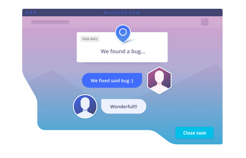
This means that your client (or another team member) just goes on the website, points, and clicks where he sees a bug, then adds his or her comment in context.
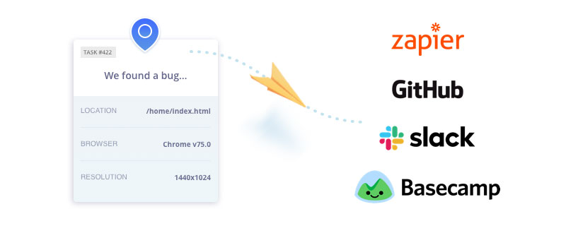
For each comment, the BugHerd sidebar allows you to tag your tasks for easier management and tracking, as well as assigning each task to the right person. For the developer, all necessary information will be provided automatically, such as the selector information or browser details. For every bug report, a screenshot is automatically attached.
A Visual Solution for Bug Tracking
You already know the old saying: “An image is worth a thousand words”. You can verify it if you try to describe a visual idea to someone, compared to creating mockups of the same idea.
Using a visual solution like BugHerd acts as a translator between tech and non-tech people. It removes the need to send annoying back and forth emails clarifying details. Instead, all the info needed to fix the issue is pinned directly to the task .
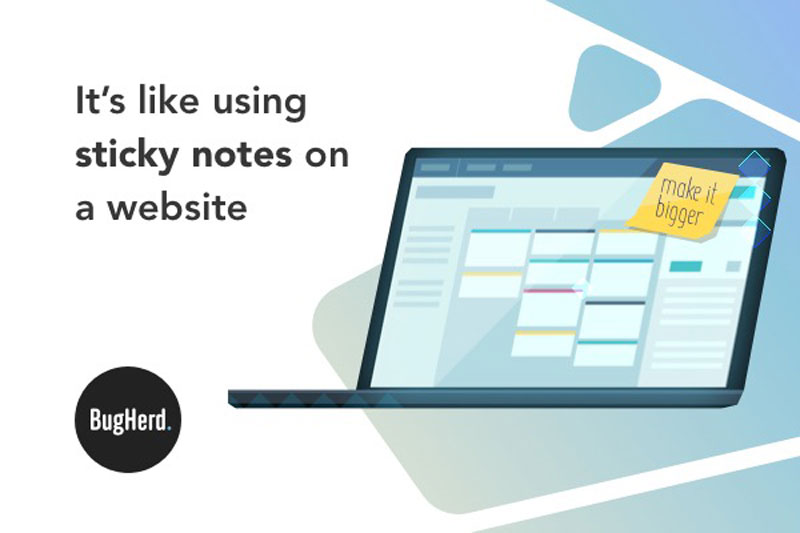
BugHerd is like using sticky-notes to pin client feedback and track bugs directly on a page. It’s a visual feedback tool for websites used by folks to manage projects across the web.
Bugs Management Done Right!
BugHerd is not only about visual feedback, but it also helps you track and manage bugs more efficiently as a team. You can manage as many projects as you want with it, and each task is organized into a Kanban board, which is a workflow visualization tool that enables you to optimize the flow of your work. This way, BugHerd also brings the power of visual bug management to developers.
On top of that, BugHerd shows a lot of love for developers by understanding that they don’t want to change all of their habits when they start using a new tool. The visual feedback and bug tracking tool also integrates with the apps that are most used by devs, such as Slack, GitHub, Zapier, or Basecamp.
Used by the Best Design Teams!
BugHerd has been around since 2010, which gives it a lot of experience and means that most of its features have been refined based on… their client feedback.
With thousands of users across the globe (172 counties at the time of writing this to be precise), you’re in good company. Some of their clients are among the best design teams you can think of, such as Dyson, Bloomberg, McKinsey & Company, among others.
Ready to give it a try? Head to their website and sign up for a free trial.
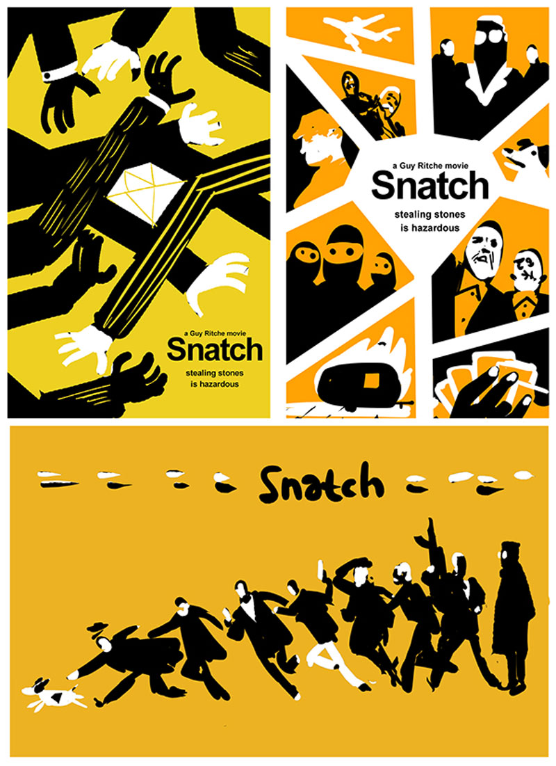
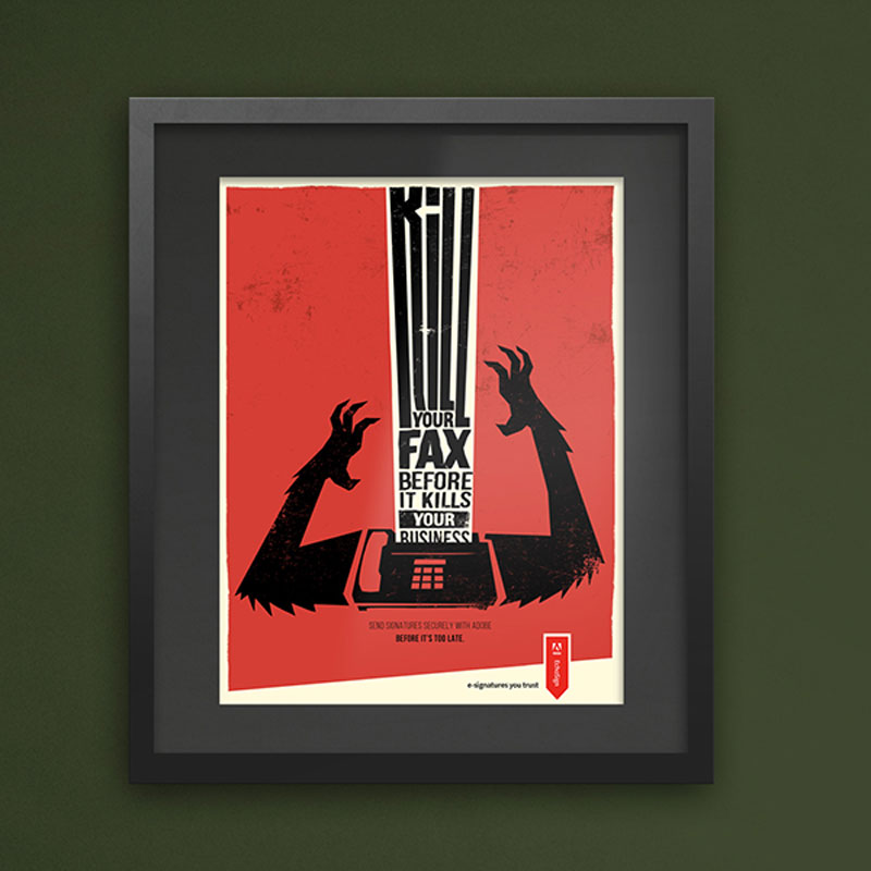
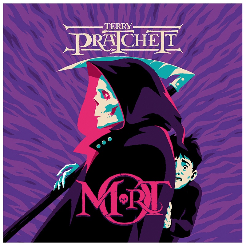
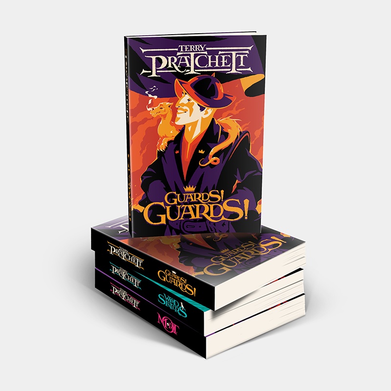
Freelance graphic designer and illustrator Levente Szabo, who goes by the name Brisk Graphics, has a portfolio filled with amazing work.
His illustrative style is a perfect fit for poster design and book covers, as it brings a very different look-and-feel from all these photographic posters that you see everywhere.
In his designs, you can see some clear references to great designers such as Saul Bass, the famous designer behind the Hitchcock movie posters, but Szabo still manages to get a unique touch that makes him recognizable.
Freelance graphic designer and illustrator Levente Szabo, who goes by the name Brisk Graphics, has a portfolio filled with amazing work.
His illustrative style is a perfect fit for poster design and book covers, as it brings a very different look-and-feel from all these photographic posters that you see everywhere.
In his designs, you can see some clear references to great designers such as Saul Bass, the famous designer behind the Hitchcock movie posters, but Szabo still manages to get a unique touch that makes him recognizable.
Freelance graphic designer and illustrator Levente Szabo, who goes by the name Brisk Graphics, has a portfolio filled with amazing work.
His illustrative style is a perfect fit for poster design and book covers, as it brings a very different look-and-feel from all these photographic posters that you see everywhere.
In his designs, you can see some clear references to great designers such as Saul Bass, the famous designer behind the Hitchcock movie posters, but Szabo still manages to get a unique touch that makes him recognizable.
I’m in love with SVG. Sure, the code can look dense and difficult at first, but you’ll see the beauty in the results when you get to know it. The bonus is that those results are in code, so it can be hooked up to a CMS. Your designers can rest easy knowing they don’t have to reproduce an effect for every article or product on your site.
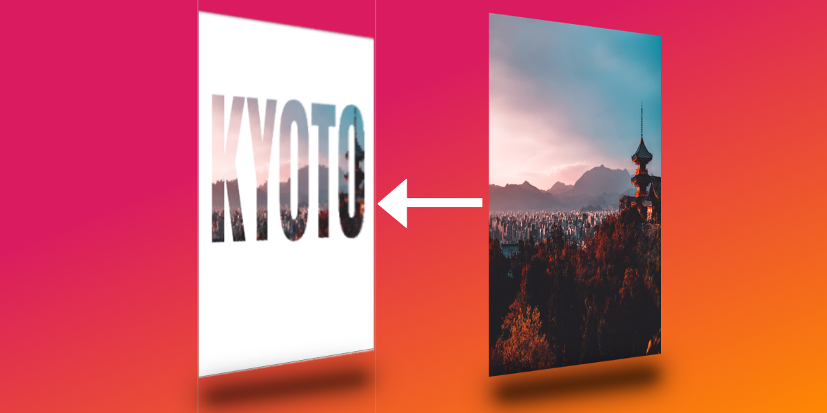
Today I would like to show you how I came up with this glass text effect.
Step 0: Patience and space
SVG can be a lot to take on, especially when you’re just starting to learn it (and if you are, Chris’ book is a good place to start). It’s practically a whole new language and, especially for people who lack design chops, there are lots of new techniques and considerations to know about. Like HTML, though, you’ll find there are a handful of tools that we can reach for to help make SVG much easier to grasp., so be patient and keep trying!
Also, give yourself space. Literally. SVG code is dense so I like to use two or three new lines to space things out. It makes the code easier to read and helps me see how different pieces are separated with less visual distraction. Oh, and use comments to mark where you are in the document, too. That can help organize your thoughts and document your findings.
I’ve made demos for each step we’re going to cover in the process of learning this glass effect as a way to help solidify the things we’re covering as we go.
OK, now that we’re mentally prepared, let’s get into the meat of it!
Step 1: Get the basic image in place
First things first: we need an image as the backdrop for our glass effect. Here we have an <svg> element and an <image> within it. This is similar to adding an <img> in HTML. You’ll notice the dimensions of the viewBox attribute and <image> element in the SVG element are the same. This ensures that the <image> is exactly the same size as the actual picture we’re linking to.
That’s a key distinction to note: we’re linking to an image. The SVG file itself does not draw a raster image, but we can reference one in the SVG code and make sure that asset is in the location we point to. If you’ve worked with Adobe InDesign before, it’s a lot like linking to an image asset in a layout — the image is in the InDesign layout, but the asset itself actually lives somewhere else.
Straightforward so far, but this is where things get complicated because we’re going to add a filter to the image we just inserted. This filter is going to distort the image. If you look closely at the difference between the demo in the last step and the one in this step, you’ll see that the edges of objects in the image are a little rough and wavy. That’s the filter at work!
First, we create another <svg> to hold filter. This means that if we ever want to reuse our filter — for example on multiple elements on the page — then we totally can!
Our first filter (#displacement) is going to distort our image. We’re going to use feTurbulence and feDisplacementMap, each explained by Sara Soueidan much better than I can in this post. Beau Jackson also wrote up a nice piece that shows how they can be used to make a cloud effect. Suffice to say, these two filters tend to go together and I like to think of them as when something needs to appear „wobbly.”
With our filter container in place, we just need to apply that filter to our image with a filter attribute on the <image>, magic!
We don’t want the entire image to be distorted though. We’re going to clip the shape of our distorted <image> to the shape of some text. This will essentially be the portion of the picture seen „through” the glass.
To do this, we need to add a <text> element in a <clip-path> and give it an id. Calling this id in the clip-path of our <image> now restricts its shape to that of our <text>. Wonderful!
OK, so it’s bueno that we have the distorted <image> clipped to the <text>, but now the rest of the image is gone. No bueno.
We can counteract this by adding a copy of the same <image> but without the clip-path or filter attributes before our existing <image>. This is where I like to add some nice comments to keep things neat. The idea is like placing a transparent layer over what we have so far.
I know, I know, this isn’t very neat, and we’re repeating ourselves. Ideally, we would set our filter straight on the <text> element and use the in="BackgroundImage property for feDisplacementMap to warp what’s behind the text, without the need for extra elements. Unfortunately, this has poor browser support, so we’re going to go with multiple images.
Next, we’re going to duplicate our text just as we did for the image in the last step. Unfortunately, because the text is in a clip-path, it’s now not available for rendering. This is the last time we’re going to duplicate content like this, I promise!
Now we should have something that looks like a normal image with black text over it. If the distortion filter on the <image> we’ve already made is what we can see „through” the glass, then our new <text> is going to be the glass itself.
<svg>

  <!-- more stuff -->

  <!-- TEXT - clipped -->
  <clipPath id="clip">
    <text x="50%" y ="50%" dominant-baseline="middle" text-anchor="middle">KYOTO</text>
  </clipPath>

  <!-- TEXT - visible -->
  <text x="50%" y ="50%" dominant-baseline="middle" text-anchor="middle">KYOTO</text>

<!-- more stuff -->

</svg>
This is where things start to get exciting, at least for me! 🤓
We want to create a dark edge along the text element which, when paired with a light edge (we’ll look at that next), will add depth to the appearance of the text against the image.
We want a new filter for our <text>, so let’s create one in our filter’s SVG element and give it an id="textFilter and link it to the filter attribute of the <text> element.
SVG works from the background to the foreground, so the first thing we’re going put in our filter is the shadow that the glass would have, as that is furthest back. I’m gonna level with you, this one is pretty complex, but we’re going to go through it one step at a time.
For this effect, we’re using four filter primitives: feMorphology, feOffset, feFlood and feComposite.
feMorphology is first. We’re using this to make the text fatter. In the demo below, comment out the next three primitives ( feOffset, feFlood, feComposite ) and play with it. I have the value radius="4" to achieve the glass effect, but see what happens if you set it to 1… or 100!
feOffset is used to move all the „pixels” in the previous primitive ( feMorphology ) across the x- or y-axis. The values dx="5" and dy="5" move the „pixels” right on the x-axis and y-axis, respectively. The higher the number, the further they move. Put in negative numbers for dx and the „pixels” will move left. Negative dy and they’ll move up! Again, the is the sort of thing you start to learn as you play around with them.
The reason I have quotes around „pixels” is because they’re not screen pixels like you might expect in CSS. Rather, they refer to the dimensions we set on the parent <svg>. I think of them as percentages. We have used these settings viewBox="0 0 1890 1260" in our example. This means our <svg> is 1890 „pixels” wide. If we set dx="189" it means we’ll move our element 10% of the way across the SVG (1890 divided by 189).
feFlood is great. If you want to fill the screen with color, this is the primitive you need! You might wonder why we can’t read our text now when we apply it. That’s because you can only see the result of the last filter primitive that was created. The result of each of the previous primitives was related to our <text> element. The result of feFlood is just like its name: a flood of color. It doesn’t know what you did before and it doesn’t care — it’s merely going to fill an area with color.
This is where some people start getting frustrated with SVG. It’s hard to work on something when you can’t see it! Trust me, as you work with SVG more you’ll get used to this. In fact, the next few steps will need us to rely on this and trust that everything is still in place.
feComposite is going to solve this issue for us. What does it do? MDN describes it as:
The SVG filter primitive performs the combination of two input images pixel-wise in image space using one of the Porter-Duff compositing operations: over, in, atop, out, xor, and lighter.
That to me is jibba-jabba. I think of it as affecting the alpha layer of in with the color/alpha of in2.
With this in place we can once again see our text spelled out and, because the color we used is slightly transparent, we can even see the distorted „glass” effect coming through. Great!
This is essentially the same as what we literally just did, but we’re going to shift the shape up and to the left using negative dx/dy values. We’re also setting a slightly white color this time. We’re aiming for a nice depth effect.
We’re again in a position where what we can see is the most recent result from a filter primitive, but we can’t see our dark edge! feComposite isn’t what we want to use to bring them together because we don’t want the alpha of the dark edge colored by the light edge… we want to see both! Which leads us to…
feMerge! It’s a hero. It lets us take any number of primitive results and merge them, making a new image. Woohoo, we can now see both dark and light edges together!
However, we do want them to be edges rather than both filling up the entire text, so we need to remove the space that the original <text> takes up. What we need next is another feComposite to chop out the original SourceGraphic. Because we used feMorphology to fatten the letters for our edges, we can now chop the original letter shapes out of the result of our feMerge.
Now we’re starting to look like glass, with just one piece missing.
Step 9: Yes, a bevel
We have a pretty good 3D-looking glass effect. However, the letters look flat. Let’s add one more effect and make them look more rounded.
To achieve this we’re going to create a bevelled effect.
First we’re going to use feGaussianBlur. This will blur our existing filters slightly. We’re going to use this blurred result as basis to add some feSpecularLighting. As usual, feel free to play with the numbers here and see what effects you can get! The main one you might want to change is the lighting-color attribute. The image that we’re using here is slightly dark, so we’re using a bright lighting-color. If your image was very bright, this would make the letters hard to read, so you might use a darker lighting-color in that case.
I like the term Front-End Developer. It’s encapsulates the nature of your job if your concerns are:
Building UIs for web browsers
The spectrum of devices and platforms those web browsers run on
The people who use those web browsers and related assistive technology
The breadth of knowledge for all-things front-end development has gotten super deep. I’ve found that front-end developers that have stretched themselves to the point they are thinking of themselves as full-stack developers more and more. I think that’s kinda cool and empowering, but it doesn’t mean that everyone needs to go that wide.
Brad Frost referred to sides of the spectrum as „back of the front” and „front of the front.” I once drew the line, in The Great Divide, as heavy JavaScript vs. not. These distinctions aren’t to divide people, but to acknowledge the spectrum and that there are people all over it.
In a new article called „Frontend Design, React, and a Bridge over the Great Divide,” Brad makes the point that the role of „Front-End Designer” exists on the spectrum right smack in the middle between design and development, where „development” refers to the back-end or deeper JavaScript stuff.
The jobs?
Crafting semantic HTML markup
Creating CSS code
Authoring JavaScript that primarily manipulates objects in the DOM
Testing across browsers and devices
Optimizing the performance of front-end code
Working with designers
Working with back-end and application developers
That sounds like the „traditional” explanation of a front-end developer to me — if there is such a thing — but it makes sense to rename that role since front-end development is the term that got so wide.
Brad adds these responsibilties to the list:
Create a library of presentational UI components
Author and document a robust, intuitive component API for each presentational component
Determine how flexible or rigid the component library should be
Maintain the presentational components as a product
That’s where I think this metaphor comes in:
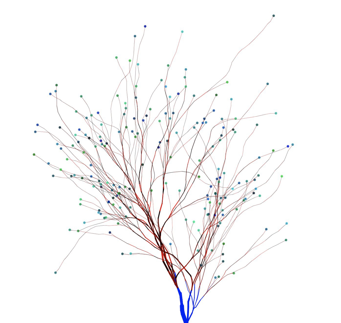
Me, Brad and a slew of you out there are front-end developers. We work in browsers and we care about the users and where and how they interact with those browsers. We do the things on Brad’s first list like craft HTML and CSS, work with designs and do testing. We share that common trunk of skills on the tree above.
But Brad is more of a systems designer than I am. His dot lands somewhere differently on that tree. I don’t know if I’m particularly skilled at anything, but my dot definitely falls elsewhere on that tree. Perhaps on an entirely different branch, as I quite like working with JavaScript tooling and logic and APIs and such. The bulk of Brad’s article is about React and finding a place in the realm of front-end development where the job isn’t ignoring React, but working with it in such a way that doesn’t mean every other aspect of development doesn’t have to come along for the ride.
I like the term Front-End Developer. It’s encapsulates the nature of your job if your concerns are:
Building UIs for web browsers
The spectrum of devices and platforms those web browsers run on
The people who use those web browsers and related assistive technology
The breadth of knowledge for all-things front-end development has gotten super deep. I’ve found that front-end developers that have stretched themselves to the point they are thinking of themselves as full-stack developers more and more. I think that’s kinda cool and empowering, but it doesn’t mean that everyone needs to go that wide.
Brad Frost referred to sides of the spectrum as „back of the front” and „front of the front.” I once drew the line, in The Great Divide, as heavy JavaScript vs. not. These distinctions aren’t to divide people, but to acknowledge the spectrum and that there are people all over it.
In a new article called „Frontend Design, React, and a Bridge over the Great Divide,” Brad makes the point that the role of „Front-End Designer” exists on the spectrum right smack in the middle between design and development, where „development” refers to the back-end or deeper JavaScript stuff.
The jobs?
Crafting semantic HTML markup
Creating CSS code
Authoring JavaScript that primarily manipulates objects in the DOM
Testing across browsers and devices
Optimizing the performance of front-end code
Working with designers
Working with back-end and application developers
That sounds like the „traditional” explanation of a front-end developer to me — if there is such a thing — but it makes sense to rename that role since front-end development is the term that got so wide.
Brad adds these responsibilties to the list:
Create a library of presentational UI components
Author and document a robust, intuitive component API for each presentational component
Determine how flexible or rigid the component library should be
Maintain the presentational components as a product
That’s where I think this metaphor comes in:
Me, Brad and a slew of you out there are front-end developers. We work in browsers and we care about the users and where and how they interact with those browsers. We do the things on Brad’s first list like craft HTML and CSS, work with designs and do testing. We share that common trunk of skills on the tree above.
But Brad is more of a systems designer than I am. His dot lands somewhere differently on that tree. I don’t know if I’m particularly skilled at anything, but my dot definitely falls elsewhere on that tree. Perhaps on an entirely different branch, as I quite like working with JavaScript tooling and logic and APIs and such. The bulk of Brad’s article is about React and finding a place in the realm of front-end development where the job isn’t ignoring React, but working with it in such a way that doesn’t mean every other aspect of development doesn’t have to come along for the ride.
Building and maintaining your own website is a great idea. Not only do you own your platform, but you get to experiment with web technologies along the way. Recently, I dug into a concept called serverless functions, starting with my own website. I’d like to share the results and what I learned along the way, so you can get your hands dirty, too!
But first, a 1-minute intro to serverless functions
A serverless function (sometimes called a lambda function or cloud function) is a piece of code that you can write, host, and run independently of your website, app, or any other code. Despite the name, serverless functions do, indeed, run on a server; but it’s a server you don’t have to build or maintain. Serverless functions are exciting because they take a lot of the legwork out of making powerful, scalable, apps.
I started my journey with a challenge: I wanted to have an email list sign-up form on my site. The rules are as follows:
It should work without JavaScript. I’d like to see how much I can get by with just CSS and HTML. Progressive enhancements are OK.
It shouldn’t require external dependencies. This is a learning project, so I want to write 100% of the code if possible.
It should use serverless functions. Instead of sending data to my email list service client-side, let’s do it server(less)-side!
Meet the team: 11ty, Netlify, and Buttondown
My website is built using a static site framework called 11ty. 11ty allows me to write templates and components in HTML, so that’s how we’ll build our email form. (Chris recently wrote a great article about his experience with 11ty if you’re interested in learning more.)
The website is then deployed using a service called Netlify) and it is the key player on our team here: the point guard, the quarterback, the captain. That’s because Netlify has three features that work together to produce serverless excellence:
Netlify can deploy automatically from a GitHub repo. This means I can write my code, create a pull request, and instantly see if my code works. While there are tools to test serverless functions locally, Netlify makes it super easy to test live.
Netlify Forms handles any form submissions my site gets. This is one part of the serverless equation: instead of writing code to collect submissions, I’ll configure the HTML with a few simple attributes and let Netlify handle the rest.
Netlify Functions allows me to take action with the data from my forms. I’ll write some code to send emails off to my email list provider, and tell Netlify when to run that code.
Finally, I’ll manage my email list with a service called Buttondown. It’s a no-frills email newsletter provider, with an easy-to-use API.
Bonus: for personal sites like mine, 11ty, Netlify, and Buttondown are free. You can’t beat that.
The form
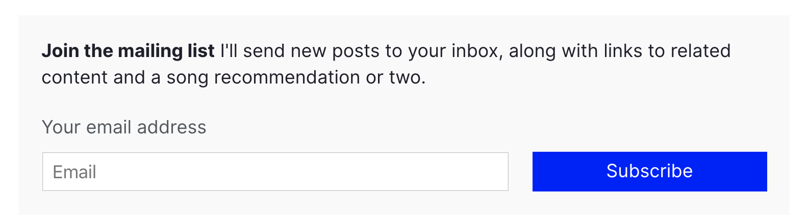
The HTML for my email subscription form is very minimal, with a few extras for Netlify Forms to work.
<form class="email-form" name="newsletter" method="POST" data-netlify="true" netlify-honeypot="bot-field">
  <div hidden aria-hidden="true">
    <label>
      Don’t fill this out if you're human:
      <input name="bot-field" />
    </label>
  </div>
  <label for="email">Your email address</label>
  <div>
    <input type="email" name="email" placeholder="Email"  id="email" required />
    <button type="submit">Subscribe</button>
  </div>
</form>
First, I set the data-netlify attribute to true to tell Netlify to handle this form.
The first input in the form is named bot-field. This tricks robots into revealing themselves: I tell Netlify to watch for any suspicious submissions by setting the netlify-honeypot attribute to bot-field. I then hide the field from humans using the html hidden and aria-hidden values — users with and without assistive technology won’t be able to fill out the fake input.
If the form gets submitted with anything in the bot-field input, Netlify knows it’s coming from a robot, and ignores the input. In addition to this layer of protection, Netlify automatically filters suspicious submissions with Askimethttps://www.netlify.com/blog/2019/02/12/improved-netlify-forms-spam-filtering-using-akismet/). I don’t have to worry about spam!
The next input in the form is named email. This is where the email address goes! I’ve specified the input-type as email, and indicated that is required; this means that the browser will do all my validation for me, and won’t let users submit anything other than a valid email address.
Progressive enhancement with JavaScript
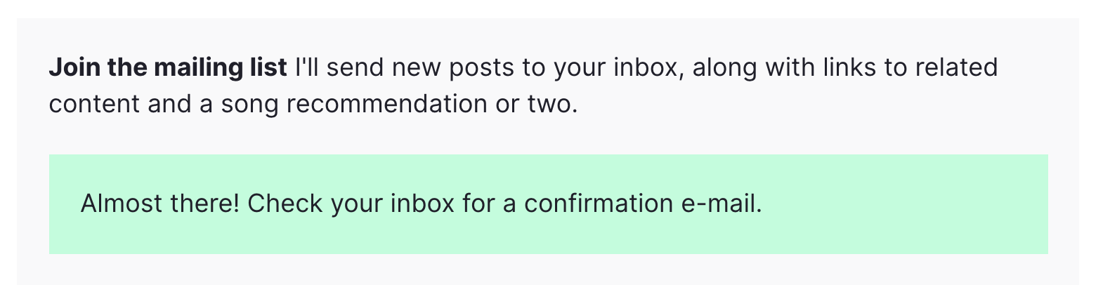
One neat feature of Netlify Forms is the ability to automatically redirect users to a “thank you” page when they submit a form. But ideally, I’d like to keep my users on the page. I wrote a short function to submit the form without a redirect.
const processForm = form => {
  const data = new FormData(form)
  data.append('form-name', 'newsletter');
  fetch('/', {
    method: 'POST',
    body: data,
  })
  .then(() => {
    form.innerHTML = `<div class="form--success">Almost there! Check your inbox for a confirmation e-mail.</div>`;
  })
  .catch(error => {
    form.innerHTML = `<div class="form--error">Error: ${error}</div>`;
  })
}
When I provide the content of my email form to this function via the form value, it submits the form using JavaScript’s built-in Fetch API. If the function was successful, it shows a pleasant message to the user. If the function hits a snag, it’ll tell my users that something went wrong.
This function is called whenever a user clicks the “submit” button on the form:
const emailForm = document.querySelector('.email-form')
if (emailForm) {
  emailForm.addEventListener('submit', e => {
    e.preventDefault();
    processForm(emailForm);
  })
}
This listener progressively enhances the default behavior of the form. This means that if the user has JavaScript disabled, the form still works!
The serverless function
Now that we have a working email submission form, it’s time to do some automation with a serverless function.
The way Netlify functions work is as follows:
Write the function in a JavaScript file in your project.
Tell Netlify where to look for your function via the netlify.toml file in your project.
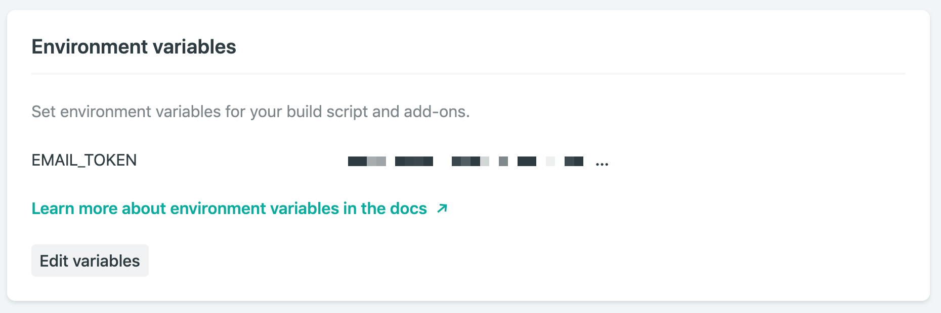
Add any environment variables you’ll need via Netlify’s admin interface. An environment variable is something like an API key that you need to keep secret.
That’s it! The next time you deploy your site, the function will be ready to go.
The function for my site is going to be in the functions folder, so I have the following in my netlify.toml file:
[build]
  base = "."
  functions = "./functions"
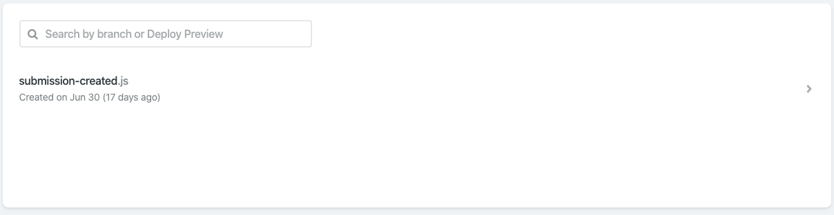
Then, I’ll add a file in the functions folder called submission-created.js. It’s important to name the file submission-created so that Netlify knows to run it every time a new form submission occurs. A full list of events you can script against can be found in Netlify’s documentation. If you’ve correctly named and configured your function, you should see it on Netlify’s Functions dashboard:
Netlify’s Functions dashboard shows I’ve correctly configured my submission-created function
The content in submission-created.js looks like this:
Line 1 includes a library called dotenv. This will help me use environment variables. Environment variables are useful to hold information that I don’t want to make public, like an API key. If I’m running my project locally, I set my environment variables with a .env file in the repo, and make sure it’s listed my .gitignore file. In order to deploy on Netlify, I also set up environment variables in Netlify’s web interface.
On line 2, I add a small library called node-fetch. This allows me to use Javascript’s Fetch API in node, which is how we’ll send data to Buttondown. Netlify automatically includes this dependency, as long as it’s listed in my project’s package.json file.
On line 3, I import my API key from the environment variables object, process.env.
Line 4 is where the function is defined. The exports.handler value is where Netlify expects to find our function, so we define it there. The only input we’ll need is the event value, which will contain all of the data from the form submission.
After retrieving the email address from the event value using JSON.parse, I’m ready to send it off to Buttondown. Here’s where I use the node-fetch library I imported earlier: I send a POST request to https://api.buttondown.email/v1/subscribers, including my API key in the header. Buttondown’s API doesn’t have many features, so it doesn’t take long to read through the documentation if you’d like to learn more.
The body of my POST request consists of the email address we retrieved.
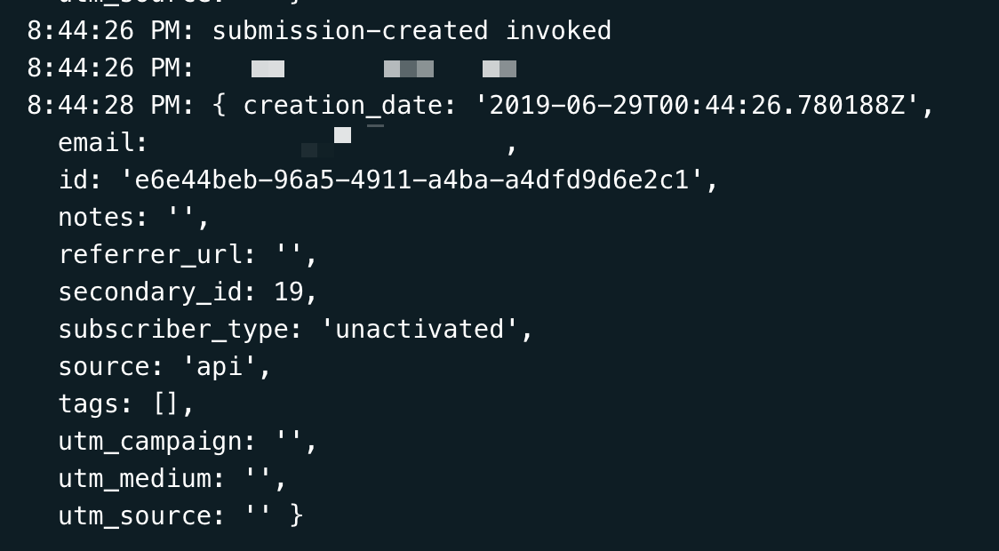
Then (using the neat .then() syntax), I collect the response from Buttondown’s server. I do this so I can diagnose any issues that are happening with the process — Netlify makes it easy to check your function’s logs, so use console.log often!
Deploying the function
Now that I’ve written my function, configured my netlify.toml file, and added my environment variables, everything is ready to go. Deploying is painless: just set up Netlify’s GitHub integration, and your function will be deployed when your project is pushed.
Netlify projects can also be tested locally using Netlify Dev. Depending on the complexity of your code, it can be faster to develop locally: just run npm i netlify -g, then netlify dev. Netlify Dev will use the netlify.toml file to configure and run the project locally, including any serverless functions. Neat, right? One caveat: Netlify Dev currently can’t trigger serverless functions on form submissions, so you’ll have to test that using preview builds.
An idea for the future
Buttondown’s API has a few possible responses when I submit a new email. For instance, if a user submits an email that’s already subscribed to the list, I’d love to be able to tell them as soon as they submit the form.
Conclusion
All in all, I only had to write about 50 lines of code to have a functional email newsletter sign-up form available on my website. I wrote it all in HTML, CSS, and JavaScript, without having to fret with the server side of the equation. The form handles spam, and my readers get a nice experience whether they have JavaScript enabled or not.
Tired of PowerPoint? Don’t worry—you can create great presentations using a free, open-source application: OnlyOffice. Discover how to get the most out of it in our new course, Up and Running With OnlyOffice Presentations.
What You’ll Learn
You can use OnlyOffice online, on every desktop and mobile operating system, self-hosted, or hosted via a cloud service. It supports PPTX, PPT, and ODP file formats, and on top of that it’s open source and can be used completely free of charge on the desktop or when self-hosted.
In this course, instructor Kezz Bracey will tell you everything you need to know to start creating awesome presentations in OnlyOffice.
Here are some free lessons from this course, as a preview of what you can expect:
Interface Overview
This video will give you a quick overview of the OnlyOffice Presentations interface and its key components.
Working With Text in OnlyOffice
In this video, you’ll see how to add text and control its layout and basic styling attributes. You’ll also learn how to work with text boxes and handle some extras, like adding special characters and formatting code examples.
Themes and Colour Schemes
OnlyOffice uses a system of themes and premade color schemes that control how things like new slides, charts, shapes and text look throughout your presentation. Discover how you can use these systems in this video.
Take the Course
You can take our new course straight away with a subscription to Envato Elements. For a single low monthly fee, you get access not only to this course, but also to our growing library of over 1,250 video courses and industry-leading eBooks on Envato Tuts+.
Plus you can download unlimited items from the huge Envato Elements library of more than 1.3 million creative assets. Create with unique fonts, photos, graphics and templates, and deliver better projects faster.
Tired of PowerPoint? Don’t worry—you can create great presentations using a free, open-source application: OnlyOffice. Discover how to get the most out of it in our new course, Up and Running With OnlyOffice Presentations.
What You’ll Learn
You can use OnlyOffice online, on every desktop and mobile operating system, self-hosted, or hosted via a cloud service. It supports PPTX, PPT, and ODP file formats, and on top of that it’s open source and can be used completely free of charge on the desktop or when self-hosted.
In this course, instructor Kezz Bracey will tell you everything you need to know to start creating awesome presentations in OnlyOffice.
Here are some free lessons from this course, as a preview of what you can expect:
Interface Overview
This video will give you a quick overview of the OnlyOffice Presentations interface and its key components.
Working With Text in OnlyOffice
In this video, you’ll see how to add text and control its layout and basic styling attributes. You’ll also learn how to work with text boxes and handle some extras, like adding special characters and formatting code examples.
Themes and Colour Schemes
OnlyOffice uses a system of themes and premade color schemes that control how things like new slides, charts, shapes and text look throughout your presentation. Discover how you can use these systems in this video.
Take the Course
You can take our new course straight away with a subscription to Envato Elements. For a single low monthly fee, you get access not only to this course, but also to our growing library of over 1,250 video courses and industry-leading eBooks on Envato Tuts+.
Plus you can download unlimited items from the huge Envato Elements library of more than 1.3 million creative assets. Create with unique fonts, photos, graphics and templates, and deliver better projects faster.
Agregator najlepszych postów o designie, webdesignie, cssie i Internecie