As designers, we are bound to work with large files. If you work with Photoshop and create a bit complex compositions, it’s very possible to create files that are over 1 GB. When working with clients, it can be difficult to send these files.
Surge Send solves this problem in a brilliant way. The platform makes file transfer easy, fast, instant, and secure. It was designed specifically for the needs of creative people, such as photographers, designers, or architects.
No matter where you are and the quality of your internet connect, Surge Send lets you send your designs, photographs, videos, or pretty much anything, without a problem. The interface is extremely user-friendly, with several great features you should check out.
How Surge Send Works
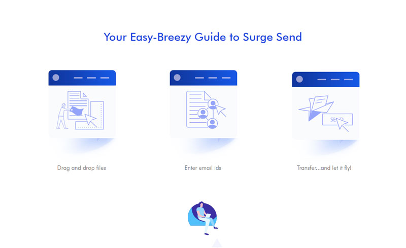
The best proof that Surge Send is easy to use is the image below and the fact it takes only a small paragraph to describe how to use it. Drag-and-drop your files, enter your email ID, and click on a button to send. It’s just as easy as that!
Pause Uploads for a Better Workflow
Stop worrying about your internet connection or upload failure in general. Surge Send gives you the chance to pause your upload at any time and resumes once your connectivity is back to normal. This is especially useful when you are in the middle of a 30 GB file upload and Skype starts ringing. In that case, all you need to do it to pause the upload in a matter of seconds, then you can pick up your call.
Track Downloads for Peace of Mind
If you track whether your emails have been opened or not, you already know how useful it is to be notified of the reception of information you send. With Surge Send, you can do the same with the files you send, thanks to an ingenuous alert system that will email you every time a file is downloaded by a recipient.
A Highly-secured Service
All files sent with Surge Send are encrypted with 256-bit federal level encryption. If that’s not enough for you, you can add a password for it to make sure that only the people with the code will be able to download it. With Surge Send, security is not optional, but it’s a core feature.
Transfer Files on the Go
This feature is something I could have used so often. Do you need to go out in the middle of a file upload? Just pause it and switch to a new device, then you can resume the upload from the new device, not need to lose the precious minutes already spent on that upload.
Share your Files Publicly with Surge Access
As a designer, you can be interested in have a reliable way to share large files for public download. For example, if you create a great resource that is packed in a 6 GB zipped folder, you will want to share it elsewhere than on your own web server (if you have one).
To do so, you just need to upload your files to Surge Send and choose the public option. You will then be able to obtain a share link that you can send in any way you want. Of course, you can always choose to keep your download links private.
Super Surge Will Ensure Faster and Guaranteed Downloads
If downloads of very large files are failing, you can turn on Super Surge, an option that uses the power of P2P to guarantee fast delivery.
Go Pro for an Even Better Experience!
Although Surge Send is already an excellent service with the free plan, it’s possible to make it even better by going premium with Surge Pro. Thanks to the team at Surge Pro, Designer Daily’s readers can get one month free by signing up using this link.
This way, you will enjoy more space for your uploads, the ability to send larger files, the possibility to keep files indefinitely, access to transfers history, or the possibility to schedule the expiry date of link, among other things.
There’s no question that a drag-and-drop editor
makes building websites easy, but its only as good as the design elements it can
access. The Visual Composer Website Builder, working in combination with the
Visual Composer Hub and its massive library of content elements, templates,
blocks, and stock images, makes building a website as fast and easy as can be.
With the Hub, you don’t have to settle for what’s
there, since each of the content elements, blocks, and templates is easily
personalized, so you’ll always get precisely what you want and need.
There’s more to the Visual Composer Hub than
first meets the eye.
That said, let’s take a look at how it works
and what’s inside.
What is the Visual Composer Hub and What’s Inside?
The Visual Composer
Hub is a cloud-based marketplace of web design elements and features. It
connects to your Visual Composer account and alleviates the problem web
designers often have of having to rely on plugins or custom code to achieve the
results they want.
Once downloaded, the selected element will be
in your account and ready to drag, drop, and put to use.
The Visual Composer Hub Library
The Visual Composer Hub’s library of content is
massive and diverse. The content can be used with any theme, including themes
you already have or are using. You can always view all the content in the
forever-free Visual Composer Hub although you need to unlock Visual Composer
Premium for full access and unlimited downloads.
What’s Inside the Visual Composer Hub?
There’s really no other solution like it for access to virtually
unlimited website content and easy content downloads; whether you need –
Content Elements
Page Templates
Block Templates
Stock Images
Or, all the above.
Let’s examine each in
detail.
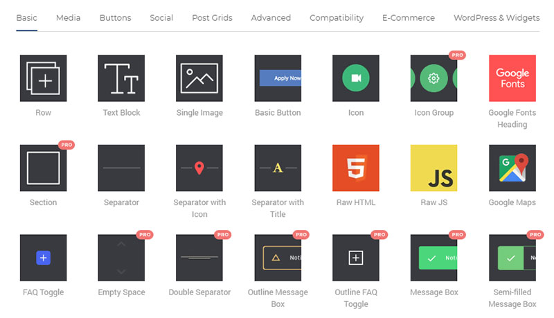
1. Content Elements
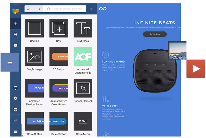
Simpler and slicker than ever best describes searching and downloading the Hub’s first-class content elements from its huge library. With Visual Composer Premium you can have an unlimited number of downloads.
These Hub Content Elements,
which are constantly being updated consist of:
Media
Social
Post Grids
Buttons
Compatibility elements that
can be integrated with MailChimp, Ninja Forms, Envira Gallery and more.
Advanced Elements that include
hover boxes, logo sliders, tabs and more.
and, an E-Commerce Plug
With these easily accessed elements you can
forget about any need for coding while building your site.
Furthermore –
You can edit any element. Multiple edit options are available for each
element. The edit feature even includes Element CSS Animations you can use
right out of the box to create beautiful and amazing transitions.
You can easily replace elements and also switch between them. The Smart
Replace options enables you to change the look of your content easily and in an
instant.
There are several advanced features you can use; some of which are only
available to Visual Composer Premium users. You can create content types that
allow you to organize elements and create element hierarchies. Turbo-powered
editing flexibility is another feature as is the ability to leave notes to team
members.
If you’re really interested in gaining access to all the designer content elements, take a look at what having a Visual Composer Hub Premium account will do for you.
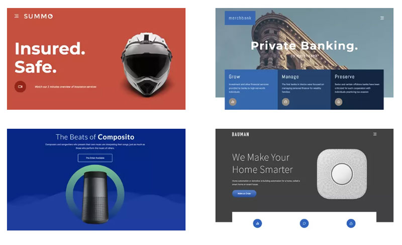
2. WordPress Templates
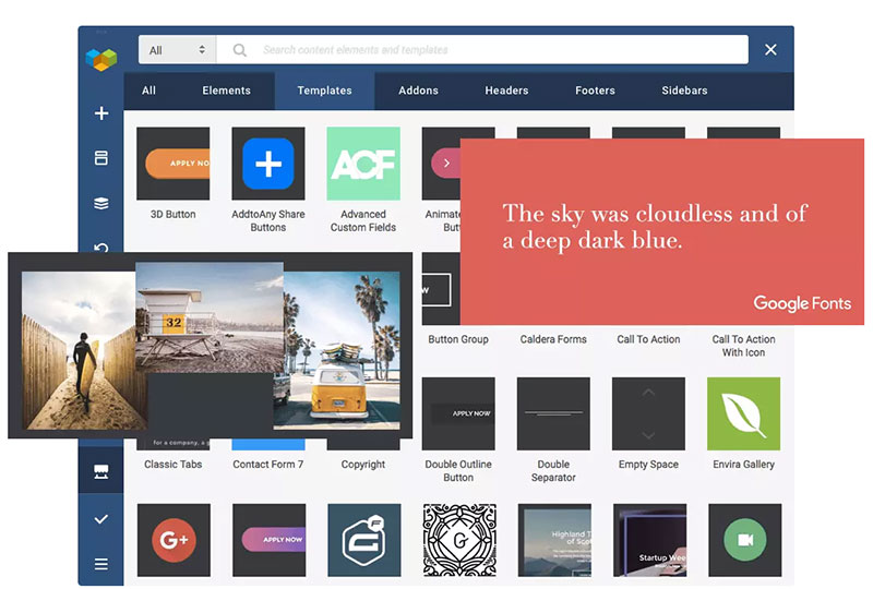
Page templates make up an important part of the Visual Composer Hub Library. Here, you’ll find templates for any theme; and those you find will be fully editable. It’s simply a matter of searching for a template that fits your website look and feel. Having found what you want, simply click download to add it to your account. Adjust it to satisfy your needs and you’ll have a beautiful page in no time at all.
Any template you use or modify can be automatically
stored in the library. You can also store any page you create to be used in the
future as a template, export and import templates, add global templates, and
even add and store template widgets.
Given what’s already in the library, and having
the ability to store pages, other templates, or templates you’ve customized
means you don’t have to be a web designer to create awesome pages; you have
drag and drop and a cloud base solution consisting og a unique library of
designer templates to work with.
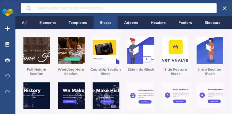
3. Block Templates
With a huge arsenal of content elements and
templates at the ready, you’re set to turn out one stunning website after
another; each one faster and easier than the others.
Yet, something is missing. Something that
combines the flexibility an array of content elements provides with the speed
and simplicity templates offer. Something making up the middle ground, the
designer’s “sweet spot”.
Block Templates represent the Goldilocks standard for the combination of custom design and easy drag-and-drop functionality. Simply put, they can make your work as a designer oh-so-much easier.
A Visual Composer Premium subscription allows
you to unlock Block Templates; giving you the ability to build pages in
sections. It doesn’t get much better.
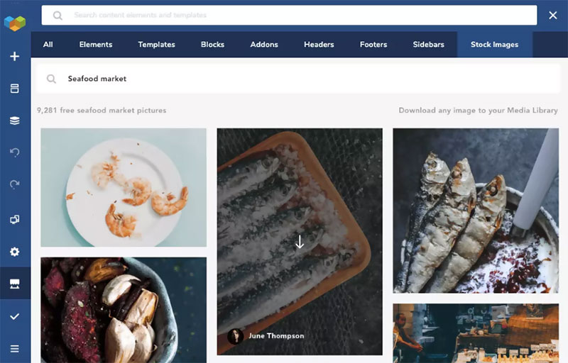
4. Stock Images
You’re good to go, except for one thing. If
you’re going to build stunning websites, you’re going to need some good
imagery. The Visual Composer Hub solution to that problem lies in its seamless
integration with Unsplash stock photography.
Find a high-quality stock photo to your liking? Simply download it from your Visual Composer Website Builder’s Frontend editor and it’s ready to use. It just doesn’t get any easier.
If you find an especially appealing image, and
you’d like to see or use more of the same, simply hover over an image, click on
the name of the author, and you’ll be able to download other works by that
author to give your website a more unified look and feel.
Conclusion
It’s indeed true that a drag-and-drop visual website editor
isn’t enough to get the job done. It takes a library of content elements,
templates and stock photography to make web design possible, and truly simple
at the same time.
You now know the basics of what you’ll find in the Visual
Composer Hub. When we said the library is massive, we meant it. What we
didn’t mention were add-ons and other premium hub elements you can also check out.
There’s no question that a drag-and-drop editor
makes building websites easy, but its only as good as the design elements it can
access. The Visual Composer Website Builder, working in combination with the
Visual Composer Hub and its massive library of content elements, templates,
blocks, and stock images, makes building a website as fast and easy as can be.
With the Hub, you don’t have to settle for what’s
there, since each of the content elements, blocks, and templates is easily
personalized, so you’ll always get precisely what you want and need.
There’s more to the Visual Composer Hub than
first meets the eye.
That said, let’s take a look at how it works
and what’s inside.
What is the Visual Composer Hub and What’s Inside?
The Visual Composer
Hub is a cloud-based marketplace of web design elements and features. It
connects to your Visual Composer account and alleviates the problem web
designers often have of having to rely on plugins or custom code to achieve the
results they want.
Once downloaded, the selected element will be
in your account and ready to drag, drop, and put to use.
The Visual Composer Hub Library
The Visual Composer Hub’s library of content is
massive and diverse. The content can be used with any theme, including themes
you already have or are using. You can always view all the content in the
forever-free Visual Composer Hub although you need to unlock Visual Composer
Premium for full access and unlimited downloads.
What’s Inside the Visual Composer Hub?
There’s really no other solution like it for access to virtually
unlimited website content and easy content downloads; whether you need –
Content Elements
Page Templates
Block Templates
Stock Images
Or, all the above.
Let’s examine each in
detail.
1. Content Elements
Simpler and slicker than ever best describes searching and downloading the Hub’s first-class content elements from its huge library. With Visual Composer Premium you can have an unlimited number of downloads.
These Hub Content Elements,
which are constantly being updated consist of:
Media
Social
Post Grids
Buttons
Compatibility elements that
can be integrated with MailChimp, Ninja Forms, Envira Gallery and more.
Advanced Elements that include
hover boxes, logo sliders, tabs and more.
and, an E-Commerce Plug
With these easily accessed elements you can
forget about any need for coding while building your site.
Furthermore –
You can edit any element. Multiple edit options are available for each
element. The edit feature even includes Element CSS Animations you can use
right out of the box to create beautiful and amazing transitions.
You can easily replace elements and also switch between them. The Smart
Replace options enables you to change the look of your content easily and in an
instant.
There are several advanced features you can use; some of which are only
available to Visual Composer Premium users. You can create content types that
allow you to organize elements and create element hierarchies. Turbo-powered
editing flexibility is another feature as is the ability to leave notes to team
members.
If you’re really interested in gaining access to all the designer content elements, take a look at what having a Visual Composer Hub Premium account will do for you.
2. WordPress Templates
Page templates make up an important part of the Visual Composer Hub Library. Here, you’ll find templates for any theme; and those you find will be fully editable. It’s simply a matter of searching for a template that fits your website look and feel. Having found what you want, simply click download to add it to your account. Adjust it to satisfy your needs and you’ll have a beautiful page in no time at all.
Any template you use or modify can be automatically
stored in the library. You can also store any page you create to be used in the
future as a template, export and import templates, add global templates, and
even add and store template widgets.
Given what’s already in the library, and having
the ability to store pages, other templates, or templates you’ve customized
means you don’t have to be a web designer to create awesome pages; you have
drag and drop and a cloud base solution consisting og a unique library of
designer templates to work with.
3. Block Templates
With a huge arsenal of content elements and
templates at the ready, you’re set to turn out one stunning website after
another; each one faster and easier than the others.
Yet, something is missing. Something that
combines the flexibility an array of content elements provides with the speed
and simplicity templates offer. Something making up the middle ground, the
designer’s “sweet spot”.
Block Templates represent the Goldilocks standard for the combination of custom design and easy drag-and-drop functionality. Simply put, they can make your work as a designer oh-so-much easier.
A Visual Composer Premium subscription allows
you to unlock Block Templates; giving you the ability to build pages in
sections. It doesn’t get much better.
4. Stock Images
You’re good to go, except for one thing. If
you’re going to build stunning websites, you’re going to need some good
imagery. The Visual Composer Hub solution to that problem lies in its seamless
integration with Unsplash stock photography.
Find a high-quality stock photo to your liking? Simply download it from your Visual Composer Website Builder’s Frontend editor and it’s ready to use. It just doesn’t get any easier.
If you find an especially appealing image, and
you’d like to see or use more of the same, simply hover over an image, click on
the name of the author, and you’ll be able to download other works by that
author to give your website a more unified look and feel.
Conclusion
It’s indeed true that a drag-and-drop visual website editor
isn’t enough to get the job done. It takes a library of content elements,
templates and stock photography to make web design possible, and truly simple
at the same time.
You now know the basics of what you’ll find in the Visual
Composer Hub. When we said the library is massive, we meant it. What we
didn’t mention were add-ons and other premium hub elements you can also check out.
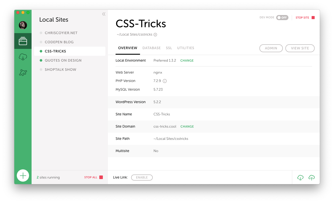
I first heard of Flywheel through their product Local, which is a native app for working on WordPress sites. If you ask around for what people use for that kind of work, you’ll get all sorts of answers, but an awful lot of very strong recommendations for Local. I’ve become one of them! We ultimately did a sponsored post for Local, but that’s based on the fact that now 100% of my local WordPress development work is done using it and I’m very happy with it.
Now I’ve taken the next step and moved all my production sites to Flywheel hosting!
Full disclosure here, Flywheel is now a sponsor of CSS-Tricks. I’ve been wanting to work with them for a while. I’ve been out to visit them in Omaha! (👋 at Jamie, Christi, Karissa, and everybody I’ve worked with over there.) Part of our deal includes the hosting. But I was a paying customer and user of Flywheel before this on some sites, and my good experiences there are what made me want to get this sponsorship partnership cooking! There has been big recent news that Flywheel was acquired by WP Engine. I’m also a fan of WP Engine, being also a premium WordPress host that has done innovative things with hosting, so I’m optimistic that a real WordPress hosting powerhouse is being formed and I’ve got my sites in the right place.
Developing on Local is a breeze
It feels like a breath of fresh air to me, as running all the dev dependencies for WordPress has forever been a bit of a pain in the butt. Sometimes you have it going fine, but then something breaks in the most inscrutable possible way and it takes forever to get going again. Whatever, you know what I mean. At this point, I’ve been running Local for over a year and have had almost no issues with it.
There are all kinds of features worth checking out here. Here’s one that is very likely useful to bigger teams. Say you have a Flywheel account with a bunch of production sites on it. Then a new person starts working with you and they have their own computer. You connect Local to Flywheel, and you can pull down the site and have it ready to work on. That’s pretty sweet.
Local doesn’t lock you into anything either. You can use Local for local development and literally use nothing else. Local can push a site up to Flywheel hosting too, which I’ve found to be mighty useful particularly for that first deployment of a new site, but you don’t have to use that if you don’t want. I’ll cover more about workflow below.
Other features that I find worthy of note:
Spinning up a new site takes just a second. A quick walkthrough through a wizard where they ask you some login details but otherwise offer smart-but-customizable defaults.
Dealing with HTTPS locally is easy. It will create a certificate for you and trust it locally with one click.
You can flip on „Live Link”, which uses ngrok to create a live, sharable URL to your localhost site. Great for temporarily showing a client or co-worker something without having to move anything.
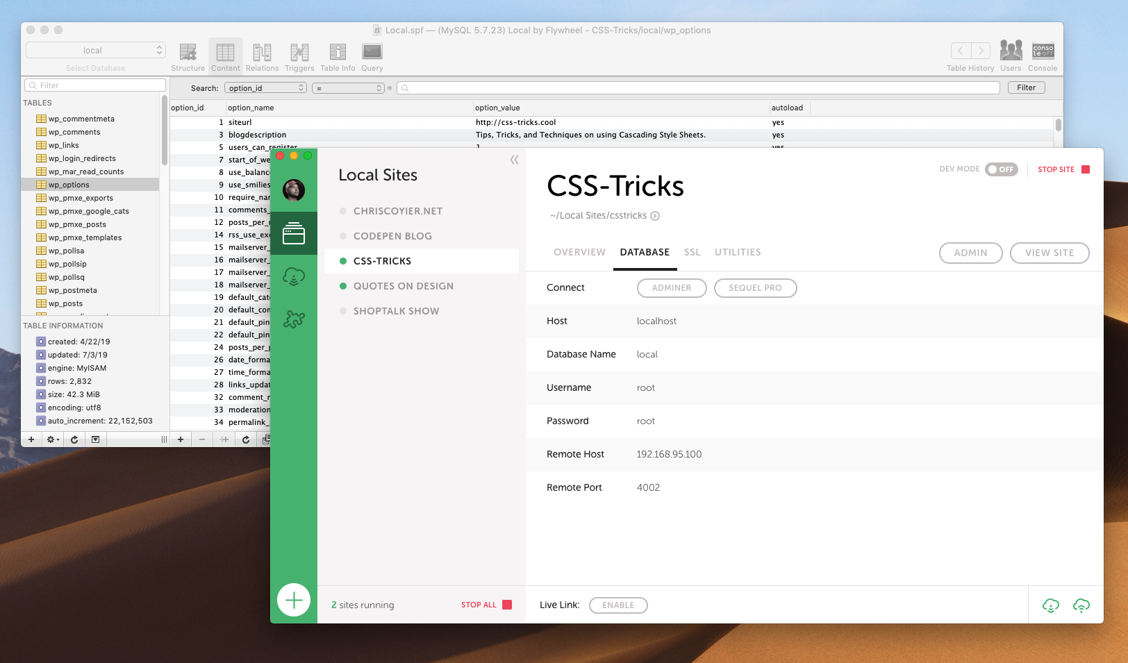
One click to pop open the database in Sequel Pro, my favorite free database tool. Much easier than trying to spin up phpMyAdmin or whatever on the web to manage from there.
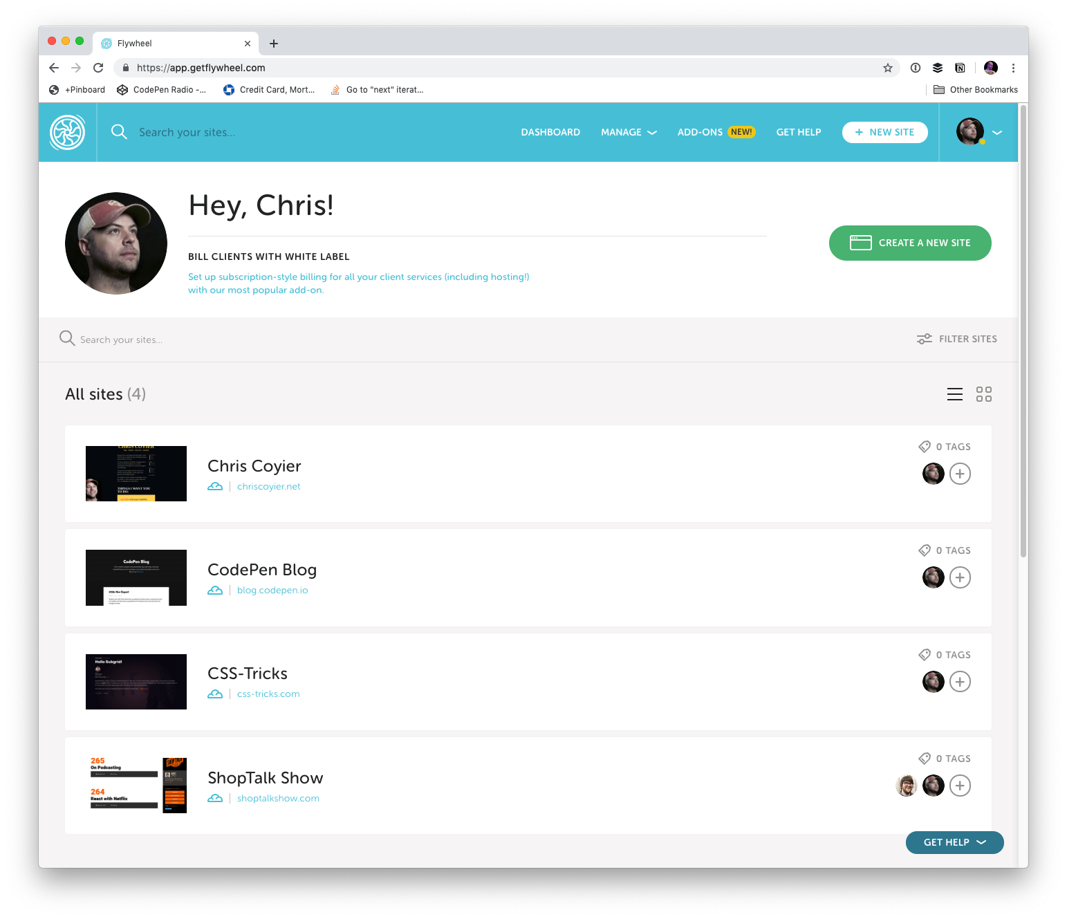
Flywheel’s Dashboard is so clear
I love the simple UI of Local, and I really like how that same design and spirit carries over into the Flywheel hosting dashboard.
There are so many things the dashboard makes easy:
You need an SSL cert? Click some buttons.
Wanna force HTTPS? Flip a switch.
Wanna convert the site to Multisite? Hit a button.
Need to edit the database? There is a UI around it built in.
Want a CDN? Toggle a thing.
Need to invite a collaborator on a site? Go for it.
Need a backup? There are in there, download it or restore to that point.
It’s a big deal when everything is simple and works. It means you aren’t burning hours fighting with tools and you can use them doing work that pushes you forward.
Workflow
When I set up my new CSS-Tricks workflow, I had Flywheel move the site for me (thanks gang!) (no special treatment either, they’ll do that for anybody).
I’ve got Local already, so my local development process is the same. But I needed to update my deployment workflow for the new hosting. Local can push a site up to Flywheel hosting, but it just zips everything up and sends it all up. Great for first deployment but not perfect for tiny little changes like 95% of the work I do. There is a new Local for Teams feature, which uses what they call MagicSync for deployment, which only deploys changed files. That’s very cool, but I like working with a Git-based system, where ultimately merges to master are what trigger deployment of the changed files.
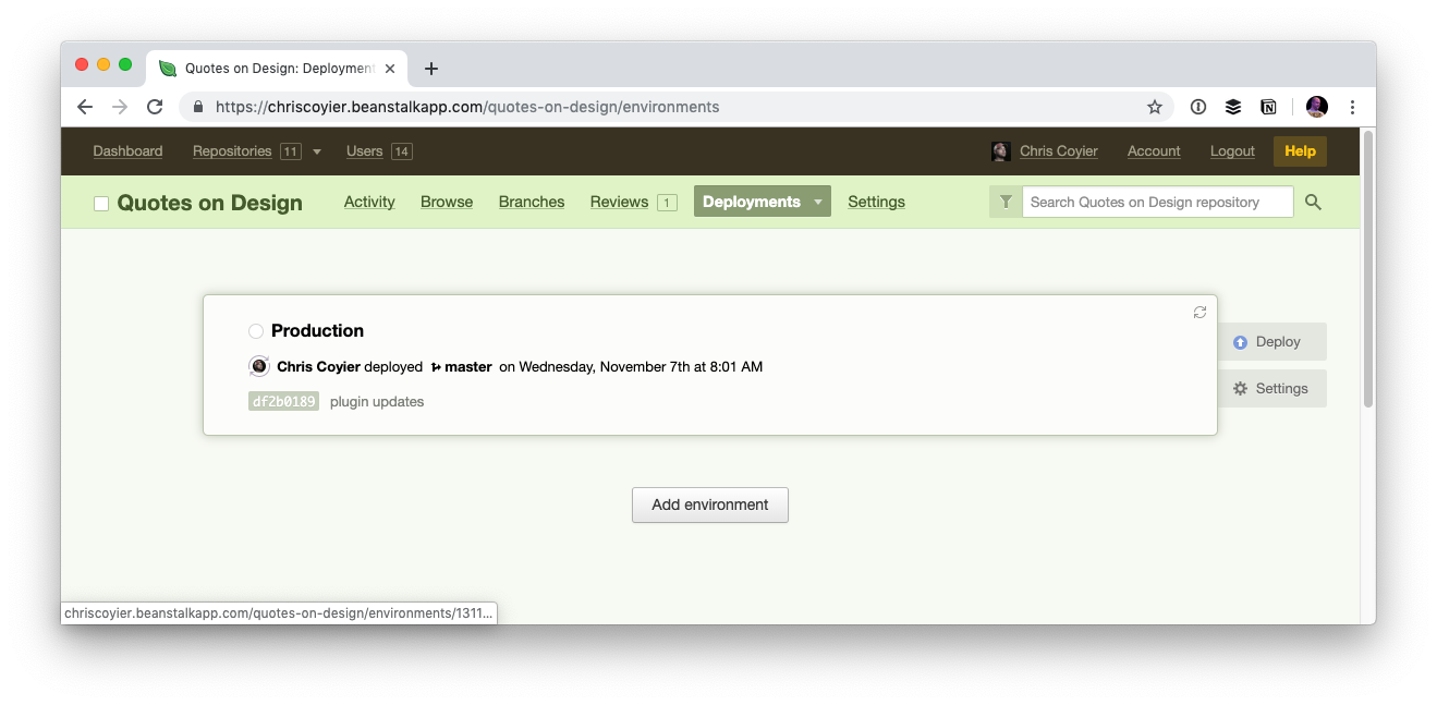
For years I’ve used Beanstalk for Git-based deployment over SFTP. I still am using Beanstalk for many sites and think it’s a great choice, but Beanstalk has the limitation that the Git-repo is basically a private Git repo hosted by Beanstalk itself.
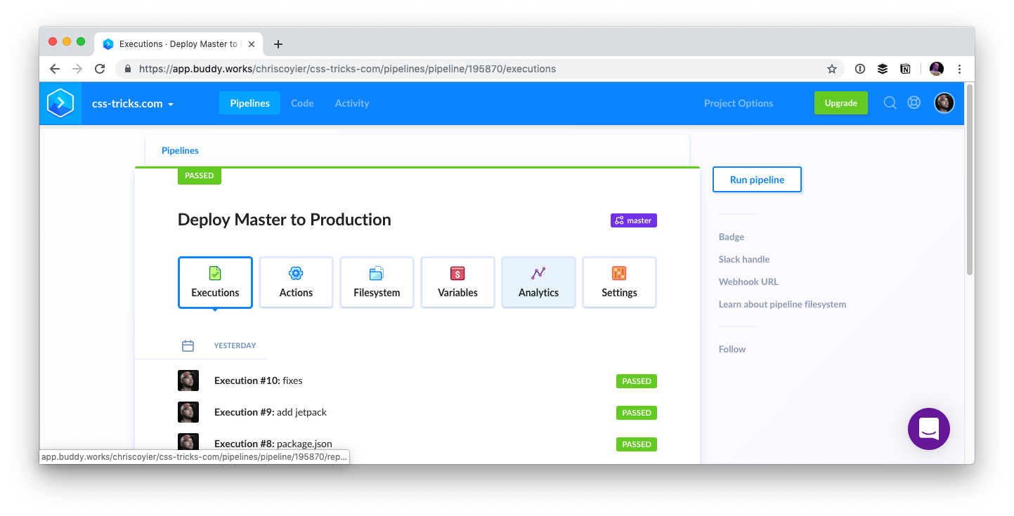
During this change, I needed to switch up what the root of the repo is (more on that in a second) so I wanted to create a new repo. I figured rather than doing that on Beanstalk, I’d make a private GitHub repo and set up deployment from there. There are services like DeployHQ and DeployBot that will work well for that, but I went with Buddy, which has a really really nice UI for managing all this stuff, and is capable of much more than just deployment should I ultimately need that.
Regarding the repo itself, one thing that I’ve always done with my WordPress sites is just make the repo the whole damn thing starting at the root. I think it’s just a legacy/comfort thing. I had some files at the root I wanted to deploy along with everything else and that seemed like the easiest way. In WordPress-land, this isn’t usually how it’s done. It’s more common to have the /wp-content/ folder be the root of the repo, as those are essentially the only files unique to your installation. I can imagine setups where even down to individual themes are repos and deployed alone.
I figured I’d get on board with a more scoped deployment, but also, I didn’t have much of a choice. Flywheel literally locks down all WordPress core files, so if your deployment system tries to override them, it will just fail. That actually sounds great to me. There is no reason anyone from the outside should alter those files, might as well totally remove it as an attack vector. Flywheel itself keeps the WordPress version up to date. So I made a new repo with /wp-content/ at the root, and I figured I’d make it on GitHub instead just because that’s such an obvious hub of developer activity and keeps my options wide open for deployment choices.
Maybe I’ll open source it all one day when I’ve had a chance to comb through it.
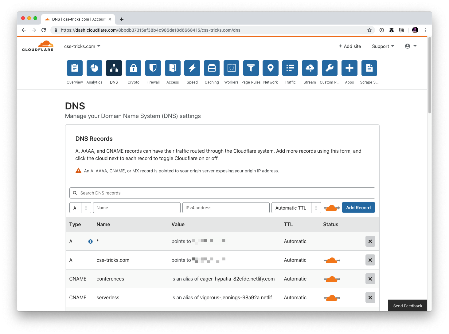
For the same kind of spiritual reasons, during the the move, I moved the DNS over to Cloudflare. This gives me control over DNS from a third-party so it’s easy for me to point things where I need them. Kind of a decentralization of concerns. That’s not for everyone, but it’s great for me on this project. While now I might suffer from Cloudflare outages (rare, but it literally just happened), I benefit from all sorts of additional security and performance that Cloudflare can provide.
So the workflow is Local > GitHub > Buddy > Flywheel.
And the hosting is Cloudflare > Flywheel with image assets on Cloudinary.
And I’ve got backups from both Flywheel and Jetpack/VaultPress.
In the world of likes and social statistics, reviews are very important method for leaving feedback. Users often like to know the opinions of others before deciding on items to purchase themselves, or even articles to read, movies to see, or restaurants to dine.
Developers often struggle with with reviews — it is common to see inaccessible and over-complicated implementations. Hey, CSS-Tricks has a snippet for one that’s now bordering on a decade.
Let’s walk through new, accessible and maintainable approaches for this classic design pattern. Our goal will be to define the requirements and then take a journey on the thought-process and considerations for how to implement them.
Scoping the work
Did you know that using stars as a rating dates all the way back to 1844 when they were first used to rate restaurants in Murray’s Handbooks for Travellers — and later popularized by Michelin Guides in 1931 as a three-star system? There’s a lot of history there, so no wonder it’s something we’re used to seeing!
There are a couple of good reasons why they’ve stood the test of time:
Clear visuals (in the form of five hollow or filled stars in a row)
A straightforward label (that provides an accessible description, like aria-label)
When we implement it on the web, it is important that we focus meeting both of those outcomes.
It is also important to implement features like this in the most versatile way possible. That means we should reach for HTML and CSS as much as possible and try to avoid JavaScript where we can. And that’s because:
JavaScript solutions will always differ per framework. Patterns that are typical in vanilla JavaScript might be anti-patterns in frameworks (e.g. React prohibits direct document manipulation).
Languages like JavaScript evolve fast, which is great for community, but not so great articles like this. We want a solution that’s maintainable and relevant for the long haul, so we should base our decisions on consistent, stable tooling.
Methods for creating the visuals
One of the many wonderful things about CSS is that there are often many ways to write the same thing. Well, the same thing goes for how we can tackle drawing stars. There are five options that I see:
Which one to choose? It depends. Let’s check them all out.
Method 1: Using an image file
Using images means creating elements — at least 5 of them to be exact. Even if we’re calling the same image file for each star in a five-star rating, that’s five total requests. What are the consequences of that?
More DOM nodes make document structure more complex, which could cause a slower page paint. The elements themselves need to render as well, which means either the server response time (if SSR) or the main thread generation (if we’re working in a SPA) has to increase. That doesn’t even account for the rendering logic that has to be implemented.
It does not handle fractional ratings, say 2.3 stars out of 5. That would require a second group of duplicated elements masked with clip-path on top of them. This increases the document’s complexity by a minimum of seven more DOM nodes, and potentially tens of additional CSS property declarations.
Optimized performance ought to consider how images are loaded and implementing something like lazy-loading) for off-screen images becomes increasingly harder when repeated elements like this are added to the mix.
It makes a request, which means that caching TTLs should be configured in order to achieve an instantaneous second image load. However, even if this is configured correctly, the first load will still suffer because TTFB awaits from the server. Prefetch, pre-connect techniques or the service-worker should be considered in order to optimize the first load of the image.
It creates minimum of five non-meaningful elements for a screen reader. As we discussed earlier, the label is more important than the image itself. There is no reason to leave them in the DOM because they add no meaning to the rating — they are just a common visual.
The images might be a part of manageable media, which means content managers will be able to change the star appearance at any time, even if it’s incorrect.
It allows for a versatile appearance of the star, however the active state might only be similar to the initial state. It’s not possible to change the image src attribute without JavaScript and that’s something we’re trying to avoid.
Wondering how the HTML structure might look? Probably something like this:
<div class="Rating" aria-label="Rating of this item is 3 out of 5">
  <img src="/static/assets/star.png" class="Rating--Star Rating--Star__active">
  <img src="/static/assets/star.png" class="Rating--Star Rating--Star__active">
  <img src="/static/assets/star.png" class="Rating--Star Rating--Star__active">
  <img src="/static/assets/star.png" class="Rating--Star">
  <img src="/static/assets/star.png" class="Rating--Star">
</div>
In order to change the appearance of those stars, we can use multiple CSS properties. For example:
.Rating--Star {
  filter: grayscale(100%); // maybe we want stars to become grey if inactive
  opacity: .3; // maybe we want stars to become opaque
}
An additional benefit of this method is that the <img> element is set to inline-block by default, so it takes a little bit less styling to position them in a single line.
This was once a fairly common implementation. That said, it still has its pros and cons.
For example:
Sure, it’s only a single server request which alleviates a lot of caching needs. At the same time, we now have to wait for three additional events before displaying the stars: That would be (1) the CSS to download, (2) the CSSOM to parse, and (3) the image itself to download.
It’s super easy to change the state of a star from empty to filled since all we’re really doing is changing the position of a background image. However, having to crack open an image editor and re-upload the file anytime a change is needed in the actual appearance of the stars is not the most ideal thing as far as maintenance goes.
We can use CSS properties like background-repeat property and clip-path to reduce the number of DOM nodes. We could, in a sense, use a single element to make this work. On the other hand, it’s not great that we don’t technically have good accessible markup to identify the images to screen readers and have the stars be recognized as inputs. Well, not easily.
In my opinion, background images are probably best used complex star appearances where neither CSS not SVG suffice to get the exact styling down. Otherwise, using background images still presents a lot of compromises.
SVG is great! It has a lot of the same custom drawing benefits as raster images but doesn’t require a server call if it’s inlined because, well, it’s simply code!
We could inline five stars into HTML, but we can do better than that, right? Chris has shown us a nice approach that allows us to provide the SVG markup for a single shape as a <symbol> and call it multiple times with with <use>.
<!-- Draw the star as a symbol and remove it from view -->
<svg xmlns="http://www.w3.org/2000/svg" style="display: none;">
  <symbol id="star" viewBox="214.7 0 182.6 792">
    <!-- <path>s and whatever other shapes in here -->
  </symbol>
</svg>

<!-- Then use anywhere and as many times as we want! -->
<svg class="icon">
  <use xlink:href="#star" />
</svg>

<svg class="icon">
  <use xlink:href="#star" />
</svg>

<svg class="icon">
  <use xlink:href="#star" />
</svg>

<svg class="icon">
  <use xlink:href="#star" />
</svg>

<svg class="icon">
  <use xlink:href="#star" />
</svg>
What are the benefits? Well, we’re talking zero requests, cleaner HTML, no worries about pixelation, and accessible attributes right out of the box. Plus, we’ve got the flexibility to use the stars anywhere and the scale to use them as many times as we want with no additional penalties on performance. Score!
The ultimate benefit is that this doesn’t require additional overhead, either. For example, we don’t need a build process to make this happen and there’s no reliance on additional image editing software to make further changes down the road (though, let’s be honest, it does help).
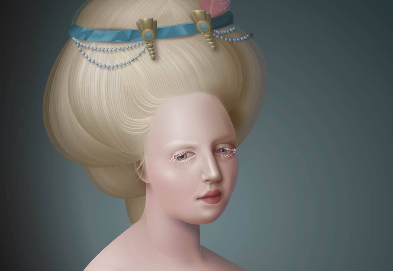
This method is very similar to background-image method, though improves on it by optimizing drawing the shape with CSS properties rather than making a call for an image. We might think of CSS as styling elements with borders, fonts and other stuff, but it’s capable of producing ome pretty complex artwork as well. Just look at Diana Smith’s now-famous “Francine” portrait.
Francine, a CSS replica of an oil painting done in CSS by Diana Smith (Source)
We’re not going to get that crazy, but you can see where we’re going with this. In fact, there’s already a nice demo of a CSS star shape right here on CSS-Tricks.
Or, hey, we can get a little more crafty by using the clip-path property to draw a five-point polygon. Even less CSS! But, buyer beware, because your cross-browser support mileage may vary.
This method is very nice, but very limited in terms of appearance. Why? Because the appearance of the star is set in stone as a Unicode character. But, hey, there are variations for a filled star (★) and an empty star (☆) which is exactly what we need!
Unicode characters are something you can either copy and paste directly into the HTML:
We can use font, color, width, height, and other properties to size and style things up a bit, but not a whole lot of flexibility here. But this is perhaps the most basic HTML approach of the bunch that it almost seems too obvious.
Instead, we can move the content into the CSS as a pseudo-element. That unleashes additional styling capabilities, including using custom properties to fill the stars fractionally:
Let’s break this last example down a bit more because it winds up taking the best benefits from other methods and splices them into a single solution with very little drawback while meeting all of our requirements.
Let’s start with HTML. there’s a single element that makes no calls to the server while maintaining accessibility:
<div class="stars" style="--rating: 2.3;" aria-label="Rating of this product is 2.3 out of 5."></div>
As you may see, the rating value is passed as an inlined custom CSS property (--rating). This means there is no additional rendering logic required, except for displaying the same rating value in the label for better accessibility.
Let’s take a look at that custom property. It’s actually a conversion from a value value to a percentage that’s handled in the CSS using the calc() function:
--percent: calc(var(--rating) / 5 * 100%);
I chose to go this route because CSS properties — like width and linear-gradient — do not accept <number> values. They accept <length> and <percentage> instead and have specific units in them, like % and px, em. Initially, the rating value is a float, which is a <number> type. Using this conversion helps ensure we can use the values in a number of ways.
Filling the stars may sound tough, but turns out to be quite simple. We need a linear-gradient background to create hard color stops where the gold-colored fill should end:
Note that I am using custom variables for colors because I want the styles to be easily adjustable. Because custom properties are inherited from the parent elements styles, you can define them once on the :root element and then override in an element wrapper. Here’s what I put in the root:
The last thing I did was clip the background to the shape of the text so that the background gradient takes the shape of the stars. Think of the Unicode stars as stencils that we use to cut out the shape of stars from the background color. Or like a cookie cutters in the shape of stars that are mashed right into the dough:
Of the five methods we covered, two are my favorites: using SVG (Method 3) and using Unicode characters in pseudo-elements (Method 5). There are definitely use cases where a background image makes a lot of sense, but that seems best evaluated case-by-case as opposed to a go-to solution.
You have to always consider all the benefits and downsides of a specific method. This is, in my opinion, is the beauty of front-end development! There are multiple ways to go, and proper experience is required to implement features efficiently.
In the world of likes and social statistics, reviews are very important method for leaving feedback. Users often like to know the opinions of others before deciding on items to purchase themselves, or even articles to read, movies to see, or restaurants to dine.
Developers often struggle with with reviews — it is common to see inaccessible and over-complicated implementations. Hey, CSS-Tricks has a snippet for one that’s now bordering on a decade.
Let’s walk through new, accessible and maintainable approaches for this classic design pattern. Our goal will be to define the requirements and then take a journey on the thought-process and considerations for how to implement them.
Scoping the work
Did you know that using stars as a rating dates all the way back to 1844 when they were first used to rate restaurants in Murray’s Handbooks for Travellers — and later popularized by Michelin Guides in 1931 as a three-star system? There’s a lot of history there, so no wonder it’s something we’re used to seeing!
There are a couple of good reasons why they’ve stood the test of time:
Clear visuals (in the form of five hollow or filled stars in a row)
A straightforward label (that provides an accessible description, like aria-label)
When we implement it on the web, it is important that we focus meeting both of those outcomes.
It is also important to implement features like this in the most versatile way possible. That means we should reach for HTML and CSS as much as possible and try to avoid JavaScript where we can. And that’s because:
JavaScript solutions will always differ per framework. Patterns that are typical in vanilla JavaScript might be anti-patterns in frameworks (e.g. React prohibits direct document manipulation).
Languages like JavaScript evolve fast, which is great for community, but not so great articles like this. We want a solution that’s maintainable and relevant for the long haul, so we should base our decisions on consistent, stable tooling.
Methods for creating the visuals
One of the many wonderful things about CSS is that there are often many ways to write the same thing. Well, the same thing goes for how we can tackle drawing stars. There are five options that I see:
Which one to choose? It depends. Let’s check them all out.
Method 1: Using an image file
Using images means creating elements — at least 5 of them to be exact. Even if we’re calling the same image file for each star in a five-star rating, that’s five total requests. What are the consequences of that?
More DOM nodes make document structure more complex, which could cause a slower page paint. The elements themselves need to render as well, which means either the server response time (if SSR) or the main thread generation (if we’re working in a SPA) has to increase. That doesn’t even account for the rendering logic that has to be implemented.
It does not handle fractional ratings, say 2.3 stars out of 5. That would require a second group of duplicated elements masked with clip-path on top of them. This increases the document’s complexity by a minimum of seven more DOM nodes, and potentially tens of additional CSS property declarations.
Optimized performance ought to consider how images are loaded and implementing something like lazy-loading) for off-screen images becomes increasingly harder when repeated elements like this are added to the mix.
It makes a request, which means that caching TTLs should be configured in order to achieve an instantaneous second image load. However, even if this is configured correctly, the first load will still suffer because TTFB awaits from the server. Prefetch, pre-connect techniques or the service-worker should be considered in order to optimize the first load of the image.
It creates minimum of five non-meaningful elements for a screen reader. As we discussed earlier, the label is more important than the image itself. There is no reason to leave them in the DOM because they add no meaning to the rating — they are just a common visual.
The images might be a part of manageable media, which means content managers will be able to change the star appearance at any time, even if it’s incorrect.
It allows for a versatile appearance of the star, however the active state might only be similar to the initial state. It’s not possible to change the image src attribute without JavaScript and that’s something we’re trying to avoid.
Wondering how the HTML structure might look? Probably something like this:
<div class="Rating" aria-label="Rating of this item is 3 out of 5">
  <img src="/static/assets/star.png" class="Rating--Star Rating--Star__active">
  <img src="/static/assets/star.png" class="Rating--Star Rating--Star__active">
  <img src="/static/assets/star.png" class="Rating--Star Rating--Star__active">
  <img src="/static/assets/star.png" class="Rating--Star">
  <img src="/static/assets/star.png" class="Rating--Star">
</div>
In order to change the appearance of those stars, we can use multiple CSS properties. For example:
.Rating--Star {
  filter: grayscale(100%); // maybe we want stars to become grey if inactive
  opacity: .3; // maybe we want stars to become opaque
}
An additional benefit of this method is that the <img> element is set to inline-block by default, so it takes a little bit less styling to position them in a single line.
This was once a fairly common implementation. That said, it still has its pros and cons.
For example:
Sure, it’s only a single server request which alleviates a lot of caching needs. At the same time, we now have to wait for three additional events before displaying the stars: That would be (1) the CSS to download, (2) the CSSOM to parse, and (3) the image itself to download.
It’s super easy to change the state of a star from empty to filled since all we’re really doing is changing the position of a background image. However, having to crack open an image editor and re-upload the file anytime a change is needed in the actual appearance of the stars is not the most ideal thing as far as maintenance goes.
We can use CSS properties like background-repeat property and clip-path to reduce the number of DOM nodes. We could, in a sense, use a single element to make this work. On the other hand, it’s not great that we don’t technically have good accessible markup to identify the images to screen readers and have the stars be recognized as inputs. Well, not easily.
In my opinion, background images are probably best used complex star appearances where neither CSS not SVG suffice to get the exact styling down. Otherwise, using background images still presents a lot of compromises.
SVG is great! It has a lot of the same custom drawing benefits as raster images but doesn’t require a server call if it’s inlined because, well, it’s simply code!
We could inline five stars into HTML, but we can do better than that, right? Chris has shown us a nice approach that allows us to provide the SVG markup for a single shape as a <symbol> and call it multiple times with with <use>.
<!-- Draw the star as a symbol and remove it from view -->
<svg xmlns="http://www.w3.org/2000/svg" style="display: none;">
  <symbol id="star" viewBox="214.7 0 182.6 792">
    <!-- <path>s and whatever other shapes in here -->
  </symbol>
</svg>

<!-- Then use anywhere and as many times as we want! -->
<svg class="icon">
  <use xlink:href="#star" />
</svg>

<svg class="icon">
  <use xlink:href="#star" />
</svg>

<svg class="icon">
  <use xlink:href="#star" />
</svg>

<svg class="icon">
  <use xlink:href="#star" />
</svg>

<svg class="icon">
  <use xlink:href="#star" />
</svg>
What are the benefits? Well, we’re talking zero requests, cleaner HTML, no worries about pixelation, and accessible attributes right out of the box. Plus, we’ve got the flexibility to use the stars anywhere and the scale to use them as many times as we want with no additional penalties on performance. Score!
The ultimate benefit is that this doesn’t require additional overhead, either. For example, we don’t need a build process to make this happen and there’s no reliance on additional image editing software to make further changes down the road (though, let’s be honest, it does help).
This method is very similar to background-image method, though improves on it by optimizing drawing the shape with CSS properties rather than making a call for an image. We might think of CSS as styling elements with borders, fonts and other stuff, but it’s capable of producing ome pretty complex artwork as well. Just look at Diana Smith’s now-famous “Francine” portrait.
Francine, a CSS replica of an oil painting done in CSS by Diana Smith (Source)
We’re not going to get that crazy, but you can see where we’re going with this. In fact, there’s already a nice demo of a CSS star shape right here on CSS-Tricks.
Or, hey, we can get a little more crafty by using the clip-path property to draw a five-point polygon. Even less CSS! But, buyer beware, because your cross-browser support mileage may vary.
This method is very nice, but very limited in terms of appearance. Why? Because the appearance of the star is set in stone as a Unicode character. But, hey, there are variations for a filled star (★) and an empty star (☆) which is exactly what we need!
Unicode characters are something you can either copy and paste directly into the HTML:
We can use font, color, width, height, and other properties to size and style things up a bit, but not a whole lot of flexibility here. But this is perhaps the most basic HTML approach of the bunch that it almost seems too obvious.
Instead, we can move the content into the CSS as a pseudo-element. That unleashes additional styling capabilities, including using custom properties to fill the stars fractionally:
Let’s break this last example down a bit more because it winds up taking the best benefits from other methods and splices them into a single solution with very little drawback while meeting all of our requirements.
Let’s start with HTML. there’s a single element that makes no calls to the server while maintaining accessibility:
<div class="stars" style="--rating: 2.3;" aria-label="Rating of this product is 2.3 out of 5."></div>
As you may see, the rating value is passed as an inlined custom CSS property (--rating). This means there is no additional rendering logic required, except for displaying the same rating value in the label for better accessibility.
Let’s take a look at that custom property. It’s actually a conversion from a value value to a percentage that’s handled in the CSS using the calc() function:
--percent: calc(var(--rating) / 5 * 100%);
I chose to go this route because CSS properties — like width and linear-gradient — do not accept <number> values. They accept <length> and <percentage> instead and have specific units in them, like % and px, em. Initially, the rating value is a float, which is a <number> type. Using this conversion helps ensure we can use the values in a number of ways.
Filling the stars may sound tough, but turns out to be quite simple. We need a linear-gradient background to create hard color stops where the gold-colored fill should end:
Note that I am using custom variables for colors because I want the styles to be easily adjustable. Because custom properties are inherited from the parent elements styles, you can define them once on the :root element and then override in an element wrapper. Here’s what I put in the root:
The last thing I did was clip the background to the shape of the text so that the background gradient takes the shape of the stars. Think of the Unicode stars as stencils that we use to cut out the shape of stars from the background color. Or like a cookie cutters in the shape of stars that are mashed right into the dough:
Of the five methods we covered, two are my favorites: using SVG (Method 3) and using Unicode characters in pseudo-elements (Method 5). There are definitely use cases where a background image makes a lot of sense, but that seems best evaluated case-by-case as opposed to a go-to solution.
You have to always consider all the benefits and downsides of a specific method. This is, in my opinion, is the beauty of front-end development! There are multiple ways to go, and proper experience is required to implement features efficiently.
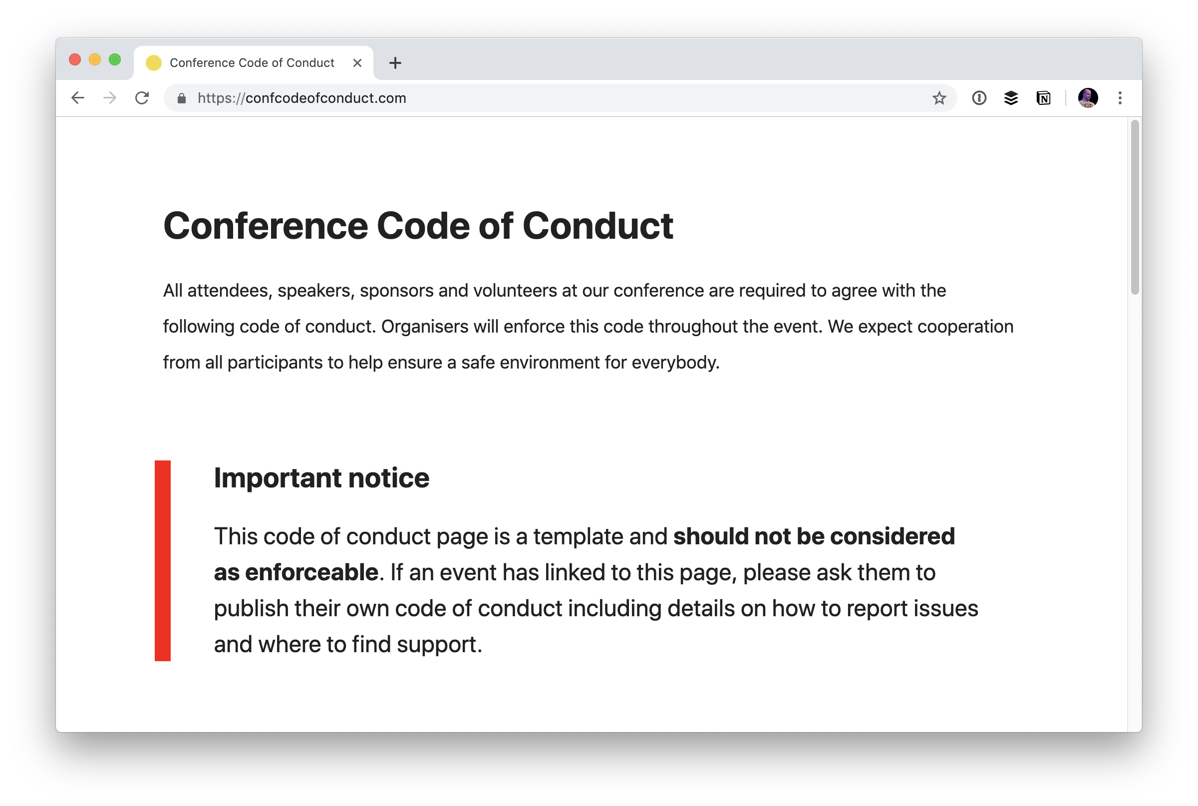
Now that we’re running this, I’ve got loads of Pull Requests for conferences all around the world. I didn’t realize that many (most?) conferences use the template at confcodeofconduct.com. In fact, many of them just link to it and call it a day.
That’s why I’m very happy to see there is a new, bold warning about doing just that.
Important notice
This code of conduct page is a template and should not be considered as enforceable. If an event has linked to this page, please ask them to publish their own code of conduct including details on how to report issues and where to find support.
It’s great that this site exists to give people some starter language for thinking about the idea of a code of conduct, but I can attest to the fact that many conferences used it as a way to appear to have a code of conduct before this warning while make zero effort to craft their own.
The primary concern about linking directly to someone else’s code of conduct or copy and pasting it to a new page verbatim is that there is nothing about what to do in case of problems. So, should a conduct incident occur, there is no documented information for what people should do in that event. Without actionable follow-through, a code of conduct is close to meaningless. It’s soul-less placating.
This is just one example:
It’s not to single someone out. It’s just one example of at least a dozen.
I heard from quite a few people about this, and I agree that it’s potentially a serious issue. I’ve tried to be clear about it: I won’t merge a Pull Request if the conference is missing a code of conduct or it simply links to confcodeofconduct.com (or uses a direct copy of it with no actionable details).
I know the repo is looking for help translating the new warning into different languages. If you can help with that, I’m sure they’d love a PR to the appropriate index HTML file.
Bad behavior in public transportation is a worldwide issue, and the London Underground is no exception despite British citizens great reputation in terms of behavior in public spaces.
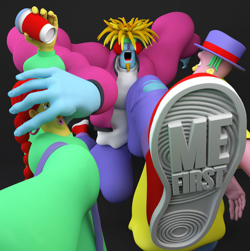
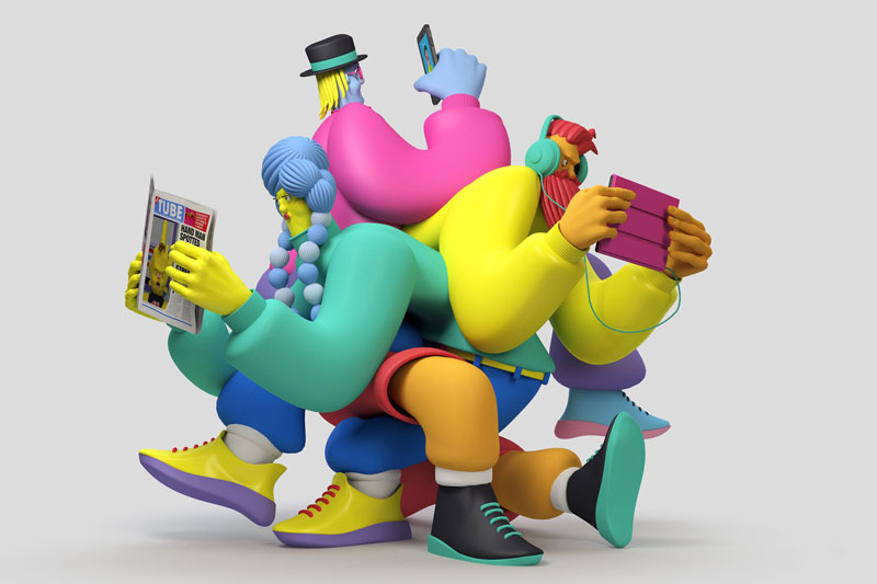
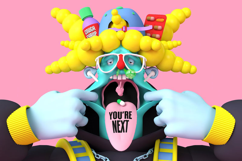
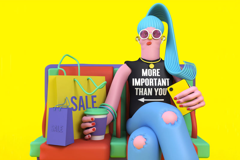
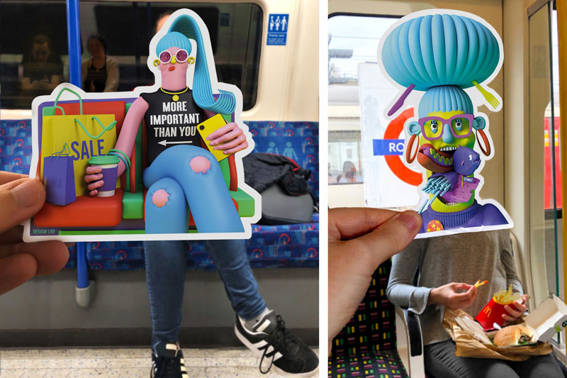
In this personal project, illustrator Matt Wood, who goes by the pseudonym Design Lad, created a set of colorful displays of commuters bad behaviors he could observe.
The 3D illustration style used is very in-your-face and makes the obnoxious behaviours even more blatant. The bright colors used add another layer of discomfort to the viewer, making the experience even more real.
Bad behavior in public transportation is a worldwide issue, and the London Underground is no exception despite British citizens great reputation in terms of behavior in public spaces.
In this personal project, illustrator Matt Wood, who goes by the pseudonym Design Lad, created a set of colorful displays of commuters bad behaviors he could observe.
The 3D illustration style used is very in-your-face and makes the obnoxious behaviours even more blatant. The bright colors used add another layer of discomfort to the viewer, making the experience even more real.
Bad behavior in public transportation is a worldwide issue, and the London Underground is no exception despite British citizens great reputation in terms of behavior in public spaces.
In this personal project, illustrator Matt Wood, who goes by the pseudonym Design Lad, created a set of colorful displays of commuters bad behaviors he could observe.
The 3D illustration style used is very in-your-face and makes the obnoxious behaviours even more blatant. The bright colors used add another layer of discomfort to the viewer, making the experience even more real.