This article is not a definitive guide to :has(). It’s also not here to regurgitate what’s already been said. It’s just me (hi 👋) jumping on the bandwagon for a moment to share some of the ways I’m most likely to use :has() in my day-to-day work… that is, once browser support is good enough. (Firefox is the last holdout, but will support it, which is imminent.)
When that does happen, you can bet I’ll start using :has() all over the place. Here are some real-world examples of things I’ve built recently and thought to myself, “Gee, this’ll be so much nicer once :has() is fully supported.”
Avoid having to reach outside your JavaScript component
Have you ever built an interactive component that sometimes needs to affect styles somewhere else on the page? Take the following example, where <nav> is a mega menu, and opening it changes the colors of the <header> content above it.
I feel like I need to do this kind of thing all the time.
This particular example is a React component I made for a site. I had to “reach outside” the React part of the page with document.querySelector(...) and toggle a class on the <body>, <header>, or another component. That’s not the end of the world, but it sure feels a bit yuck. Even in a fully React site (a Next.js site, say), I’d have to choose between managing a menuIsOpen state way higher up the component tree, or do the same DOM element selection — which isn’t very React-y.
With :has(), the problem goes away:
header:has(.megamenu--open) {
  /* style the header differently if it contains
    an element with the class ".megamenu--open"
  */
}
No more fiddling with other parts of the DOM in my JavaScript components!
Better table striping UX
Adding alternate row “stripes” to your tables can be a nice UX improvement. They help your eyes keep track of which row you’re on as you scan the table.
But in my experience, this doesn’t work great on tables with just two or three rows. If you have, for example, a table with three rows in the <tbody> and you’re “striping” every “even” row, you could end up with just one stripe. That’s not really worth a pattern and might have users wondering what’s so special about that one highlighted row.
What to get fancier? You could also decide to only do this if the table has at least a certain number of columns, too:
table:has(:is(td, th):nth-child(3)) {
  /* only do stuff if there are three or more columns */
}
Remove conditional class logic from templates
I often need to change a page layout depending on what’s on the page. Take the following Grid layout, where the placement of the main content changes grid areas depending on whether there’s a sidebar present.
That’s something that might depend on whether there are sibling pages set in the CMS. I’d normally do this with template logic to conditionally add BEM modifier classes to the layout wrapper to account for both layouts. That CSS might look something like this (responsive rules and other stuff omitted for brevity):
/* m = main content */
/* s = sidebar */
.standard-page--with-sidebar {
  grid-template-areas: 's s s m m m m m m m m m';
}
.standard-page--without-sidebar {
  grid-template-areas: '. m m m m m m m m m . .';
}
CSS-wise, this is totally fine, of course. But it does make the template code a little messy. Depending on your templating language it can get pretty ugly to conditionally add a bunch of classes, especially if you have to do this with lots of child elements too.
Contrast that with a :has()-based approach:
/* m = main content */
/* s = sidebar */
.standard-page:has(.sidebar) {
  grid-template-areas: 's s s m m m m m m m m m';
}
.standard-page:not(:has(.sidebar)) {
  grid-template-areas: '. m m m m m m m m m . .';
}
Honestly, that’s not a whole lot better CSS-wise. But removing the conditional modifier classes from the HTML template is a nice win if you ask me.
It’s easy to think of micro design decisions for :has() — like a card when it has an image in it — but I think it’ll be really useful for these macro layout changes too.
Better specificity management
If you read my previous article, you’ll know I’m a stickler for specificity. If, like me, you don’t want your specificity scores blowing out when adding :has() and :not() throughout your styles, be sure to use :where().
That’s because the specificity of :has() is based on the most specific element in its argument list. So, if you have something like an ID in there (why, I’m not sure!), your selector is going to be tough to override in the cascade.
/* specificity score: 0,1,0.
  Same as a .standard-page--with-sidebar
  modifier class
*/
.standard-page:where(:has(.sidebar)) {
  /* etc */
}
The future’s bright
These are just a few things I can’t wait to be able to use in production. The CSS-Tricks Almanac has a bunch of examples, too. What are you looking forward to doing with :has()? What sort of some real-world examples have you run into where :has() would have been the perfect solution?
While I am not a regular Chrome extension programmer, I have certainly coded enough extensions and have a wide enough web development portfolio to know my way around the task. However, just recently, I had a client reject one of my extensions as I received feedback that my extension was “outdated”.
As I was scrambling to figure out what was wrong, I swept my embarrassment under the carpet and immediately began my deep dive back into the world of Chrome Extensions. Unfortunately, information on Manifest V3 was scarce and it was difficult for me to understand quickly what this transition was all about.
Needless to say, with a pending job, I had to painstakingly navigate my way around Google’s Chrome Developer Documentation and figure things out for myself. While I got the job done, I did not want my knowledge and research in this area to go to waste and decided to share what I wish I could have had easy access to in my learning journey.
Why the transition to Manifest 3 is important
Manifest V3 is an API that Google will use in its Chrome browser. It is the successor to the current API, Manifest V2, and governs how Chrome extensions interact with the browser. Manifest V3 introduces significant changes to the rules for extensions, some of which will be the new mainstay from V2 we were used to.
Manifest V3 will officially begin rolling out in January 2023.
By June 2023, extensions that run Manifest V2 will no longer be available on the Chrome Web Store.
Extensions that do not comply with the new rules introduced in Manifest V3 will eventually be removed from the Chrome Web Store.
One of the main goals of Manifest V3 is to make users safer and improve the overall browser experience. Previously, many browser extensions relied on code in the cloud, meaning it could be difficult to assess whether an extension was risky. Manifest V3 aims to address this by requiring extensions to contain all the code they will run, allowing Google to scan them and detect potential risks. It also forces extensions to request permission from Google for the changes they can implement on the browser.
Staying up-to-date with Google’s transition to Manifest V3 is important because it introduces new rules for extensions that aim to improve user safety and the overall browser experience, and extensions that do not comply with these rules will eventually be removed from the Chrome Web Store.
In short, all of your hard work in creating extensions that used Manifest V2 could be for naught if you do not make this transition in the coming months.
January 2023
June 2023
January 2024
Support for Manifest V2 extensions will be turned off in Chrome’s Canary, Dev, and Beta channels.
The Chrome Web Store will no longer allow Manifest V2 extensions to be published with visibility set to Public.
The Chrome Web Store will remove all remaining Manifest V2 extensions.
Manifest V3 will be required for the Featured badge in the Chrome Web Store.
Existing Manifest V2 extensions that are published and publically visible will become unlisted.
Support for Manifest 2 will end for all of Chrome’s channels, including the Stable channel, unless the Enterprise channel is extended.
The key differences between Manifest V2 and V3
There are many differences between the two, and while I highly recommend that you read up on Chrome’s “Migrating to Manifest V3” guide, here is a short and sweet summary of key points:
Network request modification is handled with the new declarativeNetRequest API in Manifest V3.
In Manifest V3, extensions can only execute JavaScript that is included within their package and cannot use remotely-hosted code.
Manifest V3 introduces promise support to many methods, though callbacks are still supported as an alternative.
Host permissions in Manifest V3 are a separate element and must be specified in the "host_permissions" field.
The content security policy in Manifest V3 is an object with members representing alternative content security policy (CSP) contexts, rather than a string as it was in Manifest V2.
In a simple Chrome Extension’s Manifest that alters a webpage’s background, that might look like this:
// Manifest V2
{
  "manifest_version": 2,
  "name": "Shane's Extension",
  "version": "1.0",
  "description": "A simple extension that changes the background of a webpage to Shane's face.",
  "background": {
    "scripts": ["background.js"],
    "persistent": true
  },
  "browser_action": {
    "default_popup": "popup.html"
  },
  "permissions": [ "activeTab", ],
  "optional_permissions": ["<all_urls>"]
}
// Manifest V3
{
  "manifest_version": 3,
  "name": "Shane's Extension",
  "version": "1.0",
  "description": "A simple extension that changes the background of a webpage to Shane's face.",
  "background": {
    "service_worker": "background.js"
  },
  "action": {
    "default_popup": "popup.html"
  },
  "permissions": [ "activeTab", ],
  "host_permissions": [ "<all_urls>" ]
}
If you find some of the tags above seem foreign to you, keep reading to find out exactly what you need to know.
How to smoothly transition to Manifest V3
I have summarized the transition to Manifest V3 in four key areas. Of course, while there are many bells and whistles in the new Manifest V3 that need to be implemented from the old Manifest V2, implementing changes in these four areas will get your Chrome Extension well on the right track for the eventual transition.
The four key areas are:
Updating your Manifest’s basic structure.
Modify your host permissions.
Update the content security policy.
Modify your network request handling.
With these four areas, your Manifest’s fundamentals will be ready for the transition to Manifest V3. Let’s look at each of these key aspects in detail and see how we can work towards future-proofing your Chrome Extension from this transition.
Updating your Manifest’s basic structure
Updating your manifest’s basic structure is the first step in transitioning to Manifest V3. The most important change you will need to make is changing the value of the "manifest_version" element to 3, which determines that you are using the Manifest V3 feature set.
One of the major differences between Manifest V2 and V3 is the replacement of background pages with a single extension service worker in Manifest V3. You will need to register the service worker under the "background" field, using the "service_worker" key and specify a single JavaScript file. Even though Manifest V3 does not support multiple background scripts, you can optionally declare the service worker as an ES Module by specifying "type": "module", which allows you to import further code.
In Manifest V3, the "browser_action" and "page_action" properties are unified into a single "action" property. You will need to replace these properties with "action" in your manifest. Similarly, the "chrome.browserAction" and "chrome.pageAction" APIs are unified into a single “Action” API in Manifest V3, and you will need to migrate to this API.
Overall, updating your manifest’s basic structure is a crucial step in the process of transitioning to Manifest V3, as it allows you to take advantage of the new features and changes introduced in this version of the API.
Modify your host permissions
The second step in transitioning to Manifest V3 is modifying your host permissions. In Manifest V2, you specify host permissions in the "permissions" field in the manifest file. In Manifest V3, host permissions are a separate element, and you should specify them in the "host_permissions" field in the manifest file.
Here is an example of how to modify your host permissions:
In order to update the CSP of your Manifest V2 extension to be compliant with Manifest V3, you will need to make some changes to your manifest file. In Manifest V2, the CSP was specified as a string in the "content_security_policy" field of the manifest.
In Manifest V3, the CSP is now an object with different members representing alternative CSP contexts. Instead of a single "content_security_policy" field, you will now have to specify separate fields for "content_security_policy.extension_pages" and "content_security_policy.sandbox", depending on the type of extension pages you are using.
You should also remove any references to external domains in the "script-src", "worker-src", "object-src", and "style-src" directives if they are present. It is important to make these updates to your CSP in order to ensure the security and stability of your extension in Manifest V3.
The final step in transitioning to Manifest V3 is modifying your network request handling. In Manifest V2, you would have used the chrome.webRequest API to modify network requests. However, this API is replaced in Manifest V3 by the declarativeNetRequest API.
To use this new API, you will need to specify the declarativeNetRequest permission in your manifest and update your code to use the new API. One key difference between the two APIs is that the declarativeNetRequest API requires you to specify a list of predetermined addresses to block, rather than being able to block entire categories of HTTP requests as you could with the chrome.webRequest API.
It is important to make these changes in your code to ensure that your extension continues to function properly under Manifest V3. Here is an example of how you would modify your manifest to use the declarativeNetRequest API in Manifest V3:
You will also need to update your extension code to use the declarativeNetRequest API instead of the chrome.webRequest API.
Other aspects you need to check
What I have covered is just the tip of the iceberg. Of course, if I wanted to cover everything, I could be here for days and there would be no point in having Google’s Chrome Developers guides. While what I covered will have you future-proofed enough to arm your Chrome extensions in this transition, here are some other things you might want to look at to ensure your extensions are functioning at the top of their game.
Migrating background scripts to the service worker execution context: As mentioned earlier, Manifest V3 replaces background pages with a single extension service worker, so it may be necessary to update background scripts to adapt to the service worker execution context.
Unifying the**chrome.browserAction**and**chrome.pageAction**APIs: These two equivalent APIs are unified into a single API in Manifest V3, so it may be necessary to migrate to the Action API.
Migrating functions that expect a Manifest V2 background context: The adoption of service workers in Manifest V3 is not compatible with methods like chrome.runtime.getBackgroundPage(), chrome.extension.getBackgroundPage(), chrome.extension.getExtensionTabs(), and chrome.extension.getViews(). It may be necessary to migrate to a design that passes messages between other contexts and the background service worker.
Moving CORS requests in content scripts to the background service worker: It may be necessary to move CORS requests in content scripts to the background service worker in order to comply with Manifest V3.
Migrating away from executing external code or arbitrary strings: Manifest V3 no longer allows the execution of external logic using chrome.scripting.executeScript({code: '...'}), eval(), and new Function(). It may be necessary to move all external code (JavaScript, WebAssembly, CSS) into the extension bundle, update script and style references to load resources from the extension bundle, and use chrome.runtime.getURL() to build resource URLs at runtime.
Updating certain scripting and CSS methods in the Tabs API: As mentioned earlier, several methods move from the Tabs API to the Scripting API in Manifest V3. It may be necessary to update any calls to these methods to use the correct Manifest V3 API.
And many more!
Feel free to take some time to get yourself up to date on all the changes. After all, this change is inevitable and if you do not want your Manifest V2 extensions to be lost due to avoiding this transition, then spend some time arming yourself with the necessary knowledge.
On the other hand, if you are new to programming Chrome extensions and looking to get started, a great way to go about it is to dive into the world of Chrome’s Web Developer tools. I did so through a course on Linkedin Learning, which got me up to speed pretty quickly. Once you have that base knowledge, come back to this article and translate what you know to Manifest V3!
So, how will I be using the features in the new Manifest V3 going forward?
Well, to me, the transition to Manifest V3 and the removal of the chrome.webRequest API seems to be shifting extensions away from data-centric use cases (such as ad blockers) to more functional and application-based uses. I have been staying away from application development lately as it can get quite resource-intensive at times. However, this shift might be what brings me back!
The rise of AI tools in recent times, many with available-to-use APIs, has sparked tons of new and fresh SaaS applications. Personally, I think that it’s coming at a perfect time with the shift to more application-based Chrome extensions! While many of the older extensions may be wiped out from this transition, plenty of new ones built around novel SaaS ideas will come to take their place.
Hence, this is an exciting update to hop on and revamp old extensions or build new ones! Personally, I see many possibilities in using APIs that involve AI being used in extensions to enhance a user’s browsing experience. But that’s really just the tip of the iceberg. If you’re looking to really get into things with your own professional extensions or reaching out to companies to build/update extensions for them, I would recommend upgrading your Gmail account for the benefits it gives in collaborating, developing, and publishing extensions to the Chrome Web Store.
However, remember that every developer’s requirements are different, so learn what you need to keep your current extensions afloat, or your new ones going!
Learn how to get started with Affinity Photo in this beginner-friendly course! We’ll cover all the essential tools you need to know to create different photo and text effects.
Jump straight to the Affinity Photo skill you want to learn:
What are adjustment and live filter layers in Affinity Photo?
What are live filter layers in Affinity Photo?
How to remove a background in Affinity Photo
How to create a text effect in Affinity Photo
About Your Instructor
Abbey Esparza
I’m a mixed media artist and freelancer with over ten years of experience in digital art. In the last five years of my career, I have found a passion for sharing my knowledge and creating educational content showing that anyone can be a successful artist.
There’s no better place to start than with our user interface, known as the „Studio” in Affinity Photo. We’ll be covering how to best set up your Preferences for max performance, as well as customizing your studio.
Have you ever wondered what Personas are in Affinity Photo? They are less complicated than they sound. We’ll cover what Personas are, how to switch between them, and when you might use one over another.
Now that we know how to move and adjust our layers, it’s time to learn about adjustment layers and layer masks. An Adjustment Layer is exactly what it sounds like: an image adjustment that is on its own layer.
Below we can see all of the different adjustments that Affinity Photo has. We’ll be using the Recolor layer as our beginning example, before we move on to bigger photo effects.
We will then learn about layer masks, how to create them and how they work. A layer mask is used to hide a portion of a layer, while still giving us the option to bring back what we hid at any time.
Quick Tip! How to Use LUTs
2.3 How to Use Layer Modes & Live Filter Layers in Affinity Photo
Layer modes change how a layer will interact with all the layers below it. We’ll be using them to create both photo and text effects, but first we have to cover the basics.
Last but not least, some of the most powerful features in Affinity Photo are Live Layers. They’re the last layer type we’ll be covering. To start, we’ll use a single Motion Blur live layer to create a vibrant lens flare effect.
Quick Tip! How to Create a Halftone Effect
2.4 How to Create a Hand-Drawn Pencil Effect in Affinity Photo
If you can’t find a premade brush, then Affinity Photo makes it easier than ever to create your own. We’ll take a look at how to create both an Image brush and Intensity brush.
3.3 How to Create an Easy Watercolor Effect in Affinity Photo
Removing backgrounds is something all photo editors have to do at some point. We’ll be using the Selection Brush tool combined with layer masks to quickly remove a subject from their background.
4.2 How to Refine Masks & Extract Hair in Affinity Photo
But what about shadows? There’s a neat trick we can use for images on studio backdrops using Layer ModesAdjustments and Layer Masks. This technique will let us use the original background of a photo for an accurate shadow.
Always try to use the original shadows in a photo. When extracting or creating shadows, the Multiply layer mode is going to be the best tool for the job.
Now, it’s time to combine everything we’ve learned to turn this image into a proper photo manipulation. First, we’ll cover simple color correction using a Brightness/Contrast adjustmentlayer to blend the initial two images together.
Next, we’ll shift the hues of the image to be much more creative and eye-catching. We’ll do this by targeting the greens of both the background and the subject with an HSL adjustment layer.
Lastly, we’ll use a global Clarity live filter and a Curves adjustment to tie the two images together and give everything a consistent style.
Quick Tip! How to Create a Glow Effect
5. How to Create Text & Edit Type in Affinity Photo
Custom fonts are a must for any designer or artist. In order to create a holographic text effect, we’ll first need to download and install the Devant Horgen font.
When it comes to Affinity Photo, it’s all about slowly learning how to mix and match tools to create what you want to make. In this final video, I tell you why I chose the basics that I did, explain why I might have left out certain tools, and tell you where you might want to go from here.
Want even more assets to follow along with? Get unlimited downloads of photos, fonts, and add-ons on Envato Elements! Choose from thousands of Affinity Photo assets, with no daily download limits.
Learn More About Affinity Photo
Still want to learn more about Affinity Photo? Here are a few videos you’ll love:
Or if you prefer written tutorials, try our huge library of free Affinity tutorials. Here are a few to get started with:
In this article, you’ll learn the best font to pair with Times New Roman to bring a modern look to your designs.
Times New Roman is a classic serif typeface dating back to the 1930s. This is most likely the first font you ever saw installed on a desktop computer. In this article, I’ll show you some good sans serif fonts to pair with Times New Roman.
More Fonts to Pair With Times New Roman at Envato Elements
If you’ve been wondering what font to pair with Times New Roman, hands down, sans serif fonts are the best. So when you need good sans serif fonts to pair with Times New Roman, Envato Elements should be your go-to resource. Elements offers thousands of premium mockups, graphic templates, logos, photos, fonts, and much more. And you can download as many of these digital assets as you like, as often as you like, for one low monthly fee.
Devina Rodent is a classic humanist sans serif font. This Times New Roman font pairing is classic and legible. Neither font competes with the other in terms of design. This pairing is suitable for branding, packaging design, and editorial design.
This grotesk style sans serif, Brulia Display, is an amazing variable font inspired by brutalist architecture. This is a good font to pair with Times New Roman due to its sophisticated personality.
Gayaku is a sans serif with a modern feel. The strokes have no contrast, and it has quite a corporate look. This is a good font to pair with Times New Roman if you’re looking for a unique solution.
This ultra-modern display font, Bermont, is bold, heavy, and has a strong character. This Times New Roman font pairing can look contemporary on an editorial design piece or for branding projects and flyers.
Monospace typefaces are good sans serif fonts to pair with Times New Roman. Bergen Sans is a clean monospace font with post-Bauhaus aesthetics. This pairing has high contrast in its shapes, making it look contemporary.
Bolgart is a geometric sans serif with a heavy setting. This stunning font creates a great variation against a serif font like Times New Roman. These are two fonts that complement each other due to their very different anatomy.
Bionzhe is similar to the previous example, but this font has more letterspace, and it’s slightly less heavy. This font pairing with Times New Roman can look strong and powerful. Bionzhe is a great balance to make Times New Roman less serious.
Sans serif fonts come in different widths and shapes. Fraset is slightly wider, and that makes it look like a fun and playful font. This is one of the best fonts to pair with Times New Roman due to its quirkiness.
Mathelo has a good balance between a geometric and humanist font. The characters have a less serious quality to them. If you’re looking for a font pairing with Times New Roman for a younger audience, Mathelo is a good option.
Argon is a new modern grotesk font based on 1950s Swiss minimalism. The characters possess a combination of sharp and rounded curves. For a functional look, Argon is a good sans serif font to pair with Times New Roman.
Arkibal Mono is inspired by old store signs from the 1830s. It’s the perfect balance of classic fonts with a modern twist. While this font is classified as a slab serif, it’s very different from a classic serif font. This Times New Roman font pairing is edgy and cool.
The best fonts to pair with Times New Roman are variable fonts, the ones that allow you to experiment more to get different looks. Agharti is a large family of almost 50 fonts with 7 different widths and weights. By mixing and matching all these options, you can get anything ranging from classic looks to something more edgy and contemporary.
Another versatile font pairing with Times New Roman is Neuething. This clean and simple font has been meticulously designed and refined. This font pairing can look modern and cool on branding and social media posts.
A modern look isn’t hard to create with Times New Roman. Montras is a modern sans serif font with bold strokes and fun details. This font pairing with Times New Roman is great for branding anything youth-related.
Ritola Sans is a sans serif font that pairs perfectly with Times New Roman. The font has heavy strokes that sometimes are contrasted with thin details for a fun look. This pairing is modern, legible, and can look powerful.
That’s It!
In this article, you learned about the best fonts to pair with Times New Roman. This classic font has been around for many, many decades. It’s the default font for many applications on desktop computers and one that we’ve seen on plenty of printed materials.
There are lots of sans serif fonts to pair with Times New Roman. Depending on the different sans serif fonts that complement each other, we can make the Times New Roman combo look classic, edgy, or contemporary. It’s such a versatile font! Which one was your favorite sans serif?
When you need fonts that complement each other in a ready-made combo, Envato Elements should be your go-to resource. Elements offers thousands of premium mockups, graphic templates, logos, photos, fonts, and much more. And you can download as many of these digital assets as you like, as often as you like, for one low monthly fee.
So you’re learning how to use Photoshop, you’re testing the tools, and suddenly „marching ants” appear—tiny lines moving rhythmically over the screen. They can be pretty annoying because after they’ve appeared, nothing works the way it used to. So you may be wondering how to get rid of marching ants in Photoshop.
You may also know very well what these moving lines are, and you have a different problem with them—how to hide marching ants in Photoshop, so that you can benefit from their presence without them covering a part of your picture.
In this short tutorial, I’ll answer both of these questions!
What You’ll Learn in This Marching Ants Photoshop Tutorial
What are marching ants in Photoshop?
How to get rid of marching ants in Photoshop
How to hide marching ants in Photoshop
What You’ll Need
You can use any photo for this tutorial, but if you like the picture of a cute ant that I’ve used, you can find it here:
In Photoshop, you may often want to select one area of the image and edit it separately from the rest—or remove that part, copy it to a different layer, etc. Marching ants indicate the border of that selected area. So to bring the ants onto the screen for the purpose of this tutorial, you can use any of the selection tools:
Here, I’ve used the Lasso Tool (L) to outline the head of the ant:
Now, I can use the Move Tool (V) to move the selected area somewhere else:
Or change the color of the head with the Hue/Saturation (Control-U) adjustment:
2. How to Get Rid of Marching Ants in Photoshop
OK, so you’ve edited your selected area, and now you want to get rid of the marching ants. How can you do it?
It’s very simple: go to Select > Deselect, or use the Control-D shortcut.
3. How to Hide Marching Ants in Photoshop
As you can see, the marching ants are very useful because they’re showing you which area has been selected. However, if you want to see what the image will look like after editing, these ants may stand in the way. So if you want to hide the marching ants without removing the selection, use the Control-H shortcut.
By hiding the borders of the selection area, you get a direct preview of your edits
Caution: always remember to deselect (Control-D) after editing, or make the ants come back by pressing Control-H again. Otherwise, the invisible selection will stay there, leading to a lot of confusion later.
Good Job!
Now you know how to get rid of marching ants in Photoshop, as well as how to temporarily hide them when needed.
Recommended Tutorials
If you liked this marching ants Photoshop tutorial, you may also enjoy our other tutorials for beginners:
Did you know that you can create multi-layered artwork in Adobe Illustrator, and then turn layers on and off in InDesign? Importing Illustrator files into InDesign isn’t as hard as you think. Learn how in this quick tutorial.
Work with multi-layered illustrations like this one on InDesign.
If you’re constantly working on Illustrator and InDesign projects, Envato Elements could be a great source of creative resources for you. You’ll find all kinds of graphic templates, vector illustrations, logos, and more. Once you learn how to convert your designs from Illustrator to InDesign, you’ll have more template alternatives to work with.
What You’ll Learn in This Tutorial on Multi-Layered Illustrator Artwork in InDesign
Wondering how to import Illustrator files into InDesign? You’ll discover that importing Illustrator files into InDesign is quite easy! Here’s what we’ll cover in this tutorial:
How to create artwork with multiple layers
How to open Illustrator files in InDesign
How to turn layers on and off to customize the illustration to match your design
Let’s get started!
1. How to Create Artwork With Multiple Layers
Step 1
Create some artwork in Adobe Illustrator that contains multiple layers. I’ve created a map that contains nine layers. Note that these are top-level layers. You cannot manipulate Illustrator sublayers in InDesign. The layers that are visible here are the layers that will be visible when the Illustrator file is placed in InDesign.
Be sure that all of your artwork fits on the Illustrator artboard. Any artwork that extends off the artboard will be cropped when the artwork is placed in InDesign.
Step 2
Adobe Illustrator AI format is the preferred format for importing Illustrator artwork into InDesign. AI format works better than EPS for a variety of reasons. You must use AI format if you wish to manipulate the Illustrator layers in InDesign.
Choose File > Save As. Choose Adobe Illustrator (AI) for the file format, and then click the Save button.
Fill in the Illustrator Options dialog as shown below, and then click the OK button. You can choose a later version of Illustrator, of course, but the Create PDF Compatible File option must be selected.
2. How to Open Illustrator Files in InDesign
Now, open an Illustrator file in InDesign. Choose File > Place. In the Place dialog box, check Show Import Options, then select the Illustrator file you saved in Step 2, and click the Open button.
A Place PDF dialog will appear on your screen. You may think, „Huh? I’m not placing a PDF, I’m placing an Illustrator (AI) file.” Actually, InDesign sees this AI file as a PDF file.
There are many powerful options for placing Illustrator artwork in the Place PDF dialog boxes. You can use the page selector to choose which page of an Illustrator file with multiple artboards should be placed. You can choose how to crop the image, and whether or not you want the image to have a transparent background.
For this tutorial, we’re primarily concerned with the Layers section of the dialog. In this section, you can choose which layers in the Illustrator file you’d like to have displayed or hidden in the InDesign file. Click on the eyeball icon to hide or display a layer. Click the OK button when you’re finished.
When you see the loaded graphics cursor in InDesign, click to place the Illustrator artwork in your InDesign layout. The Illustrator artwork should look just like it did in Illustrator, unless you changed the layer visibility above.
What if you want to change the visibility of Illustrator layers after the artwork is already on the page? You can do that too!
Use the Selection Tool (black arrow) in InDesign to select the placed Illustrator file, and choose Object > Object Layer Options. In the dialog box that appears, click on the eyeball icon next to a layer name to hide or display a layer.
Click the OK button, and the appearance of the artwork will change on the InDesign page.
You’re all set! Now you know how to import Illustrator files into InDesign. You could even convert your designs from Illustrator to InDesign.
Want to Learn More?
Are you just getting started with InDesign? Learning how to import files from Illustrator into InDesign is a good trick to have. Get some pro tutorials, tips, and tricks from the Envato Tuts+ YouTube channel. We highly recommend going for this InDesign for Beginners free course to get you started:
We also have useful tutorials and articles for you to dive into—not only Illustrator to InDesign tricks, but also a variety of beginner and advanced content. Take a look at this selection we’ve made for you:
This Illustrator into InDesign technique is extremely valuable for using several variations of artwork in different places, all by placing a single file.
Take your company logo, for example. You may have many variations, all stored as separate files: color, grayscale, with tagline, without tagline, etc. Instead, you could have all these variations as separate layers in a single Illustrator file. Then you can convert from Illustrator to InDesign and design more efficiently. Think about how this might affect your workflow…I’m convinced you will find a use for it!
Editorial Note: This post has been updated with contributions from Janila Castañeda. Janila is a staff writer with Envato Tuts+.
Check out the best cursive calligraphy fonts inspired by handwriting, calligraphy brushes, and much more.
In this article, we’ll answer the questions „What is a cursive font?” and „What is a calligraphy font?” These two words are often used interchangeably, and while there are similarities between these two styles, it’s important to know what they’re all about. Let’s take a look at their definitions and see some examples of awesome calligraphy cursive fonts!
The cursive style of font resembles the style that some of us learned in school. The purpose of this style is to write quickly and as legibly as possible, without lifting the pen off the paper. Therefore, all the letters are connected. Cursive fonts are simpler than calligraphy since there’s no stroke contrast.
What Is a Calligraphy Font?
The calligraphy style of fonts contains characters that use specific strokes. Both of these styles of fonts are usually based on real handwriting, but the pen and the construction of the calligraphic character are different. The purpose of calligraphy is different to the cursive style because in calligraphy, lifting up the pen is not a problem, and many different pens can be used. Fonts can be cursive and calligraphic at the same time, and vice versa.
Unlimited Cursive & Calligraphy Fonts at Envato Elements
When you need amazing calligraphy fonts, Envato Elements should be your go-to resource. Elements offers thousands of premium mockups, graphic templates, logos, photos, fonts, and much more. And you can download as many of these digital assets as you like, as often as you like, for one low monthly fee.
Vendetta is a cursive calligraphy font with an authentic handwritten style. The end strokes of the characters have a good balance of movement and a relaxed feel. This is a great font for branding, logos, and social media designs.
Saltacrus is a signature style font that’s modern, and you can sense the flow of the ink in each character. This calligraphy cursive font is great to enhance a photography studio’s branding or to use as a signature for a wedding invitation or a logo. It’s unique and full of energy.
This handwritten font can be used as a cursive calligraphy tattoo font, and it is legible and distinctive. The pack contains a large number of ligatures and punctuation. Use this sophisticated font for branding, wedding invitations, or cards.
If you’re looking for an energetic font, Southland letter is a great option. This calligraphy cursive alphabet font has signature-style ascendants, very tall and slim. The pack contains uppercase, lowercase, and numeral characters.
Add a modern touch to your design with Randelion. This calligraphy feminine cursive tattoo font is vibrant and loud. This font is suitable for social media posts, branding, and apparel design.
Cursive handwriting calligraphy fonts with high-quality line work are hard to come by. Edinburgh is a modern script font perfect for projects that need a feminine touch. Suitable for social media posts, branding, and posters.
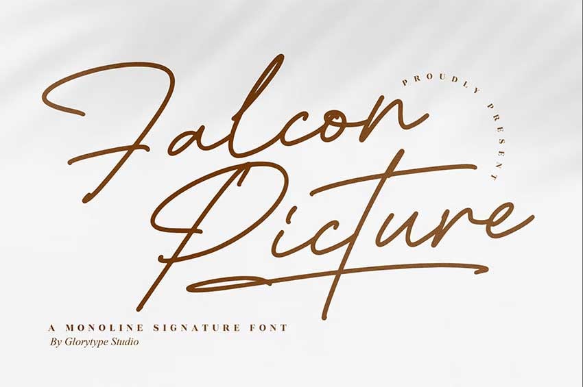
This monoline font has cursive calligraphy font traits. Cursive fonts are based on pen strokes: a single line with no contrast. Falcon has a good balance of cursive and calligraphy style fonts.
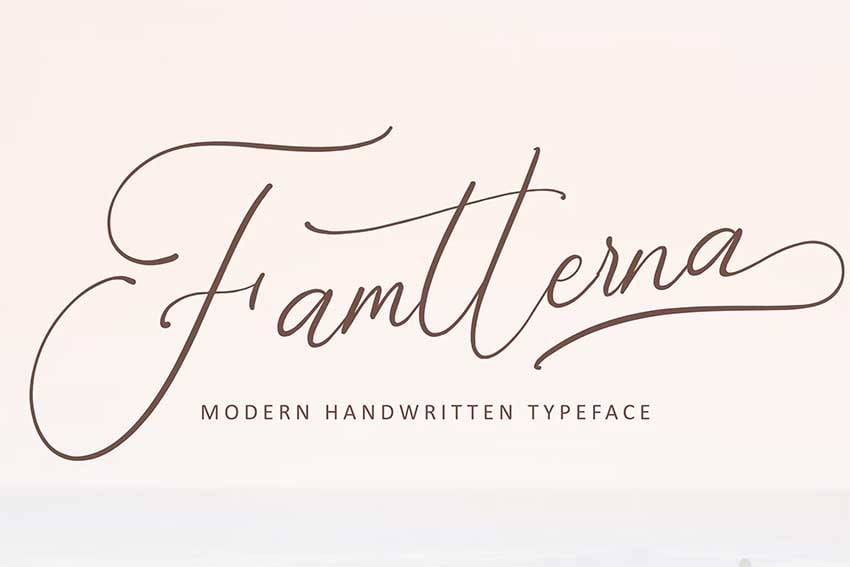
Famtterna is a modern calligraphy cursive font. It has the intricacies of the calligraphy style and the fluidity of cursives. This font is suitable for wedding invitations, headers, and branding.
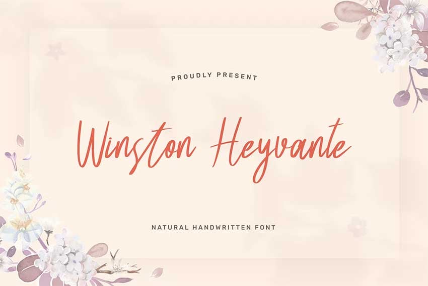
Winston Heyvante is a calligraphy cursive alphabet font with a decorative flair. It is suitable for wedding invitations, blog branding, and book covers. The pack contains multiple stylistic alternatives to elevate your designs.
This cursive handwriting calligraphy font is energetic but extremely legible. While it’s expressive, the characters have a high contrast in the strokes, which makes it look more elegant. Summit Foxes includes ligatures and alternates to mix up different characters and get different looks.
Pueriel is a vintage cursive calligraphy font with a traditional flair. If you’re looking at vintage-inspired fonts that can help you recreate objects and letters from that era, this is a great choice. Pueriel comes with over 200 glyphs that can help you create a natural vintage look.
Fragmentix is a font with very little contrast between the characters. Packed with tons of ligatures and alternates, this font is suitable for anything from book covers to movie titles. Mix it up with a serif or sans serif font to achieve an edgy look.
Butter Milky has plenty of calligraphy cursive alphabet font alternates that make it suitable for multiple design projects. This handwritten style is very vintage from the 50s and 60s. It can add a nice touch to vintage-inspired projects.
If you’re looking for an expressive cursive calligraphy font, Maistoray is a stunning choice. This font is suitable for brand design, book covers, and social media. The strokes resemble a flat ribbon moving in the air, and the font has a beautiful air of elegance.
Herittage is a signature-style cursive font. It’s versatile and suitable for a wide range of projects, from posters to wedding invitations and branding. The strokes on the font have a relaxed look, perfect for vacation-themed projects.
Asterika is a handwritten cursive calligraphy font with elegant curves. The font has a heavy ink look, and the curves flow nicely. This script font is suitable for wedding invitations, social media, and packaging.
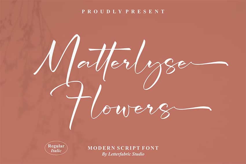
If you’re looking for a looser and more organic font, Matterlyse can get the job done. This font is suitable for print projects as well as websites. Use it for branding, social media posts, and book covers.
Ronatalia is a romantic font that resembles cursive calligraphy fonts. The characters have a high contrast between the strokes and look expertly crafted. This font is suitable for social media posts, branding, and personal projects.
If you’re looking for the ultimate high-end elegance, Blanchard is a regal option. This font is calligraphy oriented, expertly made, and looks expensive. It’s suitable for brand design for high-end brands, social media, and invitation cards.
Gillbert Hittola is an easygoing font that communicates fun and stability. It’s one of the fonts that, regardless of its application, can be classic and confident. Gillbert Hittola is suitable for printed designs, branding, and posters.
Ametta is an elegant and fashionable cursive calligraphy font. The energetic characters are great for projects that require a great deal of personality. The pack comes with alternate characters and ligatures to make every word special.
If you’re looking for a sharp, elegant, and all-around regal font, Ranlikha is all that. The characters have beautiful swirls that also look romantic. Mix this font with a serif to get a classic look suitable for restaurant branding.
Malliandra is a calligraphy feminine cursive tattoo font inspired by handwriting. This font is also suitable for wedding invitations, packaging design, labels, and book covers. The pack contains multilingual options and many beautiful swashes and ligatures.
If you’re looking for a more formal old style of calligraphic cursive font, Ofinitti is inspired by real brush strokes. The brush strokes look realistic, and the character shapes are clean. This font is suitable for branding and quotes.
Mattinha is a font with strokes that look heavily inked. This is a nice touch if you’re going for a handmade look in your design projects. Pair it with a sans serif font for a modern look in your wedding invitations.
Fonts created with a flat pen can give off a very classic look. Kidnatting is a good-looking font with characters that look energetic. The strokes change in thickness the same way real handwriting does.
Sellicite is a modern handwritten font using a thin stroke that almost looks monoline. The low contrast in the strokes keeps the font subdued and classic. Sellicite is suitable for enhancing and accompanying sans serif fonts.
Another monoline font that comes in a signature style is Breaket. This font is wider than it is tall, and the counters inside some of the vowels are non-existent. This last feature helps enhance that signature style. Breaket is suitable for invitations, brand design, and quote posters.
Hellow Script is a feminine-style cursive calligraphy font. The characters feature elegant swirly strokes that enhance the girly look. This font is suitable for brand design, packaging, and book covers.
If you’re looking for a true handwritten cursive font, Marina Bullock is a great option. This authentic handwriting font is great for projects that need a human touch and an organic look. The pack comes with a variation of glyphs to achieve an even more natural look.
Lenteras is a thick monoline cursive font that resembles the style of middle-school handwriting. Since the stroke is thicker than most monoline fonts, Lenteras looks fun, laidback, and young. This font is suitable for book covers, movie posters, and social media.
This cursive calligraphic font, Qitamesa, is inspired by brushes, with a slight contrast between the strokes. Use this modern script font on business cards, brand design, and posters.
Kaytha is a romantic monoline font with simple strokes. This cursive calligraphy style font features swirls at the end of each character, which makes it look modern and stylish. The pack comes with many stylistic sets, swashes, and ligatures to customize the characters as much as you would like.
Questario is a stylish script font inspired by brush calligraphy. The font is edgy, modern, and gives out a confident personality. Questario is suitable for branding, social media, and posters.
If you’re looking for a classic yet impactful font, Kiramba brings those two attributes to the table. The contrast between the strokes is high, and the swashes on the strokes have a tear-shaped end, which adds a contemporary feel. The font is suitable for stationery, invitations, and logos.
Brush pen calligraphy has been around for a while, but never in the high quality in which Azkia is presented. This script font was based on real analog sketches and later redrawn on a computer. The pack contains 1,200 glyphs, more than enough to bring variation and uniqueness to your design projects.
If you’re looking for an elementary school feel, Lazy Ride is a cool font for that. This cursive calligraphy font started out as a logo and is now extended into a font. With more than 670 glyphs, Lazy Ride can cover anything from brand design to quotes and posters.
Fanland is a cursive calligraphy font with an elegant touch. It’s romantic, classy, and beautiful, perfect for a wedding invitation. The pack comes with multiple stylistic sets to make the characters just different enough that they look handwritten.
A feminine font like Ashfall is perfect for projects that need a feminine touch. Suitable for branding for restaurants, flower shops, and skincare brands, Ashfall features a smooth texture and beautifully balanced characters.
If you’re on the lookout for an elegant font, Moranhill is the perfect cursive calligraphy font. It has a low contrast in the strokes and gives off stability and class. The pack contains many ligatures and stylistic alternates.
Raffiator is a modern, smooth, and classic font, with simple lines. The font features a high contrast in the strokes and slightly open counters, making it look handwritten. Raffiator is suitable for wedding invitations, newsletters, and book covers.
Metalurdo is an elegant cursive calligraphy font with style. This font has a classic look that can make any project travel back in time. Metalurdo is suitable for product labels, wedding invitations, and social media posts.
Donatellia is a font that exudes luxury, perfect for high-end branding projects. The font features beautiful lines that make it look like a true handwritten font. The tear shape at the end of the strokes resembles pooling ink, enhancing the handwritten effect even more.
Playlist is an energetic, dramatic, and stylish font. Made with modern calligraphy in mind, this handwritten style font features characters that look true to real handwriting. Playlist is suitable for any music-related projects, band logos, merchandising, and poster design.
Bellanaisa is a modern calligraphic font featuring a high contrast in the strokes. Dramatic, classic, and fresh, this font is great for book cover designs, wedding invitations, and letterpress style posters. The pack contains multiple language support and many stylistic alternates.
That’s It!
Now that you know the differences and similarities between cursive and calligraphy fonts, you’re ready to explore. Which one of these fonts was your favorite?
And remember, when you need cursive handwriting calligraphy fonts, Envato Elements should be your go-to resource. Elements offers thousands of premium mockups, graphic templates, logos, photos, fonts, and much more. And you can download as many of these digital assets as you like, as often as you like, for one low monthly fee.
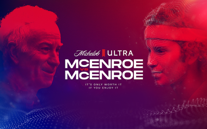
THE ORIGINAL? Michelob Ultra “Mc Enroe vs Mc Enroe”– June 2022 “2022 John McEnroe is playing a match
against a younger version of him” Cannes GOLD Lion (Digital Craft)
Watch the Case Study Video
Agency : FCB New York (USA)
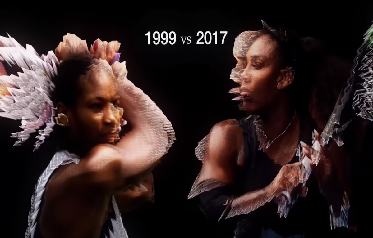
LESS ORIGINAL Nike “Never Done Evolving” – Sept 2022 “2017 Serena Williams is playing a match
against a younger version of her” Source : Ad Age
Watch the Case Study Video
Agency : AKQA (USA / Australia / Brazil)
Those of you who have been reading CSS-Tricks for a while may remember that we used to publish a little thing we called CSS-Tricks Chronicles. Our friend Chris Coyier would write up a reflection from the past couple of months or so, and it was a great way to get a pulse on what’s happening around CSS-Tricks, the site, and what the team is doing.
We like that and want to keep it going. It’s a new era, though! So what we’re going to do is welcome you back to what we’re now calling Behind the CSScenes. You’re going to meet some new and familiar faces in these updates, starting with Haley Mills, who is kicking off the very first issue.
How’s the transition going?
[Haley Mills:] Before we dive in, let me start by introducing myself! My name is Haley, and I’m the manager of Content Integration here at DigitalOcean. I’ve been at DigitalOcean for 5 years and previously worked on our editorial team, helping authors publish all sorts of topics through our Write For DOnations program.
Many folks here at DigitalOcean (including myself) are avid readers of CSS-Tricks, and we still have to pinch ourselves for how lucky we are to be entrusted with this community. We recognize that CSS-Tricks is a critical free resource for devs across the world, and my goal is to keep it that way.
Since the acquisition, we have published 95 pieces of new content and look forward to growing that number.
In the month of August, we performed maintenance on 6 existing pieces of content.
That said, change is to be expected when passing a torch.
I think we all know that no one can replace Chris’ voice — it’s a big reason why CSS-Tricks is, well, CSS-Tricks. His ability to have you laughing while learning something new is a skill that few can compete with. I know many of you miss his writing because you told us so in a survey (which we’ll get to in a bit), but it also opens up a huge opportunity for us all to take the torch and continue doing what CSS-Tricks does best:
Find creative solutions to problems and share them with the world. Chris brought people together this way on CSS-Tricks — and you can give back, too.
Your blossoming idea could turn out to be what the Flexbox Guide is for me and so many other people, so I humbly encourage you to reach out in our Guest Writing Form and talk to us about your topic ideas. We have two awesome editors, Geoff and Brad, to help you shape and bring your ideas to life to share with the CSS-Tricks community. In addition to paying you for your contribution, we will now also make a matching donation to a tech-focused charity of your choice.
Next up, we have Product Manager Karen Degi with some survey result highlights.
The results are in…
[Karen Degi:] In June, we shared a survey to collect feedback to help shape the future of CSS-Tricks. We received almost 900 responses, including some great written responses that helped us understand what CSS-Tricks means to the larger community.
Many of you also volunteered to talk to us directly, which has us thinking about the best way to gather those thoughts. If you’re one of those folks, know that we haven’t forgotten about you and still want to hear from you. We just want to make sure we approach this in the most effective way!
The survey confirmed some things we already suspected and brought new things to our attention. The top few things that grabbed our attention are:
Engaging, high-quality content is at the heart of CSS-Tricks. We’re working to make sure that we continue investing in in-depth guides on front-end topics, as well as providing short articles about quick tricks and tutorials with embedded demos.
You love RSS! As we continue investing in CSS-Tricks and bringing new functionality, we’ll make sure we keep an eye on how our changes affect the RSS feed.
You come to CSS-Tricks to learn, to be entertained, and to do your jobs better. You do not come to CSS-Tricks because you’re excited about being sold…well, anything, really. Although we think DigitalOcean is pretty great, and we’ll probably continue to talk about ourselves where it makes sense, we understand that we need to do so in a way that is honest, trustworthy, and connected to your needs as a front-end enthusiast.
Next up is Logan Liffick, Senior Digital Experience Designer, with redesign updates.
A redesign is in the works!
[Logan Liffick:] If you’ve worked on the front end — or really anywhere on the web, you’re bound to know CSS-Tricks. It’s where I, and many others, started the journey. So, when I was asked to spearhead a redesign for the site, it was nothing short of an honor. Without a doubt, undertaking a brand update for something so familiar to so many is a challenge of incredible magnitude
If I were to do justice to this project, I’d need to pay tribute to the original. That mentality became the underlying theme of my work, and any effort to rejuvenate took inspiration from existing patterns and styles from the site.
Upon first glance, you’ll notice the fresh coat of paint. Past that, you’ll recognize the site reads more “editorial” than before. This was a purposeful decision to accentuate existing type stylings and, more importantly, to pay homage to the essence of CSS-Tricks as an informational resource.
Preserving the element of “fun” was also top of mind. Sprinkled throughout the site are various snippets from the actual CSS “tricks” shared on this site — for example, there’s going to be a little Easter egg tucked inside a sticky footer using Preethi’s slide-out effect that’s my personal favorite, a fantastic suggestion from Geoff himself. Gradients are now a core color-way in the system, and border-radii have been rounded out.
We wanted to give ourselves permission and space to explore an open-ended and malleable system far into the future, which lines up nicely with the overall mission and goal of CSS-Tricks: to explore what’s possible with CSS. This is just the beginning, there’s so much more to see, do, and learn with CSS-Tricks living in our (digital) ocean.
Next is Geoff with author highlights!
New authors!
[Geoff:] We’ve added a few new faces to our growing list of guest authors who have contributed to CSS-Tricks:
You may have also seen our editor Bradley Kouchi’s name pop up a couple of times, and you can expect to continue seeing him on a semi-regular basis.
That’s 16 new authors! You can be one, too, by filling out our guest writing form.
On a related note, I’m pleased as punch that we still get regular contributions from a large band of familiar faces from before the DigitalOcean acquisition. Just look at all the fine folks who’ve continued to share their great ideas with us:
Big shake-ups like the one we’re going through today can be scary. Seeing these familiar names in article bylines has helped me a ton as far as continuity and consistency go. CSS-Tricks still seems very CSS-Tricks-y to me, and that’s a big deal.
Until next time…
We hope you’ve enjoyed this little peek behind the CSScenes! We’ll do it again… and again and again. As you can tell, there’s a lot of activity happening around here, which means we’ll have lots to share in the next edition.
Oh, and if you’re one of the many who’ve told us just how much you miss the newsletter, it’s still here! We’re sending it just once a month while we get back in the swing of things, and you may very well need to re-subscribe to get it (we had to do a lot of scrubbing after the keys to the site were handed over).