Wszystkie wpisy, których autorem jest admin

Simple steps to take before designing a business card (with free template included)

Post pobrano z: Simple steps to take before designing a business card (with free template included)

Need a
creative and cost-effective yet subtle way to advertise your business or spread
the word about your personal brand? If yes, explore the use of business cards
and how designing one to fit your specific needs can help boost your brand’s
recognizability and increase customer leads.

To make the
entire business card-making process easier, we have listed down the most
important elements that should be considered prior to using them to your
advantage. By considering each factor carefully, you are taking a small step
that will allow you to craft a business card that truly complements your brand.

Design Theme

Deciding on a
design theme for your business card is the first step in the card-making
process. This step should not be neglected because a business card theme will
act as the unifying element of the entire calling card.

To
illustrate, if you are a florist and you want to have a business card that will
match your business and occupation, it is best to choose a card design theme
that suits your flower shop business. In this case, following a flat minimalist
card design may work as your business card theme. On the other hand, having a
grunge neon color scheme and design theme may work against your personal brand
identity.


Your business
card theme or motif does not have to be fully formed from the get-go. Simply
deciding on a color palette or on one design element (like the use of a
specific font style) is enough. Give yourself (or your graphic artist) room to
further improve on your base theme choices as the card-making process goes on.
In fact, you may take design inspiration from various free graphic design and
editing sites like Canva.com and Template.net
all before you actually sit down and create an actual business card.

Paper Size and Type

The next step
to take before designing a business card is to find out your preferred paper
size and type. This is an important element that anyone looking for a business
card design should factor in order to create a more unified and impactful look
for their business cards.

Traditionally,
a business card measures 3.5 inches by 2 inches. But nowadays, more and more
people are considering other paper size options. For example, there are now square,
round, and even hexagonal business cards.

In relation
to the paper size, the type of paper to be used should also be considered. You
may choose from regular cardstock, glossy, matte, linen, kraft, and other
premium paper options.

Choose a
paper size and type that will best allow you to showcase your brand’s identity
without compromising your marketing budget.

Bleed

When printing
out any kind of graphic design project, designers need to designate a printing
bleed area on the document. The printing bleed refers to the printed area that
is intended to be cut off. This is the part of the printed business card is the
edge or corner of the card that may contain some design elements but will need
to be removed in order to make sure that all the cards will look exactly alike.

For those who
want to design their own business card, you should make sure that you have
created a bleed area on the card design template. Once the bleed area is placed
on your business card template, you are then free to add your other design
elements and print out the business card without having any issues with the
final business card design.

If you want
to make sure that the business card you are creating already contains a
built-in bleed area, you may use any free or premium business card templates
found at Template.net. This site is rich with printable graphic design project
templates that you can use.

Budget

Another step
that anyone looking to design their own business card should do and factor into
their pre-card-making process is to decide on and find out their marketing
budget. Remember that making business cards is often considered as an
advertising strategy. You will need money to fund the creation and printing of
these business cards.

For most
businesses, creating business cards can be a cost-effective alternative to
making other kinds of print advertising materials. However, freelancers and
individuals may find creating and printing business cards still a costly
endeavor.

Therefore, prior
to sitting down and designing what kind of business card you want, you still
need to create a budget plan that will match your funds and what you want your
completed business card to look like.

Printing Method and Techniques

Earlier, we
have discussed the importance of choosing the paper size and type for your
business card beforehand. This next step in the business card-making process is
related to that. Another crucial step that should be considered prior to
designing a business card is your preferred printing method.

The easiest
and perhaps most convenient method for printing business cards is by doing it
yourself and using your own home or office printer. However, the quality of the
business card printed this way will greatly vary due to the difference in the
printer, ink, and paper being used.

This is the
reason why a lot of people will prefer to use the services of a professional
printing shop. In these shops, people can choose from letterpress printing,
flexography, lithography, gravure printing, and a lot more. Choosing a printing
method also means that you get to decide if you want to have embossed,
debossed, varnished, foiled, laminated, die-cut, or lasered print finishes and
techniques.

Therefore,
prior to designing a business card, you need to know all these printing
techniques and methods and choose the one method that you like best. By doing
this, the rest of the entire card designing process will be easier and more
smooth-sailing.

Color Modes

The last step
to take before designing a business card is to know the difference between
different color modes. When creating any kind of printed media, the two main
color modes used are RGB and CMYK. RGB stands for Red, Green, Blue and it is
used in desktops, TVs, and cameras among others. CMYK stands for Cyan, Magenta,
Yellow, Key (black) and it is used by professional printers.

By knowing
what these two color modes are and how you can optimize your graphic design
project to match the CMYK color mode used in printing, you will have an easier
and quicker time in printing your business cards. Knowing how to convert RGB
into CMYK will also allow you to design your business cards that will translate
well from RGB to CMYK color schemes.

Get Ready to Design Your Business Cards!

You have now
reached the end of this short guide on the top steps to take before designing a
business card. Refer back to the guide as much as you need. And, hopefully, you
will master the art of business card design soon. For now, enjoy the
card-making process and have fun soaking your brain with all the design
lessons.

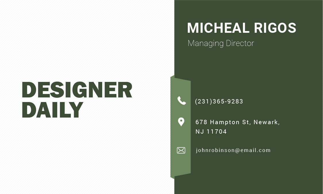
Download our business card template

Issho branding by Dutchscot

Post pobrano z: Issho branding by Dutchscot

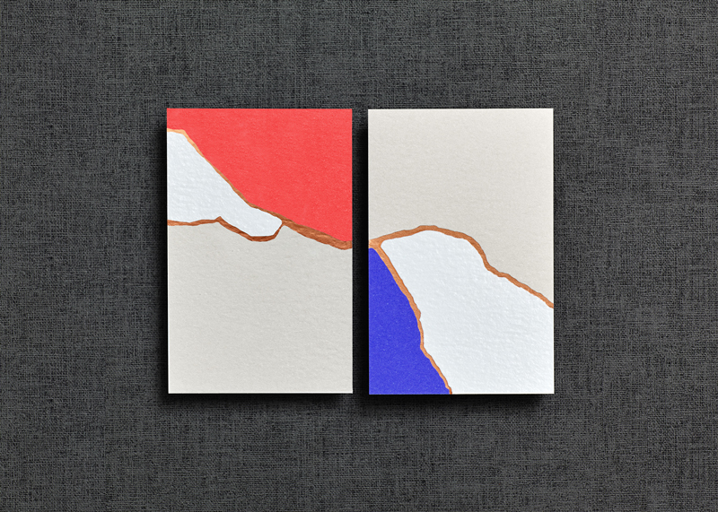
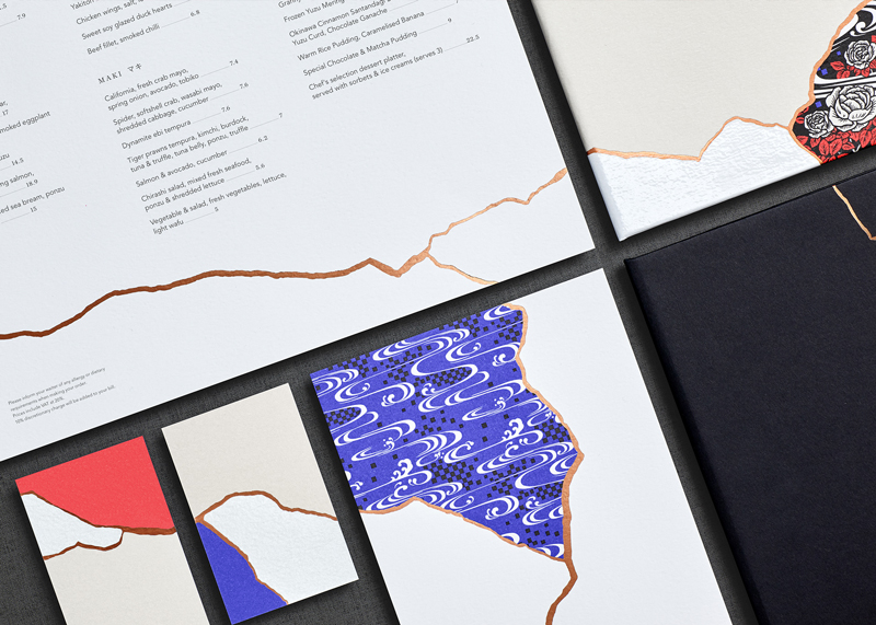
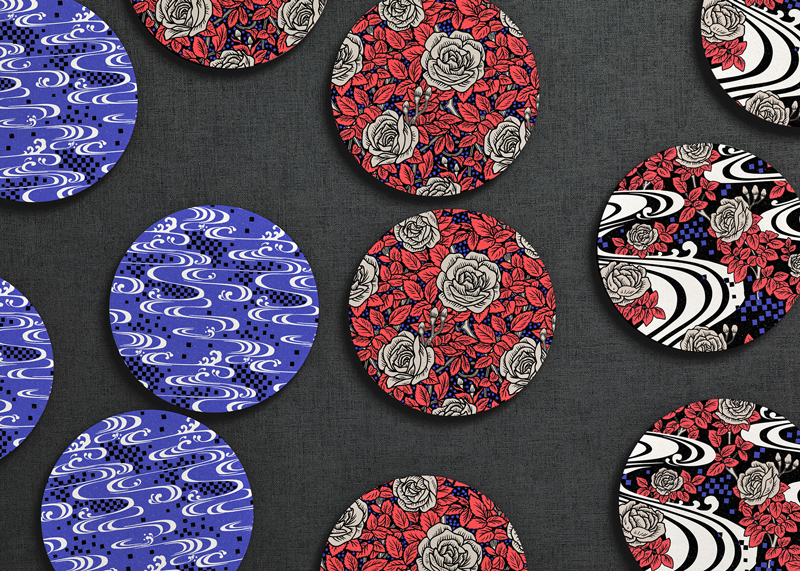
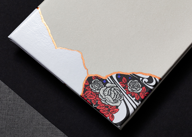
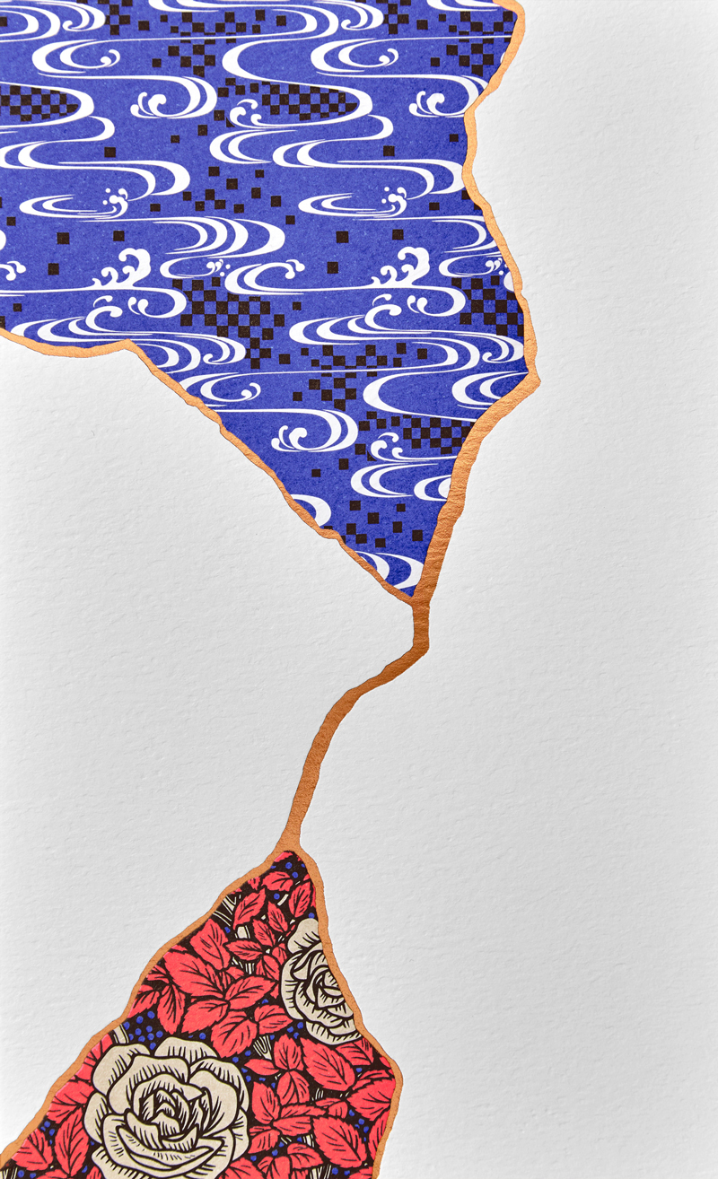
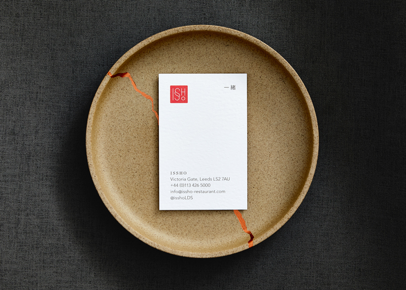
Issho is a Japanese restaurant based in England, in Leeds to be more accurate. In Japanese, the name of the place means “Togetherness”, a quite appropriate name for a place that bring people together.

For their branding, the restaurant owners called Dutchscot, a London-based design consultancy. The designers opted for a concept based on the traditional Japanese art of Kintsugi, which is the art or repairing broken items with gold joints.

Issho branding by Dutchscot

Post pobrano z: Issho branding by Dutchscot

Issho is a Japanese restaurant based in England, in Leeds to be more accurate. In Japanese, the name of the place means “Togetherness”, a quite appropriate name for a place that bring people together.

For their branding, the restaurant owners called Dutchscot, a London-based design consultancy. The designers opted for a concept based on the traditional Japanese art of Kintsugi, which is the art or repairing broken items with gold joints.

Valid CSS Content

Post pobrano z: Valid CSS Content

There is a content property in CSS that’s made to use in tandem with the ::before and ::after pseudo elements. It injects content into the element.

Here’s an example:

<div 
  data-done="✅"
  class="email">
    chriscoyier@gmail.com
</div>
.email::before {
  content: attr(data-done) " Email: "; /* This gets inserted before the email address */
}

The property generally takes anything you drop in there. However, there are some invalid values it won’t accept. I heard from someone recently who was confused by this, so I had a little play with it myself and learned a few things.

This works fine:

/* Valid */
::after {
  content: "1";
}

…but this does not:

/* Invalid, not a string */
::after {
  content: 1;
}

I’m not entirely sure why, but I imagine it’s because 1 is a unit-less number (i.e. 1 vs. 1px) and not a string. You can’t trick it either! I tried to be clever like this:

/* Invalid, no tricks */
::after {
  content: "" 1;
}

You can output numbers from attributes though, as you might suspect:

<div data-price="4">Coffee</div>
/* This "works" */
div::after {
  content: " $" attr(data-price);
}

But of course, you’d never use generated content for important information like a price, right?! (Please don’t. It’s not very accessible, nor is the text selectable.)

Even though you can get and display that number, it’s just a string. You can’t really do anything with it.

<div data-price="4" data-sale-modifier="0.9">Coffee</div>
/* Not gonna happen */
div::after {
  content: " $" 
    calc(attr(data-price) * attr(data-sale-modifier));
}

You can’t use numbers, period:

/* Nope */
::after {
  content: calc(2 + 2);
}

Heads up! Don’t try concatenating strings like you might in PHP or JavaScript:

/* These will break */
::after {
  content: "1" . "2" . "3";
  content: "1" + "2" + "3";

  /* Use spaces */
  content: "1" "2" "3";
  /* Or nothing */
  content: "1 2 3";
  /* The type of quote (single or double) doesn't matter, but content not coming back from attr() does need to be quoted. */
}

There is a thing in the spec for converting attributes into the actual type rather than treating them all like strings…

<wood length="12" />
wood {
  width: attr(length em); /* or other values like "number", "px", or "url" */
}

…but I’m fairly sure that isn’t working anywhere yet. Plus, it doesn’t help us with pseudo elements anyway, since strings already work and numbers don’t.

The person who reached out to me over email was specifically confused why they were unable to use calc() on content. I’m not sure I can help you do math in this situation, but it’s worth knowing that pseudo elements can be counters, and those counters can do their own limited form of math. For example, here’s a counter that starts at 12 and increments by -2 for each element at that level in the DOM.

See the Pen Backwards Double Countdown by Chris Coyier (@chriscoyier) on CodePen.

The only other thing we haven’t mentioned here is that a pseudo element can be an image. For example:

p:before {
  content: url(image.jpg);
}

…but it’s weirdly limited. You can’t even resize the image. ¯\_(ツ)_/¯

Much more common is using an empty string for the value (content: "";) which can do things like clear floats but also be positioned, sized and have a background of its own.

The post Valid CSS Content appeared first on CSS-Tricks.

POSTing an Indeterminate Checkbox Value

Post pobrano z: POSTing an Indeterminate Checkbox Value

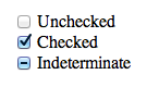
There is a such thing as an indeterminate checkbox value. It’s a checkbox (<input type="checkbox">) that isn’t checked. Nor is it not checked. It’s indeterminate.

We can even select a checkbox in that state and style it with CSS!

Some curious points though:

  1. It’s only possible to set via JavaScript. There is no HTML attribute or value for it.
  2. It doesn’t POST (or GET or whatever else) or have a value. It’s like being unchecked.

So, say you had a form like this:

<form action="" method="POST" id="form">
  
  <input name="name" type="text" value="Chris" />
  
  <input name="vegetarian" type="checkbox" class="veg">
  
  <input type="submit" value="Submit">
  
</form>

And, for whatever reason, you make that checkbox indeterminate:

let veg = document.querySelector(".veg");
veg.indeterminate = true;

If you serialize that form and take a look at what will POST, you’ll get "name=Chris". No value for the checkbox. Conversely, had you checked the checkbox in the HTML and didn’t touch it in JavaScript, you’d get "name=Chris&vegetarian=on".

Apparently, this is by design. Checkboxes are meant to be boolean, and the indeterminate value is just an aesthetic thing meant to indicate that visual „child” checkboxes are in a mixed state (some checked, some not). That’s fine. Can’t change it now without serious breakage of websites.

But say you really need to know on the server if a checkbox is in that indeterminate state. The only way I can think of is to have a buddy hidden input that you keep in sync.

<input name="vegetarian" type="checkbox" class="veg">
<input name="vegetarian-value" type="hidden" class="veg-value">
let veg = document.querySelector(".veg");
let veg_value = document.querySelector(".veg-value"); 
veg.indeterminate = true;
veg_value.value = "indeterminate";

I’ve set the indeterminate value of one input and I’ve set another hidden input value to "indeterminate", which I can POST. Serialized means it looks like "name=Chris&vegetarian-value=indeterminate". Good enough.

See the Pen Can you POST an intermediate value? by Chris Coyier (@chriscoyier) on CodePen.

The post POSTing an Indeterminate Checkbox Value appeared first on CSS-Tricks.

POSTing an Indeterminate Checkbox Value

Post pobrano z: POSTing an Indeterminate Checkbox Value

There is a such thing as an indeterminate checkbox value. It’s a checkbox (<input type="checkbox">) that isn’t checked. Nor is it not checked. It’s indeterminate.

We can even select a checkbox in that state and style it with CSS!

Some curious points though:

  1. It’s only possible to set via JavaScript. There is no HTML attribute or value for it.
  2. It doesn’t POST (or GET or whatever else) or have a value. It’s like being unchecked.

So, say you had a form like this:

<form action="" method="POST" id="form">
  
  <input name="name" type="text" value="Chris" />
  
  <input name="vegetarian" type="checkbox" class="veg">
  
  <input type="submit" value="Submit">
  
</form>

And, for whatever reason, you make that checkbox indeterminate:

let veg = document.querySelector(".veg");
veg.indeterminate = true;

If you serialize that form and take a look at what will POST, you’ll get "name=Chris". No value for the checkbox. Conversely, had you checked the checkbox in the HTML and didn’t touch it in JavaScript, you’d get "name=Chris&vegetarian=on".

Apparently, this is by design. Checkboxes are meant to be boolean, and the indeterminate value is just an aesthetic thing meant to indicate that visual „child” checkboxes are in a mixed state (some checked, some not). That’s fine. Can’t change it now without serious breakage of websites.

But say you really need to know on the server if a checkbox is in that indeterminate state. The only way I can think of is to have a buddy hidden input that you keep in sync.

<input name="vegetarian" type="checkbox" class="veg">
<input name="vegetarian-value" type="hidden" class="veg-value">
let veg = document.querySelector(".veg");
let veg_value = document.querySelector(".veg-value"); 
veg.indeterminate = true;
veg_value.value = "indeterminate";

I’ve set the indeterminate value of one input and I’ve set another hidden input value to "indeterminate", which I can POST. Serialized means it looks like "name=Chris&vegetarian-value=indeterminate". Good enough.

See the Pen Can you POST an intermediate value? by Chris Coyier (@chriscoyier) on CodePen.

The post POSTing an Indeterminate Checkbox Value appeared first on CSS-Tricks.

The Way We Talk About CSS

Post pobrano z: The Way We Talk About CSS

There’s a ton of very quotable stuff from Rachel Andrew’s latest post all about CSS and how we talk about it in the community:

CSS has been seen as this fragile language that we stumble around, trying things out and seeing what works. In particular for layout, rather than using the system as specified, we have so often exploited things about the language in order to achieve far more complex layouts than it was ever designed for. We had to, or resign ourselves to very simple looking web pages.

Rachel goes on to argue that we probably shouldn’t disparage CSS for being so weird when there are very good reasons for why and how it works — not to mention that it’s getting exponentially more predictable and powerful as time goes by:

There is frequently talk about how developers whose main area of expertise is CSS feel that their skills are underrated. I do not think we help our cause by talking about CSS as this whacky, quirky language. CSS is unlike anything else, because it exists to serve an environment that is unlike anything else. However we can start to understand it as a designed language, with much consistency. It has codified rules and we can develop ways to explain and teach it, just as we can teach our teams to use Bootstrap, or the latest JavaScript framework.

I tend to feel the same way and I’ve been spending a lot of time thinking about how best to reply to folks that argue that “CSS is dumb and weird.” It can sometimes be a demoralizing challenge, attempting to explain why your career and area of expertise is a useful one.

I guess the best way to start doing that is to stand up and say, “No, CSS is not dumb and weird. CSS is awesome!”

Direct Link to ArticlePermalink

The post The Way We Talk About CSS appeared first on CSS-Tricks.

Styling the Gutenberg Columns Block

Post pobrano z: Styling the Gutenberg Columns Block

WordPress 5.0 is quickly approaching, and the new Gutenberg editor is coming with it. There’s been a lot of discussion in the WordPress community over what exactly that means for users, designers, and developers. And while Gutenberg is sure to improve the writing experience, it can cause a bit of a headache for developers who now need to ensure their plugins and themes are updated and compatible.

One of the clearest ways you can make sure your theme is compatible with WordPress 5.0 and Gutenberg is to add some basic styles for the new blocks Gutenberg introduces. Aside from the basic HTML blocks (like paragraphs, headings, lists, and images) that likely already have styles, you’ll now have some complex blocks that you probably haven’t accounted for, like pull quotes, cover images, buttons, and columns. In this article, we’re going to take a look at some styling conventions for Gutenberg blocks, and then add our own styles for Gutenberg’s Columns block.

Block naming conventions

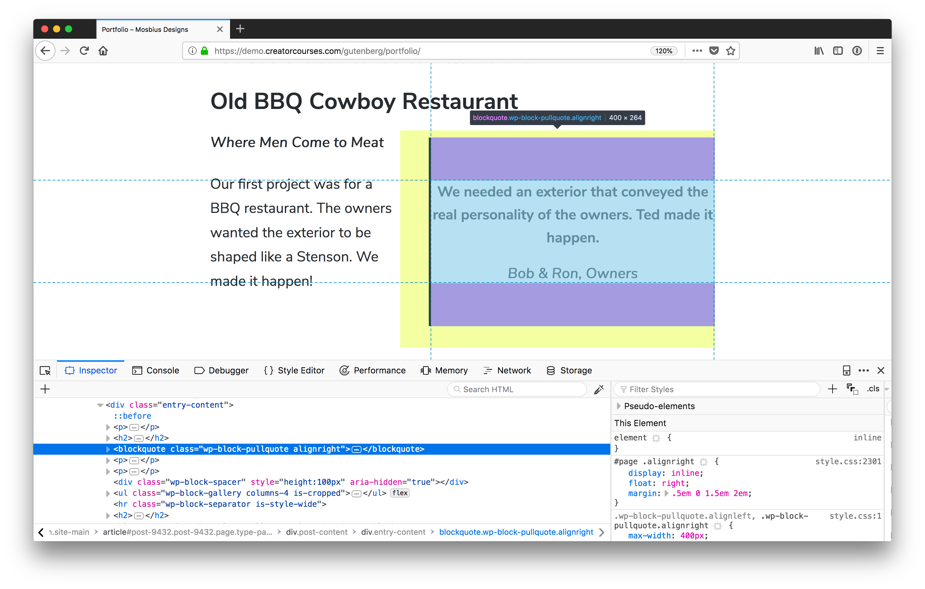
First things first: how are Gutenberg blocks named? If you’re familiar with the code inspector, you can open that up on a page using the block you want to style, and check it for yourself:

The Gutenberg Pull Quote block has a class of wp-block-pullquote.

Now, it could get cumbersome to do that for each and every block you want to style, and luckily, there is a method to the madness. Gutenberg blocks use a form of the Block, Element, Modifier (BEM) naming convention. The main difference is that the top level for each of the blocks is wp . So, for our pull quote, the name is wp-block-pullquote. Columns would be wp-block-columns, and so on. You can read more about it in the WordPress Development Handbook.

Class name caveat

There is a small caveat here in that the block name may not be the only class name you’re dealing with. In the example above, we see that the class alignright is also applied. And Gutenberg comes with two new classes: alignfull and alignwide. You’ll see in our columns that there’s also a class to tell us how many there are. But we’ll get to that soon.

Applying your own class names

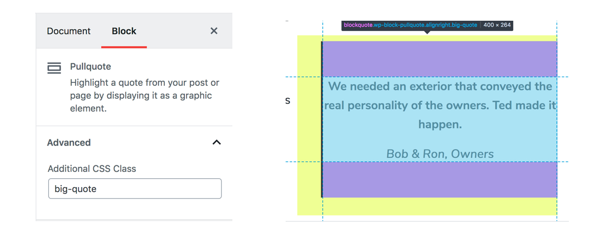
Gutenberg blocks also give us a way to apply our own classes:

The class added to the options panel in the Gutenberg editor (left). It gets applied to the element, as seen in DevTools (right).

This is great if you want to have a common set of classes for blocks across different themes, want to apply previously existing classes to blocks where it makes sense, or want to have variations on blocks.

Much like the current (or “Classic”) WordPress post editor, Gutenberg makes as few choices as possible for the front end, leaving most of the heavy lifting to us. This includes the columns, which basically only include enough styles to make them form columns. So we need to add the padding, margins, and responsive styles.

Styling columns

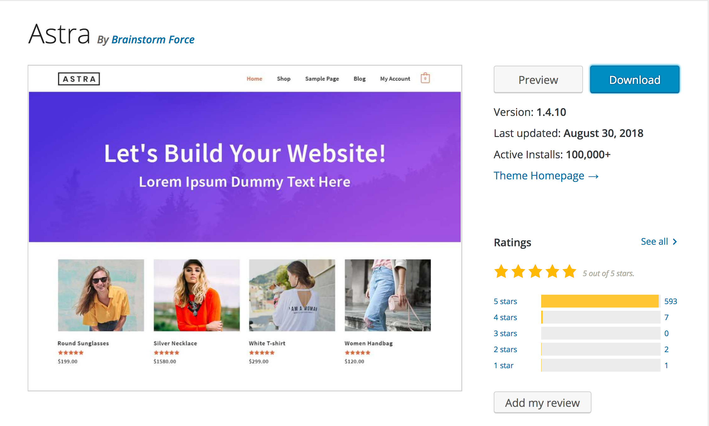
Time to get to the crux of the matter: let’s style some columns! The first thing we’ll need to do is find a theme that we can use. There aren’t too many that have extensive Gutenberg support yet, but that’s actually good in our case. Instead, we’re going to use a theme that’s flexible enough to give us a good starting point: Astra.

Astra is available for free in the WordPress Theme Directory. (Source)

Astra is a free, fast, and flexible theme that has been designed to work with page builders. That means that it can give us a really good starting template for our columns. Speaking of which, we need some content. Here’s what we’ll be working with:

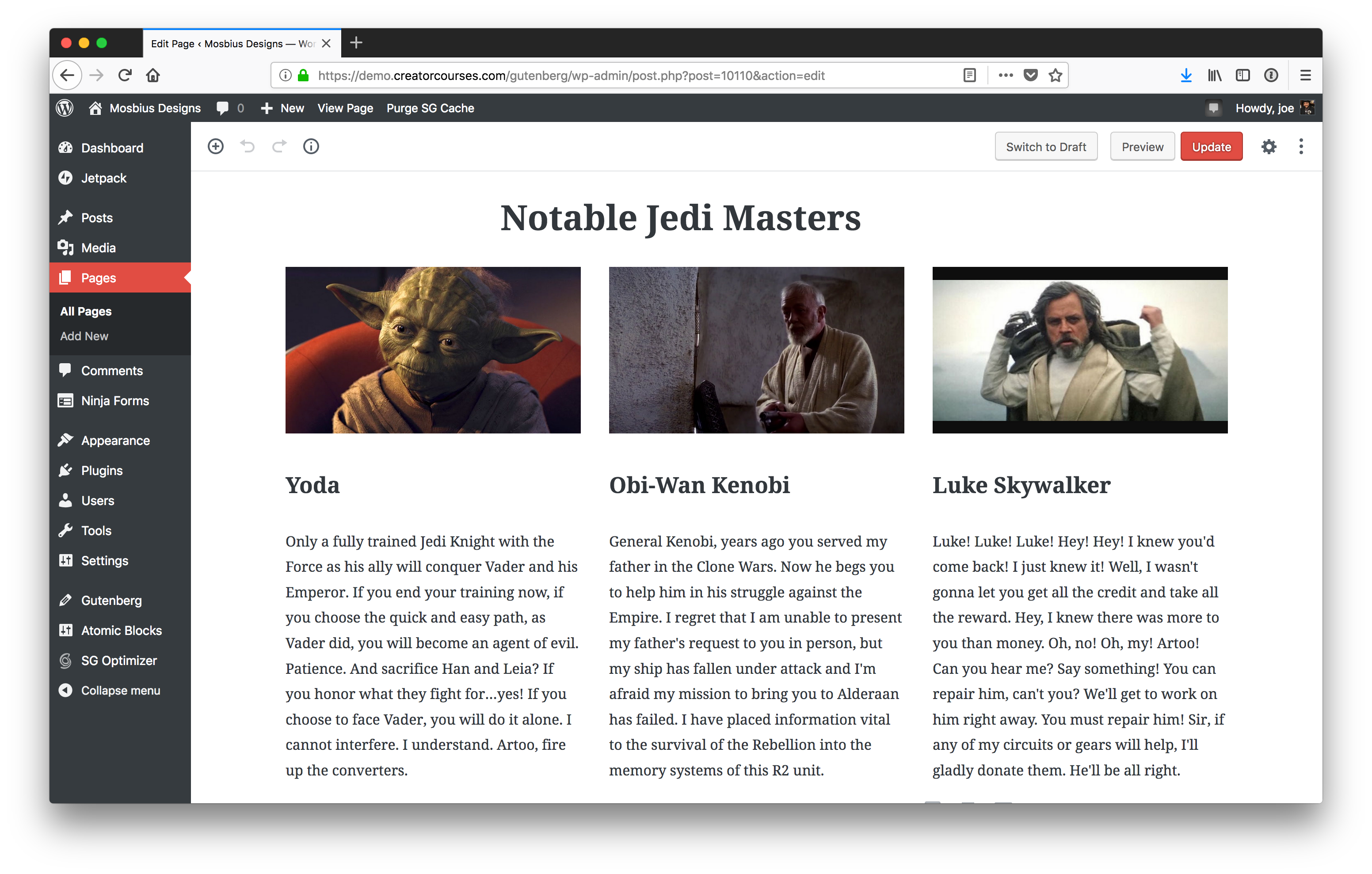
Our columns inside the Gutenberg editor.

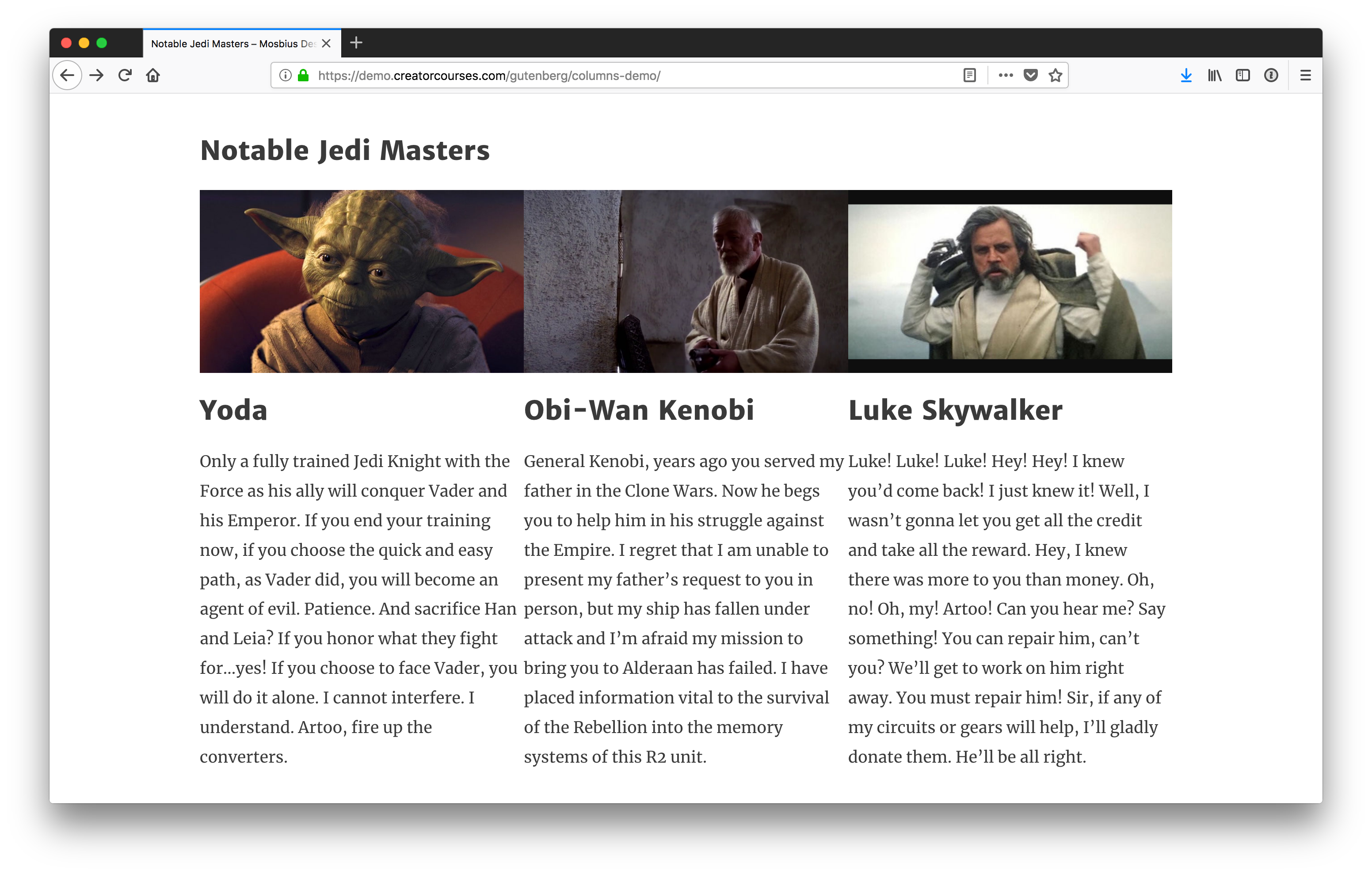
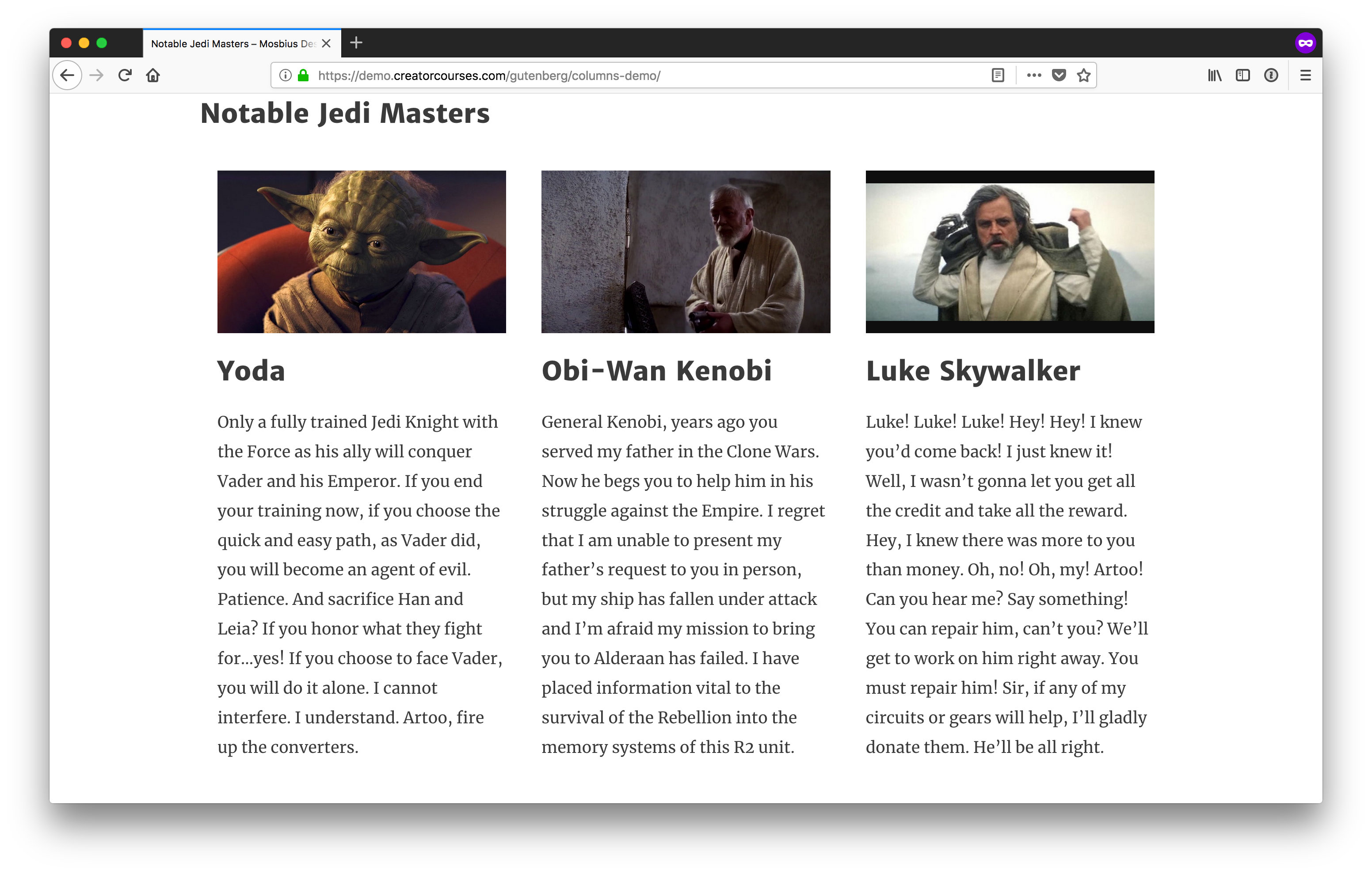
We have a three-column layout with images, headings, and text. The image above is what the columns look like inside the Gutenberg editor. Here’s what they look like on the front end:

Our columns on the front end.

You can see there are a few differences between what we see in the editor and what we see on the front end. Most notably, there is no spacing in between the columns on the front end. The left end of the heading on the front end is also lined up with the left edge of the first column. In the editor, it is not because we’re using the alignfull class.

Note: For the sake of this tutorial, we’re going to treat .alignfull, .alignwide, and no alignment the same, since the Astra theme does not support the new classes yet.

How Gutenberg columns work

Now that we have a theme, we to answer the question: “how do columns in Gutenberg work?”

Until recently, they were actually using CSS grid, but then switched to flexbox. (The reasoning was that flexbox offers wider browser support.) That said, the styles are super light:

.wp-block-columns {
  display: flex;
}

.wp-block-column {
  flex: 1;
}

We’ve got a pen with the final styles if you want to see the result we are aiming for. You can see in it that Gutenberg is only defining the flexbox and then stating each column should be the same length. But you’ll also notice a couple of other things:

  • The parent container is wp-block-columns.
  • There’s also the class has-3-columns, noting the number of columns for us. Gutenberg supports anywhere from two to six columns.
  • The individual columns have the class wp-block-column.

This information is enough for us to get started.

Styling the parents

Since we have flexbox applied by default, the best action to take is to make sure these columns look good on the front end in a larger screen context like we saw earlier.

First and foremost, let’s add some margins to these so they aren’t running into each other, or other elements:

/* Add vertical breathing room to the full row of columns. */
.wp-block-columns {
  margin: 20px 0;
}

/* Add horiztonal breathing room between individual columns. */
.wp-block-column {
  margin: 0 20px;
}

Since it’s reasonable to assume the columns won’t be the only blocks on the page, we added top and bottom margins to the whole parent container so there’s some separation between the columns and other blocks on the page. Then, so the columns don’t run up against each other, we apply left and right margins to each individual column.

Columns with some margins added.

These are starting to look better already! If you want them to look more uniform, you can always throw text-align: justify; on the columns, too.

Making the columns responsive

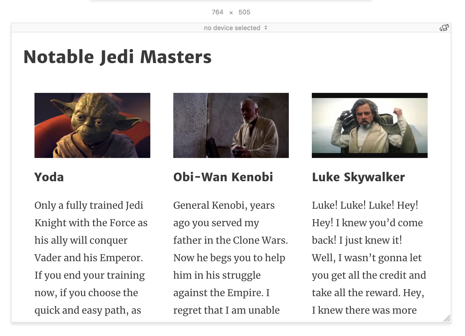
The layout starts to fall apart when we move to smaller screen widths. Astra does a nice job with reducing font sizes as we shrink down, but when we start to get around 764px, things start to get a little cramped:

Our columns at 764px wide.

At this point, since we have three columns, we can explicitly style the columns using the .has-3-columns class. The simplest solution would be to remove flexbox altogether:

@media (max-width: 764px) {
  .wp-block-columns.has-3-columns {
    display: block;
  }
}

This would automatically convert our columns into blocks. All we’d need to do now is adjust the padding and we’re good to go — it’s not the prettiest solution, but it’s readable. I’d like to get a little more creative, though. Instead, we’ll make the first column the widest, and then the other two will remain columns under the first one.

This will only work depending on the content. I think here it’s forgivable to give Yoda priority as the most notable Jedi Master.

Let’s see what that looks like:

@media screen and (max-width: 764px) {
  .wp-block-columns.has-3-columns {
    flex-flow: row wrap;
  }
  
  .has-3-columns .wp-block-column:first-child {
    flex-basis: 100%;
  }
}

In the first few lines after the media query, we’re targeting .has-3-columns to change the flex-flow to row wrap. This will tell the browser to allow the columns to fill the container but wrap when needed.

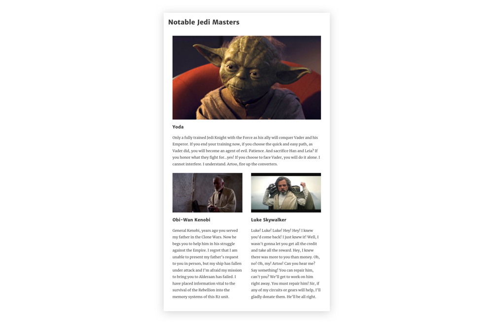
Then, we target the first column with .wp-block-column:first-child and we tell the browser to make the flex-basis 100%. This says, “make the first column fill all available space.” And since we’re wrapping columns, the other two will automatically move to the next line. Our result is this:

Our newly responsive columns.

The nice part about this layout is that with row wrap, the columns all become full-width on the smallest screens. Still, as they start to get hard to read before that, we should find a good breakpoint and set the styles ourselves. Around 478px should do nicely:

@media (max-width: 478px) {
  .wp-block-columns.has-3-columns {
    display: block;
  }
  
  .wp-block-column {
    margin: 20px 0;
  }
}

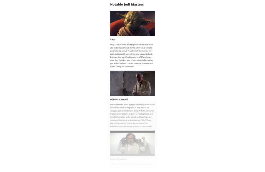
This removes the flex layout, and reverses the margins on the individual columns, maintaining the spacing between them as they move to a stacked layout.

Our small screen layout.

Again, you can see all these concepts come together in the following demo:

See the Pen Gutenberg Columns by Joe Casabona (@jcasabona) on CodePen.

If you want to see a different live example, you can find one here.

Wrapping up

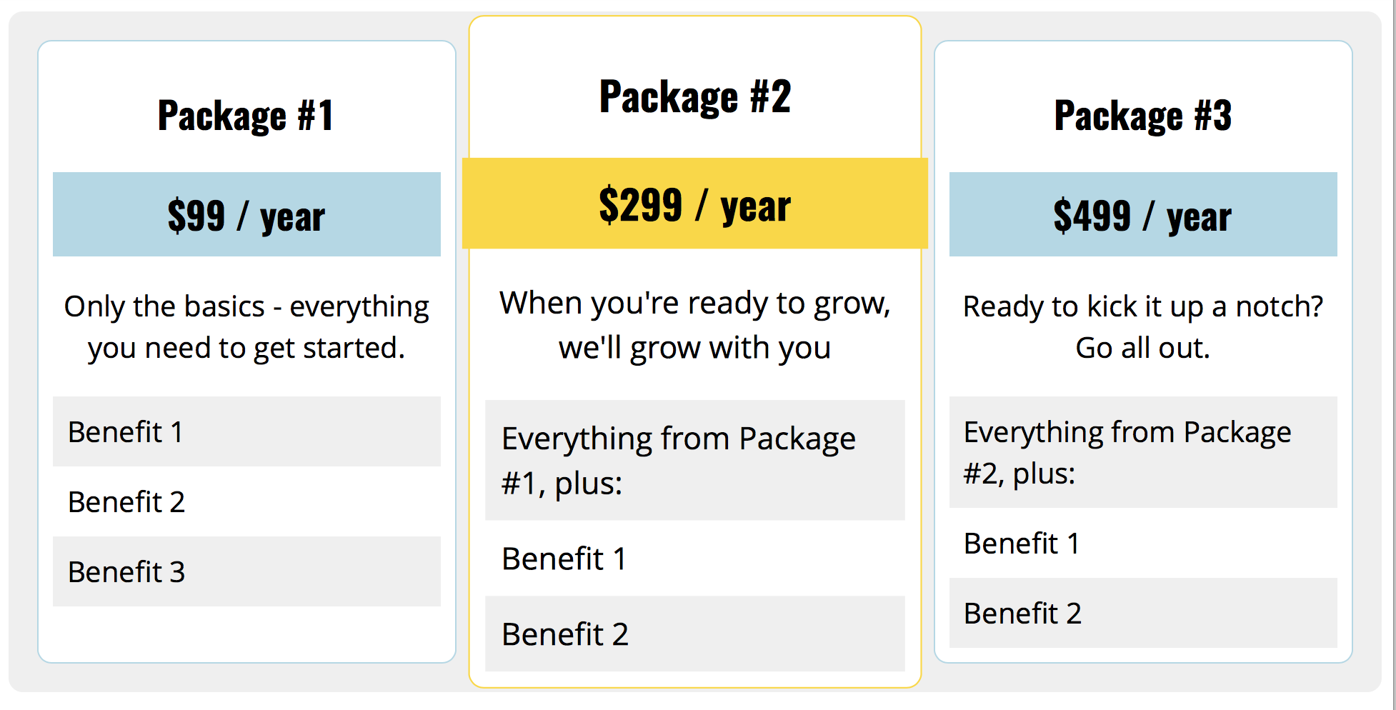
So, there you have it! In this tutorial, we examined how Gutenberg’s Columns block works, it’s class naming conventions, and then applied basic styles to make the columns look good at every screen size on the front end. From here, you can take this code and run with it — we’ve barely scratched the surface and you can do tons more with the CSS alone. For example, I recently made this pricing table using only Gutenberg Columns:

(Live Demo)

And, of course, there are the other blocks. Gutenberg puts a lot of power into the hands of content editors, but even more into the hands of theme developers. We no longer need to build the infrastructure for doing more complex layouts in the WordPress editor, and we no longer need to instruct users to insert shortcodes or HTML to get what need on a page. We can add a little CSS to our themes and let content creators do the rest.

If you want to get more in-depth into preparing your theme for Gutenberg, you can check out my course, Theming with Gutenberg. We go over how to style lots of different blocks, set custom color palettes, block templates, and more.

The post Styling the Gutenberg Columns Block appeared first on CSS-Tricks.