Create a new 500 x 104 px document, and double-click the Background layer to unlock it.
Step 2
Double-click the Layer 1 layer to apply a Gradient Overlay effect with these settings:
Check the Dither box.
Use the faucet 150 gradient fill.
Step 3
Pick the Single Column Marquee Tool and click once anywhere to select a single vertical line.
Then, go to Edit > Define Pattern, and set the Name to Lines.
2. How to Create a Background Texture
Step 1
Create a new 850 x 588 px document with the Resolution value set to 300, place the Black grunge wall texture image on top of the Background layer, and resize it as needed.
Step 2
Go to Image > Adjustments > Levels, and change the Gamma value to 1.10.
Step 3
Double-click the texture layer to apply a Color Overlay effect with these settings:
Color: #3b7aab
Blend Mode: Overlay
This will add a blue color to the texture.
3. How to Create and Style Text Layers
Step 1
Create the text using the font Kenney Future, and set the Size to 50 pt.
Duplicate the text layer and change the copy’s Fill value to 0%.
Double-click the original text layer to apply the following layer style:
Step 2
Add a Bevel and Emboss with these settings:
Style: Stroke Emboss
Technique: Chisel Hard
Depth: 550
Size: 6
Uncheck the Use Global Light box
Angle: -169
Altitude: 37
Gloss Contour: Ring
Check the Anti-aliased box
Highlight Mode: Color Dodge
Opacity: 75%
Shadow Mode: Linear Burn
Opacity: 40%
Step 3
Add a Contour with these settings:
Contour: Cone – Inverted
Check the Anti-aliased box.
Range: 100%
Step 4
Add a Stroke with these settings:
Size: 3
Position: Outside
Fill Type: Gradient
Angle: 90
Click the Gradient box to create the gradient
Create the Gradient by adding alternating Color Stops of the Colors#1b5ad3 and #6db7fd.
Step 5
Add an Inner Shadow with these settings:
Blend Mode: Color Burn
Color: #0886f1
Opacity: 60%
Uncheck the Use Global Light box
Angle: 90
Distance: 0
Choke: 25
Size: 9
Step 6
Add an Inner Glow with these settings:
Blend Mode: Vivid Light
Opacity: 70%
Color: #7ffffd
Choke: 30
Size: 16
Check the Anti-aliased box
Range: 100
Step 7
Add a Gradient Overlay with these settings:
Check the Dither box
Blend Mode: Linear Burn
Opacity: 75%
Scale: 109%
Create the Gradient using the Colors#145190 to the left and #9517ff to the right.
Step 8
Add a Pattern Overlay with these settings:
Pattern: Lines
Scale: 7%
Step 9
Add an Outer Glow with these settings:
Blend Mode: Overlay
Opacity: 75%
Color: #dd69ff
Spread: 10
Size: 30
Check the Anti-aliased box
Step 10
Add a Drop Shadow with these settings:
Opacity: 100%
Uncheck the Use Global Light box
Angle: 90
Distance: 10
Spread: 30
Size: 15
Step 11
Add another instance of the Drop Shadow effect with these settings:
Opacity: 70%
Uncheck the Use Global Light box
Angle: 90
Distance: 20
Size: 35
This will create the main effect.
4. How to Add More Layer Effects
Double-click the copy text layer to apply the following layer style:
Step 1
Add a Bevel and Emboss with these settings:
Size: 49
Uncheck the Use Global Light box
Angle: 58
Altitude: 21
Gloss Contour: Cone – Inverted
Check the Anti-aliased box
Highlight Mode: Vivid Light
Opacity: 77%
Shadow Mode:
Opacity: 0%
Step 2
Add a Contour with these settings:
Contour: Rolling Slope – Descending
Check the Anti-aliased box.
Range: 100%
Step 3
Add an Inner Shadow with these settings:
Blend Mode: Soft Light
Color: #ab2eec
Opacity: 100%
Uncheck the Use Global Light box
Angle: 90
Distance: 0
Size: 21
Step 4
Add an Inner Glow with these settings:
Blend Mode: Vivid Light
Opacity: 25%
Gradient: Use the Colors #3b5e7e to the left, #588b8a in the middle, and #c5c396 to the right
Source: Center
Size: 51
Check the Anti-aliased box
Range: 100%
Step 5
Add a Gradient Overlay with these settings:
Check the Dither box
Blend Mode: Linear Light
Opacity: 50%
Scale: 109%
Create the Gradient using the Colors#98addc to the left and #9e727f to the right.
Step 6
Add a Pattern Overlay with these settings:
Blend Mode: Multiply
Pattern: Paper 2
Step 7
Add an Outer Glow with these settings:
Blend Mode: Color Dodge
Opacity: 75%
Color: #88621f
Spread: 10
Size: 20
This will finish off the text effect.
5. How to Add Finishing Touches
Step 1
If you want to add more than one line of text, just duplicate both styled text layers, and change their contents.
Step 2
Click the Create new fill or adjustment layer icon at the bottom of the Layers panel and choose Color Lookup.
Choose the Fuji REALA 500D Kodak 2392 (by Adobe).cube table from the 3DLUT File menu, and change the layer’s Opacity to 35%.
Congratulations, You’re Done!
In this tutorial, we used textures, patterns, and layer styles to create a quick and easy tech-inspired scan-lines text effect.
Please feel free to leave your comments, suggestions, and outcomes below.
Welcome back! We’ve just taken a look at what Gutenberg is and how it operates from the admin side. Gutenberg is certainly going to have a massive impact on the WordPress world. If you are just arriving here and have no idea what we’re talking about, I recommend at least skimming Part 1 to make sure you have the appropriate background.
Let’s create a custom block with a bit of help from a wonderful tool called create-guten-block. Onward!
To create a Gutenberg block, you create a WordPress plugin. Anything that affects *content*, like a Gutenberg block certain will, needs to be a plugin so that it remains active even as you change themes. Something that is very theme-specific or just affects how your site looks can be part of the theme files or functions.php file in your theme. Read more about this distinction in our article about WordPress Functionality Plugins.
That said, the blocks in themes issue is a hot topic. The WordPress Theme Review Team is discussing whether or not to allow blocks in themes at all as part of themes. A post, “Getting Ready for Gutenberg”, on the Theme Review Team’s Make page posed this question, and was met with strong opinions from both sides. The general consensus, however, is that blocks are plugin territory.
WordPress.org is comprised of various teams, each with their own homepage at make.wordpress.org/team-name, channel in the WordPress Slack, and a weekly meeting. If you are interested in getting involved in WordPress or curious about how it operates, I highly recommend browsing through a list of the teams here, joining a Slack channel, and popping into a weekly meeting to see how it all happens.
In the far future, it’s possible that themes will consist of *just a stylesheet*, while all custom functionality and content structure come from blocks in plugins. I’m paraphrasing the words of Tammie Lister, Gutenberg’s design lead, on this episode of Shoptalk Show. Very much worth a listen!
Taking a setup shortcut… for now
What’s kept me from diving head first into modern JavaScript is the dang configuration. The transpiling, the bundling, the code splitting, the tree shaking… yeesh, I’m busy! I love learning new things, but there’s a limit to my patience and, apparently, configuring a build process for a small test project is my limit.
It’s this sentiment that led to the development of a tool called create-react-app, zero-configuration build setup for, you guessed it, creating React apps. It’s brilliant. Assuming you have a functioning node and npm installation, you can run a single command and you have a project ready for you to start coding in React. The transpiling, bundling, and tree shaking is set up for you.
But wait… can we use create-react-app for Gutenberg blocks? No, but the aforementioned create-guten-block, developed and beautifully documented by Ahmad Awais, does pretty much the same thing for us! That’s what we’ll be using for our block.
create-guten-block is not the only block generating tool at our disposal! You can scaffold a block using WP-CLI, but I have chosen not to because the default setup is for ES5 (for now) and does not give us what we need for our journey into modern JavaScript. That being said, I found it helpful to dig through the ES5 implementation of a block as a way to reinforce the core concepts, so maybe give it a go after you finish here!
Yes, this is a shortcut. We are choosing to avoid understanding the core concepts of a technology by using a tool. We’ll have to learn these concepts someday. But for now, I’m totally fine bypassing this configuration step. My philosophy about using tools such as this: use them, but do so with the understanding that it *probably* won’t save you time or effort in the long run.
It’s worth noting that, like create-react-app, create-guten-block allows you to npm eject your configuration. This means exposing all of the settings the tool has created for us and making them available for customization. Note, however, that this is irreversible; if you eject and then make a mistake, you’re on your own to fix it! Like I said, you’ll have to learn it someday 🙂
Step 1: Install create-guten-block
We will first install create-guten-block globally, like so:
npm install -g create-guten-block
In theory this should work no problem, but that’s not realistic. create-guten-block requires a minimum of Node version 8 and npm 5.3, so if you haven’t updated either of them for a while, that’s one possible error (and here’s one possible solution).
I always start by pasting my console error into a search engine and removing line numbers and file names to keep my query general. In the interest of improving this tutorial, however, I am curious to hear about what went wrong so feel free to post your issue in the comments as well.
Step 2: Create that guten-block
It’s time! Let’s do it! You know what? I’m not going to tell you how because Ahmad’s documentation is so good and there’s no sense in replicating it.
Go here and follow Ahmad’s instructions to create that guten-block in your command line.
You should see something like this when running the command, create-guten-block test, where “test” is the name of my block.
Step 3: Activate the plugin
Go to your Plugins screen, activate your new block plugin — it should be called something like test-block — CGB Gutenberg Block Plugin where „test-block” is what you named your block when creating it.
Step 4: That’s it! Let’s use our custom block!
So easy! Now, go to the editor view of a post or page, locate your block, and insert it.
Although I named my block “test”, searching “test” in the block selector yielded the wrong result as you can see in the gif above. The default name of the block is instead “CGB Block” — we will change this very soon!
Text editor setup (optional)
I’ve found it very helpful to have a specific text editor setup for developing blocks. I use Visual Studio Code for my text editor, but I’m sure you can figure out something similar with whatever editor is your preference.
Here are the key ingredients:
Easy access to the command line to keep an eye on build errors (there will be build errors)
Easy access to both your plugin’s directory and Gutenberg’s source directory from #2
My VS Code setup for Gutenberg development. Notice the integrated terminal and multiple source directories on the right.
In VS Code, I accomplish this using the following features:
The integrated terminal — open with Command + ~ on Mac, or from the menu bar with View > Integrated Terminal
A Workspace containing folders for both your plugin and Gutenberg’s source from GitHub. You can doing this by opening your plugin directory in VS Code, then choosing File > Add Folder to Workspace and selecting the Gutenberg directory you downloaded from the GitHub repo. You can then save the Workspace for easy access with File > Save Workspace As (I called mine “Blocks” in the image above).
This part is optional, and you don’t have to use VS Code. The important thing is having ready access to the command line, your plugin’s source, and the Gutenberg plugin’s source for reference. You can totally reference the source on GitHub if you like, but I enjoy having the files in the same environment for side-by-side comparison and easy searching with Find In Folder.
We are using Gutenberg from the plugin repository for the actual functionality, but that instance only includes the compiled files. We want to reference the source files, so we need to use the codebase directly from GitHub. If you’d like to access updates before they are released in the plugin, you can clone the repository. It would be totally possible to build and work from the GitHub version, but for simplicity’s sake, we are using the plugin version in this tutorial.
Once you are ready to go, make sure you are cd’d into your block’s plugin folder and run npm start. You should see a satisfying message indicating the process has started:
After running npm start in our plugin folder, we are officially “Watching for changes…” (and we didn’t have to touch any config! Cheaters…)
I’m using Wes Bos’s theme for Cobalt 2 in VS Code as well as the same theme for ZSH in my Terminal and iTerm. This makes absolutely no difference in how the technology works, but it does make a difference, on a personal level, to customize your workspace and make it feel like your own (or Wes Bos’, in my case).
What’s what
Now that we are in code mode, let’s take a look at the files we’ll be working with. I’ll borrow this from the create-guten-block Readme for reference:
For the purposes of this tutorial, we are only concerned with what is inside the src directory. We will not touch anything in dist (those are compiled files), plugin.php, or any stragglers such as package.json, package-lock.json, or.eslintignore.
plugin.php officially alerts WordPress of our plugin’s existence. It requires src/init.php, which is where we’ll write any PHP we need for our block(s). In general, we won’t write anything in plugin.php — out of the box, the only code it contains are the comments to register our plugin.
The block directory contains files for single, individual block. This includes:
block/block.js — All the JavaScript for the individual block.
block/editor.scss — Sass partial for styles specific to the editor view,
block/style.scss — Sass partial for styles specific to the front-end view, i.e. what you see when you view your page/post.
Now, open up src/blocks.js:
I think of src/blocks.js as a table of contents for blocks, similar to the role of an index.scss or main.scss in a Sass project structure. If we wanted to include two blocks in our plugin — let’s say this was a suite of custom blocks — we could, in theory, duplicate the block directory, rename it, and add something like this to src/blocks.js:
import 'new-block/block.js';>
Then, whatever create-guten-block has prepared for us behind the scenes would know to include our new block’s block.js in the main script file compiled into dist (now is a good time to take a peek into dist, if you haven’t already).
Not too bad so far, right? We still haven’t really gotten to any JavaScript…
A challenge!
Okay, now it’s time for a challenge! Open up src/block/block.js and take a couple of minutes to read through the author, Ahmad’s, excellent comments.
Then, see if you can figure out how to*:
Change the name of your block, that is, the one that shows in the block selector
Change the icon of your block (❤ Dashicons)
Change the text that displays on the front end i.e. when you “View Post”
Change the text that displays on the back end i.e. editor view
Give the front end view a border radius of 30px
Give the editor view a gradient background
Make the text in first paragraph tag editable
* You should be able to work through (almost!) all of these in about 10 minutes. 😉
How was that?
What problems did you run into? Did you get tired of reloading the editor? Did you see the “This block appears to have been modified externally” message more often than you’d like? I sure did, but such is life with new technology — there’s a lot to be desired in the developer experience, but this isn’t a priority for the team at present and will come in the later stages of Gutenberg’s planned development.
Most importantly, did you get #7?
If you did, then you should be writing this tutorial! That one was a gotcha. I hope you felt at least a little confused and curious because that’s how we learn! We’ll get to that in Part 3.
Now that we have our bearings, let’s dig deeper into this notion of a block.
Skeleton of a block
Here is block.js with the comments stripped out — what we might call the skeleton of a static block:
// Stripped down version of src/block/block.js

// PART 1: Import dependencies
import './style.scss';
import './editor.scss';

// PART 2: Setup references to external functions
const { __ } = wp.i18n;
const { registerBlockType } = wp.blocks;

// PART 3: Register the block!
registerBlockType( 'cgb/block-test', {

  // Part 3.1: Block settings
  title: __( 'test - CGB Block' ),
  icon: 'shield',
  category: 'common',
  keywords: [
    __( 'test — CGB Block' ),
    __( 'CGB Example' ),
    __( 'create-guten-block' ),
  ],

  // PART 3.2: Markup in editor
  edit: function( props ) {
    return (
      <div>You’ll see this in the editor</div>
    );
  },

  // PART 3.3: Markup saved to database
  save: function( props ) {
    return (
      <div>This is saved to the database and returned with the_content();</div>
    );
  },
} );
Let’s do a side-by-side comparison with another static block, the “Separator” block from the default blocks included in Gutenberg. That file is is located in gutenberg/blocks/library/separator/index.js. If you have the folder open in either VS Code or Sublime, you can use the shortcut Command + Option + 2 on a Mac, or View > Split Editor to get the files side-by-side.
If you are following the text editor setup outlined previously, you should have something like this:
In this image, I copy/pasted the above stripped-down version of the block into an empty file to compare it without the comments. That’s optional!
What similarities do you notice? What differences? Open up a few of the other block directories inside gutenberg-master/library/, and take a peek into their files, comparing them to our block skeleton. Spend a few minutes reading the code and see if you can spot some patterns.
Here are a few patterns I noticed:
There are curly braces in variable declarations and function arguments all over the place.
Markup appears inside of return statements and often contains made-up tag names (you might recognize these as React components).
All blocks seem to have a settings object containing entires for title, icon , category, etc. In the library blocks, they appear in an export const settings = ... object, whereas in our plugin block, they are part of an argument for registerBlockType.
All blocks have functions for edit and save as part of the settings object.
The syntax for the functions is slightly different than our block’s editand save functions:
edit( { className } ) { ... } in separator/index.js
edit: function(props) { ... } in our block.js
The library blocks appear to reference attributes and instead of props
All blocks in the library contain an index.js. Some contain a block.js or other files that appear to contain a definition for a class extending a Component, e.g. class LatestPostsBlock extends Component { ....
What did you find? Feel free to contribute in the comments (but don’t stop reading here!).
A somewhat brief and relevant tangent
You probably noticed a statement importing @wordpress/i18n in every index.js and block.js file in the library, as well as a reference to wp.i18n in our plugin’s block.js. i18n stands for internationalization just like a11y stands for accessibility. Internationalization refers to the practice of developing your application to be easily translated to other languages. Since we want to prepare all static text in our blocks for translation, we assign wp.i18n to an alias of __for brevity, very much like we use the $ as an alias for good ‘ol jQuery. Read more about i18n for WordPress here
It’s also worth mentioning where that wp in wp.i18n is coming from and why it’s referenced as @wordpress/i18n in the Gutenberg source. wp is a global object — global meaning a variable available everywhere — containing all of WordPress’ publicly available JavaScript API methods. To demonstrate this, open up the console while on a page within the WordPress admin. Type wp and hit Enter. You should see something like this:
So, anytime we reference something within that wp object, all we are doing is accessing some functionality the WordPress JavaScript API provides us. @wordpress/i18n in the Gutenberg source is doing the same thing, but its importing the functions from an npm module rather than the global object. The functions in the wp global have been intentionally exposed to the public API by the WordPress core developers for use in themes and plugins.
If you are anything like my internal critic, you might be thinking, “Whatever, Lara, I don’t care about those details. Just tell me how to make a cool block with all the JavaScript already!” To which I would reply:
There are so many moving parts and new concepts in this environment that, I’ve found, the more code I take for granted, the more frustrating and time-consuming the process becomes. Approach every line of code with curiosity! If you don’t know what it does, do a Find in Folder in the Gutenberg source and see if you can find a trail to follow. For me, at least, this has been a much more enjoyable way to approach unfamiliar code than trying to build something haphazardly with copy and paste.
And with that, let’s wrap up Part 2!
Homework
What? Homework? Heck yes, there is homework! In Part 3, Andy 🍉 will dive into modern JavaScript goodies: React, JSX, and ES6 syntax. Although our series is written for those relatively new to JavaScript, it is helpful to learn the code and the concepts from many different angles and resources.
In an effort to introduce some concepts early on, here is an outline for some “Homework” prior to Part 3:
1. Spend some time (1-2 hours) on a React tutorial, or until you can explain in your own words:
The render method in React
JSX and that those made-up tag names map to JavaScript functions
Why React uses className instead of class
Recommended resources:
I really liked Learning React.js by Eve Porcello on Lynda.com. Lynda is a paid service, but you can watch for free with a library card in some cities (Los Angeles, for sure).
I’ve been working my way through Brian Holt’s Complete Intro to React course on Frontend Masters (paid) and it’s very good.
I can’t go without mentioning Wes Bos’s React for Beginners course(paid) — I haven’t done it myself, but I’ve heard only great things, and he keeps it up to date!
I’d also recommend reading React State from the Ground Up here on CSS-Tricks, by Kingsley Silas, because it specifically dives into state in React. If you are brand new to React, this will be a lot to digest, but I think it’s worth getting it into your brain ASAP even if it doesn’t make sense quite yet.
2. Understand ES6 Destructuring and find a few examples of it in both the Gutenberg source and our plugin (that won’t be hard).
3. Be comfortable with conditional or ternary operators.
In a sentence, ternary operators are shorthand for if...else statements. You’ll see these all over the Gutenberg source — find some simple examples that provide a fallback for a string’s value, as well as more robust uses like in blocks/library/paragraph/index.js, for example.
Not to get too far down this rabbit hole, but if you are extra ambitious, do some research about type coercion in JavaScript. This article on FreeCodeCamp and this chapter from You Don’t Know JS by Kyle Simpson are solid starting points.
Okay! Thank you so much for reading, and see you in Part 3 for React, JSX, and other goodies.
Comments
Was there any part of this tutorial that didn’t make sense? Did you get lost anywhere? We’d love to keep making this better, so please let us know if any part of this was hard to follow or if any information is incorrect or out of date.
Interestingly, one of the most important areas of a blog post is the comment section. This plays an important role in the success of a post or an article, as it allows proper interaction and participation from readers. This makes it inevitable for every platform with a direct comments system to handle it in realtime.
In this post, we’ll build an application with a live comment feature. This will happen in realtime as we will tap into the infrastructure made available by Pusher Channels. We will also use the sentiment analysis to measure whether comments are positive or negative, and display this information on an admin panel.
Let’s learn how to use the Mesh Tool while creating a photo-realistic T-shirt!
Begin by drawing the shape of half of a shirt with the Pen Tool (P). Fill it in with #F3F3F3.
Create a copy of the shape! Put it aside—we will need it later.
Let’s start using a Mesh! Take the Mesh Tool (U)
and start creating a Mesh grid on the object by placing nodes.
Afterwards, select the nodes on the left edge of the shirt and
change their color to #B7B7B7.
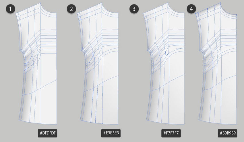
Add some more nodes, as indicated in the screenshot below, and color the selected nodes with #F4F4F4, adding wrinkles to the shirt.
Step 2
Continue coloring the nodes as indicated below. Use these colors:
#DFDFDF
#E3E3E3
#F7F7F7
#B9B9B9
Step 3
Take the second copy of the shirt, reflect it, and continue coloring.
#F3F3F3
#B7B7B7
#D9D9D9
#EEEEEE
Step 4
Finish the second half.
#CFCFCF
#C4C4C4
#B9B9B9
#E3E3E3
Step 5
Draw a sleeve.
#EAEAEA
#BDBDBD
#B6B6B6
#CFCFCF
#DADADA
#BDBDBD
Step 6
#E9E9E9
#C0C0C0
#F4F4F4
Step 7
Bend the Mesh into a collar with Effect > Warp > Arc, using -85% Bend.
Object > Expand Appearance of the result.
Step 8
Draw the second part of the collar.
#6A6A6A
#979797
Step 9
Combine the collar parts.
Step 10
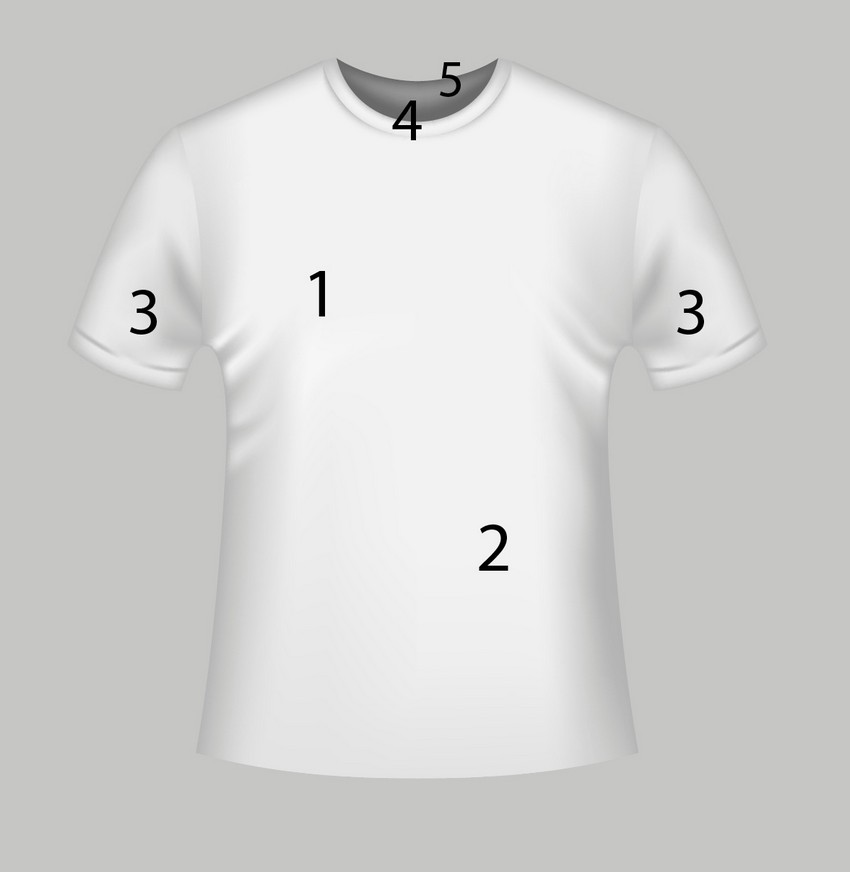
Assemble the T-shirt mockup!
2. How to Recolor the T-Shirt Mockup Template
Step 1
To get all the colors you can see in the thumbnail, create three more copies of the white shirt we just made.
Grab a copy and proceed to Edit > Edit Colors > Adjust Colors. Change the tab to Greyscale and apply 32% Black. Don’t forget to tick the Convert box.
Step 2
Create two more copies of the grey shirt mockup we just made. Grab the original and recolor it with Edit > Edit Colors > Adjust Colors.
This time, change the tab to RGB and apply 18% Red, -30% Green, and -26% Blue. Don’t forget to tick the Convert box.
Step 3
Take another copy and essentially repeat the last step by going to Edit > Edit Colors > Adjust Colors, changing the tab to RGB and applying 6% Red, 13% Green, and -60% Blue.
Step 4
Take the final copy and convert it to orange with 27% Red, -5% Green, and -41% Blue.
Step 5
Grab one of the original white T-Shirts and convert it to Grayscale with 40% Black.
Step 6
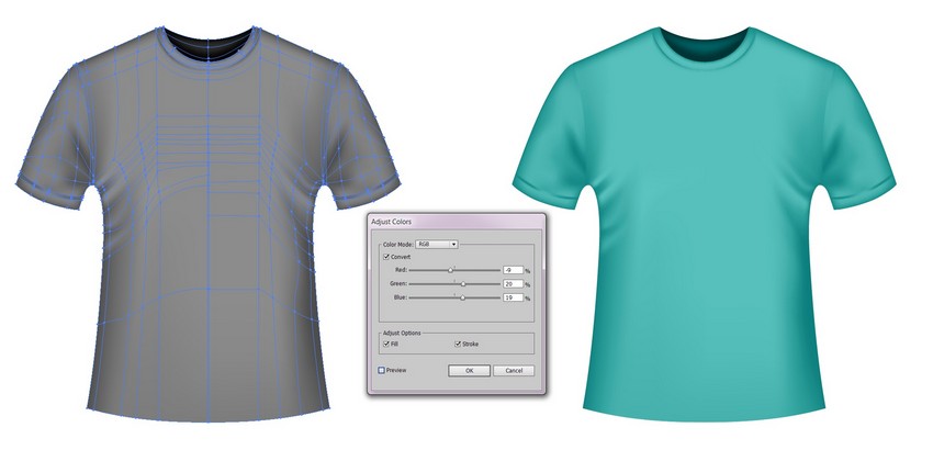
Recolor the grey template to cyan with -9% Red, 20% Green, and 16% Blue.
Step 7
Take the last white copy and turn it black with 63% Black.
Step 8
Create a copy of the black T-Shirt mockup and recolor it to dark red with 9% Red, -9% Green, and -7% Blue.
Step 9
Congratulations! Your colorful set of T-Shirt mockup templates is done!
Photo manipulations are a fun way to test out fantasy compositions and dramatic self-portraits. And you can place yourself into one easily by using a few simple tools in Photoshop!
So in this tutorial, I’ll show you how to create a magical self-portrait using stocks and 3D assets in Adobe Photoshop.
Get inspired! Find more stocks for your photo art on Envato Market.
Tutorial Assets
The following assets were used in the production of this tutorial
This year I’ve embarked on a personal project to place myself into more of my art. Not only has this been a great experience for learning about Photoshop, but it has also helped improve my overall confidence.
And if you want to make cool and creative self-portraits, you should definitely just go for it! You can see more of these self-portraits on my Instagram.
Forest Theme
For this portrait, I wanted to place myself into something more magical—a cool forest manipulation with a bit of fantasy and allure. To facilitate this, I recently bought an LED light from Home Depot ($20) and immediately got to experimenting with new pictures.
Let’s take a before and after look at the manipulation with the stocks we’ll be using:
Feel free to use your own self-portraits for this tutorial. Even smartphone pictures will do—just make sure you have enough light and clarity.
To save time on this extensive manipulation, I’ll be giving you a pre-edited version of my self-portrait made with frequency separation techniques and the background already removed.
But if you’re looking to get inspired by the photo shoot perspective, feel free to check out my previous tutorial:
Start by opening a New Document in Photoshop at 1500 x 2217 pixels and 72 dpi.
Feel free to increase the resolution if you plan on printing your portrait.
Copy and Paste the Forest Stock (with an image size of 1920 x 1848 pixels) onto a New Layer above the white background, resizing it to make it much bigger with the Free Transform Tool (Control-T).
This will be our new background. So go ahead and Delete the white layer below it.
Position the image so that it favors the left side. This will create an interesting perspective to place the portrait and other details.
Step 2
Now open the Self-Portrait Stock. Double-click the background layer to make it normal.
Use the Magic Wand Tool (W) to select the white background, and then hit Delete on your keyboard to remove it. If the selection spills over into the picture, just remove those areas by using the Lasso Tool (L).
Hold Control-A to select the entire image, and then Copy and Paste it onto a New Layer above the forest. Place the picture within the center of the composition.
When I originally took these pictures, I had no clue how I was going to use them. So you’ll notice that my picture is cut off on the left side since I was leaning up against a wall.
Because of this, I have built the entire composition keeping this in mind, so we’ll need to cover up any awkwardly cut areas next.
Step 3
To cover up those missing areas, we’ll use some simple leaves. Open the Leaves Stock in Photoshop. Follow the same steps as before.
Remove the dark background by selecting and deleting it with the Magic Wand Tool (W).
Then Copy and Paste the Leaves Stock onto a New Layer above the portrait.
Resize it for a much smaller fit as shown above, using the Free Transform Tool (Control-T).
Step 4
For more balance, let’s create more copies of the leaves layer.
Duplicate (Control-J) the leaves layer twice, and then flip both copies. Select each layer, and go to Edit > Transform > Flip Horizontal to flip it.
Now fill in both sides of the portrait with leaves.
Place the layer for the first copy above the original leaves layer. Then position the actual leaves underneath the first set to fill in the area beneath them.
Select the second leaves copy and position the layer underneath the portrait layer.Resize it for a much smaller fit (and more depth of field) with the Free Transform Tool (Control-T).
Now that we have the leaves all set, we can move on to adding butterflies.
2. How to Use 3D Assets From Envato Elements
A crucial part of this manipulation is the monarch butterflies. So I’ll be using amazing 3D assets from Envato Elements to help achieve this effect.
By using 3D assets, I’ll be able to position the butterflies at the exact angles I need for this composition. This means I can achieve a more believable and realistic effect for an incredible result.
Step 1
Start by locating each butterfly. Here are the three stocks I’ll be using:
Now View the 3D Render for each stock. Once it loads, position the butterfly at the angle you need. Move it up, down, or sideways to see different views.
Then download that angle.
For this particular set of butterflies, here are all five angles I’ll be downloading.
You’ll receive each butterfly as a transparent PNG (with accompany shadows), which you can easily place into the manipulation.
Step 2
Let’s add the butterflies!
Copy and Paste each butterfly angle onto New Layers above the rest.Resize each butterfly using the Transform Tool (Control-T).
Then add as many butterflies as you’d like. Since insects are usually drawn to light, I’ve made sure to face the butterflies towards the light. You can also rotate or even flip the images for more variation.
Continue resizing them in different areas for more depth of field. The first butterfly, for instance, is the largest because it’s closest to the viewer.
Try to tell a story with the butterflies. Rest a few on the leaves or even place one on my fingertips as shown above.
When you’re through, Merge the butterfly layers together.
Step 3
The setup for our manipulation is almost complete!
Our last step before we blur, relight and color the composition is to add more hair. For this portrait, I’ve already airbrushed any imperfections and even removed my right arm for a better composition.
Now I’ll use the Polygonal Lasso Tool (L) to make a selection of the curls on the right. Hold Control-J to Paste a copy onto a New Layer, and then resize the hair using the Free Transform Tool (Control-T).
Do the same for the left side to cover my shoulder.
Then Merge the hair layers with the portrait layer. You may need to reposition the leaves layer above the portrait/hair layers to allow this effect.
Now we have glorious extensions!
3. How to Create Depth of Field
Let’s move on!
With all of our elements in place, we can start to relight the composition and add depth of field. This will help create more realism and make it look as though the photo was actually taken within a forest setting.
Step 1
Start with the background.
Select the forest layer and go to Filter > Blur > Gaussian Blur.
Add a Radius of 3 pixels and hit OK.
Step 2
Now the leaves. Let’s slightly blur the original Leaves and Leaves copy layers next. Select each layer and go to Filter > Blur > Gaussian Blur. Then add a Radius of 2 pixels and hit OK.
Step 3
Let’s make the leaves in the background appear farther away.
Select the Leaves copy 2 layer and go to Filter > Blur Gaussian Blur. Set the Radius to 4.8 pixels and hit OK.
Step 4
Last, we’ll blur the front butterfly.
We’ve already made several butterflies fly out of the shot to create a lively and active scene. Now we can blur the front butterfly for even more depth.
Use the Lasso Tool (L) to make a quick selection around the front butterfly. Then go to Filter > Blur > Gaussian Blur, adding a Radius of 5 pixels.
Here’s a look at our composition so far!
Great! Let’s move on to lighting.
4. How to Adjust the Lighting
Now that everything is in place, it’s important to get the lighting as perfect as we can. Keep in mind that every photo manipulation requires extensive relighting for a more believable look.
If you’re using your own stocks in this case, just follow the same methods, but tweak the settings to your personal desires.
Step 1
Let’s start by darkening the background.
Select the Leaves copy 2 layer. Then go to Layer > New Adjustment Layer > Curves. Adjust the curve as shown below for more darkness and contrast.
Step 2
Adjust the color of the background leaves even further.
Select the Leaves copy 2 layer and go to Layer > New Adjustment Layer > Curves. Right-click the adjustment to set the curves as a Clipping Mask to the Leaves copy 2 layer.
Adjust the curves for the Green and RGB Channels as follows for a greenish effect.
This play on the contrast also creates an interesting color effect! Pretty cool!
Step 3
Now adjust the lighting for the middle ground leaves.
Follow the same steps as before by setting new Curves Adjustment Layers as Clipping Masks to the remaining leaves layers.
Start with the original leaves. Make them reflect the bright lighting seen from my light bar. Adjust the curves for the RGB, Green, and Blue Channels as shown below.
Step 4
Move on to the bottom leaves (Leaves copy).
Set a New Adjustment Layer of Curves as a Clipping Mask to the layer.
Adjust the curves for the RGB, Blue, and Green Channels as shown below. This time we don’t need as much light because the LED light is above this specific section of leaves.
Step 5
Time for some shadow! To keep this part from being too confusing, let’s break it down into simple sections, just as we did with the lighting steps.
Start with the butterflies.
Set a New Layer as a Clipping Mask to the butterflies layer. Change the Layer Blend Mode to Multiply. Then use a Soft Round Brush (0% Hardness, 30-60% Opacity) to paint black shadow onto the butterflies.
Concentrate the shadow on the wings and body. Then lower the Layer Opacity to 58%.
Add another Clipped layer above it set to Multiply.
Now use a deep earthy red #271416 to paint more shadow onto the butterflies, setting the Layer Opacity to 76% when you’re done.
Keep this shadow layer softer, making sure the shadows are placed in the opposite direction to the light source.
Step 6
We’ll add shadow to the leaves by following the same method.
Create New Layers set as Clipping Masks to the Leaves and Leaves copy layers.
Set the Layer Blend Modes to Multiply, and then use a Soft Round Brush to paint black onto the leaves. Make sure the shadow covers the bottom leaves completely. Then cover the top row. This will create more dimension.
Frame the light source as best as you can. Then adjust the Layer Opacities as needed (50-75%)
Step 7
Next, we’ll shade the hair and body.
Just like before, add a New Layer set as a Clipping Mask to the portrait. Set the Layer Blend Mode to Multiply and use a Soft Round Brush to paint brown #864a3b and dark red #271416 colors onto the hair, face, and body.
Chisel out the shadows for a more dramatic look. Adjust the Opacity as needed.
Here’s what we have so far.
5. How to Blend the Colors and Lighting
Great job so far! Keep going!
Step 1
Now that we have the base shadows down, it’s time to fine-tune our composition for a more seamless blend.
In these next steps, I’ll be using a mixture of digital painting techniques and Adjustment Layers to achieve the desired effect.
Fill a New Layer above all the others with orange #9c6b00 using the Paint Bucket Tool (G), and lower the Opacity to 36%.
Set the LayerBlend Mode to Vivid Light.
Add a New Color Lookup Adjustment Layer. Set the 3DLUT File to Crisp_winter.look and lower the Opacity to 39%.
Step 2
Intensify the shadows even more.
Create a New Layer set to Multiply above the rest. Use dark reddish browns like #1a070e and #140b01 to paint shadow (Soft Round Brush – 0% Hardness, 100% Opacity) all around the subject, leaving out the top leaves and LED light. Lower the Opacity to 21%.
Then fill a New Layer with blue above the previous. Set the Blend Mode to Pin Light, Opacity to 65%, and use a Layer Mask to remove the middle and leaf areas.
Step 3
One of the coolest lighting effects you can achieve is by playing with glitch images.
Here I’ll be using #38 from this Glitch Effect Overlays pack for a cool rainbow reflection. Copy and Paste the image above the blue layer and set it to Overlay.
Lower the Opacity to 40% and use a Layer Mask to remove any unwanted areas around the face.
Step 4
Almost there!
Before we move on to the final edits of this manipulation, let’s quickly edit the colors, brightness, and contrast.
Create a New Adjustment Layer of Color Balance with the following settings:
Then follow up with a New Adjustment Layer of Levels. Set the following values for the Red, Green, and Blue Channels.
Here’s the result so far.
6. How to Finish the Manipulation
The last steps for this manipulation will pump up the lighting, refine the details, and use more Adjustment Layers to bring everything together.
Ready? Let’s do this!
Step 1
Here is when I’ll start to use digital painting techniques to transform this selfie into a magical portrait.
Start by creating a New Layer above the rest. Use the Brush Tool (B) to paint directly onto my face and hair. First, I’ll use a Soft Round Brush to paint more brown shadow underneath my hair, while adding some brown around my forehead too.
Then I’ll switch over to a Hard Round Brush (B) to adjust my makeup (eyebrows/eyeliner) and paint more sharp details for my hair. I’ll also take this opportunity to clean up any areas around the leaves where the light should be reflected. Feel free to use the Eyedropper Tool (E) to sample colors from these areas as you refine more details.
Step 2
Let’s add more light!
Create a New Layer set to Overlay. Use a mixture of Soft and Hard Round Brushes (40-70% Opacity) to paint white onto the composition for more light.
Create rays of light coming from my hand and bounce the light around the forest. Push this effect as far as you want for a powerful glow.
Step 3
In between adding more light, remember to continue refining these details. Use a Hard Round Brush to draw sharp edges around the butterflies, leaves, and hair. I’ve even drawn simple details like loose curls and sparkly dots around the composition.
Add highlights to the hair by painting white lines onto a few flowing strands, and then use the Eraser Tool (E) to softly diminish the edges of each highlight. Feel free to add another New Layer set to Overlay for even more white light.
Make certain areas pop out from the shine of the LED light. Paint white light onto the butterflies, jewelry and LED for more intensity. Later on, I’ll also paint a few blue highlights on the hair, leaves, and butterflies for a cool effect.
Step 4
As we start to finish up, we’ll use Adjustment Layers again to tweak the colors. I have quite a few layers to go, so let’s run through them quickly.
Add a New Adjustment Layer of Channel Mixer. Adjust the settings for the Red, Green, and Blue Channels.
Then add a New Adjustment Layer of Gradient Map. Create a blue #0a00b2 to turquoise #01fffcLinear Gradient and set it to Lighter Color. Lower the Opacity to 8%.
Duplicate (Control-J) this adjustment. Set the copy to Saturation and the Opacity to 10%.
Step 5
Now create a New Adjustment Layer of Curves. Adjust the curves for the RGB, Blue, and Red Channels as shown below.
Step 6
Now for the last two Adjustment Layers.
Create a New Adjustment Layer of Color Balance. Set the settings to the following values below:
Now bring out all the rich colors. Add a New Adjustment Layer of Saturation.
Then set the Saturation to 15.
Step 7
One more step to go!
For a subtle fade, create a New Layer above the rest. Select the Gradient Tool (G) and use it to create two passes of Linear Gradients that go from color to transparent.
Start with a rich blue color #181f40 that moves from the bottom upwards, and then select black and create a black to transparent Linear Gradient moving downwards.
Then set the Layer Blend Mode to Difference and the Opacity to 18%.
Feel free to keep this composition as is, or crop it if you’d like. For a tighter perspective, I’ll use the Crop Tool (C), and make sure I adjust it so that my eyes are almost aligned with the middle.
All Done! Great Job!
Congratulations on creating this forest-inspired photo manipulation. I hope you are inspired to tackle your own self-portraits for one-of-a-kind selfies you’ll always remember.
If you enjoyed this tutorial, let us know! Share your comments and results below.
For more photo manipulation tutorials like this one, check out these links: