I had never heard of the backdrop-filter property until yesterday, but after a couple of hours messing around with it I’m positive that it’s nothing more than magic. This is because it adds filters (like changing the hue, contrast or blur) of the background of an element without changing the text or other elements inside.
Take this example where I’ve replicated the iOS notification style: see how the background of each of these boxes are blurred but the text isn’t?
That’s only a single line of CSS to create that faded background effect, just like this:
.notification {
  backdrop-filter: blur(3px);
}
Now it’s worth noting that browser support for this CSS property isn’t particularly well supported just yet (see below). But we’ve been trying to do this sort of filtering stuff for a really long time and so it’s great to see that progress is being made here. Chris wrote about the “frosted-glass” technique in 2014 and way back then you had to use a bunch of weird hacks and extra images to replicate the effect. Now we can write a lot less code to get the same effect!
We also get to pick from a lot more filters than just that frosted glass style. The following demo showcases all of the backdrop-filter values and how they change the background:
Each of these boxes are just separate divs where I’ve applied a different backdrop-filter to each. And that’s it! I sort of can’t believe how simple this is, actually.
And this could make all sorts of elaborate and complex designs, especially if you start combining them together with animations.
But wait, why do we even need this property? Well, after reading up a little it seems that the go-to default example is a modal of some description. That’s what Guillermo Esteves was experimenting with back in 2015:
I reckon we can do something much weirder and more beautiful if we put our minds to it.
A note about browser support
The backdrop-filter property is not well supported at the time of this writing. And even in Safari where it is supported, you’ll still need to prefix it. There’s no support for Firefox at all. But, really, do websites need to look exactly the same in every browser?
This browser support data is from Caniuse, which has more detail. A number indicates that browser supports the feature at that version and up.
CSS preprocessor variables and CSS custom properties (often referred to as „CSS variables”) can do some of the same things, but are not the same.
Practical advice from Mike Riethmuller:
If it is alright to use static variables inside components, when should we use custom properties? Converting existing preprocessor variables to custom properties usually makes little sense. After all, the reason for custom properties is completely different. Custom properties make sense when we have CSS properties that change relative to a condition in the DOM — especially a dynamic condition such as :focus, :hover, media queries or with JavaScript.
You can draw, you know it. You can hold a pencil, you can lead lines, but somehow they don’t want to listen to you. As long as you draw something that doesn’t require precision, something chaotic, it works all right. But any time you try to draw from a reference, the proportions are so off that it’s scary.
Why does it happen? Is something wrong with you? Your eyes are OK, your hand is OK… why can’t you just draw what you see? It looks so easy!
A lot of things that we do in life seem easy only because they’re automatic to us. But if you tried to explain them to someone who’d never done them, you’d understand how complex they are. Just try to focus on your steps when walking!
Automation is great—it lets you do certain things effortlessly and almost magically. However, in order to reach this state, you need to put an effort into it first. When first learning how to drive, there’s so much to focus on that it’s totally overwhelming. But after some practice you’re able to talk and listen to the radio when driving, and you still have enough attention to see that pedestrian.
Professional artists make drawing look easy, but it’s only because it was hard for them earlier in their lives. When you force yourself to draw complicated things over and over again, and they don’t turn out as intended, it’s because you ignore this simple fact—you must learn how to do it in order to do it.
This is the second part of the drawing basics series. In the first part we were learning how to control the tool so that it didn’t disturb your future exercises. If you still have problems with it, don’t start this part before finishing the previous one! It’s very important to do it at your own pace. Come back here when you’re really ready, otherwise you’ll make it harder than it needs to be.
Also, if you’re new to this series and you’re sure you don’t need to practice pure manual skills, read that first part anyway. You’ll find there a very important introduction and general tips about learning.
What There Is to Learn
There are things that you learn consciously, things that are fully explainable. Precise drawing isn’t one of them. It’s one of the „mind skills”, meaning it’s learned by your mind rather than consciously by you. For example, as a child you learned how perspective worked. That’s why now you’re not scared of the world constantly moving and changing size as you move. But do you, consciously, know the rules of perspective?
These „mind skills” are very easy to learn—and very hard at the same time. They’re hard, because you can’t learn them consciously. You can’t read a book about them, and you can’t listen to a lecture, come back home and just know them. You can’t learn them—it’s only your mind that can do it.
And the mind learns best through repetition. That’s the simplicity of this. You just need to practice, and practice a lot, until it starts being automatic. That will be the sign that your mind is grasping it! Easy, isn’t it?
Well, if it were that easy, you would already be a master of copying references. Haven’t you practiced it many times? Your manual skills certainly developed, but your problem with proportions hasn’t been solved. It’s because you were practicing many kinds of exercises at the same time. Even if you progressed at one of them, it wasn’t noticeable because of other mistakes.
This is what this stage is about. I’ll show you simple exercises, each focusing on a slightly different part of the problem. This way you’ll clearly see your progress, and even though these drawings won’t be anything worth admiration, you’ll be able to transfer the skill gained here to your „real” works—not only for copying references, but for everything!
What you need to keep in mind when practicing:
Never forget that you’re doing it because you want to. Nobody’s forcing you, and you don’t have an obligation to draw well.
It’s perfectly normal when it turns out bad. You’re learning! If you were expecting your drawings to turn out great every time, why would you learn? There’s nothing wrong with the outcome, but with your expectations about it.
Each exercise is based on skills gained in the previous one. Therefore, the last ones may be impossible to do before you practice some more. Don’t push yourself—take it easy. Being too ambitious may slow down your progress!
It will take time. It doesn’t require much time every day (see the previous part for more info), but it needs to be a constant, regular practice.
There may be moments when you feel uncomfortable. This feeling of „mental stretching” is a clear sign that you’re working on a long unused „mind-muscle”. It may be painful, in a weird way, but this is a direct signal that you’re learning something new! Learn to embrace this feeling, and don’t use it as an excuse to do something more pleasant.
Take a break from drawing serious things for some time. This way you’ll prevent yourself from being disappointed (if you expect to be much better after one session of exercises), and you’ll have a pleasant surprise when you’re ready.
Always start a session with a warm-up, also described in the previous part.
Use continuous lines only for small shapes. For drawing in a larger scale, use the „soft lines” described in the previous part.
1. Measure the Distance Between Dots
Let’s start slowly. Draw two dots with a random distance in between. Then draw another dot, trying to use the same distance. Repeat it many times in various directions, and feel free to use diagonal lines, too. Try a different distance every time you do this exercise. The longer the distance, the more challenging the exercise.
This exercise:
„warms up” your mind for working with proportions
is focused on seeing distance, a base of proportions
is extremely simple in construction—there’s only one type of mistake you can make here!
2. Copy the Length of Lines
Draw a line of random length. Then try to draw it once again under the original. After finishing a column, repeat them on the sides. The lines don’t need to be perfect (mine certainly aren’t!), but if drawing them seems too hard, it’s a sign you haven’t finished the first stage.
This exercise:
is not only about seeing distance, but also about replicating it
engages your hand, eyes, and mind all together
extends the exercises from the first stage about line control
3. Measure the Distance Between Equal Length Lines
Draw a line of random length, and then draw it once again. Repeat the process, using the same distance that appeared between the first two. The longer the lines and distances, the harder the exercise.
This exercise:
is another level of the two previous ones
stretches your mind-muscles very intensively, because you’re processing two distances at a time. Don’t let it discourage you!
4. Draw Crosses: Squares
We’re picking up speed now, so don’t worry if you start losing your breath. The beginning must be hard!
Draw a line of random length, and then cross it in the middle with another line of the same length. „Close” the cross with more lines. The more like a square it looks, the better. Do the same with rotated crosses (45 degrees).
This exercise:
contains a clear indicator of your progress (how squarish the squares are)
extends your manual skill by drawing squares
introduces you to seeing angles
5. Draw Stars: Circles
Draw a line of random length. Cross it with a line of the same length, but on a 45 degree angle. Add another one, rotating by another 45 degrees. Do it until you have four lines crossing each other. Close the star with a circle—the more lines touch it, the better.
This exercise:
contains a clear indicator of your progress (if all the lines touch the circle)
is very complex: combines seeing distance, copying distance, seeing angle, and copying angle
extends your manual skill by drawing circles
6. Copy Squares and Circles
Draw a circle, then a square of similar size below. Copy the circle and square, trying to achieve the same size every time. Remember: if it’s too hard, draw the shapes „softly”, with repeating-overlapping lines.
This exercise:
extends your manual skill by drawing circles and squares
introduces you to a concept of „general size” (various lengths combined to create a shape)
trains your „complex precision”—it’s the first step to copying more complicated shapes
7. Scale Squares and Circles
Draw a circle, and then draw smaller copies of it. Do the same with squares.
This exercise:
extends your manual skill by drawing circles and squares
is the first step to scaling the reference
8. Copy Combined Figures
Time to combine all the skills you are learning into one complex exercise, a simulation of what you’re going to do when drawing from a reference.
Draw a combination of shapes: squares, circles, rectangles, lines. Then copy the figure as accurately as possible.
This exercise:
combines all the previously practiced skills
is a simulation of 1:1 reference copying
9. Copy and Scale Combined Figures
Again, draw a combination of various shapes. This time don’t copy it directly; instead, scale all the components at the same degree.
This exercise:
combines all the previously practiced skills
is a simulation of scaled copying—the case when it’s the easiest to lose proportions
10. Copy and Rotate Combined Figures
Draw a combination of shapes. Copy all the components, this time rotating them all by the same degree. Be very, very careful!
This exercise:
combines all the previously practiced skills
trains you for seeing proportions even in a disturbed reference
11. Copy, Scale, and Rotate Combined Figures
Draw a combination of shapes. Copy the components, transforming them all in two ways: scaling and rotating. Paradoxically, you may find it easier than the previous exercise!
This exercise:
greatly engages all kinds of mind-muscles
12. Copy, Scale, and Rotate Smooth Shapes
Let’s finish this session with a very strong accent. Draw a simple, smooth shape. Transform it in all the ways: copy 1:1, scale, rotate, and combine the transformation.
This exercise:
is extremely hard!
greatly engages all kinds of mind-muscles
is a good final exercise—when all the previous ones become boring, this one will stay challenging
Good Job!
That was the second stage. Make sure to stay here for longer—these aren’t easy exercises, and the harder they are for you, the more important it is to work through them. Give yourself as much time as needed, and even more than this!
How can you tell when to stop? When these exercises become boring, but not in an unenjoyable-boring way—rather I-can-do-it-with-my-eyes-closed boring.
The next step after mastering them is to draw from a reference. However, keep in mind it won’t become completely trivial. It depends on how much work you’ve put into these exercises, and what you’ve learned from them.
So, this was about drawing from a reference. Next time we’re going to look into drawing from imagination!
You can print this image for a quick reminder of all the exercises
Organize your Instagram stories with beautiful covers! Check out this video below!
Photoshop in 60 Seconds: Instagram Story Cover
Making a creative Instagram profile is a really easy way to get more followers. Now you can organize your favorite stories with clever covers on your profile. This video will show you
how to create three easy covers using awesome gradient backgrounds and fine-line icons.
Watch the steps unfold and get all the details you need in the process below. Check out more amazing backgrounds and resources on Envato Elements.
How to Create an Instagram Story Cover
First set up your document. Open a New Document at 1080 x 1920 pixels, the perfect size for Instagram.
Now decide which color or graphic you want to use for the cover’s background. For an easy result, simply Fill a New Layer with any color using the Paint Bucket Tool (G).
But for a more creative route, I’ll use one of these beautiful Gradient Backgrounds from Envato Elements. Copy and Paste the background onto a New Layer and position it in place using the Move Tool (V).
Now add the categories. Download a Fineline Icon Pack and use the icons to define each category. Here I’ll add the Instagram logo for Instagram templates, a music icon for my favorite music, and the sun icon for lifestyle posts.
Position each icon in the center of the graphic and upload the result to Instagram. Then go to your profile and create new covers for your Instagram stories.
Here is the final result.
Learn More With Our Tutorials!
Inspired to learn more cool tips for Instagram? Start with one of our Photoshop
tutorials! Create fun and inspiring graphics to post on all your social media profiles.
Get Amazing Design Resources
Want to create videos like this? Download the resources used in this video:
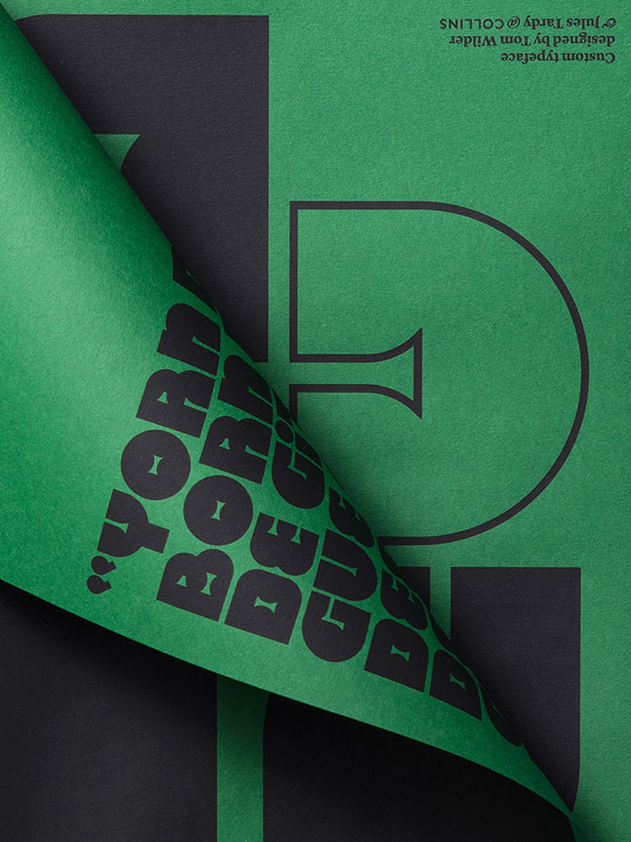
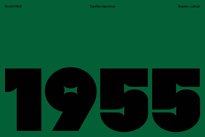
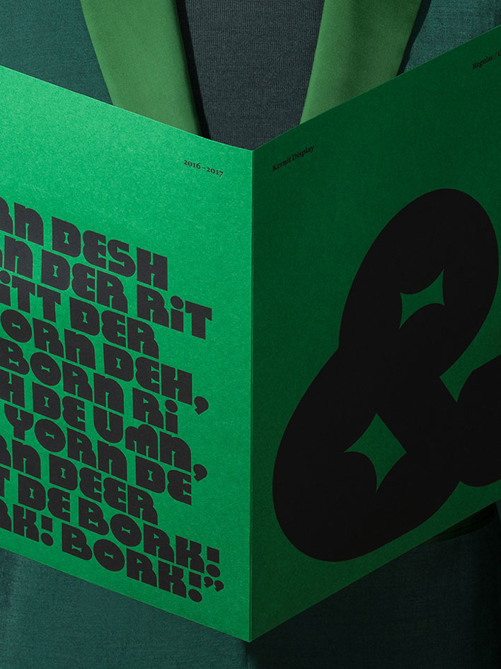
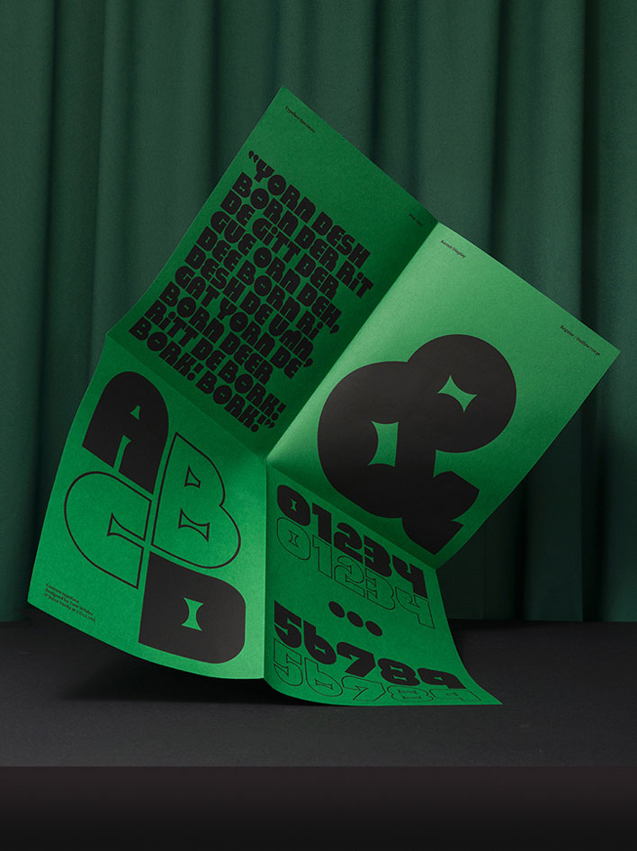
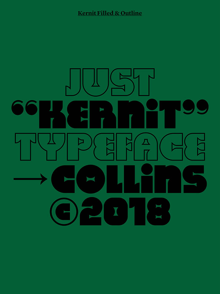
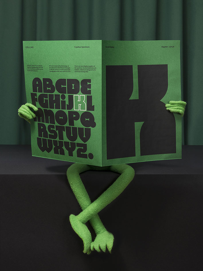
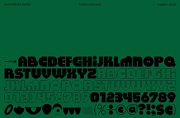
When Collins & MCKL designed a new font for an exhibition about Jim Henson, the creator of the Muppet Show, the naturally named it Kernit, a word referencing to both Kermit the frog and kerning, a typographic term.
The font, intended for the Jim Henson Exhibition at the Museum of the Moving Image, features bold characters inpired by the show. You can download it in bold and outline on this website.
The team at Figma has created a new resource for “learning, creating and evangelizing design systems” called Design Systems that already has a good collection of interviews and articles by some folks thinking about these things.
I particularly liked Jeroen Ransijn’s post on how to convince your company it’s ready for a design system, where he writes:
Building a design system is not about reaching a single point in time. It’s an ongoing process of learning, building, evangelizing and driving adoption in your organization.
Jetpack is an official WordPress plugin directly from Automattic. It’s an interesting plugin in that it doesn’t just do *one thing* — it does a whole slew of things that enhance what your WordPress site can do. *Any* WordPress site, that is, and often with extremely little effort. Those easy win features Jesse Friedman calls light switch features, meaning you literally flip a switch in Jetpack’s settings and start benefitting. I love that.
There are dozens of features in Jetpack, and I personally make use of most of them and see the benefit in all of them. Allow me to share with you five of my favorites and how they are actively used right here on this site. It’s actually a bit hard to pick, so perhaps I’ll do this again sometime!
1) Related Posts
This seems like such a simple little feature, but it’s anything but. Something has to analyze all the content on your site and figure out what is most related to the current content. That kind of thing can be incredibly database intensive and bring even powerful hosting to its knees. WP Engine, by all accounts a powerful and WordPress-tuned host, bans many of them outright:
Almost all “Related Posts” plugins suffer from the same fundamental problems regarding MySQL, indexing, and search. These problems make the plugins themselves extremely database intensive.
Jetpack handles this by offloading the work off your servers and onto theirs. Your site has no additional load for this super useful feature. I find it does a great job.
I’m quite serious about that. I’ve been involved with far too many sites where old content was mired with old crufty HTML or otherwise formatted in a way that held them back, and cleaning up that content was an impractically large job. You avoid that situation entirely if you create your content in Markdown (and stick to Markdown syntax).
Things like <span style="font-weight: bold; font-family: Georgia; color: red;"> around seemingly random sentences. <div class="content-wrap-wrap"> wrapping every single blog post because it was just “what you did”. Images force-floated to the right because that made sense three designs ago. Headers with class names on them that don’t even exist anymore. Tables of data spit into content with all the whitespace stripped out and weird alignment attributes you barely recognize. An about page that was pasted in from Microsoft Word.
Content like this will not and cannot last.
With Jetpack, you flip on Markdown support and you’re good!
Almost more importantly, it feels like the Markdown option you can trust. There are other plugins out there that add Markdown support, and that’s great, but they leave open questions. How long is the plugin going to be supported? What variety of Markdown did they pick? Is that variety going to continue to be supported? Does it work in comments? These kind of questions make me nervous.
Choosing Jetpack feels safe because it’s the official Markdown choice of WordPress, in a plugin we can be sure will be updated forever.
It’ll be interesting to see what Markdown + Gutenberg is like!
3) Social Sharing
This is a multi-pronged feature.
One, it can easily add sharing buttons to your posts. This isn’t a particularly difficult thing to do for any developer worth their salt, but having it abstracted away in a plugin is nice.
Two, it can share your posts directly to social sites like Twitter and Facebook. That’s a much harder thing to write from scratch. It’s a thing I used a paid third-party service for years. It was a pleasant surprise when I discovered Jetpack’s ability to do this.
The „official” buttons can be nice as they have the most integrated functionality with the services themselves, but I dig that the other options are like „Responsible Social Sharing Links” in that they have the least possible performance overhead.
It allows you to customize the mesasge, and does smart stuff like includes the Featured Image as image attached to the social post.
4) Comment Improvements
I’m a little uncomfortable using a third-party comment system on my sites. I like control. Comments are content and I like making sure those are in my own database. Yet, I think users have a little higher expectations of comment thread UX than they used to. Having to manually type in your name and email and all that feels kinda old school in a not-so-great way.
Fortunately, Jetpack can replace your comment form with a modernized version:
Now users can log in with their social accounts, making leaving a comment a much easier flow. Not to mention the fact that it’s all the less work you have to do styling the comment form.
Notice the „Notify me of new comments via email” checkbox there too. Guess what powers that? Jetpack. That’s a nice feature for people who are leaving question-style comments on your site. They very likely want to be notified of about the conversations happening in comments as it evolves.
5) Security
I’ve been deep into the world of web development for many years. The more I know, the more I can see that I don’t know. We all have to focus on certain things to get done what we need to on our own journeys. I fully admit I know very little about server-side web security. I’d rather leave that exertise to others, or ideally, software that I trust.
Here’s some fun statistics from here on CSS-Tricks:
It’s nice to know my site is being protected that way from malicious logins. Spam, an even more direct problem, is also taken care of by Akismet, the spam-blocking plugin that my Jetpack subscription covers.
Should anything happen to the site, I know it’s backed up off my server by VaultPress, which is also part of my Jetpack subscription.
See how much it does!?
Again, this is just a handful of the features of Jetpack. There are so many niceties tucked into it I consider it a no-brainer plugin. Probably the first and most important plugin you’ll install on any self-hosted WordPress site.
There are numerous techniques you could use to build links, some of them white hat while others black hat. Google is very keen on sites that use black hat techniques and will place penalties on such sites, so while building links through ghost marketing, you should be careful to avoid falling in the hands of Google algorithms because this will literally take you back to zero. With that said, you still have white hat methods that are natural and safe that you could utilize.
Here are some guidelines you may use to generate high-quality links.
Content marketing
The first step you should take in building links is content marketing, which is basically producing high quality content that is sharable. By far, this is the most legitimate link building solution because you will naturally get links from different sources. Choose a relevant topic and conduct in-depth research to come up with an original article. Curate comprehensive advice and publish on your website and newsletter. You could also share on social media platforms like Twitter and Facebook. If your content is good, your target audience will share it and this will give you natural backlinks.
Broken link building
Broken link building includes identifying broken links on blogs and sites and giving the site owners an alternative resource. You need an SEO tool like Ahrefs to identify sites in your niche that have broken links for articles. Export data about the sites and reach out to as many as possible because most of them will definitely not agree to the offer. How this works is that after approval you create an article on the topic highlighted on the broken link, then ask the site to use your link instead of that which is not available.
Guest posting for SEO link building
Guest blogging is an effective technique and this works because you give valuable input to sites then they give you a link in return. Choose your targets wisely and build a diverse link profile including authoritative inbound link profile. Reach out to the sites you have identified and show them a sample of the article you intend to publish. After they have approved your request create a high-quality article and include one link to your site in a natural flow.
Link building with social shares
One of the options for getting links is encouraging social sharing. Although this does not impact ranking directly, social shares could impact the number of people who see the content and eventually link to it. This explains the reason posts that have many social shares usually rank high on search results.
Build links with reviews
Another way to build links is through reviews. There are many review platforms that you can join that will link back to your site. You could also talk to an online influencer to get them to review your content and this could get you some links. Sites like Trustpilot give you an opportunity to link back to your site and reviewers could also help to spread the good news about your business if your services or goods are perfect.
Link building is a diverse specialty and you can use different methods to earn links for your site. The rule of the thumb to good link building is to always avoid strategies that would be classified as spamming or black-hat because this will bring down the reputation of your site in the eyes of Google. Try the ideas mentioned here coupled with other white-hat methods and you will see results.
Welcome to our Illustrator in 60 Seconds series, in which you can learn an Illustrator skill, feature, or technique in just a minute!
Illustrator in 60 Seconds: How to Create Custom Guides in AI
Always wanted to create custom guides from more intricate shapes but never knew exactly how? Well, if that’s the case, you should watch this quick video, which will show you how easy the process is!
By default, Illustrator
comes with a basic Ruler system that you can turn on using the Control-R keyboard shortcut. You can use it to add both horizontal and vertical guidelines, to which your shapes can
snap, by simply clicking and dragging them out.
But what about those
situations when you need to build a set of custom guides based on more
intricate shapes? You’ll be happy to hear that the software allows you to do just that using any shape, as long as it’s a vector.
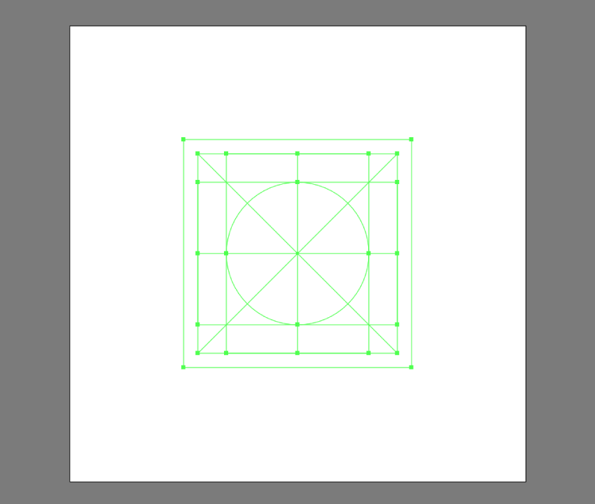
In my case, I’ve set up a simple
grid system that I’ll be using for some custom icons that I’ve built using a
couple of basic geometric shapes and strokes.
To convert my shapes into guides, I first have to
select them and then go to View >
Guides > Make Guides or use the faster right click > Make Guides option. This will turn them into a
custom reference grid that I can lock and use to build my assets on.
Creating shapes in Illustrator can sometimes become an unintuitive process, especially if you’re doing it using Pathfinder’s Shape Modes. Luckily for us,…
In this article, we’re going to talk about the top ten most useful tools in Adobe Illustrator. Whether you’re into icon design, illustrations or any other…
This little quick tip is dedicated to a subject that is close to my heart but at the same time gave me some strong headaches in the early days of my design…
60 Seconds?!
This is part of a series of quick video tutorials on Envato Tuts+ in which we introduce a range of subjects, all in 60 seconds—just enough to whet your appetite. Let us know in the comments what you thought of this video and what else you’d like to see explained in 60 seconds!
Agregator najlepszych postów o designie, webdesignie, cssie i Internecie