Post pobrano z: iPhone People Talking Pixel – Kelly Anna talks Camera

Post pobrano z: iPhone People Talking Pixel – Kelly Anna talks Camera
Post pobrano z: How We Fight Back

Post pobrano z: Facebook – Alegria Illustrations

Post pobrano z: How to Create a Set of Organic, Hand-Drawn, Retro Patterns in Adobe Illustrator
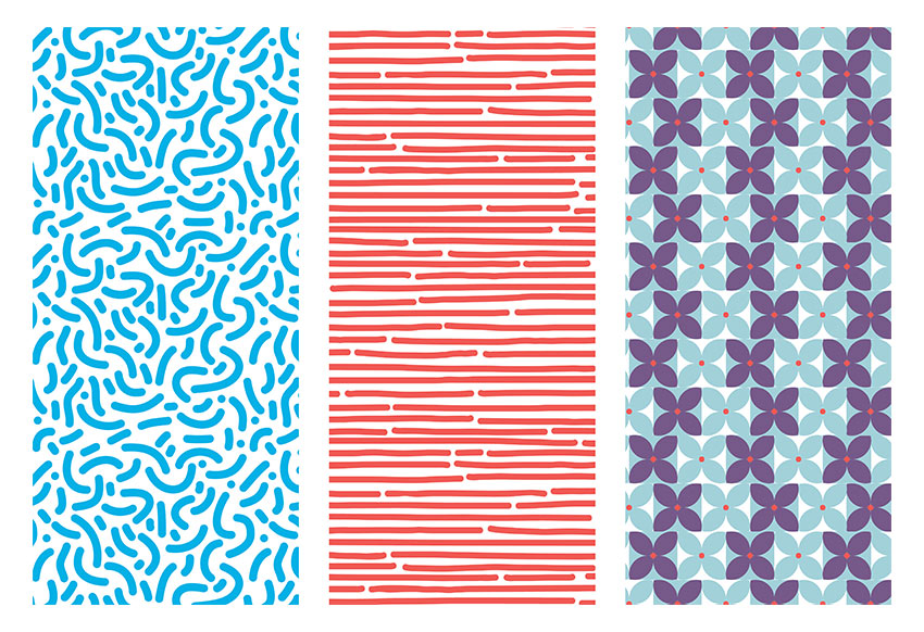
Have you always wondered how to make seamless patterns in Illustrator? Patterns that look effortless and are pleasant to the eye? In this tutorial, you will learn how to use the Pattern Option tool in Illustrator to create a set of fun patterns.
If you’re looking for Adobe Illustrator addons and patterns, head on over to GraphicRiver.
Open Adobe Illustrator and head to File > New. Let’s name our file Patterns-v1, and let’s create a single square Artboard. Set the Width and Height to 1080 x 1080 px. Under Advanced, choose RGB for our Color Mode and 72 ppi for Raster Effects. If you are planning on printing it, use 300. Click OK.

Let’s bring up our Pattern Options panel by going to Windows > Pattern Options. Let’s open the Swatches panel as well by going to Windows > Swatches. The new patterns we create will be added to the Swatches panel.

Let’s start by setting the brush for our first organic pattern. Select the Paintbrush Tool (B) from the Tools panel. For the Fill and Stroke color, double-click the stroke color and select a blue color with the following code: #00B0E6. Click on the fill color and select None (/).

Head over to the Control bar. Click on Brush Definition and double-click on the round brush to open the Calligraphic Brush Options. On the new window, change the Size brush to 40 pt and change the Name to 40 pt. Round. Click OK.

Go to the Tools panel and double-click on the Paintbrush Tool (B) to open the Paintbrush Tool Options panel. I am using the settings in the image below. This is to create a soft shape with curves and no hard edges, which will result in fewer points to edit.

Using the Paintbrush Tool (B), create soft C shapes. I created the bigger shapes first and later filled them in with smaller dots and strokes. You can create anything—there’s no right or wrong in this!
Try to focus on staying inside the page and making the shapes evenly spaced. We will fix the edges later on.

Add smaller details within the frame, like dots and short strokes. Remember not to worry too much about the edges as they will be fixed later on. Use the Direct Selection Tool (A) to select single points of the shapes and edit.

Select the composition you just created, head over to the Pattern Options panel, and click on the dropdown menu on the top right side. Select Make Pattern, which will open up a window letting you know that the new pattern will be added to the Swatches panel. A second window will let you know that the strokes will now be extended into shapes. Click OK in both cases.
At this point you will enter Pattern Editing Mode, where you can edit the composition you just created as a whole pattern. You will notice you are in this mode when there is a bar over the document with a red stroke under it. Please note that the compositions around the main pattern are not clickable objects.

Let’s start by setting up the basics to edit the pattern. Head over to the Pattern Options and name the pattern. I will name mine New Pattern 1. Set the Tile Type to Grid and the Width and Height to the same size as the artboard we created, 1080 x 1080 px.
Under Copies I have 3×3 selected, which is the number of sets that appear around the main pattern. Make sure that Show Tile Edge is checked, which will add a blue margin to see the edge of the composition that we want to work on now.

Let’s edit the pattern. Use the Zoom Tool (Z) to get closer into the composition. Remember that only the composition within the blue stroke is editable.
Use the Paintbrush Tool (B) to add elements. The new elements will be automatically drawn in the other compositions. This is a great tool for creating seamless patterns. Command-Z will be your friend for this stage as you will need to go back and forth to find the right balance.

Let’s work on the edges. Continue using the Paintbrush Tool (B) and draw a line over the blue margin. The exceeding part will be drawn on the opposite side of the main composition; this is a great way to know how the elements are being connected.
A seamless pattern works better when there’s no visible margin on the main composition. You can Zoom (Z) in and out to see what the pattern looks like and fix elements that seem too obvious to the eye.

To save the pattern, simply head over to the top of the document, above the red line, and click on Save a Copy. This will save a copy of the pattern. You can save as many copies as you like throughout the process so you can go back and forth.
Another way of saving the pattern is by pressing Command-S to save the original pattern with its original name. This won’t create a whole new pattern, but will save the one you have been editing. A window will open letting you know that the strokes will be expanded. Click OK.

Our pattern has been added to the Swatches panel, so now it’s time to use it! Click on the Rectangle Tool (M), draw a square, and select our newly created pattern in the Swatches panel as the Fill color.
If the pattern seems too big or small, you can resize it in the Pattern Options panel and lower the Width and Height to change the margin. Once you have resized the margin, proceed to resize the composition by selecting all of it, as if you were working normally outside Pattern Editing Mode.
Now you are ready to use the pattern anywhere!

Let’s duplicate the artboard we created by hitting Shift-O, and you will get an outline around the artboard. Press Option-Shift and drag the artboard to duplicate and maintain the same XY level.

Using the Paintbrush Tool (B) from the Tools bar, create horizontal lines across the artboard. For this pattern, feel free to go outside the board and to change the point size of the brush. I am using a brush size of 40 pt, but remember we can change the size of our pattern later on. I am also using red color: #F05A54.

Open the Pattern Options panel by going to Window > Pattern Options. Select the shapes and, in the Pattern Options panel, click on the dropdown menu in the top right corner. Select Make Pattern. The pattern will be added to the Swatches panel.

Pattern Editing Mode will be activated. Let’s experiment with the options in the Pattern Options panel. Change the Tile Type to Hex by Column, which will make the pattern change from a square grid to a hexagonal grid margin in which the composition will overlap. Change the Height and Width to have a smaller size; I am activating the Maintain Width and Height Proportion option and changing the Width to 400 px. Resize the pattern to fit the margin.

Feel free to edit the pattern. When you are good with it, click Done on the top of the document, above the red stroke. This will take us out of Pattern Editing Mode, and our pattern will be edited in the Swatches panel. Our second pattern is ready to use!

Let’s create one last pattern inspired by the 70s. Using the Ellipse Tool (M), create two circles and make them overlap to create a leaf. Using the Pathfinder panel, Intersect the two shapes.

Duplicate the leaf by pressing Command-Shift and clicking and dragging. We need four leaves to create a flower. Using the Rotate Tool (R), rotate each leaf while pressing Shift for an even rotation. Let’s add a red circle in the centre. I am using the following codes: blue #A3D1DA and red #F05956.

Duplicate the flower shape, and change the leaves’ color to purple with the color code #775988, and add a square as a background. Duplicate the two tiles by pressing Command-Shift and clicking and dragging horizontally. Do the same vertically until it looks like the image below:

Open the Pattern Options panel by going to Window > Pattern Options. Select the shapes and, in the Pattern Options panel, click on the dropdown menu in the top right corner. Select Make Pattern. The pattern will be added to the Swatches panel. For this pattern, let’s choose a Height and Width of 400 px and resize the composition so that the pattern is smaller.

I am choosing to select alternate horizontal lines of flowers and shifting them slightly to the left to add visual interest. As you can see, anything that appears outside of the left margin will reappear on the right side.

Click on Done at the top of the document, above the red line.

Duplicate the square we created previously and apply the pattern. Now you have three patterns that you can use for anything!

Congratulations! In this tutorial we’ve learned to:


Post pobrano z: Stitches Typography / Une copie mal ficelée?
 |
 |
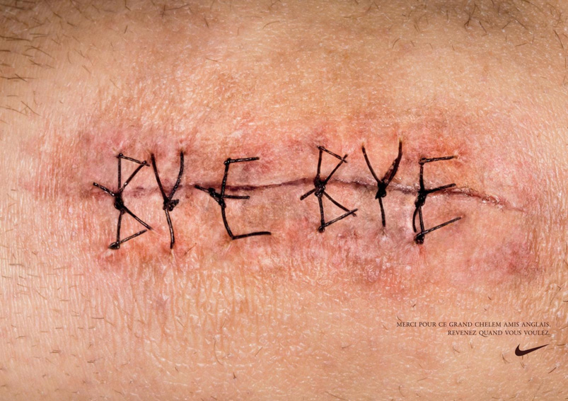
| THE ORIGINAL? Nike Rugby – 2010 Source : Coloribus Agency : Wieden + Kennedy (The Netherlands) |
LESS ORIGINAL Plan International – 2018 Source : Luerzer’s International Archive Agency : Young & Rubicam (Brazil) |
Post pobrano z: Mini People in the Jungle: beautiful grayscale illustrations by Dawid Planeta
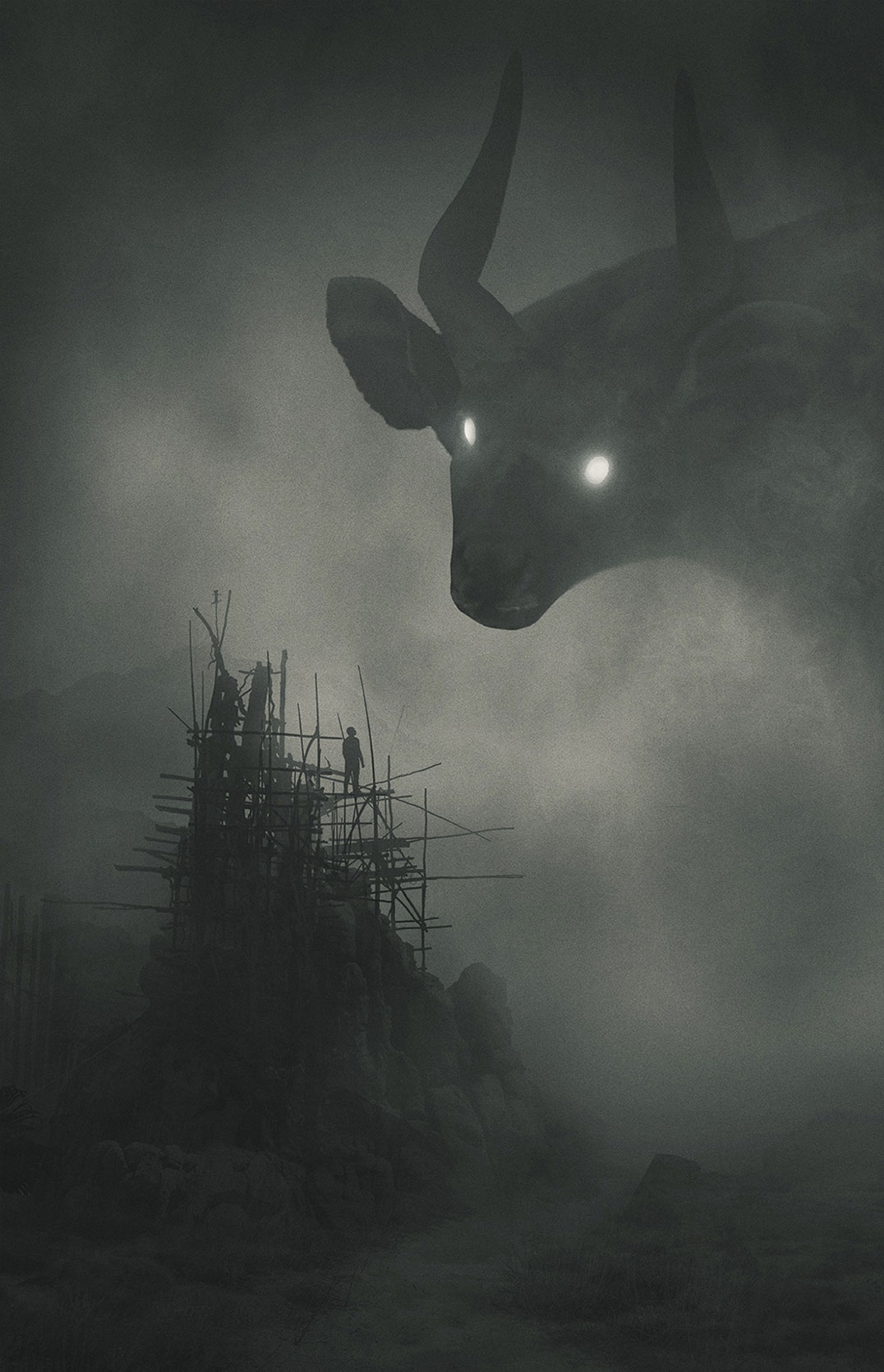
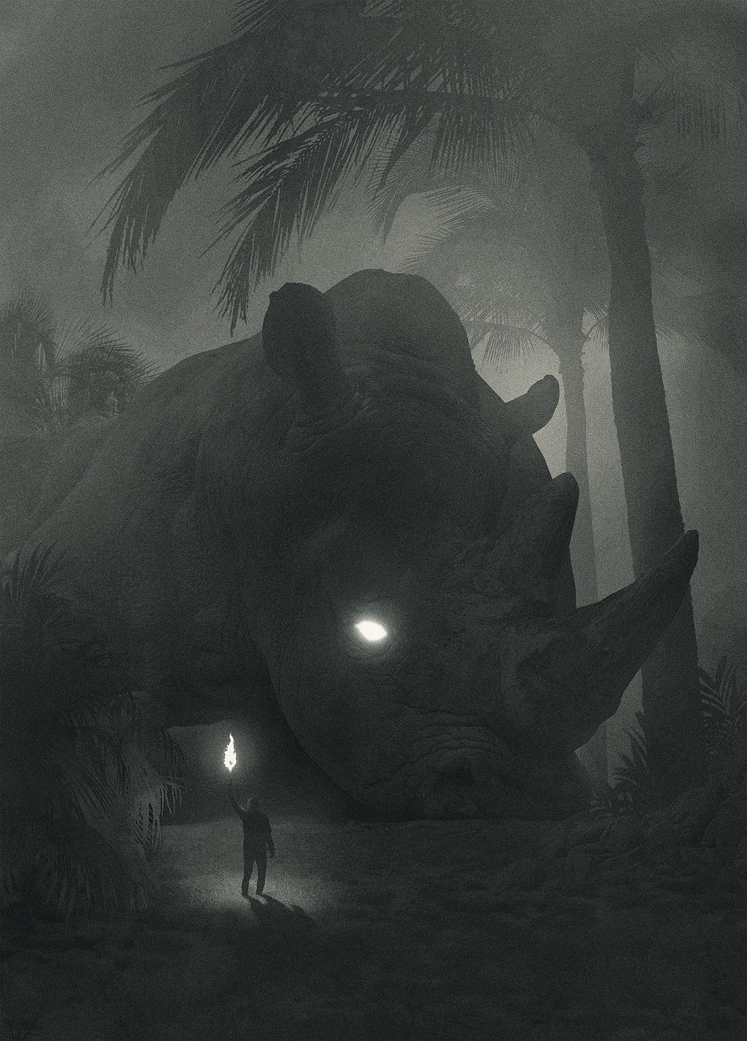
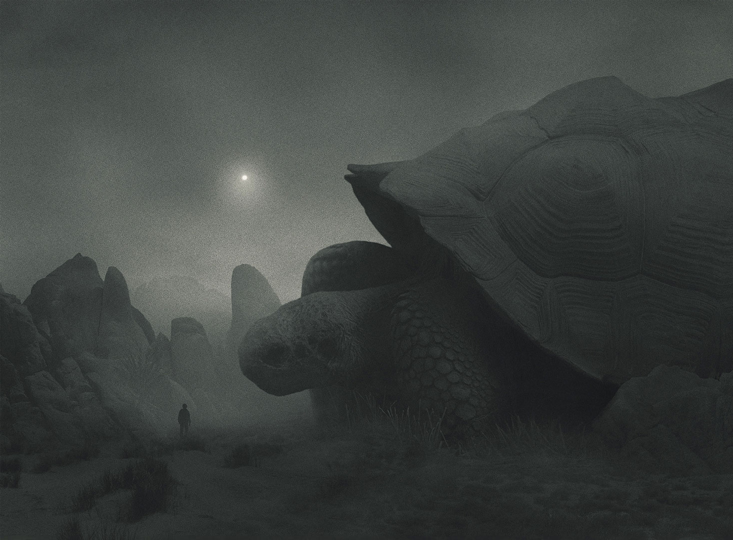
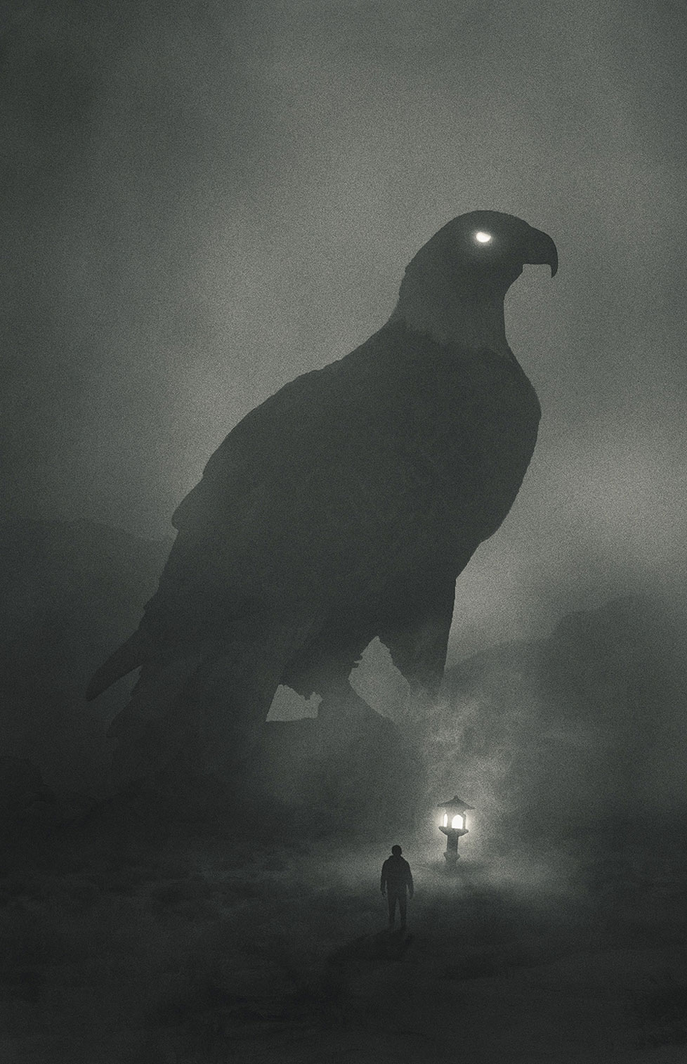
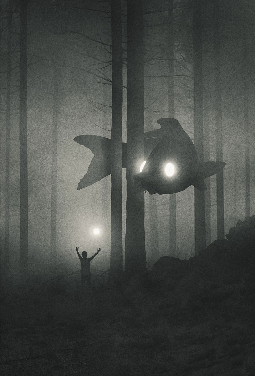
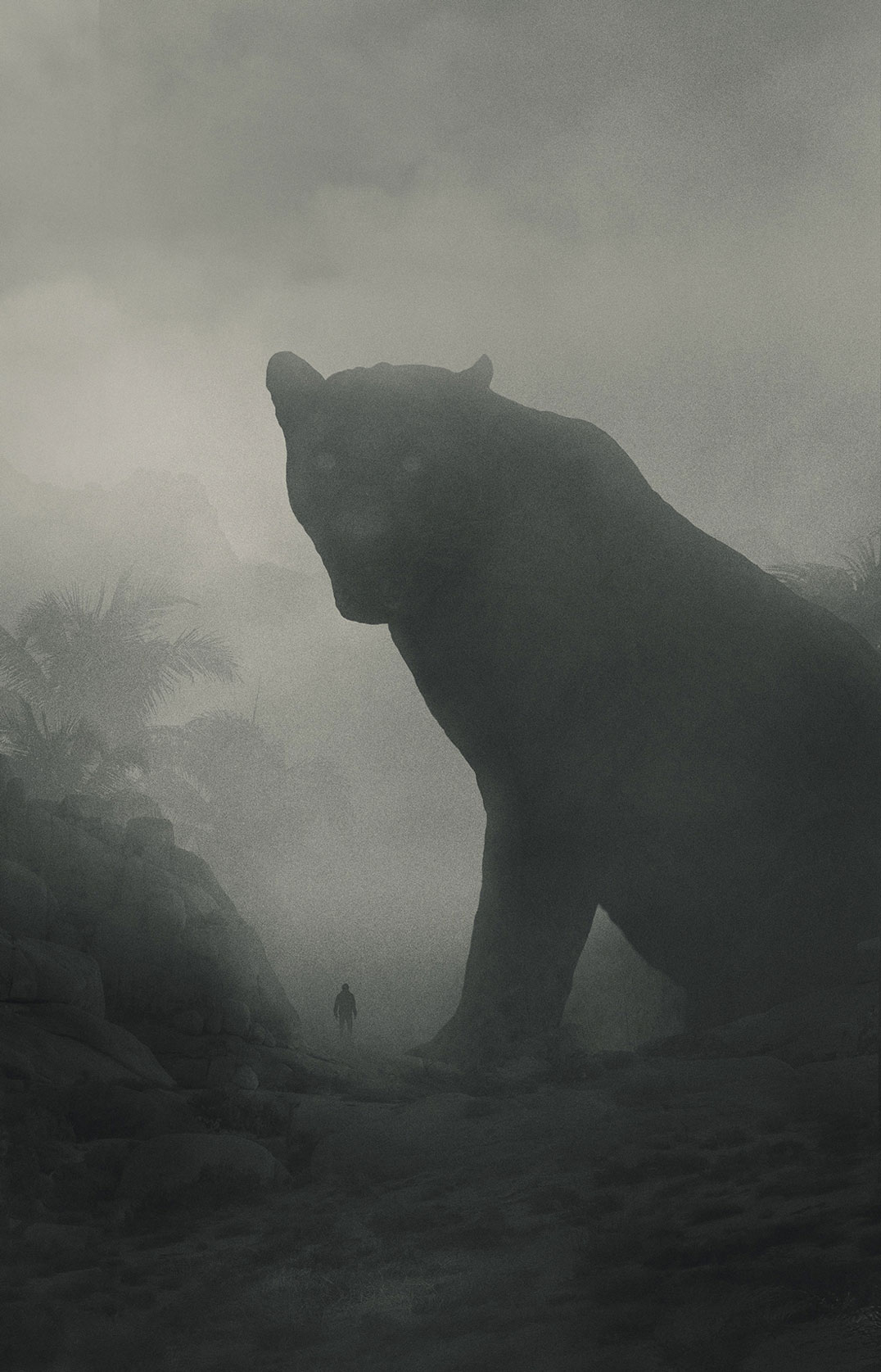
Dawid Planeta is a graphic design, illustrator, and artist from Poland. One of his most prominent work recently is his series of illustration titled “Mini People in the Jungle“. It features dark, colorless scenes with gigantic animals with glowing eyes. As one could have guessed, the artist’s inspiration comes from the dark side, from his own personal struggle with depression. The result is stunning and can be followed with recent artworks regularly added on his Tumblr.

Post pobrano z: Loyto L1: a modern take on the traditional analogue watch
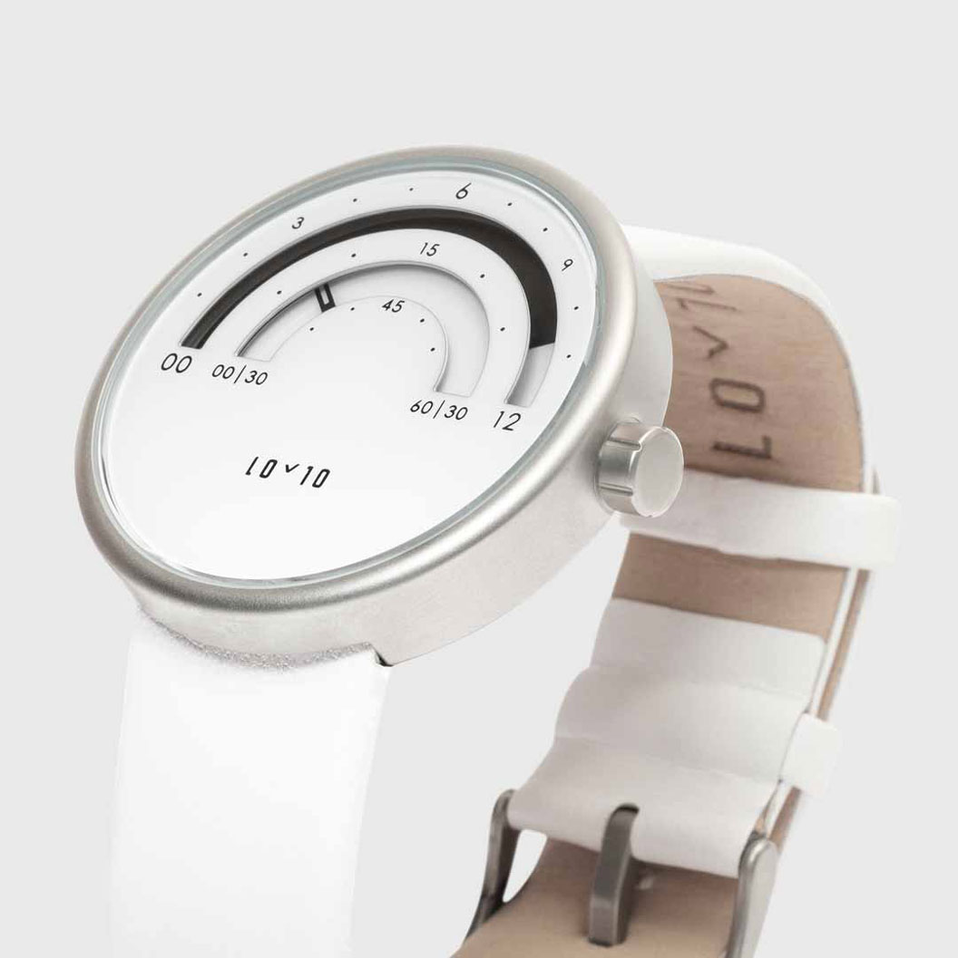
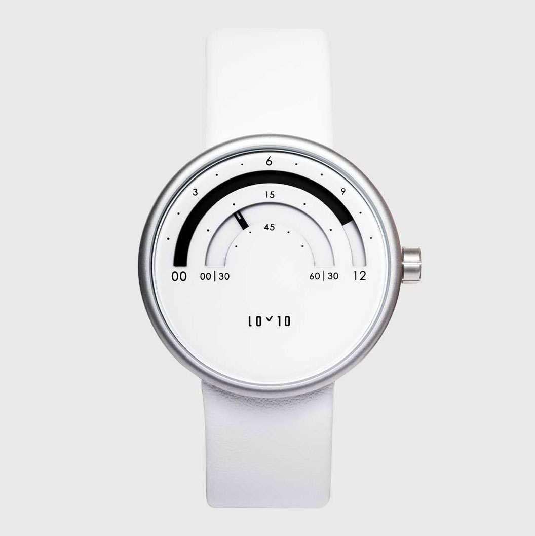
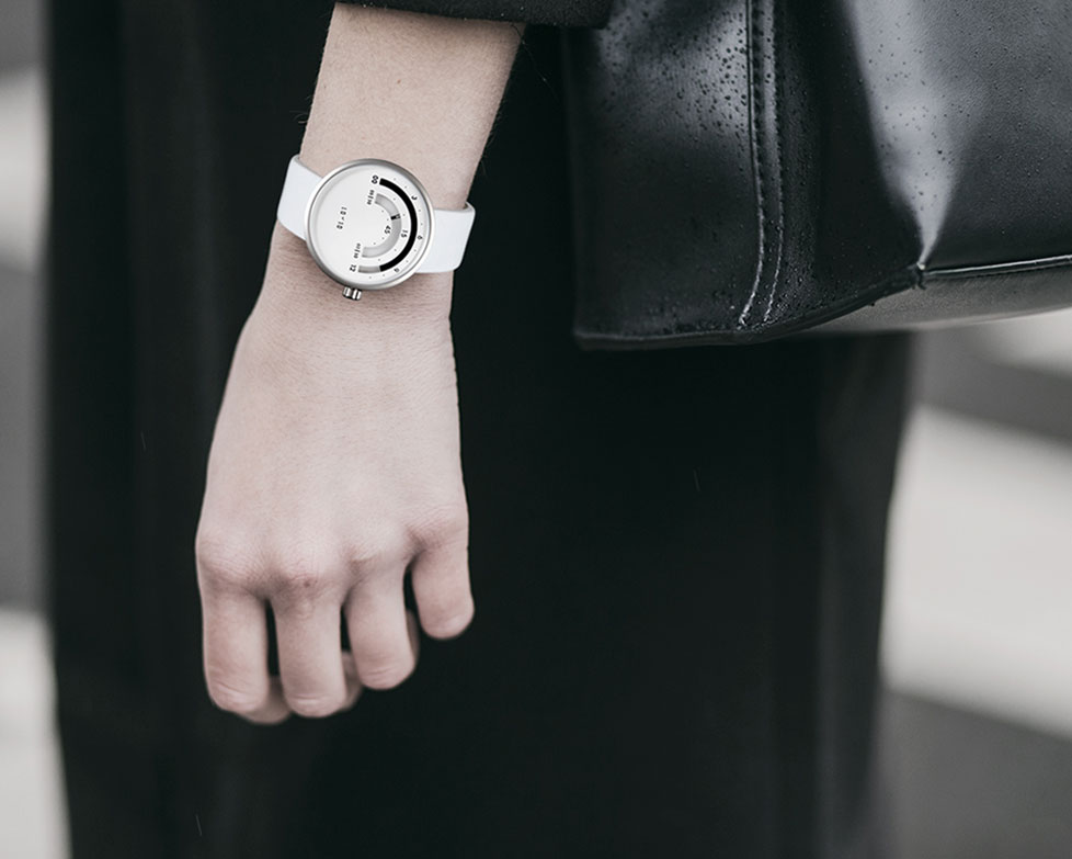
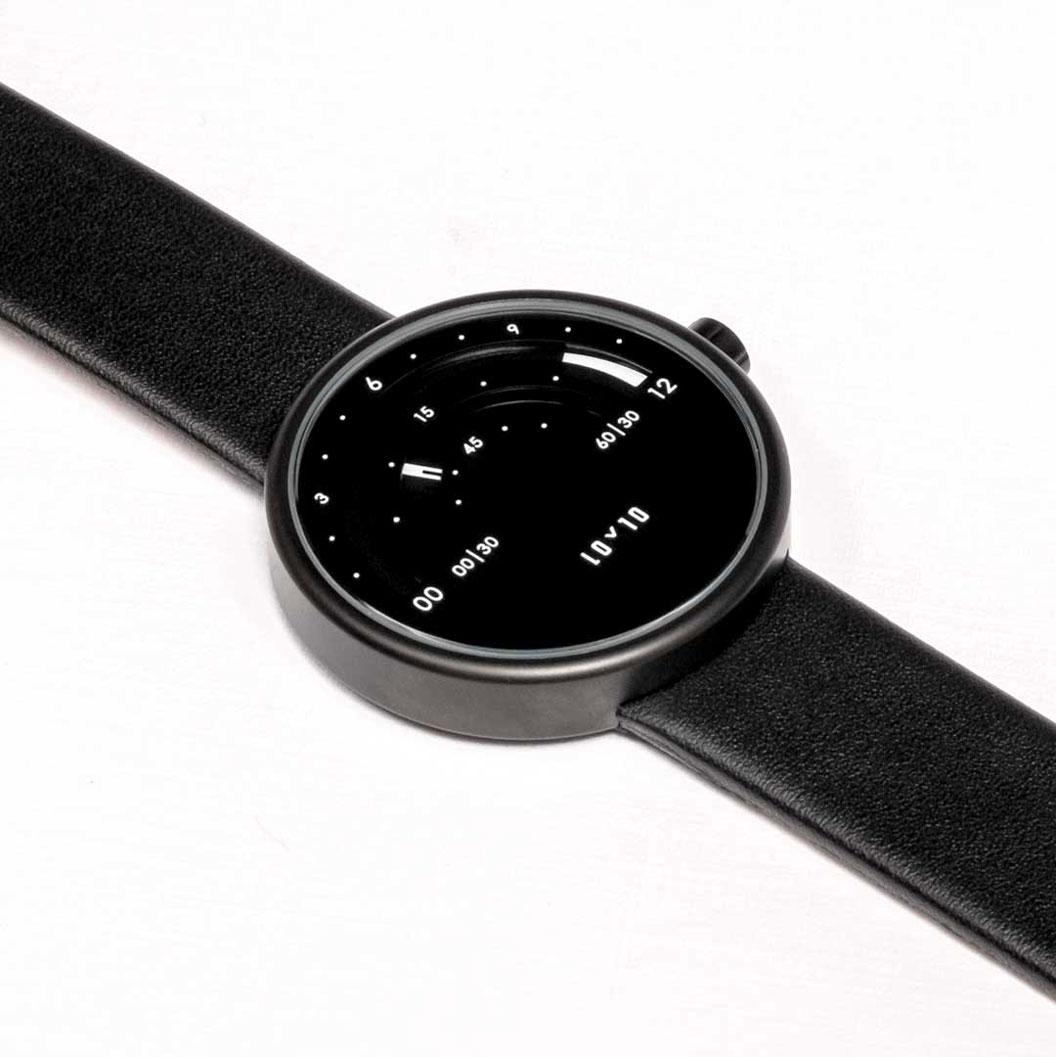
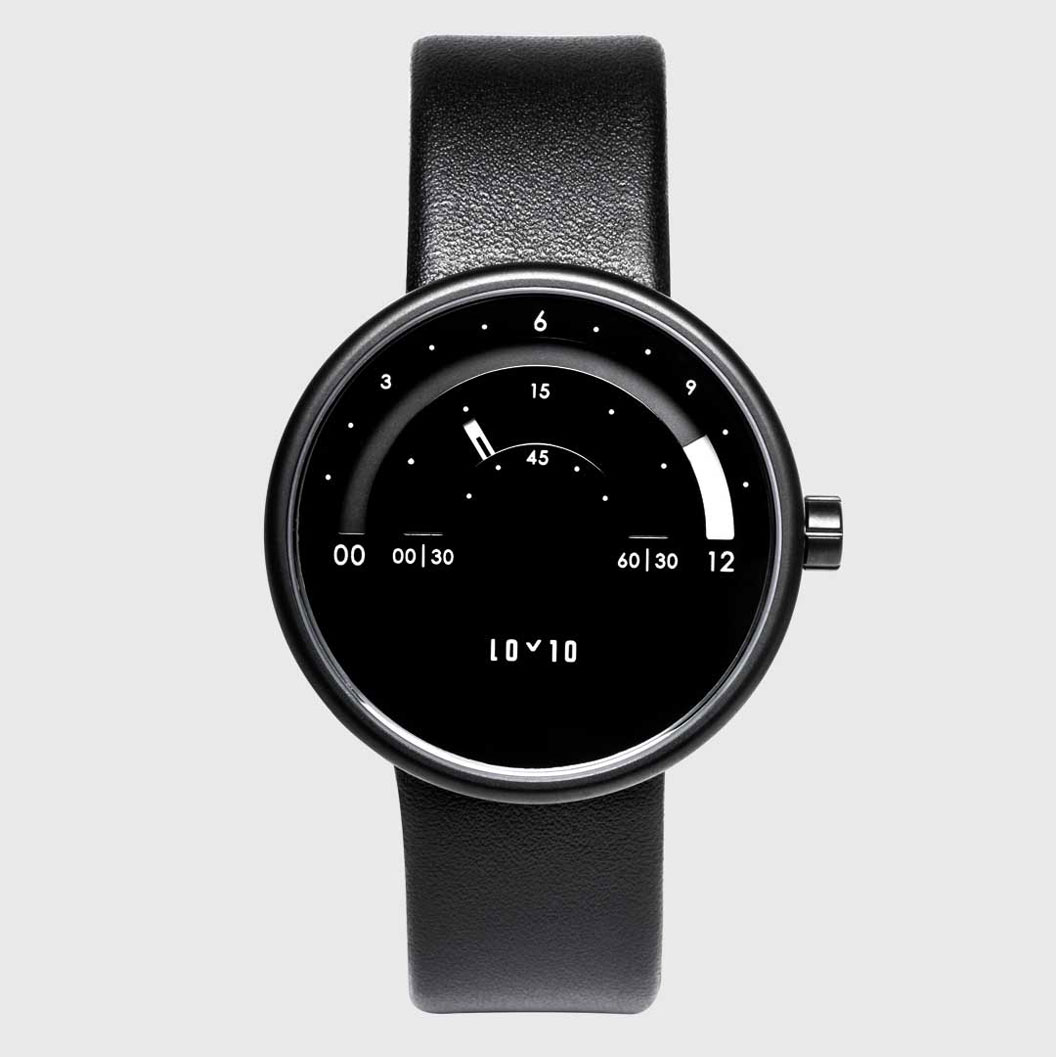
Many designers choose to design for smartwatches because the digital screens allow them to create modern interfaces and innovate. Innovating with a technology that has been around for hundreds of years is harder, especially when the technology behind is more restrictive.
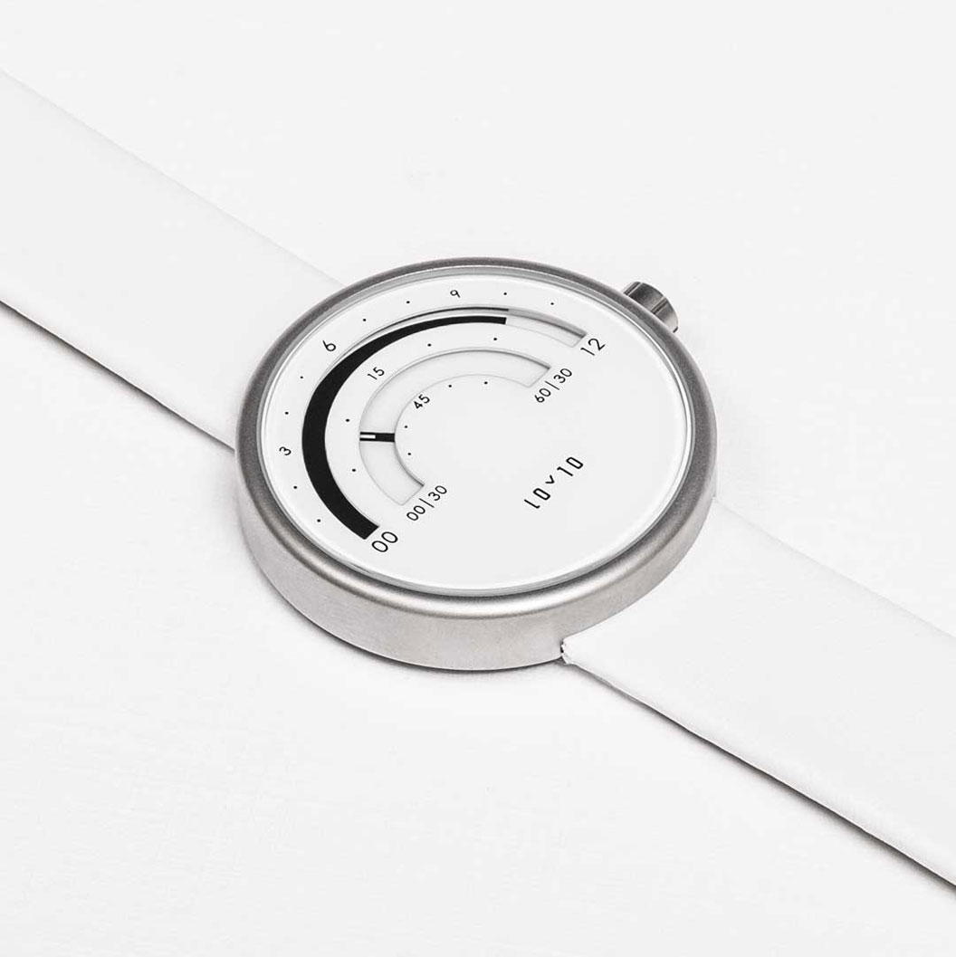
With the Loyto L1, the designers found a way to give a new, modern graphic representation of “reading time”. You can find this beautiful watch on Loyto Watches.


Post pobrano z: VS Code Can Do That?
Clever microsite from Burke Holland and Sarah Drasner that highlights some of VS Code’s coolest features. All fifteen of them are pretty darn cool. Here’s a few other compelling features I’ve seen people use/love:
Personally, I’m still on Sublime. I gave VS Code the college try last year but failed. I can’t even remember why now, which means it’s probably about time to try again. If it was slowness, maybe it was because I was using too many add-ons.
Direct Link to Article — Permalink
The post VS Code Can Do That? appeared first on CSS-Tricks.
Post pobrano z: How to Create a Scary Back Alley Scene in Adobe Illustrator

Welcome back to another Illustrator
tutorial, in which we’re going to take a close look at the process of
creating a scary scene. You’ll see how easy it is to put it together using nothing
more than a few geometric shapes and tools.
So assuming you already
grabbed a fresh mug of coffee, let’s get started!
Also, don’t forget you can always add new elements to the illustration by heading over to GraphicRiver, where you’ll find a great selection of scary vector assets.
Assuming you already have Illustrator up
and running in the background, bring it up and let’s set up a New Document (File > New or Control-N)
which we will adjust as follows:
And from the Advanced tab:

Once we’ve finished setting up our project
file, it would be a good idea to structure our document using a couple of
layers, since this way we can maintain a steady workflow by focusing on one
section of the illustration at a time.
That being said, bring up the Layers panel, and create a total of two
layers, which we will rename as follows:

Quick tip: I’ve colored all of
my layers using the same green value, since it’s the easiest one to view when
used to highlight your selected shapes (whether they’re closed or open paths).
Now that we’ve finished layering our
document, we can start working on the actual project, and we will do so by
gradually building the background. That being said, make sure you’ve positioned
yourself on the first layer, and let’s jump straight into it!
Using the Rectangle Tool (M), create an 800 x 600 px rectangle, which we will
color using #2A323D and then position in the center of the underlying Artboard
using the Align panel’s Horizontal and Vertical Align Center options.

With the main background shape in place,
we can shift our focus over to the center of the Artboard, where we will create
the visible section of the brick wall.
Start by creating a 480 x 396 px rectangle, which we will
color using #F76C5E and then center align to the underlying Artboard, positioning it at a distance of 78 px from
its top edge.

Adjust the upper
section of the shape by individually selecting its two anchor points using the Direct Selection Tool (A), and then
pushing them to the inside by 200 px using the Move tool
(right click > Transform > Move
> Horizontal > +/- 200 px depending on which side you start with).

Start adding the
first row of bricks using sixteen 32 x
16 px rectangles with a 4 px thick
Stroke (#DD4C45), which we will
group using the Control-G keyboard
shortcut and then center align to the bottom of the wall, making sure that
their bottom outline falls outside of its surface.

Create a copy (Control-C > Control-F) of the row
that we’ve just grouped, and then position it above, making sure to push it to
the right by 16 px
using either the directional arrow keys or the Move tool (right click >
Transform > Move > Horizontal > 16 px).

Add the remaining
bricks by selecting the two rows that we currently have and then dragging them
to the top while holding down the Alt
and Shift keys, making sure their
outlines overlap as seen in the reference image.
As soon as you have the first duplicates,
add the remaining ones by pressing the Control-D
keyboard shortcut until you’ve filled in the wall. Once you’re done, remove the
extra top row and then select and group (Control-G)
all the remaining ones together before moving on to the next step.

Next, we’re going to mask the
rows that we’ve just grouped using a copy (Control-C)
of the underlying wall, which we will paste in front (Control-F) and then, with both of them selected, simply right click > Make Clipping Mask.

Take a couple of
moments and enhance some of the bricks by double clicking on them to isolate
them, and then opening up either their top or bottom paths as seen in the
reference image. Once you’re done, press the Escape key to exit Isolation
Mode, and then select both the bricks and the wall and group them together
using the Control-G keyboard
shortcut.

Now that we’ve finished working on the
brick wall, we can move towards the bottom of the Artboard, where we will
quickly build the sidewalk.
Create the main shape
for the projected light using a 560 x 48
px ellipse, which we will color using #F76C5E and then position below the wall
as seen in the reference image.

Add the visible
section of the sidewalk using a 560 x 24
px rectangle (#2A323D), which we will position on the upper half of the
ellipse, making sure to select and group the two together afterwards using the Control-G keyboard shortcut.

With the wall and sidewalk in place, we
can now focus on the last piece of the background, which we will create one
shape at a time.
Create the vertical
body of the post using an 8 x 48 px rounded
rectangle (#2A323D) with a 4 px Corner
Radius, which we will center align to the wall’s top edge as seen in the
reference image.

Add the horizontal segment
holding the post to the wall using a 16
x 12 px rectangle (#2A323D), which we will position 8 px from the previous shape’s bottom
edge.

Create the little
side details using two 2 x 4 px rectangles, which we will color using #2A323D and then position as seen in the reference
image. Once you’re done, select and group the four shapes together using the Control-G keyboard shortcut.

Add the light bulb
using a 28 x 16 px ellipse, which we
will color using #FFE7C5 and then position on the upper section of the stand
so that its upper half goes outside of the wall’s surface.

Adjust the shape that
we’ve just created by removing its upper half. You can do that by selecting its top anchor point
using the Direct Selection Tool (A)
and then pressing Delete, making sure
to close the resulting path using the Control-J
keyboard shortcut. Once you’re done, select and group (Control-G) all of the light’s composing shapes together, doing the
same for the entire background before locking the current layer and moving on
to the next section of the illustration.

Now that we have our background in place,
we can shift our focus over to the foreground, where we will continue working
on our scene. So assuming you’ve positioned yourself on the second layer,
let’s start working on the little door frame.
Create the inner
section of the room using a 120 x 278 px
rectangle, which we will color using #2A323D and then center align to the
upper edge of the sidewalk.

Start working on the
right section of the door frame by creating an 18 x 278 px rectangle (#FFE7C5), which we will position on the
left side of the previous shape.

Add the bottom
decorative insertion using a 10 x 96 px rectangle
(#2A323D), on top of which we will add a smaller 2 x 88 px one (#FFE7C5), which we will group (Control-G) and then position 4 px from the previous shape’s bottom edge.

Create the upper
insertion using a copy (Control-C >
Control-F) of the one that we’ve just grouped, which we will then position
on the opposite side of the frame, making sure to maintain the same 4 px gap.

Add the vertical
detail lines using three 2 x 70 px rectangles
(#2A323D) which we will horizontally stack 2 px from one another, grouping (Control-G) and then positioning them between the two decorative
insertions.

Finish off the
current section of the frame by adding the hard shadow using an 18 x 8 px rectangle, which we will color
using #2A323D and then align to the upper edge of the frame. Once you’re done,
select and group (Control-G) all of its composing shapes together before moving on to the
next step.

Create the left section of the frame using a copy (Control-C
> Control-F) of the one that we’ve just finished working on, which we
will position on the opposite side of the entrance.

Start working on the
upper section of the frame by creating a 172
x 18 px rectangle (#FFE7C5), which we will position on top of the entrance, as seen in the reference image.

Add the round decorative
elements using two 14 x 14 px circles
(#FFE7C5), which we will position on the upper section of the frame, making
sure to center align them to the frame’s side sections.

Create the decorative
insertion using a 164 x 10 px rectangle
(#2A323D), on top of which we will add a smaller 156 x 2 px one (#FFE7C5), grouping (Control-G) and then positioning the two in the center of the
frame’s top section.

Add the main shape
for the raised portion using a 108 x 12
px rectangle, which we will color using #FFE7C5 and then position as seen
in the reference image.

Create the side
curvatures using two 6 x 6 px circles
(#FFE7C5), which we will position on the sides of the previous shape and then
adjust by selecting their top and outer anchor points using the Direct Selection Tool (A) and then
removing them by pressing Delete.
Close the resulting paths using the Pen
Tool (P), and once you’re done, move on to the next step.

Add the vertical
insertion lines using thirteen 4 x 8 px rectangles
(#2A323D) horizontally stacked 4 px from
one another, grouping (Control-G)
and then center aligning them to the bottom edge of the raised section. Take
your time, and once you’re done, make sure you select and group (Control-G) all of the current section’s
composing shapes together, doing the same for the entire door afterwards.

Once we’ve finished working on the
entrance, we can move over to its right side and quickly create the little
doorbell.
Create the base of
the bell using an 8 x 12 px rectangle, which we will color using #FFE7C5 and then position 14 px from the door frame’s right
section and 16 px from its three
vertical insertion lines.

Add the smaller side
sections using two 2 x 8 px rectangles, which we will color using #FFE7C5 and then position as seen in the reference
image.

Create the round
endpoints using two 4 x 4 px circles
(#FFE7C5), which we will position onto the doorbell’s center shape so that
their inner halves overlap it.

Finish off the
doorbell by adding the little button using a 4 x 4 px circle, which we will color using #2A323D and then center
align to the larger body. Once you’re done, select and group (Control-G) all of its composing shapes, before moving on to the next section of the illustration.

As soon as we’ve finished working on the
doorbell, we can shift our focus back to the entrance, where we will change the
mood of the scene by adding the dark yet friendly presence.
Start working on the
mouth by creating a 56 x 8 px ellipse, which we will color using #F76C5E and then center align to the entrance,
positioning it 84 px from
its top edge.

Adjust the shape that we’ve just created by
first selecting it and then pinching its left and right anchor points using the
Anchor Point Tool (Shift-C).

Select the resulting
shape’s top anchor point using the Direct
Selection Tool (A) and then push it to the bottom by 16 px using the Move tool (right click >
Transform > Move > Vertical > 16 px).

With the fill color
set to #2A323D, draw the crooked teeth with the help of the Pen Tool (P), using the reference image
as your main guide. Once you’re done, select the resulting
shape and the mouth and group the two together using the Control-G keyboard shortcut.

Create the main shape
for the right eye using a 10 x 10 px circle
(#F76C5E), which we will adjust by selecting and pushing its top and bottom
anchor points to the right side by 1 px and its left and right ones to the bottom by another 1 px. Once you’re done, position the
resulting shape above the mouth as seen in the reference image.

Add the iris using a 2 x 6 px ellipse (#2A323D), which we
will center align to the resulting eye, making sure to position it 3 px from its right
edge. Once you have the shape in place, select and group the two together using
the Control-G keyboard shortcut.

Create the left eye
using a copy (Control-C > Control-F)
of the one that we’ve just finished working on, which we will vertically reflect
(right click > Transform > Reflect
> Vertical) and then position on the opposite side of the mouth. Once
you’re done, select and group (Control-G)
all of the monster’s composing shapes, before moving on to the next section.

We are now down to the last section of our
little composition, which will help us achieve that level of scariness that we
want our illustration to portray. So, assuming you’ve finished working on the
monster, shift your focus over to the bottom section of the entrance, and let’s
wrap things up!
Create the main shape
of the ball using a 28 x 28 px circle, which we will color using #F76C5E and then align to the entrance’s bottom edge.

Add the little rings
using four 32 x 16 px ellipses with
a 2 px thick Stroke (#2A323D), which we will adjust by selecting and removing
their top anchor points, vertically stacking the resulting shapes 4 px from one another. Once you’re
done, select and group (Control-G)
all the rings together, doing the same for the entire ball afterwards.

Create the main shape
for the dripping blood using a 4 x 8 px rectangle
(#F76C5E), which we will adjust by setting the Radius of its bottom corners to 2 px from within the Transform
panel’s Rectangle Properties,
positioning the resulting shape on the sidewalk as seen in the reference
image.

Add the side sections
using two 4 x 4 px circles (#F76C5E), which we will adjust by removing their bottom and outer anchor points, closing
and positioning the resulting paths on the sides of the previous shapes as seen
in the reference image. Make sure to select and group (Control-G) all three of them afterwards.

Finish off the current section, and with it the project itself, by adding the projected shadow, which we will
create using a 24 x 20 px ellipse (#2A323D). Position it on the lower section of the sidewalk, at a distance of
10 px from the projected light’s
bottom edge. Once you’re done, select and group all of the foreground’s
composing shapes using the Control-G
keyboard shortcut, before hitting that save button.

As always, I hope you had fun working on
the project and most importantly managed to learn something new and useful
along the way.
If you have any questions, feel free to post them within the comments section, and
I’ll get back to you as soon as I can!


Post pobrano z: Gillette Razors: BabyFace Texture screen
Media
Gillette
Beard fashion was bad for Gillette and for babies, whose only language of communication is touch. Research proved that soft warm contact is essential for development. We convinced dads to sacrifice their beards by launching the first-ever skin to surface haptics campaign. Haptic technology uses electrostatic forces to manipulate the friction between finger and screen. Our tablets featured in maternity wards, birth classes and baby-fairs enabling expecting parents to contrast the scratch of a beard stubble vs. a clean-shaven face, just as a baby would.
Advertising Agency:Acw Grey, Tel Aviv, Israel
Advertiser:P&G
Chief Creative Officer:Tal Riven
Creative Director:Moti Rubinstein
Copywriter:Shay Chikotay
Art Director:Oren Alster
Ux:Oren Alster
Ui Designer:Oren Alster
Svp Account Director:Shai Almagor
Regional Communication Planning Director:Gilad Kat
Mediacom Client Director:Shimi Hamias
Head Of Planning:Dana Wolfsfeld
Head Of Production:Gal Yaakov
Photographer:Ariel Van Straten
Ceo:Greg Topel
Tanvas:Greg Topel, Jamaal Hollins, Mondher Cherif
Texture Design:Jamaal Hollins
Chief Scientist:Mondher Cherif
Producer:Israel Revach