Plus, for better or worse, people like having links that are styled to match the look of other true buttons on the site
<a href="#0" class="button">Button</a>
One challenge is getting all those elements to look and layout exactly the same. We’ll cover that a few ways.
Another challenge is getting people to use them correctly
This is a bit surprising to me — but I hear it often enough to worry about it — is that more and more developers are using <div>s for buttons. As in, they just reach for whatever generic, styling-free HTML is handy and build it up as needed. Andy Bell explains why a real button is better:
So, <button> elements are a pain in the butt to style right? That doesn’t mean you should attach your JavaScript events to a <div> or an <a href="#"> though. You see, when you use a <button>, you get keyboard events for free. You’re also helping screen reader users out because it’ll announce the element correctly.
And here’s Andy again helping you out with a chunk of CSS that’ll get you a cleanly styled button:
It’s that styling that just might be the mental roadblock
It’s a bit understandable. Buttons are weird! They have a good amount of default styling (that come from the „User Agent Stylesheet”) that varies from browser to browser and means you have work to do to get them exactly how you want.
See all the weirdness there?
Without any styling, the button is kinda little and has that native border/border-radius/box-shadow thing going on.
Just by setting the font-size, we lose all those defaults, but it’s got a new default look, one with a border and square corners, a gradient background, and no box-shadow. This is essentially -webkit-appearance: button;.
Buttons have their own font-family, so don’t inherit from the cascade unless you tell it to.
Here’s Chrome’s user agent stylesheet for buttons:
Firefox behaves a bit differently. See in the video above how setting border: 0; removed the border in Chrome, but also the background? Not the case in Firefox:
I only point this out to say, I get it, buttons are truly weird things in browsers. Factor in a dozen other browsers, mobile, and the idea that we want to style all those different elements to look exactly the same (see the opening of the article), and I have a modicum of empathy for people wanting to avoid this.
/**
 * 1. Change the font styles in all browsers.
 * 2. Remove the margin in Firefox and Safari.
 */

button,
input,
optgroup,
select,
textarea {
  font-family: inherit; /* 1 */
  font-size: 100%; /* 1 */
  line-height: 1.15; /* 1 */
  margin: 0; /* 2 */
}

/**
 * Show the overflow in IE.
 * 1. Show the overflow in Edge.
 */

button,
input { /* 1 */
  overflow: visible;
}

/**
 * Remove the inheritance of text transform in Edge, Firefox, and IE.
 * 1. Remove the inheritance of text transform in Firefox.
 */

button,
select { /* 1 */
  text-transform: none;
}

/**
 * Correct the inability to style clickable types in iOS and Safari.
 */

button,
[type="button"],
[type="reset"],
[type="submit"] {
  -webkit-appearance: button;
}
I was a tiny bit surprised to see WTF, Forms? not cover buttons, only because of how much weirdness there is. But the form elements that project whips into shape are even more notoriously difficult!
A Style-Testing Kinda Thingy
I feel like the answer to this is basically a big ol’ block of CSS. That’s what Andy provided, and you could very likely come to one on your own by just being a little heavier handed than the usual of setting style rules with your buttons.
Still, I felt compelled to make a little tester machine thingy so you can toggle styles on and off and see how they all go together in whatever browser you happen to be in:
The biggest point here is to use the correct native elements, as you get a bunch of functionality and accessibility for free. But you might as well get the styling right, too!
Warning: Be careful when marking up links with the button role. Buttons are expected to be triggered using the Space key, while links are expected to be triggered through the Enter key. In other words, when links are used to behave like buttons, adding role="button" alone is not sufficient. It will also be necessary to add a key event handler that listens for the Space key in order to be consistent with native buttons.
You don’t need role="button" on <button> because they are already buttons, but if you’re going to make any other element button-like, you have more work to do to mimic the functionality.
Plus, don’t forget about :hover and :focus styles! Once you’ve wrangled in the styles for the default state, this shouldn’t be so hard, but you definitely need them!
Learn how to create Photoshop text effects in this beginner’s tutorial. You’ll be shown how to create a Photoshop action for your text effect and more.
This text effect that we are going to create is part of Super Bundle Styles. This is a collection of 146 unique styles and is the first bundle of the series.
Image inside the zip file attached to this tutorial (optional)
1. How to Create the Text Effect
Step 1
Create a new 850 x 500 px 72 dpi document and name it Glass Text Effect. Then place an image that you’d like to use as the background.
I’m going to use an abstract image that I created. This image is attached to this tutorial.
Step 2
Go to Window > Character to open the Character panel. Then change the font to Soviet Program, the text size to 130 pt, and the color to white #ffffff, and turn Faux Bold On.
After that, pick the Horizontal Type Tool (T) and write GLASS.
Step 3
Select the text layer and change the Fill Opacity to 0%. Then go to Layer > Layer Style > Blending Options to open the Layer Style panel.
Step 4
To create this text effect, we need two layers. So let’s first create a border with a simple shadow.
Add a Drop Shadow with these settings:
Blend Mode: Normal
Color:#000000
Opacity: 100%
Use Global Light: Off
Angle: 120°
Distance: 5 px
Spread: 21%
Size: 9 px
Contour: Linear
Anti-aliased: Off
Noise: 0%
Layer Knocks Out Drop Shadow: On
Step 5
Add a Stroke with these settings:
Size: 4 px
Position: Outside
Blend Mode: Normal
Opacity: 78%
Overprint: Off
Fill Type: Gradient
Reverse: Off
Align with Layer: On
Style: Linear
Angle: 75°
Dither: Off
Scale: 100%
Click on the gradient bar to create a new gradient.
Note that we have to add stops above (Opacity) and below (Colors) the gradient bar.
Let’s first add stops for opacity:
Stop 1: Location: 0% Opacity: 0%
Stop 2: Location: 4% Opacity: 100%
Stop 3: Location: 26% Opacity: 0%
Stop 4: Location: 43% Opacity: 100%
Stop 5: Location: 64% Opacity: 0%
Stop 6: Location: 85% Opacity: 100%
Stop 7: Location: 100% Opacity: 0%
Then add stops for the colors below the gradient bar with these settings:
Stop 1: Location: 0% Color: #ffffff
Stop 2: Location: 6% Color:#ffffff
Stop 3: Location: 7% Color:#194962
Stop 4: Location: 41% Color:#ffffff
Stop 5: Location: 42% Color:#194962
Stop 6: Location: 84% Color:#e0e0e0
Stop 7: Location: 85% Color:#194962
Then name it Glass Gradient and click on New to add this gradient to the presets, we are going to use it later.
Step 6
Now add a Bevel & Emboss with these settings:
Style: Stroke Emboss
Technique: Smooth
Depth: 1000%
Direction: Down
Size: 1 px
Soften: 0 px
Use Global Light: Off
Angle: 86°
Altitude: 21°
Gloss Contour: Cove – Shallow
Highlight Mode: Screen
Highlight Color:#ffffff
Highlight Opacity: 75%
Shadow Mode: Multiply
Shadow Color:#000000
Shadow Opacity: 29%
Then activate the Contour option of Bevel & Emboss with these settings:
Contour: Linear
Anti-aliased: Off
Range: 50%
Step 7
Now add an Inner Glow with these settings:
Blend Mode: Normal
Opacity: 75%
Noise: 0%
Color:#fdfdfd
Technique: Softer
Source: Edge
Choke: 0%
Size: 2 px
Contour: Linear
Anti-aliased: Off
Range: 50%
Jitter: 0%
Step 8
Add an Outer Glow with these settings:
Blend Mode: Normal
Opacity: 72%
Noise: 0%
Color:#b0f1ff
Technique: Softer
Spread: 91%
Size: 4 px
Contour: Linear
Anti-aliased: On
Range: 100%
Jitter: 0%
After that, click OK.
Step 9
Press Control-J to duplicate the text layer, and then rename this copy Glass 2. After that, Double-Click the layer Glass 2 to open the Layer Style panel.
Add a Gradient Overlay with these settings:
Blend Mode: Normal
Dither: Off
Opacity: 100%
Reverse: Off
Style: Linear
Align with Layer: On
Angle: 90°
Scale: 100%
Click on the gradient bar and create a new gradient with these settings:
Stop 1: Location: 0% Color:#40006e
Stop 2: Location: 51% Color:#b900ce
Stop 3: Location: 100% Color:#40006e
Step 10
Now add a Color Overlay with these settings:
Blend Mode: Color
Color:#ff003c
Opacity: 100%
The Color Overlay will make it easier for you to change the color of the text effect later.
Step 11
Now let’s make the text effect look glossy.
Add a Bevel & Emboss with these settings:
Style: Inner Bevel
Technique: Smooth
Depth: 317 %
Direction: Up
Size: 43 px
Soften: 0 px
Use Global Light: Off
Angle: 90°
Altitude: 37°
Gloss Contour: Rolling Slope – Descending
Highlight Mode: Screen
Highlight Color:#ffffff
Highlight Opacity: 16%
Shadow Mode: Multiply
Shadow Color:#000000
Shadow Opacity: 4%
Step 12
Add an Inner Shadow with these settings:
Blend Mode: Vivid Light
Color: #baf3ff
Opacity: 100%
Use Global Light: Off
Angle: 120°
Distance: 0 px
Choke: 0%
Size: 18 px
Contour: Linear
Anti-aliased: Off
Noise: 0%
Step 13
Add a Stroke with these settings:
Size: 3 px
Position: Center
Blend Mode: Normal
Opacity: 78%
Overprint: Off
Fill Type: Gradient
Gradient: Glass Gradient (the one we created)
Reverse: Off
Style: Linear
Align with Layer: On
Angle: 78°
Dither: Off
Scale: 150%
Step 14
Add an Inner Glow with these settings:
Blend Mode: Normal
Opacity: 100%
Noise: 0%
Color:#000000
Technique: Softer
Source: Edge
Choke: 59%
Size: 3 px
Contour: Linear
Anti-aliased: On
Range: 100%
Jitter: 0%
Step 15
Add a Drop Shadow with these settings:
Blend Mode: Multiply
Color: #0076a2
Opacity: 71%
Use Global Light: Off
Angle: 120°
Distance: 3 px
Spread: 7 %
Size: 2 px
Contour: Linear
Anti-aliased: Off
Noise: 0%
Layer Knocks Out Drop Shadow: On
After that, click OK.
2. How to Create the Action
Now that we have the styles complete, we are going to create an action to make it easier to apply the effect to anything we want.
Step 1
Select the first text layer (glass) on the Layers panel, and then go to Window > Styles to open the Styles panel.
After that, click on the little Create New Style icon on the Styles panel, name it Glass – A, and click OK.
Do the same for the second text layer (glass 2), naming it Glass – B.
Step 2
Go to Window > Actions to open the Actions panel. Then click on Create new set, name it Glass Text Effect, and click OK.
Step 3
Before we start recording the new action, go to the Layers panel and click to select the first text layer.
Then go back to the Actions panel, and click on the Create New Action icon. Name it Red Glass Text Effect, and click on Record.
Step 4
Go to the Styles panel and click on the Glass – A style.
Step 5
Now press Control-J to duplicate the layer, and rename it glass TOP.
After that, go to the Styles panel again and click on the Glass – B style. And finally, go to the Actions panel and click on the Stop Recording icon.
And We’re Done!
To apply the effect to some text, you have to select the Red Glass Text Effect action in the Actions panel and then click on Play.
The action will automatically duplicate the layer and apply both styles correctly.
In this tutorial, you learned how to create a glass effect using a simple gradient. You also learned how to use two layers to create a single text effect. Then you learned how to create an action to apply the effect to anything you want with a single click.
We create a line of school notebooks, changing the stock images of animals of the cover by rescue animals with their stories, to educate to the children about the adoption and respect for the animals.
1 in 9 adolescents is a victim of cyberbullying. Nearly half of them have never reported it. Unlike physical bullying that leaves behind scars and bruises, online bullying is much harder to spot. Daniel represents every child who has been silenced through technology. By creating digital billboards that project soundwaves inaudible for the human ear, Shazam recognized the “silence” and helped Daniel and other victims to speak up.
With the Pepsi Vintage chatbot, users can take a trip down memory lane to see how the Pepsi can looked in the year they were born! Launched through out the Middle East this unique Pepsi chatbot also let users create their customized Pepsi cans with their name’s on it. You could also buy online or buy in store once you browse through the vintage Pepsi cans. Users can search for „Pepsi Vintage Chatbot” on Messenger or visit https://m.me/PepsiVintageChatbot to interact it! The chatbot was built by alivenow, a leading digital agency with a focus on tech.
Afros are beautiful—and so is space! Let’s put them together in this galaxy-inspired portrait tutorial for Adobe Photoshop.
In this tutorial, we’re going to draw in Adobe Photoshop, from start to finish. You should have a basic understanding of Photoshop—for example, creating new documents, selecting content, and creating new layers should be familiar to you.
First, start by creating a New Document. For this illustration, I’m going to work at 8 inches by 10 inches, at 300 dpi.
Step 2
When sketching, I always draw on a New Layer—separate from the Background. This helps keep these two aspects independent.
Start with basic shapes to help establish your subject. I like to use Photoshop’s basic Hard Round Brush when drawing my initial sketches.
Note the variable transparency in my lines—this is because my Opacity Jitter and Flow Jitter are set to Pen Pressure. You can find these settings in your Brush panel(located under Windows > Brush), and we will discuss them further, after creating a Custom Brush, in this tutorial.
Step 3
I often like to draw on top of my initial sketch, using it as a guide—on a New Layer.
When drawing afro textured hair, I like to focus on soft, round shapes. No two afros are exactly the same, so looking at reference is a strong idea! In this case, I wanted the hair to have some weight, as well as thickness.
2. How to Create a Custom Brush
Step 1
Before we get too far into this illustration, let’s take a look at our Brushes.
I often use Photoshop’s default Brushes when I draw and paint, but for this illustration, I’d like to use a Custom Brush. I could probably get away with using a Soft Round Brush for the afro, but I know I’m going to want a little extra texture in there. So let’s create a basic textured brush together.
Please keep in mind that creating Custom Brushes is potentially a tutorial all its own. There is a lot that can be done and customized!
First, we’ll need to create a second New Document. I chose to work at 100 pixels wide by 100 pixels high.
Then, create a black circle on a New Layer. I used the Ellipse Tool to do so (hold down the Shift keywhile using the Ellipse Tool to create a perfect circle).
Then I chose Rasterize Layer so it would no longer be a vector-based Layer. To do this, Right Click and select Rasterize Layer.
Step 2
Now, we need to add some texture to our circle. First, make sure to Lock Transparent Pixels in your Layers panel, so the Filters we apply stay within the circle. I applied both the Sponge and Film Grain Filters via the Filters Gallery to add some texture (you can find these via Filter > Filter Gallery).
Step 3
Next, I adjusted the Exposure (found via Image > Adjustments > Exposure) and hand drew some imperfections, both inside and around the circumference of the circle (remember to turn off Lock Transparent Pixels to do so, because we no longer want to stay inside the boundaries of our circle).
My goal was to lighten the circle and make the primary contours look more organic (instead of a clean, perfect circle).
Step 4
Keep in mind that yours won’t look exactly like mine—and that’s fine! The goal is to create a brush with some texture and variation.
Finally, apply a Gaussian Blur to the circle (I chose around 2.5%) and clean up any stray markings that you don’t want included in your Brush. You can find Gaussian Blur under Filters > Blur > Gaussian Blur.
Step 5
To turn this circle into a Brush Preset, go to Edit > Define Brush Preset. You will then be prompted to give your Brush a name—any name will do! I normally choose a name that will help me remember what I created and/or what purpose I intended.
3. How to Add Initial Color and Values
Step 1
Now that we’ve created our Custom Brush, let’s go ahead and start working with color.
Personally, I like to apply base colors on top of my lines, in a New Layer with the Blending Mode set to Multiply.
I chose a brown color, a little darker in value than the skin tone, as my base. For the eyes, accessories, and clothing, I decided to start with a purple color.
Step 2
If you haven’t already, make sure to Save your work! I regularly Flatten my Layers when I’m painting; it’s a personal preference, but it’s also why I tend to save regularly and save multiple versions of my work.
In this case, once I’m happy with my initial color choices, I Flatten my artwork Layers, keeping the Background independent.
I also chose a new Background Color via the Color Picker in the Tools panel. In this case, I know I want to go with something dark and space-like, so I chose a dark, cool gray.
Step 3
I’m happy with my color choices, but I decided I might like to give everything a purple hue, since the character is going to be set in space.
I created a New Layer and set the Blending Mode to Hue. Setting the Opacity to 32% gives it a slight hue, rather than an entirely purple hue. I used the same purple that I used in other parts of the illustration.
Step 4
Now, let’s experiment with our light source.
Create a New Layer on top of your artwork Layers and set it to Clipping Mask (Right Click on the Layer and choose Clipping Mask from the available options). This way, when we apply color, it will be confined to the area the artwork occupies (we’ll automatically „stay in the lines”).
I experimented with a light purple here, with the Layer’s Blending Mode set to Multiply.
Step 5
With my initial colors and values selected, it’s time to start blending and refining the artwork.
When painting the face, I tend to stick to a Soft Round Brush, especially in the rounder parts of the face. When there’s a harsher shadow, I will often start with a Hard Round Brush and then blend using a Soft Round Brush.
Some artists may prefer painting on top of their work on a New Layer—and this may be what you prefer, especially if you’re leery about making mistakes.
Step 6
In my opinion, it is very important to keep an eye on your Brush Settings. If you’re not getting the results you want with your Brush Strokes, adjusting these settings would likely be a step in the right direction.
For example, I almost always draw with the Opacity Jitter and Flow Jitter set to Pen Pressure. Opacity is generally the amount of transparency, and Flow can be considered how much color „comes out”.
You can find these settings in your Brush panel(located under Windows > Brush).
Step 7
You can also experiment with the Opacity and Flow in your Options panel when you have the Paint Brush selected.
So, for example, when I want a smooth transition on the face area, I might lower my Opacity and Flow considerably—versus when I’m drawing hard lines and I know I want a bold, hard contour.
Here is an example of overlapping Brush Strokes with varied Opacity and Flow, to further illustrate this concept in an isolated example.
Step 8
Personally, I like to add highlights and additional shadows later in my process, following the same techniques described. For example, for the eye area, I used a New Layer with a Blending Mode set to Multiply.
Step 9
Now let’s take what we’ve learned and apply this to our Custom Brush. We’re going to use it for my favorite part—the afro!
I would recommend keeping the Brush Spacing between 5% to 10% for this Brush and the purpose of this tutorial. Again, you can open the Brush panelby going to Window > Brush.
Brush Spacing is the space between your Defined Brush. Remember the circle we created as the basis of our Custom Brush? Turn the Brush Spacing up high, and it’ll start to resemble the circle we originally created.
However, we don’t want to draw a line of fuzzy circles—we want a relatively fluid stroke that has some texture to it. Here is an example of the texture we can create with this Custom Brush versus a standard Hard Round Brush.
Personally, when I’m painting afro textured hair, I like to apply color in a circular motion. I often think about clouds in terms of shape, as my guide.
4. How to Create Your Galaxy Background
Step 1
However, we’re not going for clouds in this tutorial—we’re going to work with galaxy colors! Now that I have the basics of my portrait figured out, I’m going to skip to the background. I want the background to feature similar, galaxy-inspired patterns and colors.
You may want to Hide your artwork Layer(s) so you can focus on the Background, for now. You can do this by toggling visibility on and off.
First, create a New Layer above the Background Layer and Fill it with black. This is going to be the start of our starry sky.
Step 2
We’re going to apply a Filter to this New Layer. There are many ways you could approach this—the goal is simply to create a background full of stars. For this tutorial, we’re going to use the Sponge Filter in the Filter Gallery (found via Filters > Filter Gallery)
Step 3
Next, apply a Gaussian Blur (found via Filter > Blur > Gaussian Blur). I chose to apply a radius of 3.5 pixels.
Step 4
Then, we need to adjust the Curves. Go to Image > Adjustments > Curves, to open this panel.
Our goal is to manipulate the Input points so they are close together.
Step 5
Next, let’s Create a New Layer, on top of the one we were just working on. We’re going to apply a Cloud Filter to this layer, using the colors black and white.
Set this Cloud Layer’s Blending Mode to Color Dodge.
Step 6
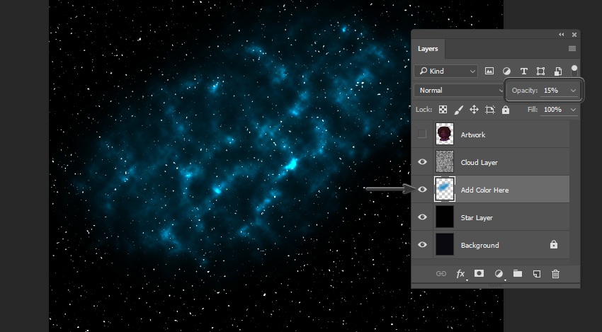
Now, for the fun part! We need to create a New Layer between the Cloud Layer (set to Color Dodge) and the Star Layer (the one right above the Background Layer). Set this New Layer’s Opacity to 15%.
Once you’ve created this Layer, take a Soft Round Brush and choose any color you’d like. I chose to start with a light blue color, because I know this is one I’d like in my galaxy.
As you paint, you’ll notice it starts to look like clouds of color in the stars!
Step 7
You can add additional Layers of color here, if desired. Try adding different colors, using a Soft Round Brush. In this case, I stuck to blue, purple, and violet hues until I had pretty splashes of color.
It’s also a good idea to turn your Artwork layer back on, so you can get an idea of how your galaxy visually relates to the artwork.
5. How to Paint Galaxy Colors in the Hair
Step 1
We’re going to apply these galaxy colors we’ve created to the hair, using a Clipping Mask and Blending Modes.
First, create a New Layer above your artwork and set it as a Clipping Mask (as described earlier in this tutorial). I like to use a Hard Round Brush to fill in the area I want to work with—in this case, the hair area.
Step 2
Once you’re happy with the area you’ve defined, set the Layer’s Blending Mode to Color. Make sure to toggle Lock Transparent Pixels on, so we are confined to the area we’ve just established when we’re drawing.
Now, using a Soft Round Brush, start applying colors inspired by the galaxy in the background. You’ll notice that it changes the color of the hair.
Step 3
At this point, I like to draw on top of my work and add small refinements. For example, using the same Custom Brush from earlier, I added some lighter blues and variations in the hair.
6. How to Add Finishing Touches
Step 1
I also wanted to put sparkles in the hair, to push the galaxy aesthetic further. I started by drawing simple shapes—little dots and crosses—where I wanted to see stars.
Step 2
Then, I Duplicated this Layer and added a Gaussian Blur to it, to give them a glow.
Lower the Opacity of the original Layer to 20%, and then create a New Layer on top of both of the Layers of sparkles. I drew small dots in the center of each sparkle, on this Layer, to push them further.
Step 3
Finally, it’s time for some finishing touches. For the eyes and earrings, I used a Hard Round Brush to add some extra details and shine. My light source is coming from the viewer’s left, so I made sure to keep that in mind.
I also added a cute star shape to her cheek! Notice how it looks soft against the skin—this can be achieved by lowering the Opacity of the layeryou’re drawing on.
I also thought a touch of galaxy-inspired eye shadow would help push things further! I did so using the same technique we used earlier, when adding colors to the hair. Create a New Layer, set the Blending Mode to Color, and add color using a Soft Round Brush. If the color seems too intense, try lowing the Opacity.
Step 4
One last thing and we’re done! Using a Soft Round Eraser, I removed some of the base of the artwork, so the character blends into the starry background.
Awesome Work!
We’ve drawn a lovely, galaxy-themed portrait. As a woman of color with afro textured hair myself, I’d love to rock this look—but until I can get in touch with my inner space princess, painting this out-of-this-world style will have to do!
Good luck experimenting with your own galaxy-themed portraits!
I find the concept of subgrid a little hard to wrap my mind around.
I do understand the idea that we want to use nested semantic markup as we like and have elements participate in one grid so we don’t have to flatten our markup just for layout reasons. But that is largely handled by display: contents;.
Rachel Andrew explains it in a way that finally clicked for me:
I have an item spanning three column tracks of the grid, it is also a Grid Container with three column tracks – however these do not line up with the tracks of the parent…
If the nested grid columns were to be defined as a subgrid, we would use the subgrid value of grid-template-columns on that child element. The child would then use the three column tracks that it spanned, and its children would lay out on those tracks.
It’s not that the parent disappears, it’s that it shares grid lines with the parent so that getting internal elements to line up with everything else happens naturally.
An institution’s motto, an artist’s intro, a company’s tagline, a community’s principle, a service’s greeting… all of them have one thing in common: they’re one brief paragraph displayed on a website’s home page — or at least the about page!
It’s rare that just one word or one line of text welcomes you to a website. So, let’s look at some interesting ways we could style the lines of a paragraph.
To see how things currently are, let’s try giving borders to all the lines of some text in an inline span and see how it looks:
<p><span>Hummingbirds are birds from...</span></p>
The edges appear broken, which they technically are, as the inline box has been fragmented into multiple lines. But we can fix those broken edges with box-decoration-break!
The box-decoration-break property in CSS can decorate the edges of fragments of a broken inline box (as well as of a page, column, and region boxes).
Its value, clone, does that with the same design that appears in the box’s unbroken edges, and its default value, slice, does not copy the decorations at the edges, keeping the break very visible like you saw in the demo above.
The property affects not only the border but also the shadow, spacing, and background of the broken edges.
Let’s play with the background first. While writing the post on knockout text, I was working with the background-clip property and wanted to see if the design held up for multiple lines of text. It didn’t.
The background gradient I applied was not replicated in every line, and after clipping it, only the first one was left with a background. That is, unless box-decoration-break: clone is added:
The background-clip property with the text value clips a background to the shape of its foreground text. Since we used box-decoration-break, the gradient background is shown and clipped uniformly across all the lines of the text.
Going back to the border, let’s see how its shape and shadow can be copied across the broken edges, along with padding:
<img src="tree.png">
<p><span>Supertrees are tree-like structures...</span></p>
<img src="tree.png">
<p><span>Supertrees are tree-like structures...</span></p>
In the second paragraph of the demo, the background is cropped until the content box (background-clip: content-box). As you can see, the crop happens in the broken edges as well, because of box-decoration-break: clone.
Another way we can style borders is with images. You might see a gradient border around the lines of text below, covering the broken edges, if the browser you’re now using supports border-image and the application of box-decoration-break over its result.
<p><span>The Malaysia–Singapore Second Link...</span></p>
An additional behavior we can tap into for decorating individual lines is of outline’s. In supported browsers, box-decoration-break can add an outline to every line of the text, including the broken edges, which is useful for creating bicolored dashed borders.
As observed in the demo, box-decoration-break withstands animation.
Besides borders and backgrounds, box-decoration-break can also manage shapes applied over elements. There is not much use for it in inline boxes, and is maybe better used in a column or page box, although the application is not yet widely supported in browsers.
But to show an example of what that does, let’s try applying the clip-path property to the span.
The property clip-path itself is only fully supported by Firefox, so only in it you might see an expected outcome. But following are two images: the results of applying a circular clip path over the span, without and with box-decoration-break.
span {
  clip-path: circle(50% at 202.1165px 69.5px);
  ...
}
Circular clip-path on a span with box-decoration-break: clone
You’ll notice in the first image that the 50% radius value is derived from the width of the inline box (the longest line) where box-decoration-break is not used.
The second image shows how box-decoration-break: clone redefines the computed value for 50% by basing them on the widths of the individual lines while keeping the center same as before.
And here’s how the inset function of clip-path (an inset rectangle) applied over the span clips it without and with box-decoration-break:
Inset clip-path on a span with box-decoration-break: clone
Without box-decoration-break, only a portion of the first line that matches the length of the shortest is visible, and with box-decoration-break: clone, the first line is fully visible while the rest of the box is clipped.
So, maybe if you ever want to show only the first line and hide the rest, this can come in handy. But, as I mentioned before, this application is more suitable for other types of boxes than ones that are inline. Either way, I wanted to show you how it works.
Browser Support
As we’ve seen here, box-decoraton-break can be super useful and opens up a lot of possibilities, like creating neat text effects. The property enjoys a lot support with the -webkit prefix, but is still in Working Draft at the time of this writing and lacks any support in Internet Explorer and Edge. Here’s where you can vote for Edge support.
This browser support data is from Caniuse, which has more detail. A number indicates that browser supports the feature at that version and up.
Desktop
Chrome
Opera
Firefox
IE
Edge
Safari
69*
11
32
No
No
TP*
Mobile / Tablet
iOS Safari
Opera Mobile
Opera Mini
Android
Android Chrome
Android Firefox
11.3*
11
all
62*
66*
57
Wrapping Up
The box-decoration-break: clone copies any border, spatial, and background designs applied on a fragmented inline box’s unbroken edges to its broken ones. This creates an even design across all the lines of the text, decorating them uniformly and can be super useful for all those blurbs of text that we commonly use on websites.