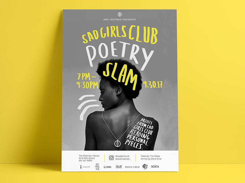
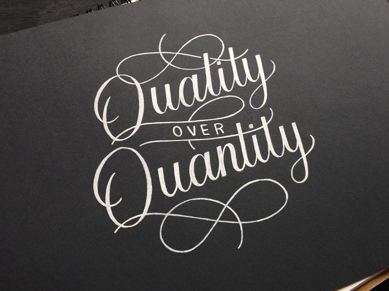
Hand drawn typography has grown into a field of its own. Illustrators, designers and letter artists are working with multimedia to make their own contributions to this growing trend.
From traditional sign making long used by local communities, to illustration used in publishing, hand-drawn typography creates a sense of creativity, uniqueness, and playfulness in illustration and design.
Creating your own lettering, even if it’s just simply by doodling, can be a creative form of expression. However, with all of the potential opportunities in this field, creating your own lettering is a means of developing your own skills.
There are many different techniques that experienced typographers use in their graphic design projects. This is because typography is an art and a science, with rules or formulas which create effective pages which are intuitive to readers.
When creating your own hand-drawn letters or fonts, follow these basic rules to help your page look both unique and effective.
You can always download free handwriting fonts from an article or another, but it delivers a bigger satisfaction to actually create one.
Inspire yourself from the best work out there
When you create your own lettering, it is different than handwriting. Instead, you are drawing or illustrating your font.
To do this, it is helpful to create a folder of inspirational ideas. You can explore the work of other lettering artists too.
Many publish their work online, so you could always browse Pinterest or YouTube to find inspiration.
Create a formula for your lettering
When you create and design your own lettering, begin by measuring the height and width of the letters you will use on your page.
This will depend on the design of our letters and how you would like to lay them out. Some fonts are small and wide, while others are narrow.
Many designers use a ruler to layout the type on their page, making lines around the letters they are inspired by to show the width or height.
These measurements are then transferred to a page where the designer begins to experiment with his/her own font designs.
Use shapes to map out your page
When creating the space for a font, designers often map their page using empty shapes. Thus, a large rectangle may be used to represent the space where a headline will eventually go. Speech bubbles create spaces to be filled by text.
These shapes give an indication of the length or height you’d use for your fonts. However, hand-drawn letters do not have to be constructed in straight lines and can vary in height or curve in wave format, depending on the design.
Use different sizes to create hierarchy
When you design your letters or fonts, you can use different sized fonts for different words, depending on importance.
This is an easy way to create hierarchy, or evaluate the importance of a message. You can shrink unimportant words such as ‘and’ but then increase the size of important words in order to grab your reader’s attention.
Once you have placed your words on the page, you can adjust or resize them as you go along. If you’re drawing by hand, this requires a pencil and eraser. Gradually, a sleek, clean-lined page will begin to emerge.
Focus on consistency
When you are working on a larger project, it’s helpful to make sure the different aspects of your design are consistent. If you create a brand logo, for example, it has to be exactly the same in all areas of the project.
In order to create identical lettering, you can create a stencil. If work has been done already, make careful reference, as even slight deviations can make a project look messy. Top level designers work with a consistency which creates a fluid flow across the page.
Do your research
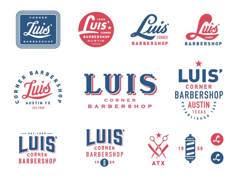
If you’re creating typography by hand, this often creates a historic or vintage element. Do some research before you get started.
Many contemporary logos use vintage style (exploring what is already out there enables you to set yourself apart).
However, you could also draw on historic images or references in order to create an interesting font. You could also look at how people used fonts or lettering in years gone by in order to create the mood of the era.
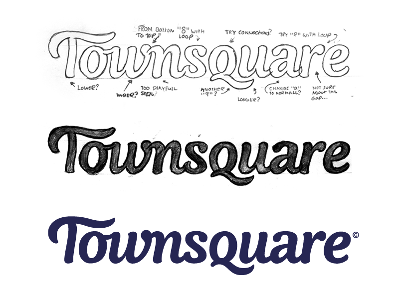
Once you know what you would like to achieve, go out and sketch! Create more than one design, exploring what works best and refining it until you are happy with the result.
Pay attention to the message your typeface is communicating. Explore how many different fonts you would like to use in your design, and how to pair them with each other.
Look at your layout, and how you would like to place your different fonts and how this fits in with the mood or historical element you are portraying.
Transform with Photoshop
Once you’ve created your font, import your design into Photoshop. Your next step would be to change your design from a colored photograph to a high contrast black and white image. Using Photoshop using greyscale mode.
Choose image > mode > Grayscale
Alternatively, click Layer > Adjustment Layer > Black and White
Within the same menu you can select from:
Levels: Use the highlighted eye drops on the left of the menu. You can use the white dropper to define the pure white parts of your image, and the black dropper will define pure black aspects.
Brightness and Contrast: This can help you to contrast various aspects of your image in a manual way. You can adjust these two factors until you achieve a high contrast between light and dark.
Selective Color: Use this to define the texture of your image. Play with the amount of black you would like within the image in order to achieve a high level of contrast.
Polish your image using Illustrator
Once you’ve created your rastor image, you will need to turn it into a vector using Illustrator.
You will need to import the high contrast image into Illustrator. Make sure it is selected and then use Image Trace. You will be able to create a vector sketch from your design. You can then tweak your image to be as sleek or messy as you would like.
Once you have created your vector, you can make some final changes to the style. You can expand the object and Ungroup it in order to access the anchor points of your vector. Using the toolbar, you can add, delete or move these anchor points.
If you’d like your work to be very sleek in order to use it as a logo, you can tighten it up in order to create smoother lines.
Summary
These helpful tips will assist you to create hand-lettered fonts which can be used with consistency, giving a touch of creativity and uniqueness to your graphic design pages.
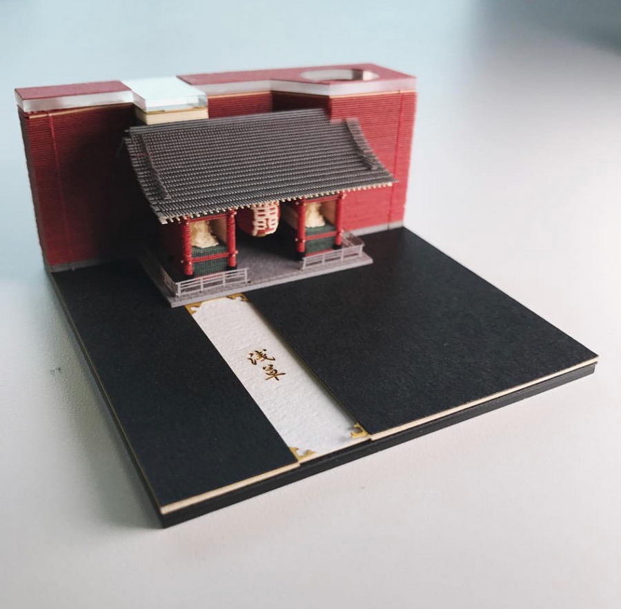
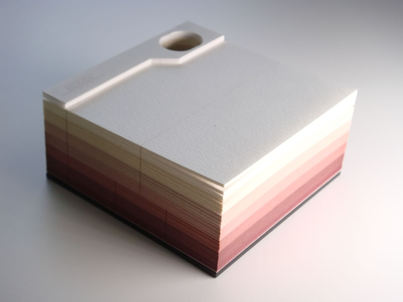
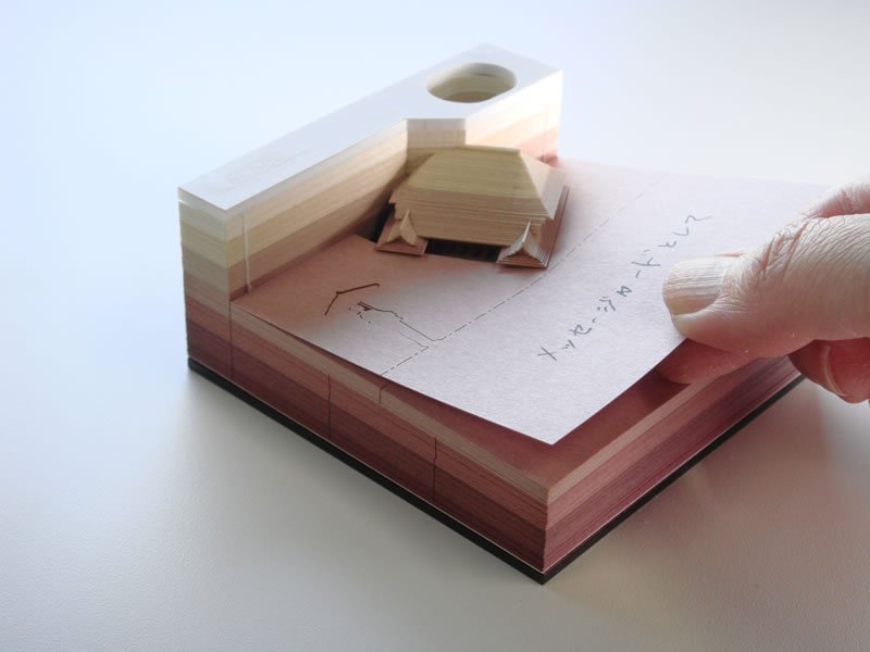
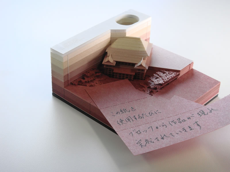
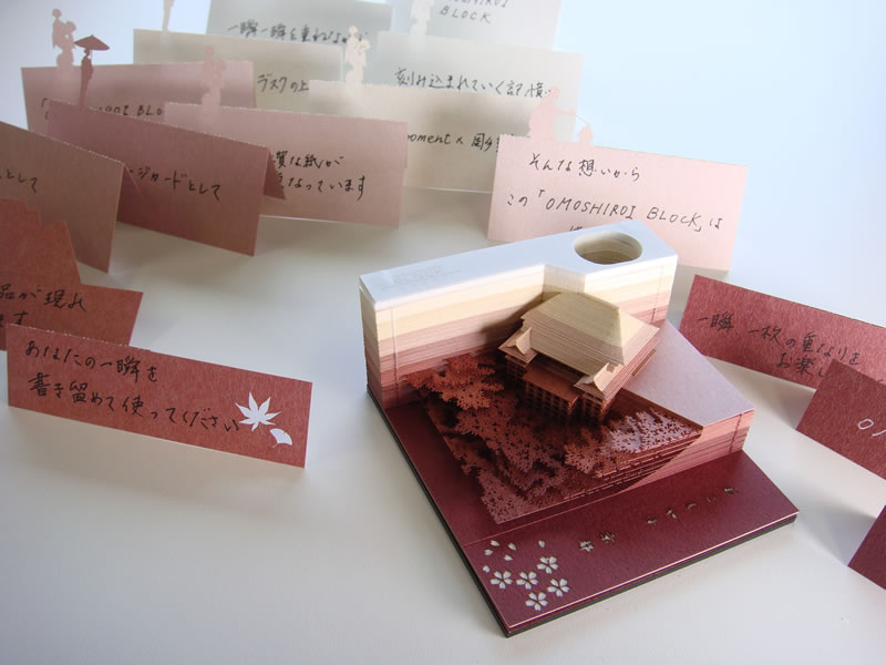
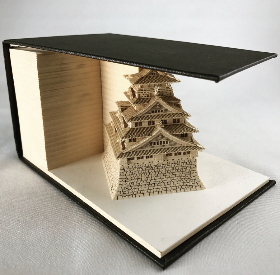
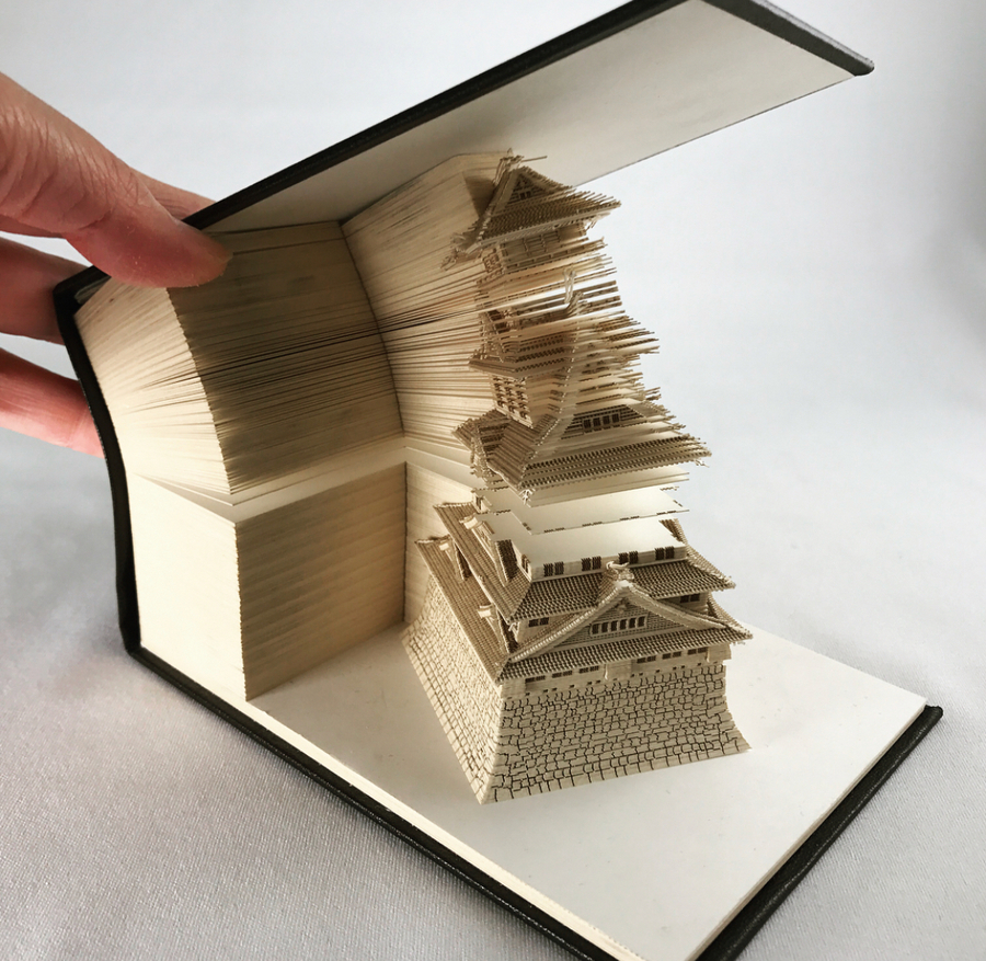
If you thought that paper notes blocks could not become a form of art, the Japanese will prove you wrong with the Omoshiro Block. These average looking paper note cards reveal stunning tiny paper sculptures as you remove the paper. These innovative stationary designs are created using laser-cutting technology, they reveal various architectural beauties, such as Kyoto’s Kiyomizudera Temple, Tokyo’s Asakusa Temple and Tokyo Tower.
Do you remember being a kid, cutting out pictures from magazines? Did you glue them onto paper to create your own collages? This post is about cutting out images on the web using the CSS property clip-path. We will discuss how to do the cutting and how we can use these cut-out parts to create some interesting effects, combining these cut-out parts with the original image.
I’ll use the following photo as an example. The flower stands out from the rest of the photo. It is a natural focal point to cut out and create our effects around.
First off, we are going to create a new SVG file and import our example image into it. You will need image editing software with vector capability to make the cut. I’m using Inkscape, a free open source editor, but you can apply the same method covered in this post using other applications such as Adobe Illustrator or even an online editor, like Vectr.
Let’s start out by creating a new 100px square SVG document in the image editor. It’s important to use a 100px square because clipping paths come in length-percent. Choosing a 0-100 scale will allow for seamless conversion from pixel to percent.
One thing that I find very valuable before proceeding is to examine the SVG code output from the editor. Getting that output depends on the application. For example, there are two methods in Illustrator alone. Looking at the markup gives us insight into what the editor is doing behind the scenes because not all applications export SVG the same way. Seeing the code will increase your understanding of the markup. It’s a win-win.
The SVG output should give us something like this:
One of the more important parts of the above is the viewBox attribute because it represents the internal coordinate system of the SVG document. Here’s a thorough explanation of how it works. Above, we can see that the document has the correct proportions where width, height and viewBox all span from 0 to 100.
Next up is importing the image. Here we’ll want to resize the image to 100px square and place it at the origin (0, 0). Doing so might break the aspect ratio of your image, unless your image is already in a square proportion. Our example image is not. This will not be a problem when applying clip-path later on.
The image is temporarily rescaled to meet the new square proportion.
Looking at the generated code once again, we now should see the <image> tag inside the SVG document. Note the preserveAspectRatio is set to none. This tells us that the image’s original dimensions are being ignored.
The concept of cutting images is called masking. If you are unfamiliar with masking it’s essentially drawing a closed shape with the pen tool around an area of the image. You don’t need to be savvy with a vector editor to do this. It doesn’t require any particular artistic skills and it can be done in a few basic steps.
Masking digital images is very much like cutting images out of real magazines. The path created in the vector editor is the same you’d follow using a pair of scissors. Select the pen tool and start drawing the outline of the part of the image that you want to cut out. In this case, it’s the flower focal point we pointed out earlier. Create as many points you like along the way to shape the mask. Be sure to close the path as the last step.
It is important to only use cusp nodes when doing the cutting because clip-path does not support complex shapes, like Bezier curves at the time of this writing. It supports only simple shapes such as polygon, circle and ellipse.
If we view the SVG code now, the output will include a path with all the coordinates of the shape you drew. Here is an abbreviated example of my path’s output:
Below is a video of me cutting out the flower and the result. The cutting took me about two minutes and the result is pretty decent.
Here is my image with a slight opacity on the mask to show the final shape that was cut out:
Converting SVG to CSS Clip Path
Now that we have the mask let’s have a look at how we go from SVG to clip-path. This means converting the path descriptor, or the d attribute in the SVG code.
Before we look into how to do the conversion, let’s talk a bit about the reasons for using clipping paths. You might ask why we’re creating a clipping path at all? Why not mask the image in the vector editor and export a pre-cut image? It’s possible and using images is a lot more convenient than working with a huge chunks of CSS code. But there are two principal benefits of going with the clipping path as I see it: interactivity and compression. SVG is essentially code in the DOM that can be manipulated and it is a much smaller file size than a bitmap image of the same shape.
The syntax for CSS clipping paths is somewhat the reverse of what it is in SVG. Pairs are comma-separated and spaces separate coordinates. This is the complete opposite to the SVG descriptor syntax. To further complicate the conversion, some shapes only use absolute coordinates. SVG paths are more flexible as they can use both coordinate systems.
I’ve created a rudimentary Node script that converts SVG paths. It takes paths in relative coordinates and outputs corresponding polygons using CSS clip-path. It uses regex to parse SVG files. Feel free to fork it and enhance it. One obvious addition would be to add normalization of proportions. Adding normalization would eradicate the need to only use square images when creating masks.
Here is the result of applying the clip-path to the photo of the flower:
Now that we have the cut-out part let’s have a look what we can with it.
Overlay Effect
One quite neat trick is to stack the cut-out part on top of the original image. Below is a pen illustrating the idea of overlaying the cut-out part on top of the original image. It will give you an idea of the positioning and the two different parts involved. Having these two different elements gives us the possibility to apply separate effects on the foreground and the background respectively.
Highlighting parts on an image is not just visually appealing. It can also have a real impact on the user experience of your site. It isn’t hard to come up with useful scenarios where you might like to highlight parts of an image in a web page. Highlighting tagged people in a photo could be one use-case. Another could be to highlight certain features of a product in a product showcase. A third case could be a photo of a map, in which you would like to highlight places to do some storytelling around. Highlighting or emphasizing parts of the UI can when properly applied be powerful UX pattern. Using clipping paths is one way to achieve highlights in your UI.
Going back to the photo of the flower we can now easily make the flower stand out. One way to achieve this is to tone down the background behind the flower by lowering its opacity:
An interesting note is that the browser will hit-test the mask. Thus, to make it a bit more playful, we can trigger the highlight effect when the user hovers the flower. One way to do this is to add JavaScript event handlers (addEventListener) and attach them to the masked element. Setting these handlers to trigger on events like mouseenter and mouseout captures the user hovering the flower. We can even toggle classes on the background element to trigger the effect. A CSS opacity transition is essentially what’s needed.
There is nothing that prevents us from reusing the above technique several times in the same image. Here’s an example of highlighting many people in a photo. In this case there are several overlaid cut-outs:
An effect that we’ve been seeing more in the last year is blurred backgrounds. It’s kind of a reverse way to enhance foreground elements. Rather than enhancing the foreground element itself one can create the same effect by blurring background elements. This way of enhancing foreground elements has another pleasant side-effect: the element in your current focal point remains untouched. But, at the same time, it becomes more prominent.
The easiest way to achieve a blur effect is to use the CSS filter blur. The following pen uses the same JavaScript callback method as the previous example to trigger the effect on hover. Instead of toning down the background, it is blurred with a CSS filter transition.
Having a transition using the CSS filter, however, is very costly in terms of performance. This has to do with the shader running on the GPU used to create the blur effect. Animating the CSS blur filter is generally not a good idea. A more performant option is to reuse pre-filtered version of the image and use a cross-fade. In other words, we animate the opacity of a duplicated background image instead of animating the blur. Here is what that looks like:
Another option to reinforce the cut-out element is to use an outline effect. Reusing the mask is an easy way to make it. If we insert the SVG in between the two main elements and add a slight scale (1.04 in this case), we’ll make it appear as an outline.
What if the part you want to cut out has holes in it? What if it shows parts of the background that you would like to exclude?
For instance, imagine you want to cut out a donut. Then you want the mask to exclude the hole in the middle. How do you then cut out the mask? The clip-path specification doesn’t allow more than one polygon unless we use SVGs. This means there is no possible way to create more than one shape at a time.
Well, one way to create these holes is to use very thin connectors and draw it as one shape. In other words, we can make a very thin incision from the edge and cut out the hole. This pen illustrates what it looks like when we make these connectors very thin:
To make the highlight effect even more playful we can actually morph the clip-path itself. Below is an example of creating a dynamic highlight of a butterfly in three shots. The highlight is morphed between the three different cut-out parts on hover.
So, can clip-path be used in all browsers? Unfortunately, not at the moment! If we look the caniuse table it kinda looks a bit like a traffic light at the time of this writing.
This browser support data is from Caniuse, which has more detail. A number indicates that browser supports the feature at that version and up.
Desktop
Chrome
Opera
Firefox
IE
Edge
Safari
66
51
54
No
No
TP*
Mobile / Tablet
iOS Safari
Opera Mobile
Opera Mini
Android
Android Chrome
Android Firefox
11.0-11.2*
37*
No
62
62
57
Wrapping it Up
Some key points I hope you walk away with from this post:
Using clipping paths is one way to make parts of your images stand out
Stacking the cut-out part on top of the original image makes it possible to create different kinds of highlight effects in images
We can leverage the browser’s hit testing on masks to create interactive effects on cut-out parts
The clip-path property makes way for UX patterns that highlight and create effects around parts of your images
Effective immediately, all new features that are web-exposed are to be restricted to secure contexts. Web-exposed means that the feature is observable from a web page or server, whether through JavaScript, CSS, HTTP, media formats, etc. A feature can be anything from an extension of an existing IDL-defined object, a new CSS property, a new HTTP response header, to bigger features such as WebVR. In contrast, a new CSS color keyword would likely not be restricted to secure contexts.
In other words, if your site isn’t HTTPS, you won’t get new web tech features. Holy jeepers. The reasoning is the web should be using HTTPS, so this is our way of beating you with a stick if you try to use fancy features without going HTTPS first.
It’ll be fascinating to watch the first major feature drop and if they stick to their word here. The web dev forums of the internet will overflow with WHY DOESN’T grid-gap WORK WITH MY FLEXBOX? (or some likely coming-soon feature) questions and the answer will be: talk to your server team. What if they drop container queries behind this? That would be a hilarious devastating tornado of developer fury.
There has been a lot of research on the landscape this year! Here are a few snippets from a bunch of articles. There is a ton of information in each, so I’m just picking out a few juicy quotes from each here.
Perhaps the most interesting bit is how different the data looked at is. Each of these is different: a big developer survey, npm data, GitHub data, and StackOverflow data. Yet, they mostly tell the same stories.
The Brutal Lifecycle of JavaScript Frameworks
Ian Allen of StackOverflow writes:
JavaScript UI frameworks and libraries work in cycles. Every six months or so, a new one pops up, claiming that it has revolutionized UI development. Thousands of developers adopt it into their new projects, blog posts are written, Stack Overflow questions are asked and answered, and then a newer (and even more revolutionary) framework pops up to usurp the throne.
Using the Stack Overflow Trends tool and some of our internal traffic data, we decided to take a look at some of the more prominent UI frameworks: Angular, React, Vue.js, Backbone, Knockout, and Ember.
This time last year, not many had faith that Vue would ever become a big competitor to React when it comes to major companies adopting it, but it was impossible to ignore Vue this year, even sending Angular a bit into the shadows in terms of developer hype.
We asked over a hundred questions to more than 28,000 developers all over the world, covering topics going from front-end libraries all the way to back-end frameworks.
I particularly enjoyed the opinions. Lots of people who love working with JavaScript and find it to be moving in the right direction and find it overly complex.
This one is from Laurie Voss of npm, which is probably the best source of data for usage but faces interesting challenges with that data:
You can use npm’s download statistics to give you insight into the amount of people actively invested in using and maintaining a package. However, probably more important than absolute popularity is growth.
Packages, once incorporated into software, have very long lives. People very seldom rip packages out of software once they’re installed. Because of this very low “churn,” packages hardly ever decline in usage. Furthermore, nearly all packages in the npm Registry grow in usage as the number of total npm users continues to skyrocket. They vary only in how fast they’re growing.
This makes measuring growth harder, since measuring absolute growth in downloads all the time makes almost everything look popular.
All in all it tells a familiar story: React is incredibly popular and Vue is the one to watch.
Vue.js did do very well in 2017. It got a lot of headlines and a lot of people got interested. As I predicted, it did not come close to unseating React, and I’m confident to predict it won’t unseat React in 2018, either. That said, it could overtake Angular in 2018.
We’re celebrating all things celebratory this week! And what sort of celebration could be more fun than a night out clubbing?
This flyer is an easy way of tapping into the pastel-neon gradient trend. In this tutorial suitable for beginners to InDesign, we’ll look at how to create gradient swatches and apply them to a simple layout that can be adapted for print or online.
Once you’ve installed the font files onto your computer, you’re ready to get started.
1. How to Set Up a Flyer Layout in InDesign
Step 1
Open InDesign and go to File > New > Document.
Set the Width of the page to 4 in and Height to 6 in, to create a standard size flyer.
Set the Margins to 0.4 in and add a Bleed of 0.25 in.
Then go ahead and click OK.
Step 2
Expand the Layers panel (Window > Layers) and double-click on the Layer 1 name. Rename it Background and click OK.
Choose New Layer from the panel’s drop-down menu (at top-right), and name this layer Pattern, before clicking OK.
Then add a further three new layers in this order: Type Behind, Circle and, at the top, Type in Front.
Lock all the layers except the bottom one, Background.
2. How to Create Gradient Swatches in InDesign
You can create the equivalent of Photoshop’s ‘gradient maps’ in InDesign by tweaking the settings of gradient swatches. First, you’ll need to create a base group of standard swatches, to use as building blocks for your gradient swatches.
Step 1
Expand the Swatches panel (Window > Color > Swatches) and choose New Color Swatch from the panel’s drop-down menu.
Name this first swatch Neon Mint, and set the Type to Process. You can choose either RGB (for online) or CMYK (for print) depending on your intention to share the flyer in hard or soft copy. Here I’m going for RGB, as I’m planning to share the flyer on social media.
Set the values to R=140 G=249 B=208, and click Add and then OK.
Step 2
Repeat the process described in the previous step, to create a palette of nine more swatches, with the following names and values:
Blue: R=61 G=177 B=252
Pastel Pink: R=250 G=200 B=253
Rose: R=244 G=136 B=170
Neon Lime: R=145 G=255 B=142
Purple: R=110 G=89 B=190
Neon Pink: R=255 G=84 B=232
Pastel Lime: R=234 G=247 B=201
Neon Yellow: R=248 G=255 B=81
Deep Rose: R=240 G=88 B=171
Step 3
Now it’s time to create your first gradient swatch. Click on New Gradient Swatch in the Swatch panel’s menu.
Name the swatch Gradient Map 1, set the Type to Linear, and choose Swatches from the Stop Color menu.
Click on the left-hand stop on the Gradient Ramp below, and select Neon Lime from the swatch menu above.
Click on the right-hand stop, and choose Purple.
You can add more colors to your gradient by clicking anywhere on the Gradient Ramp and adding a new stop. From the left side, add a stop set in Neon Pink. Then one in Pastel Lime. And a third one in Neon Yellow.
Make sure the stops are spaced relatively evenly across the ramp, before clicking Add and then OK.
Step 4
Working on the Background layer, select the Rectangle Tool (M) from the Tools panel (docked to the left side of the workspace) and drag across the whole page, extending it up to the bleed on all sides.
Set the Fill of the shape to Purple from the Swatches panel.
Step 5
With the shape selected, go to Object on the main menu, and Effects > Transparency.
Pull the Opacity down to 10%.
Click on Inner Glow in the window’s left-hand menu. Increase the Choke to around 4% and Noise to 8%, to add texture across the whole shape. Then click OK.
Step 6
Create another shape using the Rectangle Tool (M) over the top of this first rectangle. From the Swatches panel, set the Fill to Gradient Map 1.
Go to Window > Color > Gradient and adjust the Angle of the gradient to 110, so that it extends diagonally from the bottom-right to the top-left corner of the page. You can also adjust the position of the stops to soften the gradient if you need to.
3. How to Build Up Shapes and Typography on Your Flyer
Step 1
Return to the Layers panel and choose New Gradient Swatch from the drop-down menu.
Call this swatch Gradient Map 2, and choose Blue and Neon Mint from the swatches list to create a two-color gradient. Click Add, and then OK.
Step 2
Lock the Background layer and unlock the Circle layer.
Select the Ellipse Tool (L), and, holding Shift, drag to create a perfect circle across the center of the page. Set the Fill to Gradient Map 2 and Stroke to [None].
Step 3
With the circle shape selected, go to Object > Effects > Drop Shadow.
Click on the colored square to the right of the Mode menu at the top, and change the Effect Color to Pastel Pink. Click OK, and add about 13% Noise to the shadow. Then click OK to exit the window.
Step 4
Lock the Circle layer and unlock the layer below, Type Behind.
Take the Type Tool (T) and drag to create a square text frame at the top-right corner of the circle shape.
Type in ‘C’ and, from either the top Controls panel or the Character panel (Window > Type & Tables > Character), set the Font to Charlevoix Pro ExtraBold, Size 130 pt.
Adjust the Font Color to [Paper] from the Swatches panel.
Step 5
Select the text frame and Edit > Copy, Edit > Paste. Move this second frame to the bottom-right corner of the circle, as shown below.
Select both the ‘C’ and ‘B’ text frames and head up to Object > Effects > Drop Shadow.
Switch the Effect Color to Neon Mint, pull the Opacity down to about 60%, and add 25% Noise. Then click OK.
Step 6
Take the Type Tool (T) again and create a smaller, longer text frame next to the ‘B’ frame.
Type in ‘NIGHT’ and set the Font to Charlevoix Pro Medium, Size 22 pt and increase the Tracking (letter-spacing) to 90. Change the Font Color to Pastel Lime.
Then Right-Click on the text frame and choose Transform > Rotate 90 Degrees CW.
Move the text frame to sit snugly against the left side of the ‘B’ letter.
Step 7
Use the Type Tool (T) to create another small text frame up in the right-hand corner of the page. Here you can add an introductory sentence such as ‘RIOT BLVD presents its opening’.
Set the Font to Charlevoix Pro, setting titles in Bold and other text in Medium. You can set most text in [Paper], but pull out key info in a contrasting color like Deep Rose.
Step 8
Add more text frames to the bottom-left corner of the page, setting text in Charlevoix Pro Bold, Medium and Regular to create hierarchy, and the Font Color to [Paper].
Step 9
Head back to the Layers panel and expand the Type Behind layer by clicking on the small arrow symbol to the left of the layer’s name.
Select the <B> element with your mouse and drag it down onto the Create New Layer button at the bottom of the panel to duplicate it.
Unlock the Type in Front layer at the top, before dragging the <B> copy upwards to sit on this layer. Then you can lock the Type Behind layer, and work on the Type in Front layer.
Step 10
Edit the ‘B’ letter on the Type in Front layer to read ‘L’ instead and move it to sit above the ‘B’.
Select the ‘L’ text frame and Edit > Copy, Edit > Paste, adjusting the letter of the copy to read ‘U’. Move so that it sits below the ‘C’, as shown below.
4. How to Add a Retro Pattern to Your Flyer
Step 1
Lock the Type in Front layer and unlock the Pattern layer.
Switch to the Pen Tool (P) and click onto the page or pasteboard three times to create a triangle shape, before uniting the shape at its first anchor point. Use the Direct Selection Tool (A) to select anchor points individually and move them to create a symmetrical triangle shape.
Step 2
Set the Fill of the triangle shape to Rose and Stroke Color to [None].
Move the triangle over to the top-left corner of the page, and scale it down and rotate it a little.
With the shape selected, go to Object > Effects > Drop Shadow. Switch the Effect Color to Neon Lime and add about 10% Noise, before clicking OK.
Step 3
Copy and Paste the triangle repeatedly, scattering shapes around the page and rotating them to different angles to create a jaunty, jumpy effect.
Your flyer’s finished! Awesome work!
All that’s left to do now is File > Save your hard work, and then File > Export to export it as either a print-ready PDF file (choose Adobe PDF [Print] from the Format menu) or online image file (choose JPEG or PNG).
Conclusion: Your Finished Flyer
Pastel-neon gradients are a big trend for this year, and this colorful flyer is a great way to tap into the style. It works perfectly for club or party flyers—but why not try using gradient swatches on different designs too?
In this tutorial, you’ve picked up some handy skills for applying to InDesign and other layout projects in the future. You now know how to:
Create gradient swatches (or ‘gradient maps’) in Adobe InDesign.
Layer color, shapes, patterns and type for a 3D look in your designs.
Format typography to a high standard.
Apply sophisticated effects to graphics, like glows, shadows, and transparencies.