
Wszystkie wpisy, których autorem jest admin

I am the future – Itau Bank
Post pobrano z: I am the future – Itau Bank
Brazilian bank Itaú Unibanco is running a commercial, “I Am The Future” (Eu sou o futuro), designed to inspire proactive engagement with the future. Narrated by Brazilian actress Fernanda Montenegro, the film discusses how people’s actions in the present can influence everyone’s future. Themes such as love, fear, uncertainty, truth, happiness, peace, differences and hope convey the contemplative tone of the message. “I am the future” is the third in a trilogy of films marking the end of the year and the beginning of a new year. The 2015 film talked about human relations with the world’s digitalization. In 2016 the focus was on how to enjoy the digital world’s wonders to live more and enjoy more each moment without pursuing lost time. In this last commercial the theme relates to giving too much thought about the future and neglecting the present. It shows that future is uncertain, it is scary, but we are the ones who can create our best destiny. If we want more love and happiness, we need to love more and be happier now because our future depends on us. “Nós não estamos nas mãos do futuro. O futuro é que está em nossas mãos.” (We are not in the hands of the future. The future is in our hands.) The film was shot in Uruguay, on location in Montevideo, Punta Ballena and Cabo Polônio.

Itau I Am The Future Credits
The I Am The Future campaign was developed at Africa by chief creative officer Sergio Gordilho, creative directors Otavio Schiavon and Jeferson Rocha, copywriter Everton Behenck, art director Edson Rosa, innovation and creative research team Andreia Rocha, Eduardo Berardinelli and Asaph Luccas, agency producers Rodrigo Ferrari, Tais Olhiara and Ian Inglez, account team Ana Hasegawa, Tariana Cruz, Bruna Motta and Rebeca Coelho, media team Luiz Fernando Vieira, Francisco Custodio, Beto Lima, Caroline Tanzillo, Gabriel Tardelli, Brunna Sa, Paula Rumachella and Jade Moura, planning team Rodrigo Maroni, Marina Pires, Rafael Camilo, Felipe Nogueira, Bruno Schwarzschild, and Leonardo Juhasz, working with Itau Bank marketing team Eduardo Tracanella, Thiago Cesar Silva, Leticia Banheti and Mariana Carvalho.
Filming was shot by director Vellas (Felipe Vellasco) via Saigon with director of photography Pierre Kerchove, executive producers Marcelo Altschuler and Carol Pessini, art director Marcelo Reginato, editor Beto Araujo, finishing artist Fabio Abreu
Post production was done at Nash with post production coordinator Virgini Fares.
Sound was produced at Antfood by sound producers Lou Schmidt, Pedro Botsaris, Wilson Brown and Vinicius Nunes. Music is the Forrest Gump feather theme, by Alan Silvestri.
Voice over was by Fernanda Montenegro.
How to impress by creating a website with great typography
Post pobrano z: How to impress by creating a website with great typography
When you are working on a website, you’re aware that great typography helps to create a message, keeps viewers engaged and adds to your design.
There are so many fonts available, that you might wonder how you create the perfect choice for your site. Here are some tips to help you:
Go back to the basics
Working with website design means looking at the foundations of a font.
Explore the divide: almost every font choice is based on the decision of serif or sans serif.
Use space: kerning means working on the space between letters, tracking means pulling blocks of text together by eliminating excessive space, and leading refers to the amount of space between text lines.
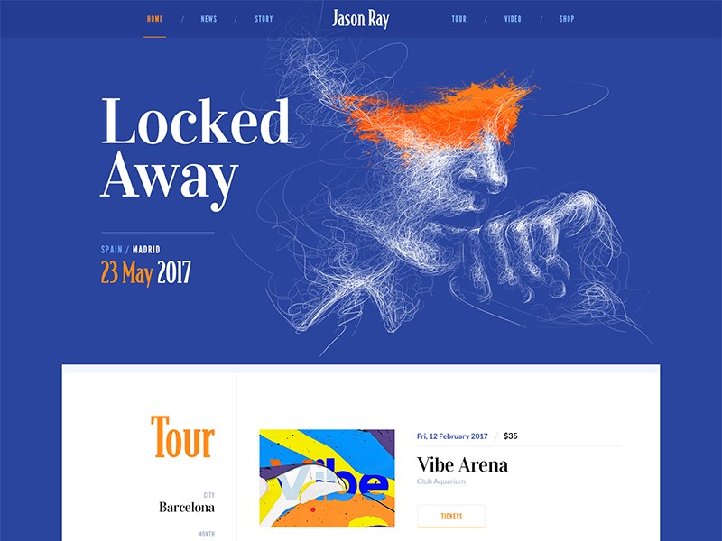
Legibility: ensure that your text is easy to read. Play with font size to ensure that your viewers will be able to read easily without impacting how sentences run across a page.
Remove hyphens and justification: this helps to keep your work looking organized and eliminates unnecessary spaces.
Limit choice: try to use only two or three fonts on a screen. This keeps your page from becoming chaotic or overwhelming.
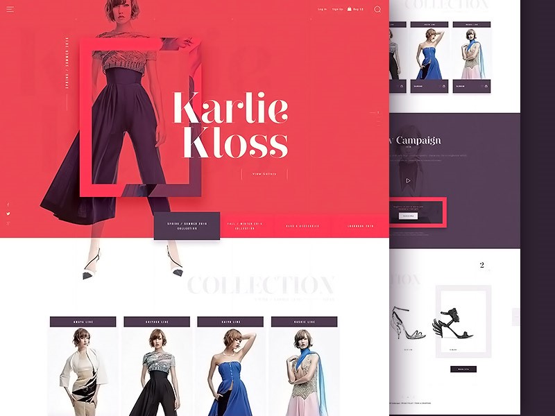
Remember to contrast: when you want to make a message pop out onto your screen, remember to use contrast.
Contrast is created by combining light and dark colors, but can also be used by contrasting color intensities such as vivid and muted colors.
Use browser friendly fonts
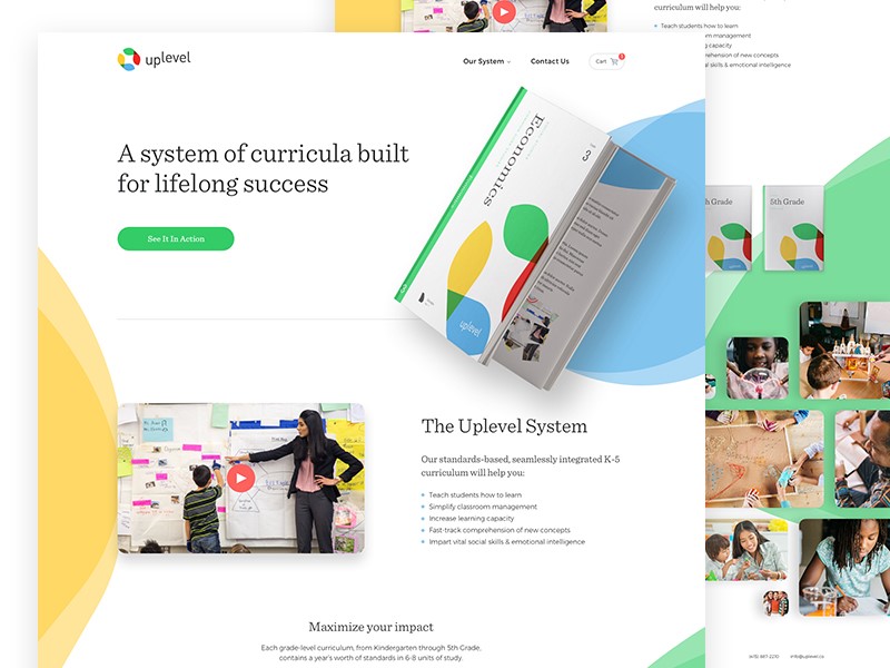
When you are shifting between browsers, make sure your texts are compatible. Text should also be compatible with different devices, such as mobile phones and laptop computers.
To do this, you could explore browser friendly fonts from Google Fonts, and ensure that you can read or use them on a smartphone or tablet.
How to create atmosphere or emotion using text
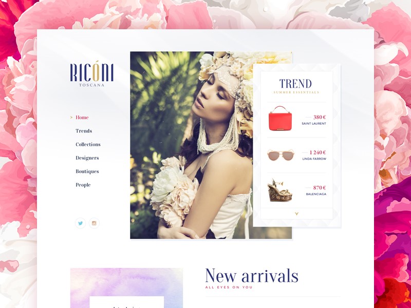
Words or sentences carry a message, but your viewer will take a first glance at your site and absorb meaning from your design, text, background, and color.
Your audience will not be able to relate to your site or text if the following four elements are not present:
- Type
- Color
- Texture
- Image
Adding these to your typography will enable you to create atmosphere, and to pass on a message to your viewers.
Working with color
When working with color, limit your choices. Many designers use a primary color, secondary color and accent color.
By using too many colours in your design, your website will be chaotic. If you’d like to create points of emphasis, use contrast instead of additional colour.
Be creative with your graphics
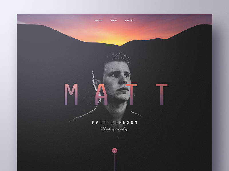
Surely, you want your site to be different than other websites in your niche. You can design a great header, footer or simply create a creative background.
That would be easy for a graphic designer, but if you’re a web designer that usually tackles simple graphics and code, it might be quite the challenge.
My advice is to start reading a few typography tutorials for Photoshop or Illustrator. Then, the sky is the limit when it comes to designing beautiful typography designs.
Working with content
When working with content, add hierarchy by working with paragraphs, headings, and subheadings.
While books are divided into chapters, sections, and paragraphs, websites use individual pages. The navigation bar represents a table of contents.
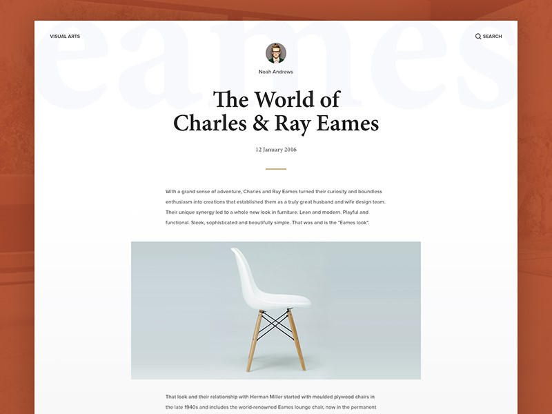
Websites have a clear distinction between titles, main paragraphs, and subsections of content. Subparagraphs often come with subheadings, so that users can take in information quickly.
Web users often want to be able to take in information quickly and get the general idea of a page. Page design is about making the reading process as quick and efficient as possible.
It is for the designer to lay out content according to importance. This means getting to know the content of your client’s pages so that you can organize it effectively.
Create mockups
If you’re working with small amounts of content, arrange the text according to headings, subheadings, and short paragraphs or bullet points.
However, if you are working with a great deal of text design a mock-up first. This will help you to work with chunks of text in a way which is both attractive and easy to read.
This way you can experiment with different combinations or page settings. Once you are happy with the mockups, you can incorporate other elements of your design.
Align your text
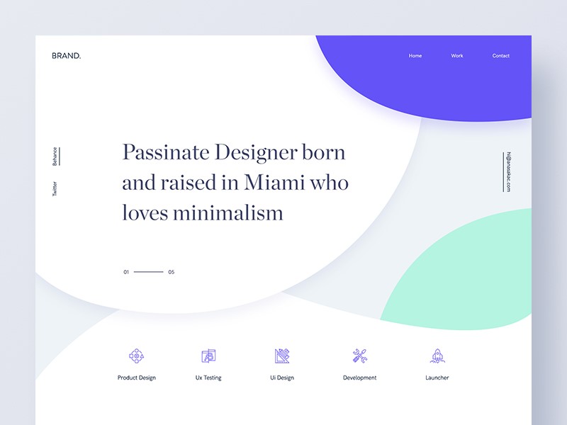
Alignment means placing text so that it can be read from left to right.
Aligning text from left to right prevents creating a chaotic feel to the website and makes it look professional. Only center large headlines on a website.
Preview the website
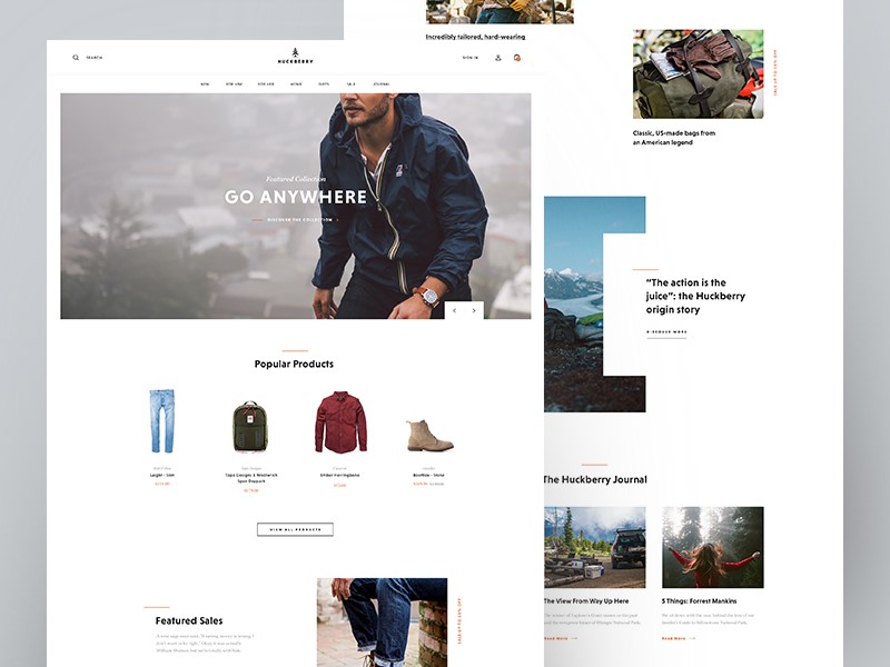
Once you have inserted your text into your page, take a look at how it fits within the page.
Look for text errors such as excess spacing, or sentences which fall out of balance. Examine the white space above and below your text. Without changing the content, make sure that the text gives an attractive and legible appearance to the page.
Create hierarchy
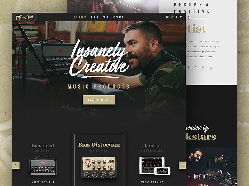
In the current society, website users are exposed to so much information on a daily basis that, were this not arranged effectively, it would feel chaotic.
As a designer, it is your role to structure this information so that it is easily digestible, arranged into a hierarchy of importance, and attractive to look at.
This relies on typography. From a design perspective, creating hierarchy is absolutely crucial in order to ensure users engage with a site.
Acknowledge the tone and message
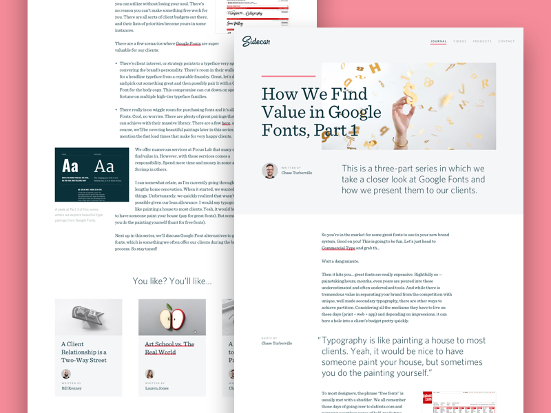
When selecting a font, consider the tone and message of your content or site. Pick a typeface which matches the project you are working on.
A typeface for a thrash metal band would be different to that of a vintage furniture and clothing shop. Corporate projects would be different to casual ones.
Ask whether your typeface should be formal or casual, sleek or elegant, large or small, bold or light, and how it will pair with the colors you will be using on the site. How will the mood of the letters match with the words being read? A focus on zen design, for example, would clash with a very elaborate font.
Ending thoughts
Website designers use text to tell a story using words, but to provoke emotion and atmosphere through design.
When the writer and designer are able to work together to produce quality content which can be effectively and legibly displayed, this creates an attractive and easily absorbable end result.
9 Easy Ways to Keep Your Website Visitors Longer
Post pobrano z: 9 Easy Ways to Keep Your Website Visitors Longer
Your website’s bounce rate, or the rate at which people leave shortly after arriving, is used by search engines as a measure of the fit of the site with the user’s query. If people leave the site quickly, search engines use that as a vote of no confidence in the content and downrank your site. Conversely, “sticky” sites that keep visitors longer are given higher rankings – and they’re more likely to convert visitors to customers. Here are 9 easy ways to keep your website visitors for longer.
Don’t Drive Them Away by Design
If your website takes too long to load, people will bounce away from it. And the patience of the average viewer is falling. You used to lose 10% of your potential visitors every second. You’ll now lose a fair percentage if the page isn’t starting to show results in three seconds.
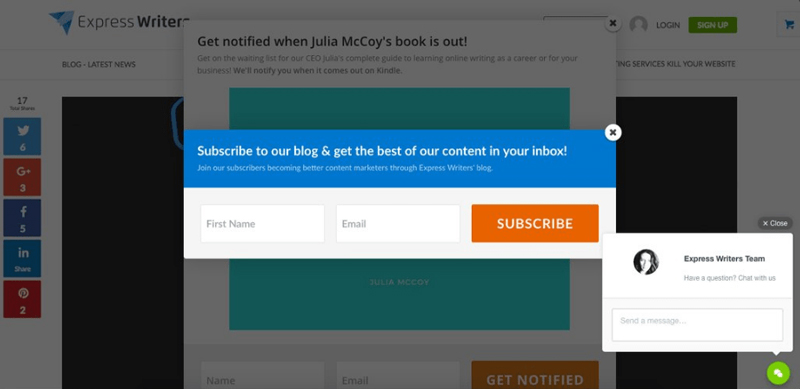
One way you drive away visitors as soon as they arrive is with pop-ups and interstitials. Think about landing on a webpage, and instead of the content you expect, there’s a pop-up ad. That drives visitors away. Another mistake is putting an interstitial or partial block on the page, whether asking them to sign up for your newsletter or promoting your newest product. Remove all obstacles between your visitors and your content and you’ll retain more of them.
Don’t Accidentally Tease Them
If your website is still using Adobe Flash, your site could play a few seconds of rich multimedia before erroring out. You’ve just guaranteed they’ll leave your site and never return. Don’t show up in search results for informational queries and then take them to a spammy landing page with too many ads. They’ll abandon the site again and avoid it forever.
Be an Open Book
Ensure that your text is readable on every screen size without visitors having to resize the text. Don’t forget to check the readability and usability of buttons and menus. And don’t use weird fonts that visitors have to download.
Adjust Your Search Engine Optimization
One common cause of bounces is the fact that your content isn’t a fit for the search. The solution here is to study the customer segment arriving on the site versus the focus of the content. One solution is to leave your page’s SEO as it is but tailor the content to better answer the question visitors are asking. Another is to alter the key terms on the page so that it ranks higher in the searches that your content answers.
Improve Your Answer
One reason people bounce away from websites is that the page isn’t answering the question. This is where a long introduction before answering the user’s question causes them to quit the page. The solution is to answer at least a partial answer like a yes or no before going into detail further down on the page. This at least keeps the reader on the page and reading a while longer.
Use Smart Formatting
Smart formatting makes it easy to read your content. This takes the form of bulleted lists, FAQ formats, suitable images, short paragraphs and frequent subheadings. The benefit of smart formatting is that it makes it easy for someone to skim the content to find what they want.
Lead Them On to Other Content
Another way to keep visitors on your pages is to embed links to related content on your website. For example, you’re showing the pros and cons of the Model A product. Provide a link on the same page to take them to the specifications for Model A or a comparison of Model A to its main rival. If people follow internal links to other content, search engines see this as an endorsement for your content. If someone is seeking advice on how to fix a problem with your product, give them your link to the repair kit you recommend instead of letting them look for it elsewhere.
Use Intuitive Navigation
Intuitive navigation is a navigation structure that users understand immediately. If you have an ecommerce page, design the product structure so that someone looking at a blue short sleeved sweater by brand B can tell how to see other sweaters by brand B or your other short sleeved sweaters. This keeps them on the site as they browse instead of abandoning your site for someone else’s. A web design company can help you implement this if it isn’t already set up on your website.
Be Mindful of Their Needs
One variation of this is creating targeted pages that are optimized to answer questions the users are asking, so they don’t have to hunt for answers. Another variation is using a few, high quality images that are directly relevant to the query but minimizing bandwidth demands, whether you use content delivery networks or have a lazy load of third party content.
Conclusion
Keeping your visitors on page is all about understanding their needs and improving their user experience. You also have to design your site for maximum readability and make the navigation as seamless as possible.
Multi-Lingual Web Design – 7 Essential SEO Elements to Keep in Mind
Post pobrano z: Multi-Lingual Web Design – 7 Essential SEO Elements to Keep in Mind
In an increasingly international business climate, it is becoming more important to make your website accessible to all of your customers, regardless of the language they speak. Here are 7 essential SEO elements to keep in mind for multi-lingual web design. We’ll give specific tips instead of platitudes while making the advice as generally applicable as possible.

Have an International Web Marketing Strategy
It is amazing how many people look at the international market and assume that having a website with content in that language is enough. They ignore the fact that Google isn’t the dominant search engine in every other part of the world. For example, Baidu dominates Asia while Yandex is strong in Russia. So, work with the search engines and social media sites that your international customers will be using in order to reach them.
Create Well Crafted Content for Each Audience
One solution is having separate web domains for each of your customers’ languages. This adds to the number of sites you have to maintain and do SEO for, and dilutes your company’s homepage in search engine results, but it gives each linguistic group a website designed for their language and culture. You can thus have buttons, content and support information in their native tongue instead of hoping they can run it through a translation website. If you’re creating separate company websites to target each country’s customers, use the country code in the top level domain to garner trust and rank higher in searches in those countries.
Another option is having content in several languages on each website. Create a separate page for each language, for example yourwebsite.com/ru and submit each of these pages in Google webmaster tools just like you submit every other site you might have. Tip: Use hreflang code which specifies the language for each of your pages. This will help search engines better understand your website and get better rankings in specific countries. Call to action buttons help with conversion. It is recommended that the CTA buttons are also translated in the specific languages you are targeting.
In any of these cases, it is wise to hire an SEO agency that understands truly universal web design and can create quality content in every language you want your customers to read.
Design with the International Customer in Mind
Ecommerce sites found that shopping cart abandonment rates are lower if the prices are presented in someone’s own currency instead of an intermediate currency. You should design your website to show someone the currency based on where they are connecting to the site. Make your international shipping policies clear with information on delivery time and product tracking if you’re not shipping products from a hub within their country.
Use the Key Search Terms They Are Using
It is amazing how many businesses build key search terms into their content and on-page SEO in English even when translating the content to Spanish, French or Arabic. Integrate the key search terms searchers in those languages are using into each page, whether building them into the title, tags or content.
Consider Customer Support in Their Language
One issue that trips up many international businesses is the lack of support for customers in their own language. Perhaps they find they are unable to order the product; you’ll lose their business forever if they cannot reach someone to help them complete the order that can actually answer their questions. Make sure the Q and As are in their language so they rank properly. Contact an SEO agency to not only create this content but apply the right SEO in the customer’s language so that your Spanish language tech support page comes up for Spanish speaking searchers, for instance.
Select Hosting Strategies that Suit Your Users
You should not assume that your customers are best served by a server in their own country, though there are times this is the best option. Consider whether or not you want mirrored servers in their country or you want to rely on local content delivery networks instead.
Generalize All of the Design as Much as Possible
Your website design should be based on logos and branded colour schemes that don’t rely on language to communicate whose site it is. Where possible, use universally accepted images of your product in use. Ikea, for example, created assembly instructions with gender neutral figures assembling its furniture so that no one was offended by an uncovered woman assembling furniture. Many websites focus on someone’s hands holding or assembling the product instead of images of the whole person; this may have the side benefit of reducing the size of the image and its load time, as well.
Conclusion
Multi Lingual can seem intimidating at first, but it doesn’t have to be. You need to have an international marketing strategy if you’re going to reach your ideal foreign customers. And, make sure that you design your website to provide answers and content geared towards an international audience.
Thank You (2017 Edition)
Post pobrano z: Thank You (2017 Edition)
As 2017 comes to a close, as we do each year, let’s take a numbers-based glance back at CSS-Tricks. And more importantly, tip our collective hat to all y’all that come here and read the site.
We really do think of the site as somewhere you come and read. While a lot of people’s experience with CSS-Tricks is a place that shows up in search results to find the answer to some web design/dev question (and that’s awesome), another way to experience the site is to read it like a magazine. We publish an article (or a couple) nearly every day, from a variety of authors, with the hope that it’s interesting and exposes us all to new ideas.

According to Google Analytics, which we’ve had installed and reported from anonymously since day 1 around here, we had 75 million pageviews this year. Very little of CSS-Tricks makes use of any kind of „single page app” type tech, so that’s pretty accurate to people visiting and clicking around. It’s down from 77 million last year. I’d like to think that’s because of ad blockers, which often block Google Analytics, are up in usage for the visitors of CSS-Tricks, but it’s just as likely we’re just down a smidge this year. Sessions are also down a smidge at 54 million but Users steady at 21 million.
We were on a publishing role though! We published 595 posts, blowing away last year with only 442, the previous record. We also published 50 pages (i.e. snippets/videos/almanac entries) beating 43 last year. Certainly, we’re in favor of quality over quantity, but I think this is a healthy publishing pace when our goal is to be read, in a sense, like a magazine. That has been more clear to me this year. We produce content with complementary goals and one of those goals is that of a magazine. We hope the site is worth reading day after day and week after week. The other is that the content lasts and is referenceable for many years to come. Hopefully thinking of things that way can be a guiding light, balancing news and reference content, while avoiding stuff that is neither.
I always wished there was an easy way to figure out what the most popular articles published that year were, but I still don’t have a great way to do that. The top 10 is dominated by our big guides, things like our Guides to Grid, Flexbox, SVG, and centering.
Those top 10 make up about 15% of total traffic, which is a massive slice, but that leaves 85% of traffic as part of the „long tail”. That’s a satisfying thought when you’re in it for the long haul as we are. Not every article is a huge top 10 smash hit, but does contribute to the long tail which is a much bigger slice collectively anyway.
For the last bunch of months, we’ve been using Algolia for search. My plan only has 7 days of analytics retention, which isn’t enough data to expose major trends. In looking at a week of data though, you can see some surprising top terms like React, SVG, grid, flexbox, font, border… Another thing that’s clear is that on-site search is quite important. Algolia reports ~15,000 queries a day. I don’t think that represents „user typed in a thing and submitted it” because the search happens in real-time, so each character typed can result in a query. Still, likely hundreds or low-thousands of searches a day.
I’m going to convert us back to using Google search. I think Algolia is a fantastic product, I just don’t have the developer time right now to give it the work it needs.
The location of y’all seems to be spreading out internationally little by little. The United States is down to 22% of traffic from 23% and India back to down to 11% from 12% (meaning more traffic came from elsewhere). Those are the top 2, then it goes UK, Germany, Canada, France, Netherlands, Poland, Russia, Brazil. What would be really interesting is to figure out visitors per-capita. For example, Singapore has a population of 5.6 million and had 111,319 unique users, so you could say about 2% of Singaporeans visited CSS-Tricks last year. Lols probably not, but hey that’s what the back-of-the-napkin math shows. Whereas with the 4.6 million unique visitors from the US compared to the 323 million population means only 1.5% has visited.
We gained about 10,000 newsletter subscribers this year for a total of 31,376. That’s about a third of the entire list size. I love our newsletter. I think it has a ton of potential and is always worth reading. To be perfectly honest I’d like to see our newsletter subscriber numbers be higher than our Twitter followers, but that’ll be a tall hill to climb.
Search is the origin of 86.6% of the traffic we get. Direct visits and referral links result in another 5% each. Social media just 2.5%. Whenever I look at that I’m reminded of the disproportionate amount of energy spent on it. Still, it aligns with our goal of being a publication people regularly read and being a source of news, so it feels worth it.
Speaking of social media, we rose 44,000 follows on Twitter last year, again an astonishing number, but it’s down year-over-year for the last several years. 71,900 likes on Facebook, only rising about 3,000, which isn’t bad considering we do hardly anything at all on Facebook. Growth is much more explosive on YouTube. We’re at 40,123 subscribers there from 32,174 last year, despite only posting a paultry 6 videos.
This is a classic loop in my head: maybe we should have a dedicated social media person! But even part-time employees are expensive… is it worth it? How much more potential is there? Could they add so much value they pay for themselves? What else could they do? And then the questions swirl around in my head so quickly the idea fizzles out. I guess I’ll just say if that kind of thing interests you, reach out!
For once, mobile traffic is actually up. 6.2% this year from below 5% last year. Industry-wide, that’s rock bottom. CSS-Tricks is just weird that way. A lot of developers b searching stuff at work, unsurprisingly. Less than 1% is tablets. 30% of the mobile traffic is iPhones.
Y’all left about 5,040 comments on the site this year, which is a smidge down year over year from the past few years, but it actually feels significantly up to me, since we’ve been much more stringent about what comments we publish this year. I do the vast majority of comment moderation and I trash a lot more than I used to. Anything that off-topic, rude, or unhelpful doesn’t see the light of day. I hope that doesn’t scare you off from commenting. In fact, I hope it encourages it. Anything on-topic and helpful will absolutely be published and won’t be lost in a sea of junk.
We’ve had 20,238 people use our contact form. Don’t worry, I love email.
Goal Review
Double newsletter subscribers. We didn’t double but we grew by a third, which is pretty strong. Especially since we did little to nothing to promote it. We probably need to do a better job of promoting it and somehow incentivizing signups, especially since it’s such a good way to reach people.
More pairing videos. Pretty hard fail here. The main difficulty is scheduling multiple people together, combined with the pressure of producing something worth watching. It’s one thing for an audio podcast like ShopTalk where we can schedule someone and just chit-chat about tech. It’s another thing to ask someone to pair with you and essentially do live coding. It’s still a good idea, it just needs a more serious time commitment and leader. And honestly, probably a sponsor so that it can be worth everyone’s time.
Maintain a mostly-daily publishing schedule. Check and check! This is the first year we’ve actually kept an honest to god schedule, structured after daily posting. We’ll be moving forward with that for sure.
Assemble content in more useful ways. We got a good start on this with Guides. We haven’t done a ton with them yet, but we have given ourselves a way to build these without too much effort, and I think the potential in them is fantastic.
New Goals
Publish something in a new format. We have a lot of publishing power around here with lots of writers and a solid platform. Let’s use it to publish a book or something book-like.
More editorial vision. Admittedly, what we published each day is a bit random. That’s not a terrible thing since the site has a niche anyway, but I’d call it a good goal to exert some editorial guidance to what we publish and when. Meaning commissioning and shepherding work that is a good fit for this site and publishing it with timing that makes some sort of sense.
Interesting sponsorship partners. The most rewarding and powerful partnerships between sponsors and publications are ones of mutual respect and admiration. There are loads of businesses out there I think are doing a terrific job of building what the build, and I’d like to forge relationships with them to promote what they do. And do that promotion in a way that we are uniquely able to do. Get in touch if you think you’re a part of that company.
Create another very popular page. It’s just a matter of time and topic. I’d like to find at least one web development topic that could really use a strong reference page and spend a good amount of time making what we consider a perfect fit for that, with the goal of it really resonating with developers.
Most importantly
Thank you, again, for being a part of this community.
See the Pen Text Animation with CSS – thank you screen! by Nooray Yemon (@yemon) on CodePen.
Thank You (2017 Edition) is a post from CSS-Tricks
What You Build
Post pobrano z: What You Build
I tweeted this yesterday and it seemed to resonate with some folks:
Just a little reminder that it’s about 100 times more important what you build than how you build it.
— Chris Coyier (@chriscoyier) December 10, 2017
What I was feeling when I wrote that was a little tired of endless discussions on tech minutia and yearning for more focus on what we are building and discussion about why.
If you’re a reader of this site, you and I live in the same bubble. It’s a nice bubble. It’s full of smart people who like to chat about web design and development. I live it and love it.
It’s easy to get into a heated discussion about frameworks, what type of class names make the most sense, which optimization techniques are most important, or what part of your code base is should be responsible for styling. Those are great discussions that guide our industry.
But what is more important? The naming convention you chose or if your user can actually book a flight? Which state store library you picked or if you actually had the scarf your user was looking for? Which command line tool pulled your dependencies or whether someone was able to find and read the instructions to send in their court appeal?
I was trying to encourage people to build and think about what they are building rather than get too discouraged about the how. You’re building things for people and that’s such a big responsibility. One that outweighs technical choices, as important as they seem.
I enjoyed the pushback I got on it though.
Most of it centered around the fact that if you make poor tech choices, that limits the quality of what you build and slows your ability to change and adapt to changing user needs. Fair enough.
Good tech just might lead to directly better features and UX for your users. Fair enough. Good tech might be a differentiator between you and your competition. Fair enough.
My favorite was calling out the story of the three little pigs. If you aren’t familiar, there is a Big Bad Wolf that is trying to eat the piggies. Each of them built a house to protect themselves. I imagine you can guess which of the pigs did better: the one who built their house out of hay, or the pig who built their house out of bricks.
Fair enough.
Drew McLellan gets into this in All That Glisters, but focuses on the old vs new tech issue:
There are so many new tools, frameworks, techniques, styles and libraries to learn. You know what? You don’t have to use them. You’re not a bad developer if you use Grunt even though others have switched to Gulp or Brunch or Webpack or Banana Sandwich. It’s probably misguided to spend lots of project time messing around with build tool fashions when your so last year build tool is already doing what you need.
And this gem:
Software, much like people, is born with a whole lot of potential and not much utility. Newborns — both digital and meaty — are exciting and cute but they also lead to sleepless nights and pools of vomit.
He goes on to say that what you are building might help dictate your tech choices. Ah yes, the what. Not only is what your things does litearlly the only thing people care about, it also helps guide tech choices.
What You Build is a post from CSS-Tricks
How to Create a CV
Post pobrano z: How to Create a CV
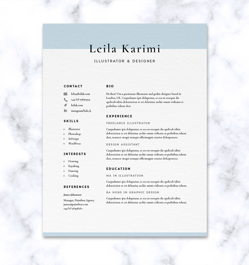
A beautifully designed resume can spell the difference between securing that interview or being tossed onto a pile of overlooked applications. While a jazzy design might be appropriate for some creative roles, most employers will be looking for a CV that’s pleasant to look at and easy to read.
Here we’ll create a timeless resume design with a minimal, pared-back style in Adobe InDesign. Once you’ve created the layout, you can also easily customise the color scheme and fonts to adapt the resume to any job application.
If you’re looking for a different resume design, you’ll find CV templates in a range of easy-to-edit styles on GraphicRiver and Envato Elements.
 ResumesWhat is the Difference Between a CV vs Resume?Charley Mendoza
 ResumesHow to Design a Creative ResumeGrace Fussell
 Resumes50+ Professional Resume & CV TemplatesGrace Fussell
What You’ll Need to Create Your CV
Less is more when it comes to resumes. All you will need is two legible, professional fonts—one sans serif to use for subheadings, and one serif to use for your name and the body text.
To recreate the design pictured here, you’ll need to download and install the following fonts:
To add contact icons to your design, you can download this social media icons bundle too.
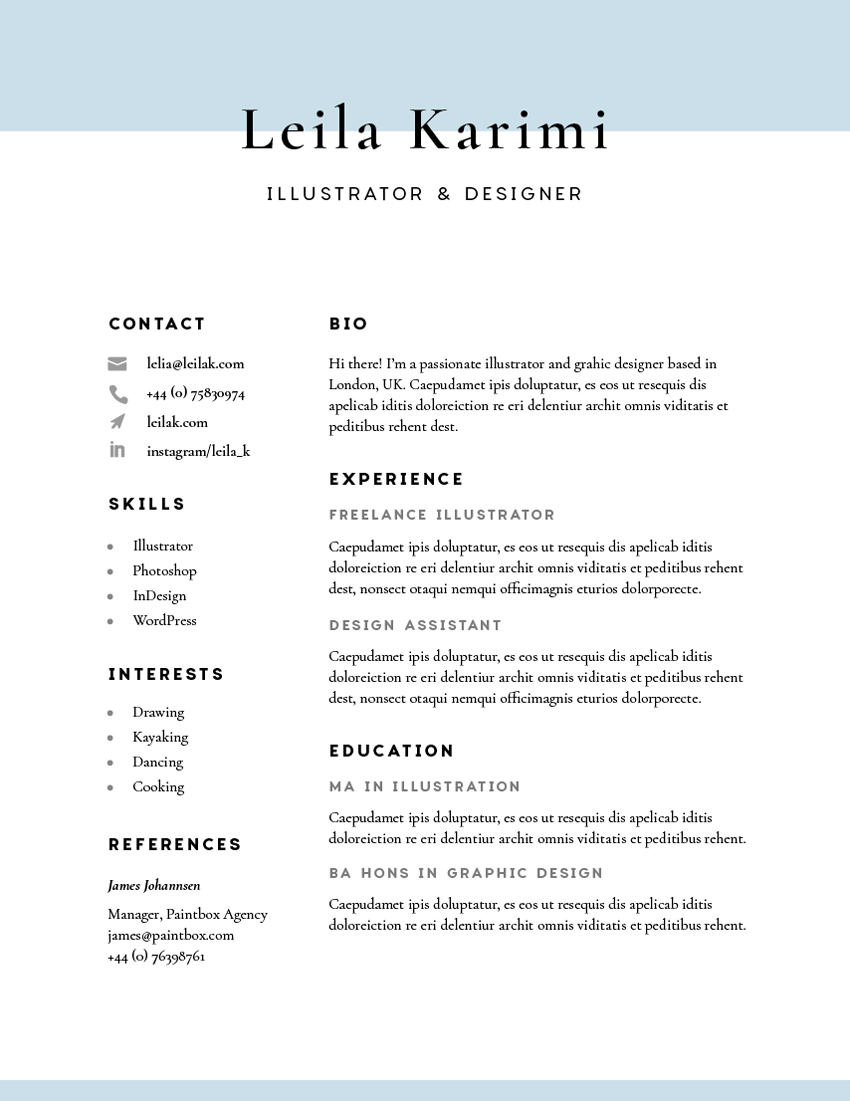
1. How to Establish a Grid for Your CV
Before you start designing your resume, it’s really important to establish a grid for the page, to help you guide the placement of text. Here, we’ll use guides to create a two-column grid.
Step 1
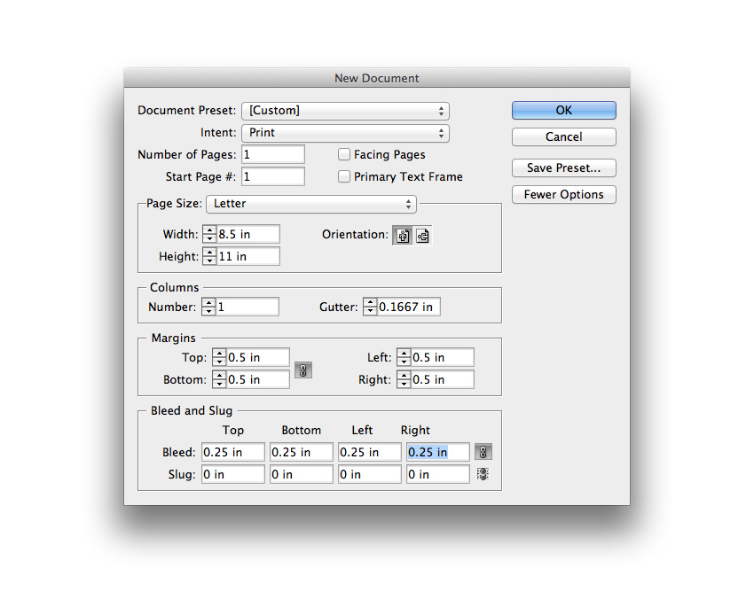
Open up Adobe InDesign and go to File > New > Document.
With the Intent set to Print, uncheck the Facing Pages box, to create a single sheet document.
From the Page Size menu, choose Letter*.
Add a Bleed of 0.25 in and click OK to create your new document.
* This is the standard US resume size. For Europe, Australia, and elsewhere, A4 tends to be the standard size. You can adapt the page size and position of the grid lines, described below, accordingly.
Step 2
Structuring your layout around a grid will be key to making this classic resume look really professional.
First up, make sure the rulers are visible (View > Show Rulers).
Then drag out a vertical guide from the left-hand ruler. In the Controls panel at the top of the workspace, you’ll be able to see the X position of the guide as you drag it across. Bring this first guide along to X:1.08 in.

Step 3
Drag out two more vertical guides to X:2.89 in and X:3.29 in.

Then drag another out to X:7.5 in.

Step 4
From the horizontal ruler running along the top, drag down three guides to Y:1.5 in, Y:2.01 in, and Y:3.16 in.

Drag down one more guide to Y:9.52 in.

Step 5
Expand the Layers panel (Window > Layers), and double-click on the Layer 1 name. In the Options window that opens, rename the layer Main Grid and click OK.

Choose New Layer from the panel’s drop-down menu (accessible at the top-right corner). Name this layer Type and click OK.

Lock the Main Grid layer so as not to disturb the position of your grid while you work.

2. How to Format Typography on Your CV
Paying attention to the details of your text formatting will ensure that your resume will really shine.
Step 1
Zoom into the top of your resume. Take the Type Tool (T) and drag onto the page to create a text frame. Type in your name and allow the baseline of the text to sit on the top horizontal guide.
From the Character panel (Window > Type & Tables > Character), set the Font to Cormorant SemiBold, Size 45 pt. Increase the Tracking (letter-spacing) to 90.
From the Paragraph panel (Window > Type & Tables > Paragraph), adjust the text to Align Center.

Step 2
Take the Type Tool (T) again and create a text frame below the first, resting the baseline on the next guide down.
Type in your role (e.g. ‘Illustrator and Designer’) and set the Font to Charlevoix Pro Regular, Size 13 pt, Tracking 100 and flush the text to Align Center. From the Character panel’s main menu (at top-right), choose All Caps.

Step 3
Now it’s time to start building up sub-headings and sections on your resume. Create a text frame that fits snugly underneath the next horizontal guide down, and against the third vertical guide, as shown below.
Type in ‘BIO’ and set the Font to Charlevoix Pro Bold, Size to 12 pt, and Tracking to 140.

Create a larger text frame below the first, with a little spacing between the two. Type in your bio text, setting the Font to Cormorant Regular, Size to 11 pt, and Leading (line-spacing) to 15 pt.

Step 4
Return to the Layers panel and create a New Layer above Type, naming it Line Spacing Grid. On this layer you can place extra guides to help you space out the sections of text evenly.

Step 5
Lock the Type layer to avoid disturbing the text frames.
Drag three guides down from the top ruler to mark out the baseline of the ‘BIO’ sub-heading and the top and bottom of the body text frame.
Select all three guides and Edit > Copy, Edit > Paste, before dragging them down to sit below the text frames.

Then unlock the Type layer and Copy and Paste the two bio text frames, moving them to fit onto the guides you’ve just created.

Step 6
You can edit the sub-heading of this copy to read ‘EXPERIENCE’. To create another sub-heading for the job title, delete the body text frame, and create a text frame with the job title set in Charlevoix Pro SemiBold, Size 10 pt, Tracking 140.
From the Swatches panel (Window > Color > Swatches), you can adjust the Tint of the default [Black] color of the text, bringing it down to around 65%.

Copy and Paste the body text frame under ‘BIO’, above, and move below this tinted sub-heading.

Step 7
Bring down two more guides to mark out the baseline of the tinted sub-heading and the top of the body text frame beneath it.

Select and Copy all the guides marking out the ‘EXPERIENCE’ section…

… and move them below, resting the top guide in the group over the baseline of the body text frame.

Copy and Paste the tinted sub-heading and body text frame, moving this below, using the guides to position it accurately.

Step 8
Use two guides to mark out the spacing between the ‘BIO’ and ‘EXPERIENCE’ sections.

Then select all the guides which mark out the spacing, as well as the position of all the sub-sections under ‘EXPERIENCE’, and Copy them.

Move them below, sitting the top guide of the group on the baseline of the last line of body text.

Then Copy and Paste all the text frames from the Experience section, moving them below.

Adjust the pasted sub-heading to read ‘EDUCATION’, and edit the tinted sub-headings and body text to list your qualifications and details about them.

Step 9
With the text frames in the large column now formatted, you can start working on the sections in the left-hand, narrow column. This is a great place to put smaller items of info that need to be found by the interviewer quickly and easily, like contact details and references.

Copy and Paste the ‘BIO’ sub-heading and body text frame below, moving them over to the top of the left-hand column, and reducing the length to fit inside it, as marked out by the two vertical guides.
Edit the text to read ‘CONTACT’, and in the text frame below, type in your email address, phone number, etc. Increase the Leading (line-spacing) of the text to around 20 pt, to visually separate each line.

Step 10
Reduce the width of the body text frame so that there’s a little space available to the left side of the frame. Here you can place some optional icons to make the contact section more memorable and easy to read at a glance.
Switch to the Rectangle Frame Tool (F) and drag onto the page, creating a small frame to the left of the top line.

Go to File > Place and choose one of the vector icons from the icons bundle you downloaded earlier. Click Open, and allow it to fill the frame.
If the icons are set to a black color, you can pare down the boldness of them by selecting the image frame and going to Object > Effects > Transparency. Bring the Opacity down to around 40%.

Place more icons down along the length of the ‘CONTACT’ section.

Step 11
Select the two guides marking out the spacing between the ‘BIO’ and ‘EXPERIENCE’ sections, and Copy them.

Paste them, moving them down to mark out the same spacing between the ‘CONTACT’ section we’ve just created and the next section down, which is going to be ‘SKILLS’.

Edit the ‘SKILLS’ text to read a list of skills, like software you can use, for example.

Step 12
Highlight the list of skills you’ve typed up, and click on the Bulleted List icon in the top Controls panel to add bullet points to the list.

You can edit the look of the bullets by going to the menu at the top-right corner of the workspace (under the search bar) and clicking Bullets and Numbering.

In the window that opens, choose New Character Style from the Character Style drop-down menu.

From here, you can format the style of your bullets.

To create a very simple tinted bullet style, click on Character Color in the window’s left-hand menu. Bring the Tint of the [Black] swatch down to 60%, and click OK. Then click OK again to exit the window.


Step 13
Copy the two guides marking out the spacing between the ‘CONTACT’ and ‘SKILLS’ sections, and Paste them, moving them to sit below the ‘SKILLS’ section.

Copy and Paste the ‘SKILLS’ section, and move it below, editing the text to read ‘INTERESTS’.

Step 14
You can also add a ‘REFERENCES’ section below interests.
Try setting the name of the reference in Cormorant Bold Italic to create a bit of hierarchy.


3. How to Add a Touch of Color to Your CV
Step 1
Create a new layer sandwiched between Main Grid and Type. Name it Color, and lock all other layers.

Step 2
Take the Rectangle Tool (M) and drag across the top of the page, extending the shape up to the top, left and right edges of the bleed, and halfway down the name text below.

Step 3
Expand the Swatches panel (Window > Color > Swatches) and choose New Color Swatch from the panel’s drop-down menu (at top right).
Name the swatch Baby Blue, and set the Color Type to Process and Mode to CMYK. Adjust the percentage levels below to C=33 M=9 Y=9 K=0. Click Add and then OK.

Apply the Baby Blue swatch to the Fill Color of the rectangle shape.

Step 4
With the rectangle selected, head up to Object > Effects > Transparency. Bring the Opacity down to 80% to create more of a watermark effect.

Step 5
Copy and Paste the rectangle, moving it down to the bottom of the page.
Reduce the height of the rectangle so that only a small margin of color can be visible along the bottom edge.

Your CV design is finished—great work!

All that’s left for you to do is export it ready for printing. Read on to find out how…
4. How to Export Your CV for Printing
Note: These steps show you how to export your resume for professional printing. This is recommended if you want to print your CV to a high standard. If you’d rather print from a home printer, you can go straight to File > Print in InDesign.
Step 1
Go to File > Export.
In the window that opens, choose Adobe PDF (Print) from the Format drop-down menu, and hit Save.
In the Export Adobe PDF window, select [Press Quality] from the Adobe PDF Preset menu at the top.

Step 2
Click on Marks and Bleeds in the window’s left-hand menu.
Check All Printer’s Marks and Use Document Bleed Settings, before clicking Export at the bottom.

Ta-dah! Your CV is now ready for sending straight off for printing.

Conclusion: Your Finished CV
Awesome job—your resume’s ready to be sent off in the post. Fingers crossed you’ll get that interview!
In this tutorial you’ve picked up a range of handy print design skills you can apply to other print projects. You now know how to work with advanced grids and section spacing, and how to format type to a high standard.
If you’re looking for more resume templates, you can find easy-to-edit professional styles on GraphicRiver and Envato Elements.


How to Create an Elderly Man Illustration in Adobe Illustrator
Post pobrano z: How to Create an Elderly Man Illustration in Adobe Illustrator

Today we will create an illustration of an elderly man. We’re going to do this by using some basic geometric shapes combined with the power of some simple tools in Adobe Illustrator.
And to keep our love for grandparents, remember that grandparents’ day is in September, and this tutorial could result in a beautiful card for them.
If you are looking for more to draw, feel free go to GraphicRiver to browse a bunch of great vector characters.
And now, let’s get started!
1. How to Create the Head
Step 1
After opening your Adobe Illustrator and creating a new document with 850 x 850 px Width and Height, we will start to create the man’s head. Using the Rounded Rectangle Tool, create a beige rounded rectangle. In the image below, you can see which fill color you need.
To get a rounded rectangle with very rounded corners, create a small rounded rectangle first, and then stretch it while holding down the Shift key. Or you can go to View > Show Corner Widget and modify the corners by dragging them inside.
Now, we can draw the hair. Start by creating a grey rounded rectangle. To place it behind, hit Control-X, Control-B. Now add two smaller rounded rectangles to the sides of the head.

Step 2
In this step, we will create the ears and neck.
First, add another thin vertical rounded rectangle and attach it to the left side of the head behind the small grey rounded rectangle and in front of the large grey rounded rectangle.
Now, while holding the Shift and Alt keys, move this ear to the right. You will get another copy of the ear to complete the ears.
Using the Ellipse Tool (L), create an oval with the same beige color and place it under the face to create the neck.

Step 3
Let’s add the eyebrows. Using the Ellipse Tool (L), create a thin, horizontally aligned, light grey oval. Then take the Direct Selection Tool (A), select by dragging the top and bottom anchor points of the oval, and slide them up. This will be the eyebrow. Place the left eyebrow over on the left side. While keeping the left eyebrow selected, hold the Alt and Shift buttons, and move it to the right. Now you have two eyebrows.

Step 4
Let’s make the nose. Place a new vertical light brown ellipse. Using the Direct Selection Tool (A), select the left and right anchor points and then move them down. Create a new copy of this shape in front (Control-C, Control-F), and change its fill color to beige using the Eye Dropper Tool (I). To take the color you want, select the necessary object (the one you want to change color), take the Eyedropper Tool (I), and click on the necessary object.
Make the new beige copy a bit thinner, so you can see just the sides of the previous light brown shape. The nose is done! Group it for your convenience: right-click > Group.
Next, we will add eyes. Using the Ellipse Tool (L), draw a dark brown circle for the left eye. To make an even circle, draw an oval using the Ellipse Tool (L) while holding down the Shift key. Select the left eye and, while holding the Shift and Alt keys, move it to the right to get another copy of it. Now you have two eyes.

Step 5
Next, we will create the mouth and mustache.
First, create a light grey rounded rectangle and place it under the man’s nose. To have this rectangle under the nose, just select the nose and place it over the rounded rectangle: Control-X, Control-F.
Now, we will cut the bottom half of the rounded rectangle: using the Rectangle Tool (M), create a rectangle and cover the bottom part of the rounded rectangle. The rectangle will be used as a cutter; therefore its color is not important. Select both shapes and press the Minus Front button on the Pathfinder panel (Window > Pathfinder). This action leaves us with half of the rounded rectangle, which looks like a mustache. (Just something interesting: do you have some ideas how else you can create mustaches in any other shape?)
Next, create a light brown ellipse and place it behind the mustache. Then create a copy of this ellipse in front (Control-C, Control-F), make it a bit smaller, and change the fill color to the same as the color of the face.

Step 6
To make the glasses, create an even circle. It needs to have an almost black stroke color and a light fill color, as shown in the image below. Place this circle in front of the left eye. Hold the Shift and the Alt keys together, and move this circle to the right to duplicate it.
Now we need to add a transparency to the fill color and keep the stroke color unchanged. For this, we will lower the opacity of the fill color: on the Appearance panel (Window > Appearance), you have to click on the word “Fill” then “Opacity” and in the pop-up menu, decrease its Opacity to 50%. Remember: you need to change the Opacity just for the Fill, not for the Stroke. That’s why we use the Appearance panel and not the Transparency panel, which will change the Opacity of the whole circle, fill and stroke.
Then, using the Arc Tool, add an arc between the two glasses as a bridge. Make sure you delete the fill color and leave just the stroke color.
With the help of the Arc Tool again, draw the left and right temples of the glasses. Be sure to check Round Cap on the Stroke panel.

2. How to Create the Body and Legs
Step 1
Let’s make the body. Delete the stroke color and set the fill color presented below. Using the Rounded Rectangle Tool, create a red rounded rectangle and attach it to the head. Place it behind the head.
Now, using the Bulge effect, we will slightly deform this rounded rectangle. Select the rounded rectangle and go to Effect > Warp > Bulge. In the new window, adjust the presented options. Expand this shape (Object > Expand Appearance).

Step 2
To create the arms, we will start with an arc. First, delete the fill color and set the stroke color the same as the body color, or just press Shift-X. Check Round Cap on the Stroke panel and make the Weight of this stroke very thick (around 30-40 px).
Now, using the Arc Tool, draw the man’s left arm. Move the handles of the anchor points using the Direct Selection Tool (A) to achieve the result you need. To make a copy of the arm, select it, right-click your mouse, and select Transform > Reflect. Once you get a dialogue box, select Axis Vertical, Angle 90 degrees, and press Copy. Move the newly created arm to the right.

Step 3
For the left hand, create an oval and attach it to the left arm. Keep the same fill color as for the face. Take the Direct Selection Tool (A), select the bottom anchor point, and move it up to get a result similar to the image below. Make a copy of this shape and attach it to the right arm.

Step 4
Create a dark grey rounded rectangle and attach it below the body. Hide a part of this rounded rectangle behind (use Control-X, Control-B).
Using the Rectangle Tool (M), draw a rectangle for the left leg. Then take the Direct Selection Tool (A) and move the lower right anchor point to the left.
Make a copy of the leg: select it, right-click your mouse, and select Transform > Reflect. In the dialogue box, select Axis Vertical, Angle 90 degrees, and press Copy. Move the created copy to the right.

Step 5
For the shoes, make a copy of the shape of the mustache, which we created before. Add a thin, horizontally aligned, rounded rectangle for the shoe sole. Set the necessary fill color for the shoe. While holding the Alt and Shift keys, move the whole shoe to the right leg.

3. How to Create the Walker
Step 1
Create a rounded rectangle using the Rounded Rectangle Tool with no fill color and a greyish-blue stroke color. Select the Scissors Tool (C) and click on the left and right parts of the rounded rectangle, marked in the image below. Delete the bottom part of the rounded rectangle by pressing the Delete button on your keyboard.

Step 2
Place the shape below the left hand (use Control-X, Control-B). And place a copy of it below the right hand (to have them horizontally aligned, move the left copy to the right while keeping the Shift and Alt keys pressed).
Finally, join the two sides of the walker with a horizontal line (match the thickness of the line to the thickness of the vertical lines) using the Line Segment Tool (\).

Step 3
Using the Rectangle Tool (M), draw a dark grey rectangle. Then, using the Direct Selection Tool (A), move the upper anchor points to the center. Attach four copies of this shape to the bottom of the walker to create the tips.

4. How to Create the Background
Step 1
Create a light green square with 850 px Width and Height, by using the Rectangle Tool (M). First select this tool, and then click on your artboard and enter the necessary width and height in the new dialogue window, and press OK.

Step 2
Place the image of the man with the walker in front of the background.

Step 3
To finalize the image, add a few dark green rounded rectangles below as shadows.

Conclusion
And we are finished! Well done! I hope you enjoyed learning some of the processes and shortcuts during the creation of this image in Adobe Illustrator.
Always respect your elders—they made it through school without Google or Wikipedia!


You are what you document
Post pobrano z: You are what you document
There are so many little gems in this piece by Yevgeniy Brikman all about documentation. He digs into a lot more than simply documenting code though and focuses on how we can document every phase of our work, from design to process and beyond.
Here’s my favorite lines that made me sit back and shout “Wahoo!”:
When a developer uses your code, they are really learning a new language, so choose the words in it wisely.
…programs must be written for people to read, and only incidentally for machines to execute.
I like how Yevgeniy suggests that there are kinda two different mindsets that we have to get into when writing code: one for making the dang thing work in the first place, and another for explaining how and why we did a specific way. There’s context-switching that takes place between those different stages of work.
Anyway, when seen in this light, documentation could be much more than a nice-to-have. Instead, it might just be 50% of the work.
Direct Link to Article — Permalink
You are what you document is a post from CSS-Tricks