Ever discussed with your designer friends about which countries have the best designers? This kind of argument will always be heated as pretty much any point of view will be biased. Now, thanks to the World Design Rankings, we have a statistic base to discuss upon.
The World Design Rankings provide a listing with the ranking of all countries based on the number of designers that have been granted with the A’ Design Award, so it’s basically what Olympics are to Sports. Like in the Olympics, where athletes are rewarded for their performances and ranked by categories, designers get to be ranked in the Designers Rankings website.
It comes as no surprise that the countries with the biggest economies came first, as there is usually more money there to finance bigger projects. Here is the top three design countries according to these rankings. Enjoy a sample of work!
1. The USA
The most awarded design studio from the USA is the design department of a company that you know pretty well for making your kids and yourself fat: Pepsi Co. Working as a designer for them seems quite fun, as the designers get room for experimenting and producing great designs.
Bottles designed by the multi-awarded PepsiCo design department.
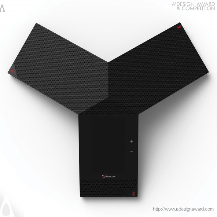
Pip Tompkin Design is the second most awarded agency from North America, with a lot of awards to their credit. Among other things, they designed this cool Polycom conference phone.
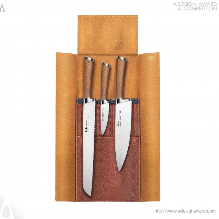
Cangshan is ranked third among the design studios in the USA, they designed these amazing cooking knives.
2. China
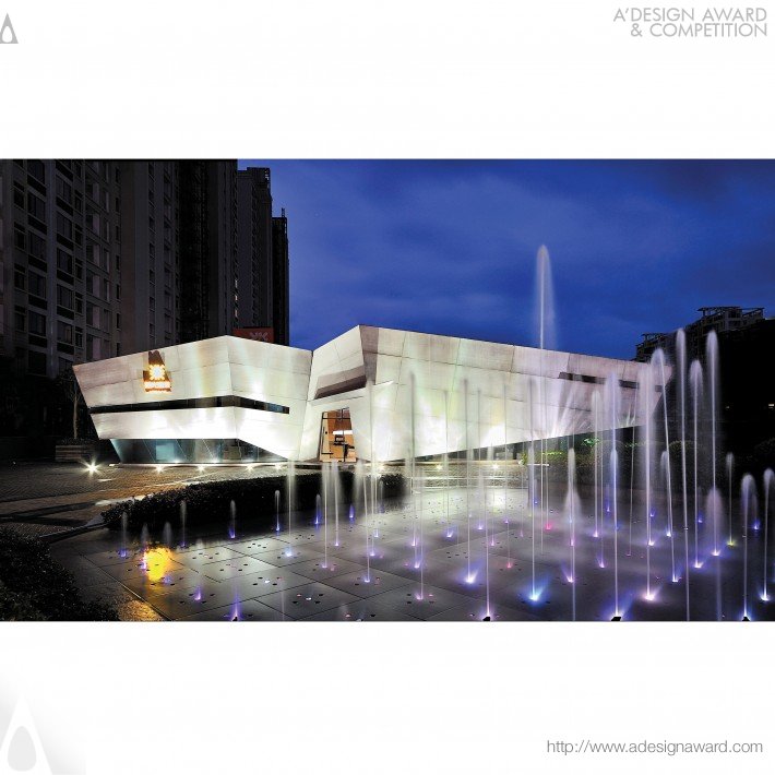
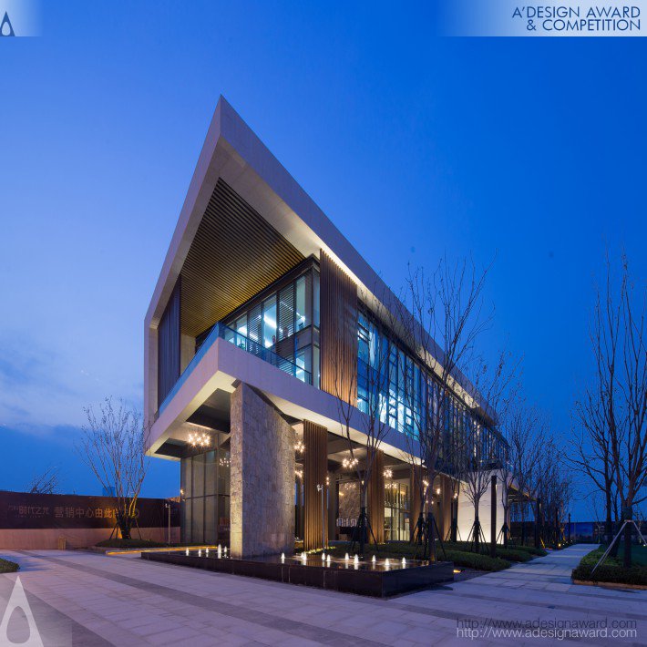
In China, the country that comes second in the Design Olympics, Kris Lin is the most awarded designer with his spectacular architectural work, you can see an example of it here with the Origami Real Estate Agency.
Johnson Li of Lenove Ltd. in China is another great producer of high-quality designs, like this Ideapad.
If you like good architecture, you will enjoy the work of the next Chinese designer: Raynon Chiu.
3. Japan
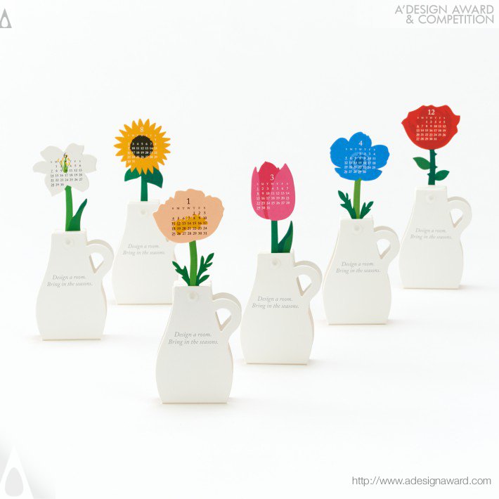
Japan is a country known for its amazing aesthetics, so it may come as a surprise that this country doesn’t finish at the first place. They are represented by a large number of top-notch designers, such as Katsumi Tamura and his flower calendar.
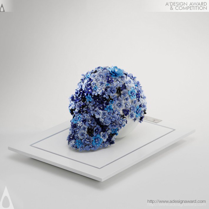
Yasumichi Morita is another example of a great Japanese designer and artist, his Life is a Flower porcelain artwork is just stunning.
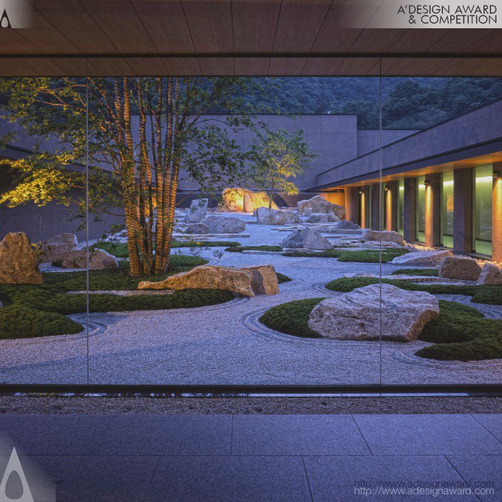
With a different spectrum of work, Shunmyo Masuno creates memorable landscape designs like the one he did for the Hofu City Crematorium.
I draw an oval shape for the goat’s head, using the HB graphite pencil.
Step 2
I add the shapes of the ears and pointed horns. Keep the elements simple and stylized; we’ll refine them later.
Step 3
I draw the neck of the goat; it is basically a simple elongated shape.
Step 4
I add the rough shapes of the chest and the rump; they are the building blocks of the goat’s body.
Step 5
I join the shapes of the body, outlining the back of the goat. It has a prominence that marks the hip bone.
Step 6
I draw the framework of the goat’s limbs, marking the joints with big circles.
At this stage, we can already mark the bottom line of the goat’s body.
Step 7
I refine the shape of the goat’s forelimbs; they are thicker in the knee area and end with a hoof.
Goats also have dewclaws on the back side of the limbs, which are rudimentary hooves.
Step 8
I draw the contours of the hind legs. They have hocks—the joints between the knee and the fetlock that point backwards.
Step 9
It’s time to draw the goat’s face. I sketch a vertical core line, and then add three horizontal lines for the eyes, nose, and mouth.
Step 10
I draw the eyes with horizontal pupils. The eyes of a real goat are relatively small, but I want my drawing to look cute, so I make them slightly bigger.
Then I add the nose and the mouth with a hint of a smile.
Step 11
I refine the shape of the ears, adding a deep shadow.
Step 12
I add several contour lines to each horn and draw the beard. Both male and female goats have beards.
Step 13
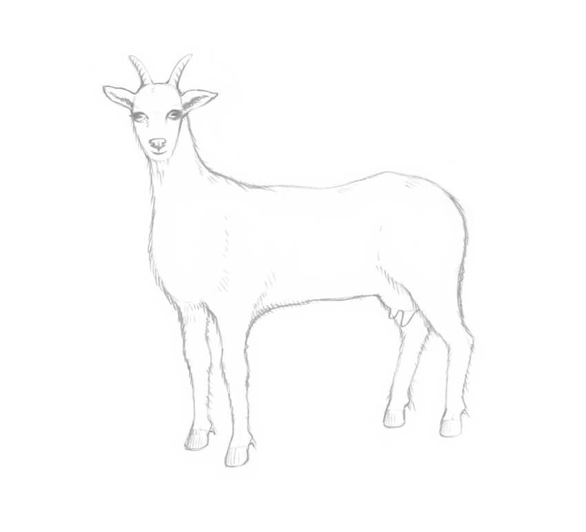
The body of a goat is covered with hair; its coloring can vary from white to grey or black.
I draw the hair along the contours of the goat’s body, using long hatches.
Step 14
I add the rounded udder with two prominent teats.
Step 15
I draw a short tail and create an illusion of its texture, using long graphite lines.
Step 16
Let’s give some completeness to our sketch by adding values. With the HB pencil, I draw relatively long hatches that imitate hair.
With the 3B pencil, I darken the sides of the goat’s head to make the drawing more realistic.
Step 17
I continue to add long hatches to the front part of the goat’s body, using the HB pencil.
It’s the right time to accent small details like the cloven hooves or the longer strands of hair.
Step 18
I complete creating the illusion of hairy texture, working in the same technique.
I also strengthen the core shadows, applying an additional layer of hatching with the 3B pencil.
As a finishing touch, I add light hatches that imitate grass at the goat’s feet, using the HB pencil.
2. How to Draw a Baby Goat
Step 1
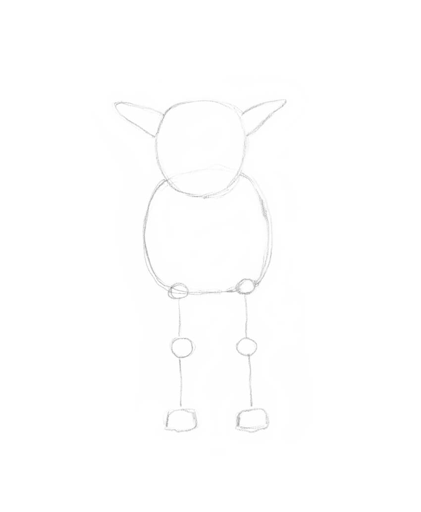
I draw the rounded shape of the head, and then add the ears. The head of a baby goat is relatively big in comparison to the body; it is also shorter than the head of an adult goat.
Baby goats don’t have horns as adult goats do, but they have so-called 'horn buds.’ These are small bumps on the top of the head, between the ears and above the eyes. Our goat is too young, so we don’t need to overload the drawing with information.
Step 2
I add the rough shape of the chest. The neck of a baby goat is shorter than this part of the body of an adult animal.
Step 3
I draw the framework of the front legs.
Step 4
I add the contours of the limbs, accentuating the knees.
Step 5
It’s time to draw the reference lines of the animal’s face. I sketch the vertical core line, and then add lines for the eyes, nose, and mouth. Leaving enough space for the forehead is important.
I also refine the shape of the ears.
Step 6
I draw the eyes with horizontal pupils. Then I add the nose and a smiling mouth.
Step 7
I add the back and the hind legs of the baby goat. The foreshortening doesn’t allow us to see much of the animal’s back, but we should mark it to make the drawing look realistic.
Step 8
With the HB pencil, I add long hatches that imitate hair.
As a cute addition, I draw a floral diadem on the head of the baby goat. There is no need to draw all the tiny petals or other details; just create something that looks like small flowers.
Step 9
I create an illusion of hair, using the HB pencil, just as we did with the adult goat.
I darken the eyes, the neck, and the back limbs to increase the contrast and make the drawing more credible.
Your Artworks Are Complete
Congratulations! You’ve created two beautiful drawings of charming goats. I hope you’ve enjoyed the process, and no animal seems too difficult to draw now!
These features have not landed in any stable browsers at the time of writing. However, everything discussed is already in Firefox Nightly by default and key parts are in Chrome Canary (with the Experimental Web Platform Features flag enabled), so I recommend using one of those browsers (when reading this article) to see as many of the features in action as possible.
Regardless your preferred method of animation on the web, there will be times that you need to animate the same property in separate animations. Maybe you have a hover effect that scales an image and a click event that triggers a translate — both affecting the transform. By default, those animations do not know anything about the other, and only one will visually be applied (since they are affecting the same CSS property and the other value will be overridden).
element.animate({
  transform: ['translateY(0)', 'translateY(10px)']
}, 1000);

/* This will completely override the previous animation */
element.animate({
  transform: ['scale(1)', 'scale(1.15)']
}, 1500);
The second animation in this Web Animations API example is the only one that would be visually rendered in this example as both animations play at the same time and it was the last one defined.
Sometimes we even have grander ideas where we want a foundational animation and then based on some user interaction change in state we smoothly modify the animation a bit midway without affecting its existing duration, keyframes, or easing. CSS Animations and the current Web Animations API in stable browsers today cannot do this out of the box.
A New Option
The Web Animations specification introduces the composite property (and the related iterationComposite). The default composite is 'replace' and has the behavior we have had for years now where an actively animating property’s value simply replaces any previously set value — either from a rule set or another animation.
The 'add' value is where things change from the previous norms.
Now both animations will be seen as the browser on the fly figures out the appropriate transformation at a given point in the element’s timeline accounting for both transformations. In our examples, the easing is 'linear' by default and the animations start at the same time, so we can break out what the effective transform is at any given point. Such as:
0ms: scale(1) rotate(0deg)
500ms: scale(1.25) rotate(60deg) (halfway through first animation, 1/3 through second)
1000ms: scale(1.5) rotate(120deg) (end of first, 2/3 through second)
An individual animation does not just consist of a start state and end state — it can have its own easing, iteration count, duration, and more keyframes in the middle. While an element is mid animation you can throw an additional transformation on it with its own timing options.
This example lets you apply multiple animations on the same element, all affecting the transform property. To keep from going all out in this example, we limit each animation to a single transformation function at a time (such as only a scale), starting at a default value (such as scale(1) or translateX(0)), and ending at a reasonable random value on that same transformation function, repeated infinitely. The next animation will affect another single function with its own randomized duration and easing.
element.animate(getTransform(), //e.g. { transform: ['rotate(0deg), 'rotate(45deg)'] }
{
  duration: getDuration(), //between 1000 and 6000ms
  iterations: Infinity,
  composite: 'add',
  easing: getEasing() //one of two options
});
When each animation starts, the browser will effectively find where it is in its previously applied animations and start a new rotation animation with the specified timing options. Even if there is already a rotation going in the opposite direction, the browser will do the math to figure out how much a rotation needs to happen.
Since each animation has its own timing options, you are unlikely to see the exact same motion repeated in this example once you have added a few. This gives the animation a fresh feel as you watch it.
Since each animation in our example starts at the default value (0 for translations and 1 for scaling) we get a smooth start. If we instead had keyframes such as { transform: ['scale(.5)', 'scale(.8)'] } we would get a jump because the didn’t have this scale before and all of a sudden starts its animation at half scale.
How are values added?
Transformation values follow the syntax of in the spec, and if you add a transformation you are appending to a list.
For transform animations A, B, and C the resulting computed transform value will be [current value in A] [current value in B] [current value in C]. For example, assume the following three animations:
Each animation runs for 1 second with a linear easing, so halfway through the animations the resulting transform would have the value translateX(5px) translateY(-10px) translateX(150px). Easings, durations, delays, and more will all affect the value as you go along.
Transforms are not the only thing we can animate, however. Filters (hue-rotate(), blur(), etc) follow a similar pattern where the items are appended to a filter list.
Some properties use a number as a value, such as opacity. Here the numbers will add up to a single sum.
Since each animation again is 1s in duration with a linear easing, we can calculate the resulting value at any point in that animation.
0ms: opacity: 0 (0 + 0 + 0)
500ms: opacity: .35 (.05 + .1 + .2)
1000ms: opacity: .7 (.1 + .2 + .4)
As such, you won’t be seeing much if you have several animations that include the value 1 as a keyframe. That is a max value for its visual state, so adding up to values beyond that will look the same as if it were just a 1.
Similar to opacity and other properties that accept number values, properties that accept lengths, percentages, or colors will also sum to a single result value. With colors, you must remember they also have a max value, too (whether a max of 255 in rgb() or 100% for saturation/lightness in hsl()), so your result could max out to a white. With lengths, you can switch between units (such as px to vmin) as though it is inside a calc().
When you are not doing an infinite animation (whether you are using a composite or not) by default the animation will not keep its end state as the animation ends. The fill property allows us to change that behavior. If you want to have a smooth transition when you add a finite animation, you likely will want a fill mode of either forwards or both to make sure the end state remains.
This example has an animation with a spiral path by specifying a rotation and a translation. There are two buttons that add new one second animations with an additional small translation. Since they specify fill:'forwards' each additional translation effectively remains part of the transform list. The expanding (or shrinking) spiral adapts smoothly with each translation adjustment because it is an additive animation from translateX(0) to a new amount and remains at that new amount.
Accumulating animations
The new composite option has a third value — 'accumulate'. It is conceptually in line with 'add' except certain types of animations will behave differently. Keeping with our transform, let’s start with a new example using 'add' and then discuss how 'accumulate' is different.
Which will visually push an element to the right 50px and then scale it down to half width and half height.
If each animation had been using 'accumulate' instead, then the result would be:
transform: translateX(50px) scale(.5)
Which will visually push an element to the right 50px and then scale it down to half width and half height.
No need for a double take, the visual results are in fact the exact same — so how is 'accumulate' any different?
Technically when accumulating a transform animation we are no longer always appending to a list. If a transformation function already exists (such as the translateX() in our example) we will not append the value when we start our second animation. Instead, the inner values (i.e. the length values) will be added and placed in the existing function.
If our visual results are the same, why does the option to accumulate inner values exist?
In the case of transform, order of the list of functions matters. The transformation translateX(20px) translateX(30px) scale(.5) is different than translateX(20px) scale(.5) translateX(30px) because each function affects the coordinate system of the functions that follow it. When you do a scale(.5) in the middle, the latter functions will also happen at the half scale. Therefore with this example the translateX(30px) will visually render as a 15px translation to the right.
I mentioned before that there is also a new related iterationComposite property. It provides the ability to do some of the behaviors we have already discussed except on a single animation from one iteration to the next.
Unlike composite, this property only has two valid values: 'replace' (the default behavior you already know and love) and 'accumulate'. With 'accumulate' values follow the already discussed accumulation process for lists (as with transform) or are added together for number based properties like opacity.
As a starting example, the visual result for the following two animations would be identical:
The first animation is only bumping up its opacity by .5, rotating 50 degrees, and moving 2vmin for 2000 milliseconds. It has our new iterationComposite value and is set to run for 2 iterations. Therefore, when the animation ends, it will have run for 2 * 2000ms and reached an opacity of 1 (2 * .5), rotated 100 degrees (2 * 50deg) and translated 4vmin (2 * 2vmin).
Great! We just used a new property that is supported in only Firefox Nightly to recreate what we can already do with the Web Animations API (or CSS)!
The more interesting aspects of iterationComposite come into play when you combine it with other items in the Web Animations spec that are coming soon (and also already in Firefox Nightly).
Setting New Effect Options
The Web Animations API as it stands in stable browsers today is largely on par with CSS Animations with some added niceties like a playbackRate option and the ability to jump/seek to different points. However, the Animation object is gaining the ability to update the effect and timing options on already running animations.
Here we have an element with two animations affecting the transform property and relying on composite:'add' — one that makes the element move across the screen horizontally and one moving it vertically in a staggered manner. The end state is a little higher on the screen than the start state of this second animation, and with iterationComposite:'accumulate' it keeps getting higher and higher. After eight iterations the animation finishes and reverses itself for another eight iterations back down to the bottom of the screen where the process begins again.
We can change how far up the screen the animation goes by changing the number of iterations on the fly. These animations are playing indefinitely, but you can change the dropdown to a different iteration count in the middle of the animation. If you are, for example, going from seven iterations to nine and you are seeing the sixth iteration currently, your animation keeps running as though nothing has changed. However, you will see that instead of starting a reverse after that next (seventh) iteration, it will continue for two more. You can also swap in new keyframes, and the animation timing will remain unchanged.
Modifying animations midway may not be something you will use every day, but since it is something new at the browser level we will be learning of its possibilities as the functionality becomes more widely available. Changing iteration counts could be handy for a game when a user get a bonus round and gameplay continues longer than originally intended. Different keyframes can make sense when a user goes from some error state to a success state.
Where do we go from here?
The new composite options and the ability to change timing options and keyframes open new doors for reactive and choreographed animations. There is also an ongoing discussion in the CSS Working Group about adding this functionality to CSS, even beyond the context of animations — affecting the cascade in a new way. We have time before any of this will land in a stable major browser, but it is exciting to see new options coming and even more exciting to be able to experiment with them today.
In this tutorial you will learn how to create an amazing vexel art effect. I will explain everything in so much detail that everyone can create it, even those who have just opened Photoshop for the first time.
The effect shown above is the one I will show you how to create in this tutorial. If you would like to create the even more advanced vexel art effect
shown below, using just a single click and in only a few minutes, then
check out my Vexel Photoshop Action.
What You’ll Need
To recreate the design above, you will need the following photo:
First, open the photo that you want to work with. To open your photo, go to File > Open, choose your photo, and click Open. Now, before we get started, just check a couple of things:
Your photo should be in RGB Color mode, 8 Bits/Channel. To check this, go to Image > Mode.
For best results, your photo size should be 1500–3500 px wide/high. To check this, go to Image > Image Size.
Your photo should be the Background layer. If it is not, go to Layer > New > Background from Layer.
2. How to Create the Vexel Art Style
Step 1
In this section, we are going to create the vexel art style. Press Control-J on your keyboard to duplicate the Background layer, go to Image > Adjustments > Shadows/Highlights, and enter the settings below:
Step 2
Now go to Image > Adjustments > Shadows/Highlights again and enter the settings below:
Step 3
Go to Image > Adjustments > Brightness/Contrast and set the Brightness to -20 as shown below:
Step 4
Now go to Filter > Sharpen > Unsharp Mask, and set the Amount to 500%, Radius to 5.0 px, and Threshold to 0 levels as shown below:
Step 5
Go to Filter > Stylize > Diffuse and set the Mode to Anisotropic as shown below:
Step 6
Now go to Filter > Noise > Reduce Noise and use the settings below:
Step 7
Go to Filter > Blur > Smart Blur, and set the Radius to 5.0, Threshold to 25, Quality to Low, and Mode to Normal.
Step 8
Now go to Filter > Sharpen > Unsharp Mask, and set the Amount to 500%, Radius to 1.0 px, and Threshold to 0 levels.
Step 9
Go to Filter > Stylize > Diffuse and set the Mode to Anisotropic.
Step 10
Now go to Filter > Stylize > Oil Paint, set the Stylization to 5.0 and Cleanliness to 2.0, and uncheck the Lighting.
Step 11
Go to Filter > Stylize > Oil Paint again, set the Stylization to 10.0 and Cleanliness to 10.0, and uncheck the Lighting.
Step 12
Now go to Filter > Blur > Surface Blur, and set the Radius to 5 px and Threshold to 15 levels as shown below:
Step 13
Go to Filter > Filter Gallery > Artistic > Cutout, and set the Number of Levels to 8, Edge Simplicity to 5 and Edge Fidelity to 3 as shown below:
Step 14
Now go to Image > Auto Tone and then Image > Auto Contrast to make some auto-corrections to the photo’s tone and contrast.
Step 15
Go to Image > Adjustments > Brightness/Contrast and set the Contrast to 100 as shown below:
Step 16
Now go to Filter > Sharpen > Unsharp Mask, and set the Amount to 50%, Radius to 5.0 px, and Threshold to 0 levels as shown below:
Step 17
Now name this layer VexelArt.
3. How to Make the Final Adjustments
Step 1
In this section, we are going to make some final adjustments to the design. Press D on your keyboard to reset the swatches. Then, go to Image > Adjustments > Gradient Map to create a new gradient map adjustment layer and name it Overall Contrast.
Step 2
Now change the Blending Mode of this layer to Luminosity and set the Opacity to 56%.
Step 3
Go to Layer > New Adjustment Layer > Levels to create a new levels adjustment layer and name it Overall Brightness.
Step 4
Now Double-click on this layer thumbnail and in the Properties panel enter the settings below:
Step 5
Go to Layer > New > Gradient Map to create a new gradient map adjustment layer and name it Color Look.
Step 6
Now Double-click on this layer thumbnail, and then in the Properties panel, click on the gradient to open up the Gradient Editor panel and enter the settings below:
The left color stop has color e000e0, and the right color stop has color 005161.
Step 7
Change the Blending Mode of this layer to Color.
Step 8
Now go to Layer > New Adjustment Layer > Vibrance to create a new vibrance adjustment layer and name it Overall Vibrance/Saturation.
Step 9
Double-click on this layer thumbnail and in the Properties panel set the Vibrance to +43 and Saturation to +22 as shown below:
Step 10
Now press Control-Alt-Shift-E on your keyboard to make a screenshot, and then press Control-Shift-U to desaturate this layer. Then, go to Filter > Other > High Pass and set the Radius to 2 px.
Step 11
Name this layer Overall Sharpening and change the Blending Mode of this layer to Overlay.
You Made It!
Congratulations, you have succeeded! Here is our final result:
If you would like to create the even more advanced vexel art effect shown below, using just a single click and in only a few minutes, then check out my Vexel Photoshop Action.
The action works so you simply fill in your subject with a color and just play the action. The action will do everything for you,
giving you fully
layered and customizable results. The action also creates 20 preset color looks that you can choose from.
The action comes with a detailed video tutorial that demonstrates how to use the action and customize the results to get the most out of the effect.
ExxonMobil Europe is connecting into the Christmas season with “Esso Reindeer Princess”, an online film set in Norway. The commercial explores the story of Anne, a young woman who has found her place in the Sámi tradition of reindeer racing. Growing up in her local community she felt as though she didn’t fit. However she has gained acceptance after becoming the world’s number-one reindeer racer. Running online and on social media across European markets, the campaign aims to show the difference an Esso station can make in remote communities. Amid the snowscape, we see footage of an Esso service station providing a beacon of light and connection to the outside world for the people who live in this remote place. “The Reindeers saved me”.
Paul Cohen, Global Executive Creative Director on ExxonMobil, adam&eveDDB said: “This is a compelling and human story that shows the difference an Esso station can make to a remote community. Esso are proud to keep the Reindeer Princess racing and this seemed like the perfect time of year to bring this story to a wider audience.”
Esso Reindeer Princess Credits
The Esso Reindeer Princess campaign was developed at Adam&Eve/DDB by chief creative officer Richard Brim, executive creative director Paul Cohen, creatives Natasha Lyons and Dan Lacey, agency producer Rebecca Holt, planners James Price and Philip Mattei, global business directors Katie Toller and Peter Lewis, business director Caroline Logan, account director Emily Hahn and senior account manager Adriane Bowes, working with ExxonMobile marketing communications manager EAME Retail Fuels Christophe Fay.
Media was handled at UM by media planner Jack Graham.
Filming was shot by directors Wilkins & Maguire via Stink Films with director of photography Tat Radcliffe, executive producer Jon Chads, and producer Paz Parasmand.
Germany shopping chain OTTO is running “Together It’s Christmas”, an advertising campaign centred on the classic Christmas song “Feliz Navidad”. Set in the middle of the Bolivian mountains, the Together It’s Christmas commercial (Gemeinsam wird’s Weihnachten) shows a bus journey going awry after a landslide. With no help in sight, the passengers come to realise that they will not be celebrating the beginning of their Christmas holidays with their loved ones, but with strangers. Inspired by the young girl who starts singing ‘Feliz Navidad’, a classic Christmas song throughout the Spanish speaking world, the passengers come together to embrace the festive spirit in union. The “Together It’s Christmas” campaign is featured on a microsite: otto.de/gemeinsam
“With our Christmas campaign, we want to show that the essence of Christmas is coming together, sharing, and caring for one another. We want to remember these values, that are more important than ever today, and get us in the mood for the forthcoming Christmas season”, said Marc Opelt, OTTO-divisional marketing director and online-retail spokesman,
The newly interpreted Christmas song ‘Feliz Navidad’, which has been specially created for the campaign by MOKOH Music, can be downloaded for free otto.de/gemeinsam
Online Response
OTTO’s YouTube video attracted a range of comments, including from people concerned that a German television commercial featured a Hispanic cultural setting and that Christmas meanings and cultural traditions were being downplayed. The one “white” character is portrayed as an insensitive gringo. OTTO responded with the following note on their YouTube page:
“Our Christmas film tells a story about unity and the thought of coming together. The underlying values behind it should not be ruined by people who clearly have contradictory intentions and have no interest in living a harmonious life together with everyone. With great disappointment we read the kind of comments that were posted by a number of users. The film deliberately depicts a story about Christmas from different kinds of perspectives. For example from the point of view of a child, who won’t make it home on time for Christmas Eve. Or from the point of view of a bus driver, who would have rather taken the day off. Or of a tourist, who does not have the necessary language skills to communicate with the locals. Eventually, all these different individuals manage to make the most of each other and the situation, whilst being stuck in the Bolivian hills and together they celebrate Christmas. Beyond disagreements, beyond cultural differences, political dispute and religious orientation. A beautiful thought – especially in times like these – as we love diversity and cherish every human being. And this is the kind of appreciation we wish to anticipate here in the discussions on YouTube.”
Otto Feliz Navidad Credits
The Otto Feliz Navidad campaign was developed at Heimat Berlin by chief creative officer Guido Heffels, managing director Maik Richter, creative director Teresa Jung, senior creative Lisa Yvonne Heimgartner, creative Lima Shengelia, account director Vivien Ott, account manager Lena Lehmann and agency producer Meike Kornrumpf.
Filming was shot by director Daniel Mulloy via RSA Films and BigFish Film with director of photography Mátyás Erdély HSC, executive producer Kai-Lu Hsiung (RSA), executive producers Frank Siegl and Dagmar Garber (Bigfish), producers Ulrich Kreis and Ben Porter.
To round out 2017, we’re thrilled to bring you a new Step by Step from the one and only Allen Laseter. Sit back and enjoy an in-depth look at how he goes about making a faux 3D looping animation.
In the following steps you will learn how to create a mountain rescue unit vector badge in Adobe Illustrator. For starters you will learn how to set up a simple grid and how to create the main badge shape. Using basis vector shape building techniques and some warp effects, you will learn how to create the rest of the shapes. Moving on, you will learn how to add some subtle shading and a flat background. Finally, you will learn how to add text and how to easily bend it.
For more inspiration on how to adjust or improve your final badge, you can find plenty of resources at GraphicRiver.
1. How to Create a New Document and Set Up Grid
Hit Control-N to create a new document. Select Pixels from the Units drop-down menu, enter 850 in the width and height boxes, and then click that More Settings button. Select RGB for the Color Mode, set the Raster Effects to Screen (72 ppi), and then Create Document.
Enable the Grid (View > Show Grid) and the Snap to Grid (View > Snap to Grid). You will need a grid every 5 px, so simply go to Edit > Preferences > Guides & Grid, and enter 5 in the Gridline every box and 1 in the Subdivisions box. Try not to get discouraged by all that grid—it will make your work easier, and keep in mind that you can easily enable or disable it using the Control-„ keyboard shortcut.
You should also open the Info panel (Window > Info) for a live preview with the size and position of your shapes. Don’t forget to set the unit of measurement to pixels from Edit > Preferences > Units. All these options will significantly increase your work speed.
2. How to Create the Main Shape
Step 1
Pick the Ellipse Tool (L) and focus on your Toolbar. Remove the color from the stroke and then select the fill and set its color to R=87 G=158 B=214.
Move to your artboard and simply create a 310 x 70 px shape—the grid and the Snap to Grid should make it easier.
Step 2
Pick the Rectangle Tool (M), create a 310 x 255 px shape, and place it as shown in the first image. Make sure that it stays selected and go to Object > Path > Add Anchor Points.
Switch to the Direct Selection Tool (A), select the anchor point highlighted in the first image, and drag it 115 px down as shown in the second image.
Step 3
Select both shapes made so far, open the Pathfinder panel (Window > Pathfinder), and click the Unite button.
Step 4
Make sure that your shape is still selected and go to Effect > Stylize > Rounded Corners. Enter a 25 px Radius, click OK, and then go to Object > Expand Appearance.
3. How to Create the Smaller Shapes
Step 1
Make sure that your blue shape is still selected and go to Object > Path > Offset Path. Enter a 25 px Offset and click OK. Fill the resulting shape with red and don’t forget to send it to back with Shift-Control-[.
Reselect your blue shape and go again to Object > Path > Offset Path. This time, enter a -15 px Offset and click OK. Fill the resulting shape with yellow.
Step 2
Select your red and yellow shapes and click the Minus Front button from the Pathfinder panel.
Step 3
Using the Rectangle Tool (M), create a 200 x 100 px shape and place it as shown in the first image. Select this rectangle along with the red shape and click the Intersect button from the Pathfinder panel. Fill the resulting shape with R=246 G=40 B=17.
Step 4
Select your blue shape and go to Object > Path > Offset Path. Enter a -15 px Offset, click OK, and fill the resulting shape with R=32 G=43 B=63.
Step 5
Using the Rectangle Tool (M), create a 320 x 155 px shape and place it as shown in the first image. Select this new rectangle along with the darker blue shape and click the Intersect button from the Pathfinder panel. Make sure that the resulting shape is filled with R=32 G=43 B=63.
Step 6
Pick the Rectangle Tool (M) and create a 360 x 85 px shape. Fill it with R=246 G=40 B=17 and place it as shown in the following image.
4. How to Create the Mountains
Step 1
Using the Pen Tool (P), create a sharp mountain outline roughly as shown in the following image. Once you’re done, fill this shape with R=248 G=232 B=217.
Step 2
Pick the Ellipse Tool (L), create a 50 px circle and place it as shown in the first image. Select your mountain shape and go to Object > Path > Offset Path. Enter a 5 px Offset, click OK, and bring the resulting shape to front (Shift-Control-]).
Select both shapes made in this step and click the Minus Front button from the Pathfinder panel. Fill the resulting shape with R=248 G=232 B=217.
Step 3
Using the Pen Tool (P), create several sharp shapes as shown in the first image. Fill them all with R=153 G=196 B=230.
5. How to Create the Bent Shapes
Step 1
Select your red rectangle and go to Effect > Warp > Arch. Enter the attributes shown below, click OK, and then go to Object > Expand Appearance.
Step 2
Pick the Rectangle Tool (M) and create a 360 x 85 px shape. Fill it with R=32 G=43 B=63, place it as shown in the first image, and then go to Effect > Warp > Arch. Enter the attributes shown below and click OK. Expand your selection (Object > Expand Appearance) and then send it to back (Shift-Control-[) .
6. How to Add Strokes, Shading, and a Background
Step 1
Select your blue shape and focus on the Appearance panel (Window > Appearance). Select the stroke, set the color to R=248 G=232 B=217, and then open the Stroke fly-out panel. Increase the Weight to 15 px and check the Align Stroke to Inside button.
Step 2
Make sure that your blue shape is still selected and keep focusing on the Appearance panel. Add a second stroke using the Add New Stroke button and select it. Set the color to R=32 G=43 B=63 and the Weight to 10 px.
Step 3
Select all the shapes made so far and add copies in front (Control-C > Control-F). Make sure that only these copies are selected and click the Unite button from the Pathfinder panel.
Send the resulting shape to back (Shift-Control-[) and focus on the Appearance panel. Select the fill, set the color to R=32 G=43 B=63 and lower its Opacity to 15%, and then go to Effect > Path > Offset Path. Enter a -30 px Offset, click OK, and then go to Effect > Distort & Transform > Transform. Enter the attributes shown below, click OK, and then go to Effect > Blur > Gaussian Blur. Enter a 20 px Radius and click OK.
Step 4
Pick the Rectangle Tool (M) and create an 860 px square. Fill it with R=248 G=232 B=217, make sure that it covers your entire artboard, and don’t forget to send it to back (Shift-Control-[).
7. How to Add Text
Step 1
Pick the Type Tool (T) and open the Character panel (Window > Type > Character). Select the Balatype font and set the size to 70 px.
Simply click on your artboard and add the „HIMALAYA” piece of text. Place it as shown in the following image and set the color to R=248 G=232 B=217.
Step 2
Make sure that your piece of text is still selected and go to Effect > Warp > Arch. Enter the attributes shown below and then click OK.
Step 3
Pick the Type Tool (T) and focus on the Character panel. Use the same font and set the size to 35 px.
Add the „RESCUE UNIT” text and set its color to R=248 G=232 B=217. Place this new piece of text as shown in the following image and go to Effect > Warp > Arch. Enter the attributes shown below and then click OK.
Step 4
Pick the Type Tool (T), add the „EVEREST” piece of text, and set its color to R=248 G=232 B=217. Place this new piece of text as shown in the following image and go to Effect > Warp > Arch. Enter the attributes shown below and then click OK.
Step 5
Pick the Type Tool (T) and focus on the Character panel. Use the same font and set the size to 100 px. Add a little „+„, set the color to R=248 G=232 B=217, and place it as shown in the first image.
Return to the Character panel and set the size to 30 px. Add the „19” and the „69” pieces of text and place them as shown in the last two images.
Change the fill color to R=32 G=43 B=63 and then create about seven copies. Spread these copies roughly as shown in the first image and then send them behind that red shape.
Congratulations! You’re Done!
Here is how it should look. I hope you’ve enjoyed this tutorial and can apply these techniques in your future projects. Don’t hesitate to share your final result in the comments section.
Feel free to adjust the final design and make it your own. You can find some great sources of inspiration at GraphicRiver, with interesting solutions to improve your design.
Agregator najlepszych postów o designie, webdesignie, cssie i Internecie