Wszystkie wpisy, których autorem jest admin

How to Create a Power Scene Photo Manipulation With Adobe Photoshop

Post pobrano z: How to Create a Power Scene Photo Manipulation With Adobe Photoshop

Final product image
What You’ll Be Creating

In this tutorial I’ll show you how to use Adobe Photoshop to create a power scene using a variety of photo manipulation techniques. 

First, we’ll build the base environment using images of the sky and buildings. After that, we’ll add the flying rocks and lightning and blend them together using adjustment layers, masking, and brushes. Later, we’ll paint the light and particles. We’ll use several adjustment layers to complete the final effect.

Tutorial Assets

The following assets were used during the production of this tutorial:

1. How to Make the Base Environment

Step 1

Create a new 2000 x 1333 px document with the given settings:

new file

Step 2

Open the sky image. Use the Rectangular Marquee Tool (M) to select the
sky only and add it to the white canvas using the Move Tool (V).

add sky

Step 3

Go to Layer > New Adjustment Layer > Hue/Saturation and bring the Saturation value down to -100:

sky hue saturation

Step 4

Create a Curves adjustment layer to bring more light, especially the
top left of the sky where the main light will be located. On the layer
mask, activate the Brush Tool (B) to paint over the lower section to reduce the effect there.

sky curves

Step 5

Cut out the buildings and add them to the main document.

add buildings

Step 6

Use the Lasso Tool (L) to select the building on the top right and then
hit Control-J to paste the selected one into a new layer. Flip it
horizontally by choosing Edit > Transform > Flip Horizontal. Move
it to the top left to fill in this corner and resize it to be a bit
smaller.

select right towers
add to the left

Step 7

Copy the building in the lower right of the canvas and add it to the
top left corner where we’ve added a small building in the previous step.

add more tower

Step 8

The buildings look a bit darker than the sky. On each of the building
layers, create a new layer (set as Clipping Mask), change the mode to
Overlay 100%, and fill with 50% gray.

DB new file

Use
the Dodge Tool (O) with Highlight Range and Exposure about 50-60% and the
Burn Tool with Midtones Range to bring more light and details to the
buildings. You can see how I did it with Normal mode and the result with
Overlay mode.

DB normal mode
DB overlay mode

Step 9

Select all the building layers and Dodge/Burn ones and press Control-G
to create a group for them. Change this group’s mode to Normal 100% and
add a Hue/Saturation adjustment layer within the group. Bring the Cyans
value down to -51:

buildings hue saturation

Step 10

Create a Curves adjustment layer to brighten the buildings more. On
this layer mask, use a soft black brush to erase some corners of the
buildings as they shouldn’t get much light on there.

buildings curves 1

Step 11

Make a Levels adjustment layer to decrease the dark contrast in the
corners of the buildings. Paint on the rest of the buildings so that they won’t
be affected by this adjustment layer.

buildings levels

Step 12

Create a new layer and use a soft white brush to paint on the top of
the building to brighten these areas more. Change this layer mode to
Soft Light 100%.

building light
building light result

2. How to Add the Rocks

Step 1

Open the rock images pack. Browse the meteor10 folder and grab the one
you like and place it in the middle of the space between the buildings.
Use the Free Transform Tool (Control-T) to move the top of the rock towards the sky to fit the
angle of the buildings.

add big rock

Duplicate
this layer and move the bright side of the rock towards the light. Use
Control-T
with the Warp mode to bend it until you get a result like
the one below:

big rock duplicated

Step 2

Use a layer mask to blend this rock with the existing one.

rocks blending

Step 3

Add several rocks to both sides of the scene by duplicating this
layer or selecting others from the folders. Use the Warp Tool to tweak and
bend the rocks so they appear different.

add more rocks

Step 4

Add more rocks around the buildings and make them in different sizes using
Control-T with the Warp mode. Place some bigger ones on the edges of the
canvas. On each of these layers, go to Filter > Motion Blur and
apply similar settings to the ones below. Depending on the size, angle and
distance of the rock, you can change the settings to get
your desired result.

more rocks with motion blur settings 1
rocks with motion blur settings 2
rocks with motion blur settings 3

Step 5

Create a group for all the rock layers and add a Hue/Saturation adjustment
layer within the group. Bring the Saturation value down to the minimum.

rocks hue saturation

Step 6

Use a Curves adjustment layer to brighten the rocks. On the layer mask,
use a soft black brush to erase the shadow side of the rocks so they
won’t be affected by this adjustment layer.

rocks curves
rocks curves masking

3. How to Add the Lightning

Step 1

Open the lightning 1 image. Isolate the lightning using the Magic Wand
Tool (W)
and add it to the bottom of the biggest rock (middle one) so it
looks as if it’s coming down from the rock. Use Control-T to change its
perspective and make the top much smaller and the bottom much bigger.

add  lightning 1

Step 2

Select two details of the original image and add them to the big fork of lightning.

select two details from lightning 1
add more details to lightning 1

Step 3

Create a group for the lightning layers and use a Hue/Saturation adjustment layer to desaturate the effect’s color.

lightning 1 hue saturation

Step 4

Open the lightning 2 image. Use the Lasso Tool (L) to select the big fork and add it to the bottom of the middle rock. Use Control-T to make it connected to one of the falling rocks on
the right.

select lightning 2
add lightning 2

Change this layer mode to Screen 100% and use a layer mask to remove the edges around the fork.

lightning 2 screen mode

Step 5

Add other forks of lightning from the original image and connect them to three rocks on the left and the top sides.

add more rays from lightning 2

Step 6

Make a group for these layers and alter the group’s mode to Screen
100%
. Add a Hue/Saturation adjustment layer and reduce the Saturation
value to -100:

lightning 2 hue saturation

Step 7

Create a Levels adjustment layer to remove the white edges completely.

lightning 2 levels

4. How to Paint the Light and Particles

Step 1

Create a new layer on top of the layers and use a soft white brush to
spot on the area between the rock and the big fork of lightning to make a light hole.

paint light hole

Step 2

Make a new layer and change the mode to Overlay 100%. Use a soft white
brush with a lowered opacity (about 50%) to paint glow around the light hole and on the two forks below.

paint more light glow

Step 3

Make a new layer and turn the foreground to black. Press F5 to change the setting of this brush. After that, use this brush to paint tiny particles around the rocks area.

particles brush settings 1
particles brush settings 2
particles brush settings 3
particles brush settings 4
particles result

5. How to Make the Final Adjustments

Step 1

Create a Curves adjustment layer on top of the layers and decrease the
lightness. On this layer mask, use a soft black brush to paint on the
middle of the space between the buildings and the top of them to keep
their brightness.

whole scene curves 1
whole scene curves 1 masking
whole scene curves 1 masking result

Step 2

Make another Curves adjustment layer to bring more light to the space
between the buildings. Paint on the rest of the scene so it won’t be affected by this
adjustment layer.

whole scene curves 2

Step 3

Use a Color Balance adjustment layer to complete the final effect.

whole scene color balance

Congratulations, You’re Done!

I hope that you’ve enjoyed the tutorial and learned something new for
your own projects. Feel free to share your results or leave comments in
the box below. Enjoy Photoshopping!

final result

How to create a landing page that converts

Post pobrano z: How to create a landing page that converts

When you’ve got your website up and running, you’ve taken out the search engine and Facebook adverts you need, and you are getting lots of traffic, and people are landing on your page, what do you do when your viewers go no further?  In other words, they do not convert into clients or customers?

A good landing page is an essential aspect of web design.  This means that when viewers land on your site, they will take action.

A good landing page makes it easy.  But how do you create a landing page which converts?

You want your landing page to give an excellent first impression.  This impression is created in the blink of an eye.

Internet users are impatient, and won’t stay long on your site if it does not appeal.  You want your audience to linger long enough to convert from visitor to customer.

Decide on your specialty

What makes your site unique (your unique selling point or USP), or sets you apart from your competition?  Declare what you offer that your competition doesn’t have on your landing page.  Do so obviously, so that viewers are in no doubt.

In order to declare your USP you could use your headline, a subheader or a value proposition.  Make sure it POPS out at your reader.  If your viewers bounce off your page (go no further than a simple landing), rethink how your USP is being communicated.

Also, use a website layout that leads the user to your unique selling point and to the call to action.

Five ways to get your message across:

  1. Keep your language simple and concise. This will mean that your viewers understand exactly what you offer without confusing terms of difficult jargon.
  2. Use the word ‘free’ as a reward to encourage users to engage. This could mean a free trial or sign up period.  There could also be a ‘buy one, get one free’ deal, or a discount code or coupon to be used within a specified time period.
  3. Create a comparison to a well-known brand. Show how you stand up to your competition (make sure you can back it up).
  4. Share how your viewer will receive a return on investment. Will landscaping their garden improve the curb appeal of a home?  Share this so that your user understands the purpose or benefit of investing their money into a product.
  5. Show long-term or immediate benefits. This means showing your users how your product or service will assist them.  Will they be eligible for promotion by taking an online course?  Point this out.  Give references from past customers to back up your point.

Use a call to action

Your call to action is one of the most important aspects of your landing page because it asks users to engage further.  It should be a focus of your page.

Making your call to action seem appealing is crucial if you want to convert viewers into subscribers or clients.

The following prompts invite a call to action:

  • Sign up
  • Learn more
  • Free Download
  • Start your Free Trial
  • Create an Account

Evoke user imagination

By representing the brand visually, you aim to show your viewers what your product or service looks like, and how it will be of benefit.

A sportsman, crossing the finish line, arms raised in delight will show the benefit of a good pair of running shoes.

Your goal is to get your user to imagine himself in this situation.  You can use photos or videos to showcase your product, showing how it will bring benefit to your user’s everyday life.

Share the benefits

Your user won’t want to buy a product unless it offers benefit.  Speak directly to your customer, sharing what your product offers.  Go into detail.

Your headline and images may attract user attention, but by engaging further, you encourage your user to delve deeper.

Try to answer any questions which may arise.  Use bullet points for easy understanding.  Make your wording clear and concise so that your user understands what you are saying.

Offer Proof

Share research, customer testimonials and articles on your product.

Offer up proof from scientific studies.  Show reviews from people who have purchased the download and have found it helpful.

Explain clearly how your product provides an example of these services, and why users would benefit from making a purchase.

Tips for keeping it simple

Your landing page is there to invite a call to action.  Keep it simple.  You can add a link to a home page to share additional information later on.

Keep your product page separate.  Your goal is to keep your viewer from getting distracted or feeling lost.  You want your viewer to focus on the call to action.

Limit extra navigation, which could distract your viewer from the Call To Action.  You don’t want your viewer to move from the landing page too quickly.

Keep your objective clear and simple.  Don’t add too much information beyond sharing your brand, purpose and value.  Only add what is necessary to carry out this goal.  The call to action should be clear and visible.

Make sure the content is consistent with what your visitor has previously seen or heard about your brand.  Any feeling of disconnect will make your visitors feel lost or as though they are in the wrong place.

Your landing page must add something of value to your customer.  Your visitor has to be shown the benefits of engaging further.

Be flexible and engaging with your landing page.  Find out what appeals to your customers and offer it up.  Change your landing page when you offer new products.  This will give you the opportunity to convert internet traffic into new clients or customers.

Summary

Your landing page is the place where you showcase your brand or design, inviting visitors to become loyal customers.

A powerful landing page will bring business goals to fruition.  Showcase a brand, sharing the benefits and offering the opportunity to sign up.  Then stay flexible, improving and developing your page as needs arise.

10 Useful Graphic Software for Beginners

Post pobrano z: 10 Useful Graphic Software for Beginners

“A picture is worth a thousand words.” This statement is justifiable through the graphic design technologies that are effective for both beginner and experienced graphic web designers. Through free and payable graphic design software, one can improve their graphics content to appeal to the market through high-quality visuals and materials.

Listed below are 10 effective graphic design software that every beginner should consider in coming up with attractive models, images, and texts for their websites.

1. Photoshop

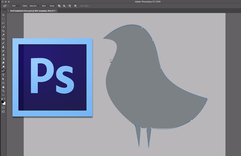
With its flexibility in the application of Windows and Mac devices, Photoshop is an effective photo-editing tool for beginners. It enables one to convert a simple photo to an intriguing masterpiece work of art. Photoshop is quite popular with the millennial as most viral photos on the internet are courtesy of its simple sharing platform that covers popular social media platforms like Facebook, twitter, and Instagram. The user is able to remove/crop out or add images and combine several images together. It has numerous filters with auto fix mode on elements such as color & enables photo rotation.

2. FILMORA

FILMORA possesses simple video editing tools enabling the user to crop, rotate, flip, merge videos among others. It provides over three hundred effects great for converting video into other file formats and readily applicable motion elements. It enables the creation of animated beautiful texts and titles for attractive headings, easy selection of music from the music library and sound effect to enhance specific scenes, and effective overlays and filters.

3. CANVA

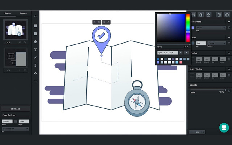
A free online web design software with simple features for dragging and dropping. Its fonts and layouts selection is wide with numerous shapes, photos, and icons for achieving attractive images applicable in both social platforms and presentations.

4. VECTR

It is easily accessible through downloading on the desktop or website as an app with no charges. VECTR best suits beginners in vector graphics offering easily usable graphic design tools and editing options including filters and easily accessible platforms for sharing one’s work enhancing collaboration.

5. Adobe Premiere Pro

Through Adobe’s customer’s satisfaction aim, the software is equipped with effective video editing tools depending on the user’s specification that vary from movies to short commercial clips and even music videos.

6. Director Suite

It’s a flexible professional video editing software that focuses on photos, audio, color, and video enhancing one’s creativity. Its cost is reasonable compared to the vast array of services and specialization it possesses.

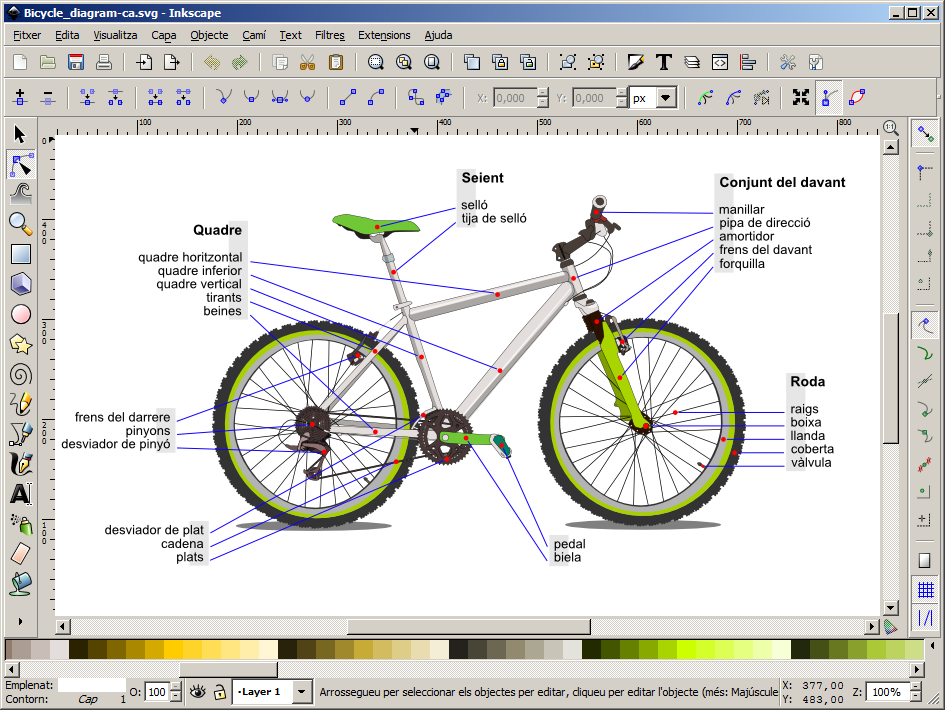
7. INKSCAPE

It enables flexibility in the application in Mac devices, Windows, Linux among others. Its free services are effective for web designers specializing in logo creation and branding services. INKSCAPE scalable vectors and drawings are flexible. It possesses a unique alphabet transparency feature.

8. PAINT.NET

It is available through windows enhancing the simple application of photo and image editing tools for effective designs. It enables adjustment of graphics layers acting as a substitute for Microsoft Photo editor among other software.

9. Adobe Indesign

Its application favors both mobile phone and desktop accessories. Its specialization is focused on the creation of layout designs. Adobe Indesign is effective for web designers specialized in the printing press for books and digital magazines. One can easily transfer and share work from both desktop and Smartphone enabling application of available phone and desktop apps for an effective outcome.

10. Xara Xtreme

An effective photo editing software specifically helpful to photographers in editing different features ranging from photo texture to color. One can easily resize an image by following the easily explained rules concerning its available image editing tools. A good example is its ability to correct errors caused by the lens.

In conclusion, there is various graphics software that can serve both beginner and advanced web designers. One should consider the cost value as some are free while others tend to have a fee payment requirement. Some of the useful graphic design software includes Photoshop, Filmora, CANVA, VECTR, Adobe Premiere Pro, \Director Suite, INKSCAPE, PAINT.NET, and Xara Xtreme. Listed above are ten efficient graphic designs that will improve one’s images, videos, and texts to high-quality, eye-catching graphic design products.

10 Best Graphic Design Tools For 2018

Post pobrano z: 10 Best Graphic Design Tools For 2018

The right kind of graphic design tools can easily modernize your workflow, assisting you to execute in a smart way and more proficiently. You are actually investing your time and energy in crafting wonderful, eye-catchy designs for your clients’ satisfaction and to the delight of your regular users. So the graphic designers though being busy; need to stay updated with the new design tools of 2018 that will help them become more fruitful and creative in the coming year, thus saving their time. Mentioned here are 10 brand new graphic design tools that can bring out the best in your projects!

1. Photoshop CC’s Curvature Pen Tool

If you are having a Creative Cloud subscription, then a cool new pen tool is accessible in the Tools panel to create curved lines in Photoshop CC much simpler. With the help of this Curvature Pen tool, you can click to add points which will directly make drawing curves between them. The push and pull the segments of the curve purely to modify it for better.

2. Lightwell

Available for iPad, iPhone, and OS X, the Lightwell tool allows you to upload your 2D designs superbly and spin them into interactive storytelling apps. Currently free on Apple Store and reaching Google Play Store in 2018, this tool offers a prospective easy and quick method to bring all the stories and media to life.

3. Sketch

Sketch is a Bohemian Coding’s vector UI design tool that has small size documents and provides hundreds of plugins to makes the workflow smoother and simpler for a designer. The Sketch features a great built-in grid system and user-friendly and creates interface design much simpler.

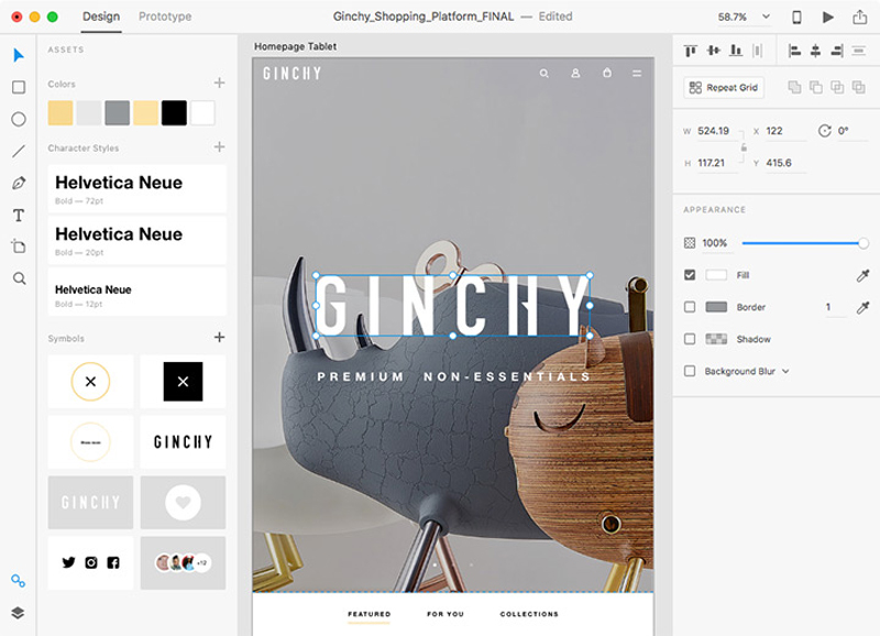
4. Adobe XD

Adobe XD covers drawing tools that enable the designer to choose a device-precise art-board size to start a project and can also import a trendy UI kit like Google’s Material Design. XD is also a light interface along with multiple photos loaded in it, and good for mood-boards.

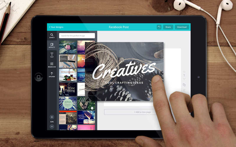
5. Canva

Canva is the most popular and free tool used for creating amazing designs, brochures, and logos. The graphic designers can easily utilize this browser-based tool to craft graphics for print as well as the web. Canva is just perfect for carving superb images for your website and social media. One can apply the drag-and-drop feature of Canva and specialized layouts to design striking graphics always.

6. Type Nugget

Type Nugget deals with CSS typography. This is known to be an online typesetting tool which offers you good control of typestyles. Type Nugget exhibits a wide range of text samples on the page that can be easily live-tweaked in a panel on the right side. Thus the panel allows the graphic designer to choose the font size, style, weight, letter spacing, text decoration, and much more for individual features of the page, like headings, global styles, links, paragraphs, and HTML lists.

7. Parallax SVG Animation Tools

SVG Animation Tools is available in the form of a Python script which is crafted by Gareth Battensby of Parallax. This tool helps in creating long or complex sequence SVG animations in a very easy way. The Parallax SVG Animation tools are ideal for the front-end developers who do the animation of SVG graphics along with GSAP or related animation libraries.

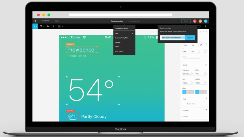
8. Figma

Accessible in the browser, or on Mac, Linux, or Windows, the Figma has free and paid versions which depend on what you apply it for. It is an interface design tool which allows numerous designers to team up in real-time.  One can get discount & coupons at Couponobox.com for premium tools. You can use Figma to craft a couple of icons for articles that you want to publish on your website as its workflow is exceptional.

9. Affinity Designer

Serif’s Affinity Designer has been amazingly well-designed and is a unique graphic design tool. You can enjoy using its features that include nondestructive, adjustable layers where you can easily adjust vectors or images sans smashing them.

10. Pattern Lab

Pattern Lab is a stunning pattern-driven design tool that is based on Atomic Design concept. It is a language-and-tool-agnostic and also a static site generator which sews up UI components together. Pattern Lab allows the designer to layer the UI patterns inside each other and even design along with dynamic data.   

Hence, save your budget, energy and time in your future webs design projects with these above new graphic design tools.

2017 Staff Favorites

Post pobrano z: 2017 Staff Favorites

It’s been a very productive year for the web community, and as all of us here at CSS-Tricks roamed around to conferences, read posts, and built projects, there were some highlights of contributions that really stuck out to us. Each of us picked 5 resources that were either the most helpful, the most unique, or are things you might have missed that we think are worth checking out.

Sarah’s Picks

The Miracle of Generators

I quite like when someone takes a deep dive on a particular subject and does it well. I had the honor of seeing Bodil Stokke give this talk at Frontend Conference Zurich and it’s as charming and entertaining as it is educational.

Designing with Grid

Jen Simmons covers the status of CSS Grid, and how to work with it from design to development. Jen is a master of grid, and the lab section of her site shows the capability of this medium.

An update since this talk has come out: Grid has also shipped in Microsoft Edge.

Vue Apollo

This is more like two things I’m interested in wrapped up in a single thing. Guillaume Chau has done a great job of creating an Apollo/GraphQL integration for Vue, including a few great demos to explore.

The Coding Train

This resource has been out for a while, but Dan now has such a great collection that it’s a great time to mention it.

Coding Train are small, half-hour chunks of tutorials- everything from creating a star field to learning how Neural Networks work. Dan is an incredibly engaging and lovable instructor and makes you feel very welcome when exploring new concepts.

Motion in Design Systems

Val Head gets to the heart of the matter when it comes to integrating motion into a Design System or Component Library.

It can be really tough to communicate animation because you necessarily need to collaborate between design and engineering. Val gives you some tools to make this process function well.

Robin’s Picks

Design Systems

Design Systems by Alla Kholmatova was one of the best design books I read in 2017.

It’s a book all about how to collaborate with a team and reveals that code quality is only one part of designing great systems on the web. The book isn’t so much about design as much as it’s about learning how to communicate across large groups of people and how we can better communicate with everyone in an organization.

Web Typography

Another great book I read this year was Web Typography by Richard Rutter, this time focusing a great deal more on the relationship between CSS and typesetting.

My favorite part of the book though is where Richard describes that web typography is fundamentally different from other forms of typesetting and requires a series of new skills. It makes for exciting reading.

Purple.pm

For most of this year I’ve been focusing on improving my UX and product design skills and I have to say that Purple was the most useful tool for organizing large amounts of data and research. I used it as an archive that stored every document I made, every Balsamiq wireframe and hi-fi Figma mockup I created all in one place. This made it so much easier to communicate with other teams and explain my thinking on a project.

Figma

This year I switched to using the web-based design tool Figma full time. It’s been so very useful because my day job work requires collaborating with dozens of engineers, product managers and other designers — so being able to quickly share a mockup with them and get feedback has exponentially improved my design chops. Plus, it reminds me of Fireworks which is probably one of the best apps ever made.

Inkwell

This year Hoefler & Co. released Inkwell, a new family of typefaces that mimics a variety of handwriting styles and I can’t stop thinking about them. One great example of their use is on Chris’ blog where all these weird styles shouldn’t work at all but somehow they just do.

Chris’ Picks

A Design System for All Americans by Mina Markham

A masterclass in public speaking if you ask me. Funny, personal, and right on target for the kind of work a lot of us are doing.

Notion

Notion is probably the most significant bit of new software I’ve switched to this year. It’s a notes app at it’s core and it’s feature-rich in that regard. One of my favorites features is that every note is also a folder, so you can get as nested as you like with your organization. If you give it a shot, I bet you’ll be able to see how it quickly can replace lots of other apps.

Most significant to a list like this, is that it’s built for the web, but also has native apps on a variety of platforms. I think 2017 was significant in that we started to really feel a blurring between what is web and what is platform native. I suspect it will get harder and hard to tell, and then with all the advantages the web has inherently, it will make less and less sense to build anywhere else.

CSS

CSS had a banner year. CSS Grid, of course, but we also got font-display starting to ship, which is wonderful for performance. We got landmark selectors like :focus-within that prove parent selectors aren’t impossible. Vector graphics has moved it way into CSS with a collection of properties, including animation and movement. You might say CSS has gotten more capable and easier. I enjoyed writing posts like this one about a slider that shows how far you can get in CSS these days.

RIP Firebug

I think it’s nice the Firebug homepage is an homage, goodbye, and short history to Firebug. Firebug laid the foundation for what good DevTools could be. I’m glad browsers have taken them in-house and turned them into the powerhouses we use now, but that’s all thanks to Firebug.

If I had to pick the most significant three things that have made the web the development platform it is today: 1) DevTooling, started by Firebug 2) The agreement from all browsers that web standards benefit everyone and actually being disciplined about applying that thinking 3) Evergreen browsers.

PWAs

I feel like Progressive Web Apps are essentially good marketing for a collection of good ideas that benefit any website. That’s exactly the case Jason Grigsby makes:

That makes it an easy pick for 2017. HTTPS! Service workers for offline friendliness! Performance focused! Do these things, and be rewarded with more features that native apps enjoy, like a position on the home screen on mobile devices. Blur them lines, y’all! Even if you don’t do everything on the list, there are big advantages for every step along the way.

Geoff’s Picks

CSS Grid

This one comes as no surprise but it’s certainly worthy of multiple mentions. Grid has really rejuvenated my love for CSS. Not only does it take a lot of the complexity of out layouts that used to require creative uses of floats, displays and positioning, but it has allowed me to cut CSS frameworks completely out of my workflow. I mean, it’s that frameworks are bad or should not be used, but I personally leaned on them a lot for their grid systems. That’s no longer the case and the result is one less dependency in my stack and the liberty to write more vanilla CSS.

Prototyping Tools

Robin already mentioned Figma and that is totally in line with what I’m referring to. There seemed to be an explosion of innovation in prototyping tools. Sketch, Figma, InVision and, yes, Adobe all upped their games this year and web designers were the beneficiaries. These tools have opened up have made it easier to collaborate with other designs, critique work, get client feedback, and ultimately get into the browser faster. I have never spent less time in graphic design software and it’s been awesome.

Here’s a taste of what I’m referring to:

Contrast in Accessibility

Often when we talk about accessibility, the focus is on things like semantics, document structure, screen readers ARIA roles. It can get super complicated. That’s why I really enjoyed Lara’s recent post advocating for accessible UI. Aside from being extremely well-written, she presents commonsense approaches to improving accessibility in ways that go beyond code.

One of her suggestions to check color contrasts in the design to ensure good legibility. This one really resonated with me because I recently worked on a project with a visual brand that includes a lot of greens and yellows. Running our designs through the tools Lara recommends revealed that our work failed many accessibility checks. It also taught me that accessibility really does not favor greens and yellows.

Web Typography: Designing Tables to be Read, Not Looked At

If you didn’t catch Richard Rutter’s post on A List Apart, I’ll please go read that right now. Don’t worry, I’ll wait right here for you.

You back? Great!

This one was a splash of cold water in my face. Richard not only convicted me to honestly assess whether I over-design tables but also turned all my preconceptions about what a table is and what a good one looks like. Good design is problem solving and this post is one that reminds me design for solutions before aesthetics.

place-items

Chris snuck this property into a demo and I had no idea it existed. I had to forgive myself a little when I saw that browser support on it is low, but it is a really nice shortcut that combines the align-items and justify-items properties. You may have guessed why I love this: it comes in super handy with Grid and Flexbox. While support is limited it Chrome 59+ and Firefox 45+, I am stoked to see more browsers hop on board.


What are your picks for 2017?


2017 Staff Favorites is a post from CSS-Tricks

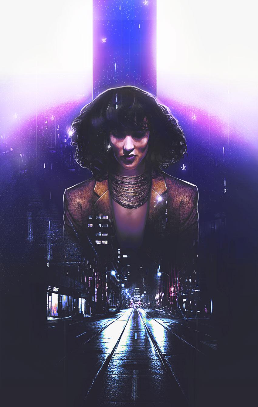
How to Create an 80s-Inspired Double Exposure Manipulation in Adobe Photoshop

Post pobrano z: How to Create an 80s-Inspired Double Exposure Manipulation in Adobe Photoshop

Final product image
What You’ll Be Creating

Here’s an ode to 80s power suits and supreme boss chicks. Learn how to create an epic 80s-inspired photo manipulation in Adobe Photoshop.

Today, I’ll cover how to style a person from scratch before adding cityscape images for an awesome double exposure effect.

Get inspired! Find more 80s-inspired effects on Envato Market.

Tutorial Assets

The following assets were used in the production of this tutorial:

Finding Retro Inspiration

Let’s take a look at the before and after. I love this part.

This manipulation combines a few of my favorite trends from the past
year. It mixes a double exposure effect with a 1980s vibe for a cool
movie-poster-like effect.

References and Inspiration

Pictures always shape the result! So make sure you pick photos that fit the vibe you’re trying to achieve. I was inspired by this simple Business Woman stock because she reminds of Jennifer Beals in the movie Flashdance.

And I just know we can do magic with that hair!

With that in mind, I’ve also gathered cityscape images to fit the retro 80s vibe because of their bright lights and neon colors. Always bookmark extra stocks for more variations.

Now for the tutorial! Let’s begin.

1. How to Style and Manipulate Your Subject

Step 1

Our subject seems a little distracted, so we’ll have to restyle the photo a bit for a fierce look. First, create a New Document at 1780 x 2800 pixels and 100 dpi.

Note: these dimensions are not traditional poster dimensions by any means (though it resembles a poster), so make sure you alter the numbers accordingly. 

Use the Magnetic Lasso Tool (L) to extract the subject from the photo. Copy and Paste it into your document, Free Transforming (Control-T) her body slightly to make it straighter.

Extract the subject

Step 2

For this next part, we want to create powerful, boss chick body language. Let’s make her shoulders more forward!

Fix her shoulders
  1. Use the Polygonal Lasso Tool (L) to create a selection around the right side of her suit. Since this side is the straighter of the two, we’ll use it to create stronger body language.
  2. Copy and Paste the right side of the suit onto its own New Layer. Then Control-J to Duplicate it. Flip the copy by going to Edit > Transform > Flip Horizontal.

Here is the result so far with the new shoulders in position.

Shoulder Result

Step 3

Continue to modify her suit and style.

Paint the skin
  1. Use the Rectangular Marquee Tool (M) to cut the top half of her body off, specifically the area right above her collar. We’ll need to insert a necklace here soon.
  2. Her
    blouse makes her look super corporate, so let’s add another realm of
    fierceness with some Grace Jones vibes! Create a New Layer below the suit layers and use a Hard Round Brush to paint tan #be9b84 below her neck. Use the Eraser Tool (E) at a low Opacity (10-20%) to erase the color for a subtle skin-like gradient.

Step 4

Let’s add that necklace!

Copy and Paste a selection of this Beaded Necklace onto the canvas.

Position it onto a New Layer above the skin before adding a Layer Mask. Mask away any remnants from the previous photo until there’s only the necklace left.

Don’t worry—we’ll fill any gaps left over later!

Mask the necklace

Step 5

Time for her curls!

Have fun with this step—it’ll add a lot of personality to the manipulation.

Make a selection of her hair using the Polygonal Lasso Tool (L). Copy and Paste this selection onto a New Layer. Resize her hair using the Free Transform Tool (Control-T).

Pull her hair wider and taller for voluminous 80s hair!

Resize the hair

For even more volume, consider using Liquify. Select the hair layer and go to Filter > Liquify. Use the Forward Warp Tool (W) to push her hair, stretching the curls out until it looks full and teased.

Liquify the hair

Here is the result when we’re through. Epic 80s hair!

Feel free to use a Layer Mask to feather out the edges.

Hair after liquify

Step 6

This next step is optional. So let me first say, there is nothing wrong with her face. I just want it to look more symmetrical.

To do this, we’ll first Copy and Paste a selection of the left side of her face onto a New Layer. Then Flip this side to mirror the other by going to Edit > Transform > Flip Horizontal. Use the Eraser Tool (E) to blend any harsh edges.

Flip the models face

2. How to Adjust the Skin

Step 1

Before we move on to the double exposure effect, let’s adjust the colors.

Create a New Layer and set it to Saturation. Use the Brush Tool (B) to paint a golden yellow color #b37f1a over the subject’s skin. This will make her appear more tanned. Lower the Opacity to 38%.

Tan the subject

Step 2

On another New Layer above the model, smooth out her skin with a Soft Round Brush.

Paint a light tan color #dd9364 over her skin to minimize the uneven light hitting her face.

Keep the brush Opacity low (15-30%) as well as the Hardness (0%) for the best result.

Smooth Her Skin Tone

3. How to Set Up the Graphic Elements

Step 1

Let’s start piecing together the rest of this scene!

Create a New Layer underneath the model.

Use the Rectangular Marquee Tool (M) to make a selection in the shape of a skinny rectangle above her head. Fill this section in with a light #959aa1 to medium gray #8b909a gradient using the Paint Bucket Tool (G).

This top bar will draw the focus to our subject for more drama.

Add the top bar

Step 2

Do the same for the bottom, this time creating a medium gray #383938 to dark gray #1c1e1d gradient.

Add the bottom bar

4. How to Create the Double Exposure Effect

Step 1

The magic of this manipulation is behind the double exposure look. We’ll be creating this by blending our two city photos together.

Let’s start with the first photo.

Add the first city
  1. Copy and Paste the City #1 stock onto a New Layer above all the others. 
  2. Set the Layer Blend Mode to Lighten. Add a Layer Mask to mask out the top portions with a Soft Round Brush.

Step 2

Control-J this layer to create a Duplicate. Set the Layer Blend Mode to Lighten.

Now turn it upside down. Go to Edit > Transform > Flip Vertical.

Position this copy layer (named „flip” below) higher than the other. Try to make some of the lights from the buildings blend into her hair. Adjust the Layer Mask accordingly.

Add the flipped city

Step 3

Now add the second city.

All we really need from this photo is a subtle hint of those bright red buildings.

So Copy and Paste the City #2 stock onto a New Layer above the others. Position it to align with the first city photo.

Set the Layer Blend Mode to Color Dodge, and then add a Layer Mask to mask out everything else besides the red buildings.

Add the second city photo

Continue experimenting with this method, add more bits of glittery city lights to her face as well as the top gray bar.

5. How to Blend All the Colors Together

I’ve tried to set up this tutorial in the order that would work best for this effect.

Some parts might look a little trippy at first, but these next steps will help bring all the colors of the manipulation together.

It’s a lot. But you’ll love it, I promise!

Step 1

Let’s start with the background.

Add the background colors
  1. Create a New Layer above the white background layer. Use the Gradient Tool (G) to create an upward-moving, gray #484847 to transparent Linear Gradient.
  2. Create another New Layer above the gradient. Use a Soft Round Brush to paint a blue #5674ae circle behind the model.

Step 2

Adjustment Layers are the best way to get cool results!

Add a New Adjustment Layer of Color Lookup above all the other layers in the panel.

Set the 3DLUT File to:

  • FoggyNight.3DL
Add a color lookup adjustment

Step 3

Create two New Layers above the Color Lookup layer.

Set the first one to Overlay. Create a white to transparent downward-moving Linear Gradient (30-50% Opacity).

On the layer above it, Fill it with purple #362f58 using the Paint Bucket Tool (G). Adjust the Opacity to 74% and set the Blend Mode to Lighten.

Adjust the colors with blend modes

Step 4

Time for more adjustments!

Add a New Adjustment Layer of Curves. Adjust the curves for the RGB, Blue, and Green Channels for a cool color effect. 

Curves adjustment layer

Step 5

Add a second Curves adjustment. This time, adjust the curves for the Blue and RGB Channels like the following ones below.

second curves adjustment

Follow up with a New Adjustment Layer for Levels.

Add the following values for the RGB and Blue Channels.

Blue Channel:

  • 0, 0.76, 162
  • 0, 255

RGB Channel:

  • 26, 0.84, 204
  • 21, 255
Levels adjustment

Here’s the result.

levels result

6. How to Add the Final Touches

Step 1

Ready to finish? Me too!

Create a New Layer above all the others. Set the Blend Mode to Hue and paint purple #1c083b across the top to recolor the yellow parts. 

This layer will also add some shadow to the bar, so play with the softness for more depth.

Paint purple for the top

Step 2

Add some color to the suit too! We’ll use Layer Styles.

Remember to keep some of your layers separated. Right-click the right suit layer and go to Blending Options. Add a yellow #ffbb35 Color Overlay and black Satin Effect with the following settings.

Add layer styles ot the suit

Recreate this easily on the left side! Simply Right-click the right suit layer and go to Copy Layer Style. Then Paste this style onto the left layer.

Here’s the result below.

Color the suit yellow

Step 3

Take some time to add crisp white highlights to the edges of the model and top bar.

Use a tapered Hard Round Brush to create the backlight, and then add some vertical lines in varying Opacities for a surreal look.

Add white highlights

Step 4

Continue the highlights onto her hair and suit.

I love adding texture! Use this Star Brush from our essential Photoshop Brush pack to create tiny areas of grainy white texture which blend into the rest of the composition.

Get creative! Draw some fun stars by hand for a cool graphic effect!

Draw stars and texture

Step 5

Almost there!

Add some beautiful glow to the manipulation.

Create a New Layer and set it to Overlay. Use a Soft Round Brush to paint soft yellow #e6d98f onto the model’s hair and suit. Paint some yellow onto the white background for a beautiful effect too!

Add glow to the composition

Finish with a New Adjustment Layer for Gradient Map.

Use the Gold-Copper preset, and then set the Layer Blend Mode to Luminosity and the Opacity to 40%.

Add a gold copper gradient map

Check out the final result below!

7. How to Add a Quick 80s Text Effect

Turn this look into an epic 80s movie poster with a quick text effect! Just download one of the many amazing premade text effects from Envato Elements.

Here, I used the third file from this 80s Text Effect Volume 1 package.

Extract the text effect

Merge only the text layers together before extracting and inserting your title into the manipulation.

Check out this alternate version below!

Alternate with text effect

All Done, Great Job!

Photo manipulations help us learn how to use Photoshop in new ways. Continue creating beautiful effects inspired by your favorite retro styles!

I hope you’ve enjoyed this tutorial! Feel free to add your comments and share your results with us below.

For more fun photo manipulations, check out these great tutorials:

80s Double Exposure Photoshop Manipulation by Melody Nieves

Fragmented HTML5 Video

Post pobrano z: Fragmented HTML5 Video

I have seen various implementations of the Voronoi Diagram. Perhaps you’ve seen one without knowing what it was. It almost looks like random stained glass:

Wikipedia:

In mathematics, a Voronoi diagram is a partitioning of a plane into regions based on distance to points in a specific subset of the plane.

It’s even possible to create a Voronoi diagram by hand, as eLVirus88 has documented.

I wanted to give it a try.

The Idea

My idea is to chop up a video into fragmented parts (called cells) and put them into 3D space on a slightly different z-axis. Then, by moving the mouse, you would rotate the whole experience so you would see the cells in different depths.

The Code

Building on top of Raymond Hill’s and Larix Kortbeek’s JavaScript implementation, the first thing I needed to was split up the cells.

I choose to use the <canvas> element, and put each of the cells on different canvas on a differnet 3D plane through CSS.

The Voronoi library takes care of computing all the sites to cells and creating objects with the vertices and edges for us to work with.

Cells to Canvases

First we create the canvases to match the number of Voronoi cells. These will be rendered to the DOM. The canvases and their respective contexts will be saved to an array.

var canv = document.createElement('canvas');
    
canv.id = 'mirror-'+i;
canv.width = canvasWidth;
canv.height = canvasHeight;

// Append to DOM
document.body.appendChild(canv);
document.getElementById('container-mirrors').appendChild(canv);

// Push to array
canvasArray.push(canv);
contextArray.push(canv.getContext('2d'));

Masking

All of the canvases are now a copy of the video.

The desired effect is to show one cell per canvas. The Voronoi library provides us with a compute function. When providing the sites with the bounds we get a detailed object where we extract all of the cells edges. These will be used to create a cut out to each section using the globalCompositeOperation.

// Compute
diagram = voronoi.compute(sites, bounds);

// Find cell
for (i=0;i<sites.length;i++) {
  if (!found) {
    cell = diagram.cells[i];
if (sites[j].voronoiId === cell.site.voronoiId) {
      found = 1;
    }
  }
}

// Create mask to only show the current cell
ctx.globalCompositeOperation = 'destination-in';
ctx.globalAlpha = 1;

ctx.beginPath();

var halfedges = cell.halfedges,
nHalfedges = halfedges.length,
v = halfedges[0].getStartpoint();

ctx.moveTo(v.x,v.y);

for (var iHalfedge=0; iHalfedge<nHalfedges; iHalfedge++) {
  v = halfedges[iHalfedge].getEndpoint();
  ctx.lineTo(v.x,v.y);
}

ctx.fillStyle = sites[j].c;
ctx.fill();

Adding Video

Displaying video to the canvas only takes a couple of lines of code. This will be executed on requestAnimationFrame:

v = document.getElementById('video');
ctx.drawImage(v,0,0,960,540);

It’s also possible to use a video input source (like a webcam), but I didn’t like the result as much for this demo. If you would like to know how to use the webcam to draw to canvas using the getUserMedia() method you can read about it here.

To optimise video drawing performance skip a few frames in between the requestAnimationFrame. Videos for the web are usually encoded with a frame rate not higher than 30 fps.

See the Pen Fragmented HTML5 Video – Demo 1 by virgilspruit (@Virgilspruit) on CodePen.

Conclusion

Demos like this are my favorite things to do. Seeing what’s out there and adding your own layer of interactivity to it. I’m looking forward to seeing what other people will be doing with this nice visual algorithm.

See the Pen Fragmented HTML5 Video – Demo 2 by virgilspruit (@Virgilspruit) on CodePen.

See the Pen Fragmented HTML5 Video – Demo 3 by virgilspruit (@Virgilspruit) on CodePen.

View Demos GitHub Repo


Fragmented HTML5 Video is a post from CSS-Tricks

Further working mode changes at WHATWG

Post pobrano z: Further working mode changes at WHATWG

The Web Hypertext Application Technology Working Group (WHATWG) announced that it has adopted a formal governance structure:

The WHATWG has operated successfully since 2004 with no formal governance structure, guided by a strong culture of pragmatism and collaboration. Although this has worked well for driving the web forward, we realized that we could get broader participation by being clear about what rights and responsibilities members of the community have. Concretely, this involves creating an IPR Policy and governance structure.

WHATWG was founded by folks at Apple, Mozilla and Opera. The new structure will be comprised of individuals from Apple, Google, Microsoft and Mozilla. The Big Four, you might say.

I find this interesting because we often think of the Web as a wild west where standards are always evolving and adopted at a different pace. This change largely keeps public contributions to the Living Standards in tact, but establishes a clearer line of communication between working groups and provides a path to appeal and resolve disputes over standards.

Living Standards are informed by input from contributors, driven by workstream participants, articulated by editors, and coordinated by the Steering Group. If necessary, controversies are resolved by the Steering Group with members appointed from the organizations that develop browser engines.

And, with representatives from leading browsers at the table, we may see more agreement with adoption. I’m speculating here, but it seems reasonable.

If you’re like me and are fuzzy on the differences between WHATWG and W3C, Bruce Lawson has a pretty simple explanation. It still kinda blows my mind that they’re both standards we often refer to but come from two completely different groups.

Direct Link to ArticlePermalink


Further working mode changes at WHATWG is a post from CSS-Tricks

Refactoring Your Way to a Design System

Post pobrano z: Refactoring Your Way to a Design System

Mina Markham on refactoring a large and complex codebase into an agile design system, slowly over time:

If you’re not lucky enough to be able to start a new design system from scratch, you can start small and work on a single feature or component. With each new project comes a new opportunity to flesh out a new part of the system, and another potential case study to secure buy-in and showcase its value. Make sure to carefully and thoroughly document each new portion of the system as it’s built. After a few projects, you’ll find yourself with a decent start to a design system.

As a side note, Mina’s point here also reminds me of an old blog post called „Things You Should Never Do” by Joel Spolsky where he talks about how all this work and all this code you feel you needs to be refactored is actually solving a problem. Deleting everything and starting from scratch is almost never a good idea:

When you throw away code and start from scratch, you are throwing away all that knowledge. All those collected bug fixes. Years of programming work.

I’m not entirely sure that Joel’s piece about programming fits snuggly with Mina’s point but I think it’s an interesting one to make nonetheless: new code doesn’t necessarily mean that it’s better.

Direct Link to ArticlePermalink


Refactoring Your Way to a Design System is a post from CSS-Tricks

Design deals for the week

Post pobrano z: Design deals for the week

Every week, we’ll give you an overview of the best deals for designers, make sure you don’t miss any by subscribing to our deals feed. You can also follow the recently launched website Type Deals if you are looking for free fonts or font deals.

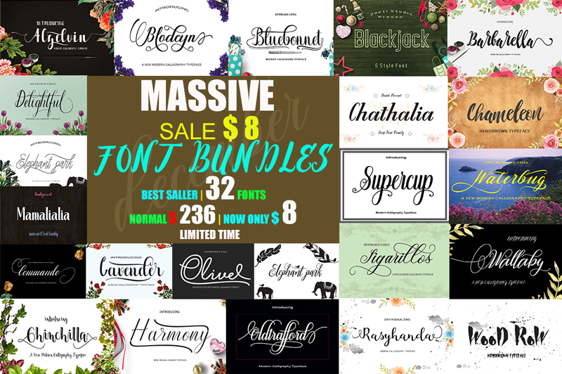
December massive font bundle

This package contains 32 Font Scripts,brush & font regular. Includes some best-selling fonts. Harmony Script, Lavender Script, Barbarella Script, Bluebonnet Script, Chameleon Script, Commando Dll Script & regular, with hundreds of glyphs, including alternates, ligatures, swashes, contextual alternatives and international language support. It can be accessed by using OpenType smart programs like Adobe Illustrator, Adobe InDesign, CorelDraw X6-X7, Microsoft Word.

$4 instead of $236 – Get it now!

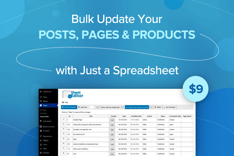
Bulk Update Your Posts, Pages and Products with Just a Spreadsheet

Whether you run a WooCommerce website or have tons of posts on a WordPress platform, you know how frustratingly slow it can be to update information. What if prices change by 10%? What if you want to add the same text or photo to every single post? Well now you can do it all in a snap thanks to Sheet Editor! Easily create, customize and edit your posts, pages and product in bulk all through a simple spreadsheet.

$9 instead of $19.99 – Get it now!

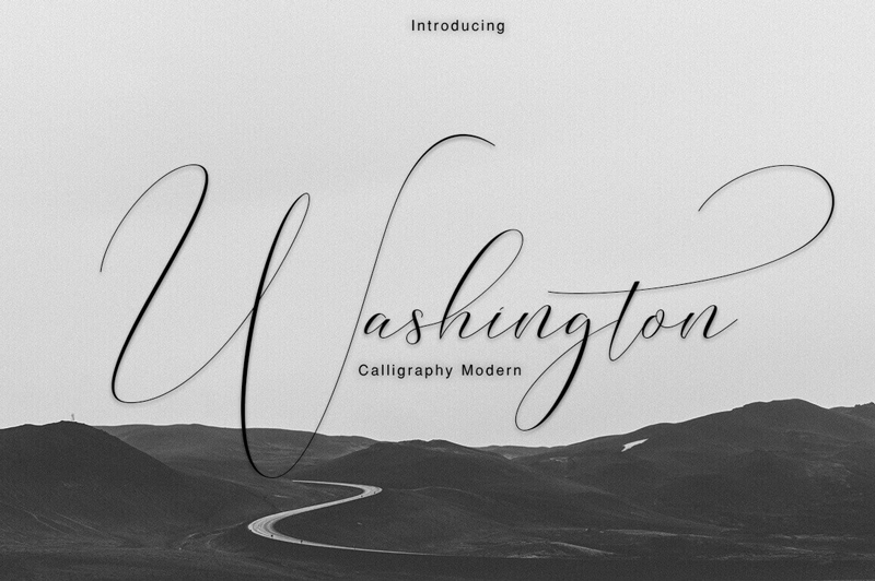
Professional Washington Calligraphy Modern with 450+ Glyphs

You don’t need to be a Founding Father to use this elegant and professional typeface. But you’ll certainly feel like one! The Washington Calligraphy Modern Typeface is an incredibly elegant font that practically flows off the end of a calligraphy pen. Packed with more than 450 glyphs, multi-lingual support and extras from swashes to ligatures, you can practically feel the power flowing out of this font.

$9 instead of $22 – Get it now!

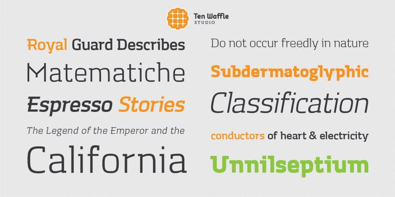
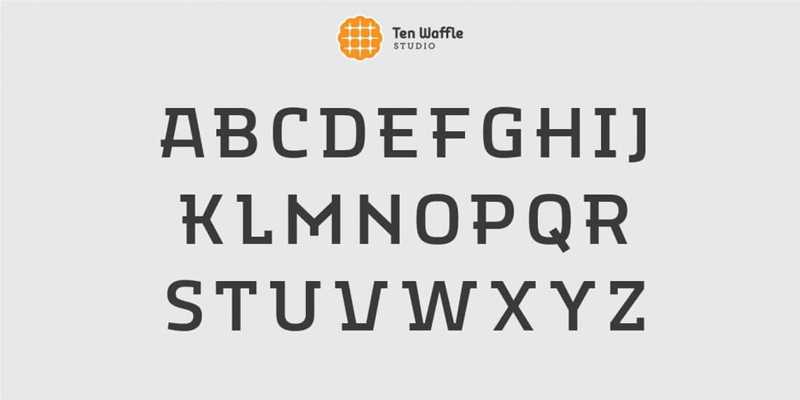
TWS Mora: A Modern Font Family

If you’re in need of a modern, display slab font family, you’ve come to the right place. The TWS Mora font family is as flexible as it is multifaceted, mixing up geometric shapes with humanistic strokes. It’s the perfect choice to use for projects centered around classical literature, music and other creativity.

$9 instead of $54.99 – Get it now!

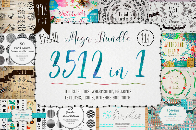
3500+ Textures, Brushes, Icons, Watercolors & More Graphic Elements

Designers are always looking for more. More graphics. More textures. More brushes. Well, with this Mega Bundle of a Mighty Deal, you’ll get all that and more! Packed with more than 3,500 professional graphic elements, you’ll get everything from patterns to textures to brushes to icons. No matter your latest project, you’re sure to find some new design elements in this bundle that fit the bill perfectly for you.

$14 instead of $13,580 – Get it now!