Wszystkie wpisy, których autorem jest admin

Photoshop in 60 Seconds: Brush Panel—A Look at the New 2018 Update

Post pobrano z: Photoshop in 60 Seconds: Brush Panel—A Look at the New 2018 Update

Get updated on the latest features to Adobe Photoshop. Check out the quick video below.

If you’re looking for amazing premium Photoshop brushes, head on over to GraphicRiver.

Photoshop in 60 Seconds: Brush Panel

Adobe recently unveiled a suite of new additions to Creative Cloud for 2018. Today, we’ll go over a few of the latest updates dedicated to Photoshop’s Brush panel.

Check out this quick video below to see a few of the new features explained, like folders for custom brushes and so much more!

Photoshop’s Brush Panel Features for 2018

Here are a few of the new features now available for the Brush panel in Adobe Photoshop.

Brush Management and Setup

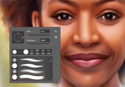
You can now drag and drop any brush preset to a new location. Easily toggle different views to understand which brush you’re using and see additional settings like the Brush Tip, Stroke, and Name for a better workflow.

Brush Management

Importing Brushes

Photoshop has also made it easier to download and install brushes! Choose the Get More Brushes option from the flyout menu to use awesome brushes from Adobe’s acquisition of illustrator Kyle Webster’s brush packs. Once you’ve downloaded a pack, just click on the ABR file while Photoshop is still running to use it right away.

Importing Brushes in Photoshop CC

Stroke Smoothing

Photoshop now has advanced Stroke Smoothing to help artists and designers avoid jittery strokes. Enable different modes by clicking the gear icon, and experiment with the Smoothing value for the best results.

Stroke Smoothing

Learn More With Our Tutorials!

Inspired to learn more about Photoshop brushes? Start with one of our
tutorials! Continue to grow your skills over time with easy to follow lessons.

Check out these tutorials to learn more from our experts:

How to Draw a Deer Step by Step

Post pobrano z: How to Draw a Deer Step by Step

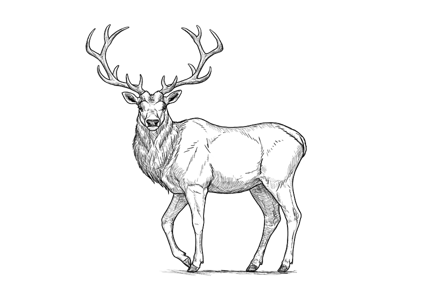
Final product image
What You’ll Be Creating

For me, a deer is the symbol of autumn—the time when the males of this timid species turn into the real kings of the forest, with a crown of antlers on their heads. Of all the deer species, my favorite is the red deer—not as big as a moose, but more regal looking. 

In this tutorial, I will show you how to draw such a deer step by step: from the sketch, torso, legs, and details of the head to a pair of beautiful antlers.

This is a simple tutorial about how to draw a deer. If you want to learn more about deer anatomy and various species, you’ll be interested in the tutorial below:

1. How to Sketch a Deer

The biggest problem with drawing real things is that it’s very easy to lose proportions. To avoid such a mistake, we need to plan the body before adding any details. Such a plan should be sketched lightly, so that you can fix anything after you finish it.

Step 1

Draw a rectangle. This will be the torso of our deer.

base body rectangle

Step 2

Measure the distance to the ground. It should be slightly longer than the width of the torso.

distance between bpdy and ground

Step 3

Find the points where the limbs start.

limbs slots in body

Step 4

Sketch the limbs.

simplified deer legs

Step 5

To add a realistic form of the chest, add a circle to the lower left corner of the rectangle.

simplified deer sternum

Step 6

Add an oval to the front of the rectangle. This is the simplified form of the rotated neck.

simplified deer neck rotated

Step 7

Sketch the neck.

deer neck length

Step 8

Add the head on top of the neck.

deer head simplified shape

Step 9

Add the muzzle to the head.

deer muzzle simplified shape

Step 10

Add the direction of the ears…

deer ears length and direction

… and their general shape.

deer ears simplified shape

Step 11

Sketch the antlers step by step:

deer antlers how to start
deer antlers basic shape
elk antlers how to draw
simplified deer antlers

2. How to Draw the Legs of a Deer

Once you have the sketch, take a good look at it and see if you got the proportions correct. If not, this is the last moment to fix them!

Step 1

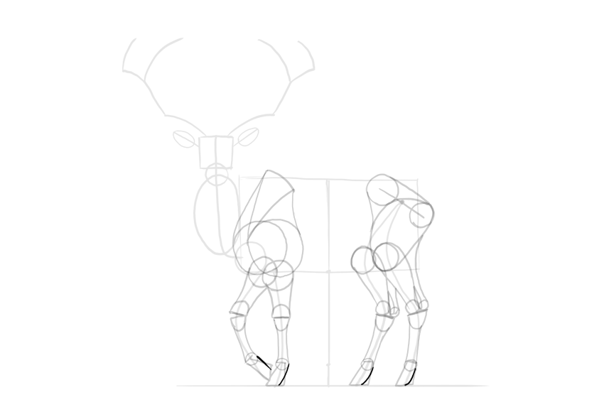
The forequarters of many animals can be drawn with a „6” shape, which includes both the shoulder area and the shoulder blade. Draw it for both front legs.

deer forequarters
deer shoulders drawing

Step 2

Sketch the top of the shoulder blade.

deer shoulder blade

Step 3

Close the whole shoulder area.

deer shoulder area

Step 4

Sketch the hips.

deer simplified hips

Step 5

Add a circle in the knee area.

deer simplified knees

Step 6

The main muscle mass of the thigh can be created by outlining the knee, the hip joint, and the back of the hip.

deer thigh shape

Step 7

Add the rest of the thigh by connecting the big muscle mass to the other end of the hip.

deer complete thigh shape

Step 8

Mark the wrist/ankle area at around 60% of the limb’s length.

deer legs proportions

Step 9

Mark the hoof at about one-third of the length below the wrist/ankle.

deer hooves proportions

Step 10

Draw the circle in the joint right above each hoof. It should be quite small.

deer hooves base

Step 11

Sketch a general shape of the hoof. This trick can be useful for drawing horses as well.

deer simplified hooves

Step 12

Draw the simplified shapes of the joints. The lower legs of hoofed animals are not very muscular, so the form of the bones should be accentuated instead.

deer leg joints simplified

Step 13

Add muscle forms to the forearms and calves.

deer simplified muscle masses
deer simplified calves

Step 14

Draw the characteristic space under the Achilles tendon.

deer achilles tendon

Step 15

Outline the whole legs. Keep the parts below the wrist/ankle thinner than the ones above.

deer simplified leg outline

Step 16

Finish the shape of the hooves.

deer hooves detailed shape
deer hooves shape complete

Step 17

Deer are even-toed ungulates, and they have four toes—two make the actual hoof, and two are hanging in the back.

deer hooves four toes
deer back toes

3. How to Draw the Head and Antlers of a Deer

Step 1

Divide the head into thirds.

deer face proportions

Step 2

Attach two ovals to the sides, within the middle third.

deer eye sockets

Step 3

Draw a smaller oval inside, close to the outer edge of the bigger one.

deer eyes proportions

Step 4

Draw a line at about a third of the mouth.

deer mouth proportion

Step 5

Outline the chin and the nose.

deer chin
deer nose shape

Step 6

Add the nose holes.

deer nose holes

Step 7

Outline the whole head.

deer muzzle shape
deer jaw shape

Step 8

Draw two circles to create a base for the ears.

deer ear base

Step 9

Connect the ears to the head by outlining their base.

deer detailed ear shape

Step 10

Add circles for the base of the antlers.

deer antlers base

Step 11

Mark all the points where you want the antlers to branch out.

deer antlers branching

Step 12

Sketch the „branches”.

deer antlers sketch

Step 13

Add a circle at every branching. This will help you achieve the right thickness of the antlers.

deer antlers thickness

Step 14

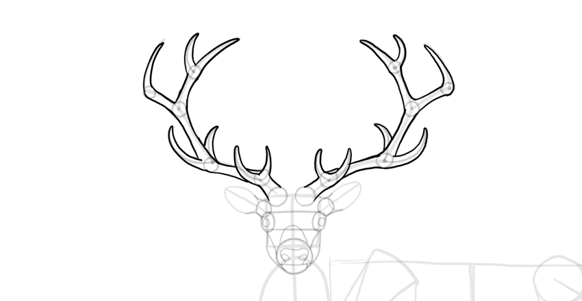
Outline the antlers.

deer antlers outline

4. How to Draw the Torso of a Deer

Step 1

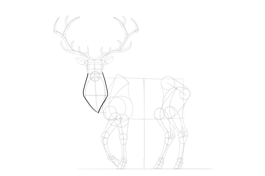
Cross the neck with a line to find its width.

deer neck width

Step 2

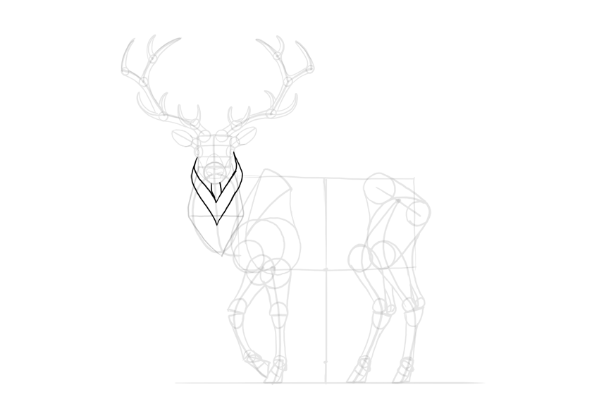
Outline the neck, creating a diamond shape for the mane.

deer neck mane

Step 3

Add more layers to the mane.

deer detailed mane

Step 4

The spine of the deer reaches higher than the shoulder blade. Sketch the characteristic „hump” made by it.

deer back hump

Step 5

Finish the neck.

deer detailed neck
deer detailed torso

Step 6

Outline the whole torso.

deer torso shape

Step 7

Add the details.

deer tail

5. How to Finish a Drawing of a Deer

The sketch is finished, so now we can add the final lines. If you’re drawing traditionally, it’s good to use a darker tool now (for example, an ink liner will nicely cover the pencil strokes), or to place a new sheet of paper on the sketch and draw the final lines on it.

Step 1

Sketch the bulging „eyebrows” of the deer.

deer grumpy face

Step 2

Draw the eyes with all the details.

how to draw deer eyes

Step 3

Draw the nose.

how to draw deer nose

Step 4

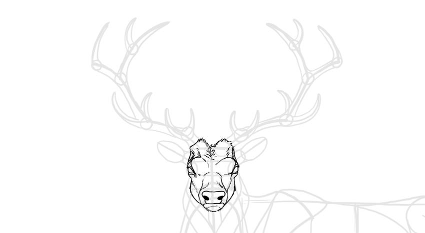
Outline the whole head. Not all lines should be outlined continuously—sketch them with short lines to simulate hair.

how to draw deer head

Step 5

Outline the ears. The darkness inside will make them look fluffy.

how to draw deer ears

Step 6

Outline the antlers and add some texture to them.

how to draw deer antlers

Step 7

Outline the mane.

how to draw deer mane

Step 8

Outline the whole body.

how to draw deer silhouette

Step 9

You can add some details to accentuate the anatomy of the deer.

how to draw deer body details

Step 10

Darken the eyes, nose, and hooves.

how to draw a detailed deer

Step 11

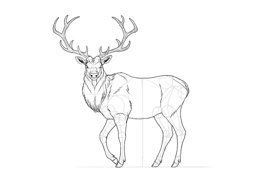
Finally, you can outline the whole animal with a darker stroke, and shade it in a simple way using hatching.

how to shade deer

Good Job!

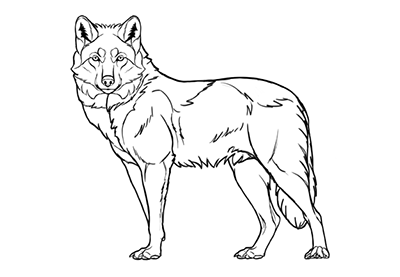
Did you like this tutorial? You may also enjoy other animal-themed tutorials of ours:

Or you may want to check out other deer-related tutorials:

Design deals for the week

Post pobrano z: Design deals for the week

Every week, we’ll give you an overview of the best deals for designers, make sure you don’t miss any by subscribing to our deals feed. You can also follow the recently launched website Type Deals if you are looking for free fonts or font deals.

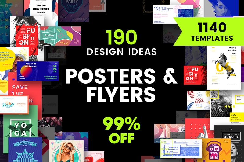
Poster and Flyer Design Templates Bundle

Too busy to design on your own? Use our templates bundle to choose a perfect design for poster or flyer. It contains 190 visual concepts, each with 2 poster and 4 flyer formats ‒ 1140 templates total.

$30.6 instead of $3040 until December 24 – Get it now on Etsy!

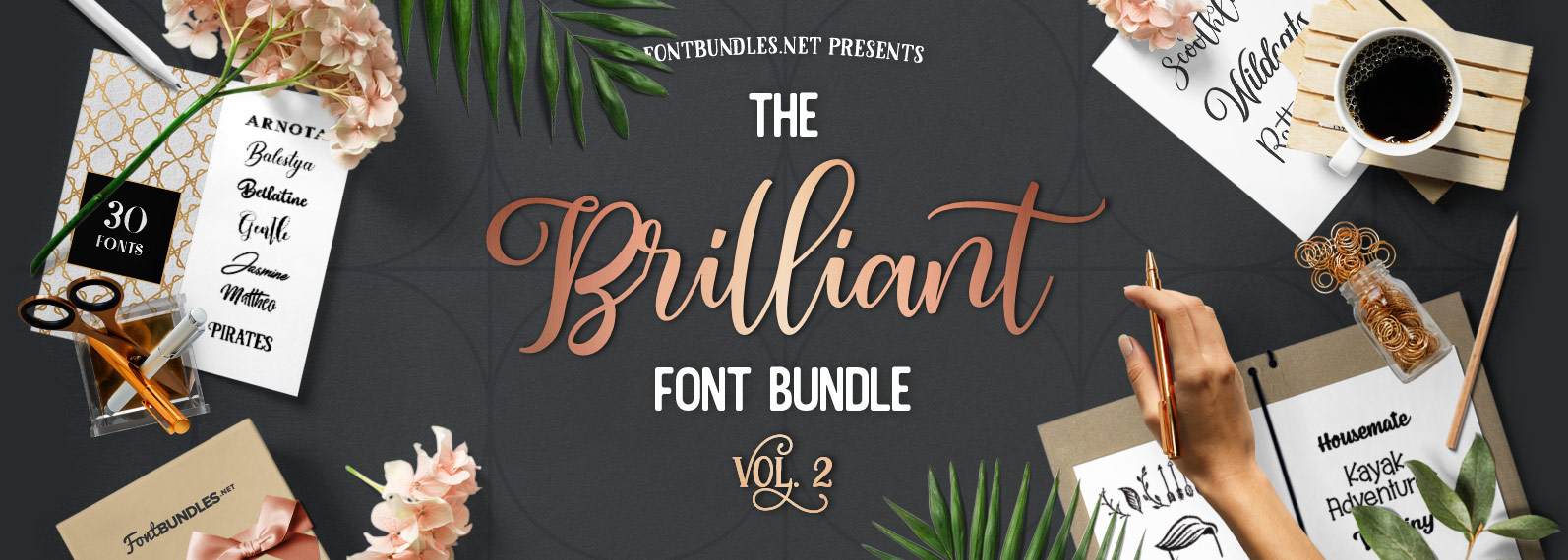
The Brilliant Font Bundle Volume II

The Brilliant Font Bundle Volume II has arrived. Jam-packed with 46 fonts from 30 different font families for only $21. Saving you 95% off the RRP!

$21 instead of $429 – Get it now!

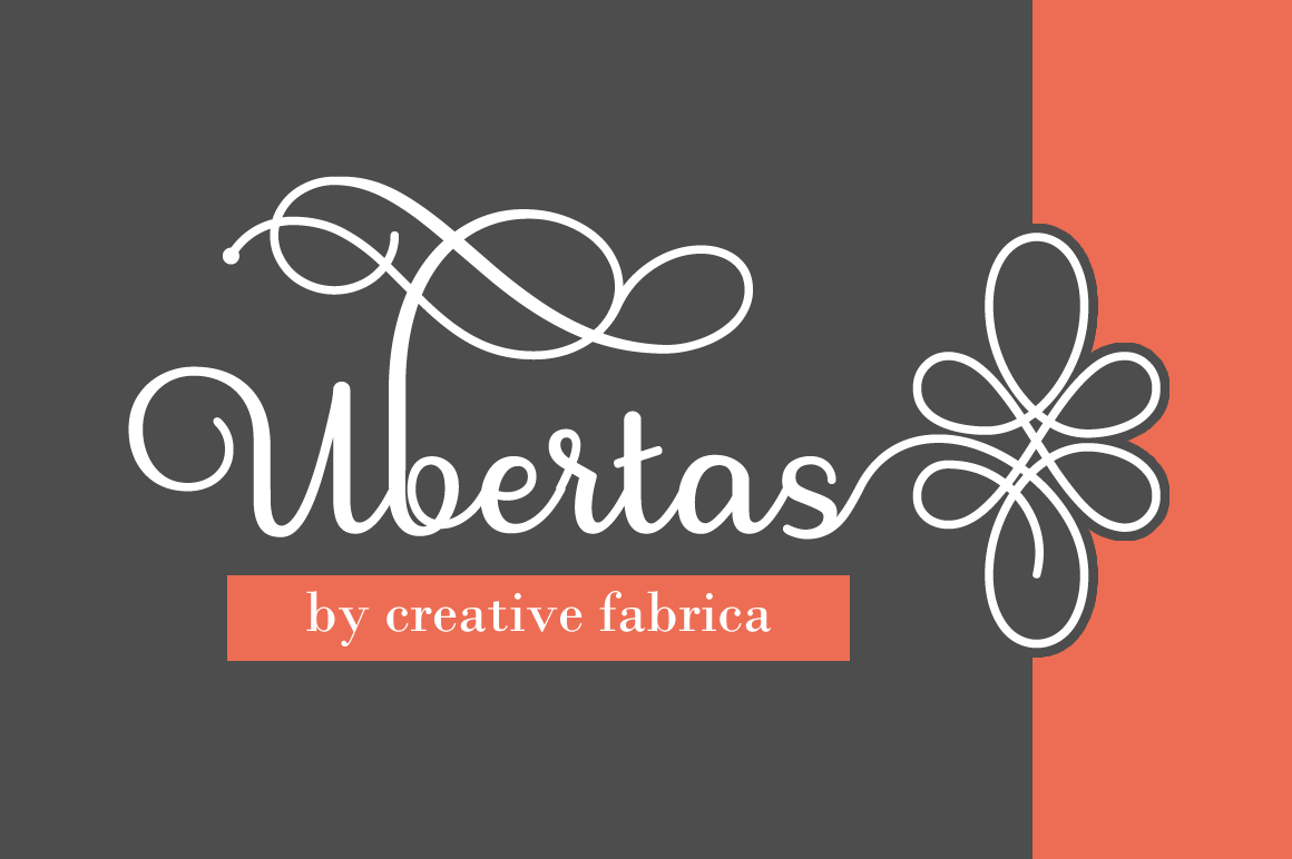
800+ Unique Characters in Stunning Ubertas Script Font

Let the fonts flow with this beautiful Mighty Deal featuring the stunning Ubertas Script font. With curves in all the right places, this terrific typeface includes more than 800 characters, plenty of alternates and offers a regular and italics version.

$7 instead of $22 – Get it now!

StockPop’s Mega Stock Bundle of 20,000+ Stock Photos, Videos, Audio & More

Cast aside your licensing fears! With this Mega Stock Bundle from StockPop, you’ll instantly have yourself a royalty and copyright free library packed with over 20,000 premium stock photos, videos, background audio and more. From food to flowers you’ll have a ridiculous amount of categories to search through in order to beef up your latest project.

$39 instead of $149 – Get it now!

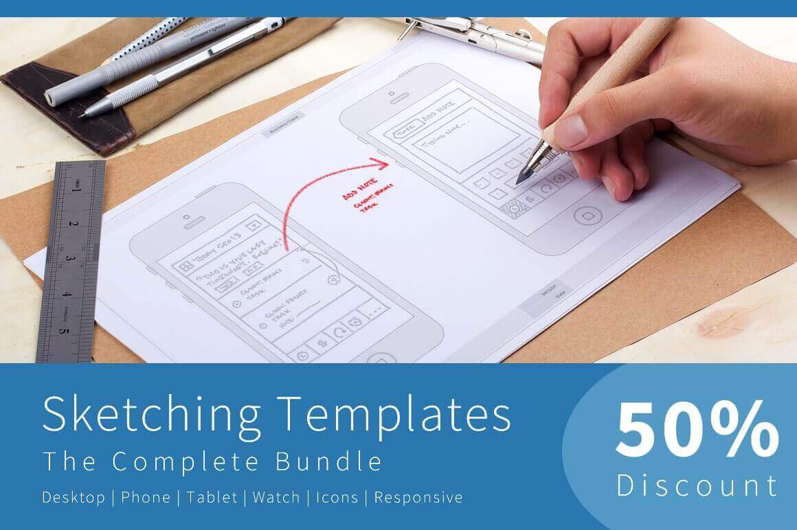
Sketching Templates Bundle of 8 Unique Design Contexts

Sometimes you just need to sketch out your ideas. Now with this professional Sketching Templates Bundle, you can easily dive right in to start generating ideas for your newest app or website. Featuring multiple guide types, you can choose from 8 different designs that range from phones to tablets to watches, as you jot down your ideas. Stop wasting time drawing and redrawing the same device over and over again. Instead, just hit the ground running with your ideas!

$19 instead of $39 – Get it now!

Understanding human behavior to deliver a better UX

Post pobrano z: Understanding human behavior to deliver a better UX

Design can reach the peak of its efficiency when combined with excellent knowledge of psychology. Designers often rely on people’s reaction to different visual incentives in order to take the most of their designs.

As you can notice, the psychology applied is very basic and it doesn’t require you to be an expert in order to use its techniques. In fact, there are few basic guidelines and psychology principles which every designer should use to improve the effectiveness of his design.

Human reaction to visual stimuli is significantly more connected to the subconscious thoughts than it is to the conscious ones. Interestingly enough, it is very predictable. Designers should understand people’s perception and to anticipate the reactions they might have.

Still, don’t worry if you don’t have the appropriate psychology or human factors training. With practice and experience, you will soon be able to distinguish which is the best design and to become a professional interface designer.

We suggest some outstanding examples for improving user experience, applicable for both software and hardware.

Contemplative Listening

Contemplative listening may as well be the most applied psychological principle in UX. It is a straightforward but gradual process of reflective attention, where designers focus on the needs of their customers and they reflect them back to prove they’ve understood them.

Observed from a psychological aspect, the procedure builds empathy, where the listener is focused on clarifying what has been said, while the orator starts feeling validated and free from any judgmental interruption.

With the improvement of their interaction, parties invest more and more trust into each other and they develop meaningful conclusions, which could not be reached otherwise.

Human Reaction

Reactions are emotional products which are created in the central nervous system. They originate subconsciously, and they influence our actions in a manner which can hardly be controlled.

As self-aware and concentrated as you may think you are, you are still a human being. It is also time to let go of that cognition prejudice that there is a ‘higher force’ that can control and plan all of our actions and reactions.

According to modern psychology, a large part of our behavior is dominated by the so-called ‘old brain’, namely our survival instincts. This part of our mind is faster than any logical or conscious thinking and it takes the lead in every basic need we might have (food, reproduction, danger). In such situations, the brain triggers our ‘visceral reactions’ and we react in a fast and unexpected manner.

An overview of costs and benefits

We might be far ahead than our nomadic ancestors in many aspects, but we reflect a large part of their behavior. Even when our mind is dealing with a completely normal task, we are subconsciously calculating the energy we would need to perform it, the time or the worthiness of its results.

In the online world, this means that energy-inefficient or low-reward tasks are quite unlikely to be performed. Take the example of form and its meaning: large forms take time and energy, while short ones are easy to fulfill.

In order to fulfill the long form and to do it properly, users would expect a valuable reward. Even if the reward is the actual information they were looking for, users may not find it valuable enough and they may turn to another site where the procedure is simpler.

The role of Hick’s law in design for human behavior

Hick’s Law must be applied when talking about costs and benefits. Firstly, if you give your users larger lists of possibilities to choose from (pages, images, texts, etc), you are automatically wasting more of their energy.

That energy waste grows and grows to a point where a user cannot really estimate the benefit of complying with your requirements.

Psychology can solve this problem too-you can apply simple psychology principles and you will estimate how people will react to every aspect of your design.

Device inertia

As we already explained, the reason for users’ apathy towards an item/service is that their cost will be higher than their benefit.

Switching devices is a very good example which can explain this-replacing your current screen with a bigger one may seem a good idea at first (larger pictures, better comparisons), but at the same time you would have to approach a different device, do a navigation to the desired site, and do the same search all over again.
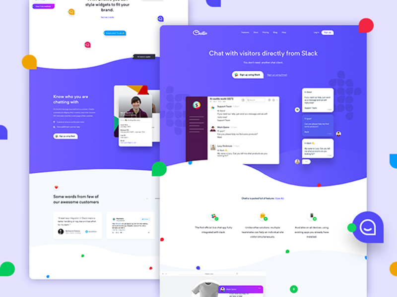
Yes, it sounds like a waste of time. This is exactly when users start experiencing device inertia.

Assuming that the user did a detailed calculation between energy and time expenditure, and the ones he would have saved, and the result would be standing in favor of the optimal device with better quality, he would move and he would use it for a longer time.

However, the calculation would most probably stand in support of the current device, and he would stay had there been only one more interaction.

The reason is that people are prone to short-term planning. Their tendency is to go step by step, avoiding the risk of taking more than a single step ahead.

Behavior and the feeling of power

Let me use a personal example to explain this connection – I have a friend who is very intelligent and never lazy. Still, she holds tight to suboptimal online methods that she had established herself, and she is not willing to change them. Here is why:

  • She was the one to discover the methods first.
  • It hasn’t crossed her mind that there is software which can make the accomplishment of her tasks easier and simpler.
  • She is satisfied with her methods and she thinks they are good enough.

Psychology calls this state momentum behavior. It usually occurs when people decide to stick to a familiar option, instead of looking for something new that could actually help them. Down that road, they become used and loyal to those methods and they deny any other interface element.

‘Picky’ attention
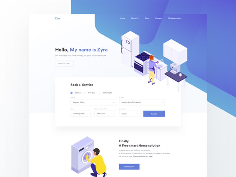
Face it – not every element you put on the screen will be noticed. In fact, due to the design type, the particular situation or the user’s preferences, most of the elements will be ignored.

But is this good or bad for your user? Firstly, picky attention is a result of our cost/benefit calculations and it is directly dictated by our nature and the process of evolution. When people are overwhelmed with incentives, they are mentally unable to pay equal attention to all of them.

Take a Manhattan street as an example – if you could pay the same attention to stylish people’s outfits, or the unpleasant smell of garbage containers as you pay to traffic, you’d probably end up under the wheels of some rushing car.

People are ‘programmed’ in a way to pay attention to the most important incentives and to ignore those which are less interesting or menacing to their wellbeing.

Design for human behavior: Solutions
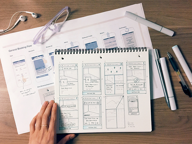
It is a designer’s obligation to help his users to stay focused and to derogate from device inertia, momentum behavior or picky attention. These are the strategies that could help:

  • Choose the important tasks and the important devices and focus on them. If you don’t know which ones, search for the most commonly used.
  • Don’t expect your users to switch devices in order to perform a specific task.
  • Make sure that your users have no problems when syncing information throughout various platforms. Make it really easy for them to resume or restore the work done on a particular device when they start using another one.
  • Take behavioral research seriously. Analyze the way in which people perform tasks and make sure to implement the most reliable/usable one.
  • Refrain from you think is an important UI element. You might be considering including advertisements or similar content, but you need to make sure it is not exactly the thing your users would ignore.

Most of all, avoid blaming your ‘lazy’ users for the failure of your design solutions. If they are not applying it, it may not be as good as you thought.

The way people think nowadays is a product of long evolution, and users are not very likely to change their mental resources just because your app requires them to act differently. Learn the basics of designing apps and start from there.

The effect of expectations

 

The moment when you are introducing a new product to a particular target group is the moment when people will be most susceptible in terms of being convinced to go for it. Therefore, you have to ‘touch’ their needs and emotions with clear illustrations and credibility statements.

Looking at the iPad and its first releases, the producers were faced with extreme levels of expectations and they still managed to communicate properly and to release products which were clearly synchronized with those expectations.

You may be really convinced of the quality of your product, but checking their videos and rethinking your persuasion methods may still help you.

The mental model
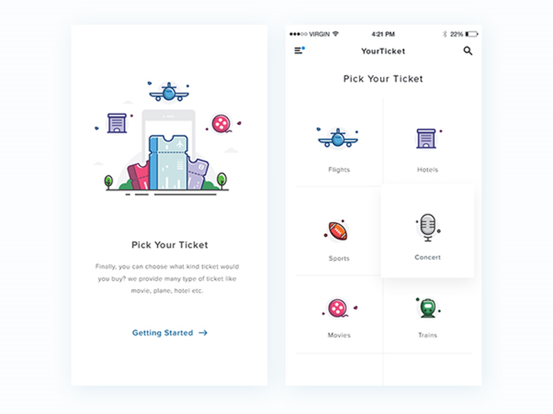
 

Interface design and improving user experience consist of two separate models: Systematic models (explaining the system’s operation) and interaction models (explaining the way in which people interact with that system).

United, these models create the so-called mental model which ought to be ‘absorbed’ by the users. The user can either approve or refuse the model, using his previous experience with digital products. What you need to ensure is that your model will comply with their interpretation of your design.

Long story short, the model needs to be an effective combination of system and interaction, which looks like something efficient, which could satisfy the needs of users.

Preference or performance?
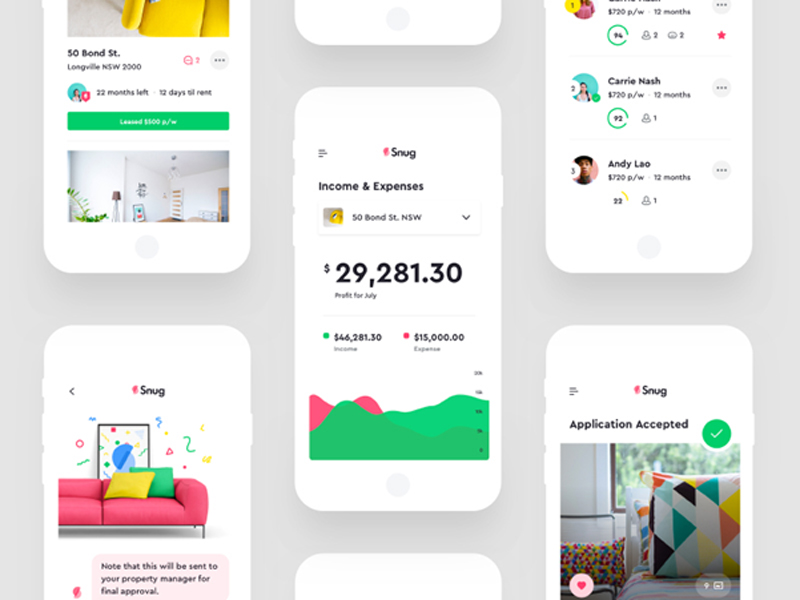
The most common mistake of designers and businessmen is that they believe that users’ affection to a certain product automatically means that the product is efficient and ensures excellent performance.

People are not really able to distinguish between the product they want to purchase and the product that could really improve their abilities by using it. Unfortunately, they often make poor choices of products that are not really helpful. The main problem is that they remain unable to compare and to understand their mistake.

The most appropriate tactic to determine whether a user is really satisfied with a product is to observe the way he is using it. Obviously, you are not supposed to make surveys and interviews, but to remain on the side and to monitor the interaction.

You should pay attention to their results, rather than their approach, and to decide how your product could benefit from it. As simple as it sounds, this is a tactic employed by the best products and outstanding producers-they made a solid, well-informed decision.

Final thoughts

What could be more useful for a successful design than a proper understanding of its potential users?

Each psychology principle shouldn’t be implemented in web design, but the proper understanding of a set of important concepts could be the shortcut to outstanding results.

Therefore, keep users’ mind in your mind. Make sure there is a balance between your product and their mindset and learn everything about it.


New Solar Plant In Chile To Power 13,000 Homes Per Year
Post pobrano z: New Solar Plant In Chile To Power 13,000 Homes Per Year


Chile is building a brand new solar power plant that has some exciting outcome on the future. The plant is expected to provide energy on day and night as well as throughout inclement weather, to power up to 13,000 homes annually. This project will make Chile one of the top solar energy spots in the world.

It is a clear sign that energy storage on large scale projects is developing further with a range of large batteries networks being developed this year within California and Australia. Clean energy expects truly value the energy storage industry and expect it to become even more significant as further renewable energy sites are constructed worldwide.


Don’t Use My Grid System (or any others)

Post pobrano z: Don’t Use My Grid System (or any others)

This presentation by Miriam at DjangoCon US last summer is not only well done, but an insightful look at the current and future direction of CSS layout tools.

Many of us are familiar with Susy, the roll-your-own Grid system Miriam developed. We published a deep-dive on Susy a few years back to illustrate how easy it makes defining custom grid lines without the same pre-defined measures included in other CSS frameworks, like Foundation or Bootstrap. It really was (and is) a nice tool.

To watch Miriam give a talk that discourages using frameworks—even her very own—is a massive endorsement of more recent CSS developments, like Flexbox and Grid. Her talk feels even more relevant today than it was a few months ago in light of Eric Meyer’s recent post on the declining complexity of CSS.

Yes, today’s CSS toolkit feels more robust and the pace of development seems to have increased in recent years. But with it come new standards that replace the hacks we’ve grown accustomed to and, as a result, our beloved language becomes less complicated and less reliant on dependencies to make it do what we want.

Direct Link to ArticlePermalink


Don’t Use My Grid System (or any others) is a post from CSS-Tricks