Wszystkie wpisy, których autorem jest admin

Comparing Novel vs. Tried and True Image Formats

Post pobrano z: Comparing Novel vs. Tried and True Image Formats

Popular image file formats such as JPG, PNG, and GIF have been around for a long time. They are relatively efficient and web developers have introduced many optimization solutions to further compress their size. However, the era of JPGs, PNGs, and GIFs may be coming to an end as newer, more efficient image file formats aim to take their place.

We’re going to explore these newer file formats in this post along with an analysis of how they stack up against one another and the previous formats. We will also cover optimization techniques to improve the delivery of your images.

Why do we need new image formats at all?

Aside from image quality, the most noticeable difference between older and newer image formats is file size. New formats use algorithms that are more efficient at compressing data, so the file sizes can be much smaller. In the context of web development, smaller files mean faster load times, which translates into lower bounce rates, more traffic, and more conversions. All good things that we often preach.

As with most technological innovations, the rollout of new image formats will be gradual as browsers consider and adopt their standards. In the meantime, we as web developers will have to accommodate users with varying levels of support. Thankfully, Can I Use is already on top of that and reporting on browser support for specific image formats.

The New Stuff

As we wander into a new frontier of image file formats, we’ll have lots of format choices. Here are a few candidates that are already popping up and making cases to replace the existing standard bearers.

WebP

WebP was developed by Google as an alternative to JPG and can be up to 80 percent smaller than JPEGs containing the same image.

WebP browser support is improving all the time. Opera and Chrome currently support it. Firefox announced plans to implement it. For now, Internet Explorer and Safari are the holdouts. Large companies with tons of influence like Google and Facebook are currently experimenting with the format and it already makes up about 95 percent of the images on eBay’s homepage. YouTube also uses WebP for large thumbnails.

If you’re using a CMS like WordPress or Joomla, there are extensions to help you easily implement support for WebP, such as Optimus and Cache Enabler for WordPress and Joomla’s own supported extension. These will not break your website for browsers that don’t support the format so long as you provide PNG or JPG fallbacks. As a result, browsers that support the newer formats will see a performance boost while others get the standard experience. Considering that browser support for WebP is growing, it’s a great opportunity to save on latency.

This browser support data is from Caniuse, which has more detail. A number indicates that browser supports the feature at that version and up.

Desktop

Chrome Opera Firefox IE Edge Safari
23 12 No No No No

Mobile / Tablet

iOS Safari Opera Mobile Opera Mini Android Android Chrome Android Firefox
No 11.1 all 4.2-4.3 62 No

HEIF

High efficiency image files (or HEIF) actually bear the extension HEIC (.heic), which stands for high efficiency image container, but the two acronyms are being used interchangeably. Earlier this year, Apple announced that its newest line of products will support HEIF format by default.

On top of smaller file sizes, HEIF offers more versatility than other formats since it can support both still images and image sequences. Therefore, it’s possible to store burst photos, focal stacks, exposure stacks, images captured from video and other image collections in a single file. HEIF also supports transparency, 3D, and 4K.

In addition to images, HEIF files can hold image properties, thumbnails, metadata and auxiliary data such as depth maps and audio. Image derivations can be stored as well thanks to non-destructive editing operations. That means cropping, rotations, and other alterations can be undone at any time. Imagine all of your image variations contained in a single file!

Apple is doing everything it can to make the transition as seamless as possible. For example, when users share HEIF files with apps that do not support the format, Apple will automatically convert the image to a more compatible format such as JPG.

There is no browser support for HEIF at the time of this writing.

This browser support data is from Caniuse, which has more detail. A number indicates that browser supports the feature at that version and up.

Desktop

Chrome Opera Firefox IE Edge Safari
No No No No No No

Mobile / Tablet

iOS Safari Opera Mobile Opera Mini Android Android Chrome Android Firefox
No No No No No No

That being said, the file format offers impressive file savings for both video and images. This is becoming increasingly important as our devices become stronger and are able to take higher quality images and videos, thus resulting in a greater need for efficient media files.

FLIF

Free Lossless Image Format (or FLIF) uses a compression algorithm that results in files that are 14-74 percent smaller than older formats without sacrificing quality (i.e. lossless). Therefore, FLIF is a great fit for any type image or animation.

The FLIF homepage claims that FLIF files are 43% percent smaller on average than typical PNG files. The graph below illustrates how FILF compares to other formats in this regard.

FLIF often winds up being the most efficient format in tests.

FLIF takes advantage of something called meta-adaptive near-zero integer arithmetic coding, or (appropriately) MANIAC. FLIF also supports progressive interlacing so that images appear whole as soon as they begin downloading, which is another feature that has shown to reduce web page bounce rates.

The potential of FLIF is very exciting, but there is no browser support at the moment nor does it look like any browsers are currently considering adding it. While creators of the format are working hard on achieving native support for popular web browsers and image editing tools, developers can access the FLIF source code and snag a polyfill solution to test it out.

The Existing Stuff

As mentioned earlier, we’re likely still years away from the new formats completely taking over. In some cases, it might be better to stick with the tried and true. Let’s review what formats we’re talking about and discuss how they’ve stuck around for so long.

JPG

As the ruling standard for most digital cameras and photo sharing devices, JPG is the most frequently used image format on the internet. W3Techs reports that nearly three-quarters of all websites use JPG files. Similarly, most popular photo editing software save images as JPG files by default.

JPG is named after Joint Photographic Experts Group, the organization that developed the technology; hence why JPG is alternatively called JPEG. You may see these acronyms used interchangeably.

The format dates all the way back to 1992, and was created to facilitate lossy compression of bitmap images. Lossy compression is an irreversible process that relies on inexact approximations. The idea was to allow developers to adjust compression ratios to achieve their desired balance between file size and image quality.

The JPG format is terrific for captured photos; however, as the name implies, lossy compression comes with a reduction in image quality. Quality degrades further each time an image is edited and re-saved, which is why developers are taught to refrain from resizing images multiple times.

GIF

GIF is short for graphics interchange format. It depends on a compression algorithm called LZW, which doesn’t degrade image quality. The GIF format lacks the color support of JPG and PNG, but it has stuck around nonetheless thanks to its ability to render animations by bundling multiple images into a single file. Images stored inside a GIF file can render in succession to create a short movie-like effect. GIFs can be configured to display image sequences a set number of times or loop infinitely.

Image courtesy of Giphy.com

PNG

The good old portable network graphic (PNG) was originally conceptualized as the successor to the GIF format and debuted in 1996. It was designed specifically for representing images on the web. In terms of popularity, PNG is a close runner-up to JPG. W3Techs claims that 72 percent of websites use this format. Unlike JPG, PNG images are capable of lossless compression (meaning no image quality is lost).

Another advantage over JPG is that PNG supports transparency and opacity. Since large photos tend to look superior in the JPG format, the PNG format is typically used for non-complex graphics and illustrations.

Comparing the transparency support of JPG (left) and PNG (right).

Ways to Improve Image Optimization and Delivery

There are a few vital things to consider when optimizing images for the web because any file format—including the new ones—can end up adding yet another layer of complexity. Images typically account for the bulk of the bytes on a web page, so image optimization is considered low-hanging fruit for improving a website’s performance. The Google Dev Guide has a comprehensive article on the topic, but here is a condensed list of tips for speeding up your image delivery.

Implement Support for New Image Formats

Since newer formats like WebP aren’t yet universally supported, you must configure your applications so that they serve up the appropriate resources to your users.

You must be able to detect which formats the client supports and deliver the best option. In the case of WebP, there are a few ways to do this.

Invest in a CDN

A content delivery network (CDN) accelerates the delivery of images by caching them on their network of edge servers. Therefore, when visitors come to your website, they get routed to the nearest edge server instead of the origin server. This can produce massive time savings especially if your users are far from your origin server.

We have a whole post on the topic to help understand how CDNs work and how to leverage them for your projects.

Use CSS Instead of Images

Because older browsers didn’t support image shadows and rounded corners, veteran web developers are used to displaying certain elements like buttons as images. Remember the days when displaying a custom font required making images for headlines? These practices are still out in the wild, but are terribly inefficient approaches. Instead, use CSS whenever you can.

Check Your Image Cache Settings

For image files that don’t change very often, you can utilize HTTP caching directives to improve load times for your regular visitors. That way, when someone visits your website for the first time, their browser will cache the image so that it doesn’t have to be downloaded again on subsequent visits. This practice can also save you money by reducing bandwidth costs.

Of course, improper caching can cause problems. Adding a fingerprint, such as a timestamp, to your images can help prevent caching conflicts. Fortunately, most web development platforms do this automatically.

Resize Images for Different Devices

Figuring out how to best accommodate mobile devices with inferior screen resolutions is an ongoing process. Some developers don’t even bother and simply offer the same image files for all users, but this approach wastes your bandwidth and your mobile visitors’ time. Consider using srcset so that the browser determines which image size it should deliver based on the client’s size dimensions.

Image Compression Tests

It’s always interesting to see the size differences each image format provides. In the case of this article, we’re comparing lossless and lossy image formats together. Of course, that’s not common practice as many times lossy will be smaller in size than lossless as the quality of the image suffers in order to produce a smaller image size.

In any case, choosing between lossless and lossy image formats should be based on how image intensive your site is and how fast it already runs. For example, an e-commerce shop may be comfortable with a slightly degraded image in exchange for faster load times while a photographer website is likely the opposite in order to showcase talent.

To compare the sizes of each of the six image formats mentioned in this article, we began with three JPG images and converted them into each of the other formats. Here are the performance results.

As previously mentioned, the results below vary significantly due to lossless/lossy image formats. For instance, PNG and FLIF images are both lossless, therefore resulting in larger image files.

Image 1 Size Image 2 Size Image 3 Size
WebP 1.8 MB 293 KB 1.6 MB
HEIF 1.2 MB 342 KB 1.1 MB
FLIF 7.4 MB 2.5 MB 6.6 MB
JPG 3.9 MB 1.3 MB 3.5 MB
GIF 6.3 MB 3.9 MB 6.7 MB
PNG 13.2 MB 5 MB 12.5 MB

According to the results above, HEIF images were smaller overall than any other format. However, due to their lack of support, it currently isn’t possible to integrate the HEIF format into web applications. WebP came in at a fairly close second and does offer ways to work around the less-than-ideal amount of browser support. For users who are using Chrome or Opera, WebP images will certainly help accelerate delivery.

As for the lossless image formats, PNG is significantly larger than it’s lossy JPG counterpart. However, when optimized with FLIF, savings of about 50 percent were realized. This makes FLIF a great alternative for those who require high-quality images at a smaller file size. That said FLIF currently isn’t supported by another web browsers yet, similar to HEIF.


Conclusion

The old image formats will likely still be around for many years to come, but more developers will embrace the newer formats once they realize the size-saving benefits.

Cameras, mobile devices and many gadgets, in general, are becoming more and more sophisticated meaning that the images and videos taken are of higher quality and taking up more space. New formats must be adopted to mitigate this and it looks like we have some extremely promising options to look forward to, even if it will take some time to see them officially adopted.


Comparing Novel vs. Tried and True Image Formats is a post from CSS-Tricks
How to Create a Low Poly Tree in Cinema 4D

Post pobrano z: How to Create a Low Poly Tree in Cinema 4D

Final product image
What You’ll Be Creating

Follow this tutorial step-by-step to create a low poly tree model that you can use in video games, graphic design and illustration projects whilst learning Cinema 4D quickly.

Some of the skills you’ll learn in this tutorial include creating basic 3D shapes, extrusion techniques, basic rendering techniques and how to colour 3D objects.

1. How to Create a Cube

Step 1

Open Cinema 4D and take a look at the top menu bar of the screen. You’ll find almost all the tools that you will need to create the floating island. 

Select a new project in Cinema 4D and enter Perspective Mode by selecting it with the mouse.

Four different views in Cinema 4D

Step 2

Navigate the mouse to the top of the screen and click on the Add Cube Object button in the top menu bar.

Primary-Click and Hold on the blue Add Cube Object button. This reveals a sub menu where you can click to create more objects. This will come in handy later on in the project. Create the Cube tool by clicking on it.

Clicking the Add Cube Object button

Step 3

Make sure that the cube is selected and then click on the Make Editable button in the menu bar on the left of the screen.

Clicking the Make Editable button

2. How to Extrude Polygons from a Cube

Step 1

Select the Polygons button on the left side of the screen. This allows you to select the polygons on the cube.

Clicking the Polygons button

Step 2

Click the polygon that you would like to extrude. The polygon will appear highlighted in yellow. Hold the Control Button on the keyboard and use the mouse to hover over the direction you want to move the polygons to. For this example we will use the y axis (green arrow). 

The mouse cursor should change shape, indicating that you can move the polygons. Whilst holding the Control Button, click and drag the arrow to extrude the polygons.

Extruding the polygons from the cube object

Step 3

Choose from any of the polygons sides in order to extrude the object to the shape that you want.

Extruding polygons in different directions

3. How to create the Tree Trunk

Step 1

Use the Scale Tool to create a tapered look to the tree trunk. Make sure to select the top polygon first using the Polygons button.

Selecting the Scale Tool button

Step 2

Click and drag the axis using the scale tool to taper the top of the cube.

Scaling down the top polygon

Step 3

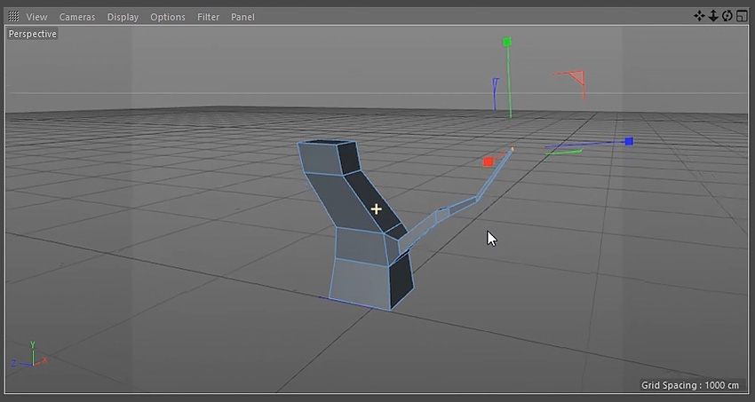
Extrude the polygons and use the Move Tool to change the direction of the tree trunk to give it an interesting shape.

Extruding polygons from the base

Step 4

Remember to taper the top polygon by using the Scale Tool.

Scaling down the top polygon

Step 5

Repeat the previous steps a few more times, using the Scale Tool and the Move Tool, until you are happy with the shape of the tree trunk.

Modelling the tree trunk

4. How to create Tree Branches

Step 1

To create the branches select the polygon for it’s point of origin using the Polygons button.

Once you have a polygon selected, secondary-click the mouse to bring up a menu and select Bevel from the list of options.

Selecting the bevel tool

Step 2

Click and drag on the selected polygon until you are happy with the shape of the bevel.

Using the bevel tool

Step 3

Use the Move Tool to extrude the branch out. Hold the Control Button on the keyboard whilst using the mouse to click and drag the selected polygon.

Extruding polygons for the branch

Step 4

Taper the branch using the same techniques used to taper the tree trunk. Play around using the Move Tool and the Scale Tool to get the best results.

Using the scale tool to taper the branch

Step 5

Keep extruding and tapering the branch out until you are happy with the overall shape. Remember to use the Move Tool to send the branch out into different directions.

Modelling and shaping the branch

Step 6

Choose another polygon on the branch and extrude another shape out.

Extruding and shaping the branch

Step 7

Repeat the steps above to create a second and third branch. Make sure to view the tree from different angles in the viewport. This will give you the most interesting shapes for the tree.

Creating a second branch
Creating a third branch

5. How to create Low Poly Leaves

Step 1

Navigate to the top menu and click and hold on the Cube Button. This reveals a menu with options to create more shapes. Select the Sphere. This will spawn a sphere in the scene.

Selecting the Sphere button

Step 2

Navigate to the top menu and click and hold the Bend Button. This will reveal another set of options. Select Polygon Reduction.

Selecting the Polygon Reduction button

Step 3

Drag the Polygon Reduction into the Sphere. This will reduce the amount of polygons in the sphere.

Dragging the Polygon Reduction into the Sphere

Step 4

Make sure Polygon Reduction is still selected. In the bottom window change the Reduction Strength until you are satisfied with the results.

Adjusting the Polygon Reduction strength setting

Step 5

Navigate to the top menu and click and hold the Bend Button again. This reveals another set of options. This time select Displacer.

Selecting the Displacer button

Step 6

Drag the Displacer into the Sphere. This changes the shape of the sphere and add more options.

Dragging the Displacer into the Sphere

Step 7

With the Displacer still selected, navigate to the bottom of the screen where the Displacer options are located. Select the Shading tab and click the arrow button next to Shader. Select Noise from the drop down menu.

Adjusting the Displacer settings

Step 8

Select the Object tab and adjust the Height until you are happy with the way the sphere looks.

Adjusting the Displacer settings

Step 9

Select the Sphere then select the Scale Tool. Make sure that the Model button is selected and use the Scale Tool to adjust the shape of the sphere until you are happy with it’s shape.

Scaling the sphere object

Step 10

Use the Move Tool to position the sphere correctly on the tree. Using all four views in the viewport can help with this. To do this, click on the middle button on the mouse.

Using the Move Tool to position the sphere

Step 11

Duplicate the Sphere by holding the Control Button and clicking and dragging the Sphere Object.

Duplicate the sphere object

Step 12

Move the new sphere to another position on the tree using the Move Tool. Adjust the look of the new sphere by selecting the Displacer and using the options as outlined in the previous steps.

Duplicating more spheres

Step 13

Continue to duplicate and position new spheres to create a look that you are happy with.

Creating the look of low poly tree leaves

Step 14

Repeat the steps to create leaves for the other branches of the tree.

Creating more low poly tree leaves

6. How to Group Objects

Step 1

Select all the Sphere Objects that belong to a group of leaves. Group objects by holding the Shift Key on the keyboard and selecting objects with the mouse.

Selecting a group of sphere objects

Step 2

With the objects selected press Alt-N to create a new group.

Grouping sphere objects together

Step 3

Use the mouse to select the Null Group and rename the group with a suitable name.

Renaming the group object

Step 4

Repeat the steps for each sphere group.

Renaming all the group objects

7. How to Colour Objects

Step 1

At the bottom of the screen click on the Create Button and select New Material.

Selecting the New Material button

Step 2

Double click on the Material and a new window will appear. Untick Reflectance.

Untick Reflectance in the Material Editor

Step 3

Select Colour and double click on the box at the top of the window.

Selecting the colour box

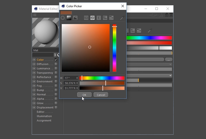
Step 4

Select a suitable colour for the tree trunk and then click the OK button.

Using the colour picker

Step 5

Apply the material to the tree trunk by clicking and dragging it to the object using the mouse.

Dragging the new material into the tree trunk

Step 6

Repeat the steps to create several different coloured materials for the leaves. 

Selecting new colours for more materials

Step 7

Apply the materials to the grouped objects.

Adding the new materials to the tree leaves

8. How to add Light to the Scene

Step 1

Choose a suitable angle in the viewport by navigating around the scene. Click on the Camera button at the top to create a camera.

Selecting the Camera button

Step 2

To set up the basic lighting, you’ll want to go to the Floor button located in the top menu bar. Left Click-Hold and then select Physical Sky from the menu.

Selecting the Physical Sky button

Step 3

Ensuring that Physical Sky is selected in the menu on the right, a new menu will appear on the bottom right of the screen. Select the Time and Location tab and choose a time using the left and right arrow keys. This will change the lighting of the scene. Choose a suitable time to light up the scene.

Adjusting the Time and Location

Step 4

To add additional lighting to the scene, select the Add Light button in the top menu bar at the top of the screen.

Selecting the Add Light button

Step 5

This will create a Light Object which you can move around the scene. Move the light object using the Move Tool to a suitable position.

Using the Move Tool to position the Light Object

Step 6

To customise the lighting further, experiment with the light object options in the bottom right of the screen. Here you can adjust the Intensity, Light Type and even Colour.

Adjusting the light settings

9. How to Render the Scene

Step 1

Click on the Render Settings button on the top menu bar.

Selecting the Render Settings button

Step 2

Choose the resolution, height and width of the image. This tutorial uses the settings 1920×1200 72dpi.

Adjusting the render settings for output

Step 3

Choose where you’d like to save the file and the file name. You may wish to tick Alpha Channel on, if you want to continue editing the image in another program such as Adobe Photoshop.

Adjusting the render settings for save

Step 4

Go to the Effect button at the bottom left and select both Ambient Occlusion and Global Illumination from the drop down menu. This will add these options to the render.

Selecting Ambient Occlusion and Global Illumination

Step 5

Click the Render button and wait for the render to finish.

Selecting the Render button

Conclusion

And with that, the 3D Low Poly Tree is complete. Feel free to share the own creations below. Explore different camera angles, lighting set ups and colours to find out what works best for the illustration.

You can also export the image to Adobe Photoshop to enhance it further or to use it as part of a larger scene or illustration. 

The final render of the low poly tree

Sofinco: Smart Money, Smart Life

Post pobrano z: Sofinco: Smart Money, Smart Life

Film
Sofinco

Advertising Agency:BETC, Paris, France
Production Company:Superette
Executive Producer:Armelle Fradet
Producer:Karine D’hont
DoP:José Luis Bernal
Director Assistant:Jean Paul Alegre
Production Design:Baptiste Glayman
Post Production:Mikros
Editor:Manuel Countant
Colorist:Emiliano Serantoni
Design:Albert Marcet, Elmo Studio
Animation:Albert Marcet, Elmo Studio
Recording Studio:Schmooze
Mix Studio:Klang
Voice Over Artist:Kester Lovelace

FlyStation: Love Flying?

Post pobrano z: FlyStation: Love Flying?

Film
FlyStation

Who are these men in white costume? Where is this place? What’s going to happen? The Indoor Skydivers featured in this movie are instructors at FlyStation Japan. Enjoy the magnificence, the art, and beauty in the “Mystery of Life”.

This movie is an expression of the tremendous power of the wind speed in FlyStation’s “Wind Tunnel”. You will be “blown away” with the maximum wind speed of 360km/h created by one of the most advanced wind tunnel technologies available.

Showing a sumo wrestler’s flight, this movie highlights the thrill of riding on winds with a maximum speed of 360km/h. Could this really happen? Enjoy the expression of “body ripples” never seen before, No CG was used!

Advertising Agency:Frontage, Tokyo, Japan
Creative Director:Yuki Asai
Copywriter:Yuki Asai
Art Director:Kuniyasu Obata
Creative Producer:Akira Suzuki
Account Executives:Kiri Bando, Rie Maruki, Vladimyr Cessant
Director:Shuhei Shibue
DoP:Ryuhei Watanabe
Light Man:Yuki Maeshima
Producer:Atsushi Yamamoto, Geek Pictures
Production Manager:Tomohisa Imagawa, Geek Pictures
Production Assistant:Taku Kudo, Geek Pictures
Stylist:Katsumi Miyasaka
Hair Make:Junko Ota
Music Producer:Junya Terui, MassiveMusic Tokyo
Editors:Hiroyasu Tsurukawa, Ayumu Yokoi
Assistant Director:Shunsaku Mayama

École Polytechnique: A Lifetime of Science

Post pobrano z: École Polytechnique: A Lifetime of Science

Film
École Polytechnique

Production Company:Troublemakers.Tv
Director:Fabien Ecochard
Executive Producer:James Hagger
Production Manager:Felipe Bernard
Production Assistants:Mathilde Siméon, Amel Djafer
Location Manager:Capucine Roux
1st assistant director:Mélanie Le Portier
DoP:Guillaume Adrey
1st Assistant Camera:Raphaël Dougé
Gaffer:Grégory Bar
Spark:Michael Jean
Grip:Clément Cantier
Set Designer:Audrey Malécot
Art Director:Rabeir Ourak
1st Assistant Art Director:Hacine Brahimi
2nd Assistant Art Director:Ertan Kaya
Costumer Designer:Marine Escurat
Hair:Clémence Sanvoisin
Makeup:Clémence Sanvoisin
Editors:Fabien Ecochard, Romain Boileau
Assistant Editor:Alexis Ghnassia
Nuke Compositors:Guilhem Ramisa, Soto & Pablo Gotor
Colorist:Thomas Canu
Catering:Pic & Chic
Music:Josette Music Club
Little Girl:Diane Lenz
Young Woman:Marion Gaillard
Dog:Jean-Louis The Dog

How to Create a Glazed Cookie Text Effect in Adobe Photoshop

Post pobrano z: How to Create a Glazed Cookie Text Effect in Adobe Photoshop

Final product image
What You’ll Be Creating

This tutorial will show you how to use Photoshop’s brush settings, layer styles, and adjustment layers to create a fun, bright glazed cookies text effect. Let’s get started!

This text effect was inspired by the many Layer Styles available on GraphicRiver.

Tutorial Assets

The following assets were used during the production of this tutorial:

1. How to Create a Gradient Background and Text Layers

Step 1

Create a new 1000 x 800px document, and click the Create new fill or adjustment layer icon at the bottom of the Layers panel to add a Gradient layer.

Create the gradient fill using the Colors #e8d2d6 to the left and #ddbcc0 to the right, and change the Angle to 107.

Gradient Layer

Step 2

Create the text in All Caps using the font Sniglet, and set the Size to 250 pt.

You can create the whole word at once, or, if you want a more dynamic result, create each letter on a separate layer.

If you are creating the letters separately, make sure to place each one’s layer in a group with the letter’s name.

Create the Text Layers

2. How to Create and Save a Stroke Brush Tip

Step 1

Pick the Brush Tool and open the Brush panel. Choose a hard round tip and use these settings:

Brush Tip Shape

Brush Tip Shape

Shape Dynamics

Shape Dynamics

Step 2

Click the Create new brush icon in the bottom right corner of the panel, change the Name to Cookie Stroke, and click OK.

Cookie Stroke Brush Tip

3. How to Create and Stroke a Work Path

Step 1

Right-click the text layer and choose Create Work Path.

Create Work Path

Step 2

Create a new layer on top of the text layer, name it Stroke, make sure that the Brush Tool is still active, and hit the Return key to stroke the path.

Pick the Direct Selection Tool (A), and hit the Return key again to get rid of the work path.

Stroke the Work Path

Step 3

Put both the text and Stroke layers in a group and name it Text and Stroke.

Text and Stroke Group

4. How to Style a Layer Group

Double-click the Text and Stroke group to apply the following layer style:

Step 1

Add a Bevel and Emboss with these settings:

  • Size: 7
  • Check the Anti-aliased box
  • Highlight Mode:
    • Color: #b08965
  • Shadow Mode:
    • Color: #d3a35e
    • Opacity: 35%
Bevel and Emboss

Step 2

Add a Contour with these settings:

  • Contour: Half Round
  • Check the Anti-aliased box.
Contour

Step 3

Add a Drop Shadow with these settings:

  • Color: #762b3d
  • Opacity: 38%
  • Distance: 3
  • Size: 5
Drop Shadow

Step 4

Add another Drop Shadow effect instance with these settings:

  • Color: #7d3848
  • Opacity: 50%
  • Distance: 15
  • Size: 25
Drop Shadow

This will style the main cookie shape.

Styled Cookie Shape

5. How to Add a Texture Image

Step 1

Open the Biscuits image, and pick the Elliptical Marquee Tool to select one of the cookies in the image. You can select only the part you want to use as well.

Go to Edit > Copy to copy the selected part.

Select and Copy the Texture

Step 2

Go back to the original document and go to Edit > Paste to paste the copied biscuit texture.

Place the pasted layer inside the letter’s group on top of the Text and Stroke group. Then, right-click the biscuit texture layer, and choose Create Clipping Mask.

Press Command-T to enter Free Transform Mode, and resize and rotate the texture until you like how it looks.

Hit Return to commit the changes.

Add the Cookie Texture

6. How to Contract a Selection

Step 1

Command-click the text layer’s thumbnail to create a selection.

Create a Selection

Step 2

Go to Select > Modify > Contract, and change the Contract By value to 5.

Contract Selection

Step 3

Create a new layer at the top of the letter’s group and name it Glaze 01.

Fill the selection with White, and press Command-D to deselect.

Fill Selection

Step 4

Duplicate the Glaze 01 layer and name the copy Glaze 02, and change the copy’s Fill value to 0.

Duplicate the Layer

Step 5

Place both glaze layers in a group and name it Glaze.

Glaze Group

7. How to Create a Smooth Glaze Style

Double-click the Glaze 01 layer to apply the following layer style:

Step 1

Add a Bevel and Emboss with these settings:

  • Size: 9
  • Soften: 9
  • Check the Anti-aliased box
  • Highlight Mode: Soft Light
    • Color: #b08965
  • Shadow Mode:
    • Color: #b69c5e
    • Opacity: 35%
Bevel and Emboss

Step 2

Add a Contour with these settings:

  • Contour: Half Round
  • Check the Anti-aliased box.
Contour

Step 3

Add a Texture with these settings:

  • Pattern: Clouds
  • Depth: 25%
Texture

Step 4

Add an Inner Shadow with these settings:

  • Color: #d3d1c8
  • Opacity: 35%
  • Distance: 3
  • Size: 7
Inner Shadow

Step 5

Add a Color Overlay with these settings:

  • Color: #f1efde
Color Overlay

Step 6

Add a Drop Shadow with these settings:

  • Blend Mode: Linear Burn
  • Color: #2c1c0b
  • Opacity: 15%
  • Distance: 3
  • Size: 3
Drop Shadow

This will create a soft glaze style.

Styled Glaze

8. How to Create a Textured Glaze Style

Double-click the Glaze 02 layer to apply the following layer style:

Step 1

Add a Bevel and Emboss with these settings:

  • Size: 7
  • Soften: 7
  • Uncheck the Use Global Light box
  • Angle: 85
  • Altitude: 26
  • Check the Anti-aliased box
  • Highlight Mode: Vivid Light
    • Color: #ffffff
  • Shadow Mode: Linear Burn
    • Color: #b1997c
    • Opacity: 28%
Bevel and Emboss

Step 2

Add a Contour with these settings:

  • Contour: Half Round
  • Check the Anti-aliased box.
Contour

Step 3

Add a Texture with these settings:

  • Pattern: Satin
  • Depth: 26%
Texture

This will create a more textured glaze.

Styled Glaze

9. How to Create More Letters

Repeat the same steps to create any more letters you need.

Use the Free Transform Mode to rotate the letters and place them however you like.

You don’t need to re-apply all the layer styles for each layer. Instead, you can right-click the styled layer, choose Copy Layer Style, right-click the new layer you want to apply the same layer style to, and choose Paste Layer Style.

Once you’re done, place all the letter groups in another group and name it Text.

Text Group

10. How to Create a Sprinkles Brush Tip

Pick the Brush Tool and open the Brush panel.

Choose a hard round tip and use these settings:

Brush Tip Shape

Brush Tip Shape

Shape Dynamics

Shape Dynamics

Scattering

Scattering

11. How to Create a Sprinkles Style

Step 1

Create a new layer on top of the Text group, and place it in a group with the name Sprinkles.

Sprinkles Group

Double-click the new layer to apply the following layer style:

Step 2

Add a Bevel and Emboss with these settings:

  • Size: 6
  • Uncheck the Use Global Light box
  • Angle: 98
  • Altitude: 53
  • Check the Anti-aliased box
  • Highlight Mode: Vivid Light
    • Opacity: 5%
  • Shadow Mode: Color Burn
Bevel and Emboss

Step 3

Add a Contour with these settings:

  • Contour: Rounded Steps
  • Check the Anti-aliased box.
  • Range: 59%
Contour

Step 4

Add a Color Overlay with these settings:

  • Color: #f88dc7

This is where you can choose the color of the sprinkles on the styled layer, so you can choose any color you like.

Color Overlay

Step 5

Add a Drop Shadow with these settings:

  • Color: #2a2826
  • Opacity: 20%
  • Distance: 2
  • Size: 3
Drop Shadow

12. How to Add Sprinkles

Step 1

Rename the styled layer to the color you chose for the Color Overlay effect, and copy its layer style.

Click-drag slightly over the letters to add the sprinkles. You can change the brush tip’s Spacing and Scattering values as needed to create an effect you like.

Add the Sprinkles

Step 2

Create new layers, name each one with the color you want its sprinkles to be, and paste the layer style to it.

All you need to do to change the sprinkles’ color is double-click the sprinkles layer, and choose a new Color value for the Color Overlay effect.

Color Overlay

Step 3

You can add as many sprinkle layers and colors as you like to fill the text with.

Add More Sprinkles

13. How to Add Global Adjustments

Step 1

Once you’re done adding the sprinkles, put the Text and Sprinkles groups in another new group and name it Cookies.

Cookies Group

Step 2

Add a Levels adjustments layer and clip it to the Cookies group.

Then, change the Highlights value to 6, the Gamma to 0.90, and the Shadows to 248.

Levels

Step 3

Add a Vibrance adjustments layer and clip it to the Cookies group, and change the Vibrance value to 20.

Vibrance

Step 4

Add a Brightness/Contrast adjustments layer and clip it to the Cookies group, and change the Contrast value to 15.

BrightnessContrast

Step 5

Place the Cement texture image on top of the Gradient fill layer, resize it to fit within the document, and rename its layer to Texture Overlay.

Change the Texture Overlay layer’s Blend Mode to Linear Burn and its Opacity to 50%.

Texture Overlay

Congratulations! You’re Done!

In this tutorial, we created a gradient background and text layers.

Then, we created a simple brush tip, used it to stroke the text, and styled the text and stroke layers to create the main cookie shape.

After that, we created and styled glaze layers, and created a sprinkles brush tip that we added on top of the glazed cookies and styled with different colors.

Finally, we used a couple of adjustment layers to add global adjustments to the effect.

Please feel free to leave your comments, suggestions, and outcomes below.

Final Result

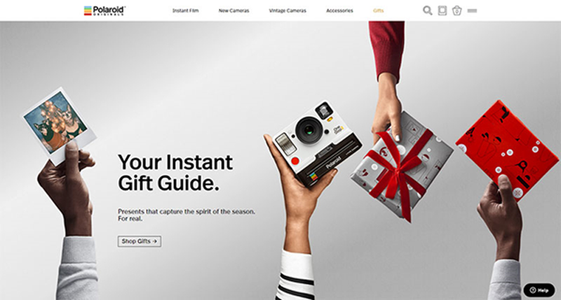
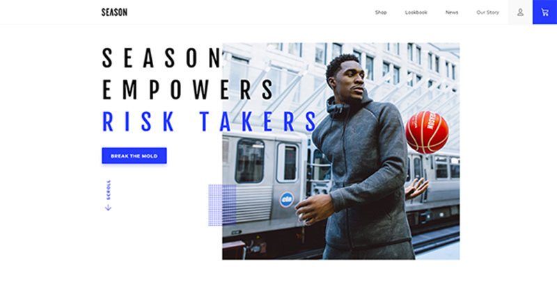
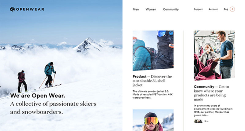
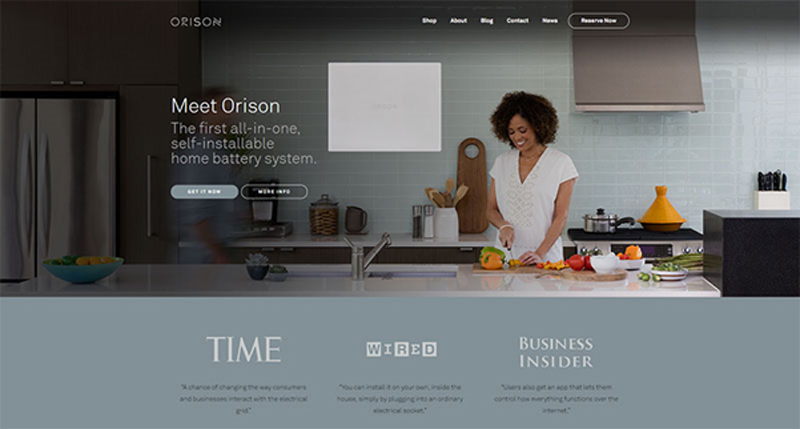
Important principles to follow when designing an eCommerce site

Post pobrano z: Important principles to follow when designing an eCommerce site

Do you remember the last time you had to contact support to help you check out? Odds are good you can’t, as a site that led you to a deal will also likely make the process smooth.

The high card abandonment rates that go beyond 50% are mostly recorded before initiating checkout, as it is at that point that customers decide whether they trust you or not.

While we can’t speak of universal customer retention rules in eCommerce, we can still share a couple of tips and fundamentals that can help designers build successful sites. Some of them are pretty self-explanatory, but with so many sites burning out in their attempt to attract attention, they shouldn’t be taken for granted.

Functional and simple navigation

It’s not exactly rocket science, isn’t it? Begin with your own examples: Would you purchase a piece you can get in 2 minutes, or scroll through tenths of options until you find what you need?

Conversions and complexity simply don’t go together. Shoppers find unrelenting categorization and excess menus and clicks fairly annoying, and they prefer an intuitive, no-brainer navigation.

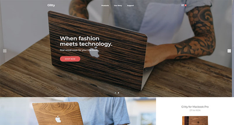
Speaking of which, we’re not insinuating that you should create an overly simple website. A menu, for instance, is an absolute must, and so are the basic headers and subtitles that help understand the hierarchy of the website.

Quantity is not the only thing you should worry about – what matters is also whether the options are clear, for the sake of which you should use one- to two-word headers. The tone should be transparent and direct, ideally combined with fun and engaging wording that is still on point.

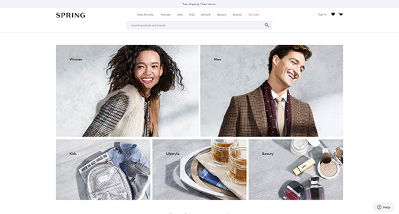
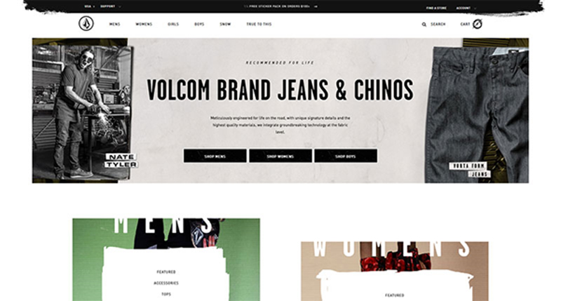
For instance, it may sound like a great idea to label the categories of apparel eCommerce websites as ‘Kicks’ or ‘Threads’, but not everyone in its audience would be able to understand them. Plain and straightforward titles have 9x bigger chances to retain more clients.

Familiarity is another thing people appreciate while shopping online. An arrow pointing to the left is expected to lead to the previous page, the same way a pointing finger should enable them to click on a link.

To make your clients’ shopping experience even friendlier, stick to symbols they can understand.

Before the site goes online, check whether all your navigation options are functional. The last thing you want is that your client will navigate for ages through your intricate and confusing sections, only to discover a 404 error or another inconvenient problem.

Also, I know you want to create cool websites, but remember that those that are popular are also cool because they’re functional at the same time. Don’t sacrifice usefulness for the sake of creating something that only you like.

The influence of color and type

Colors and typography can make or break an eCommerce website, which makes them your leading tools.

Using the right font and palette, retail sites manage to attract and convince thousands of users to check their promotions and to buy their products. Here is how they do it:

Is it readable?


Typography leaves enough room for many engaging experiments, and designers adore it. They shape, twist, and contour letters, and transform words into skillful and beautiful works of art.

Yet, you must keep in mind that not all visitors come with a refined taste in art, and they may not understand what you’re trying to sell them. Your message should always be readable, up front, and at point, so that it will bring you the answer you expect.

Fun copy is an alternative you should definitely consider.

Consistent types

Make sure that the headers on your site are consistent with the sub-headers and body copies.

This, however, is only a small portion of coming up with a well-defined style for your website, a mission that requires you to be very patient, and one that will never be entirely accomplished. You should think of your website’s style as a living document, and work on it each time your brand undergoes a change.

Customers do recognize uniqueness as they see it, and it is your task to make that happen. To do so, you can always learn from best performing styles in your industry, and try to incorporate their practices on your own website.

Depending on how complex your offer is, you can divide this document into two distinct parts: a guide on creativity and style, and a guide on copy style, and build up the perfect website step by step.

Familiarizing with your brand and your audience

Will 10 seconds be enough for you to describe what your eCommerce website is selling? Could your customers or employees describe it in the same way? If the answer is no, you should take some time to analyze your brand and its current position on the market.

Once you have all details, it will be much easier to take the right steps to position it among competitors, and build up the right style to attract more customers.

Those working with a popular and established brand have a huge advantage, and they should keep up the good work and make customers even happier.

Another important task is to analyze your audience. What can be done to target even more buyers and to boost your revenue? In most cases, designers lack the proper identification of targeted demographics, and end up creating a site that doesn’t feel too comfortable to its visitors.

In cases like these, websites are risking losing the trust factor. Given that there is no salesperson to lead customers to checkout, you must make sure they understand the sales funnel and that they trust your brand.

Balance between form and function

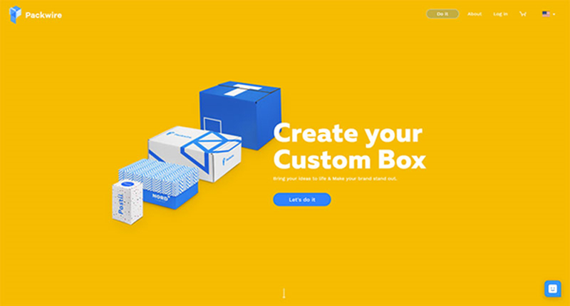
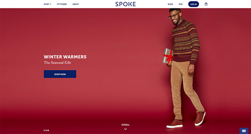
eCommerce websites are not only supposed to be functional, but eye-catchy as well. This is the reason they are entrusted to creative people who know exactly how to attract traffic.

Yet, the quality of your design should not overcome the quality of your products, but rather answer the common questions of customers, and address their needs.

To ensure your customers are motivated to purchase your product, promote it using the services of a professional and experienced web designer.

Automated search

A search feature is compulsory for any eCommerce website, and there are no exceptions to this rule. It would be overly ambitious to believe that all customers browse randomly to discover a piece they like – in fact, most of them arrive with defined expectations, and want to locate the product in few seconds.

To improve their experience, you can take the search feature to a whole new level, and enhance it with an auto-complete functionality.

This means that users will receive automated suggestions before they’ve typed in the entire word, which aims to help foremost horizontal sellers targeting a well-defined audience.

Ending thoughts

Commerce businesses of today rely heavily on quality websites to close more deals. As a matter of fact, for certain retailers, websites are the only interaction portals for their customers, and they do their best to provide them a great shopping experience.

With competition being as harsh as it is, surfers are becoming intolerant to poorly designed websites, meaning that it takes a masterpiece to attract their attention, and to maximize your chances of success.


Système U Christmas Instore

Post pobrano z: Système U Christmas Instore

Système U stores in France are running a Christmas marketing campaign with a television commercial highlighting one of the founding values of the company : proximity. U’s merchants come from the region where their store is located. Their commitments in local life, taken independently, are daily embodied in the actions of their stores – both socially and economically. U is naturally close to its customers and is committed to taking care of them – and what better time than Christmas to reassert this link? U and TBWA\Paris brought to life a touching Christmas tale conveying the idea that we can all take care of each other as well as we take care of those we love. The commercial, “Chez U, NoëlEnsemble”, presents a store manager’s generous gift of time and fun for a lonely pensioner (and a lucky lobster).

Système U Christmas

Système U Christmas Credits

The Système U Christmas campaign was developed at TBWA\Paris by executive creative directors Benjamin Marchal and Faustin Claverie, head of TV Maxime Boiron, TV producer Amer Zoghbi, account management team Luc Bourgery, Philippe Senejoux, Delphine Abou, Eva Mellul, working with U marketing team Sandrine Burgat, Laurène de Demandolx, Céline Guérin.

Filming was shot by director Vincent Lobelle via Insurrection.

Sound was produced at TBWA\Else by head of music and sound Olivier Lefebvre, sound and music team Ferdinand Huet, Thomas Jacquet et Eliot Just. Music is “Prisoner” by Har Mar Superstar.

Media was handled by My Media.