Wszystkie wpisy, których autorem jest admin

10 Essential Adobe Photoshop Brushes You Should Own

Post pobrano z: 10 Essential Adobe Photoshop Brushes You Should Own

To celebrate ten years of Envato Tuts+, we’re giving away this essential pack of Photoshop brushes! Learn how to create your own, and find more inspiration from our trusted tutorials.

10 Essential Brushes You Should Own

Do you love Photoshop brushes? So do we! Create magical paintings and manipulations with incredible, high-resolution brushes. In this collection of essentials, I’ll show you various basic and texture-based brushes every designer should own. 

How to Create Custom Photoshop Brushes

To build the ultimate toolkit, you’ll need amazing Photoshop brushes. They’re super easy to make, and you’ll be glad you made them in the long run.

Here is the method I’ll be using to create most of these brushes. Feel free to leave any questions for more clarification.

1. Basic Round Brush

I’ll try not to play favorites here, but after painting for nearly ten years, I generally stick with a basic round brush. Here’s the reason:

1 Round Brush = Many, Many Brushes

You see, the Round Brush stands alone. It’s the first brush you’ll get to know and the one you’ll never put down. But you also won’t want to! You can use it for photo editing, painting, calligraphy, and so many other cool projects.

Here are a few examples of the type of magic you can make with a round brush:

The standard Round Brush features 100% Hardness, which usually stumps people in the beginning. It can feel very reminiscent of Microsoft Paint (RIP), but it doesn’t have to.

Instead, take advantage of learning about Brush Opacity and pen pressure sensitivity. If you have a graphics tablet, you’ll be blown away by the amount of options and flexibility available.

I, for example, like to have at least one Photoshop Round Brush with 100% Hardness and no extra pressure settings. A blunt brush that reminds me to think about crisp details often.
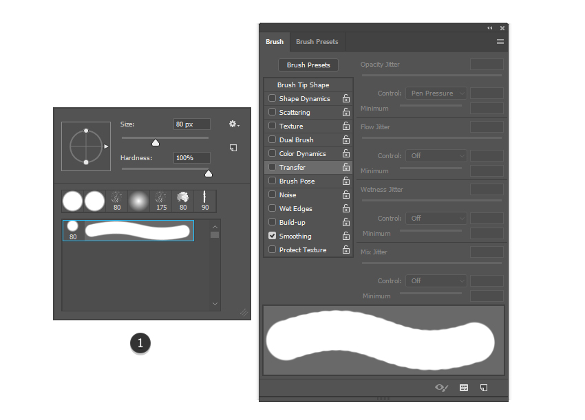
Basic Round Brush
Simple brushes like this are made using the Create New Brush option.

But like many people, I like having choices.

So I’ll show you two examples of how to work with this brush with different settings. Bring up the Brush panel (F5). Now go to Shape Dynamics. Change the brush Control to Pen Pressure.

For sketches, comics, and general inking, use this brush.

Sketch Round Brush

For soft, atmospheric effects, and general blending, you can try this brush below. All you have to do is lower the Hardness to 0% and set the Transfer to Pen Pressure.

Don’t worry, you won’t have to remember these settings—I’ve included them as bonuses with our pack!

Bonus Soft Round Brush

Still having trouble with the basics? Here are a few more tips!

  • Vary the Brush Opacity often.
  • Use 50–100% Hardness to create crisp, clean details.
  • Use 0–50% Hardness for general blending and shading.
  • If you’re pressing too hard on the tablet, then the Opacity is too low.

2. Grunge Brushes

Despite all of the minimalism we see, grunge brushes are here to stay. Just like round brushes, they hold an important place in our essential brush kit.

So what can you use them for?

Just about anything. Grunge brushes are so varied in texture, style, and overall complexity that you can use them for a variety of projects. Check these out, for instance:

Grunge brushes are usually made from texture stocks. Some of the more common ones come from paper, stone, and glass images.

So for the next brush in our pack, I’ll create one using this paper image. Feel free to play with Adjustment Layers for more variation.

Grunge brush pack

Subtle textures are more flexible, so a simple grain like this is multipurpose for any creative need. You can also try out more images for incredible effects.

3. Drip and Splatter Brushes

Though still considered grunge, drip and splatter brushes are next up on the list for basic Photoshop essentials.

Horror, retro, and antique design are all amazing styles creatives love. And although these brushes seem mostly gruesome, drip and splatter textures are actually a natural part of weather and erosion.

Here are two completely different results using drip and splatter elements:

This splatter was created using the bristles of a paint brush to flick paint onto paper. If you need some ideas for how to use this brush, consider trying it out on an explosive effect. Or add more debris to a post-apocalyptic scene with just a few clicks.

Splatter Custom Brush

Learn how to create Gothic photo manipulations with blood and splatter. Give this fun tutorial a try:

4. Watercolor Brushes

Every designer should have a set of watercolor brushes. They add great texture to any design and are often multipurpose.

But what can you use watercolor brushes for?

Watercolor brushes are perfect for:

  • print design
  • text effects
  • photo manipulations
  • paintings

Here are a few tutorials to inspire your watercolor creations:

For this set, I’ve included several brushes for your projects. These brushes are made using very diluted paint and a soft bristled brush.

Watercolor Brushes

Want to create your own watercolor brushes? Check out this tutorial:

5. Smoke and Fire Brushes

Fire is so hard to replicate that many artists just give in with a stock. And there’s absolutely nothing wrong with mixing multiple mediums.

Using these brushes is also pretty simple. Anytime you need a bit of smoke or fire, just click once (or a few times) on the canvas.

Want to see these in action? Check out these tutorials:

Great for designers, matte painters, and photo manipulators, smoke and fire brushes create realistic, fiery details with fantastic atmosphere.

To create a Smoke Brush specifically, you’ll need a high-resolution image first. I’ll be using this smoke image from Envato Elements. Hold Control-I to Invert the image.

Then use the Rectangular Marquee Tool (M) and go to Edit > Define Brush Preset to create your new brush.

Custom Smoke Brush

It’s that simple! Gather dozens of smoke images to create your own smoke brush set!

6. Geometric Brushes

Going all the way back to the Egyptians, geometric design has always been a huge part of art and creativity. And you can explore elegant designs with various minimal shapes.

Get started with a photo effect for more experience with geometric elements. Try out this fun Photoshop tutorial to learn how:

When it comes to creating the actual brush, keep it simple sweetheart! Here I used Photoshop’s Shape Tool to create a multipurpose circular brush.

Circle brush

This brush can be used to create awesome tube designs or texture for clothing and metal. Keep the Brush Opacity between 70–100% to accentuate the pattern, or at low levels like 1–20% for a bit of grunge.

7. Art Brushes

Whenever you want to feel like Da Vinci, just open Adobe Photoshop. You too can feel like your favorite traditional artists, even with digital software.

Art brushes are used to create beautiful artistic effects. They simulate traditional art strokes and are used in collaboration with normal round brushes. Check out these tutorials for more painting inspiration:

The best way to create these brushes is to go back to the basics.

Use a simple brush along with acrylic paint to paint several brush strokes. Scan them into your computer or just take a quick picture with an iPhone.

Art Brushes

Here I’ve created two different brushes made from the same paint stroke. The first is the original paint texture, and the second mimics the actual art form. Experiment with both to find the style you like.

8. Star Brushes

Another popular trend highlights the spectacular outer space. Star brushes allow artists to paint dozens of tiny star dots in fewer steps.

Want to see them in effect? Master beautiful star and flare light effects with these tutorials:

Select the Brush Tool (B) and use a Hard Round Brush at 100% Opacity to create many small dots on your canvas. Then use the Polygonal Lasso Tool (L) to follow the same steps as before to create your custom brush.

Star Photoshop Brush

Add small clusters of stars to your landscape paintings for realistic night-time environments.

9. Realistic Hair Brushes

Google recently told me that our hair contains 100,000 hair follicles. 100,000!

Will you be painting them all by hand? I certainly won’t!

Use hair brushes to make the process easier! Yes, it’s true! You can paint dozens of hair strands with a single brush stroke. Learn how to paint realistic hair from these tutorials:
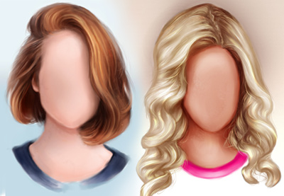
To create a Photoshop hair brush, the process is pretty simple. Use the Brush Tool (B) again, at full Hardness and Opacity.

Paint four black dots in a row. Capture these dots as a custom brush. Then enable Pen Pressure under the Shape Dynamics and Transfer settings for a fluid result.

Use this efficient hair brush to save valuable time!

Hair Brush

10. Nature Brushes

Build a forest without ever drawing a single tree. Nature brushes are essential for a fast painting workflow.

And the best types of brushes are usually in the form of a silhouette. These brushes can be used to paint background bushes, flowers, and more. Learn how to work with natural brushes with these tutorials:

For this brush, I used this 3D object from Envato Elements. After downloading the tree at the angle you prefer, pass it through the Threshold filter at a high level. Enjoy a clean silhouette effect that can help you overcome depth of field issues.

Nature Photoshop Brush

Nature brushes can also be made from high-quality stocks! Check out this video to create a custom leaf brush set:

Get the Essentials!

Conquer the Brush Tool one tutorial at a time. Experiment with different styles and textures by downloading brushes from your favorite artists.

Essential Photoshop Brush Pack

New to Photoshop? No problem!

Learn more about the Brush Tool to make the most out of these assets:

Design deals for the week

Post pobrano z: Design deals for the week
first image of the post

Every week, we’ll give you an overview of the best deals for designers, make sure you don’t miss any by subscribing to our deals feed. You can also follow the recently launched website Type Deals if you are looking for free fonts or font deals.

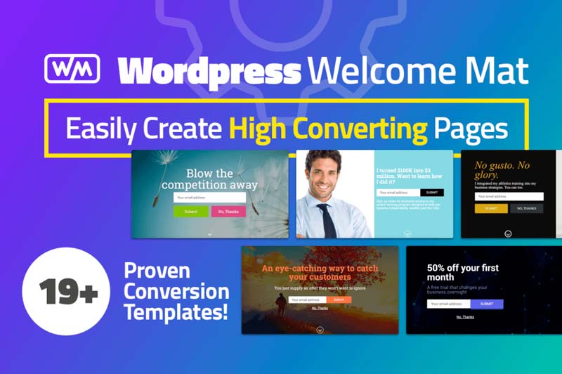
Increase Website Conversions with WordPress Welcome Mat

Want to easily capture member emails? Now you can with a simple call-to-action page. This Mighty Deal features more than 19 Welcome Mat templates with clear CTA buttons to greatly increase your site conversions. Fully customizable and easy to export your data, you won’t find a warmer welcome on the Web!

$27 instead of $100 – Get it now!

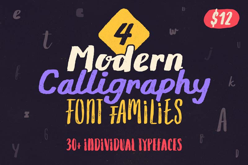
4 Modern Calligraphy Font Families, 30+ Individual Typefaces

Need a brush font for your latest project? Then you can stop your search because this Mighty Deal from Typsketchbook has you completely covered. Full of 4 Modern Calligraphy Font Families, your typeface toolbox will be overflowing with sketch styles from brush to ink pen to marker, all thanks to the 30+ individual typefaces included in this deal.

$12 instead of $407 – Get it now!

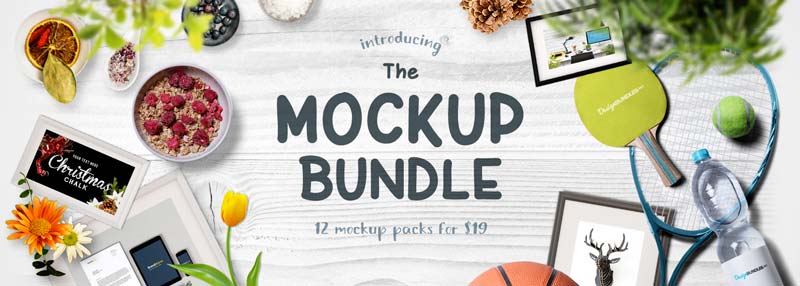
The Mockup Bundle

This bundle includes 12 mock up packs perfect for crafters, designers, design & marketing agencies, branding & merchandise companies + anyone who wants to achieve that professional image. You can save 90% off the RRP for a limited time only.

$19 instead of $181 – Get it now!

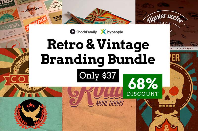
2000+ Professional Retro & Vintage Design Elements

It’s time to relive the past with this amazing Retro & Vintage Branding Bundle from DesignShock! A great bundle of bundles, this collection of 4 retro-style bundles includes a variety from hipster vectors to vintage business cards. You’ll snag more than 2,000 design elements including brushes, textures, actions, vectors, icons and more to give your latest project a totally retro vibe.

$37 instead of $116 – Get it now!

ASSEMBLY: A Robust Multipurpose Theme with Page Builder

Talk about a powerful, responsive and multipurpose website template! Built on the bootstrap framework, Assembly lets you easily build out any type of site you want using contemporary modular blocks. Toss in 1000s of usable photos, 18 pre made pages, and 700+ icons, and you’ve got the makings of a masterpiece.

$9 instead of $17 – Get it now!

How to Create a Celebration Countdown Sticker Set in Adobe Illustrator

Post pobrano z: How to Create a Celebration Countdown Sticker Set in Adobe Illustrator

Final product image
What You’ll Be Creating

In today’s tutorial we’re going to learn how to create a set of messenger stickers to share on our chat apps. We will use basic Adobe Illustrator geometric
shapes and tools, grasping some quick, useful tips along the way.

I have roughly sketched out the concept that we will be creating: the numbers from 10 to 1 in various balloon forms and fireworks. If you’re looking to speed up your workflow or buy similar illustrations, you can always head over to GraphicRiver to buy graphics to decorate the pack.

Let’s start popping with our balloon countdown!

sketch concept celebration baloon countdown tutorial

Tutorial Assets

In order to complete this tutorial, you’ll need the following:

1. How to Set Up the New Project File

Step 1

Start up Adobe Illustrator.

Let’s set up
a New Document (File > New or Command-N)
using the following settings:

  • Name: Celebration_Countdown
  • Width: 512
    px
  • Height: 512
    px
  • Units:
    Pixels
  • Number
    of Artboards:
    11
  • Color Mode: RGB
  • Click Create
Create New Document Pixels RGB

2. How to Illustrate the Balloon Shapes & Numbers

Step 1

Begin by typing in the countdown numbers, 10 to 1.

Open the Character panel: Window > Type > Character (Command-T). Select the Type Tool from the Tools panel. Choose a bubble-like font; for example, I used Sniglet. Set
the stroke color to null, with black fill color. 

From the Character panel, set the font size to 215 pt, and type onto each Artboard the corresponding countdown number, 10, 9, 8, 7, 6, 5, 4, 3, 2, 1, and leave the last artboard empty.

Sniglet font Type countdown Number characters Type Tool

Step 2

Let’s begin drawing our balloon shapes.

First you need to transform all the type into objects. To do so, Select > All (Command-A), to select all the numbers. Next, Type > Create Outline, to turn the numbers into objects.

Select All Type Create Outlines

Step 3

From the Tools panel, select the Pen Tool (P), and set
the stroke color to black, with no fill color. Draw in all the balloon shapes freehand except the circular ones, for which you can use the Ellipse Tool (L).

Then from each artboard select the elements, expand them gradually to fit within the artboard space, and rotate them slightly to create a floating illusion.

Pen tool Ellipse Tool Draw Balloons

Step 4

Next, take the Selection Tool (V), select all the black filled numbers, and  Shift-X as a shortcut to swap fill with stroke color.

Then select the balloon shapes and Object > Path > Offset Path. Set Offset at -13px and Joins: Round, then OK.

Object > Ungroup (Command-Shift-G), to ungroup them from one another.

Path Object Offset path SWap Shift X

Step 5

Select the Pen Tool (P), from the Tools panel, keeping
the black stroke color, with no fill. Draw the inner balloon highlight and shadow areas.

Pen tool Draw highlights shadow Balloons

Step 6

We need to put in the balloon strings.

Start by opening the Brushes panel: Window > Brushes. Then from the panel menu: Open Brush Library > Show Calligraphic Brushes > Artistic > Artistic_Calligraphic library.

Choose the 10pt Calligraphic Brush, from the Artistic_Calligraphic library. Then select the Paintbrush Tool (B), with a black stroke, no fill, and draw the balloon strings for each balloon.

File > Save (Command-S).

Calligraphic Brush Paintbrush tool draw balloon strings

3. How to Color & Add Effects

Step 1

Let’s color!

First, give the following colors to the inner, outer and balloon knots:

  • Pink: Inner (#FA3D9E) : Outer (#FFA1D5) : Knot (#DD1482)
  • Blue: Inner (#2B8EF9) : Outer (#5FD2FF) : Knot (#0977DB)
  • Red: Inner (#F63536) : Outer (#FF9CBB) : Knot (#E01C1D)
  • Green: Inner (#71BA0B) : Outer (#ABED27) : Knot (#5F9B00)
  • Yellow: Inner (#FFDC0D) : Outer (#FFFB73) : Knot (#FFBC00)

Make sure to change the stacking arrangement of your objects as you move along.

To Arrange top or bottom in position: Object >
Arrange > Bring to Front
(Shift-Command-]) or Object > Arrange >
Send to Back
(Shift-Command-[).

To Arrange one step front or back: Object > Arrange > Send Backward (Command-[) or Forward
(Command‑]).
Object > Arrange > Bring Forward.

Give the fireworks red and yellow colors.

Color Fill and Arrange Objects Front Back Shortcuts

Step 2

Next, let’s add gradient color to the numbers.

Open the Gradient panel: Window > Gradient. Apply the following gradients:

  • Yellow: #FFDC0D to #FFBC00 set at -90° angle
  • Red: #F63536 to #E01C1D set at -90° angle
  • Green: #71BA0B to #5F9B00 set at -90° angle
Color Gradient panel 90 degree angle

Step 3

Next, let’s add some highlights.

Open the Transparency panel: Window > Transparency. Take the Selection Tool (V) and select all the balloon highlights. Remove the black stroke color, and select Fill (X).

Then from the Transparency panel, set Blending Mode to Screen. On the Gradient panel, choose a white fill for the left gradient slider, and set an Opacity of 80%, fixed at a -45° angle.

Afterwards, choose a white fill on the right gradient slider, and set its Opacity to 0%.

gradient opacity screen transparency panel highlight 45 angle

Step 4

Then move on to placing the shadow gradients.

Start with the shadow area of the pink: Take the Selection Tool (V) and select all the balloon shadow areas. Remove the black stroke color, and select Fill (X). Choose Blending Mode: Multiply, from the Transparency panel.

Then on the Gradient panel, choose a dark pink color fill on the left gradient slider, and set Opacity: 80%, at a 120° angle. On the right gradient slider, keep it white and set Opacity at 8%.

color gradient mulitply transparency opacity angle shadows

Repeat the same steps for the other shadows, except match the dark color gradient slider with the respective colors, so dark red slider with red, dark green on green balloons, etc.

color gradient mulitply transparency opacity angle shadows

Step 5

After, with the Selection Tool (V), select each balloon string and give it a stroke color of your choice. Make sure all are sent back: Object > Arrange >
Send to Back
(Shift-Command-[).

apply color stroke strings balloon

Step 6

Let’s add some shine.

From the Tools panel, under the Paintbrush Tool (B) dropdown, select the Blob Brush Tool (Shift-B). Select a white fill.

Then choose a Blob Brush Tool size by holding the left square bracket key ([) to decrease and the right square bracket (]) to enlarge the brush size, to draw some shine blobs on the balloons.

Paintbrush Tool Blob Brush Shift B Highlights

Step 7

Afterwards, add highlights to the numbers.

Use the Blob Brush Tool (Shift-B), but instead of a white fill use light color tones, and apply Screen: Blending Mode from the Transparency panel.

Blob Brush tool Transparency Screen Blending Mode Highlights

Step 8

Let’s draw some confetti!

Draw the confetti using the Paintbrush Tool (B). Use the 5pt Oval brush from the Artistic_Calligraphic library and use a 2-3pt Stroke Weight.

Try drawing confetti swirls with different colors and stroke weights.

Paint Brush Tool Artistic Calligraphic Brush Stroke

Step 9

Add more confetti using the Ellipse Tool (L), Star Tool and Rectangle Tool (M), and use different colors and shape sizes. Note: Don’t draw tiny elements.

Then Arrange to the front or back: Object >
Arrange > Bring to Front
(Shift-Command-]) or Object > Arrange >
Send to Back
(Shift-Command-[).

Looking colorful!

USe ellipse Star Rectangle tool Arrange Front Back Color

Step 10

Next, we need the numbers to pop out a bit.

Use the Selection Tool (V) to select the numbers inside the balloons: 10, 9, 7, 5, 4, 3, and 1. Duplicate the selection by Shift-Option-Dragging slightly lower.

Give the selection a yellowish gold color #CCB842. Then set the Blending mode to Multiply, from the Transparency panel.

You will need to Arrange one step back: Object > Arrange > Send Backward (Command-[.

Selection Duplicate Blending Mode Multiply Arrange Balloons

Step 11

Finally, use the Selection Tool (V) to Group (Command-G) each balloon with its respective parts, center it on the artboard, scale it, and modify anything you find misfitting.

File > Save (Command-S).

Group Selection Center Artboard Modify Balloons

4. How to Export & Share

Step 1

Once you’ve finalized the artwork, you need to Export your files.

File > Export > Export As, and select a location for the file. Make sure to choose a PNG format, and select Use Artboards to Export.

Set the PNG Options settings:

  • Resolution: Screen (72 ppi)
  • Background Color: Transparent
  • OK
PNG Options Export transparent background files

Step 2

Now that you have created your sticker set, it’s time to upload it.

Head over to Sticker Market, and Register yourself a Creators Account, and wait to get verified. This is a relatively quick process, compared to other sites. Once you are verified, fill in your details.

Follow the sticker upload Guidelines. Upload the set, fill in the description, price and tags, and Save.

StickerMarket Misschatz Creator Upload Set Celebration Stickers

Step 3

On the next page, select the type of Action and Emotion for each sticker. Fill in the details and Save for submission.

sticker market details tags sticker set save

Wait for approval, and your stickers will be ready for the public to purchase.

stickermarket celebration countdown sticker set sell

10, 9, 8, 7, 6, 5, 4, 3, 2, 1…..Congratulations!!!

Hope you had fun following this tutorial and you were able to learn some useful tips.

I would love to see what you create! Please feel free to share your sticker designs with us.

Count down, have fun, and share with your friends on chat messengers like WhatsApp, Viber, Line, iMessage and more on Android or iPhone!

Final Balloon Countdown Sticker Set Stickermarket

Breaking the Grid

Post pobrano z: Breaking the Grid

If you thought CSS Grid solves issues where overflowed content escaping the confines of a horizontal layout, then think again. Dave Rupert writes up two ways he unintentionally broke outside the grid and how he wrangled things back into place.

As a Front-End developer nothing bothers me more than seeing an unexpected horizontal scrollbar on a website. While building out a checkout layout with CSS Grid I was surprised to find something mysterious was breaking the container. I thought Grid sort of auto-solved sizing.

Eventually I found two ways to break CSS Grid. As it would happen, I was doing both in the same layout.

Turns out these special cases boil down to:

  • Using overflow-x on an grid element
  • Using grid on form controls (or, more specifically, replaced elements)

Dave’s solution is a set of CSS rules affectionately named Fit Grid, which is a helper class that effectively removes and replaces the automated min-width: auto property assigned to grid items. This is a super helpful resource, though he admits it toes the line of „Clearfix 2.0” territory.

Direct Link to Article — Permalink


Breaking the Grid is a post from CSS-Tricks

Building a design system for HealthCare.gov

Post pobrano z: Building a design system for HealthCare.gov

Sawyer Hollenshead has written up his thoughts about how he collaborated with the designers and developers on the HealthCare.gov project.

In this post, I’d like to share some of the bigger technical decisions we made while building that design system. Fortunately, a lot of smart folks have already put a lot of thought into the best approaches for building scalable, developer-friendly, and flexible design systems. This post will also shine a light on those resources we used to help steer the technical direction.

There’s a lot going on in here, from guidelines on code architecture and documentation to build systems and versioning. In other words, there’s a lot of great detail on the inner workings of a massive public project that many of us are at least outwardly familiar with.

Interesting to note that this project is an offshoot of the United States Design Systems project, but tailored specifically for the Centers of Medicare & Medicaid Services, which oversees HealthCare.gov.

Direct Link to Article — Permalink


Building a design system for HealthCare.gov is a post from CSS-Tricks

Renault: Yellow Teapot

Post pobrano z: Renault: Yellow Teapot

Media
Renault

Advertising Agency:Publicis Conseil, Paris, France
Executive Creative Directors:Marcelo Vergara, Cédric Gueret
Senior Copywriter:Jean-Laurent Py
Senior Art Director:Cedric Auzannet
3d:Pierrick Lamoureux
Account managers:Adrien Dumont, Domitille Bouvier, grégoire_Bautier, Lisa Wey
Planning:Filippo Del’Osso, Nicolas Izel
Director:Jean-Paul Frenay
Sound Producer:Fabien Cornec
Production House:Prodigious
3d Production:Audrey Lagnous, Mathieu Gérard, Nicolas Bossu
Producers:Manuel Henoque, Romain Guilbert, Melissa Adali, Sarah Vavasseur
Postproduction:Solveig Pastor, Tara Galy-Nadal
3D postproduction:Matthieu Royer, Prodigious, Fanny Bilani, Arthur Paux, Olivier Zibret, Benoit Messager, Mathieu Destrade, Stephen Plongeon, Reepost
Film Editor:Aaron Fuks
Sound Design:Marcelo Baldin, Combustion Studio

Logitech launches the perfect keyboard for designers

Post pobrano z: Logitech launches the perfect keyboard for designers
first image of the post

At IFA 2017 in Berlin, Logitech unveiled its latest high-end keyboard that includes a multifunctional scroll wheel on the left hand side. This scroll wheel is the secret weapon that makes this keyboard so good for power users.

With keys that make it somewhat similar to a laptop keyboard, Logitech added a little hollow to each key to make it more ergonomic and user-friendly. Material-wise, the Craft keyboard is based on a metallic plate with added aluminium, it uses a battery that can be charged using a USB port.

The scroll wheel is definitively the strong point of the keyboard, and probably the best reason to buy it. It can be used for many functions in Photoshop, Word, Adobe Premiere, or Google Chrome. It can for example be used to change tabs very fast in Chrome, or to go from a screen to another in Premiere. Of course, there will be a learning curve, but the features are quite stunning.

McDonald’s McCafé: Employee Commentary

Post pobrano z: McDonald’s McCafé: Employee Commentary

Film, Online
McDonald’s Canada

Venture behind-the-scenes for the making of McCafé’s unique speciality coffees. McCafé is a proud sponsor of the Toronto International Film Festival.

Advertising Agency:Cossette, Toronto, Canada
Chief Creative Officer:Peter Ignazi, Carlos Moreno
Group Creative Director:Ed Morris
Creative Director:Jonathan Careless, Troy Mcguinness
Senior Art Director:Andrew Bernardi
Senior Copy Writer:Lee Cristiano
Agency Producer:Tony Desousa
VP of Strategy:Scott McKay
Senior Content Strategist:Carly Miller
Account Executive:Dane Armstrong
Account Supervisor:Nicole Bakker
Group Account Director:Geoff Wilton
Svp:Kathy Mcguire
Managing Director:Kathy Mcguire
Production & Editorial House:Skin & Bones
Executive Producer:Dan Ford
Line Producer:Luke Bryant
Offline Post Producer:Tanja Harney
Director:Taso Alexander
DoP:Barry Parrell
Editor:Mitch Finn
Audio House:Pirate Audio
Audio Mixer:Joanne Uyeyama
Track Director:Tom Eymundson
Colour Transfer and Online:The Vanity
Colourist:Andrew Exworth
Flame Artist:Michael Mederios
Online Producer:Kayla Baxter
Casting House:Mann Casting
Casting Director:Steven Mann
Client:McDonald’s Restaurants of Canada Limited
Senior Marketing Manager – Eastern Canada:Chuck Coolen
Regional Marketing Supervisor:Andrew Mumford