Wszystkie wpisy, których autorem jest admin

Kragen

Some Scent

Covers

Mr Jukes “Leap Of Faith”

How to Create an Engraved Stone Text Effect in Adobe InDesign
Post pobrano z: How to Create an Engraved Stone Text Effect in Adobe InDesign

You can’t miss this Games of Thrones-style type effect. Perfect for posters and social media that need to command attention, this effect is also super quick and easy to create using Adobe InDesign.
How to Create an Engraved Stone Text Effect in InDesign
To create this effect, you’ll need a simple stone background (try this texture from PhotoDune for a marble effect or this Pixabay background for a more grungy effect), and a chunky font (here I’ve used Charlevoix Pro ExtraBold).

Step 1
Set up a new document in InDesign (File > New > Document) at A4 landscape size or a page size you prefer. Then create two layers, Background below and Type above. Lock Type to work on the Background layer.
Take the Rectangle Frame Tool (F) and drag to create an image frame that extends across the whole page. Go to File > Place, choose your stone background image, and click Open. Allow it to fill the whole frame. Select the frame and Edit > Copy.
With the frame selected, go to Object > Effects > Transparency, bringing the Opacity down to 50%. Click OK to exit the window.

Edit > Paste in Place a copy of the original stone image frame. Then head to Object > Effects > Gradient Feather. Set the Type to Radial, allowing the gradient to get lighter towards the center of the page.

Step 2
Lock the Background layer and unlock the Type layer above. Create a large text frame in the center of the page using the Type Tool (T) and type in your text. Set the Font to Charlevoix Pro ExtraBold or your font of choice.

When you’re happy with the formatting of your text, head up to Type > Create Outlines to vectorize the text. Edit > Copy the vector to keep a copy to hand for a little later.
With the vector selected, go to File > Place, choose the same stone background image as before, and Open, allowing it to fill the whole text.

Go to Object > Effects > Transparency and choose Multiply from the Mode menu.

Click on Inner Shadow and bring the Opacity down to 30%. Increase the Choke to 45% and Noise to 30%, before clicking OK.

Step 3
Edit > Paste in Place to drop a copy of the original vectorized text onto the page. From the Swatches panel, create a new CMYK swatch that mimics some of the tones in the darker parts of your stone image. Using the Eyedropper Tool (I) is a quick and simple way to find a suitable color. Here I’ve created a grey swatch, C=74 M=53 Y=39 K=29. Apply your new swatch to the Fill of the new vector.

Go to Object > Effects > Transparency and set the Mode of the vector to Multiply.

Click on Gradient Feather and create a -90 degree Linear gradient, creating a deep shadow effect inside the text.

Edit > Copy and Edit > Paste in Place the vector, and then go to Object > Effects > Gradient Feather. Switch the Angle to 90 degrees to flip the direction of the shadow effect.

Click OK, and your engraved stone effect is complete. Awesome job!
Conclusion: Your Finished Type Effect
This sort of type effect brings a majestic, Games of Thrones-style touch to any design, but would look particularly striking on poster layouts or social media banners.
Looking for more display fonts for your next project? Check out the range of headline typefaces available on GraphicRiver and Envato Elements.

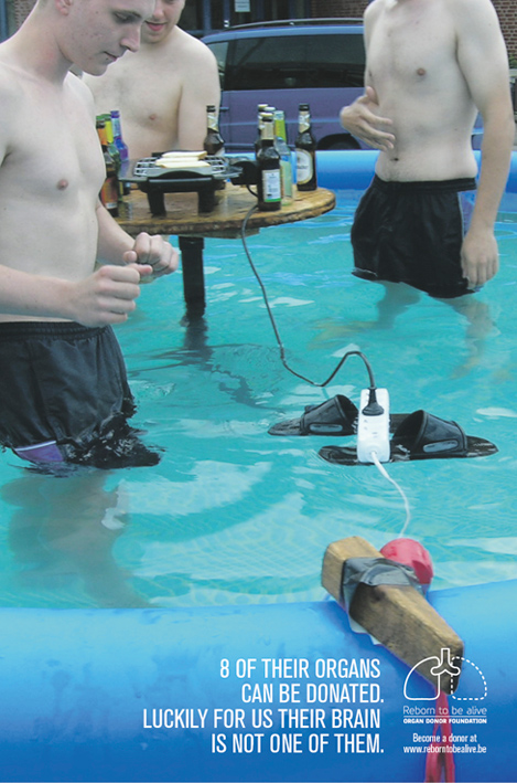
Swimming pool BBQ / Branchés sur la même idée?
Post pobrano z: Swimming pool BBQ / Branchés sur la même idée?
 |
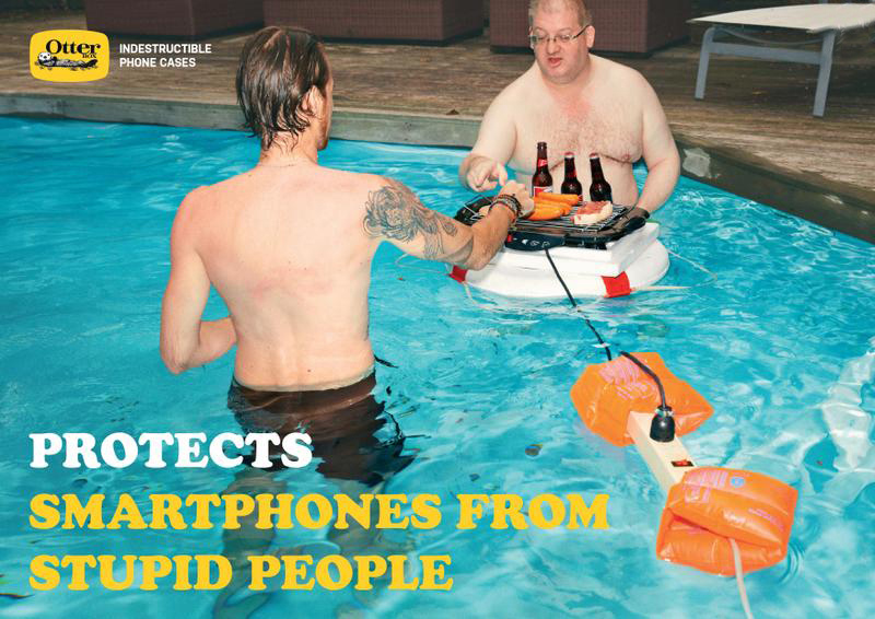 |
| THE ORIGINAL? Reborn to be alive – 2014 Source : Coloribus Ag : Duval Guillaume (Belgium) |
LESS ORIGINAL Otter Phone Cases – 2017 Source : Cannes Lions OUTDOOR SHORTLIST Agency : Ogilvy & Mather (Singapore) |
Design deals for the week
Post pobrano z: Design deals for the week
Every week, we’ll give you an overview of the best deals for designers, make sure you don’t miss any by subscribing to our deals feed. You can also follow the recently launched website Type Deals if you are looking for free fonts or font deals.
Sans Serif Typeface Collection
a go-to collection for any designer or hobbyist to create gorgeous headers and graphics. Use the San Serif Typeface Collection for headlines, display graphics, labels, wedding invitations, vintage posters, and more. With three distinct products, each with their own character, and 5 total styles, you can always find the perfect pairing for your next project.What’s Included?
$16 – Get it now!
Fancy Items Scene Generator (440+ Items)
Now you can easily and quickly build up a variety of different mockups using the Fancy Items Scene Generator! Easy to use, just drag and drop more than 440 high-resolution items into a scene. Completely customizable, these high-res items and scenes are perfect for big retina screens as well as printed projects.
$15 instead of $38 – Get it now!

Crafters Delight Bundle
The Crafters Delight Bundle is here! This wonderful bundle is truly a crafters delight and comes with the following included: 16 fonts from 12 different font families, 350+ SVG’s, 650 + Different elements. Almost all the products come in SVG, DXF, EPS, PNG and JPEG file formats and are perfect for cutting and crafting.
$24 instead of $363 – Get it now!

50 Professional PowerPoint & Keynote Presentation Templates
It’s time to get down to business. Serious business. Your presentations have great information in them, but if they don’t look super professional, you may lose your audience. With a sharper focus on the overall look, you can really impress your clients and close that deal you’ve been working so hard on. This bundle features 50 Professional PowerPoint and Keynote Presentations, along with some creative bonus elements to get you presenting on a higher level.
$17 instead of $750 – Get it now!

850 Quality, Customizable Infographics Templates
Never worry about getting your point across again! With this collection of 850 Infographics Templates, you can easily put together a colorful story through pictures and charts. Simple to customize, you’ll reach your audience quicker than ever in an entertaining and informative manner.
$19 instead of $650 – Get it now!

Quickly Build Fully Functional Web & Mobile Prototypes with UX-App
Prototyping has never been this easy, nor this functional! Yes, the future of wireframes is here and its name is UX-App. This powerfully advanced web based tool lets you easily create fully functional prototypes, with no coding necessary. Simply stack various logic blocks to customize over 100 advanced components from working carousels to nested list views. There’s even a slew of mobile options.
$29 instead of $79 – Get it now!

Tips and Tricks for the Best Online Animation
Post pobrano z: Tips and Tricks for the Best Online Animation
It doesn’t seem so long ago that all it took to have a stand out web presence was some great content with the right keywords and a good logo. How times have changed. These days, if you can’t catch your audience in the first couple of seconds with some eye catching animation, you have lost them forever.
Of course, the principle of animation is as old as the hills, and despite constantly changing technology, some practices have stood the test of time and are as relevant today as they were years ago. Here are our top four tips and tricks to get the best out of online animation:
1. Turn the sound down
The first tip is one of those that has stood the test of time. If you want to check how effective your animation really looks, click the mute button and just watch it. There is nowhere to hide, and if something is not right, it will be far easier to spot it without the distraction of the soundtrack. In fact, it will stick out like a sore thumb.
2. Try SVG Animation
If the first tip dates back 50 years or more, the second is cutting edge. In case you have not heard of it before, SVG stands for scalable vector graphics, and SVG animation is set to become the next big thing in online animation. SVGs are essentially similar to GIFs, but have the advantage of being far less heavy when it comes to file size. This means they load faster and run smoother. SVGator is a quick and easy way to animate SVG. It offers a user-friendly interface and automatically generated code.
3. Small is beautiful
Don’t try to create War and Peace. The best way to get better faster is to work on short animations and get them out the door. You will find your skill base grows, as well as your confidence. As Woody Allen almost said, if it takes longer than ten seconds, you’re doing it wrong.
4. There’s more to expression than expression
One of the biggest challenges animators face is getting facial expressions right. When you really look properly, however, you will see that it is less about the poses and more about the motion. For example, eyes darting in confusion or lips trembling in sadness. Focus on the movement as much as the pose, and the desired effect will come far more naturally.

5 Steps to Choosing an E-Commerce Theme Your Clients Will Love
Post pobrano z: 5 Steps to Choosing an E-Commerce Theme Your Clients Will Love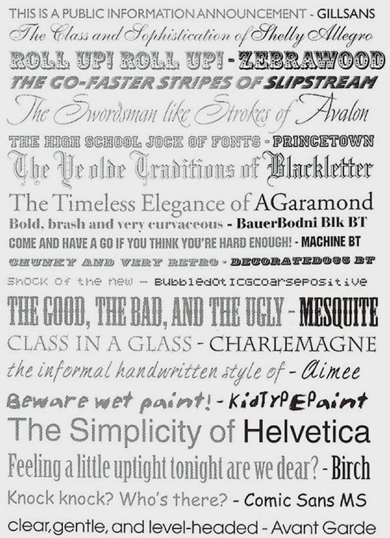
Your client doesn’t know what he wants in terms of design, so you have a blank screen to work on. The whole point of an e-commerce site is to sell, so all your design decisions must focus on what works for the final customer. You know what works, but you have to explain your choice to the client who is only interested in sales figures.
1. Understand the Target Profile
This is the one area where your client knows more than you. Listen and listen hard. Ask questions about the age, gender, education, and motivations of the target customer. Then go away and do your own research. This will include mobile use and color/font preferences. Look at other sites that are competing with your client’s and see what works for them.
The font you choose and layout also play a large part in any decision to stay or click the ‘back’ button. First impressions count, and you have only a fraction of a second to convince a website user that the site is reputable and aimed at them. A Stamford study showed that people’s decisions regarding a site’s trustworthiness depend on visual cues like the header, rather than logical ones such as a good privacy policy or generous returns conditions.
People read emotional meanings into fonts, and these are linked to the common usage types of each font. The image above from Graphic Design School by David Dabner illustrates this.
2. Understand What the Client Wants
Expand the brief to include the client’s expectations and preferences regarding layout, color, number of products to a page, product categories and total number of items. Failure to set down in black and white what the client expects can lead to your design being rejected and you not being paid for your time.
3. Choose a Theme
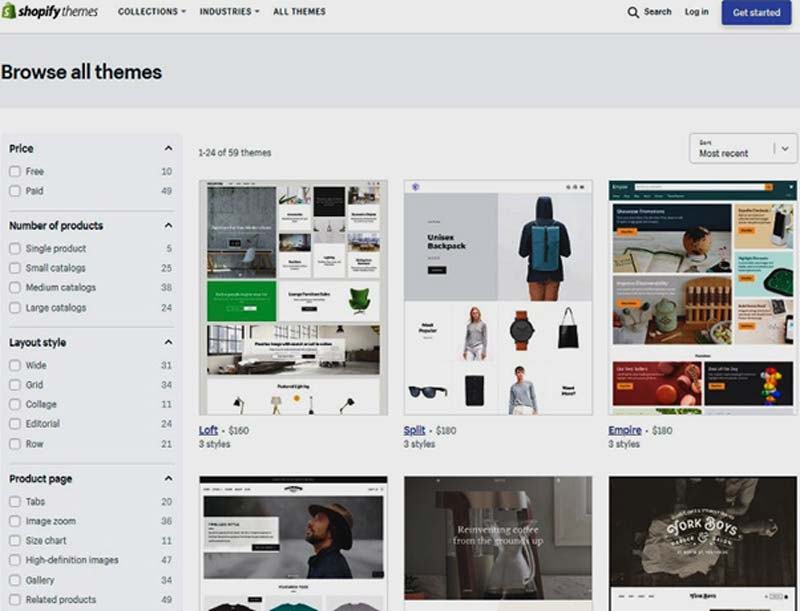
Just looking at Shopify themes, there are 59 themes to choose from. You can narrow your selection using the filters on the left of the screen, but you still have too many to choose from.
Start with this great guide on choosing an e-commerce store theme that will help you to narrow your choice down to one or two.
4. Choose a Layout
Most themes can be customized and come with two to four style options that allow you to change the layout. Use your brief to decide on the best option for the client’s customers, but be prepared to change the layout if the client demands you do so.
Mobile First Design Principles
Most users will be on small phone screens, so your design needs to work for them. Buy Now, and Navigation links should use large buttons, rather than text links.
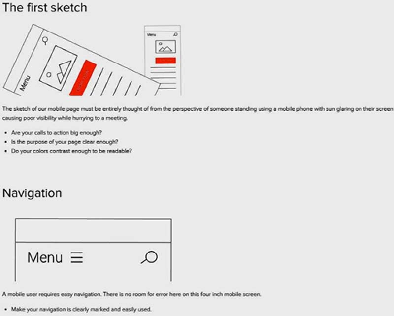
The screen shot above from Varvy illustrates a few mobile-first design principles, but the page itself is a prime example of how this design philosophy makes desktop users’ lives easier, too. There is lots of white space, fonts are large, and contrast is good, all of which benefit everyone, no matter what device they are using.
5. Choose a Color Scheme
This Designer Daily article explains the psychology of color in detail.
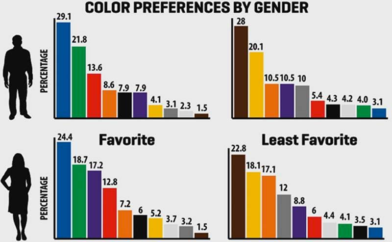

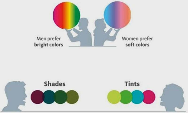
Color plays a large part in customers’ decisions to stay on a site, as this chart from HotDesign.com shows. It gives a clue as to why most websites use a blue design. Your color choices will be guided by the preferences of the target profile. Female users have a preference for more subtle shades as shown in the diagram below from Entrepreneur.com.
Build a unique color palette to suit your client’s customers using a tool such as the one from Paletton.com shown below.
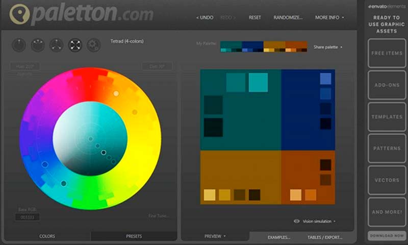
The Paletton tool allows you to choose different numbers and different color wheel relationships of colors.
In Brief
Avoid giving the client more than two options in your presentation. It is for you as the designer to decide on colors, layouts, and fonts, and to explain your choices to your client so he is happy enough to pay you. You have to justify your design decisions and relate them to your brief. Your final theme design may well differ from what the client was expecting, and he or she must be happy with that before you are paid.
Ultimately, it is your client who pays you, so you might have to compromise between what you think is the best design and what your client wants.