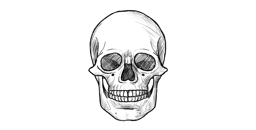
Recently, I showed you how to draw a skull in profile. This time, I’ll show you the more interesting view, perfect for tattoos and scary illustrations. This view is also very simple, so you don’t need to be a skilled artist to follow this tutorial!
A hint before you start: it’s easier to keep the proportions right when you’re drawing small.
1. How to Draw a Base for a Human Skull Drawing
Step 1
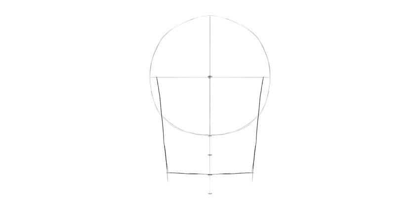
Draw a circle. It doesn’t need to be perfect, and feel free to draw it with many lines. Find its center, too.
Step 2
Draw a line under the circle, using the length of its radius.
Step 3
Divide this line into three sections.
Step 4
Draw a square „bucket” under the circle.
Step 5
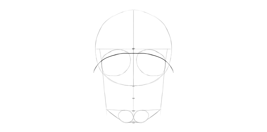
Draw two ovals in the bottom third of this line. This will be the chin.
Step 6
Connect the ovals with the rest of the lines.
Step 7
Draw two huge leaning ovals in the lower half of the circle.
Step 8
These ovals are not eye sockets yet—their shape is too simple for this. Let’s fix it. Draw a curve crossing both ovals, leaving some space for the eyebrow area.
Step 9
Connect this curve with the sides of the skull.
Step 10
Draw another curve on the bottom, leaving a similar amount of space below.
Step 11
You can outline the eye sockets now by giving them some space on the sides.
Step 12
Draw a curve from the corner of the eye socket towards the other socket, going through the chin. This will be the mouth area.
2. How to Draw Human Skull Details
Step 1
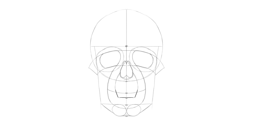
Draw a teardrop shape between the eye sockets, at the bottom of the circle. This will be the nose.
Step 2
Make the nose more detailed.
Step 3
Draw a curve across the mouth, through the mark between the first two thirds.
Step 4
We need to add more details to the mouth. First, define the front of the upper jaw with two curves.
Step 5
Draw the border of the lower teeth.
Step 6
Connect the teeth area to the chin.
Step 7
Draw the border of the upper teeth now.
Step 8
Finish the borders of the teeth area with these curves.
Step 9
We need to add the details to the lower jaw, too.
Step 10
Add the final curves to the skull.
Step 11
Divide the teeth area into separate teeth.
3. How to Finish and Shade a Skull
Step 1
Let’s finish the drawing. If you’re drawing traditionally, you can put a new sheet of paper over it, or simply draw with a darker medium now.
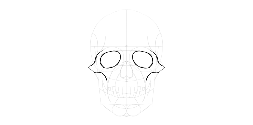
Outline the eye sockets.
Step 2
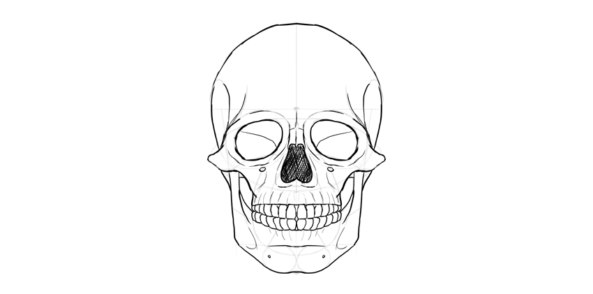
Outline the nose. Don’t forget about the nasal bridge on top.
Step 3
Add more detail to the edges of the eye sockets.
Step 4
Outline the teeth. They’re slightly tapered towards the bone.
Step 5
Add some details under and over the teeth.
Step 6
Outline the lower jaw.
Step 7
Outline the upper part of the skull.
Step 8
Add more fancy details, if you want to be even more accurate.
Step 9
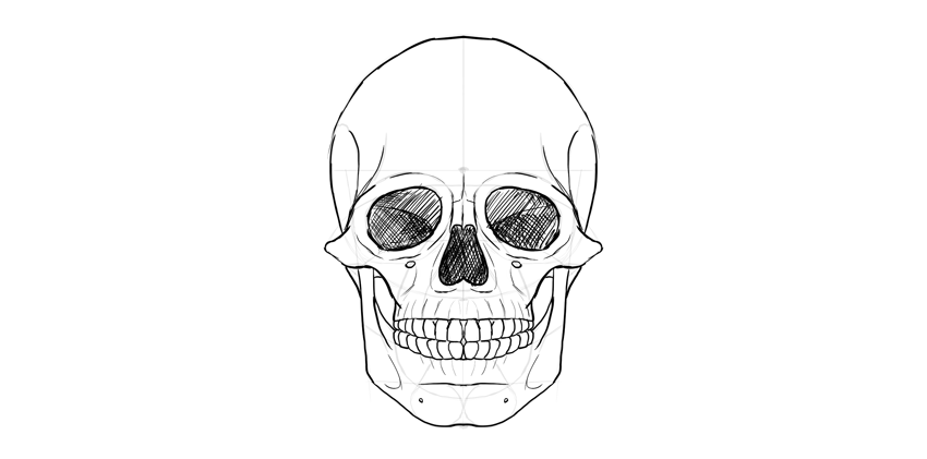
You can shade the drawing, if you want. Start by darkening the darkest parts…
… then cross-hatch the shadow areas.
Finally, thicken some of the lines to make the effect more interesting.
Good Job!
Do you want to try some other simple drawing tutorials? We’ve got you covered:
Glitch effects are still popular these days and appear in many variations. Using the animation feature in Photoshop, we are going to turn a simple image into a short movie.
In this tutorial, I will teach you how to lift an object from its background using the automated Content Aware Fill and the good old copy and paste technique. Finally, we will add subtle animation into the scene.
Let’s start by analyzing the image. We have a bus and two trucks in the scene. Before we can animate them, we need to lift them from their background. We can do it using the old way, i.e. manual Clone Stamp Tool, or using the automated Content Aware Fill feature. For better results, I suggest you use the biggest image resolution available. With a larger image, you can see all the detail and make the cloning process easier.
Step 2
First, we are going to cut the furthest truck from the background. Duplicate the background by pressing Control-J. Make a selection around the truck using the Lasso Tool. Click Edit > Fill. Select Contents: Content-Aware.
Step 3
Click OK to let Photoshop automatically fill the selection with suitable pixels. Photoshop did a nice job, but not perfect. If you look closer, there are some flaws that we have to fix.
Step 4
We’ll continue using a simple copy and paste technique. Copy (Control-C) a part of the road, and paste (Control-V) it on top of the previous road segment made by the Content-Aware Fill. You may need to rotate and transform its shape. You can also bend the new road shape to match the road perspective by right clicking inside the transformation bounding box and selecting Warp.
Step 5
Add a layer mask into the new road segment. Activate the Brush Tool with low Hardness (0%) and set the foreground color to black.
Step 6
Paint the edge of the road until it fades into the background.
Step 7
We also need to add road markings to keep it identical to the other road segment. Select the road marking and copy it using the shortcut Control-Shift-C. Paste it (Control-V) on the desired area. You can use a warp transformation to bend the road marking shape. Pull one of the boxes to change the direction of the road marking.
Step 8
Add a mask into the layer and then paint its edge with black using a soft Brush Tool until it fades naturally into the background.
Step 9
Next, we need to reveal the truck again. We can simply copy the truck from the original background onto a new layer and place it on top.
Step 10
Add a layer mask and paint its edge with black until the truck fades into the background.
Step 11
Let’s continue with the second truck. Start by making a path around the truck. Hit Control-Enter to convert the path into a selection. Hit Control-J to duplicate it as a new layer.
Step 12
Next, we need to cover the truck. Select part of the road segment and copy it. You can directly copy the content of the selection using the shortcut Control-Shift-C. If you want to use regular Control-C, you will need to activate the corresponding layer first.
Step 13
Move it until the truck is covered. Obviously, you will need to use the Stamp Tool to remove the electricity pole.
Step 14
Load the previous selection covering the truck and save it as a layer mask. As you can see, we still need to fix its edge.
Step 15
Add another copy of the road segment and delete its edge using a soft Brush Tool.
Step 16
Make a new layer. Use the BrushTool to draw a thin line for the electricity cable. For its color, sample the available cable by Alt-clicking it while the BrushTool is active.
Step 17
Copy the truck and paste it between the cable and the road.
Step 18
We are going to move the truck through the street above it. So select the street and copy it to a new layer (Control-C and then Control-V).
Step 19
The road segment should be placed above the truck so that when it moves, it is hidden by the road. For now, place the truck in its original place.
Step 20
Next, we’ll work on the bus. Duplicate the background and select the bus manually using the Lasso Tool. We’ll try to remove the bus automatically using the Content-Aware Fill feature. Click Edit > Fill and select Contents: Content-Aware. Click OK.
Step 21
In this case, Content Aware Fill isn’t good enough. You will need to polish the result.
Step 22
Depending on your situation, you may want to try manual cloning. Here, I select some parts of the road behind the bus and then copy (Control-Shift-C). Then, paste the road segment on top of the bus. Hit Control-T and then rotate it until it matches the road perspective. Right click and select Warp for a more advanced transformation. Pull the corresponding boxes until the new road aligns nicely to the original one.
Step 23
Add a layer mask and paint its edge with black until the new road blends seamlessly into the original road.
Step 24
Try to remove any similarity to the original clone source by making it overlap with another part of the image.
Step 25
Reveal the original bus image again by duplicating it onto a new layer. Place it on top of the new road.
2. How to Animate an Object and Add a Glitch
Step 1
Let’s move on to prepare the glitch animation. We don’t want to have a huge-sized GIF animation. It’s just not effective. We need to scale down its size. Click Image > Image Size. In the next dialog box, make sure the Resample checkbox is activated. Set the image width to 800 pixels. Click the OK button.
Step 2
Our glitch animation will be very short, only half a second. For this, we only need 5 or at most 6 frames, with each frame lasting for 0.1 second. Duplicate the bus layer five times and keep them in a separate group layer.
Step 3
Activate one of the bus layers and apply a Wave filter. Click Filter > Distort > Wave. In this tutorial, we set a short Wavelength with minimum Vertical Scale:1%.
Step 4
Move on to the next bus layer. Apply the same Wave filter. Hit Control-Alt-F. To differentiate the result, hit Randomize. You can also change some of the available settings if needed.
Step 5
Keep on adding this to the other buses on different layers.
Step 6
Repeat the same steps on the furthest truck. Duplicate it five times and then apply the Wave filter, but this time with lower settings to keep its result subtle.
Step 7
We are now ready to start animating the scene. Open up the Timeline panel. Click Create Frame Animation. We will make the animation frame by frame.
Step 8
For the first frame, return the scene to its original position. Every truck and bus should be stationary in its place. Set the frame duration to 1 second.
Step 9
Click the New Frame button in the lower part of the panel to add the next frame. In this frame, make sure that the layer which has the truck going under the street is active. Hit the Down Arrow and then the Left Arrow button once to move its position one pixel down and one pixel left. Set its duration to 0.1 second.
Step 10
Make another frame. Again, move the truck one pixel down and one pixel left. As in the last frame, set its frame duration to 0.1 second.
Step 11
You already know the drill. Add a new frame and then move the truck one pixel down and one pixel left. Keep on doing this until the truck is hidden out of sight, covered by the street. To see the result, click the Plays animation button. Below, you can see the animation.
Step 12
Let’s move on to the bus animation. Add another frame. Hide the original bus layer and reveal one of the layers that contains the bus altered with the wave filter. Set its duration to 0.1 second.
Step 13
Add another frame. Hide the previous layer and reveal another layer that contains the bus altered with the wave layer. The duration should be 0.1 second.
Step 14
Another new frame and another layer. Go on, you know the drill.
Step 15
After half a second, put back the original bus.
Step 16
Set its frame duration to 2.0 seconds. This will add another „silence” into the scene. Below, you can see the animation we have so far.
Step 17
Add another frame. This time, we’re going to animate the furthest truck. Hide the original truck and reveal the one that has been altered with the Wave filter. Set the frame duration to 0.1 second.
Step 18
Add another frame. Hide the last layer that contains the altered truck and reveal the next. Continue doing this until we have half a second animation of the truck glitching.
3. How to Export an Animation as a GIF File or Video
Step 1
Our final step is exporting the animation. You can use the Save for Web command to save the animation as a GIF file. Make sure you have selected Looping Options: Forever to keep the animation running.
To save file size, try to decrease the number of colors used in the final file. By decreasing the number of colors, you may risk losing contrast, brightness, and so on. So keep experimenting to get a sensible proportion between file size and image quality.
Step 2
You can also export the animation directly from Photoshop as a video by clicking File > Export > Render Video.
Awesome Work, You’re Done!
As you can see in this tutorial, we can get unlimited variations of glitch effects by combining them using different types of distortion. Check out other Envato Tuts+ tutorials on glitcheffects for more inspiration.
If you follow this tutorial, don’t forget to share your final result in the comment section below. I’d love to see it.
I was asked (by this fella on Twitter) a question about design patterns. It has an interesting twist though, related to hiring, which I hope makes for a good poll.
Note: There is a poll embedded within this post, please visit the site to participate in this post’s poll.
I’ll let this run for a week or two. Then (probably) instead of writing a new post with the results, I’ll update this one with the results. Feel free to comment with the reasoning for your vote.
Imgix has been a long-time display ad sponsor here on CSS-Tricks. This post is not technically sponsored, I just noticed that they released a tool for analyzing image performance at any given URL that is pretty interesting.
We know web performance is a big deal. We know that images are perhaps the largest offender in ballooning page weights across the web. We know we have tools for looking at page performance as a whole. It seems fairly new to me to have tools for specifically analyzing and demonstrating how we could have done better with images specifically. That’s what this Page Weight tool is.
Clearly this is a marketing tool for them. You put in a URL, and it tells you how you could have done better, and specifically how imgix can help do that. I’m generally a fan of that. Tools with businesses behind them have the resources and motivation to stick around and get better. But as ever, something to be aware of.
As we can see checking out the homepage for Page Weight, you drop in a URL, it analyzes all the images and gives you some information about how much more performant they could have been. What’s going on behind the scenes there?
We run each image on the page through imgix, resizing to fit the image container as best we can tell, and also transform file formats, color palettes, and quality breakpoints to determine which combination provides the best size savings. Then we display that version for each image.
I see it suggests fitting the image to the container, but that only makes sense for 1x displays right? Images need to be larger than their display pixel size for visual crispness on high-density display.
Definitely. The Page Weight tool does not currently address high-DPR display differences, but our service does. We offer automated high-DPR support via Client Hints, and manually via our dpr parameter, which allows developers to set the desired value directly (useful on its own or as a fallback for Client Hint support in browsers that don’t yet support that functionality). Our imgix.js front-end library also generates a comprehensive srcset (based on the defined sizes) to address whatever size/DPR the device requires.
I think most developers here are smart enough to realize this is really smart marketing for imgix. But also smart enough to realize the images are a huge deal in web performance and want to do better. What can imgix do that a developer on their own can’t do? Or that is fairly impractical for a developer to do on their own?
First, it is important to note that resizing is not the only thing that imgix does, although it is a very common use case. We provide over 100 different processing parameters that enable developers to do everything from context-aware cropping to color space handling to image compositing. So adopting imgix gives a developer access to a lot of image handling flexibility without a lot of hassle, even if they’re primarily using it to support responsive design.
That said, it is not impossible to get a very simple resizing solution running on your own, and many developers start out there. Usually, this takes the form of some kind of batch script based on ImageMagick or Pillow or some other image manipulation library that creates derivative images for the different breakpoints.
For a while, that’s often sufficient. But once your image library gets beyond a few hundred images, batch-based systems begin to break down in various ways. Visibility, error handling, image catalog cleaning, and adding support for new formats and devices are all things that get much harder at scale. Very large sites and sites where content changes constantly will often end up spending significant dev time on these kinds of maintenance tasks.
So really, „could you build this?” is a less useful question than „should you build this?” In other words, is image processing central enough to the value proposition of what you’re building that you’re willing to spend time and effort maintaining your own system to handle it? Usually, the answer is no. Most developers would rather focus on the what’s important and leave images to something like imgix — a robust, scaleable system that just works.
Does the tool look at responsive images syntax in HTML? As in, which image was actually downloaded according to the srcset/sizes or picture element rules?
Not yet. That’s a feature we’re hoping to implement in the next version of the tool.
Can you share implementations of imgix that are particularly impressive or creative?
An interesting use we see more and more is image processing for social media. These days, many sites see the majority of their traffic coming in through social, which makes it more important than ever to make content look good in the feed. Setting OpenGraph tags is a start, but every social network has a different container size. This creates a similar problem to the one posed by mobile fragmentation, and we can help by dynamically generating social images for each network. This provides a polished presentation without adding a ton of overhead for the person maintaining the site.
Other customers are pushing even further by combining several images to create a custom presentation for social. HomeChef, a meal delivery service, does this to dynamically create polished, branded images for Pinterest from their ingredient photos.
We actually created an open source tool called Motif (GitHub Repo) to make it easier for developers to get started with dynamically generating social images through imgix.












 DrawingHow to Draw a Wolf Step by StepMonika Zagrobelna
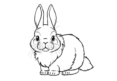 AnimalsHow to Draw a Cute Bunny Step by StepMonika Zagrobelna
 AnimalsHow to Draw a Dolphin Step by StepMonika Zagrobelna