At first the title made me think of Git conflicts, but that’s not what this is about. It’s about namespacing selectors for components. Ultimately, they decided to use a Webpack loader (not open source, it doesn’t appear) to prefix every single class with a hashed string representing the version. I guess that must happen in both the HTML and CSS so they match. Lots of folks landing on style-scoping in one way or another to solve their problems.
It makes me think about another smaller-in-scope issue. Say you have an alternate version of a header that you’re going to send to 5% of your users. It has different HTML and CSS. Easy enough to send different HTML to users from the server. But CSS tends to be bundled, and it seems slightly impractical to make an entirely different CSS bundle for a handful of lines of CSS. One solution: add an additional attribute to the new header and ship the new CSS with artificially-boosted specificity to avoid all the old CSS. Then when you go live, remove the new attribute from both.
If you’re an aspiring creature artist, you may know the struggle of trying to draw a head in a specific view from imagination. It’s so easy to lose the proportions when adding all the details to some crazy 3D view! Even if you study hundreds of photos, you may still have trouble imagining the 3D form of what you’re drawing.
That’s why it’s good to study skulls—you can hold them in your hand, you can touch and rotate them, and this way you can find the set of guide lines that will work for every view. In this tutorial, I will show you how to study skulls to become better at drawing animals from imagination.
What You Will Need
Obviously, a skull. You can buy a real skull from a local hunter, but be careful. Some animals are hunted as a part of the population control (in Poland, that’s foxes) or as an effort to get rid of invasive species (in Poland, raccoon dogs), so getting a skull acquired this way is fine.
However, some animals are hunted illegally, and by buying a skull from this kind of hunter you support this practice. Before you buy a skull, do some research to find out if the animal you want to study is under protection in your area. In that case, even buying such a skull may be illegal!
In many cases, the safest way is to buy a high-quality replica. The only difference lies in the smallest details, so they’re perfectly fine to study, and they’re also often much cheaper than the real thing!
Here’s a photo of my fox skull. I won’t copy it—I will just use it to show what parts to pay attention to.
1. How to Draw the Upper Jaw
Step 1
We want to establish the proportions as completely and as early as possible, to create a support for more lines. I prefer to start with the width of the forehead—it’s a part of the „top cross” that creates an impression of a plane with only two lines.
Step 2
The other arm of the cross is the line going along the longer axis of the skull. It should bend according to the profile of the head.
See? Only two lines, and we already see the top of the skull.
Step 3
The eyes are another important element that should be established early. Attach the eye sockets to the shorter arm of the cross, paying attention to the perspective.
Step 4
The nose is another thing that captures our attention, and it can be simplified to a nice, regular shape. Its position will help us imagine the end of the muzzle.
Step 5
The basic proportions are established, and now we can slowly build the form on them. First, the top of the muzzle. The nasal bridge is usually flat, keeping a constant width on its way towards the forehead. You can also elongate it to create the front of the muzzle, slightly protruding to close on the food.
Step 6
The muzzle has a variable width along its length, so it’s important to divide it into simpler parts. For example, the very front of the muzzle has a pretty constant width. Sketch it as a simple three-dimensional form.
Step 7
Here’s where things get slightly more difficult, because we can’t draw everything as simple forms. But we can try! There’s a wide part in front of the eye sockets—define its width, and then connect it to that simple front form.
Step 8
That was only the upper part of the skull, but there’s also another part below, with the teeth attached to it. Sketch its side, turning a bit towards the middle line.
Step 9
Outline the side. It’s hard to see it in the photo, but the part right below the eye socket turns towards the skull and, in many cases, away from the view.
Step 10
Time for the actual forehead. This will give the eye sockets some more definition as well.
Step 11
We’ve drawn the eye sockets as simple ovals, but they’re a little more complicated than that. Fix their shape now.
Step 12
The zygomatic arch—the cheekbone—can be tricky to draw because of its curvy shape. In most cases, it helps to imagine it like this:
Step 13
Finish the form of the bone by adding some width to it.
Step 14
The braincase is not simply a sphere on the back of the skull—it has the shape of a teardrop attached under the forehead.
Step 15
The eye sockets are not hollow. Draw a wall between the muzzle and the braincase (it’s very hard to explain it with a photo only, but if you have a skull in front of you, you’ll know what I mean!).
Step 16
Time for the canines! Foxes have them very long and curved.
Step 17
Sketch all the teeth—just their general form, without any details.
2. How to Draw the Lower Jaw
Step 1
The upper jaw is finished, so we can take care of the lower one now. Studying them separately like this will help you draw the jaws open in the future.
Start by finding the jaw joint—the point of attachment and rotation.
Step 2
Sketch the line of the lower jaw, keeping it in proportion to the upper one.
Step 3
The lower jaw has a width and a special shape. Sketch it.
Step 4
Outline the front part of the lower jaw.
Step 5
The back of the lower jaw has a complex shape. Start with a gentle arch coming towards the joint.
Step 6
Create a smaller arch between these two parts.
Step 7
Draw a line between the joint and the bottom line of the jaw.
Step 8
There’s an additional structure to the back of the lower jaw. Add it by drawing a line going away from the rhythm of the jaw.
Step 9
Finish its shape.
Step 10
Add the shape of the lower canines, fitting right between the upper incisors and upper canines.
Step 11
Outline the rest of the teeth.
3. How to Finish Drawing a 3D Study of a Skull
Step 1
Our sketch is done, and now we only need to stress some lines to make the form clearer. Start with the nasal bridge.
Step 2
Add the forehead.
Step 3
Outline the form of the muzzle, with all its 2D planes.
Step 4
Outline the teeth in the front.
Step 5
Outline the cheekbones.
Step 6
Outline the teeth, giving them only a basic form.
Step 7
Outline the lower jaw.
Step 8
Define the hollow in the back of the lower jaw.
Step 9
Draw lines on the side of the lower jaw to show its 3D form.
Step 10
Outline the lower teeth.
Step 11
Add some form lines to the back of the head as well.
Step 12
When you’re done, you can darken some of the main lines to make them stand out among all these form-establishing ones.
Step 13
You can also shade the skull to make its 3D form even more pronounced.
Good Job!
You have drawn your first skull study! But that’s not all. Studying is about practicing and experimenting. Draw the same skull in other views, testing your set of guide lines on each of them, until you are ready to draw such a skull entirely from imagination. This will help you draw the head of the animal in all the views you wish without any reference, and will be also helpful for designing new, realistic creatures.
Want a new fresh look for your Facebook profile? In this tutorial, we’ll design a template to create a custom Facebook cover photo and profile picture that interact seamlessly with each other. We’re going to do this by making your profile and cover photos overlap so the two appear as one whole image. Many have tried to achieve this polished look, but they don’t always succeed due to sizing issues. Well, let’s see if we can get this right.
Feel lazy? Check out my plugin for Photoshop to get an amazing result in seconds! “Seamless Identity Action for Facebook” is a Photoshop plugin that allows you to create an eye-catching cover and profile picture for your Facebook page.
Tutorial Asset
The following asset has been used during the production of this tutorial:
Create a new document specifying the following options for the selected preset:
Width and Height: Specify the size of the document. Type 1630 px for width and 734 px for height.
Orientation: Specify a page orientation for the document. Select Landscape.
Color Mode: Specify a color mode for the document. Select RGB.
Resolution: Specify the fineness of detail in a bitmap image measured in pixels/inch or pixels/centimetre. Since we’re using this template for web images, the resolution is irrelevant. Keep the default resolution 72 Pixel/Inch.
Background contents: Specify a background color for the document. Select White.
Step 2
With the Rectangle Tool (U), click somewhere on the canvas to create a new 1630 x 605 px rectangle.
Open the Properties panel by selecting in the top menu Window > Properties, and set the rectangle position to 0 for X and Y axis, and then set the Stroke and the Fill to No color.
In the Layers panel,rename the layer just created by double-clicking on the layer’s name and typing „Cover Photo„.
Step 3
With the Rectangle Tool (U), click somewhere on the canvas to create a new 307 x 307 px rectangle. In the Properties panel, set its position to 38 for X and 341 for Y axis and then set the Stroke and the Fill to No color.
In the Layers panel, rename the layer just created by double-clicking on the layer’s name and typing „Profile Picture„.
Step 4
Right-click on the layer „Profile Picture” and choose Duplicate Layer and then press OK. Rename this new layer „Frame„.
Step 5
Add a new Layer Style to the „Frame” layer by double-clicking on the layer, outside the layer name or thumbnail.
Add a new Stroke effect. This outlines the object on the current layer using color, a gradient, or a pattern.
Set Size to 8 px, Position to Outside, and Fill Type to White Color. Keep Opacity to 100% and Blend Mode to Normal.
Now add a new Drop Shadow. This adds a shadow that falls behind the contents on the layer. Set Blend Mode to Normal, ColorBlack, Opacity22 px, Distance 0, Spread100%, Size10 px. Keep the other options like the image below:
Step 6
Select the layer „Profile Picture” and then with the Rectangle Tool (U) click somewhere on the canvas to create a new 1630 x 129 px rectangle. In the Properties panel, set its position to 0 for X and 605 for Y axis and then set the shape Fill to White and the Stroke to No color.
Rename this new layer „Base„.
Step 7
Select the layer „Profile Picture” and choose in the top menu Layer > New Fill Layer > Solid Color. Press OK and choose any color. Rename this layer „Fill„.
Step 8
Now we’re going to add some new anchor points to modify the path.
In the Layers panel, select the layer „Base” and then, to select the path, choose the Path Selection tool, and click anywhere inside the path component.
Selecting a path component or path segment displays all of the anchor points on the selected portion. Selected anchor points appear as filled squares and unselected anchor points as hollow squares.
Select the Add Anchor Point Tool.
To add an anchor point, position the pointer over the path segment and click. Add four anchor points like the image below:
Step 9
Select the Convert Point Tool and click on each of the four points we just created to convert them.
Step 10
Select the Direct Selection Tool.
Click on point 2 and drag the segment to its new position behind the frame. Do the same with point 3. Now the path of the „Base” layer should be similar to this:
Step 11
Double-click on the „Base” layer, outside the layer name or thumbnail, and add a new Layer Style. Add a new Drop Shadow, setting the Blend Mode to Normal, Opacity to 35%, Color to Black, Angle to 90°, Distance to 0 px, Spread to 40%, and Size to 200 px.
Step 12
Now we need to edit the „Base” effect separately from the layer. To do this, we can ask Photoshop to put the layer style on its own separate layer (or layers if necessary). Click on the „Base” layer, and then move down your mouse on the „Drop Shadow” effect, open the contextual menu by right-clicking on it, and choose Create Layers. Your effect will now appear on its own layer beneath the „Base” layer.
A message may alert you that: „Some aspects of the Effects cannot be reproduced with layers„. If so, press OK.
Step 13
In the Layers panel, select the layer just created. For an English version of Photoshop, its name should be „Base’s Drop Shadow„. With the layer selected, Command-Click (Mac)on the thumbnail of the layer „Frame” to select the shape.
Step 14
Our purpose now is to delete the shadow inside the profile picture frame. Choose Edit > Cut (Command-X) and deselect by choosing Select > Deselect.
Step 15
Select the layers „Base’s Drop Shadow„, „Base„, and „Frame„. To select multiple contiguous layers, click the „Frame” layer and then Shift-click the „Base’s Drop Shadow” layer.
Right-click on one of the layers and select „Merge Layers” to combine them all into one.
Step 16
It’s time to save our progress. Choose File > Save As. Choose the PSD format from the Format menu. Specify a filename (Facebook-Frame.psd) and location and click Save.
Your Facebook frame is ready! Go forward and discover how to add a photo to the Facebook frame, and save a new ready-to-upload profile picture and cover photo!
2. How to Add a Photo to the Template
Step 1
Locate the Layers panel on the right side of your workspace and notice that we made four layers:
„Frame”: This layer is the preview of the real Facebook page and will help you to position correctly your photo and see how your profile will look once uploaded to Facebook.
„Fill”: This layer contains a placeholder fill. Position your photo above it.
„Profile picture”: This layer will be used to crop and export your profile picture.
„Cover Photo”: This layer will be used to crop and export your cover photo.
Step 2
Select a photo that you want to use as your profile picture and cover photo. If you’re following along with the sample photo, download this. Open it with Photoshop.
Try to use a photo that is at least 2,000 pixels wide so that you can easily place it into the template.
Learn to choose the best photo for this purpose. The profile picture will be in the bottom left corner of the photo. In the photo I’m using for this tutorial, the subject is in the bottom left corner of the composition so that it’s easier to reposition. A good photo will have the subject small or in the distance. Perfect for this purpose are photos with a landscape behind the subject.
Step 3
Locate the file tabs at the top of the workspace and click on the photo file. Go to Select > All. Press Command-C (Mac) on your keyboard to copy the photo.
Go back to the template by clicking on „Facebook-Frame.psd” from the file tabs at the top of the workspace. Click the „Fill” layer from the Layers panel to make it active, and press Command-V (Mac)on your keyboard. This will paste the photo above the Facebook frame layer.
Step 4
Click on the layer with the photo just imported in the Layers panel to make it active.
Go to Edit > Free Transform, or press Command-T (Mac) on your keyboard. A bounding box will appear around the edges of the photo.
To Scale, drag a handle on the bounding box. Press Shift as you drag a corner handle to scale proportionately. When positioned over a handle, the pointer becomes a double arrow.
To Reposition, click and drag anywhere within the bounding box.
To Rotate, move the pointer outside the bounding border (it becomes a curved, two-sided arrow), and then drag. Press Shift to constrain the rotation to 15° increments.
You can also flip your photo by choosing Edit > Transform > Flip Horizontal.
When you transform a bitmap image (versus a shape or path), the image becomes slightly less sharp each time you commit a transformation; therefore, performing multiple commands before applying the cumulative transformation is preferable to applying each transformation separately.
Make sure to position the photo so that it fills both the cover photo and profile picture areas. When you’re done, press Enter on your keyboard.
Step 5
Once you’ve positioned the photo, click on the small eye icon to the left of the „Frame” layer in the Layers panel to hide the layer.
3. How to Save the Profile and Cover Image
Step 1
In the Layers panel, locate the „Profile picture” layer thumbnail. Hold down Command (Mac) on your keyboard and click on the layer thumbnail. This will select the area of the profile picture, a square image of 307 x 307 px.
Go to Image > Crop to crop the image to the profile picture area.
Step 2
Go to File > Export > Save for Web (Photoshop CC 2015) or File > Save for Web & Device (before Photoshop CC 2015).
From the Format dropdown, choose JPEG. From the Quality dropdown, choose Very High.
When you’re done, click Save. Choose a name for the profile picture and click OK.
Step 3
Click on the History panel from the right side of your workspace. If you can’t see it, go to Window > History.
Click on the previous step in the History panel. This will reload the uncropped image.
Step 4
In the Layers panel, locate the„Cover Photo” layer thumbnail. Hold down Command (Mac) on your keyboard and click on the layer thumbnail. This will select the area of the Cover Photo, a rectangular image of 1630 x 605 px. Go to Image > Crop to crop the image to the cover photo area.
Step 5
After cropping, go to File > Export > Save for Web (Photoshop CC 2015) or File > Save for Web & Device (before Photoshop CC 2015).
From the Format dropdown, choose JPEG. From the Quality dropdown, choose Very High.
When you’re done, click Save. Choose a name for the cover photo and click OK.
4. How to Upload Your Photos to Facebook
Step 1
To add a profile picture or change your current profile picture:
Go to your profile and hover over your profile picture. Click Update Profile Picture. Now you can:
Upload a photo from your computer.
Take a new photo.
Select a photo you’ve already uploaded or one you’re tagged in.
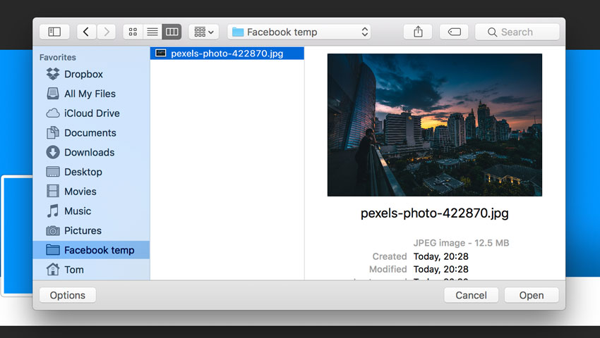
Choose „Upload a photo from your computer„. Select the Profile Picture just created. Don’t crop your photo!Click Skip Cropping in the bottom left, and click Save.
Step 2
To add or change your cover photo:
Go to your profile.
Hover over Update Cover Photo in the top-left of your current cover photo.
Click Update Cover Photo. If you don’t currently have a cover photo, click Add Cover Photo.
Select Choose from my photo and navigate to the cover photo just created.
Once you choose the photo, you could reposition it by clicking the image and dragging it up or down. Don’t reposition the photo, don’t drag the image in this step!
Click Save Changes.
Remember that the images created with this tutorial are sized in proportion to the display dimensions on Facebook, so you don’t need to reposition or crop the images when uploading them.
5. Facebook Pages and Mobile Layout
Unfortunately, Facebook made bold changes to the layout for pages, and the images created with this tutorial won’t work with Facebook pages. Facebook has removed the profile picture from the cover image territory. Now the profile picture has moved to the left-hand column of the layout. At the moment, it is possible to create a seamless profile picture and cover photo only for personal profiles.
The same problem exists with the mobile layout. If you’ve visited any Facebook pages on your iPhone, you might have noticed that the cover photo isn’t displayed the same way it is on desktop—only the middle section will appear on mobile, while the profile picture will move significantly towards the centre.
Anyway, we can optimize our images to look good on mobile devices.
In order to avoid ugly discrepancies, don’t place important information on the right of the profile picture, especially if you know that the majority of your page users are mobile users.
Congratulations, You’re Now Done!
Great job! Our seamless profile picture and cover photo are finished. You can use your imagination and continue playing around and adding details until you are fully satisfied with the result. I hope you’ve discovered some new tips and tricks that you can use for creating wonderful projects in future. Feel free to share your results in the comments below!
If you need more control over your images, my advice is to download the “Seamless Identity Action for Facebook”, a Photoshop plugin that allows you to create an eye-catching cover and profile picture for your Facebook profile with some premium options such as bigger profile images, parallel updates with the Facebook layout changes, and more.
Would you like to know how to create this breath-taking fantasy landscape in Adobe Photoshop? Join our new course, An Introduction to Digital Matte Painting, to get detailed step-by-step instructions in over two hours of video.
What You’ll Learn
In this course, you’ll learn how to create a seamless fantasy landscape using the techniques of digital matte painting and photo manipulation.
Envato Tuts+ instructor Ed Lopez will take you through the process of creating a digital matte painting using classic techniques in Adobe Photoshop, from editing and composing an image to finishing a fully photorealistic painting.
Some of the techniques in the course are quite advanced, so if you’re more of a Photoshop beginner, you might like to try our earlier course, Digital Matte Painting for Beginners.
Watch the Introduction
Take the Course
You can take our new course straight away with a subscription to Envato Elements. For a single low monthly fee, you get access not only to this course, but also to our growing library of over 1,000 video courses and industry-leading eBooks on Envato Tuts+.
Plus you now get unlimited downloads from the huge Envato Elements library of 200,000+ photos and 26,000+ design assets and templates. Create with unique fonts, photos, graphics and templates, and deliver better projects faster.
And if you’re serious about improving your digital painting in Photoshop, why not check out the wide range of Photoshop brushes on Envato Market? They’ll help you create any effect you want, from watercolor to smoke and from optical flares to cracked ink.
According to an article from A List Apart about CSS Grid, a „new era in digital design is dawning right now.” With Flexbox and Grid, we have the ability to create layouts that used to be extremely difficult to implement, if not impossible. There’s an entirely new system available for creating layouts, especially with Grid. However, as with most web technologies, browser support is always something of an issue. Let’s look at how we can make the fundamental aspects of Grid work across the browsers that support it, including older versions of Internet Explorer that supported an older and slightly different version of Grid.
The Sales Pitch
If you visit caniuse.com, you’ll see that CSS Grid is supported in current versions of all major browsers except Opera Mini. So why not start using it? Rachel Andrew wrote extensively on the subject of if it’s „safe to use” or not. It is, assuming you’re OK with a fallback scenario that doesn’t replicate exactly what Grid can do:
If your website really needs to look the same in all browsers (whatever that means to you), you won’t be able to use any features only available by using Grid. In that case, don’t use Grid Layout! Use Grid Layout if you want to achieve something that you can’t do in a good way with older technologies.
Grid is a major change to CSS layout. It’s powerful, (fairly) easy to use, and, if you’re working on open source or on a team, easy for fellow developers to read. In this article, we’re going to look at how we can write Grid code to be as compatible as we can possibly make it, including some degree of fallback.
The Sauce
The main thing we want to do in this post is address browser compatibility for the fundamentals of CSS Grid. We’ll cover how to construct a parent grid element and place child grid elements within.
The outliers are going to be Internet Explorer and Edge. Edge is just starting to ship the modern CSS grid syntax, and it’s an evergreen browser so ultimately we won’t have to worry about Edge too much, but at the time of this writing, it matters. IE 10 and 11 are rather locked in time, and both support the old syntax.
Again, Rachel Andrewhas information on this old syntax, what it supports, and how to use it. The old syntax, for example, doesn’t support display: grid;, we have to do display: -ms-grid;. And there are similarly prefixed for many of the properties.
Even then, many of the properties themselves are not the same. But it’s okay. The differences are not that great and we can get some help from Sass. The saving grace here is that we only need vendor prefixes for IE/Edge. Any other browsers will be addressed by the „standard” properties.
First, let’s define a Grid parent using a Sass @mixin:
This is helpful, but the grid itself isn’t yet compatible with the old CSS Grid style.
Next we need to cover the differences in defining the grid parent rows and columns. Let’s beef up the grid a little bit and define it to be compatible across all browsers (for example, by using -ms-grid-columns in addition to grid-template-columns):
The -ms- prefixed properties will work for IE/Edge and the non-prefixed properties will work for other grid-supporting browsers. This particular demo will give us the following dimensions:
One column 150px wide.
One column that takes up all available space left over by the other columns (1fr = 1 fraction of the remaining space after other elements are calculated).
Two columns at 100px wide apiece.
Three rows at 1fr tall apiece.
Check out the value for grouping on line 19. IE and Edge don’t have syntax for grouping a set of rows or columns that are all the same dimensions. We can accomplish the same thing in any other browser using the repeat() function:
repeat([number of columns or rows], [width of columns or height of rows])
No vendor prefix can help us here, we’ll need to write out each column manually with the old syntax.
Now we have a grid that’s compatible across all browsers, but we still need to address the grid children. The following Pen illustrates how they can be made compatible:
Here’s what you need to know about the difference between properties for the grid children in different browsers. In most browsers, you define a grid child by the grid lines where it starts and ends. Grid lines are the lines that exist between the columns and rows you’ve defined. The syntax looks like this:
grid-column-start: 3;
grid-column-end: 5;
/* or the shorthand version: */
grid-column: 3 / 5;
This element will span column lines 3 through 5 in your grid.
In IE and Edge, you define a grid child by the line it starts on and how many rows or columns it spans (There is no shorthand version as in the previous example). The syntax looks like this:
-ms-grid-column: 3;
-ms-grid-column-span: 2;
This element will start on line 3 and span 2 columns. The two code snippets above will effectively create the same element. Notice that 5 – 3 (from the first snippet) is 2, which is the column span from the IE/Edge example. This allows us to do some quick math in our @mixin and get all the needed information from four numbers. The subtraction on lines 17 and 19 sets your span number for IE/Edge.
Using @include grid-element; allows you to define a grid child for any browser using only four numbers: The column start and end, and row start and end.
So now we’ve got grid parents and children that work for all browsers.
Drawbacks and Fallbacks
It’s an unfortunate reality that not all browsers support CSS Grid, and that the old syntax doesn’t support everything from the modern syntax. For example, grid-gap and grid-auto-rows or grid-auto-columns are very useful properties in the modern syntax that there isn’t any equivalent to in the old syntax.
Sometimes you can use the @supports for help. @supports works a bit like a media query, where if it matches the CSS inside it applies.
This can get very tricky though, as @supports is not supported in IE. This kind of creates a puzzle when you want to use features like grid-auto-rows or grid-gap to automate portions of the layout, as you have three scenarios now: modern grid support, old grid support with @supports, old grid support without @supports.
@supports (display: -ms-grid) {
  /* This will apply in Edge (old syntax), but not IE 10 or 11 */
}
For the old syntax, you’ll have to place your grid children and set their margins explicitly so the CSS is recognized by IE, which would nullify the need for auto placement or grid-gap in other browsers.
The following Pen is kind of a hodge-podge, due to the issue of @supports compatibility. You can see how grid-auto-rows works, and how to set the gaps for IE/Edge where grid-gap won’t work. Again, if you have to support IE, the need for explicitly setting values may nullify the need for properties that set layout styles automatically.
The grid-auto-rows property will automatically generate successive rows of a specified height as the columns fill up. You can play with it in the Pen by adding more divs. Another row will be added each time you increase the number of divs past a multiple of three (the number of columns).
The grid-gap property essentially turns the lines between your grid children into gutters. You can set its value using all the usual CSS size units like rems, ems, pixels, etc. In the demo above, the properties involving nth-child set margins that replicate the gutter effect of grid-gap for IE and Edge. It’s not that difficult to account for with simple grids but you can see how it could get out of hand quickly with more advanced or flexible grids.
These two properties and others can be used as a basis for some very powerful layouts. If you’re responsible for supporting IE and Edge, it will come down to a judgment call on whether or not your project warrants the code it takes to account for them. It’s also true that sites don’t necessarily have to look the same in all browsers. And because grid layouts are so easy to construct, they’re probably worth the extra time.
I think it’s worth taking some time to consider whether your project would benefit from CSS Grid and use the @supports rule if it would.
Conclusion
CSS Grid is changing the way layouts on the web are constructed and how they work. Browser support is probably always going to be an issue for web technologies but the saving grace here is that it’s really not that bad for CSS Grid. And even then, the differences are easily accounted for in our code. CSS Grid layouts are awesome and powerful and with a little convenience help from tools like Sass, they can also be compatible.
8th August is International Cat Day… in celebration, we’ve republished one of our favourite cat themed tutorials from our archives. This was originally published in March 2014, but the process and tools are still relevant now. Enjoy!
In this tutorial I’m going to show you how to create a unique background texture for my slam dunking cat, as well as some great tips along the way to improve your illustration work in Adobe Illustrator.
Tutorial Assets
In order to complete this tutorial, you will need the following image:
I first begin sketching my concept. I use the Pencil Tool (N) and use a fine Stroke Weight for this, about 0.001in.
Due to the thickness of the strokes, it shouldn’t distract when it is used when adding colors and volume to your render, even when zoomed in.
For convenience, I put the drawing in it’s own layer and it will be placed above all my new layers. When the picture is ready, you can delete the sketch.
Step 2
Group together the line work (Control-G) and then change the Blending Mode to Multiply. This will make it easier to see on top of your rendering.
2. Use a Photograph to Create a Background Texture
Step 1
Although I want the cat to be the focus of the viewers attention, I’d like to introduce a subtle crowd texture in the background. So after searching for an appropriate image, I’ve found this great image by Jmrosenfeld on Flickr. I will be Live Tracing this image to help with the texture.
Step 2
After applying Live Trace, go to Object > Live Trace > Tracing Options. I’ve used the settings below to create a low fidelity trace of the photo.
Step 3
Let’s release the image from the Live Trace object by going to Object > Expand. Tick all options available and click on OK.
Step 4
Using the Magic Wand Tool with the tolerance set to 3 to 10, select colors which are similar to each other. Then in the Pathfinder panel, select Unite. This will not only free some RAM on your computer but will also create a texture of minimalist light and shadow silhouettes, while still keeping a rough edge to your shapes.
Step 5
Using the Magic Wand Tool again, select areas which contain unnecessary detailing and delete them.
I’ve then changed the colors for some of the shapes so we’re left with minimal colors in the texture.
3. Render Your Illustration
Step 1
I like to add gradients to my backgrounds and then use the Eraser Tool to remove any parts I don’t want from the texture.
I want the center of the texture to be a lot more focused, with it fading out towards the top. This will help create a greater sense of depth. I’ll be doing this with Radial Gradients.
Step 2
To create a more dynamic background, I’m going to use sharp contrasts on the paw and tail in front of the image. In order to bring more focus to this, I’m going to delete any distracting details and use gradients to soften the texture.
Step 3
I then use a light gradient with Blending Mode Screen to emphasis the back board to create further focus on the cat.
Step 4
I copied the crowd texture from the layers below. Then I delete some unnecessary parts, put the crowd texture to the front and apply Blending Mode Hard Light. Now the crowd has got more volume and looks more lively.
Step 5
You don’t always have to draw everything from scratch. I’m using a basketball from a previous illustration I’ve done and added it to this illustration.
Step 6
Decide where the light is coming from and how this will affect your character. From this begin adding light and shadowed areas to the illustration.
Step 7
I defined the body parts that are not lit with a medium shadow color. One of the main painting principles is that the light areas should be warm, then the shadows should be expressed through cold colors. And vise versa; if the light is cold, then the colors used for the shadows should be warm.
When coloring, don’t be afraid to go beyond the lines of the drawing, paint freely and with expression. Later you can just separate the layer with the cat from the background and the crowd texture and delete everything you don’t need with the Eraser Tool.
Step 8
To make the work with Eraser Tool easier and less time-consuming, just adjust the setting to make it more sensitive to the touch if you’re using a graphics tablet.
Step 9
Mistakes are more obvious from a distance. From time to time, zoom out from your illustration and observe the composition as a whole rather than loads of zoomed in parts.
I found by doing this, my illustration is too bright in contrast and lacking in other colors. So to correct this I go to Edit > Edit Colors > Adjust Color Balance. I then adjusted the shades and color saturation.
Step 10
Now I begin working on the details. To put the paw and the tail forward, I gave them more contrast through the use of gradients. This helps them stand out more. I’ve used a contrasting blue-green color on the tail and foot to help differ the color in comparison to the colors used in the body.
Step 11
I’m going to create a brush to use when drawing the contours and when creating clean lines. So go to the Brushes panel and click on New Brush > New Calligraphic Brush. Use the settings below and click on OK.
Step 12
Continue adding colors to your composition. Be careful when using shades of blue as this will pull a lot of attention due to it’s contrast to the other colors in the illustration. When using this contrasting color, opt for gradient fills as these have a much softer edge to them.
Step 13
When working with a vector which is as complex as this, you should always arrange your layers and keep them organized so you can hide the ones not required when focusing on another. This will help cut down on your file being so heavy to work with.
Step 14
Focus the detailing on objects which are closer to the viewer, in terms of perspective. Any details in the background will be lost and only clutter the foreground.
Step 15
Illustrator has a lot of great free brushes within it’s libraries. I’ve used the ink splatter Art and Scatter brushes over the top of this composition to add a subtle grungy texture.
Awesome Work!
There we have our slam dunk cat! I hope you’ve enjoyed this tutorial and picked up some great tips to improve your own work.