Wszystkie wpisy, których autorem jest admin

Photicular

Post pobrano z: Photicular

I was on vacation this past week and at some little beach gift shop they were selling this really cool big thick book called Ocean: A Photicular Book. You’ve probably seen something like it before… a plastic card that shows different images depending on how you are looking at it. This book is extremely well done in that the image are very high quality, and the design of the book makes the images move as you turn the pages.

Here’s a quick video:

check this book it's the coolest pic.twitter.com/isRLATp9im

— Chris Coyier (@chriscoyier) April 13, 2017

Here’s an explanation by Dan Kainen:

Photicular, also known as Lenticular, or Integrated Photography, was first conceived in the early 20th century, but the basic concept has been around since 1692 when a French painter created paintings that revealed one, and then the other as the observer walked by. The simplest form of it is to cut two images into thin vertical strips and interleave them, placing in front of the composite image a plane of bars, like a picket fence, which only allows one to see one image at a time through the gaps. Instead of bars, lenses can be used, and more than two images – as many as dozens – can be interleaved.

The end result is really neat in the Ocean book. After mentioning this one on Twitter, I’ve heard good things about the Safari one as well. I’m sure they are all awesome. It’s almost like the newspapers and paintings in Harry Potter!

Of course, it made me think about how we might do something Photicular-like on the web. We have videos and GIFs on the web, so it’s not exactly hard to make images move. But it’s not just in the movement itself that made these books cool, it was that it moves along with your actions (of turning the page).

Perhaps we could page through a GIF as a user scrolled. Can you programmatically control which frame of GIF is currently being shown? Sorrrrrrta. There is no simple native technology for that, but there are some alternatives.

Dennis Gaebel wrote about a technique he saw on the Capser Mattress site last year.

Rather than a GIF, you can use an image sprite, and swap out which part of the image you are showing as you scroll. His final demo is here:

See the Pen How to Animate a Coffee Drinking Sprite With ScrollMagic by Envato Tuts+ (@tutsplus) on CodePen.

If you really wanted to stick with a GIF, BuzzFeed actually created a JavaScript library called libgif-js specifically for exerting control over GIFs in this way. Through this lib, you can jump to certain frames, pause and start the GIF like you can with video, and even make the GIFs „rubbable”, meaning dragging left-and-right on them scrub the GIF backward and forwards.

To get super meta, here’s a GIF of me playing with a „rubbable” GIF:

The squishing is just what the GIF is of, it’s the ability to scrub through the GIFs frames that is interesting here. Well, squishing Steve Buscemi’s head is interesting too, but you know what I mean.

Related

A decade ago, I remember my old boss Tim Chatman designing a paper flip book thing for a client of ours.

It’s not Photicular, but it uses the same kind of slotted paper tabs you pull to make the images change.

I’m also reminded of one of my own favorite childhood books, Dinnertime, where different animals pop out at you as you turn the pages.


Photicular is a post from CSS-Tricks

ES6 modules support lands in browsers: is it time to rethink bundling?

Post pobrano z: ES6 modules support lands in browsers: is it time to rethink bundling?

Modules, as in, this kind of syntax right in JavaScript:

import { myCounter, someOtherThing } from 'utilities';

Which we’d normally use Webpack to bundle, but now is supported in Safari Technology Preview, Firefox Nightly (flag), and Edge.

It’s designed to support progressive enhancement, as you can safely link to a bundled version and a non-bundled version without having browsers download both.

Stefan Judis shows:

<!-- in case ES6 modules are supported -->
<script src="app/index.js" type="module"></script>
<!-- in case ES6 modules aren't supported -->
<script src="dist/bundle.js" defer nomodule></script>

Not bundling means simpler build processes, which is great, but forgoing all the other cool stuff a tool like Webpack can do, like „tree shaking”. Also, all those imports are individual HTTP requests, which may not be as big of a deal in HTTP/2, but still isn’t great:

Khan Academy discovered the same thing a while ago when experimenting with HTTP/2. The idea of shipping smaller files is great to guarantee perfect cache hit ratios, but at the end, it’s always a tradeoff and it’s depending on several factors. For a large code base splitting the code into several chunks (a vendor and an app bundle) makes sense, but shipping thousands of tiny files that can’t be compressed properly is not the right approach.

Preprocessing build steps are likely here to stay. Native tech can learn from them, but we might as well leverage what both are good at.

Direct Link to ArticlePermalink


ES6 modules support lands in browsers: is it time to rethink bundling? is a post from CSS-Tricks

What graphic designers can take from contemporary art

Post pobrano z: What graphic designers can take from contemporary art
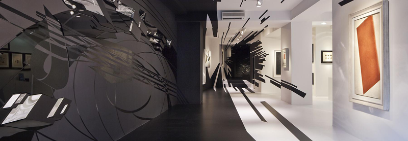
first image of the post

A graphic artist who is constantly looking for new sources of inspiration can find it in the most diverse places, from a piece of graffiti glimpsed from a train to an artist’s signature in the corner of a picture.

The world of contemporary art provides a rich variety of great ideas for reasons that are implicit in its name. It is always offering something new, inspirational and innovative. As such, contemporary art can serve as an important influence for graphic designers in the following five ways:

  • It challenges conventional thinking.
  • It offers new approaches to creative design.
  • It provides unique sources of inspiration.
  • It allows for a blending of cultural concepts.
  • It helps graphic designers embrace the latest art trends.

Where to look

There is no shortage of contemporary art galleries in every major city where you can seek inspiration. However, if you wish to find something a little out of the ordinary and truly cutting edge, then it is always a good idea to venture a bit off the beaten track.

For example, no visitor to Zurich should miss Galerie Gmurzynska on Paradeplatz. Originally established in 1960s Cologne, the gallery has a reputation for consistently featuring art that is rather unusual. As a case in point, while it loosely specializes in Russian avant-garde exhibits, it is currently hosting an exhibition on American icons.

This is just one example of the hidden treasures that you can find throughout Europe if you look beyond the usual tourist trails and well-known galleries such as the Tate Modern.

Drawing inspiration

If you are a graphic designer who is new to contemporary art, then you may have some doubts as to what you can take out of it. You might be reluctant to admit it, but you would not be the first to say that you don’t “get” a piece of art. Just keep in mind that every piece of art is not designed to appeal to everyone in the world.

Even if a piece of art does not strike a chord with you, there is much to be learned from considering what inspired the artist to create it and what it says to other people who view it. The range and diversity of what is loosely labeled as contemporary art provides a perfect opportunity to examine it from different viewpoints and perspectives.

The most common criticism of modern art is that it “does not look like anything,” but it is not quite that simple. What people actually mean is that it does not look like anything else, because unlike a portrait or a landscape, it is not attempting to recreate something that already exists. Put another way, is it more artistic to paint a representation of a church or create something entirely new?

The idea is that contemporary art challenges conventional thinking and helps you approach the entire sphere of graphic design from a new angle.

Give it a try

If preconceived notions about what you do and do not appreciate have so far prevented you from entering a contemporary art gallery, then take the plunge and give it a try. It will broaden your perspectives and inspire you to create better designs. And you never know — you might just like it too!

Between the Lines

Post pobrano z: Between the Lines

Media queries are great for changing values in sudden snaps at different screen sizes. But, combining the power of calc() and viewport units like vw and vh , we can get an awful lot of fluidity across our layouts. For this we’ll use a technique called linear interpolation.

Linear interpolation is a formula used to find a value between two points on a line. In our case those two points are CSS values, like font-sizes, margins or widths, that we want to interpolate between over a set of viewport widths.

The reason we might want to interpolate between values over a set of viewport widths is to avoid having to create multiple breakpoints to control the flow of our content when the viewport changes. Instead, we let the user’s browser calculate, according to our instructions, what values it gets. Let me explain.

The following snippet is a Sass function based on linear interpolation that we, at Aranja, have been calling between.

/**
 * Computes a CSS calc function that betweens a value from
 * A to B over viewport-width A to viewport-width B.
 * Requires a media query to cap the value at B.
 */

@function between($to, $from, $toWidth, $fromWidth) {
  $slope: ($to - $from) / ($toWidth - $fromWidth);
  $base: $from - $slope * $fromWidth;

  @return calc(#{$base} + #{100vw * $slope});
}

The function is used like so:

$small: 400px; 
$large: 1000px;

.Container {
  /* The base (smallest) value. */
  padding: 20px;

  /* In $small it should be 20px and in $large it should be 100px,  */
  /* In viewports between that its padding should be calculated */
  @media (min-width: $small) {
    padding: between(20px, 100px, $small, $large);
  }

/* In $large we cap the value at 100px */
  @media (min-width: $large) {
    padding: 100px;
  }
}

The code example above shows how we can between a container’s padding from being 20px in “mobile”-size to being 100px in “desktop”-size. Any size between that would get a calculated amount of padding ranging between 20 and 100 pixels. To prevent the padding from exceeding the maximum value we cap it with a breakpoint.

Try resizing the following demo to see the example in action:

See the Pen

The between function excels in solving spacing problems. Problems that previously we would have solved by hand using different media queries.

Example layout

The talented Carly Sylvester lent me the following wireframe she designed for a volunteer firefighter website so I get to demonstrate this technique on a real-world layout.

The design document consists of a desktop, tablet and mobile versions of the website, at 1440px, 720px and 324px respectively.
In reality, the lines between these different devices are not so clear-cut, so we’ll use the given values as target points and interpolate between them using our function.

Notice how the layout of the desktop and tablet versions are similar except for the use of white-space and font-sizes–which we’ll be able to interpolate between smoothly. When we get to our smallest target point we snap the layout into a classic full-width mobile layout.

See the Pen

For comparison, let’s see the implementation done the usual way, where the 3 main breakpoints are used to snap the layout their new values.

See the Pen

Videos of Demos

Resizing layout with between
Resizing layout without between

Try browsing the demos in different screen sizes and the benefits of our function should be clear. To make the „regular” version of the website better we’d need to add more breakpoints in addition to the original three from the design document, resulting in more jumps.

Combined with the power of rem

A powerful technique we can do with the function is to between the root font-size and base our styles on rems:

See the Pen

The rem unit refers to the root font-size (the font size set on the :root or html element) to determine its value and the root font-size refers to the viewport width to determine its value. We set the root font-size to be 10px at the smallest and 18px at the largest and the result is a smooth transition between the two. The smallest the card in the demo ever gets is 245px, at our $small breakpoint, and it gradually grows until it reaches its peak, 440px, at our $large breakpoint.

Closing

I am convinced that by utilizing this technique we can make the web a better experience for users browsing on devices that don’t fit into the generalization of „mobile” or „tablet” sizes. For me, at least, it also makes the development process more enjoyable as there are fewer layout-related bugs on my table.

Regarding browser support–the fact that we only need calc() and vw for the technique to work puts it at around 97% in USA and Europe, and around 84% globally.

In the demos above, for example, unsupported browsers (Which are mainly Opera Mini and UC Browser) will either use our lowest (base) values or our highest (capped) values, depending on the viewport width.


Between the Lines is a post from CSS-Tricks

Design deals for the week

Post pobrano z: Design deals for the week
first image of the post

Every week, we’ll give you an overview of the best deals for designers, make sure you don’t miss any by subscribing to our deals feed. You can also follow the recently launched website Type Deals if you are looking for free fonts or font deals.

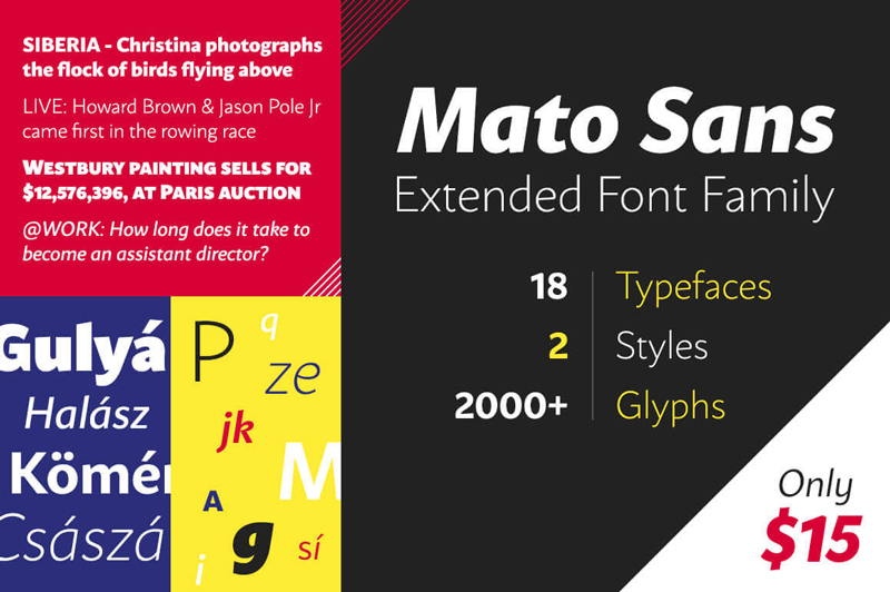
Mato Sans font family

This large font family features 18 fonts, each in 2 unique styles, as well as more than 2,000 glyphs per font! Toss in plenty of OpenType features and extended language sets for Latin and Cyrillic characters.

$15 instead of $290 – Get it now!

Lifetime Access to DesignBold’s Library of 6,000+ Templates

DesignBold can help you create beautiful designs in just a few short minutes! Whip up graphics for any social media account, blog posts, banners, advertisements, invitations, you name it. Fully customizable, this Mighty Deal gets you lifetime access to DesignBold’s extensive library of more than 6,000 templates.

$37 instead of $1140 – Get it now!

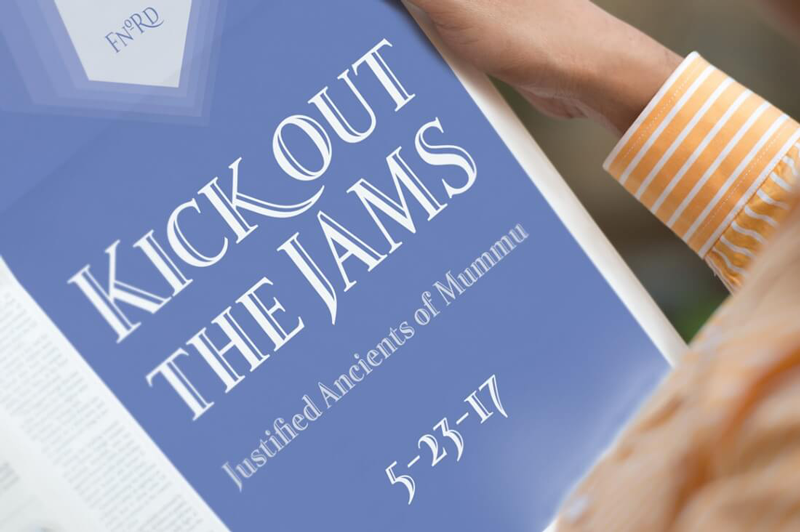
Fnord Type Family of 23 Unique Fonts

The Fnord Type Family is a contemporary humanist serif typeface containing 23 unique fonts! That’s 4 styles in 5 weights, plus an additional 3 display styles! With more than 650 glyphs per font, a full European character set and loads of extra features, this family has you covered and then some.

$17 instead of $230 – Get it now!

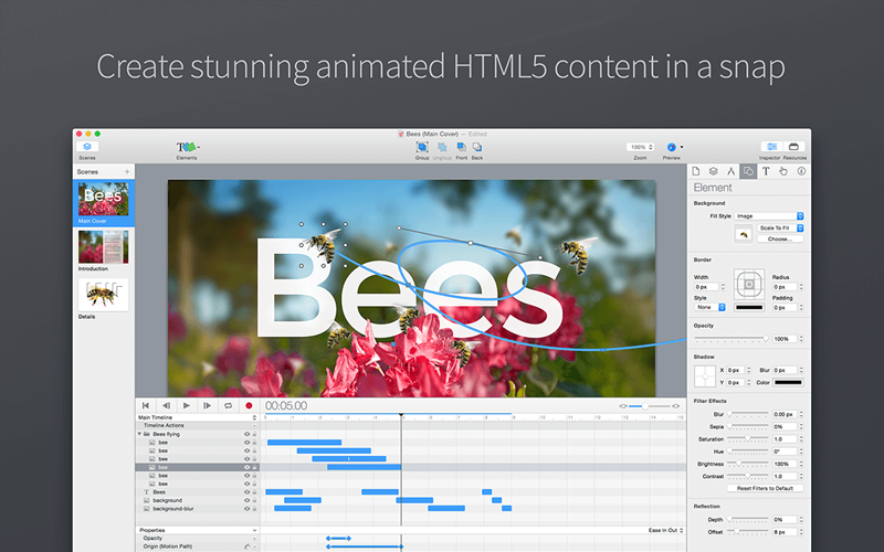
Tumult Hype for Mac

Animations can turn the ordinary into the extraordinary! With Tumult Hype 3.6, even the extraordinary levels up! This amazing Mac app lets you easily and quickly whip up beautiful HTML5 animations that work on timelines or based on user interactions. These animations can be built with keyframes and will display across all of today’s modern screen sizes. And if you act now, you can get Tumult Hype today for less than half price!

$24 instead of $49 – Get it now!

Bundle of 400+ High Quality Vector Textures from Ultrashock

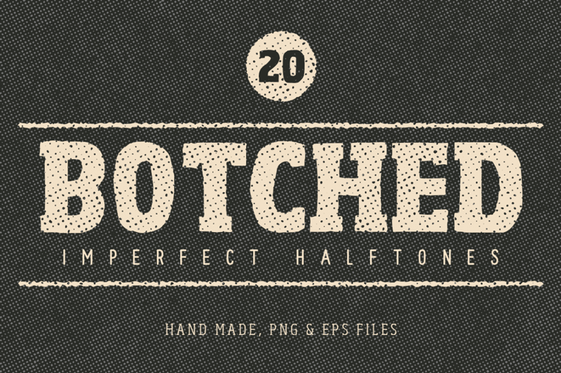
Stock up on a ton of creative items now with Ultrashock’s latest Creative Bundle which contains 418 brand new vector textures including Slick Tones (smooth halftone patterns with subtle gradients), Scratches and Scuffs, Retropress (distressed halftone scuffs), Subtle Grit Volume 01 and 02, Authentic Wood Grain, Noise Volume 01 and 02, Fine Grit, Retro Textures, Rusty Metal, Destructive Forces Backgrounds, Botched Imperfect Halftones, Granite Textures and more all with amazing value!

$24 instead of $674 – Get it now!

Nissan Frontier CloudCatcher saves village

Post pobrano z: Nissan Frontier CloudCatcher saves village

Nissan Brasil is promoting the new Nissan Frontier four wheel drive pickup with The CloudCatcher (O Caçador de Nuvens), a commercial in which two young farmers take drastic action to save their village from drought. The men are despairing over their dried-up crops when one of them has a bright idea: although their village is parched, there’s a stubborn rain cloud around a nearby mountain that refuses to move. They devise an ingenious scheme involving their Nissan Frontier truck, some ropes and a makeshift parachute that will eventually bring a piece of cloud down to the village. The commercial was filmed in Picotes, a village in Paraíba, northeastern Brazil, where it hadn’t rained for six years. Just as a the final rain scene was about to be shot, it actually started raining. The CloudCatcher campaign, with the tagline “#ÉMaisQueForça” (More than Force) is also made up of magazine and newspaper ads, a microsite, social media pieces and CRM.

Nissan Frontier Cloudcatcher

Nissan Frontier CloudCatcher Credits

The Nissan Frontier CloudCatcher campaign was developed at LewLara/TBWA by chief creative officer Felipe Luchi, creative directors Sthefan Ko and Gustavo Diehl, creatives Sthefan Ko, Fabio Santoro, Pedro Paes, Guilherme Possobon and Renato Simon, RTV team Luzia Oliveira and Cristiane Marinari, planners Renata d’Avila, Luciana Mussato, Maria Fernanda Haddad, Murilo Chagas and Luiz Menezes, media team Luiz Ritton, Thiago Ferraz, Suellen Kiss, Daniele Farhat, Bruna Dantas and Renato Pierote, general account director Wilson Negrini, account team Xiko Coutinho, Raiza Scatena and Caio Bottan, working with Nissan Brasil marketing team Arnaud Charpentier, Humberto Campusano, Mariana Lemos, Fabio Lima, Juliano Fortini and Murilo Almeida.

Filming was shot by director Rodrigo Saavedra via Landia, Sao Paulo, with executive producers Carol Dantas and Sebastian Hall, director of photography Javier Juliá, and production designer Julian Romera.

Film director Rodrigo Saavedra said, “4×4 and pick-up truck ads are generally all about power, all about being aggressive and tackling any terrain that comes your way. What struck me about this film was the fact that it actually has quite an emotional story at it’s core. It tells the story of two farmers struggling with a drought and then goes into a fantastic tale which nonetheless requires some extremely hard work from their Nissan Frontier.”

Visual effects were produced at Clan VFX. Colour grading was by Marla Colour Grading.

Sound and music were produced at Supersonica, by sound designer Vinicius Villani, account director Cristiane Marquesi, composers Antonio Pinto and Gabriel Ferreira, and voiceover artist Denis Garcia.

MIA Onlus Shelter Box helps Milan Homeless

Post pobrano z: MIA Onlus Shelter Box helps Milan Homeless

Milano in Azione Onlus (MIA Onlus) has launched the Shelter Box, a project designed to help the approximately 3,000 homeless people living in Milan. Over winter the number of beds in emergency shelters is increased in a temporary “cold floor” housing plan. However, come March 31, many find themselves back on the streets. “When winter ends, the emergency continues”. Some of these people have been on the streets for years, while others are recent arrivals, having lost their job, their home and love. MIA Onlus is distributing the Shelter Box that serves as a bed, chair, table and portable bag, providing shelter from the elements while sleeping, and storage of possessions during the day. The following commercial raises awareness of the post-Winter realities, and calls for financial support in extending the Shelter Box program.

MIA Onlus Shelter Box

The MIA Onlus Shelter Box is a design product made of quality cardboard, durable and lightweight, able to provide maximum insulation from moisture. This box is composed of a telescopic structure of three elements that interlock and allow the product to easily turn into a bed, a chair, a table or a backpack. It can be transported as a container to be reused over time.

At the end of the “cold Municipal Plan” (March 31), when many homeless people have had to leave their bed and get back on the road, MIA Milan in Action Fund has distributed the first modules to some of its clients but is now looking for financial support to grow the program.

Shelter Box Credits

The MIA Onlus Shelter Box campaign was developed at Leo Burnett Italia, Milan, by executive creative directors Francesco Bozza and Alessandro Antonini, creative director Nicoletta Zanterino, art directors/designers Filippo Formentini and Marco Zilioli, copywriters Alejandra Gumucio and Andrea Zanino, product designer Andrea Longoni, and producer Alessandra Caldi.

Filming was shot by director Claudio Gallinella via Bedeschifilm.

Autism Day in the Life of Enzo

Post pobrano z: Autism Day in the Life of Enzo

French agency Herezie has produced a pro-bono documentary, “With You We Can Heal It”, in partnership with Vaincre L’Autisme, following the day-to-day life of Enzo, a young boy with autism. Launched to coincide with World Autism Awareness Day (April 2, 2017), the film is designed to support global awareness raising and fundraising. For autistic Enzo, climbing stairs is like climbing Mt Everest. Expressing himself, nearly impossible, without being able to say simple words. One cannot imagine how this little boy or his parents do it. But, they do.

Autism film Enzo and Mother

Baptiste Clinet, Executive Creative Director of Herezie explains the thinking behind the campaign:

“Spending a month to create this documentary to help raise awareness for autism and a call for donations, permitted me to witness, first-hand, what the child goes through –with determination– repeating the same exercise over and over again. It was one of the most humbling things I’ve had the chance to witness. We cannot comprehend how hard it is for the child, the parents and caretakers; but, we need to. This need to engage and help in any way we can, is what drove us to create the film to be shared widely by anyone and everyone in support and celebration of World Autism Awareness Day.”

Autism film Enzo climbing steps

Q&A Up close with Herezie

Q. What’s the story in 2 sentences? It’s the story of an autistic and non-verbal 5 years old boy who practices for 30 days to become the spokesman of an association.

Q. In your own words, what is the emotional reason people should care? In France, there are 650 000 people with ASD (Autistic Spectrum Disorder) and a real lack of infrastructure to take care of them. It could be their brother, their child, their life.

Q. Why this idea? To be able to speak, to be able to write.. All these simple things that get us through life, we take them for granted. We wanted to show the amount of effort, help and time an autistic person needs to achieve these simple things, and the fact that only money can assure these kids to be appropriately accompanied.

Q How does the idea position the marque? The idea shows how the association can accompany and take care of all the people with ASD. It also shows that it’s a « human size » association that needs money.

Q. Tell me about the tonality you chose and why? For too many people, « autism » is hard to define. We wanted to explain and show them what it’s like. Instead of showing tears and failure, we wanted to show determination, dedication and love. When you get to know the families who have to deal with ASD, you immediately get blown away by those precise qualities.

Q. Where did you shoot and why? We shot at the Futuroschool, where Enzo goes every day. It had to be 100% real. No acting, nothing.

Q. What was the most challenging part of pulling off this idea and how did you overcome it? The most challenging thing was to not disturb Enzo’s routine in the process of bringing this campaign to life. Besides, we didn’t know the outcome of all this. We had to adapt our message to Enzo’s capacities; and, yet, we weren’t sure he was going to succeed. With the help of his parents and all the people at the Futuroschool, we managed to spend enough time with him.

Q. Who was the director and why? With a very low budget, we had to find clever solutions to follow Enzo through this journey. We decided to partner with Auguste Bas and Robin Deriaud, two freshly graduated and talented students of Luc Besson’s school École de la Cité. This way, they could be with Enzo 8 hours a day for an entire month.

Autism Day in the Life Credits

The Autism Day in the Life campaign was developed at Herezie Group by executive creative director Baptiste Clinet, head of creative content Paul Marty, art directors/copywriters Jacques Denain, Nicolas Duménil, strategic planner Camille Lallier, PR directors Kim Ball and Morgane Le Rol, agency producer Barbara Vaira, COO Pierre Callegari, CEO Andrea Stillacci, associate general managers Edouard De Pouzilhac, Thomas Couteau, and associate managing director Arno Pons.

Digital work was done at 5eme Gauche.

Filming was shot by directors Auguste Bas and Robin Deriaud via FullDawa Production, Paris, with producers Boris Mendza, Gael Cabouat, Alexandre Bonaldi, production coordinator Maud ramos Guerrero.

Editor was Mehdi Lachhab. Grading was done at Bend the Colour Studio by colourist Raphael Kourisky.

Original music was by Eraldo Bernocchi and Lorenzo Esposito Fornasari, at TransmutationLtd.