Everything has to be locked down due to the virus. But what if you can’t stay in because you don’t have a home to go to. If you’re literally homeless? But finding shelter isn’t the only issue homeless people are facing during the crisis. With the majority of shops closed some people don’t know where to find food or even wash their hands. Agency came up with the idea of solo street musical marathon #listenathome #слухайвдома for those who have no home. A marathon to raise the awareness of the problem and raise money to help homeless people to get their daily meals, face masks and hand sanitizers. And that is the commercial to promote it. The spot was created with the real footage of locked down Kyiv during COVID-19 and actual photos of homeless people. And to make it more touching agency used a famous song about having no home: Alone in canoe – I don’t have home.
Everything has to be locked down due to the virus. But what if you can’t stay in because you don’t have a home to go to. If you’re literally homeless? But finding shelter isn’t the only issue homeless people are facing during the crisis. With the majority of shops closed some people don’t know where to find food or even wash their hands. Agency came up with the idea of solo street musical marathon #listenathome #слухайвдома for those who have no home. A marathon to raise the awareness of the problem and raise money to help homeless people to get their daily meals, face masks and hand sanitizers. And that is the commercial to promote it. The spot was created with the real footage of locked down Kyiv during COVID-19 and actual photos of homeless people. And to make it more touching agency used a famous song about having no home: Alone in canoe – I don’t have home.
Everything has to be locked down due to the virus. But what if you can’t stay in because you don’t have a home to go to. If you’re literally homeless? But finding shelter isn’t the only issue homeless people are facing during the crisis. With the majority of shops closed some people don’t know where to find food or even wash their hands. Agency came up with the idea of solo street musical marathon #listenathome #слухайвдома for those who have no home. A marathon to raise the awareness of the problem and raise money to help homeless people to get their daily meals, face masks and hand sanitizers. And that is the commercial to promote it. The spot was created with the real footage of locked down Kyiv during COVID-19 and actual photos of homeless people. And to make it more touching agency used a famous song about having no home: Alone in canoe – I don’t have home.
In 1964, the first-ever Ford Mustang rolled off the production line. 10 million Mustangs later, the inspiration continues. For 55 years, the Ford Mustang has fueled millions of stories around the world— sparking new adventures, inspiring competition, filmmakers and song writers; becoming memories, and steering the course of history. To commemorate the 10 millionth Mustang made we created a gallery online representing some of the most impactful and timeless cultural stories inspired by the Mustang.
In 1964, the first-ever Ford Mustang rolled off the production line. 10 million Mustangs later, the inspiration continues. For 55 years, the Ford Mustang has fueled millions of stories around the world— sparking new adventures, inspiring competition, filmmakers and song writers; becoming memories, and steering the course of history. To commemorate the 10 millionth Mustang made we created a gallery online representing some of the most impactful and timeless cultural stories inspired by the Mustang.
We mentioned a way to make a CSS-only carousel in a recent issue of the newsletter and I thought that a more detailed write up would be interesting and capture some of my thoughts on making one.
So, here’s what we’re making today:
There’s no JavaScript here, whatsoever! No jQuery plugins. No trickiness. Just a couple of new-ish CSS properties that I’ve been experimenting with as well as some basic HTML.
OK to start, we need to focus on the markup. The design includes a left navigation made up of images and a large image gallery on the right that lets us scroll through each image individually. We’ll also need a wrapper to help us organize the layout:
After saving images with the CodePen asset manager, I started adding the URLs to the nav element:
<nav class="lil-nav">
  <a href="#image-1">
    <img class="lil-nav__img" src="..." alt="Yosemite" />
  </a>
  <a href="#image-2">
    <img class="lil-nav__img" src="..." alt="Basketball hoop" />
  </a>
  <!-- more images go here -->
</nav>
See that the href to each of these links is pointing to an ID? That’s because if we look at the demo again, we want to be able to click an image and then we want to it to hop to the larger version of that image in the gallery to the right.
So, now we can start to add these images to the large gallery, too…
<div class="gallery">
  <img class="gallery__img" id="image-1" src="..." alt="Yosemite" />
  <img class="gallery__img" id="image-2" src="..." alt="Basketball hoop" />
  <!-- more images go here -->
</div>
Nifty. Next is the fun part: styling this bad boy. We can use a grid layout the parent .wrapper and set some smart defaults for the img element:
So far, we have our layout sorted and our links set up. Next, let’s any any overflow that might spill outside our wrapper and make sure that the nav and the gallery are scrollable:
We can scroll through each image in the gallery now, but if this was a production website we’d probably want to make sure that folks can scroll passed this carousel a bit more easily. Trent Walton wrote about this very problem several years ago and I think it’s always worth keeping in mind.
Next up, let’s focus on the carousel snap of each image in the gallery. To do that we’ll need to use the scroll-snap-type and scroll-snap-align property like this:
Now try scrolling through the gallery on the right-hand side again:
CodePen Embed Fallback
If you want to learn more about these properties I’d highly recommend this piece about practical CSS scroll snapping which digs into the nitty-gritty of these properties.
We have a pretty dang usable carousel! From here, all we have to do is tidy up the design because the gallery image isn’t the full height of the screen. To do that we can use object-fit and give each image a min-height with the vh unit, just like this:
Now the big gallery images will always be the full size of the screen and will scale to take up the width and height. Let’s move on and tackle the style of the little navigation images:
At first, I made this little nav act like a carousel too, but it felt really weird. I’m just keeping the default scroll behavior for now. In that demo above, though, try clicking an image. Notice how it jumps to that image in the carousel immediately? It would be nice if we could animate that transition a bit — and we can!
.gallery {
  overflow: scroll;
  scroll-snap-type: x mandatory;
  scroll-behavior: smooth;
}
That scroll-behavior CSS property is super handy for this and so now the whole thing will animate if you click one of the nav items:
CodePen Embed Fallback
Nifty, eh? One more tiny thing we could do here is throw a filter on the nav items to make them black and white and then animate them on hover:
I’m sure there’s a lot more we could do here but I think this works quite nicely!
CodePen Embed Fallback
We could even throw a tiny bit of JavaScript into the mix to show which image is active, but I reckon that folks know that just from looking at the gallery.
That’s it! We now have a carousel that’s pretty dang good for progressive enhancement and it means we don’t have to load a library of JavaScript or write a bunch more code than we really need to.
Making the carousel responsive…
Let’s go one step further though and make this chap responsive. What we want to do is reverse the order of our grid by moving all of our current styles into a media query that is only activated at larger screens.
You might want to open up this demo in a new tab and decrease/increase the size of the browser to see the changes take place:
CodePen Embed Fallback
If you load this demo on a mobile device you should see how the layout switches between the two modes. This is done by using a single media query on the .wrapper element. Note that we’re using Sass:
Let’s add one on the navigation, too. But this time, we need to tell the navigation to start on the second row so it moves to the bottom of the screen:
With the gallery we need to switch around the scroll-type for larger screens and reverse the overflow property as well:
.gallery {
  overflow-x: scroll;
  overflow-y: hidden;
  scroll-snap-type: x mandatory;
  scroll-behavior: smooth;
  display: flex;

  @media screen and (min-width: $large) {
    display: block;
    overflow-y: scroll;
    overflow-x: hidden;
    scroll-snap-type: y mandatory;
  }
}
That’s the bulk of the changes we’ve had to make and I quite like it! If we wanted to make this production-ready, we would think about accessibility (e.g. we probably don’t want screen readers to read out all the images in both the nav and gallery). Then there’s performance — we might consider lazy-loading so the images are only rendered when they’re needed.
We mentioned a way to make a CSS-only carousel in a recent issue of the newsletter and I thought that a more detailed write up would be interesting and capture some of my thoughts on making one.
So, here’s what we’re making today:
There’s no JavaScript here, whatsoever! No jQuery plugins. No trickiness. Just a couple of new-ish CSS properties that I’ve been experimenting with as well as some basic HTML.
OK to start, we need to focus on the markup. The design includes a left navigation made up of images and a large image gallery on the right that lets us scroll through each image individually. We’ll also need a wrapper to help us organize the layout:
After saving images with the CodePen asset manager, I started adding the URLs to the nav element:
<nav class="lil-nav">
  <a href="#image-1">
    <img class="lil-nav__img" src="..." alt="Yosemite" />
  </a>
  <a href="#image-2">
    <img class="lil-nav__img" src="..." alt="Basketball hoop" />
  </a>
  <!-- more images go here -->
</nav>
See that the href to each of these links is pointing to an ID? That’s because if we look at the demo again, we want to be able to click an image and then we want to it to hop to the larger version of that image in the gallery to the right.
So, now we can start to add these images to the large gallery, too…
<div class="gallery">
  <img class="gallery__img" id="image-1" src="..." alt="Yosemite" />
  <img class="gallery__img" id="image-2" src="..." alt="Basketball hoop" />
  <!-- more images go here -->
</div>
Nifty. Next is the fun part: styling this bad boy. We can use a grid layout the parent .wrapper and set some smart defaults for the img element:
So far, we have our layout sorted and our links set up. Next, let’s any any overflow that might spill outside our wrapper and make sure that the nav and the gallery are scrollable:
We can scroll through each image in the gallery now, but if this was a production website we’d probably want to make sure that folks can scroll passed this carousel a bit more easily. Trent Walton wrote about this very problem several years ago and I think it’s always worth keeping in mind.
Next up, let’s focus on the carousel snap of each image in the gallery. To do that we’ll need to use the scroll-snap-type and scroll-snap-align property like this:
Now try scrolling through the gallery on the right-hand side again:
CodePen Embed Fallback
If you want to learn more about these properties I’d highly recommend this piece about practical CSS scroll snapping which digs into the nitty-gritty of these properties.
We have a pretty dang usable carousel! From here, all we have to do is tidy up the design because the gallery image isn’t the full height of the screen. To do that we can use object-fit and give each image a min-height with the vh unit, just like this:
Now the big gallery images will always be the full size of the screen and will scale to take up the width and height. Let’s move on and tackle the style of the little navigation images:
At first, I made this little nav act like a carousel too, but it felt really weird. I’m just keeping the default scroll behavior for now. In that demo above, though, try clicking an image. Notice how it jumps to that image in the carousel immediately? It would be nice if we could animate that transition a bit — and we can!
.gallery {
  overflow: scroll;
  scroll-snap-type: x mandatory;
  scroll-behavior: smooth;
}
That scroll-behavior CSS property is super handy for this and so now the whole thing will animate if you click one of the nav items:
CodePen Embed Fallback
Nifty, eh? One more tiny thing we could do here is throw a filter on the nav items to make them black and white and then animate them on hover:
I’m sure there’s a lot more we could do here but I think this works quite nicely!
CodePen Embed Fallback
We could even throw a tiny bit of JavaScript into the mix to show which image is active, but I reckon that folks know that just from looking at the gallery.
That’s it! We now have a carousel that’s pretty dang good for progressive enhancement and it means we don’t have to load a library of JavaScript or write a bunch more code than we really need to.
Making the carousel responsive…
Let’s go one step further though and make this chap responsive. What we want to do is reverse the order of our grid by moving all of our current styles into a media query that is only activated at larger screens.
You might want to open up this demo in a new tab and decrease/increase the size of the browser to see the changes take place:
CodePen Embed Fallback
If you load this demo on a mobile device you should see how the layout switches between the two modes. This is done by using a single media query on the .wrapper element. Note that we’re using Sass:
Let’s add one on the navigation, too. But this time, we need to tell the navigation to start on the second row so it moves to the bottom of the screen:
With the gallery we need to switch around the scroll-type for larger screens and reverse the overflow property as well:
.gallery {
  overflow-x: scroll;
  overflow-y: hidden;
  scroll-snap-type: x mandatory;
  scroll-behavior: smooth;
  display: flex;

  @media screen and (min-width: $large) {
    display: block;
    overflow-y: scroll;
    overflow-x: hidden;
    scroll-snap-type: y mandatory;
  }
}
That’s the bulk of the changes we’ve had to make and I quite like it! If we wanted to make this production-ready, we would think about accessibility (e.g. we probably don’t want screen readers to read out all the images in both the nav and gallery). Then there’s performance — we might consider lazy-loading so the images are only rendered when they’re needed.
That title is from the opening tweet of a thread from Benjamin De Cock. I wouldn’t go that far, myself. What I like about the term is that ‘Front-End’ literally means the browser, and while the job has been changing quite a lot — and is perhaps fracturing before our eyes — the fact that the job is about doing browser work is still true. We’re browser people. This was a point I tried to make in my “Ooooops I guess we’re full-stack developers now” talk.
I really like Benjamin’s sentiment though. There is a scourge of implementations of things on the web that are both heavier and worse because they re-implement something that the browser offers better and “for free.” Think sliders: scrolling behavior, snap points, fixed/sticky positioning, form controls, animation, etc.
Our industry seems to have acknowledged that backend and frontend developers require very different skills (even though they often use the exact same language), and yet it’s struggling to see there’s too much bundled into the term “front-end developer”.
That’s the tricky part. That’s at the heart of The Great Divide. There’s an awful lot of front-end developers where their job solely focuses on JavaScript. You could call them “JavaScript Engineers” or “JavaScript Developers,” and that feels OK. However, I’m not sure what you call someone who’s a great front-end developer, not particularly focused on JavaScript, but is on other aspects of the front end.
The modern frontend developer is most often than not a “Jack of all trades” mastering JS (or even just a framework) and barely tolerating HTML/CSS as a necessary evil. That’s understandable. I strongly think it’s a different specialization, and it’s too much for a single person.
Yep, it’s OK! The divide isn’t a bad thing; it’s just a thing. Front-end teams need JavaScript specialists and CSS specialists and accessibility specialists and performance specialists and animation specialists and internationalization specialists and, and, and, and. They don’t have to all be separate people. People can be good at multiple things. It’s just exceptionally rare that people are good at everything, even when scoped only to front-end skills.
That title is from the opening tweet of a thread from Benjamin De Cock. I wouldn’t go that far, myself. What I like about the term is that ‘Front-End’ literally means the browser, and while the job has been changing quite a lot — and is perhaps fracturing before our eyes — the fact that the job is about doing browser work is still true. We’re browser people. This was a point I tried to make in my “Ooooops I guess we’re full-stack developers now” talk.
I really like Benjamin’s sentiment though. There is a scourge of implementations of things on the web that are both heavier and worse because they re-implement something that the browser offers better and “for free.” Think sliders: scrolling behavior, snap points, fixed/sticky positioning, form controls, animation, etc.
Our industry seems to have acknowledged that backend and frontend developers require very different skills (even though they often use the exact same language), and yet it’s struggling to see there’s too much bundled into the term “front-end developer”.
That’s the tricky part. That’s at the heart of The Great Divide. There’s an awful lot of front-end developers where their job solely focuses on JavaScript. You could call them “JavaScript Engineers” or “JavaScript Developers,” and that feels OK. However, I’m not sure what you call someone who’s a great front-end developer, not particularly focused on JavaScript, but is on other aspects of the front end.
The modern frontend developer is most often than not a “Jack of all trades” mastering JS (or even just a framework) and barely tolerating HTML/CSS as a necessary evil. That’s understandable. I strongly think it’s a different specialization, and it’s too much for a single person.
Yep, it’s OK! The divide isn’t a bad thing; it’s just a thing. Front-end teams need JavaScript specialists and CSS specialists and accessibility specialists and performance specialists and animation specialists and internationalization specialists and, and, and, and. They don’t have to all be separate people. People can be good at multiple things. It’s just exceptionally rare that people are good at everything, even when scoped only to front-end skills.
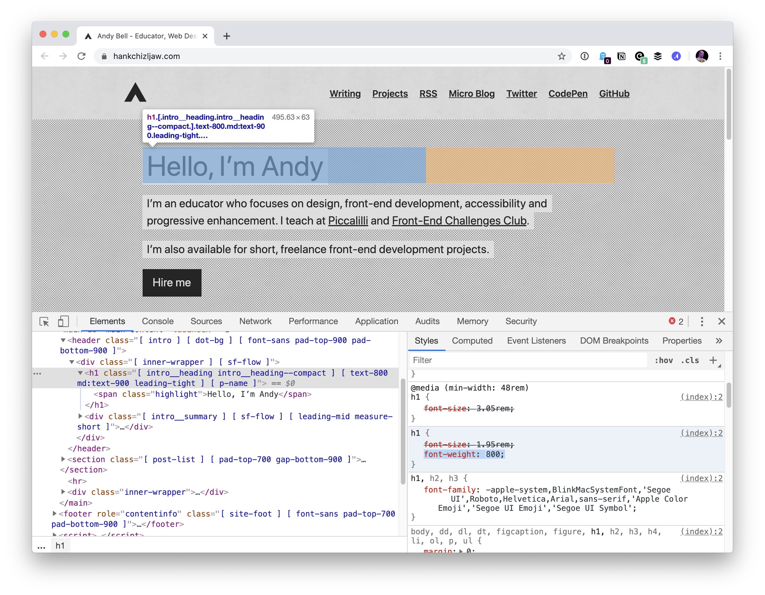
There was just a bug late last year where system fonts (at least on Mac, I don’t know what the story was on other platforms) in Chrome appeared too thin and tracked-in at small sizes and too thick and tracked-out at larger sizes. That one was fixed, thankfully. But while it was a problem, it was the reason I gave up on system fonts for now and switched something else. A performance loss but aesthetic gain.
Now there is a new much worse bug, where the system font can’t be bolded. It’s not great, as a ton of sites roll with the system font stack as it has two major benefits: 1) it can help your site look like the operating system 2) it has great performance as the site doesn’t need to download/display and custom fonts.
… the bug caught the attention of Adam Argyle, maker of VisBug and Chrome CSS Developer Advocate at Google. Argyle created a Chromium bug report, but the Chromium development team ultimately decided it wasn’t a blocker for releasing version 81. That resulted in sites like Coywolf not being able to use bold text for fonts that are larger than 16px (e.g., every heading).
The bug won’t be fixed in version 82 because the Chromium team announced that they’re skipping it, and will be releasing version 83 in mid-May instead. Argyle assured everyone on the original GitHub bug report that it would be fixed in version 83.
Above is Jon’s site. Andy Bell’s site got hit by it too.
So we’re looking at 4 weeks or so. Šime Vidas proposed a temporary fix of going Helvetica for now:
body {
  font-family: -apple-system, Helvetica;
}
I guess with -apple-system in there, older versions of Chrome/macOS still might be able to benefit from system fonts? Not sure.
That brings up a source of confusion for me. When I first heard of using system font stacks, there was -apple-system and BlinkMacSystemFont and you were supposed to use them in that order in the font stack. Then came along -system-ui, and that seemed to work well all by itself and that was nice as it was obviously less Mac-specific. But there is also system-ui (no starting dash), and that seems to do the same thing and I’m not sure which is correct. Now it looks like the plan is ui-sans-serif and friends (like ui-serif and ui-monospace). I like the idea, but I’d love to hear clarity from browser vendors on what the recommended use is. Are we in a spot like this?
/* Just a guess... */
body {
  font-family:
    ui-sans-serif,
    system-ui,
    -system-ui,
    -apple-system,
    BlinkMacSystemFont,
    Roboto, Helvetica, Arial,
    sans-serif,
    "Apple Color Emoji";
}
Another observation from me… as I was trying to replicate this on Chrome 81, at first I was like “weird, works for me”, because I was trying out the bolding on default 16px text. I noticed that it was when the font was 20px or bigger the problem kicked in: