There was just a bug late last year where system fonts (at least on Mac, I don’t know what the story was on other platforms) in Chrome appeared too thin and tracked-in at small sizes and too thick and tracked-out at larger sizes. That one was fixed, thankfully. But while it was a problem, it was the reason I gave up on system fonts for now and switched something else. A performance loss but aesthetic gain.
Now there is a new much worse bug, where the system font can’t be bolded. It’s not great, as a ton of sites roll with the system font stack as it has two major benefits: 1) it can help your site look like the operating system 2) it has great performance as the site doesn’t need to download/display and custom fonts.
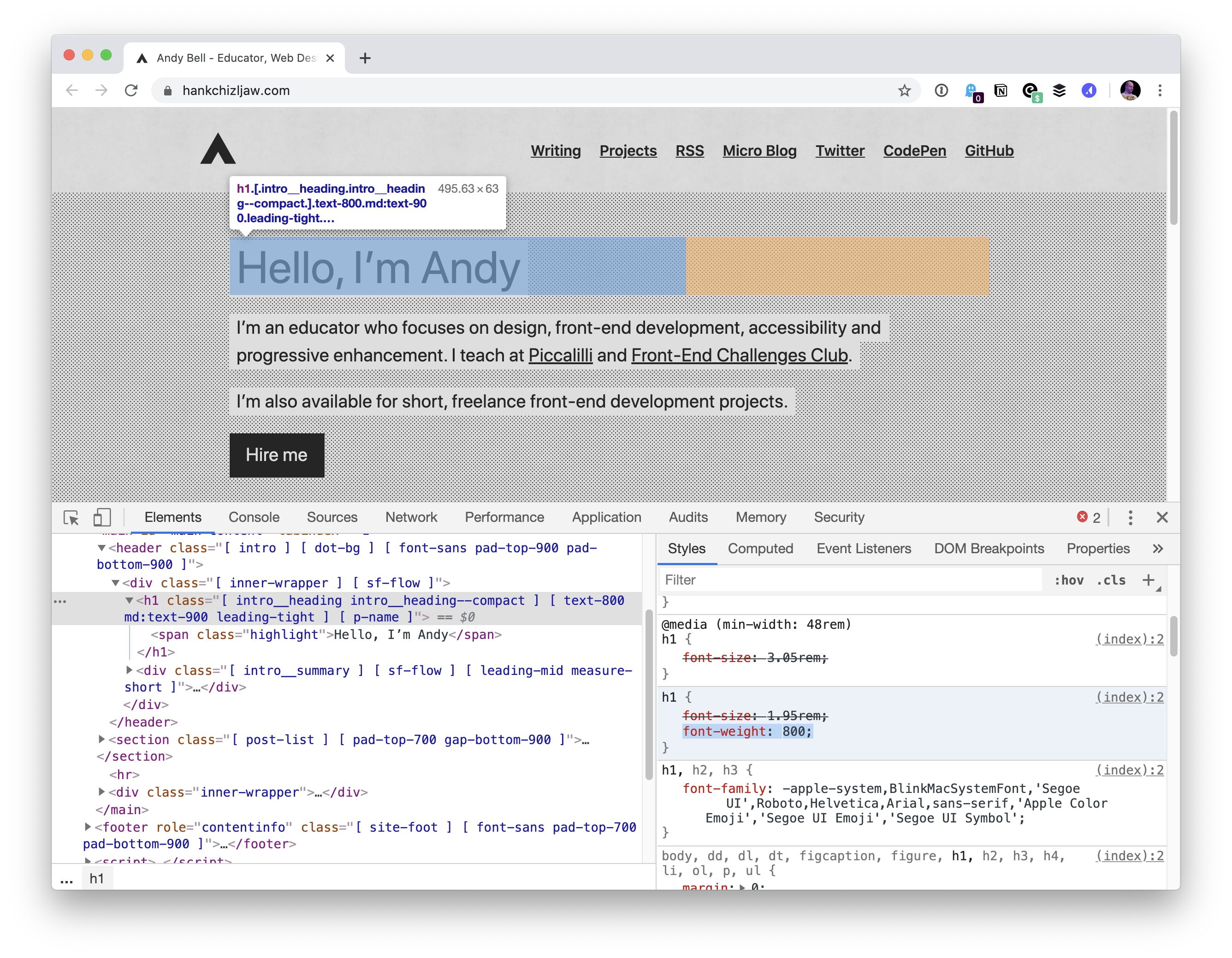
… the bug caught the attention of Adam Argyle, maker of VisBug and Chrome CSS Developer Advocate at Google. Argyle created a Chromium bug report, but the Chromium development team ultimately decided it wasn’t a blocker for releasing version 81. That resulted in sites like Coywolf not being able to use bold text for fonts that are larger than 16px (e.g., every heading).
The bug won’t be fixed in version 82 because the Chromium team announced that they’re skipping it, and will be releasing version 83 in mid-May instead. Argyle assured everyone on the original GitHub bug report that it would be fixed in version 83.
Above is Jon’s site. Andy Bell’s site got hit by it too.
So we’re looking at 4 weeks or so. Šime Vidas proposed a temporary fix of going Helvetica for now:
body {
  font-family: -apple-system, Helvetica;
}
I guess with -apple-system in there, older versions of Chrome/macOS still might be able to benefit from system fonts? Not sure.
That brings up a source of confusion for me. When I first heard of using system font stacks, there was -apple-system and BlinkMacSystemFont and you were supposed to use them in that order in the font stack. Then came along -system-ui, and that seemed to work well all by itself and that was nice as it was obviously less Mac-specific. But there is also system-ui (no starting dash), and that seems to do the same thing and I’m not sure which is correct. Now it looks like the plan is ui-sans-serif and friends (like ui-serif and ui-monospace). I like the idea, but I’d love to hear clarity from browser vendors on what the recommended use is. Are we in a spot like this?
/* Just a guess... */
body {
  font-family:
    ui-sans-serif,
    system-ui,
    -system-ui,
    -apple-system,
    BlinkMacSystemFont,
    Roboto, Helvetica, Arial,
    sans-serif,
    "Apple Color Emoji";
}
Another observation from me… as I was trying to replicate this on Chrome 81, at first I was like “weird, works for me”, because I was trying out the bolding on default 16px text. I noticed that it was when the font was 20px or bigger the problem kicked in:
Favicons are the little icons you see in your browser tab. They help you understand which site is which when you’re scanning through your browser’s bookmarks and open tabs. They’re a neat part of internet history that are capable of performing some cool tricks.
One very new trick is the ability to use SVG as a favicon. It’s something that most modern browsers support, with more support on the way.
Here’s the code for how to add favicons to your site:
If a browser doesn’t support a SVG favicon, it will ignore the first link element declaration and continue on to the second. This ensures that all browsers that support favicons can enjoy the experience.
You may also notice the alternate attribute value for our rel declaration in the second line. This programmatically communicates to the browser that the favicon with a file format that uses .ico is specifically used as an alternate presentation.
Following the favicons is a line of code that loads another SVG image, one called safari-pinned-tab.svg. This is to support Safari’s pinned tab functionality, which existed before other browsers had SVG favicon support. There’s additional files you can add here to enhance your site for different apps and services, but more on that in a bit.
Here’s more detail on the current level of SVG favicon support:
This browser support data is from Caniuse, which has more detail. A number indicates that browser supports the feature at that version and up.
Desktop
Chrome
Firefox
IE
Edge
Safari
80
41
No
80
TP
Mobile / Tablet
Android Chrome
Android Firefox
Android
iOS Safari
80
No
No
13.4
Why SVG?
You may be questioning why this is needed. The .ico file format has been around forever and can support images up to 256×256 pixels in size. Here are three answers for you.
Ease of authoring
It’s a pain to make .ico files. The file is a proprietary format used by Microsoft, meaning you’ll need specialized tools to make them. SVG is an open standard, meaning you can use them without any further tooling or platform lock-in.
Future-proofing
Retina? 5k? 6k? When we use a resolution-agnostic SVG file for a favicon, we guarantee that our favicons look crisp on future devices, regardless of how large their displays get.
Performance
SVGs are usually very small files, especially when compared to their raster image counterparts — even more-so if you optimize them beforehand. By only using a 16×16 pixel favicon as a fallback for browsers that don’t support SVG, we provide a combination that enjoys a high degree of support with a smaller file size to boot.
This might seem a bit extreme, but when it comes to web performance, every byte counts!
Tricks
Another cool thing about SVG is we can embed CSS directly in it. This means we can do fun things like dynamically adjust them with JavaScript, provided the SVG is declared inline and not embedded using an img element.
Since SVG favicons are embedded using the link element, they can’t really be modified using JavaScript. We can, however, use things like emoji and media queries.
Emoji
Lea Verou had a genius idea about using emoji inside of SVG’s text element to make a quick favicon with a transparent background that holds up at small sizes.
Now that all modern browsers support SVG favicons, here's how to turn any emoji into a favicon.svg:
For supporting browsers, this code means our star-shaped SVG favicon will change its fill color from black to white when dark mode is activated. Pretty neat!
Other media queries
Dark mode support got me thinking: if SVGs can support prefers-color-scheme, what other things can we do with them? While the support for Level 5 Media Queries may not be there yet, here’s some ideas to consider:
Use light-level to desaturate favicon colors in a low-light environment.
Use inverted-colors to “flip” inverted colors to preserve branding, or to ensure a photorealistic favicon looks as intended.
A mockup of how these media query-based adjustments could work.
Keep it crisp
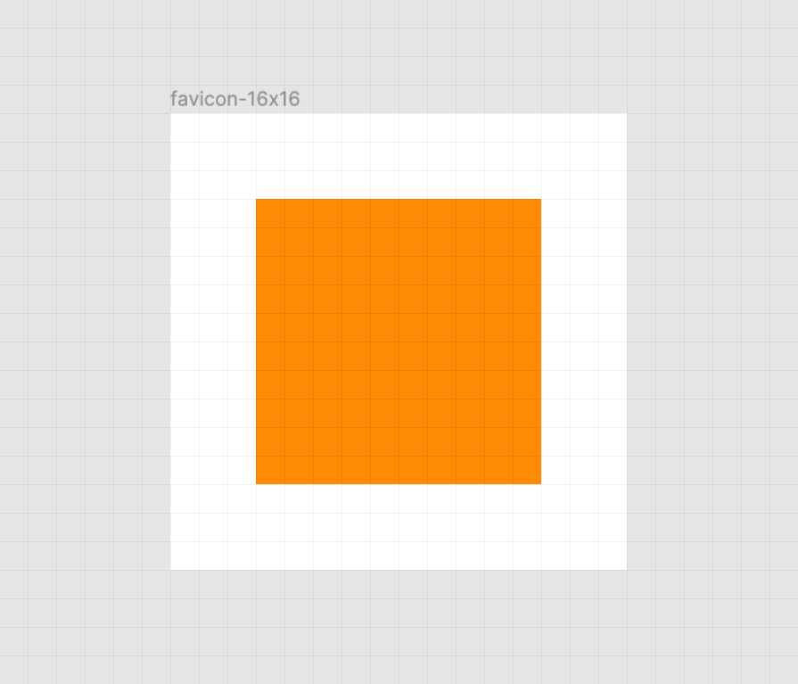
Another important aspect of good favicon design is making sure they look good in the small browser tab area. The secret to this is making the paths of the vector image line up to the pixel grid, the guide a computer uses to turn SVG math into the bitmap we see on a screen.
Here’s a simplified example using a square shape:
When the vector points of the square align to the pixel grid of the artboard, the antialiasing effect a computer uses to smooth out the shapes isn’t needed. When the vector points aren’t aligned, we get a “smearing” effect:
A vector point’s position can be adjusted on the pixel grid by using a vector editing program such as Figma, Sketch, Inkscape, or Illustrator. These programs export SVGs as well. To adjust a vector point’s location, select each node with a precision selection tool and drag it into position.
In addition to favicons, there are a bunch of different (and unfortunately proprietary) ways to use icons to enhance its experience. These include things like the aforementioned pinned tab icon for Safari¹, chat app unfurls, a pinned Windows start menu tile, social media previews, and homescreen launchers.
If you’re looking for a great place to get started with these kinds of enhancements, I really like realfavicongenerator.net.
It’s a lot, but it guarantees robust support.
A funny thing about the history of the favicon: Internet Explorer was the first browser to support them and they were snuck in at the 11th hour by a developer named Bharat Shyam:
As the story goes, late one night, Shyam was working on his new favicon feature. He called over junior project manager Ray Sun to take a look.
Shyam commented, “This is good, right? Check it in?”, requesting permission to check the code into the Internet Explorer codebase so it could be released in the next version. Sun didn’t think too much of it, the feature was cool and would clearly give IE an edge. So he told Shyam to go ahead and add it. And just like that, the favicon made its way into Internet Explorer 5, which would go on to become one of the largest browser releases the web has ever seen.
The next day, Sun was reprimanded by his manager for letting the feature get by so quickly. As it turns out, Shyam had specifically waited until later in the day, knowing that a less experienced Program Manager would give him a pass. But by then, the code had been merged in. Incidentally, you’d be surprised just how many relatively major browser features have snuck their way into releases like this.
I’m happy to see the platform throw a little love at favicons. They’ve long been one of my favorite little design details, and I’m excited that they’re becoming more reactive to user’s needs. If you have a moment, why not sneak a SVG favicon into your project the same way Bharat Shyam did way back in 1999.
¹ I haven’t been able to determine if Safari is going to implement SVG favicon support, but I hope they do. Has anyone heard anything?
No one can deny that UX (user experience) is the foundation of any website. This is the main reason why many website owners always look for ways to improve it. Some even spend a lot of money on design because of it.
UX design is the process of improving user satisfaction through various aspects of a website. These enhancements usually deal with usability, efficiency, and accessibility of a website.
On the other hand, the user interface consists of the elements that a user interacts with when using a digital website or service. Of course, the user interface is a part of the user experience.
Conversion rates are directly proportional to the UX design of a website. After all, according to the latest sales stats, as much as 83% of customers would give a recommendation after a positive experience with a brand.
In other words, a good UX design means much more than an intuitive user flow and stunning layout.
However, what’s even more important is that a great UX will instantly boost the experience visitors are having while on your website. And that can significantly help with conversions in your sales funnel.
If you are interested in learning how to improve user experience with some great design tips, keep reading.
Create a straightforward call-to-action button
Call-to-action (CTA) buttons are used to attract users towards conversion on a website.
The way people implement these buttons can vary. However, some of the most common ones include:
Starting a trial.
Signing up for updates.
Downloading the app.
Booking a consultation.
The CTA on your website needs to be placed on every page of the website. It has been recorded that websites that have a clear CTA have higher conversion rates.
Furthermore, if your website is designed in folds, it is essential to keep your CTA above the fold so that it is easy for users to see.
Bear in mind the following:
Be careful when picking the color for your CTA. Use colors that make the CTA stand out and make them big enough to be easily spotted.
When writing your CTA text, make sure that it is action-oriented. Do not use passive verbs in the text. The text needs to be subtle but still active enough to prompt the user to take action.
Be careful not to include more than five words when writing your CTA.
All in all, a clear and visible CTA is important if you want to improve UX.
All your website pages have to be consistent
When it comes to user experience, consistency means making everything on your website match.
This includes:
Heading sizes
Font choices
Coloring
Button styles
Spacing
Design elements
Illustration styles
Photo choices
All of the elements need to be themed to make the overall design coherent between pages and on the same page.
For users to have a nice experience as they navigate your website, it is important that they are aware of the fact that they are still on your website. Hence, drastic design changes from one page to the other can make visitors feel lost and confused.
If you need to rearrange elements or add new ones to your website, consider utilizing the power of the drag and drop WordPress page builders.
WordPress is the most widely used website-building platform and the drag and drop feature makes it really easy for non-experts to make design changes.
Although search engines don’t punish you harshly for soft 404 errors (page not found), a user will.
When a website visitor clicks on an image or link, they expect it to take them to the next place they want to go. It will annoy them if they find a 404 error page.
Also, it will definitely make them think about whether spending time on your website was a good decision. After all, they can always go to another website for a faster solution.
Error pages are very frustrating and they completely disrupt the user’s journey throughout your website. Next to slow page load time, they are at the top of the list of unwanted aspects of a website.
If you want to check for 404s, you can set up Google Webmaster tools on your website and check crawl errors.
Additionally, you can also ensure that when a visitor lands on a 404, the page provides them with the option to get back on track.
Speed up page loading time
It is easy to get frustrated when a web page is loading slowly. This can lead to visitors abandoning your website and moving on to another website where they can enjoy faster loading times.
In general, if a page takes more than 2 seconds to load, the users are most likely to leave the website. Depending on the loading time of your website, users decide if they would like to further visit your website or move to another site.
Remember, improving the website load speed for desktop is not enough. You need to optimize for mobile users too. Since the mobile-first approach is promoted by Google, it is crucial to optimize and design your webpage for mobile users and show you care about them.
Thanks to Google and its tool called PageSpeed Insights,if you enter the URL of the site you want to check, Google will highlight the areas where your page speed is weak.
On top of that, the tool provides suggestions on how you can improve the loading time.
Authentic images are better than stock photos
Images play a significant role in making a website look more professional and pleasing. However, you need to pay attention here too since your photos have to fit the overall design of your pages.
Avoid stock photos for a couple of very simple reasons. Yes, they are cheap (and often free), they are easy to use, but they may do more harm than good.
Stock images look professional. However, your website visitors will figure out these are stock images and thus lose interest before too long. Also, stock images are overused and don’t appeal to the users.
On the other hand, original photos draw more website visitors. The reason for this is that they have a personal approach and the user can easily connect.
Another thing to bear in mind is that using stock photos shows that you have not invested too much effort in designing the website. Therefore, it won’t look unique, as the visitors might have already seen it on another website.
Therefore, try to use authentic images, no matter how basic and simple they might look.
Finally, just because outreach campaigns aren’t necessarily something directly related to the website design, it doesn’t mean that the messages you send out should look different and feel different from the content of your website.
In other words, after you learn how to create a newsletter, you should think about conversions and efficient converting email design.
Therefore, you also need to follow some email design practices that can help with UX.
White space
In order for your email design to be appealing, you need an adequate amount of white space around your CTA button.
This use of white space is meant to signal the importance of a given CTA button. Not only will your email look nice this way, but it will also guide a reader’s eyes towards the button.
Directional cues
If you want an effective and simple way to guide your readers to the crucial part of your email, you need to use directional cues.
These cues will help a person to move in the direction of your CTA, which is, generally speaking, the whole point of the email. Consequently, this enables the user to easily follow the action process, which results in a higher click-through rate for your business.
Therefore, it shouldn’t be emphasized how important it is to use the directional cues in your emails and thus integrate them into your larger campaign and journey for the user.
No one can deny that UX (user experience) is the foundation of any website. This is the main reason why many website owners always look for ways to improve it. Some even spend a lot of money on design because of it.
UX design is the process of improving user satisfaction through various aspects of a website. These enhancements usually deal with usability, efficiency, and accessibility of a website.
On the other hand, the user interface consists of the elements that a user interacts with when using a digital website or service. Of course, the user interface is a part of the user experience.
Conversion rates are directly proportional to the UX design of a website. After all, according to the latest sales stats, as much as 83% of customers would give a recommendation after a positive experience with a brand.
In other words, a good UX design means much more than an intuitive user flow and stunning layout.
However, what’s even more important is that a great UX will instantly boost the experience visitors are having while on your website. And that can significantly help with conversions in your sales funnel.
If you are interested in learning how to improve user experience with some great design tips, keep reading.
Create a straightforward call-to-action button
Call-to-action (CTA) buttons are used to attract users towards conversion on a website.
The way people implement these buttons can vary. However, some of the most common ones include:
Starting a trial.
Signing up for updates.
Downloading the app.
Booking a consultation.
The CTA on your website needs to be placed on every page of the website. It has been recorded that websites that have a clear CTA have higher conversion rates.
Furthermore, if your website is designed in folds, it is essential to keep your CTA above the fold so that it is easy for users to see.
Bear in mind the following:
Be careful when picking the color for your CTA. Use colors that make the CTA stand out and make them big enough to be easily spotted.
When writing your CTA text, make sure that it is action-oriented. Do not use passive verbs in the text. The text needs to be subtle but still active enough to prompt the user to take action.
Be careful not to include more than five words when writing your CTA.
All in all, a clear and visible CTA is important if you want to improve UX.
All your website pages have to be consistent
When it comes to user experience, consistency means making everything on your website match.
This includes:
Heading sizes
Font choices
Coloring
Button styles
Spacing
Design elements
Illustration styles
Photo choices
All of the elements need to be themed to make the overall design coherent between pages and on the same page.
For users to have a nice experience as they navigate your website, it is important that they are aware of the fact that they are still on your website. Hence, drastic design changes from one page to the other can make visitors feel lost and confused.
If you need to rearrange elements or add new ones to your website, consider utilizing the power of the drag and drop WordPress page builders.
WordPress is the most widely used website-building platform and the drag and drop feature makes it really easy for non-experts to make design changes.
Although search engines don’t punish you harshly for soft 404 errors (page not found), a user will.
When a website visitor clicks on an image or link, they expect it to take them to the next place they want to go. It will annoy them if they find a 404 error page.
Also, it will definitely make them think about whether spending time on your website was a good decision. After all, they can always go to another website for a faster solution.
Error pages are very frustrating and they completely disrupt the user’s journey throughout your website. Next to slow page load time, they are at the top of the list of unwanted aspects of a website.
If you want to check for 404s, you can set up Google Webmaster tools on your website and check crawl errors.
Additionally, you can also ensure that when a visitor lands on a 404, the page provides them with the option to get back on track.
Speed up page loading time
It is easy to get frustrated when a web page is loading slowly. This can lead to visitors abandoning your website and moving on to another website where they can enjoy faster loading times.
In general, if a page takes more than 2 seconds to load, the users are most likely to leave the website. Depending on the loading time of your website, users decide if they would like to further visit your website or move to another site.
Remember, improving the website load speed for desktop is not enough. You need to optimize for mobile users too. Since the mobile-first approach is promoted by Google, it is crucial to optimize and design your webpage for mobile users and show you care about them.
Thanks to Google and its tool called PageSpeed Insights,if you enter the URL of the site you want to check, Google will highlight the areas where your page speed is weak.
On top of that, the tool provides suggestions on how you can improve the loading time.
Authentic images are better than stock photos
Images play a significant role in making a website look more professional and pleasing. However, you need to pay attention here too since your photos have to fit the overall design of your pages.
Avoid stock photos for a couple of very simple reasons. Yes, they are cheap (and often free), they are easy to use, but they may do more harm than good.
Stock images look professional. However, your website visitors will figure out these are stock images and thus lose interest before too long. Also, stock images are overused and don’t appeal to the users.
On the other hand, original photos draw more website visitors. The reason for this is that they have a personal approach and the user can easily connect.
Another thing to bear in mind is that using stock photos shows that you have not invested too much effort in designing the website. Therefore, it won’t look unique, as the visitors might have already seen it on another website.
Therefore, try to use authentic images, no matter how basic and simple they might look.
Finally, just because outreach campaigns aren’t necessarily something directly related to the website design, it doesn’t mean that the messages you send out should look different and feel different from the content of your website.
In other words, after you learn how to create a newsletter, you should think about conversions and efficient converting email design.
Therefore, you also need to follow some email design practices that can help with UX.
White space
In order for your email design to be appealing, you need an adequate amount of white space around your CTA button.
This use of white space is meant to signal the importance of a given CTA button. Not only will your email look nice this way, but it will also guide a reader’s eyes towards the button.
Directional cues
If you want an effective and simple way to guide your readers to the crucial part of your email, you need to use directional cues.
These cues will help a person to move in the direction of your CTA, which is, generally speaking, the whole point of the email. Consequently, this enables the user to easily follow the action process, which results in a higher click-through rate for your business.
Therefore, it shouldn’t be emphasized how important it is to use the directional cues in your emails and thus integrate them into your larger campaign and journey for the user.
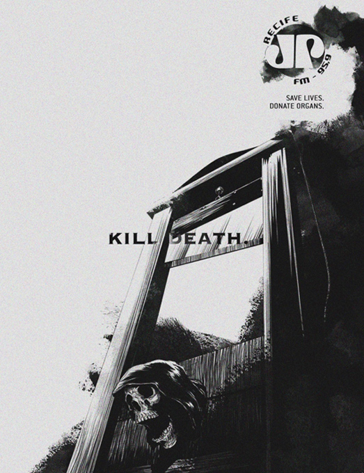
THE ORIGINAL? Joven-Pam FM – Organ Donation – 2017 “Kill Death. Save Lives. Donate Organs” Click on the image to enlarge Source : Martpet Agency : MartPet, Recife (Brazil)
LESS ORIGINAL Jinzhou Driving-School – 2020 “Kill death. Stay Safe, Buckle Up”
Click on the image to enlarge
Source : Adsoftheworld
Agency : The Whole Adv (China)
THE ORIGINAL? Joven-Pam FM – Organ Donation – 2017 “Kill Death. Save Lives. Donate Organs” Click on the image to enlarge Source : Martpet Agency : MartPet, Recife (Brazil)
LESS ORIGINAL Jinzhou Driving-School – 2020 “Kill death. Stay Safe, Buckle Up”
Click on the image to enlarge
Source : Adsoftheworld
Agency : The Whole Adv (China)
THE ORIGINAL? Joven-Pam FM – Organ Donation – 2017 “Kill Death. Save Lives. Donate Organs” Click on the image to enlarge Source : Martpet Agency : MartPet, Recife (Brazil)
LESS ORIGINAL Jinzhou Driving-School – 2020 “Kill death. Stay Safe, Buckle Up”
Click on the image to enlarge
Source : Adsoftheworld
Agency : The Whole Adv (China)
You can create an easy 3D anaglyph effect in this Photoshop tutorial showing you how to make anaglyph pictures. We will show you how to create this 3D photo effect in less than 60 seconds with this anaglyph tutorial.
A 3D Anaglyph image is one that contains two different
colored images, one for each eye, using filters of typically red and
cyan, although some people may describe it as a red-blue 3D image.
To experience that pop-out stereoscopic photo effect, make sure to use
3D red-cyan glasses to see this cool trick in action. Though it’s known
to be used for photography and film, you can incorporate this look into
your designs and illustrations for an interesting twist.
Let’s take a look at how to create this simple effect in this quick 60-second video below. And check out our selection of 3D Effect Photoshop Actions on Envato Market.
1. How to Create a 3D Anaglyph Photo Effect in Photoshop
Step 1
Double-click the background layer and Name the new layer „Left”. Then hold Control-J to create a Duplicate of this layer, renaming the new copy „Right”.
Step 2
Select the right layer and Right-click to go to Blending Options. Under BlendingOptions, Advanced Blending, uncheck the Red optionfor the RGB channels and hit OK.
Step 3
Repeat this process with the left layer, Right-click and go to Blending Options, but this time uncheck the Green option for the RGB channels and hit OK.
Step 4
With the left layer still selected, grab the Move Tool(V) and press the Left Arrow key between five to ten times to shift the layer to the left. Now select the right layer and press the Right Arrow key several times to shift the layer to the right.
Step 5
Then use the Crop Tool(C) to crop away the edges.
How to Make Anaglyph Pictures—With Photoshop Actions!
Continue working with 3D effects with these great resources! Find more incredible design assets on Envato Market and Envato Elements. Create quick red-blue stereoscopic images with these amazing 3D anaglyph Photoshop action resources which you can download now!
Master the 3D look with just a few clicks. This first Photoshop action features eight different color options with separate distortion settings. Adjust the effect even more with 17 filters that will make your images pop. Check it out!
Need a quick and easy red-blue 3D filter effect? Check out this awesome Photoshop action from Feelfreestudio. Designed for Photoshop versions CS3 and above, this action makes an intense 3D anaglyph you can customize with new colors.
Make a special interactive version for your 3D effect. This exclusive Photoshop action comes from mrcharlesbrown. Grab it to enjoy a perfected anaglyph effect that works with Type A and B 3D glasses. Add it to your design arsenal!
Stereoscopic 3D effects work brilliantly for movie posters, websites, and videos. Create content you love with this great action that includes a total of eight actions. Easy to use, this non-destructive action will produce professional results without damaging your photos.
Or check out this simple 3D effect action for a trippy effect. Made by designer ClauGabriel, this action includes well-organized layers that can be customized to your preferences. Style any portrait, object, or landscape photo with a cool red-blue 3D filter effect!
More Photo Effect Inspiration
This is part of a series of quick video tutorials on
Envato Tuts+ in which we introduce a range of subjects, all in 60
seconds—just enough to whet your appetite. Let us know in the comments
what you thought of this video and what else you’d like to see explained
in 60 seconds!
Enjoyed this anaglyph tutorial? Want to learn more about Adobe Photoshop and how to create awesome photo effects? Check out the following tutorials below:
You can create an easy 3D anaglyph effect in this Photoshop tutorial showing you how to make anaglyph pictures. We will show you how to create this 3D photo effect in less than 60 seconds with this anaglyph tutorial.
A 3D Anaglyph image is one that contains two different
colored images, one for each eye, using filters of typically red and
cyan, although some people may describe it as a red-blue 3D image.
To experience that pop-out stereoscopic photo effect, make sure to use
3D red-cyan glasses to see this cool trick in action. Though it’s known
to be used for photography and film, you can incorporate this look into
your designs and illustrations for an interesting twist.
Let’s take a look at how to create this simple effect in this quick 60-second video below. And check out our selection of 3D Effect Photoshop Actions on Envato Market.
1. How to Create a 3D Anaglyph Photo Effect in Photoshop
Step 1
Double-click the background layer and Name the new layer „Left”. Then hold Control-J to create a Duplicate of this layer, renaming the new copy „Right”.
Step 2
Select the right layer and Right-click to go to Blending Options. Under BlendingOptions, Advanced Blending, uncheck the Red optionfor the RGB channels and hit OK.
Step 3
Repeat this process with the left layer, Right-click and go to Blending Options, but this time uncheck the Green option for the RGB channels and hit OK.
Step 4
With the left layer still selected, grab the Move Tool(V) and press the Left Arrow key between five to ten times to shift the layer to the left. Now select the right layer and press the Right Arrow key several times to shift the layer to the right.
Step 5
Then use the Crop Tool(C) to crop away the edges.
How to Make Anaglyph Pictures—With Photoshop Actions!
Continue working with 3D effects with these great resources! Find more incredible design assets on Envato Market and Envato Elements. Create quick red-blue stereoscopic images with these amazing 3D anaglyph Photoshop action resources which you can download now!
Master the 3D look with just a few clicks. This first Photoshop action features eight different color options with separate distortion settings. Adjust the effect even more with 17 filters that will make your images pop. Check it out!
Need a quick and easy red-blue 3D filter effect? Check out this awesome Photoshop action from Feelfreestudio. Designed for Photoshop versions CS3 and above, this action makes an intense 3D anaglyph you can customize with new colors.
Make a special interactive version for your 3D effect. This exclusive Photoshop action comes from mrcharlesbrown. Grab it to enjoy a perfected anaglyph effect that works with Type A and B 3D glasses. Add it to your design arsenal!
Stereoscopic 3D effects work brilliantly for movie posters, websites, and videos. Create content you love with this great action that includes a total of eight actions. Easy to use, this non-destructive action will produce professional results without damaging your photos.
Or check out this simple 3D effect action for a trippy effect. Made by designer ClauGabriel, this action includes well-organized layers that can be customized to your preferences. Style any portrait, object, or landscape photo with a cool red-blue 3D filter effect!
More Photo Effect Inspiration
This is part of a series of quick video tutorials on
Envato Tuts+ in which we introduce a range of subjects, all in 60
seconds—just enough to whet your appetite. Let us know in the comments
what you thought of this video and what else you’d like to see explained
in 60 seconds!
Enjoyed this anaglyph tutorial? Want to learn more about Adobe Photoshop and how to create awesome photo effects? Check out the following tutorials below:
You can create an easy 3D anaglyph effect in this Photoshop tutorial showing you how to make anaglyph pictures. We will show you how to create this 3D photo effect in less than 60 seconds with this anaglyph tutorial.
A 3D Anaglyph image is one that contains two different
colored images, one for each eye, using filters of typically red and
cyan, although some people may describe it as a red-blue 3D image.
To experience that pop-out stereoscopic photo effect, make sure to use
3D red-cyan glasses to see this cool trick in action. Though it’s known
to be used for photography and film, you can incorporate this look into
your designs and illustrations for an interesting twist.
Let’s take a look at how to create this simple effect in this quick 60-second video below. And check out our selection of 3D Effect Photoshop Actions on Envato Market.
1. How to Create a 3D Anaglyph Photo Effect in Photoshop
Step 1
Double-click the background layer and Name the new layer „Left”. Then hold Control-J to create a Duplicate of this layer, renaming the new copy „Right”.
Step 2
Select the right layer and Right-click to go to Blending Options. Under BlendingOptions, Advanced Blending, uncheck the Red optionfor the RGB channels and hit OK.
Step 3
Repeat this process with the left layer, Right-click and go to Blending Options, but this time uncheck the Green option for the RGB channels and hit OK.
Step 4
With the left layer still selected, grab the Move Tool(V) and press the Left Arrow key between five to ten times to shift the layer to the left. Now select the right layer and press the Right Arrow key several times to shift the layer to the right.
Step 5
Then use the Crop Tool(C) to crop away the edges.
How to Make Anaglyph Pictures—With Photoshop Actions!
Continue working with 3D effects with these great resources! Find more incredible design assets on Envato Market and Envato Elements. Create quick red-blue stereoscopic images with these amazing 3D anaglyph Photoshop action resources which you can download now!
Master the 3D look with just a few clicks. This first Photoshop action features eight different color options with separate distortion settings. Adjust the effect even more with 17 filters that will make your images pop. Check it out!
Need a quick and easy red-blue 3D filter effect? Check out this awesome Photoshop action from Feelfreestudio. Designed for Photoshop versions CS3 and above, this action makes an intense 3D anaglyph you can customize with new colors.
Make a special interactive version for your 3D effect. This exclusive Photoshop action comes from mrcharlesbrown. Grab it to enjoy a perfected anaglyph effect that works with Type A and B 3D glasses. Add it to your design arsenal!
Stereoscopic 3D effects work brilliantly for movie posters, websites, and videos. Create content you love with this great action that includes a total of eight actions. Easy to use, this non-destructive action will produce professional results without damaging your photos.
Or check out this simple 3D effect action for a trippy effect. Made by designer ClauGabriel, this action includes well-organized layers that can be customized to your preferences. Style any portrait, object, or landscape photo with a cool red-blue 3D filter effect!
More Photo Effect Inspiration
This is part of a series of quick video tutorials on
Envato Tuts+ in which we introduce a range of subjects, all in 60
seconds—just enough to whet your appetite. Let us know in the comments
what you thought of this video and what else you’d like to see explained
in 60 seconds!
Enjoyed this anaglyph tutorial? Want to learn more about Adobe Photoshop and how to create awesome photo effects? Check out the following tutorials below: